
Three more figures from the Battle Break set.
Starting with Horse Whale (ホシクジラ):
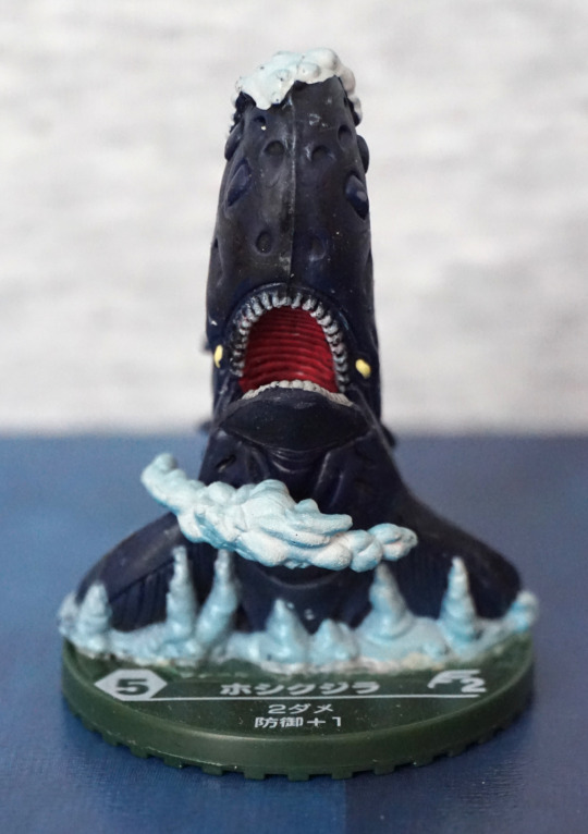
Yep. You read that right. Apparently this is a horse whale… Does look like a whale from this angle… but I’m not getting horse. There’s some foam added to the figure, but it looks more like clouds or ice formations.
Left:
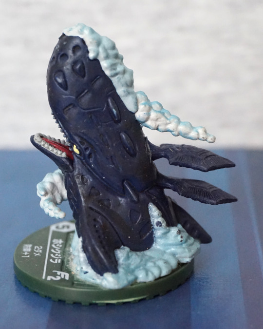
From the sides, it definitely looks more like a squid-whale than a horse-whale, with the squidlike appendages on its back. The foam has some pretty weird dark blobs on it, where it looks like the paint was incorrectly applied, which I don’t like. The creature itself has a nice design though.
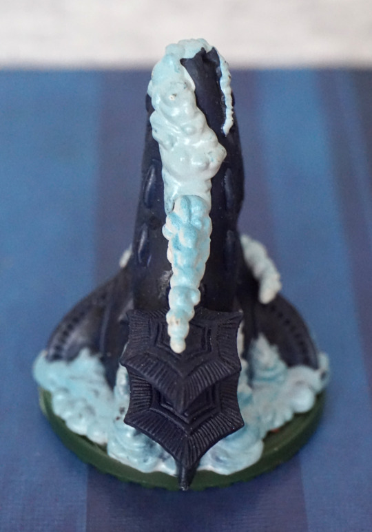
Right:
I think the foam looks better on this side, but is still kind of ropy, and I’d prefer if it was waves instead of seafoam. The slots on the upper part of his head make it look like it might’ve been crossed with a submarine, and the regular spacing of the elements give it a machinelike feel to me.
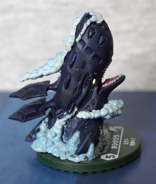
Back:
I like the patterns on the finlike protrusions on its back. Foam still looking kind of “eh” to me. I think the solidity of it is what ruins it mostly – if they used transparent plastic here, I think they could’ve achieved a better effect that wasn’t so solid. For a cheap figure it does the job, though.
Overall, I like this one, and do like the creature’s design, but not so fond of the added parts.
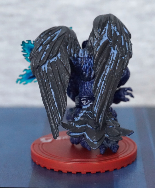
Crow Teng (クロウ・テング):
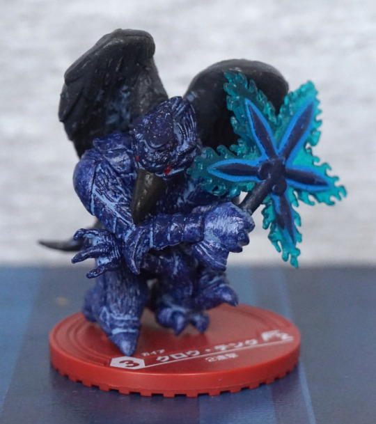
Here we have a not-so-black crow. Which made me thing “eagle” prior to translating the name. Here we have an interesting battle pose, and a wandlike weapon, which makes me think this dude is a caster. Whichever, he’s a mean looking-dude.
Right:
I like the sculpted texture on his body, but I think they’ve been a bit miserly with the light blue paint here, and it doesn’t highlight some of the key features, which makes look a little odd overall. I think the part on his leg could’ve been directly painted, instead of giving him a wash, and it would’ve improved the overall appearance. He does have a red beady eye, which is a nice focal feature.
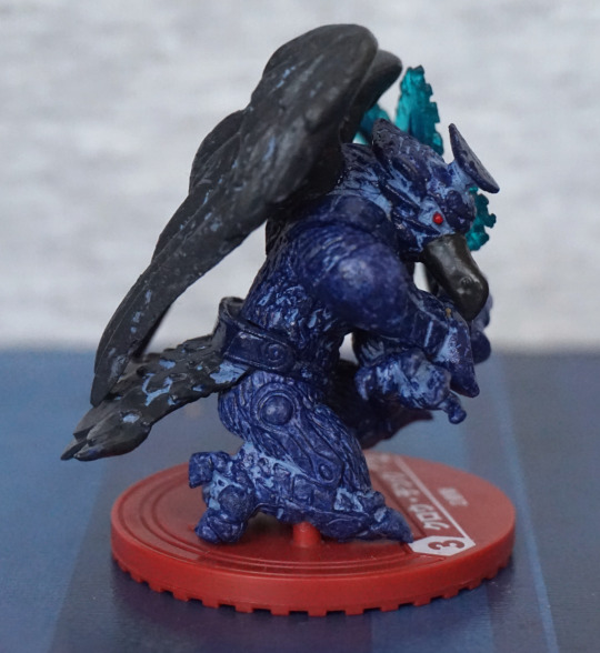
Back:
Looks like he’s had a run-in with a tin of paint. Here the wash is VERY sloppy, and I kind of wish they didn’t bother. Makes it look like a statue in disrepair instead of acting as highlights.
From the front, this a nice looking piece. From the other angles… not so much.
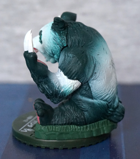
Killer Panda (キラー・パンダ):
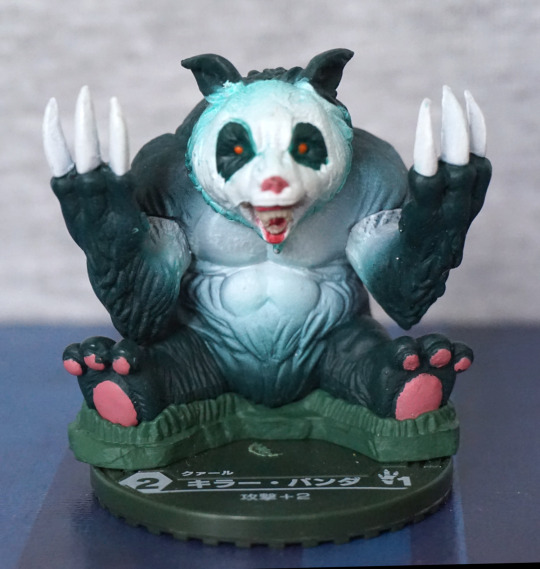
Vicious and cute. The colour scheme isn’t really befitting of a panda, but I do like the paint apps. The fading has been done well on his body, and most of the painted highlights are done neatly. They’ve even given him some grass to sit in.
Left:
Paint between his parts didn’t get blended… oops. Looks a bit derpy from the side. We also have some paint chips, which aren’t great.
Back:
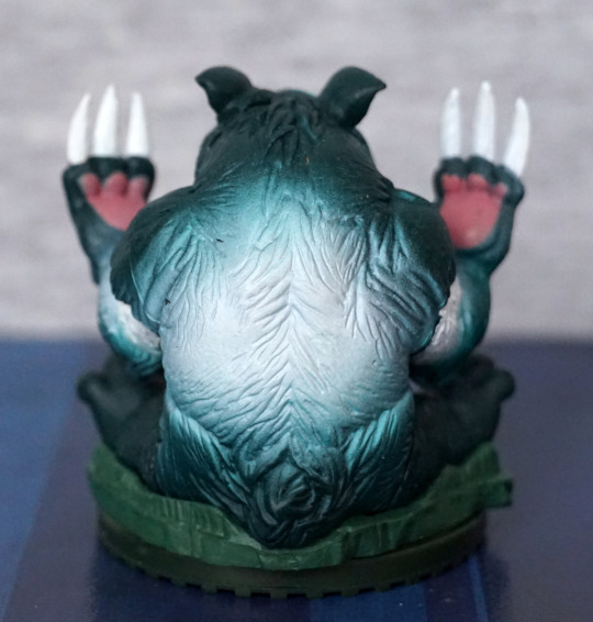
His palms have been painted to match his feet, which works well. Faiding is done well on the back, so he looks good from this angle too. Just a shame about the paint chips on the left.
Overall, he’s not a very inventive character, but he is well-executed, apart from some paint issues on the sides.