Category: Trading & Small figures

Aliens x M.U.S.C.L.E – Series 2 – Part 2

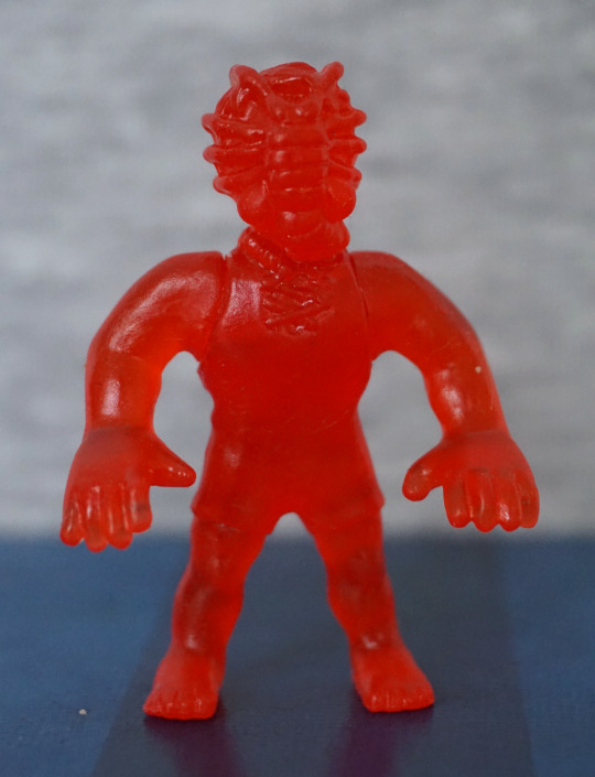
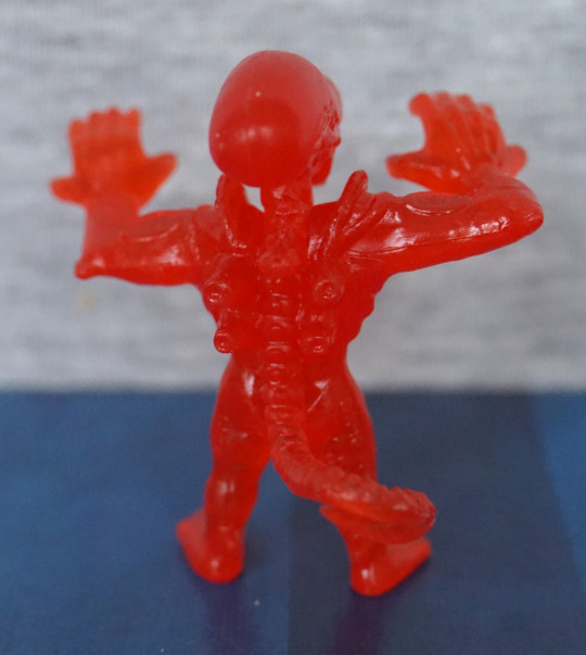
Now for some alien warriors and their main nemesis…

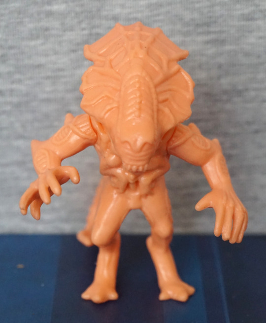
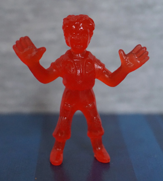
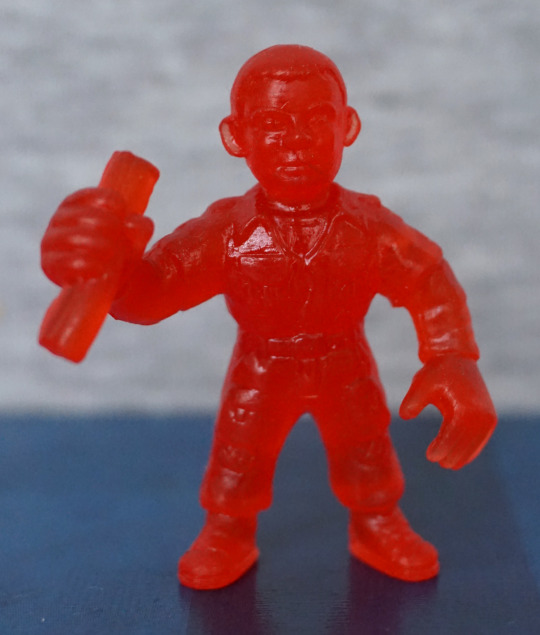
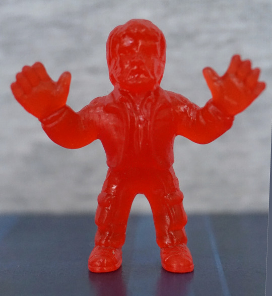
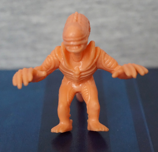
First up, this dude:

Why, hello there! This one, um, has a normal hair. That’s mine. Sorry. Overall, he looks OK, pretty similar to the ones in the other set. Only this one is waving. 
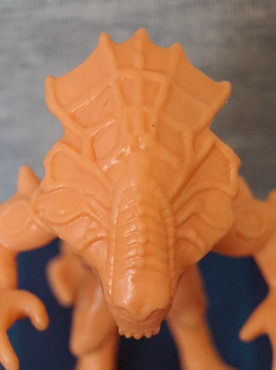
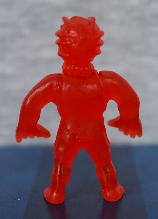
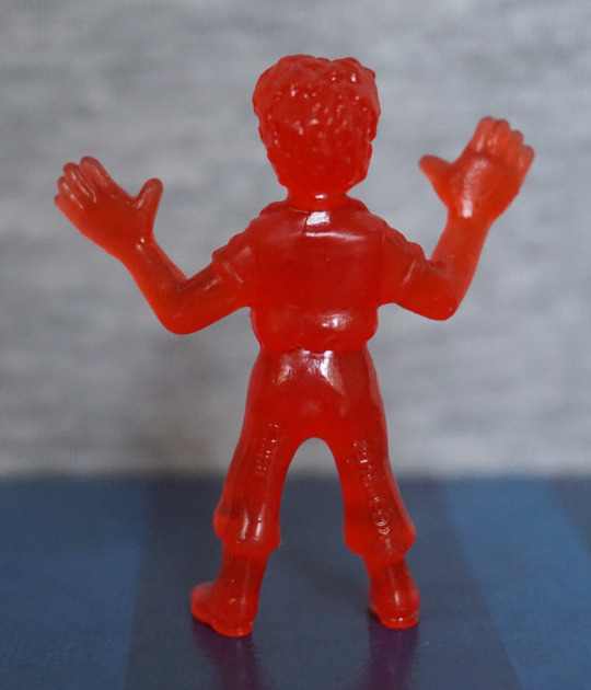
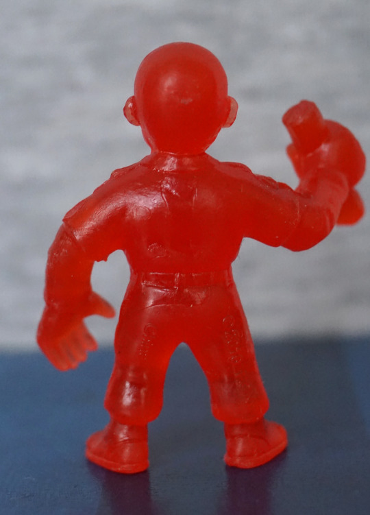
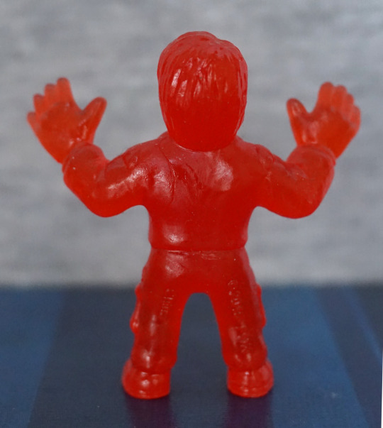
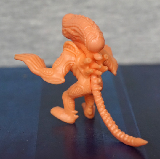
Top of his head:

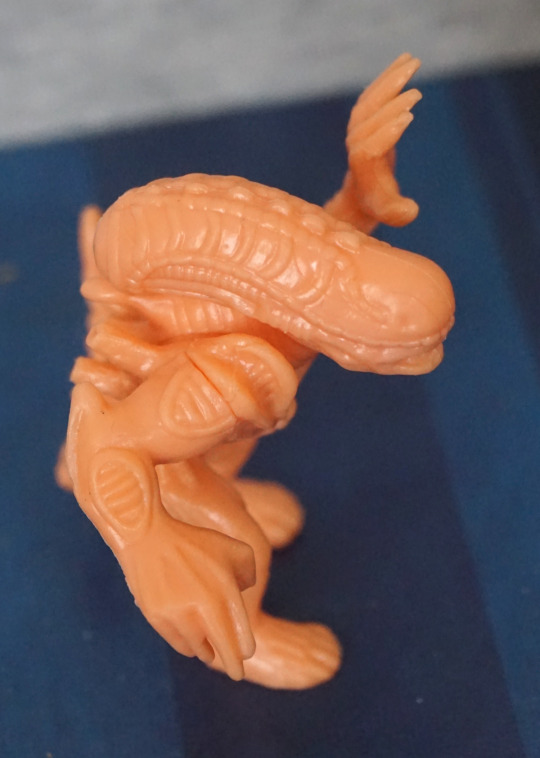
I do like the sculpting on the top of these alien warrior’s heads. That part did come out well, though here we can see the arm joint is a bit “eh”. 
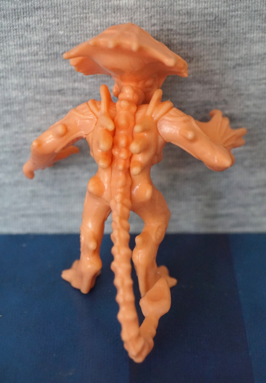
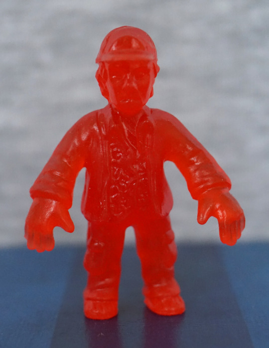
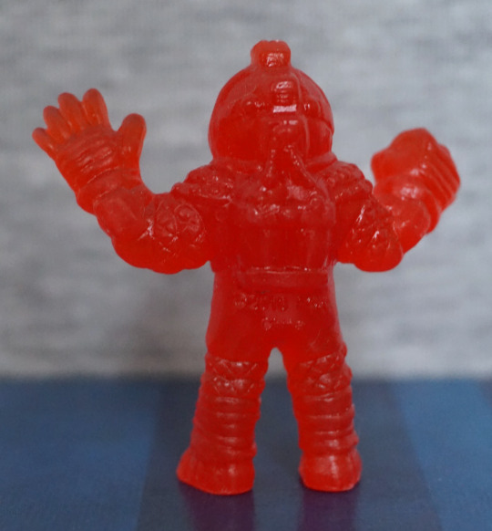
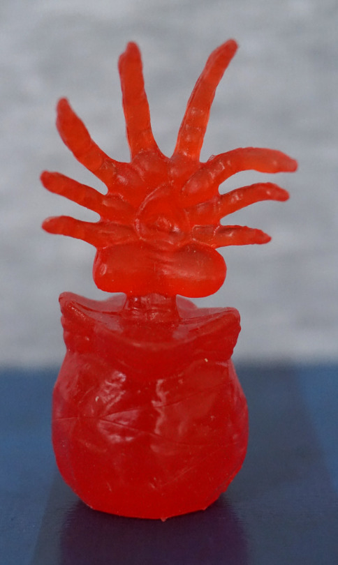
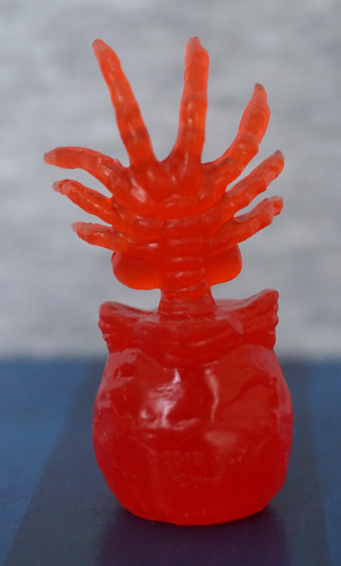
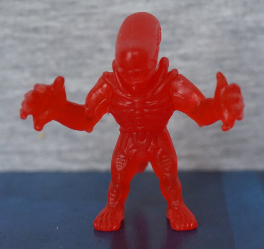
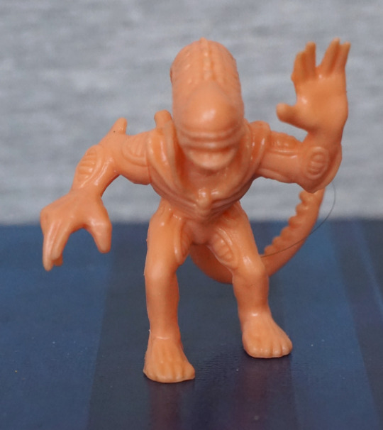
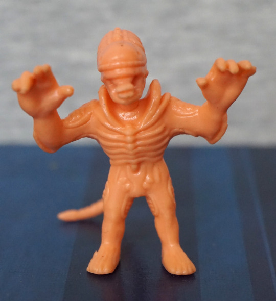
Xeno number 2:

This guy… likes to lounge around. This guy I’d say is the weakest of the three warriors in this set – his pose isn’t overly exciting, and he doesn’t stand up on his own either… 

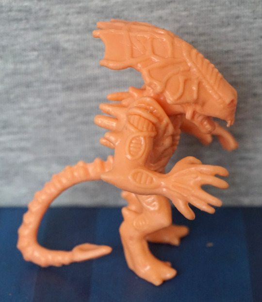
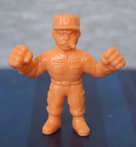
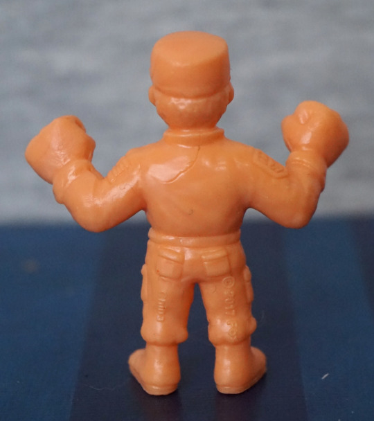
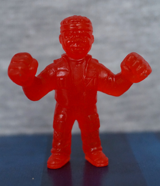
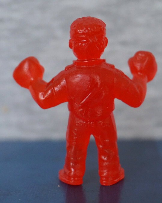
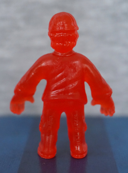
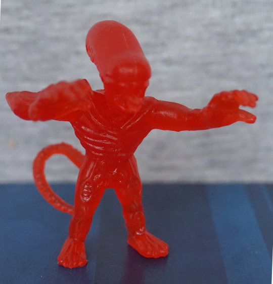
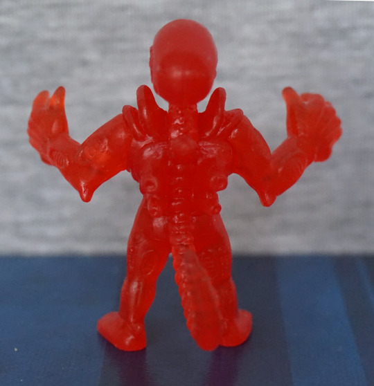
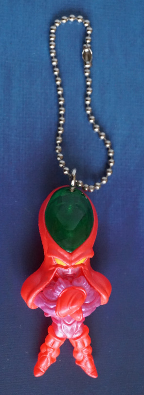
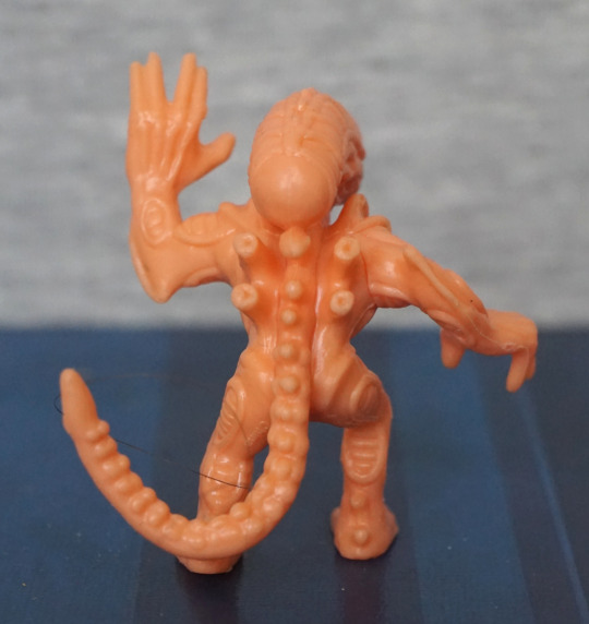
Lastly for the xenos:

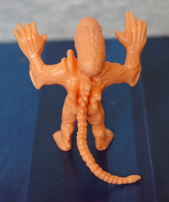
With his arms up, this feels more like a xeno pose, crossed with a M.U.S.C.L.E one. He’s also in attack mode, with his inner mouth poking out. He also isn’t super at balancing, but his tail does more to support him, so he doesn’t look like he’s lazing out. 

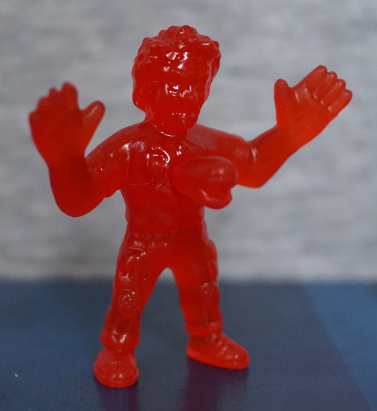
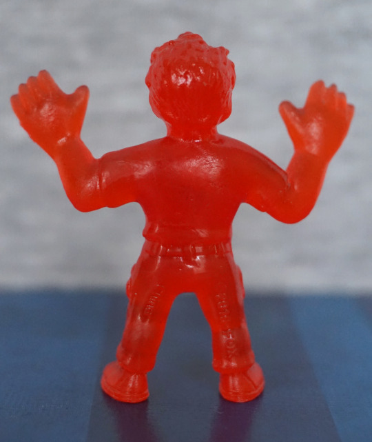
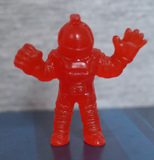
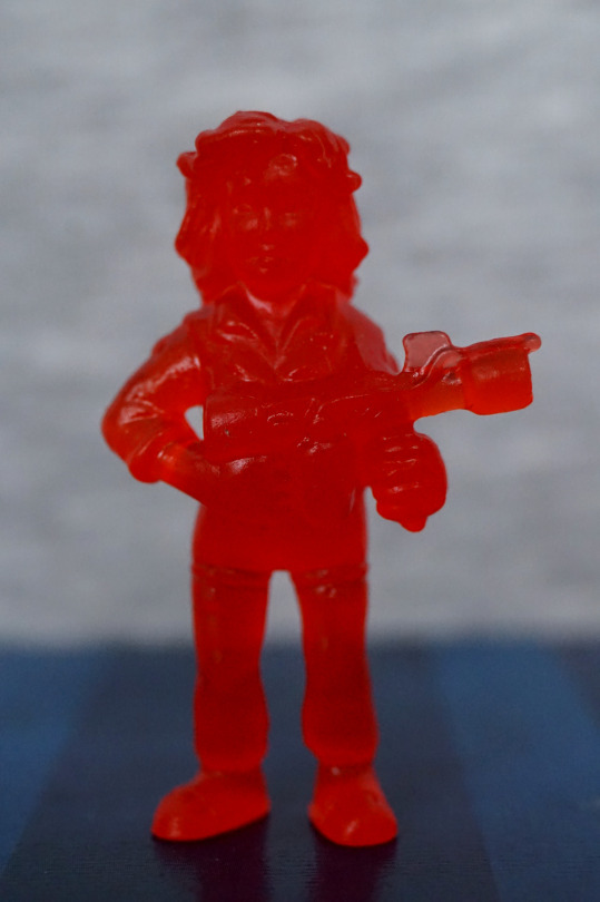
Now for their natural enemy… the Ripley!

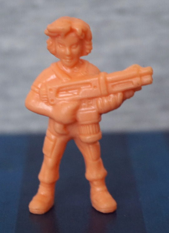
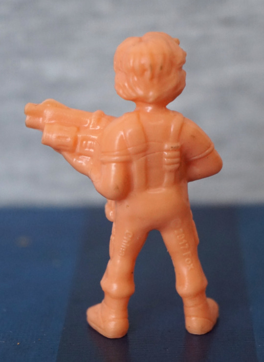
The sculpting feels more detailed than series 1, and she has something that almost passes as an expression. 
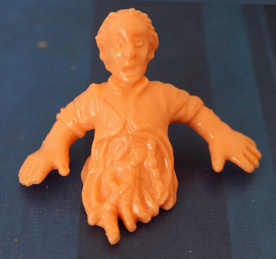
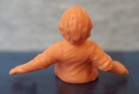
Ripley with Newt:

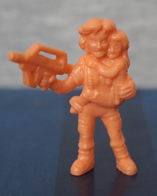
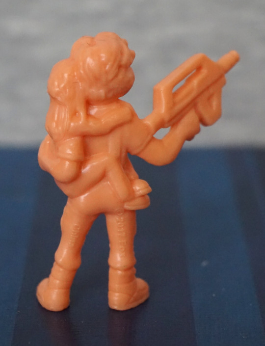
Another iconic “pose”. However, I’m not too much of a fan of the sculpt on this one, no matter how hard I try to not see it. From the front, Newt looks like she’s melting into Ripley a bit, and the faces look odd. From the back, Newt’s leg looks like it has been flattened, which doesn’t look good. The hair sculpts look good, if a little merged. Rifle looks the part though. 

Again, a mixed bag. The sculpts seem to have more detail in this set, but there’s more balance issues with this set, or other moulding weirdnesses. 

Aliens x M.U.S.C.L.E – Series 2 – Part 1

Series 2! For this series, I got the “normal” edition, which is in a flesh colour. I think there was a limited run of these in different colours, but in blind bags, but those aren’t ones easily available. However, I was happy to get these in a non-translucent plastic. 

First up, the Alien Queen herself:

image
image
image
image

She has her cute li’l arms sculpted, and her large head plate. At a glance, I don’t mind the head plate, but looking close, the spider-web effect is a bit odd to me. The front part of her head I like the texture of though. Here, you can see better the odd ring bits than the translucent set – here I can tell they look odd to me as the rest of the arm lacks texture, which makes them stand out. 

Her back and spine look good – lots of sculpting and texture here, giving a detailed appearance. No detail under her head plate, though. Overall, I like this one.

Powerloader, featuring Ripley:

image

Here we can see Ripley piloting the powerloader – her clothes are nicely sculpted, and her face is fine for the size. I think they did a good job with this, given the size. One of the aerials is a bit bent on mine, but I could fix this. 

Sides:

image
image

Lots of small mechanical details here, which are nice. Claws look nice, but a little bent – I suspect if I do try to sort these, there is a good chance they’ll bend a bit over time. The join between the front cage and the powerloader itself is a bit rough, but it doesn’t really bother me. 

Back:

image

Looks good from the back – we have a decent amount of hydraulic parts modelled here. Just need to sort out that derpy aerial… 

Half a figure, Bishop:

image
image

Unfortunately mine has a hairline from when it was moulded. Ignoring that, he’s been well-sculpted, and I love this iconic choice of character and “pose”. 

Apone:

image
image

First thing that stands out to me is the flatness of the top of his hat – not sure why his hat is so flat. However, he does look ready to kick butt with that cigar and his fists. Sculpting is OK on this one, but again, another one of those hair marks. 

Bit of a mixed bag here – I think the sculpts are better thus far than the first series, but there’s more of those hairlines. Also the Alien Queen isn’t very well balanced, so she’ll need some tack to keep upright. 

Aliens x M.U.S.C.L.E – Series 1 – Red ver. – Part 3

Now for the last four figures in this set. 

So, let’s continue on with Kane…

Nom! Here we have Kane being facehugged. The facehugger is nicely sculpted, but his body is a bit lacking – the way they’ve done the joins on his arms doesn’t work well – instead of looking like the edges of his shirt, it very much looks like his arms are stuck on. His shorts/legs is a better bit of moulding. 

Kane, unfortunate ver.:

Due to the material used, I don’t think the chestburster shows up too well on this one. But it’s certainly an iconic thing to include, I can see why they did this one. Even though it’s a bit indistinct, I’m glad they included this.

Lambert:

I don’t find the likeness on this one too good, and her expression certainly looks odd in my photo. Her clothes are nicely sculpted, but her body feels an over-distorted shape – looks like they tried to give her boobs, but didn’t sculpt the shirt shape correctly, so her entire top is puffed out. 

Lastly, Parker:

Again, a mould hairline on the back. I think this decently looks like Parker, and the sculpting is good – his iconic headband is there, and his clothes look decent. And he also looks ready to do some punchin’ M.U.S.C.L.E-style. 

Overall, these ones were a bit of a mixed bag, but I don’t think any of them are terrible. I like the red colouring, but it does make the sculpting look less distinct, so I feel this is a bit of a trade-off. 

I’m glad I got this set, and I like the mash-up between the two franchises…. enough to buy series 2! Stay tuned for series 2 😉

Aliens x M.U.S.C.L.E – Series 1 – Red ver. – Part 2

Now for four more of the series 1 of the Alien M.U.S.C.L.E figures.

Ash:

image
image

What’s he holding here? Not entirely sure… is it the Inanimate Carbon Rod? Hm. His front is sculpted well, and has a reasonable level of detail, given the figure type. However, the back feels a bit bland and seems to have a couple of moulding issues – there’s a couple of hairlines on his back, which I don’t think are supposed to be there. 

Brett:

image
image

Looks reasonably like the character, Here we have some sculpting to stand in for his shirt design, and I think that works well. We also have some creasing moulded on the back of his jacket, which is a nice touch. 

Dallas:

image
image

This was also one I recognised when taking them out of the tub, so the likeness is likely reasonable. Again, on his back there’s some hairlines which I’m pretty sure are not supposed to be there. His outfit looks good from the front though, and is nicely detailed. 

Lastly, for this blog, Kane in his spacesuit:

image
image

I did have to look at the character list to see who this was… This one is pretty detailed though, and does look like the iconic spacesuits used in the movies. And with those fists, its wearer could certainly go do some punchin’

Overall, most of these were decent, but I think the Ash one didn’t look as good as the others – I didn’t find the likeness as good as the others, and there seems to be some sloppiness of the design around the back. 

Aliens x M.U.S.C.L.E – Series 1 – Red ver. – Part 1

Saw Ashens on Youtube review some of these, and decided to get some for myself. Found this red “trash can” of them cheap-ish on a UK site and went ahead and ordered them.

They come in a nicely designed tub, based on the old MUSCLE figure packaging:

And it has this really cool lid design:

D’aww, look at that cute chestburster, busting out of the lid. The artwork is nicely done on the packaging, and mix the two properties well.

So let’s look at some figures! Today, we’ll mostly focus on the aliens. Let’s start with a facehugger:

These things are not easy to photograph… The translucent plastic works OK, and the sculpting is good on the facehugger itself – we have joints on the legs, the sucker on the bottom, and the spine markings along its back. The egg feels less detailed, as there is no indentation in the top and it doesn’t seem to have much texturing on the outside. 

First xeno:

Again, the translucent plastic does make the details hard to see, but they are there. He definitely has the MUSCLE proportions, with the large hands and stretched pose. He does have a pretty noticeable seam on his head, though. 

Wanna hug?

Fairly similar to the first, but with a different pose. I do like this one’s pose more than the other. With these, I like the sculpting on the tail and the “pipes” and shoulder blades look good. The round parts on the front of the legs I find a little weird-looking. 

Last one for today, Ripley:

She seems OK, for what I can see of her. I recognised her, so that’s a good sign for the sculpting. There’s a decent amount of detail here – her hair has texture, we can see her boiler suit collar, and the details on her shoes. 

Overall, I’m happy with these four. 

Battle Break – Part 4

This is the fourth and final part of the Battle Break figures. Let’s see what the last few boxes bring us!

Here we have a Sphinx, Spin-X (スフィン-X):

Robo-sphinx! I love the design of this one, and he’s nicely painted. Looks like some of the green may’ve smudged a bit onto the middle of his wing by mistake. The colours work well together, and fit the Egyptian theme. 

Front:

Here his front is dominated by a large cannon. I like the ornate design on the end of it.

Back:

The bottom of his back looks a bit odd, with the way his legs are attached to it, giving to a strange, bulbous look. Back of his head looks OK. 

Ranch Lizard (牧場トカゲ):

A big one and a little one, aww. The overall design is reminiscent of a triceratops. The sculpting is decent, and the colour scheme works. 

Back:

More of the same. Paint looks OK for teh most part, but could do with a bit more dark paint on the brown part of the tail. 

Head:

Yup, don’t want to have this guy headbutt me. Thinking that’d hurt with that chitinous protrusion. 

So, if you’re a rancher, this is apparently the lizard for you!

Adams! (アダムス):

And now for something completely different… an alien beaming down! Loving the classic alien design. The colours work well together, and the sculpt is decent. This is probably one of my favourites. 

Side:

Here we can see the beam is translucent, and can just about see the alien through it. 

Back:

If you just want an alien craft beaming something down, this is the view for you. I think this figure has been well-sculpted and painted. 

And lastly, Waterline (ウォータリアン):

Here we have a water-based dude, with water protruding from his head. I like the colour scheme on this one too, and the purple parts seem to have been painted neatly on this one. The water on this one is a lot more effective than the foam stuff on the Horse Whale, and wish they went for more of this look on the Horse Whale figure. 

Side:

I like the design of his armour, and his watery hairstyle. The wave and foam have also been painted well, and it does look like a cresting wave. 

Back:

Yup, looks like a wave back here! Not too much to see, but the sculpt and paint are nice. Overall, I really like this one, but he is a bit hard to display so you can see him well due to the wave surrounding him.

With this set overall, I’m pleased with what I got. Some of the figures aren’t that great, but I think there is enough inventive designs here that they work as display pieces as well as game counters. Could also see these being re-purposed for another board game, if these characters fit the theme. 

Battle Break – Part 3

Three more figures from the Battle Break set. 

Starting with Horse Whale (ホシクジラ):

Yep. You read that right. Apparently this is a horse whale… Does look like a whale from this angle… but I’m not getting horse. There’s some foam added to the figure, but it looks more like clouds or ice formations. 

Left:

From the sides, it definitely looks more like a squid-whale than a horse-whale, with the squidlike appendages on its back. The foam has some pretty weird dark blobs on it, where it looks like the paint was incorrectly applied, which I don’t like. The creature itself has a nice design though.

Right:

I think the foam looks better on this side, but is still kind of ropy, and I’d prefer if it was waves instead of seafoam. The slots on the upper part of his head make it look like it might’ve been crossed with a submarine, and the regular spacing of the elements give it a machinelike feel to me. 

Back:

I like the patterns on the finlike protrusions on its back. Foam still looking kind of “eh” to me. I think the solidity of it is what ruins it mostly – if they used transparent plastic here, I think they could’ve achieved a better effect that wasn’t so solid. For a cheap figure it does the job, though. 

Overall, I like this one, and do like the creature’s design, but not so fond of the added parts.

Crow Teng (クロウ・テング):

Here we have a not-so-black crow. Which made me thing “eagle” prior to translating the name. Here we have an interesting battle pose, and a wandlike weapon, which makes me think this dude is a caster. Whichever, he’s a mean looking-dude. 

Right:

I like the sculpted texture on his body, but I think they’ve been a bit miserly with the light blue paint here, and it doesn’t highlight some of the key features, which makes look a little odd overall. I think the part on his leg could’ve been directly painted, instead of giving him a wash, and it would’ve improved the overall appearance. He does have a red beady eye, which is a nice focal feature.

Back:

Looks like he’s had a run-in with a tin of paint. Here the wash is VERY sloppy, and I kind of wish they didn’t bother. Makes it look like a statue in disrepair instead of acting as highlights. 

From the front, this a nice looking piece. From the other angles… not so much. 

Killer Panda (キラー・パンダ):

Vicious and cute. The colour scheme isn’t really befitting of a panda, but I do like the paint apps. The fading has been done well on his body, and most of the painted highlights are done neatly. They’ve even given him some grass to sit in. 

Left:

Paint between his parts didn’t get blended… oops. Looks a bit derpy from the side. We also have some paint chips, which aren’t great. 

Back:

His palms have been painted to match his feet, which works well. Faiding is done well on the back, so he looks good from this angle too. Just a shame about the paint chips on the left.

Overall, he’s not a very inventive character, but he is well-executed, apart from some paint issues on the sides. 

Battle Break – Part 2

More Battle Break figures! 

First one for today is One of Nine (ワン・オブ・ナイン):

A little ninja dude! I do like the purple-green colour scheme, and he also comes with a small piece of scenery. The painting looks OK from the front, but you can see some parts where they are a bit rough. 

Top-side:

Here, I think the grey parts of his helmet are likely intentional, but there seems to be a scuff on his shoulder, and uneven application on the outstretched arm. Arm blade looks decent though. His helmet has a suitably techno-looking plume on his helmet.

Left:

I do like the way they’ve got him running and leaning forward. Does make for an interesting pose. Here’s some more uneven paint though. 

Back:

His back is dominated by this ludicrously large ninja star… Not sure what he intends to do with it, but it does look cool! The sculpting and painting is nice on this part though. 

Bazooka infantry (バズーカ歩兵):

Fairly straightforward… a dude with a bazooka! Looks almost like some kind of golem, with him painted in green. 

Sides:

The sculpting job is nice, and the paint job is decent. 

Back:

The design of his suit does also give weight to him being a golem/stone warrior – the screwlike part makes me think more golem than human. 

Imo, he’s an OK figure, but not very interesting compared to the others in this set.

Aiai (アイアイ):

I love this cute dude… and certainly lives up to his name, with all the eyes… wondering if it should be translated as eye-eye. Whatever, he certainly has an eye on you! The colours work well together, and the painting is mostly decent, though there is a bit of wandering paint on its hair, in the middle.

Back:

No sneaking up on this dude! Big bit of stray paint on his lower left ear. Colour scheme feels well-balanced from the back too, and he is nicely textured in the sculpt.

Rather like this little dude. Don’t think he’s my favourite, but definitely like him more than some of the others. 

Battle Break – Part 1

and Another thing I added to an order on a whim – it worked out as £10.63 for 15 mini-figures

(would’ve been slightly less if the retailer didn’t screw with my order…), which is pretty cheap. These figures are supposed to be for a board game called “Battle Break” but isn’t something I’m going to play. 

Looking at the sides of the box, there were 17 possible figures, and I got 13 of them, which is a good innings for random-boxed items. 

First up, Lion King (獅子王):

This is the guy on the front of the boxes, and he does indeed look spiffy, though  he does lack lower legs and feet. I love the hair and mane parts, and I think the colour scheme works well.

Side views:

Ah, silly-sized weapons… gotta love ‘em. I think the design is pretty inventive, and I like the claw theme, which fits with he character. Here we get a good look at his hair, and I like the way it is sculpted. The eye adds a nice contrast to the rest of the figure. 

Back:

I do like the texture on his cape – has a rustic feel to it. Almost like a thatched roof type-thing. 

Overall, I think this miniature is nicely sculpted and painted. 

Leviathan (リヴァイアサン):

Here we have a green semitransparent dragon-y dude. I like the water effect included with this figure. What I like less is the super-obvious seam lines that don’t fit well. Not entirely convinced with the angles of his wings and head from this view. With him having a line of spikes on his stomach as well as his back, it makes it hard to notice we’re looking at the underside of his body here, which makes him look abnormally twisted until you look closer imo. 

Sides:

I really like the head of this figure – the shape and colours both look nice. There is a seam line on his head, but it is a lot less obnoxious than the one on his body and the wings. The translucent effect works well when viewing his right-hand side. 

Back:

Here I think his pose makes more sense. The coloration looks better on the back of his wings, but we do seem to have some of the sea colour creeping through on his right one.

Overall, and OK figure. Not my favourite. 

Lizard Magician (トカゲ呪術師):

Not a big fan of this brushed shading effect, but his sculpt is OK. The colours work, but aren’t anything special to me. The green ball came out well imo, and I like the design of his head.

Back:

Here we have a decent amount of sculptwork, though there seems to be some missing lines on his tail – we have indentations on the right, but not the left which looks odd. The back of his frills is nicely rendered though, and so is his spines. The other details are a bit “eh”. 

Overall an OK figure, but I don’t feel it’s anything special. Fine for Poundland fodder, lol. 

Groot – Guardians of the Galaxy – Metacolle

This figure was gifted to me by a friend. He posted it to me, but didn’t put a note with the figure, so I was confused for awhile, wondering when I ordered a mini-Groot figure until I worked out this was the gift he sent me :).

So let’s have a look at the li’l guy.

MetaColle figures certainly live up to their name – for his small size he’s pretty weighty because of it. This figure is nicely painted, for its size. The fade on his head is nicely done, with some green detailing on his body. 

The gaps on his body are because he has articulation in these areas. So you can pose him a bit too!

To give an idea of size, here’s a promo shot:

So he’s not too far off the size of the Nano metalfigs, for things to compare him to. 

Left:

I like the sculpting on him – the wood effect works well. The blended paint on his head works well from this side too. 

Right:

From this side we can see he has got good detailing on the top of his head, as well as the sides. 

Back:

Here’s the only drawback as far as I’m concerned – he has a visible screw in his back. Would’ve been nice to have a plug or something to cover this up, but I don’t think it’s a big thing for what you get. 

Overall, I really like this little figure, and think he’s a decent quality figure. These figures have an RRP of ¥1,000, though if buying direct from Japan they’re usually around ¥800, which I think is a fair price point for these figures. 

DC Nano-Metals – Part 3

And here we have the last three in the pack. 

So let’s start with Martian Manhunter:

I think this is one of the best-looking ones in the set – the paint is fairly neat, though the blue paint is over-spilling in some areas. The red paint is within the lines though, which is the more critical colour here. We have a better choice of green here, which makes me more confused about why they went with the green they did for Killer Croc. I do wish they painted his belt red though. The disc parts should be gold, but being a simplified figure, I’m going to let them off for not painting these. The pose and sculpt are both decent, so no complaints there.

Back:

Not much to see here, other than cape. Not the most realistic ripples, but it’ll do. Also his cape paint seems to have escaped onto his head 😛

Superman:

Again, a not-too-bad figure. I think this one is let down by the paint a bit, but that isn’t helped by the relatively ambitious sculpt – with him in a flying pose, they’ve had to use the cape as support, which means the blue and red paint have bled into each other in places. Also makes it hard to paint without the over-spill showing up badly. The logo has been rendered surprisingly well, comparing the paint jobs in these figures. Again, no mouth, but this weirdly seems to only feel “apparent” when you’re looking up close. 

Back:

Cape looks good, and the paint job looks surprisingly decent and clean here.

Yep, I think this one is one of the stronger ones in this set. 

Lastly, Wonder Woman:

Interestingly, the females in these Nano Metal figures actually get mouths – and their faces look better for it. What doesn’t looks so good though, is the lasso on her hip – the lasso looks OK in of itself, but they’ve distorted her leg so the lasso has something to support it… so her leg looks rather misshapen. Personally I would’ve preferred it if they had the lasso sitting on her leg, instead of flatting out her leg to accommodate it. Paint-wise, she looks OK. 

The one thing that does bother me though is no “banner” at the top of her shirt – she needs some silver pain here, to match her headband if they were going for her more silvery look. To me, this makes it feel like she’s more “sexy Halloween costume” than Wonder Woman. 

Back:

Bit of escaping paint on her leg there, but overall, not a bad paint job. Here we can see her shoes have been turned into platforms to support her properly, which I think is a fair enough decision. 

If you ignore the lack of edging on her top, not a bad nano figure.

Overall, this set isn’t too bad, if you can pick it up cheaply. There’s definitely some misses in the set, but most of the figures are reasonably solid for their size. These figures are 1.65″ tall on average, so normally you wouldn’t look so closely at them as some macro photography. I’m not sure I’d pay the RRP for the set, but if you see these at a discount, I don’t think they’re too bad. 

DC Nano-Metals – Part 2

Now for four more Nano Metals figures. 

Here is some Killer Croc:

*GRIN*. Can’t say I’m a fan of the sculpt on this one, but it does amuse me so. The green doesn’t fit Killer Croc at all either. Shorts are roughly painted, and don’t look great either. The parts of his face that are painted are painted neatly but… well… it looks like that. Just look at it

There’s some nice sculpt details here in the spiny knobbles, it’s nice they’ve given him pockets, but that right pocket sticks out so far, like he’s got a large lump of something in there. Left pocket would look better, if it didn’t melt into his back. 

Overall, this one has amusement value only. 

Metamorpho:

I’d say this guy is the least-known out of the heroes included in this set. Paint is a bit sloppy in this guy, though he can partly get away with it, being a guy made out of several elements. Wish they would’ve done his shorts in black, rather than lazing out and just doing them in brown. The figure already features black on his face, so not sure why they didn’t. 

Back:

They’ve done a nice job of sculpting his mud leg, and the paints are a bit neater back here. 

Overall, I think he’s a decent mini-figure. 

Two-Face:

This is based on his orange-and-purple outfit form, which wouldn’t be my first pick. However, they’ve done a decentish job of rendering him at a first glance – colours look bold, suit is sculpted well, and his face has both its halves. Main issues for me is they didn’t paint his tie black, and whilst they gave him a mouth, it does look rather odd. And on that point… where are his eyes?!

And is it me, or does he look like he’s trying to take a shit? 

Back:

Back looks OK, but the paint doesn’t quite meet happily in the middle. 

Overall, probably not one I’m going to prominently display.

Lastly, Mr Freeze:

I really like the colours and pose on this one. However, his head doesn’t hold up to close scrutiny – looks like they didn’t fully decide if they were going to do his head or his helmet, and melded the two… I think it would’ve been better if they went without the helmet, and made his head less elongated. This would make the figure look better, and give the owner the option to add a clear part, if they wished. The gun is nicely sculpted though. 

Back:

Gun looks good back here, and his backpack looks decent. Helmet-head looks less silly from this angle, as there are no details on this side. 

Overall, I think he’s one of the stronger figures in the set. But dammit… that head-thing. Wish they didn’t do that. 

DC Nano-Metals – Part 1

I bought this set cheap-ish at TK Maxx. 

First up is a silverish Batman:

The paint is mostly in the right places and doesn’t look too bad. No mouth painted though… Can’t say I’m a big fan of the colour scheme, but I think it works. 

Back:

Not too much to see at the back. The cape is nicely wrinkled though. 

The Flash:

I like the colours on this one, and the paint is neatly done on this o0ne. The logo came out decently well on his chest, and his muscle definition works. 

Back;

His belt is a bit sloppy here, and the wing(?) on his boot is more of a nub. His body is sculpted well though. Pretty pleased with this one.

Green Lantern:

This guy, the paint went a bit sloppy – think the green needed to extend a bit more down his front, and one of his gloves has a bit of white mist paint. His mask is OK, but again, half a face, though the way his faces is moulded almost gives him a mouth a bit higher up. The logo on his suitl looks nice, but his chest does sort of seem to melt at the bottom, in terms of sculpt. 

Back:

Looks OK from the back, though his hair does melt into his suit. Don’t think the green and the black paint want to play nice with each other, but I don’t think it’s too bad.

Out of these three, Flash is the one I like most. I don’t think any of these look bad, but not really keen on the Batman.

Classic Archer – Archer

Here’s a bit of a fun figure… Archer being Classic Archer:

When I found this figure existed, I had to get it. It’s not the fanciest of figures, being on par with a trading figure, but the pose really makes it. 

For the paint, what’s there is painted neatly, but there isn’t any shading. Might’ve been nice to have some shading on his jacket, so it wasn’t so flat and grey. Unfortunately mine has a bit of a scrape on the knee, but I did buy this secondhand, so this may’ve been the previous owner. Being flat-shaded though, it’ll probably be easier to fix if I do. 

Let:

I can hear him glugging down his drink, whilst he’s making Mallory wait… This figure is certainly posed well. I like the fact they’ve sculpted texture on his hair, and the seam is mostly smoothed out on his side. The bottle also has some good decals on it, which look good. 

Right:

I, uh, focused on his leg? Though there isn’t too much more to see here than the other side – seam appears blended, and the paint is neat. Here we can see the bottle is semitransparent, which is a nice touch. 

Back:

Some little nods to fabric creasing at his shoulder and elbow. His shoes have the soles sculpted, which is a nice touch. Fairly plain back here though. 

Overall, I’m pleased with this figure. The paintwork might not be overly complex, but being a cartoon character, this isn’t super-necessary. What’s there is neat, which is more important imo. This figure is really good in the posing and the sculpting, which is what sells this figure. The iconic pose works well, and I think this is a good collectable for an Archer fan. 

Nagisa Kaworu – Chibi Plugsuit – Evangelion

Just a small figure for today, a li’l chibi Kaworu:

Got him in a shop in the UK, who sells a few small anime collectables. I like the light shading in his hair, and the facts he’s in his plugsuit. Not sure if the face entirely fits him, but I’ll mildly let it off for being a chibi. 

Left:

Here we see he has a painted ring shine, which I’m not a massive fan of. I like the sculpt of the hair though, and the plugsuit looks decent from the side.

Right:

Again, more shine, and a li’l tuft of hair at the top for added cuteness. Hair mould lines are mostly blended in, giving the hair a “finished” feel. Plugsuit is also neatly painted on this side, and I like the fact his ears have been sculpted and are poking out of his hair. 

Back:

Looks OK from the back, but the stand does rather hide him. With the stand going most of the way up his hair, it’s pretty distracting, if you want to look at him from the back. Also he has a nasty habit of pinging out of the stand when you move him, which I don’t like. Kinda wish it was lower down somehow, or he had a body stand. With a poke-in-the-back stand you do lose some design, but they do tend to hold figures better than these claw stands. 

Overall, he’s an OK chibi, but I’m not sure how much it really captures Kaworu, though this is based on his Evangelion@School appearance rather than the show. Wish the stand would hold him better than it does, but it is functional if you leave him be. 

Karina & Pao-Lin – Tiger & Bunny – Half-age Characters

Now for the second two half-age characters I got out of the blind boxes.

First one today is Karina Lyle, aka Blue Rose:

As she’s young in the anime, she looks very young here. The figure itself is neatly painted, and looks good. 

Left:

Her hair looks decent, bit of stray paint from the skirt. Shoes are well-sculpted and painted.

Right:

The snake is printed well on her towel.Her hair sculpt feels a bit imprecise,but does the job. 

Back:

Hair looks good from the back, and she is posed well. I think it gets her shy nature over well. Her shirt is well-sculpted, though I think the skirt is a little overly flat. 

Overall, I think it’s a decent figure, but nothing special.

Lastly, Pao-Lin Huang:

I like the pose on this one – feels dynamic, and fits the kung-fu stylings of Dragon Kid. Most of her is painted well – special mention to the hair clip – though there is some stray black paint on the stripe that extends down her left leg. I like the sculpting on her suit, and gives it a good “suit” feel. 

Left:

Hair is a bit overly flat here, and some knobbly paint. Her pose works well from this side though.

Right:

Again, the hair feels overly flat, her shoe is painted well, though her pants paint did escape a bit onto her shoe. 

Back:

Hair looks OK from the back – a bit more detail here, so it doesn’t feel so flat. The suit is creased nicely back here, and the black lines are nice and sharp, so she looks good from the back.

Overall, two more nice figures that fit the theme of the sets (two were from one series, the other two from another). Out of these two, Pao-Lin is my favourite. Out of all four, I’d probably pick Kotetsu as my favourite, followed by Pao-Lin. 

Kotetsu & Keith Goodman – Tiger & Bunny – Half Age Characters

In a fit of rarity, I actually bought these in a brick n’ mortar store, for a not-too-unreasonable price. I got four of these figures total, and will be splitting them into two blogs.

This first blog will feature Kotetsu T. Kaburagi and Keith Goodman.

First up,

Kotetsu:

image

Looking cute in his half-age form, I think they did a really good job on this one. The paint is mostly pretty neat, with a couple of stray bits – main one that can be seen here is the collar.

Left:

image

Bit of a loose lump on his lower leg here. Paint is neat around the beads and strap he wears on his left wrist, and the buckle on his hat. 

Right:

image

Bit of blobbiness on the waistcoat seam, but again, nothing too bad. Seam on his hat is fairly visible, but not really a dealbreaker. Paint on his sleeve has decided to take over his arm a bit, though. 

Back:

image

Buckle on the back of his waistcoat looks good, and the wrinkles on his clothes look fairly realistic. Hair is also nicely sculpted. 

Overall, I’d say this is a decent trading figure, that succeeds in looking like a young Kotetsu. 

Now for Keith Goodman, aka Sky High:

image

Here he is, definitely with an air of the “cool kid” about him, which I think works well for him. I don’t think the paint works quite as well on him as it does on Kotetsu – it feels a bit shiny in places, and I think his jeans could’ve done with a bit of shading to blend them in a bit more. 

Left:

image

The logo on his jacket is rendered well, and the sculptwork here is nice. Not really sold on the slight shininess of the jacket though. 

Right:

image

I’m liking the dynamicness of his pose, and the detailing on his shoes. 

Back:

image

Slight paint lump on the back of his hair. Would’ve been nice to see some more strands back here in his hair, but overall it looks OK. Nothing to really complain about back here – looks like I’d expect, so that’s good. 

Overall, I think he’s also a decent figure, but I think Kotetsu has the edge in quality over Keith. Still, they’re both solid figures that I could recommend. I think they both succeed in being the half-age counterparts of the characters they represent. 

Lala Deviluke & Misc Straps

First up is this mini-figure of Lala:

This figure has her wearing Peke, in his normal dress-form. Her hat was a pain – she now has a small blob of tack under it to keep in in place. It can balance on its own, but has a tendency to roll off eventually. Bad Peke! 

Her face is nice and detailed, and I like her hair. The paint on her dress is OK, but looks a little blobby. 

Sides:

The parts on the sides of her hat look really good, though the purple band isn’t particularly neat. Hair looks fine fromthe sides. 

Back:

Her hair looks good from the back, hat looks plain, not that there’s much detail to go back here. 

Overall, this figure is OK for a trading figure. 

Now for some dangling doodads that I bought around the same time. First up, Migi with some popcorn:

Migi, the bucket and the popcorn are painted nearly, and look good. I love this little strap, and glad I bought it.

This one is Hatchiyack from Dragon Ball Super:

This isn’t a character I’m familiar with, but I loved the design and the bright colours. The painting is neat, and he has a decent amount of detail in the sculpt. 

This is helmet of 

Senkou Kishi Road/Flash Knight:

Again, not a series or character I’m not familiar with, but I loved the metallic purple colouring, plus the gold colour matches well with the purple. Painting looks neat from the front, but a bit iffy on the sides. Overall, an interesting-looking strap. 

Klan Klang – The rest!

OK, last Klan Klang blog for awhile… These are the last few Klan Klang items that I bought in this tranche of buying stuff. Don’t worry, I have more Klan Klang items on order (not figures though), so there will be more Klan Klang in the new year! (Yeah, you guys can’t see the massive backlog I have right now… So. Many. Photos.)

First up, Klan Klang teaches!

image

Aww, isn’t that adorable?! The paint on this figure has been well done, and is neatly painted. 

Here she is without the desk obscuring her:

image

D’aww. Don’t think she felt like coordinating colours this day… I feel the orange and purple clash a fair bit with the pink. 

Sides:

image
image

Hair seam is average, the spiky parts of her hair look good, and the paint neat. 

Back:

image

Hair looks good, but a bit plain in the middle. Also the pink of her hair ties could’ve done with going a bit further up into her hair. Decent enough though. 

Top of the desk:

image

Here we have some writing, but I can’t read Japanese. Talked to a friend on Discord, who helped me translate this to “Oi! You are not watching!”… poor Klan Klang, not getting the attention of the class!

Here’s the front of the desk:

I like the fact they’ve included a storage slot here – a fair amount of attention-to-detail has been put into this desk, which is nice. 

I was on the fence about adding this mini-figure to my order, as I didn’t feel it was very “Klan Klang”, but overall I’m glad I did – it’s a very cute figure, and a welcome addition to my collection. 

Next up, we have an acylic standee:

image

I love the detailed outfit, and the colours work well. The shading details in her hair are really good too. These acrylic stands are of a decent size, so they don’t get lost in amongst the rest of the rubbish on my desk. 

Here’s the back, even though there isn’t a lot to see:

image

And, lastly, a mini-shikishi board:

image

Not sure if the colouring is supposed to be like this, or it has gotten faded over time – the colours seem a bit overly red. I like the design, but wish she looked a little happier tbh. I like the more casual nature of depiction, which sets it apart from the other stuff I own. May end up tacking another one onto an order, if I see another at a convenient time, just to see if this one is indeed sun-faded. If this comes up for sale, it’s usually cheap, so would be perfect to be tacked onto an order. 

Hope all the Klan Klang didn’t get too tedious! 

Klan Klang – Chibi figures – Macross Frontier

Now for two chibi-styled prize figures of Klan Klang. 

First one is Klan Klang in her “Lovely Bomber” outfit:

Here she sports something other than her pink headband, and a prettied-up guitar. I love the vibrant blue of her hair, and her outfit works well, for its small size. 

Sides:

Hair seam isn’t doing any hiding, but the sides of her uniform are neatly painted, and I like the shoulderpads she’s wearing. She also has blue hairbands to match her blue “Lovely Bomber” headband. 

Back:

Plenty of hair back here, and a nod to her usual hairstyle. 

Base:

Ah, Japanese translation, how we love thee. The logo is decently visible too, and her feet don’t obscure it too much, which is a nice touch. Her shoes look nice too. 

Now for a micronized Klan Klang:

Here she is in her micronized outfit. I think the cute face fits, but not totally sold on the skin tone. Her outfit is nice and vibrant, and features all the major features. Paint is a bit over the lines in places, but not excessively bad. Worst bit for me is the pink that doesn’t quite go to her right-hand-side of the headband. 

Sides:

Hair looks good, has some shading and joins up well. She has some stubby ribbon bits, which I think are fair for the smallness of the figure and the chibi style. Her ears are nicely pointed, and look good pointing out of her hair. 

Back:

Her hair flows to the side on this figure, so we can see the back of her uniform… or at least some of it, thanks to the support. The support on this figure actually works well. The hair coming out from behind her headband is overemphasised on here, compared to some of her counterparts. Looks a bit odd like this, but not too offputting. She does seem to have pink glasses-cleaners in her hair though, than the sheer fabric she actually has. 

Base:

Base looks OK, and does the job. Fits Klan Klang, by being a representation of her headband though. 

Overall, I’m happy with both of these figures. Overall, I think the quality of the Lovely Bomber figure is higher, but I prefer the micronized version for her outfit.