Tag: morrigan

Morrigan Aensland – Large Prize Figure!

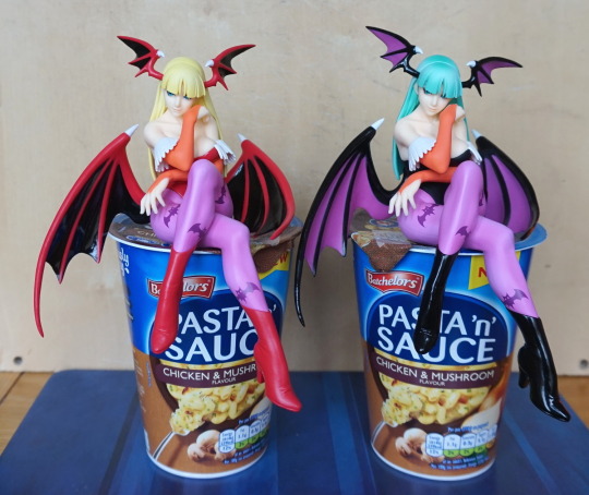
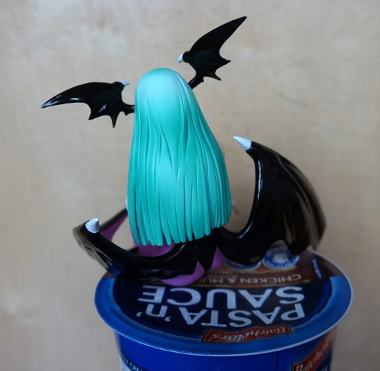
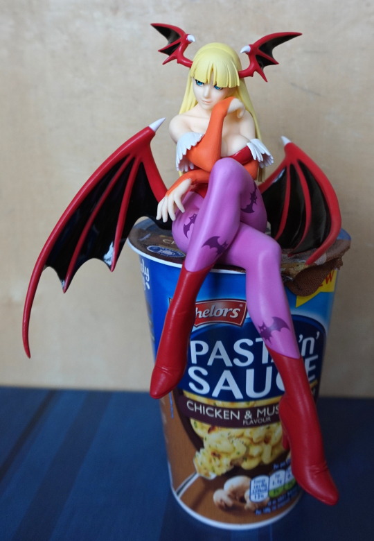
Now for a jumbo prize figure of Morrigan:

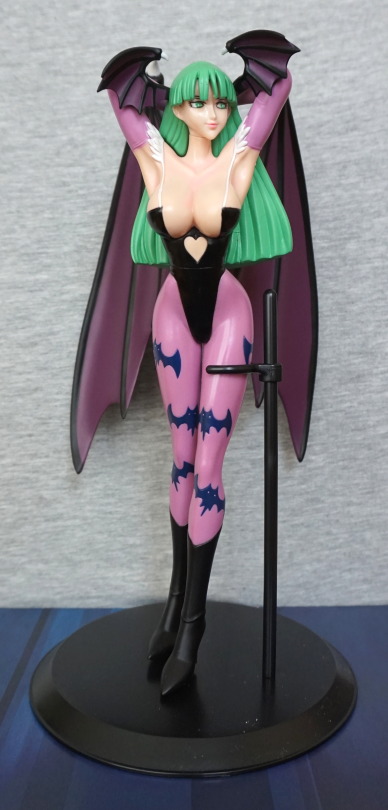
This is one large lady and I still haven’t fully sorted her legs out ><. They have bent over time, so she wouldn’t stand up properly out of the box. Did try to set them into the correct positions, but failed thus far. Also the box… was in a REALLY bad condition – looks like mould had grown on the inner part of the box, and the glue had failed on the window for the box. Chucked out the inner of the box as I don’t really want to “collect” some mould! 

I really like this figure, though she is a bit on the simplistic side, in terms of finish. She has some paint detail on her skin, but not so much anywhere else. The bats on her leggings are nicely done though, if she’ll stand up kkthx. 
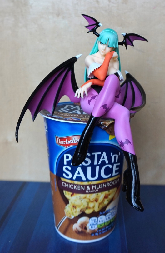
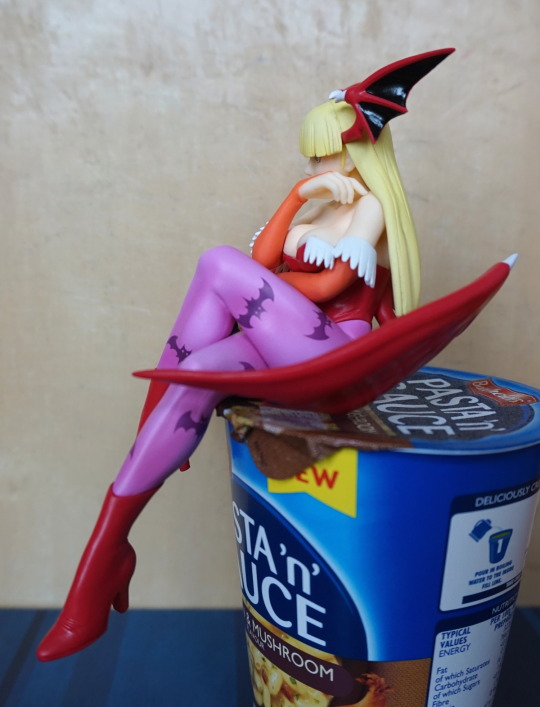
Left side:

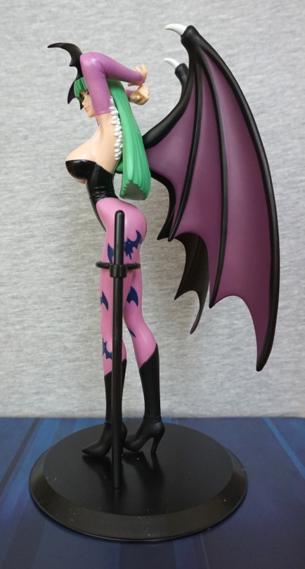
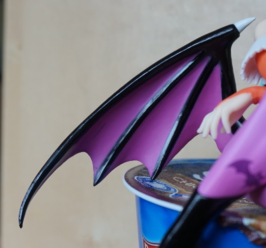
Her wings are a good size, and look good from the front and sizes. Here you can see there is some crease detailing in her top, but it’s not really visible from the front. The white tassels are a nice addition. 
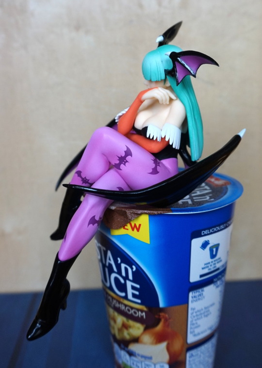
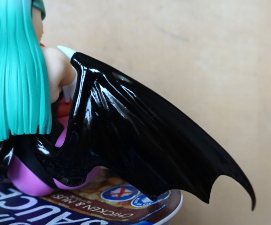
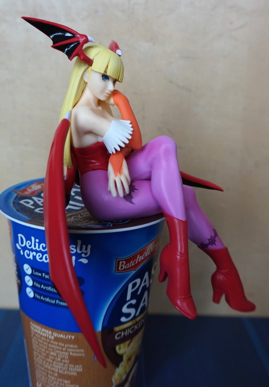
Right side:

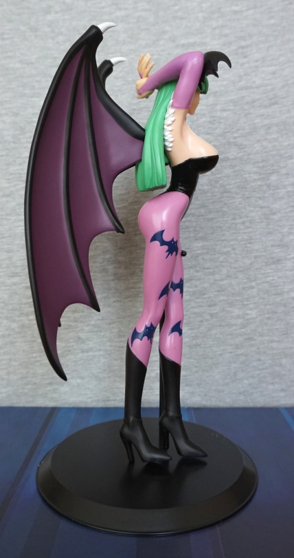
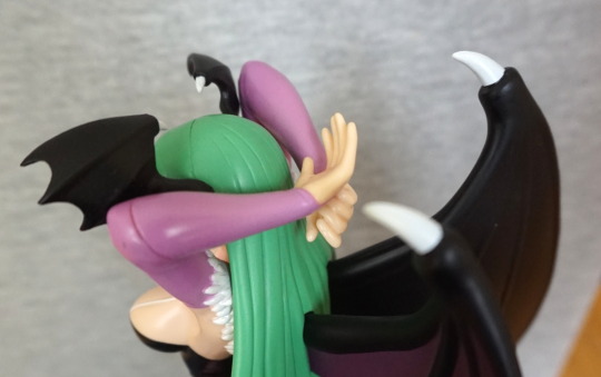
Not too much different from the left, so I’ll mention the obvious side boob – yep, plenty of that. Her hair does look like a “lump” of green, not sure what they could’ve done to alleviate that, maybe have more shape on the bottom? It’s also thick as this is where her wings attach, as we’ll see in this next shot:

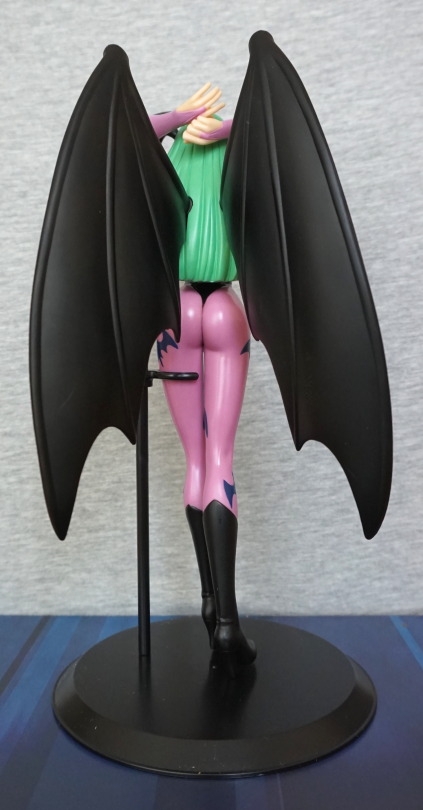
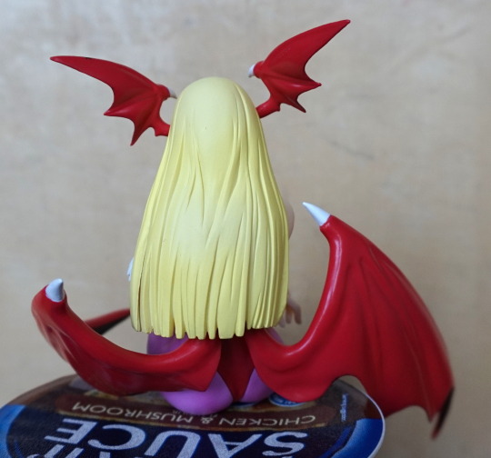
Getting these wings in was a bit of a pain. They could’ve possibly done with using more “regular” pegs, but I guess they didn’t due to weight and getting them to stay. Once they’re in there, they’ll stay though. I had to heat up her hair to get it to relent enough to get the lugs in. We can also admire her backside from this angle, and the ends of her gloves, which have been done nicely. 

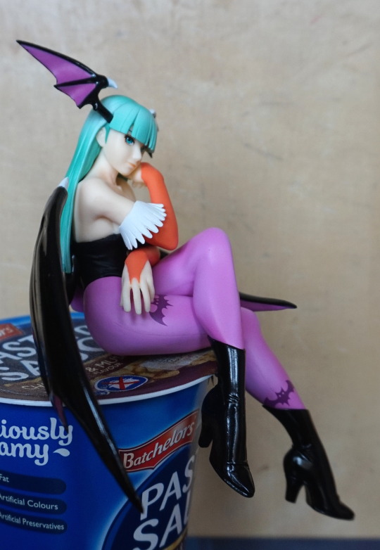
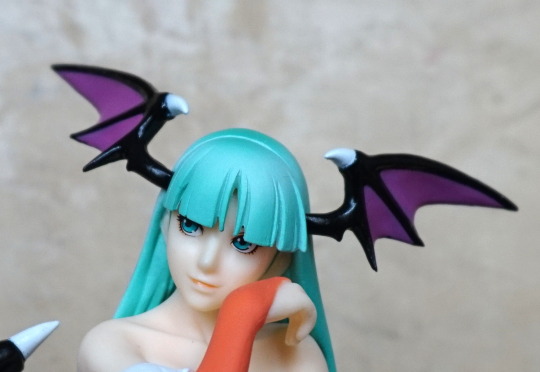
So let’s get some close-ups in. Here’s her face:

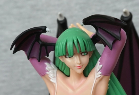
Here I noticed the slight abrasions on her hair grumble. They don’t particularly show from a distance though. She has some lighter paint on her collarbone – for a figure of this size, it really helps that they actually did some shading on her – it’d end up looking pretty flat if they didn’t. Some stray white paint, but not too much. Her lips have been done nicely. 

Arms:

An obvious seam here, but not visible from the front. The purple-pink of her gloves is nice. In the previous shot, you can see they’ve also moulded the edges on her gloves, which is a nice detail. 

My main gripe with this figure is she’s overly shiny from the front, but that’s not uncommon in prize figures, especially older ones. If there were more readily-available Morrigan figures, I may not have got this one, but for an affordable Morrigan figure, I’m happy with her. Just need to fix them legs properly… 

Morrigan Noodle Stoppers

Ordered these, was excitedly anticipating them until I got the Yoko one, pondered cancelling order, then remembered the order with a retailer than doesn’t officially support cancellations, so decided definitely not. Fortunately I think these ones turned out better than the Yoko one. 

I ordered both variants, here they both are:

image

Should’ve swapped them in this shot – 1P/default coloring on the right, 2P on the left. These figures could grace your noodles whilst they’re cooking but their pose is perfect for a shelf edge. 

First up, 1P:

image

I love the pose chosen, and the shading in her hair is nice. The print on the leggings has been done well, and is crisp. She has a mix of shiny and non-shiny finish – was ‘promised’ for Yoko, but this shows FuRyu can do it. 

Left side:

image

Her hand is nicely posed, the left wing helping to keep your noodles shut. The white edging on her top doesn’t have the best finish though. For the most part, the wings were painted well – but there are a couple of lines where the purple paint wasn’t applied thick enough. 

Right side:

image

Yeah, she’s regardin’ you. And finding you wanting. Bit of a seam here on her leggings, but is one of the nicer ones for prize figures. 

Her back:

image

The shading on her hair is nice, but there is a bit of much on her hair, which I’m not sure if I can clean up. 

Close-up of her face:

image

It has been nicely done imo, you can just about see the dodgy painting of the orange bit though. The hair mould is crisp, but the way the paint went on, it does make it look a bit clumpy. On the 1P one, it’s not so noticeable, but it does feel a bit overly square. 

Back of the wing:

image

Shiny!

Front:

image

The black line I didn’t notice until I processed this photo – fortunately it usually falls into the shadows. The purple and black do provide a nice, crisp contrast.

Now onto 2P:

image

This one has a less shiny finish, but it’s nice to have some variety. She’s exactly the same mould as the 1P one. 

Her left:

image

Clothing edging does look neater on this one, and the leggings are just as spiffy. 

Right:

image

Same look of disapproval. But here you cna really notice the squareness of her hair. It just looks… so very square. And the yellow paint seems to emphasise this. Also she seems to have slopped some orange paint on her hand here. Oh well. 

Back:

image

The shading is less distinctive on this one. To the naked eye. it can look very flat, in terms of colouring, which makes the hair look more unnatural. In this shot, it doesn’t look as bad as I had in my head. 

I’m pleased with the pair, and glad I ordered both. I think the less ambitious design to the Yoko noodle stopper helped improve the quality of these figures. If I were to change something about these figures, it would be the hair, but displayed on a shelf it looks fine. My favourite parts of the figure is the paintwork on the legs and the face. Her legs are shaded very well, which makes them stand out. Would recommend these figures, if you like what you see.