Tag: totaku

Knuckles – Totaku

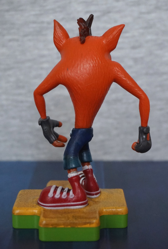
And finally, let’s look at Knuckles.

Front:

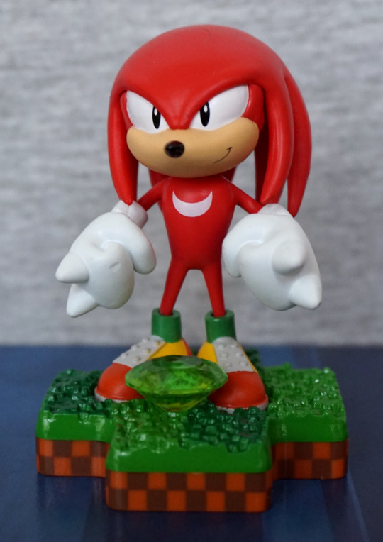
This one seemed to have the least issues with paint, and I should imagine the crescent moon print on his chest helps with that. Here we have him, in his Lego-shoe glory! 

Knuckles also have an accessory of a Chaos Emerald – I think this works well, as Knuckles has a “thing” for the emeralds, The emerald also has been done well, in transparent plastic. 

Left:

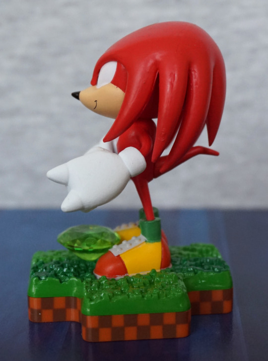
His hand feels a bit elongated, and the seams in his hair are a bit rough. Rest of it looks OK.

Right:

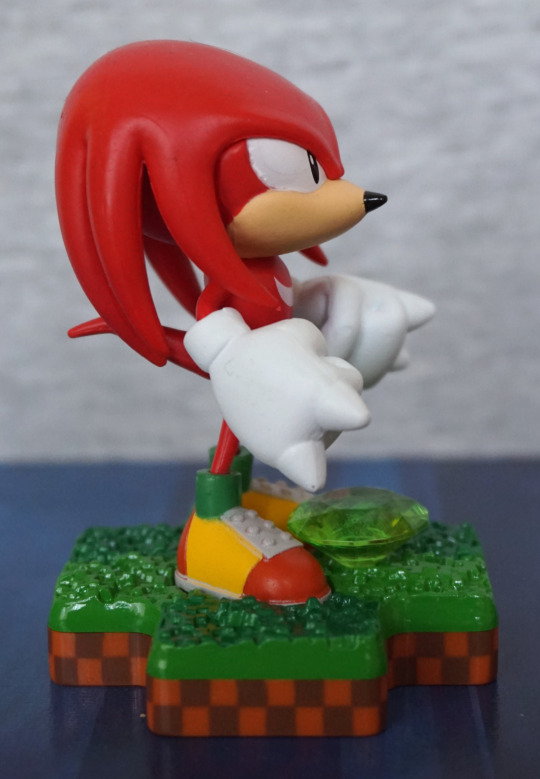
Hair is neater on this side, but his eye seems to have some lumpy paint.

Back:

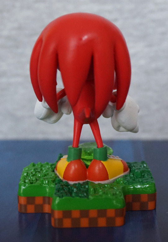
“Hair” looks good from the back, and the backs of his paint seem to be painted well. And we have his li’l tail :). 

Overall, I think he’s a decent figure, and a good choice for the set. I glad they did the more-original three, rather than some of the later characters. 

And here are all three together:

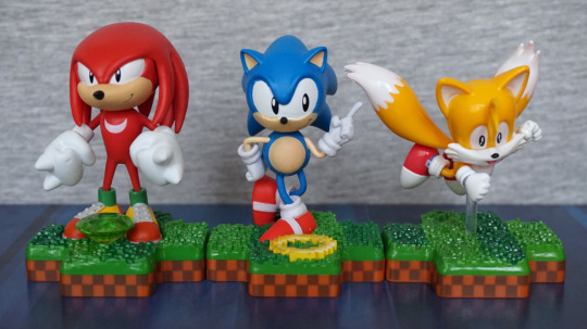
Feel like I should have probably put Tails in the centre here… But with the bright colours, they do look very nice as a set. Kinda wish Tails had some item in front of him, to complete the set. If you can pick the three up for a reasonable price, I’d recommend them, but with the caveat of seeing what ones you’re buying beforehand, due to the annoying paint issues. Just wish they were a little more consistent for the price. 

Tails – Totaku

Second Sonic-based Totaku… Tails!

Front:

This one… I didn’t pick so good, and there’s actually a small paint chip on his moustache. If you look carefully, it is on the right in this photo. I did almost think about seeing if I could exchange him, but then apathy took over. However, the colours work well on him, and it feels accurate to his in-game appearance. They have included a small detail of his tongue, which is nice to see they have paid some attention to detail. 

The base is very similar to Sonic’s, but this time with nothing to decorate it. 

Left:

His head and body look OK, but not sure what’s going on with the white paint on his shoe there. Seems to have gone a little uneven… maybe they put this one in the box a bit quick? Bit of paint has gone walkies on his tail, but it isn’t too much of a mess. 

Right:

Looks OK from this odd angle I apparently photographed him at. Do like the sculpt on the hair strands. 

Back:

Tails butt! Not too much to see back here, but looks fine imo. 

Overall, I think this one is decent, especially if you can get one without derpy white paint. This one seemed to be the one most prone to paint flaws in the shop I was at though… And if you’re paying £10 for a small figure, you’d expect a little more QC tbh. 

Sonic – Totaku

Now… Sonic, from Sonic! The next three blogs will be the Sonic The Hedgehog Totaku that have been released. 

Front:

Love the base for this one – they’ve emulated Green Hill Zone for these. including the stripey greens. The details are all nice and crisp on the base, and it works really well.

We also have a ring flat to the base – does look a little odd lying down, but at least it isn’t an accessory that’s easily knocked over. I also appreciate it as an extra detail. 

The colours for Sonic are nice and bold, and match his in-game appearance. The pose chosen also works well. However there are a bunch of small paint flaws, some of which I find more annoying than the ones on Crash. Mine has a white dot on his left sneaker, and I don’t like rough paint above his right eye. 

Left:

Here we have quite a bad seam on the lower spike. We can also see a seam in the head, but it’s blended decently enough. 

Right:

Seam on his lower spike is less obnoxious on this side, but still visible. Bottom of his shoe feels a bit square – would be nice if they mad his foot taper a bit more. Not sure if it’s exactly a match for the other one, which doesn’t seem so square. His hand and arm are painted nicely though. 

Back:

The spikes look good from the back, and I like the golden buckle on his shoe. Surprisingly few issues back here. 

Overall, I think he’s decent, but potentially beset by paint issues. I know for a couple of the Sonic ones I did spend some time comparing, and I’m not sure if it is just a general issue or a first run issue, but these ones seemed less consistent with the paint jobs than  the other Totaku I’ve looked at. However, if you’re either able to overlook or find a decently painted one, it’s a pretty nice figure. 

Crash Bandicoot – Totaku

Here’s Crash Bandicoot… from Crash Bandicoot. In Totaku form:

These figures are kind of cheaper collectables, but they are pretty small… which kind of negates the price point imo. So let’s see how this dude stacks up… 

First thing that stands out is his bright orange colour, which is accurate to his in-game appearance. I also like his base – the sandy coloured base works well, and I like the paint effect on it.

Face close-up:

His eyes are neat for the most part, as well as the eyebrows. Brown paint on his muzzle escapes his top lip a bit though. The light orange fur patch is painted neatly on this side, but less so on the other. The gloves are also painted well. So some minor flaws, but nothing too annoying. 

Left:

I like the way the fur texture is throughout his body, and does have some natural-type patterns to the direction of the fur. His shoes look good and the wite seems neat for the most part, and so are his gloves.

His jeans seem to be sculpted OK, but are darker than they should be imo. Doesn’t bother me much as I never played the games, so I don’t really notice the inaccuracy, but looking at other pictures of him, they upper part should really be a lighter colour. 

Right:

Love the nose and the expression. This side looks good for the most part, but we do see where the brown paint escaped his muzzle somewhat. Shading in his ear is nice though. 

Back:

Bit of a plaint fleck on mine, near his left shoulder. However, the texture work is nice, only issue back here imo (other than the fleck) is them pants being too dark blue. 

Overall, it’s decent for a small figure. The paintwork is pretty decent for the most part, but not free of flaws. For the price they retail in the UK, I think they’re slightly overprice, but GAME has often been doing deals on these, so you may be able to pick them up for a more reasonable price. Not entirely sure if he’s worth the £10 I paid, but I think he’s a fairly decent figure. 

AG-SYS – Wipeout

And this was the one I was waiting for, before I bought the other, as they’re 2 for £20 at GAME. 

Managed to snag this one prior to the official release date (per GAME’s site). Was just there, chillin’ on the shelf, so I wasn’t leaving without it… and gladly they had the Feisar there too :D.

So here it is:

This ship ha a more interesting design than the other, what with having two distinct “halves”. The paintwork is nicely done, and it also has the weathering effect like the other.

Right:

This one has asymmetric paintwork, which is a nice attention to detail. Paintwork looks neat and crisp.

Top:

Love the overall shape of this one – a fair bit different from a bog-standard ship design. Also has its designation nicely painted down the middle. I also like the fact they’ve done the windows in transparent plastic, adding to the realism of the figure. 

Back:

Some nice detailing in the engine area here.

Underside:

They’ve actually painted down here on this one, which seems to be a step up from the previous one. Looks like they’ve learned from the last one.

And here are the pair together:

They look great together, and I’d definitely get more Wipeout ships, if they chose to release them. Even if this pair cost me £20… I’m not entirely sure they’re worth that much, but hey, captive audience unfortunately. They know how to pick their franchises! 

Feisar FX350 – Wipeout

This is the first of two Totaku based on ships from the game Wipeout. 

Right:

I like the dirty/weathered effect they’ve added, and the details and decals look good for the most part. However, that ladder looks kinda derpy for being painted on. Maybe they should’ve taken the time to mould that a bit at least… 

Left:

Ladder on this side actually looks less derpy in this shot, as it seems to have a bit more detailing and not be just black lines… hm… This side is pretty much a clone of the other, and looks good imo.

Front:

Hullo. Not much to see here!

Top:

Love the shape of these craft, lovely sleek design. 

Back:

The vroomy bits! Don’t look very vroomy though. 

Bottom:

Looks a bit like a bike seat! Not too much detail down here, but some at least. 

Overall, I like this figure. The detailing and paintwork is good, and I like the fact it sits on a ball joint, so you can position it at any angle you like. They’re fairly small figures though, and kind of expensive here, at £10 each. I don’t mind too much for these ones, as there isn’t really much Wipeout loot out there, and this one is done decently well.