Tag: western figures

Aliens x M.U.S.C.L.E – Series 2 – Part 1

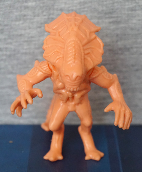
Series 2! For this series, I got the “normal” edition, which is in a flesh colour. I think there was a limited run of these in different colours, but in blind bags, but those aren’t ones easily available. However, I was happy to get these in a non-translucent plastic. 

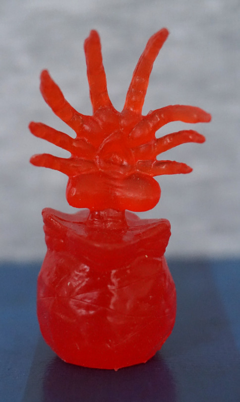
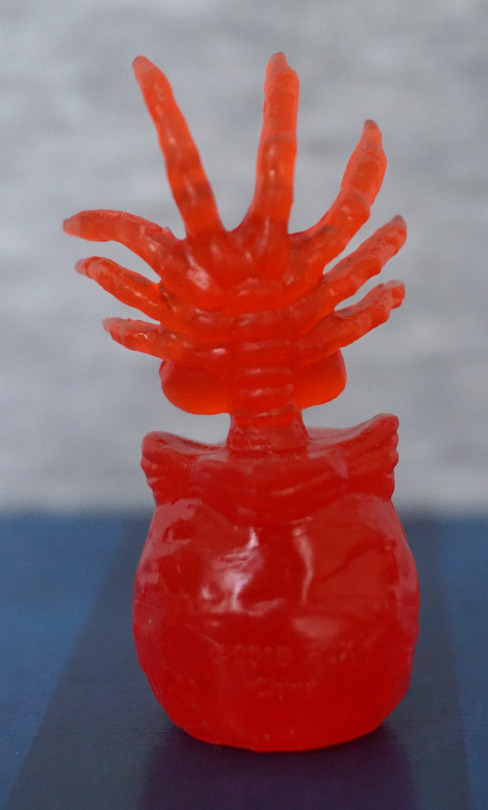
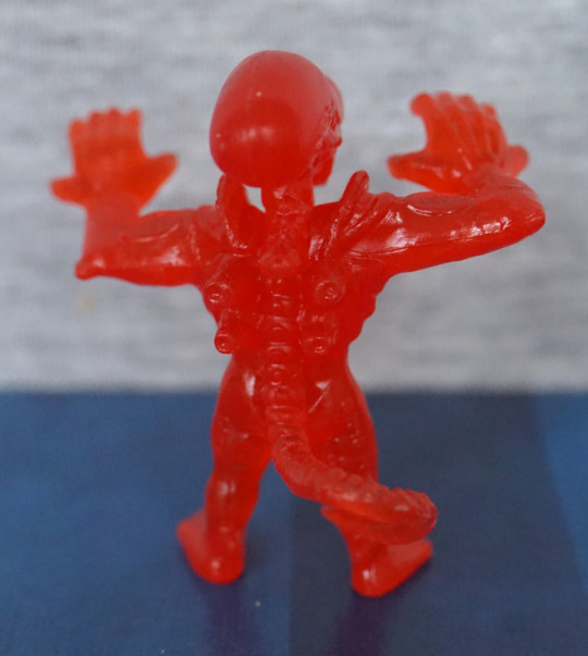
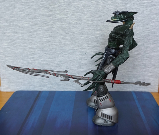
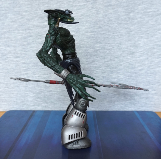
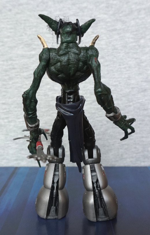
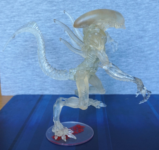
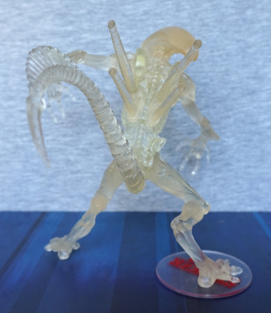
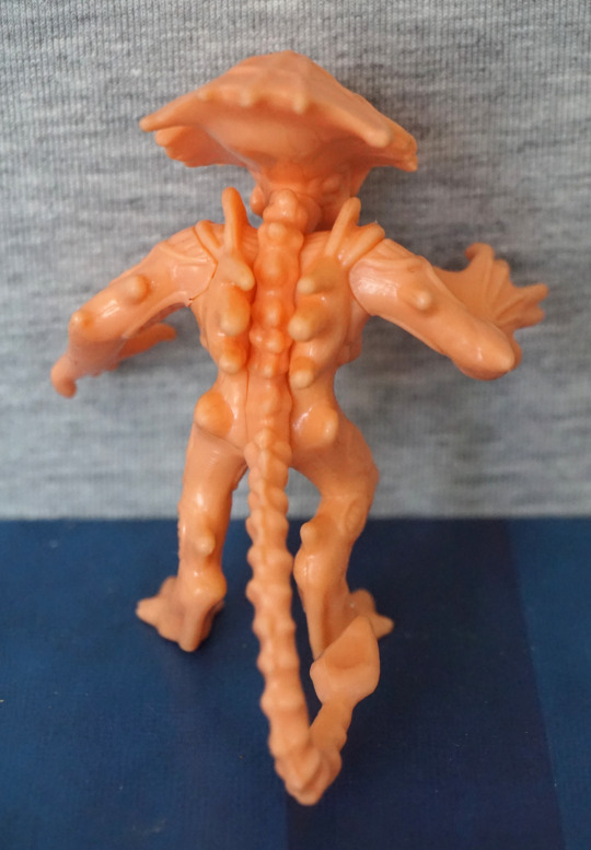
First up, the Alien Queen herself:

image
image
image
image

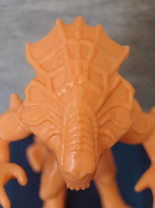
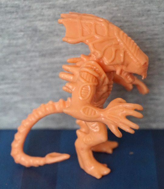
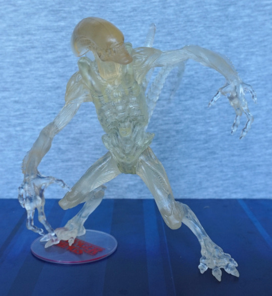
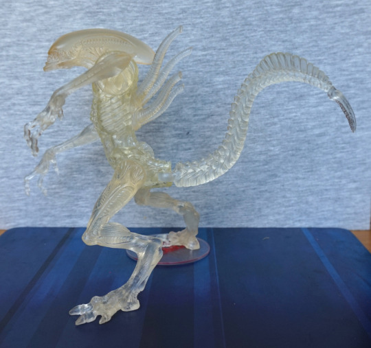
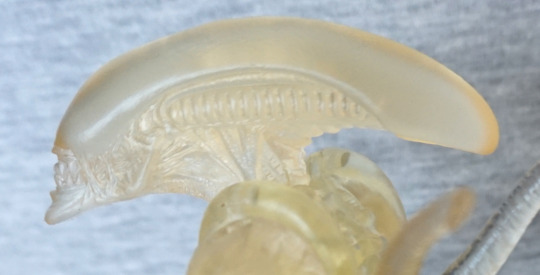
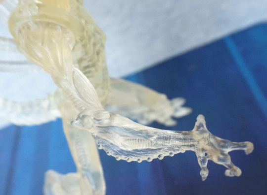
She has her cute li’l arms sculpted, and her large head plate. At a glance, I don’t mind the head plate, but looking close, the spider-web effect is a bit odd to me. The front part of her head I like the texture of though. Here, you can see better the odd ring bits than the translucent set – here I can tell they look odd to me as the rest of the arm lacks texture, which makes them stand out. 

Her back and spine look good – lots of sculpting and texture here, giving a detailed appearance. No detail under her head plate, though. Overall, I like this one.

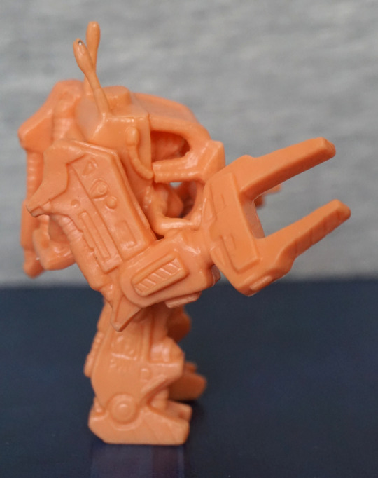
Powerloader, featuring Ripley:

image

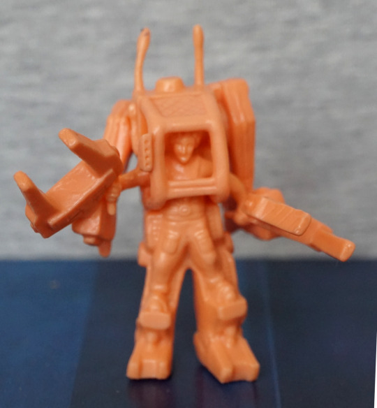
Here we can see Ripley piloting the powerloader – her clothes are nicely sculpted, and her face is fine for the size. I think they did a good job with this, given the size. One of the aerials is a bit bent on mine, but I could fix this. 

Sides:

image
image

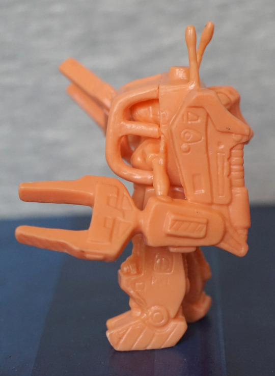
Lots of small mechanical details here, which are nice. Claws look nice, but a little bent – I suspect if I do try to sort these, there is a good chance they’ll bend a bit over time. The join between the front cage and the powerloader itself is a bit rough, but it doesn’t really bother me. 

Back:

image

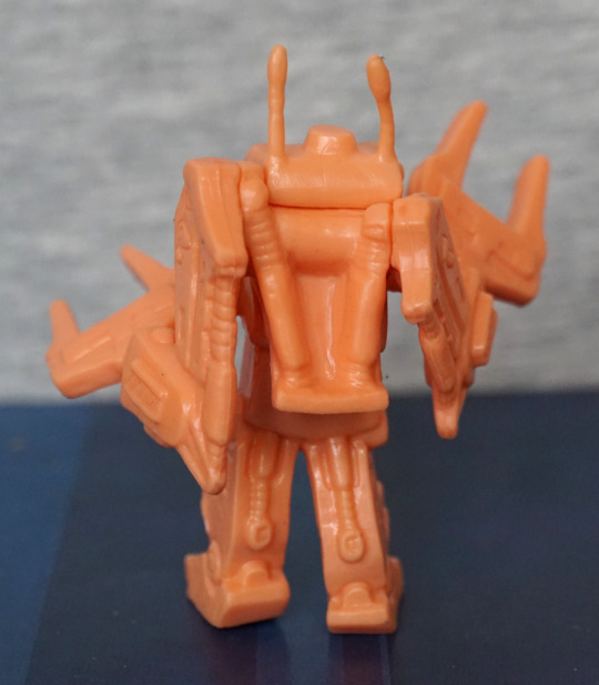
Looks good from the back – we have a decent amount of hydraulic parts modelled here. Just need to sort out that derpy aerial… 

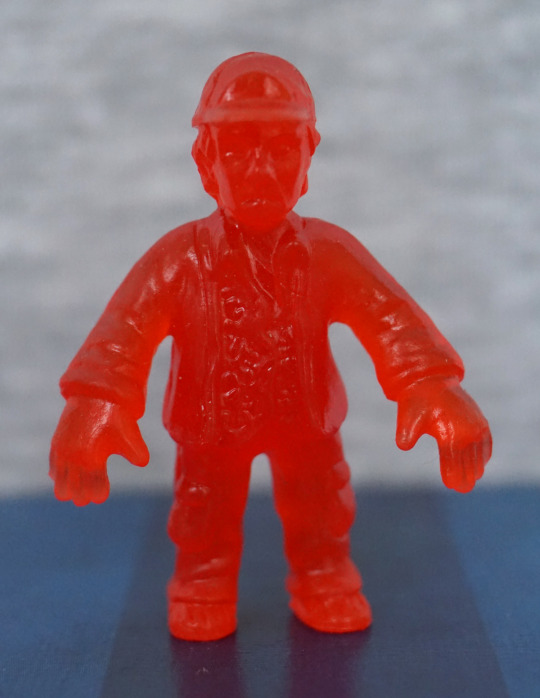
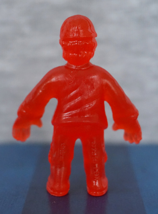
Half a figure, Bishop:

image
image

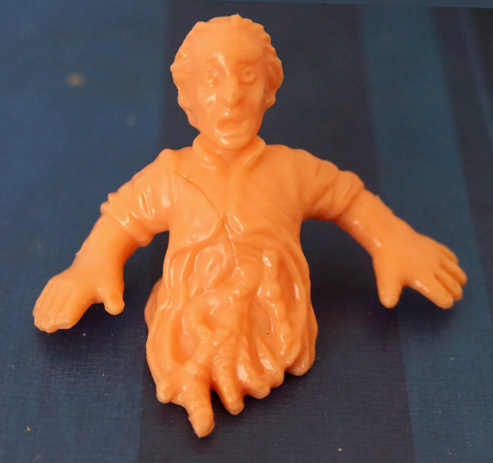
Unfortunately mine has a hairline from when it was moulded. Ignoring that, he’s been well-sculpted, and I love this iconic choice of character and “pose”. 
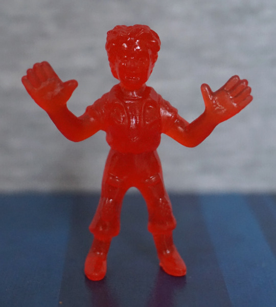
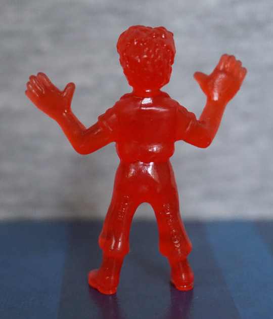
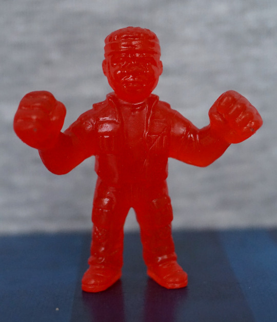
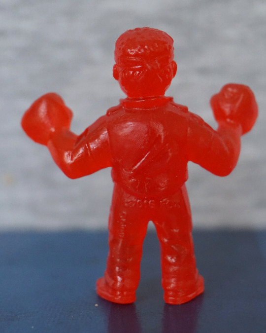
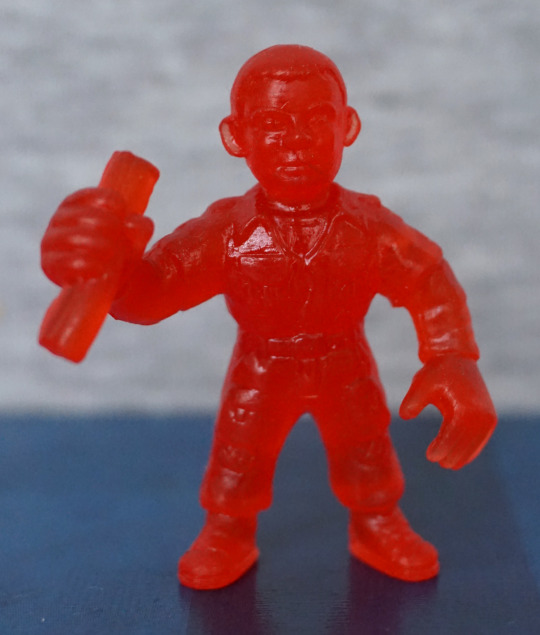
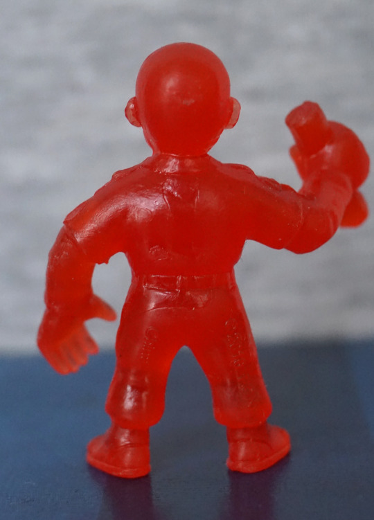
Apone:

image
image

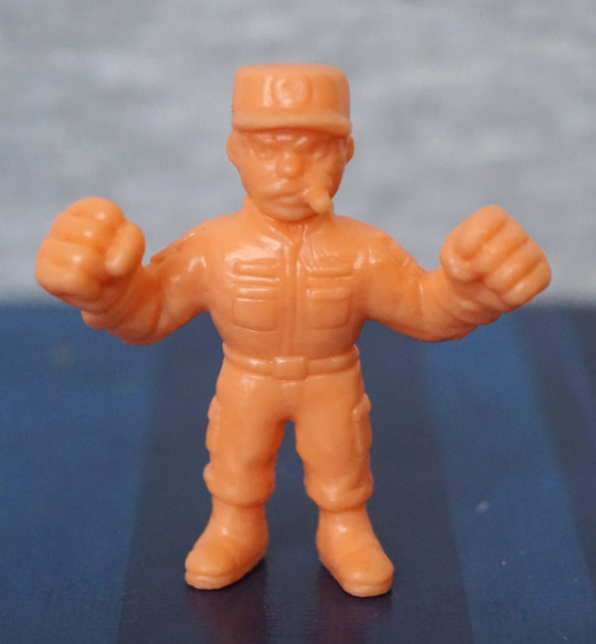
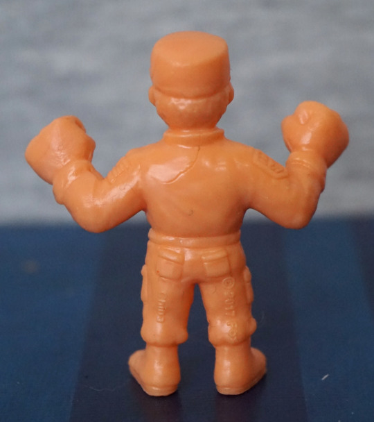
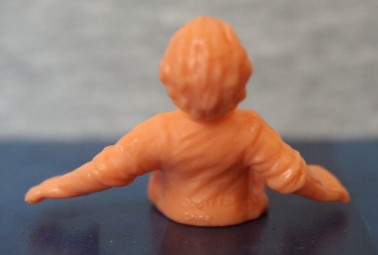
First thing that stands out to me is the flatness of the top of his hat – not sure why his hat is so flat. However, he does look ready to kick butt with that cigar and his fists. Sculpting is OK on this one, but again, another one of those hair marks. 

Bit of a mixed bag here – I think the sculpts are better thus far than the first series, but there’s more of those hairlines. Also the Alien Queen isn’t very well balanced, so she’ll need some tack to keep upright. 

Aliens x M.U.S.C.L.E – Series 1 – Red ver. – Part 3

Now for the last four figures in this set. 

So, let’s continue on with Kane…

Nom! Here we have Kane being facehugged. The facehugger is nicely sculpted, but his body is a bit lacking – the way they’ve done the joins on his arms doesn’t work well – instead of looking like the edges of his shirt, it very much looks like his arms are stuck on. His shorts/legs is a better bit of moulding. 

Kane, unfortunate ver.:

Due to the material used, I don’t think the chestburster shows up too well on this one. But it’s certainly an iconic thing to include, I can see why they did this one. Even though it’s a bit indistinct, I’m glad they included this.

Lambert:

I don’t find the likeness on this one too good, and her expression certainly looks odd in my photo. Her clothes are nicely sculpted, but her body feels an over-distorted shape – looks like they tried to give her boobs, but didn’t sculpt the shirt shape correctly, so her entire top is puffed out. 

Lastly, Parker:

Again, a mould hairline on the back. I think this decently looks like Parker, and the sculpting is good – his iconic headband is there, and his clothes look decent. And he also looks ready to do some punchin’ M.U.S.C.L.E-style. 

Overall, these ones were a bit of a mixed bag, but I don’t think any of them are terrible. I like the red colouring, but it does make the sculpting look less distinct, so I feel this is a bit of a trade-off. 

I’m glad I got this set, and I like the mash-up between the two franchises…. enough to buy series 2! Stay tuned for series 2 😉

Aliens x M.U.S.C.L.E – Series 1 – Red ver. – Part 2

Now for four more of the series 1 of the Alien M.U.S.C.L.E figures.

Ash:

image
image

What’s he holding here? Not entirely sure… is it the Inanimate Carbon Rod? Hm. His front is sculpted well, and has a reasonable level of detail, given the figure type. However, the back feels a bit bland and seems to have a couple of moulding issues – there’s a couple of hairlines on his back, which I don’t think are supposed to be there. 

Brett:

image
image

Looks reasonably like the character, Here we have some sculpting to stand in for his shirt design, and I think that works well. We also have some creasing moulded on the back of his jacket, which is a nice touch. 

Dallas:

image
image

This was also one I recognised when taking them out of the tub, so the likeness is likely reasonable. Again, on his back there’s some hairlines which I’m pretty sure are not supposed to be there. His outfit looks good from the front though, and is nicely detailed. 

Lastly, for this blog, Kane in his spacesuit:

image
image

I did have to look at the character list to see who this was… This one is pretty detailed though, and does look like the iconic spacesuits used in the movies. And with those fists, its wearer could certainly go do some punchin’

Overall, most of these were decent, but I think the Ash one didn’t look as good as the others – I didn’t find the likeness as good as the others, and there seems to be some sloppiness of the design around the back. 

Aliens x M.U.S.C.L.E – Series 1 – Red ver. – Part 1

Saw Ashens on Youtube review some of these, and decided to get some for myself. Found this red “trash can” of them cheap-ish on a UK site and went ahead and ordered them.

They come in a nicely designed tub, based on the old MUSCLE figure packaging:

And it has this really cool lid design:

D’aww, look at that cute chestburster, busting out of the lid. The artwork is nicely done on the packaging, and mix the two properties well.

So let’s look at some figures! Today, we’ll mostly focus on the aliens. Let’s start with a facehugger:

These things are not easy to photograph… The translucent plastic works OK, and the sculpting is good on the facehugger itself – we have joints on the legs, the sucker on the bottom, and the spine markings along its back. The egg feels less detailed, as there is no indentation in the top and it doesn’t seem to have much texturing on the outside. 

First xeno:

Again, the translucent plastic does make the details hard to see, but they are there. He definitely has the MUSCLE proportions, with the large hands and stretched pose. He does have a pretty noticeable seam on his head, though. 

Wanna hug?

Fairly similar to the first, but with a different pose. I do like this one’s pose more than the other. With these, I like the sculpting on the tail and the “pipes” and shoulder blades look good. The round parts on the front of the legs I find a little weird-looking. 

Last one for today, Ripley:

She seems OK, for what I can see of her. I recognised her, so that’s a good sign for the sculpting. There’s a decent amount of detail here – her hair has texture, we can see her boiler suit collar, and the details on her shoes. 

Overall, I’m happy with these four. 

Vampire – Wetworks – Alt Colour version

This figure was a random pickup at an action figure store I visited. Thought he looked cool, so decided to buy him. When I did my research on this figure, I found he was the alt colouring. 

So here he is, in his alternative colour scheme glory:

Personally, I prefer this colouring to the main version – here he has black pants and loincloth, which I think fits the theme of the figure better. He’s also a dark green instead of a greyish colour, which I don’t think helps him look vampiric, but the sculpt doesn’t say “Vampire” to me anyway, despite that being his name. 

The sculpt on him is nice and detailed for the most part, but… that waist… what’s going on there?! 

Let’s take a closer look:

Totally tubular! Now I’ve seen it, I’m not sure I can unsee it… not a big fan of this design. I do like the logo thing going on, on the loincloth. The loincloth is made out of a fairly thick plastic, which coupled with the odd waist design, does make it look comedy-sized. As a standalone piece it looks OK, but with it sitting strangely on his hips, it isn’t a good look imo. I am loving the detail on his skin though, which can be seen in the upper parts of this photo. 

Face:

He has this headgear thing that slides on his head. Kind of in two minds about this piece – he looks better with it, but in of itself, it just feels odd. If you don’t like it, then it is an optional part though, so isn’t a biggie. Jury’s out for me though. 

Left:

Here he is, leaning back apparently. He cuts a decent profile from the side imo – looks a lot less strangely shaped from the side. His head sticks out nicely, and I love his hands, with their elongated claw-style. The tendons show up from the top too. 

Aand the obligatory fat leg parts – this is a McFarlane creation after all – these are painted well, and have enough details to not be plain. This fat leg design is useful for keeping the figures upright though! I do like the lesser need for stands. 

He holds his weapon decently well – you could probably get a more convincing grip out of it than I have, but it slots OK over his hand. 

Right:

Loving the veinwork on his arm, and the horns on his shoulders. The silver bracers around his wrists add a nice detail to the figure, and hide the joint. ABout joints – there aren’t a huge amount, but there are a few posing possibilities. McFarlane figures don’t tend to be super-articulated, especially of this age, but they make up for it in looks imo. 

Back:

The texture details are continued around to the back, and he has some blood marks on his upper right arm. His hair is quite scraggly, but does the job – I doubt a creature like this would have neat hair, after all. Loincloth looks OK back here, but has the same issues as the front (as well as seemingly making a break for it! If you don’t like it, there’s the option of removing it). We also have some mechanical details on the back of his legs, which is nice to see. 

Weapon:

Clod do with a little more red paint on some of the wire/vine parts. It has an interesting, tribal design, but does kinda look… lump of plastic-y. I think if they had sharper points and maybe some paint shading, it would look better. I think it’s mostly the very rounded points that make me think more “cosplay prop” than “dangerous weapon”. I think they could’ve gone a bit pointier, without making it “ouch” pointy. 

Overall, a decent figure. Not sure I’d particularly recommend it, but if you like what you see, and can find him for a decent price, I think a solid enough figure. 

DC Nano-Metals – Part 3

And here we have the last three in the pack. 

So let’s start with Martian Manhunter:

I think this is one of the best-looking ones in the set – the paint is fairly neat, though the blue paint is over-spilling in some areas. The red paint is within the lines though, which is the more critical colour here. We have a better choice of green here, which makes me more confused about why they went with the green they did for Killer Croc. I do wish they painted his belt red though. The disc parts should be gold, but being a simplified figure, I’m going to let them off for not painting these. The pose and sculpt are both decent, so no complaints there.

Back:

Not much to see here, other than cape. Not the most realistic ripples, but it’ll do. Also his cape paint seems to have escaped onto his head 😛

Superman:

Again, a not-too-bad figure. I think this one is let down by the paint a bit, but that isn’t helped by the relatively ambitious sculpt – with him in a flying pose, they’ve had to use the cape as support, which means the blue and red paint have bled into each other in places. Also makes it hard to paint without the over-spill showing up badly. The logo has been rendered surprisingly well, comparing the paint jobs in these figures. Again, no mouth, but this weirdly seems to only feel “apparent” when you’re looking up close. 

Back:

Cape looks good, and the paint job looks surprisingly decent and clean here.

Yep, I think this one is one of the stronger ones in this set. 

Lastly, Wonder Woman:

Interestingly, the females in these Nano Metal figures actually get mouths – and their faces look better for it. What doesn’t looks so good though, is the lasso on her hip – the lasso looks OK in of itself, but they’ve distorted her leg so the lasso has something to support it… so her leg looks rather misshapen. Personally I would’ve preferred it if they had the lasso sitting on her leg, instead of flatting out her leg to accommodate it. Paint-wise, she looks OK. 

The one thing that does bother me though is no “banner” at the top of her shirt – she needs some silver pain here, to match her headband if they were going for her more silvery look. To me, this makes it feel like she’s more “sexy Halloween costume” than Wonder Woman. 

Back:

Bit of escaping paint on her leg there, but overall, not a bad paint job. Here we can see her shoes have been turned into platforms to support her properly, which I think is a fair enough decision. 

If you ignore the lack of edging on her top, not a bad nano figure.

Overall, this set isn’t too bad, if you can pick it up cheaply. There’s definitely some misses in the set, but most of the figures are reasonably solid for their size. These figures are 1.65″ tall on average, so normally you wouldn’t look so closely at them as some macro photography. I’m not sure I’d pay the RRP for the set, but if you see these at a discount, I don’t think they’re too bad. 

DC Nano-Metals – Part 2

Now for four more Nano Metals figures. 

Here is some Killer Croc:

*GRIN*. Can’t say I’m a fan of the sculpt on this one, but it does amuse me so. The green doesn’t fit Killer Croc at all either. Shorts are roughly painted, and don’t look great either. The parts of his face that are painted are painted neatly but… well… it looks like that. Just look at it

There’s some nice sculpt details here in the spiny knobbles, it’s nice they’ve given him pockets, but that right pocket sticks out so far, like he’s got a large lump of something in there. Left pocket would look better, if it didn’t melt into his back. 

Overall, this one has amusement value only. 

Metamorpho:

I’d say this guy is the least-known out of the heroes included in this set. Paint is a bit sloppy in this guy, though he can partly get away with it, being a guy made out of several elements. Wish they would’ve done his shorts in black, rather than lazing out and just doing them in brown. The figure already features black on his face, so not sure why they didn’t. 

Back:

They’ve done a nice job of sculpting his mud leg, and the paints are a bit neater back here. 

Overall, I think he’s a decent mini-figure. 

Two-Face:

This is based on his orange-and-purple outfit form, which wouldn’t be my first pick. However, they’ve done a decentish job of rendering him at a first glance – colours look bold, suit is sculpted well, and his face has both its halves. Main issues for me is they didn’t paint his tie black, and whilst they gave him a mouth, it does look rather odd. And on that point… where are his eyes?!

And is it me, or does he look like he’s trying to take a shit? 

Back:

Back looks OK, but the paint doesn’t quite meet happily in the middle. 

Overall, probably not one I’m going to prominently display.

Lastly, Mr Freeze:

I really like the colours and pose on this one. However, his head doesn’t hold up to close scrutiny – looks like they didn’t fully decide if they were going to do his head or his helmet, and melded the two… I think it would’ve been better if they went without the helmet, and made his head less elongated. This would make the figure look better, and give the owner the option to add a clear part, if they wished. The gun is nicely sculpted though. 

Back:

Gun looks good back here, and his backpack looks decent. Helmet-head looks less silly from this angle, as there are no details on this side. 

Overall, I think he’s one of the stronger figures in the set. But dammit… that head-thing. Wish they didn’t do that. 

DC Nano-Metals – Part 1

I bought this set cheap-ish at TK Maxx. 

First up is a silverish Batman:

The paint is mostly in the right places and doesn’t look too bad. No mouth painted though… Can’t say I’m a big fan of the colour scheme, but I think it works. 

Back:

Not too much to see at the back. The cape is nicely wrinkled though. 

The Flash:

I like the colours on this one, and the paint is neatly done on this o0ne. The logo came out decently well on his chest, and his muscle definition works. 

Back;

His belt is a bit sloppy here, and the wing(?) on his boot is more of a nub. His body is sculpted well though. Pretty pleased with this one.

Green Lantern:

This guy, the paint went a bit sloppy – think the green needed to extend a bit more down his front, and one of his gloves has a bit of white mist paint. His mask is OK, but again, half a face, though the way his faces is moulded almost gives him a mouth a bit higher up. The logo on his suitl looks nice, but his chest does sort of seem to melt at the bottom, in terms of sculpt. 

Back:

Looks OK from the back, though his hair does melt into his suit. Don’t think the green and the black paint want to play nice with each other, but I don’t think it’s too bad.

Out of these three, Flash is the one I like most. I don’t think any of these look bad, but not really keen on the Batman.

Catwoman Barbie – Batman

And now for a Barbie that I can appreciate! Never did see one as a kid that I’d ever want, but at 32 I find the purrfect Barbie for me:

Hm. I really could’ve straightened out that mask a bit more, couldn’t I?

Anyways, onto the figure – I think the fusion of Catwoman and Barbie works well here – it definitely looks like an even mix of both. I love the fact the clothes have been made to look like leather, and she has just enough touches to sell itself as being Catwoman. A large part of that is the mask, but she has cat claws on her gloves, and the quintessential whip. She has a utility belt thing going on, which apparently marks this as being based on Catwoman from the 2004 movie… which I haven’t watched. Hm. I should probably get on that. Anyway, moving on…

Left:

The seams have been sewn so the stitching is inwards, so everything looks nice and neat from this side. Her claws have been tipped with silver, which has been nicely done. Her neck does look a bit odd from the side though. 

Right:

Here we can see a small zipper, which is a nice attention to detail. I do rather like the fluffy upper to her gloves, and the high heels poking out from the bottom of her trousers. 

Back:

Here we can see some things that weren’t finished off too well – several of teh back joints are uneven, which is a bit of a shame. Also a bit of excess fabric at uppermost join. Her hair is very nice though, and the backs of her trousers look good, even if the belt doesn’t quite line up… 

Overall, I’m glad I bought this Barbie, and I think it makes an excellent first choice :P. Not sure if it’d appeal to a Barbie fan, as her outfit does somewhat limit her articulation, though all the joints are there. For me, I’m using this as a display piece, so I’m not bothered by knees being hampered by her trousers. I may have to get a doll stand for her though, as she’s not standing on her own with those small feet. 

Joker – DC Comics – Eaglemoss Batman Universe

This is the last of the busts I currently have to review, and it’s The Joker:

image

From the front, this one has a lot more to look at than the other ones, which I think really helps with the overall look and feel. Not a big fan of the paint on his bowtie – the darker lines aren’t blended at all, which makes it looks sloppy close-up. However, the bold colours overall work well together, and this figure does work at a bit of a distance. 

Face:

image

I appreciate them including some pink paint to represent his tongue, and this surprisingly works. His lips are OK, and they can get away with some rough paint here, what with the Joker being a bit slapdash himself. The eyebrows feel a bit severe though, as there is no detailing to them. The hair is really nice in of itself – there is shading present here, which really helps it look like hair. Some bits are missed though, as you can see on the left-hand side of his face. The right is pretty much the same on mine, but with a bit of paint on his ear. 

The gun:

image

The lettering came out well here, but mine has some marks on this side. Also you can see how the gun started off bent – this part is a softer rubbery material, which does mean it won’t break in the box, but you may have to straighten it out. What is more annoying than the black splotches is the super-lazy painting on his hand… really? This passed QA? As it’s black, maybe I’ll actually repaint this… 

Here is how bent the gun was when I got him out of the box:

image

I heated it up with a hairdryer, held it in position, then doused it for awhile in cold water:

image

Ah! Much better! I’m not too bothered about this, as it’s not the first bendy figure I’ve had and it’s pretty easy to fix, but I feel that they may have been able to go stiffer with this or use a metal wire/rod inside of it to hold it straight. Especially if someone’s new to collecting, this is going to be a really disappointing feature, and I don’t think there’s any need to have it this soft. 

Left:

image

I like this pose – there is a dynamic quality to it, and his face looks good in profile. The main messy edge here is the edge of his glove. The paint line between him and the base seems neater on this side than some of the others I have. 

Right:

image

This side of the BANG! banner is a neater than the other side, and looks good. The paint is a lot neater on this side too, with a lot less to complain about. There is a seam that goes down his side, but I don’t think this really disrupts the figure.

Back:

image

Looks like some dints got into the mould – not sure what happened here. The paint itself is smooth though, and the back of his hair is painted well. We don’t have much in the way of fabric movement back here, but it looks passable. We have one detail in the form of a suit seam running down the back, but I’m not sure it really adds anything. Collar moulding I think could’ve gone a bit better. Sleeves look nice though. 

Overall, I think this is a decent entry, and probably works better than the others as a concept – there is more going on here, which means he doesn’t look overly plain, as they decided not to fully shade these. However, there are some pretty sloppy painting mistakes and lack of paint blending that you’d get in a more premium product. I think if you set him off at a bit of a distance, it’s quite a striking piece, so would recommend if you’d like to see him sat on your shelf. Just be prepared to straighten out the gun!

Harley Quinn – DC Comics – Eaglemoss Batman Universe

So after buying the other two busts, I decided to take advantage of Eaglemoss’s introductory offer for the first three busts in the series. I will only be reviewing two, as I plan to sell the Batman bust. 

First up, we have Harley Quinn:

image

I like the colours and design on this one – it feels less plain than the other two I reviewed, but there is still a fair amount of block colour going on. I love that they’ve included the hammer, as it definitely adds something to the bust. 

Face close-up:

The eye shadow colours fee a bit overdone and severe close up, though the pain seems to be neatly done on the face. Here we can also see the apint isn’t overly neat in certain places – especially her right breast, where there is red showing from underneath the black. 

Left:

Here we get to see mostly hammer. Not sure what the back blobby bits are about, under the lower thin ring. I appreciate the weathering effect though. What I appreciate less is the escaping black paint on the side of her jacket. 

Right:

Here we can see they can do some blending with the paint – her hair doesn’t look too bad. Though the orange doesn’t match the pink that the hair and eyeshadow should be, if you’re choosy about this kind of thing. Her hairband here is also hair-coloured. Again, there’s some marks and missing bits in the paint – red dots on her sleeve, her belt is a bit skin-coloured, and a couple of dots on her hip. 

Not sure if the munch in her hair was a divot that was supposed to line up with the mallet at some point or an air bubble in the mould. Whichever, it is a bit odd. 

Back:

The design on her back in of itself is printed nicely, but not quite straight. I think this would’ve come out better if the design was a bit smaller – it feels like it takes up just a bit too much of the jacket. Again, the painting is a bit hit-and-miss, but I do like the sculpted wrinkles in the jacket. 

Overall, an OK bust, but with Eaglemoss’ varied paint job qualities, you may not want to risk ordering this one from Eaglemoss directly, as I think the paint errors do show up fairly well unless you have her at a distance. 

Poison Ivy – DC Comics – Eaglemoss Batman Universe

This is the second bust I bought in Forbidden Planet, featuring Poison Ivy:

Initially, the design kind of appealed, but… this didn’t grown on me (pun partially intended). The paint is neat on her face, but her hair painting definitely seems to leave something to be desired, and the paint jobs varied on her leafy clothing. This one was OK, but still a bit messy in places. 

Overall, from the front of this figure, she suffers from plainness – her top is nice, but the large amount of flat-coloured skin just makes it feel like there should be.. more. Her hair could have done with some shadows and highlights, and some of the edges tidying so it doesn’t look like her hair is fusing into her skin in places. 

Left:

Here we can see where a bit of the green paint blobbed onto her hair, and some unfinished edges around the hair. Here, you can see a particularly sloppy job of the top painting – all of the edges here feature inaccurate paint. 

Right:

The edges of her top are better painted on this side – passable for a cheaper bust figure. However, there are little dots in her hair that don’t look very good. 

Back:

Definitely not a fan of this angle. There’s some attempts at shading, but the overall look is Cousin Itt waterfall of hair. The overall shape isn’t very pleasing to me, and the moulding is… enthusiastic, but just doesn’t feel like it fits to me. 

Overall, I not too happy with this bust, and question my wisdom in buying it. I bought it was it was Poison Ivy… and kind of because I was buying the other one already. I did try to go for a better painted one – some of the paint jobs were really questionable. Overall, I wouldn’t recommend this one. Save your money and go and buy a Kotobukiya figure or something. 

Catwoman – DC Comics – Eaglemoss Batman Universe

I saw this in Forbidden Planet, and decided to pick it up with another bust, which will be tomorrow’s blog. 

So here she is:

I like the shininess of her outfit, and the face is painted neatly. I also like the interesting pose, with her getting ready for shenanigans,. 

Left:

Her fingers are posed a bit oddly – I don’t think that finger spacing is particularly natural. Her chest looks a good size though, and the buckle for her hood loks good. The finish on her hip doesn’t seem to be too well applied though, which doesn’t help distinguish it form her belt. 

Right:

Buckle also looks good from this side, but again, the shininess of her outfit seems to decrease on the way down. Looks like some black paint went a bit stray on the strap of her goggles. Also we have the strange finger posing on this side. Not entirely sure what’s up with that, but does look OK if you don’t focus on it. 

Back:

Some suit seamlines sculpted in the back here, which look good. I like the way they shiny paint goes around her belt, to help the strands of it stand out. Paint looks a little janky around her google strap, but not too bad. 

Overall, I think a decent amount of detail has been put into this bust. I think for the price point, this is a decent bust, and glad I bought it. I got it a bit cheaper than the RRP, which I think was a fair price for it. 

Locutus of Borg – Star Trek

Saw this figure, had to buy it:

A Locutus of Borg! That actually looks somewhat like what it’s supposed to be, which is a surprise for a Star Trek collectable. There’s a good amount of detail here – he seems to have the key elements the original design had. His head does seem a bit more elongated than Picard’s appears to be, but I can forgive it for the rest of the sculpt being solid. The paint accents that are there work well. 

Face close-up:

Looking Borg-y :D. Laser paint looks like it might’ve gone a bit walkies, but the rest of it looks good to me. 

Left:

Plenty of details on the arm, love the abundance of wires and small electronics-style details. The hair looks OK at this distance, but looks a bit like a grey smudge close up. 

Right:

The fearsome Borg “multitool”. Yeah, don’t think I want to be on the wrong side of that! Here you can see they’ve got a decent bunch of wires sculpted separately too. 

Close-up of the tool:

I like all the small details on this part, and there are some paint accents, to break up the blackness. In terms of colour scheme, they didn’t have much to work with, but they seemed to have squeezed in a few paint details here and there.

Back:

No shirking on the sculpt detail back here – there’s a goodly amount of detail, to complete Picard’s Borgification. 

Overall, I’m really happy I’ve added this figure to my collection. I paid £15 for him, which I feel is a fair price, but he usually retails above that… which, as nice as he is, I feel is too much for such a figure. There’s been a lot of duds as far as Star Trek collectables has been concerned, so it’s nice to see a nice one. 

Red Skull – Marvel

And finally, Red Skull:

Yep, he’s definitely got a red skull alright! The paint on his head is really good, and features all the details you’d expect a skull to have. However, not much are seems to have been taken when painting his sash, so that’s a bit blobby and weird. I like his screaming pose, but I don’t think they got his hand positions quite right – he looks more derped than angry because of it imo. 

Left:

Again, the head looks really nice. They’ve attempted painting a buckle on his belt, but the paint hasn’t gone on thick enough, and it looks like a smear. The pistol he’s holding does give off a German vibe, which matches what it is supposed to be. 

Right:

Sculpt looks nice, buttons could’ve done with a bit better paint job. I like the belt though. 

Back:

Paint doesn’t seem to have gone on quite right, and there’s a bit of brushmarks at the bottom. Sculptwork is passable, but his guns seem a little bent. Not sure what happened there. 

Overall, I think this is an OK figure. Again, some small paint tweaks could’ve elevated this figure into a better one, but my main complaint is with the guns – I think a little better posing could’ve gone a long way. 

Mephisto – Marvel

For the other two figures that I got with Lex, I picked characters that I think look cool, but probably should learn more about.

First pick was Mephisto:

An interesting pose, but one that’s not likely to all be in focus in one photo. The sculpt on this dude is nice, but not sure if he’s had a hard life prior to me buying him, or the paint wasn’t so good on his loincloth to begin with. Due to his red nature, the paint job is on the simpler side.

Left:

Here we can see he’s stretching out, though it is unclear where glove begins and arm starts – would be nice to get some more paint definition here for his glove, as it does look like it has mutated into being part of his arm. Or he’s wearing some kind of skin-coloured suit… 

Right:

Again, the sculpt failed to capture where glove starts and body ends. I like the fact they’ve sculpted his hand as doing something though. The side of body sculpt looks good, though, again, his boots could’ve done with a different shade of paint to differentiate them from his body. Hair looks nice though.

Back:

Cape does the job, and there’s some paint shading back here, which looks nice. Collar part of the cape looks a bit overly starched, compared with the rest of it though. 

Overall, he’s an OK figure. Could be much more if they painted his clothes properly. Wouldn’t recommend paying a premium price for this one. 

Lex Luthor – Chess Piece – DC

This figure I bought at an antiques store, that also has a few sellers that sell more modern collectables.There was a 3 figures for one price deal, and this one was my first choice:

image

And here we have Lex Luthor brandishing some kryptonite. I love the way he is posed, making the most of the stand. The paint is also really good for the most part – not too much paint creeping out of the lines. I love the skull on hte base, and there’s also a “king” symbol to show which piece this is – a fitting role for Lex Luthor.

Side:

image

Here we see he’s on his presidential campaign, to get as close to “king” as he can. I love the sculpt on the clothes, and the colour of his suit, but some of the sculpt lines are a bit strange- his heel on his right shoe seems to have an extra bit, and an odd like on his neck. Also not too sure about the ring – I don’t think it came out too well. 

Back:

image

I like the way the seamlines on this figure follow the seams that a suit would have. The finish on his suit gives it a premium suit feel to me, and the creases in his clothes are sculpted well. Though it does look like that kryptonite is melting his hand… not sure if he should be handling it like that… 

Back of the chess piece:

image

Here there’s also a marking to show it’s a king piece. I love the riveted metal effect on the base, and it really works to finish off the figure. 

Overall, I’m really glad to have him, even though I don’t intend to collect the rest of the set. For a small figure, it’s painted well and Lex doesn’t have too many good figures to choose from imo. Glad to have this in my collection, without having to buy the rest. 

She-Hulk – Marvel

I bought this at the same time as the Crash Bandicoot, And I managed to squeeze both into my luggage. And some DVDs. And some Minecraft papercraft…. This one is a fair bit smaller than Crash though. 

Front:

The sculpt is nice, but the paint feels a bit flat, and slightly squiffy in places. The face and hair are painted nicely, along with the shoes at this angle, but the purple paint is a bit missing in spots around the edges of her leotard, and a bit of lumpiness in the white paint. With this lighting, she doesn’t look too flat, but the green paint is all one colour, so it can feel a lot flatter in certain lighting conditions.

Left:

Here you can see some of the missed purple paint. Also some weird lines on the back of her legs.I think her hair looks like it’s in need of a wash…

Right:

Again, there’s some strange lines on her leg, on the lower half this time. White paint went a bit squiffy at the top of her right shoe. Hair and paint edges on her leotard are better on this side though. 

Back:

Hair looks good, but the paint edges look odd in a few places. And again, one of those strange lines running down her leg. 

Overall, it’s an OK figure for what I paid. I think some extra QC wouldn’t have been amiss on this one. Not sure I could recommend this figure though. 

Crash Bandicoot – First 4 Figures

This figure I came across on a work trip…. then had to use my best Tetris skills to fit it into my luggage… being an EasyJet flight, I only had the one case to work with… but I did it! 

So here he is:

I love the clean line and bold colours. Certainly a figure that will stand out on most shelves. The painting is neat, and I love the sculpted tongue. 

Face close-up:

I like the way they’ve blended some yellow paint around his mouth, to add some shading to his fur. He also has super-shiny eyes to contrast with his skin. 

Left:

He looks good from the side, even with the cartoonish proportions. I think they’ve done a good job with his body shape. 

Right:

Looks good from this side, though you can see a seam on the side of his body. Looks a little odd, but not hugely noticeable. His shoes look good and are neatly painted.

Back:

From the back, you can appreciate the fur texture he has. They’ve also painted a light orange area on his back, so it isn’t totally plain back here. His gloves look good – the straps are well sculpted, and there’s edging around the edges, on the fingers. He’s got a couple of creases in his trousers too, which adds to the detail. 

Base:

Sadly you can’t see much of the logo, but what’s visible is printed crisply and looks good. 

Overall, I’m really happy I managed to get him home in one piece. I love the colours and the pose, and would recommend this figure to a fan of the series. 

Alien – Clear ver – Alien Resurrection

Saw this dude on Mandarake and decided to add him to an order. Was on the fence as I don’t always go in for clear versions of things, but the coloured version of this figure I have is in poor condition, and, well, it’s a Xeno. 

Front:

I was pleasantly surprised by this figure – the details are reasonably visible, thanks to the figure size and the yellowish tint. Not sure if the yellow tint is intentional or something that’s developed over time, but it works for me, lol. 

And yeah… I still had the Demogorgon on the table… He will balance without a stand, but he’s much easier to balance with one. 

Left:

I like the tail on these figures – works well to counterbalance the figure, and looks good. I like the details in the sculpt on the legs and his chest.

Head close-up:

He doesn’t have any detail on his dome, but the side moulding makes up for it. Plenty of tendony things going on here. 

Right:

His “pipes” have a nice texture sculpted onto then. His splayed feet do help significantly in balancing him too.

Arm close-up:

I like the flange detail, and they’ve also captures the round markings. His arms also rotate at the shoulder, which gives you some customisability to his pose. His hips also rotate, which is mostly useful for balancing purposes, and you can rotate his head a bit, but I don’t find that too useful. His tail can also rotate at the base, if you want it pointing sideways.

Back:

Here we can see his spine is sculpted, and some of the details on his legs. The tail works well with the pose.

Overall, I’m happy I got this. I wouldn’t pay a huge amount for him, but for the bargain price I paid, I’m certainly happy with him.