For this figure, I preordered him after my preorder for Sidney Verry by Men’s Virtue Studio fell through as production was cancelled:
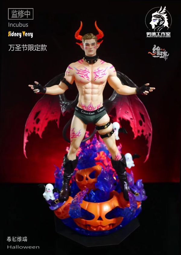
I preferred the colours and theming of this one to Green Pepper and wasn’t sure I’d really have the space for the pair – original plan was to see how this one turned out then potentially scrabble around for a Green Pepper if he sucked. Sidney is a lot more incubus-themed than Green Pepper, which made him the more interesting preorder for me. However, seeing as I wasn’t going to get him any more I jumped on the Green Pepper preorders. Fortunately Green Pepper was popular enough to complete production and eventually make it to my doorstep.
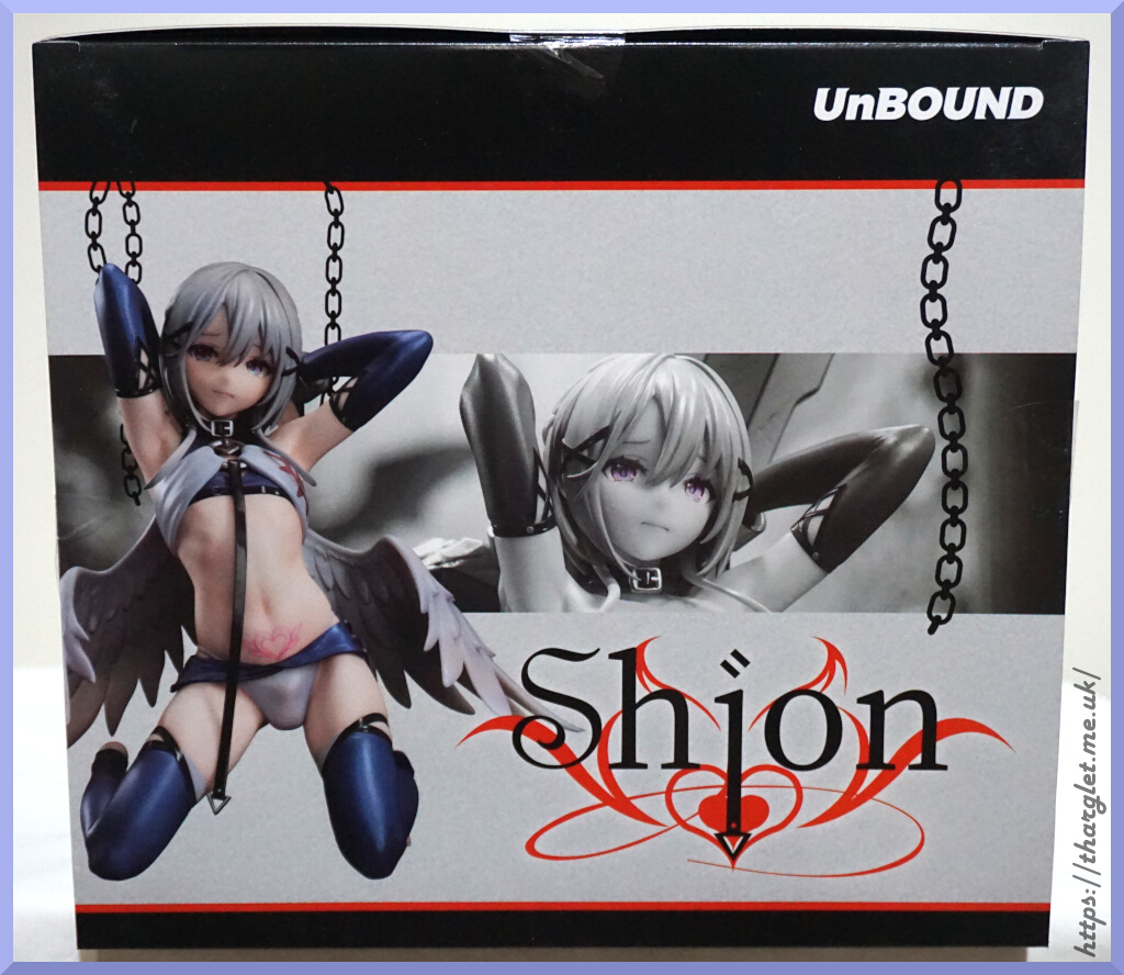
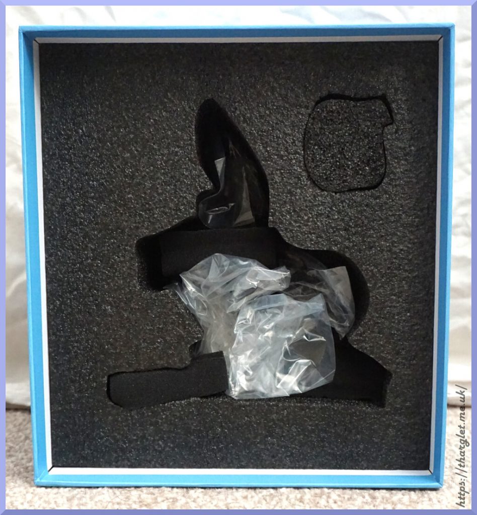
Box
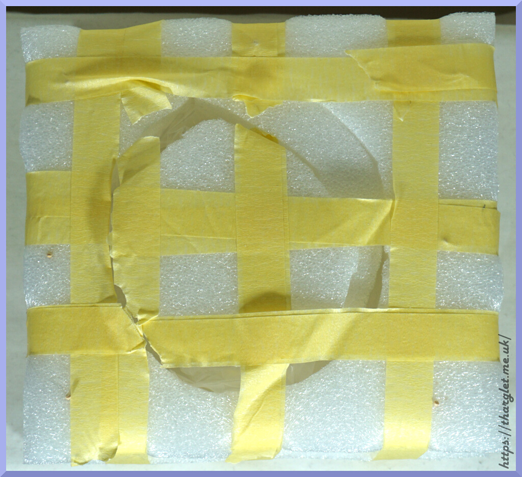
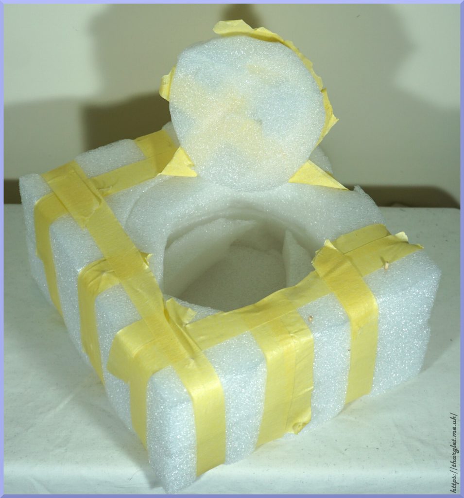
The box is huge:
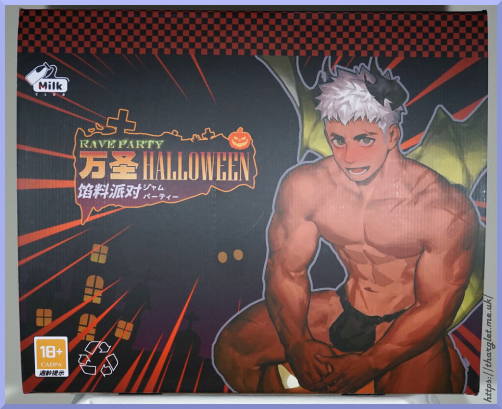
I didn’t include anything for scale, but it’s large – 57x47cm.
Depending on which language you speak, it’s either a rave party (English), stuffing party (Chinese) or a jam (of the fruit variety) party. I believe “stuffing party” is supposed to be the intended translation.
On the front we have an 18+ rating by “CADPA”. Didn’t know that game rating organisations now rate figures 😂. CADPA is the Chinese equivalent of PEGI or ESRB. Also we’re told to recycle the box – I think I’ll keep mine, thanks. Interestingly we only have Milk Club mentioned on the front of the box.
Front edge of the box:
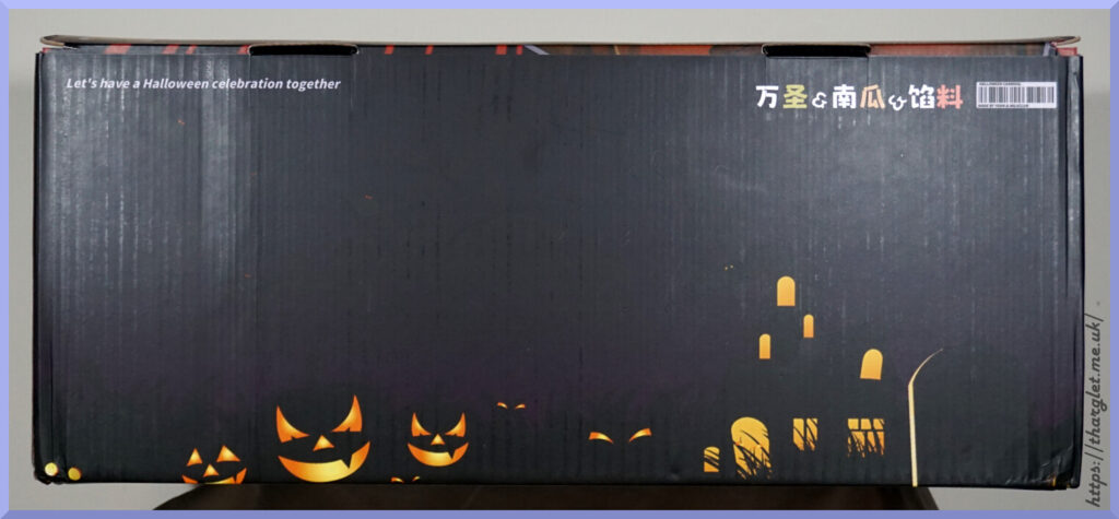
The back of the box is the same and the other sides are more of this design, so didn’t bother to include. Bottom of the box is plain black.
The silhouettes give the box some nice Halloween theming. The Chinese text reads Halloween & Pumpkin & Stuffing. We also have a fake barcode that has the text “HALLOWEEN CARNIVAL” and “MADE BY YYGN & MILKCLUB”, so YGNN do get some of a mention on the box.
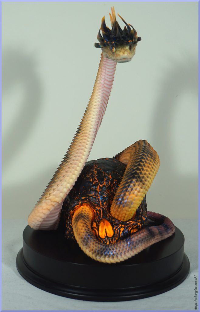
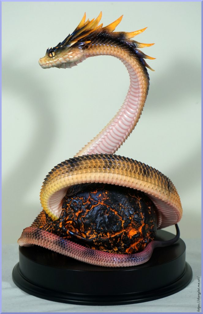
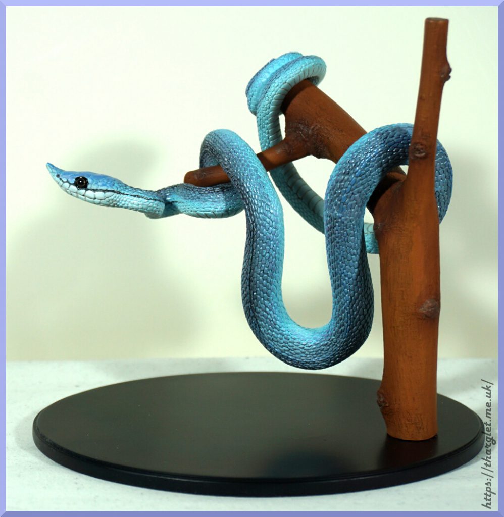
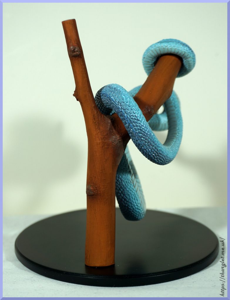
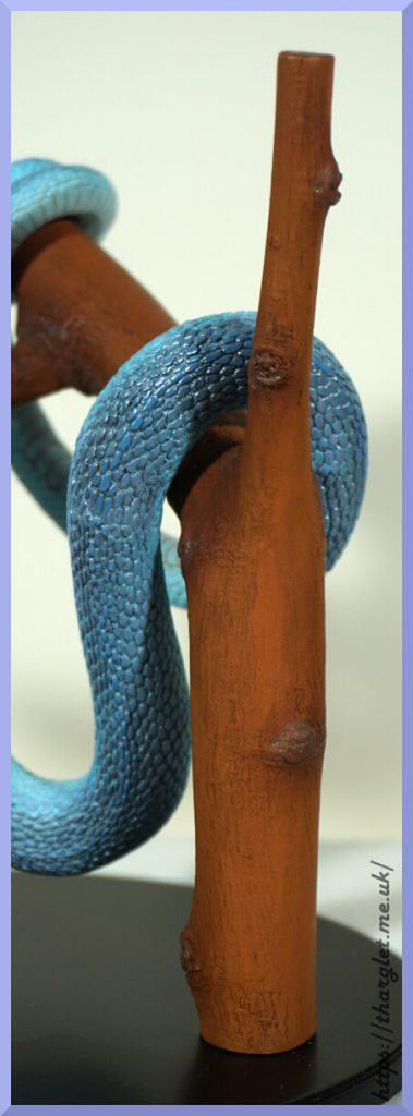
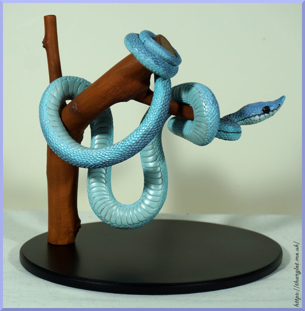
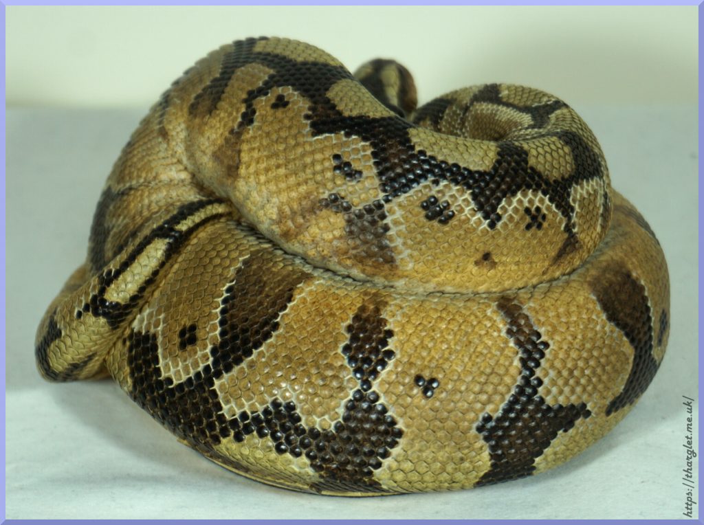
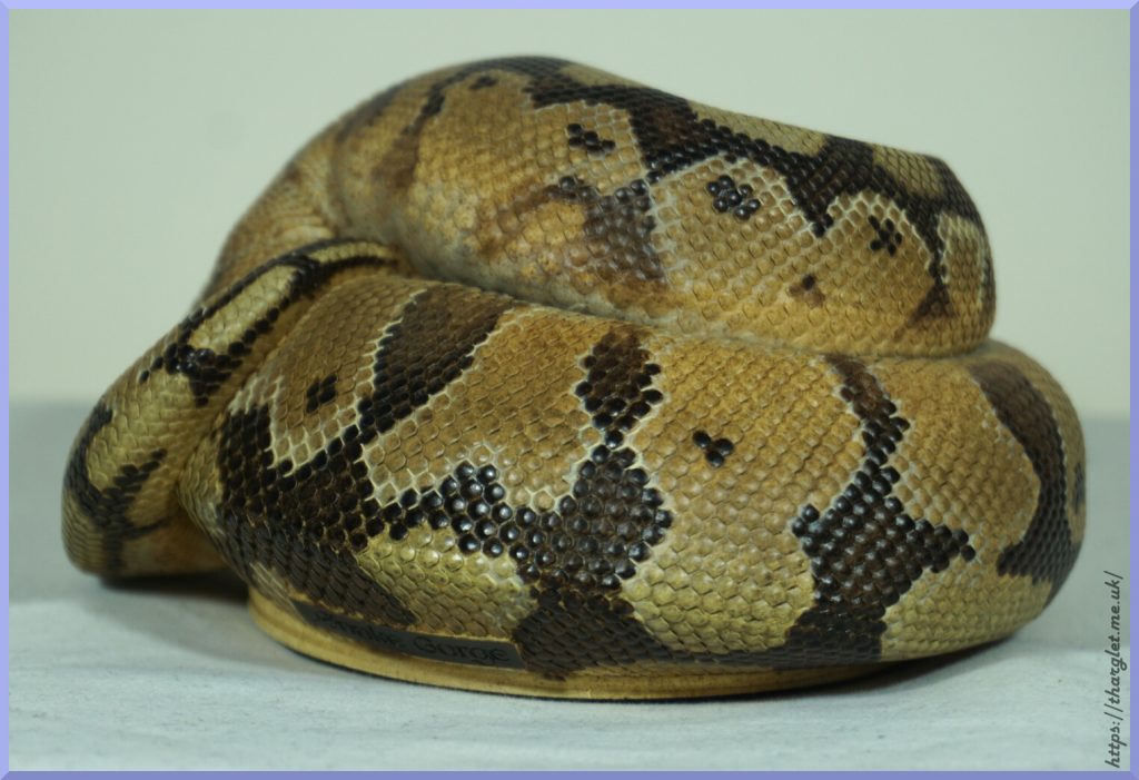
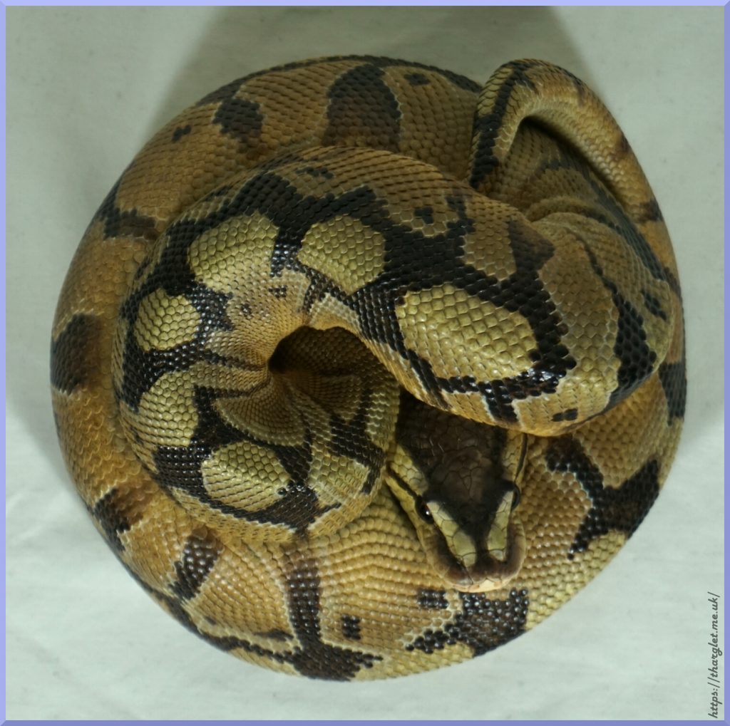
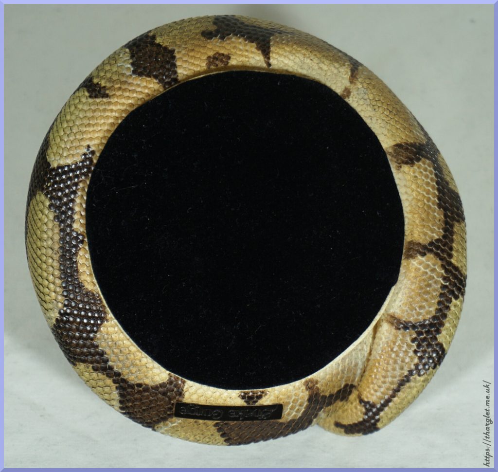
Figure spin-around
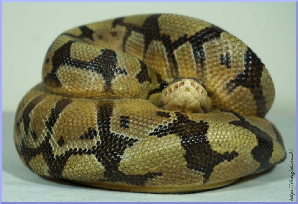
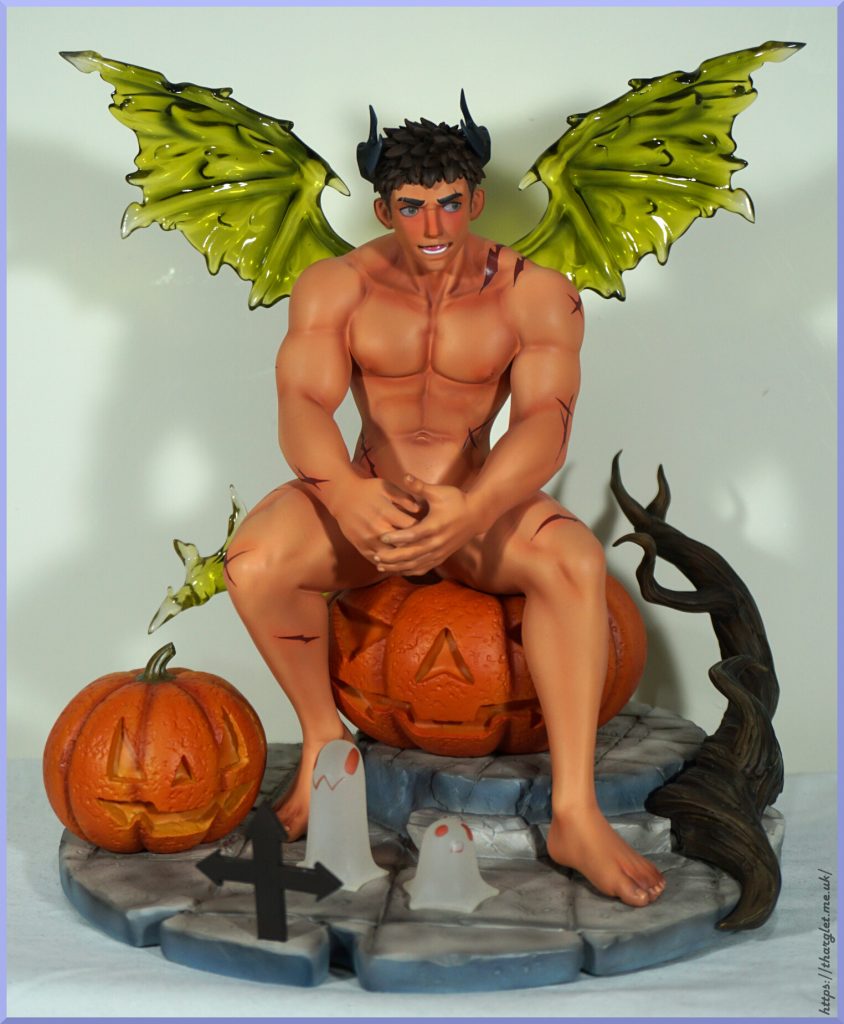
Let’s have a look at this guy and see if he’s worthy of doing some stuffing:
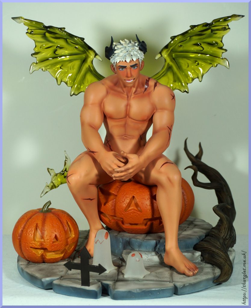
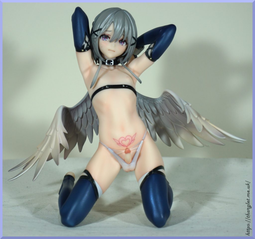
The transparent bits came out better than I hoped and love the details on the base. The figure was surprisingly easy to assemble – the parts went together well and he sits firmly on the pumpkin. One improvement from the prototype is he has no arm seams which is nice to see.
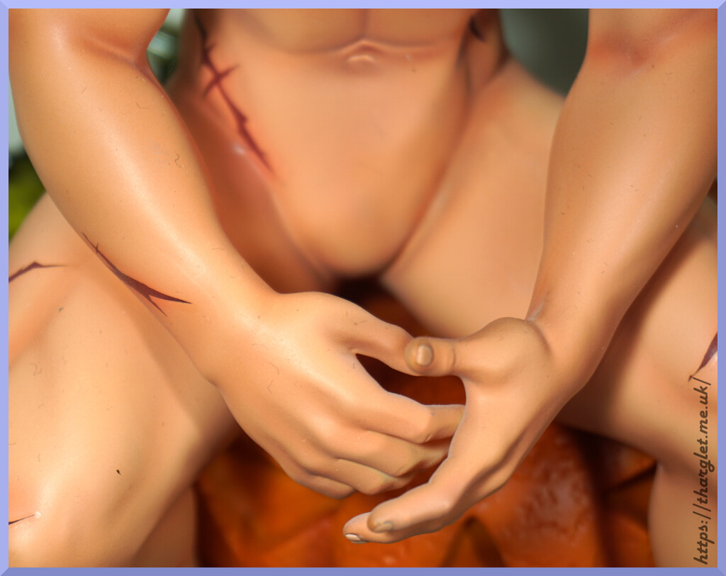
There are two disappointments for this figure. The first is the scar marks – they’re too distinct in my opinion and look more like tattoos rather than scarification or wounds. In the prototype images they’re much closer to his skin colour and thinner which makes them look more like marks on his skin rather than ink. It doesn’t ruin the figure for me, but it does detract. The second disappointment I’ll get onto later – see if you can spot the omission.
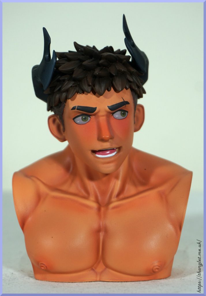
He also comes with a brown-haired head:
They’re both the same sculpt, so all you’re choosing is the hair colour here. I prefer the white hair, so have gone with that in this review.
Display bust
If you love both of his head designs, you also get a bust to display the head you’re not using:
An interesting addition that allows you to keep both heads on display. Seems fairly stable – haven’t had issues with it falling over. The sculpt and skin paint are the same as the figure, but it doesn’t have the scars on his shoulder. Can’t say I miss having them on this bust. This bust was advertised in the original promo images but I completely forgot about it so was a surprise on unboxing. It’s fine – I’ll sneak it into one of my displays, but it’s something I could take or leave.
Close-ups
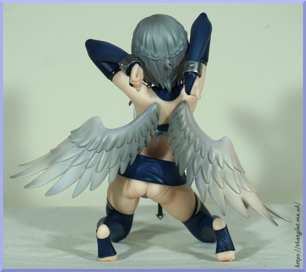
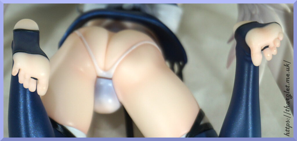
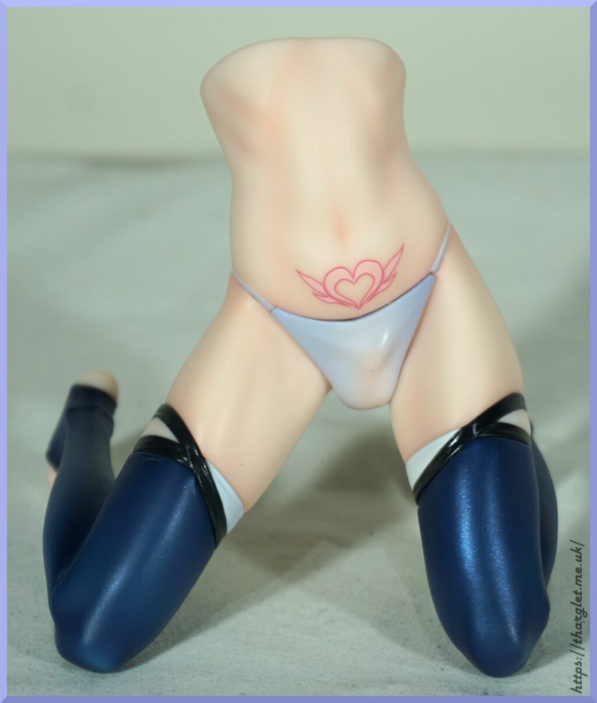
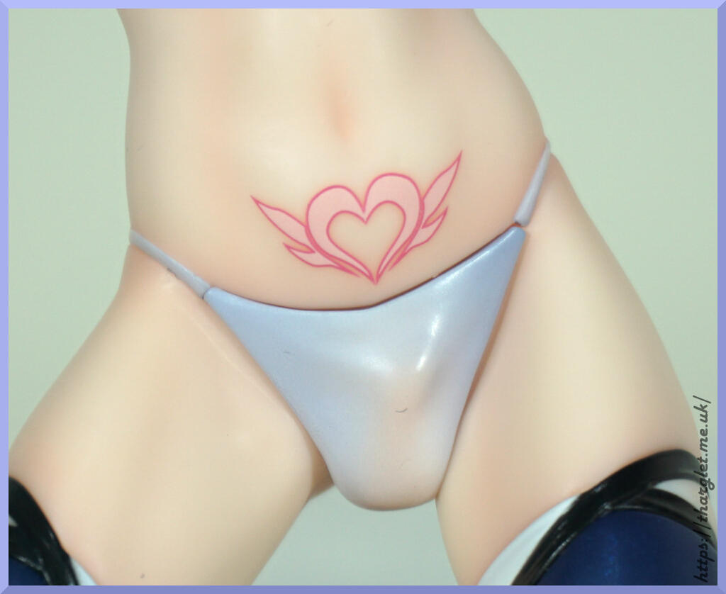
OK, let’s start with the elephant in the room – the missing feature:
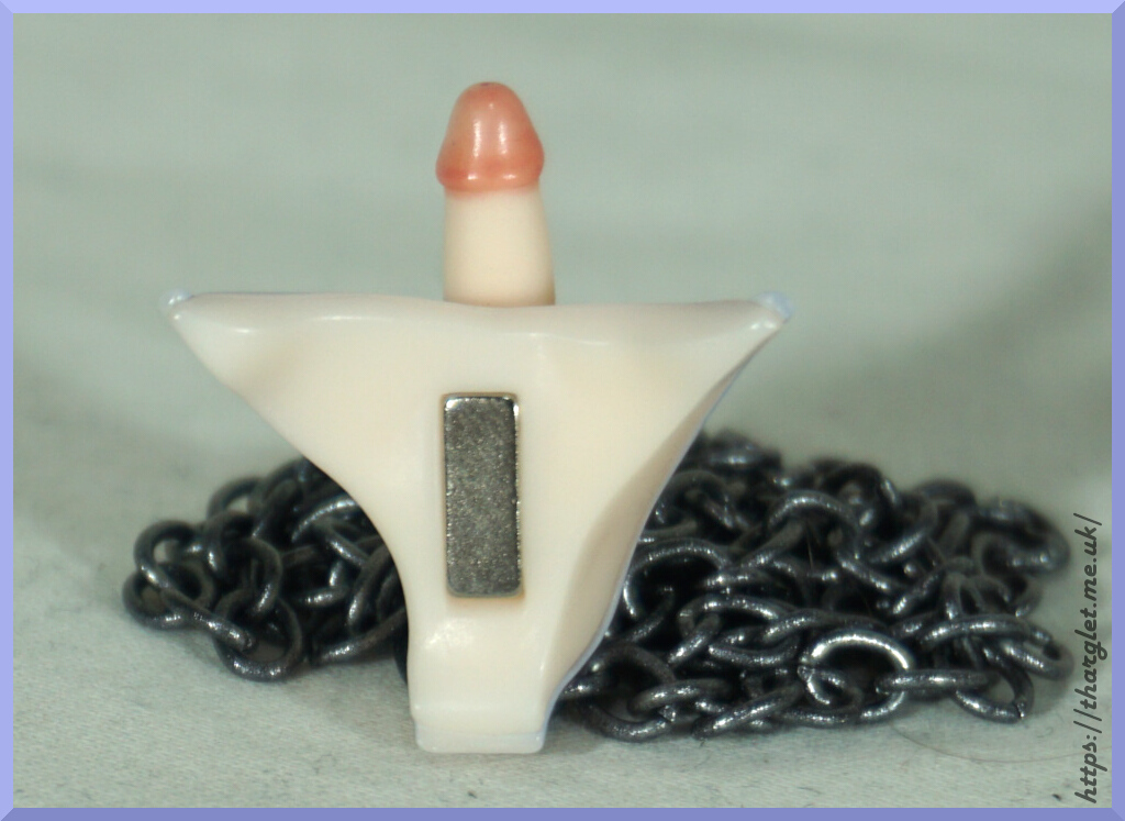
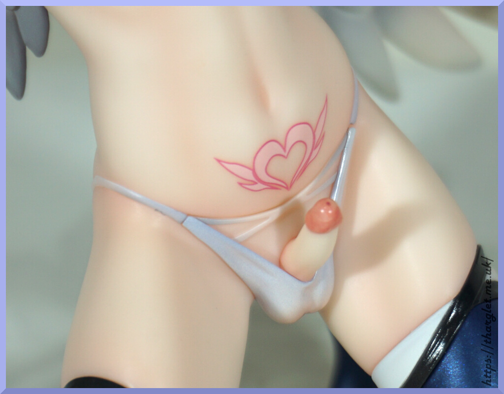
Yup, due to the Chinese restrictions he came with no penises. He was supposed to come with three choices but came with… none. Mine was a proxy order so there was a chance I missed out, but I talked to someone who preordered from an internationally-facing site and they didn’t get any either. Bummer.
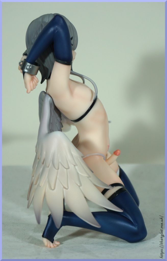
Due to where he’s holding his hands he gets away with being a Ken – if displayed at a mid or high level it hides that there is nothing there. Which is fortunate as the underwear he comes with is absolutely terrible:
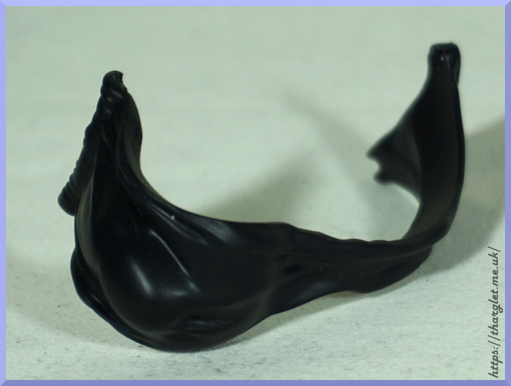
I did try doing a test fit with the gusset and it was a nope. It also transferred a little paint that I had to clean off 😒. The straps don’t clip to the main part so it’s a total waste of space in my opinion – you have to provide your own glue or putty to keep it together. It does give the impression of him having anatomy but it’s not really worth the grief of making it work. If I wanted to give him undies I think I’d buy or make a fabric pair for him. Can always give him some cotton balls…
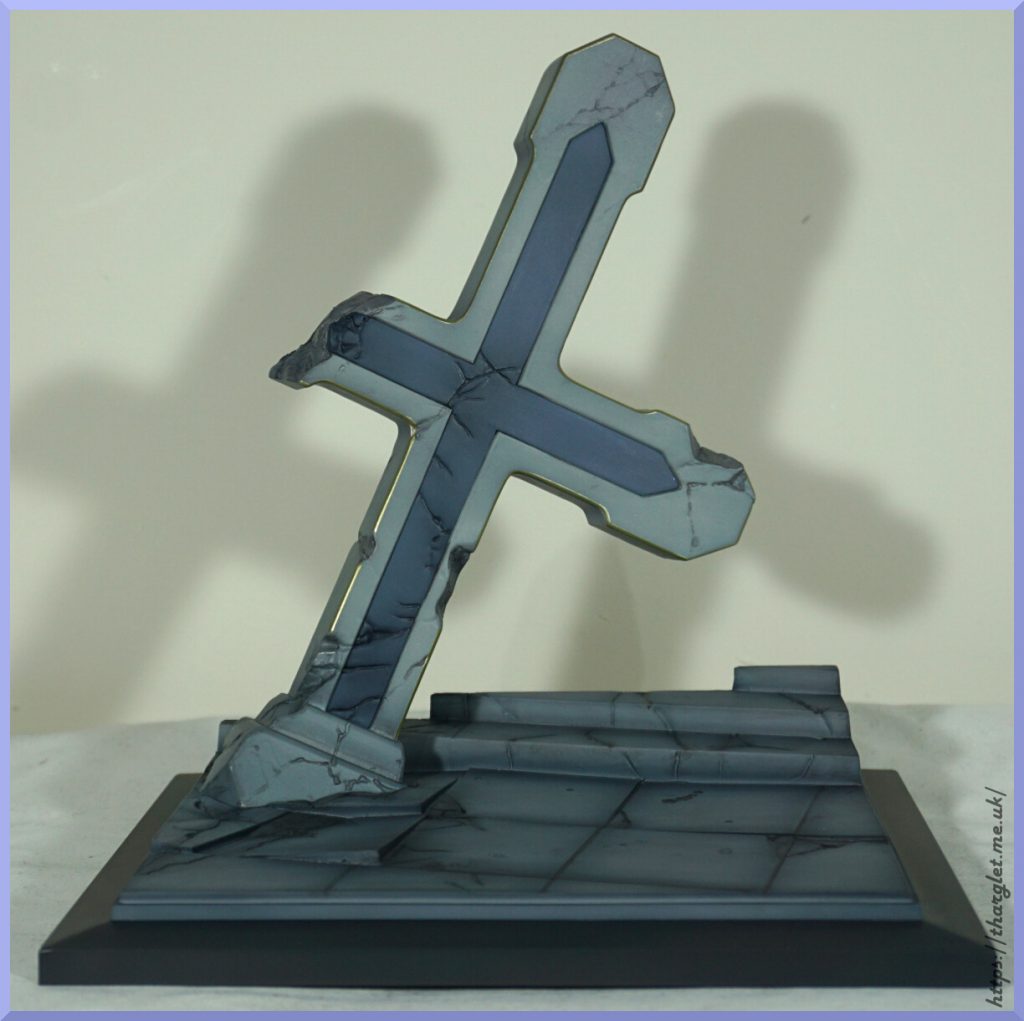
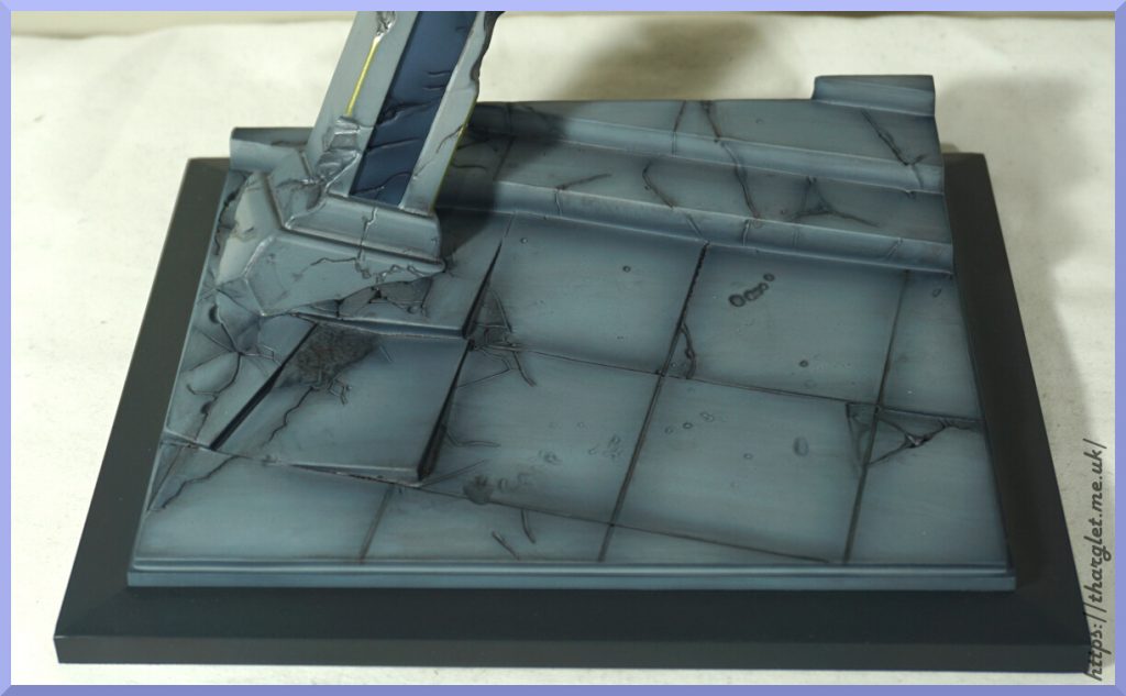
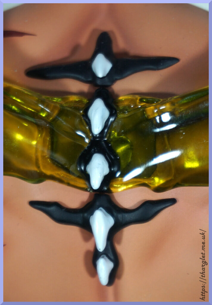
OK, with that out of the way, let’s check out some of the details on the base:
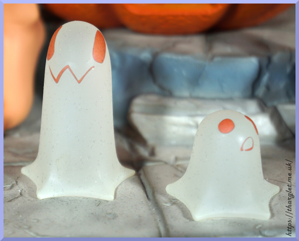
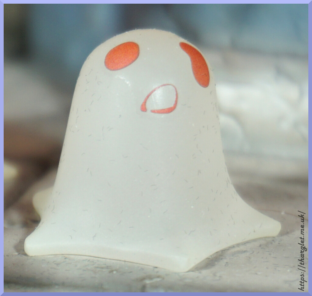
The ghosties are cute but do seem to be dust magnets 😅. The cross doesn’t have a big peg, but seems stable enough. The wood texture is nicely done on it.
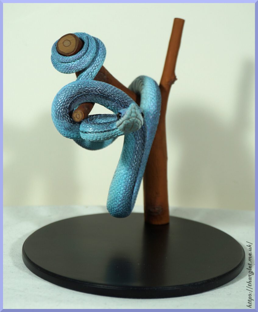
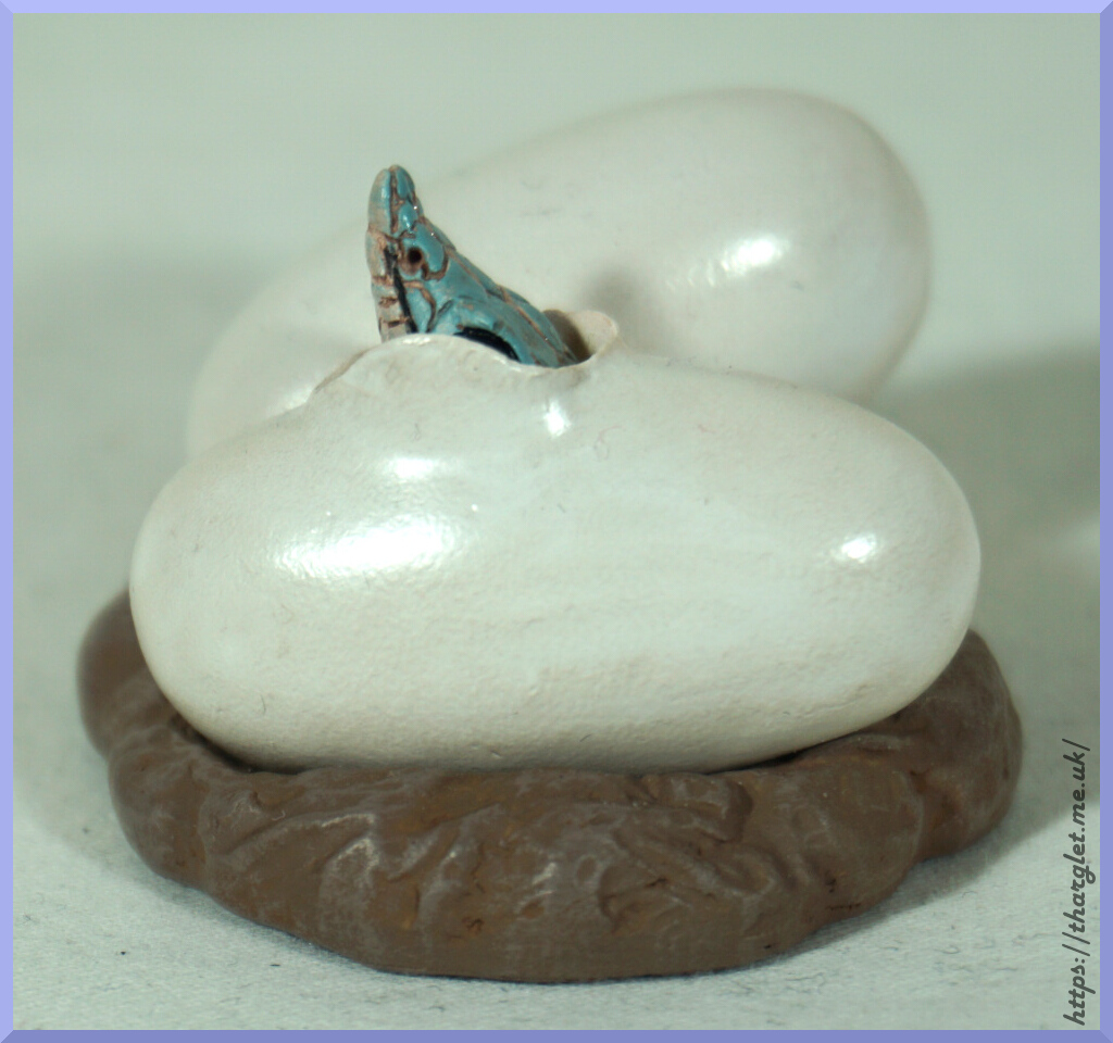
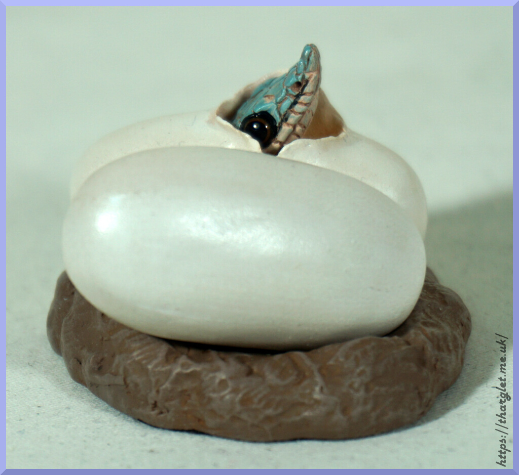
Pumpkins:
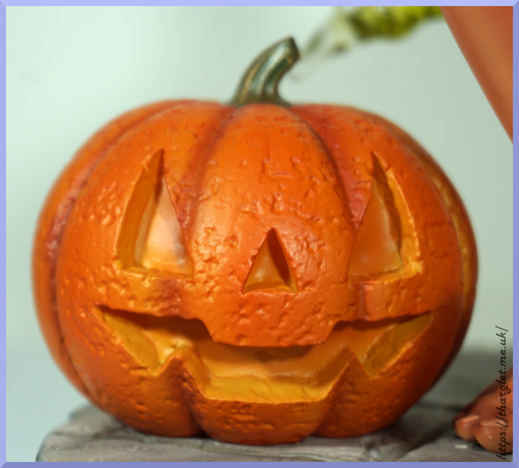

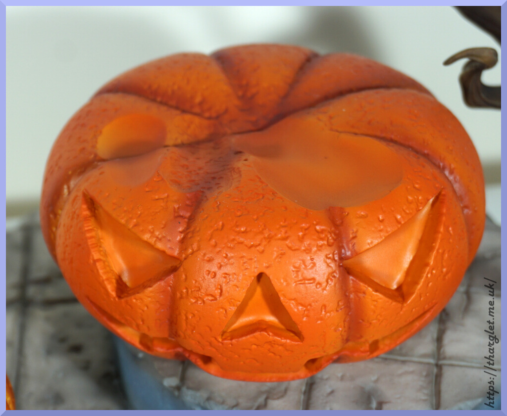
These are the stars of the show on the base – they have a good detailed texture and have vibrant orange colouring. They maybe could’ve put the paler yellow in the eyes of the bigger pumpkin like the smaller one, but this doesn’t show so much once Green Pepper’s ass is on it. The dimples on top of the large pumpkin are to keep Green Pepper sat still, and they seem to do the job well. The pumpkins aren’t initially on the base and install with large pegs.
Branch:
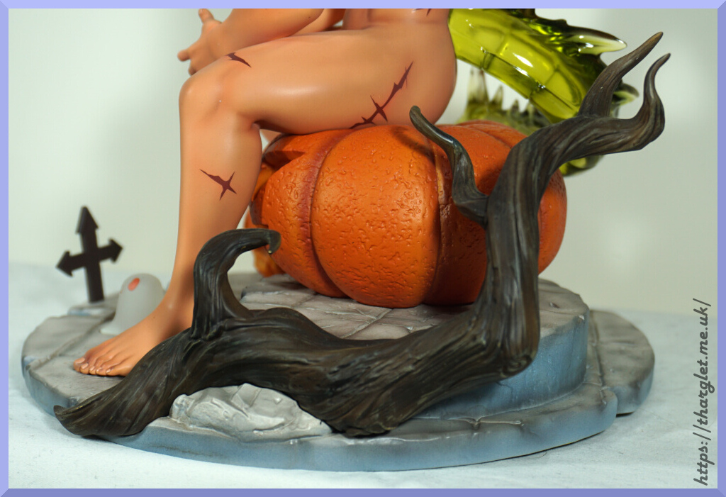
This part is also initially separate and connects magnetically to the side of the base and was easy to attach. In terms of assembly, this figure was easy to put together. Only part I had some trouble with was his head but once I got the angle right it snapped into place.
The sculpt on this branch is detailed. There is some shading on this part but it’s not very distinct. It looks the part though and fits in well with the base.
The tilework on the base is also nicely sculpted and shaded. Overall, the base is a solid addition to the figure and compliments Green Pepper well.
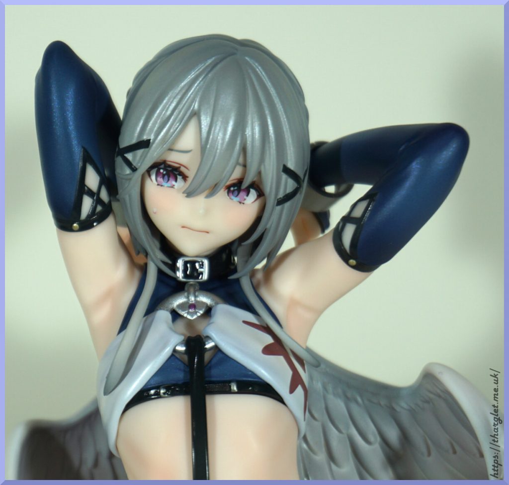
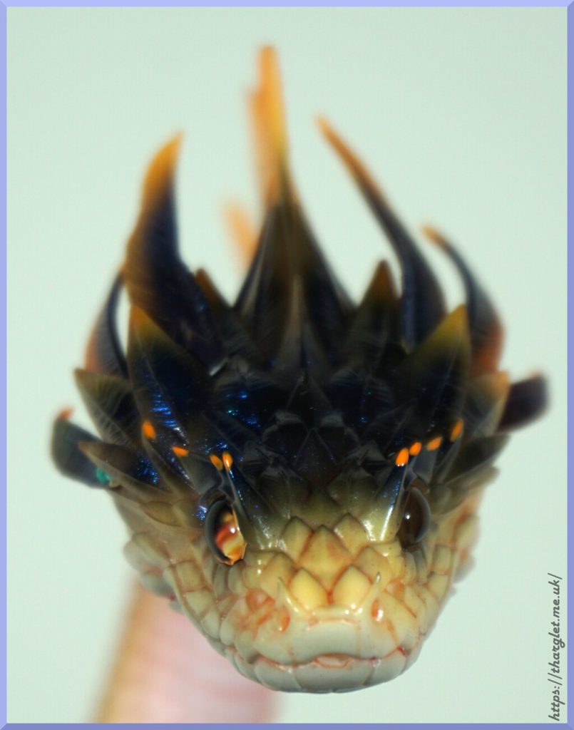
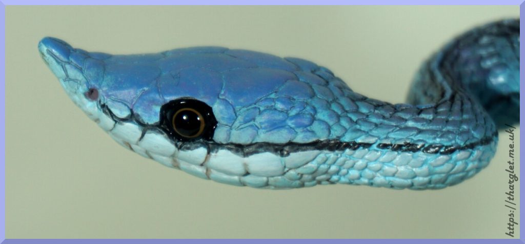
Faces:
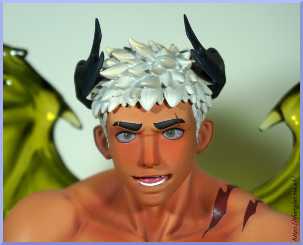
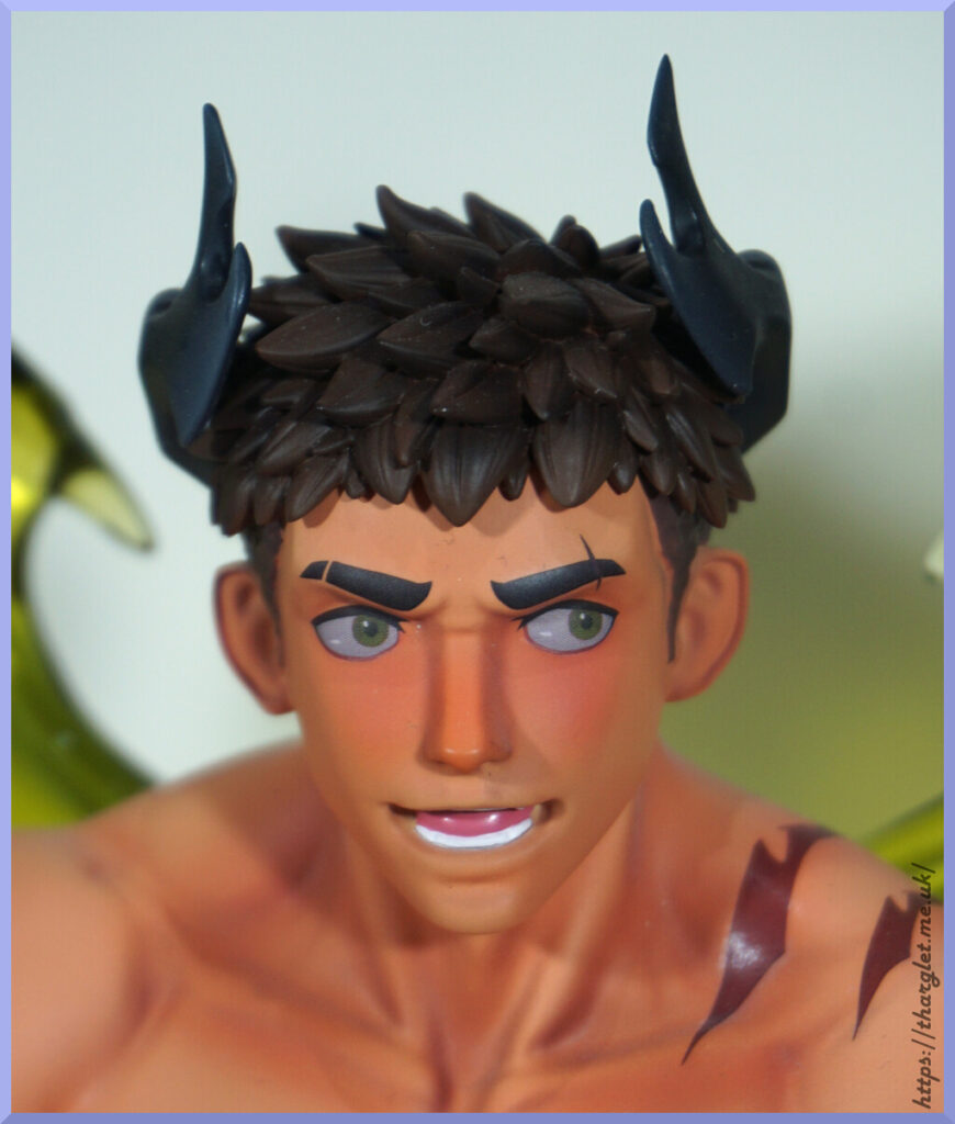
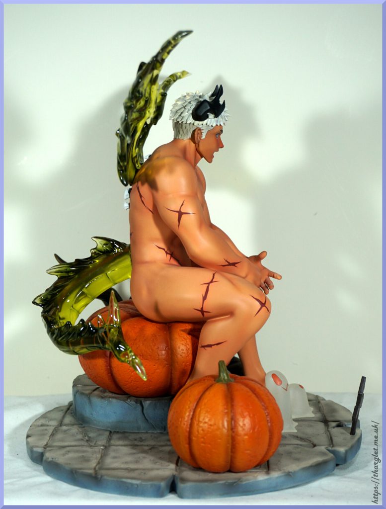
Looking closer I’ve finally noticed there is a difference I was picking up with the faces – his left eye is cross-eyed on the white-haired face and not on the brown-haired face. I knew there was something bugging me. Honestly I find the expression kind of strange – like he’s about to say something. Would’ve been nice to have included a head that was smiling or otherwise more interacting with the viewer.
Both are nicely sculpted and painted, so no complaints as to the quality from me.
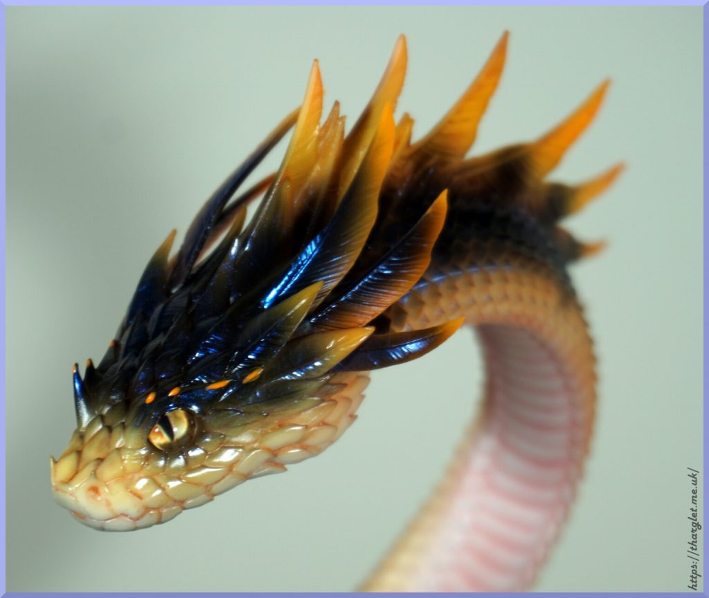
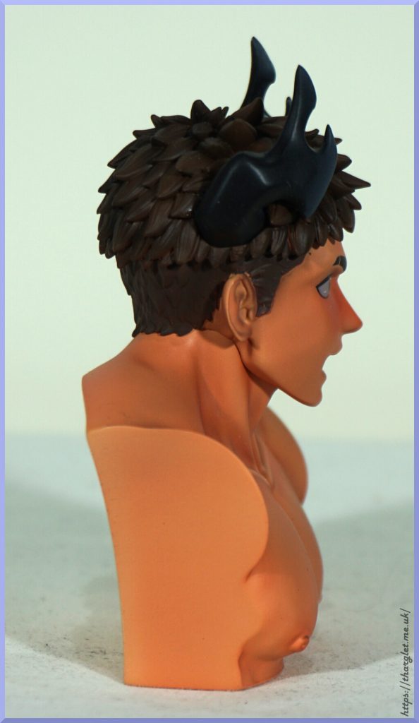
Side of the head:
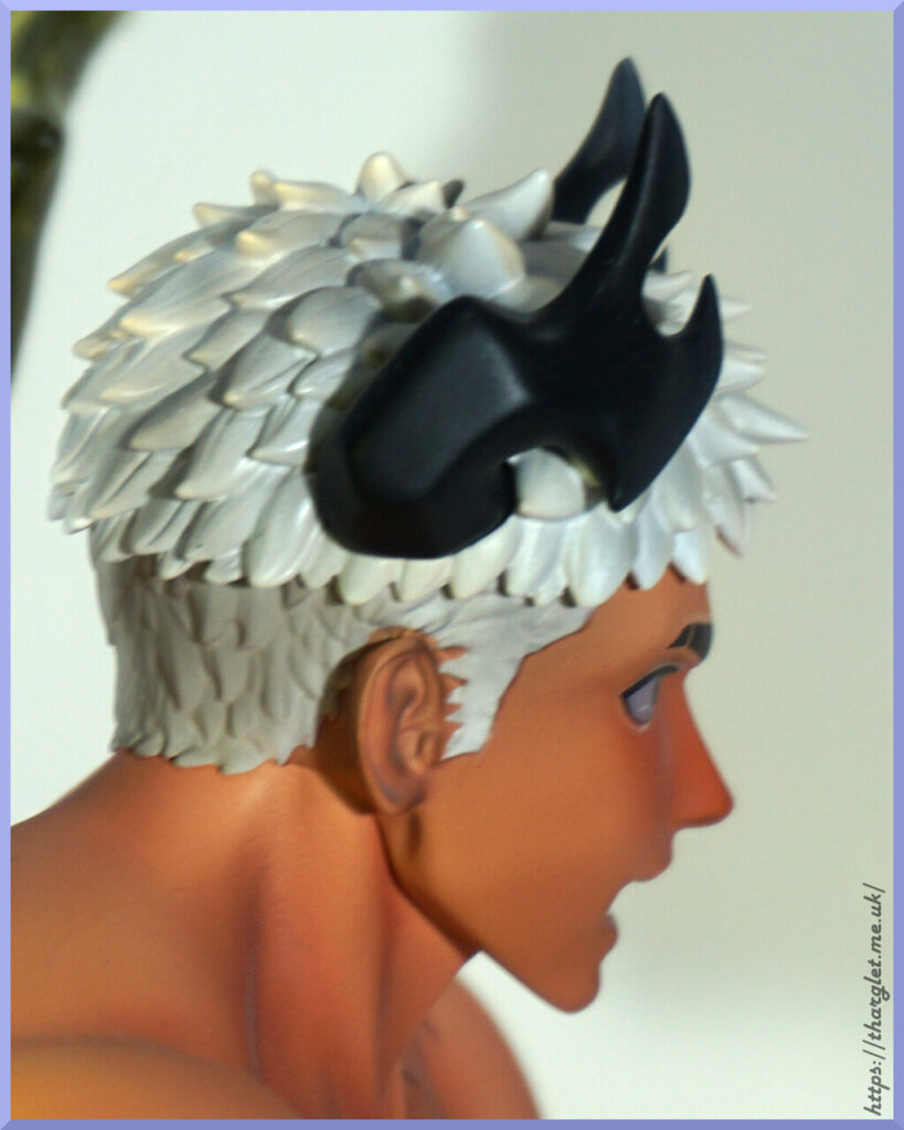
I do like the way his horns aren’t a simple shape making them more unique. The white hair has a decent amount of shading it to make it feel like hair.
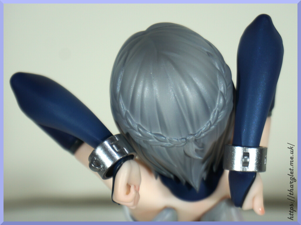
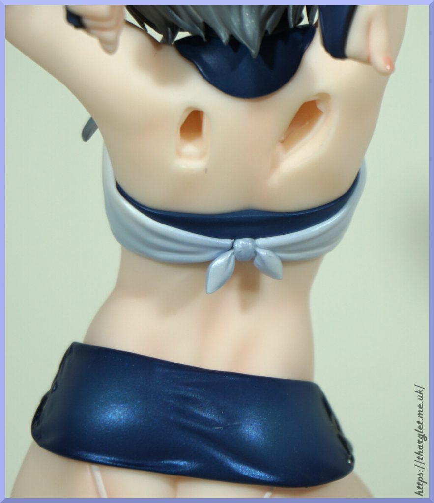
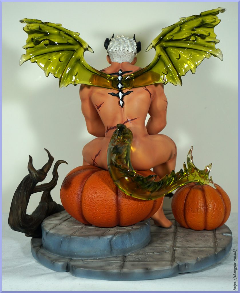
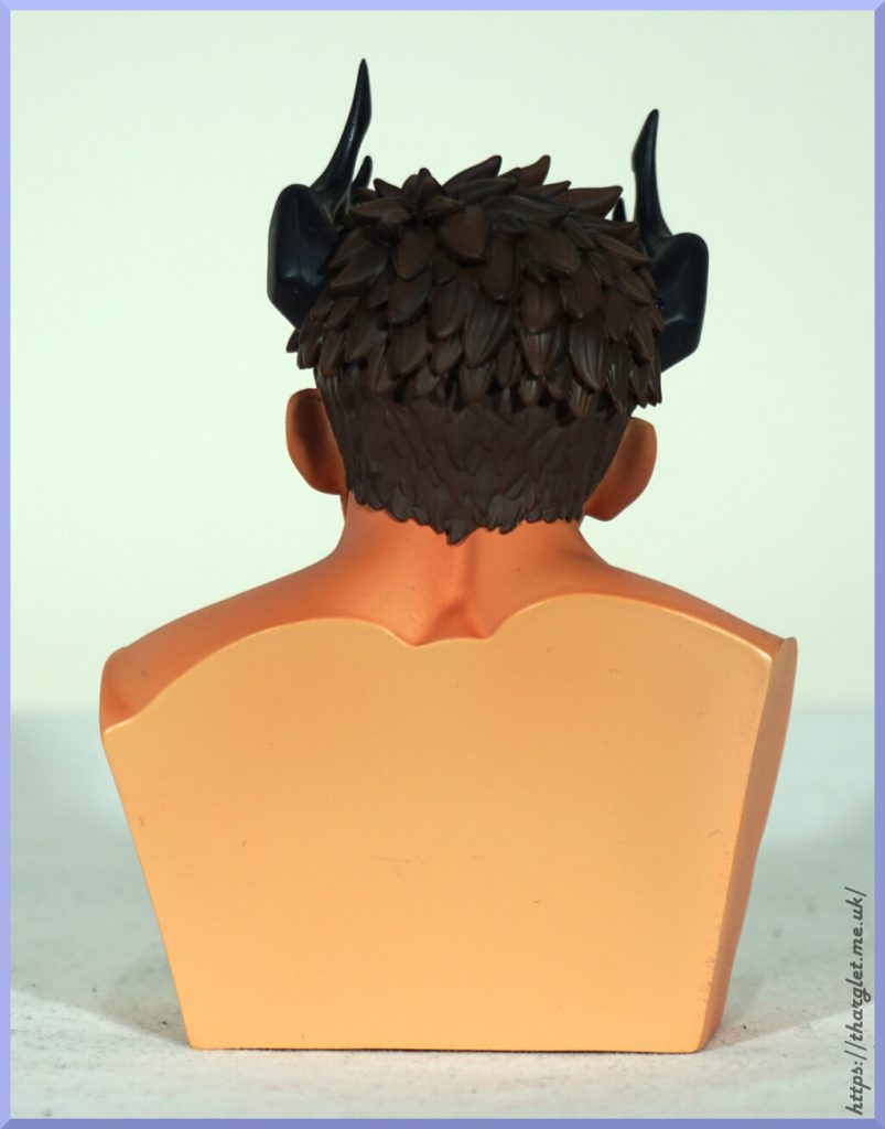
Back:
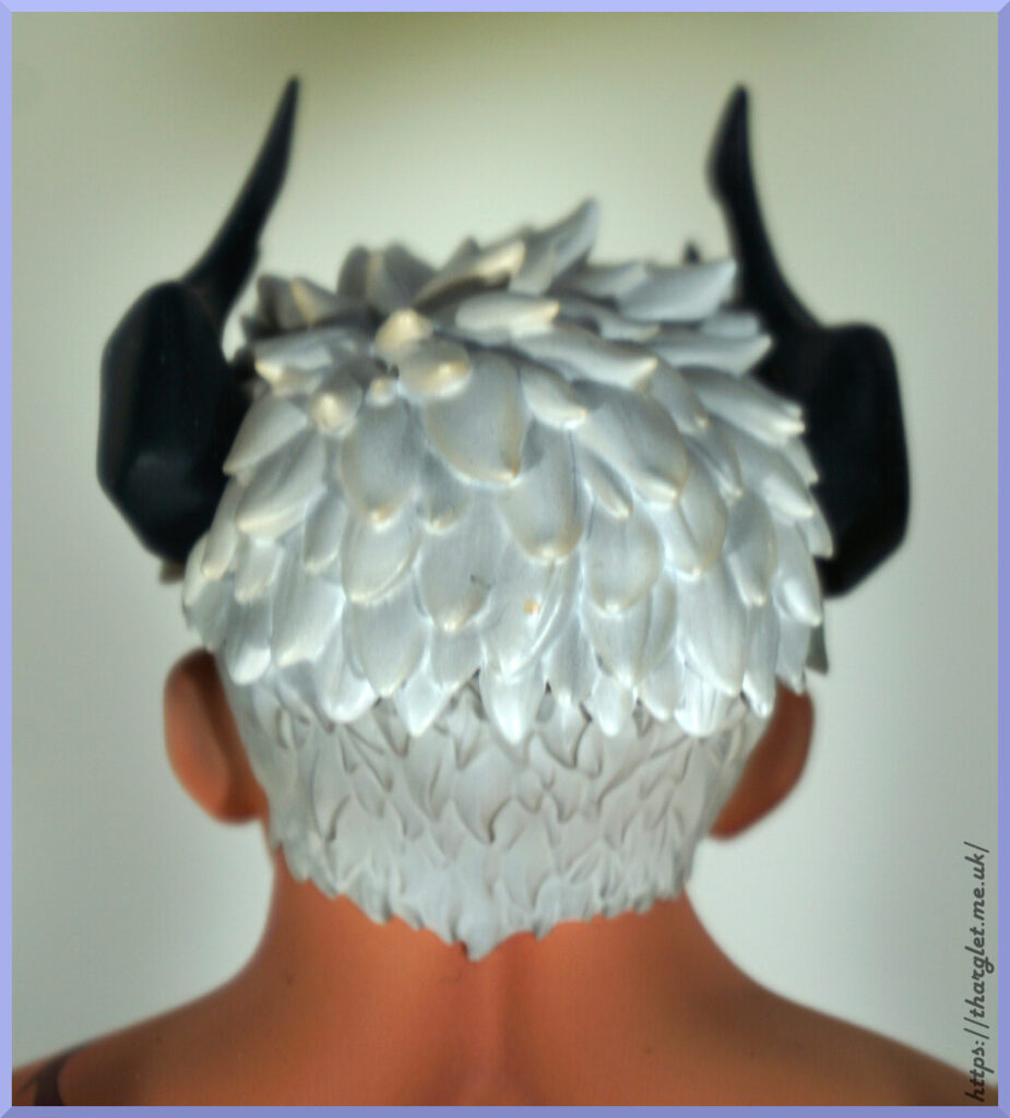
Looks like mine got a stray dot of yellow in the middle, whoops. Other than that, we have plenty of sculpting here to give his hair depth and detail.
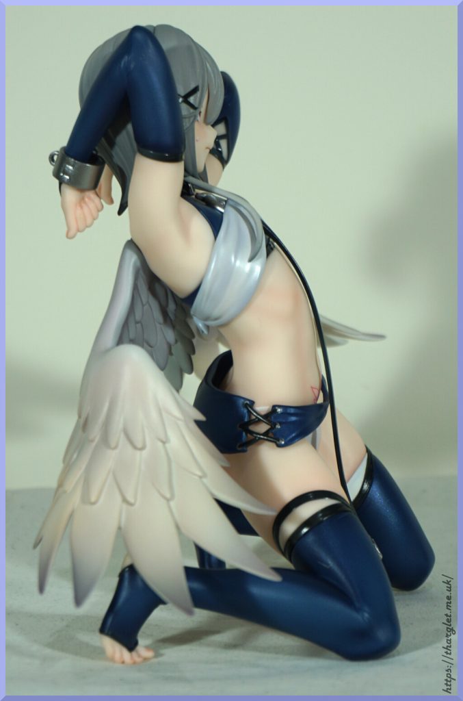
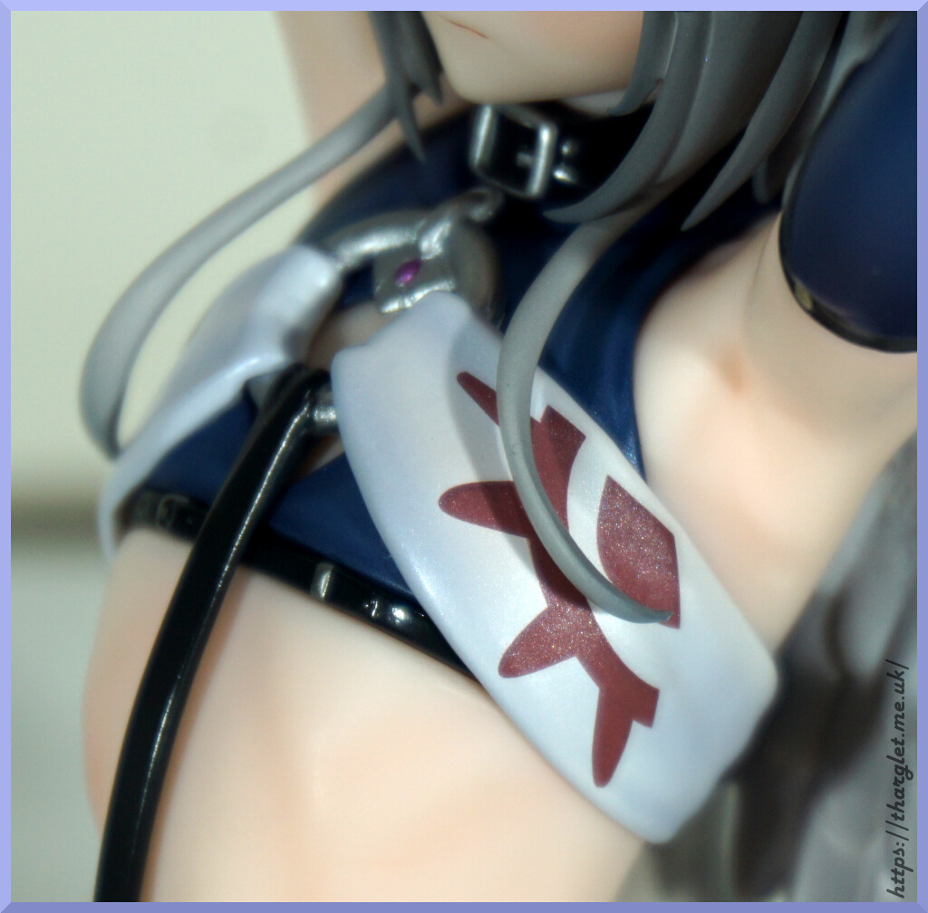
Markings:

Unfortunately the edges are far too crisp, the colours too dark and the transfer backing is too visible to pull off the effect they were going for. They really do look like some kind of Halloween temporary tattoo, which is a bit of a shame.
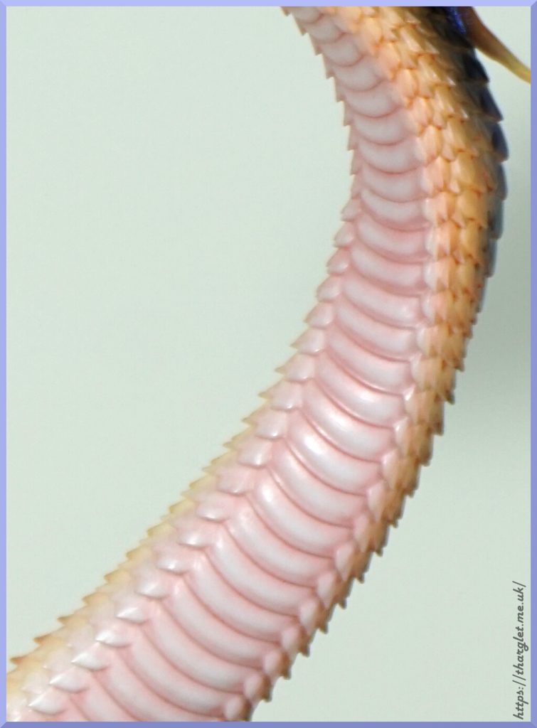
Leg:
Here we have a bit of a leg weld, where the parts of the leg are joined together. Could’ve done with some darker paint in there to hide that or moulded so more of his leg is pushing into the upper leg so there’s less of a slit. The upper thigh markings have the vibe of a 00s barbed wire tattoo. The skin shading is really nice though.
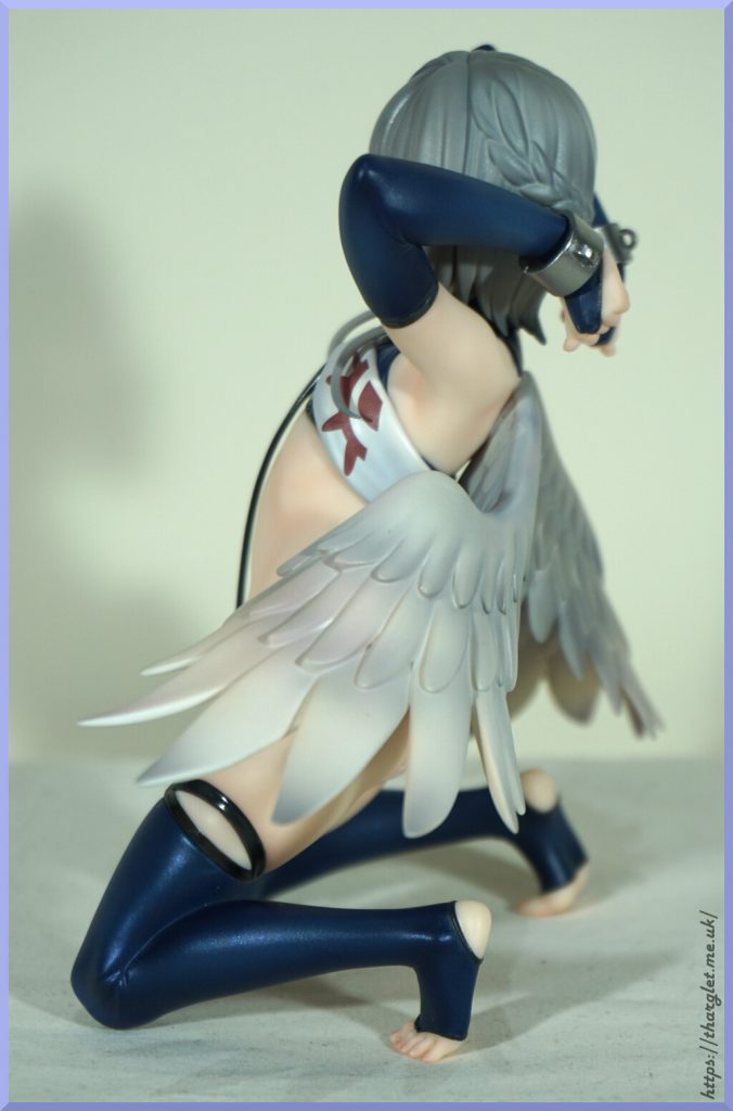
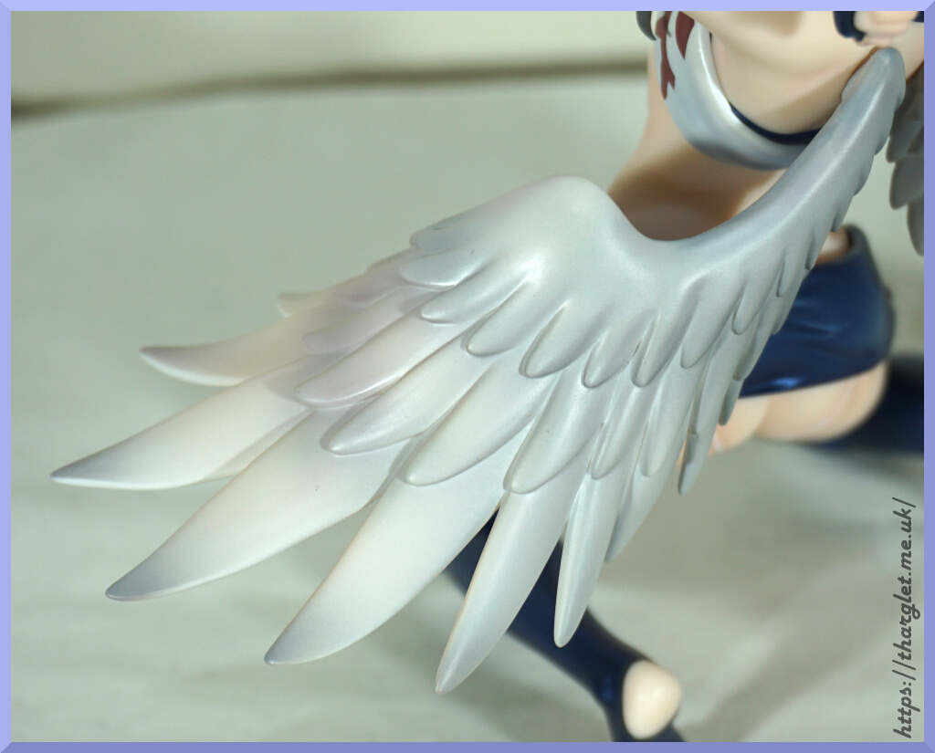
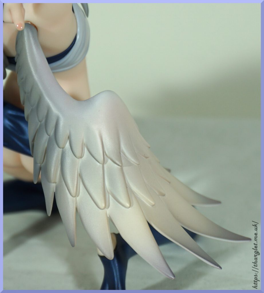
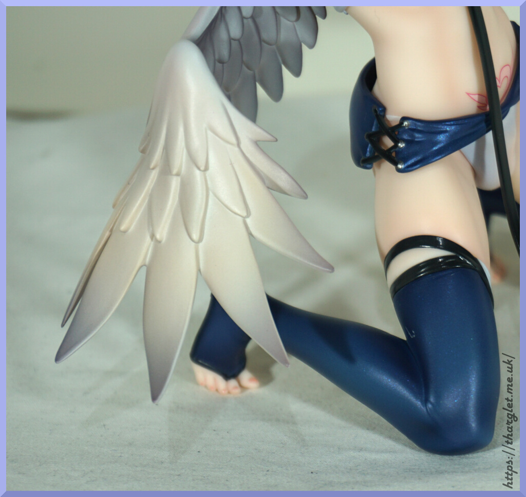
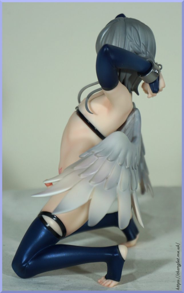
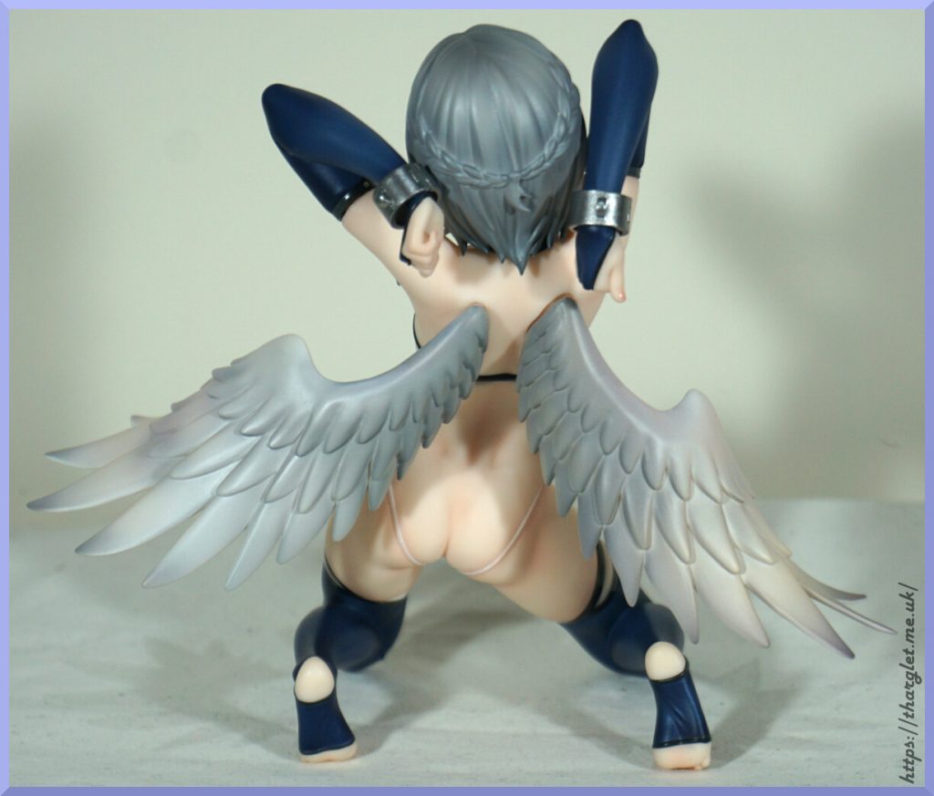
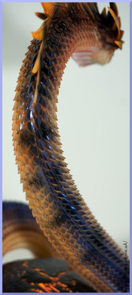
Wings:
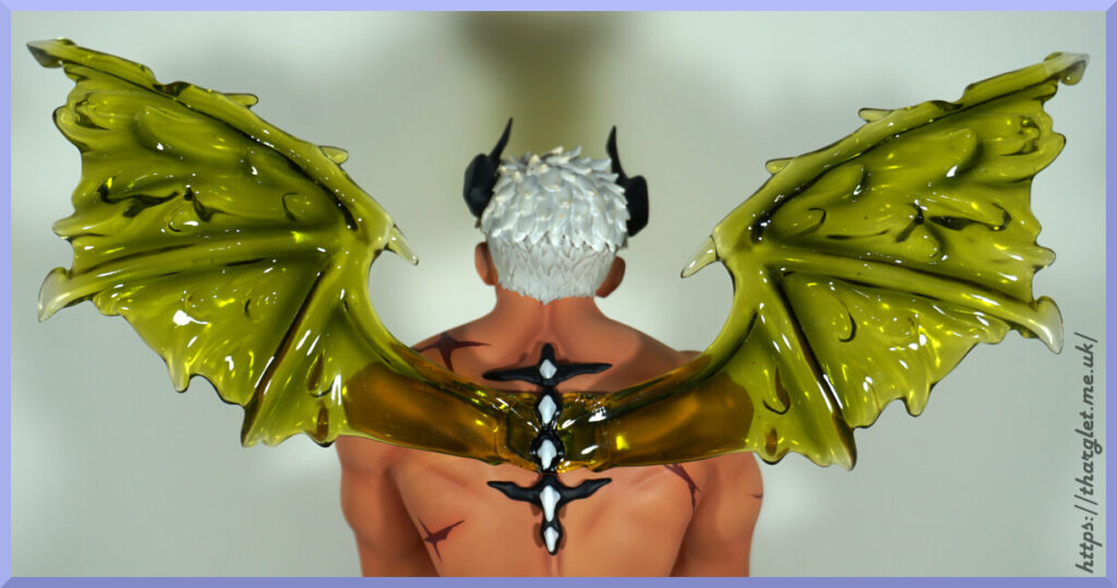
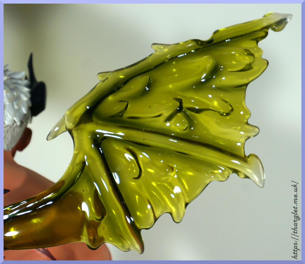
The wings come as one piece – taking them out of the box was a bit of a fun time but assembly is dead easy as the whole thing just plugs into his back. Love the colour and the gooey texture moulded into them. Transparent parts can be a hit or a miss – these ones are a hit for me.
Spine:
He has this interesting spiky design down his back. I like it, and kind of wish they played with this motif from the front – maybe some spiky elbows or around his ankles or something like that.
In the above photo you can also see the big peg that keeps the wings in. And the magnet that’s mostly hidden by the spine. So do wonder if this was actually some artistic license to help obscure this joint.
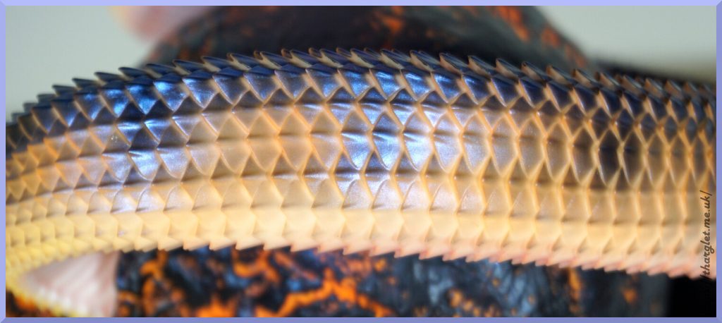
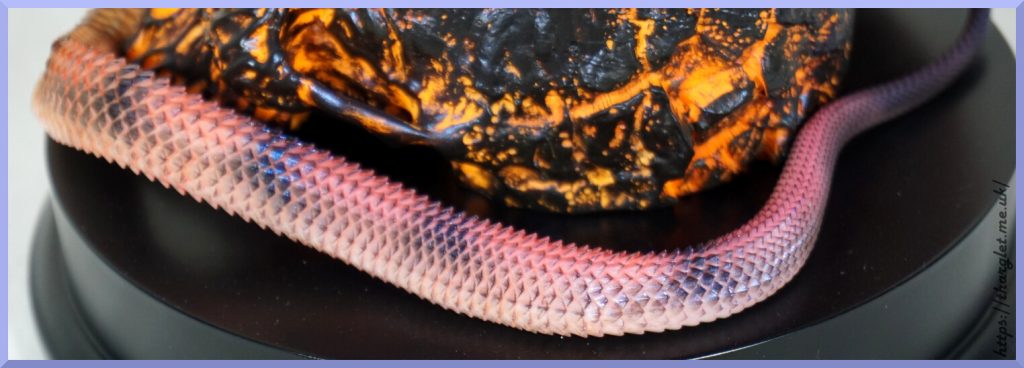
Tail:
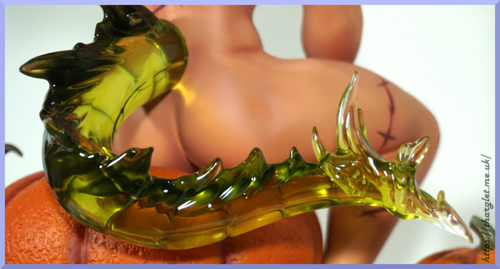
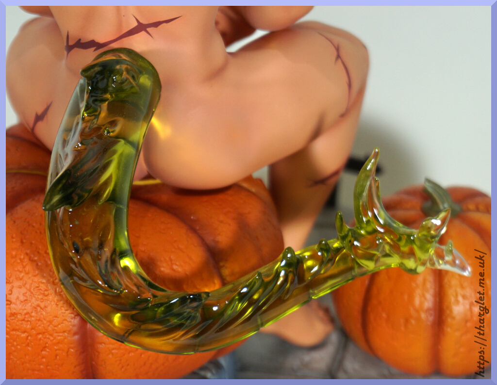
Love the shape of the tail – he could do some real damage with this fellah. The colour matches with the wings and has more of a gradient in the tail, fading to clear at the tip of it. Whilst the wings do have some clear tips it’s not as obvious as the tail. There isn’t any blend between tail and his back, but not personally bothered by this. Overall I’m happy with the detail and look of the tail.
You can also appreciate his toned bum from this side too 😉
Conclusion
Overall, I’m pleased with the look of this figure. It’s disappointing his penises were cancelled, but he interestingly looks fine without one. If I could change one thing about him it would definitely be the scars/cuts – they do look like cheap Halloween temporary tattoos and I much rather they had the more realistic look in the promos. The promo had them as healed scars, in the final product they’re kind of neither wounds or scars. For the skin some people may find the shading overdone – I think his collarbones ended up a little over-dark, but otherwise happy with it. I like the way his body is muscly but not an overdone beefcake.
The transparent parts came out better than I hoped, plus the base detail was well-executed. The underwear was an underwhelming disappointment, but thanks to his pose these can be left in the box. I have a feeling if he did come with penises I would be mildly disappointed how hidden they were thanks to his pose. Swings and roundabouts.
Could I recommend this figure? Ehhh. Depends if his negatives detract too much for you or not. Most of the figure is solidly executed – parts fit well (if we ignore the underwear), the painting and sculpting is solid in most areas, but then we have the skin markings that have a temporary tattoo vibe.