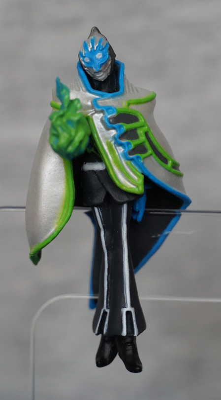
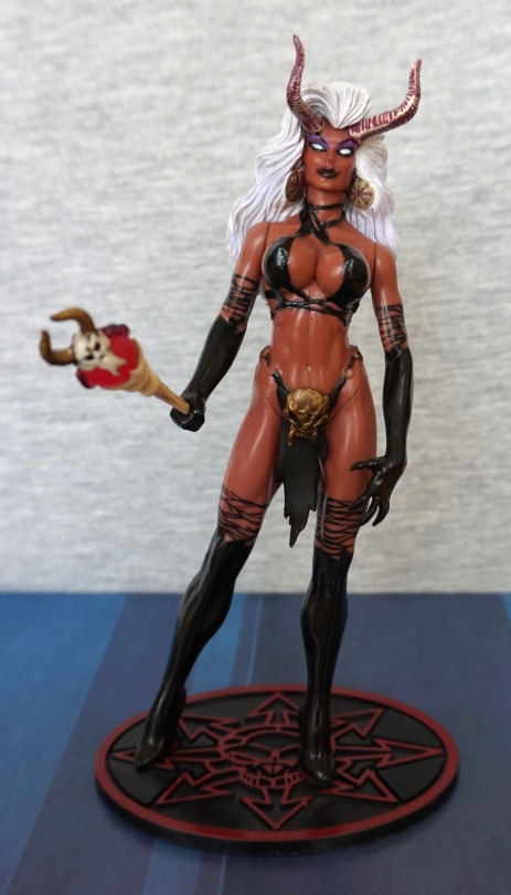
It’s time for some more Devilman! This time we’ve got Ryo Asuka:
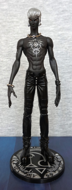
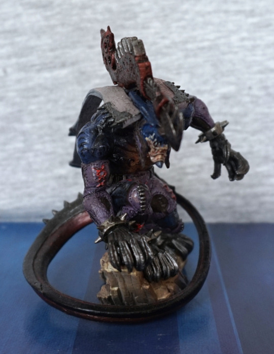
Here he is, with his normal head. I think the greyscale scheme works well with him. and I love the silver on the black. What I love less, is he has some stray silver paint on his left arm. Also the metal is a little rusty in spots – Japan doesn’t seem particularly friendly to metal parts.
He certainly has a sculpted body, and I think his trousers might be overly tight :P. I guess fashion wasn’t his first thought when summoning demons… but I doubt he needed clothes for long ¬¬.
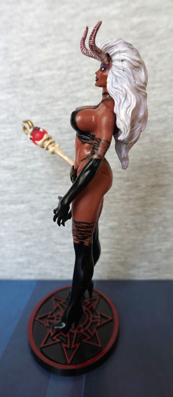
Left:
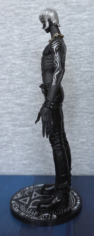
Here we see him with clawed hands, and some wonderful tribal tattoo detail. I like his cuff, and the trouser wrinkles have been sculpted well, to give them the feel of being clothes.
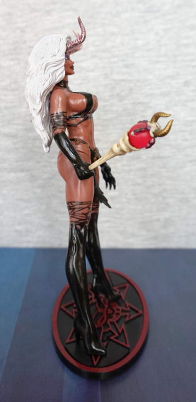
Right:
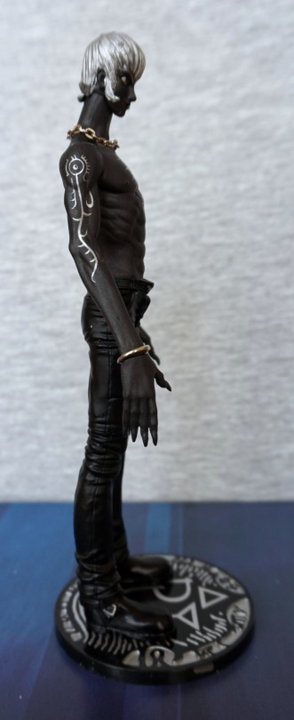
On this side we have a metal bracelet instead of a cuff, and a different tattoo. Out of the designs, I prefer the left one to the right one, but both have been painted well.
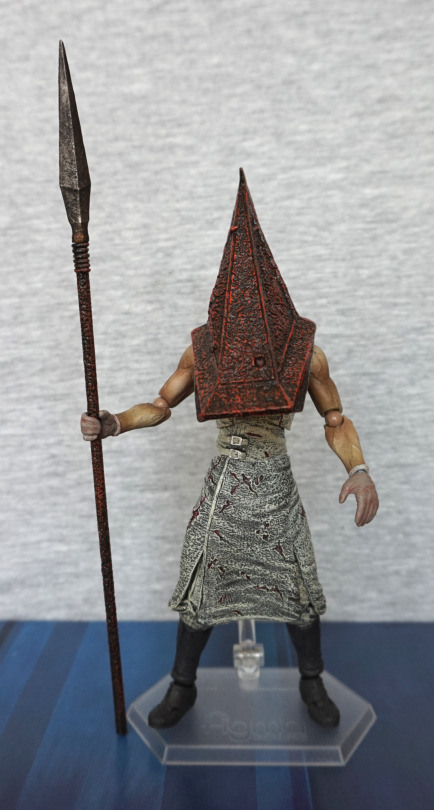
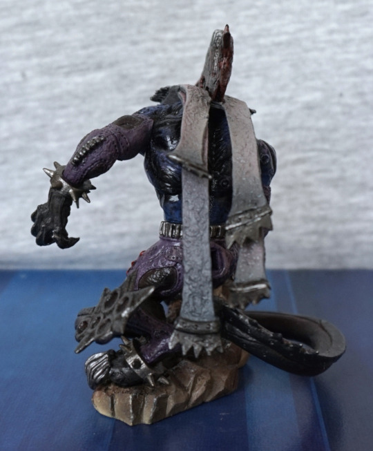
Back:
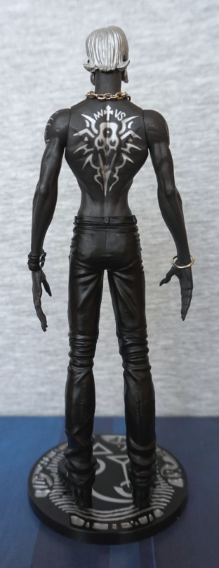
His pants have been pulled tight across his backside, but the rest shows wrinkles, as appropriate. His back tattoo looks good, but I’m seeing some more stray silver on his right shoulder. A bit of a shame the paint has ended up flicked about a bit, as it shows up quite easily against his dark skin. Here we can see the buckles on his cuff, which is a nice added detail.
Plonk, on goes the mask:
It fits on well, and here you can see one eye staring out :P. This part glows in the dark, but I didn’t take any shots of this.
Closer look at the mask:
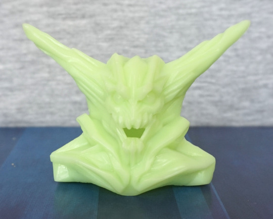
Same mould as the other ones in previous reviews. Lookin’ scary.
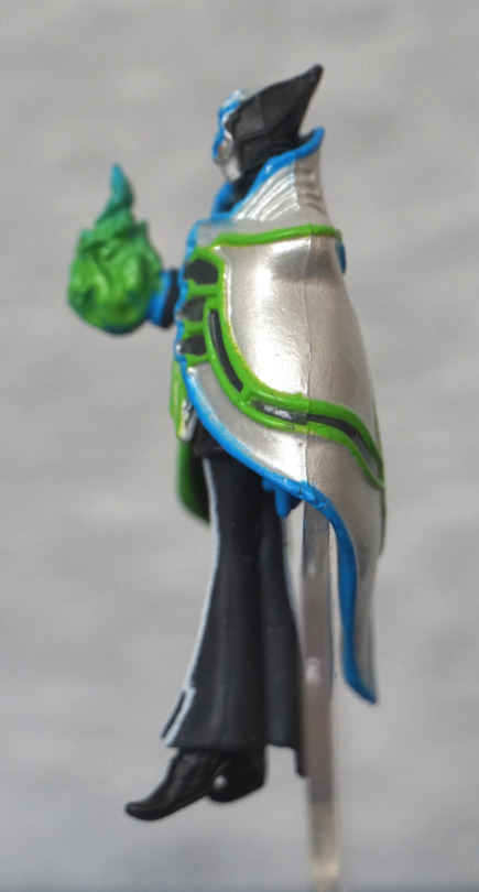
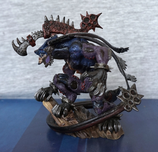
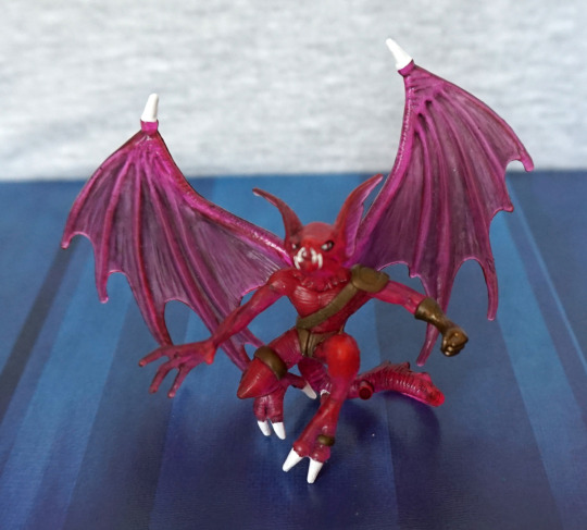
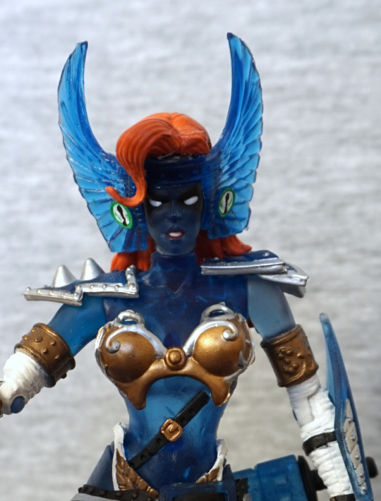
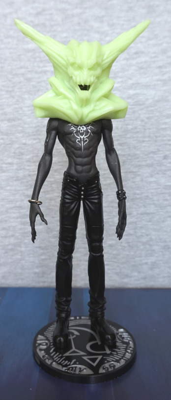
He also has a winged head:
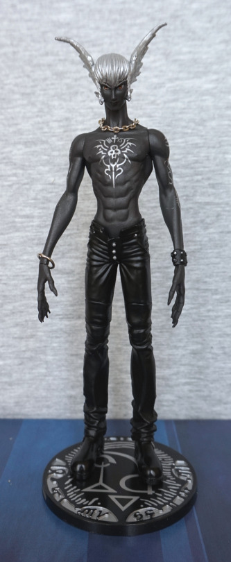
I like this head, and this is the one I think I’m going to display him with, then display the mask separately.
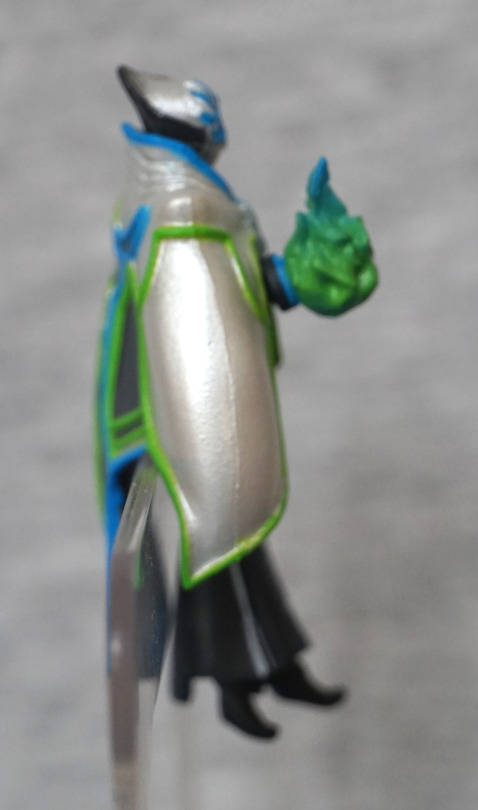
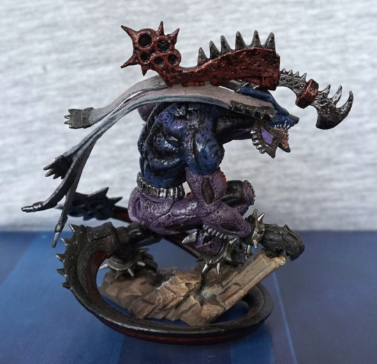
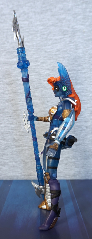
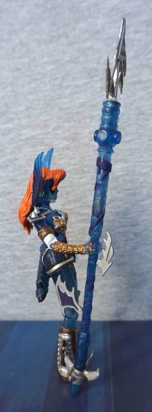
Side:
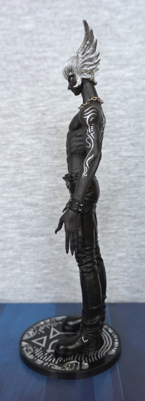
I love the wing effect, being more of a bird wing than a skin wing. Gives a difference between him and Fudo.
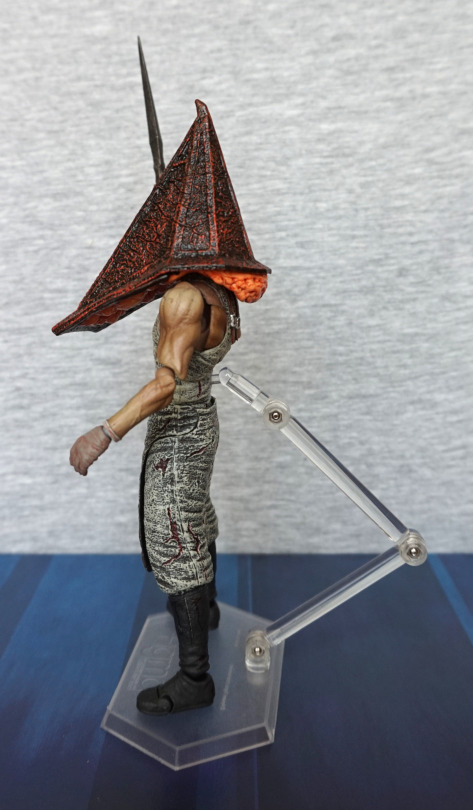
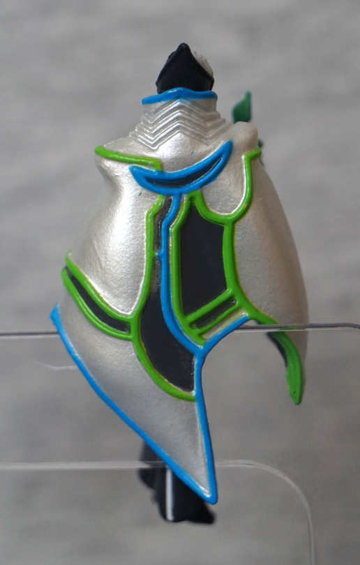
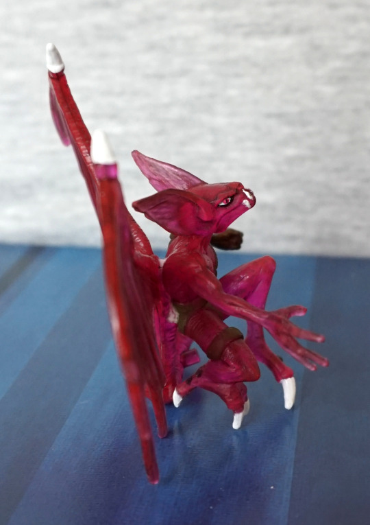
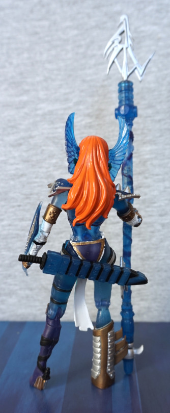
Back:
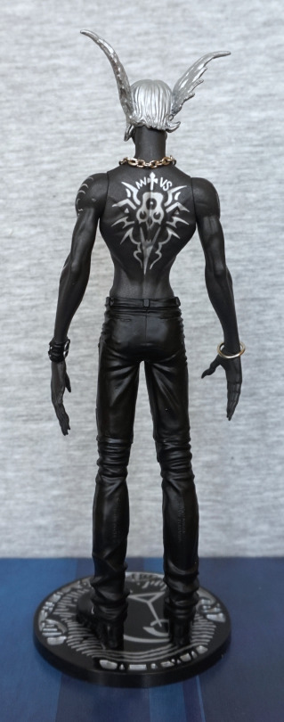
*flap flap flap*.
Overall I really like this figure and glad I got it. I think he works well with the stark colour scheme, and the subtle differences between him and Fudo in this transitional stage work well as a pair. If I see the normal version of Ryo for a good price, I may also pick that up, as I don’t have a pair to display.