Tag: moore collectables

Lady Demon – Chaos

And now for another Moore Collectables figure!
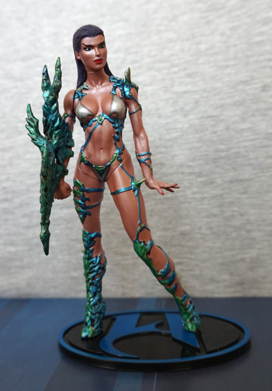
Lady Demon:

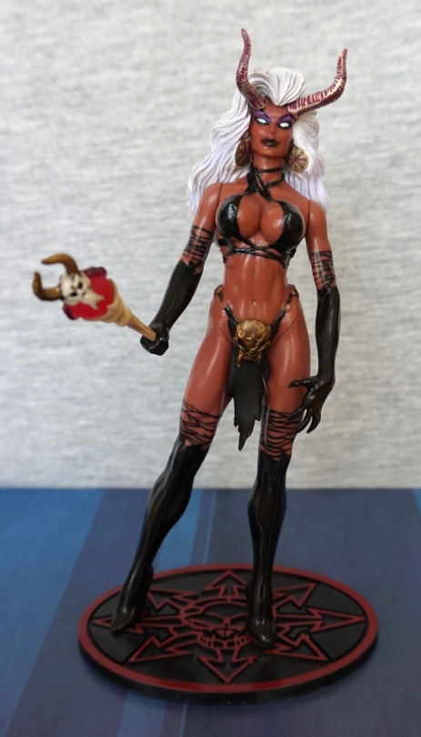
Also a sucker for demon figures :). I like her red skin and accessories – here we see her wand. The skull crotch looks good too. Her face and hair are painted well, but I think her horns could do with a bit of work. Also the rings that are part of her loincloth could’ve done with more paint, as they blend far too well into her skin, and can look unpainted from a distance. Her top is sculpted, which gives it needed depth, but the boots are painted and gloves are painted on. 
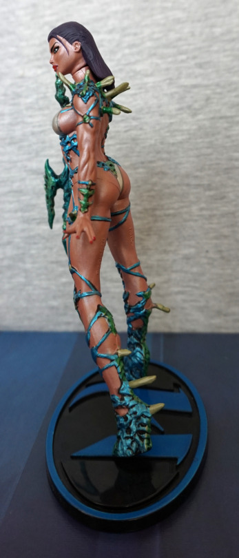
Left:

Yep, she’s deffo got some boob goin’ on. The sculpting is nice in her hair, but is quite obviously two pieces. She leans a bit on the stand – this is fairly common on Moore figures, as they only have one foot peg. I love her clawed hands. 
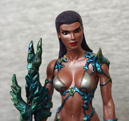
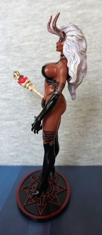
Right:

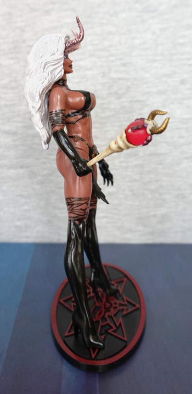
Tiny little skull detail on the side strap for her loincloth :). I wonder what demon magic keeps her boobs that perky…

Wand:

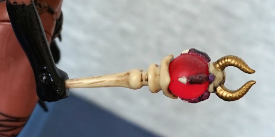
I like this wand – it is nicely detailed, with the claw & horns on the gem, and the bone effect on the handle. Imo, the bone effect came out really well.
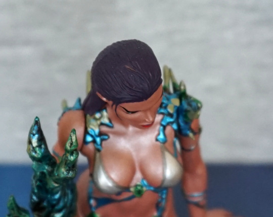
Back:

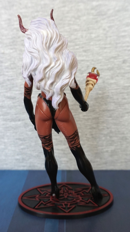
Here we see she has a very full head of hair :). Again, she has a case of copyright-butt. I do like the stands for these Chaos figures, as the Chaos logo makes for a good stand design. The indents are also useful for propping the figure/accessories. 

Sword:

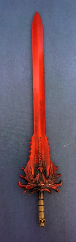
I really like the shiny red this sword is painted. The black wash at the bottom also works well, and we have a small detail of a skull on the base of the handle. I couldn’t get it into her hand so I came up with a different way of displaying it:

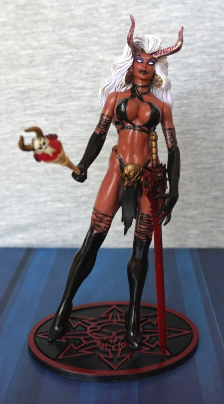
Here you can see where I use the base to help the sword stand upright. As long as it doesn’t get jostled, it’ll stay in place, helped by her hand holding it. The arm articulation actually comes in useful here, so you can pose her with the sword. 

Overall, I like this figure. The colours work well, and she has some nice small details. Again, it’s a Moore Collectables, so has that “look” to it. I’d recommend this figure, if you like this style. 

Aspen Matthews – Marine Metallic Ver – Fathom

I was attracted to this figure, thanks to its colour scheme and aquatic theming. And, er, also cheap.

So here she is:

I love the sheen her skin has, and the blue & greens work well, and definitely give the figure an aquatic feel. The blue-green weapon part comes separate, and you clip this to her arm. I like the detail in this piece. Her body is well-defined and she has a decent amount of definition in her harms. Her legs suffer from the “Moore Collectables” plainness though. 

Face:

I like her face, and it feels well-sculpted. The “fabric” part of her outfit feels very flat to her body though, with the aquatic plantlife being raised fully. 

Top of her head:

Some parts have been missed on mine, in some of the deep gaps of her hair. It ends up quite noticeable when looking at her from above, but not so much from the front. 

Left:

Not sure what the muscles are doing on her arm… she might want to get that looked at. She has painted nails, which is a nice touch. Her neck joint shows quite a bit – not sure what the point of the articulations are in these figures – it doesn’t work particularly well, but some articulation is definitely a Western thing, lol. Some of the black background paint is a bit much on her leg – it works well on the lower, denser part, but looks a bit odd higher up.  I love the use of colour on her shoulder. 

Right:

Yeah. should’a retaken this shot… but I like the shapes in the “weapon” part she has. Rest of her on this side looks good.

Back:

Lotta deformation action back here. And the copyrights somewhat spoiling it… I think they’ve given her back too much definition, and it doesn’t quite make sense. And her butt could do with a little more definition. 

Despite the figure’s flaws, I really love this figure. From the colour scheme to the theming, it falls into a few categories of “stuff I like”. If you’re OK with Moore’s style of figure, I could recommend this one. Looks far better than the default colour scheme – I’ve seen this figure being sold in a store before, and the colours make it look very messy. This is definitely the superior one for me.