Here are two snake figures from Snake Gorge, both of a Chinese moccasin (Deinagkistrodon). The Chinese common name translates to “five-step snake”, so that’s what shows up on Taobao.
First is the snake equivalent of a bust:
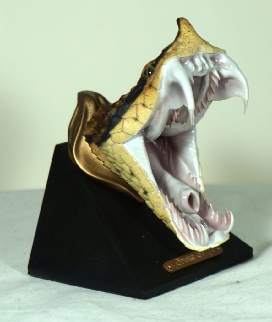
Snappy bugger that he is!
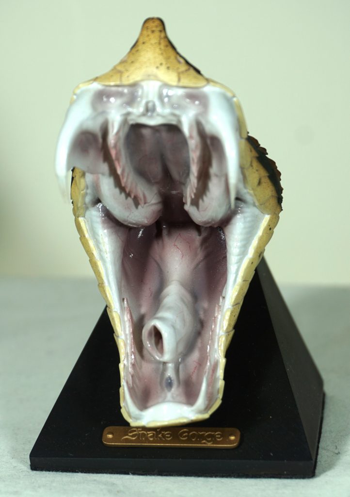
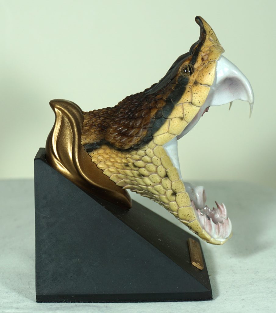
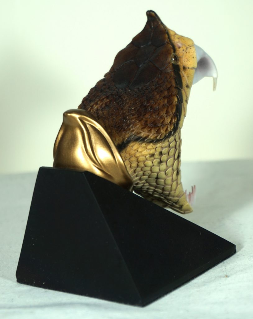
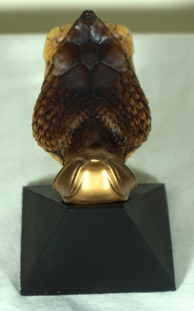
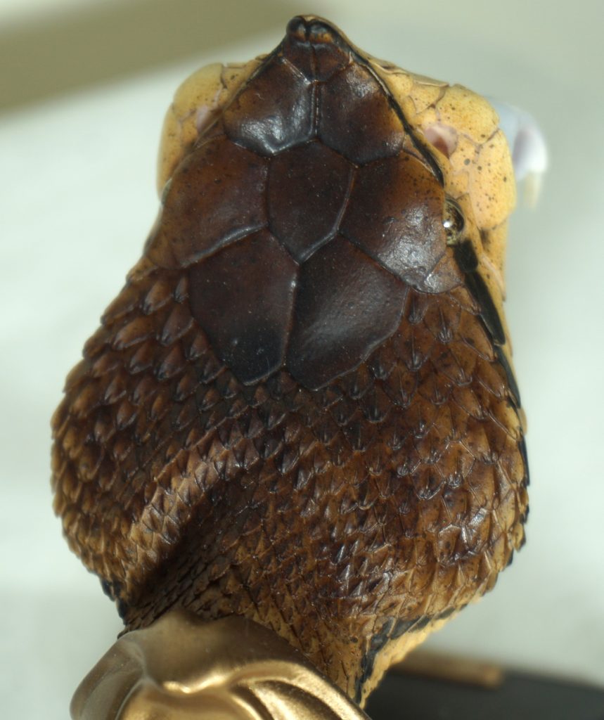
He cost CN¥398 (~£42). He’s about 10cm tall, so not particularly large but the paint more than makes up for the small size. This one is out of stock, but they do have some of the large and medium cobra heads in stock.
And now for the second dude chilling on a rock:
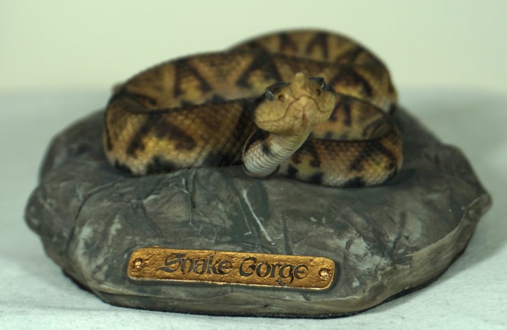
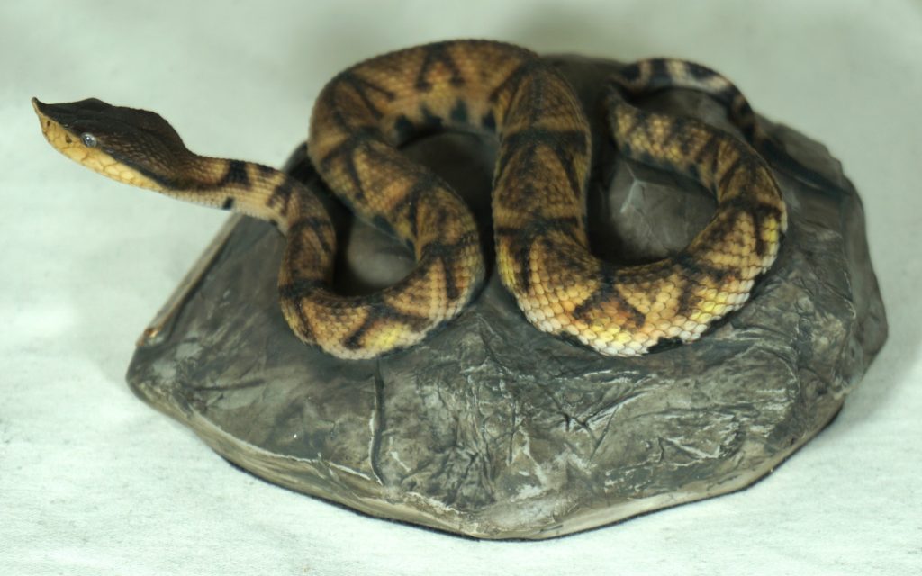
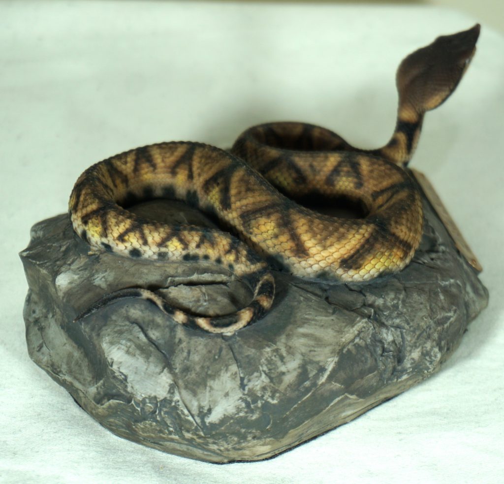
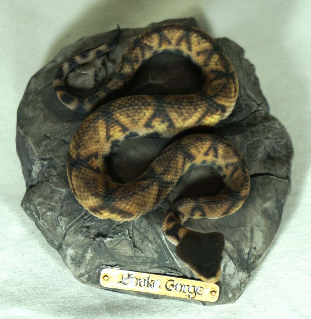
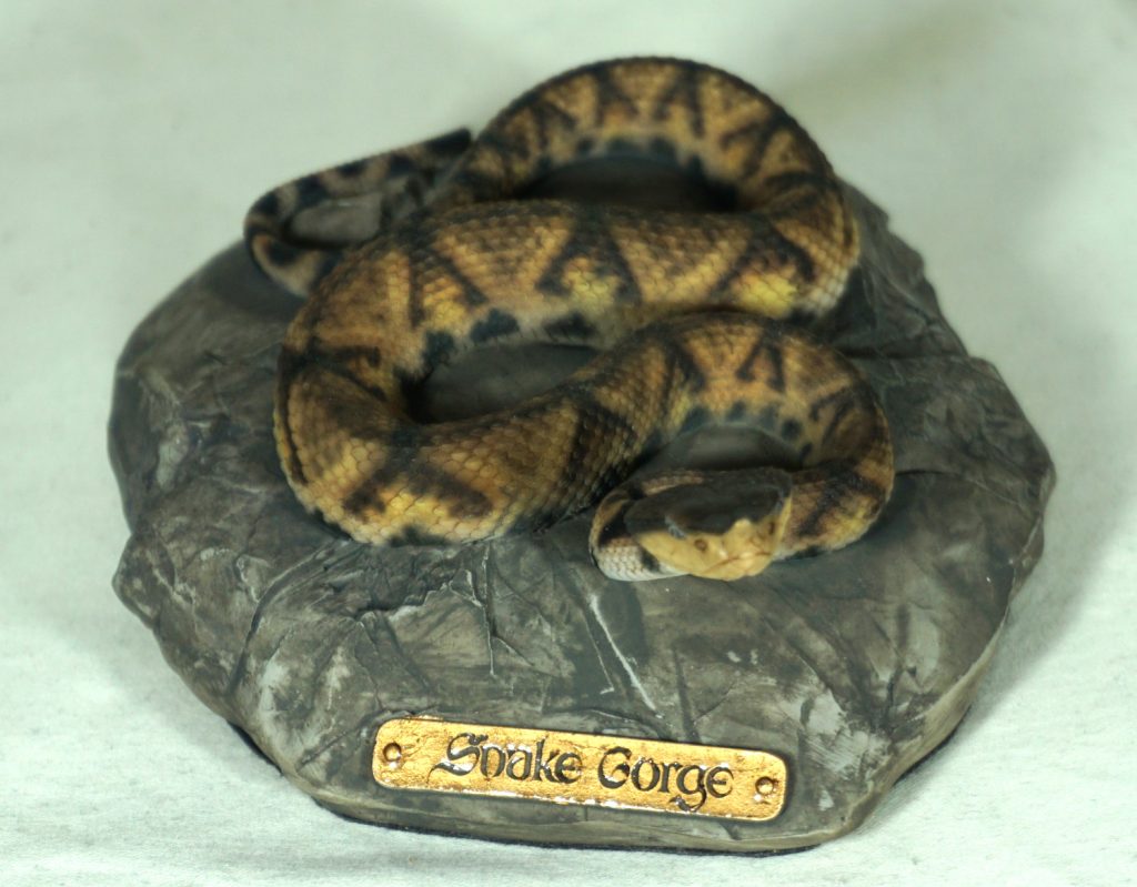
Such a cute guy chilling on a rock! He cost a bit more at CN¥780. As of time of writing, Snake Gorge have 3 left in stock in their store. He’s about 12cm in the longest dimension and 4.5cm tall. So another small fellah, so I’d say this one is for the snake lovers willing to pay a premium for a snake resin plus the paintwork. As for the paintwork, the paint on the snake itself is on point, but the rock is only so-so in my opinion. Still, a cool and unique piece to add to my collection.
As these guys were small, postage was cheap at CN¥76 (£8) for the pair. I chose to double-box and add some loose EPE as the packaging they came in wasn’t super-substantial. Thankfully the foam in their original shipping boxes protected them. The packaging wasn’t commercial – just some cut foam held together with toothpicks, so likely a very small outfit producing these. If you’re willing to pay a pretty penny for some premium-painted snakes, these may be for you. If not, feel free to enjoy my photos of them :).