Tag: eaglemoss

Voth City Ship

Bit of a random buy this one… but here is a city ship from the Star Trek universe:

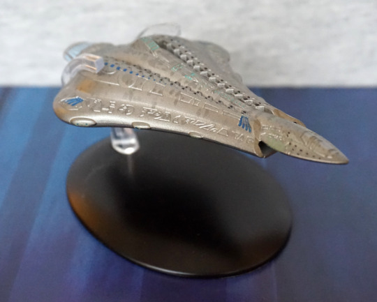
I like its slender design and rounded shape. 

Side:

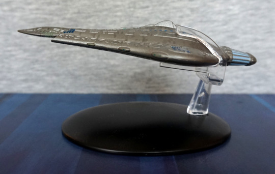
Here it is in profile… I do rather like the overall shape, and the detailing upon it

Back:

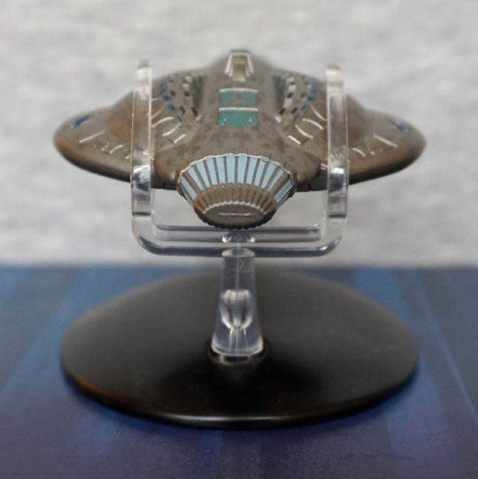
Here we have what should be the engine, but does kinda look like more windows.

Top:

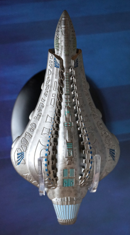
Here we can see all the details sculpted into it – there’s a reasonable amount of detail here, to give the impression of something bigger. Also some mottling, which also adds to this impression. 

Bottom:

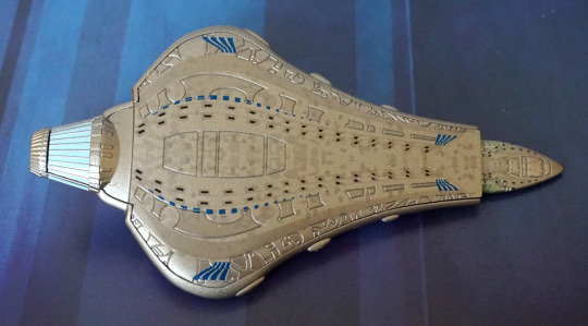
We have a similar set of details and a very flat base. This thing is… weirdly flat. Could’ve done with a bit more shape. 

One issue that isn’t pictured is that it’ll fall off its base at the slightest provocation.  If it’s on a shelf it should be fine, but touch it even ever so slightly and it is likely to take off and make a visit to the floor. Wish the stand designs had some kind of clips to actually hold the ships. Out of the ones I personally own, this one seems the worst for pinging off the stand.

Overall, I’m fond of its looks, but it isn’t overly exciting. Can’t give a strong recommendation of it, but I don’t think there’s anything particularly wrong with it either.

Starfire – DC

Another Eaglemoss figure… but this time for a DC character:

Just about recognisable as Starfire :P. This is based on her New-52 outfit and is part of the Chess Collection. Some of her body sculpting is nice, such as her chest, others are more suspect, like her upper legs and lumpy arms. 

The chosen colours for the paintwork work well, but the actual paint job is… lacking. Her face and upper clothes seem to be fine, as is most of her sues, but the other parts are roughly painted, leaving her skin looking lumpy. Top of her left boot also missed the mark. 

Left:

The upper parts of her hair look OK, but where it should blend to yellow and white there is just a sudden transition into this part, which makes look like she accidentally dipped her hair in bleach. Not a good look… 

The bands on her armguards are overly lumpy – the should be raised, but this is too raised for the bit that goes over her arm. With her boots, I think she’s supposed to be standing on her toes, but with her standing so high up like this, her feet either look misshapen or like she should have some heels descending from the back of her shoes. I think it would look better, if her feet were less straight up (i.e. if she lowered her heel more to the ground). 

Right:

Looks to be some attempt at highlights in her hair, but they don’t work too well. Her arm looks a bit lumpy this side, and apparently she’s developed some webbed fingers… Didn’t realise Starfire was turning aquatic! Her feet look less odd from this side, but still, I think she’s a bit too much on her tippy toes. 

Back:

Back paint definitely has some slops in it. Hair highlights seem to work a bit better from the back to me… Here we get to see the absolute lack of blending they’ve done between the yellow and orange paint. Not sure why they didn’t even try, seeing as the yellow and white are blended. 

Overall, this isn’t a great figure. Would only recommend to someone collecting the set or people who just want Starfire stuff (like me). Stafire has had a rough time with collectables imo, so decided to pick this up as it was Starfire and cheap enough despite its flaws. Thankfully, since buying this, Kotobukiya is re-releasing her Bishoujo figure so I’ve got that to look forward to! Yay! 

Black Panther – Marvel

Today’s blog features Black Panther, made by Eaglemoss.

Front:

This is his comic book appearance, rather than his film appearance – Eaglemoss has done figures of both, but this is the older one. 

Here he is, looking very stealthy in his cape. There isn’t much in terms of colour, but the gold accents and eyes have been painted nicely. The sculpt is good too, and I do like his pose. 

On mine, the left arm has been misassembled – I may break this at some point and reglue (probably not particularly needed to repin). Not sure how I didn’t notice this when I was photographing it…

Left:

I like the way he he bent over slightly. Here we can see the gold accents do go around his back, under his cape. Nice to see this attention to detail.

Right:

Here we can get a bit of a better look at his eye – they’ve used 2 paint colours here, which does elevate their appearance. His bag o’ tricks is a nice touch. 

Again, please ignore the “elbow”. At first, I think it looked like a design element, but on closer inspection, it’s a mistake. The joint here wasn’t pushed all the way in, so left with this mess… ah, QC. Or not. 

Back:

I like the cape design, with the large flowing wrinkles. Tiny paint scratch on the back, but this could’ve been a previous owner. 

Overall, a decent figure, or will be once I repair him I guess. If you get one that’s properly assembled at a reasonable price, I’d recommend him. 

Juggernaut – Marvel

Another big heavyweight of a character, Juggernaut:

Here we have him doing his typical thing of charging into something. Or at least I assume that’s what he’s doing. The paint job feels much simpler than that of Colossus (featured in yesterday’s blog). Here they’ve at least used two different shades of red for his outfit, so he doesn’t blend all into one, which can be an issue with some Eaglemoss figures. The paint on his arms, however, feels rather sloppy, thanks to the overspill on his bands and the half-arsed dark wash. I also feel the holes on his mask feel a bit roughly-hewn rather than neatly cut, as per his mask in his comic design. 

Left:

I think his bands are so tight he’s bleeding? He has muscles sculpted on his leg, but honestly it looks more like a piece of cooked meat rather than a leg to me. Almost like they went “fuck it, call it a day” when doing the sculpt. The boot sculpt is nice though. 

Right:

Again, due to the way his bands are painted, looks like they’re potentially cutting into his arm. Arm muscles also suffer a bit from being oddly shaped and feeling half-sculpted. 

Back:

There was an attempt. The middle band of his outfit feels an absolute mess back here. Again, you can see the poor sculpt of the muscles on his left leg. However… they’ve weirdly nailed the sculpt of the bottom of his boot, and that actually looks decent. His right boot is pretty good too – though the sole is a tad uneven. 

Overall, this figure… isn’t great. Feels like it was half-arsed in sculpt and paint. There are some positives, but overall he’s rather “meh”. Why did I buy this again? Oh yeah, bought him with another two Eaglemoss figures and didn’t look at him too closely… Wouldn’t recommend unless you really want a small Juggernaut figure. Or you’re an idiot like me and pick random stuff up for cheap. 

Colossus – Marvel

Today we’ll be looking at Colossus by Eaglemoss:

image

Here he is, in his comic book colours. There is some attempts at shading – some more successful as each other. He has some lighter red paint highlighting his muscles, but this looks a bit odd towards the top of his suit. There is some dark-coloured wash too, which works better. The lines on his body are good for the most part, but he does that strange seam on his right leg. 

Looking at him front-on:

Here’s a better look at his front, where you can see the unusual bright red paint in full effect. The sculpt on his pants(? underpants?) is good, and gives a fabric feel. 

I think his face sculpt is done well, and his boots are nicely painted. 

Left:

I like his pose, and the sculpt has a good amount of detail. They’ve certainly gone to town on his muscles. The gold accents add some nice focal points to the figure. 

Right:

Here we can see the creasing on his pants was sculpted all around. And that seam on his leg, which is slightly offputting, as it does disrupt the grooves on his leg. Bit of a difficult one to deal with though tbh. 

Back:

Here we have more of the red highlighting, that I don’t think works too well. The sparing bits on his left work better than the larger blobs on the right – I think the lighter red needed to either be used more sparingly or actually blended. There is some dark wash going on, which does help accentuate the figure though. And them pants be tight… The paint, on average, has been neatly done, which is an achievement for an Eaglemoss figure. 

Overall, I think this is a decent figure, and would recommend if you like it. Personally, I’m happy with him. 

Alien – Predator Thermal Vision ver

One last xeno before we break from the the xenos…

image

This very green grid alien. Yes, he does glow in the dark, but no… I didn’t take any photos of the glowing. So for this one, we’re mostly judging it by the sculpt – and I think it looks good. 

As far as the thermal vision goes, the green does match, and I like the way the base is a solid black, to match the lack of thermal signature ti would have. Also makes for a good, strong contrast to the figure. 

Left:

I like the way the tail is posed, going around the alien. Here we also have some super-long back pipes goin’ on too. Head is nicely detailed in the sculpt, and we have the grid pattern of the “grid alien”. 

Right:

Here we see the Alien doing some stalking, unbeknownst it is being watched. Sculpt on this side is also fully-detailed, with sculpting on its limbs, and I like the shape of its body. 

Back:

The body transitions nicely into the tail, and the pose works from the back too. 

Upper shot:

Some of the tail spines probably lack a little definition, but not too bothered about that. Here we can see where the pipes are joined to the body, but I don’t find it overly noticeable. 

Overall, I really like this figure, and was glad to get it for a decent price. Originally he was a bit more than the other figures in the “basic” set, but got him for the same price. He glows decently well, and seems to have some variation in his glow, so looks good at night too. 

Panther Alien – Aliens Retro Collection

And, finally, the panther alien:

I’mma gonna headbutt you… The body colours look really nice together, the orange head would look better if the paint app was thicker… seems a bit thin and uneven in places… 

Left:

I like the pose, has a feeling that he’s slinking. The colours also work really well, and I think they’ve chosen the right places to paint gold/silver, though some place are a bit sloppy. I think the tail adds to the impression he’s slinking. 

Right:

More of the same on the other side. I love the shape of his feet. 

Back:

Not too much to see here. Looks like the moulding got sloppy at the back of his legs though, unfortunately. Tail looks fine.

Closer look at the tail:

I like the shape of the end of his tail, and feel it is well sculpted overall.

Top:

They’ve added some orange down his back, not sure this worked too well. At his upper back, I think they should’ve stuck with just the dot-spine bits. The blend ion his spine could’ve worked, but I feel the paint app is too uneven for it to work, and was probably too ambitious with Eaglemoss’s usual final quality – their painters don’t seem to blend too well, so I think this would’ve been fine as just gold, or maybe a darker shade of orange. 

Overall, he’s pretty decent. He’s certainly an eye-catching piece, but does have some flaws in the paintwork. 

Scorpion Alien – Aliens Retro Collection

Today’s xeno is an alien crossed with a scorpion:

This one shares a similar colour scheme to the Revoltech Big Chap I got some time ago. I do like the contrast of the copper against the black. With him having a slight profile, not too much of the detail is visible front-on.

Left:

Here we can see much more of his pose, and I think he’s posed well. What I’m less fond of is how the gold highlights have been used – I think it would’ve looked better if the highlighting on the head was more like the silver on the Mantis. Again, the arms are half-copper, half black in a way that isn’t hugely appealing. 

Right:

I like the way the tail curls, but again, the odd colouration. Only place the half-colouring is working for me is the “pipes”, which are more like spikes on this one, to fit in more with the scorpion theme. 

Head close-up:

Sculpting is nice here, The copper almost fades away here, making it look less sudden than the other side. He’s also got his teeth painted in silver. Spine painting is mediocre close up. 

Back:

Back looks better as it has better copper coverage. For the tail, I’d like it more if the gold was over the top side and not on the bottom – I think that contrast works well. 

Back close-up:

I like the distribution of the copper paint on his back, though the sculpt feels “muddy” and confused. I feel the details got a bit lost here. Back spines are still cool though :P.

Overall, I think the sculpt is strong enough, and the colours work. Just would prefer the colours to be better distributed so it doesn’t look so odd. 

Snake Alien – Retro Aliens Collection

This one came with the mantis alien, and was the other figure to break in transit:

image

Yeah, it has a really thin body, so getting this one through the postal service is a risky business. It also has a LOT of spines, so these may also snap off. Even on my replacement, I had one of the tiny bits snap off near the base of its tail, but fortunately it isn’t really visible unless you know it is supposed to be there. 

So let’s get onto the less broken one:

image

HISS! He’s posed well, and the design is pretty decent. What’s there is sculpted and painted well. 

Left:

image

He arches up nicely, and I like the spines on his head. The colour contrast between the green and the brown is nice. If you see the triangular bits sticking out of its lower back, one of those is missing, but can’t remember exactly where. 

Right:

image

From the back, I’m not sure if the spines are painted as the sculptor intended, suspect they were going for a blend, but is a bit messy here. Head is nicely done though.

Back:

image

I like the detailing on the back of webbing. Not too much to say about the back. 

Base:

image

I like the way he’s curled up, to support his body. The base looks decent too. 

Overall, I like the look of this figure. However, I would’ve liked to see more meat on the body of it – not just for stability reasons. Whilst snakes don’t have too much to them, this snake seems to not exist in the middle, and is only bone and webbing in the middle. I think it would’ve helped the stability and design if this figure was given a snake’s body all  the way down. 

Mantis Alien – Aliens Retro Collection

Next up, the mantis alien:

This was the one I was most excited about… so let’s see how he fares. From the front he looks good – we have a couple of shades of green going on, and some silver. I’m glad they’ve used a couple of shades of green to paint him, as it does add a lot to the figure. I like the pose of the figure too. 

Left:

I like the pose of the arms and the body. The circular parts are nicely highlighted in the lighter green, and the sculpt o the head is lovely. What I like less is the webbing on his arm. The paint looks very sloppy on it, and it looks more like metal sheeting than skin. 

Close-up of the side of his head:

Couple of sloppy paint bits – the green on his shoulder and a little on the ribbing on the lower part of his head, but I do love this head design. The silver highlights on it work well too. 

Right:

And the webbing on this side… ergh. Awful. Looks like he’s got some metal in the crook of his arm. It’s like the sculptor didn’t even try to get the webbed effect the original had. If they did something similar to the shoulder sculpt, that may’ve worked. Anything but this… weird attempt. Nothing would’ve been better, but could’ve made the figure dangerously fragile. I’ll just stare at his lower arm instead… yes, that looks better. 

Back:

Weirdly, he has no tail. With the webbing and the lack of tail, I do wonder if the sculptor was trying to do this from memory instead of with source material… The back is OK, but not a strong point of the figure. 

Top of the head:

Pattern looks good on the top of his head :). 

Overall, he looks decent enough from the front, but the “webbing” on his arms really brings this figure down. I still like him, but there’s definitely some weird design decisions going on here, which I don’t fully understand. Yes, the arms probably needed more support material, but why no extra raised bits to look like webbing? Is this actually some kind of statue of the mantis alien, instead of a specimen? Yeah. Gonna go with that. 

Gorilla Alien – Aliens Retro Collection

With the bull alien came the gorilla alien:

This is one burly dude of an alien! I do love the “growling” pose, and we also get to see his inner mouth due to it. The blue dry brushing effect does help to accentuate parts of the figure, and I think this mostly works. 

Left:

That’s some big claws he has there on his legs! Love the colour scheme. What I love less is some of the line painting at the top of his head is a bit messy. The sculpting is nice, with plenty of details to look at. 

Right:

Here the lines are neater, but one pesky bit at the front of his head there. We have a lot fo the same details as the left side, and I do like how he’s posed. He also seems he’s got his hands curled, ready to pound the floor. 

Back:

Big butt! I think his body looks a bit awkward from this angle, and maybe needed a little more shape to it to make it less square. However, it is detailed nicely, and I do like the design of his tail, which has an interestingly sculpted end part that I like. 

Top:

He has a nice, shiny head, a little bit marred by stray paint. I like the way they’ve gone for a different finish here, and the effect it gives it. 

Overall, I’m a fan of this one. The colours are nice, and the posing is good. Feel they’ve done a good job of capturing the gorilla alien’s appearance.

Bull Alien – Aliens Retro Collection

This is the first of six blogs for the three Aliens Retro twin-packs. Bought all three packs when they were on sale on the Eaglemoss shop. Partly glad I got them there, as I was able to get replacements, as two arrived broken. However, they could’ve done a better packing job… 

These alien designs are based on the never-aired Alien cartoon designs. 

Anyways, enough ramble, let’s have a look at the Bull alien:

image

Starting off with a side pic, as front-on doesn’t have as much to see. The head design is really nice, but I’m not too fond of the body – the stripes feel too flat, making the body feel too flat in general. The front arm and feet look good, but his back leg feels a little awkwardly shaped. Not a fan of the tail – feel as if this should be beefed up, and look more like the original Kenner version. Another advantage of doing this would be to make it less fragile – my first one the tail was snapped off in the box, and getting him out, I can see why. I don’t think they had to go this thin to achieve a bull tail effect. 

Head:

image

The purple stripe is nicely painted, and faithful to the original design. The horns look good too, and I think they did a really good job here.

‘Face’:

image

Nice set of grinning, silver teeth here. Got a seam line going on, which isn’t too much of a big deal, as you don’t usually see this angle – here I’m holding the figure to get this shot. The bottom of his body doesn’t look particularly well-sculpted from here, however, again, it’s not particularly visible on display. The ‘arm’ poses do work well at this angle though, and does make him look menacing. 

Left:

image

Man… if only they gave the exoskeleton parts a bit more shape… The limbs look a lot nicer on this side imo, and the back leg doesn’t look oddly stretched. 

Back:

image

I feel his back pipes are a bit short and stumpy. I think it’d be more aesthetically pleasing if they were bigger/more dominating on his back. I like the way the exoskeleton ribs end with spine parts, but still feel they could do with more shape in general. 

Back:

image

His back looks OK, nothing special. I know bull tails are thin, but I feel as if they could add more weight to the tail, possibly remove the spine parts (maybe do ridges like the body?) to make the figure more robust. If you’re moving this figure around, be careful not to clip the tail on anything, as it will easily snap. 

Top:

image

The plates at the top of his limb joints work well, and the body shape is nice and bulky. 

Overall, I think he’s a decent figure, but does have a fragility problem in the tail. Thankfully Eaglemoss is happy to provide replacements if they have them, though resin is fairly easy to fix with superglue if you break it yourself or can’t get a replacement. If I were to change anything, it’d either be the tail or to add a more rounded shape to the flat surface of the back parts. though I feel these complaints are relatively minor. 

Chestburster Victim & Facehugger Keyring – Aliens

Now for a bit of an interesting figure… one that’s part of the scenery…

image

This wasn’t a figure I was planning on getting, but saw it for a reasonable price, and decided to go for it. Thinking of posing this with one the xenomorphs in the same Eaglemoss series. 

The sculpt is surprisingly detailed, and the paint is mostly good, which is a surprise for an Eaglemoss figure. There are some parts where the clothing paint does go onto the fines, but most strands are OK. The clothes are well done, and are shaded well, and the blood isn’t half-bad. My biggest complaint with the figure is the skin colour feels a little too ashen, and could’ve possibly done with a splash of skin-coloured paint. 

Chestburster close-up:

image

A chestburster’s head… in full, gruesome detail. I think this has been done well, and we have the t-shirt pushing back from the wound. I feel there’s some inaccuracy in how this would look irl, but I think the artistic liberty does help the chestburster stand out. I feel a little more detail in texture could’ve gone into the hair, but I don’t think this is a big thing, and the paint is nice on the hair, with the strands on the victim’s forehead. 

Sides:

image
image

The sides of the figure look nice, with the alien wall texture continuing around the figure. 

Back:

image

Was quite impressed with this – they’ve actually textured the back, so if you have this at an angle where the back shows, it will still look “the part”. The paint here is also nicely and subtly shaded. 

Due to the subject, I don’t think this figure will be especially popular, but it is nicely done, and would look nice in a diorama. 

As a small added bonus, here’s a keyring by Tsudaka Hobby that I picked up in a Suruga-ya order:

image
image

It did come with the key loop, but I removed this to more easily place it in an ita bag (featuring all my favourite things). The legs and tail are very flexible, so they’ll bend if caught on anything. The black wash is OK, but I wish they left a little more on to soften the effect. The bottom of the facehugger is also sculpted decently well. I like this keyring, and glad I got it. 

Joker – DC Comics – Eaglemoss Batman Universe

This is the last of the busts I currently have to review, and it’s The Joker:

image

From the front, this one has a lot more to look at than the other ones, which I think really helps with the overall look and feel. Not a big fan of the paint on his bowtie – the darker lines aren’t blended at all, which makes it looks sloppy close-up. However, the bold colours overall work well together, and this figure does work at a bit of a distance. 

Face:

image

I appreciate them including some pink paint to represent his tongue, and this surprisingly works. His lips are OK, and they can get away with some rough paint here, what with the Joker being a bit slapdash himself. The eyebrows feel a bit severe though, as there is no detailing to them. The hair is really nice in of itself – there is shading present here, which really helps it look like hair. Some bits are missed though, as you can see on the left-hand side of his face. The right is pretty much the same on mine, but with a bit of paint on his ear. 

The gun:

image

The lettering came out well here, but mine has some marks on this side. Also you can see how the gun started off bent – this part is a softer rubbery material, which does mean it won’t break in the box, but you may have to straighten it out. What is more annoying than the black splotches is the super-lazy painting on his hand… really? This passed QA? As it’s black, maybe I’ll actually repaint this… 

Here is how bent the gun was when I got him out of the box:

image

I heated it up with a hairdryer, held it in position, then doused it for awhile in cold water:

image

Ah! Much better! I’m not too bothered about this, as it’s not the first bendy figure I’ve had and it’s pretty easy to fix, but I feel that they may have been able to go stiffer with this or use a metal wire/rod inside of it to hold it straight. Especially if someone’s new to collecting, this is going to be a really disappointing feature, and I don’t think there’s any need to have it this soft. 

Left:

image

I like this pose – there is a dynamic quality to it, and his face looks good in profile. The main messy edge here is the edge of his glove. The paint line between him and the base seems neater on this side than some of the others I have. 

Right:

image

This side of the BANG! banner is a neater than the other side, and looks good. The paint is a lot neater on this side too, with a lot less to complain about. There is a seam that goes down his side, but I don’t think this really disrupts the figure.

Back:

image

Looks like some dints got into the mould – not sure what happened here. The paint itself is smooth though, and the back of his hair is painted well. We don’t have much in the way of fabric movement back here, but it looks passable. We have one detail in the form of a suit seam running down the back, but I’m not sure it really adds anything. Collar moulding I think could’ve gone a bit better. Sleeves look nice though. 

Overall, I think this is a decent entry, and probably works better than the others as a concept – there is more going on here, which means he doesn’t look overly plain, as they decided not to fully shade these. However, there are some pretty sloppy painting mistakes and lack of paint blending that you’d get in a more premium product. I think if you set him off at a bit of a distance, it’s quite a striking piece, so would recommend if you’d like to see him sat on your shelf. Just be prepared to straighten out the gun!

Harley Quinn – DC Comics – Eaglemoss Batman Universe

So after buying the other two busts, I decided to take advantage of Eaglemoss’s introductory offer for the first three busts in the series. I will only be reviewing two, as I plan to sell the Batman bust. 

First up, we have Harley Quinn:

image

I like the colours and design on this one – it feels less plain than the other two I reviewed, but there is still a fair amount of block colour going on. I love that they’ve included the hammer, as it definitely adds something to the bust. 

Face close-up:

The eye shadow colours fee a bit overdone and severe close up, though the pain seems to be neatly done on the face. Here we can also see the apint isn’t overly neat in certain places – especially her right breast, where there is red showing from underneath the black. 

Left:

Here we get to see mostly hammer. Not sure what the back blobby bits are about, under the lower thin ring. I appreciate the weathering effect though. What I appreciate less is the escaping black paint on the side of her jacket. 

Right:

Here we can see they can do some blending with the paint – her hair doesn’t look too bad. Though the orange doesn’t match the pink that the hair and eyeshadow should be, if you’re choosy about this kind of thing. Her hairband here is also hair-coloured. Again, there’s some marks and missing bits in the paint – red dots on her sleeve, her belt is a bit skin-coloured, and a couple of dots on her hip. 

Not sure if the munch in her hair was a divot that was supposed to line up with the mallet at some point or an air bubble in the mould. Whichever, it is a bit odd. 

Back:

The design on her back in of itself is printed nicely, but not quite straight. I think this would’ve come out better if the design was a bit smaller – it feels like it takes up just a bit too much of the jacket. Again, the painting is a bit hit-and-miss, but I do like the sculpted wrinkles in the jacket. 

Overall, an OK bust, but with Eaglemoss’ varied paint job qualities, you may not want to risk ordering this one from Eaglemoss directly, as I think the paint errors do show up fairly well unless you have her at a distance. 

Poison Ivy – DC Comics – Eaglemoss Batman Universe

This is the second bust I bought in Forbidden Planet, featuring Poison Ivy:

Initially, the design kind of appealed, but… this didn’t grown on me (pun partially intended). The paint is neat on her face, but her hair painting definitely seems to leave something to be desired, and the paint jobs varied on her leafy clothing. This one was OK, but still a bit messy in places. 

Overall, from the front of this figure, she suffers from plainness – her top is nice, but the large amount of flat-coloured skin just makes it feel like there should be.. more. Her hair could have done with some shadows and highlights, and some of the edges tidying so it doesn’t look like her hair is fusing into her skin in places. 

Left:

Here we can see where a bit of the green paint blobbed onto her hair, and some unfinished edges around the hair. Here, you can see a particularly sloppy job of the top painting – all of the edges here feature inaccurate paint. 

Right:

The edges of her top are better painted on this side – passable for a cheaper bust figure. However, there are little dots in her hair that don’t look very good. 

Back:

Definitely not a fan of this angle. There’s some attempts at shading, but the overall look is Cousin Itt waterfall of hair. The overall shape isn’t very pleasing to me, and the moulding is… enthusiastic, but just doesn’t feel like it fits to me. 

Overall, I not too happy with this bust, and question my wisdom in buying it. I bought it was it was Poison Ivy… and kind of because I was buying the other one already. I did try to go for a better painted one – some of the paint jobs were really questionable. Overall, I wouldn’t recommend this one. Save your money and go and buy a Kotobukiya figure or something. 

Catwoman – DC Comics – Eaglemoss Batman Universe

I saw this in Forbidden Planet, and decided to pick it up with another bust, which will be tomorrow’s blog. 

So here she is:

I like the shininess of her outfit, and the face is painted neatly. I also like the interesting pose, with her getting ready for shenanigans,. 

Left:

Her fingers are posed a bit oddly – I don’t think that finger spacing is particularly natural. Her chest looks a good size though, and the buckle for her hood loks good. The finish on her hip doesn’t seem to be too well applied though, which doesn’t help distinguish it form her belt. 

Right:

Buckle also looks good from this side, but again, the shininess of her outfit seems to decrease on the way down. Looks like some black paint went a bit stray on the strap of her goggles. Also we have the strange finger posing on this side. Not entirely sure what’s up with that, but does look OK if you don’t focus on it. 

Back:

Some suit seamlines sculpted in the back here, which look good. I like the way they shiny paint goes around her belt, to help the strands of it stand out. Paint looks a little janky around her google strap, but not too bad. 

Overall, I think a decent amount of detail has been put into this bust. I think for the price point, this is a decent bust, and glad I bought it. I got it a bit cheaper than the RRP, which I think was a fair price for it. 

Red Skull – Marvel

And finally, Red Skull:

Yep, he’s definitely got a red skull alright! The paint on his head is really good, and features all the details you’d expect a skull to have. However, not much are seems to have been taken when painting his sash, so that’s a bit blobby and weird. I like his screaming pose, but I don’t think they got his hand positions quite right – he looks more derped than angry because of it imo. 

Left:

Again, the head looks really nice. They’ve attempted painting a buckle on his belt, but the paint hasn’t gone on thick enough, and it looks like a smear. The pistol he’s holding does give off a German vibe, which matches what it is supposed to be. 

Right:

Sculpt looks nice, buttons could’ve done with a bit better paint job. I like the belt though. 

Back:

Paint doesn’t seem to have gone on quite right, and there’s a bit of brushmarks at the bottom. Sculptwork is passable, but his guns seem a little bent. Not sure what happened there. 

Overall, I think this is an OK figure. Again, some small paint tweaks could’ve elevated this figure into a better one, but my main complaint is with the guns – I think a little better posing could’ve gone a long way. 

Mephisto – Marvel

For the other two figures that I got with Lex, I picked characters that I think look cool, but probably should learn more about.

First pick was Mephisto:

An interesting pose, but one that’s not likely to all be in focus in one photo. The sculpt on this dude is nice, but not sure if he’s had a hard life prior to me buying him, or the paint wasn’t so good on his loincloth to begin with. Due to his red nature, the paint job is on the simpler side.

Left:

Here we can see he’s stretching out, though it is unclear where glove begins and arm starts – would be nice to get some more paint definition here for his glove, as it does look like it has mutated into being part of his arm. Or he’s wearing some kind of skin-coloured suit… 

Right:

Again, the sculpt failed to capture where glove starts and body ends. I like the fact they’ve sculpted his hand as doing something though. The side of body sculpt looks good, though, again, his boots could’ve done with a different shade of paint to differentiate them from his body. Hair looks nice though.

Back:

Cape does the job, and there’s some paint shading back here, which looks nice. Collar part of the cape looks a bit overly starched, compared with the rest of it though. 

Overall, he’s an OK figure. Could be much more if they painted his clothes properly. Wouldn’t recommend paying a premium price for this one. 

Lex Luthor – Chess Piece – DC

This figure I bought at an antiques store, that also has a few sellers that sell more modern collectables.There was a 3 figures for one price deal, and this one was my first choice:

image

And here we have Lex Luthor brandishing some kryptonite. I love the way he is posed, making the most of the stand. The paint is also really good for the most part – not too much paint creeping out of the lines. I love the skull on hte base, and there’s also a “king” symbol to show which piece this is – a fitting role for Lex Luthor.

Side:

image

Here we see he’s on his presidential campaign, to get as close to “king” as he can. I love the sculpt on the clothes, and the colour of his suit, but some of the sculpt lines are a bit strange- his heel on his right shoe seems to have an extra bit, and an odd like on his neck. Also not too sure about the ring – I don’t think it came out too well. 

Back:

image

I like the way the seamlines on this figure follow the seams that a suit would have. The finish on his suit gives it a premium suit feel to me, and the creases in his clothes are sculpted well. Though it does look like that kryptonite is melting his hand… not sure if he should be handling it like that… 

Back of the chess piece:

image

Here there’s also a marking to show it’s a king piece. I love the riveted metal effect on the base, and it really works to finish off the figure. 

Overall, I’m really glad to have him, even though I don’t intend to collect the rest of the set. For a small figure, it’s painted well and Lex doesn’t have too many good figures to choose from imo. Glad to have this in my collection, without having to buy the rest.