Tag: eaglemoss

She-Hulk – Marvel

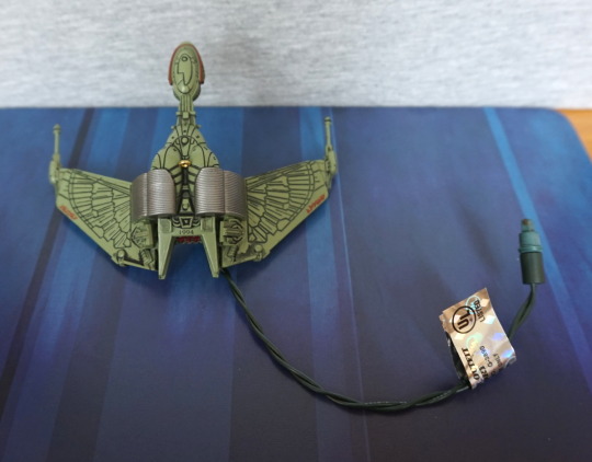
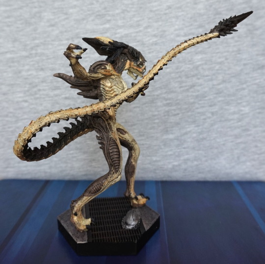
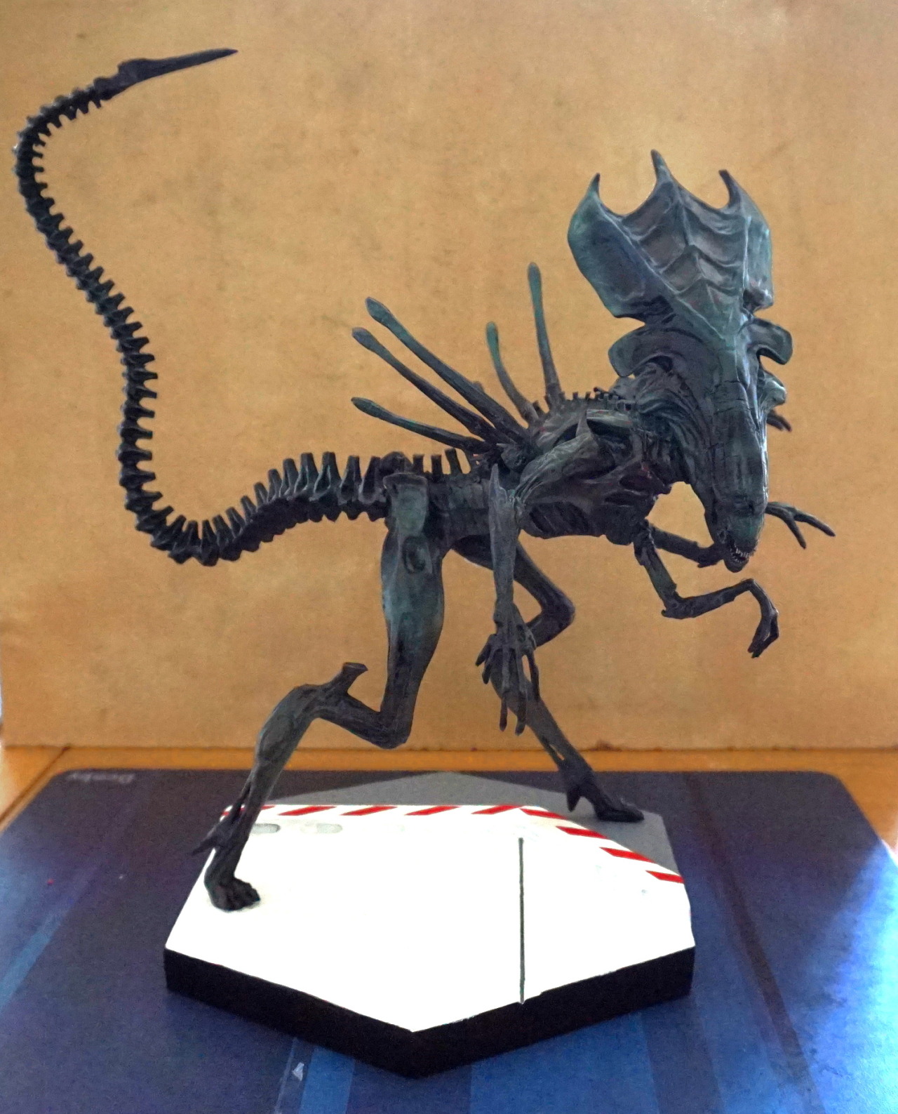
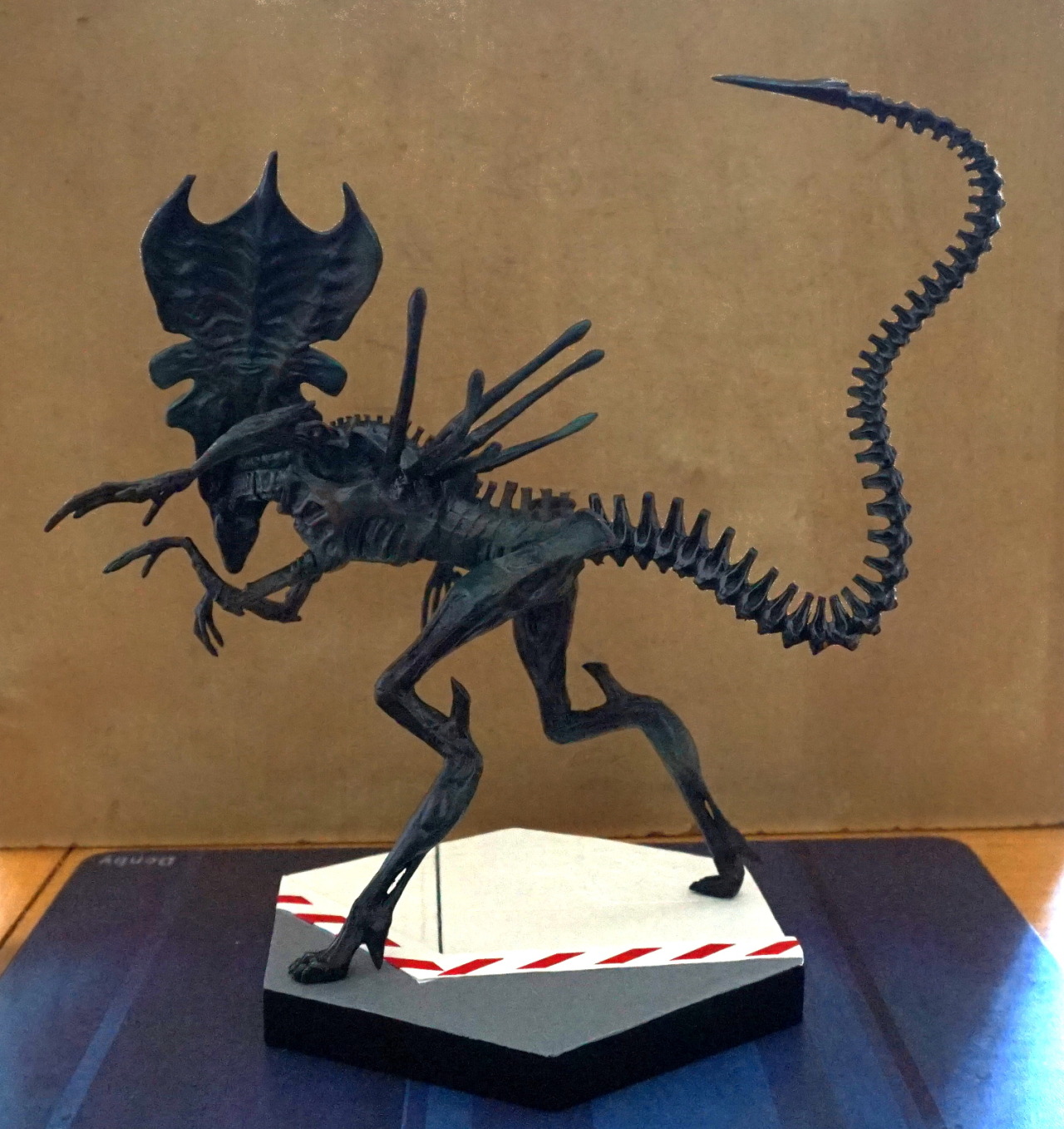
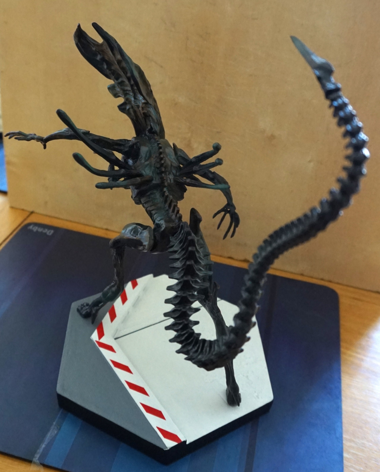
I bought this at the same time as the Crash Bandicoot, And I managed to squeeze both into my luggage. And some DVDs. And some Minecraft papercraft…. This one is a fair bit smaller than Crash though. 
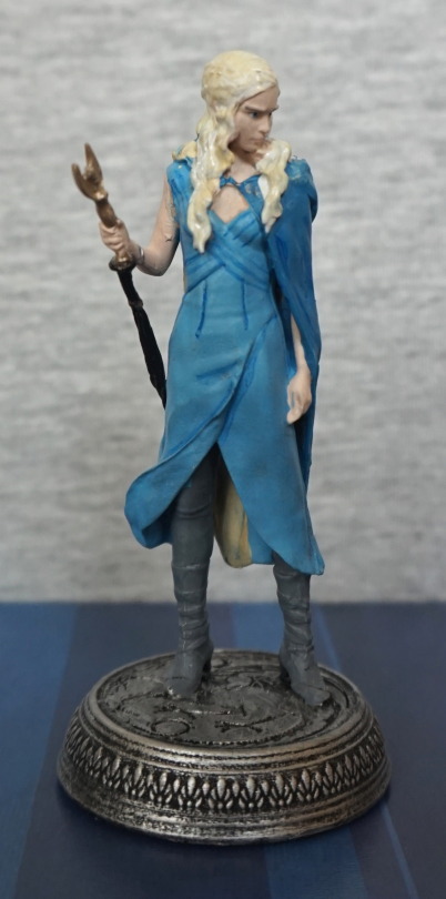
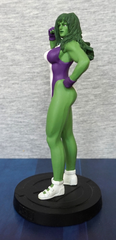
Front:

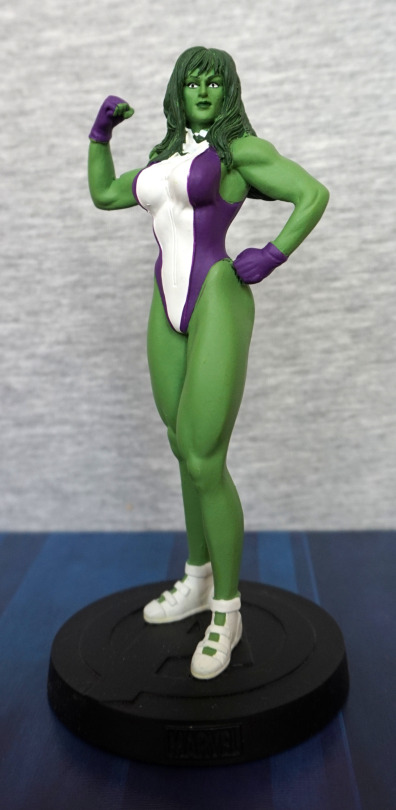
The sculpt is nice, but the paint feels a bit flat, and slightly squiffy in places. The face and hair are painted nicely, along with the shoes at this angle, but the purple paint is a bit missing in spots around the edges of her leotard, and a bit of lumpiness in the white paint. With this lighting, she doesn’t look too flat, but the green paint is all one colour, so it can feel a lot flatter in certain lighting conditions.
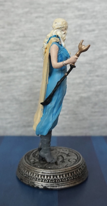
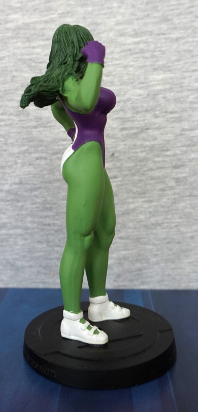
Left:

Here you can see some of the missed purple paint. Also some weird lines on the back of her legs.I think her hair looks like it’s in need of a wash…
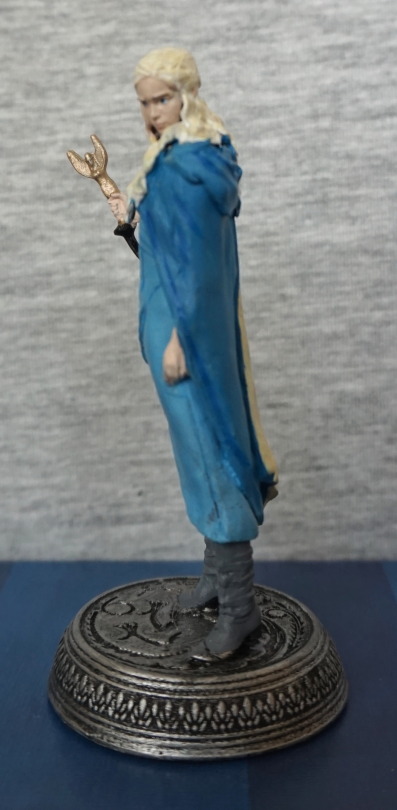
Right:

Again, there’s some strange lines on her leg, on the lower half this time. White paint went a bit squiffy at the top of her right shoe. Hair and paint edges on her leotard are better on this side though. 
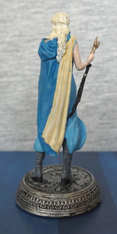
Back:

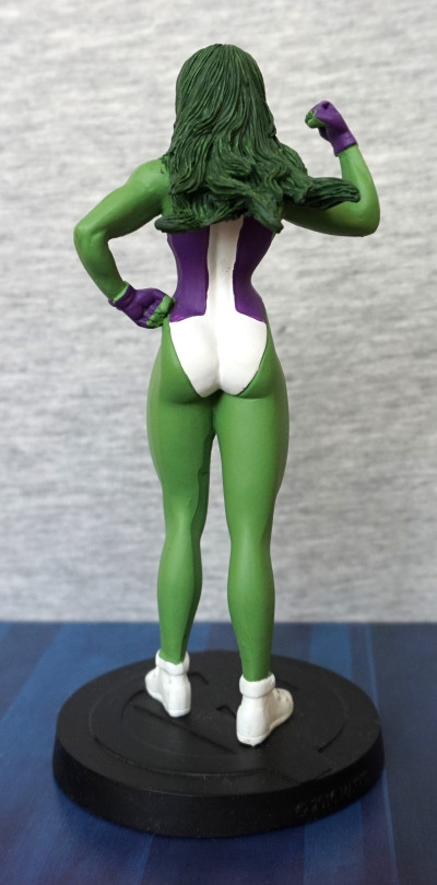
Hair looks good, but the paint edges look odd in a few places. And again, one of those strange lines running down her leg. 

Overall, it’s an OK figure for what I paid. I think some extra QC wouldn’t have been amiss on this one. Not sure I could recommend this figure though. 

Angry Groot – Eaglemoss

This figure originally came with “Marvel Fact Files – Cosmic Special Edition #5″. 

I, however, just bought the figure without the magazine:

Was drawn to this figure, due to its unusual look. Most Groot figures have him more tree-trunk-like, and this was more like spiky, angry tree. I love the shouting expression and his hairstyle. 

Left:

The paint job isn’t hugely complex, but it works. Most of the niceness of this figure is in the sculpt. 

Close-up of his arm:

Love the poking out parts of bark, and his hands look good, with the green emphasising his knuckles. 

Right:

Looks fine from this angle too. Some asymmetry going on, which is nice. 

Back:

I like the “flow” of the bark on his back. The shapes tessellate well and look good. Also a fan of that spiky hair 😀

I like this figure. The pose and facial expression convey a lot of emotion, and you can’t help but imagining him roaring. A welcome addition to my collection. 

Klingon Birds of Prey – Star Trek – Eaglemoss & Hallmark

Bought these two Klingon Birds of Prey from the same seller. Well, when you like a thing… you buy two of it :P. 

First up, the Eaglemoss figure:

Evidence Eaglemoss can make decent stuff  when they want to. Not quite sure what’s going on with the Klingon logo on the wing – seems to have more colours than it should? Maybe a Star Wars buff can comment.. However, the paint job gives a good weathered look to the ship, and the model is detailed. This model shows how little splashes of colour can really bring out a colour, with the gold accents on the end of the wing & gun, the gold accents on what I assume are auxiliary thrusters on the top and the red for the windscreens. 

Front:

Birds of Prey have quite a thin profile from the front, so not a lot to see here. Menacing though. 

Left:

Same details as the right, so I’ll pass a few comments about the stand – it stands fine, as long as you leave it alone. However, it is a bit easy to knock it out if moving/handling it. If you want to move these ships around, I’d suggest taking them off the stand first prior to moving. Don’t want to ding any weapons off!

Back:

Here we see the red of the main engine. I do like this stand’s general design – it does allow you to see all the angles, without getting in the way. No complaints about this angle. 

Top:

Here we get a much better look at the details – this Star Trek series has some impressive entries, which is why they hold their value on reselling sites. Star Trek is a bit of a weird one for licencing – they have a bunch of Playmates merch, which is largely meh, then they have really good things like this. 

Bottom:

Glad to see they didn’t skimp on the mould detail here, but… shouldn’t the undersides of the wings be red? Seems to be a different design underneath, than the one I’m familiar with. Pleased to see they did detail it, but not sure it’s entirely accurate, but I like it anyway. 

Overall, I’m really happy with this model. I do really like some of the “enemy” ship designs in Star Trek. 

The second Bird of Prey I picked up was a Hallmark Keepsake:

No stand for this one, as it’s a Christmas tree decoration, so here it is, with its butt parked on the floor. As expected for an ornament, it is less detailed than the Eaglemoss one, but still looks good imo. Here they’ve painted what looks like a heat sink in silver, which makes me realise the other one had this part in green. Hm, looks better in silver. Nice detail in having some Klingon writing on the wing. No idea what it says though. 

Top:

Here’s the wire that is designed to plug into a light string, but may get modified to work off USB, as the manual suggests it should work just fine on 5V. The “1994″ on the back above the thruster is because this ornament was manufactured in 1994. Interesting detail there, lol. No thread on the eye, but I’ve got plenty around here to supply my own. Top of it looks good at a distance. 

Front:

Yep, still small profile, though this one’s chunkier construction makes it stand out more. The yellow light at the front will light up when powered. 

Back:

Here’s a red light, which represents the thruster. I believe this one is meant to flicker when powered, but as I’m yet to test it, I haven’t seen it, only read about it in the information leaflet.  This isn’t a particularly attractive angle for the ship.

Bottom:

Red wings! Yeah, this is how I remember them! Despite the lack of shading, the paintjob on the bottom of this one outdoes the Eaglemoss one. Shame we’ve got some copyright info slightly spoiling it. This is probably one of the neater angles of this ship. 

All in all, this is a nice ship considering it’s an ornament. If you’re looking for an epically detailed display piece, this probably isn’t the ship for you, but if you like a Bird of Prey that lights up, this is an option. I’ll try to post an update if I get the lights working, but they’re yet to be tested. If I get it working, I may choose a display shelf that I’ll have powered items on, and have 5V available for LEDs. 

Daenerys Targaryen – Eaglemoss

Two collectables that don’t have much to do with each other, but are both going to be quick entries I think… 

First up, this small Daenerys Targaryen:

Unfortunately she was broken across the feet when she came – you can see the lines across her boots where I’ve reglued her. As to why I didn’t return her: I won her for 99p + postage, so it wasn’t worth the hassle of returning it. It’s not very well painted, and is probably about the level I hope to achieve with a garage kit :P. Thinking of repainting her boots as practice, and cover up the break lines. The die-cast material she’s made out of isn’t very strong, so not sure if she was already broken (image for the auction was poor), or it happened in her journey to me. 

Sometimes Eaglemoss does an OK paint job. Sometimes they… do this. I guess the GoT line is one of the ones that’s going to/has binned hard. 

Here she is from the right:

Admire the… thing she is holding and blue paint in her hair. Base is also a bit naffed. Her This is probably the best angle for the moulding on Daenerys goes. The gold part is supposed to be one item, with a tassel coming off the end, but the tassel isn’t aligned to the base of the item. The tassel moulding looks OK irl. 

Left:

Apologies for the out-of-focus shot. Her face paint is actually pretty good close up, but the quality of her hair really mars it. It looks like they overpainted blue on the hair that’s on her shoulders, and it’s way too fat to look right. And that hand paint is damn awful, as well as a total lack of definition for her fingers on this hand. Part of the hair is the same colour as her cloak – the side of the hair that’s facing us, plus a bit on her back is the same way. I don’t think cloaks come up to meet your hair… 

Back:

Paint overruns everywhere. If you look at the hair dangling down her back, you can see the blue side on the left that I mentioned in the last paragraph. The bottom tip of her coat is also missing dark blue paint. 

This could’ve been a good figure, if more care was paid to the painting. This feels like a figure that shouldn’t have passed QA – there’s some nice bits like the clasps painted in silver in her hair, and the bead on the tassel of the… thing. The face weirdly was done well, considering the rest of it. The blue detailing on her front though, comes off very much like “cheap blind bag figure”, which is a shame. 

I don’t think I’ll pick up any of these GoT figures unless I can see them in person, and can verify the paint job isn’t turd. The LotR figures were marred with the same issues, so it wouldn’t surprise me if this line is similarly affected. 

Predalien – Eaglemoss

This is the third of three figures… and the reason the blogs about these figures got delayed.

Here’s the reason why:

Yeah, how did this pass QA?! The figure was pretty recessed in the box, so not convinced this happened during shipping. 

So a grumbly email and another wait… and we have:

This dude, who hasn’t been headbutting stuff lately! However, I think his paint job is slightly dodgier in places – note the unpainted bit on her hand, but that’s far less annoying than a scratch. 

So let’s look at the entire front of him:

They’ve chosen a very dynamic pose, which adds to the figure. There’s a good amount of contrast in the dark and light areas of his body. 

Left side:

He’s quite dark on  this size. Here you can see the dreads that are part of the signs he’s a predalien, along with his feet and colouring. 

Right side:

Here you can see his tail – which is definitely one of the selling points of this figure. Almost looks like he’s holding it from this angle! The painting has been nicely done on his tail, and the leg sculpts look very nice from this angle. Can see a couple of places where the dark overpainting didn’t quite get into the gaps, which is a bit of a shame. Guess the person who painted this one didn’t quite have enough paint on their brush or poke him enough. 

Back:

Some nice details back here, but not so easy to photograph them from this angle. Love the alien backpieces. Horns? Spikes? Protrusions?

Close-up of the base of his tail:

The moulding and paint transition from his back to his tail is very nice. And ridges have been replicated well.

The end of the tail:

Mmm, wouldn’t want to get hit with that! A suitably vicious tail!

Close-up of the base:

The mould of the broken mask is nice, but there is some silver slop at the top of the mask on the base, which can show from some angles and look a little odd if you’re looking close. At this angle though, it looks nice. Base is painted well – love the rust details on the grate. 

This one is my second favourite. If it wasn’t for the dark overpainting paint flaws, he’d be vying for the top spot, but he just isn’t quite up to the swimming alien for me. 

Swimming Alien – Eaglemoss

This is the second of the three Eaglemoss figures I bought. 

Swimming Xeno! I really like this figure, and is probably my favourite of the three. 

Here he is swimming the other way round on his base:

Not sure which display option looks best. His tail is impressively moulded and painted, and I love the way it sticks out. His head is shiny, which is a nice touch. He also looks like he’s swimming, so that’s a definite bonus!

Here is his other side:

Not much in between the two sides. Both look fine.

Here is a close-up on his back end:

Looks nice :).

And the front end:

Here you can see the shiny effect on his head, and his back “spikes” reaching up above him.

From above:

Head so shiny, you can see me! His pose does look kind of flat from the top, but that’s no biggie to me. 

And his belly:

He has a hole for the post that holds him above the base, but the paint shading has been done well on him. With the glossy finish on his legs, he could almost be wet. 

Close-up of the base:

A nice range of props, coloured green to match the film and look underwatery. See? They can blend paint! 

I love this dude – he will take up a decent amount of space, being so long, but with the rod, he can stand above other small figures, so he shouldn’t be too bad to display. 

Deacon Alien – Eaglemoss

This is the first of three figures I recently ordered from the Eaglemoss store, as I noticed them having a sale on. Unfortunately, the Eaglemoss store is still rubbish – no order status, takes ages to dispatch and aren’t quite up to speed with this new-fangled technology called bubblewrap:

image

Deacon’s box got crushed, but fortunately they now use HUGE boxes, so the figure survived just fine. Not so nice for more dedicated collectors, getting a crushed box though. 

So here’s the Deacon himself:

image

Full-body shot, focused on the body:

image

He’s… OK. Bit of a disappointment tbh – the paint job isn’t blended at all, so he looks like he’s had paint slopped on him. Mould is pretty nice though, and I like the scenery they’ve given on his tile:

image

Mmm, some ‘lovely’ entrails… 

Left side:

image

That dark green paint… it almost works in a couple of spots, but meh. Looks like I painted it! Also a paint slop I didn’t notice until I did this photographs, sigh. Maybe I could repaint this…? 

Right side:

image

I love the pose they chose for the mouth – nice to see them showing off his proto-jaw. The detail put into the neck and leg muscles is nice too. Still a shame about that damn paint! The base was painted nicely though. 

Back:

image

Lovely mould work on the spine. The green lines almost work on his butt. 

The two things that disappoint me about this figure are the green paint blobs and his size. Due to his pose, he looks really tiny compared to the other figures in this range. I think it would’ve been nicer if they did him at a bit of a bigger scale, but then he wouldn’t be proportionally accurate to the others in this series and his diminutive size. 

Eaglemoss Alien Queen

Suddenly…. a wild super-large box appears! Wasn’t quite prepared for the size of this one. Thought they must have padded the box for the figure, but nope, it was taking up the whole of the box sent!

For a metal-based figure, this thing is large. It came as three separate pieces – the tail, her body and the base. Once assembled, it’s rigid, and I’m not worried about it disassembling itself, so that’s good. The detailing and paintwork are both nice. Due to my shit lighting, the base looks a bit arse in the post-editing, but Eaglemoss has some high-quality photos.

And here’s more of my derpy ones:

This last picture has less editing, so the base looks much more like it does irl. Went hunting for a discount code (which I found!) as I thought I might be slightly disappointed by it but nope… totally happy I got this one. With the code, I’d say it was worth it.