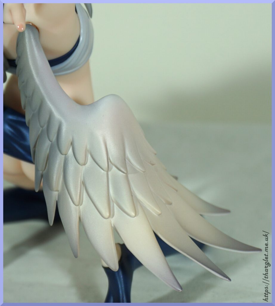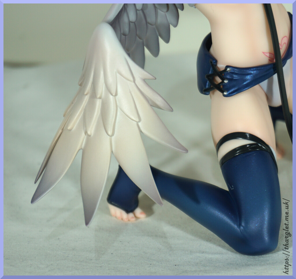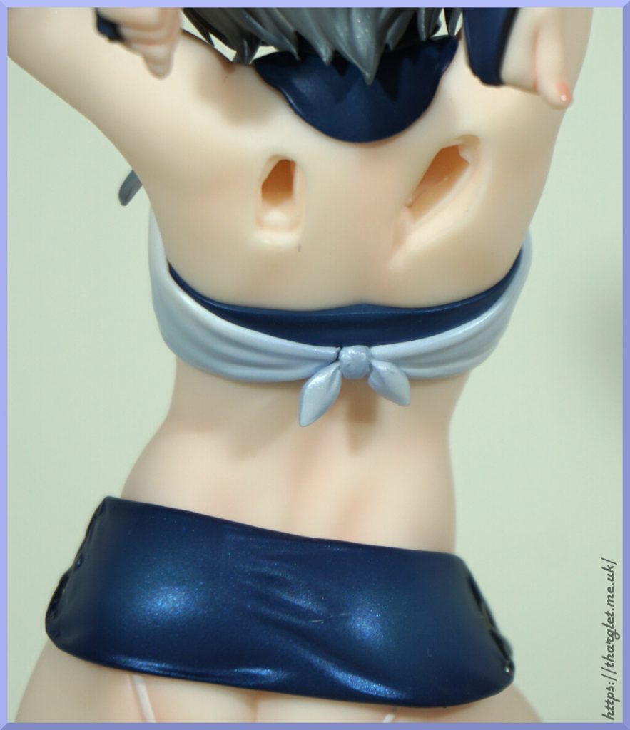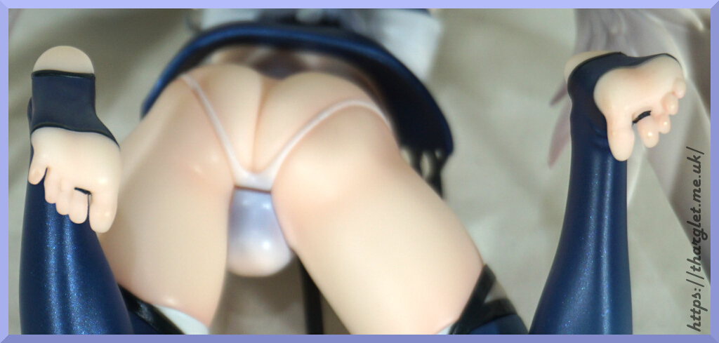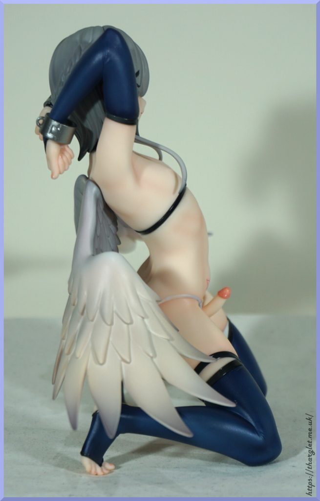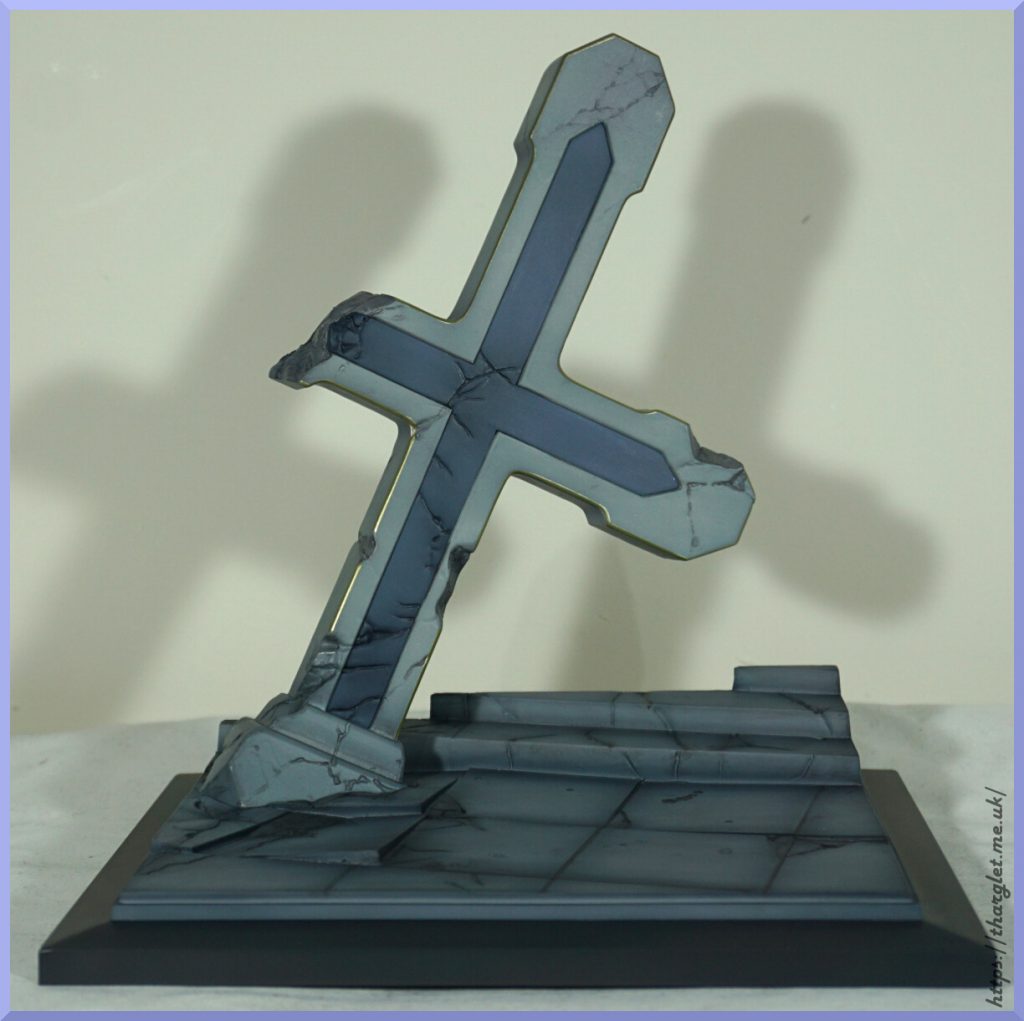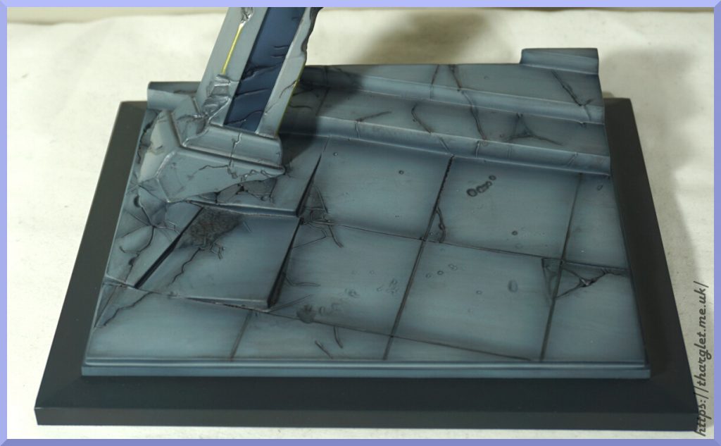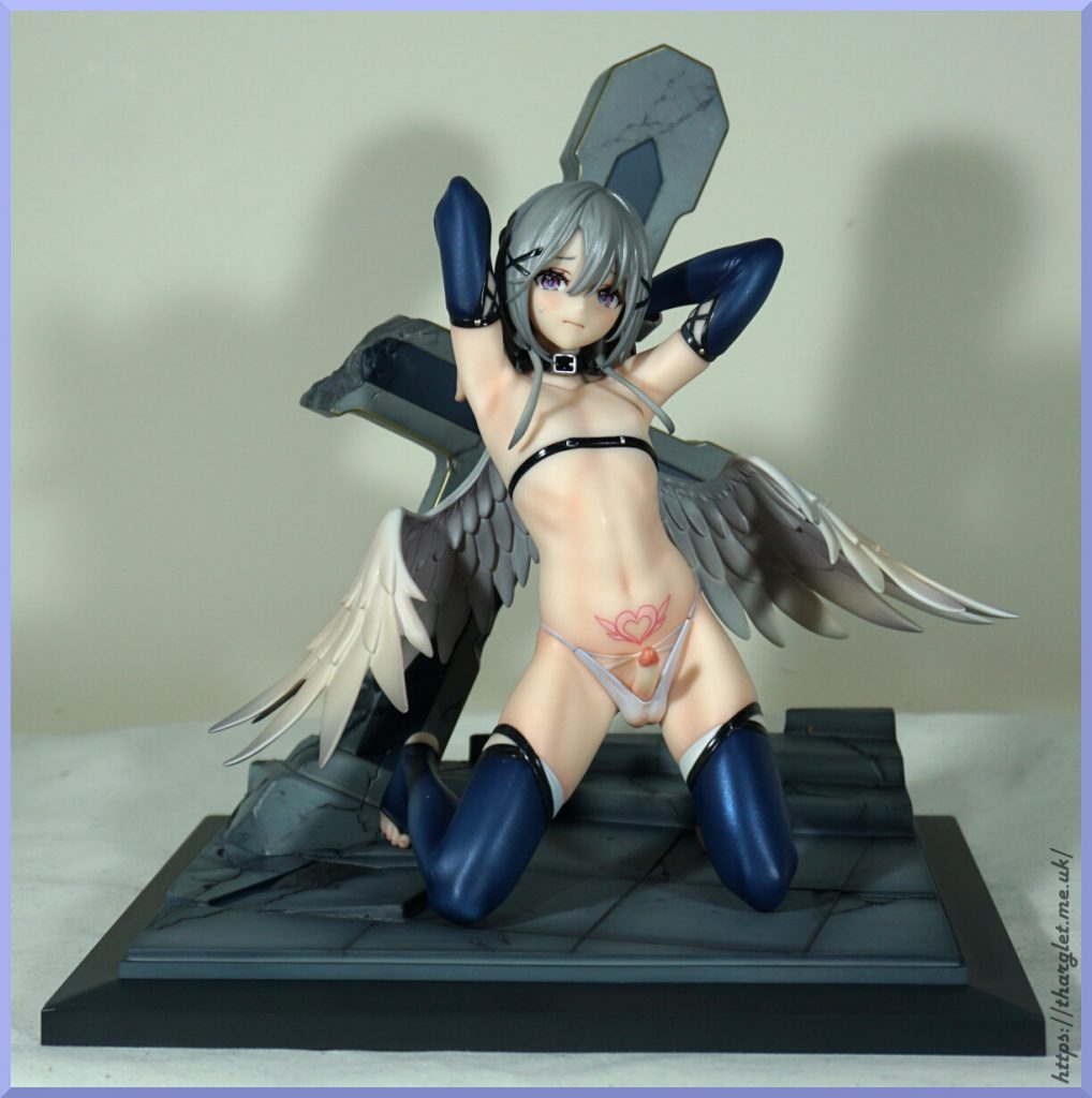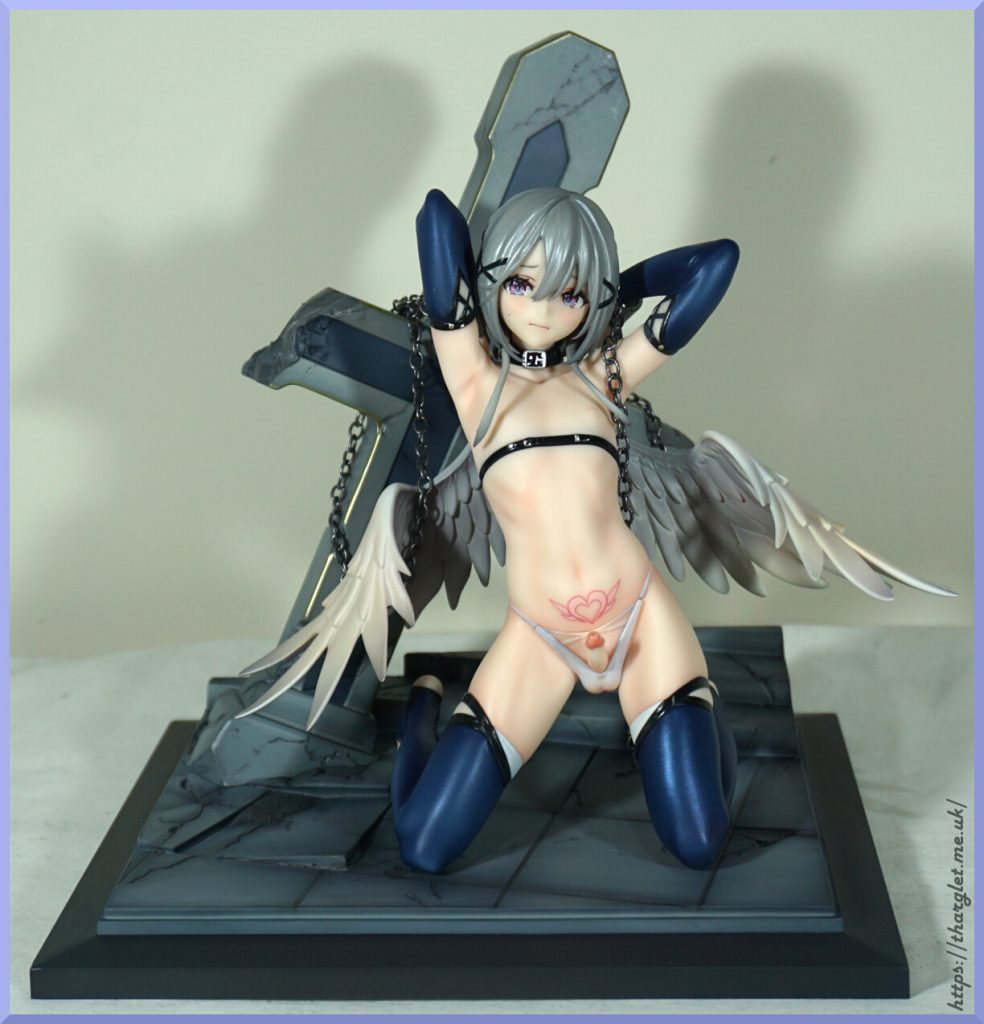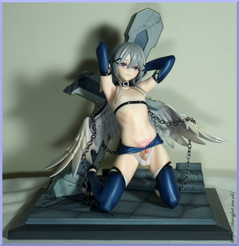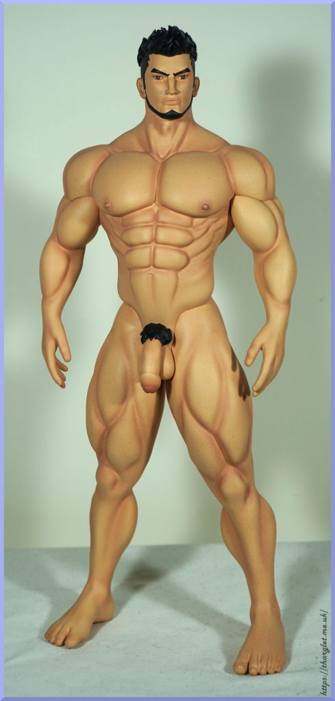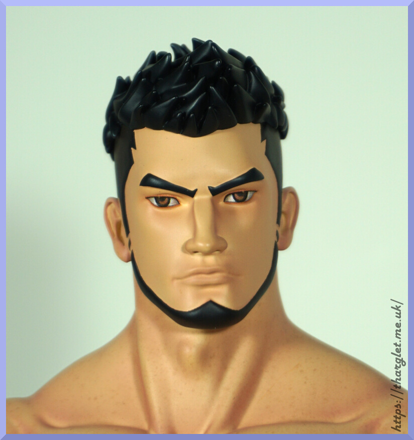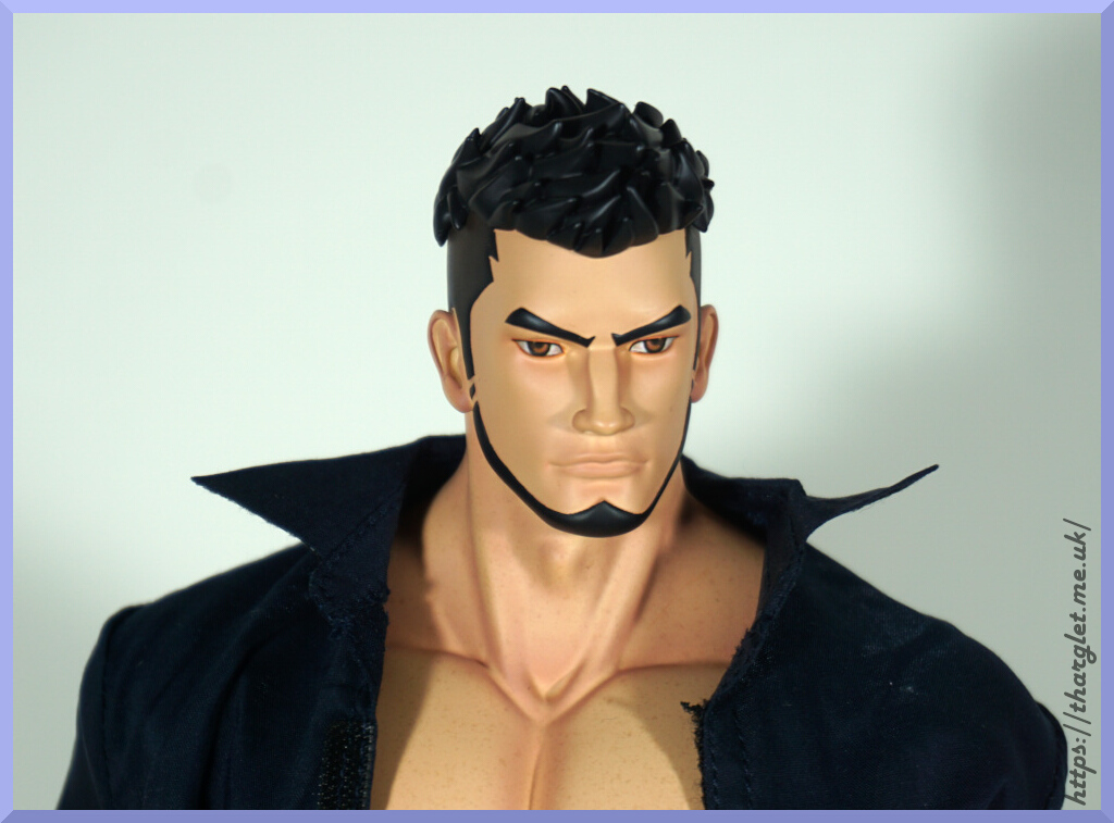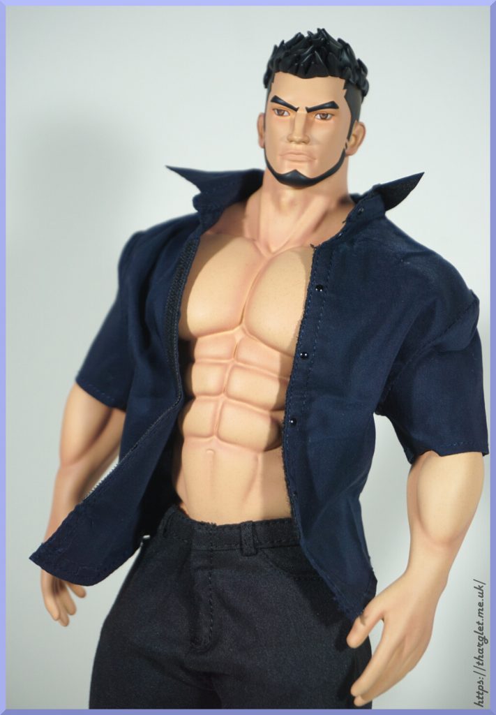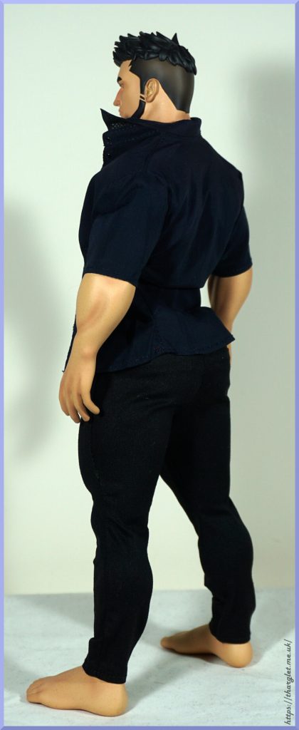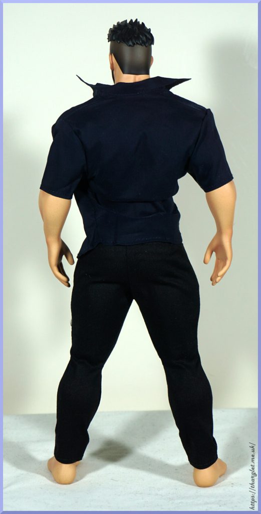
Tag: male

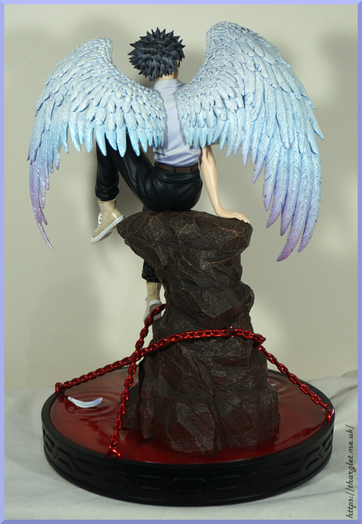
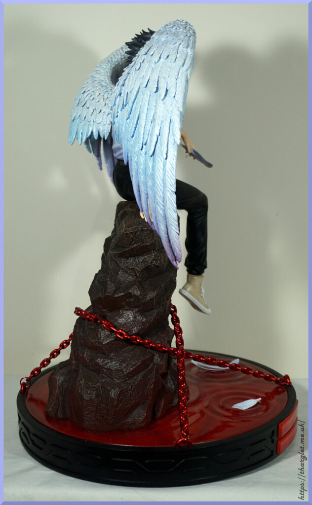
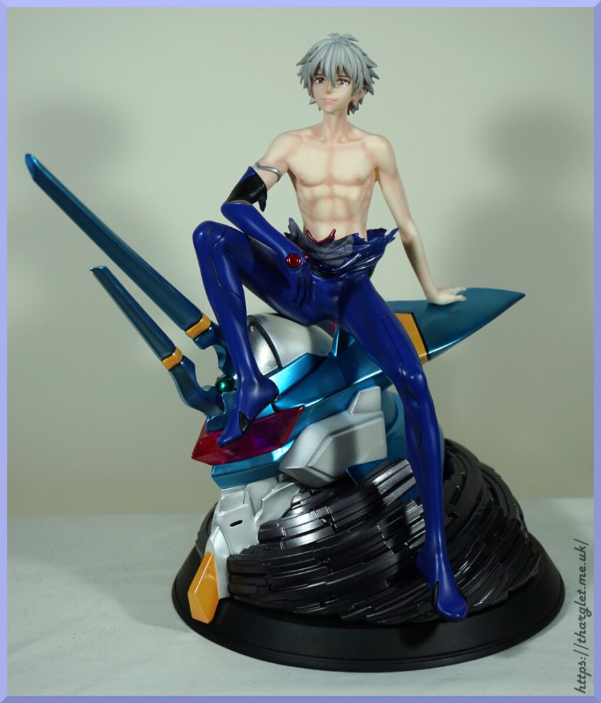
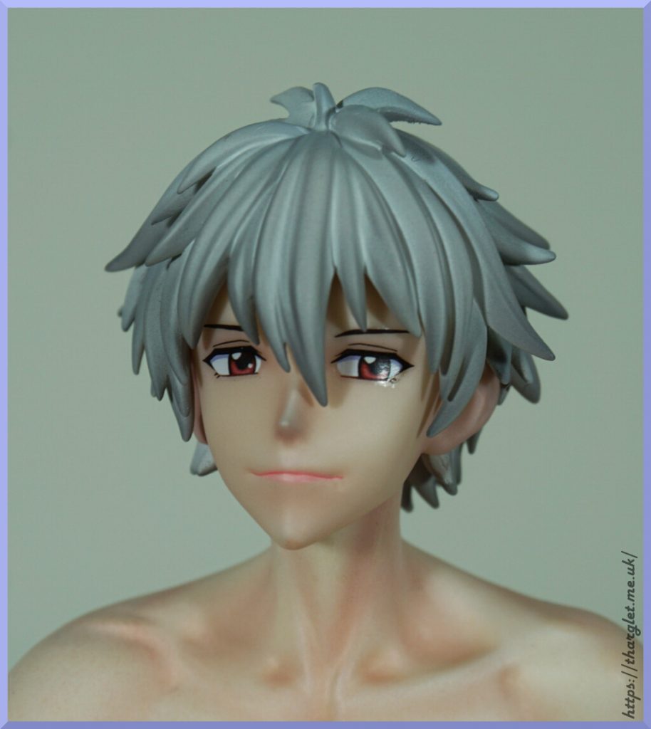
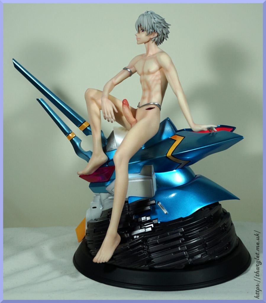
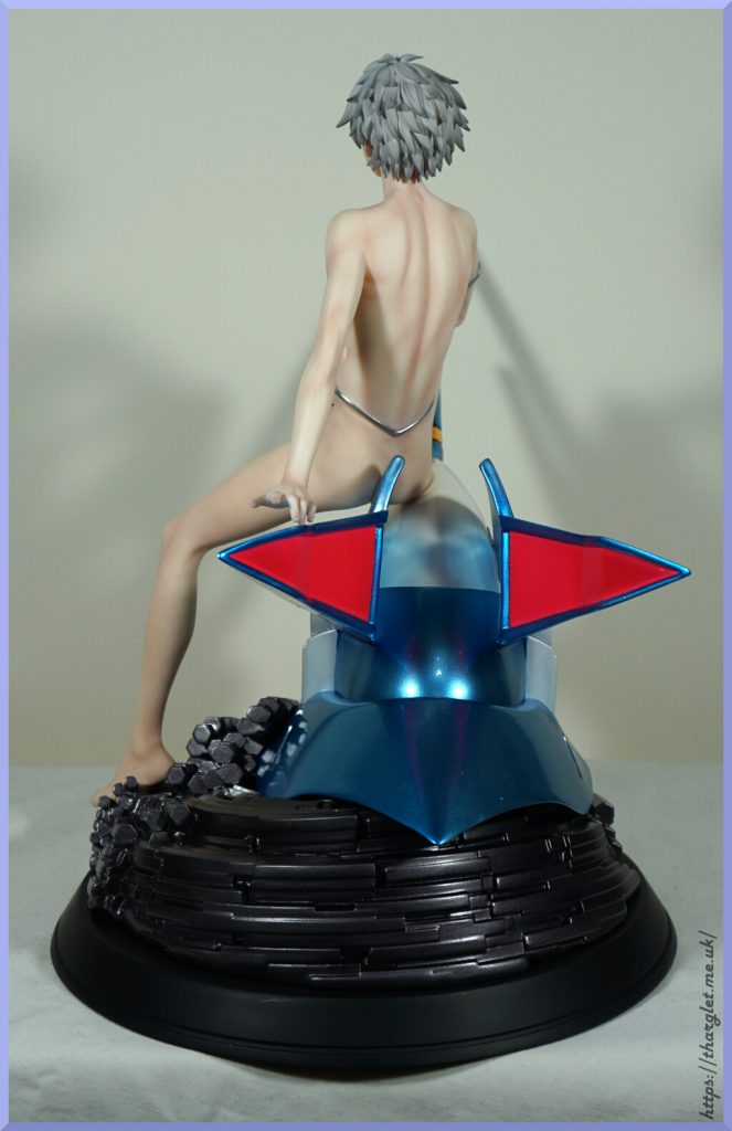
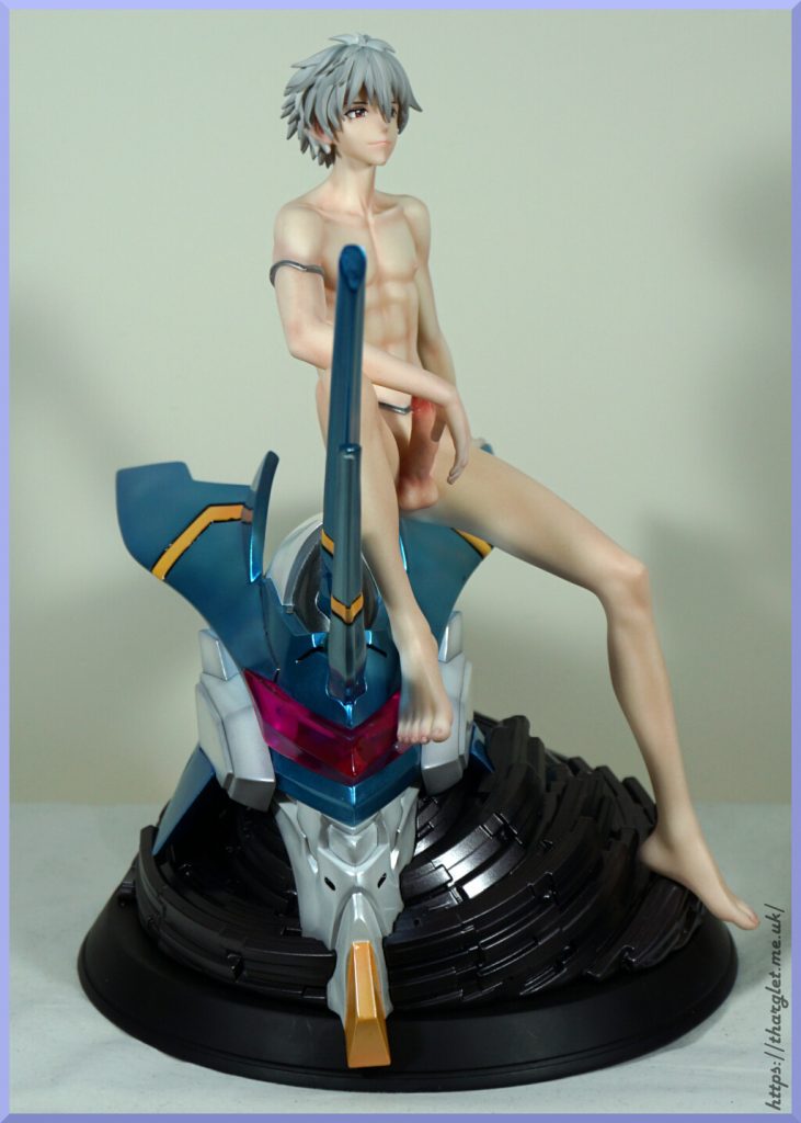
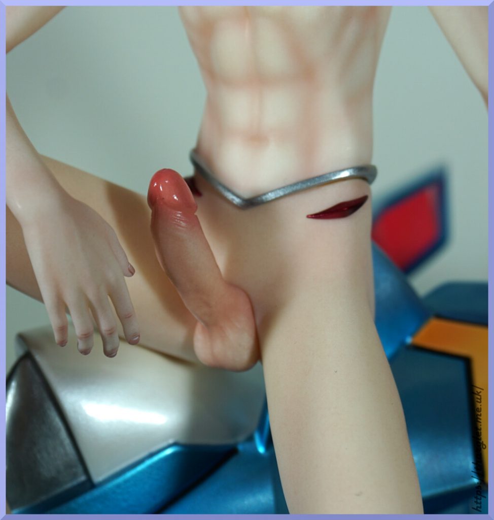
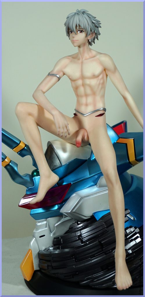
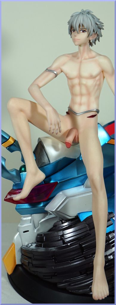
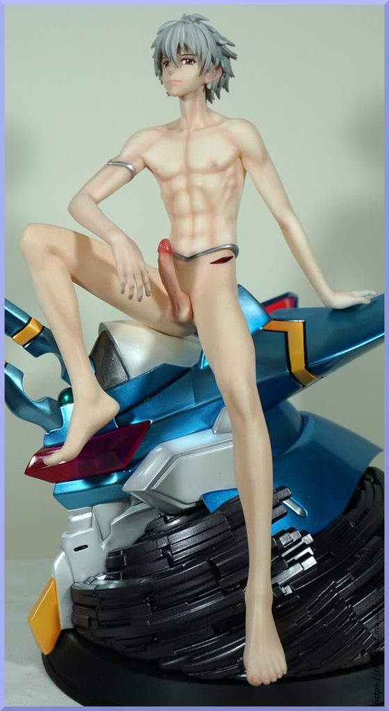
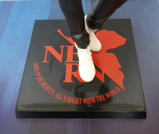
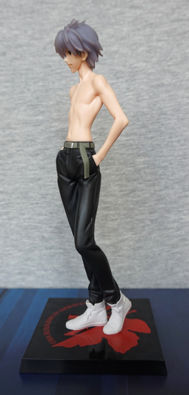
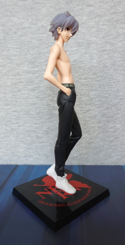
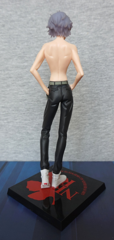
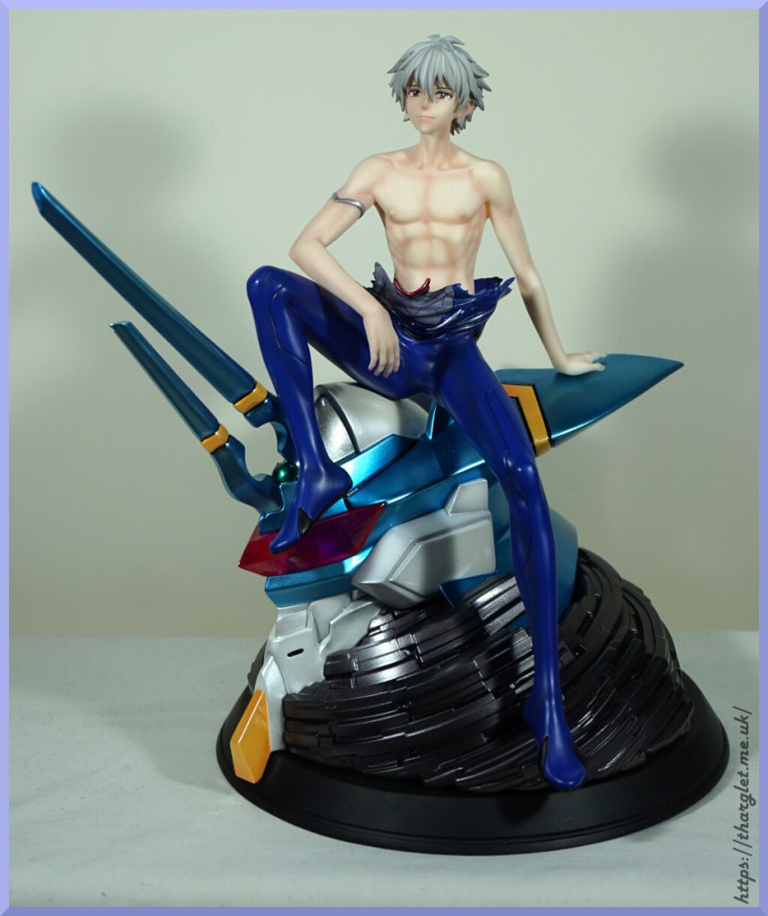
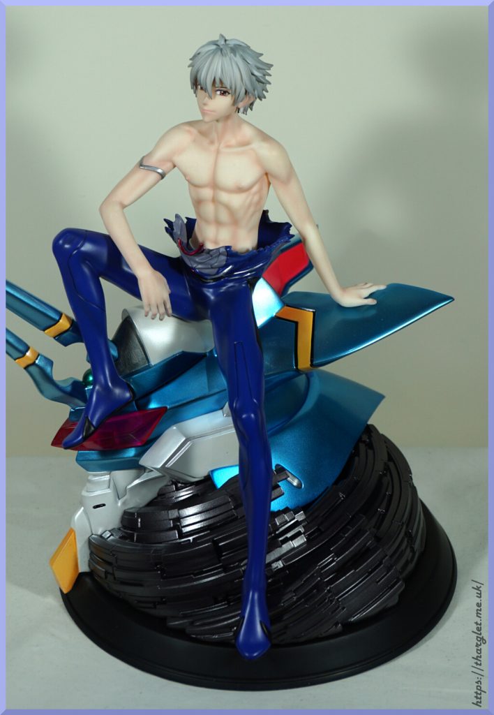
Model Power Studio – Kaworu Nagisa

No special backstory to ordering this one – stumbled across it when it went up for preorder and decided to give it a punt. Total including shipping was £204.57.

Box
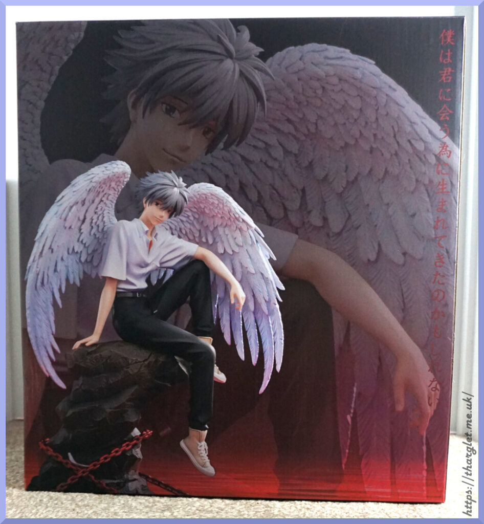
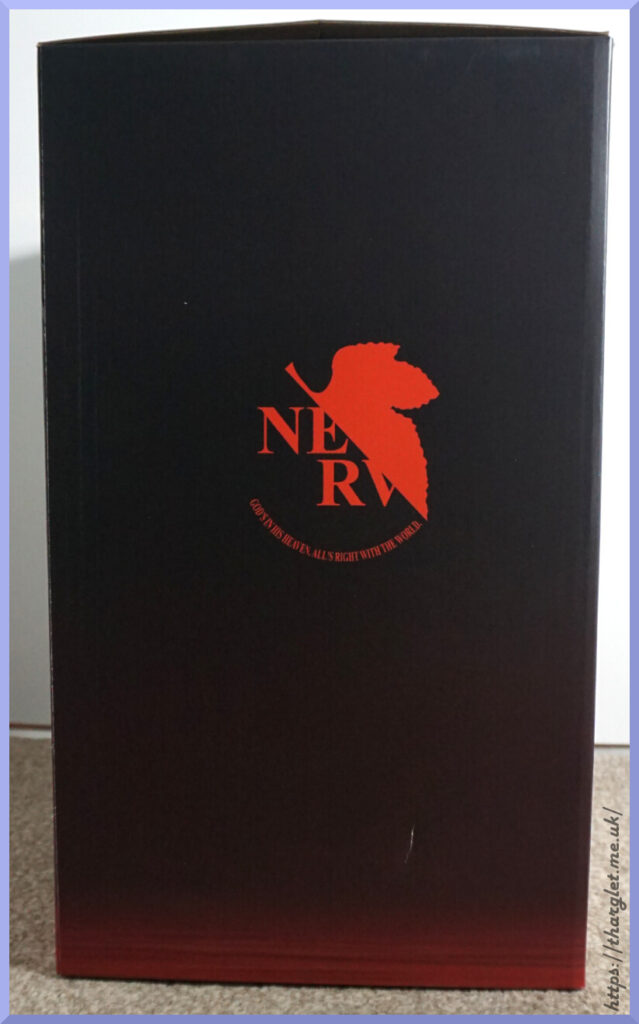
The box isn’t anything too special – same photo of the figure on the front and back, NERV logo on the sides and the Model Power Studio logo on the top. The double effect of the statue on the main picture is nice though it would’ve been nice to see the full statue on one of the sides.

Figure Spin-around
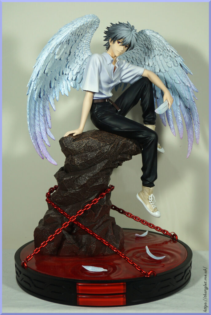
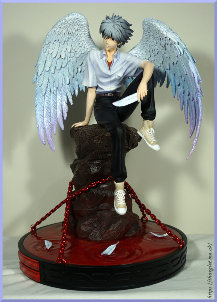
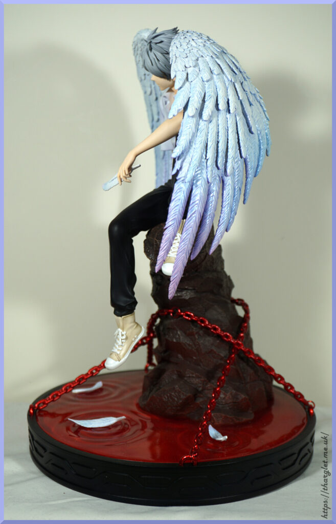
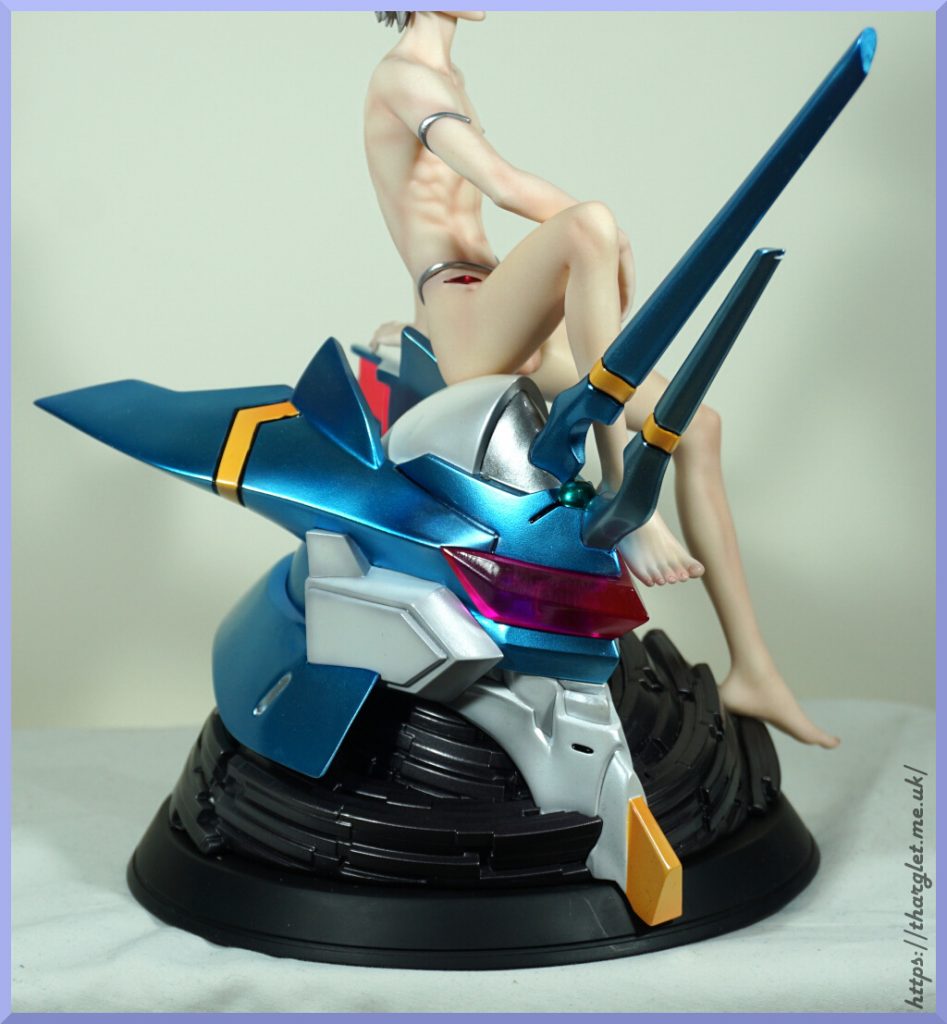
This statue came out very close to the pre-order images. Nice to get something close to the provided images, especially in the unlicensed space.

With this figure it came in only four parts – the base, Kaworu himself and two wings – plus the four feathers. It was a breath of fresh air to have a resin statue that was simple to assemble. The base was a bit hard to get out of the packaging hole it was in – I’m not sure the EPE layers were glued quite right on mine. Otherwise assembly was a breeze. Did have some confusion of where each feather was supposed to go, but decided to go with my own configuration – the most curved one is supposed to go on the chain and the one his hand is supposed to be in one of the LCL splashes. However, I put the feather in his hand and it looked right there so I stuck with it. The feather did at first wedge in there but eventually fell out and wouldn’t stay so I got my own tack to keep it in place.

Figure Close-ups

Face:
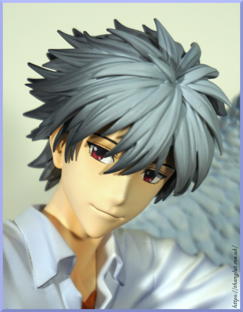
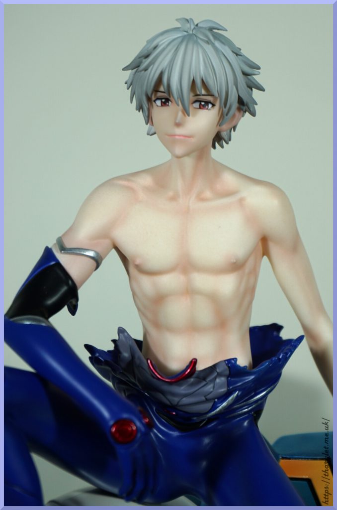
He has an anime face, which makes a nice change from realistic faces on resins. I like the deep red of his eyes and his mouth has been sculpted well. The hair has a good amount of shading and details in the sculpt.

Back of his head:
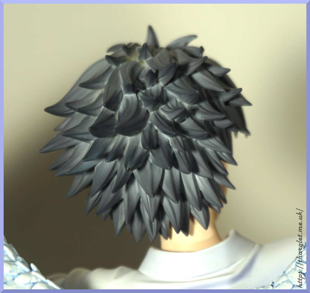
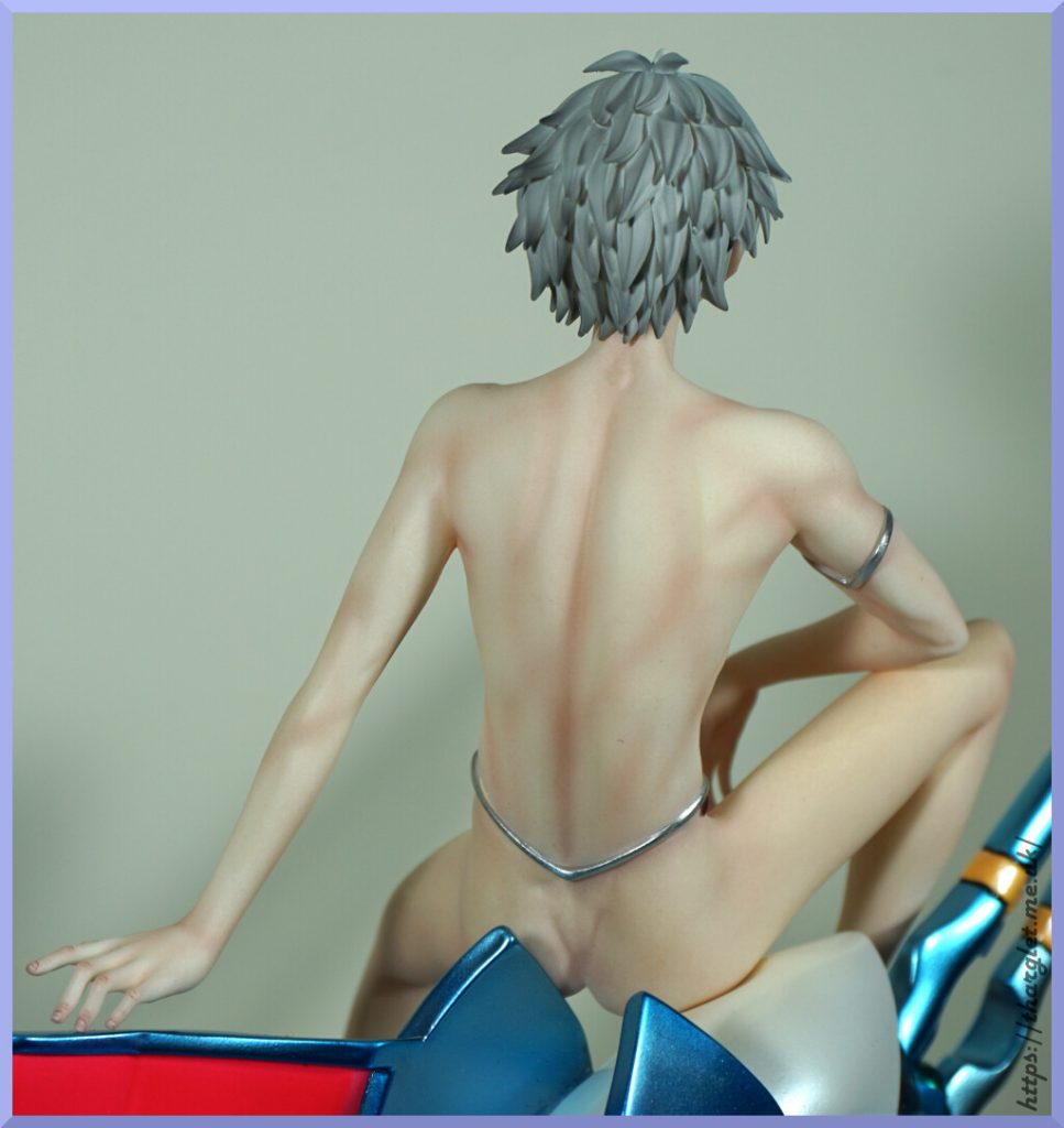
His hair is also well-shaded and sculpted back here too. Lovely and spiky.

Shirt:
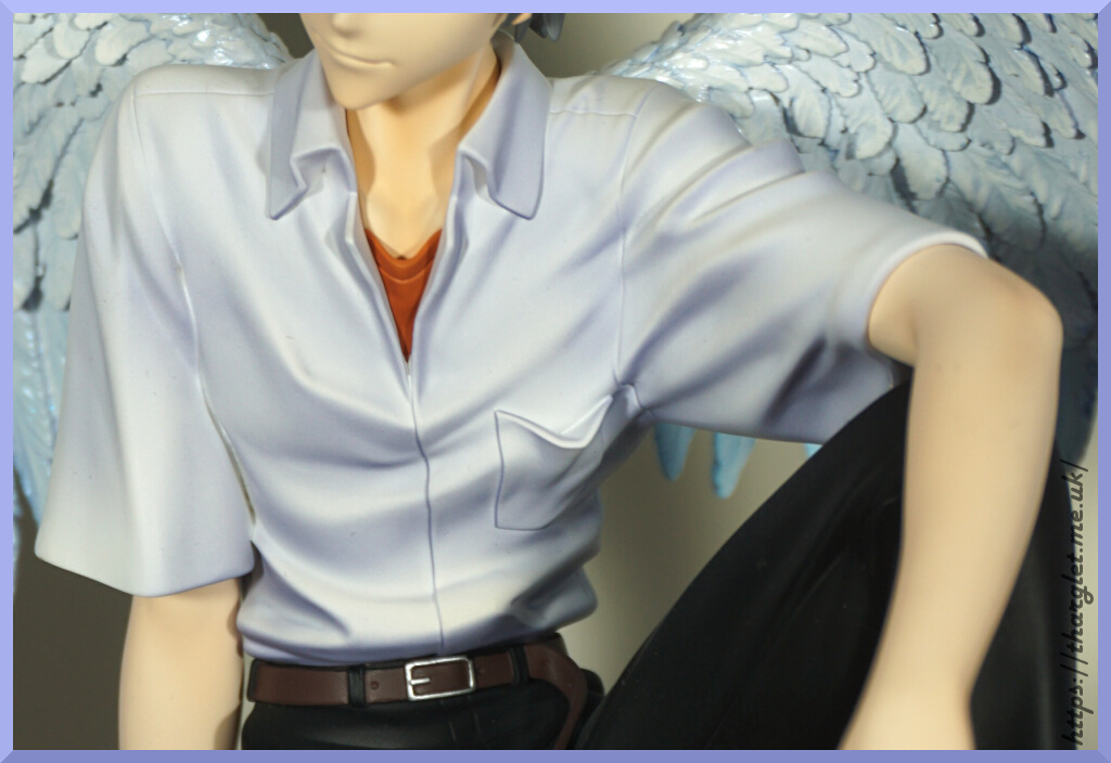
His shirt is heavily shaded which I like, though some people may find it overdone. I like the way they have sculpted his pocket and undershirt flopping open – a lot of figures leave this flat to his shirt/body.

Body:
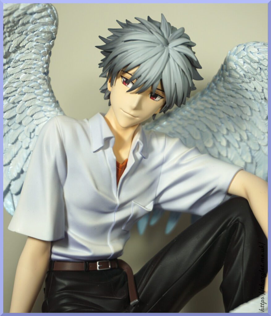
He’s a very handsome fellah. The belt is nicely painted and we have some nice sculptwork in the trousers. The trousers are a bit shiny – would’ve preferred them to be more matte, but shinyish trousers isn’t uncommon on Evangelion figures.

Wing close-up:
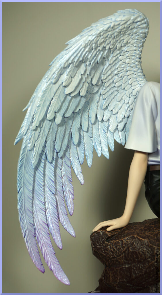
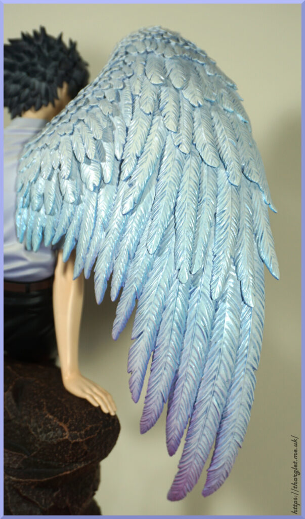
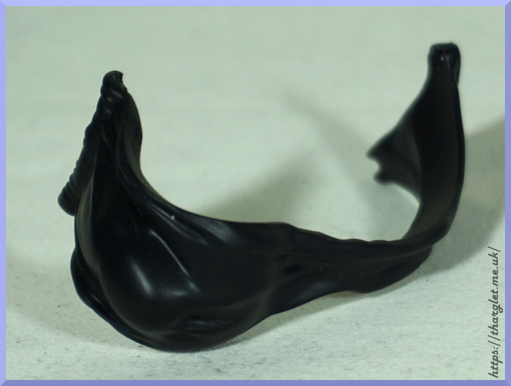
A lot of sculptwork went into the wings – each feather has its details sculpted, no half-assing here. They’ve even added in little bits of damage/ruffling. I love the way the wings have the purple fade at the tips. They’re a very nice pair of wings. Probably my favourite pair of feathered wings on a figure.

Arm:
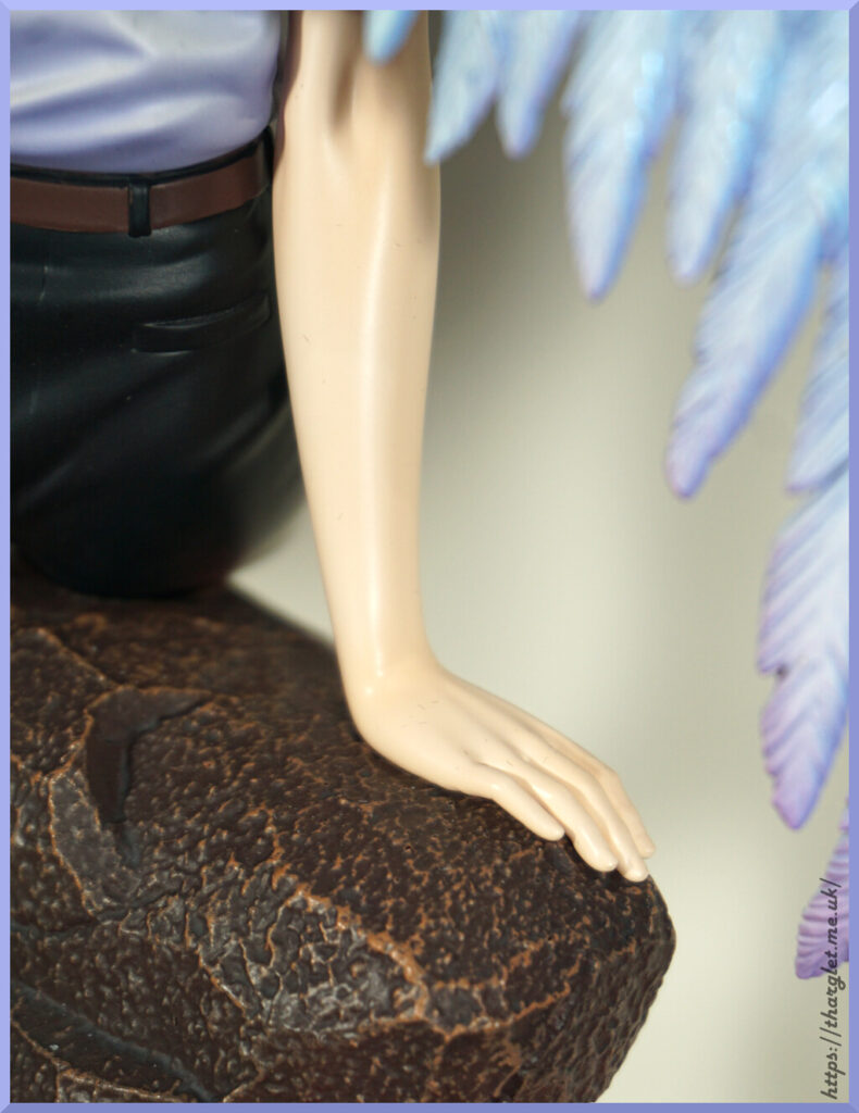
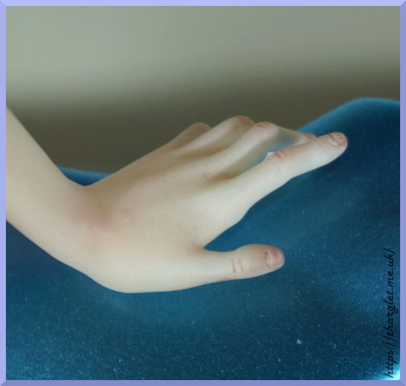
The skin unfortunately has that resiny shine to it. The sculpt is nice but could’ve done with some kind of top coat to get the shine down in my opinion. The skin tone is a nice shade. His fingernails are sculpted though he’s not a bloke who paints his nails.

Hand holding feather:
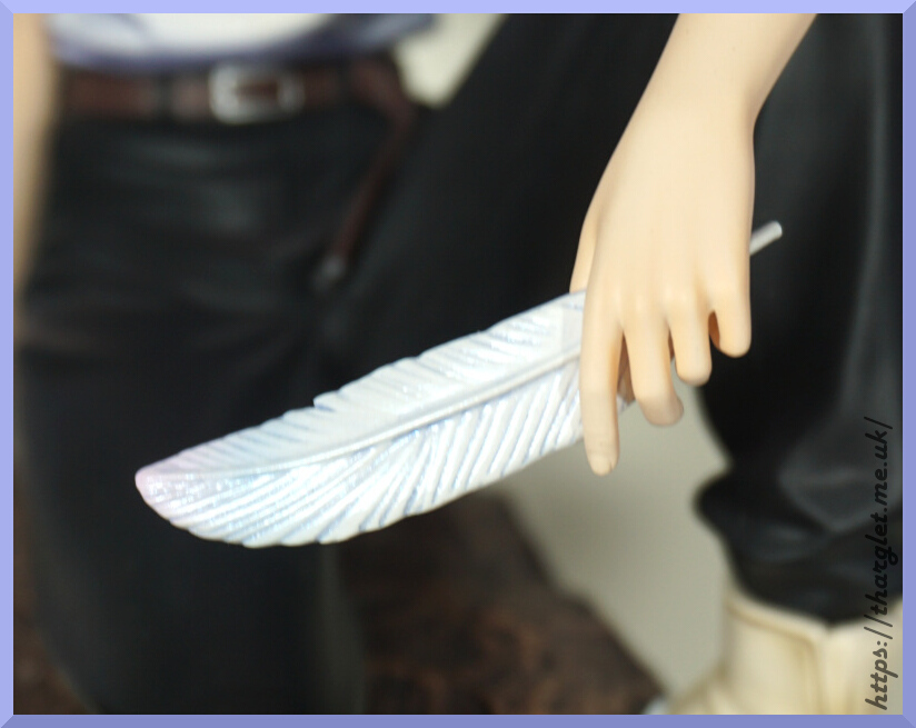
He just holds it so perfectly… Not intended to be, but it somehow gives the figure a whole different vibe. Like he’s confidently an angel.

Boot:
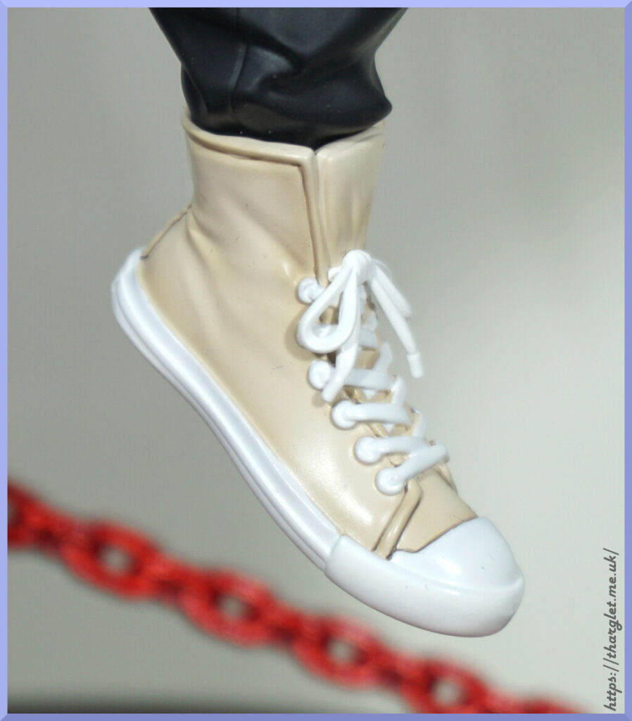
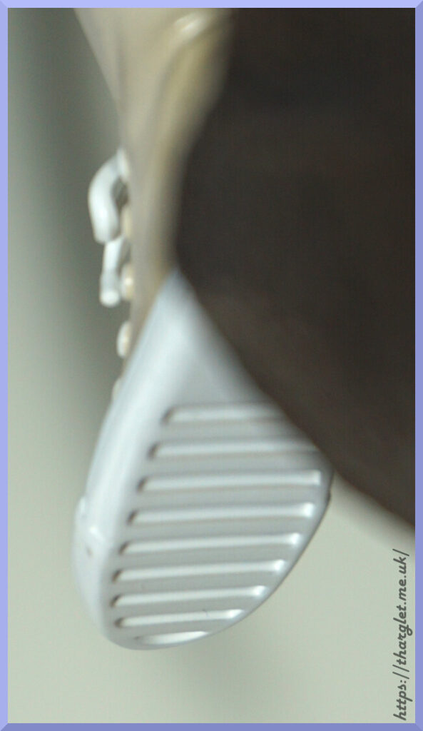
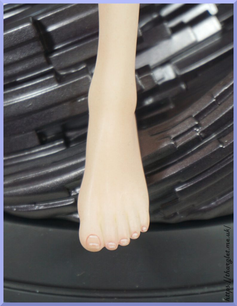
Time and care have been taken to recreate his boots. They didn’t skimp on the soles either.

The rock:
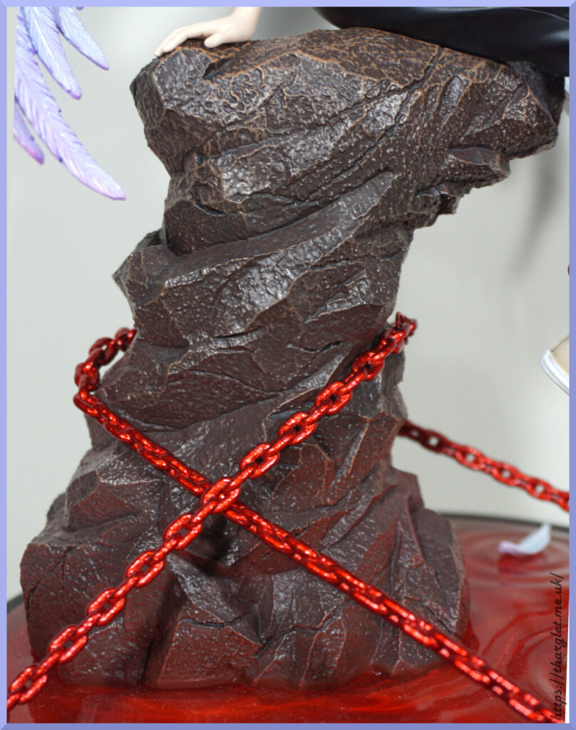
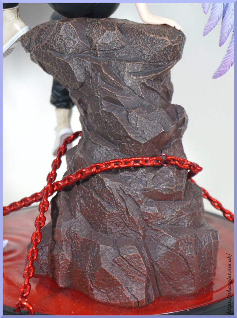
For me, this is the weakest bit of the statue – it has the appearance of a theme park rock. Just has that plastic-y finish that you’d expect of cheaper outdoor décor. The texture is reasonably rocky, the shading at the top is nice plus having the red glow from the LCL, but the overall finish does give fake rock sadly. It’s not enough to ruin the statue but would’ve been nice to see a finish to make it more realistic.

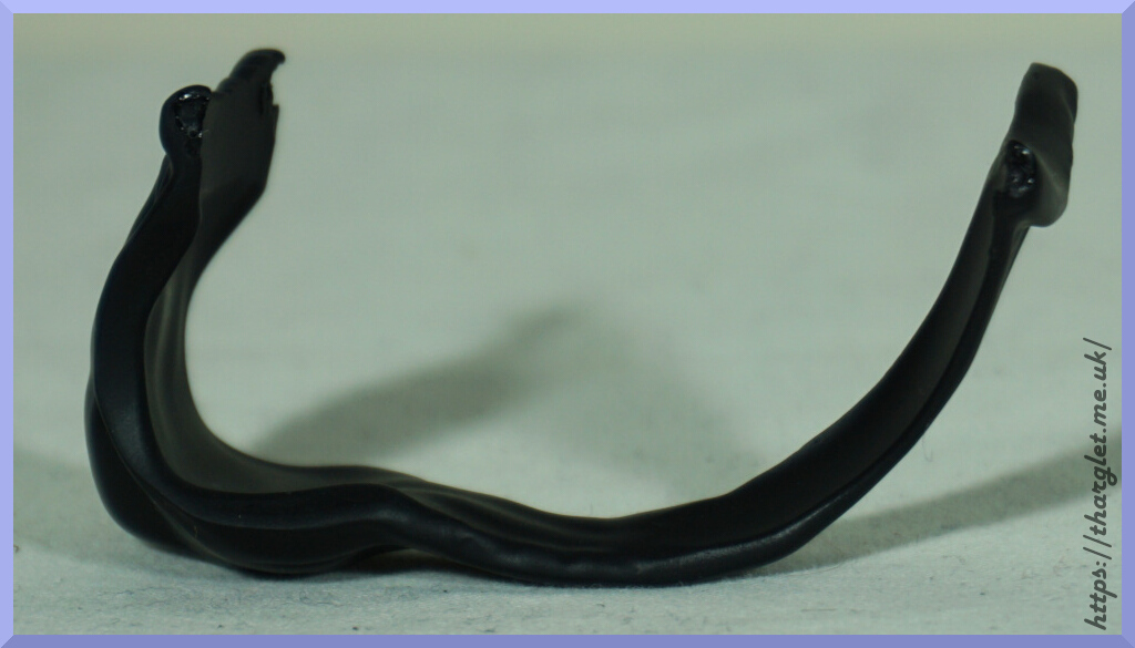
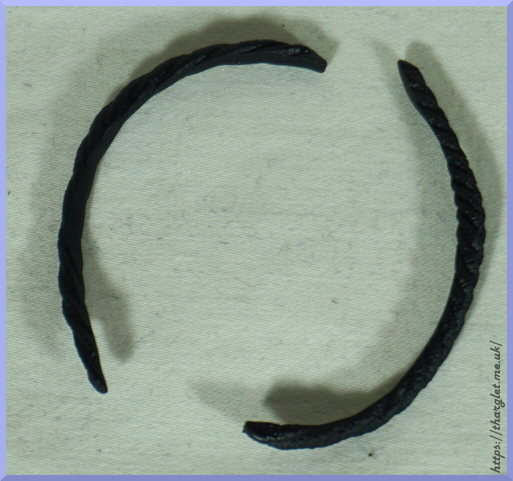
The chains are a nice touch around the rock and those work well. They’re tightly anchored so there won’t be any slipping off. With the thick paint, not sure if they’re metal or plastic under there and as they’re taut I can’t tell their weight or heft.

Close-up of one of the chains:
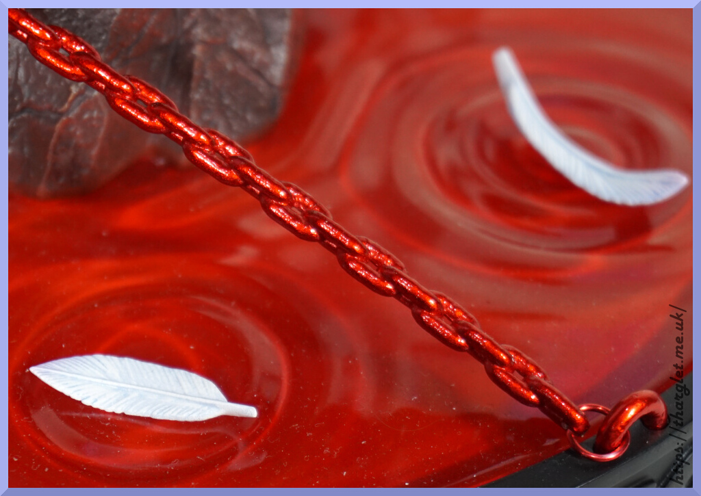
I suspect they’re a standard metal chain under the paint.

Base top:
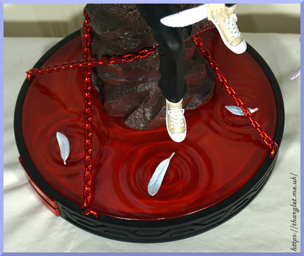
For the LCL, it has three splashes moulded into it for three of the feathers to sit. There’s no pegs or slots, so you can pose them as you like though the splashes are in size order and intend to correspond with each feather size.

Base front:
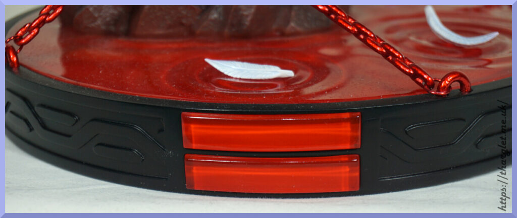
The base has these two red stripes to indicate the front. Not sure what they represent, if anything. Would’ve been nice to have one of the logos from the show or at least something referencing it. They did have the NERV logo on the box, so not like they were shying away from having it at all. Whilst the border on the base doesn’t fit any kind of Evangelion theming, it does compliment the statue.

Conclusion

I really like this statue – most of my unlicensed figures are NSFW, but this figure shows SFW figures can be worthwhile too. I love the way Kaworu is “there” in his pose. The wings are excellently detailed – I don’t think he has artwork that matches this wing style but in my opinion it suits him.

There’s a couple of areas that could be improved – my main choice would be to improve the rock and make it look less like a prop. As a Kaworu fan, this figure was worth picking up. I do own his GEM figure, but this one is entirely different vibes.
Milk Club Studio x YGNN Studio – Green Pepper

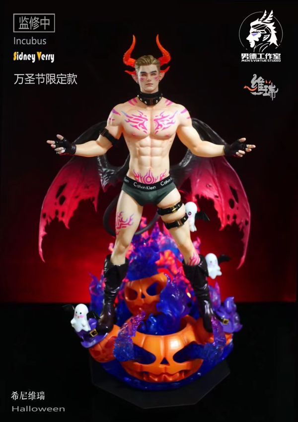
For this figure, I preordered him after my preorder for Sidney Verry by Men’s Virtue Studio fell through as production was cancelled:

I preferred the colours and theming of this one to Green Pepper and wasn’t sure I’d really have the space for the pair – original plan was to see how this one turned out then potentially scrabble around for a Green Pepper if he sucked. Sidney is a lot more incubus-themed than Green Pepper, which made him the more interesting preorder for me. However, seeing as I wasn’t going to get him any more I jumped on the Green Pepper preorders. Fortunately Green Pepper was popular enough to complete production and eventually make it to my doorstep.

Box

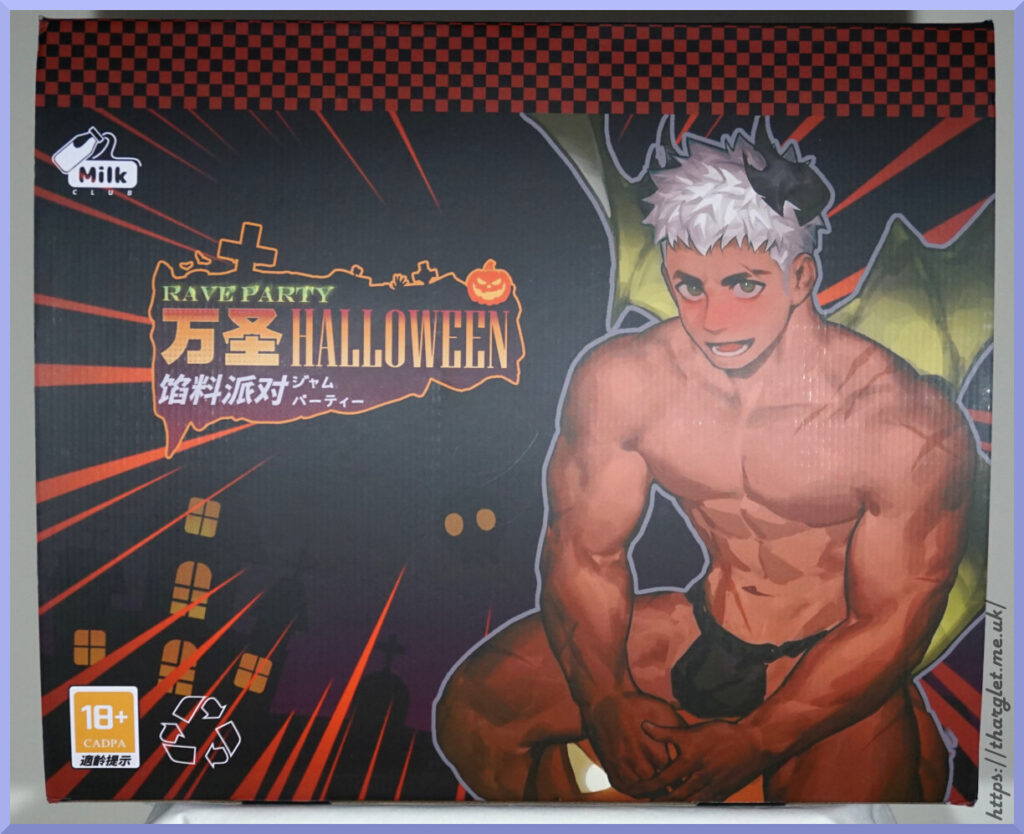
The box is huge:

I didn’t include anything for scale, but it’s large – 57x47cm.

Depending on which language you speak, it’s either a rave party (English), stuffing party (Chinese) or a jam (of the fruit variety) party. I believe “stuffing party” is supposed to be the intended translation.

On the front we have an 18+ rating by “CADPA”. Didn’t know that game rating organisations now rate figures 😂. CADPA is the Chinese equivalent of PEGI or ESRB. Also we’re told to recycle the box – I think I’ll keep mine, thanks. Interestingly we only have Milk Club mentioned on the front of the box.

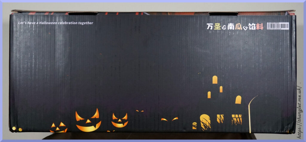
Front edge of the box:

The back of the box is the same and the other sides are more of this design, so didn’t bother to include. Bottom of the box is plain black.

The silhouettes give the box some nice Halloween theming. The Chinese text reads Halloween & Pumpkin & Stuffing. We also have a fake barcode that has the text “HALLOWEEN CARNIVAL” and “MADE BY YYGN & MILKCLUB”, so YGNN do get some of a mention on the box.

Figure spin-around

Let’s have a look at this guy and see if he’s worthy of doing some stuffing:

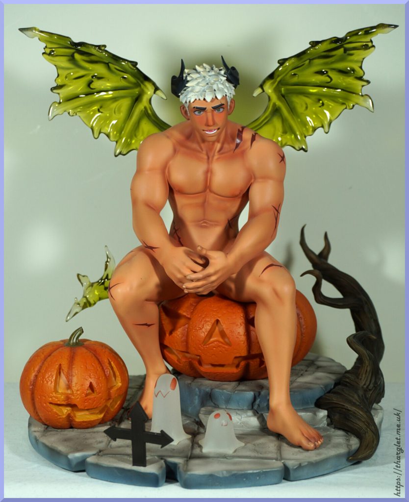
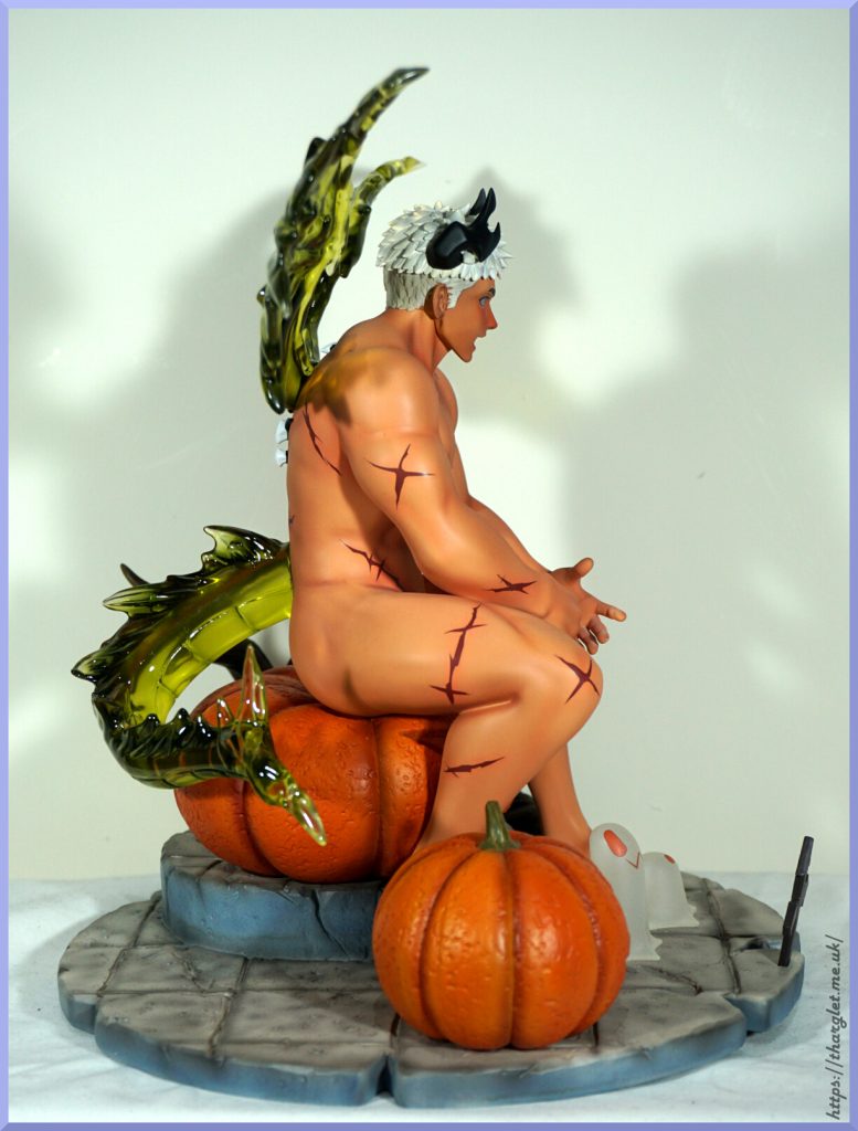
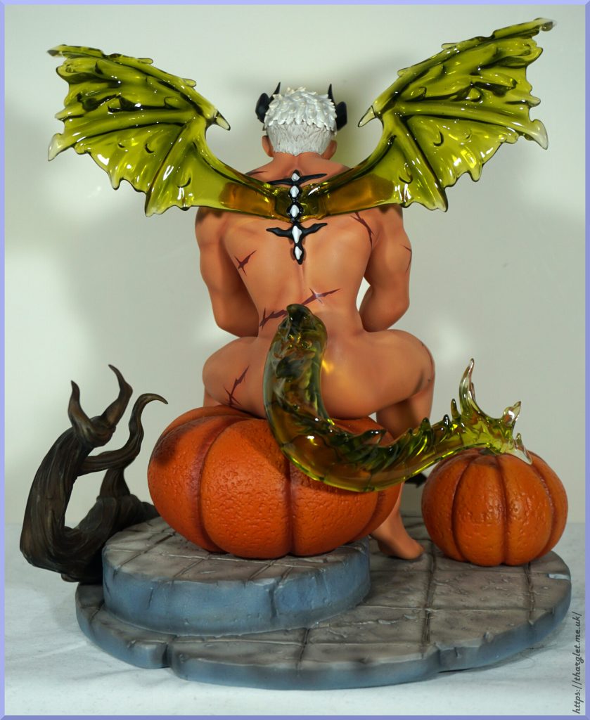
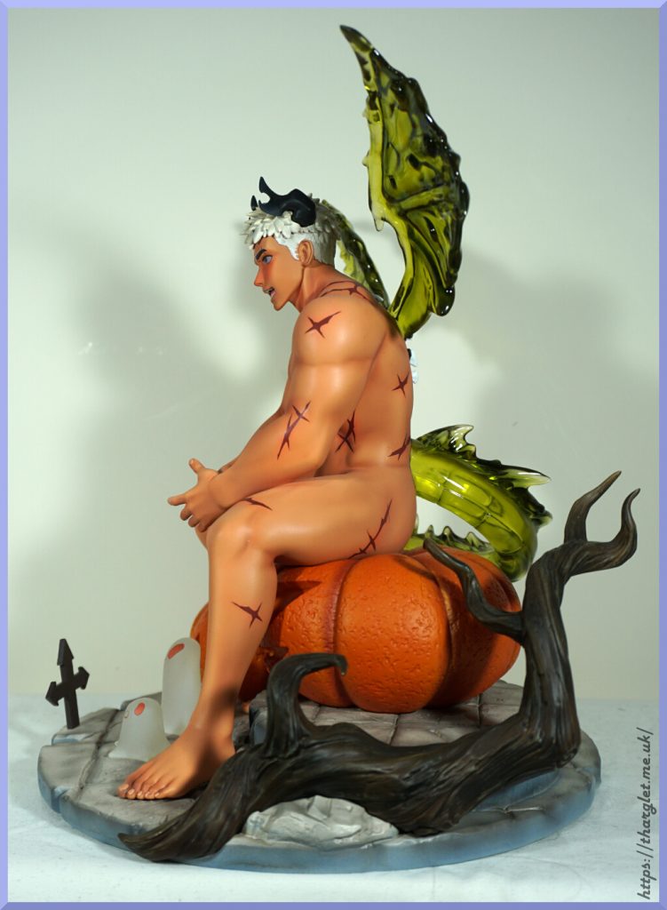
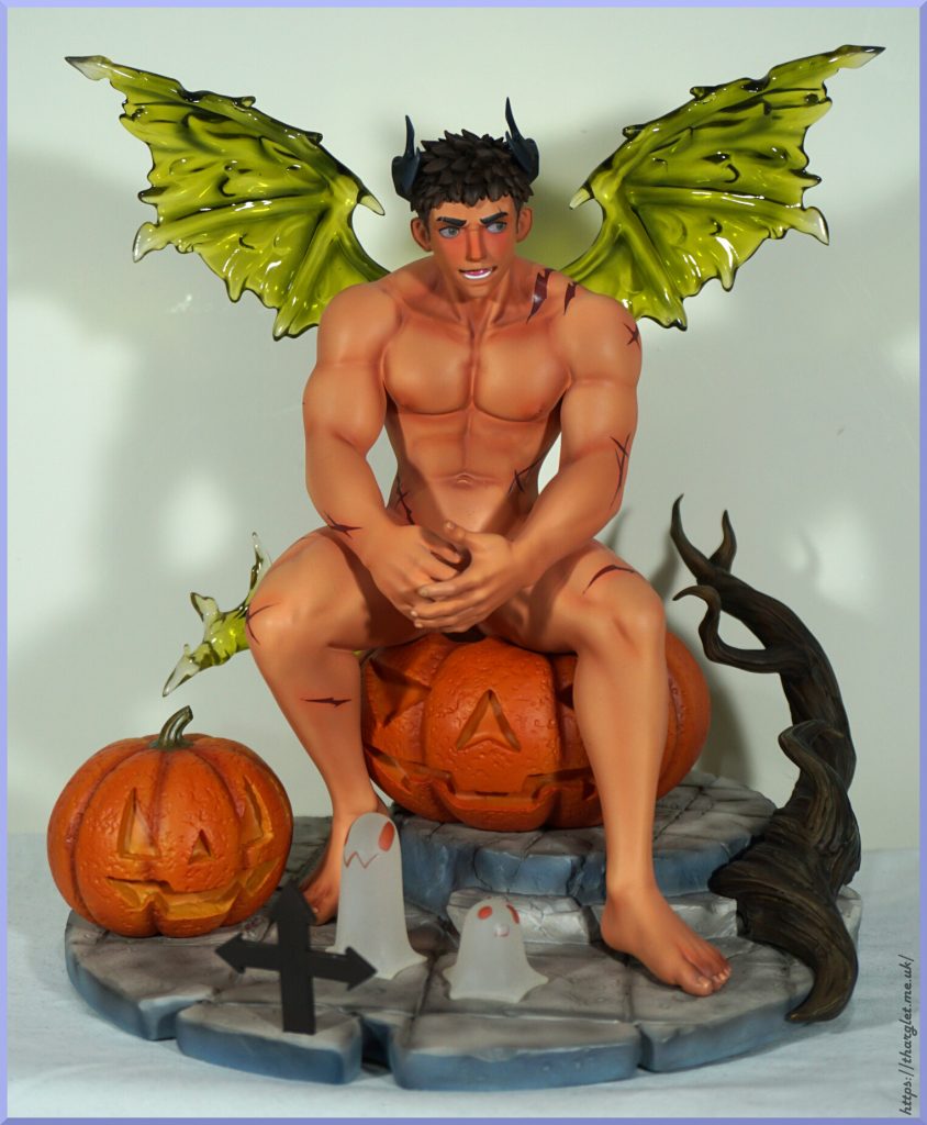
The transparent bits came out better than I hoped and love the details on the base. The figure was surprisingly easy to assemble – the parts went together well and he sits firmly on the pumpkin. One improvement from the prototype is he has no arm seams which is nice to see.

There are two disappointments for this figure. The first is the scar marks – they’re too distinct in my opinion and look more like tattoos rather than scarification or wounds. In the prototype images they’re much closer to his skin colour and thinner which makes them look more like marks on his skin rather than ink. It doesn’t ruin the figure for me, but it does detract. The second disappointment I’ll get onto later – see if you can spot the omission.

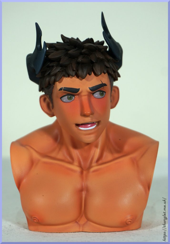
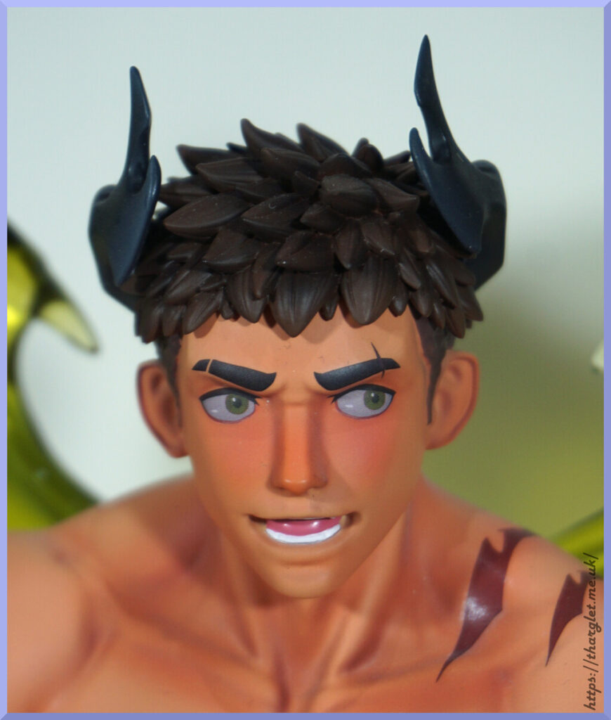
He also comes with a brown-haired head:

They’re both the same sculpt, so all you’re choosing is the hair colour here. I prefer the white hair, so have gone with that in this review.

Display bust

If you love both of his head designs, you also get a bust to display the head you’re not using:

An interesting addition that allows you to keep both heads on display. Seems fairly stable – haven’t had issues with it falling over. The sculpt and skin paint are the same as the figure, but it doesn’t have the scars on his shoulder. Can’t say I miss having them on this bust. This bust was advertised in the original promo images but I completely forgot about it so was a surprise on unboxing. It’s fine – I’ll sneak it into one of my displays, but it’s something I could take or leave.

Close-ups

OK, let’s start with the elephant in the room – the missing feature:

Yup, due to the Chinese restrictions he came with no penises. He was supposed to come with three choices but came with… none. Mine was a proxy order so there was a chance I missed out, but I talked to someone who preordered from an internationally-facing site and they didn’t get any either. Bummer.
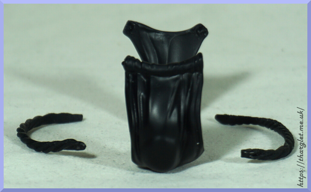
Due to where he’s holding his hands he gets away with being a Ken – if displayed at a mid or high level it hides that there is nothing there. Which is fortunate as the underwear he comes with is absolutely terrible:

I did try doing a test fit with the gusset and it was a nope. It also transferred a little paint that I had to clean off 😒. The straps don’t clip to the main part so it’s a total waste of space in my opinion – you have to provide your own glue or putty to keep it together. It does give the impression of him having anatomy but it’s not really worth the grief of making it work. If I wanted to give him undies I think I’d buy or make a fabric pair for him. Can always give him some cotton balls…

OK, with that out of the way, let’s check out some of the details on the base:

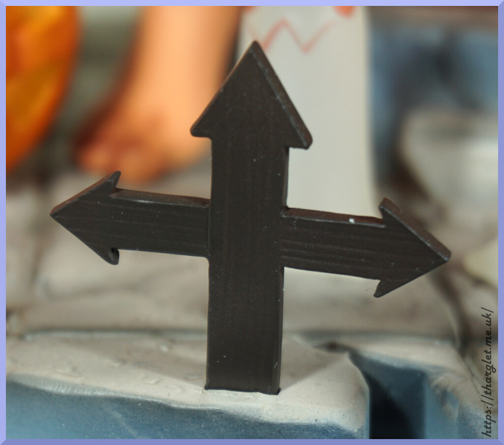
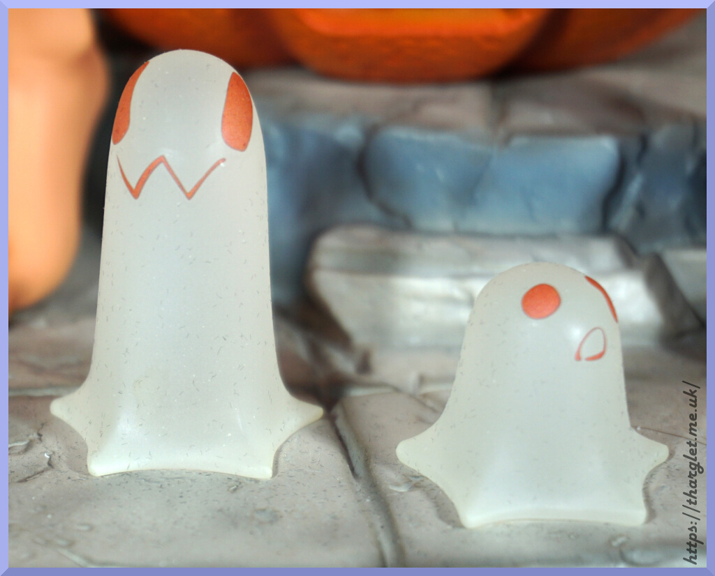
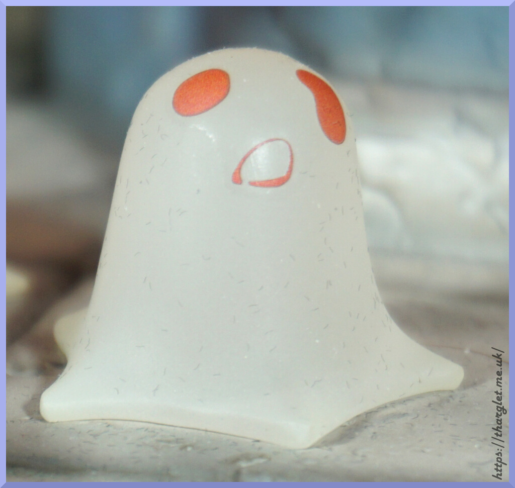
The ghosties are cute but do seem to be dust magnets 😅. The cross doesn’t have a big peg, but seems stable enough. The wood texture is nicely done on it.

Pumpkins:

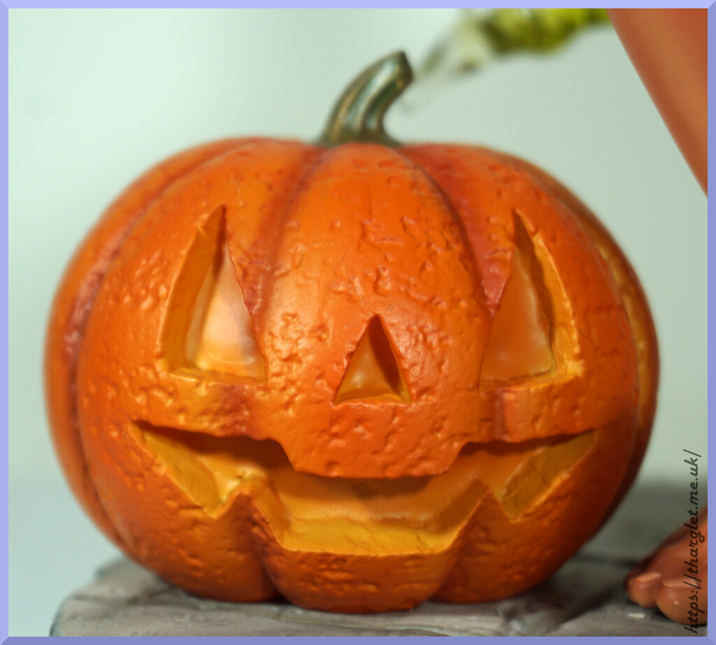
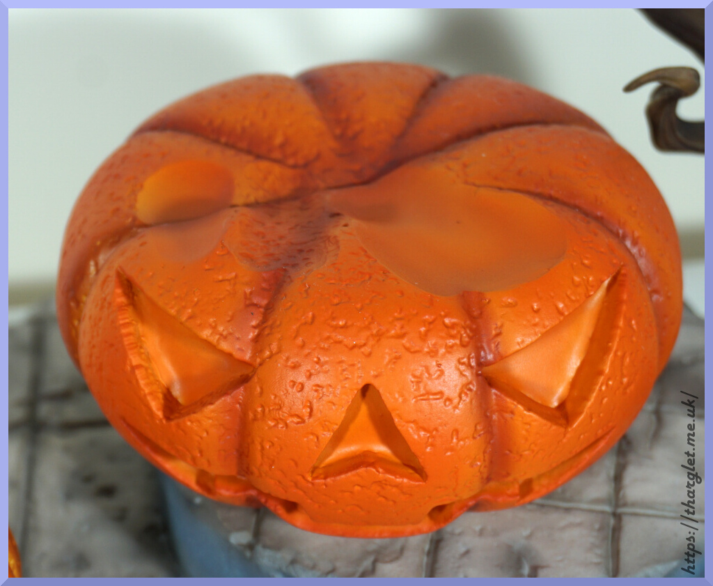
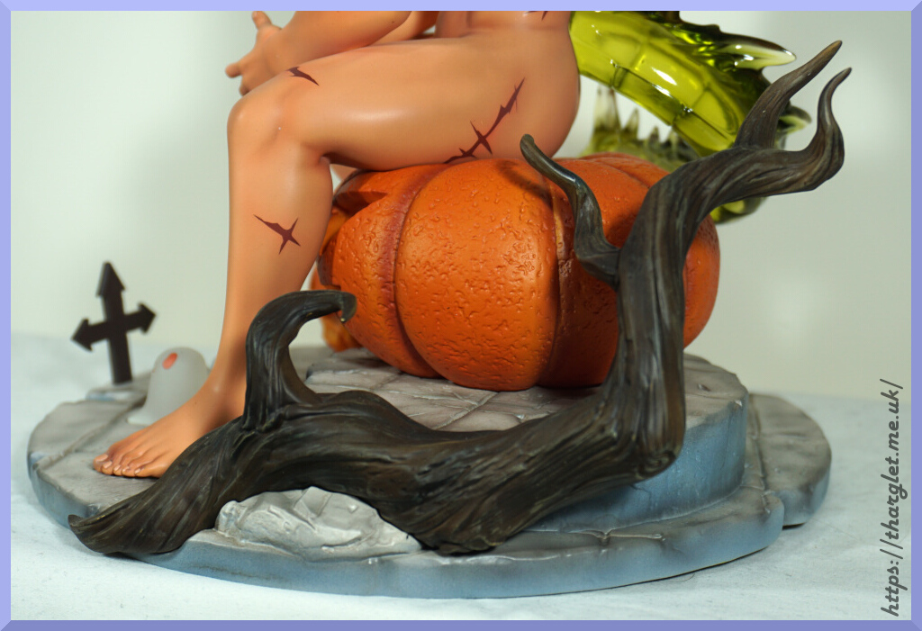
These are the stars of the show on the base – they have a good detailed texture and have vibrant orange colouring. They maybe could’ve put the paler yellow in the eyes of the bigger pumpkin like the smaller one, but this doesn’t show so much once Green Pepper’s ass is on it. The dimples on top of the large pumpkin are to keep Green Pepper sat still, and they seem to do the job well. The pumpkins aren’t initially on the base and install with large pegs.
Branch:

This part is also initially separate and connects magnetically to the side of the base and was easy to attach. In terms of assembly, this figure was easy to put together. Only part I had some trouble with was his head but once I got the angle right it snapped into place.
The sculpt on this branch is detailed. There is some shading on this part but it’s not very distinct. It looks the part though and fits in well with the base.

The tilework on the base is also nicely sculpted and shaded. Overall, the base is a solid addition to the figure and compliments Green Pepper well.

Faces:

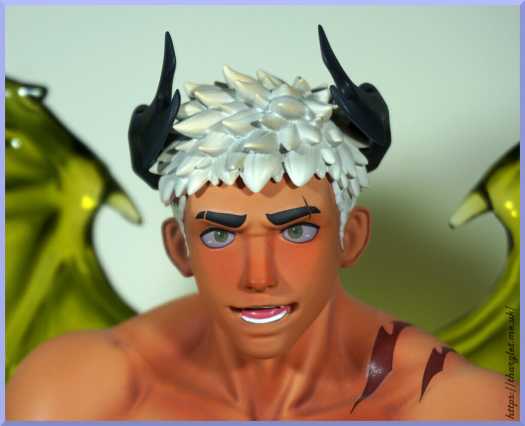
Looking closer I’ve finally noticed there is a difference I was picking up with the faces – his left eye is cross-eyed on the white-haired face and not on the brown-haired face. I knew there was something bugging me. Honestly I find the expression kind of strange – like he’s about to say something. Would’ve been nice to have included a head that was smiling or otherwise more interacting with the viewer.

Both are nicely sculpted and painted, so no complaints as to the quality from me.

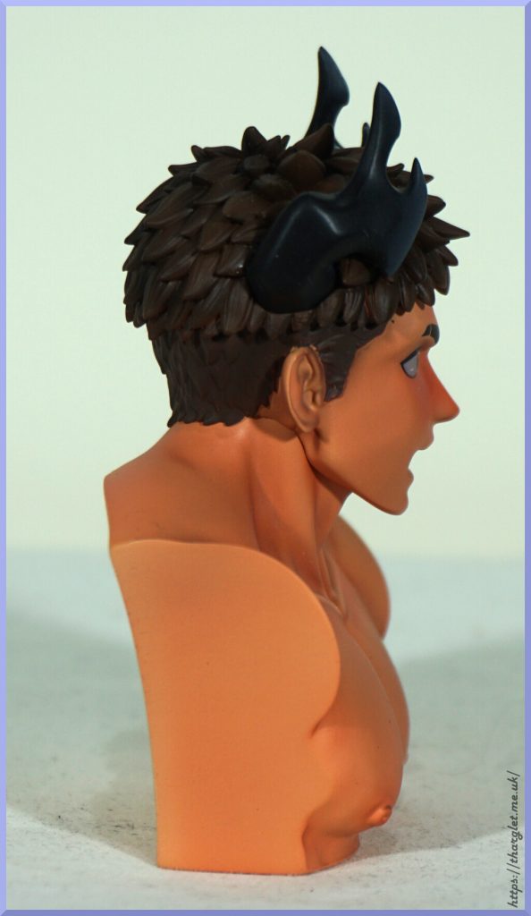
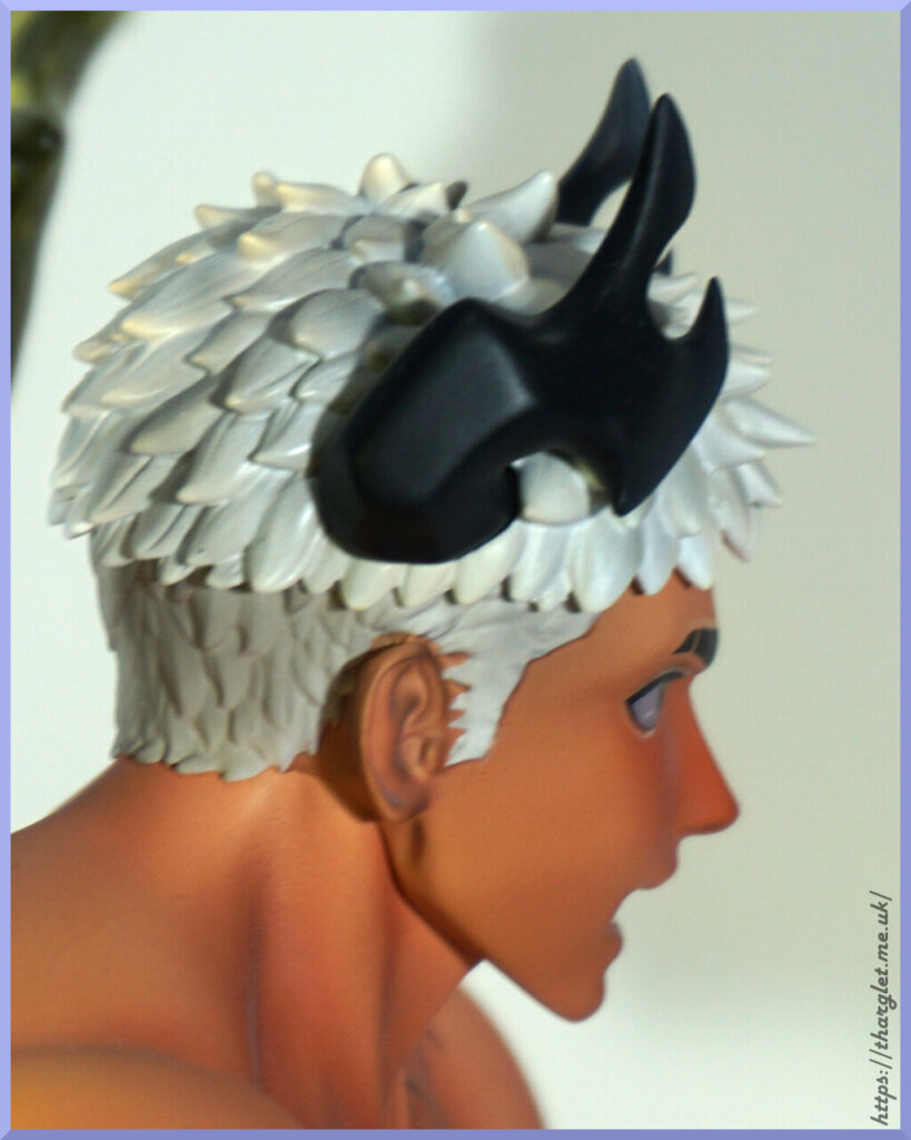
Side of the head:

I do like the way his horns aren’t a simple shape making them more unique. The white hair has a decent amount of shading it to make it feel like hair.

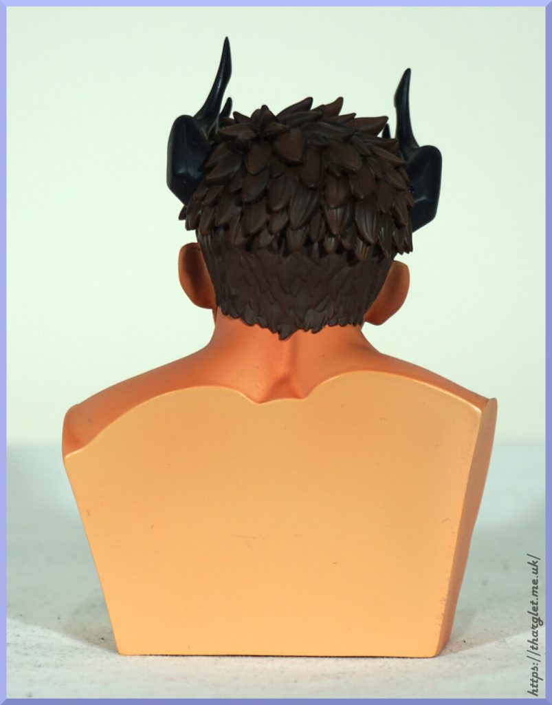
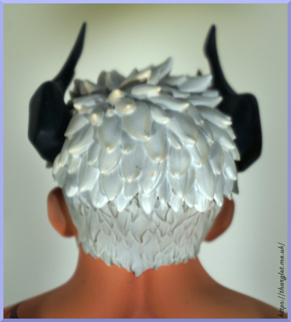
Back:

Looks like mine got a stray dot of yellow in the middle, whoops. Other than that, we have plenty of sculpting here to give his hair depth and detail.

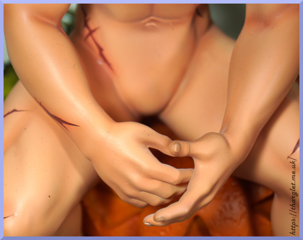
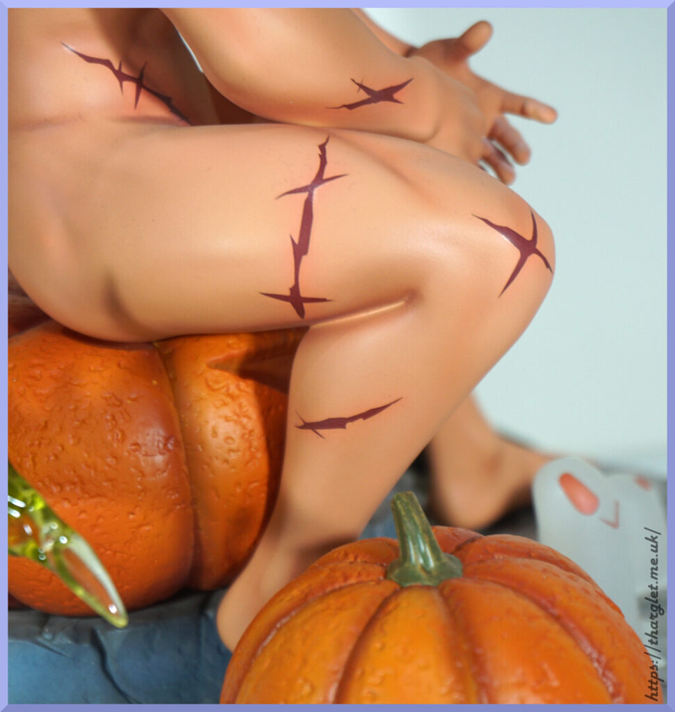
Markings:

Unfortunately the edges are far too crisp, the colours too dark and the transfer backing is too visible to pull off the effect they were going for. They really do look like some kind of Halloween temporary tattoo, which is a bit of a shame.

Leg:

Here we have a bit of a leg weld, where the parts of the leg are joined together. Could’ve done with some darker paint in there to hide that or moulded so more of his leg is pushing into the upper leg so there’s less of a slit. The upper thigh markings have the vibe of a 00s barbed wire tattoo. The skin shading is really nice though.

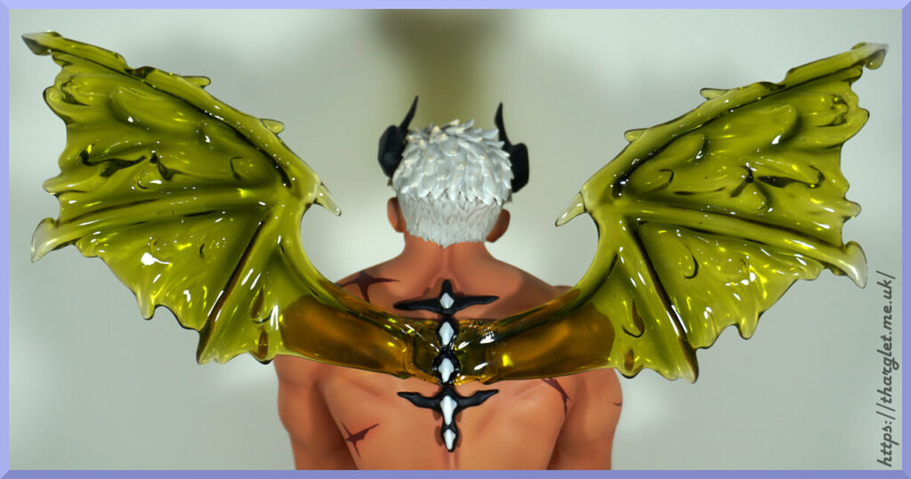
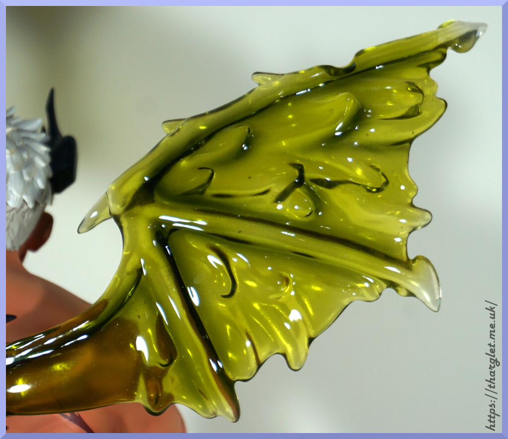
Wings:

The wings come as one piece – taking them out of the box was a bit of a fun time but assembly is dead easy as the whole thing just plugs into his back. Love the colour and the gooey texture moulded into them. Transparent parts can be a hit or a miss – these ones are a hit for me.

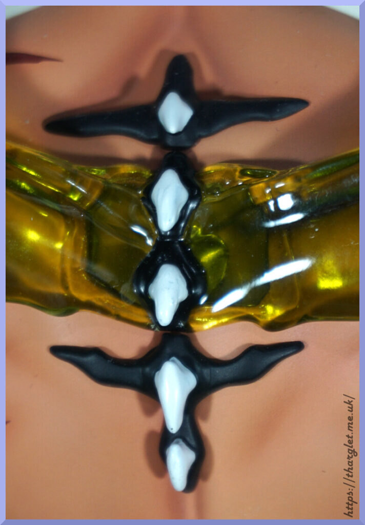
Spine:

He has this interesting spiky design down his back. I like it, and kind of wish they played with this motif from the front – maybe some spiky elbows or around his ankles or something like that.

In the above photo you can also see the big peg that keeps the wings in. And the magnet that’s mostly hidden by the spine. So do wonder if this was actually some artistic license to help obscure this joint.

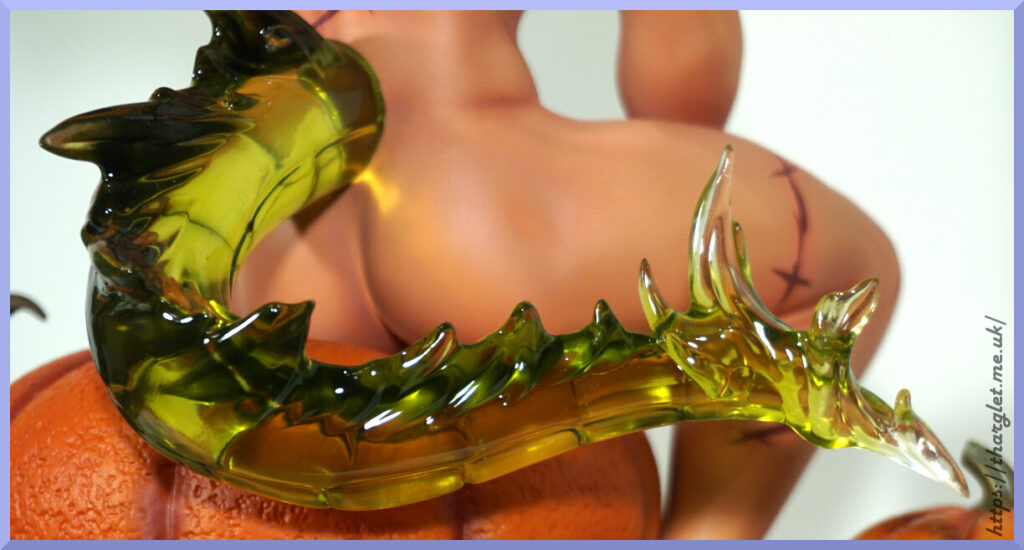
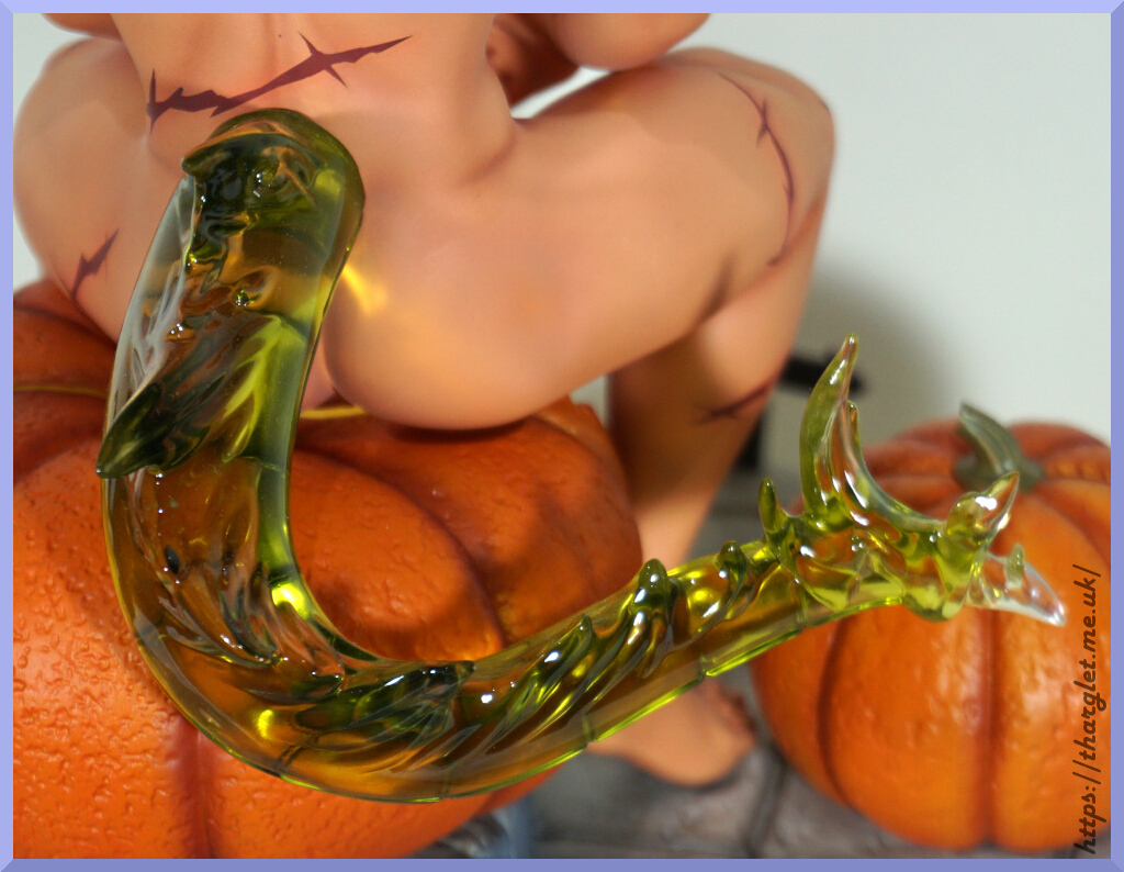
Tail:

Love the shape of the tail – he could do some real damage with this fellah. The colour matches with the wings and has more of a gradient in the tail, fading to clear at the tip of it. Whilst the wings do have some clear tips it’s not as obvious as the tail. There isn’t any blend between tail and his back, but not personally bothered by this. Overall I’m happy with the detail and look of the tail.

You can also appreciate his toned bum from this side too 😉

Conclusion

Overall, I’m pleased with the look of this figure. It’s disappointing his penises were cancelled, but he interestingly looks fine without one. If I could change one thing about him it would definitely be the scars/cuts – they do look like cheap Halloween temporary tattoos and I much rather they had the more realistic look in the promos. The promo had them as healed scars, in the final product they’re kind of neither wounds or scars. For the skin some people may find the shading overdone – I think his collarbones ended up a little over-dark, but otherwise happy with it. I like the way his body is muscly but not an overdone beefcake.

The transparent parts came out better than I hoped, plus the base detail was well-executed. The underwear was an underwhelming disappointment, but thanks to his pose these can be left in the box. I have a feeling if he did come with penises I would be mildly disappointed how hidden they were thanks to his pose. Swings and roundabouts.

Could I recommend this figure? Ehhh. Depends if his negatives detract too much for you or not. Most of the figure is solidly executed – parts fit well (if we ignore the underwear), the painting and sculpting is solid in most areas, but then we have the skin markings that have a temporary tattoo vibe.

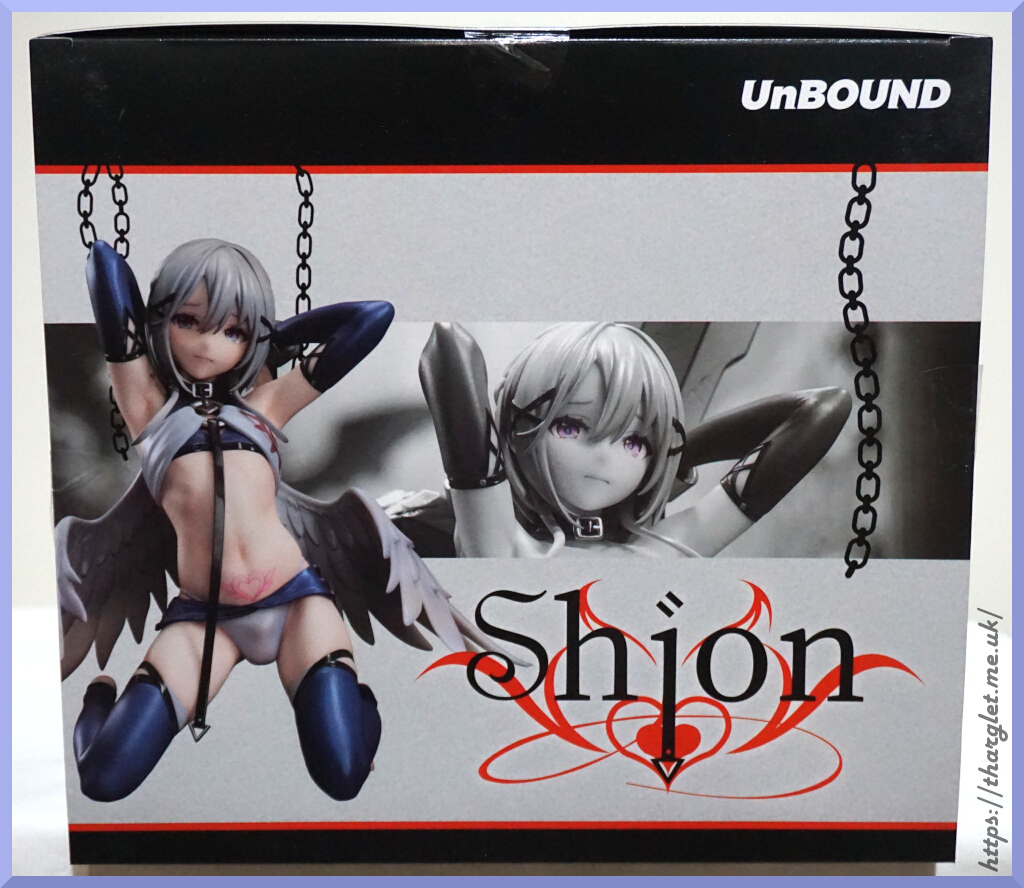
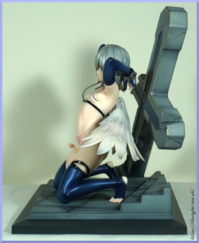
UnBound – Shion

This is the first figure by the company UnBound so was a gamble of a preorder. However, they have partnered with Native for distribution so less of a gamble than an independent manufacturer. Native usually have fairly high standards for their own figures and those they distribute.

In recent years, Native has partnered with AmiAmi for international distribution and this was my first Native-distributed preorder with them. After placing my preorder I waited. Then I waited. And waited some more. He was originally supposed to release in January 2025 but didn’t release until December 2025.

In terms of price, he was JP¥25,200 and the shipping was JP¥3,310 for registered air small packet.

Box

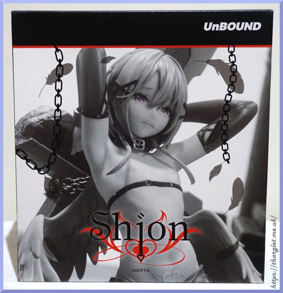
For the front and the sides they went with a mostly greyscale photo:

And then a colour shot of him on top:

Felt it was rather interesting to do the art this way but does make for a striking box. The texture of the box is plasticky – I’ve seen people comment it feels cheap and I agree. The cardboard isn’t of a premium thickness, but the main issue in my opinion is that it was a poor choice of cardboard texture. It makes it feel like a cheap plastic folder – the kind you’d get from Daiso. There are parts that have gloss on them like the feathers on the front of the box so I don’t think they were cheaping out on the box design overall.

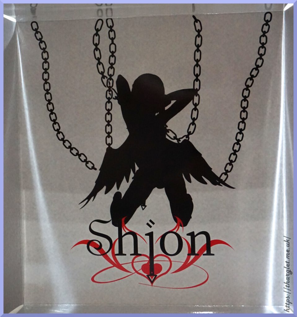
It also has a nice liner:

We’re greeted with a silhouette of the figure with logo and chains. Wasn’t initially going to include a photo of the liner in this review, but thought the detail here warranted showing it off.

Technical difficulties

When taking him out of the box one of his wings flopped off:

Er, that’s not supposed to happen. Reading the My Figure Collection comments for this figure, I’m not the only person this has happened to. Guess the QC didn’t double-check the glue on the wing pegs. From the grey smudging, I’m guessing gluing was attempted but didn’t see any evidence of residue otherwise. Pretty sure the pegs are not supposed to be friction-fit into the wings themselves.
Thankfully AmiAmi supplies you with plenty of paper, so I was able to tear a corner off and use it to gently plier out the loose peg and glue it back into the wing. Then delay the photoshoot a few hours whilst I waited for it to bond…

Clothed spin-around

Wing fixed, we can now take a good look at him as he comes out of the box:

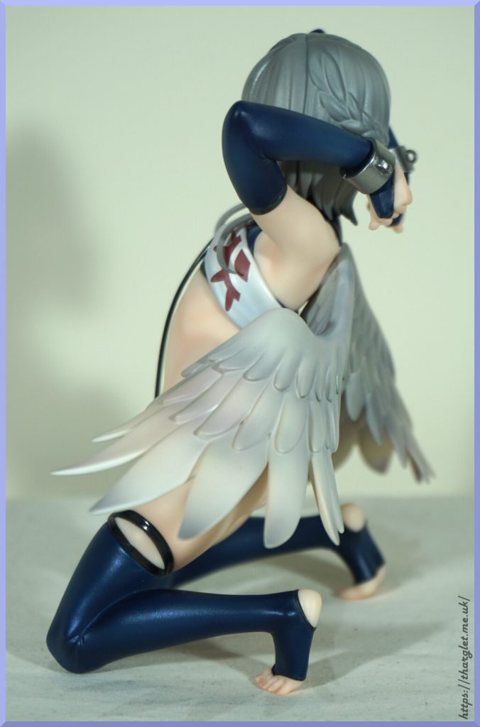
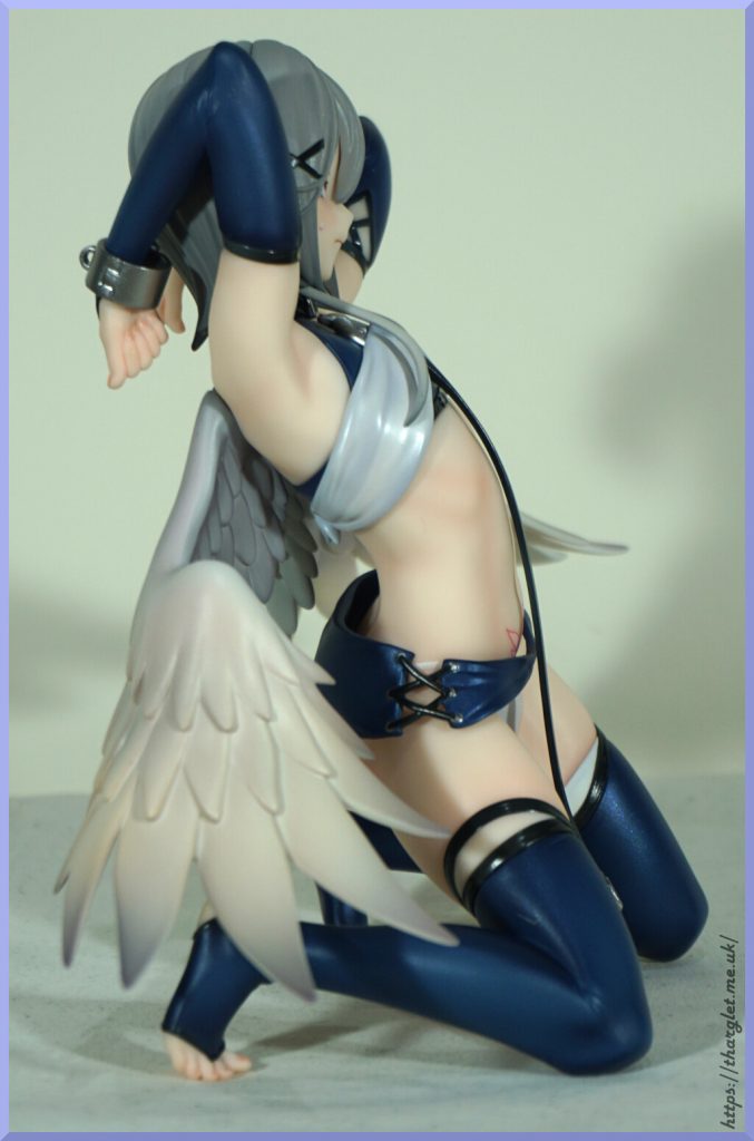
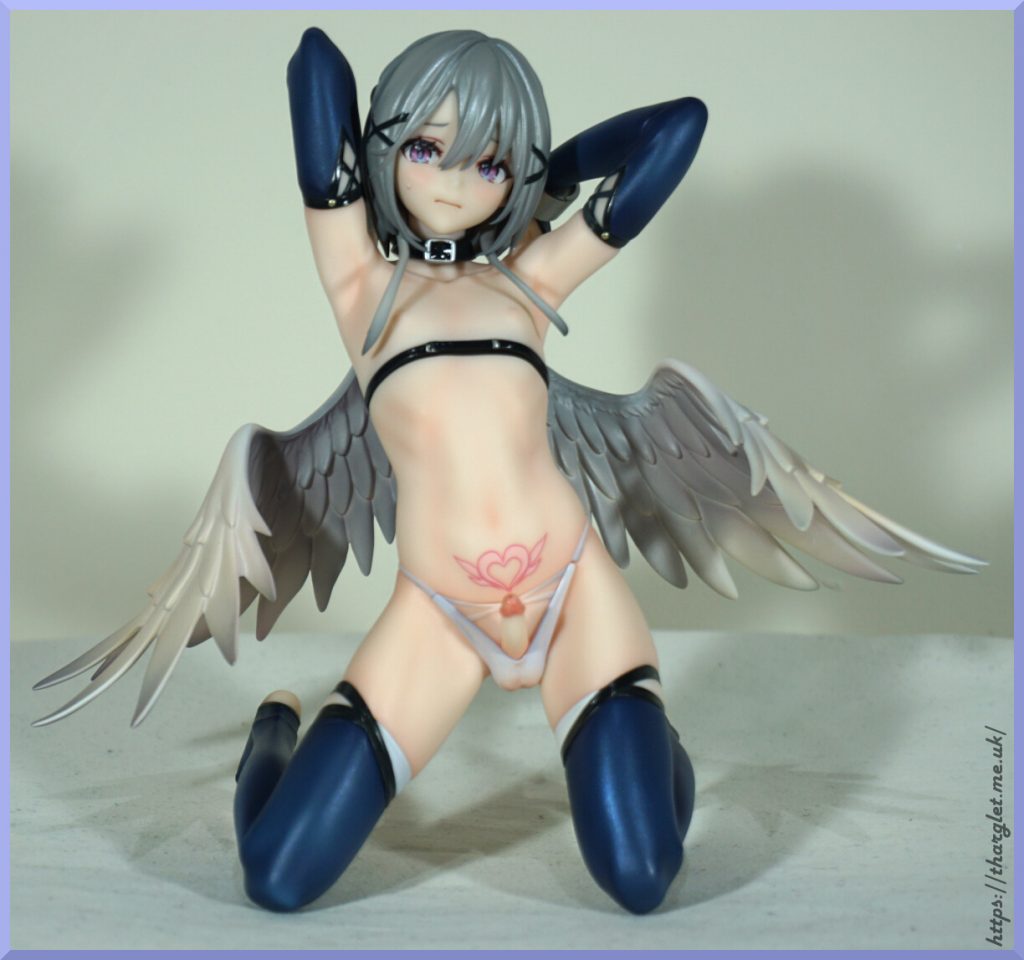
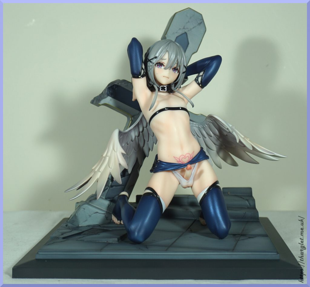
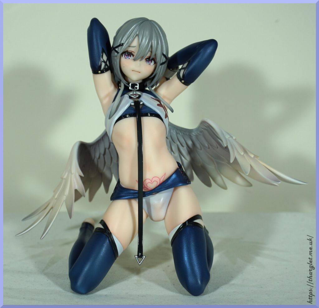
Upon getting him out of the box his small size is immediately noticeable, compounded by the chosen pose. He’s pretty much a palm-sized figure and I don’t exactly have large palms. I like the way his wings are posed around his body and the way he has a lead attached to his clothing – wish this was an option you could clip to the other body piece.
Clothed close-ups

Face:

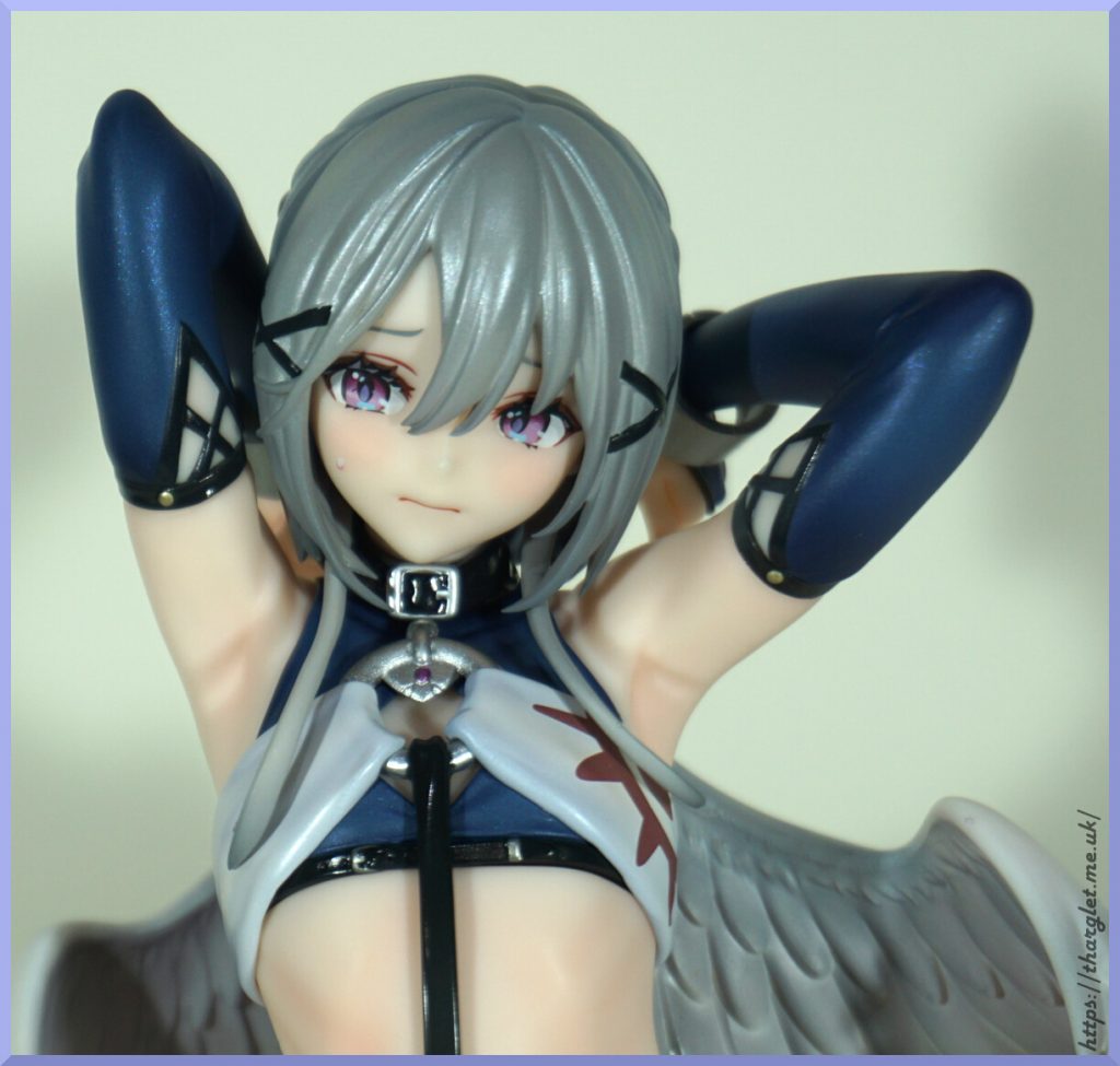
He has a concerned expression to fit with the “tied up” theme, along with flushed cheeks and droplet on his face. Sweat? Tear? Whichever you like. The eyes are nicely detailed and the purple colour is up my alley. The hair unfortunately lacks paint detail in the bulk of it, and in my opinion the shiny grey is odd. I’d like to see a bit more shading here and a different finish for the hair.

Clothing-wise, everything is painted neatly and there is a nice range of textures- from the metallic shiny of the clothing fabric to the shininess of the belts.

Hair from the back:

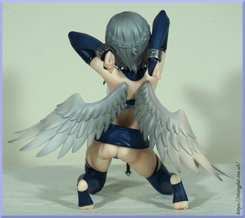
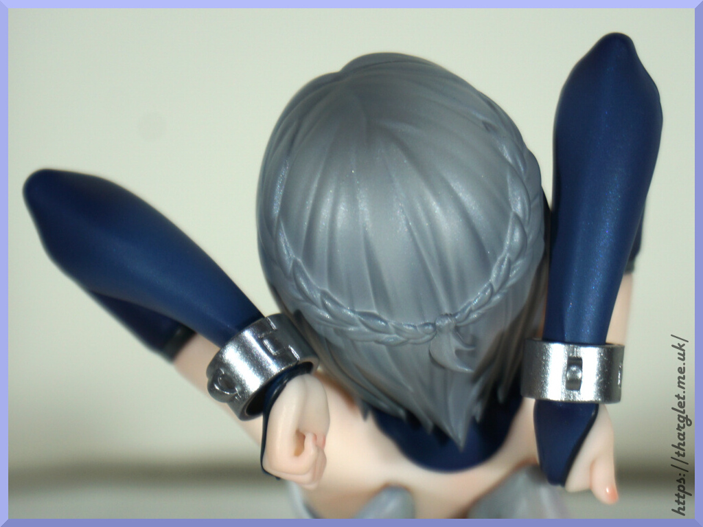
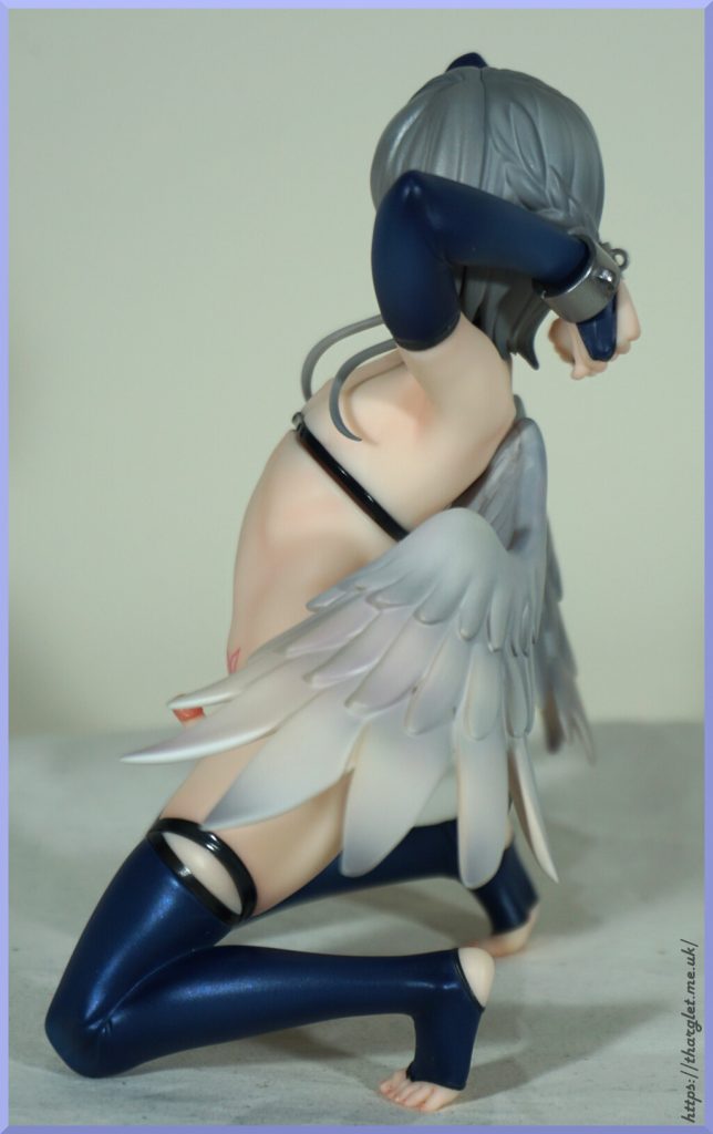
They’ve given him braids, but… ehh. The mould really isn’t selling them. There is more shading back here, but it’s not really making up for the overall finish and moulding. The two manacles look good, but one major issue – there isn’t any way of connecting them to anything without supplying your own part. His arms are nicely painted and so are his fingernails.

Side of the top:

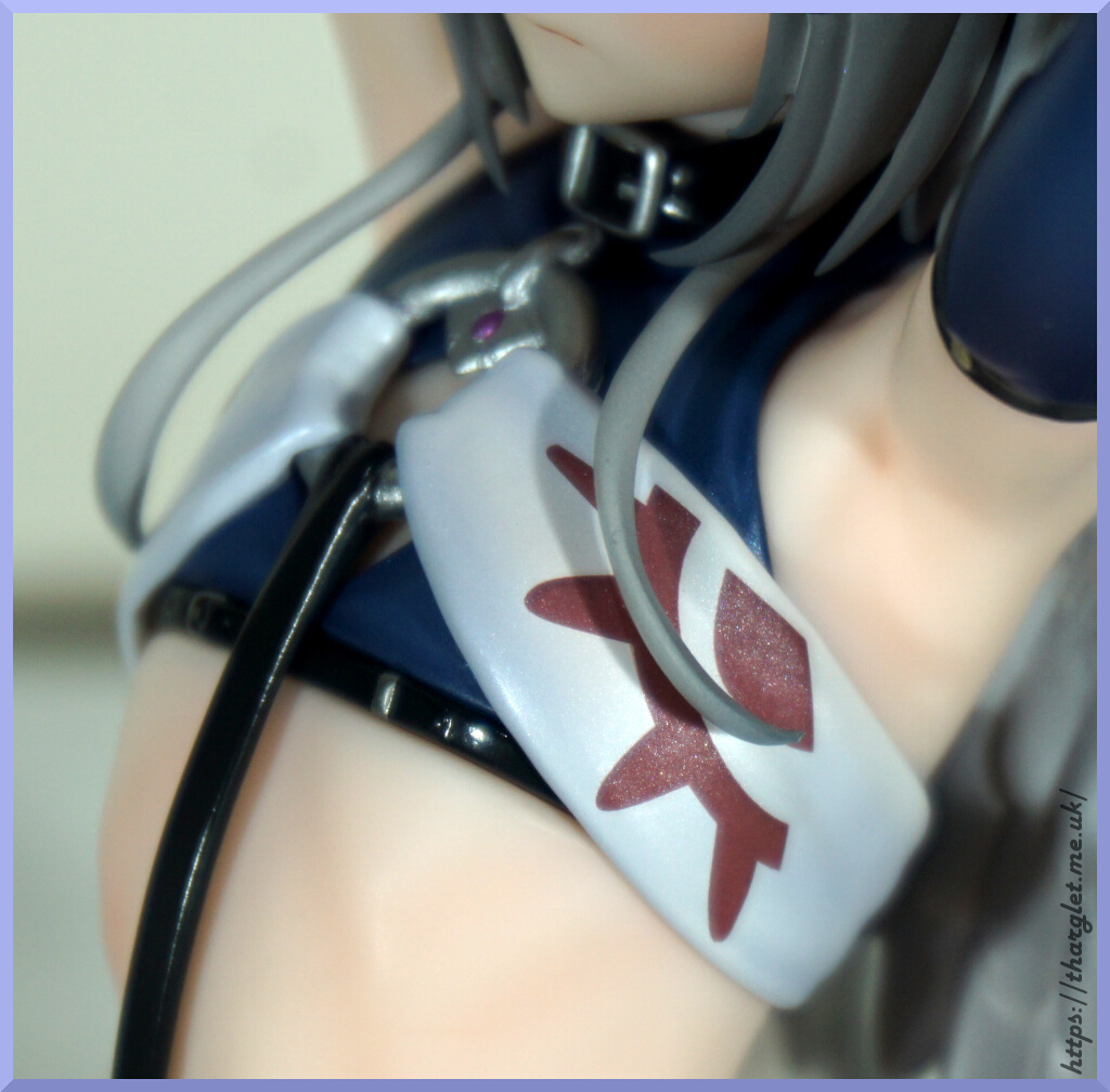
Not sure if the pattern is supposed to represent something but does add detail to the top. Looking up close I’m not sure the inner and outer parts aligned properly but not really noticeable at a viewing distance. As this part I believe is supposed to be fabric, alignment between the pattern and the fold isn’t necessarily to be expected. In the ring they’ve snuck in a purple gem detail to give it a bit more colour.

Wings:

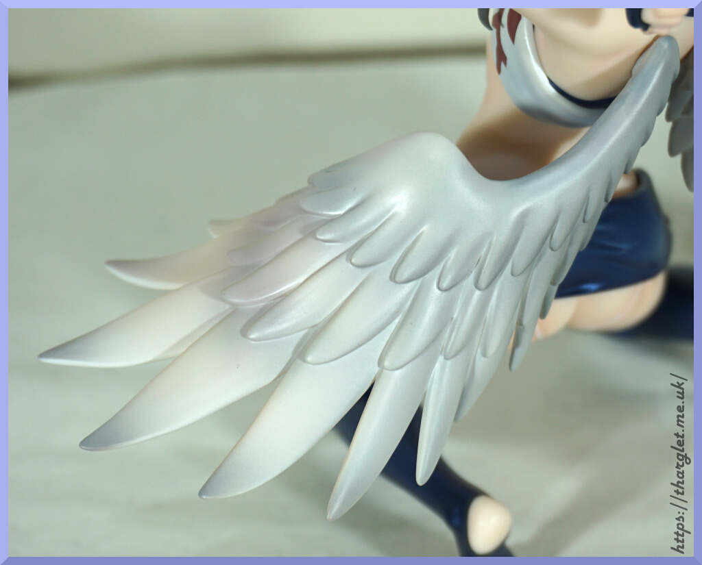
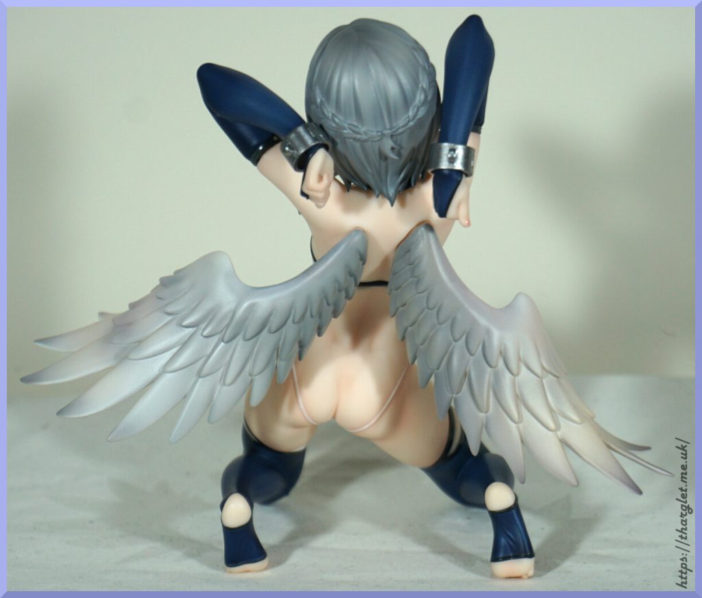
The sculpt isn’t super-detailed here – we just have large, coarse wings with no feather patterning but the feathers are sculpted on both sides. The paint has a few colours in it which helps add depth to the wings and not make them feel plasticky.

In the lower picture we can see where his skirt has lacing detail, which is a nice addition, plus his painted toenails.

Back:

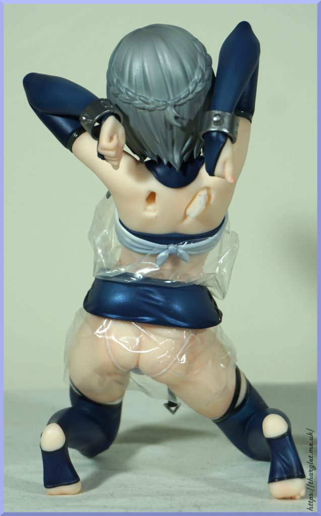
He has a cute tie at the back of his top. Plus the super short skirt that covers absolutely nothing. They’ve sculpted some creasing back here to give the impression that it is tightly pulled over his backside, however this illusion is somewhat broken by it being a loose floating part.

Looking at this skin we can see some subtle shading – this does help add depth to his skin and I do like the gentle shading.

Feet:

Here we can see his delicately-sculpted toes and the fact they’ve actually painted the strap from his stockings around his toe. I do like this attention to detail. There is a bit of a gap where his crotch is, but that might have been me pulling at it before I did the photoshoot.

Changing of the parts

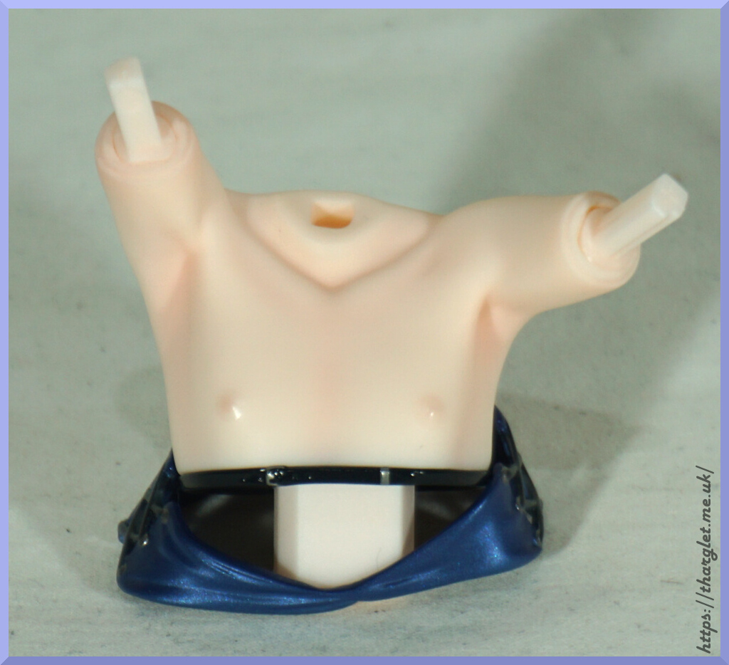
In the box he comes with a replacement crotch and upper body half. Despite already knowing this I still turned around the upper body part thinking it was a lower half at first – and I know I’m not the only one to do this. So here it is the right way up:

The skin shading is nice on this part, and we have shiny nips. Yay for male figure with nipples.

As can be seen here, there is a lot of reassembly to be done – remove arms, head, wings and lower body. The removal went smoothly, but getting his head on and wings in were a struggle. And I really didn’t want to risk being too rough with the wings with the earlier issue – I did heat up the body which helped some, but didn’t quite get the wings fully in. Likely with enough persistence I could get them fully in, but just would rather not risk it.

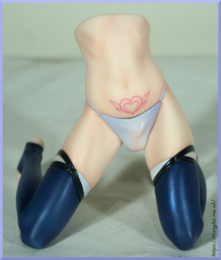
And now we have some leggies:

I don’t know why this amuses me, but it does. Without the skirt on, we can now see why he has some of a skirt – it works to hide the joins between the front panel of the underwear and the waistband.

In this half-assembled state we can also gain an appreciation of the skin shading – is one of the standout features of this figure in my opinion. They did well to highlight his body shape without going overboard.

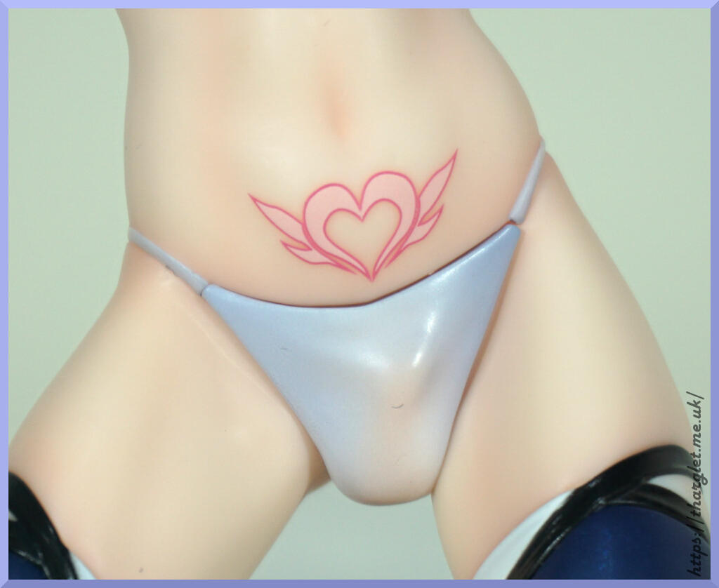
Close-up before we change out the crotch:

It does look a bit gappy here, but I think that may be my fault. Wasn’t particularly noticeable until editing the photos so don’t think it’s a big issue. Though the underwear join will still show – if you don’t like this, can hide it with the skirt.

This figure doesn’t have a full SFW option – his manhood can be seen pressing up to his underwear. The effect is nicely done and looks like skin under fabric – I have seen other figures that fail to replicate this effect so kudos for UnBound doing a good job on this. Oh, and the dust “pube” isn’t included – sorry, that’s dust floating around the room.

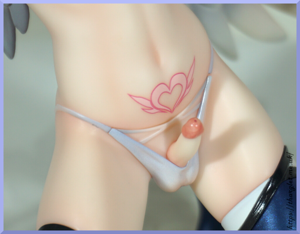
The tattoo is cleanly printed but isn’t very detailed. Would have liked to see a bit more flair here, but it’s fine for what it is.

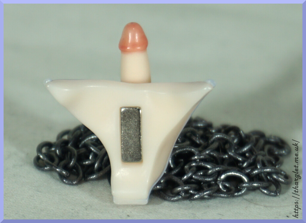
The crotches connect via a magnet:

We don’t see this much in licensed products, so nice to see it becoming more common. And if you’re curious, yes the chain he comes with is magnetic and can stick to the shown magnet 😆

And if you’re scrabbling around in your box going “where’s the penis?!”, it’s hidden under the cross. I think this is the other reason that people think the upper half is a lower half at first – you’re expecting to unbag a penis and you get…. a chest piece. But no, you have to dig deeper into the box to find the “goods”.

Installing the second option:

As expected of this body type, he has a dainty member. He has a very dark tip and pale shaft. I like the way they’ve done the underwear – they’ve made it fit in with the figure and be revealing at the same time. Whilst a fully naked lower would’ve been nice, this does keep the figure cost down by not having to have another lower body part.

And before we fully assemble, here he is without the wings:

If you just want a cute male figure without the wings, this works from the front. I’ll think you’re missing out, but if you prefer your men to not fly away this is an option. I’m sure there will be at least one person out there who’ll display him like this.

Less clothed spin-around

Whilst I call this his “naked form”, he’s definitely not fully naked, with the underwear, leg and arm coverings. But if you prefer your men less clothed, this “mode” definitely provides. The strap across his chest does well to hide the join and fits with the theme of the figure.

Base

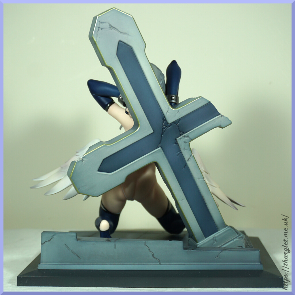
The base is a fallen cross in some kind of courtyard to fit the theme of the figure:

I like the weathering and crumbling effects. I’ve seen some people complain about this base, but I like it. There is paint detail here, but the stone isn’t super-stonelike. Though to me that just makes it feel more like a modern, veneered type construction.

Close-up on the paving:

Plenty of shading to be found here. For me, I don’t mind the very defined edges, but I can see people not being a fan of how sharply the edges are defined, especially around the stairs. For me, I don’t mind it being a vignette.

In the top-right near the stairs there are some round dimples – these are for his toes to help hold him in place. There’s also a dimple for his knee by the raised tile plus two more toe dimples near the base of the cross. It’s not a sturdy hold, but does make it so he’s harder to accidentally skid across the base.

Base display spin-around

Now to put the bits together!

The base compliments him well in my opinion – it really does add to the piece especially with his small stature. Often with freestanding figures I’ll display them without base, but this one I’ll make an exception as the base adds to the figure.

And a bonus shot with him with his skirt on:

I did try to get it to sit under the tattoo – it would fit under it but it “pings” up. Probably fixable with some heat, but not bothered enough to try. I’ll be displaying him without. Not having it clip in does mean he’s displayable without it, but any deformation and it doesn’t sit in the right spot. Not 100% sure what the best solution would be to make it friendlier to fit overall, but if you do want to display him with skirt you may need to deal with it not sitting exactly in the right spot. And displaying him without means you do have the gaps in the underwear.

And pondering that – maybe bigger gaps in the underwear would be the answer – the skirt could peg into the gaps and then supply a couple of wing-shaped bows to plug in the gaps when he isn’t wearing his skirt would look cute and hide the join. Have seen this on other figures, usually on their armbands when casting off.

Base and chain

The instructions say “you can place the chain freely”, and I suggest you should – the suggestion in the instructions is to wrap it around the cross, but doing that it is barely visible. One thing I will point out is the chain is magnetic so there is likely to be iron in there – this means if you’re in a hot and humid country you may want to periodically check for rust or place it on the base only if you don’t want to risk the figure. UK has the humidity but not the heat – not personally had issues with figure chains rusting. I have imported some from Japan that did have rust, but the rustiness hasn’t increased on figures with the imported rust. The chain I believe is painted so that will also help not having it mar the figure. The rusted chains I’ve “inherited” were unpainted.

Tied to the cross:

Chain me up:

It is disappointing that his manacles don’t allow you to attach the chain nor is there any connecting loops provided. I would’ve liked for the latter to be provided – easy and cheap to supply a pile so there isn’t any issue if the connectors break. Can understand the manacle loop being all as one part – it does make it far more delicate to have a joint or gap here which may break during assembly. Have had to assemble manacles with a gap before – it’s very nerve-wracking as it’s so easy for it to go wrong and break. Plus there can be issues with the chain slipping back out again.

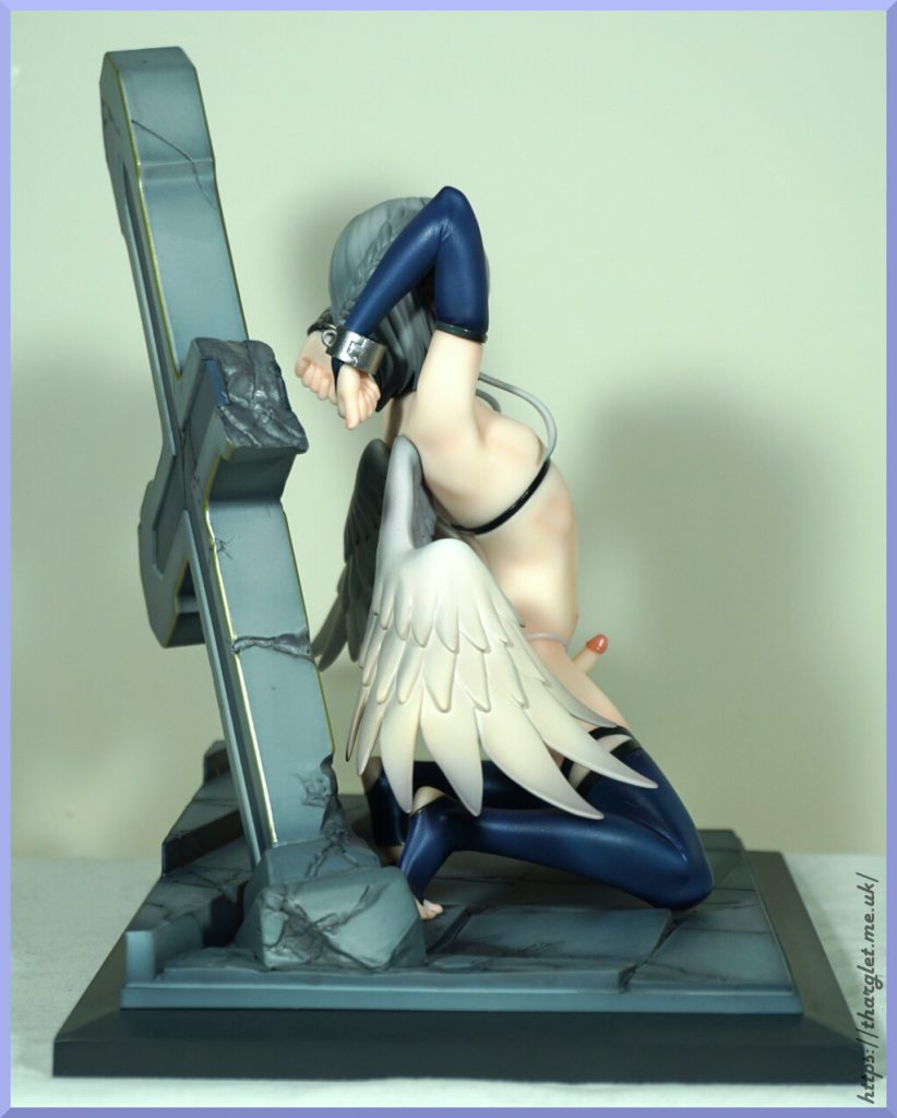
From the front, the chain display looks good, but from a side angle you can see his manacles aren’t attached to anything and that looks a little goofy. So if you have him displayed where you can see the side and want to use the chain, you may want to consider supplying your own jewellery rings/clips.

Conclusion

Overall I’m happy with this figure and hope to see more male figures by this brand. They do have one in the works, but awaiting for pre-orders to open for that one. Especially for a first figure, this is a solid piece and would recommend to anyone interested in it. The use of textures and shading is great, the sculpting is fairly solid and he’s cute overall. On the downsides, he is pretty small so may feel rather petite amongst bigger figures and the wing sculpt is rather on the basic side. There’s also some minor technical issues with the fitting of parts – notably that wing joint, the way the skirt sits and getting the parts into the unclothed top half. I don’t think any of them are dealbreakers personally, but can see these things being of a big annoyance to other people.

For anyone pre-ordering from this brand, I’d bear in mind he was delayed by a year. Whilst we don’t know if this will be a trend going forward, you may want to consider buying in stock if delays may affect your enthusiasm.

As of time of writing, he’s still in stock at AmiAmi if you want to grab him.

Sense Energy Studio – Kenta

This fellow was a random purchase – bought him from a collector in a Discord for collectors who collect male statues/figures.

After doing some research, turns out this dude has a backstory:
In 2230, humanity’s exploration of multidimensional space eliminated material scarcity and simultaneously led to the evolution of the spirit, gradually progressing towards a higher level of life.
With evolution, humans lost their emotions and feelings, which circulated and were sold as currency. Only a few people are born with the ability to generate emotions; they are called emotion creators.
If it is proven that androids can generate emotions, it will be a great step forward for humanity.

So… I guess we’ll see what kind of emotions this guy generates!

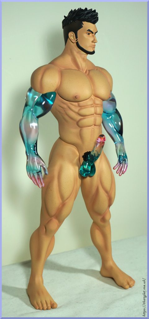
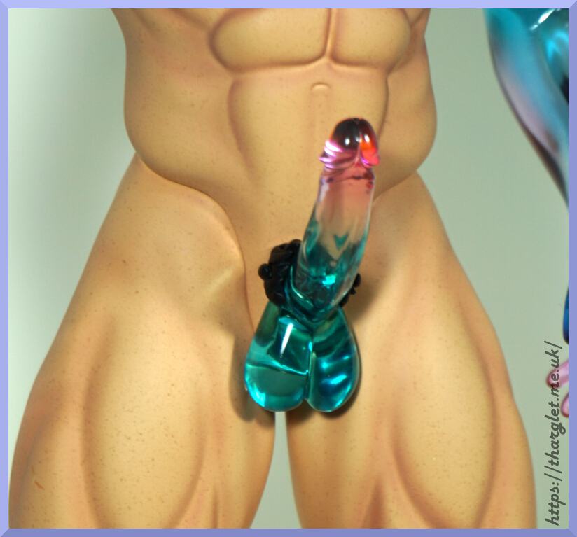
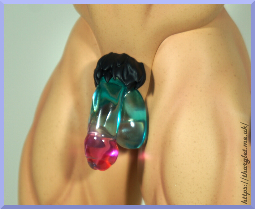
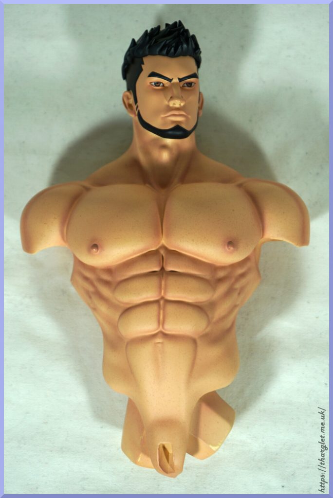
In the box, he comes naked, so let’s try him out in his naked state:

Definitely some good muscle tone on this guy! I like the way the skin is shaded – adds a lot of definition to the piece. The joints on his arms are nicely blended in, however the legs less so. Whilst he doesn’t have any extra legs, they do detach to facilitate dressing him so you don’t risk breaking him at the crotch or ripping the trousers. He has speckled skin – not sure if I’m fully sold on the speckles. On some figures the speckling can help the skin look more realistic but on this guy I think they went a little over the top and in certain lighting it can look more like dirt than skin texture. At a distance it isn’t distracting though. I may have checked a couple of times it wasn’t dirt…

Face:

Some definitely chiselled looks going on here. Not sure I’ve seen a human with such a boxy nose, but he is an android, so we can let him off. Not quite sure what to make of his expression – I think he might be up to something.

He can also be pleased to see you:

Don’t think that’s made him much happier, but both these attachment options work well and look good.

Let’s check out another angle:

That’s definitely some sproing going on there. The muscliness continues around this side, though his upper arm muscles are looking somewhat odd. On this side, we can see he’s gone for a fade to blend his hair to his beard. The hair has been moulded so it is raised from the skin, but from some angles it does look a bit like a tattoo than hair as there isn’t texture to it.

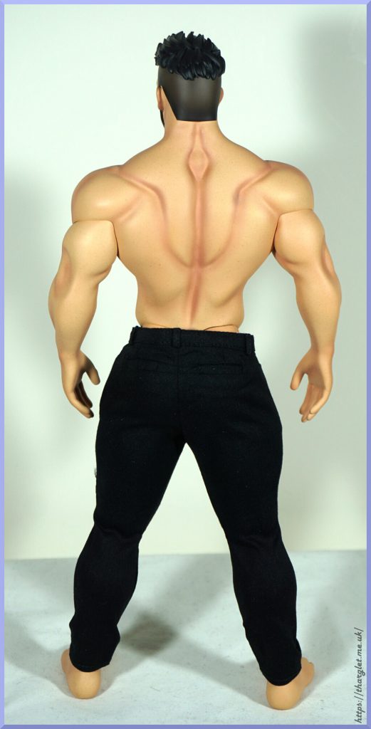
Butt view:

He has an interesting pattern on his back – I think they were aiming for bodybuilder but it doesn’t really match up with that and looks like a symbol so I feel it gives “constructed human” vibes – which isn’t off the mark seeing as he is an android.

Looking at his hair also gives a bit of android vibe as the cut at the bottom of his fade is very straight, again, giving that almost tattoo look.

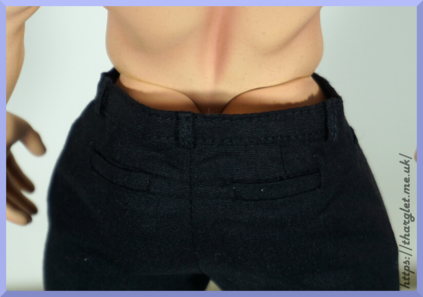
The arm and leg seams are pretty apparent – arm seams aren’t the most distracting, but there’s no missing the butt seam. Especially as it’s attached to one of the most rectangular butts I’ve seen – wish his cheeks were a bit more rounded.

Finally, we can see he didn’t skip leg day and we have some muscle definition back here too. Not quite as much as the front, but enough to let you know those legs are strong.

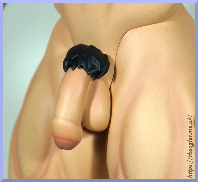
Closeup of the “goods”:

A good amount of sculpt and paint detail down here. No shading in the pubic hair, but his face/hair is more cartoon than realistic appearance. The colour tone also matches the body well.

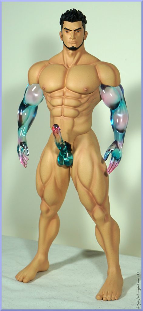
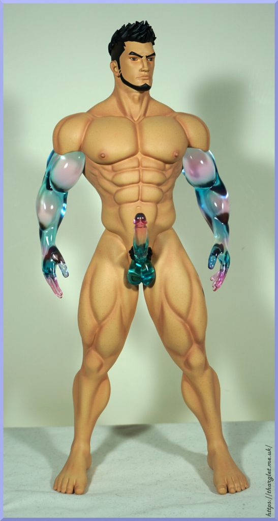
OK, what if we prefer our androids to be more… cyber? Well, we’re in luck!

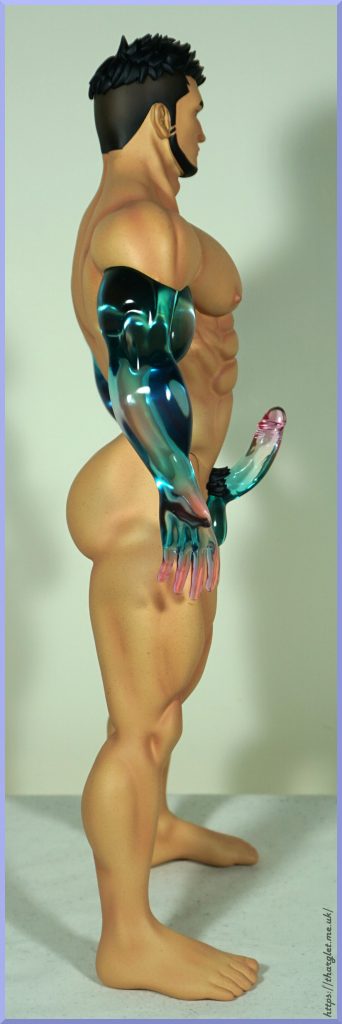
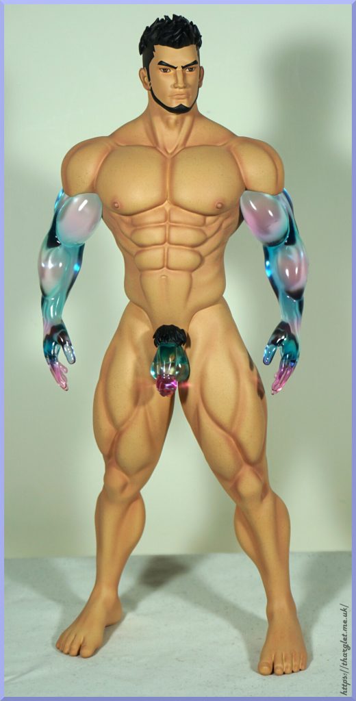
Yeah! The 90s strike! He has transparent arms and cock to match. In a very cyberesque blue-purple combo. There isn’t any transition between the shoulders and the arms, so I can see that being off-putting for some people. I think it would’ve been nice to paint a transition on the translucent part, but in some way it does give a “plug and play” feel to him.

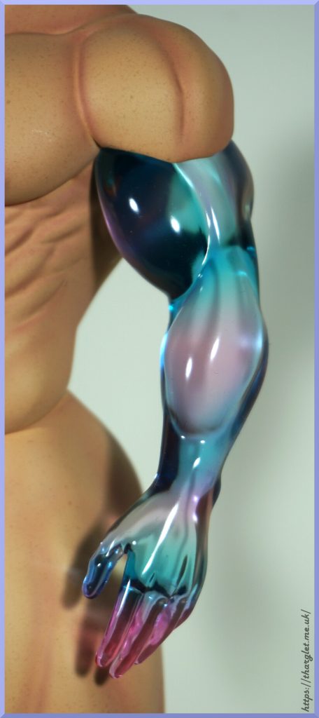
Closeup of one of the arms:

Very glossy. Also highly refractive so you can’t really see through it which I think helps improve appearance.

Let’s spin him around:

Cyber sproing, Not too much to add, the arms do look nice with their glossiness and the colour transitions on them work well.

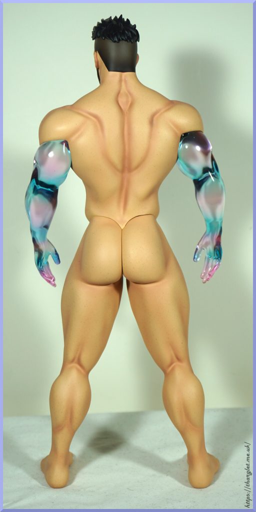
Let’s go to the back:

No cyberbutt to install, so just the arms back here. In a way, feels like there’s less of a seam versus the fleshy arms.

Flaccid cyberdick:

He also has a flaccid dick in the same style, just in case you don’t want him ready for action. This one does suit his expression better.

Close-ups of both the cyber options:

No blending in with the skin colour here, but the colours work well for what they are. Here we have the hair to help with the transition between body and penis.

Now to clothe him:

Heh, android torso.

OK, let’s put him back together:

Dressing him wasn’t too hard. The trousers were tight so getting the legs in was a bit interesting, especially when trying to not let the leg tops scrape each other when putting the second one in. Was expecting to go thigh up the trouser leg, but that wouldn’t go so he put his trousers in the more normal direction. Being able to put his legs in one at a time was certainly less fiddly than trying to get two very tight trouser legs on at the same time.

For the shirt, I ended up having to disconnect the arms to get them into the shirt then remagnetise them and slip the shirt over his shoulder. Due to being folded in transit, the clothes do have a bit of a life of their own, but could be fixed with an iron should someone want to.

Both the trousers and shirt have velcro openings. So you could shut the shirt if you wanted, and open his trousers to attach a penis – the trousers, much like a cheap hotel, have no ball room.

Closeup of his face and glamour shot in the shirt:

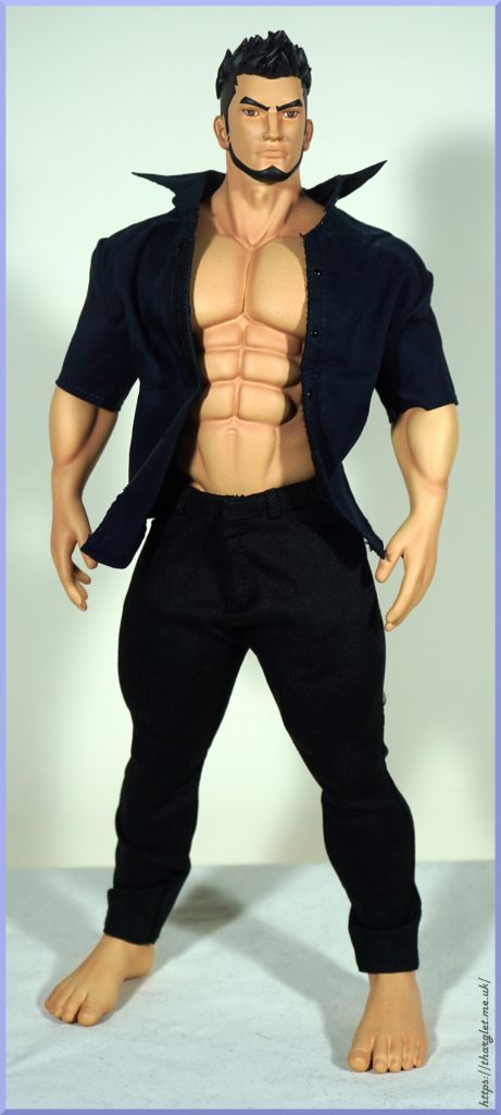
Honestly, I like the clothes more than I thought I would. If you wanted an ordinary dude looking figure, this would fit the bill. The clothes have been nicely made with a good amount of detail. We have the correct seams and buttons, which is nice to see at this scale.

The back:

Looking very smart-casual from the back. His shirt does ruck up a bit strange at the back, but it does give his body more shape. Can see the trousers hugging tight to his legs and buttocks. His arse does look better in the trousers imo.

However if we take the shirt off:

…he clearly didn’t get the trousers tailored. Due to the shape this gap isn’t helped by adding anything at the front. So if displaying him shirtless, he only looks good from the front.

Overall, the clothes look better than I anticipated – clearly effort went into making these clothes as they have details like buttons, pockets and belt loops. However, if the main appeal is the “cyber” parts, the shirt will obscure a portion of the arms and for the penis you’d need to have it poking out of his trousers. I won’t be using the clothes after this review, so can’t comment if they’ll stain over time – for clothes on figures, I’d recommend handwashing prior to use, and see about putting a protective layer between the figure and the clothes where possible. If dye leaches into a figure, it’s very difficult and sometimes impossible to get out.

Overall, he’s a nice figure but not without his flaws. Personally I’d be happy to do without the clothes and have the legs as part of the body. It may have been fun to have some cyber legs, but that may have been a bit much. Human upper, cyber lower may have been a fun look though.

Now, let’s get onto the price… From what I can find he had a domestic price of ~US$240 (CN¥1680) and was being sold internationally for ~US$270-300. I paid US$100 plus US$26 shipping, which is a far more reasonable price for him. I don’t think he’s worth over US$200 – there are too many seams and small imperfections to command this price, as well as being a very straightfoward pose. If we compare him to Gentleman Studio’s Samael, he was only CN¥888, and there is a lot more paintwork and detail on offer there. Gentleman Studio likely has far better economies of scale, but this guy should’ve really been closer to the CN¥1000 mark in my opinion. If someone handed this statue and asked me to guess the MSRP in USD, I probably would have said somewhere $100-150, not $250! So I’d say this is only one to chase down if you’re really into the aesthetic and happy to pay a premium for that or manage to find one cheap.

For me, I was attracted to the “cyber” aesthetic parts, so I’ll be displaying him with the clear arms and erect penis. Certainly a unique figure. And does he inspire emotions? That he does. Maybe not in spades, but there’s definitely something there.

LingZe Studio – Kaworu Nagisa

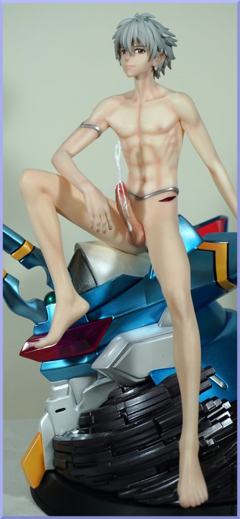
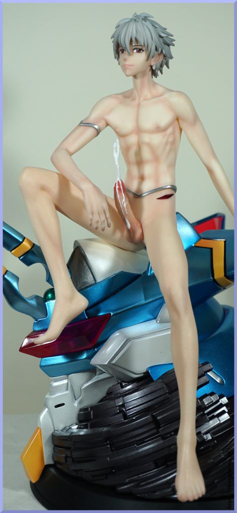
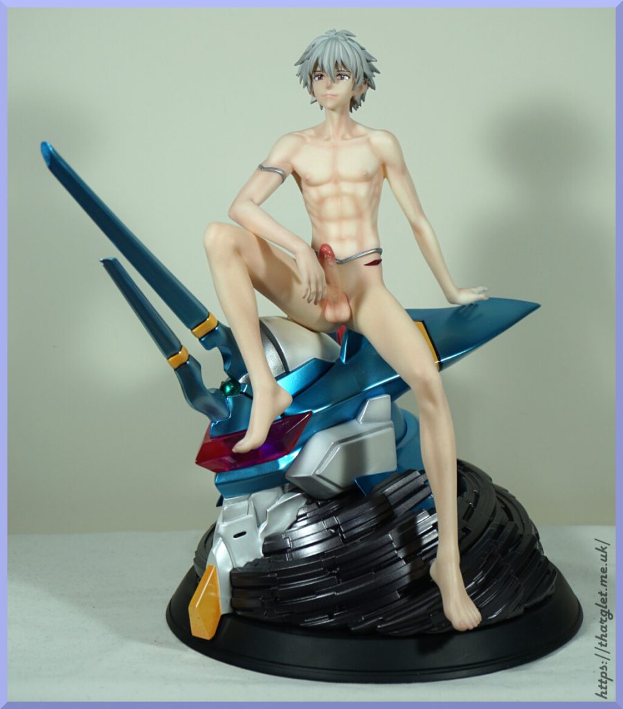
Here we have a spicy statue of Kaworu – I got the deluxe edition which comes with the naked lower half and 🍆. He also comes with his trousered lower half, so you can enjoy this half-dressed Kaworu if you don’t want to see what’s under the fold.

Here he is with the clothed arm and legs:

You can use the unclothed arm in this configuration too, which I prefer:

The paint detail on Kaworu is fantastic imo, but the EVA Mark.06 colours leave a fair bit to be desired – the finish is nice, but the colour choices are a poor match. The blue is far too light of a blue and the silver parts are more white than silver. The lower head spike also doesn’t quite match the rest of the blue parts, but not distractingly so. Definitely noticeable when assembling, but not attention-grabbing on display. However, if you are familiar with EVA Mark.06 the lightness of the blue is distracting. If you’re not bothered by this colour mismatch, then this is a great statue for Kaworu fans…. if you can get hold of one… I declined to buy when he went up for preorder, but did manage to snag one slightly over MSRP on Taobao after seeing photos of him on Twitter and kicking myself for skipping the preorder. A day or two later, the seller sold out of the 6 units they had.

And now for the spicy bits!

The nails are really nicely done and lifelike. Plenty of detail on the penis too, but doesn’t quiiite look like it belongs – probably needs a bit more of a skintone match near the base to make it match up with the body. All the penises have this in common. I swear his upper body fits in better than I have it shown here. I do like the “bonus” red details on his hips. The silver band might be distracting for some, but I kinda like it.

And now for a 🍆 brigade – he comes with a lot of options to choose from, so here they are:

Plenty to choose from! But I’ve gone with the one used in the intial photos. Maybe some day I’ll switch it up a bit. Am glad I was able to get this statue, as Kaworu isn’t exactly blessed in the figure department. I did want it when his POs went up, but I had so much on order at the time I couldn’t really justify adding to cart. But since then my orders got thinned out so I was able to pick him up on release.

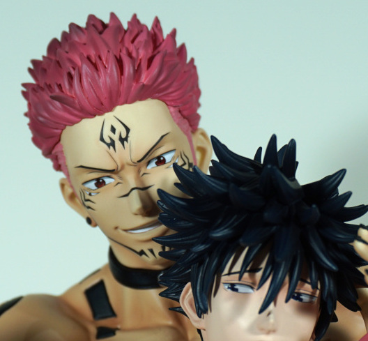
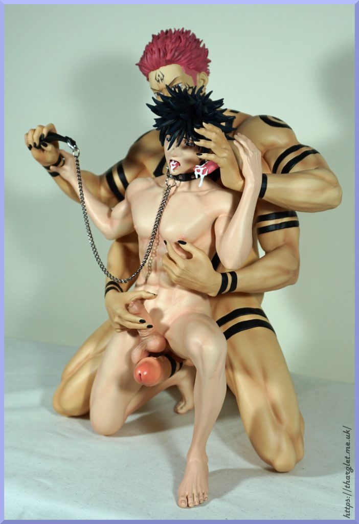
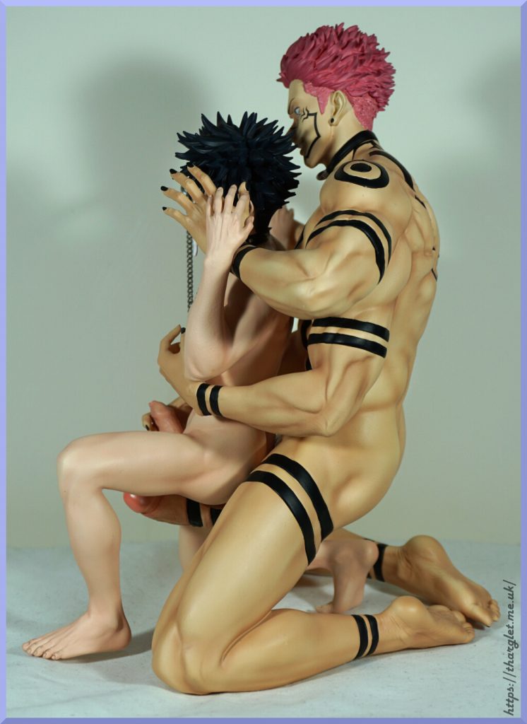
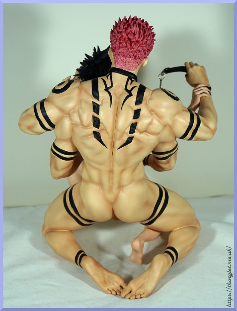
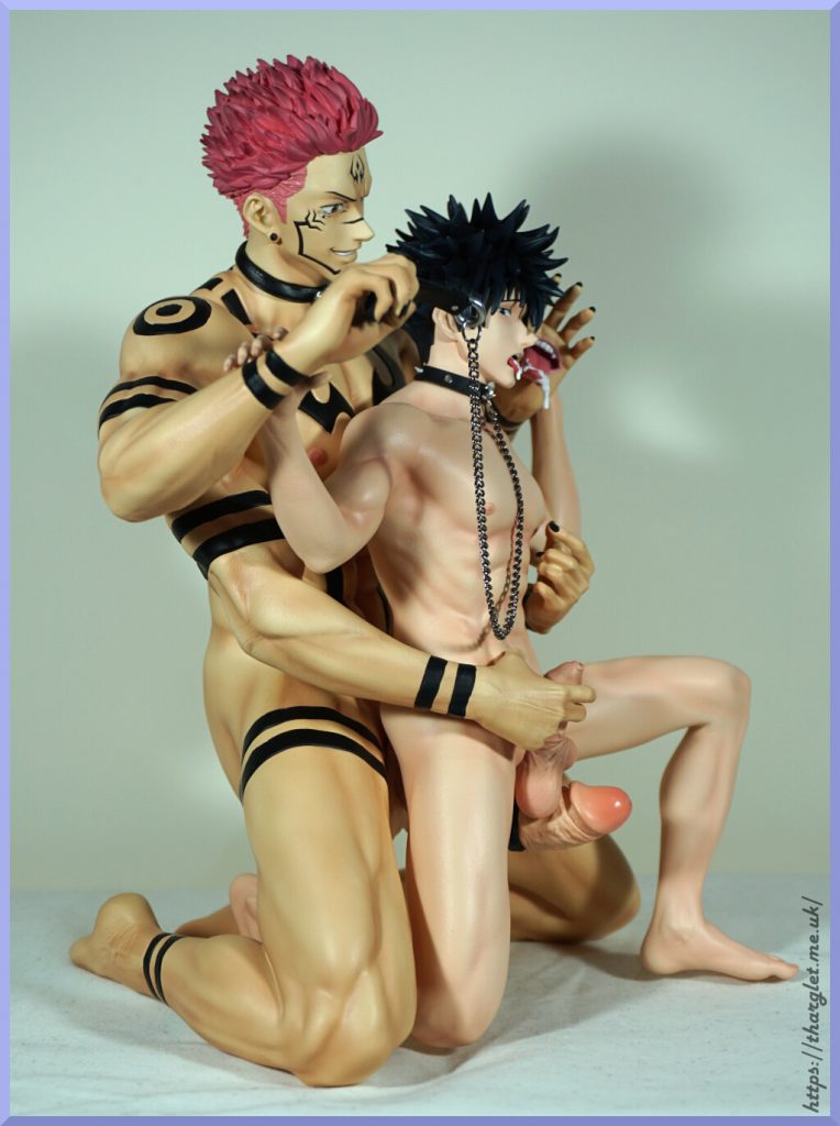
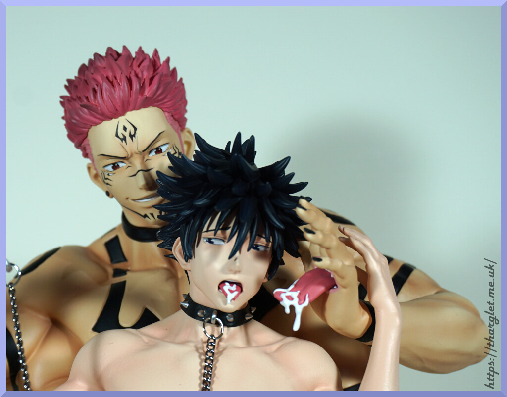
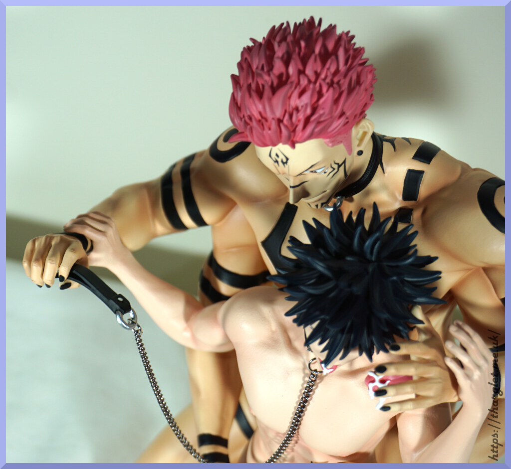
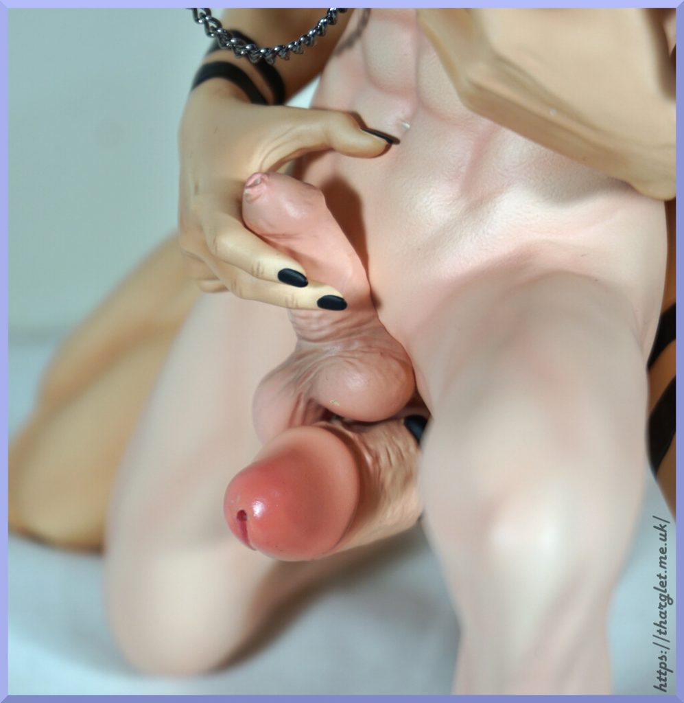
Gentleman 18 Studio – Sukuna and Megumi

This one spicy? Yes. Very. Much spice under the fold. Warning: 🍆 ahead.

Gentleman 18 Studio did a really good sculpting and painting job on this one. It was a bit of a pain to assemble, don’t have everything in perfect orientation here, but some fiddling would likely get everything sitting just right.

I ordered the normal edition – this didn’t come with the medical bed and extra heads, but it did come with a drip and stethescope, but didn’t really feel like setting them up. Unfortunately did a bit of damage to the strap in Sukuna’s hand, but can’t see it so oh well.

Hope you enjoyed your lewd journey around this statue 🙂

NL Studio – Thanos – Jack-o pose

The meme, the legend… presenting Thanos in the Jack-o pose! This figure took the internet by storm in 2022 when NL Studio announced they were going to produce him. If you’ve not heard of this figure, oh boy, you’re in for a treat! Warning: eggplant ahead!

This figure was offered in 1/6 and 1/4 scales, both with a standard and a deluxe edition – the deluxe coming with two bodies, one “clothed” and one naked. I went for the 1/6 deluxe edition – with Thanos being a large chap in general I felt the 1/6 would be sufficiently large and wanting the two bodies, the 1/6 deluxe was pricey enough at CN¥1880 (US$265).

Shipping woes

Deposit went fine, replenishment (final payment) went fine, studio didn’t take long to dispatch. Then came the fun with international shipping. He was just under the limit for volumetric shipping so ended up paying for the shipping service so I wouldn’t have to pay an eye-watering amount for volumetric shipping – his shipping via SAL was CN¥560 (US$80), volumetric was clocking in at least double that. So I stumped up the cash, and waited. Then Chinese customs refused it. Arrggghhh. Then came an agonising 2.5 months wait for it to be returned to the agent’s warehouse and get stocked back in, not knowing for sure if it was going to happen.
Thankfully it returned and my shipping was refunded, whew. In the intervening time, EMS prices came down significantly so it cost “only” CN¥585 to reship via EMS. And another CN¥20 for the shipping service…
And if the shipping wasn’t cursed enough, EMS took 14 days, when other parcels were taking 7. But he arrived and that’s the main thing!

Base

Let’s first see what number I got by flipping the base:
https://i.ibb.co/xHnmqd0/base-bottom.jpg
I think the universe is telling me he is indeed cursed. I hope the mail delay wasn’t him trying to Thanos Snap the other parcels he was shipped with.

Top view of the base:
https://i.ibb.co/zF33rmG/base-top.jpg
The base is decently weighty which is pretty common for resin bases. As Thanos is known for his destruction they went with a destroyed piece of concrete with bits of twisted metal reminiscent of parts of a building. The metal parts look good, but the concrete/asphalt looks a bit bland in person and could’ve done with a bit more variance in shading. As it is, from certain angles it does look plasticky. It’s nice they have included some earthy bits though I think they could have done adding in some darker earth tones.

Closeups:
https://i.ibb.co/m0PZDwq/base-closeup-back.jpg

https://i.ibb.co/Njq52yf/base-damage-closeup.jpg
The sculpting is really nice, but the paintwork could do with a little work. Overall, it’s decent in my opinion.

Edges:
https://i.ibb.co/bdDYf89/base-front.jpg

https://i.ibb.co/h7kVrnK/base-back.jpg
The layered effect is really cool, but the dirt bits aren’t really selling themselves properly as dirt – the bits that have more definition between the dirt and surface paint do look better than the ones that seem to be blended.

Overall, the base is not cursed. Unless we’re counting the 66 on the bottom of it. The paintwork isn’t top-notch, but mostly does the job. I could see someone with painting talent adding in a bit more shading and definition, but I don’t think it’s a necessary thing. The figure does cover up a good chunk of the base when on display, so the greyness of it isn’t overly obnoxious.

Figure parts

Starting off with the sword:
https://i.ibb.co/LJW9G2y/glaive-up.jpg

https://i.ibb.co/GkWHdVJ/glaive-down.jpg

https://i.ibb.co/378kQ6W/glaive-side.jpg
The detailing on the sword is nice – everything is painted neatly. And it’s apparently a sword rather than a glaive but being double-ended it was a bit hard for me to tell XD.
Mine curves downwards at the ends – I don’t believe this is intentional, but will have to monitor to see if it bends over time. May have to unbend it or put it away if it becomes a problem over time.

Head and limbs:
https://i.ibb.co/9yqwKGs/parts-top.jpg

https://i.ibb.co/kxvNRqZ/parts-botttom.jpg
As he has two bodies his legs, arms and head are all separate parts which connect using the power of magnets. His armour (barring the infinity gauntlet) has had battle scars and weathering applied which is nice attention to detail. We even have some dirt on the soles of his boots. No complaints with the parts here.

Let’s take a closer look at the head:
https://i.ibb.co/Kj8MFtS/head-front.jpg
In my opinion the head has been done really well – he has a creasy face and they’ve managed to replicate that well. We also have some realistic-looking eyes and they’ve given his lips a different colour and sculpted his teeth.

Other views of the head:
https://i.ibb.co/Zgwjksk/face-34.jpg

https://i.ibb.co/pPMJsgh/head-left.jpg

https://i.ibb.co/Vg8h3yC/head-back.jpg
His helmet has been really nicely done – the small details are painted well and all the battlescars in the sculpt.

The infinity gauntlet divides into two:
https://i.ibb.co/S7Mf5Hq/gauntlet-batteries.jpg

And we have a switch and two batteries:
https://i.ibb.co/FqmvgVn/gauntlet-batts-closeup.jpg
I had to have the original batteries removed for shipping reasons, and one detail that was lacking attention was the direction of the battery compartment – the plastic part is actually the wrong way around. One prodding it with a bench supply later confirmed this fact. It’s a very minor detail and doesn’t affect anything – just gotta put the batteries in the opposite direction than labelled. The terminals are around the standard way.
Getting the batteries in there can prove a little interesting as the gauntlet magnet can “steal” them, so have to watch out for that!

Gauntlet turned on under photography lighting:
https://i.ibb.co/0nfwZMv/gauntlet-on.jpg

Gauntlet under room lighting:
https://i.ibb.co/N13jYkh/gauntlet-on-no-lighting.jpg
So under very bright lighting you only see the large stone light up – but under normal conditions the second photo is more accurate.
It’s a neat feature, I don’t think it’s the best it can be but is neat for people who like lighting effects.

Bodies

OK, here’s where the cursedness will begin – time to show off the bodies!
First up is the body that sports a rather fetching metal thong.

Here it is from the front in its chickenlike glory:
https://i.ibb.co/v3ZprVZ/thong-body-front.jpg
Yeah, these bodies look rather funny without the head and limbs attached. The skin texture has been well done, with multiple colours of paint. We’ve also got his speckled skin texture replicated along with the lines that run across his body.

From above:
https://i.ibb.co/VNZk7My/thong-body-top.jpg
The thong consists metal straps that fit with Thanos’ style and I like the work that’s gone into imagining how a metal thong would work. It also slightly presses into his skin – much prefer this than some of the “bikini bites” some Japanese figures get where the clothes dig very deeply into the skin. We’ve also got a little bit of asscrack on show :). And plenty of muscles to admire.

Getting close to the thong:
https://i.ibb.co/GMtKTKt/thong-body-thong-closeup.jpg
A little bit of “skin webbing” going on here, but not enough to be noticeable. And two very pert buttocks. Thanos definitely didn’t skip bum day. Is that a thing? It should be a thing :P.

From the back:
https://i.ibb.co/qyP483K/thong-body-back.jpg
Lighting went a bit bad on this photo so has ended up coming out a bit different. But this is what we get to see from behind.

Let’s flip him over:
https://i.ibb.co/34cC5hL/thong-body-chest.jpg
The body sculpt and painting is really nice – plenty of shading and detail to his body. And painted male nips! C’mon Japanese manufacturers… give us more like this. Well, you don’t have to make them purple.

Closeup of his pouch:
https://i.ibb.co/SmNkGT7/thong-body-pouch.jpg
Shiny enough to reflect my lighting! If you don’t want the full Thanos experience, this leaves at least something to the imagination. Reasonably spacious, but I think he’d be in trouble if he got an erection in this thing – trouble with metal is it doesn’t really flex.
If you didn’t want to think about erect Thanos, you came to the wrong blog – don’t worry, you won’t have to use your imagination for too much longer.

Arm muscles:
https://i.ibb.co/znTh8fV/thong-body-arm-muscle.jpg
These look a little odd in the way they don’t quite meet, but this bit isn’t very visible once assembled.

And now for the naked body – if you want to leave Thanos’ nether regions to your imagination, this is where you’ll want to get off of this ride.
Now for some untrussed chicken:
https://i.ibb.co/CVmWRSg/naked-body-front.jpg
From the front both the bodies are similar – only the lack of a thong.

View from above:
https://i.ibb.co/xMDjn0b/naked-body-top.jpg
Above is also similar, only we’re now treated to a full view of asscrack.

Let’s lower our angle:
https://i.ibb.co/zVfbHY3/naked-body-butthole.jpg
Aaand here is where we get a full view of his balls and butthole. The butthole does look a little crater-y – not the best sculpting here. They have gone full ham on the ballsack giving it shading and texture.

If we go lower, we can start to see the penis:
https://i.ibb.co/Bj8b9fx/naked-body-back.jpg

Let’s flip him over:
https://i.ibb.co/YbsX9pY/naked-body-bottom.jpg
So this is what the posing pouch was hiding! I think from this we can ascertain he’s a grow-er rather than a show-er. For the rest of the body it’s the same as the clothed one.

Looking down at the offending article:
https://i.ibb.co/FJyGjSY/naked-body-chest-closuep.jpg

https://i.ibb.co/7tTcQDY/naked-body-penis-tip.jpg
There is a dimple representing the hole. I think the hole could have done with a little bit of dark shading to make it more hole-like. We can also see he has an oval penis rather than round.

From certain angles this makes it look kind of weirdly flat:
https://i.ibb.co/JHGCGxQ/naked-body-flat-penis.jpg

https://i.ibb.co/pr3C34p/naked-body-penis-closeup.jpg
Whilst penises can be oval I feel like this one is a bit too oval which makes it look deflated from certain angles. I’d associate Thanos being girthy in every direction. We have plentiful vein sculpting and shading though.

Full twig and berries:
https://i.ibb.co/G0FwqNQ/naked-body-penis-bottom.jpg
Looks good from this angle, and is plentiful in the size department without going crazy.

Naked body from the sides:
https://i.ibb.co/rcBh9Xd/naked-body-left.jpg

https://i.ibb.co/8BvRpk2/naked-body-right.jpg
With him unassembled, we have a glimpse of the twig from the sides. He’s got a vey bendy back but the pose kind of necessitates that.

OK, that’s the bodies checked out on their own – time to put on some limbs!

“Clothed” body

Clothed might be an exaggeration for the body sporting the thong. But it’s the easiest way of distinguishing it.
Spin-around:
https://i.ibb.co/NWYkw1S/thong-thanos-front.jpg

https://i.ibb.co/BT0ZWpR/thong-thanos-left.jpg

https://i.ibb.co/Z1vx4vw/thong-thanos-back.jpg

https://i.ibb.co/vVvL9ZZ/thong-thanos-right.jpg

https://i.ibb.co/tMxwNvR/thong-thanos-top.jpg
If you just want a Jack-O Thanos without the full nakedness, this one delivers. The pieces all fit together well, and he looks good with his head just above his arms at a slight angle.

Time to swap some pieces:
https://i.ibb.co/yfsPb6Z/bodyswap.jpg

Naked body

And now we have the version not suitable for guests:
https://i.ibb.co/KX0zzGJ/naked-thanos-front.jpg

https://i.ibb.co/XstjPjR/naked-thanos-left.jpg

https://i.ibb.co/F4tkYbP/thanos-naked-back.jpg

https://i.ibb.co/Dw8h1wh/naked-thanos-right.jpg
With the limbs attached to the body it gives a greater viewing angle of his penis. Still requires selective angles to see it, and you don’t see it from the front. So whilst he’s exposed, it’s not immediately obvious. With my naked body, his left leg doesn’t attach snugly to his body though I could likely remedy this with some white tack. It doesn’t affect his display but when you put him down his leg does shift a bit – a minorly annoying defect which doesn’t exist on the other body.

Some more shots for some closeups of the goods:
https://i.ibb.co/2kXrLWq/naked-thanos-penis-closeup.jpg

https://i.ibb.co/sP5tsbX/naked-thanos-penis-closeup-left.jpg

https://i.ibb.co/WxQ6kvH/naked-thanos-ballsack.jpg
Yep, definitely there and pointy. He might have an eye out with that thing :).

Display mode

And now for the final spin-around on his base:
https://i.ibb.co/80Y7QJG/assembled-front.jpg

https://i.ibb.co/tKsMfGL/assembled-gauntlet-on.jpg

https://i.ibb.co/0qj3RB5/assembled-34-back.jpg

https://i.ibb.co/fC4S1mV/assembled-balls.jpg
He doesn’t have pegs to attach to the base – you simply rest him on there. So he needs to be displayed somewhere where he won’t get knocked, but he has a decent amount of weight so he won’t shift too easily. The sword slots into a hole on the base, but was a bit difficult to get into the right spot.

Overall, he’s a surprisingly good-looking figure – though that should be partially expected as he is pricier than other 1/6 resins I have. The figure isn’t flawless – if I could improve one thing it would be the paint detail on the base to make it a bit more lifelike. I’d say most of the issues I have are minor and he looks fine on display. And he can sit around, surprising anyone who dares go for a side view :D.

Alex Mercer – Prototype

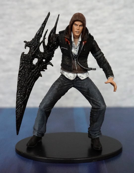
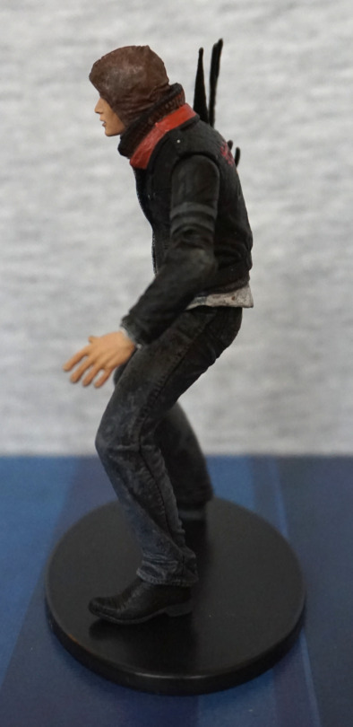
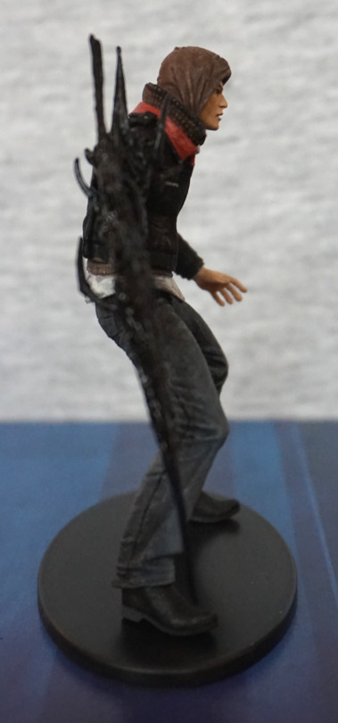
This little Mercer was a promotional item, so was a nice random find at a not-very-good con. This was the only figure I bought at the con, as there weren’t many stalls there (wasn’t much of anything tbh…) and most of them were local artists. They had an “artist’s alley”, but the entire con was pretty much artist’s alley… Nothing wrong with having a lot of artists, but it would’ve been nicer if there was more variation there. 

Anyways… enough drivel about a con of a con in the UK… 

Here he is:

Cute-sized Alex Mercer, d’aww. The detailing is nice, and the paintwork is nice and neat. I like the way the three layers of his clothing have been sculpted, and his virus arm. 

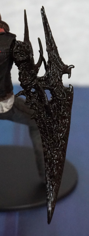
Claw arm:

I love the texture on this, and the glossier finish, which makes it have a more organic appearance. 

Left:

Here we have his normal hand, I like the way they’ve posed his fingers, so it looks like he’s about to spring into action. The seam in his jeans has also been well-sculpted, along with the stressed-jeans paintwork. 

Right:

Clothing looks good on this side too, love the creasing detail in his hood. 

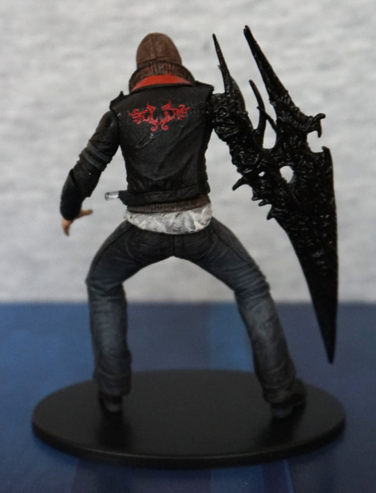
Back:

The pattern on the back of his jacket is nice and crisp. The dirty shirt effect feels a little overdone here, but isn’t really a big part. Some red paint has crept onto his collar here, so the paint at the back did get a little sloppy.

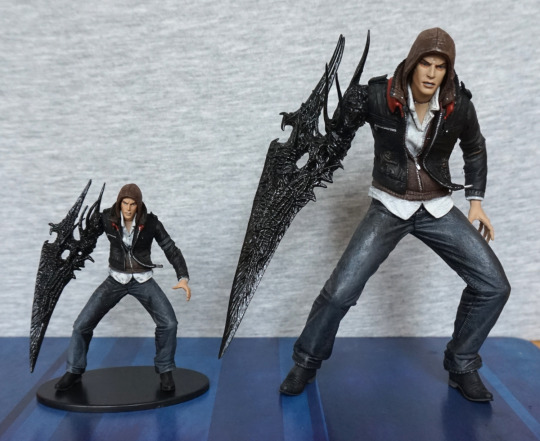
Double the Alex, double the fun!:

This guy is actually a smaller version of a larger figure that NECA produced. I bought the larger one years ago, but was never able to get the small one for a decent price, due to its more limited nature. Both have the same sculpt and articulation, so this Mercer is one that’s been shrunk in the wash :P. 

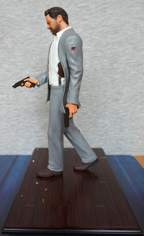
Max Payne

And now for the slightly infamous Max Payne figure that came with the collector’s edition! 

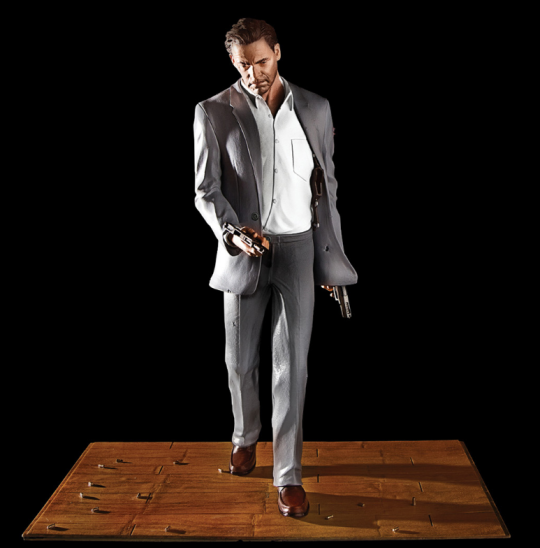
So this was the figure that was promised:

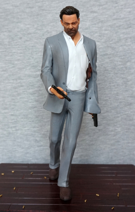
And this is what we got:

A weird grey-coloured suit with no texturing, and a white shirt that doesn’t look like it’s been anywhere near coffee and cigarettes… is this Max Payne? 

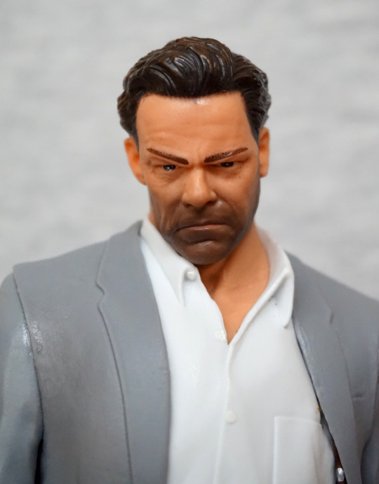
And that face:

Oh, so that’s where the coffee went. Those eyebrows also amuse me. Hair sculpt is actually rather decent – I think all the sculpting efforts went into the face and then bllerrgh. 

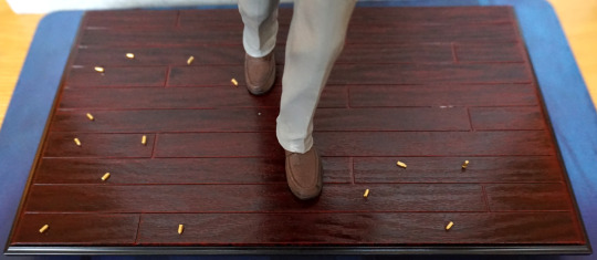
But hey, at least we got this base:

Easily the nicest part of the figure – the wood came out well, and the scattered bullets look nice. 

Left:

Some parts of the sculpt are actually quite nice – head’s pretty detailed, fabric creasing works well. Some nice detail in his hand too. 

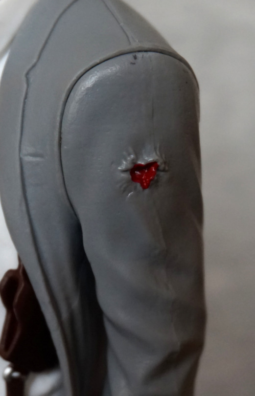
Close-up of the bullet wound:

It could have been good. Instead they stuffed some angry red paint on itand called it a day. We can see a figure seam here, but it has actually been sanded down better than I’d expect for a figure with this paint quality. 

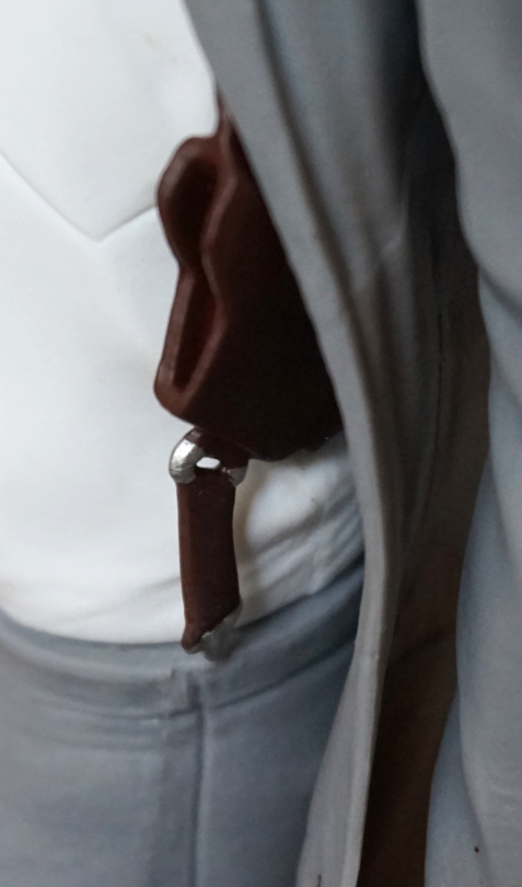
Holster:

Looks the part. Brown paint has slopped onto the ring somewhat, but overall, doesn’t look bad. 

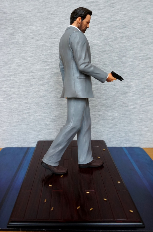
Right:

Again, sculpt is decent. His shoes look good but is suit… did he buy this from the pleather store or something? Or is that giving pleather a bad name?

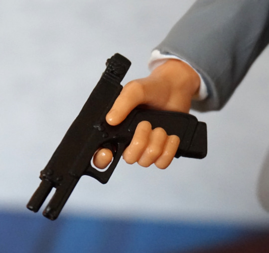
Gun:

A little webbing can be seen up close, but looks fine tbh. Gun is decent enough. Not sure why there isn’t a matte finish on his hand. OK, I know why – shiny finish is cheaper. 

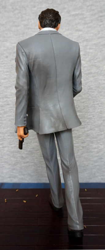
Back:

Aww, lookit – they did actually attempt some shading somewhere! Either that, or the figure rolled around the warehouse… I almost suspect that, with the paint job the rest of the figure got… 

So why did I buy this dude when I knew he was shit? 1, he was cheap and it’s Max Payne. 2, Some point in the future I aim to use this figure as painting practice – I can’t exactly make that suit look any worse! The sculpt-work is there on this figure, hidden by a shoddy, cheap paint job. Me painting him isn’t going to happen in the short-term, but when I’ve learned a couple of techniques, I plan to give it a go. And probably add a claw stand to the base (or some other mod) so that he doesn’t experience “bullet time” leans. If you do an image search for this figure, you’ll likely find ones where he’s leaning far over – apparently they didn’t use a particularly strong plastic or put rods in his legs to prevent this issue -.-

Vir Cotto – Babylon 5

Ended up seeing this guy at the Toy Fair, and as I liked the other two I have of this series, I decided to add Vir to my collection too.

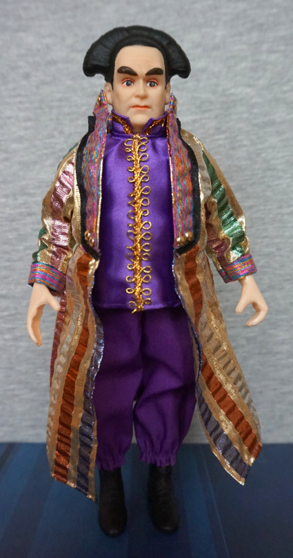
Vir:

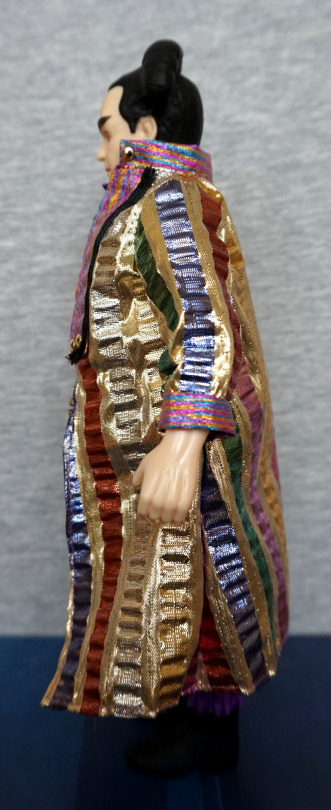
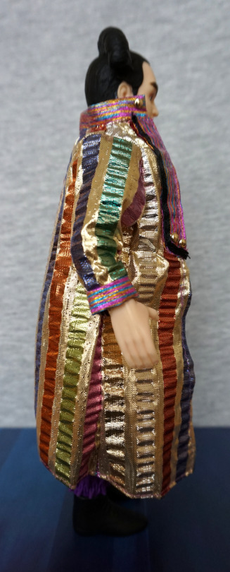
Here he is, in his shiny ceremonial outfit glory! Love the bright fabrics they’ve used on this figure, and the stitching seems neat. These figures do end up a bit uncanny valley, but it doesn’t really bother me. 

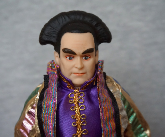
Face:

I like the detail in the face, with the makeup paint and the shading. Hair does look thick plastic though, and the eyebrows don’t really fit with the rest of his more realistic face – probably could have done with a different finish here, and possibly a bit of shading. 

Left:

Clothes look good from the side, hands could’ve done with a less shiny finish, but the sculpt is nicely detailed, and does look pretty realistic. 

Right:

Mmm, shiny and flamboyant. Fits Vir well. 

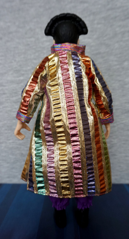
Back:

Full-on bright shininess. If you like things gaudy, this coat should do it for you. 

Overall, I’m pleased with this figure. The detailing is nice, and it is a difference change of pace to the usual action figures. If you don’t mind your figures more doll-like, and a fan of Babylon 5, then these figures might be up your alley. 

Adam Jensen – Deus Ex

This figure originally came with Loot Gaming, but I bought this at a Toy Fair (the reason a bunch of Western figures are coming out now :P). 

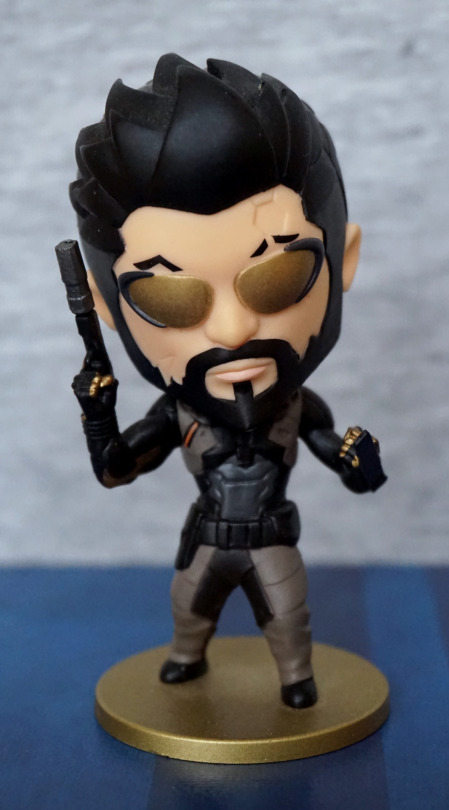
Front:

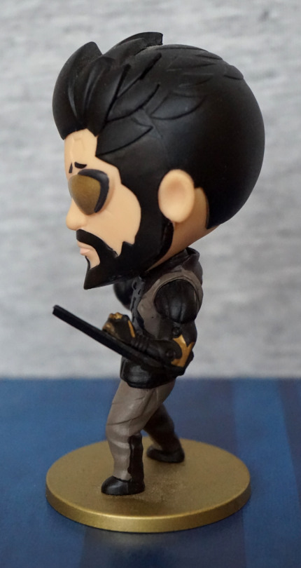
He’s a pretty nifty chibi figure, done in a solid block colour style. They’ve used some good paint for his glasses, that make them match the ones he wears in-game. They’ve included the indentation in his head, which shows attention to detail. I also think his clothes have been rendered well, and is reminiscent of one of his outfits from the game. 

Left:

His hair has been done in an interesting way. Not sure if I like the look from the side or not. But it does help give his head some detail so it isn’t a plain ball. On this side we have one of his arm blades – for those not familiar, they are dull-ended as depicted here. Here we can also see his artificial arm details here too. 

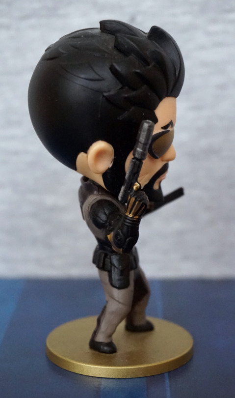
Right:

Here we have a silenced pistol. The paint detail on his hand is nice and neat. We have a weird seam going around his head here though. 

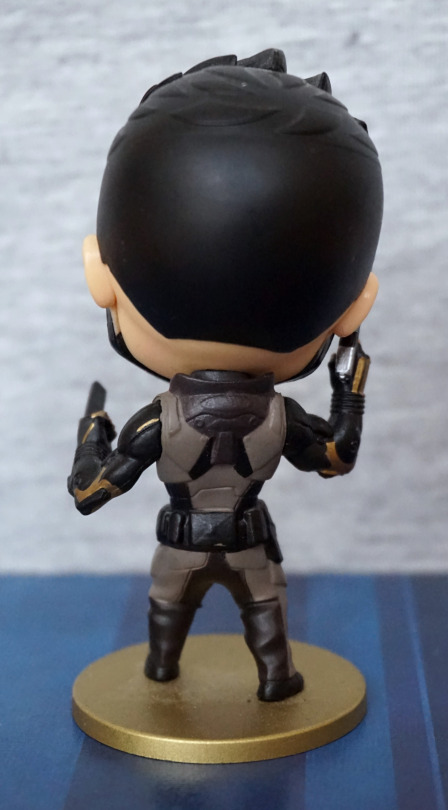
Back:

Painting and sculpting is nice back here. I also like his gold base, which complements the figure well, and fits in with the Deus Ex colour scheme, for the games he is featured in. 

Overall, I think this is a nice figure and would recommend it, if you can find it reasonably priced. 

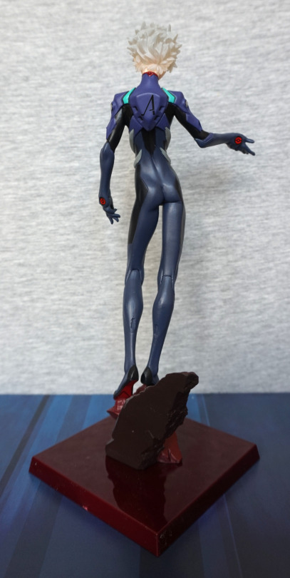
Kaworu Nagisa – Evangelion

Time to get back to a Japanese figure, and what better than Evangelion?

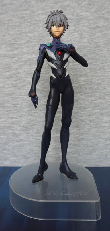
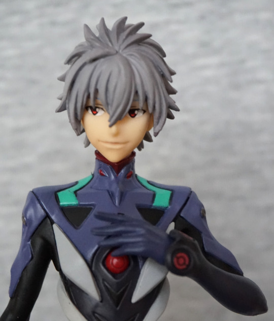
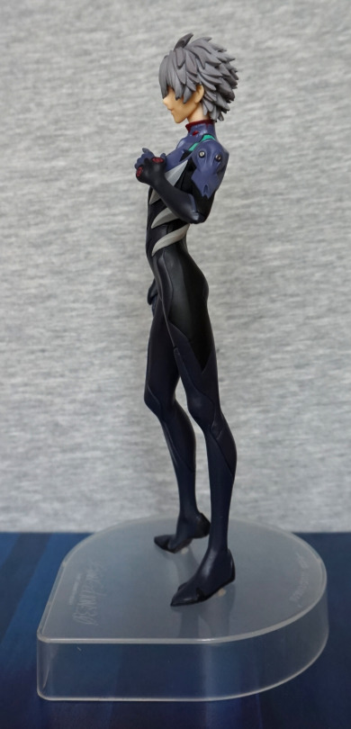
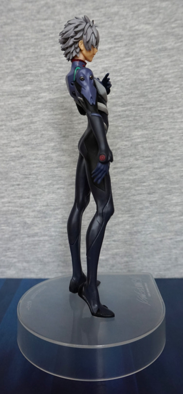
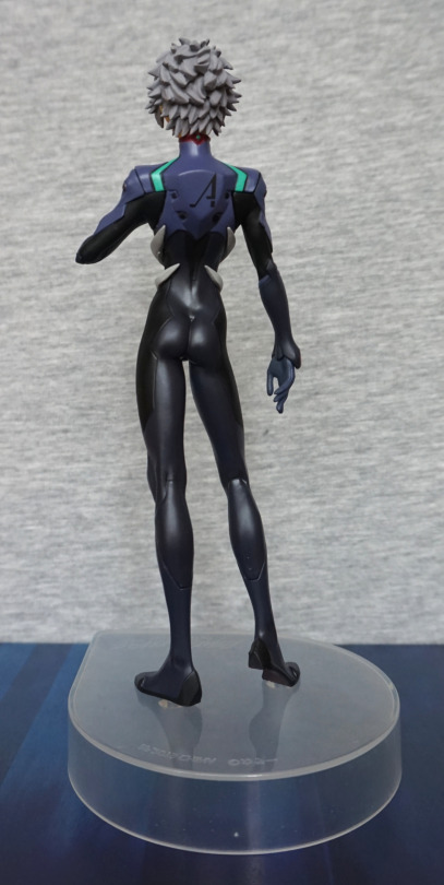
Here we have Kaworu Nagisa, in prize figure form:

Lookin’ tall as Kaworu does. I like his pose, and feel it suits him well. I also like his plugsuit, as they’ve given it a good amount of depth. With the way this figure has been designed, the parts of the figure have nice, crisp lines. I like the clear base for its neutralness. 

Face:

The hair is well-sculpted and his face is decent. 

Left:

He’s leaning forward slightly, which adds to his pose. I love the slender body shape, and the hair looks decently detailed from this side too.

Right:

There’s some good detailing on his arm – the upper light-blue part has some good sculpting details to it, along with the grey parts. His backside has a nice shape to it from this side too.

Back:

Hair also looks good from the back, and his backpack looks the part, and the print is well done here. His body feels slender, without being overly so, with some shape to his backside… very form fitting suit :P. Love the finish on the darker parts of the suit. 

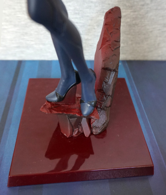
Base:

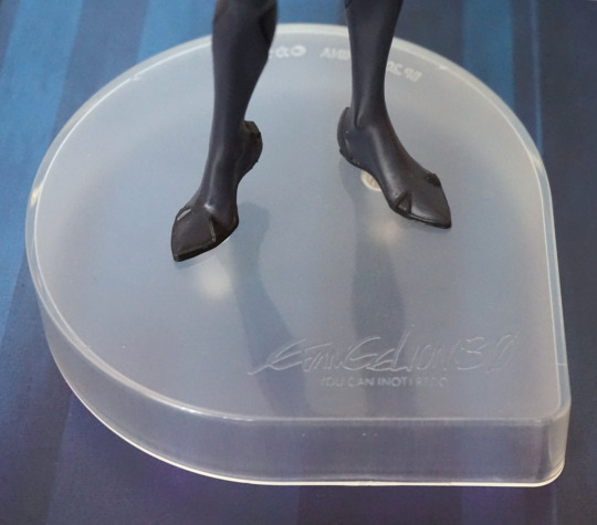
The base features a logo to say it reflects his 3.0 design. The shape of the base is mildly eye-catching, being a bit different than usual. For me, I’d prefer the base to be a little less tall, as he’s a fairly tall figure as-is.  

Overall, I’m happy with this figure, and am happy to add him to my army of Kaworus. Looking up close, you can see some of the hallmarks of a prize figure, but overall I think he’s a decent quality and would recommend. 

Tablis – Evangelion

This was a figure I was considering for a long time, then finally had the opportunity to add it to a Suruga-ya order for a reasonable price:

image

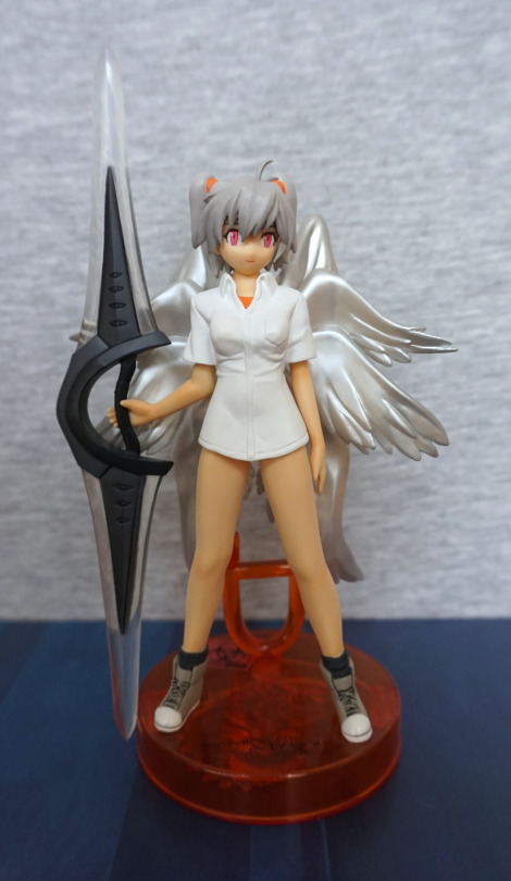
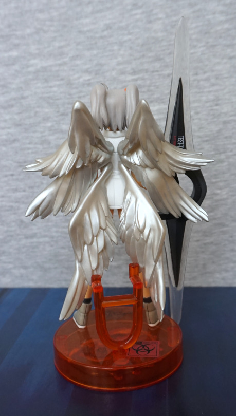
“No pants” Tablis – an angel from Evangelion. She comes with an alternate arm if you don’t want her holding the weapon, but where’s the fun in that? This figure of Tablis has a few hints to its human counterpart in the grey hair, orange undershirt and white overshirt. Not sure where he lost his pants to though. There is some underwear under that shirt though. I like the body sculpt, but the face feels overly simplistic compared.

Left:

image

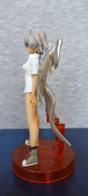
The wings have a nice amount of depth to them, and the stand holds them well, to prevent any kind of sagging over time. You could choose to leave this part off, if you wish to risk it. The shoes are nicely painted, but this side does look overly flat.

Right:

image

Not too much extra to see here. Hair has a pretty decent sculpt.

Back:

image

The wings are definitely the star feature of this figure – I love the shiny finish, and the sculptwork is really nice. Love all the different wing segments, which really adds to this figure. 

Weapon:

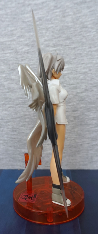
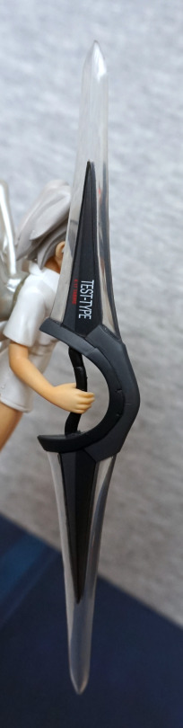
Here we have the words “TEST TYPE” and “A-17 TABRIS”. I like this little detail, but kind of wish it was on the other side or both sides, so it’d be showing in its natural position. The arm isn’t super-poseable, so it’s not easy to show the writing when displayed.

Really glad I decided to get this figure. For me, this concludes the ones of the set I was really after. There is another Rei-based one I’d like, but it’s rather hard to get hold of, so I’m not anticipating getting it. Overall, I’m pleased with this figure, and especially so with the wings. Would recommend these figures at a reasonable price, but they’re not super-detailed so wouldn’t recommend them much over their retail price. 

Locutus of Borg – Star Trek

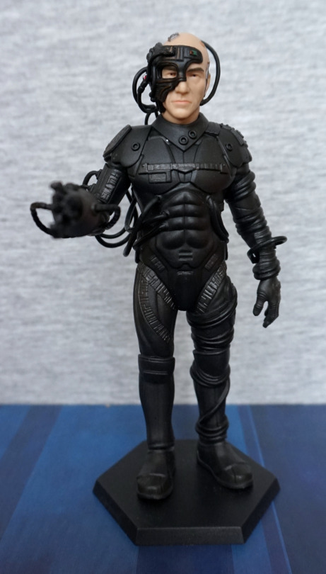
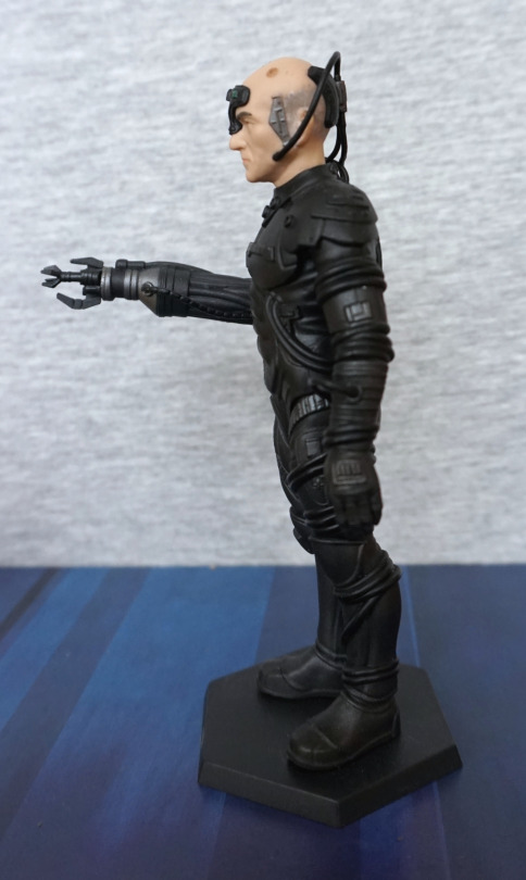
Saw this figure, had to buy it:

A Locutus of Borg! That actually looks somewhat like what it’s supposed to be, which is a surprise for a Star Trek collectable. There’s a good amount of detail here – he seems to have the key elements the original design had. His head does seem a bit more elongated than Picard’s appears to be, but I can forgive it for the rest of the sculpt being solid. The paint accents that are there work well. 

Face close-up:

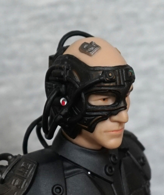
Looking Borg-y :D. Laser paint looks like it might’ve gone a bit walkies, but the rest of it looks good to me. 

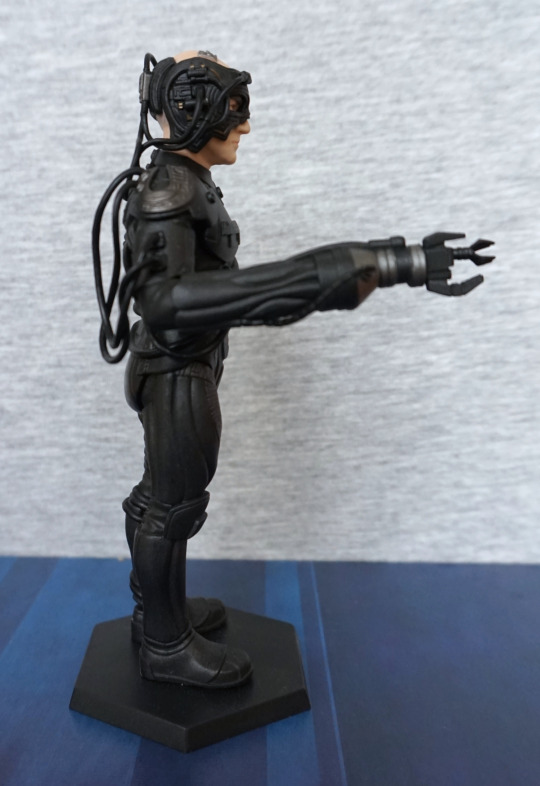
Left:

Plenty of details on the arm, love the abundance of wires and small electronics-style details. The hair looks OK at this distance, but looks a bit like a grey smudge close up. 

Right:

The fearsome Borg “multitool”. Yeah, don’t think I want to be on the wrong side of that! Here you can see they’ve got a decent bunch of wires sculpted separately too. 

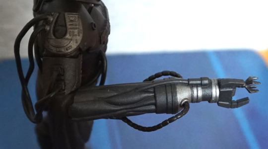
Close-up of the tool:

I like all the small details on this part, and there are some paint accents, to break up the blackness. In terms of colour scheme, they didn’t have much to work with, but they seemed to have squeezed in a few paint details here and there.

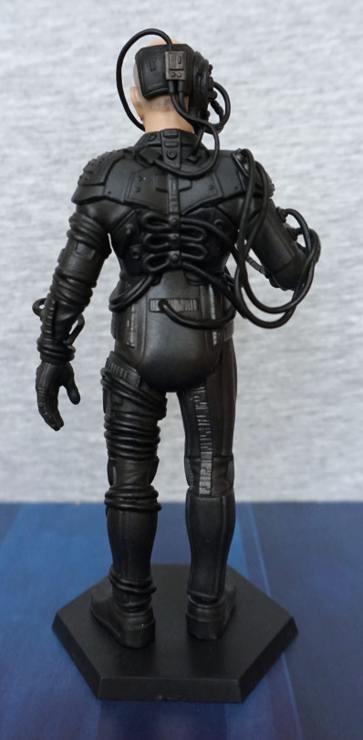
Back:

No shirking on the sculpt detail back here – there’s a goodly amount of detail, to complete Picard’s Borgification. 

Overall, I’m really happy I’ve added this figure to my collection. I paid £15 for him, which I feel is a fair price, but he usually retails above that… which, as nice as he is, I feel is too much for such a figure. There’s been a lot of duds as far as Star Trek collectables has been concerned, so it’s nice to see a nice one. 

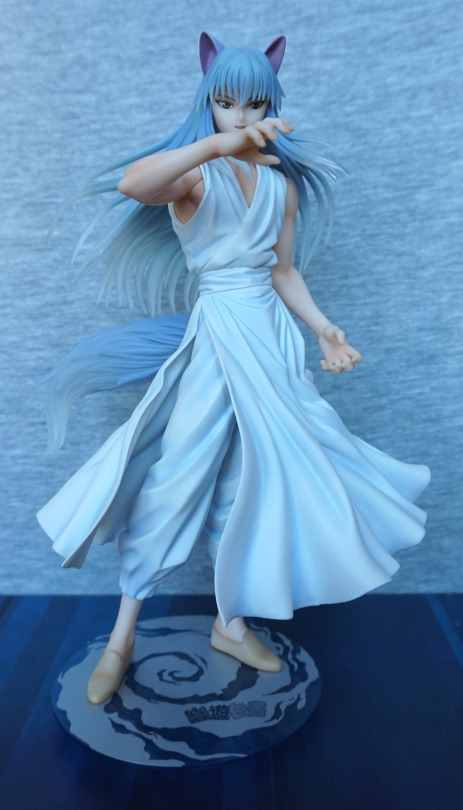
Yoko Kurama – Yu Yu Hakusho

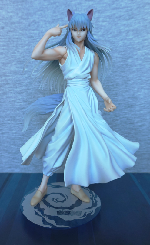
This figure I’m not familiar with the source material, but I couldn’t turn down a wolf dude, so I preordered him. 

And thus he arrived at my house:

From the photos on MFC it wasn’t clear if the translucent parts were tinted blue or purple – I’d say they’re a bluey grey. Not entirely sure my photos are also clear in this regard – camera felt like nudging the white balance into the blueish range. 

I love the motion in his clothing, and his face is sculpted well. His skin has been given a decent amount of shading, which helps his muscles stand out. I like the effect of the translucent hair, but not sure it works as well as the promo art. 

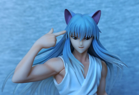
Face close-up:

I like the ears and his expression. Here we can see the seam where the arm can be exchanged – I like the fact they’ve included an exchangeable part by default (unlike Kaneki Ken…) and the seam isn’t too visible when displaying the figure. 

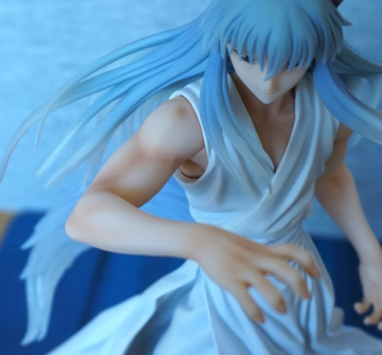
Close-up of the alternate arm:

I like this arm too, but for the photoshoot, it can get in the way of his face. His tendons are sculpted well on this arm, and the hand looks good.

Front with the alt arm:

As shown by this photo, viewing angle is important if you choose to use this arm part. However, it does make for a better generic pose than him pointing at his head. 

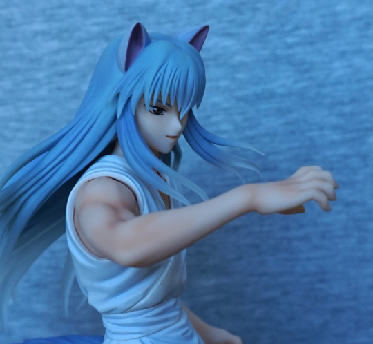
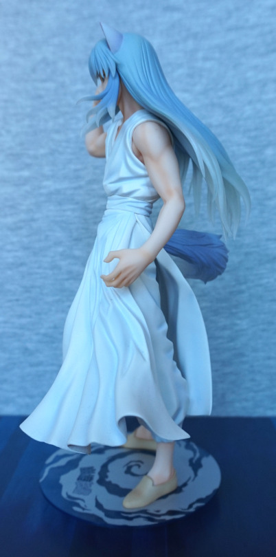
Left:

This arm is also painted well, and has a good amount of detail sculpted on his hand. Clothes also work well, and I like the way his hair flows over his shoulder.

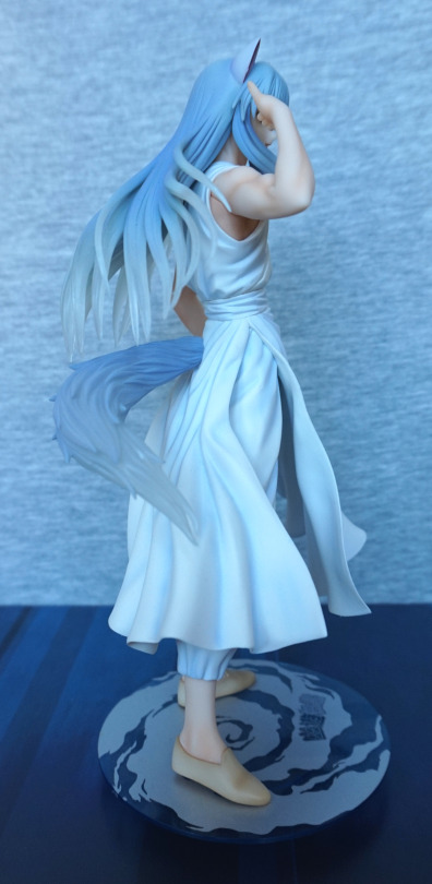
Right:

Here we get a first look at the tail – and it shows why I’m on the fence about translucent hair. It’s a nice effect in isolation, but doesn’t really give the impression of being hair. I’ll just admire the shading on his shoes and feet. 

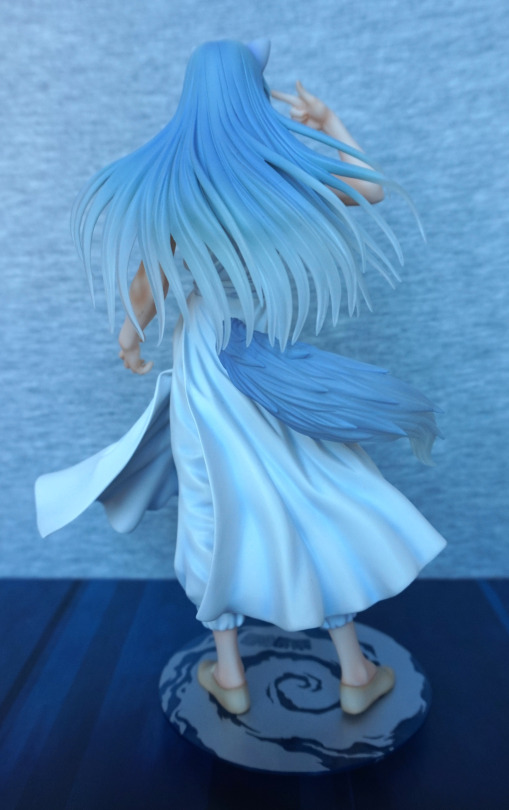
Back:

The sculpt lines in the hair are well done – it does convey the different hair textures well. Also having the sculpted strands is nice, and adds detail to the figure. 

Base:

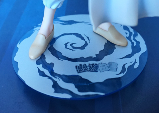
The base has a ring underneath, to make him appear as if he’s slightly floating on this wind disc. A relatively simple base for Kotobukiya, but still looks good. The silver print and the transparent blue plastic work well and complement the figure. 

Overall, I’m happy with this figure – there is more paint detail on this one than there usually is for Kotobukiya figures, and well, he’s a wolf dude :P. I’d prefer if the hair was the more purplish colour in the promo photos, but suspect that would be less canon. Looking at images of him, his hair colour does vary somewhat, but probably tends more to grey than purple. Would recommend this figure, if you like his design. There aren’t too many figures of this guy, and the other “main” one has some unfortunate arm seams. 

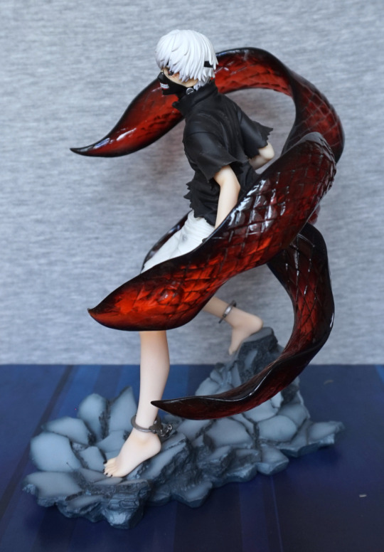
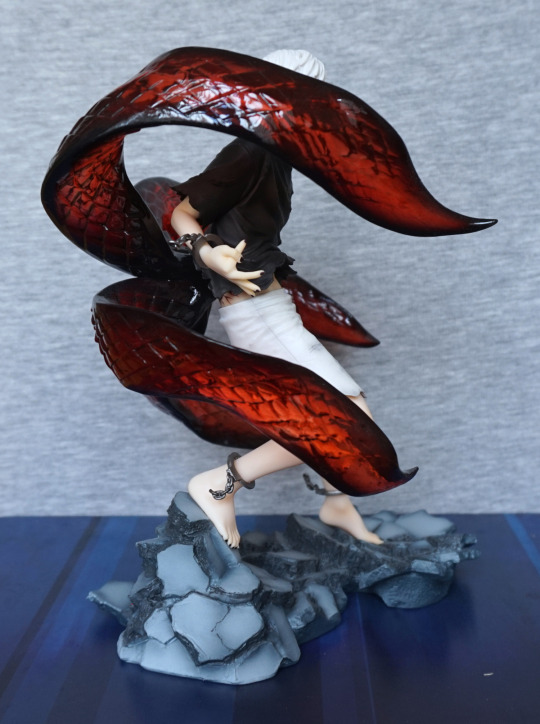
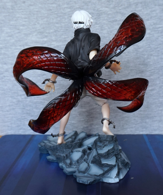
Kaneki Ken – Awakened Ver – Tokyo Ghoul

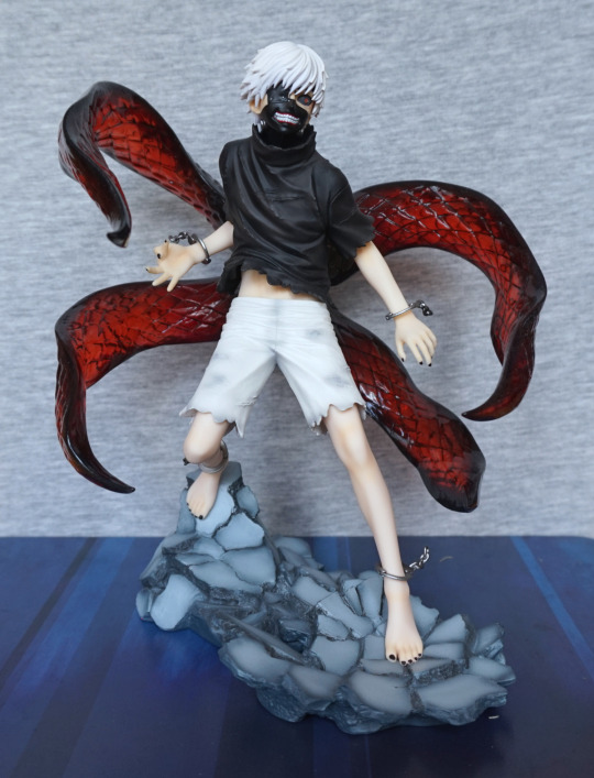
This figure I was considering chasing down in the aftermarket, as I liked the design, but then found Kotobukiya was doing a repainted re-release. So I PO’d that instead. 

So here he is:

image

I love this figure, and the base works well with him. The paintwork is really nice, and the upgraded kagune were definitely worth waiting for – I love the transparent plastic they’ve used, and think it looks much better than the pictures of the original that I’ve seen. 

He also has some nice paint details, with the shading on the shorts and his nails being painted. 

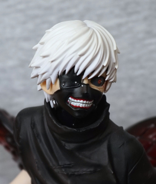
Face:

image

One mini-controversy with this figure is they didn’t re-release the bonus head – you can use it if you have it, but you’ll be relying on sourcing the old release. I’m not too bothered about it myself. The head itself is painted well, and looks good in isolation. 

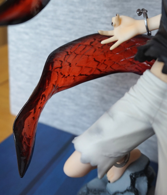
Close-up of part of the kagune:

image

Shiny, glossy :). We can also see some paint shading on his hand here too. 

Left:

image

Lotsa kagune. I like the way his feet are posed, and standing on the rock. 

Right:

image

His pose, what you can see of it, looks good from this angle too. The broken handcuffs are painted well, and have a sense of motion to them. 

Back:

image

The back of his shirt is sculpted well, and you can also see the band for his mask back here. The kagune comes out nicely from his back, pushing his shirt out of the way. 

Overall, I’m really happy with this figure, and definitely think this is one of Kotobukiya’s nicer figures. Worth the price I paid imo, though he will now have gone up in the aftermarket. Would recommend it, and not surprised it’s gone up in the aftermarket. 

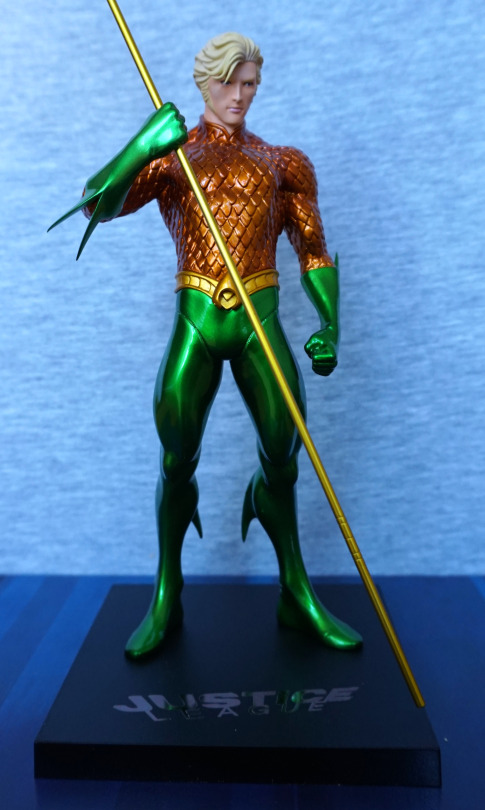
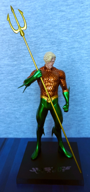
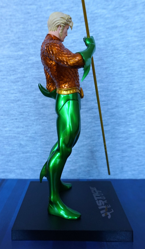
Aquaman – Justice League

This figure I was on the fence about buying, and decided to go for it, before I lost the opportunity to get it at a reasonable price. 

So here he is:

Whilst I’m not much of an Aquaman fan, I like the shininess and the colours of this figure. The copper-green colour scheme is very eye-catching, especially with the metallic effect paint. The belt has also been sculpted well, and complements the figure. 

One thing that’s a pain is his trident:

It looks nice, but he doesn’t hold it too well – it’ll easily slip through his hand, which makes it awkward if you’re moving him off the shelf… To remedy this, I’ve used a balled-up Glu Dot on his hand to hold the trident in place. I have him displayed slightly above eye-level, so the Glu Dot isn’t visible, but I don’t think it’s even that noticeable in the above shot. 

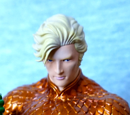
Face:

I like his face – not sure what it’s supposed to look like, but I think it has been done well in terms of general sculpt and paint. The hair has a nice sculpt to it too. We can also admire the edging on his collar here too. 

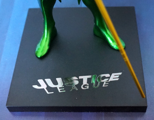
Base:

The base is the standard Artfx+ affair, with the Justice League logo, rendered nicely in silver. The base is magnetic, as these figures have magnets in their feet to hold them to the base. For him, the magnets aren’t strong enough to pick up the base, but it does help him stand up for sure. 

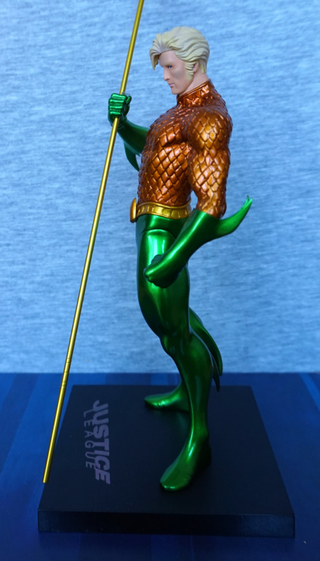
Left:

I love the curved parts on his suit, and the glossiness of the green. Almost think his gloves could’ve done with some kind of edging to make them less plain though. They feel like they end prematurely somehow. His sideburn is well done on this side though. 

Right:

The join on his leg is pretty noticeable from the side. Probably the largest flaw with the figure, outside of his slippery weapon and the fact it’s Aquaman. Still liking the fins on his outfit. 

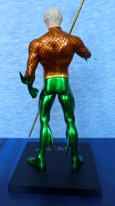
Back:

Bit of a square arse… Not sure what’s going on with that. Especially with the creases moulded underneath on his legs, it seems to emphases the odd shape  :(. I think the rest of the back of his legs looks OK, though the shiny patterns do make it look a bit like he’s got rubber-legs. For his back, I think it’s better ignore most of him from the waist down, but the suit top texture looks good, and his hair looks decent enough. 

Overall, not a bad figure, but not worth RRP. I’ve usually seen him for sale around the £35 mark, which is a fair price. I think with the lack of extra colour and shading that other characters get, maybe he should have been given a lower price point out of the gate. 

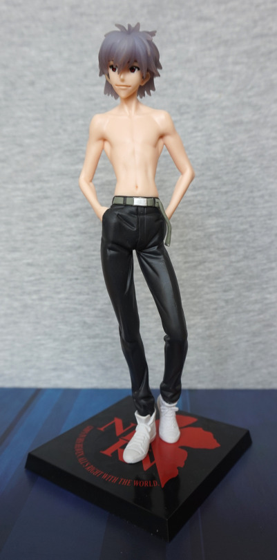
Kaworu Nagisa – Evangelion

And whaddaya know… more Kaworu! Got this a bit ago, but forgot to blog about ‘im. 

But I certainly didn’t forget about him:

He also has semitransparent hair, but I think I prefer this head o’ hair, though it does look like he has a layer of gel on it or smth. Could do with being a tad lighter.

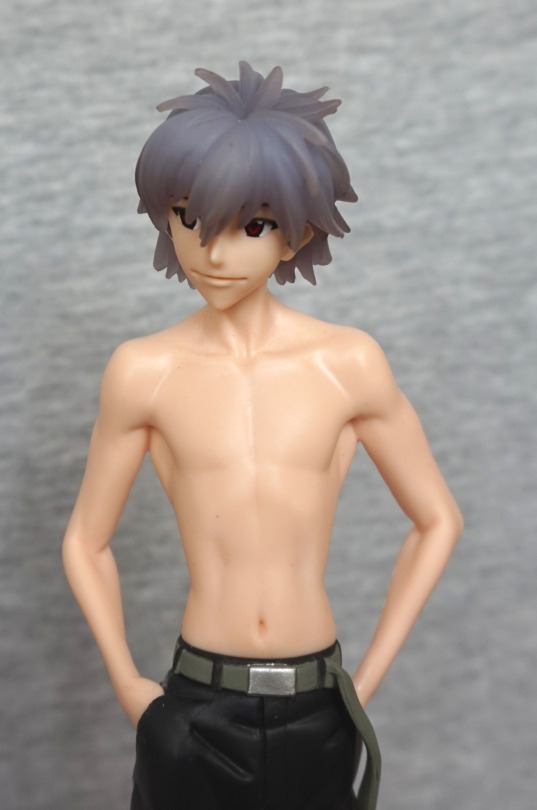
For his face, it seems very close to the other one, with the darkly shaded mouth. He’s even looking in the same direction, lol. 

Now onto the main part of this figure – his chest:

He has good definition on his chest and arm muscles. As he’s a prize figure, he is mildly shiny and lacks shading, but on this figure, the lack of shading isn’t too bad, as the sculpting makes up for it somewhat. And didn’t cost eleventy billion bucks. 

His trousers are nicely done, though the finish doesn’t complement them – I think this is where the finish works the least. The creases in his trousers look more like dents in some places, like the one by his pocket in the above picture. 

Base:

I like these bases, for not being totally plain. Not much to write home about, but works. Could quite well be a tile inside of NERV… 

Left:

His pose has some depth to it. which makes him look good from the side. Whilst his build is wiry, it’s the kind of wiry that suggests he might actually be strong, which fits with Kaworu. 

Right:

Looks fine from this angle. The lighting worked well in this pic, and has given him a decent amount of definition. 

Back:

Less of a backside on this Kaworu, but I think that’s mostly due to the style of the trousers. Whilst they aren’t baggy, nothing’s tighter than a plugsuit, lol. Here you can see his shoulderblades and, erm, the dents in his trousers. I like the fact they’ve added some paint detail to the boots, with the red stripes around the back. 

Overall, I think this is a very nice prize figure, and would recommend it if you’re a Kaworu fan, and would like him dressed in something that isn’t his plugsuit. 

Kaworu Nagisa – Evangelion

Because you can’t have too much Kaworu…

image

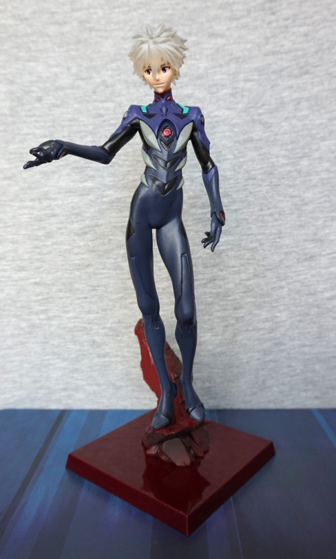
I ordered more Kaworu Nagisa. I have another version of this figure – this one has the green parts on his plugsuit, a red rock and… most importantly, semitransparent hair. These figures are on the lanky side, but this does make displaying them towards the back of display easier, without missing out on too much. 

Close-up of his face:

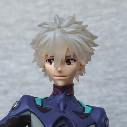
His mouth feels a bit overemphasised, but the rest of his face has been nicely done. The semitransparent hair is an interesting effect – not sure if I prefer it or not. Some red paint has escaped the lines on his plugsuit, with the pip-shaped parts on his collar. The paint job is OK for a prize figure. 

Left:

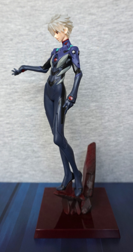
Here we can see him leaning forward, and how thin he is. I like the grey parts of his plugsuit. 

Right:

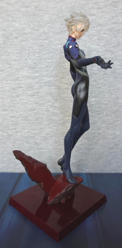
We can see he has some shape to his backside, and bits of hair where you can see his fate through. His ear has been sculpted well. 

Back:

Yep, deffo an arse on this dude. Back of the rock hasn’t had any detail put on, but the back of Kaworu himself is properly detailed. All the paint looks good. 

Stand:

Here is the rock, which does transition from grey to red. I think the lower part of the rock works, but I think the pice on the right of this pic would’ve been better just to be solid red, as it looks like someone halfarsed spraypainting a rock, instead of some kind of shading, which I think was intended. Overall, the base is what it needs to be, but isn’t anything special. 

I think the liking of this figure hinges on his transparent hair and if you like this interpretation of Kaworu. I don’t think there’s any real need to own all the repaints of this figure, unless you’re like me and want it in more than one room – I’d suggest picking your favourite/what’s available and order that. 

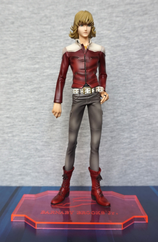
Barnaby Brooks Jr – Tiger & Bunny

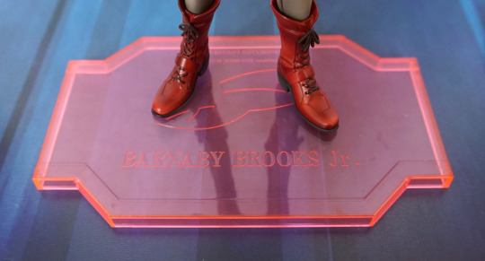
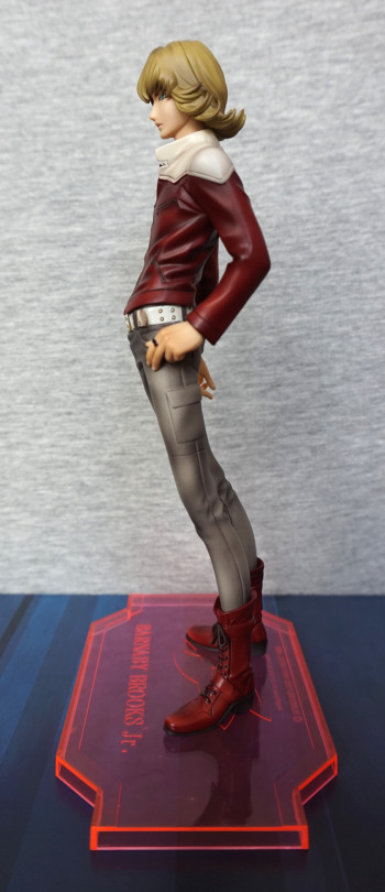
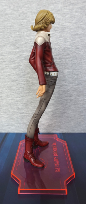
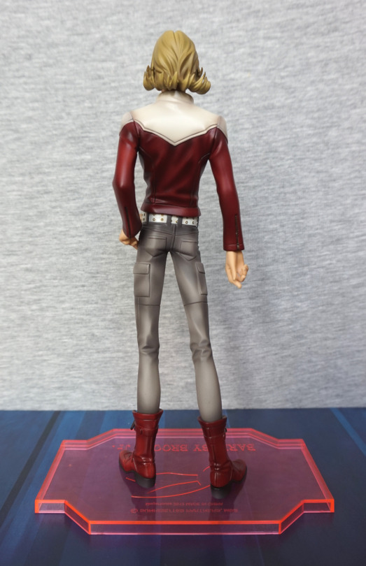
This figure is the G.E.M figure of Barnaby Brooks Jr, by Megahouse. Got this cheap from a retailer in the UK. One that garnered a poor reputation, but seems to be now just concentrating on liquidating their stock, so I grabbed a few good deals, including this one. 

So let’s have a look at him:

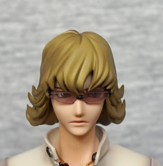
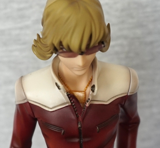
Certainly plenty of shading on him, and the sculpting is really nice on him imo. You can imagine him settling into this pose, and he has an appropriately serious expression, which fits Barnaby. Plenty of detail has been put into the clothing, which I like, as there was the large potential to leave it bland. 

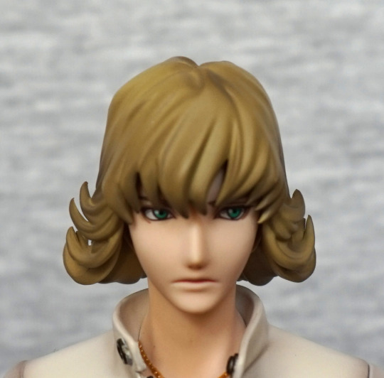
Close-up of his face:

His eyes are painted nicely, and his lips have been well done, without too much colouring. 

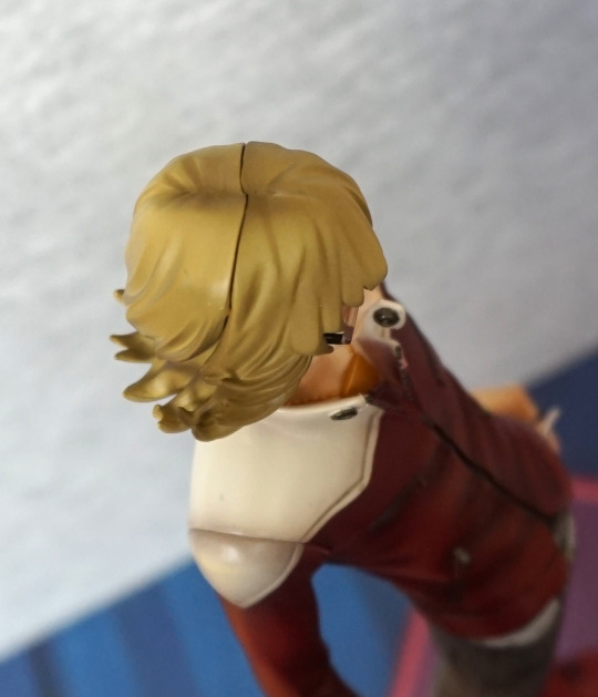
You can also exchange the front of his hair:

And have him wearing his glasses. Both options are equally viable, and I think come down to personal preference. On initially purchasing the figure, I thought I’d only want to go for this look, but on experimenting, it left me indecisive. 

Both of the hairpieces have been shaded well, so no issues there. 

Necklace:

Tucked into his jacket, you will see his signature necklace. Was particularly pleased this was included. Here we can also see his jacket has a “lived in” feel, which is rare in a figure. 

Hairline:

This is what the hairline looks like with his glasses hairpiece. A bit more visible than other figures, but this is not surprising given you can exchange his hair. 

Boots & stand:

Love the red leather of his boots, and they’re painted neatly. The base has his logo and name. In isolation, the stand is nice, but I’m not entirely sure it fits the style of the figure. I don’t find it really detracts from it, though. 

Left:

Here we can see how much work they’ve put into the creases in his outfit. Gives all of his clothes a lifelike feel. Some of the trouser shading feels a bit randomly placed, but it doesn’t detract for me. Here we also see his hand with his ring on. 

If you prefer him ringless, he also comes with this hand:

Which is identical to the other hand, barring the ring. Switching the hand in and out is easy enough, but probably want to go careful, to avoid scratching the hand or his trousers. With the connection under his jacket cuff, it doesn’t look like a replaceable part when on display. 

Right:

He is thrusting forward, which feels more evident on this side, as his arm & hand doesn’t obscure it. He has a slender build, which feels true to the anime. Paint application looks good here too. 

Back:

His backside looks rather small from this angle! Ok, maybe they overdid the slenderness? Definitely doesn’t feel like there was any slacking off here when it came to the sculpting and the painting. All looks good, if you’re happy with his build. 

Close-up of his head & shoulders:

Join on the left doesn’t look quite aligned, but I think I can let it off for that. Hair is nicely shaded, and the off-white of the top of the jacket looks good. I think they nailed the colour for this. 

Overall, I’m really happy with this figure, and can recommend it, if you’re a Barnaby fan. Some day I might get the Kotetsu that goes with him, but I do have other Kotetsu figures, so not rushing out to buy it, unless I come across a good deal.