Month: January 2019

Black Panther – Marvel

Today’s blog features Black Panther, made by Eaglemoss.
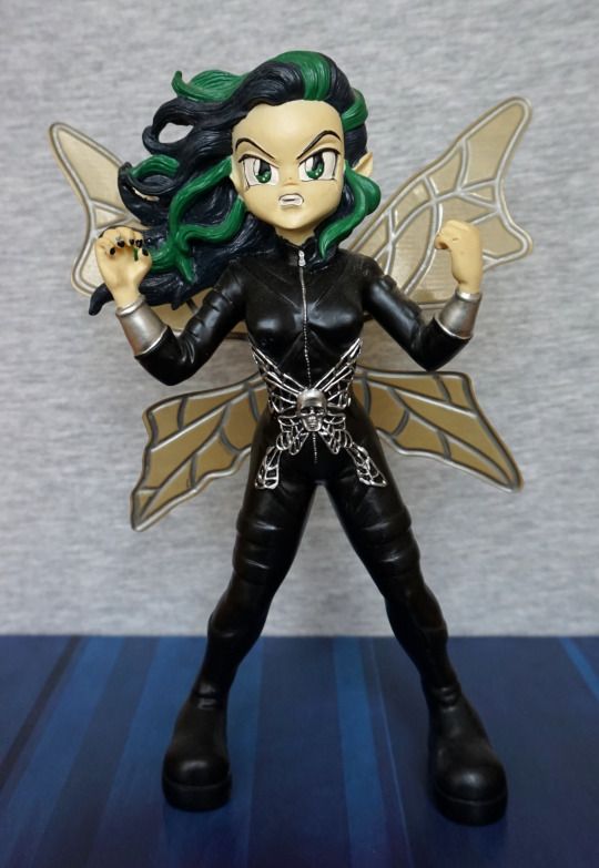
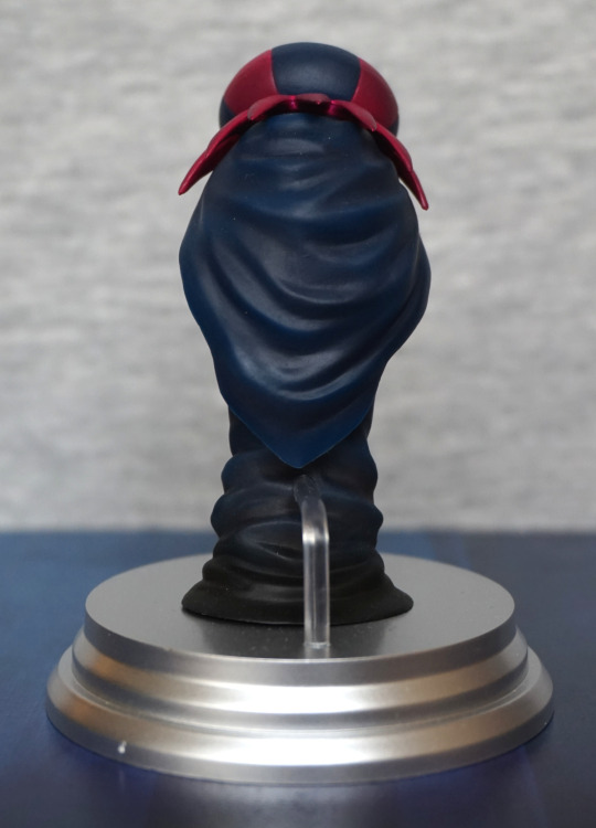
Front:

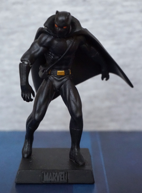
This is his comic book appearance, rather than his film appearance – Eaglemoss has done figures of both, but this is the older one. 

Here he is, looking very stealthy in his cape. There isn’t much in terms of colour, but the gold accents and eyes have been painted nicely. The sculpt is good too, and I do like his pose. 

On mine, the left arm has been misassembled – I may break this at some point and reglue (probably not particularly needed to repin). Not sure how I didn’t notice this when I was photographing it…
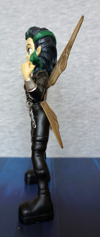
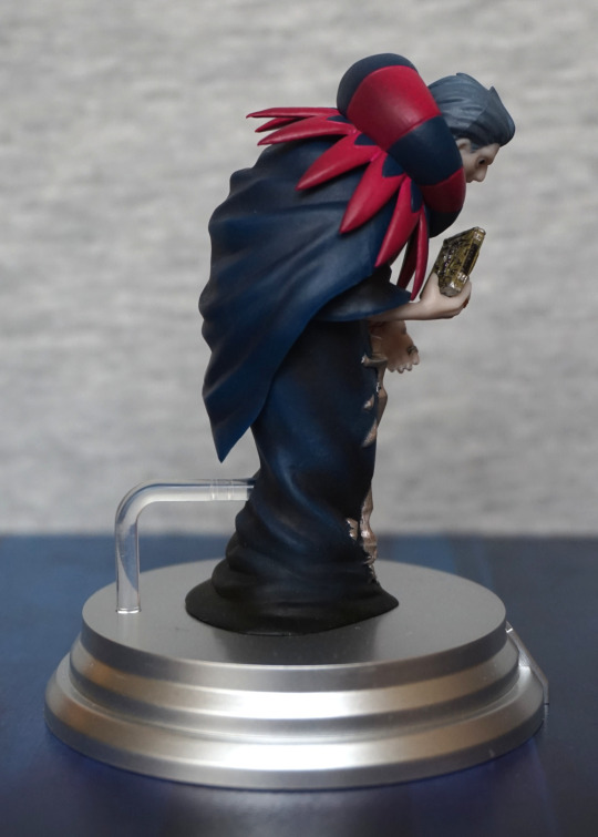
Left:

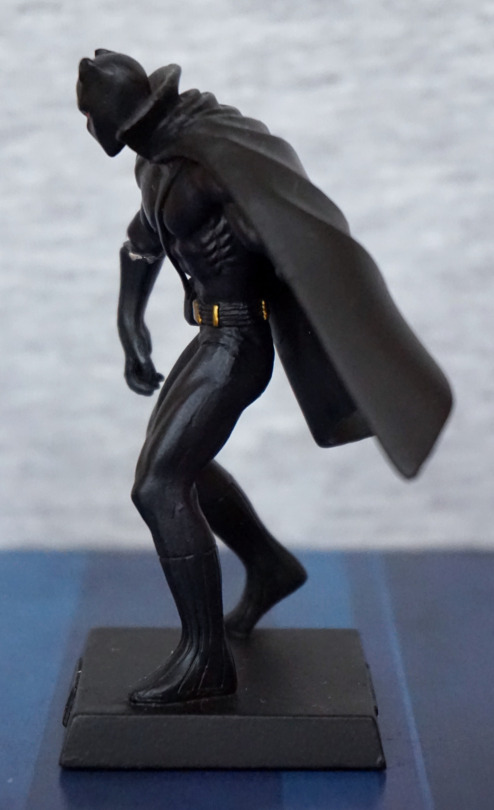
I like the way he he bent over slightly. Here we can see the gold accents do go around his back, under his cape. Nice to see this attention to detail.
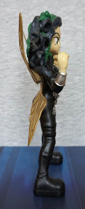
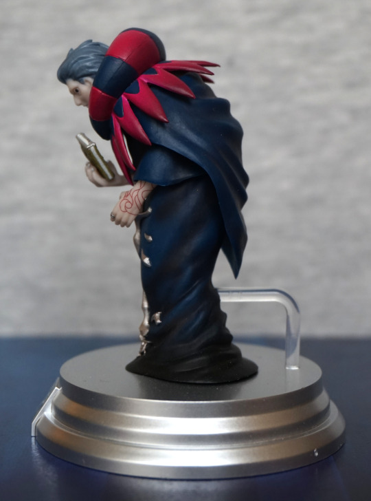
Right:

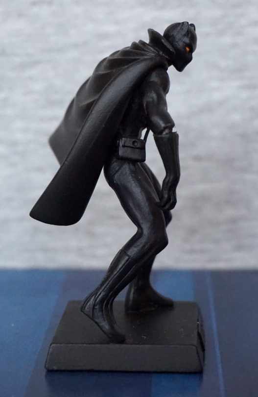
Here we can get a bit of a better look at his eye – they’ve used 2 paint colours here, which does elevate their appearance. His bag o’ tricks is a nice touch. 

Again, please ignore the “elbow”. At first, I think it looked like a design element, but on closer inspection, it’s a mistake. The joint here wasn’t pushed all the way in, so left with this mess… ah, QC. Or not. 
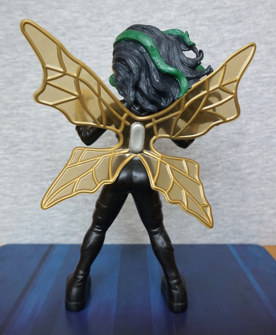
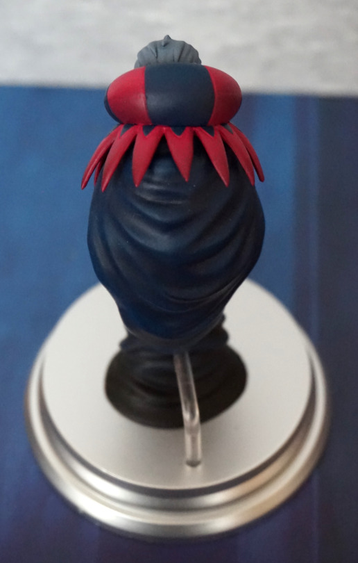
Back:

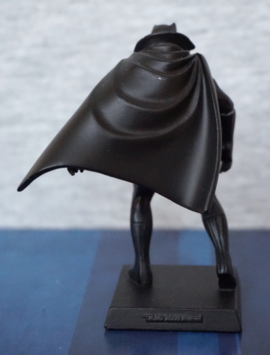
I like the cape design, with the large flowing wrinkles. Tiny paint scratch on the back, but this could’ve been a previous owner. 

Overall, a decent figure, or will be once I repair him I guess. If you get one that’s properly assembled at a reasonable price, I’d recommend him. 

Juggernaut – Marvel

Another big heavyweight of a character, Juggernaut:

Here we have him doing his typical thing of charging into something. Or at least I assume that’s what he’s doing. The paint job feels much simpler than that of Colossus (featured in yesterday’s blog). Here they’ve at least used two different shades of red for his outfit, so he doesn’t blend all into one, which can be an issue with some Eaglemoss figures. The paint on his arms, however, feels rather sloppy, thanks to the overspill on his bands and the half-arsed dark wash. I also feel the holes on his mask feel a bit roughly-hewn rather than neatly cut, as per his mask in his comic design. 

Left:

I think his bands are so tight he’s bleeding? He has muscles sculpted on his leg, but honestly it looks more like a piece of cooked meat rather than a leg to me. Almost like they went “fuck it, call it a day” when doing the sculpt. The boot sculpt is nice though. 

Right:

Again, due to the way his bands are painted, looks like they’re potentially cutting into his arm. Arm muscles also suffer a bit from being oddly shaped and feeling half-sculpted. 

Back:

There was an attempt. The middle band of his outfit feels an absolute mess back here. Again, you can see the poor sculpt of the muscles on his left leg. However… they’ve weirdly nailed the sculpt of the bottom of his boot, and that actually looks decent. His right boot is pretty good too – though the sole is a tad uneven. 

Overall, this figure… isn’t great. Feels like it was half-arsed in sculpt and paint. There are some positives, but overall he’s rather “meh”. Why did I buy this again? Oh yeah, bought him with another two Eaglemoss figures and didn’t look at him too closely… Wouldn’t recommend unless you really want a small Juggernaut figure. Or you’re an idiot like me and pick random stuff up for cheap. 

Colossus – Marvel

Today we’ll be looking at Colossus by Eaglemoss:

image

Here he is, in his comic book colours. There is some attempts at shading – some more successful as each other. He has some lighter red paint highlighting his muscles, but this looks a bit odd towards the top of his suit. There is some dark-coloured wash too, which works better. The lines on his body are good for the most part, but he does that strange seam on his right leg. 

Looking at him front-on:

Here’s a better look at his front, where you can see the unusual bright red paint in full effect. The sculpt on his pants(? underpants?) is good, and gives a fabric feel. 

I think his face sculpt is done well, and his boots are nicely painted. 

Left:

I like his pose, and the sculpt has a good amount of detail. They’ve certainly gone to town on his muscles. The gold accents add some nice focal points to the figure. 

Right:

Here we can see the creasing on his pants was sculpted all around. And that seam on his leg, which is slightly offputting, as it does disrupt the grooves on his leg. Bit of a difficult one to deal with though tbh. 

Back:

Here we have more of the red highlighting, that I don’t think works too well. The sparing bits on his left work better than the larger blobs on the right – I think the lighter red needed to either be used more sparingly or actually blended. There is some dark wash going on, which does help accentuate the figure though. And them pants be tight… The paint, on average, has been neatly done, which is an achievement for an Eaglemoss figure. 

Overall, I think this is a decent figure, and would recommend if you like it. Personally, I’m happy with him. 

Kuroyukihime – Black Dress ver

A small figure for today:

A small chibi figure of Kuroyukihime, from Accel World. With this figure, I like the hair and the outfit, but not sure if the face fits – her face seems to lack the “severity” of Kuroyukihime, as it is rounded and her expression is almost smiling. Just feel it could be tweaked a bit to give off more of a Kuro vibe… However, what is there looks nice for what it is. Her dress is nicely sculpted, and her shoes fit well with the outfit – my only real complaint is that the flower is pretty much covering up the silver butterfly detail at the top. I feel the flower could’ve been a tad smaller so the butterfly could show. 

Mask:

Bendy! Haven’t got around to fixing this – some heat and cold water should fix this, but this figure is going to be prone to this part bending.. Well, better than it breaking tbh. The mask itself looks the part and is painted well.

Left:

Not too much to see from the sides. The hair strands look nice, but not too much detail in her hair otherwise. She has a sculpted ear, which is nice, and her shoes look good.

Right:

Here we get the mast, but it does appear to float from this side, as she isn’t gripping it. 

Back:

Again, not too much to see. I do like the strands on the lower half of her hair though. Just wish there was more to her upper hair so she looks a little less like a billiard ball, though this is fairly typical for chibi figures. At least the shade is nice and compliments her. 

Overall, I find this above average for chibi trading figures, as the design means there isn’t a bunch of paint slop. I don’t think it’s winning any awards for being a Kuroyukihime figure, but in its way, it is a nice figure. Just be prepared to have to straighten out the mask handle. This figure is usually pretty cheap though, if it comes up, so it is good for the price.

Knuckles – Totaku

And finally, let’s look at Knuckles.

Front:

This one seemed to have the least issues with paint, and I should imagine the crescent moon print on his chest helps with that. Here we have him, in his Lego-shoe glory! 

Knuckles also have an accessory of a Chaos Emerald – I think this works well, as Knuckles has a “thing” for the emeralds, The emerald also has been done well, in transparent plastic. 

Left:

His hand feels a bit elongated, and the seams in his hair are a bit rough. Rest of it looks OK.

Right:

Hair is neater on this side, but his eye seems to have some lumpy paint.

Back:

“Hair” looks good from the back, and the backs of his paint seem to be painted well. And we have his li’l tail :). 

Overall, I think he’s a decent figure, and a good choice for the set. I glad they did the more-original three, rather than some of the later characters. 

And here are all three together:

Feel like I should have probably put Tails in the centre here… But with the bright colours, they do look very nice as a set. Kinda wish Tails had some item in front of him, to complete the set. If you can pick the three up for a reasonable price, I’d recommend them, but with the caveat of seeing what ones you’re buying beforehand, due to the annoying paint issues. Just wish they were a little more consistent for the price. 

Tails – Totaku

Second Sonic-based Totaku… Tails!

Front:

This one… I didn’t pick so good, and there’s actually a small paint chip on his moustache. If you look carefully, it is on the right in this photo. I did almost think about seeing if I could exchange him, but then apathy took over. However, the colours work well on him, and it feels accurate to his in-game appearance. They have included a small detail of his tongue, which is nice to see they have paid some attention to detail. 

The base is very similar to Sonic’s, but this time with nothing to decorate it. 

Left:

His head and body look OK, but not sure what’s going on with the white paint on his shoe there. Seems to have gone a little uneven… maybe they put this one in the box a bit quick? Bit of paint has gone walkies on his tail, but it isn’t too much of a mess. 

Right:

Looks OK from this odd angle I apparently photographed him at. Do like the sculpt on the hair strands. 

Back:

Tails butt! Not too much to see back here, but looks fine imo. 

Overall, I think this one is decent, especially if you can get one without derpy white paint. This one seemed to be the one most prone to paint flaws in the shop I was at though… And if you’re paying £10 for a small figure, you’d expect a little more QC tbh. 

Sonic – Totaku

Now… Sonic, from Sonic! The next three blogs will be the Sonic The Hedgehog Totaku that have been released. 

Front:

Love the base for this one – they’ve emulated Green Hill Zone for these. including the stripey greens. The details are all nice and crisp on the base, and it works really well.

We also have a ring flat to the base – does look a little odd lying down, but at least it isn’t an accessory that’s easily knocked over. I also appreciate it as an extra detail. 

The colours for Sonic are nice and bold, and match his in-game appearance. The pose chosen also works well. However there are a bunch of small paint flaws, some of which I find more annoying than the ones on Crash. Mine has a white dot on his left sneaker, and I don’t like rough paint above his right eye. 

Left:

Here we have quite a bad seam on the lower spike. We can also see a seam in the head, but it’s blended decently enough. 

Right:

Seam on his lower spike is less obnoxious on this side, but still visible. Bottom of his shoe feels a bit square – would be nice if they mad his foot taper a bit more. Not sure if it’s exactly a match for the other one, which doesn’t seem so square. His hand and arm are painted nicely though. 

Back:

The spikes look good from the back, and I like the golden buckle on his shoe. Surprisingly few issues back here. 

Overall, I think he’s decent, but potentially beset by paint issues. I know for a couple of the Sonic ones I did spend some time comparing, and I’m not sure if it is just a general issue or a first run issue, but these ones seemed less consistent with the paint jobs than  the other Totaku I’ve looked at. However, if you’re either able to overlook or find a decently painted one, it’s a pretty nice figure. 

Crash Bandicoot – Totaku

Here’s Crash Bandicoot… from Crash Bandicoot. In Totaku form:

These figures are kind of cheaper collectables, but they are pretty small… which kind of negates the price point imo. So let’s see how this dude stacks up… 

First thing that stands out is his bright orange colour, which is accurate to his in-game appearance. I also like his base – the sandy coloured base works well, and I like the paint effect on it.

Face close-up:

His eyes are neat for the most part, as well as the eyebrows. Brown paint on his muzzle escapes his top lip a bit though. The light orange fur patch is painted neatly on this side, but less so on the other. The gloves are also painted well. So some minor flaws, but nothing too annoying. 

Left:

I like the way the fur texture is throughout his body, and does have some natural-type patterns to the direction of the fur. His shoes look good and the wite seems neat for the most part, and so are his gloves.

His jeans seem to be sculpted OK, but are darker than they should be imo. Doesn’t bother me much as I never played the games, so I don’t really notice the inaccuracy, but looking at other pictures of him, they upper part should really be a lighter colour. 

Right:

Love the nose and the expression. This side looks good for the most part, but we do see where the brown paint escaped his muzzle somewhat. Shading in his ear is nice though. 

Back:

Bit of a plaint fleck on mine, near his left shoulder. However, the texture work is nice, only issue back here imo (other than the fleck) is them pants being too dark blue. 

Overall, it’s decent for a small figure. The paintwork is pretty decent for the most part, but not free of flaws. For the price they retail in the UK, I think they’re slightly overprice, but GAME has often been doing deals on these, so you may be able to pick them up for a more reasonable price. Not entirely sure if he’s worth the £10 I paid, but I think he’s a fairly decent figure. 

Figure Spotlight – Confessor Dhalia

This WoW figure I was given as a gift. She’s an undead priest:

image

She’s pretty detailed, and the colour scheme is nice. Undead can have a few flesh tones, and I think the purple works well here. 

Here’s a close-up on her shoulder armour, one of the key features for people who know the set:

image

And a close-up of her face:

image

She’s a detailed and well-painted figure, like most of the WoW DC Direct range. Kinda wish I was able to pick more up at the time! 

Here’s her back:

image

Not too much special to see here, but they did sculpt some butt, so that’s a nice touch. The skirt folds around her well, and there’s a variety of textures on display. 

Now for the figure’s weak point:

image

Yeah. Just… why? Especially being the part that attaches to the stand! Fortunately I’ve only ever had issues picking her up, but others have had issues of her falling over regularly due to this design. I guess they didn’t want to make the packaging quite deep enough to accommodate the foot that sticks out… after all, her back foot is attached. 

Reviewing the figures for WoW DC Direct series makes me sad that it’s not a thing any more. They were decent quality figures, especially for the price. Blizzard seems to be either doing overpriced NECA figures or very expensive statues, that don’t have a paint job to match the price tag. Sigh. 

But I can still enjoy Confessor Dhalia :). 

Jinx – Rock Hard Fairies

This was a random pick-up at the NEC Toy Fair, to go with the other fairy I have of this type. 

This one is apparently called Jinx and is part of the Rock Hard Fairies lineup:

I was attracted to this one as I like her outfit – love the silver butterfly skull motif in the middle. And she can rock the tight outfit :P. I also like her stripey hair. 

Left:

The texture sculpted in her hair is nice. Her narrow stance helps with balancing, along with the very square platform boots, so she’s stable on the shelf.

Right:

Not too much extra to see here. Some creaselines have been sculpted into her outfit, which is nice. Silver paint is a little overenthusiastic on her cuffs. 

Back:

Her wings have yellowed over time, but I don’t feel it ruins the look of the figure. Pretty sure she wasn’t originally like this, but I like having this touch of colour. The backs of these figures don’t look so good, due to the way the wings are attached. The back of the actual figure though is decent. 

Overall, decent if you can pick these up cheaply, but not a high-quality collectable. 

Gekkoukiba no Majo Lilith – Puzzle & Dragons

Along with yesterday’s figure, I bought this small figure of Lilith:

Was surprised by the small details on this figure, and the crown she wears has been nicely done. With the crown, the paint looks neat, and the colours compliment each other. 

Close-up:

The clothes… of what little she has… have been printed well. The small parts on her leg are nice and neat. Love her scythe too – the purple-gold works really well imo. 

Left:

On this side, she sports a dark wing. We can also see a cute heart-shaped earring here too. I like the way her hair flows too.

Right:

On this side, her hair seam is a bit more obvious, but not too bad. This side she has a red and white wing, which we can just about see from this angle. 

Closer look at the sides of her outfit:

More material here, than the clothes on her body! Nicely painted though, with very minimal painting errors. Has a good amount of detail to it too. 

Back:

The strands of her hair are sculpted well, and flow nicely. There isn’t any paint shading on her hair, which is a minor negative, but it still looks nice. 

Overall, I’m pleased with this small figure, and glad to add it to my collection.

Kakusei Minerva – Puzzle & Dragons

Again… finding myself buying Puzzle & Dragons figures, because the company that makes them does such a nice job of them. 

Here’s today’s figure:

And, wow, there’s plenty to look at here. Her wings come as four separate parts to attach, and her sword arm as a couple of pieces. Thankfully this one wasn’t in need of extra stand pieces, so she wasn’t too hard to build – just getting the wings and sword assembled in the right order. 

Face:

Her eyes are nicely printed, and the sculpting is really nice – I love her face, and the hair has been nicely done too. The red and yellow on the crown has been blended smoothly into a nice transition. Love the pale pink metallic armour too. The paint here is also clean. 

Ball:

The ball has an obvious seam, but the texturing on it is nice. The black parts on the edges of her armour contrast well. 

Left:

The sides are dominated by the wings – there isn’t any shading on the wings, but the deep sculpt does help make up for this. Love the shiny orange of the sword.

Closeup of the sword on this side:

The handle is a very nice sculpt, and the “runes” on the sword look really good. The lines are nice and clean on the sword, plus the gold and orange compliment each other nicely. 

Leg:

Love these orange spikes. Lots of sculpted details here, though the sculpted details don’t have any paint detail to them. However, that probably counts in the figure’s favour, as it’s less chance of a sloppy pant job but still looks good. 

Right:

Here we see mostly wing, but we can see more details of the sword. 

So here’s this side of the sword:

The dragon sculpt is very eye-catching, along with the gold parts on the hilt. Really love this design and the bright colours of it. 

Back:

.. though that sword is bigger than her… strong lass! Here we can see the four wing parts, as she twists to wield the sword. Love the way the wings add to her motion. and that she has four of them. 

Wings from slightly above:

Where the light on the left obliterates the shading, their non-painted nature does rather show up, but doesn’t look bad where there are shadows. 

I think the weakest part of the figure is the ball in her hand – it’s supposed to be a fireball, and could’ve been doing with being more transparent to emphasise that imo, as it does look like she’s holding a crystal or something instead. However, it does look OK in its own right (well, maybe not the seam), so if you’re not bothered about accuracy I don’t think it’s that bad. The wings do look plasticky under stronger light, but not as bad as the guardian’s white wings. These have more depth and motion to them, which does reduce the plasticky look.

Overall, she’s a really nice figure for the price, and I would recommend her if you’re a fan or just like her design. 

Devilman mini-figure 4-Pack

This set I saw on YAJ first (iirc), but then found one of the Mandarake stores had it, so went and ordered it there. 

I’ll start with my favourite, the one similar to his original colours:

The first apparent downside of these figures – they don’t stand up, and no stands are provided. Not sure if Uni-Five intended for these to be unboxed…? Or maybe you’re supposed to carry these as charms? 

The sculpts for these figures are all the same – and thankfully it’s a decent sculpt. The details are somewhat obscured due to the clear plastic, but are there. We can see details of his face, and the small protrusions of his horns. I love the pose chosen – his arms crossed is a fitting pose. 

Back:

The texture on his legs looks good, and I like the way his tail curls around his leg. The wings also work well, and I do like his pose… even if he can’t stand on his own. 

So with the sculpt analysed, here are the other colours included in the set.

Red:

Probably my least favourite of the set. Bit too on the neon side. 

Black:

Looks OK, bit better than the red one.

Glow-in-the-dark:

Whilst his sculpt details are less obvious in the daytime, he does glow, and for that he’s my second favourite. 

Overall, I like this set, but is probably a set a fair few will just display in box as it has fairly eye-catching packaging:

For myself, I’ll likely get out some white-tack to help them stand, and display them amongst my collection. And maybe sneak one into an ita bag…

Gilles de Rais – Fate/Grand Order Duel

This was the Fate/Grand Order Duel figure that I saw and wanted. I’ve always been a fan of Gilles de Rais’s look. Being a less popular character, this figure was also cheap, which was a bonus. 

So let’s have a look at him:

image

From the front, he looks decent, but I don’t like the fact he looks down – it would be nicer if he was looking a bit higher so his face was visible when looking front-on. I wouldn’t mind him looking slightly down, as that fits Gilles, but from this angle you don’t really get to see his face.

So here’s his face:

His face has been sculpted well, and has his angular look. Hair and outfit are both neatly painted, and the pink and blues chosen work well together. His rungs look good too. 

Left:

The paintwork on his arm has been done well, and the shading throughout his cloak looks really good. Definitely doesn’t have the shading issue of the prize figure. The points on his collar are nice and crisp. 

Right:

Here we see him holding his book with a claw-like grip. The book has been done well, especially for a small piece. The cloak has also been well -shaded on this side, and we can see the shading on his upper collar too. 

Back:

Props for the stand not getting in the way on this one – I like the fact they’ve gone for a shorter stand so we can appreciate his cape. The back looks really good to me – with the differing shades of blues from the upper and lower halves, and the shading within each part.

Top of his cape:

His hair his sculpted well, and his colour is nicely sculpted and painted. The spikes are slightly different, giving it a more clothinglike appearance. 

Overall, I think this is a really nice figure of Gilles, if small. As a character without a lot of figures, it’s nice to have a quality one, even if it isn’t a scale. 

Cú Chulainn – Fate/Grand Order Duel

This figure is part of a tabletop game version of Fate/Grand Order by Aniplex. Not interested in the game, but some of these figures looked nice for the second-hand price so decided to pick a few of them up. 

Today, I’m looking at Cú Chulainn (Berserker):

Was attracted to this one by the colours and the overall design – love the tattooing on his chest, and the purplish colours of his outfit. And him looking half-demon was icing on the cake :). 

Face:

Love the mischievous grin :). The paint and print are all nice and crisp, without much paint bleed. Some is visible in the white parts, if you look close up. His ruff looks decent given the figure’s size and price point. 

Left:

Here we can see he has a tail – love the long, black spikyness of it, and the red lines complement it well. The ruffs around his ankle look odd, but this is part of the character’s design. However, I notice some fanart do miss these out, and he does look better for it imo. 

Right:

He looks nice from this side too, and we get to look at his spear – I love the red, shiny colour and the fact they’ve included some texture on the handle. 

Spear tip close-up:

I love these small details included on the tip, which give it more detail. 

Back:

Not too much to see here – we have a supporting stand which goes up into his collar, which does keep him upright. The stand itself is entirely flat, so this is the only form of peg on the figure (hence him having one foot up in the air in the first photo). He seems stable enough though. I think the base compliments the figure well, and I like the icon included on the front that tells you his class. 

Overall, I’m very happy with this figure and glad I got him. The colours work well, and there’s plenty of detail to see in the paint and the sculpt. Even if you’re uninterested in the game, these seem like decent figures to display. Though some of the popular characters may set you back a bit. 

Figure Spotlight: Shana

This figure was purchased from a seller on MFC. This figure has a cast-off option, but I have not cast her off. 

image

For the cast-off option, you can take her shorts off and her top, but I have no wish to do so, as she’s a character that looks young and looks fine as she is. Japanese stuff can be weird – you have characters that look old with young ages slapped on them or vice versa. Sometimes in translation, ages are changed to be more suitable for non-Japanese audiences, to make it less weird and less awkward for us :P. Due to this, I largely go by what I would guess the age to be. 

Her necklace is a strand of copper wire by the feels of it, which is a nice touch but also awkward to move around/pose. My favourite thing about this figure is her hair – I love the colour and the translucency. 

Here she is from the back:

image

Here you can see where the top disconnects – it’s not particularly hidden. The hair has some dust stuck to it, as it has the plasticizer issue. I did consider cleaning this, but it is leaking some dye, so going to leave it until it’s noticeably dusty, just in case a sizeable amount of dye does decide to leave. She lives in a Detolf though, so not much dust lands on her. 

Here’s a side shot:

image

She leans back quite a bit in her pose. 

She has a quite striking appearance, which is what attracted me to the figure. She’s not in the greatest condition, but I did pay a reduced price for her. There was one visible flaw, where her midriff was a bit loose, but that was fixed with some paper down her pants. 

Kaworu Nagisa – Evangelion

Time to get back to a Japanese figure, and what better than Evangelion?

Here we have Kaworu Nagisa, in prize figure form:

Lookin’ tall as Kaworu does. I like his pose, and feel it suits him well. I also like his plugsuit, as they’ve given it a good amount of depth. With the way this figure has been designed, the parts of the figure have nice, crisp lines. I like the clear base for its neutralness. 

Face:

The hair is well-sculpted and his face is decent. 

Left:

He’s leaning forward slightly, which adds to his pose. I love the slender body shape, and the hair looks decently detailed from this side too.

Right:

There’s some good detailing on his arm – the upper light-blue part has some good sculpting details to it, along with the grey parts. His backside has a nice shape to it from this side too.

Back:

Hair also looks good from the back, and his backpack looks the part, and the print is well done here. His body feels slender, without being overly so, with some shape to his backside… very form fitting suit :P. Love the finish on the darker parts of the suit. 

Base:

The base features a logo to say it reflects his 3.0 design. The shape of the base is mildly eye-catching, being a bit different than usual. For me, I’d prefer the base to be a little less tall, as he’s a fairly tall figure as-is.  

Overall, I’m happy with this figure, and am happy to add him to my army of Kaworus. Looking up close, you can see some of the hallmarks of a prize figure, but overall I think he’s a decent quality and would recommend. 

Alien – Predator Thermal Vision ver

One last xeno before we break from the the xenos…

image

This very green grid alien. Yes, he does glow in the dark, but no… I didn’t take any photos of the glowing. So for this one, we’re mostly judging it by the sculpt – and I think it looks good. 

As far as the thermal vision goes, the green does match, and I like the way the base is a solid black, to match the lack of thermal signature ti would have. Also makes for a good, strong contrast to the figure. 

Left:

I like the way the tail is posed, going around the alien. Here we also have some super-long back pipes goin’ on too. Head is nicely detailed in the sculpt, and we have the grid pattern of the “grid alien”. 

Right:

Here we see the Alien doing some stalking, unbeknownst it is being watched. Sculpt on this side is also fully-detailed, with sculpting on its limbs, and I like the shape of its body. 

Back:

The body transitions nicely into the tail, and the pose works from the back too. 

Upper shot:

Some of the tail spines probably lack a little definition, but not too bothered about that. Here we can see where the pipes are joined to the body, but I don’t find it overly noticeable. 

Overall, I really like this figure, and was glad to get it for a decent price. Originally he was a bit more than the other figures in the “basic” set, but got him for the same price. He glows decently well, and seems to have some variation in his glow, so looks good at night too. 

‘Alien’ Bobblehead

So this one… I bought this from a local-ish action figure shop, he had no idea where it came from originally…. and neither do I. The figure itself has no markings, is made from resin, and is numbered but not signed, so I assume this some rando-artist item. 

So here is this piece:

image

From the front, we have something that seems to be a xeno crossed with H R Giger’s original art. The base appears to be based on an Alien egg, though this is where the bulk of the damage is on the figure – I plan to paint these in a similar colour at some point (maybe even try and get some putty out and reshape the missing bits…). The centre of its chest deviates from both the original and film designs, as it has two ribs instead of one central one. Also the shoulderblades are longer and larger. We have some strange posing with the arms, but I suspect that was to simplify the moulding process for the resin, giving this alien a stylised look of its own.

Left:

image

Here we see the head is more penisy, which follows Giger’s design more than the films. The shoulders seem to be a less-shaped version of the film version. The mould is nicely detailed though, and the shading on the figure is nice. The red and silver of its lips and teeth has been nicely done. If you look near the neck, you’ll see a little of the resin has been chipped off due to the bobblehead feature. I guess this was made when bobbleheads were in! With the egg part, the veins on it have been highlighted with paint, which I like. Whilst the eggs themselves don’t have veins, they’re usually on the ground below, which I assume where the inspiration for this came from. 

Right:

image

This side has fared better, and isn’t chipped by its neck. Here we can see the alien is a bit tubby – I feel the body needs to be a bit thinner and a bit more shaped to give off a full “Alien” vibe. 

Top of head:

image

The details are nicely rendered, and feel like a simplified version of the Alien Warrior head design. 

Back:

image

Here we don’t have protrusions, which again, was likely to simplify the moulding process… or to make the mould smaller. I suspect the artist didn’t want to cast and glue/pin the extra pieces on, so they’ve come up with their own back design. which works decently well. With Giger’s originals, they did (tend) have protrusions, but from lower down and flatter on the back. Again, the tail is flattened against the body to make it an easier mould to deal with. 

Inside the ‘egg’:

image

I like the way the tail curls around and sits in the bottom of the egg. We have some liquid detail in the egg, which I like. 

Bottom:

image

Apparently there are 1199 others out there… do you own one? Know anything about this? If so, please comment below! Water is from rinsing the dust off this fellah – he was very dusty when I got him and in need of a clean. 

Overall, I like this unusual piece – I feel it’s a more “inspired by” piece, as it doesn’t follow one particular Alien design, as far as I can tell. There are shortcuts the artist has taken to make it easier to cast, but overall, these mostly work, and make it its own piece. Don’t think I’ll get much use of the bobblehead functionality though, lol. 

(Also what’s it with amateur artists not signing their stuff?)

Panther Alien – Aliens Retro Collection

And, finally, the panther alien:

I’mma gonna headbutt you… The body colours look really nice together, the orange head would look better if the paint app was thicker… seems a bit thin and uneven in places… 

Left:

I like the pose, has a feeling that he’s slinking. The colours also work really well, and I think they’ve chosen the right places to paint gold/silver, though some place are a bit sloppy. I think the tail adds to the impression he’s slinking. 

Right:

More of the same on the other side. I love the shape of his feet. 

Back:

Not too much to see here. Looks like the moulding got sloppy at the back of his legs though, unfortunately. Tail looks fine.

Closer look at the tail:

I like the shape of the end of his tail, and feel it is well sculpted overall.

Top:

They’ve added some orange down his back, not sure this worked too well. At his upper back, I think they should’ve stuck with just the dot-spine bits. The blend ion his spine could’ve worked, but I feel the paint app is too uneven for it to work, and was probably too ambitious with Eaglemoss’s usual final quality – their painters don’t seem to blend too well, so I think this would’ve been fine as just gold, or maybe a darker shade of orange. 

Overall, he’s pretty decent. He’s certainly an eye-catching piece, but does have some flaws in the paintwork.