Month: December 2017

Ahsoka Tano & Anakin Skywalker

Saw these in GAME for 99p, so I couldn’t resist. Not hugely into Star Wars, but these were nice looking figures for a cheap price. 
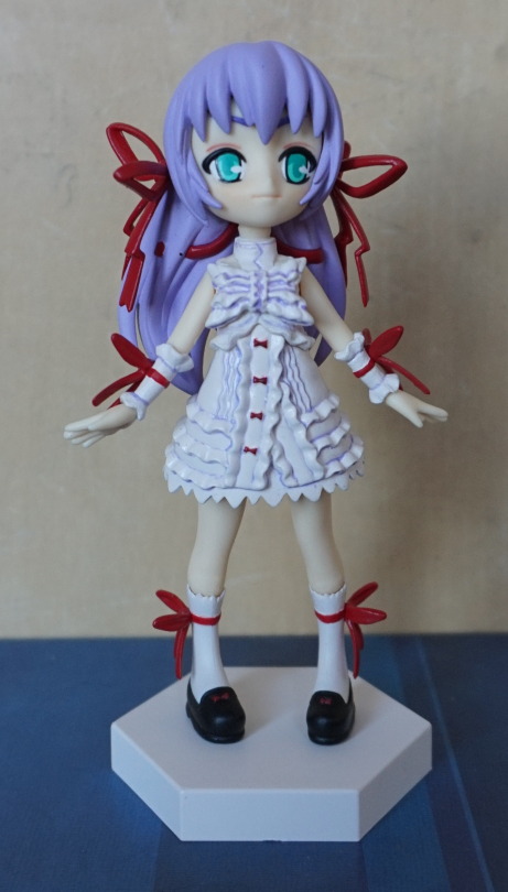
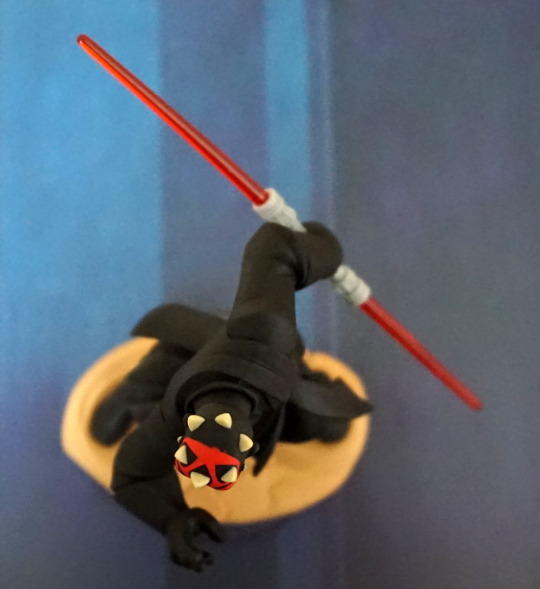
First up, Ahsoka:

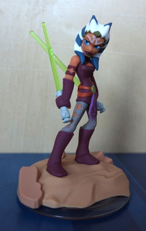
And in the writing of this article, I have learned that Twi’lek and Togrutas are two different speicies, and Ahsoka is the latter. 

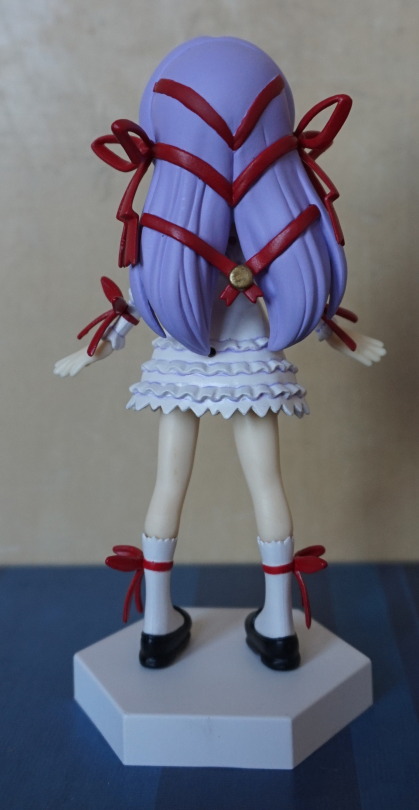
And Togrutas have three head-tails:

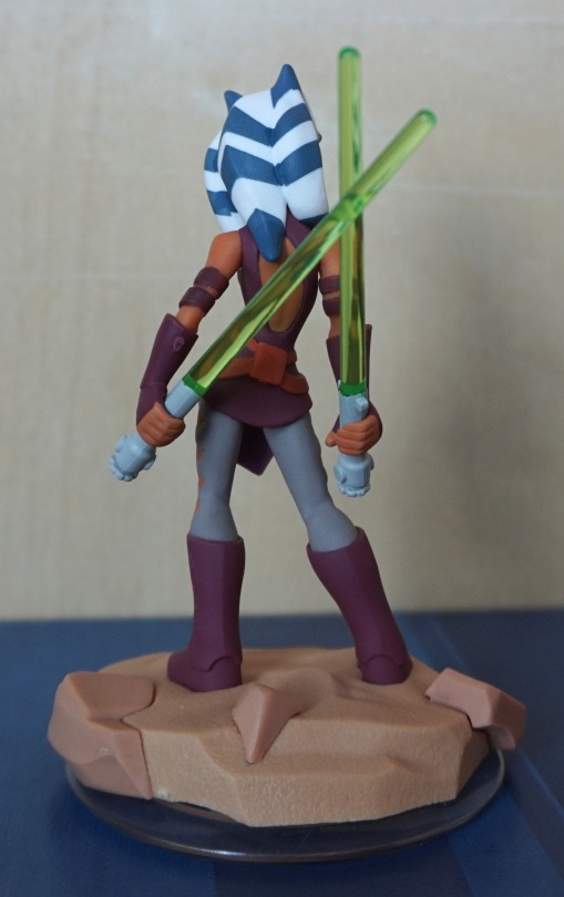
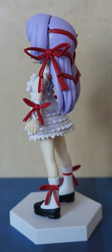
From this angle she looks particularly mean with her pair of lightsabers:

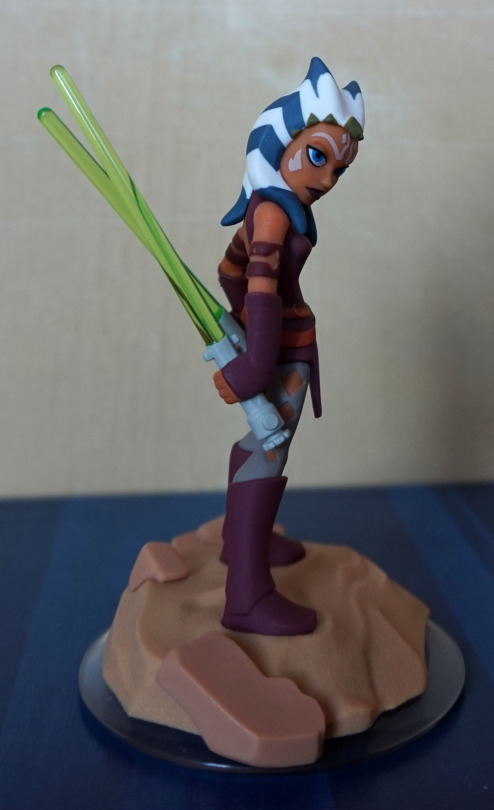
Love the use of colour in this character, and the bases for this set are nice and thematic. There is also little in the way of paint flaws on this one. 
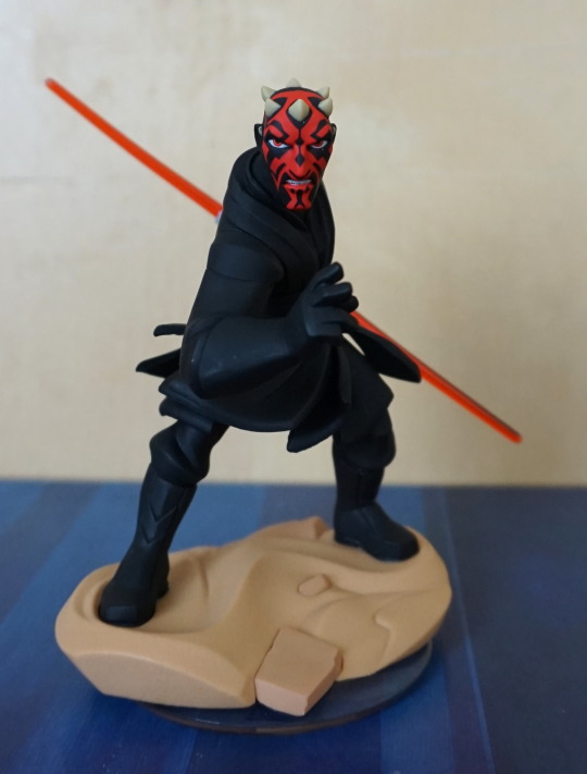
Now for Anakin:

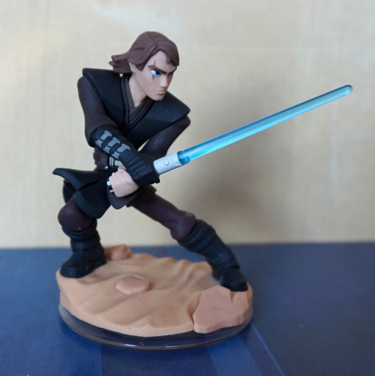
Lookin’ grumpy with his lightsaber, but also a bit dinged up, and not intentionally so. 
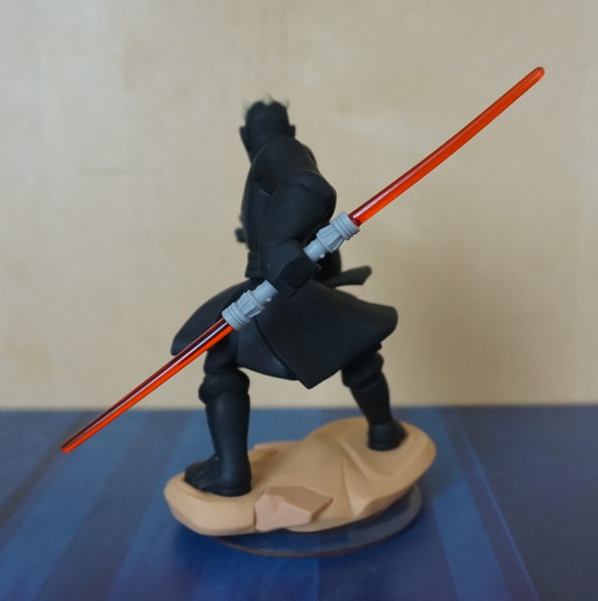
Side view:

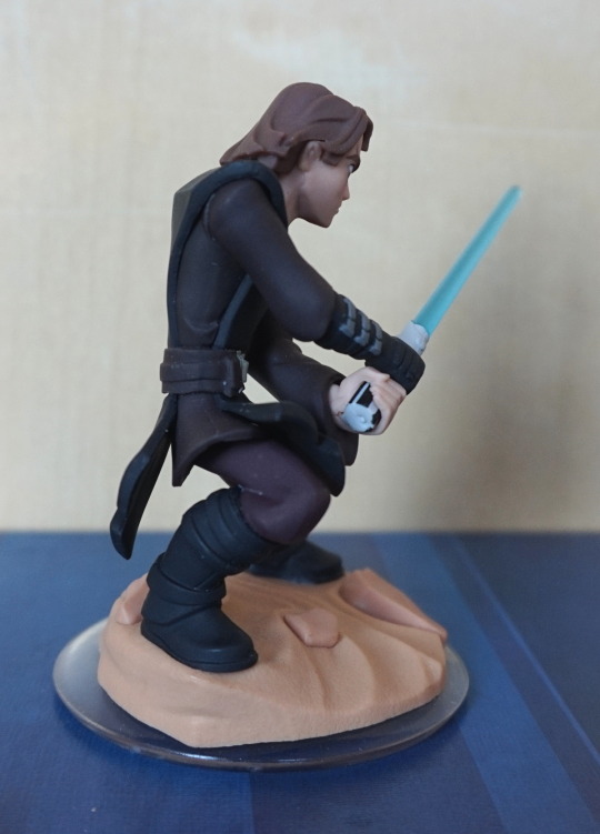
Can see the marks on his leg more on this shot, but you can admire the pose chosen. 
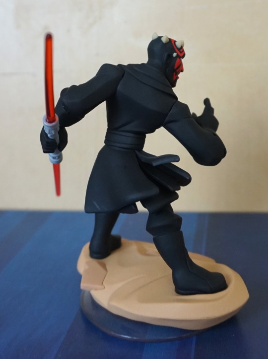
Back:

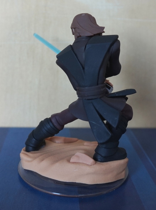
He has a weird dot on his head – looks like a hole in the outer layer of finish, and some scrapes on his coattails. Seems to be a reoccurring issue with the figures with large black areas – pretty sure the black colouring makes these marks more obvious, but it does seem to be something the darker characters are more prone to having. 

Maybe if I looked more at the sets, I could have had an Anakin with less marks on him, but tbh, I only bought this set for Ahsoka, but it’s something to be mindful of if you’re going to pick up your own set. 

For 99p, this set is cheap enough that even if you just like the character designs and want to display them, it’s worth picking up (at the time of writing, it seems readily available). The set also comes with a clear piece, but it’s not really a good display piece, so I didn’t photograph it. 

Spawn – Shadowhawk

This is the figure I bought with the one in the previous blog. 

Here he is in all his glory:

He certainly remembered to bring a weapon to the fight! Or six. Here’s a close-up of his upper weaponry:

Getting some Wolverine vibes from his face. 

Here’s a close-up of the grappling hook:

This weapon actually fires, but it’s more like a spear as it doesn’t have a thread. 

Close-up of the gun-knife:

It’s got all the attachments! Not entirely sure if it makes the gun more deadly. You could probably clobber multiple people at once with it though, should he run out of ammo…. Though he does have that pointy knife in the grapple hand. 

Here’s his back, showing where the cables are attached at his back:

The cables, unlike most other figures, came attached. Was a bit interesting getting him out of the box, but at least they won’t have the distinct disadvantage of falling out. Does mean you can’t display him without his weapons, but I’m not bothered about that. 

Side shot of the wiring:

This was originally the shot for the gun, but it came out clearer in the other pic. So you can admire his clawed hand on this side, which also has the notch for the grappling gun. 

So if you like your action figures armed to the teeth, this one is for you! Not sure I would’ve picked him up if it weren’t for the freebies the comic shop guy threw in, but getting him out of the box, he’s grown on me. Especially in the first photo in this blog, he does cut an imposing stance. 

She-Spawn

Bought this from a comic book shop in Bath, along with another Spawn figure (coming soon!). 

She had a few parts to assemble – the “gun”, shoulder armour and leg armour, plus the sword she has in her right hand. Without the accoutrements, she’s quite a slender figure with them… well, she’s quite bulky now. But not quite Spawn bulky. 

Here’s a closer shot of her upper half & shoulder-mount… thing:

Mmm, skull boobs :P. The launcher on her shoulder can figure the spear in he beast’s mouth. 

Other side of the launcher:

Is quite a big thing, with an articulated ‘tail’. 

The back of She-Spawn

Her hair is rather like an extended soft paintbrush, but it is a nice touch I like that some of the Spawn figures have. Enough details on the back for her to feel complete as a figure. 

Despite the amount of attachments, she was surprisingly easy to balance, though there is the option not to equip everything. The shoulder cannon does leave an odd hole, but the other two parts are simply clipped on. Her one annoying part is the sword – it’s not very well shaped to her hand, so she doesn’t grip it well. It just about wedges in there, but I can see myself white-tacking this in future (or boxing it). My favourite details are her asymmetric belts and the skulls ;). 

Sirene

Sirene is a character from Devilman. She’s a harpy with electric powers. This figure was on my Mandarake wishlist for some time, and my recent Urban Mine digging gave me the excuse to order it. 

image

She’s designed to go with two other Devilman figures, but still looks great on her own. Am impressed with the detail in this figure. 

Here’s a close-up of the base:

image

Her wings rest atop the branch, and her feet have some tiny little holes that her toes rest into. She’s a lot less easy to knock over than she first appears, which is nice. 

Close-up of her face:

image

She’s got very big head wings here. 

She also has butt-wings:

image

Never know when you might need to fan something away! Also there is a bit of a waterfall on this side, and the back is just “cut” water, rather than a waterfall. 

Back view of the figure:

image

This shows how the back really is the back, but the branch has been done nicely. Her head wings are also highly detailed on the back, which is nice. This would be a good figure for a mirror cabinet. 

View showing the spike details:

image

Glad I bought this figure – it exceeded expectations, and am now considering obtaining the rest have ordered Devliman. 

SnapP’s Al Azif

This was an addition to one of my recent Mandarake orders. This was super-cheap and Al Azif, so I chucked it into my cart. So what did I get?:

She has the approximate appearance of Al Azif, but her flesh colour is REALLY pale. Would be nicer if there was a bit more colour to her skin – she looks a little sick, lol. 

Back of the figure:

Some meh painting on the top bands, but OK other than that. There’s a hole here – I assume at least one of the

SnapP’s

figures comes with a tail, as this isn’t a stand hole. 

Left side:

There’s a gap in her hairpiece here – I did try to reduce this, but it’s rather obstinate. Not too much of a biggie, as it’s not visible from the front. 

Right side:

Less of a hair gap on this side. 

For a cheap figure, I can’t complain. The figure has a minimal of articulation – the shoulders and neck move. Would be nice if there was some hand articulation to get some actual poses out of it – moving the arms is a bit pointless, with the hand pose she has. The only reason she has this articulation in the first place is because her parts are replaceable with other figures in the range. If you want a “cosplaying” Al Azif figure, this figure is for you. If not, I’d give it a pass. 

Lilith Aensland

This was one of two items added to one of my Urban Mine boxes to fill out space. 

And here she is:

Nice, striking colours, but has a simple paint job, as she’s an older figure. For the most part, it’s a decently done paint job, but there is a bit of sloppiness at the top of her apron. 

Close-up of her face:

That’s one smiley, happy face. Can see the paint issues on the apron, but I don’t find them too distracting. 

Here’s a side-on view:

And here’s a pic of her back:

Some detail back here, enough to make it not fully plain. Can see some paint flaws with the white paint on her shoulder and neck. 

Close-up of the base:

This base is designed to connect to two others, and the set consists of four figures total. As this figure is old, and I’m less interested in half the set, I’m unlikely to get hold of the rest. I am considering 3D printing a new base for her, as this one isn’t particularly nice on its own. 

This is the reason why I’d want to print one:

She has pronged feet, instead of the prongs being on the base, so she needs something to hold them in place to stand up, hence me considering 3D printing rather than using some of the pegged stands I already have. 

Evangelion Chronicle Rei & Asuka

Won these on the Urban Mine auctions. Paid more than I should have done for them, but ah well… Could’ve bought one from a Mandarake store for less, but was too late when I went to check. D’oh. Should have paid around ~£5 each, but ended up paying ~£10 each, so not a massive miscalculation. 

And I do like them:

Rei Ayanami

First up, Rei. 

I do like the pearlescent nature of her outfit, and the expression feels “Rei”. There’s a decent amount of detail to be found in this figure, especially for its age. 

Here’s her back:

Her “backpack” is present, and some shading in her hair. I like the colours chosen – distinctive, and complimentary. 

Asuka Langely

Next up, Asuka:

Not as keen on her expression as Rei, but the pose is interesting. Also her number is a bit oddly placed. 

The back of Asuka:

Nice amount of “animation” in the hair. And her butt. 

Here’s a side shot, showing off more of her pose:

With both of these figures, I needed to heat the feet to get them on their bases – the plastic is kind of rubbery, so gets quite flexible when warmed. With Rei, I had to douse her in cold water, to prevent her from setting in a leaned position. I won’t be surprised if these figures will lean over time, but they’ll be easy enough to “reset”. 

These figures make a nice pair, and am glad to have them. 

Urban Mine: Evangelion Extra Book

So.. this was a wildcard bid based on this picture:

I bid low on it, ¥200, and won it for ¥100. No other takers. I bidded it on because a) Evangelion b) T-shirt c) Possibly a figure thing. 

So, let’s see what was in there. 

First of all, the book and the box:

The outers… so far, so Japanese. 

So what was the “figure”? If you look closely at the 3rd picture (or read Japanese), you may have figured it out:

A cute little awakened EVA-01 strap. 

Here’s the back of it:

Was quite annoying to get the plastic copyright tag out of the way to photo this XD. He really is quite tiny, but he’s well painted. 

Now for the t-shirt:

Translating the text on the front of the “book” (we’d call it a magazine), it does say EVA wireframe T-shirt, and yep, it certainly is. 

Here’s a closeup of the EVA:

One dude being carried by another dude. A little difficult to look at, but I find it a cool design. 

Logos on the bottom corner of the T-shirt:

The T-shirt is slightly too big for me, but I think I can get away with it :P.It’s not particularly thick T-shirt material, but feels good to wear, so I’ll see how long it lasts. 

From what I can ascertain, the book details what you can “get” in terms of scenes from the Evangelion Pachinko machine, and some ads for other Evangelion merch. There’s some cool pics in it, but not much to write home about. 

Can’t complain for less than a fiver, including shipping. The T-shirt makes it worth it, and I have the awakened EVA hanging up in the bedroom currently. If you’re a size S T-shirt or UK12-14, this T-shirt should fit. I’m around UK10-12, for comparison. 

Urban Mine: Retro Asuka

Back on the Urban Mines! First lot, this one:

Initially thought this was a different figure, but it turns out it was one not on MFC. Stuffed a bid on it, and won it for ¥100. 

So what did I get?

Haha, that face! This figure really does show its age – it has a copyright date of ‘96, which is the end of the Evangelion anime run. In my photos, she looks about the right colour, but she’s actually slightly pinkish. The text by her feet is her name in Japanese:

Side of the figure:

Not too much to say about the side – hand angle feels a bit unnatural to me. You can see that painted side hair clearer here – looking more like a sideburn than a bit of stray hair. 

Finally, the back:

Not so much detail in the hair, but her butt looks good. 

Whilst this is far from the best Asuka you can own, in some way it’s nice to own a bit of history, and to see how far figures have come over the years. The face is the weakest part of this figure, other than that it isn’t too bad. 

Odds n’ Sods: Part 2

Three more pieces of random.

Picard and Borg Queen Minimates

These figures I got from a comic book shop in Bath. 

Bought them because… Borg Queen. They’re not too bad out of the packaging, Picard looks nicer out of the packaging than I thought, with the accessories. 

Here’s a side shot, showing the phaser “clipped” to his belt:

Personally I would have preferred a back clip or something for the rifle, so he could hold the phaser and carry the rifle, as I feel Picard is more a phaser kinda guy. I should prolly re-angle that phaser though, unless I choose to switch it out with the rifle anyway… but it does leave what looks like sprue on his waist. 

Backs of the figures:

The Borg Queen’s head wires came out quite well, but the copyright info kinda spoils the look, especially a some is over the printed design too… 

I wouldn’t have bought these at full price, owing to them being stylised, but I don’t mind them being in my collection. 

Ghost Rider

This guy I bought from TK Maxx. Found him at the tills – so the annoying scrabble through the till queue merchandise was fruitful that day. It’s annoying because there can be good things hidden there, but you’ve gotta move out of the way for people ready to pay for stuff ><

Cute li’l dude :P. Hands and head are on the big side of the body, as these will work with the full-sized figures. Head looks OK, but the hands do look a bit on the odd side. 

Here he is from the back:

Yeah, not really his best angle. His fire-hair looks neat though. 

He also comes with an optional green dragon accessory:

Not familiar with this being a “thing” and I’m not entirely keen on it. It’s an OK part on its own, but I don’t think it goes with Ghost Rider. Will probably live in the box of spare parts, just in case I get a Mash ‘Em it works with. 

Side shot, if you want to see more of it:

Darth Maul

Kinda surprised I didn’t have this dude already, but he probably didn’t get the chance to bin as hard as some of the other Disney Infinity. Found this in the same TK Maxx visit as Ghost Rider. 

For some reason, both of the ones they had had small scuffings on the black parts. Not sure why, but it’s not too visible irl. His head paint has been done well though, and is very striking. 

Shot showing his saber:

Looking nice n’ lethal. 

A shot showing the back:

Again, some minor scuffing, but he looks good from this angle too. 

And just for completeness, here’s his head spikes:

Love this little Maul, despite the small flaws. A welcome addition to my collection. 

Odds n’ Sods: Part 1

CThis blog will be dedicated to three of six different smaller figures I’ve bought lately, that don’t really justify their own blog entry.

Bilbo Baggins

This dude came from Poundworld, and I don’t think I’d pay more than a pound for him, but had to get the figure because of silliness. So why silly? See for yourself:

image

It’s the ring-version of Bilbo. There is some decent moulding in there… if you can see it! And no paintwork to complain about… 

The two straps are for a bag and some water bottles. These are separate parts to the figure, so I’ve put them on best I could. 

Here’s his back:

image

He does have articulation, as can be seen, but not sure why they bothered making this figure. Definitely the peg-warmer of the set, though some of the figures didn’t fare much better, but I think most only got as far as the cheapy shops instead of pound store territory. 

Captain Sparklez

Bought this mostly because of the slime. Was also £1. 

image

He does come with a shield, but I didn’t add it to these pictures, as it’s overly large and looks terrible. The slime and slime sword are the best parts of this set for me, as I don’t follow any of the Minecraft YouTubers, though I know of them. The legs on this figure have surprisingly decent articulation – the knees and hips both move, so he’s easy to stand up. 

Backs of both figures don’t have anything to write home about:

image

And let’s have a close-up of the slime:

image

D’awwww.

Invader Zim

This was one of the overly-expensive blind bags, but I bought it anyway. Out of the things available in the bag, this was one of my top picks, so that’s one good thing 😀

image

Lookin’ very Zim, but the body paint is rather sloppy. I think it would have been nicer if they included a mouth. Wasn’t like his was too small for one… 

Here’s a shot of the side:

image

Yeah, the join isn’t particularly hidden in his overly large, bobblehead. Might be possible to do something about it, but not checked. Here you can see how the stand goes around his body and pokes into his back. Not really a fan of the stand – I’d prefer it if he stood on the plastic plate – he looks a little odd floating there. 

Onto the back:

image

Sloppy paint in evidence here too. The backpack is nice, but wondering if they missed a trick making it look like the stand was something deployed from the backpack, instead of being awkwardly halfway in the bottom of it. 

Closeup of the stand:

image

Having the logo on there is nice, but damn, this thing’s made from cheap plastic. Horrible unevenness plagues the plastic, and the edges aren’t nicely finished. You can clip it to others in the series, but I don’t see myself doing that unless these turn up in Poundland. Especially as 5 out of the 8 figures are… Gir. I don’t mind SOME Gir, but I think replacing one of the weaker Gir designs with human-disguise Zim would’ve been a good way to go. Wouldn’t recommend these unless you really want something Invader Zim. In the UK, these are currently overpriced imo. 

Ena Hoshijiro [Part 3] – Hoshi vs Hoshi

u So now I’ve introduced the two figures… let’s compare!

First off, the stands. FuRyu’s:

ACG’s:

Firstly, their holding capabilities… the ACG one is more awkward to get Hoshijiro onto, as it’s a bit of a tight fit, but she’s less prone to falling off it. If you so wish, you could actually pick Hoshijiro up, and have the stand come with her. However, the holder is actually visible from the front of the figure, unlike the FuRyu one. For the flat part of the base, I’m not particularly keen on either. ACG did try to do something to make it fit in with the figure, but I don’t think the amount of detail there justifies its size. The FuRyu one does the job of being a stand, and little else. I’d say the ACG stand wins out, but neither light my world on fire. 

OK, more important part, the figures!

With the ACG one looking matte, it definitely looks the more expensive of the two. Personally I prefer the ACG’s choice of Hoshijiro, as I like the flesh/meat mix more, but both are “valid” designs. For the hair colour, the FuRyu one is closer to the pics I can find. 

In terms of assembly, the FuRyu one was a mild pain, but it makes up for it in customisability. It would’ve been nice if ACG gave a couple of tentacle options, but it does have the added advantage that the tentacles can’t fall out :). 

The backs:

I do rather like the paint detailing on the ACG one. I feel if they did the hair shading brown instead of purple, it may have found more love. Both have clearly shaded parts, but the ACG one has stronger shading work. Which you’d expect from a scale. This angle does make the ACG support look less fugly than the FuRyu one though. 

Now for the bodies:

I think the ACG gets this one – there’s more to see of the FuRyu one from this angle, but I think the angle works better for the ACG one. I’m linking both from this angle though. 

Back view:

There’s more to see on the FuRyu one here. The ACG one is very “thin” from this angle. You can see a lot of the FuRyu tentacles here – the ACG ones have far better angles for seeing things. Also the seam line is apparent on the ACG one. 

All in all, I like them both, and they will have places in my collection. I think the ACG one is the nicer of the two, but they both have their strong points. Part of it comes down to what kind of Hoshijiro you like. With none of the other scales from other manufacturers panning out, these two are your main choices. The ACG one has potential – there could have been some additions and small changes that would have elevated it to a higher price imo, but I think its current price is a good one, if you like it and want to pick it up. 

Which Hoshijiro would you have gracing your shelves? Or would you choose ‘neither’ or ‘both’?

Ena Hoshijiro [Part 2] – FuRyu

So… this was the first Ena I got. FuRyu is one of my favoured prize figure makers, so I was fairly confident for this one when I bought it. Let’s see what I think about it currently. 

First up, a shot from her main viewing angle:

Her red growth is very much in evidence on this figure. Not necessarily a bad thing. Her tentacles are nicely visible, and you actually have a tentacle choice – the one with the pen can be replaced with just a tentacle. Let’s have a closer look at that pen:

Not perfectly painted, but I really like the fact they included this tentacle piece. However, if you’re not a fan, you can always just have tentacle. 

Here is Hoshijiro from the top:

Looking very tentacly, and shading in evidence on the red parts.

Now for her back:

Here’s where all the tentacles connect in. Initially, she has no tentacles, so you have to plug them into the holes provided. This does mean you could get rid of them entirely, if you didn’t like them, and displayed her in a way that the holes aren’t visible. Why you would do that with Hoshijiro, I don’t know, but hey, there’s probably somewhere out there doing that!

One downside of the tentacles is the connections are some are not the most secure:

Here, you can see little bits of the white tack I’ve used to “glue” them in. Fortunately this has been working for me, and they now stay in. Used to be they’d fall out if she got lightly knocked, which is a problem when I’ve displayed her next to a curtain. 

I like this figure – she does look prize-figure-y, but she won’t burn a hole in your wallet. The lattice bits do look rather painted rather than part of the growth, but the part on her leg is done nicely imo. Her flesh could potentially do with some more paint details, but the red parts are nicely shaded. With the base being white, it is very “there”, but I don’t find it detracts that much. My main issues with this figure have been her tentacles falling out and her propensity to leap off her butt stand. 

Ena Hoshijiro [Part 1] – ACG

The next three blogs will be dedicated to Ena Hoshijiro. This blog will be about the ACG version, the next blog will be about the FuRyu version (as I bought this prior to starting this blog), and the third blog will be comparing the two. 

First… some history with me and this figure. Originally saw this one up for preorder, but couldn’t really afford it, and I couldn’t find much out about it, so I didn’t preorder it, despite wanting to. Instead, I went for the FuRyu version, which had the added advantage of already being released. I remember searching a lot for it on eBay until it popped up at a good price, and I went for it. 

Recently, I went to search for the ACG version, to see what happened to it, only to find the price had severely bombed, to a price comparable to the FuRyu figure. To compare, I paid £20 shipped for the FuRyu one, and I paid just under £28 shipped for this one. There aren’t very many photos of the actual ACG figure, so I decided to just go for it. And super-glad I never preordered it for £80-90!!

So, with the backstory out of the way, here she is:

I honestly don’t think they did a bad job with her, but I can see why her price dropped. She’s not really comparable to the expensive scales I own, but there’s definitely some nice detailing in her. If you look at the picture above, you’ll see three of her tentacles have been formed into hearts. Personally, I think it would have been better to stick with one at her hand, and maybe the more subtle one towards the bottom. Not keen on the upper one. 

A closeup of the hand heart:

I like the path this tentacle takes, and did go “d’aww” when I first saw it. 

Here’s a shot of the top of her body:

I don’t find her face too far off what it should look like, but it could’ve done with some paint detail to make it look a little less flat imo. The shading on her “placental” parts is nice though, and gives them a rich variety in colour. The bit on her leg could do with some tweaking to make it look less blood dribble and more “connector”. One leg is shaded more than the other, not sure this was a good decision, but for me I don’t really see both legs at once. 

A shot from the back:

Some nice shading in her hair, but a pretty obvious seam line. The tentacles are attached nicely, with some proper “holes” for them to come out of.

A shot from behind the figure:

She certainly looks tentacley, and I like that. I think if they got rid of those silly, tight kinks I’d be totally happy with the tentacles. 

Now for closeup of the stand:

Hm. Floor tile. The original artwork showed her with a black stand, which may have been a better bet. It’s grown on me a bit, but my initial thoughts is that it would have been better with a black, smaller base to contrast against Hoshijiro, and make her stand out. I think the base could’ve done with some weathering, and maybe the pen she used in the series… almost tempted to add the latter to the base, to give me something to look at. 

She’s also a good figure if you prefer your Hoshijiro less covered in… meat. I don’t think her hair colour is particularly accurate, but I’m happy to ignore that, as I like the colour. I think she’s a solid figure for the price I paid, but I think her original asking price was too much, so not surprised her price tanked. 

Racing Mari

Out of all the Black Friday sales, this was my only purchase, and I bought this from HobbyLink Japan. I don’t have much Mari in my collection, but in recent months, I’ve decided I need more Mari. So this one contributes to the total:

The blue and pink really work well as a colour scheme imo, It’s definitely prize-figurish, so I wouldn’t have paid a lot for it… and I didn’t. 

Here’s a close-up of her face:

I like the way she’s posed, her hair and glasses are nice, but her top is a bit of a mess, especially with the black paint. They seem to have tried to make a semitransparent bit on her chest with the number on, but I don’t feel it works too well. The collar is nice though. 

Here she is from the back: 

The number decal bit is done well, and still liking the hair, but the blue stripes are a bit shaky. 

Here is a close-up of her bacl:

The paint shading in her hair is nice, but below her top, there’s definite evidence of sloppy paint. At least the red paint on this one is fast, unlike my other large Mari figure! Isn’t shiny though. 

With this figure, the pose works for me, but it is let down with fairly visible paint faults. This is a figure I’m likely to display at a distance, so that the paint flaws aren’t as noticeable. I think it’s an OK figure for the price I paid. 

Tandem Twin – MOMO

This figure I was thinking on and off about buying, but pulled the trigger as I was buying the other items from the seller. She’s an original character, so isn’t in any anime or the like. So here she is:

image

She’s cute-looking and quite tall. She’s listed on MFC at 29cm tall, and I’d agree with that. I like her cute halter top, and her pose feels natural. The body paint is not the best imo, but I think it may have partly suffered with time. The body texture appearance is on the plasticy, unreal side though. Most of the painting is well done though. 

Here’s a side shot, showing more of her face:

image

Yeah, I’m lookin’ at you. From the front-angle she’s giving a smile, this angle looks like she’s aiming to be sassy, lol. I like the way they’ve put wrinkles in her clothes, to give them a more natural appearance. With her arm, you can “feel” the way she twisted into her pose. 

A closeup of her face:

image

Yep, definitely smiling. Nice detailing on the eyes, and the way the top hangs. 

Here is her back:

image

Her tail has plenty of shading on, and the creases are also present on the back. Her hair colouring has also been done strikingly from the back – this is definitely a figure that’s been designed to be looked at from both the front and the back – a feature I appreciate, even if I don’t use it all that often!

I like this figure, but feel the skin paint lets it down a bit. I don’t have another figure to compare it to, but feel like the shades may have separated over time, however, this isn’t the only issue with skin painting imo. 


The cast-off part is quite a large portion of the figure, which is nice, as it means the seams fall along natural seam lines:

image

Some OK-looking nipples, and a top that goes underneath her boobs. At first, I thought this was the first top pushed down, but it’s a different top entirely on closer inspection. She also has a different neck decoration. The paint is less orangey on this piece, which is why I suspect the other part may have deteriorated to some extent, but it’s still sort-of shiny and not as skin-like as other figures I own. 

The back of the cast-off part:

image

Fairly similar to the other one, but the neck is different, owing to the other neckpiece, and the back of the top is different too. 

Here’s what the cast-off piece looks like when she’s assembled:

image

And a closeup of her front:

image

The nipples I find a bit too stark, but I think it’s still a decent option. It did take me awhile to decide which piece to display her with for the time being – have settled on the non-castoff, but I may switch her in future. 


Pajama Time Rei & Asuka

This is the last part of the MFC loot. And it had to be Evangelion :P.

Here they are both together:

image

These figures can be stood up as shown – there’s a foldout stand on the back – or hung up like pictures. Or laid down flat, if that’s how you roll. Currently considering mounting these on a wall somewhere.

First up, a closer look at Rei:

image

I love the weird, transparent clothing. One nice feature of it is that it does let you see more of the figure. Can’t imagine translucent nightwear irl would be made of anything comfortable enough to sleep in… I also like the wing pattern behind these figures – gives you the feeling that they’re dreaming, as well as being something related to Evangelion. Just a shame the frames are so plasticky. 

Here’s a closeup on Rei:

image

Rei’s well-posed, but the paint definitely lack detail, largely owing to these being prize figures. For a prize figure, I’d be happy with this prize though. 

Now onto Asuka:

image

Less transparency going on here, but with Asuka’s hair, there’s more detail to look at. I’d prefer her nightwear to match her flavour of red than pink, but that’s a minor gripe. Like with Rei, she has wings, but hers are less noticeable at first. 

Closeup on Asuka:

image

And a closeup on her face:

image

Yep, she seems happy and comfortable. 

I feel these two an interesting add to my collection. The frames are glow-in-the-dark, hence the kinda cheap look. Did look into whether they’re easily removable if I decided to change them, but the answer was no. Personally I’d prefer the bed “window” to be a bit clearer, to make the wings stand out more – in Asuka’s case, I think the artwork went a little too dark, which doesn’t help them stand out. 

If you’re short on shelves, these are a pair designed for your wall :). 

Saber Swimsuit

Today’s figure is Saber by Wave. No figure collection is complete without a few different Sabers, after all.

This one was packaged with her standing on the base – no assembly required. She has a nice-looking belly, and the ribbons give her a good “finish” of a figure that could’ve been quite plain. 

Here’s a more side-on view, showing one of the bows:

Nicely sculped and painted. I feel as if she could risk being a bit happier though!

Here’s a side shot showing off her hair:

And one from the back to show the bow more clearly:

Nicely coordinated with her side bows :). Unusually for a Wave figure, she actually comes with a second hair choice:

Side view:

I like this hairpiece, but I prefer the more “Saber” one. I feel it fits better, and I like the coordinating bows. 

The paint shading is very nice in this figure, and the blue bows really pulls her together as a figure. Don’t have any major complaints with her, she could be a bit more smiley, but that’s kinda Saber’s thing. 

Kazakiri Hyouka

I don’t know much about this character, but I was captivated by her looks and pose. There isn’t anything ‘critical’ shown, but I think she is more on the NSFW side in pose and coverage imo. So let’s start will a less direct shot of her:

In some ways, her face reminds me of my own, but my coworkers may disagree (um, do you? :P)

, especially as I haven’t worn glasses in many years . I definitely don’t have that sidetail though!

A more front-on shot, showing her pose and belly more:

I love the colours of her clothes – the back and canary yellow work well together. 

Here’s her back:

Hair is pretty simple, but does the job. 

I like this figure. It’s fairly simple in its way, but there’s something that captivates me. Part of it is her expression and pose, though. 

Lily – Vocaloid

This figure I almost requested my husband to buy as one of my Christmas presents… until I found something else I wanted XD. Was attracted to her by the yellow and blue colour scheme.

Mmm, shiny. And what a look she gives, lol. 

A closeup of the face:

Again, the hair is a bit meh with the paint, makes her look a bit sun-faded imo, but the sculpt is better. Here’s a back shot, showing the hair sculpt:

Not much goin’ on on top, but plenty of movement out back. You can also see the stand that holds her leg – was dubious about it at first, but it does make her much solid standing up, so it’s staying. 

Here is her left side:

Lots of wiry details, and a clear shot of the stand. 

And t’other side:

Both her hands are posed well, adding to her pose. I like the way the clothes are on her body, especially with the top being a separate piece. 

My favourite things about this figure are the blue, her belly and her collar. Not sure how I feel about her facial expression, but it does make her stand out.