Month: September 2018

Silver Crow – Accel World – Be@rbrick

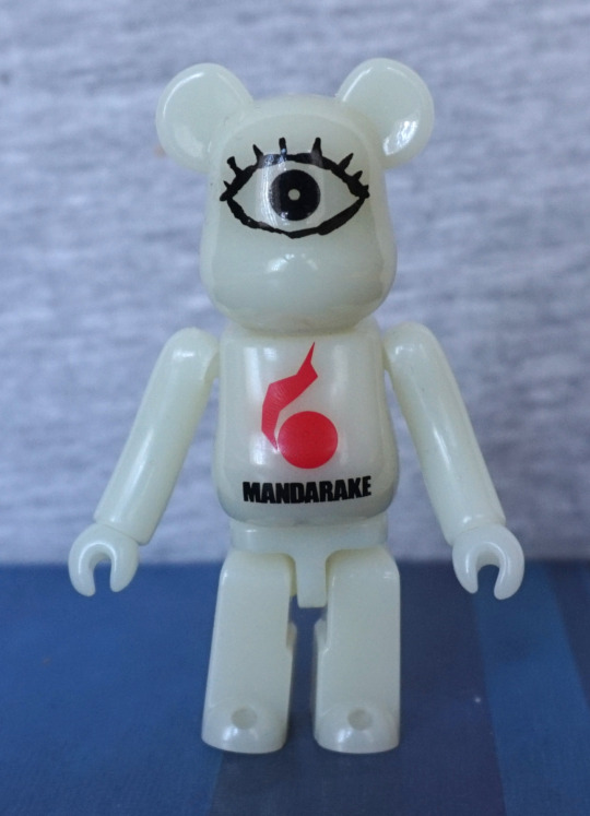
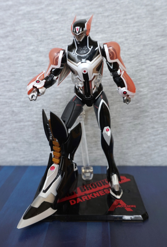
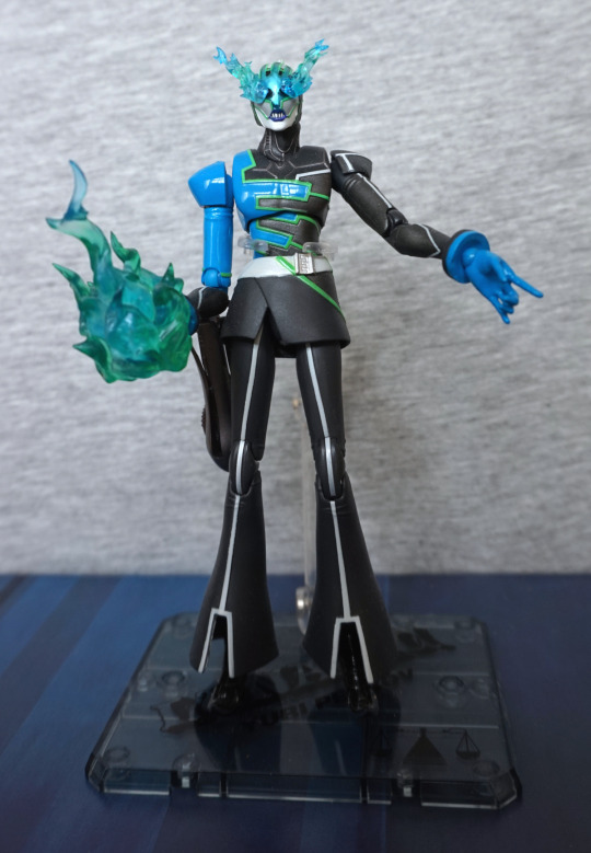
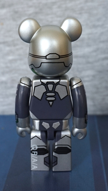
Here is a Be@rbrick of Silver Crow:

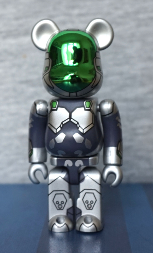
Hi me! When I went to buy this, I had to ask at the counter for it – turns out they had just about every other Be@rbrick on display, but not this one, despite having three or more in the drawer… He was one of the specific items I was after, so was glad to get him. 

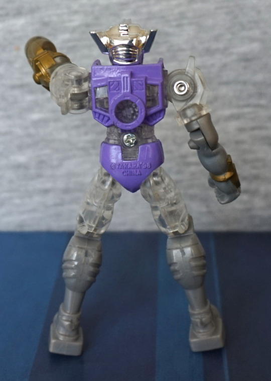
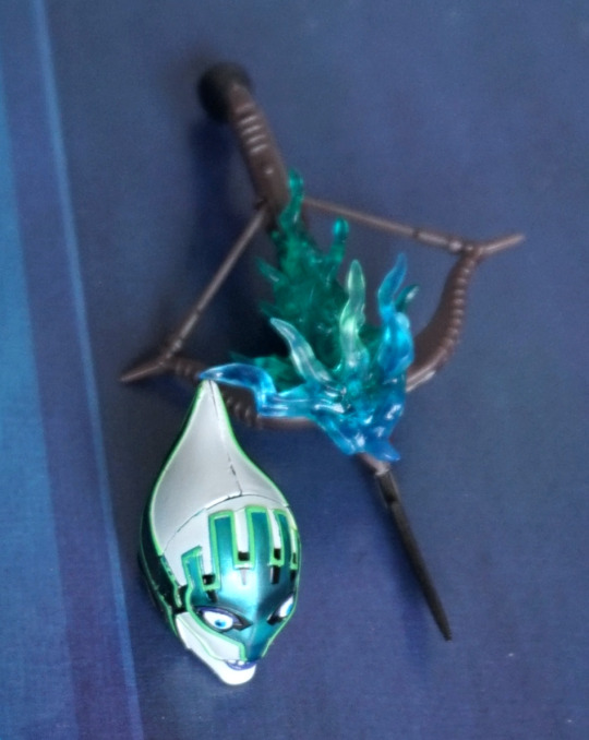
Love the shiny visor they’ve given him, and the Silver Crow design has translated reasonably well to Be@rbrick form. The lines are nice and crisp, and the design has many key features to make it recognisably Silver Crow. No wings though. 
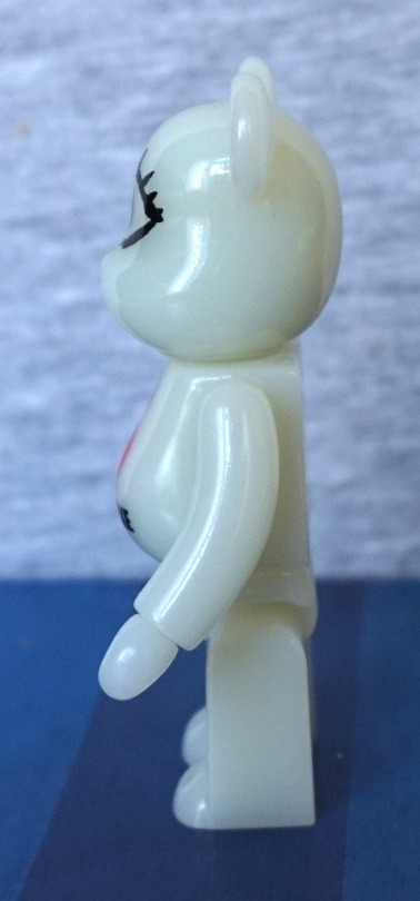
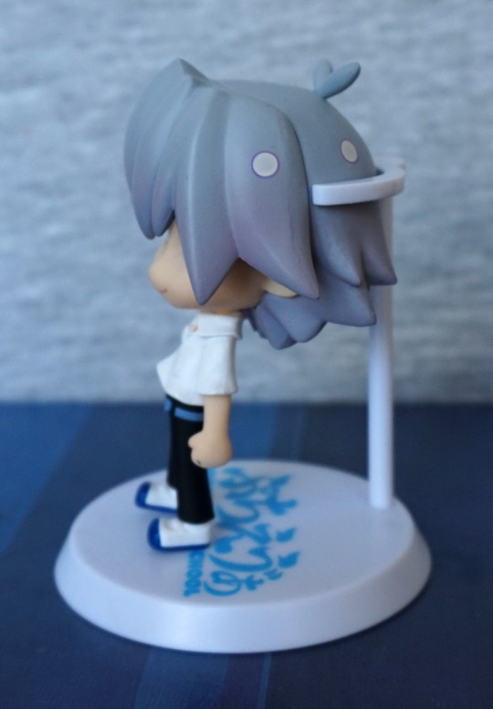
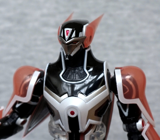
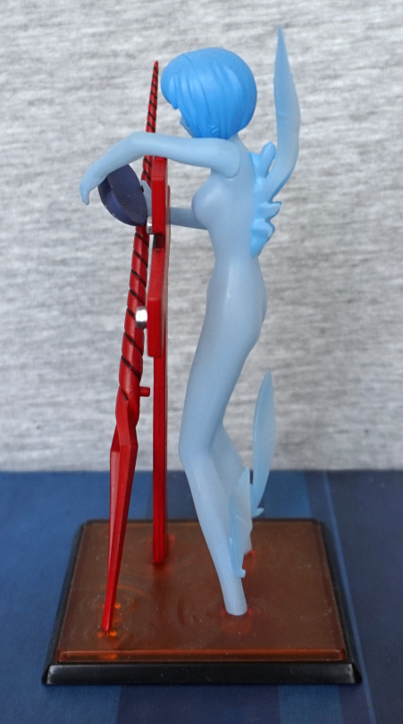
Left:

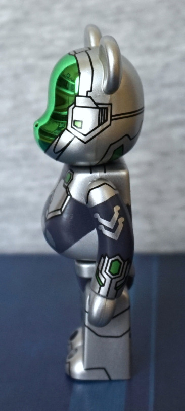
Here we see his “power” gauntlets, and the twiddly design bits on his arm. And he’s not quite as slender as Silver Crow himself! Some nice linework gives his helmet a techno feel.
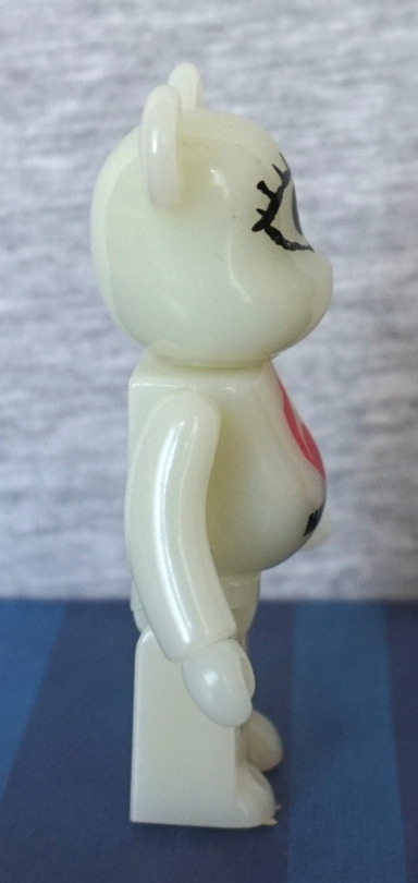
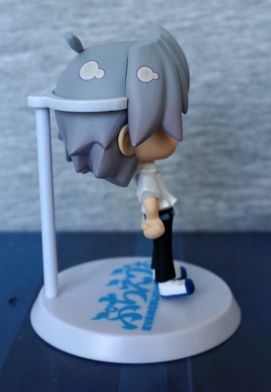
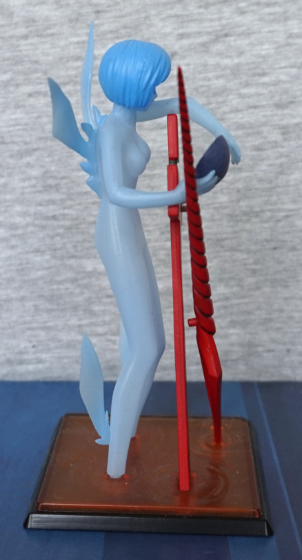
Right:

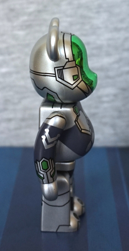
Same design here, as the left. Still definitely bear-shaped instead of Crow-shaped, but that is to be expected.
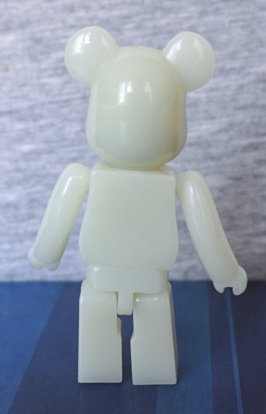
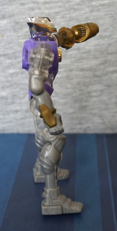
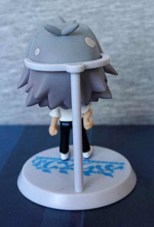
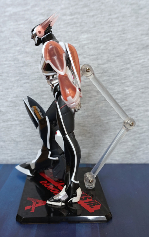
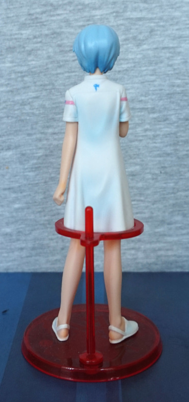
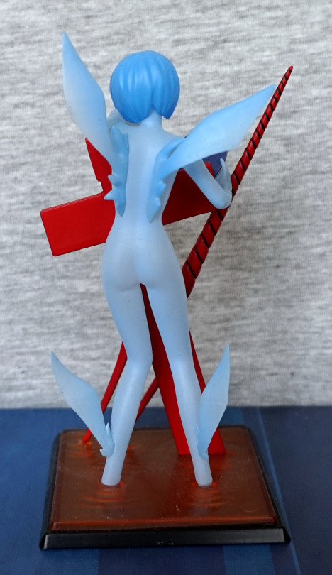
Back:

Here we have a bit of a spine decoration, and the plates where his wings would protrude from, should he deploy them. Be@rbrick isn’t in the habit of giving accessories to their bears, so this design choice makes sense. He has some detailing on the back of his legs and head, to finish off his design.

Overall, I’m happy with this Be@rbrick, especially as he was decently cheap. I feel the design was translated well, especially given the very different body types – it’s still very much recognisable as Silver Crow imo, whilst fitting to the Be@rbrick shape. A nice bit of small merch to add to the Accel World collection. 

Smile Slimes! – Dragon Quest

Here are a couple of Smile Slime items. I’ve not played Dragon Quest, but I have a soft spot for these squishy fellows.

First up, a magnet set:

Their cute faces have been done well, and I love the translucent effect.

Back:

These flat backs stick to surfaces well. Have had them stuck to various radiators in the house, plus they just about fit on the Detolf handles. My favourite one is a tie between the purple one (on account of being purple) or the blue one, as the colours fit well together… and it’s the traditional colours. 

I also had a go at a Dragon Quest gacha and got this fellow:

He’s made of a soft, smooth rubber, and is air-filled. Was quite strange picking him up for the first time! Not quite what I expected. 

Back:

Nothin’ much to see here. Not sure what you’d expect, really. 

Overall, an OK gacha. Still undecided if I like the fact he’s air-filled or not – at least if he does burst, he won’t make a mess. 

So keep smilin’ and slimin’ out there!

Hatsune Miku – Vocaloid – VN02

This figure I wanted for a long time, but because she won’t fit into a SAL small packet so held off ordering her, as the postage would be more than the figure secondhand. Plus customs fees on top of that… So this was one of the few figures on my “hit list” when I went to Japan, as putting her in a suitcase would be MUCH cheaper.
So I did:

Upon unboxing her, she turned out to be really dusty, so had to give her a good wash. I love the pose of this figure, and the shades of green, even though they aren’t very “Miku”. The figure took some effort to assemble – main issue is getting the leg protrusion lined up with the notch in the base so she stands solidly. I love the detail in this figure – her costume has a lot of details in it, and I like her face. I can see this figure not being too appealing to people who are distinctively fans of Miku, as it’s kinda fairly far off her normal design. For me, I love the future tech aesthetic. 

Face:

The face looks really nice to me – her skin is reasonably plain, but the parts of her face work together as a whole for me. I love the detail in the hair – the strands are really well-sculpted here. She also has a bit of a videogame character vibe going on, what with the green part jutting out, which if Dead Space is to be believed, is where you keep your HUD. 

Left:

Here you can see the large amount of movement in the figure – I love the way her hair curls up and backwards over her, and the clear tips. The fading-to-clear theme is also repeated on her sleeves. Here you can see where her knee support goes into the stand – the way the stand is part of the figure is another reason this figure stood out to me. It’s also surprisingly stable, which was something I was worried about, given her pose. Here we also see the speakers(?) attached to her back – these weren’t too hard to attach to the figure (and come separate in the box). I also love the shiny boots. 

Right:

Here is mostly more of what we saw in the left side. Here we can see her boots are held up by suspenders, and some of the speaker inside the stand. The white crest that juts up from it holds her quite sturdily. Her gloves and boots have been given similar designs, which helps tie the figure together thematically. 

Closeup of the speakers:

These parts have lots of small details, mostly painted ones too. The lines running around them help sell the technology feel of the figure, plus there’s some pink accents in there. I also love the holes, and their green edging.

Inside view:

They certainly didn’t slack on the details here either. Lots of small gold accents here, with some smaller dots. If you’re not busy being distracted by her backside in this shot… which is well-curved, and her legs are well-sculpted at the top, and give a lifelike loot. 

The rest of the back:

I love the gold bands around the bottom of her head, and the green parts running down her spine. This is a figure that can look good at any angle, should you have somewhere to display it where it can be viewed from different directions. 

OK, back to the backside!

I took this more for the spine detail, and upper back detail. But it features her backside a fair bit too. I like the fact they’ve sculpted creases back here too, as well as on her front. I’m a sucker for armoured spines, so I do like her back design. Here you can see where the speakers connect too – the gold parts have the pegs attached. All of the paint is neat, which is very nice. I feel maybe the back of her hair could do with a few more lines to make it feel less plastic, but that’s definitely not a biggie. 

Back of the base:

Looks good from all the angles imo. I do like the way these parts curl and crest over – only downside is the speaker isn’t very visible from many angles, though this isn’t a bother for me. Though it seems a partly odd choice to mostly hide it this way. 

Overall, I’d highly recommend this figure, if you like the look of it. I think with the colour scheme and theme, it probably is a bit of a Marmite figure, hence its lower price in the aftermarket. Though the postage cost is probably going to bite, unless you’re used to EMS/SAL parcel, or shipping other stuff with it. Or if you’re super-patient there is surface shipping… So I’d say this one probably isn’t for the Miku fan, but rather for people who love the themes in this figure. Or if you want a figure you can display on a higher shelf and it still look good – her leaning pose is really good for this. 

Raven Spawn – Spawn

Ah, a Western figure for the first time in ages! I have been buying Western stuff, but this is still part of my Japan haul… so a bunch of other stuff to get through… 

So let’s have a little look at Raven Spawn:

He was sold as a loose figure, so I don’t have his base. As far as I can tell, that’s all that’s missing, barring the box. I did think that one of his hands was missing at one point, but it had just escaped and hid behind him in the bag. I’m not bothered by the missing base, as I find the bases that these figures come with way too big and ugly. They have a feature where they can spin around, but this is kind of pointless… 

From the front, I love the pose, and the brown-black-grey colour scheme works well. 

Face:

A mean-looking dude! Wouldn’t want to meet him on a dark night. His arm is sort of poseable, but not to any significant degree – he’s definitely been designed to hold his sickle aloft. 

Closer look at the sickle:

Fairly uncomplicated weapon, though mine looks like it might be a little damaged at the end there. The sculpting is pretty nice though. 

Middle:

I love this skull tucked in here – it does a good job of holding the chains, and adds detail to his armour. 

Hand & lower chain:

Mmm, spiky. I like the way this stands out from the rest of him, so his hand can be clearly seen, despite the muted colour scheme. This hand is perfect for holding the lower chain half from his body. 

Left:

Here we get to see his leather strips cape. I like the texture on it, and the texture on his boots. 

Right:

Oops, looks like I had the chain a bit twisted up here… Love the “feathered” bits on his arm and ankles – they add a fair bit to the figure. The texture on the side of his chest looks good too. 

Back:

His cape feels a bit flat form the back. I feel almost it needed more separation of the leathery strips, so you could manually add a bit of depth, but then again, this could become annoying and tangly. Overall, not a figure that the back warrants much attention, further making the spinning base that he should have come with kind of useless. 

Overall, I like this figure – the small details really makes this figure. The sculpt really helps with what could potentially be a boring figure into an interesting one. Would recommend if you’re OK with him being more of a poseable statue and like the stylised look. 

Mandarake Be@rbrick

As one of my favourite stores… I decided to buy a piece of store merch…yup. And it was the most expensive thing I bought at that Mandarake, lol. 

Presenting the Mandarake Be@rbrick:

It has the standard articulation of a Be@rbrick – ball joints for the arms and legs,and the head swivels. They had a lot of these for sale, so no shortage in supply, but at ¥1,800 they’re not cheap. However, this is the average price for the special releases, and this one does the added advantage of glowing in the dark. So you can profess your love of Mandarake at all hours of the day… Hm. 

Print on the front is well done, and is crisp. 

Left:

Yep, standard Be@rbrick thing going on here. 

Right:

Back:

Overall, it’s a very niche thing to own. So erm, you could buy one if you want one? I bought it for its randomness and the fact I like Mandarake. They’ve been helpful when I’ve needed to contact them, and I’ve been happy with the stuff I’ve purchased, so was happy to buy this too. 

Just sad that the Urban Mines no longer exist, ah well, one less place to nickel and dime my bank account to death! But seeing all the random shite was fun… as well as getting good deals now and then. 

Miki Makimura – Devilman – Futura 20th Century Cartoonist Collection

Today we have a mini-diorama trading figure, featuring Miki:

I like this little figure, even though her skin colour is somewhat off. She should really be a pink colour, not an odd shade of brown. I do like the choice of base though, fits in with one of the episodes of Devilman, and having the arm reaching up, Miki unawares feels solid thematically. 

Miki front-on:

I like her expression, though I don’t think it quite works when viewed like this. Her hair is OK, but does lack detail. Her dress is nice – sculpted well with the creases, and the paintwork here is neat. Her legs going into her dress look a litle odd, but that’s to do with the fact you attach her legs to her body here. Would probably look less unnatural if the legs connected higher up, and made it look like her dress was lying on her legs, instead of floating above. 

Base:

The base is painted & sculpted well, and has some texture to it. The figure was a pain to assemble though, and definitely needed warming to get the parts together. I assembled this away from my usual location, so it was… awkward. 

Left:

I like the way Miki’s arm is resting on her hip. Here we can see how the demon arm joint is shaped to ensure the hand can only attach in the correct orientation. It will sort of attach in other orientations, but will only sit right if you have it like this. 

Right:

Here it really does look like it is grasping for Miki. Watch out! Here we can see the paint is rather messy around her slipper, but not too bad elsewhere. She doesn’t have an unsightly hair seam either, which I really like. Is a seamline running down her arm you can see here, though. 

Back:

The arm looks good from the back. I like the stripey effect, and they’ve blended the mud paint quite well, so it definitely looks like it’s rising out of the ground. 

Closeup of the arm:

Yep, definitely a fan of the paintwork on the arm. The sculpting is really nice too – we can see the tendons in the hand, and the claws are nicely done. Definitely gives off a devilish appearance. 

Overall, I really like this mini-figure. If you’re OK with Miki being kind of ashen, I’d recommend it. This one seems to be rather common, so shouldn’t be too expensive to pick up. 

Microman Izamu

So… this thing seems to be from the Japanese equivalent of the 80s toys that had cartoons made for them. Initially, this was a toy series that had its own backstory, which eventually got a manga and a TV series… in a similar style to some other toy lines in the West. Also part of this toyline was the inspiration and basis for Transformers! 

This part of the series, the toys were marketed as being 1:1 size and were masquerading as action figures on their visit to Earth… Old toy lines, amirite? 

So this one is called Izamu:

image

I bought him, as he was one of the cheaper ones, and I liked the gold-purple colour scheme. Some of them were pretty pricey for what they were, and I guess those were the popular characters, lol. 

Standing straight:

image

He does have a fair amount of retro toy feel going on about him, though his hinges have been incorporated well into the design, so they don’t look bad. He’s decently articulated, and has the ability to stand (which is easier, given his small size). I like the shapes of his armour pieces, making his look interesting and detailed. 

Left:

image

Here we have his arm cannon, which has a decent amount of moulding detail. The clear parts of this figure manage to look good,without overwhelming the “look” of the figure. The silver plastic isn’t the best, but hey, cheap small action figure. The sculpt detail helps make up for the lack of any detail paint, not that you’d expect a paint job on this kind of figure. 

Closeup of the gun:

I like this cross design, and the different levels used in the design to make it stand out. 

Right:

image

I like the way they’ve added a gold detail to his right arm, so it doesn’t look overly plain. Here we can see how the cannon isn’t his actual left arm, but rather attached to it (though it is a part of the figure and doesn’t remove). Here we can also see how his head being silver gives it more definition, and does look better than if it was transparent. 

Back:

image

We can see he’s fully committed to the masquerading-as-a-toy bit by the Takara stamped on his backside P. One screwhead back here – almost feels as if they missed a trick by putting it below the circular part, instead of inside. The sculptwork does go around it though, so it doesn’t look super out-of-place. Here you can see how older toys without ankle articulation are harder to balance :P. The details on the purple part of his back are really nice, and shows they thought about the back of the figure too. 

Overall, I’d recommend this line, if you’re a fan of the designs and into this retro aesthetic. The articulation is decent, and you can get a good range of poses with him imo. Better than some modern equivalents, but not the super-articulated ones (though some of the latter do suffer from being too dainty, and being awkward to pose as a result…). 

Keimi – One Piece – Rare Colour ver

Bought this one as a singular figure in a store selling unboxed trading figures. I believe they had both variants from this set, but I thought this was the prettier one:

I thought the white top went better with her pink tail (the other one had a black top with a gold star). The paint is iffy in a couple of spots (most notably n her top straps), but decent overall. Pappug also looks very happy indeed. 

Face:

I find her hair a bit of an “off” colour – not the nicest shade of green imo. For me this is the weakest bit of the figure. The painting around the edges of her top is a close second though – this mess is pretty visible. At least it didn’t go over her stomach. Her jewellery additions are nice, even if they are a bit roughly painted.

Pappug:

Strangely, he seems a bit better painted than the main figure! The sculpting on him is really nice too – the hat looks excellent, and I love his mouth. With the teeth sculpted in the way they are, it’s avoided some of the oddness that teeth on figures sometimes can have. 

Left:

Here, Pappug looks really nice from the side, and Keimi mostly does too. Her hand is a bit of an odd shape though imo. The top is nicely sculpted though, with the creases. 

Right:

Pappug still looks good, and I’m loving the sheen on her tail. The scales are also sculpted nice and evenly. I also love the shape of her waist.

Back:

The back of her hair is sculpted well, The back of her necklace has been painted neater than the the top part of her top. The bottom ins lovely and neat though. The top of her butt fin is a bit of a mess imo – looking at pics this should be more even with the top of her fin. The base is just smooth on the back, but not bothered by the lack of detail here. Imo the base does its job and does look good with the figure, but it only sort of fits thematically. Does look like she’s sitting on an iceberg, which I don’t think would be too comfortable!

Overall, I’m happy with this trading figure, and think she looks pretty. I haven’t read/watched One Piece, but I do like mermaids, and she hits the spot. 

Mari… and a bit more Mari – Evangelion

Going to make this blog a twofer. These two items I got from an “Evangelion” vending machine – it wasn’t any specific series, but rather just random small Evangelion figures in gacha balls. I was going to buy some more items from it the next day when I had more change, but sadly I forgot to store the location. D’oh. 

So, first up, the Mari figure I got:

This figure wouldn’t be something I’d ordinarily buy, but once I got her out, I was like.. yep, I want this. I like the fact she has a guitar – it makes it a more interesting figure. I also like her happy expression – is almost infectious. She’s been neatly painted, and I like that her glasses have been sculpted as a separate part.

Left:

From the side she’s OK, a couple of paint flaws. The ear sculpt is rather basic and a little odd. 

Right:

The paint is neater on this side, which make it look better. I like her pigtails. 

Back:

Yep. Pretty plain back here. Not much to this view. Guess you could admire her pigtails? 

Overall she’s good for a gacha ball, even if she wasn’t officially a gacha figure XD. 

And now for the other Mari, a keychain:

I already had the Rei version of this keychain, so this one can match with it. 

Other views:

She’s an OK little keychain. The paint is decently done, and the sculpting is good. As I’m not a big Mari fan, she won’t be up front and centre in my collection, but she passes muster to be part of my keychain collection.

Kaworu Nagisa – Evangelion – Portraits

And one more Kaworu for the road:

His hair is OK, but has a bit of a mould line. His shirt is nicely sculpted, and his undershirt neatly painted. His trousers look good, and moulded well around his hands. Or where his hands would be…. Belt paint is OK, but a bit scruffy in places. I like the sculpt job on his trainers – the laces stand out form the rest of the shoe, which not all sculpts capture. The base has been made to make it look like he’s floating a bit, which kind of works. My main downside to looking at him from the front is they have his head tilted too far down so you can’t see his face much. Would’ve liked to see his face feature more. 

Left:

His hair has a fair amount of detailed moulding from the sides – all the spikes have been sculpted. The arm goes convincingly go into his pocket, and looks good. There is a small detail on his sleeve, which is a nice touch. 

Right:

Hair also good looks from this side, and we can admire his ear on this side too – it’s been sculpted well. The collar is possibly slightly blobby, but doesn’t bother me. I like the creases in his clothes, and they look good. 

Back:

Here we can see his hair is shaded, which shows some from the sides too. His back pockets are sculpted well, and the belt painted neatly back here. 

Would recommend this as a small figure of Kaworu. If you don’t mind him looking at his shoes, he’s a nicely sculpted and painted trading figure. 

Kaworu Nagisa – Evangelion – Deformation Mini

Hm, it’s been a couple of days without Evangelion figures… let’s have another!

This time Kaworu:

This guy I bought loose at a Hobby Off. Not sure “cute” goes with Kaworu, but… he does look good cute! The hair has some purplish shading, which adds some depth. He’s been painted neatly, and the colours look good.

Left:

The purple shading continues on this side, and we have a couple of those stylised shine spots. He also has a bit of hair sticking up. 

Right:

More fancy shiny spots. His sleeve looking somewhat solid.. His hands don’t have much detail, but do the job. Hair seam trying to show itself on this side. I like the way his hair is spiky at the bottom. 

Back:

Hair looks OK from the back, and has a decent amount of shape to it. Back is painted well too. 

The stand itself isn’t anything too special and mostly does the job. He can be quite easy to knock out of the stand, or simply fall over. He’s not the worst for it, but it does look like the previous owner had that issue too, as there is a paint transfer on the base from his foot. 

Overall, he’s a decent little chibi imo. Would recommend if you want chibi Kaworu. And you know you do 😛

Mio Honda – Idolm@aster – Gasha Portraits

This was the most expensive gachapon figure I got from a gachapon machine whilst I was in Japan:

And personally, I think she was worth it. The sculpting is really good for a trading figure, and the paintwork has a fair amount of details. 

I love her happy expression and pose, and the shading in her hair. The jewellery is nicely painted, which is especially good on a small figure. I love the bright colours they’ve used on her bikini, and the colours are blended well. The only real issue I have with the front of this figure is the join above her bikini bottoms – it doesn’t quite go together, and leaves a little gap. 

Face:

Here we can see the small details on her face – where she’s blushing. The painting is mostly really neat, with only some small bits outside of the lines. Her bust has been well-sculpted, and look like boobs instead of balloons. 

Left:

Here you can see the gap at the front a bit better. The lettering on her bikini top is crisp and clear. Her hair seam is quite nicely hidden. 

Right:

The hair seam is more obvious on this side, but still reasonable. The hair shading is a bit off – the back is shaded quite differently from the front. Her pose looks good and is quite dynamic.

Back:

Her hair looks good from the back, and the bow on her top is sculpted well. The stripes on her bottoms look good, and follow the contours on her backside. I also like the details on the top of her bracelet, which you can see from this angle. 

Hey, look at this!

… from this angle she ain’t just pointing at herself…

Overall, I’m really happy with this figure. I might not be into Idolm@aster, but this is a nice figure in its own right. Glad I got this gachapon. 

Barnaby Brooks Jr – Tiger & Bunny – Darkness Edition

Good Luck Mode Activated:

Here we have a dark version of Barnaby Brooks Jr. with Good Luck Mode leg equipped. He starts off with a normal leg attached, but couldn’t resist trying this one out. Attaching it was a mild pain, and did require reading the instructions so that I didn’t pull the leg apart at the wrong points (… I may’ve tried). 

From the front, I’m impressed with him, especially as he was around a fiver. The black gives him a more classy look, with the “old gold” colour accents. I’m not sure if the pink the transparent parts quite goes – might’ve worked better if these were a deeper red. 

Face:

The parts joint nicely, and there’s some detailing around by his neck. Love the head sculpt, tho the chest feels it lacks depth somehow. 

Left:

The paint is mostly decent, without too much deviation from the lines.  Ilike the sides of his head, and there are some details in the Good Luck Mode leg, showing the machinery behind it, which is a really nice touch. 

Right:

Yeah, that leg is simultaneously cool and ridiculous! Just like the show :). His arms look good from the sides, and the silver hands complement the scheme nicely. 

Back:

Back of the legs aren’t hugely detailed imo, and serve just to “complete” the figure. The boosters are nice, and include the inner details, which show through the transparent parts well. He has some nice details on the underside of his arms that I like. 

Leg:

It does a good job of looking like the extended version of his default leg. The copper “spine” works well, giving the feeling of that’s where all the parts attach to. Yep, I wouldn’t want that thing heading towards me at high speed!

Accessories:

Not too much to speak about here. A couple of arms, and his default leg, plus a shut mask. So if you’re looking for customisabilty, this figure doesn’t really offer it, though I’m not sure what much else he would come with – he doesn’t do much of a line in weaponry. That’s more Wild Tiger’s thing… 

Overall, I think this is a decent figure, especially for the price you can get this one for. I think he could do with a decal on the white part of his chest – on the normal versions he has a little bunny logo – incorporating that would’ve helped break up the chest area a bit. I can see this being a bit of a Marmite figure – he’s decent for what he is, but I feel he a very niche appeal. Though if you do like him, you should be able to get him for a good price.

Rei Ayanami – Evangelion – Portraits – Nurse ver

And the last in this series of Reis!

One to make you feel better:

This one is also in the Portraits series of figures. Not sure if Rei would have the best bedside manner as a nurse… but here we are! The paint is a bit iffy in her stripes, but the shading on her dress does add a fair bit to this figure. 

Left:

She has a blue bow detail on her sleeve, but it looks a bit like a paint mistake. Would’ve been nice if this was a separate part. The stand holds her well, and its positioning makes it the least obtrusive it can be for the style of holder chosen. The band on her slipper is painted well and is sculpted, which makes it look good.

Right:

She has a seam in her hair, but decent for a trading figure. 

Back:

One more paint-bow back here, and some nice shading. I like the way the slipper bands dig into her skin slightly. Her hair is a bit too rounded and smooth, especially compared to the one I reviewed yesterday. The shading is still nice though.

If you want a small nurse Rei, this one hits the spot. I like collecting these Portraits figures, as they’re usually of good quality for a reasonable price. 

Rei Ayanami – Evangelion – Portraits – Spear of Longinus

More Rei? Yes, more Rei. Good news, I’m nearly out of Reis to blog about. 

So let’s look at today’s Rei:

I had a certain lack of Reis without spears, and now I have a good number, including this one. I love the pose, and the metallic blue used on her suit. With these figures, they often use this blue for the special “hidden” versions, and I think it makes a nice change from the black her suit normally is. 

The paint is nice on this one, with shading on her hair and suit. The spear is transparent plastic, same as the base, which makes it look a little cheapy, but I think it’s still OK. 

Left:

Her body is posed well, and I like the way she’s leaning slightly forward. 

Right:

I like the lance, but it’s not particularly detailed in its sculpt – it does the job, but not much more than that. She holds it well though, and we can see the paint detail on her palms. The black lines 

Back:

The darker blue on the hair gives the hair some depth, and the hair is nicely sculpted. Her backpack is nicely painted, and looks the part. Her backside is well sculpted, and has some shading for depth. I do rather like the paint job on this figure.

Overall, the figure itself is well-painted and looks the part, however the Spear isn’t the best. As long as you’re OK with that, I’d recommend this figure.

Rei Ayanami – Evangelion – On the Beach

Just a small figure today, Rei on the beach:

I have a couple of this series of figures already, so I was excited to see the Rei from this set. These figures aren’t overly complex in their design, but they’re nicely painted. The base is a rather straightforward affair – clear blue plastic, with Eva@School on it, with a slot for the background. The background is nice, and complements the figure. I like the angel that’s been included in the backdrop. 

I like her expression – I feel it captures her detachment. The ball she’s sat on also includes an angel symbol – a nice inclusion of the theme. The swimsuit also captures the essence of Rei’s plugsuit, but I do think the grey almost-penises look a bit odd. The hair has a subtle gradient, preventing it from being bland and flat. 

Left:

Here we can see the angel-on-the-beachball clearer. Edging on it is a bit unclean, but it’s easily recognisable and does the job. Here we see some overemphasised highlight marks on her hair – not sure if I’m a fan of this style of highlight. Hairclip looks good too.

Right:

Seam isn’t overly bad in the hair. Beachball looks good from this side, and we can see where her hair sticks out a bit on the front half. 

Back:

Bit of a paint mess on the ball. Hair is neatly painted on the back. They’ve reduced some of the plainness with the shine marks, but I don’t think you’ll really be looking at this side much, especially with her backdrop. They’ve given her some of a backpack, but I think this looks kind of odd, and a flat swimsuit would’ve worked better, though an actual backpack could’ve worked for a beach trip? Gotta have something to carry the beach supplies!

Overall, it’s a decent small fig, if you don’t expect too much from it. I got it for a reasonable price, so for me she was worth it. 

Rei Ayanami – Evangelion – Fraulein 001

This has been a Rei figure I’ve been thinking of getting on and off, finally grabbed it whilst I was in Japan and could get it for cheap:

I like the details in this figure – she’s well-sculpted and painted, and the Lance of Longinus is a lovely shiny red. My main complaint is the way they’ve done the stand – she doesn’t stand easily on her own, but she has a habit of looking like she’s been strung up, thanks to the stand being longer than her legs. I guess it’d be possible to give her an action pose, but I’ll likely just ignore the hung-up look or give her some kind of action pose. She seems to hold the Lance OK, though again it’s a bit of fun to pose. 

Left:

Here you can see how the stand works, and there isn’t a way of getting it so she looks comfortable. It would’ve been nice if the stand had a couple of rods, so you could decide her height. Part of me feels like butchering the stand, just so she isn’t floating. Her hair has some shading to it, and she looks well-painted from the side. Her leg will look gappy if you pose it though.

Right:

More of the same. The shapes on her suit feel accurate to her design, and the painting is good.

Back:

She has some nice, sweeping lines in her hair, and her backpack looks good. Legs are a bit segmenty from the articulation though. 

Overall this is an OK Rei figure – I don’t regard it as anything special, but she’s still a solid figure imo. Has a distinct downside in the way her stand works, but I think she looks decent for an articulated figure.

Rei Ayanami – Evangelion – Gaf’s Door

Here we have a slightly unusual Rei figure:

image

Here we have Rei in an angelic form. Saw this at a Hobby Off, and had to buy it. The figure takes a decent amount of assembly – having to peg the pieces to the base and each other. Once done though, this is a small, impressive looking figure, imo. I like the fact the cross has some shading on it. One part of me would like to see more of Rei, though. 

Base:

The base is slightly translucent, reminiscent of LCL – the fluid used in the entry plugs. Ripple marks are sculpted around where the various parts attach to the base, giving it more depth. 

Left:

Here we can see… where the lance has come unpegged from the cross. Erm. Oh, and a slim appearance of Rei. I like the sky blue colour used for her, and the shape of the winged parts.

Right:

I think she looks a little too long and flat from the side, but other than that, she looks OK. The hair stands out well from the body. 

Back:

Wings arc well from the back and I like the attachment parts they’ve given them. Her pose looks good from the back.

Overall, I really like this figure – it’s a more unusual one, and has nice colours to it. Would recommend if you can find it for a decent price. 

Luna Luna – Queen’s Blade Rebellion

This was one figure I was planning to pick up prior to visiting Japan, after seeing it on the Mandarake website. 

Here’s her upper half, in her clothed form:

Even clothed, she’s not really that SFW, but we’ll get onto that in a minute. Her top sits nicely, and definitely looks like part of the figure when she’s wearing it, so her clothed option is definitely viable if you’re not so fond of having boobs hangin’ out. I love her four tentacles posed around her head, and her hands posed in a very dancer-ish way. I love the small details here – her rings and nail polish are both well done. 


So let’s have a look at the rest of her:

Yep. Nothin’ hanging out here at all. All good. Perfectly fine for the in-laws. Her body is well-sculpted and she has a range of details – from her shoes, to the bells on her thighs, and the gold beading encircling her lower body. Her hair also has a wonderful gradient in it, and the blending looks good. 

Back:

Here we can see where her headpiece reaches around the back of her head and also has a nice range of colour. Her hair gradient feels both subtle and vibrant. With her clothing, it dangles down and hides her bum from view. The clothing has a nice sheen to it, and I like the fact it is translucent. From this side, we can see her tentacles also have metal rings on them, which are nicely sculpted and painted. 

Now for some disassembly:

There’s a fair amount to disassemble here – both her arms, and the two tentacles that aren’t wrapper around her arms, plus her head. 

After that, we can take her top off and begin reassembling her:

Aww, still looking a bit sad here.

Assembled:

And this feels the way the figure has been designed to be displayed. Her pose somehow feels better like this to me. And the clear base definitely doesn’t do anything to distract the eye. 

Face:

I like the way her nipples don’t have the severe shading a lot of other figures seem to have. This feels much more natural. Here we can also admire the fastener for the beads around her midriff, if you’re not too distracted by boobs. 

Photo of her a bit less close:

Here we can see how two of the tentacles jut out from her arms, and are nicely curled around them. And her purple protrusion, that also acts as a clip for her body jewellery. Is it a penis? Is it not? Sources say no, but that doesn’t say it isn’t hangin’ out there like one. Nope, totally wasn’t this feature that attracted me to this figure. Not at all. Nope. 

Legs:

I love the amount of detail put into her shoe – from the vibrant, well-painted colours to the creasing down by the sole. The leg behind her fishnets feels a bit flat though, and some of her skin could do with a bit more shading imo. 

Other leg:

I like these small bells dangling down, and their flowery appearance. The top of her fishnets also is nicely coloured and designed. Some of the green paint didn’t quite reach the edges, but I feel this is a minor gripe. 

“Flower”:

Clearly not a real one, but it definitely seems to be doing its job. The translucent plastic is nicely coloured. 

Left:

Her pose feels very dynamic from this angle, and she is quite a lithe body type. 

Upper half:

I like her neckpiece from this angle. and her hair’s pretty. The seamlines feel nicely hidden in her hair. 

Right:

Maybe her leg is bulging a little bit too much here? The bell/flower on her leg dangles well, and feels correct for the pose. 

Closeup on the hairpiece:

It’s not terribly easy to photo, but I love the greenish colours, and the metallic finish. She’s also got some moon earrings on, one of which can be see at this angle. 

Back:

And here we can see her shapely backside. I love the way the jewellery has been don on her back, and finished the model nicely. Her hair is probably the most vibrant from this angle.

Overall, I’m really happy with this figure and glad I got her. She’s a nice piece of (tentacly) colour, in an interesting and dynamic pose. I love the darker skin tone, and the amount of smaller details that went into this figure. If you like this kind of figure, I’d recommend her. 

Lunatic – Tiger & Bunny

Now for the Big Bad in Tiger & Bunny, Lunatic:

I’m not sure he’s the most compelling of foes, but I do love his bright blue-green colour scheme and snappy sense of dress. For this figure, I’ve “equipped” one of his flaming hands and the flaming head. He also has another head without the flaming eyes, but that just isn’t cool enough for me. 

Left:

I love the shape of his head from the side, and he’s well-articulated. He also seems to be doing a good line in trying to get flares back into fashion. The paint is nicely done, though I’m seeing one tiny bit of sprue :P. Meh, any model kit I make is way worse. 

Right:

Here we can see his sheathed crossbow – his flaming weapon of choice. I’ve chosen to use the holstered version, as I wanted to have at least one flaming hand. It clips on decently well to his side. 

Flame:

The blues and greens are blended well in the flame parts, and look really nice imo. We can also admire some of the details in the crossbow sculpt as we’re here :). 

Back:

His suit is decently detailed on the back. His shoulders are a bit gappy though. 

Crossbow and default head:

I love the flaming detail on his crossbow. His heads are both nicely painted from the front, though a little gappy on the sides. 

Rest of the small accessories:

He has a good range of pieces, which I think gives a lot of posing options, which is something really good with this figure.

Cloak parts:

Whilst these pieces look really cool, I had massive issues getting them on, and it does somewhat limit your posing options, so I’ve decided to leave them off for now. Maybe I’ll have a go with them some other day in the far future. 

Overall, I think he’s a decent figure, even if he’s probably not a popular character. I’m glad to have him, and if you’re after him, he shouldn’t be too expensive to obtain.