Tag: banpresto

Kuroyukihime – Black Dress ver

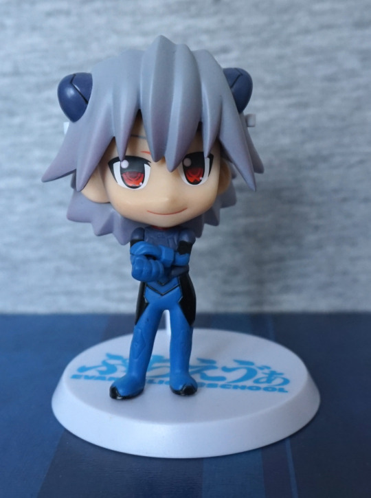
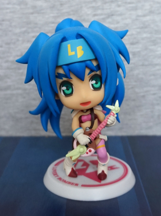
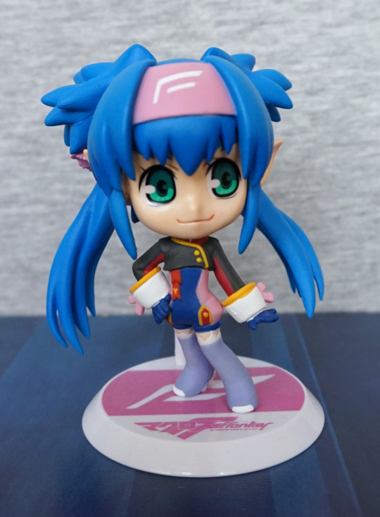
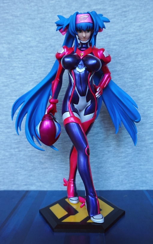
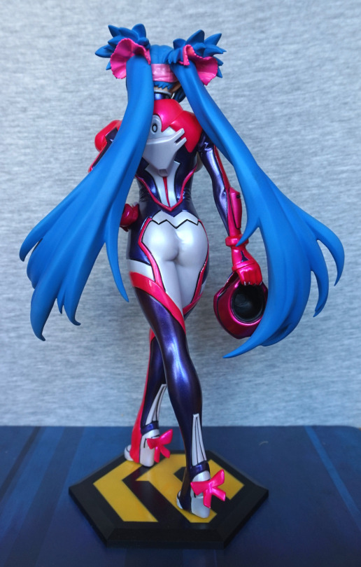
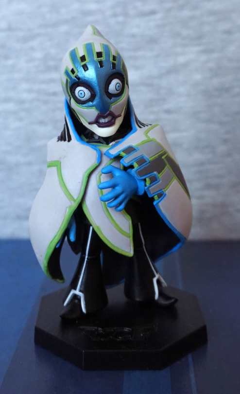
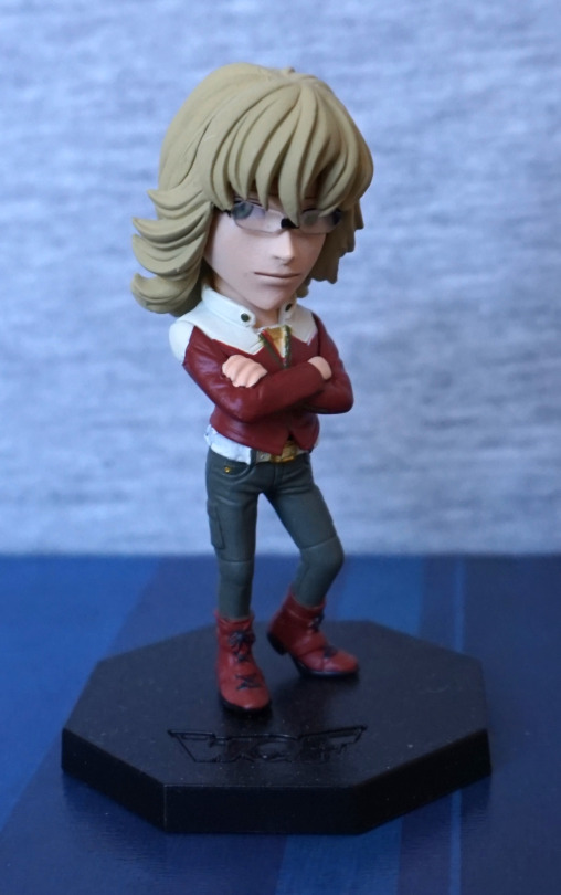
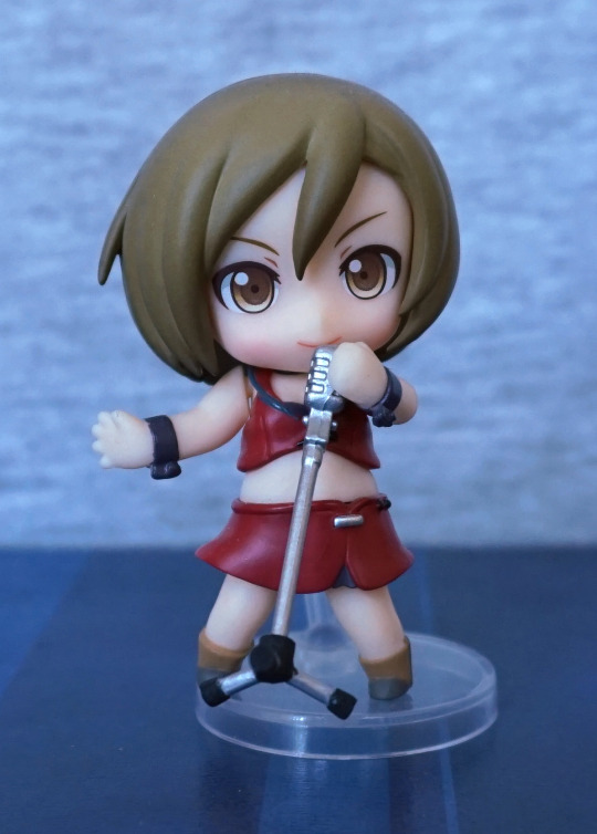
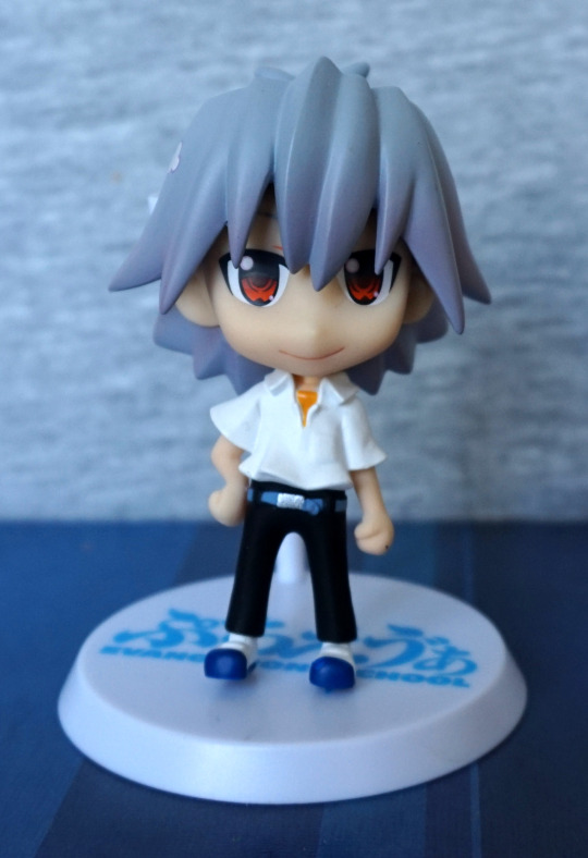
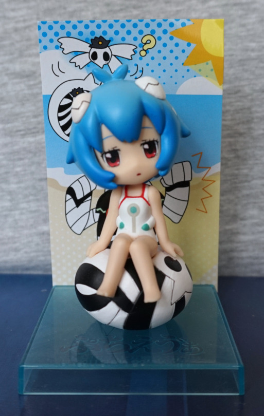
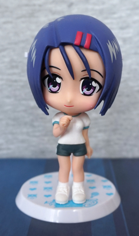
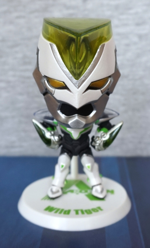
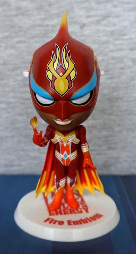
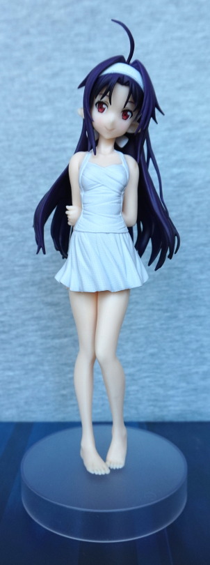
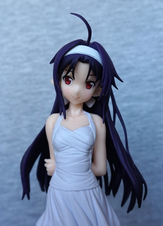
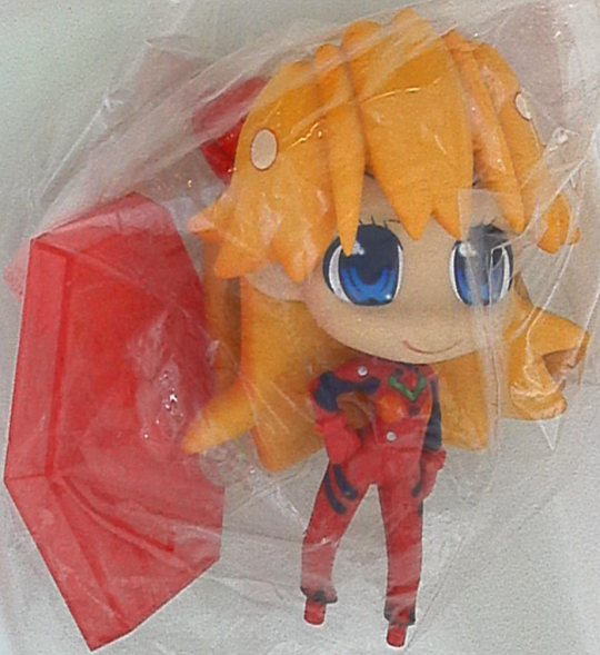
A small figure for today:

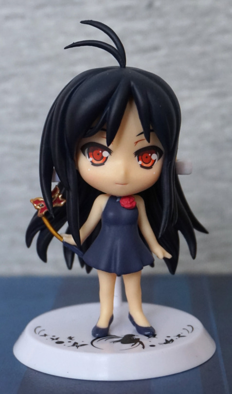
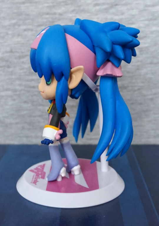
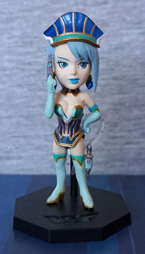
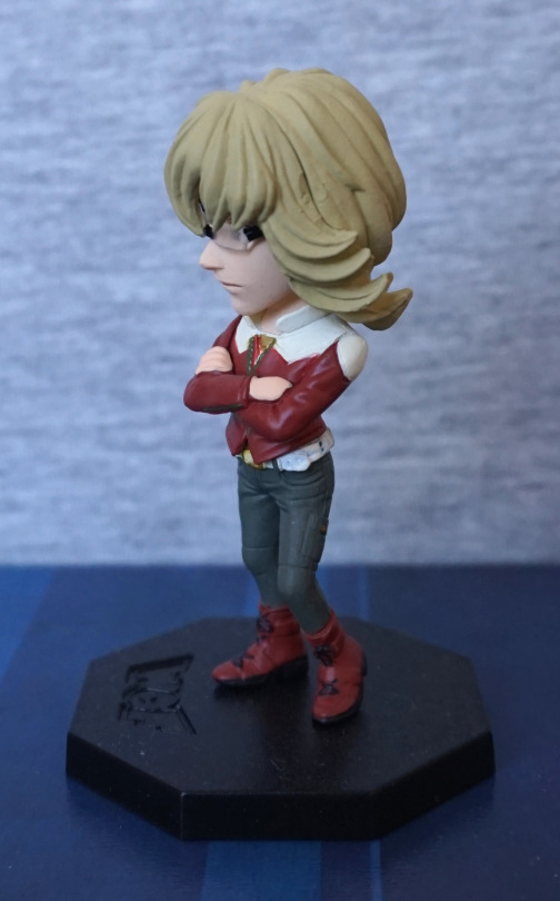
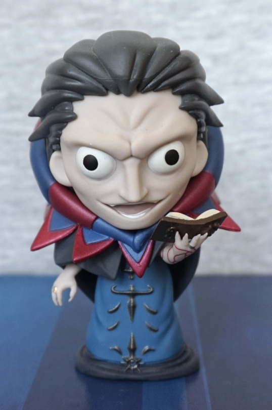
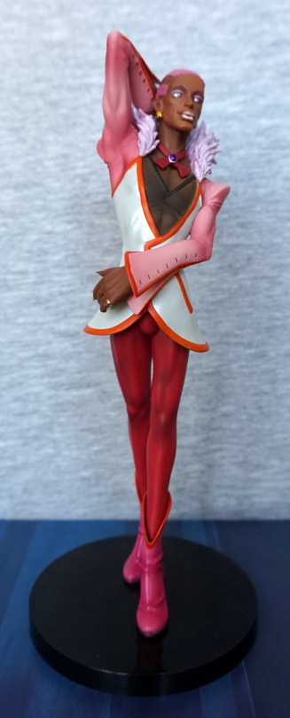
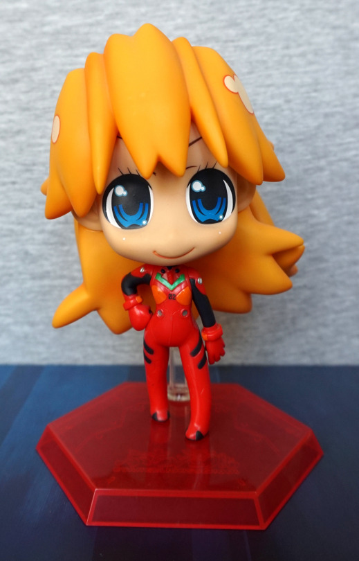
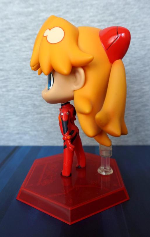
A small chibi figure of Kuroyukihime, from Accel World. With this figure, I like the hair and the outfit, but not sure if the face fits – her face seems to lack the “severity” of Kuroyukihime, as it is rounded and her expression is almost smiling. Just feel it could be tweaked a bit to give off more of a Kuro vibe… However, what is there looks nice for what it is. Her dress is nicely sculpted, and her shoes fit well with the outfit – my only real complaint is that the flower is pretty much covering up the silver butterfly detail at the top. I feel the flower could’ve been a tad smaller so the butterfly could show. 
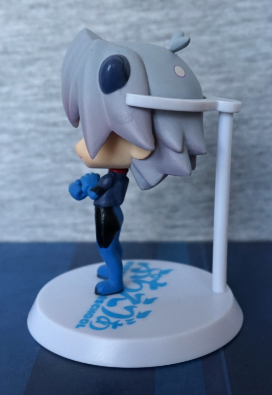
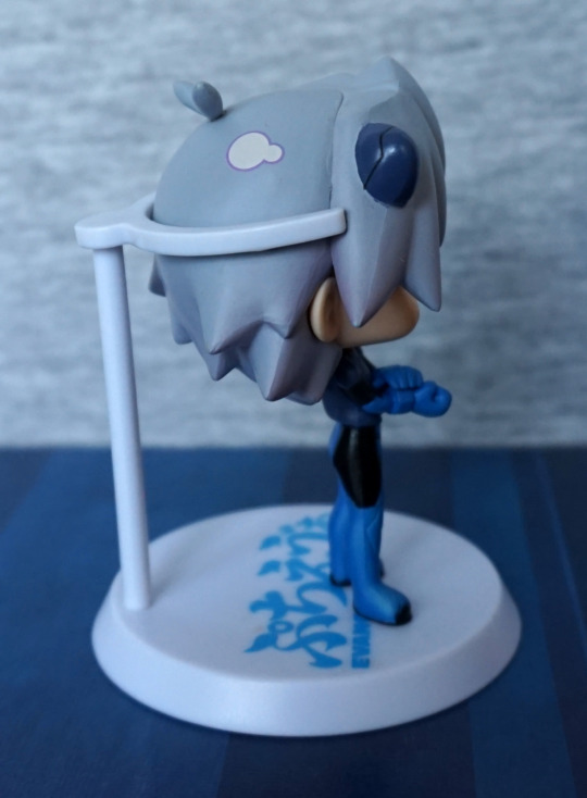
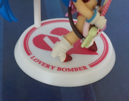
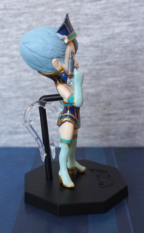
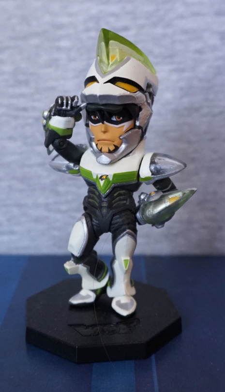
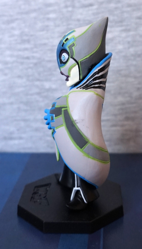
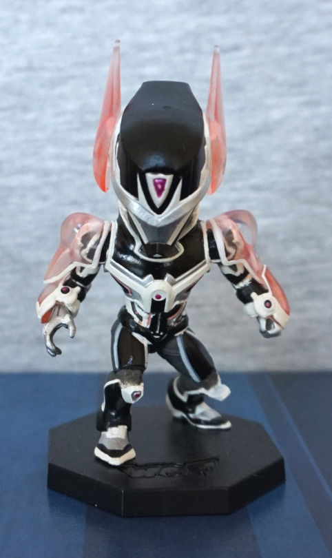
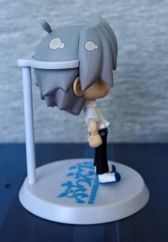
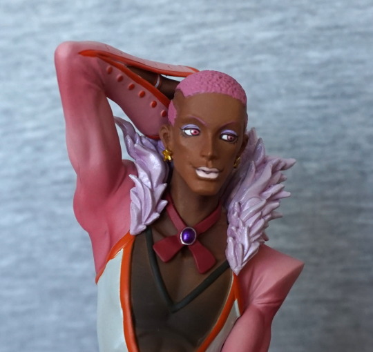
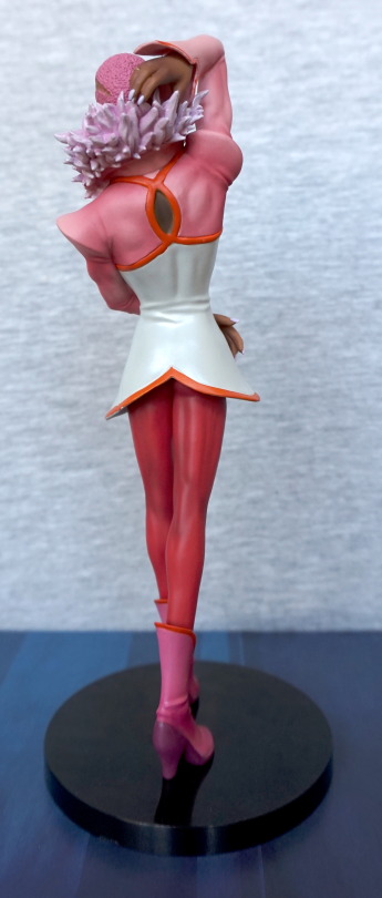
Mask:

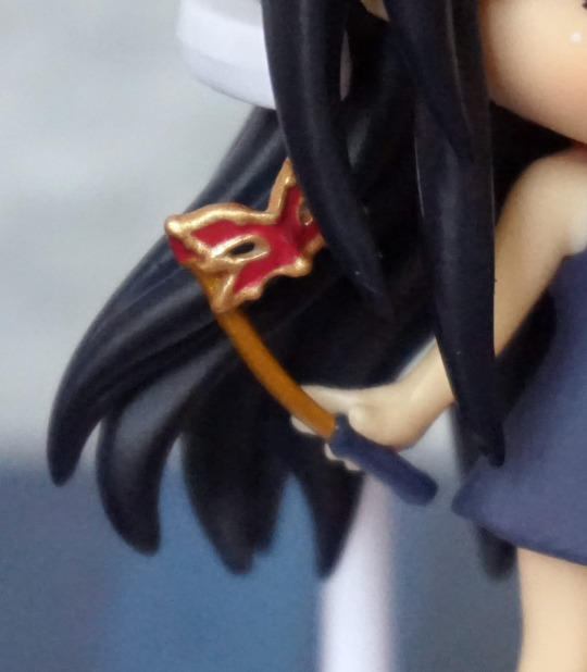
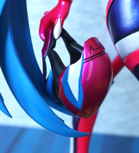
Bendy! Haven’t got around to fixing this – some heat and cold water should fix this, but this figure is going to be prone to this part bending.. Well, better than it breaking tbh. The mask itself looks the part and is painted well.
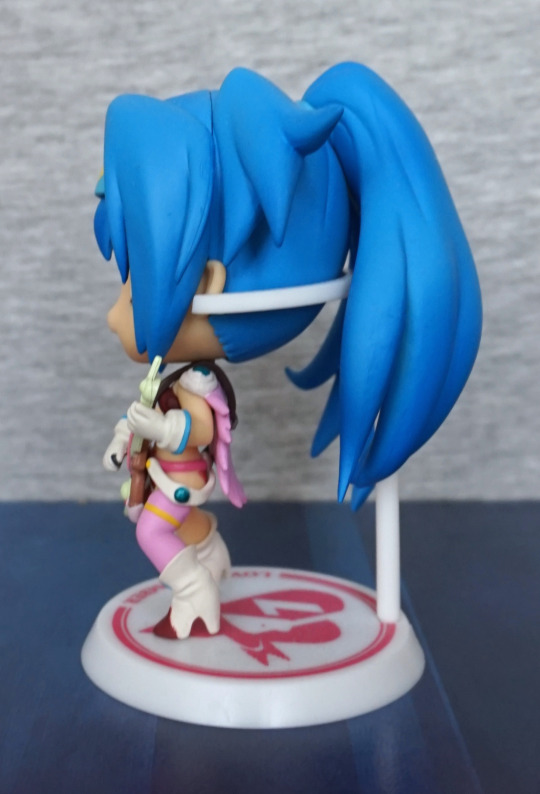
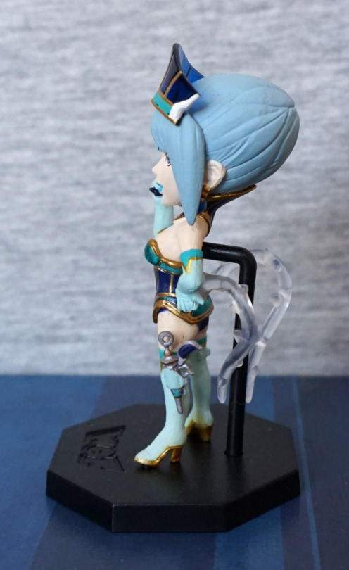
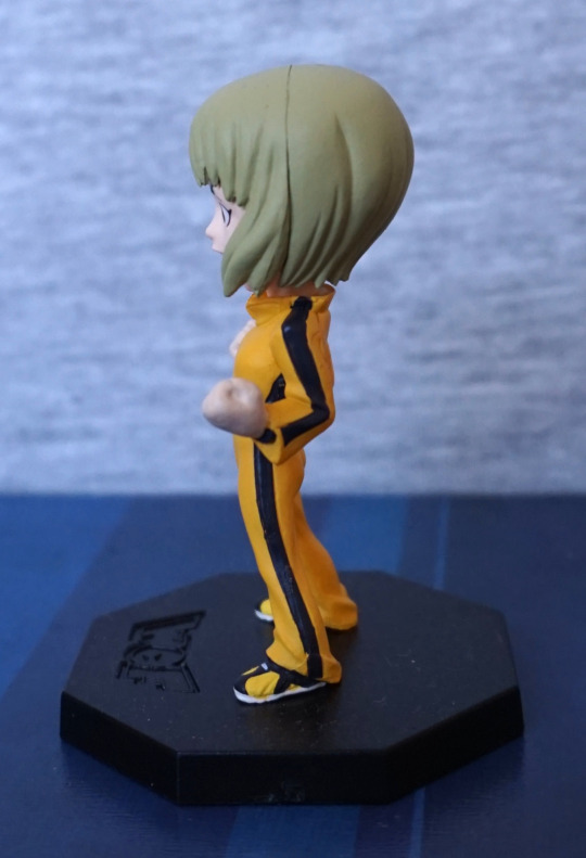
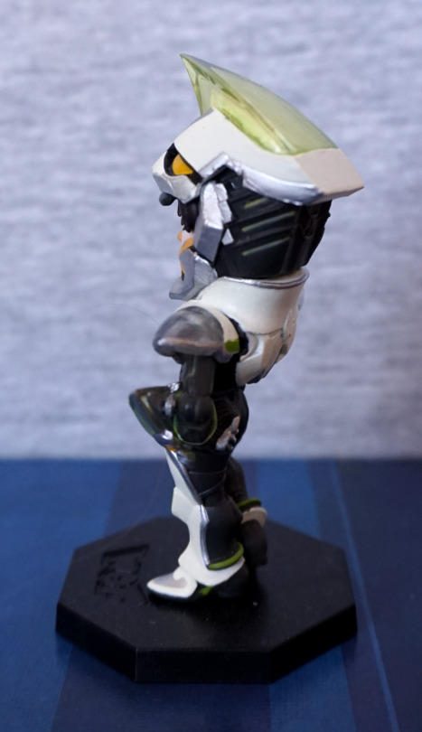
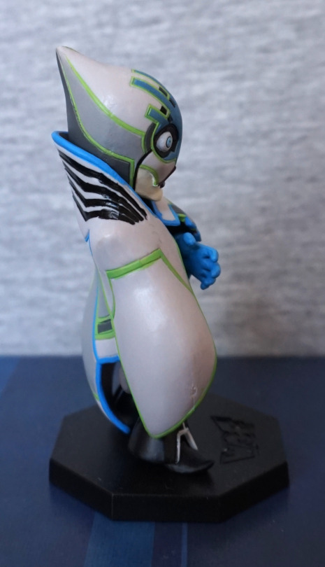
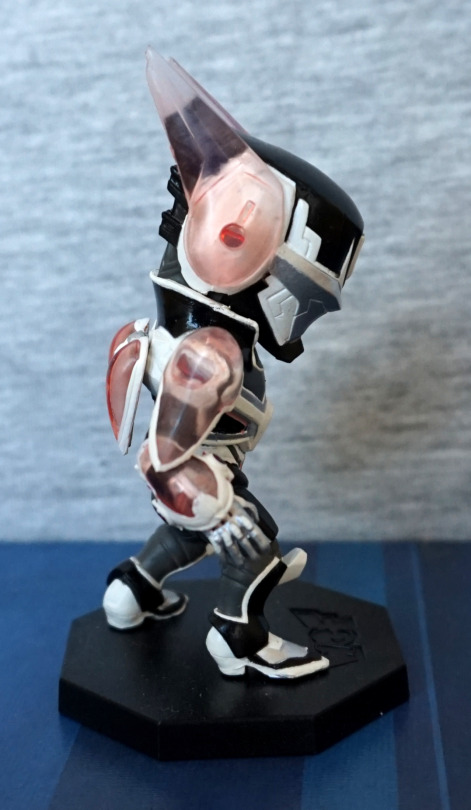
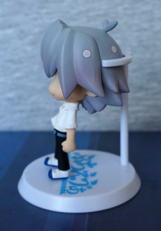
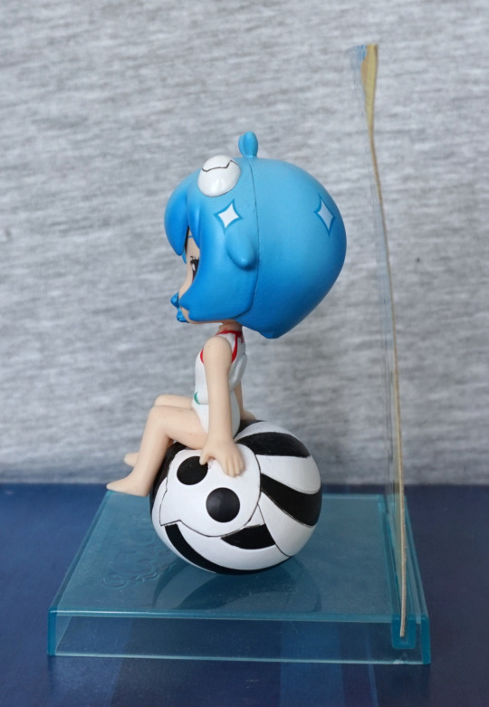
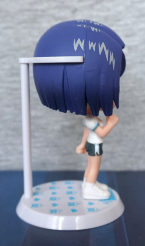
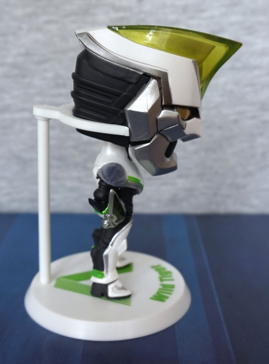
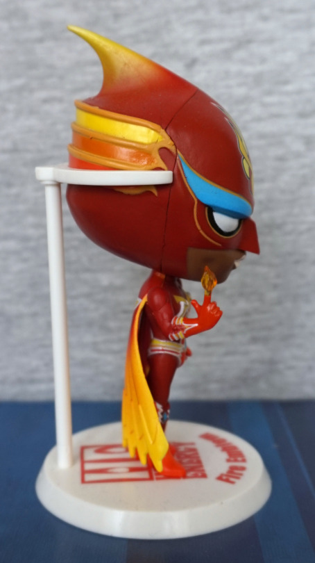
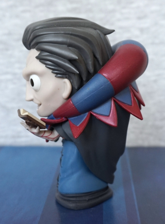
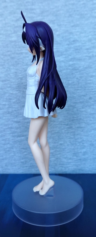
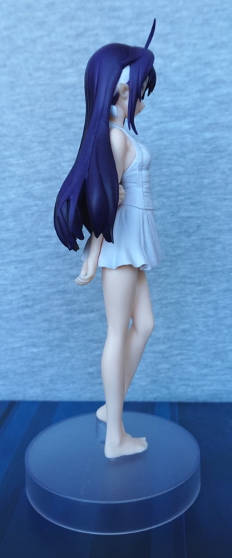
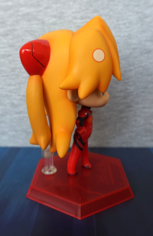
Left:

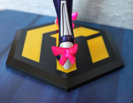
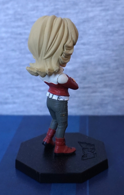
Not too much to see from the sides. The hair strands look nice, but not too much detail in her hair otherwise. She has a sculpted ear, which is nice, and her shoes look good.
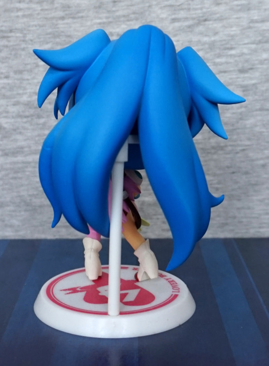
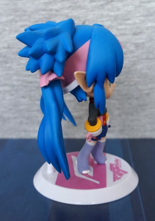
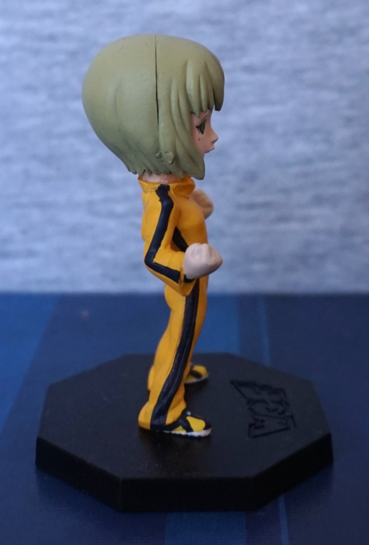
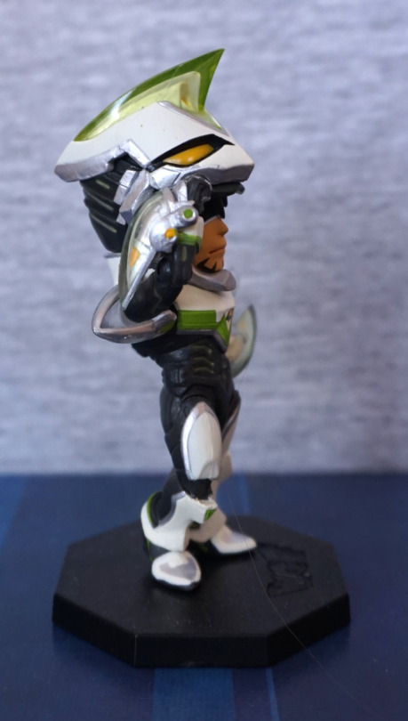
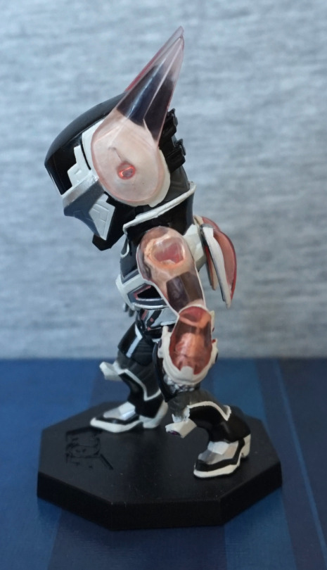
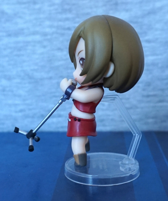
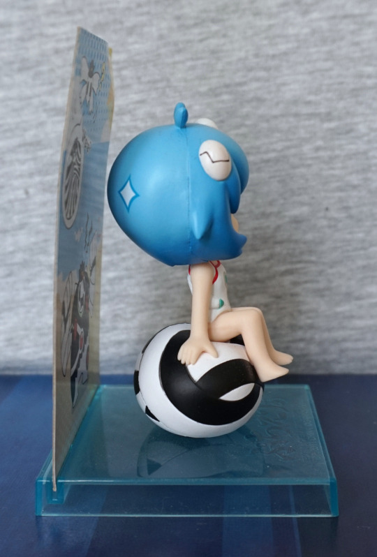
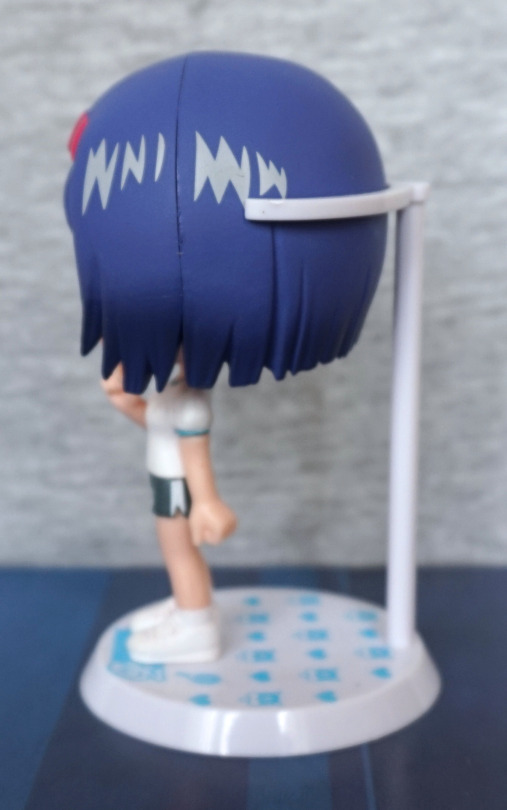
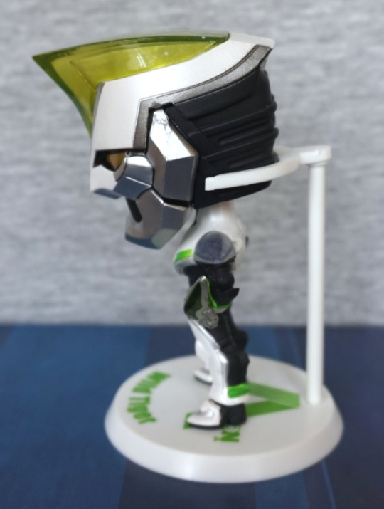
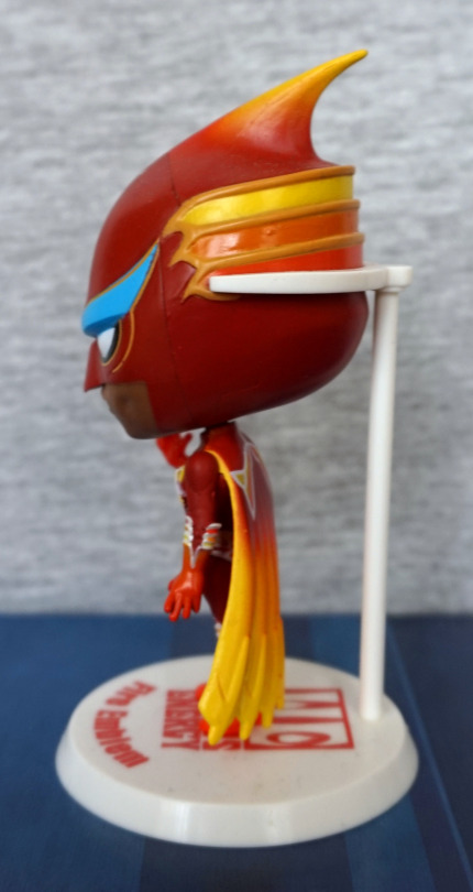
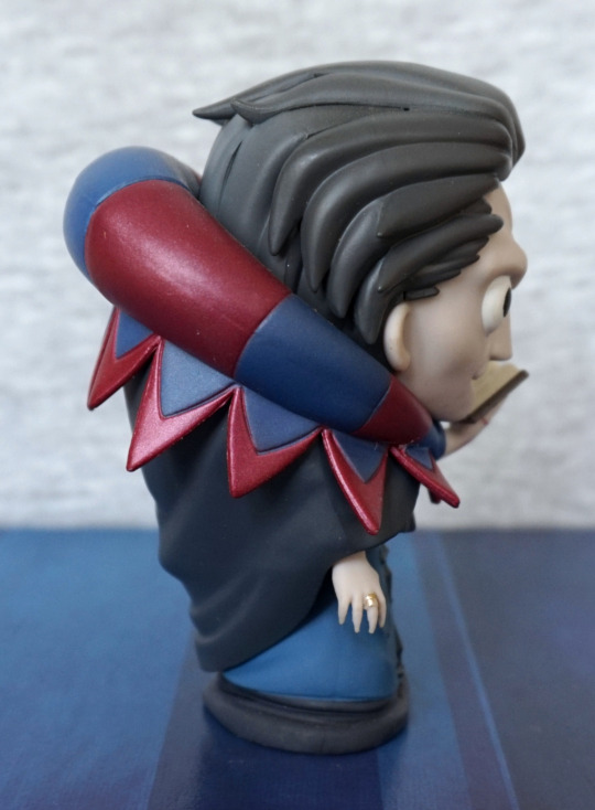
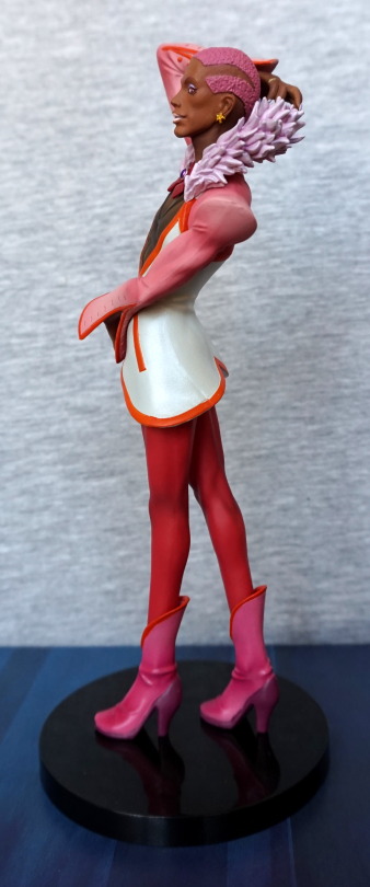
Right:

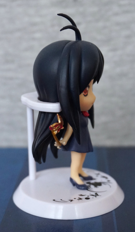
Here we get the mast, but it does appear to float from this side, as she isn’t gripping it. 
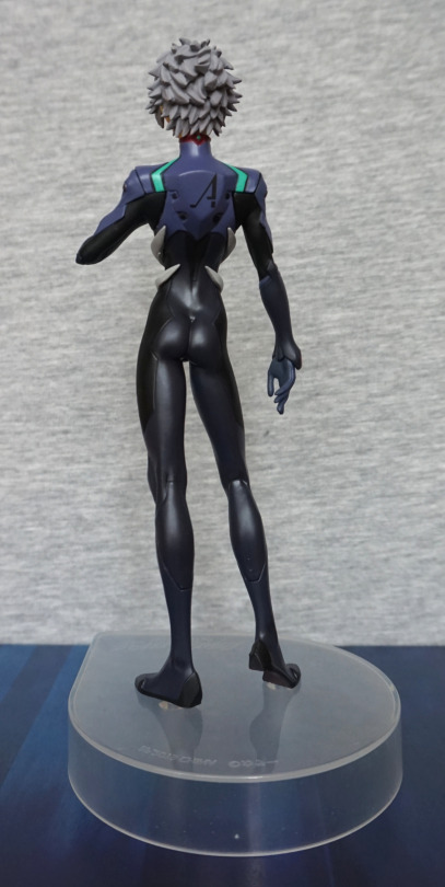
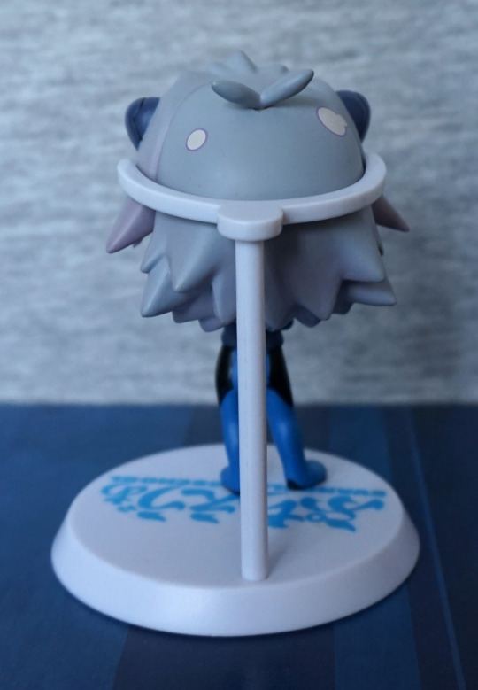
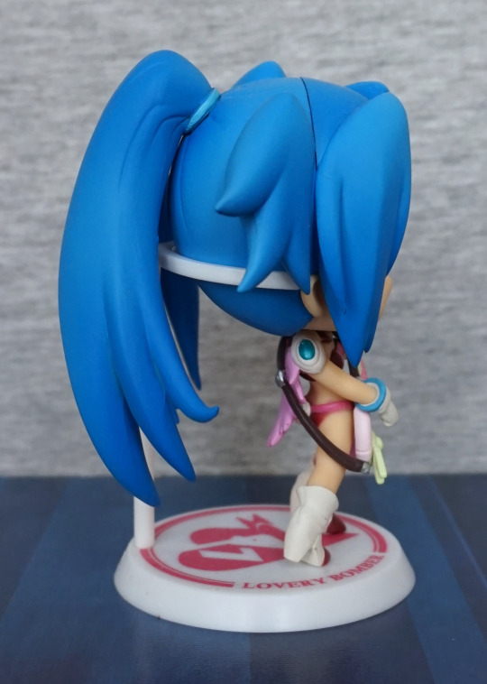
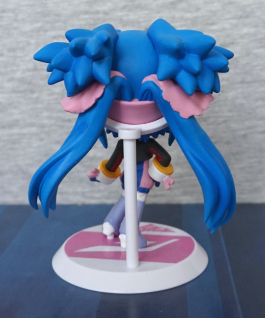
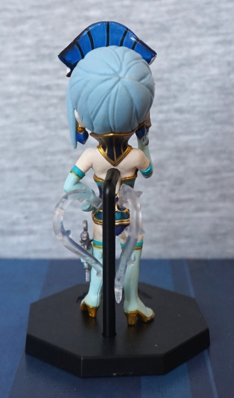
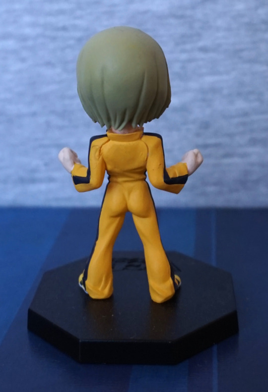
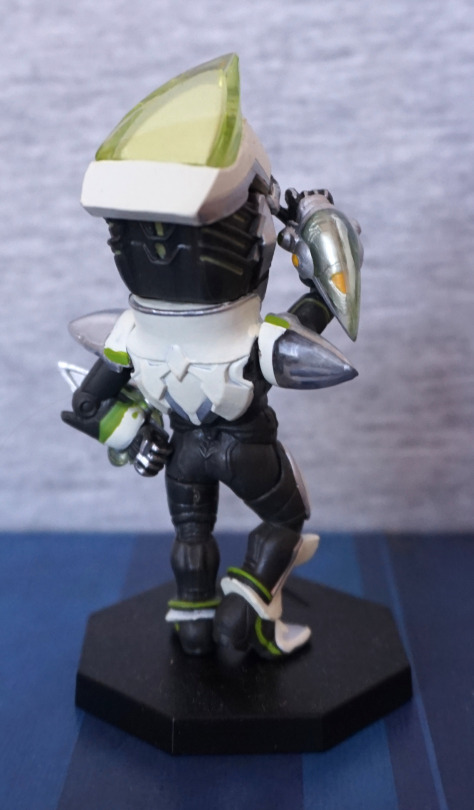
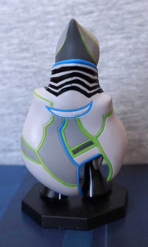
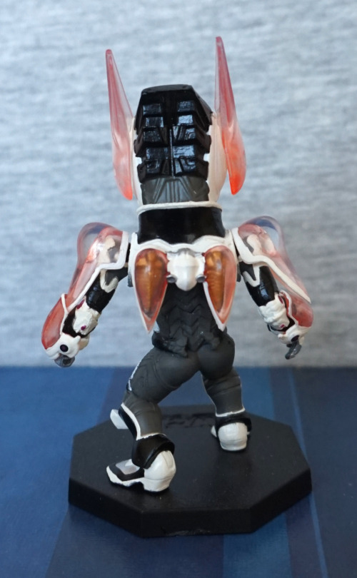
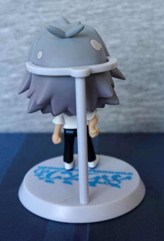
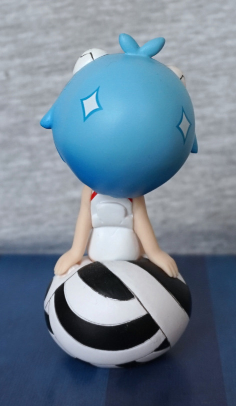
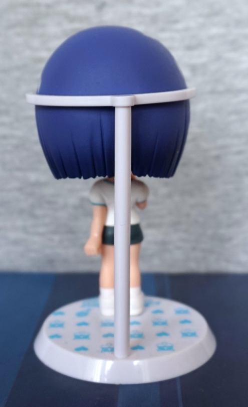
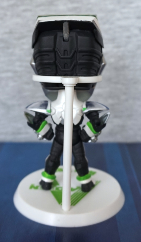
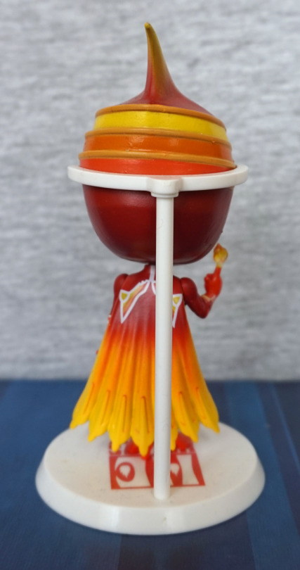
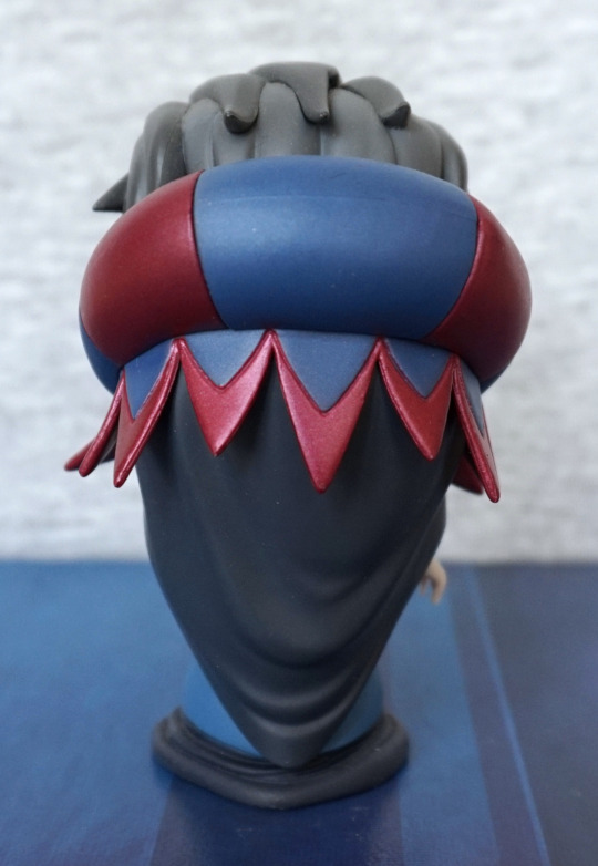
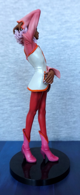
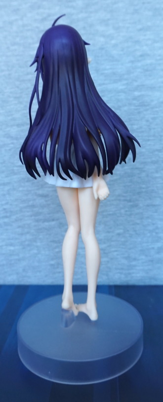
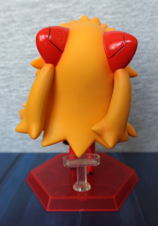
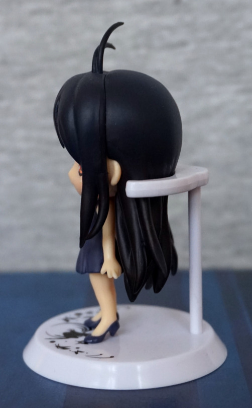
Back:

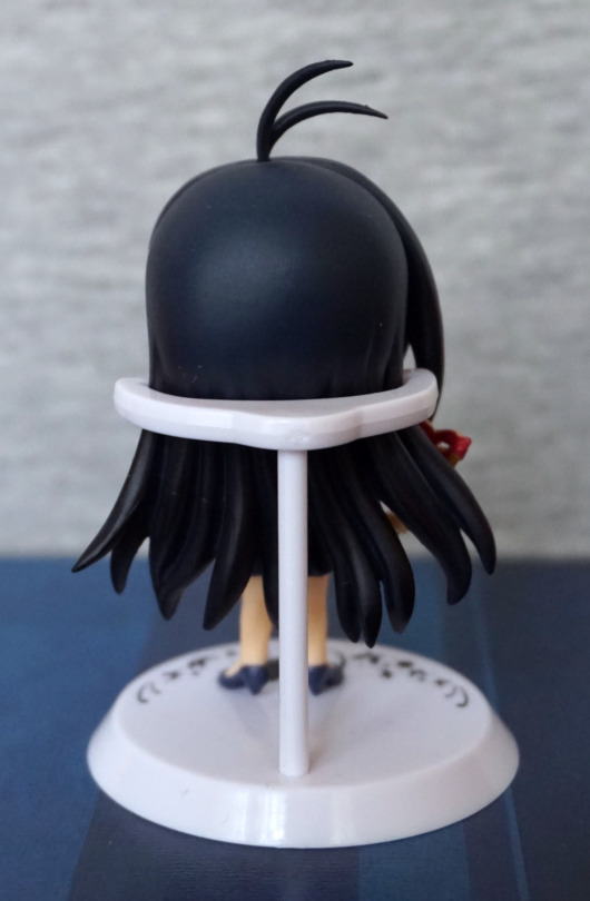
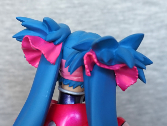
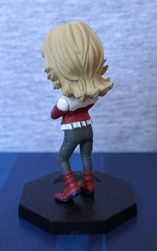
Again, not too much to see. I do like the strands on the lower half of her hair though. Just wish there was more to her upper hair so she looks a little less like a billiard ball, though this is fairly typical for chibi figures. At least the shade is nice and compliments her. 

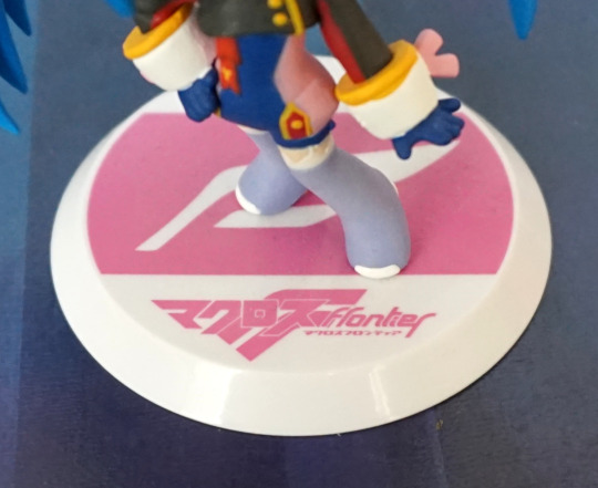
Overall, I find this above average for chibi trading figures, as the design means there isn’t a bunch of paint slop. I don’t think it’s winning any awards for being a Kuroyukihime figure, but in its way, it is a nice figure. Just be prepared to have to straighten out the mask handle. This figure is usually pretty cheap though, if it comes up, so it is good for the price.

Kaworu Nagisa – Evangelion

Time to get back to a Japanese figure, and what better than Evangelion?

Here we have Kaworu Nagisa, in prize figure form:

Lookin’ tall as Kaworu does. I like his pose, and feel it suits him well. I also like his plugsuit, as they’ve given it a good amount of depth. With the way this figure has been designed, the parts of the figure have nice, crisp lines. I like the clear base for its neutralness. 

Face:

The hair is well-sculpted and his face is decent. 

Left:

He’s leaning forward slightly, which adds to his pose. I love the slender body shape, and the hair looks decently detailed from this side too.

Right:

There’s some good detailing on his arm – the upper light-blue part has some good sculpting details to it, along with the grey parts. His backside has a nice shape to it from this side too.

Back:

Hair also looks good from the back, and his backpack looks the part, and the print is well done here. His body feels slender, without being overly so, with some shape to his backside… very form fitting suit :P. Love the finish on the darker parts of the suit. 

Base:

The base features a logo to say it reflects his 3.0 design. The shape of the base is mildly eye-catching, being a bit different than usual. For me, I’d prefer the base to be a little less tall, as he’s a fairly tall figure as-is.  

Overall, I’m happy with this figure, and am happy to add him to my army of Kaworus. Looking up close, you can see some of the hallmarks of a prize figure, but overall I think he’s a decent quality and would recommend. 

Nagisa Kaworu – Chibi Plugsuit – Evangelion

Just a small figure for today, a li’l chibi Kaworu:

Got him in a shop in the UK, who sells a few small anime collectables. I like the light shading in his hair, and the facts he’s in his plugsuit. Not sure if the face entirely fits him, but I’ll mildly let it off for being a chibi. 

Left:

Here we see he has a painted ring shine, which I’m not a massive fan of. I like the sculpt of the hair though, and the plugsuit looks decent from the side.

Right:

Again, more shine, and a li’l tuft of hair at the top for added cuteness. Hair mould lines are mostly blended in, giving the hair a “finished” feel. Plugsuit is also neatly painted on this side, and I like the fact his ears have been sculpted and are poking out of his hair. 

Back:

Looks OK from the back, but the stand does rather hide him. With the stand going most of the way up his hair, it’s pretty distracting, if you want to look at him from the back. Also he has a nasty habit of pinging out of the stand when you move him, which I don’t like. Kinda wish it was lower down somehow, or he had a body stand. With a poke-in-the-back stand you do lose some design, but they do tend to hold figures better than these claw stands. 

Overall, he’s an OK chibi, but I’m not sure how much it really captures Kaworu, though this is based on his Evangelion@School appearance rather than the show. Wish the stand would hold him better than it does, but it is functional if you leave him be. 

Klan Klang – Chibi figures – Macross Frontier

Now for two chibi-styled prize figures of Klan Klang. 

First one is Klan Klang in her “Lovely Bomber” outfit:

Here she sports something other than her pink headband, and a prettied-up guitar. I love the vibrant blue of her hair, and her outfit works well, for its small size. 

Sides:

Hair seam isn’t doing any hiding, but the sides of her uniform are neatly painted, and I like the shoulderpads she’s wearing. She also has blue hairbands to match her blue “Lovely Bomber” headband. 

Back:

Plenty of hair back here, and a nod to her usual hairstyle. 

Base:

Ah, Japanese translation, how we love thee. The logo is decently visible too, and her feet don’t obscure it too much, which is a nice touch. Her shoes look nice too. 

Now for a micronized Klan Klang:

Here she is in her micronized outfit. I think the cute face fits, but not totally sold on the skin tone. Her outfit is nice and vibrant, and features all the major features. Paint is a bit over the lines in places, but not excessively bad. Worst bit for me is the pink that doesn’t quite go to her right-hand-side of the headband. 

Sides:

Hair looks good, has some shading and joins up well. She has some stubby ribbon bits, which I think are fair for the smallness of the figure and the chibi style. Her ears are nicely pointed, and look good pointing out of her hair. 

Back:

Her hair flows to the side on this figure, so we can see the back of her uniform… or at least some of it, thanks to the support. The support on this figure actually works well. The hair coming out from behind her headband is overemphasised on here, compared to some of her counterparts. Looks a bit odd like this, but not too offputting. She does seem to have pink glasses-cleaners in her hair though, than the sheer fabric she actually has. 

Base:

Base looks OK, and does the job. Fits Klan Klang, by being a representation of her headband though. 

Overall, I’m happy with both of these figures. Overall, I think the quality of the Lovely Bomber figure is higher, but I prefer the micronized version for her outfit. 

Klan Klang – Macronized ver – Banpresto

Now for a large Klan Klang! This one was an Ichiban Kuji prize figure:

And this figure certainly is large, to match her macro size! I love the shiny purple of her uniform, and the much more serious expression, to match her personality in macro mode. I love the bold colours of her uniform, which have been replicated nicely here. She does lack detailed shading though, due to her price status. 

Face:

Her face has been sculpted decently well, though I think her mouth is a little on the big side. We have the SMS logo on her uniform, but it looks a little elongated. Her chest is large like it is in the anime… but looks like they’re defying gravity a bit. Most of the black lines around here are neatly done. 

Left:

Here we can see she has her hand on her hip and is leaning forward slightly, to suit her stance. I like the way her hair curls around her body on this side. There’s a seam in her hair by her shoulders, but it is decently blended imo. 

Right:

Aand that’s some platforms to be using for piloting! Obviously doesn’t bother her, though… I like all the detailed creases in her uniform, and the hair down the side of her face is sculpted well. 

Helmet:

Here we can see some dodgy painting, but not too bad overall. She holds the helmet well, but I seem to recall there was some hairdryer action to get her to hold it in the first place. I’d recommend warming her hand to get it in there, as I think there’s a high chance of accidentally scraping some paint. I do wonder how comfortable a helmet is with all that hair though. 

Back:

Here we see they’ve done plenty of details on the back of her suit too, which really helps complete the design. The hair looks good, and is nicely out of the way so you can appreciate the detail they’ve put into this figure. 

Hair close-up:

Here we can see the sculpting is done well, but her hair ties are not translucent on this figure – not unexpected for a prize figure. I like the way they’ve done the hair underneath her headband though. 

Heels:

I like these little bows on the back of her heels – that little bit of girlishness that stays with her in macronized form. The sculpt isn’t too detailed, but they do the job. 

Overall, I do like this figure. I think it definitely has a prize figure feel irl, but it was very reasonably priced when I bought it (and I was able to kindly ask the store I bought it from to pack it so it fit into SAL small packet, which was awesome). Overall, I’d recommend this as an affordable version of Klan Klang, though shipping might be a bit high if the store doesn’t pack it tightly. Thankfully my local mail service isn’t too brutal with parcels, so her box wasn’t even dented on arrival. 

Rem – Wedding ver – Re:Zero

I don’t usually go for wedding figures, but this one I felt was rather pretty and reasonably priced, being a prize figure, so I decided to buy her:

And, yeah, she’s really nice for a prize figure. I love the design, and the paint is neat. She has some decent translucent hair and the flowers contrast well with it. She hasn’t donned her dress yet, so she’s in her wedding lingerie… but with her veil and train. Rather the odd outfit if you think about it too much… She doesn’t have any shading to her, but the sculpting does leave her with some shadows to help out. I like the way this figure is constructed, as it has largely negated paint mess. 

Face:

Some white paint escaping on the top of her bra – that’s probably the largest paint flaw on mine. The flowers are sculpted well and look good. I like her shy/unsure facial expression and pose. 

Knickers:

These flowers are also done nicely, and you can see how the different coloured parts are separate pieces, for the most part. The other noticeable paint flaw for me is the yellow smudge on her glove, from the flower paint.

Feet:

These flowers have been painted neatly for the most part, but looks like some leaves got missed out, but not a surprise with their small size. Guess it avoids extra mess. I like the pale blue of these shoes. Not sure what’s going on with the strap/fold/thing on her left shoe though… 

Left:

I think she’s posed well, and I like the fact her straps are sculpted as a separate part – no weird foldy strap here. The veil and train look OK from this angle.

Right:

Her sides are sculpted well. Her socks feel more plastic than fabric, due to the finish and lack of shading paint. Her hair seam doesn’t show much, mostly due to the flowers.

Back:

In some of the photos I looked at of her prior to buying, I think the back looked better than it does irl – I think I’ve captured the plastic-y nature of the veil parts a bit more here. These parts are embossed on one side, and flat on the other. It’s not terrible, but I don’t think it’d fly on a scale figure. The lower part you need to push into her back, and for mine that was NOT an easy endeavour, and definitely required heating to get it into place… but once done, the connector is hidden, which I do like. From the front, I think these pieces look decent, but from the back it can make her look cheapy… but she is a prize figure. 

Overall, I think this is a strong prize figure, and worth picking up, if you want a decent budget figure that’s wedding-themed, if you can find her for a reasonable price. I bought her near her release, so she cost ¥2000 & postage. 

Ben Jackson & Doc Saito – Tiger & Bunny World Collectable Figures Vol. 3

And finally, the side characters! 

First is Ben Jackson, the taxi driver for Wild Tiger:

Here we see him as his positive self, with the obligatory hot dog. The painting is really nice on the front of this figure, and the sculpting is good too – his face looks really good, and the creasing in his trousers gives this figure a more realistic feel. 

Left:

His hair is definitely smooth…. could’ve probably done with some kind of knobbly texture. Rest of him looks fine though. 

Right:

Go Tigher! Yeah, that hair is deffo lookin’ odd…

Back:

The arm seams actually look good on this figure, and match with the coat style. They’ve added creasing to the clothing at the back, so he also looks good from the back.

Most of this figure is really good imo – just the hair could’ve done with more detail so he looks less like a brown bowling ball. 

Now for Saito the Scientist:

The paint is neat, and looks good. Though with his badge not painted, that part does look odd – more like he’s got it underneath his labcoat, and it is showing through…

Left:

Paint for his glasses got a bit escapey, and not quite enough on his hair. His shoes and coat look good though. 

Right:

Glasses a bit better pained on this side, but looking odd. Hair is of an interesting geometric shape…

Back:

Back doesn’t do the hair any favours either, but the coat looks good, plust the other clothes we can see here.

Overall a decent figure with a couple of oddities.

Blue Rose & Huang Pao-Lin – Tiger & Bunny World Collectable Figures Vol. 3

Now for some of the other heroes! 

First up, Blue Rose:

This figure was one of the reasons I went for Vol 3 – as I really like Blue Rose’s design. Aaandd… with my luck, she was broken in the box! I ended up ordering this replacement from Mandarake. And I’m glad I did – the paintwork is mostly pretty solid with this figure, and the colours are really nice. Unfortunately assembling her is not fun, and it was hard to get her ice tentacles in, as well as attached to the stand ><. You will want to warm this figure to assemble it. 

Left:

Her head feels overly egg-shaped. Her hair should stick back some, but this feels… kind of unnatural. Otherwise, she looks fine from the side.

Right:

Hm, that vine isn’t quite in her side… yeah, she’s a pain to assemble. Bit of mould mess on the side of he head, and could do with a few more lines to make it more hairlike. Her earring is nicely done though, and the ice gun looks good. 

Back:

Despite the pain to assemble, the ice tentacles look good. The paint on her collar looks really good too. 

Overall, I really like this figure, and glad I ordered a replacement. With the broken one, her tiara split. I did try to repair it, but really with the wrong glue, so the glued part shows quite badly. 

Now for Huang Pao-Lin, aka Dragon Kid:

I like her in her casual outfit, so was glad to have this one in the set. The paint is very nice on this one, and there’s been some detail put into her clothing, with the creasing. Her hands aren’t very well moulded though, and look kinda blobby. 

Left:

The black linework is mostly OK, can see some flaws if you look close, but not as bad as other figures in this set. 

Right:

Bit messier on this side, plus some mess on the hair. 

Back:

Not sure what’s going on with her back up top – looks a little overly flat, and teh seams/creases by her arms look odd. I guess the sculptor was distracted by her backside…

Overall, a decent figure, but not anything special. 

Tiger & Lunatic – Tiger & Bunny World Collectable Figures Vol. 3

Today’s two figures will be Tiger in his suit and Lunatic. 

Here we have Wild Tiger:

In this figure we get to see his face and his suit, which is a rarity with his figures. I like the fact he’s wearing his eye mask under the suit… like he needs it. The paint on his is really nice, but a little less neat on the suit, The clear pieces of his suit are nice – on his should, arm and helmet. Though, like the Bunny figure, the tint is too pale on the green parts. 

Left:

Not too much to see here. 

Right:

Paint is fairly neat, and I think he’s posed well.

Back:

His pose also works well from he back. He has a few small details painted too, which makes the figure look good – his boots, bit on his back, and the green parts on the back of his helmet. 

Overall I like this figure – and he’s a welcome addition to my collection for the different pose. 

Now for the villain of the piece, Lunatic:

His head is painted well, and his hand, but the green paint feels rather rushed on his right of his cape. The white lines on his trousers have come out well, though. 

Left:

His head is painted well, but again, paint on the cape looks rushed, and there’s a bit of a transfer mark in the middle. Think he needs to give his cape a wash!

Right:

Ditto the remarks for his left-hand side.

Back:

The green and blue paint seem a fair bit neater back here than the sides, but still has some slop and misses. Black paint didn’t feel like going within the lines on his collar. 

I’m really impressed with his head, and the sculpt overall, but the paint on his cape is rather the letdown. One to display at a distance… which fits Lunatic. But it would’ve been nicer if the painter paid a bit more time to his cape. 

Bunny – Tiger & Bunny World Collectable Figures Vol. 3

I will be doing these trading figures in pairs, as there are 8 of them, and a week of blogs dedicated to these guys feels a bit much.

So, today’s pair is… Bunny & Bunny. 

Barnaby in his casual outfit:

The sculpting on this duded is pretty nice, and the paint is mostly neat. I especially like his hair, and the amount of details that went into his jeans – the stud, the belt and the linework. 

Left:

Here we can see some of the red of his jacket escaping int the white, and some dodgy texturing on the hair, which is a lot less apparent from the front. Jeans and shoes loog good though.  The cream part on his shoulder doesn’t match the white on the main part of his jacket, which makes it look a little odd to me.

Right:

Hair has a nicer finish on this side, seam is fairly well hidden imo. 

Back:

Hair sculpt is good, jeans look good from all the angles imo, as well as the boots, belt paint is a bit suspect back here though. 

Overall, I think this is a good trading figure and has a good likeness to Barnaby Brooks Jr. 

Bunny, darkness edition:

From a first glance, this figure looks pretty good, but does have its flaws – the one that isn’t so apparent from the photos is the side fins on his head do fall off rather easily. They do stay, so long as he isn’t nudged, though. This figure does have a fair number of fine lines, which I think does show the limits of painting on small trading figures – it does feel a bit uneven in places. 

Left:

I think the fins on the sides of his head could’ve done with a bit more dye, so that his head didn’t show so clearly through these parts. Lower arm guard colour looks about right. I do like this use of transparent parts.

Right:

Mostly more of the same. I like this pose though – “ready for action”. Paint on his collar looks a little dinged up. 

Back:

The backpack parts are nicely shaped, but appear to be a different colour to the rest of the pinkish parts. Would’ve been nice if the pinkish parts coordinated more. I think the proportions have gone a little odd due to the chibification though – I feel as if the backpack is a bit too wide, and doesn’t sit how it should. 

Overall, a decent likeness, but best not looked at form the back. 

Meiko & Sheryl Nome – Vocaloid & Macross Frontier

So theme of these two is…. gacha that aren’t usually gacha. 

First up is a Nendoroid Petit – I found a Goodsmile Company vending machine in Japan, and it vends Nendoroid Petits. There were 3 series to pick from, can’t remember what my choices were, but I went for the Vocaloid ones, as I’m familiar with some Vocaloids. So ofc, it gave me one of the ones I didn’t know, Meiko:

I remember this one costing a bit more than your average gacha, but being a Nendo Petit, this makes sense. From even a quick glance, it’s fairly obvious these are a fair bit higher quality than a gacha. 

My main issue with the figure is the mic – it is a bit of a pain to get into her hand, then it very easily falls out. The mic is attached by a peg, but the hole isn’t quite tight enough to hold it well. 

Other views:

Overall, I think she’s a decent Nendoroid Petit, but don’t have any personal attachment to her. The clothes are sculpted well, and she has some nice shading on her hair. Just wish she’d stay in one piece once assembled.

Next up, Sheryl Nome:

Originally, this was an Ichiban Kuji prize, but one of the shops in Japan had a gacha machine vending stuff from Evangelion and Macross respectively. Blog about the Evangelion items here. So this was the one I got from the Macross gacha. I like Sheryl’s outfit in this figure, plus the shading in her hair. 

Without hat:

I really like her hat, but displaying her without it is a viable option, if you prefer to see her hair. It’s fully sculpted, so she doesn’t look like she’s missing anything without it. 

Other views:

I really like the piping around her hat, and her outfit looks good from all the angles. She does have some fairly noticeable seamlines in her hair though, so she’s best viewed from the front. 

Overall, really happy I have this figure. I didn’t know it existed, and is the kind of figure I’d want the moment I knew it existed… and even better, I already owned it on knowing it existed 😀

Kaworu Nagisa – Evangelion – Deformation Mini

Hm, it’s been a couple of days without Evangelion figures… let’s have another!

This time Kaworu:

This guy I bought loose at a Hobby Off. Not sure “cute” goes with Kaworu, but… he does look good cute! The hair has some purplish shading, which adds some depth. He’s been painted neatly, and the colours look good.

Left:

The purple shading continues on this side, and we have a couple of those stylised shine spots. He also has a bit of hair sticking up. 

Right:

More fancy shiny spots. His sleeve looking somewhat solid.. His hands don’t have much detail, but do the job. Hair seam trying to show itself on this side. I like the way his hair is spiky at the bottom. 

Back:

Hair looks OK from the back, and has a decent amount of shape to it. Back is painted well too. 

The stand itself isn’t anything too special and mostly does the job. He can be quite easy to knock out of the stand, or simply fall over. He’s not the worst for it, but it does look like the previous owner had that issue too, as there is a paint transfer on the base from his foot. 

Overall, he’s a decent little chibi imo. Would recommend if you want chibi Kaworu. And you know you do 😛

Rei Ayanami – Evangelion – On the Beach

Just a small figure today, Rei on the beach:

I have a couple of this series of figures already, so I was excited to see the Rei from this set. These figures aren’t overly complex in their design, but they’re nicely painted. The base is a rather straightforward affair – clear blue plastic, with Eva@School on it, with a slot for the background. The background is nice, and complements the figure. I like the angel that’s been included in the backdrop. 

I like her expression – I feel it captures her detachment. The ball she’s sat on also includes an angel symbol – a nice inclusion of the theme. The swimsuit also captures the essence of Rei’s plugsuit, but I do think the grey almost-penises look a bit odd. The hair has a subtle gradient, preventing it from being bland and flat. 

Left:

Here we can see the angel-on-the-beachball clearer. Edging on it is a bit unclean, but it’s easily recognisable and does the job. Here we see some overemphasised highlight marks on her hair – not sure if I’m a fan of this style of highlight. Hairclip looks good too.

Right:

Seam isn’t overly bad in the hair. Beachball looks good from this side, and we can see where her hair sticks out a bit on the front half. 

Back:

Bit of a paint mess on the ball. Hair is neatly painted on the back. They’ve reduced some of the plainness with the shine marks, but I don’t think you’ll really be looking at this side much, especially with her backdrop. They’ve given her some of a backpack, but I think this looks kind of odd, and a flat swimsuit would’ve worked better, though an actual backpack could’ve worked for a beach trip? Gotta have something to carry the beach supplies!

Overall, it’s a decent small fig, if you don’t expect too much from it. I got it for a reasonable price, so for me she was worth it. 

Haruna Sairenji – To Love Ru

More chibi! Get yer chibi here! Today we have Sairenji from To Love Ru in a gym outfit:

The paint quality is really nice on this one – the eyes have a fair amount of detail, and I like the blush on her cheeks. Her hairclips and clothes are also painted neatly. I like the fact she has some animation in her pose, instead of being static. 

Left:

Hair has a pretty distinct seam in it, but the hair highlights look nice, She has some shading in her hair, which is a nice touch. 

Right:

Some blobby paint on this side, d’oh, but the same isn’t quite as bad. Otherwise, fairly the same as the other side.

Back:

Not too much to see here, move along. Though the pattern on the base is nice. 

Overall, I really like this Sairenji figure. The paint quality is a cut above most chibi figures I’ve seen, and looks like Sairenji. She also wasn’t a crazy price, like most of the the To Love Ru chibis, so glad to have her. Would recommend this figure. 

Wild Tiger – Tiger & Bunny

And now for some main character action:

Whilst I don’t usually go for chibis (yet I’m doing a series of blogs featuring them…) I do rather like this one, and well, in Japan they’re cheap, lol. I liked this one for the detail on it, and I like the clear part on his head. He’s been painted well, and he has a decent amount of detail – his eyes have the black inset, the silver parts have been split into separate parts, and he has the clear shoulderpads and the guards on his arms. 

Left:

His head does have the wideness of a chibi, but doesn’t feel drastic compared to Fire Emblem. The shapes work well, and the colours feel well-chosen.

Right:

Same as the left really. I like the detailing on his legs – he has the silver edging and the green part that goes around his anke. 

Back:

He’s sculpted well back here, and you have the details of the back of his helmet, and the shapes in the white portion of the back of his suit. Some small green paint details, which help add accents to the figure.

Overall, I rather like this chibi, and am glad to have bought it. His base is better than Fire Emblem’s as you can see more of the company logo, which is also helped by his wide stance. I’d recommend this chibi, if you want a Tiger chibi. 

Fire Emblem – Tiger & Bunny

This figure I found in a bargain bin, with only half of its packaging, so he was cheap:

I love the bright colours of Fire Emblem, and this one is painted well. The decal on his head is nice, and the blue contrasts nicely with the red. They’ve made good use of transparent plastic to have him making the small flame that he does in the show. His cape is also nice and bright. 

Left:

The tip of his mask has a nice gradient to it, and the stripes are painted neatly. I find his chibi head shape a bit awkward from the sides though – looks a bit too fat. 

Right:

Some stray mustard yellow on this side, and the head seam is a lot more obvious here. Didn’t quite go fully together in assembly. His gloves looks nice though, and the cape curves a bit, which is nice.

Back:

Really liking the gradient in his cape, and the detailing on it is good. It has a sculpted shape to it, which really helps, especially with the parts at the bottom. 

The base has his company logo on, plus his name, though the logo is mostly obscured by his feet. Might’ve been better just to stick with whatever parts of the logo fit without his feet in the way, but eh. 

Again, this is a character without too many figures, so it’s nice to have him represented in my collection, even if it is in chibi form. 

Caster – Fate/Zero

GillesThis figure I bought for cheap, as he’s missing his base, but he doesn’t really need it:

And also because it’s Gilles De Rais. I find his expression a little on the odd side, but what’s there is well-painted. He has a bit of a seamline in his hair, but nothing too drastic. I can see a bit of paint slop on the bottom of his dress, but the rest is painted nicely, including the pattern on his left arm. 

Left:

Couple of seams visible here – one on the upper part of his clothing, and one in his hair, but they’re mostly hidden. Here we can see more of the linework on his arm, which looks really nice. Top has a bit of flow to it, which is nice to see.

Right:

Clothing seam is pretty well blended here. The points on his hair are sculpted nicely, and he has some fine details on his hand – you can see his rings and pointy fingernails. I love the red and blue of his… collar? Whatever it is. 

Back:

His cape hangs nicely, and the collar is painted well. Nothing to complain about here.

He’s definitely a decent chibi figure, and one I’m glad to have. I don’t think the stand really adds much (apart from ugly whiteness), so I don’t miss it at all. He doesn’t fall over either, due to his wide base for a chibi figure, so I think he looks great without it (and possibly why his previous owner no longer had it…). Glad to have another Giles to add to my collection, as there really aren’t many figures of him. 

Nathan Seymour – Tiger & Bunny – Banpresto

This figure I was considering buying prior to Japan, and came across whilst I was there, so decided to buy him. For Nathan, there are only two prepainted non-trading figures, and the other one was an exclusive, so if you’re a fan of this dude (not in costume) it’s slim pickings.

So let’s take a look what we got:

All in all, a pretty decent figure. Phew. Some paint flaws on the orange parts of his top, but the rest of it seems decent. His makeup has been replicated well, and he has shading throughout his outfit, which is definitely a bonus for a prize figure.

Face:

He has nice sculpt detail in his face, along with the makeup that matches with the show. I also like the ribbon around his neck, which is painted well, and I especially like the purple of the gem attached to it.

Left:

His hair and ruff look really good imo, and look pretty much like they’re supposed to. His earring is crisp and defined, which is good for such a small part. The clothes flow nicely, along with the shading present. We can see one seam down his coat, but it has been fairly well hidden.

Right:

Here we can see he has painted fingernails, which is good, and the different finishes. His coat is shiny, whilst the rest of him isn’t.

Back:

Here we can see his right hand has a ring on, and also has painted nails. The edge of his cuff could’ve done with a tad more orange paint though. His ruff is nicely shared though, and I like the hole in the back of his top – it adds a good amount of detail. His leggings and boots are nicely shaded, to complete the figure.

For a prize figure, this one is really good, so I am really happy with him. I’m glad they did a decent job on him as there is rather a lack of figures for the side characters of Tiger & Bunny, especially out of costume. He is one of my favourite side characters, despite being a bit too stereotypical in places. If you like this dude, I’d recommend this figure. It should also be pretty cheap to obtain, as these Tiger & Bunny figures don’t seem overly popular.

Yuuki – Code Register – Banpresto EXQ

This figure I had a couple of goes at trying to win at a claw machine, and realised it probably wasn’t gonna happen, so ended up looking for it throughout my holiday. Ended up finding her cheapish without box:

Aww, cute figure. These Banpresto figures are certainly a good thing in the prize figure world. I love Yuuki’s hair colour. The sculpting is good. but similar to the other EXQ ones I have, the skin lacks shading. The dress has an embossed pattern on, which I’m on the fence about. It does add detail, but does look a bit like she’s bandaged. Paint on the hair band looks like it goes a bit far on mine. 

Face:

Here we can see where the hairband is either ridged or the paint goes too far. Decision up to he reader. She does have some blush on her face, which is a nice touch. I love her cute expression. On mine, if you look closely, the chest doesn’t quite marry up with the dress, but it doesn’t really show when on a shelf.

Left:

Her hair curls around her nicely, and we can see where she sits on the stand. Her stand holds her well. The sculpt of her ears is clean, and looks good.

Right:

Here we can see there is shading in the hair, and a couple of seams. The seams are pretty decently hidden. 

Back:

Here we can see where the hair goes from light to dark, to light again. The backs of her legs are sculpted nicely too. 

Overall, I’m glad I got this figure, but don’t think it’s worth more than I paid. Some of these new EXQ figures are really worth their aftermarket price, but this one I’m on the fence about. I’m glad to have her, but with the outfit and the hairband, I’m more on the fence about her than the other EXQ figures. 

Asuka – Deformation Maniacs – Evangelion

This one I won via auction. I had this picture to go on: 

And thought “ah yeah, that looks like some small, cute figure of Asuka”. You know one of those ~8cm trading figures you get in Ichiban Kujis. 

Nope, wrong. She rocks in at about 14cm in height:

Ended up laughing as I got her out of the box of loot, as she was twice as big as I expected. So much for sneaking her onto the corner of a shelf! Her plugsit is rendered very nicely in chibi form, but I find her face rather too plain, especially at this size. The front of her hair is done rather nicely though. 

Left:

Her nerve clips are most definitely being used as hair clips here. Always a bit unsure on this point – does she use them as actual hair clips, or just have the ponytails just below them? Her ear is well-sculpted, and she looks less plain from this angle than the front to me. Suit is also lookin’ good and detailed. 

Right:

Yep, pretty much the same as the left, but with longer hair on this side, and a different arm pose. 

Back:

Hair so big she needs a stand for it 😛 Not much to see back here, other than the copyright on her nerve clip. 

Base:

Logo for Evangelion@School, plus some lines to make the base not plain. I do rather like this base design. 

Overall… it’s large chibified Asuka. Nothing really special to say about it. It’s nicely done for what it is, so all it really hinges on if you want a large, chibified Asuka. Not entirely sure if I did… but I have one now, lol.