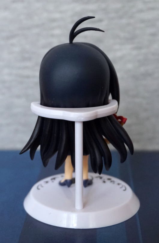
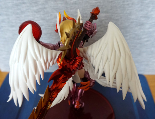
Instructions of how to cast off Konno – instructions under the fold as NSFW.
Instructions of how to cast off Konno – instructions under the fold as NSFW.
This figure I bought secondhand from another user on MFC.
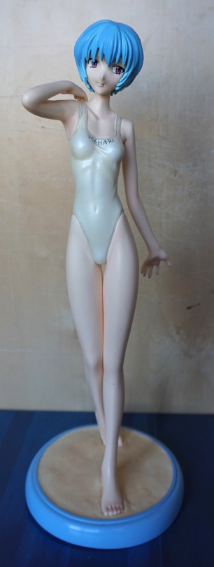
She has a small chip on her leg, that was there when I bought her. She’s a very tall figure and quite heavy, as she’s cold cast.
Left view:
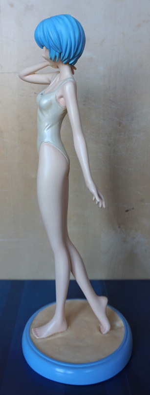
Some detail to be seen here, in her armpit and wrinkle on her swimsuit.
Right view:
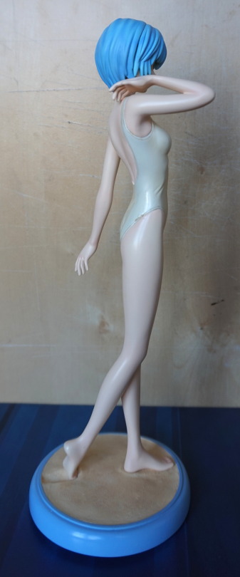
Little bit of a mark here too, at the bottom of her swimsuit. Doesn’t really affect looking at the front of the figure, and that side of her is obscured from where I chose to place her, so I forgot it was there, until I got her out for these photos.
Back:
Some detail to be seen here, but nothing that stands out to me. The dent in the sand on the base is a nice touch. Being a heavier material, it does cast some of its own shadows, but there’s no shading in the paint. This leaves her looking rather plain compared to other figures, especially as her skin tone is paler than the concept art for this figure.
She’s rather a mediocre part of my collection. I don’t regret buying her, but she doesn’t particularly stand out, either.
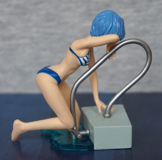
This figure was part of a Suruga-ya order. Unfortunately, this one had an unpictured extra – cigarette smell :/. So this figure got a couple of baths too…
Here she is, assembled with the pool piece:
I like the pose for this figure, which is why I chose it. Figure quality isn’t great as she’s a small gachapon figure. Main thing that bothers me is the kinda strange paint job on her hair – not sure what’s going on with the shading there.
She also has a leg piece:
.. so you can do this if you really want to. Could look cool on a shelf ledge like this, or some kind of custom display.
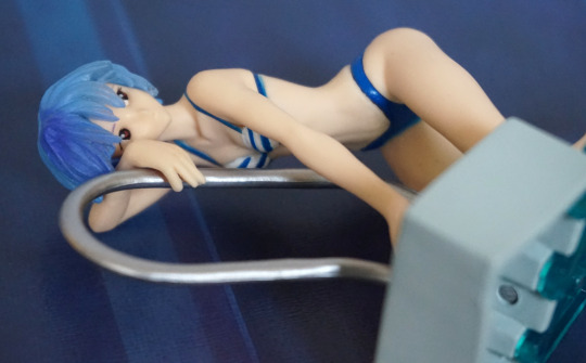
However, it’s more so you can do this:
If you’d prefer to display her without the poolside, this piece allows her to look complete. Though her pose is a bit odd without the poolside.
Some other angles without the pool:
“Don’t look at me”:
Back:
Here you can see where her parts need to be shoved together a bit more.. Her foot is nicely sculpted, and we do have some wrinkling in her bikini bottoms.
Front:
Not too much to see here. However, you can see the paint job that looks like some ink was spilled on her head… Probably needed to use a lighter blue here.
Other side:
Not too much to see on this side. Hair is nicely sculpted, pool handle looks good.
View from below:
She has some nice sculpting on her body, giving her good body definition.
Overall, she’s decent for a gacha figure, and would recommend as a “bonus” item to an order. Hopefully if you get one though, it won’t come with bonus smoke smell like mine :
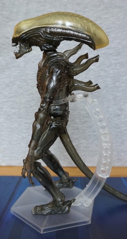
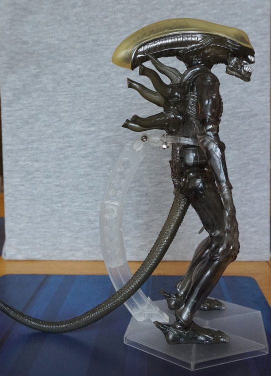
This was another random discovery on Mandarake. The description and picture didn’t match, but decided to go for it anyway and see which of the Real Action Heroes Alien figures this was…. and it turned out to be neither of the ones I was guessing it was. This one is #41.
Here he is, on a Play Arts Kai stand:
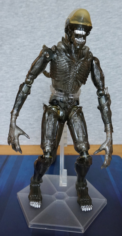
S’cuse the derpy pose XD. Some of the threads on the joints had become loose, so I added some PTFE tape, so this is slightly visible due to his transparent nature. If it ever bothers me, I’ll replace the PTFE tape with clear nail polish, but PTFE tape is what I had to hand.
Overall, he’s one cool-looking dude, but it is a rubbery plastic outer, so it had got very sticky with age – ended up giving him two baths to get rid of the sticky residue.
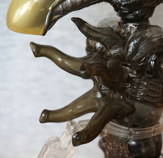
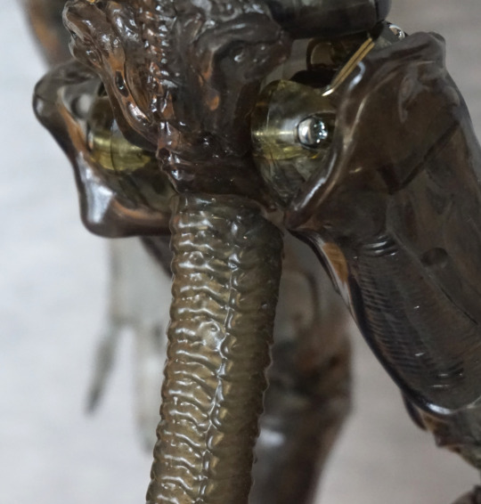
‘Face’:
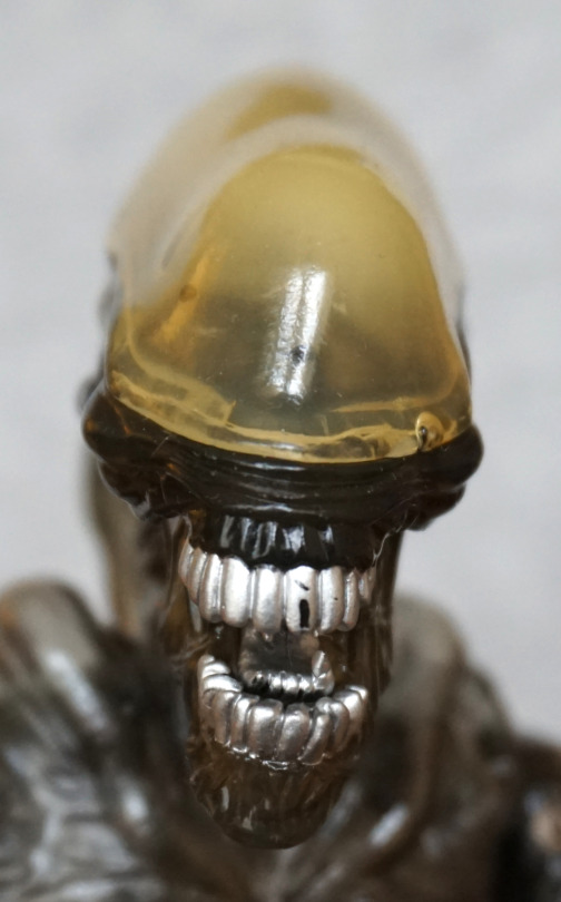
Scratches on his teeth were prior damage. Could get some silver paint/marker to fix this. His mouth has been sculpted well, and he has his inner mouth, as any Alien should.
Crotch (because apparently I deemed this as a shot worth taking):
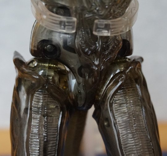
Here we can see some of the mechanisms, and the way his rubber suit is almost like a swimsuit.
Feet:
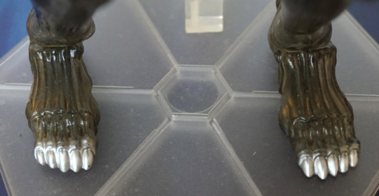
Here we have some shiny silver toes. Paint and sculpt is nice.
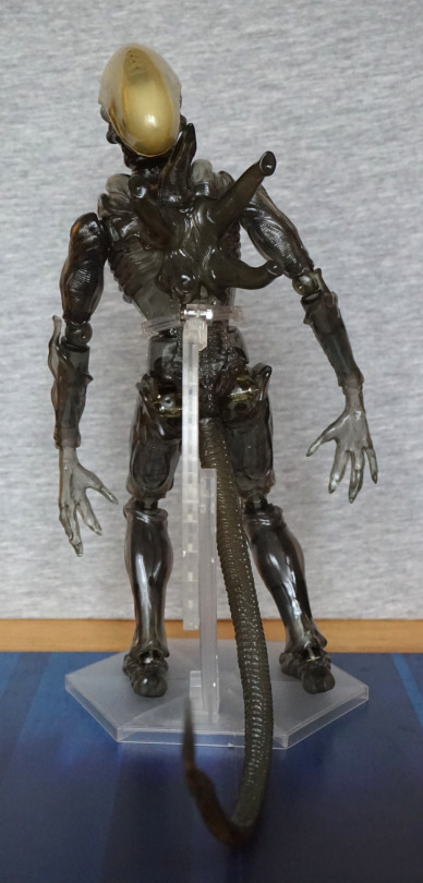
Left:
Love the sculpt on the side of his head, and he’s a decently poseable figure. Even with his joints tightened, he doesn’t stand too well on his own, so I’d recommend getting a stand, if you get any of these Alien figures.
Hand:
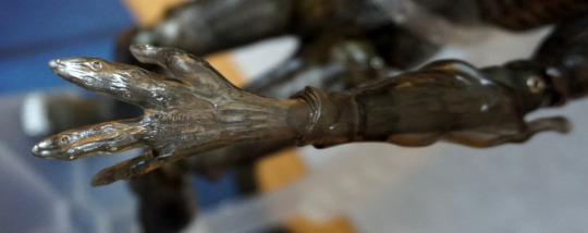
These hands are just the rubbery plastic, plus some silver painting on his fingernails.
He does have a second pair of hands:
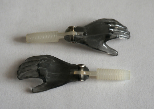
These are hard plastic, with a singular wrist joint. I prefer the spiky ones.
Right:
Looking symmetrical to the left side.
Back ‘pipes’ side:
Details look nice and crisp.
Back:
Not too much to see back here, but we can now get a good look at his tail.
Tail joint:
This is the part I dislike most about this figure – the tail goes onto a rubberised “spike” so it can fall off easily and isn’t poseable. Wish they had a hinged joint here, so you could move his tail to the side at lest.
Tail in all its glory:
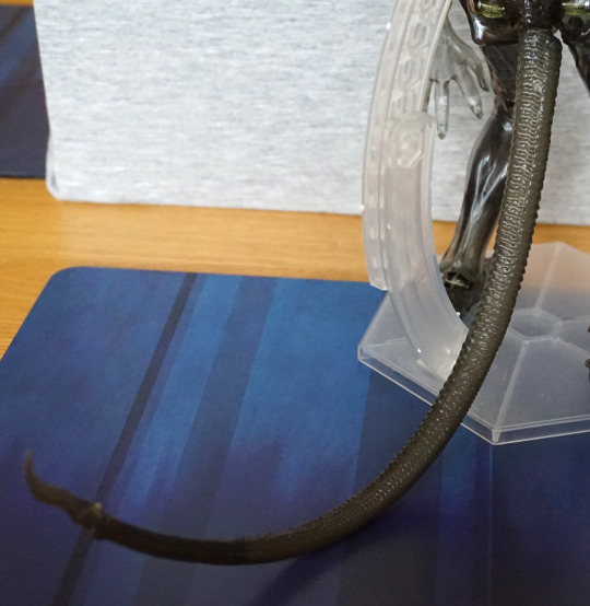
This thing is long and does pose issues when placing him on a shelf. The rubberised nub does allow it to bend to the side a bit, but can be knocked off in the process.
Tail tip:
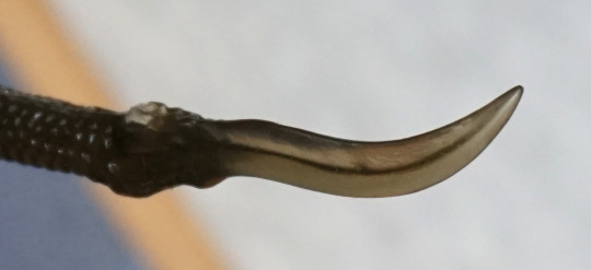
Nice bit of sculpting to end his tail.
Head dome:
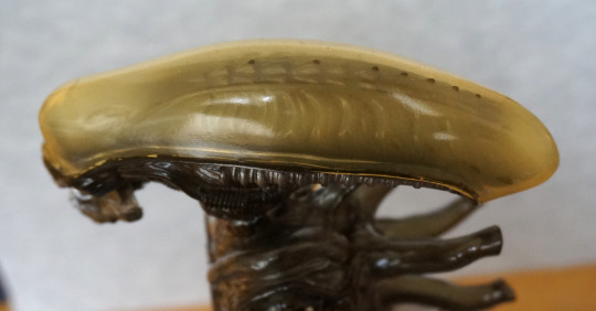
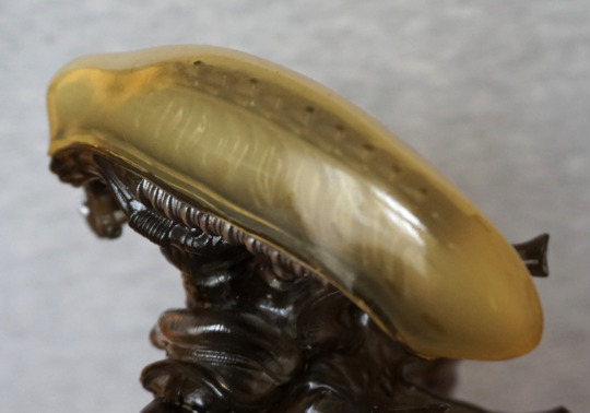
The details in here are sculpted nicely, and the transparent dome works well. You do get some dots on the dome, from the spikes pressing against it. This is also probably some of the plasticiser that’s leaked out over time too.
Overall, I really like this figure, especially for the price I paid. He hasn’t aged too well, but the faults are mostly minor and fixable. For anyone interested, for getting off the plasticiser (sticky stuff) I used either hand soap or washing-up liquid, or possibly both. And some good ol’ fashioned elbow grease. Due to his head already having some potentially liquid dots in there already, I was careful not to dunk his head in the water, just in case it leaked (which would be a pain to fix).
This was a figure I decided I wanted when I saw it. Came across it on Mandarake, where it quickly made its way to my basket.
Here she is:
Some of the “free” dust can still be seen on the base. This time it wasn’t my fault it was dusty! The thing that attracted me to this figure was her outfit. I like the cute look of her face, and the skintight outfit has been done nicely for a prize figure.
Left:
Here she’s leaning forward slightly, and she has a shapely upper body. I like that they’ve included some shading on her suit, instead of leaving it flat-coloured.
Right:
The creasing on her clothing looks good, and the boots have been done well. Her hair I’m not so keen on, but it does the job. Though to me, her hair doesn’t feel quite right – her hair is overly flat in places, which looks odd next to the more sculpted parts.
Back:
Hair looks good from the back – I do like the way it flows.
Overall, I’m pleased with this figure, though I do wonder how the rubberised bits will age.
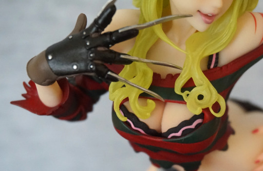
Now for another horror-themed figure – Fredd Krueger, but perhaps not as you’ve seen him before!
This figure is part of Kotobukiya’s Bishoujo line, which has a few gender-swapped characters, this being one of them.
So here he, uh, she is:
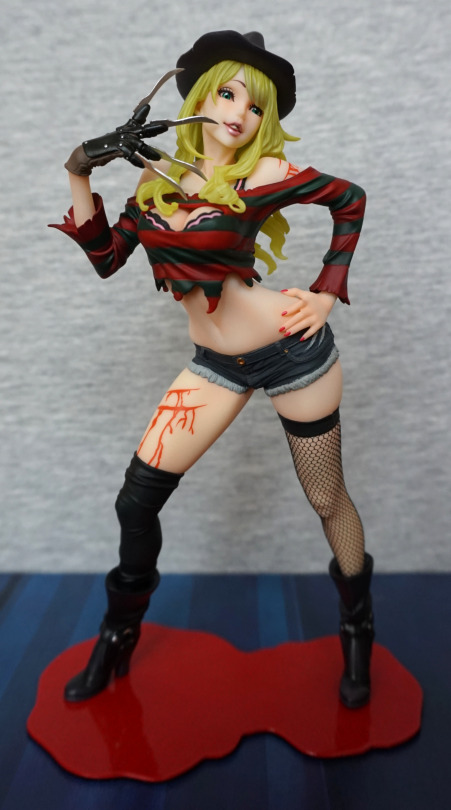
A very sultry-looking Freddy. I love the face and the pose from the front. With the second edition, they slimmed down the base and reshaped it a bit, to make it fit with the figure more. The base does the job, but I don’t have many feelings towards it.
Face:
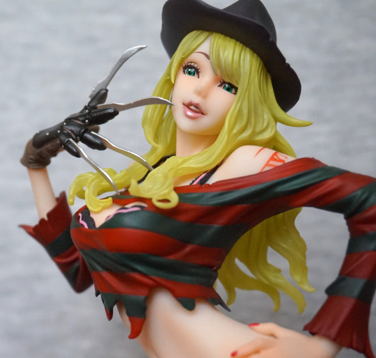
I love the way the lip gloss has been done, and the hair is an interesting effect, but feels a tad green which I find a little off-putting. The glove has been sculpted and painted well. Her top is fairly decent, but doesn’t have a proper ripped effect going on with the edging, which is a minor downside to the figure.
This close-up also shows the issue I have with her body shape – her back looks rather broken at certain angles… especially this one! She’s fine from the front, but some of the side angles aren’t very flattering.
With her arm covering her back, she doesn’t look so broken. Love the dimple in the hat, and the strands in her hair. Her boots are also nicely sculpted, and I think they pulled the ring detail off well.
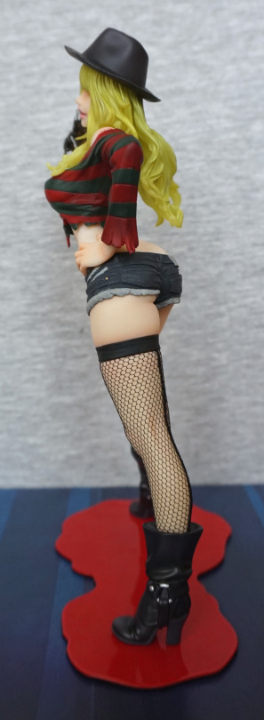
Stocking close-up:
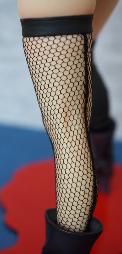
Her stocking looks especially good on this figure, and they’ve even included the stocking seam at the back, which I thought was a nice touch.
Right:
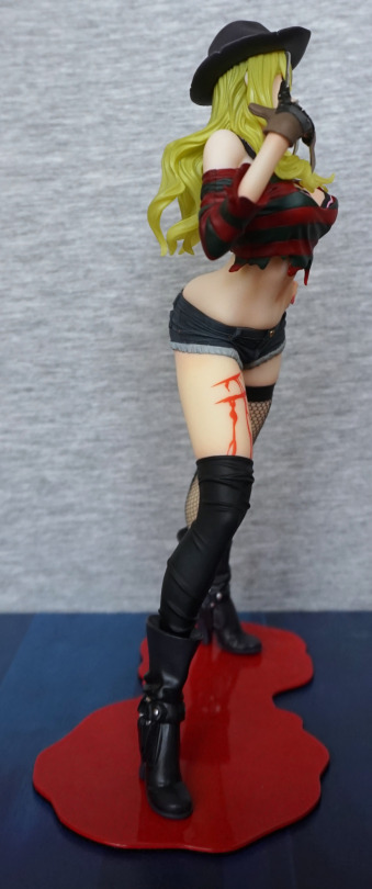
The blood effect isn’t terribly realistic, and could’ve done with a bit more shading to it. The flat red makes it look kinda bad imo. The shape of the paint works, but there’s no depth to the wound. I think a little bit of an edge would have helped.
Back:
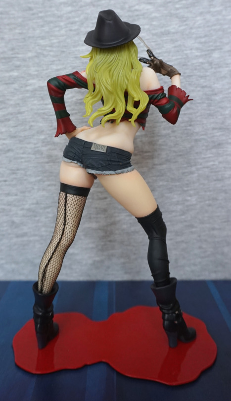
Again, lookin’ kinda bent. However, her back is otherwise sculpted well, and the shorts are really well done. Here the “off” hair shade shows up the most I think, and could’ve done with being a tad more yellow in my opinion. He doesn’t have any hair, so it would’ve been nice to give it a more complimentary shade now he has some.
Shorts close-up:
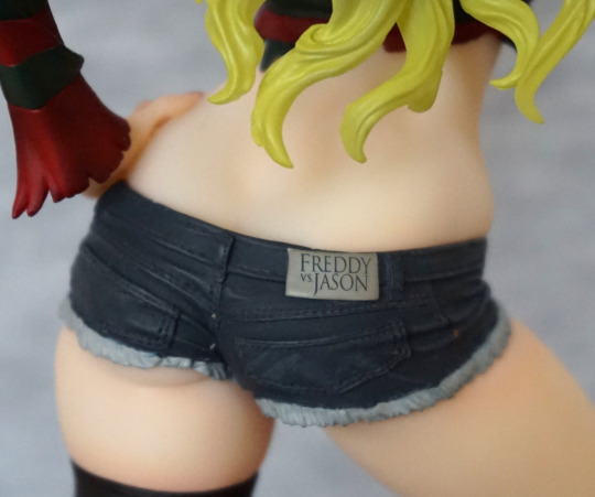
Love the logo on the back of the shorts! The detailing on these is nice, and the frayed jeans effect I think works here. The stitching has been detailed, which really adds to the realistic look.
Overall, I’m happy with this figure, and glad to have finally got around to getting it. I think the hair could’ve been done in a better colour, which is my main gripe. Seeing as I don’t move my figures around too much, I can display her at a favourable angle, so not too bothered about the oddly shaped back. I think it’d bother me more if it wasn’t for the hair though.
A small figure for today:
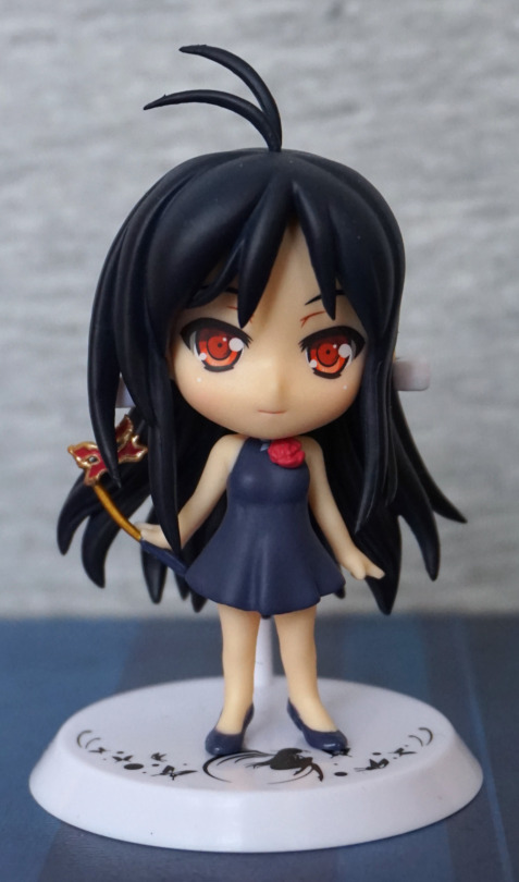
A small chibi figure of Kuroyukihime, from Accel World. With this figure, I like the hair and the outfit, but not sure if the face fits – her face seems to lack the “severity” of Kuroyukihime, as it is rounded and her expression is almost smiling. Just feel it could be tweaked a bit to give off more of a Kuro vibe… However, what is there looks nice for what it is. Her dress is nicely sculpted, and her shoes fit well with the outfit – my only real complaint is that the flower is pretty much covering up the silver butterfly detail at the top. I feel the flower could’ve been a tad smaller so the butterfly could show.
Mask:
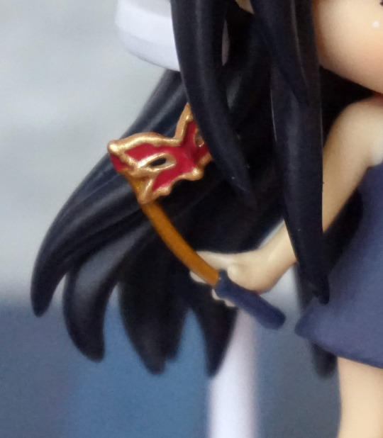
Bendy! Haven’t got around to fixing this – some heat and cold water should fix this, but this figure is going to be prone to this part bending.. Well, better than it breaking tbh. The mask itself looks the part and is painted well.
Left:
Not too much to see from the sides. The hair strands look nice, but not too much detail in her hair otherwise. She has a sculpted ear, which is nice, and her shoes look good.
Right:
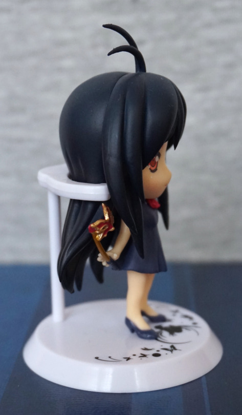
Here we get the mast, but it does appear to float from this side, as she isn’t gripping it.
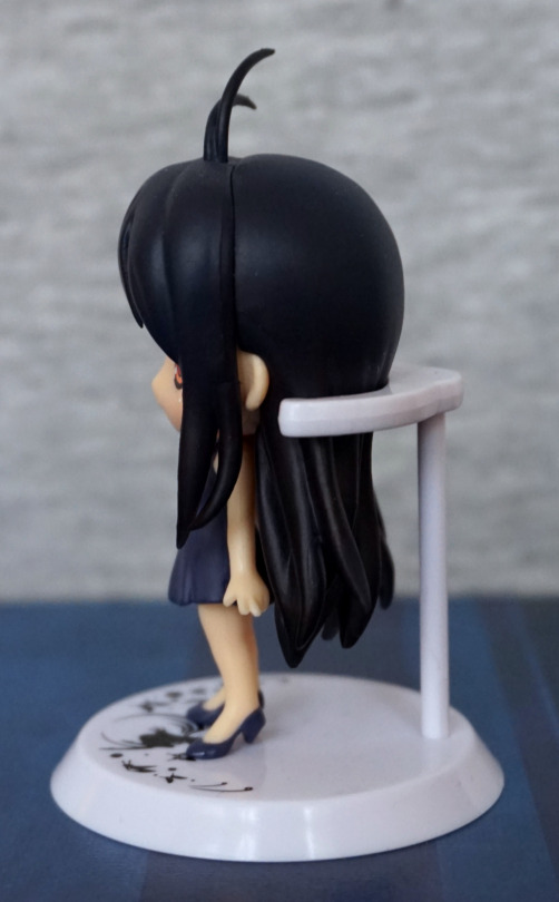
Back:
Again, not too much to see. I do like the strands on the lower half of her hair though. Just wish there was more to her upper hair so she looks a little less like a billiard ball, though this is fairly typical for chibi figures. At least the shade is nice and compliments her.
Overall, I find this above average for chibi trading figures, as the design means there isn’t a bunch of paint slop. I don’t think it’s winning any awards for being a Kuroyukihime figure, but in its way, it is a nice figure. Just be prepared to have to straighten out the mask handle. This figure is usually pretty cheap though, if it comes up, so it is good for the price.
Along with yesterday’s figure, I bought this small figure of Lilith:
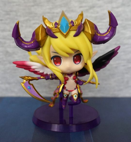
Was surprised by the small details on this figure, and the crown she wears has been nicely done. With the crown, the paint looks neat, and the colours compliment each other.
Close-up:
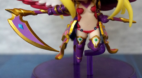
The clothes… of what little she has… have been printed well. The small parts on her leg are nice and neat. Love her scythe too – the purple-gold works really well imo.
Left:
On this side, she sports a dark wing. We can also see a cute heart-shaped earring here too. I like the way her hair flows too.
Right:
On this side, her hair seam is a bit more obvious, but not too bad. This side she has a red and white wing, which we can just about see from this angle.
Closer look at the sides of her outfit:
More material here, than the clothes on her body! Nicely painted though, with very minimal painting errors. Has a good amount of detail to it too.
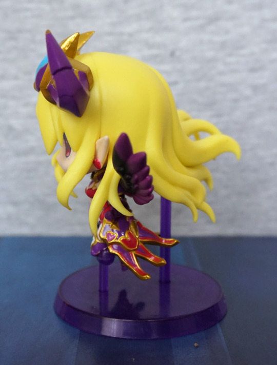
Back:
The strands of her hair are sculpted well, and flow nicely. There isn’t any paint shading on her hair, which is a minor negative, but it still looks nice.
Overall, I’m pleased with this small figure, and glad to add it to my collection.
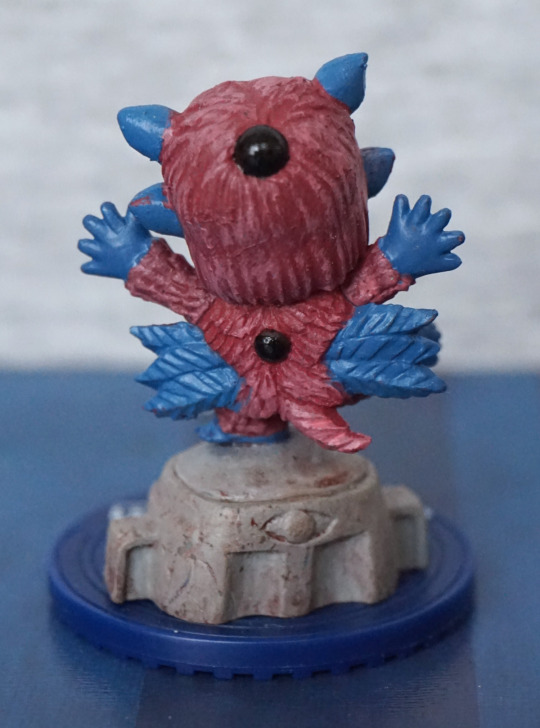
Again… finding myself buying Puzzle & Dragons figures, because the company that makes them does such a nice job of them.
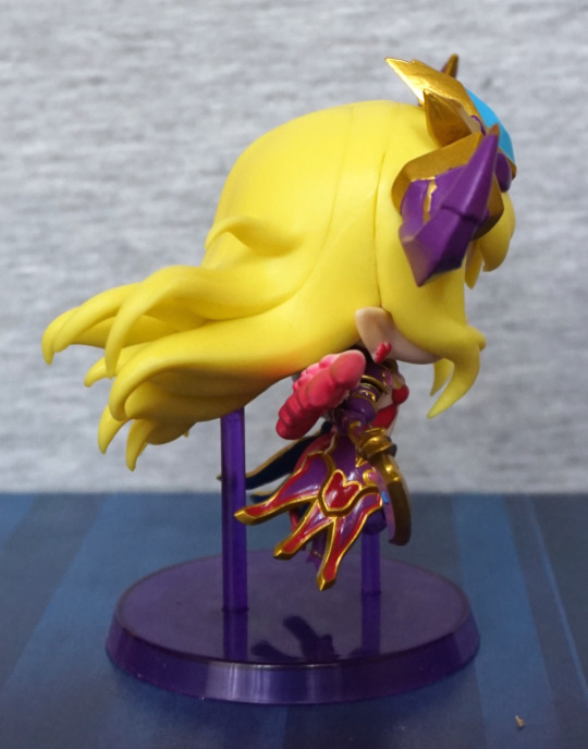
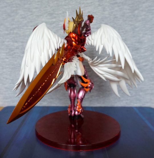
Here’s today’s figure:
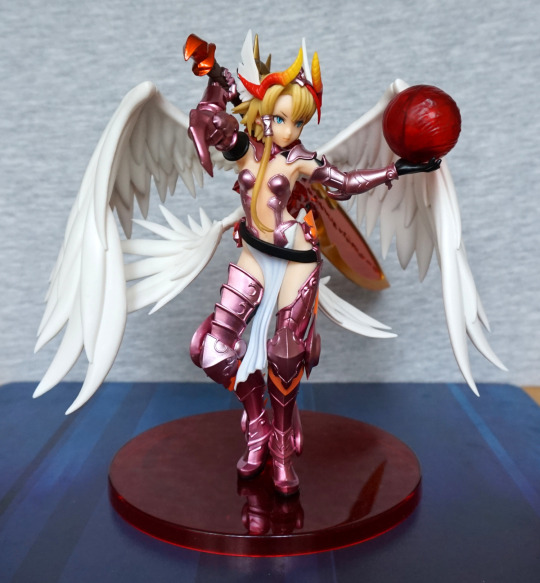
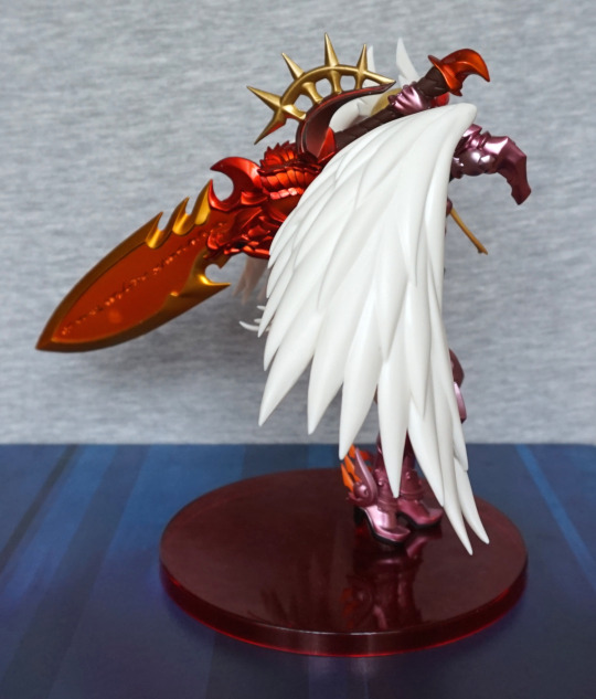
And, wow, there’s plenty to look at here. Her wings come as four separate parts to attach, and her sword arm as a couple of pieces. Thankfully this one wasn’t in need of extra stand pieces, so she wasn’t too hard to build – just getting the wings and sword assembled in the right order.
Face:
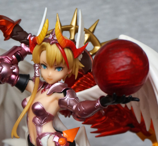
Her eyes are nicely printed, and the sculpting is really nice – I love her face, and the hair has been nicely done too. The red and yellow on the crown has been blended smoothly into a nice transition. Love the pale pink metallic armour too. The paint here is also clean.
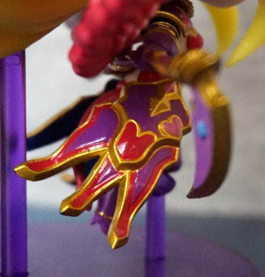
Ball:
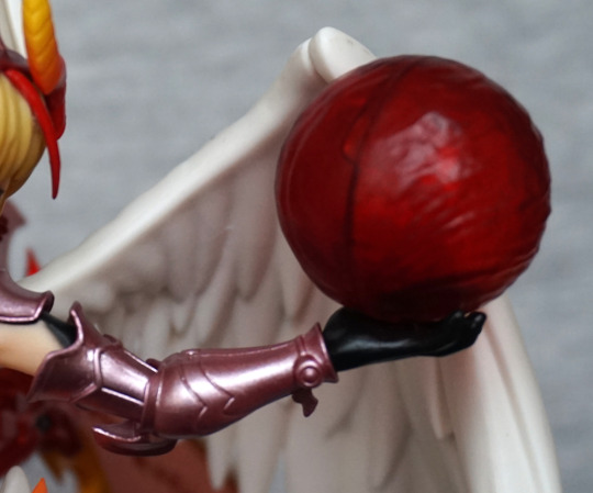
The ball has an obvious seam, but the texturing on it is nice. The black parts on the edges of her armour contrast well.
Left:
The sides are dominated by the wings – there isn’t any shading on the wings, but the deep sculpt does help make up for this. Love the shiny orange of the sword.
Closeup of the sword on this side:
The handle is a very nice sculpt, and the “runes” on the sword look really good. The lines are nice and clean on the sword, plus the gold and orange compliment each other nicely.
Leg:
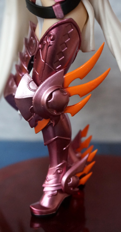
Love these orange spikes. Lots of sculpted details here, though the sculpted details don’t have any paint detail to them. However, that probably counts in the figure’s favour, as it’s less chance of a sloppy pant job but still looks good.
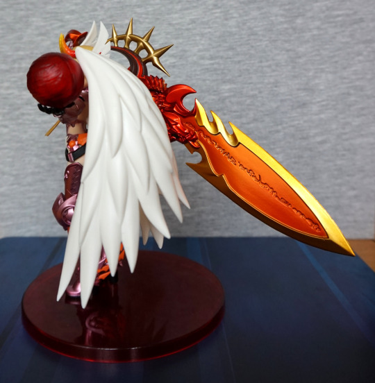
Right:
Here we see mostly wing, but we can see more details of the sword.
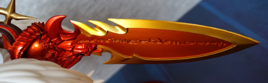
So here’s this side of the sword:
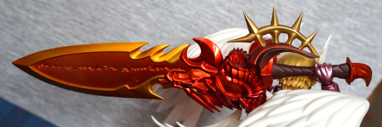
The dragon sculpt is very eye-catching, along with the gold parts on the hilt. Really love this design and the bright colours of it.
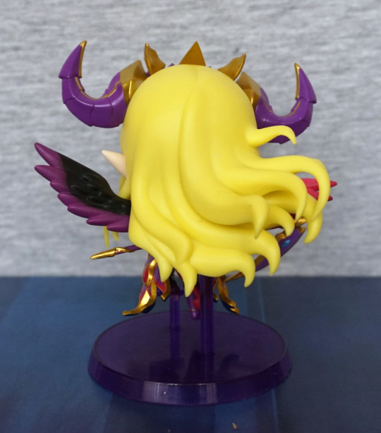
Back:
.. though that sword is bigger than her… strong lass! Here we can see the four wing parts, as she twists to wield the sword. Love the way the wings add to her motion. and that she has four of them.
Wings from slightly above:
Where the light on the left obliterates the shading, their non-painted nature does rather show up, but doesn’t look bad where there are shadows.
I think the weakest part of the figure is the ball in her hand – it’s supposed to be a fireball, and could’ve been doing with being more transparent to emphasise that imo, as it does look like she’s holding a crystal or something instead. However, it does look OK in its own right (well, maybe not the seam), so if you’re not bothered about accuracy I don’t think it’s that bad. The wings do look plasticky under stronger light, but not as bad as the guardian’s white wings. These have more depth and motion to them, which does reduce the plasticky look.
Overall, she’s a really nice figure for the price, and I would recommend her if you’re a fan or just like her design.
This set I saw on YAJ first (iirc), but then found one of the Mandarake stores had it, so went and ordered it there.
I’ll start with my favourite, the one similar to his original colours:
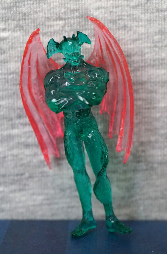
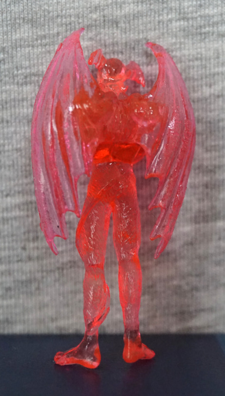
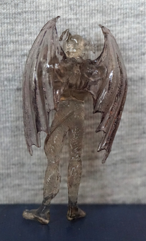
The first apparent downside of these figures – they don’t stand up, and no stands are provided. Not sure if Uni-Five intended for these to be unboxed…? Or maybe you’re supposed to carry these as charms?
The sculpts for these figures are all the same – and thankfully it’s a decent sculpt. The details are somewhat obscured due to the clear plastic, but are there. We can see details of his face, and the small protrusions of his horns. I love the pose chosen – his arms crossed is a fitting pose.
Back:
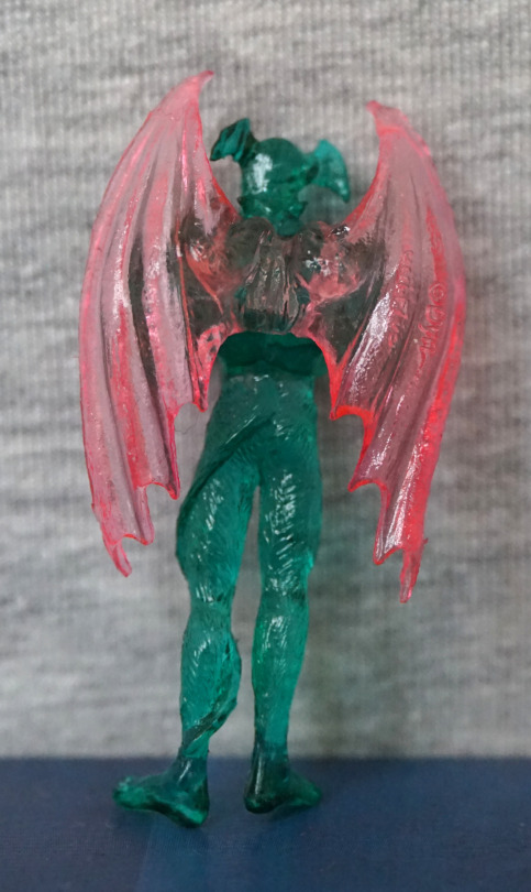
The texture on his legs looks good, and I like the way his tail curls around his leg. The wings also work well, and I do like his pose… even if he can’t stand on his own.
So with the sculpt analysed, here are the other colours included in the set.
Red:
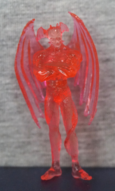
Probably my least favourite of the set. Bit too on the neon side.
Black:
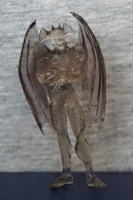
Looks OK, bit better than the red one.
Glow-in-the-dark:
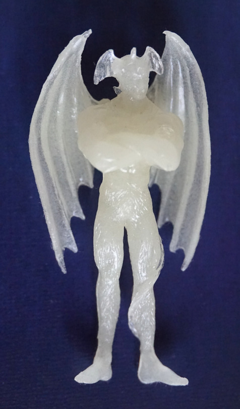
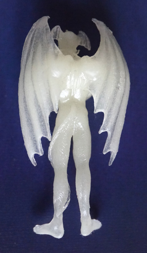
Whilst his sculpt details are less obvious in the daytime, he does glow, and for that he’s my second favourite.
Overall, I like this set, but is probably a set a fair few will just display in box as it has fairly eye-catching packaging:
For myself, I’ll likely get out some white-tack to help them stand, and display them amongst my collection. And maybe sneak one into an ita bag…
This was the Fate/Grand Order Duel figure that I saw and wanted. I’ve always been a fan of Gilles de Rais’s look. Being a less popular character, this figure was also cheap, which was a bonus.
So let’s have a look at him:
From the front, he looks decent, but I don’t like the fact he looks down – it would be nicer if he was looking a bit higher so his face was visible when looking front-on. I wouldn’t mind him looking slightly down, as that fits Gilles, but from this angle you don’t really get to see his face.
So here’s his face:
His face has been sculpted well, and has his angular look. Hair and outfit are both neatly painted, and the pink and blues chosen work well together. His rungs look good too.
Left:
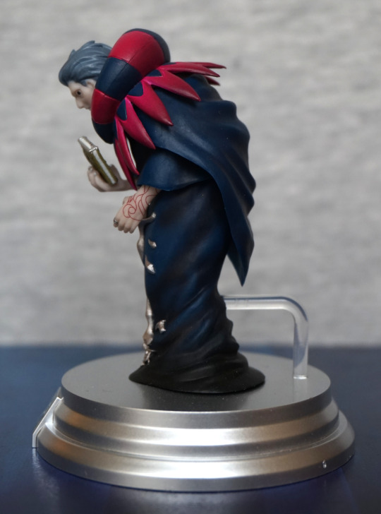
The paintwork on his arm has been done well, and the shading throughout his cloak looks really good. Definitely doesn’t have the shading issue of the prize figure. The points on his collar are nice and crisp.
Right:
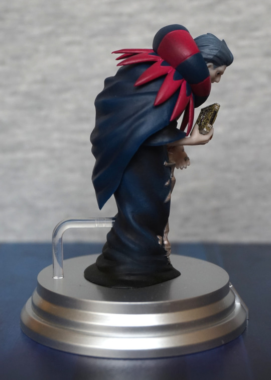
Here we see him holding his book with a claw-like grip. The book has been done well, especially for a small piece. The cloak has also been well -shaded on this side, and we can see the shading on his upper collar too.
Back:
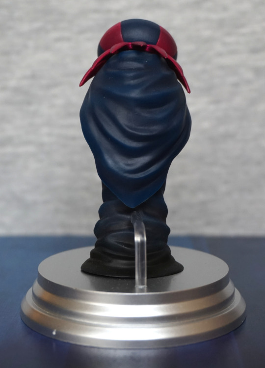
Props for the stand not getting in the way on this one – I like the fact they’ve gone for a shorter stand so we can appreciate his cape. The back looks really good to me – with the differing shades of blues from the upper and lower halves, and the shading within each part.
Top of his cape:
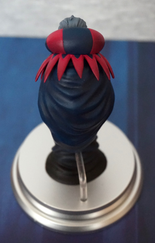
His hair his sculpted well, and his colour is nicely sculpted and painted. The spikes are slightly different, giving it a more clothinglike appearance.
Overall, I think this is a really nice figure of Gilles, if small. As a character without a lot of figures, it’s nice to have a quality one, even if it isn’t a scale.
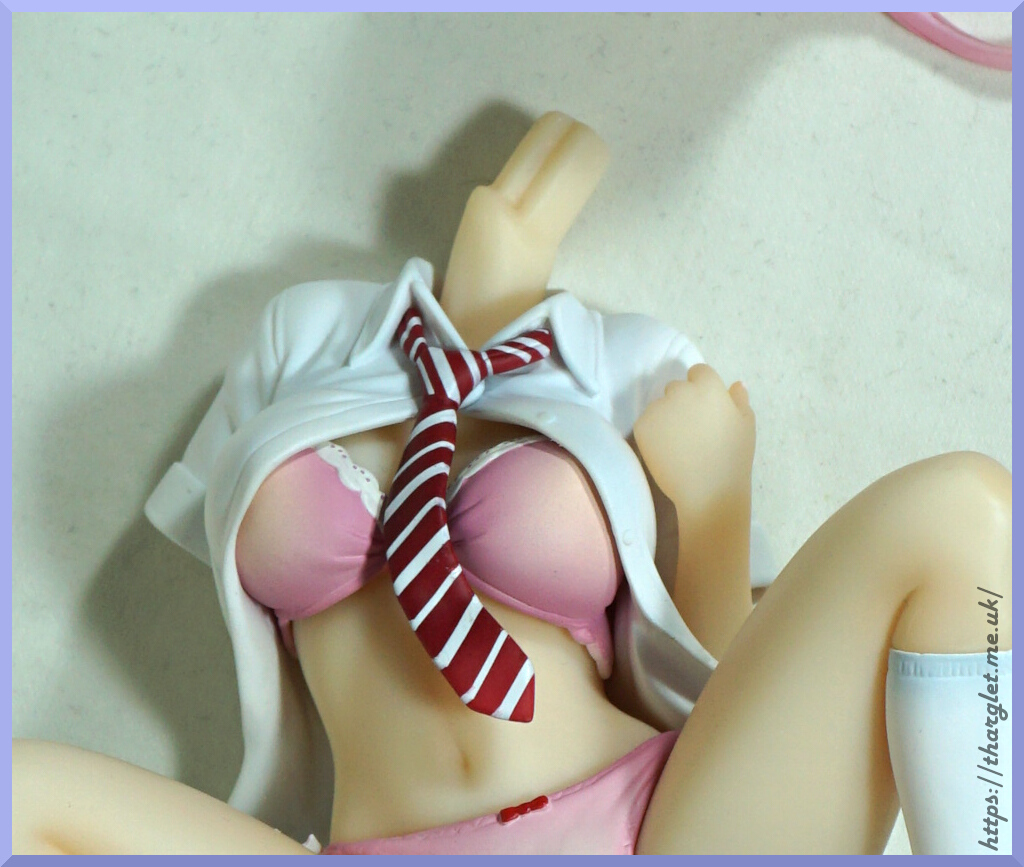
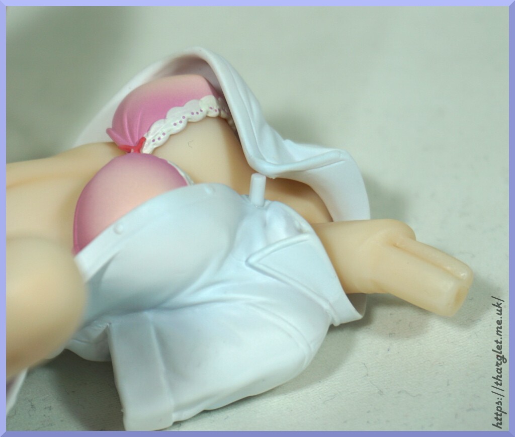
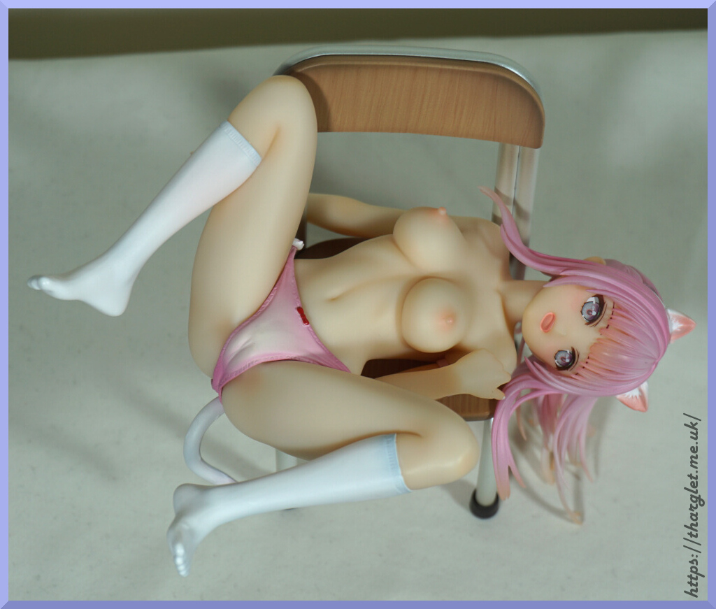
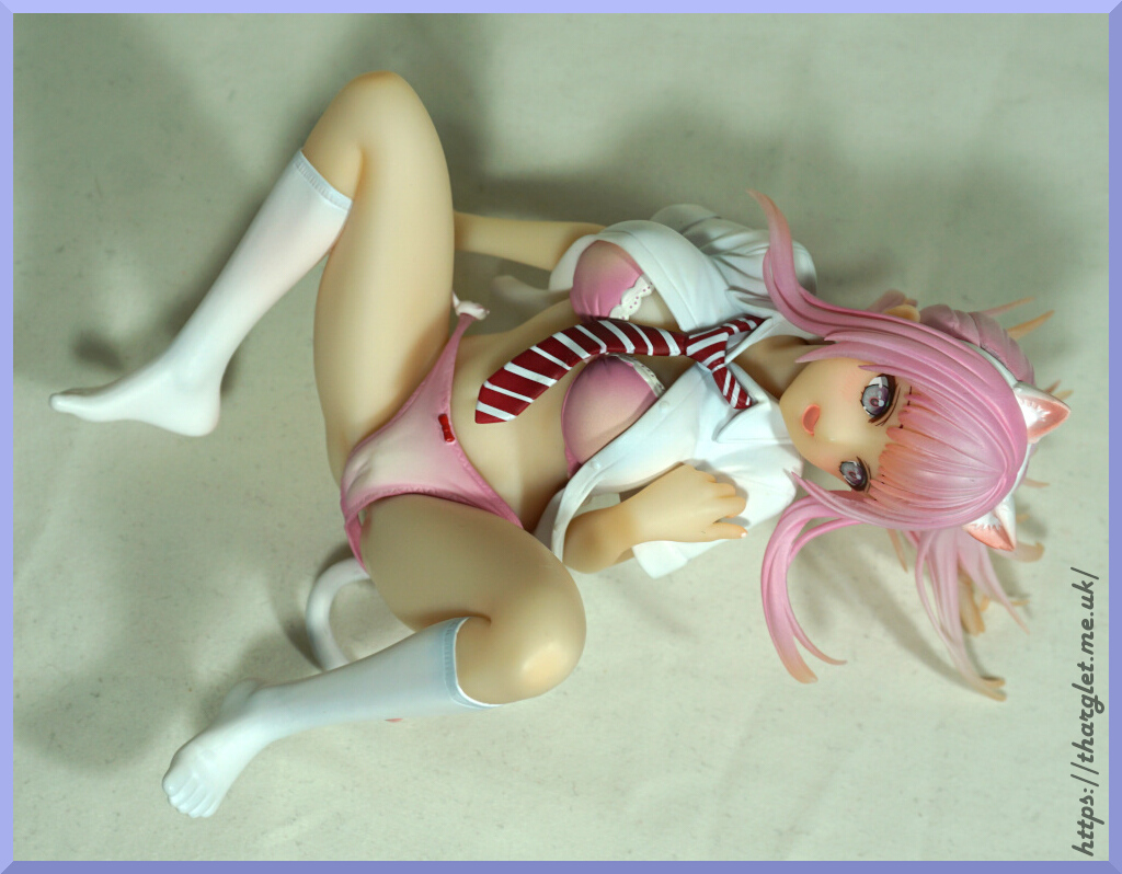
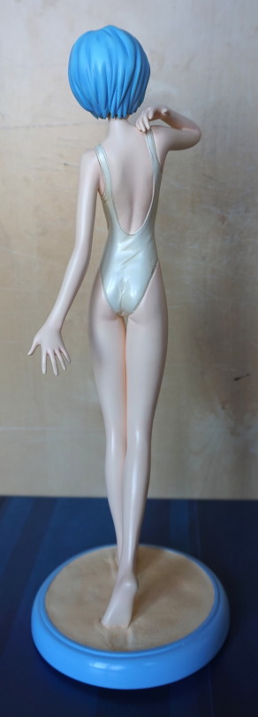
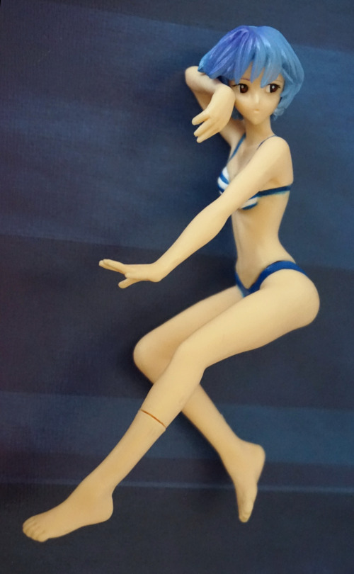
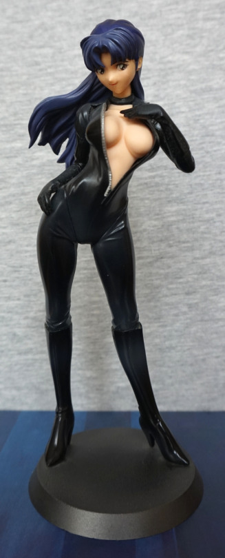
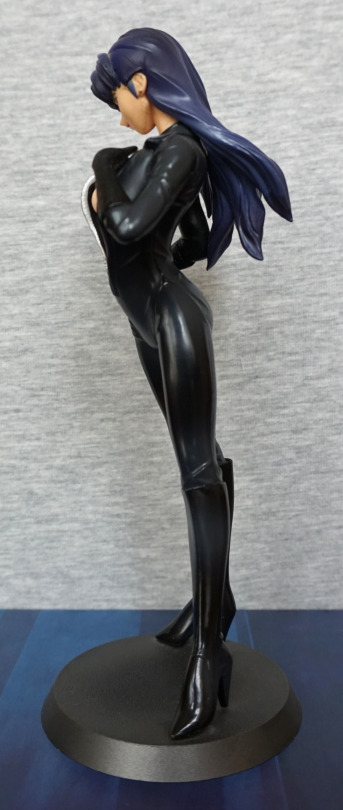
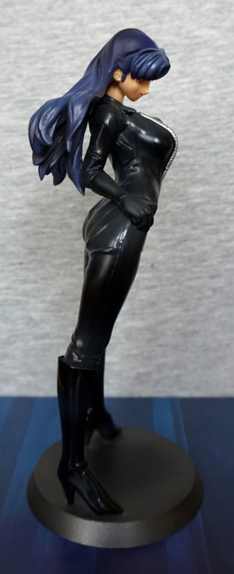
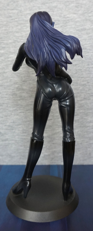
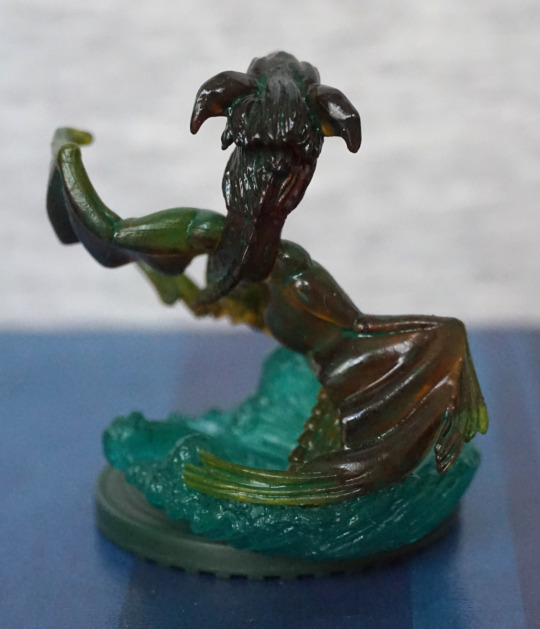
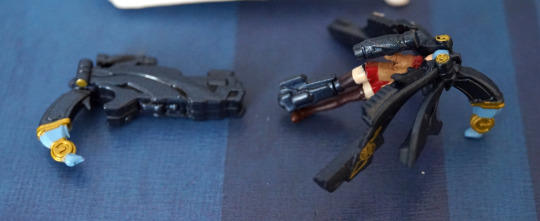
This figure was purchased from a seller on MFC. This figure has a cast-off option, but I have not cast her off.
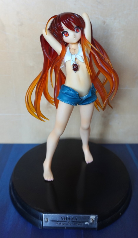
For the cast-off option, you can take her shorts off and her top, but I have no wish to do so, as she’s a character that looks young and looks fine as she is. Japanese stuff can be weird – you have characters that look old with young ages slapped on them or vice versa. Sometimes in translation, ages are changed to be more suitable for non-Japanese audiences, to make it less weird and less awkward for us :P. Due to this, I largely go by what I would guess the age to be.
Her necklace is a strand of copper wire by the feels of it, which is a nice touch but also awkward to move around/pose. My favourite thing about this figure is her hair – I love the colour and the translucency.
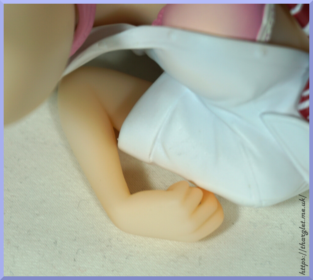
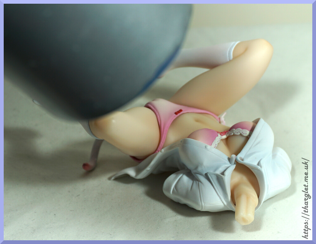
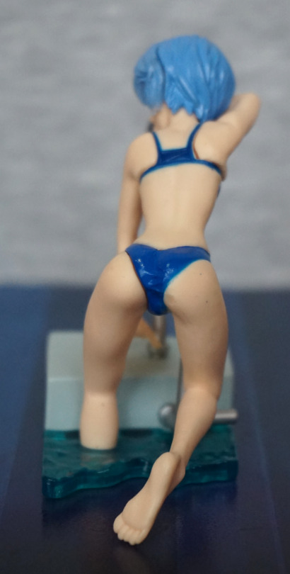
Here she is from the back:
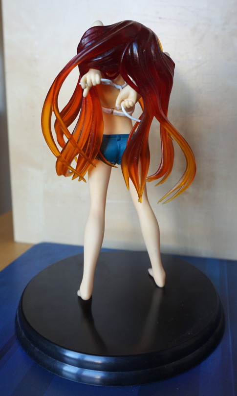
Here you can see where the top disconnects – it’s not particularly hidden. The hair has some dust stuck to it, as it has the plasticizer issue. I did consider cleaning this, but it is leaking some dye, so going to leave it until it’s noticeably dusty, just in case a sizeable amount of dye does decide to leave. She lives in a Detolf though, so not much dust lands on her.
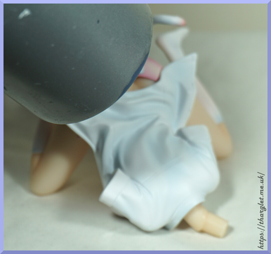
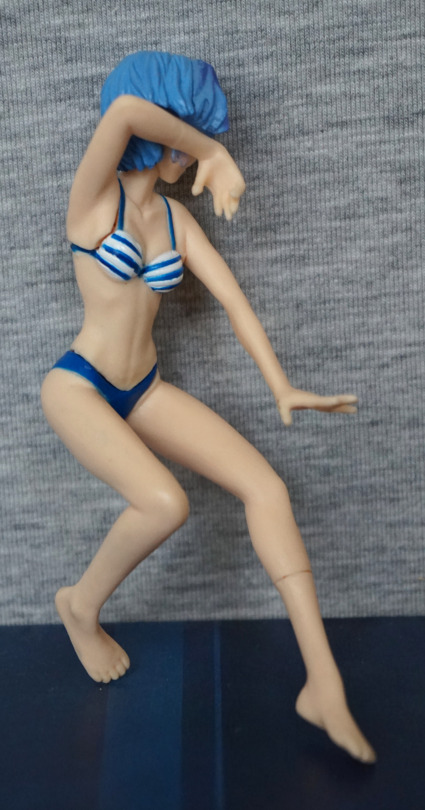
Here’s a side shot:
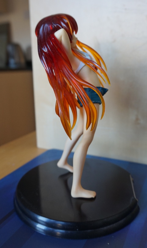
She leans back quite a bit in her pose.
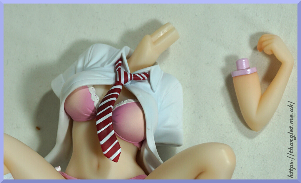
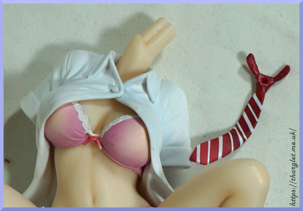
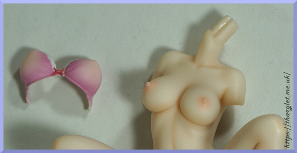
She has a quite striking appearance, which is what attracted me to the figure. She’s not in the greatest condition, but I did pay a reduced price for her. There was one visible flaw, where her midriff was a bit loose, but that was fixed with some paper down her pants.
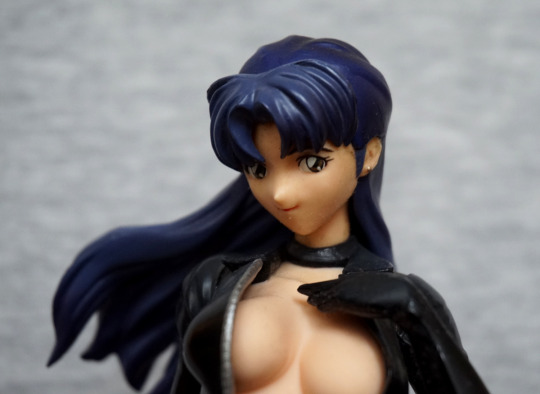
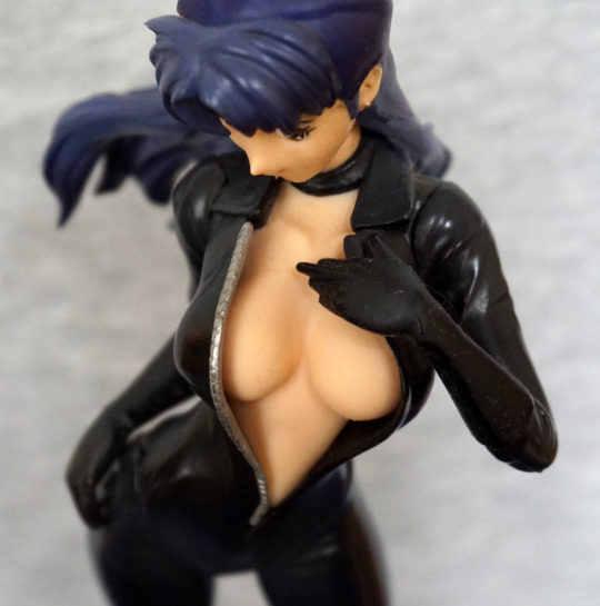
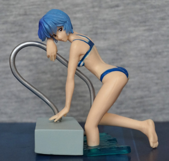
Time to get back to a Japanese figure, and what better than Evangelion?
Here we have Kaworu Nagisa, in prize figure form:
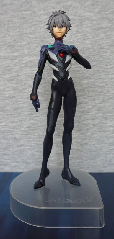
Lookin’ tall as Kaworu does. I like his pose, and feel it suits him well. I also like his plugsuit, as they’ve given it a good amount of depth. With the way this figure has been designed, the parts of the figure have nice, crisp lines. I like the clear base for its neutralness.
Face:
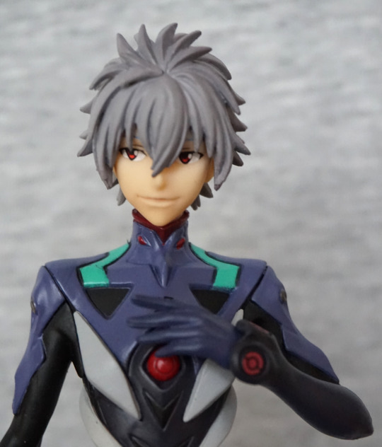
The hair is well-sculpted and his face is decent.
Left:
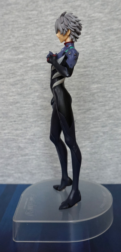
He’s leaning forward slightly, which adds to his pose. I love the slender body shape, and the hair looks decently detailed from this side too.
Right:
There’s some good detailing on his arm – the upper light-blue part has some good sculpting details to it, along with the grey parts. His backside has a nice shape to it from this side too.
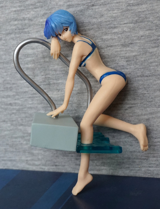
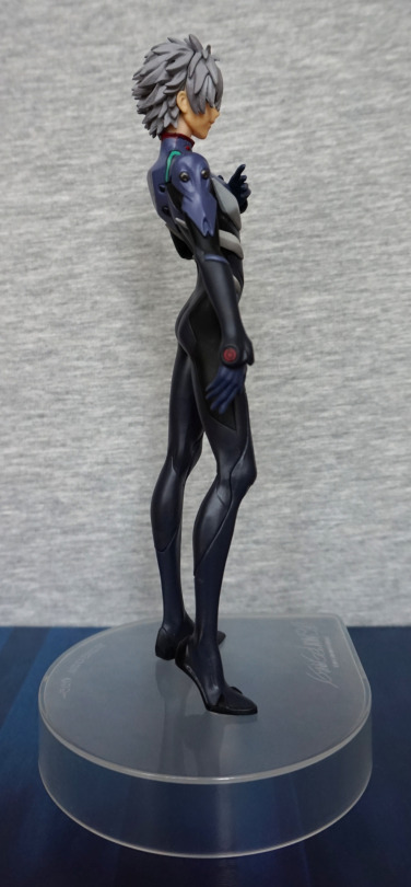
Back:
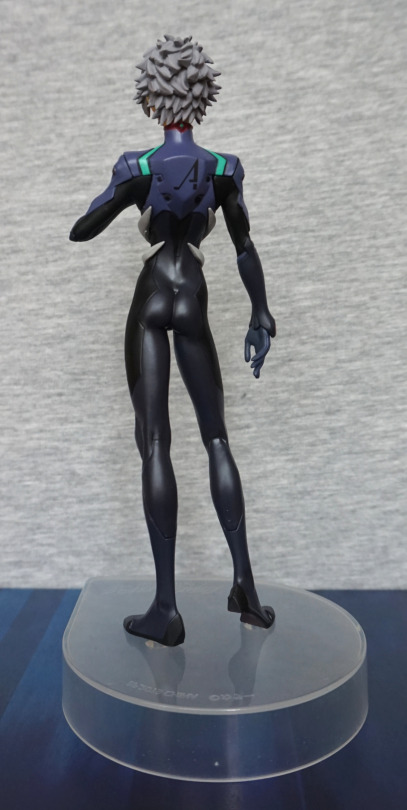
Hair also looks good from the back, and his backpack looks the part, and the print is well done here. His body feels slender, without being overly so, with some shape to his backside… very form fitting suit :P. Love the finish on the darker parts of the suit.
Base:
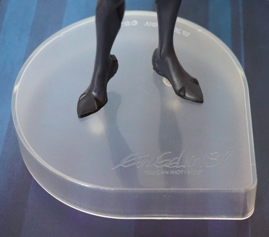
The base features a logo to say it reflects his 3.0 design. The shape of the base is mildly eye-catching, being a bit different than usual. For me, I’d prefer the base to be a little less tall, as he’s a fairly tall figure as-is.
Overall, I’m happy with this figure, and am happy to add him to my army of Kaworus. Looking up close, you can see some of the hallmarks of a prize figure, but overall I think he’s a decent quality and would recommend.
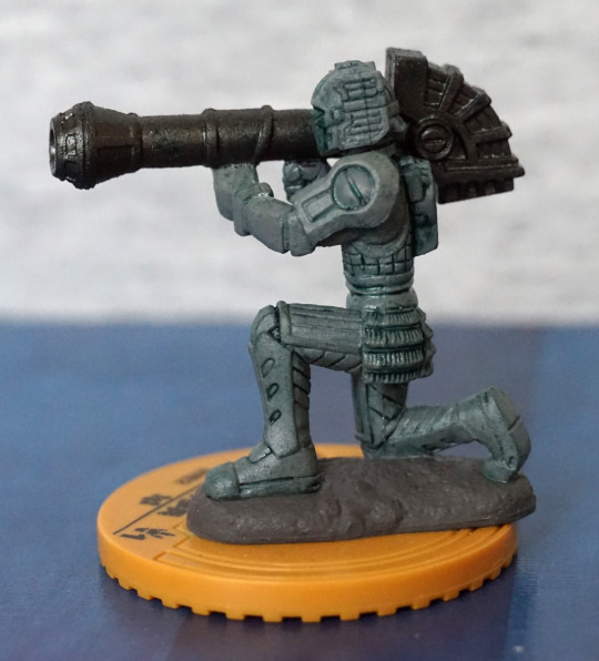
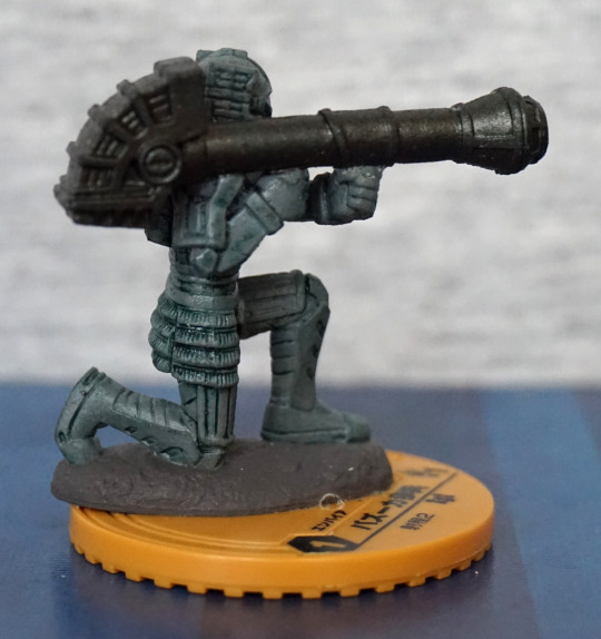
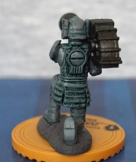
This is the fourth and final part of the Battle Break figures. Let’s see what the last few boxes bring us!
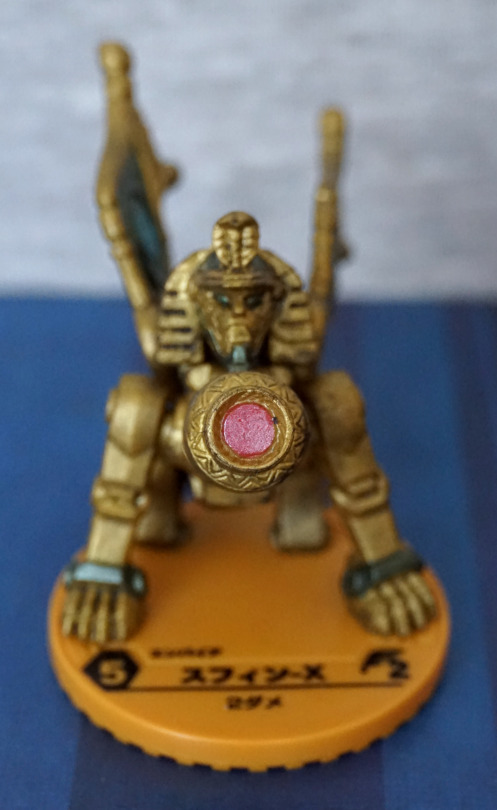
Here we have a Sphinx, Spin-X (スフィン-X):
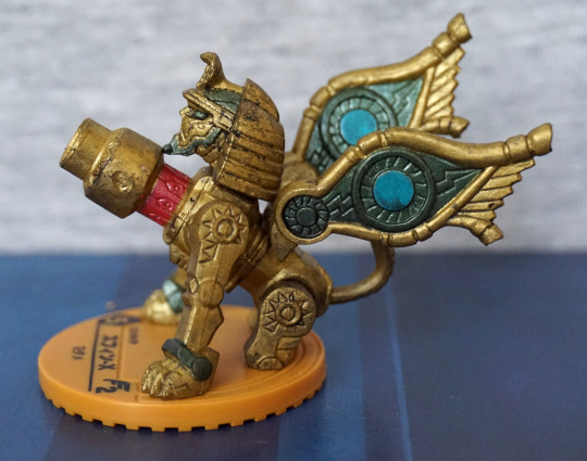
Robo-sphinx! I love the design of this one, and he’s nicely painted. Looks like some of the green may’ve smudged a bit onto the middle of his wing by mistake. The colours work well together, and fit the Egyptian theme.
Front:
Here his front is dominated by a large cannon. I like the ornate design on the end of it.
Back:
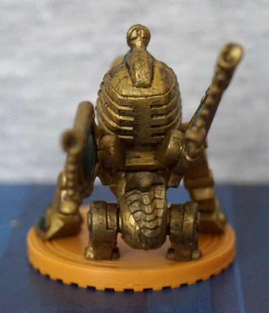
The bottom of his back looks a bit odd, with the way his legs are attached to it, giving to a strange, bulbous look. Back of his head looks OK.
Ranch Lizard (牧場トカゲ):
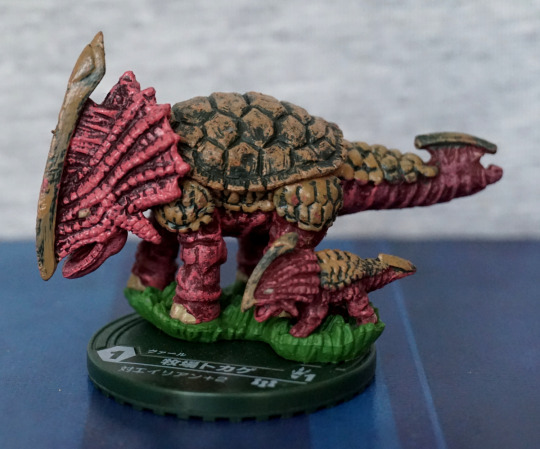
A big one and a little one, aww. The overall design is reminiscent of a triceratops. The sculpting is decent, and the colour scheme works.
Back:
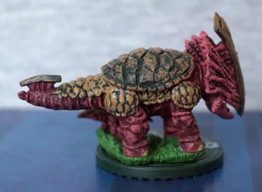
More of the same. Paint looks OK for teh most part, but could do with a bit more dark paint on the brown part of the tail.
Head:
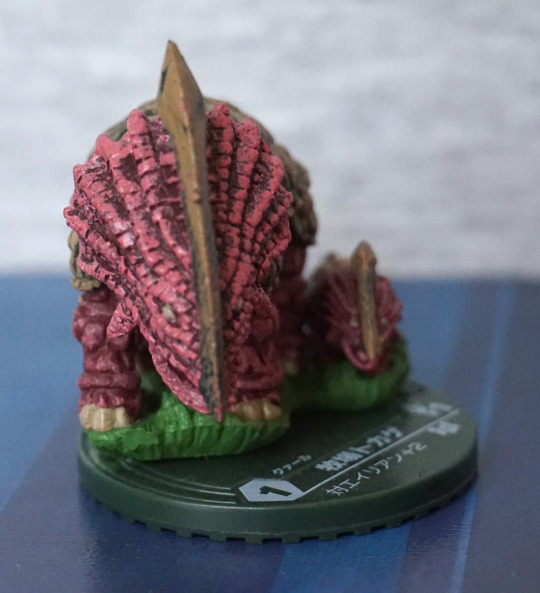
Yup, don’t want to have this guy headbutt me. Thinking that’d hurt with that chitinous protrusion.
So, if you’re a rancher, this is apparently the lizard for you!
Adams! (アダムス):
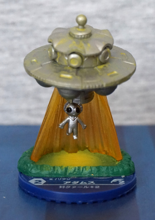
And now for something completely different… an alien beaming down! Loving the classic alien design. The colours work well together, and the sculpt is decent. This is probably one of my favourites.
Side:
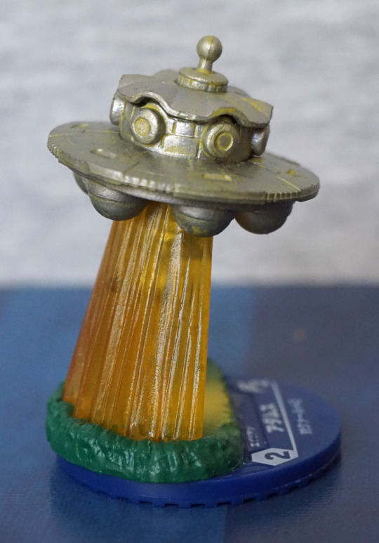
Here we can see the beam is translucent, and can just about see the alien through it.
Back:
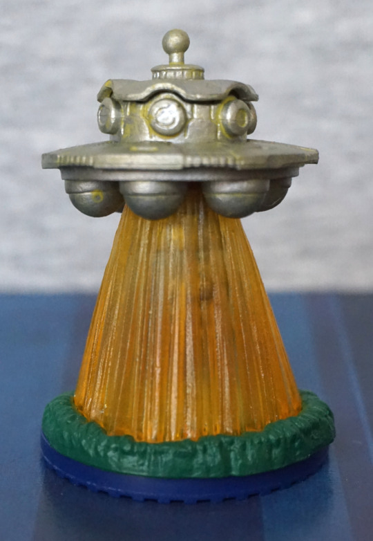
If you just want an alien craft beaming something down, this is the view for you. I think this figure has been well-sculpted and painted.
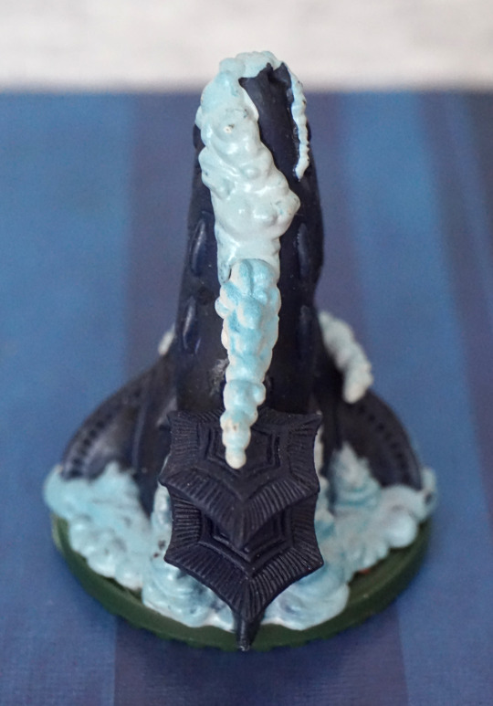
And lastly, Waterline (ウォータリアン):
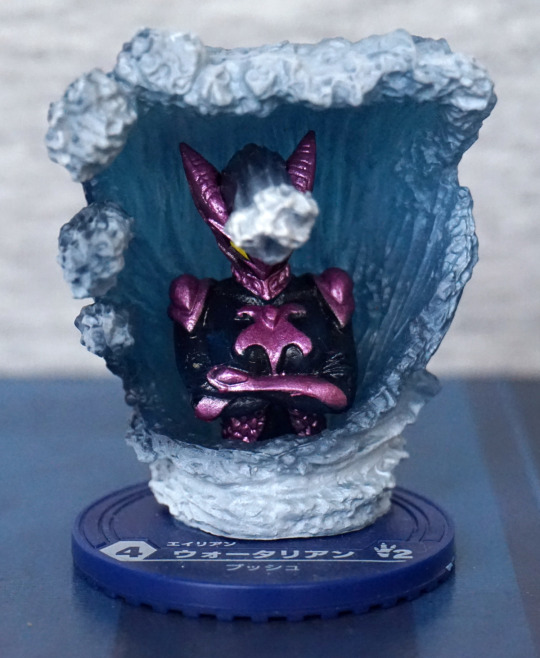
Here we have a water-based dude, with water protruding from his head. I like the colour scheme on this one too, and the purple parts seem to have been painted neatly on this one. The water on this one is a lot more effective than the foam stuff on the Horse Whale, and wish they went for more of this look on the Horse Whale figure.
Side:
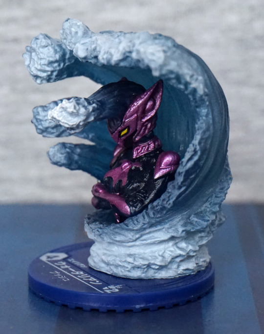
I like the design of his armour, and his watery hairstyle. The wave and foam have also been painted well, and it does look like a cresting wave.
Back:
Yup, looks like a wave back here! Not too much to see, but the sculpt and paint are nice. Overall, I really like this one, but he is a bit hard to display so you can see him well due to the wave surrounding him.
With this set overall, I’m pleased with what I got. Some of the figures aren’t that great, but I think there is enough inventive designs here that they work as display pieces as well as game counters. Could also see these being re-purposed for another board game, if these characters fit the theme.
Three more figures from the Battle Break set.
Starting with Horse Whale (ホシクジラ):
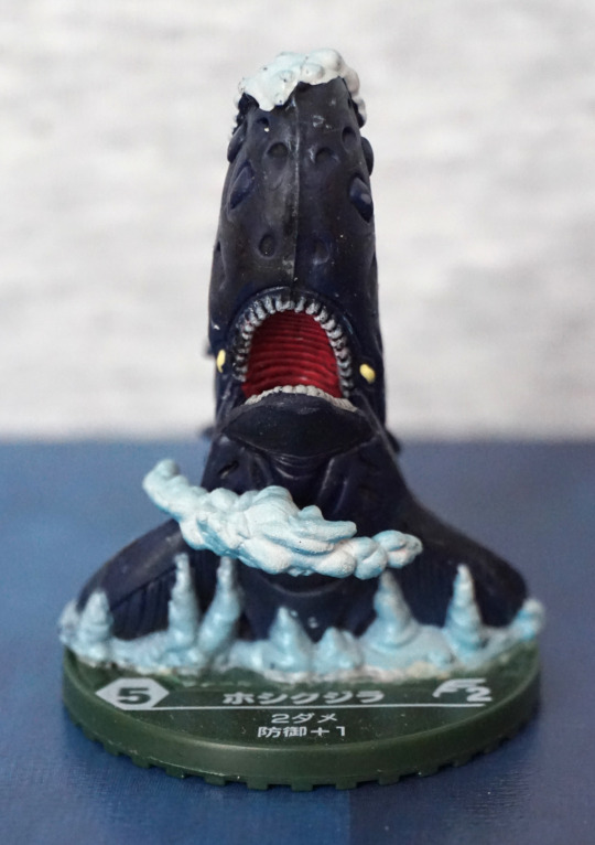
Yep. You read that right. Apparently this is a horse whale… Does look like a whale from this angle… but I’m not getting horse. There’s some foam added to the figure, but it looks more like clouds or ice formations.
Left:
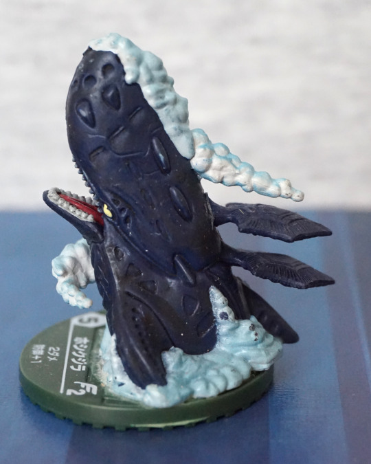
From the sides, it definitely looks more like a squid-whale than a horse-whale, with the squidlike appendages on its back. The foam has some pretty weird dark blobs on it, where it looks like the paint was incorrectly applied, which I don’t like. The creature itself has a nice design though.
Right:
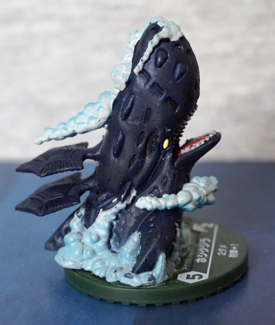
I think the foam looks better on this side, but is still kind of ropy, and I’d prefer if it was waves instead of seafoam. The slots on the upper part of his head make it look like it might’ve been crossed with a submarine, and the regular spacing of the elements give it a machinelike feel to me.
Back:
I like the patterns on the finlike protrusions on its back. Foam still looking kind of “eh” to me. I think the solidity of it is what ruins it mostly – if they used transparent plastic here, I think they could’ve achieved a better effect that wasn’t so solid. For a cheap figure it does the job, though.
Overall, I like this one, and do like the creature’s design, but not so fond of the added parts.
Crow Teng (クロウ・テング):
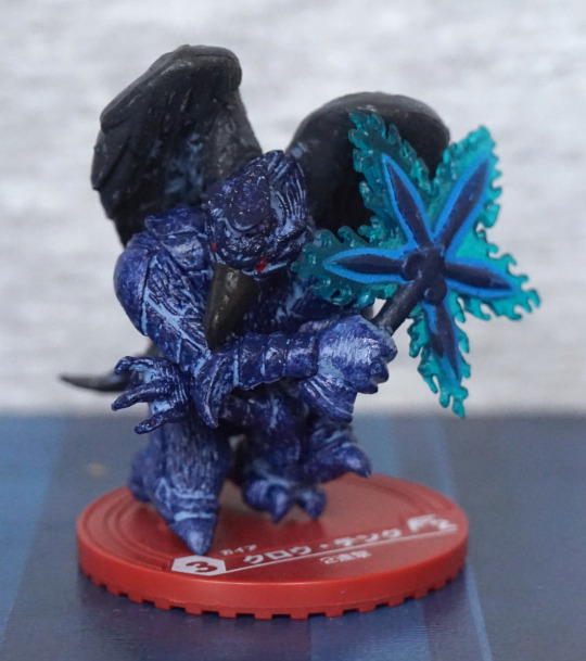
Here we have a not-so-black crow. Which made me thing “eagle” prior to translating the name. Here we have an interesting battle pose, and a wandlike weapon, which makes me think this dude is a caster. Whichever, he’s a mean looking-dude.
Right:
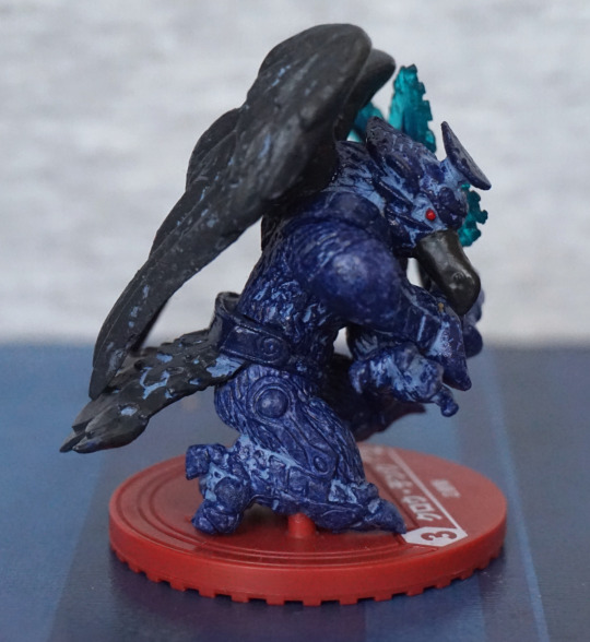
I like the sculpted texture on his body, but I think they’ve been a bit miserly with the light blue paint here, and it doesn’t highlight some of the key features, which makes look a little odd overall. I think the part on his leg could’ve been directly painted, instead of giving him a wash, and it would’ve improved the overall appearance. He does have a red beady eye, which is a nice focal feature.
Back:
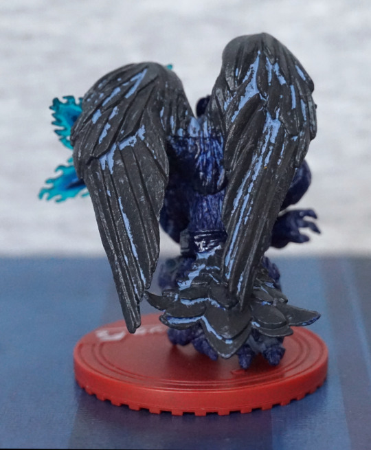
Looks like he’s had a run-in with a tin of paint. Here the wash is VERY sloppy, and I kind of wish they didn’t bother. Makes it look like a statue in disrepair instead of acting as highlights.
From the front, this a nice looking piece. From the other angles… not so much.
Killer Panda (キラー・パンダ):
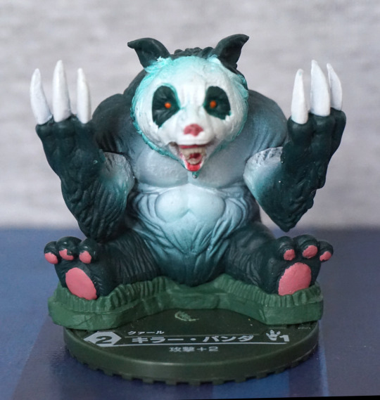
Vicious and cute. The colour scheme isn’t really befitting of a panda, but I do like the paint apps. The fading has been done well on his body, and most of the painted highlights are done neatly. They’ve even given him some grass to sit in.
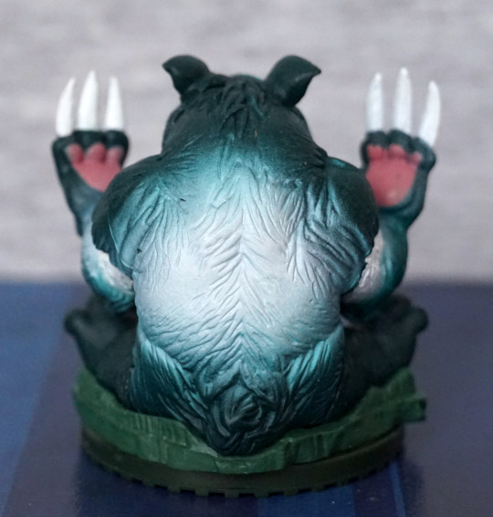
Left:
Paint between his parts didn’t get blended… oops. Looks a bit derpy from the side. We also have some paint chips, which aren’t great.
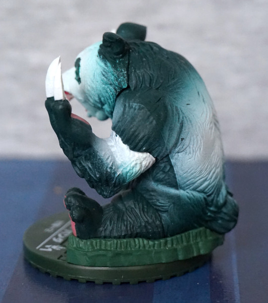
Back:
His palms have been painted to match his feet, which works well. Faiding is done well on the back, so he looks good from this angle too. Just a shame about the paint chips on the left.
Overall, he’s not a very inventive character, but he is well-executed, apart from some paint issues on the sides.
More Battle Break figures!
First one for today is One of Nine (ワン・オブ・ナイン):
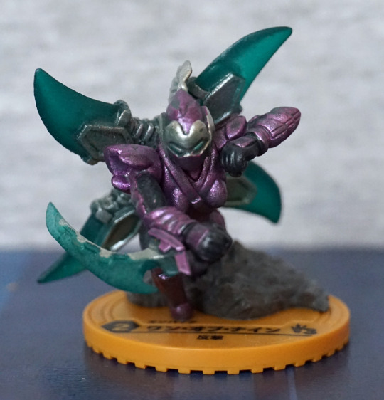
A little ninja dude! I do like the purple-green colour scheme, and he also comes with a small piece of scenery. The painting looks OK from the front, but you can see some parts where they are a bit rough.
Top-side:
Here, I think the grey parts of his helmet are likely intentional, but there seems to be a scuff on his shoulder, and uneven application on the outstretched arm. Arm blade looks decent though. His helmet has a suitably techno-looking plume on his helmet.
Left:
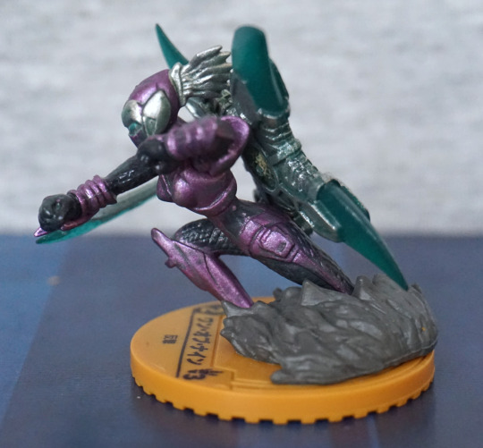
I do like the way they’ve got him running and leaning forward. Does make for an interesting pose. Here’s some more uneven paint though.
Back:
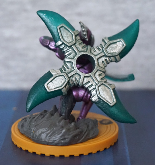
His back is dominated by this ludicrously large ninja star… Not sure what he intends to do with it, but it does look cool! The sculpting and painting is nice on this part though.
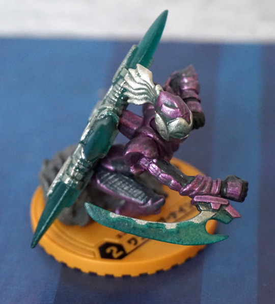
Bazooka infantry (バズーカ歩兵):
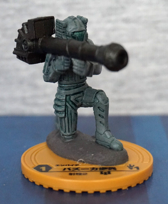
Fairly straightforward… a dude with a bazooka! Looks almost like some kind of golem, with him painted in green.
Sides:
The sculpting job is nice, and the paint job is decent.
Back:
The design of his suit does also give weight to him being a golem/stone warrior – the screwlike part makes me think more golem than human.
Imo, he’s an OK figure, but not very interesting compared to the others in this set.
Aiai (アイアイ):
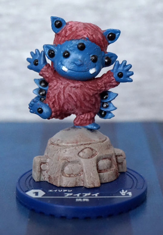
I love this cute dude… and certainly lives up to his name, with all the eyes… wondering if it should be translated as eye-eye. Whatever, he certainly has an eye on you! The colours work well together, and the painting is mostly decent, though there is a bit of wandering paint on its hair, in the middle.
Back:
No sneaking up on this dude! Big bit of stray paint on his lower left ear. Colour scheme feels well-balanced from the back too, and he is nicely textured in the sculpt.
Rather like this little dude. Don’t think he’s my favourite, but definitely like him more than some of the others.
and Another thing I added to an order on a whim – it worked out as £10.63 for 15 mini-figures
(would’ve been slightly less if the retailer didn’t screw with my order…), which is pretty cheap. These figures are supposed to be for a board game called “Battle Break” but isn’t something I’m going to play.
Looking at the sides of the box, there were 17 possible figures, and I got 13 of them, which is a good innings for random-boxed items.
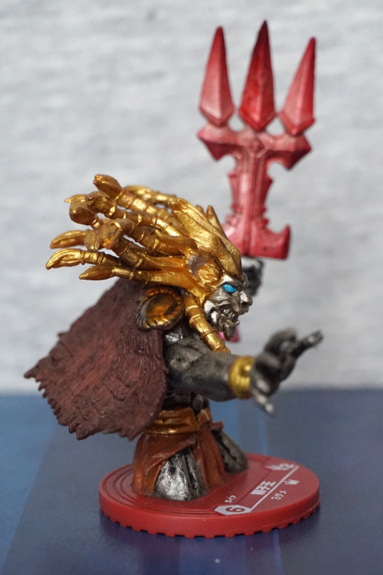
First up, Lion King (獅子王):
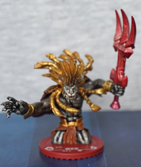
This is the guy on the front of the boxes, and he does indeed look spiffy, though he does lack lower legs and feet. I love the hair and mane parts, and I think the colour scheme works well.
Side views:
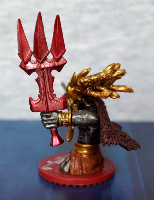
Ah, silly-sized weapons… gotta love ‘em. I think the design is pretty inventive, and I like the claw theme, which fits with he character. Here we get a good look at his hair, and I like the way it is sculpted. The eye adds a nice contrast to the rest of the figure.
Back:
I do like the texture on his cape – has a rustic feel to it. Almost like a thatched roof type-thing.
Overall, I think this miniature is nicely sculpted and painted.
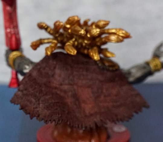
Leviathan (リヴァイアサン):
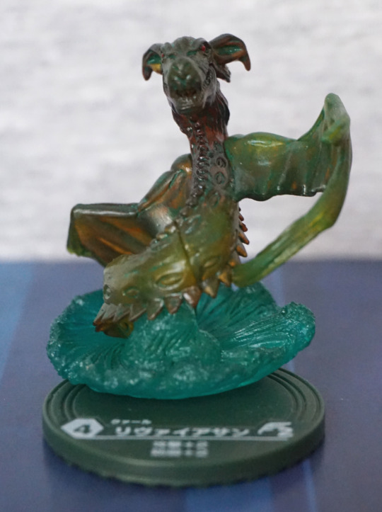
Here we have a green semitransparent dragon-y dude. I like the water effect included with this figure. What I like less is the super-obvious seam lines that don’t fit well. Not entirely convinced with the angles of his wings and head from this view. With him having a line of spikes on his stomach as well as his back, it makes it hard to notice we’re looking at the underside of his body here, which makes him look abnormally twisted until you look closer imo.
Sides:
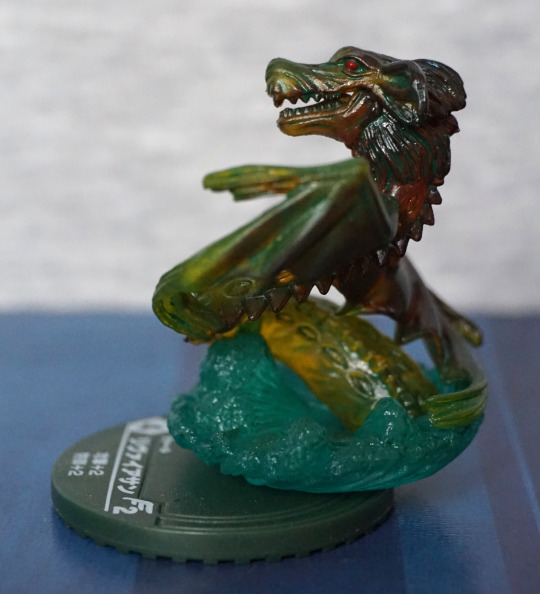
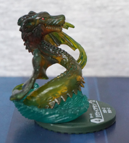
I really like the head of this figure – the shape and colours both look nice. There is a seam line on his head, but it is a lot less obnoxious than the one on his body and the wings. The translucent effect works well when viewing his right-hand side.
Back:
Here I think his pose makes more sense. The coloration looks better on the back of his wings, but we do seem to have some of the sea colour creeping through on his right one.
Overall, and OK figure. Not my favourite.
Lizard Magician (トカゲ呪術師):
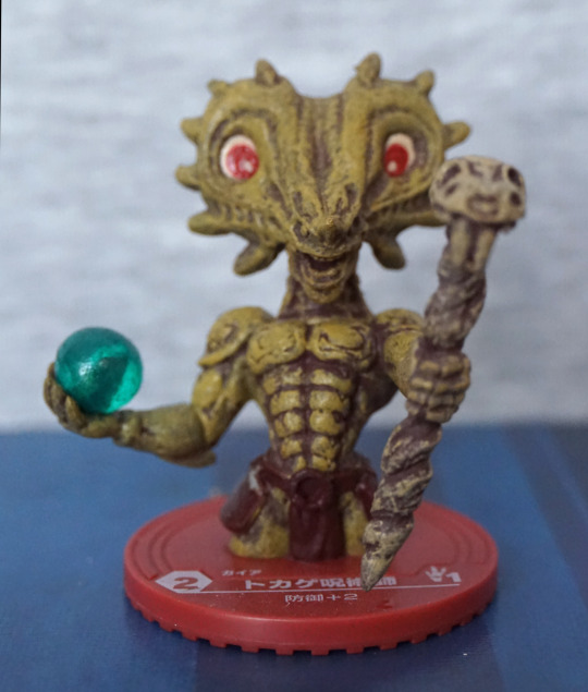
Not a big fan of this brushed shading effect, but his sculpt is OK. The colours work, but aren’t anything special to me. The green ball came out well imo, and I like the design of his head.
Back:
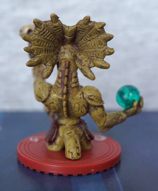
Here we have a decent amount of sculptwork, though there seems to be some missing lines on his tail – we have indentations on the right, but not the left which looks odd. The back of his frills is nicely rendered though, and so is his spines. The other details are a bit “eh”.
Overall an OK figure, but I don’t feel it’s anything special. Fine for Poundland fodder, lol.
This figure was gifted to me by a friend. He posted it to me, but didn’t put a note with the figure, so I was confused for awhile, wondering when I ordered a mini-Groot figure until I worked out this was the gift he sent me :).
So let’s have a look at the li’l guy.
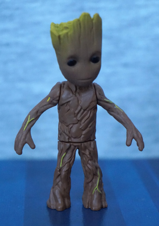
MetaColle figures certainly live up to their name – for his small size he’s pretty weighty because of it. This figure is nicely painted, for its size. The fade on his head is nicely done, with some green detailing on his body.
The gaps on his body are because he has articulation in these areas. So you can pose him a bit too!
To give an idea of size, here’s a promo shot:
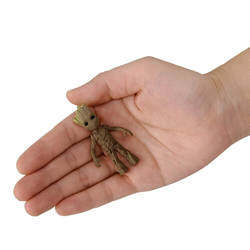
So he’s not too far off the size of the Nano metalfigs, for things to compare him to.
Left:
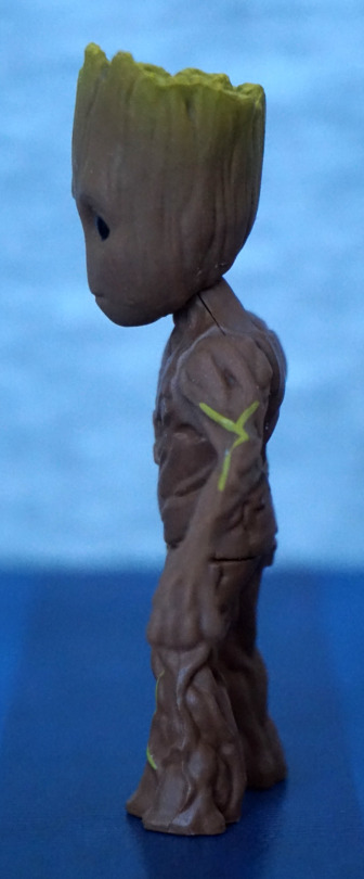
I like the sculpting on him – the wood effect works well. The blended paint on his head works well from this side too.
Right:
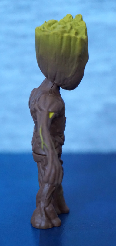
From this side we can see he has got good detailing on the top of his head, as well as the sides.
Back:
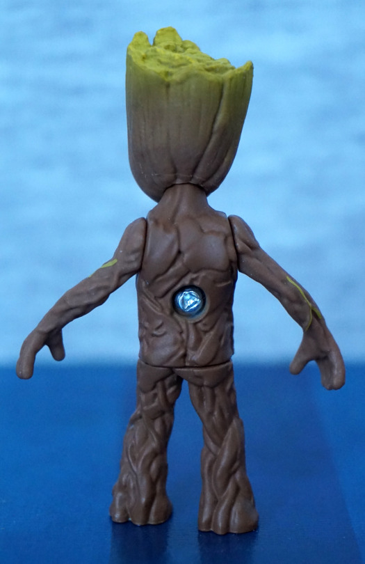
Here’s the only drawback as far as I’m concerned – he has a visible screw in his back. Would’ve been nice to have a plug or something to cover this up, but I don’t think it’s a big thing for what you get.
Overall, I really like this little figure, and think he’s a decent quality figure. These figures have an RRP of ¥1,000, though if buying direct from Japan they’re usually around ¥800, which I think is a fair price point for these figures.
This is yet another figure I bought because I thought it looked good… It was on sale dammit.
So, here she is:
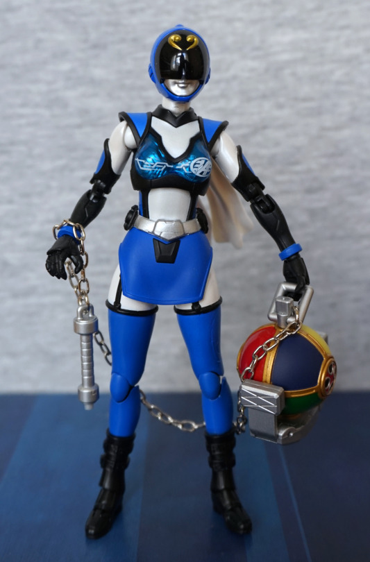
Loving the blue shade and her outfit, and the interesting range of accessories she comes with, that I have little idea about… Reading about her, she’s from a parody series, so I wouldn’t be surprised if they produced more of these than tokusatsu parody fans. In terms of a figure, her outfit isn’t very detailed, but this does give her a stark and clean appearance. I do like the shiny breastplate and the cool-looking helmet she’s wearing. However, her paintwork is flat and without shading, which puts her out of premium figure territory.
Left:
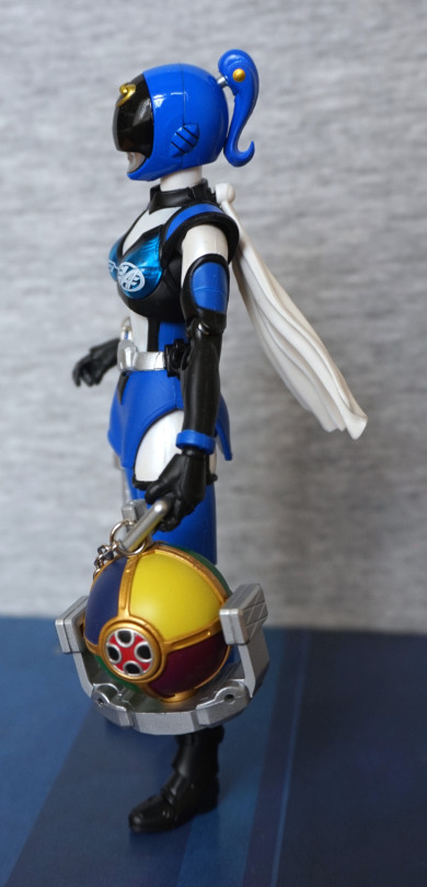
She looks fine form the side, and has a couple of details on hte side of her helmet. She also has a ponytail thing going on, but it’s not hinged. Don’t try to do so, lest you want to break this part – the gold dot is just for show. The paint lines seem clean throughout – especially on the ball accessory… which I like to think of as a multicoloured bomb…
Right:
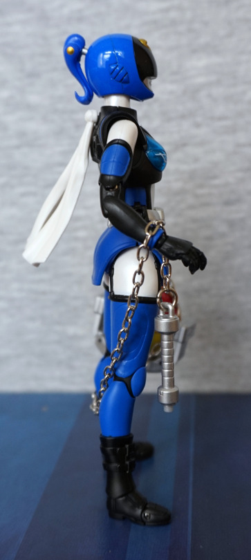
More of the same on this side. A double-jointed elbow is visible, without much to hide it, so it does look lumpy. We can also see the ribbon thing she wears on her shoulder – I like the way they’ve sculpted this so it is flowing in the breeze.
Back:
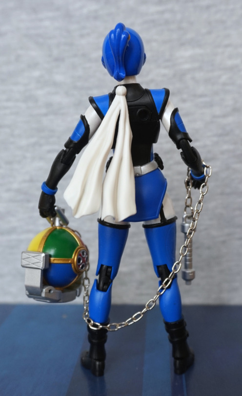
The sculpting’s nice on the back ribbon, but there isn’t too much detail here to speak of. There’s a couple of holes in her back – you could probably attach an accessory in here, or a stand. There wasn’t one in the box, but 3mm peg stands aren’t hard to come by. Was disappointed with the lack of stand, but she does have articulated toes, so she’s not too bad to balance. You can also use the accessories to weight her, if needed.
In terms of accessories, she does have a decent range of stuff. One that I managed to not photograph is another ribbon – it’s very similar to the one shown, only it’s more like one half of the ribbon shown, if you want less ribbon for posing.
She comes with these guns:
I love the overly large “armed” mode this gun has. I guess this is for when the battle gets super serious. Both guns are nicely sculpted and painted, and would make great accessories for any figure they fit with.
She also comes with many, many hands:
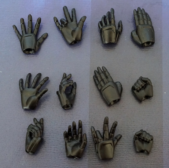
So if you need a certain hand pose, it’s probably in this lot! Always nice to see a range of hands, as it gives more posing opportunities, and especially useful for her, and the several things she can hold.
Overall, I think she’s a decent figure, but probably not a popular character, hence her cheap price. If you need a random blue ranger for your collection, this one could possibly fit the bill. With the number of parts she comes with, she could be good for custom fodder too, if you’re basing something around a Bandai figure(s).
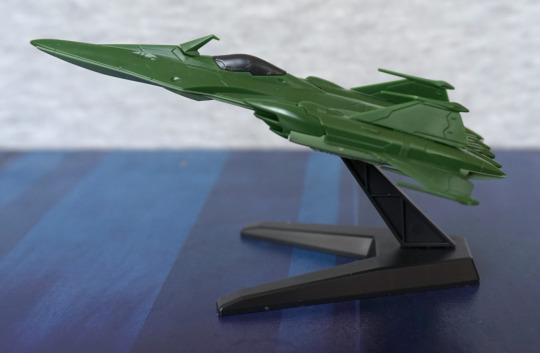
Now for a model kit! This is the Desura II Core Ship, with a couple of support fighters.
Let’s first look at the core ship itself:
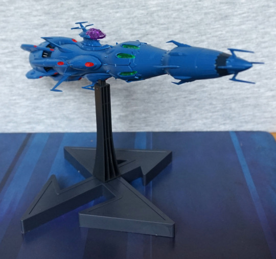
‘tis a long bugger. And spiky! If you hit it, don’t be surprised if you go “ow” and a part flies off. However, I do think it looks cool and worth the pain :P.
Building it wasn’t too difficult – the instructions were reasonably easy to follow, and the build process, from what I recall, was pretty smooth.
Left:
Here’s a side shot to admire it in all its glory. I love the profile of this ship, which is why I bought it… despite having not yet seen Battleship Yamato. It is on my “to watch” list, though.
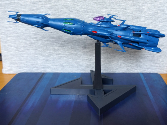
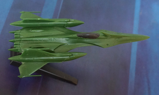
Now to deviate from my standard walk-around, and look at this thing from bow to stern.
So let’s start with the front end:
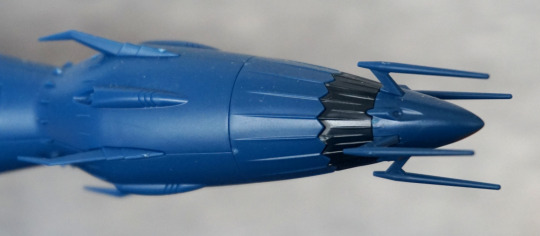
Here we have the stabby forward parts. The sculpting is nice on this model, adding details into what’s a largely plain-coloured vessel.
Moving further back:
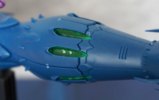
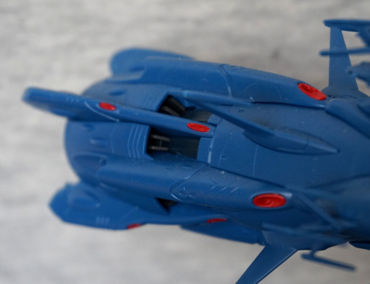
We have some clear parts here, which look nice. There are some transfers that you can add to these bits, to add a bit more detail, but I haven’t done so as of yet. I do like this bit of colour – looking at pictures of the ship from the anime, these parts glow. I could see someone modding this kit, so they could put an LED in this section, though I do believe these parts do back onto blue plastic, so it’d be a relatively hefty mod.
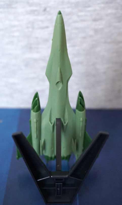
Cockpit area:
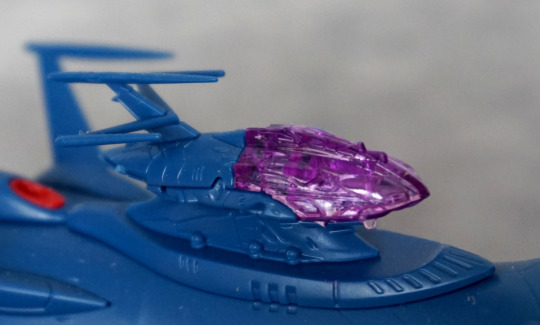
One thing that mildly disappointed me is this purple plastic bit doesn’t push up into a blue plastic “cutout” part, so if you want it to look like the pictures, you need to paint this part. Kind of a shame, as I don’t think it’d be too hard to render a part this could push up into. But if you’re not going for anime-accuracy, you could leave it like this.
Part below the cockpit:
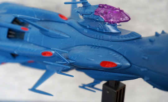
And these are the spiky bits that tend to spike you and fall apart. The vertical “M” part slots into the one that attaches to the ship, so it’s pretty easy to accidentally knock out. Have had issues with these when positioning the ship on the stand. I do like the red detail parts though.
Engine fins:
I do rather like this detail, and it has been rendered well.
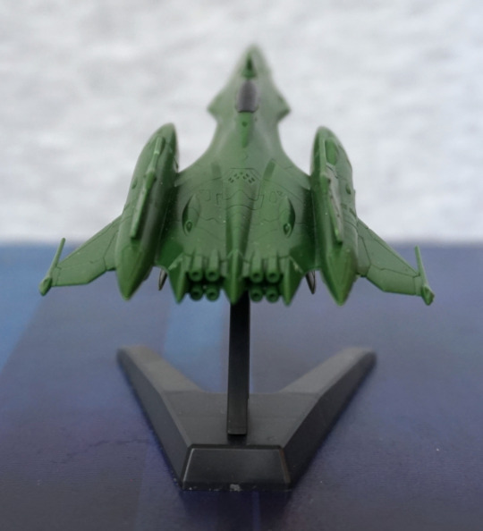
Back:
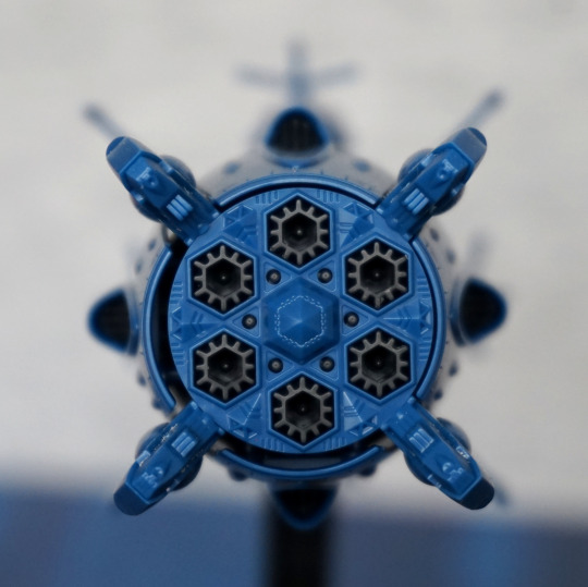
The thrusters look cool, and and I love all the little details back here. What’s less cool is two of the four fins you see here didn’t fit snugly into their slots and kept falling out. Ended up shoving a bit of White Tack onto the part that goes inside the fin, and that fixed that issue. So I’d recommend doing something similar, or glue these parts. I think the inner ring is supposed to help hold these parts in but… it doesn’t.
Base:
This is the logo for the “owners” (Great Garmillas Empire) of the Desura II… only apparently this isn’t the right way up for it. Ah well, I tried. Stand does a decent job of holding the vessel, but one of the prongs can foul on the base, so you can’t freely tilt it, but you do have a reasonable choice of angles for the ship.
And that concludes the main ship – I think it’s a cool model, and glad I bought it. Could do with some spots of paint, if I ever get around to painting anything.
Now for the support fighters:
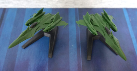
You get two of these, both identical. There aren’t too many pieces making these up, so they should be a quick build.
Quick tour of one of the fighters, as this blog is long enough already:
The mould has a decent number of details, so looks pretty decent unpainted. There are some decals that I haven’t put on yet, with the logo fro the Great Garmillas Empire. I think these are a nice inclusion to the kit, and look nice displayed flanking the core ship. One less-good part of the model is the spikes on the fins are easily bent, and this can happen when snipping them away from the sprue. Note one of them is a bit bent in the top pic.
Some of the bottom of the ship is in the dark green – this would be something ideally fixed with some light green paint, so it looks less odd. Depends if you display these with the bottoms showing or not.
Overall, I’m happy with this model kit, and I should really do some painting, so I can paint the odd bit on this one, as I think it kind of needs it. However, the moulding is nice on this kit, so you could get away with not painting it imo.