Month: July 2018

Black Lotus – Accel World – FuRyu

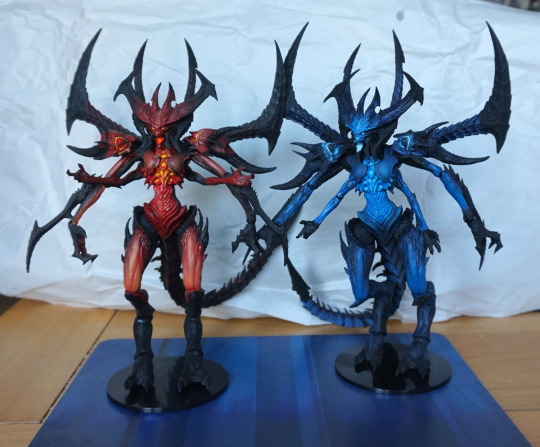
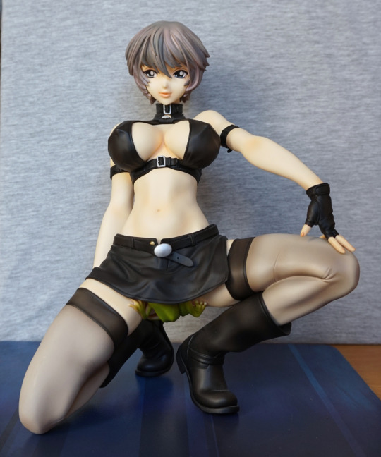
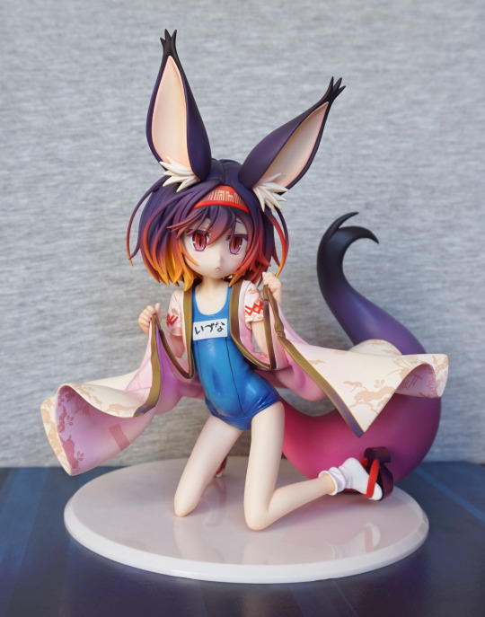
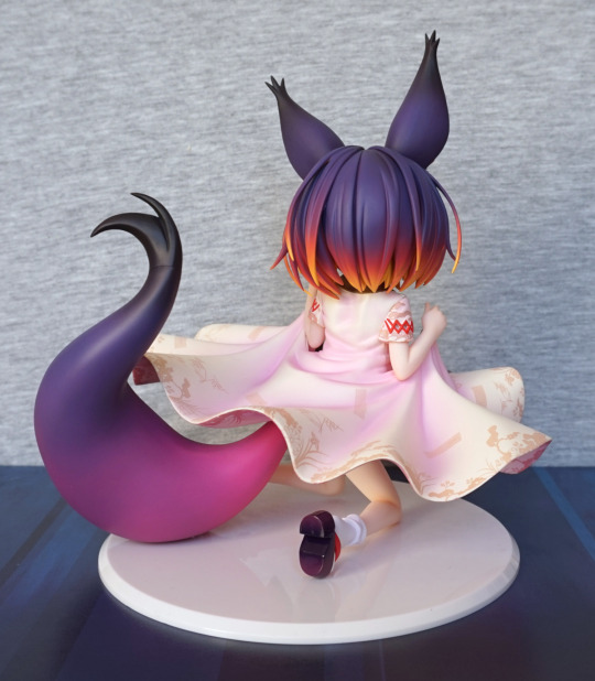
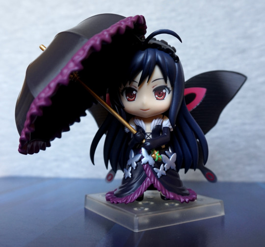
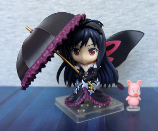
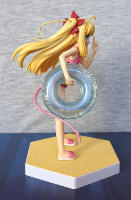
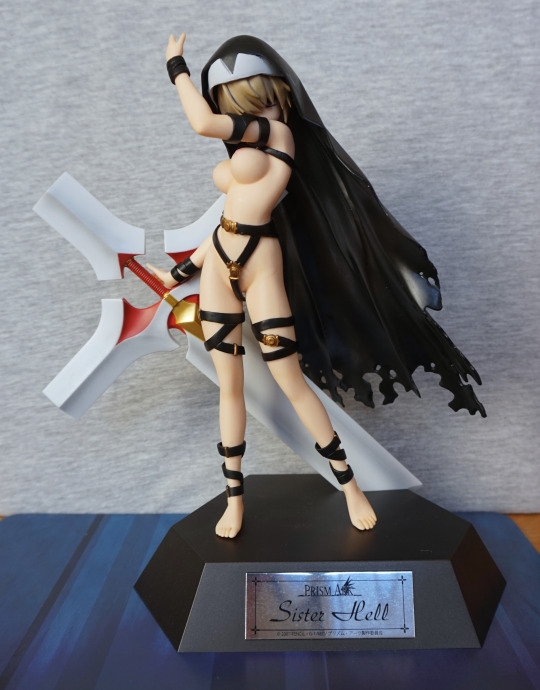
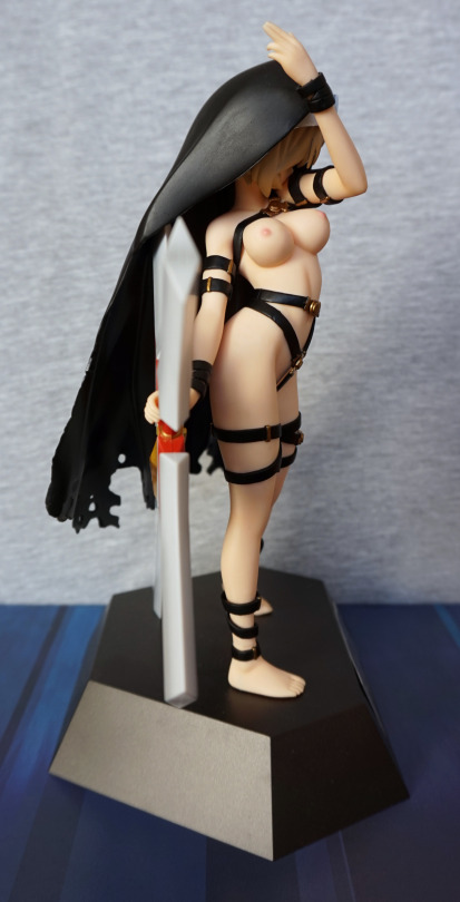
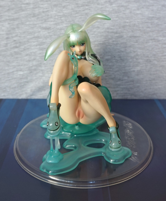
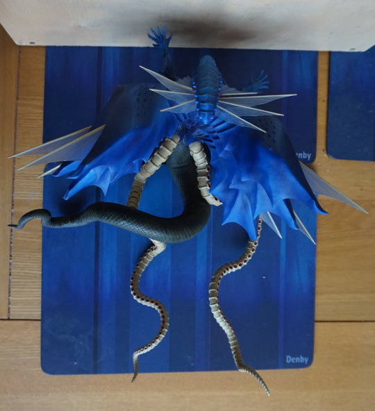
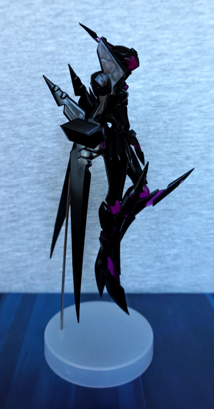
This was a figure I didn’t expect to see, so was really happy when I did. As it wasn’t overpriced, it was an instabuy. So here she is:

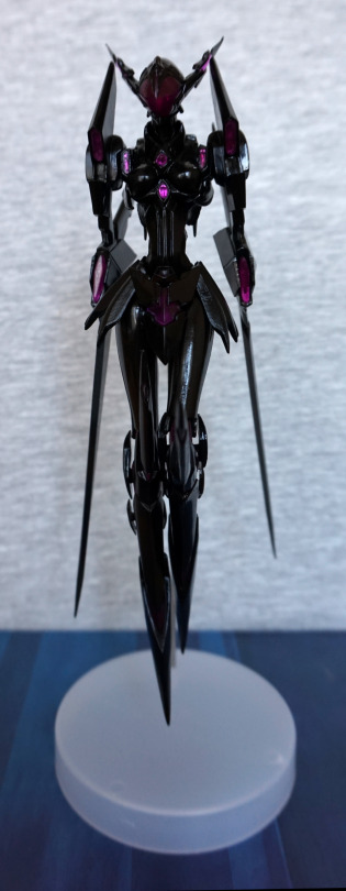
There aren’t too many figures of Kuroyukihime in her avatar form, so gotta buy them all :). According to MFC, I have all but two exclusive model kits, which are too rare for me to obsessively track down.

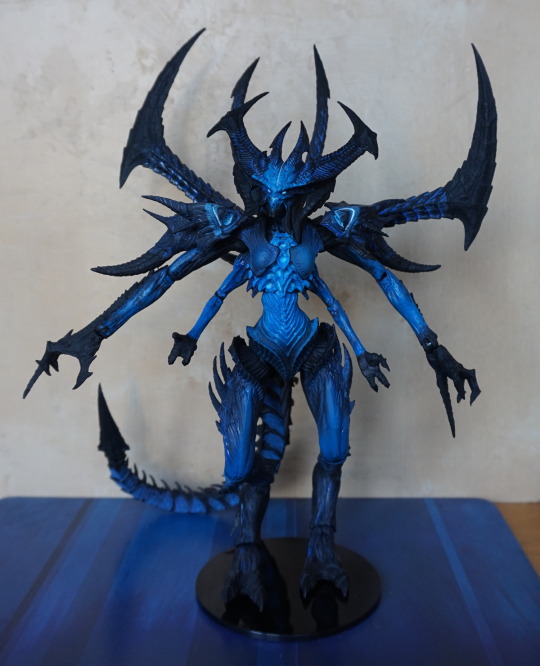
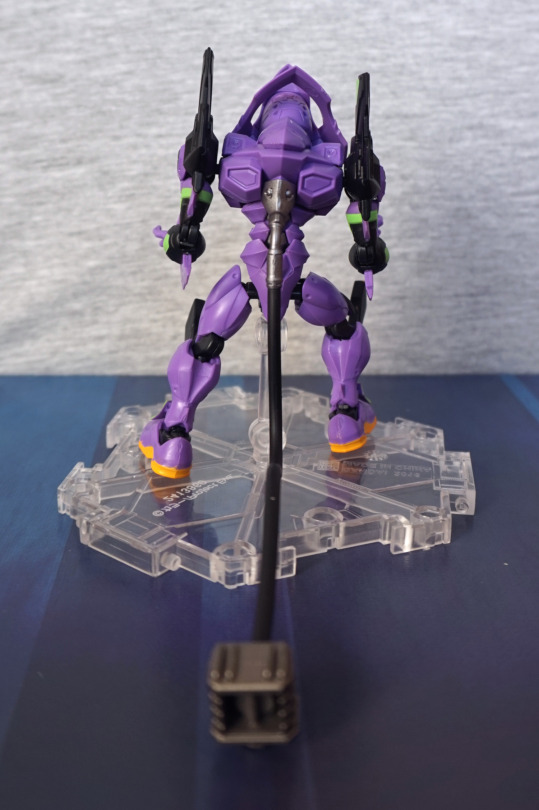
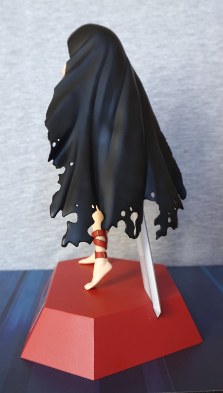
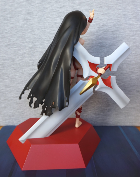
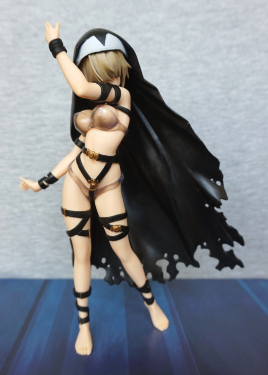
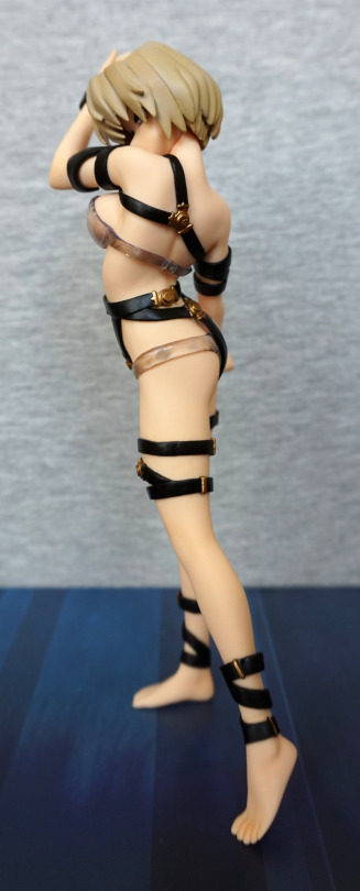
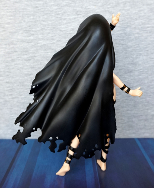
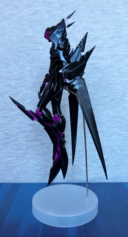
And, as usual, she’s a bit hard to photograph, with her main colour being black. Her finish isn’t too even, and being a flat colour, this is pretty noticeable. Not entirely a surprise though, as she is a prize figure. She is nicely posed though, in her battle mode.
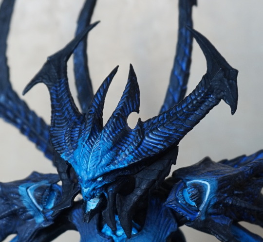
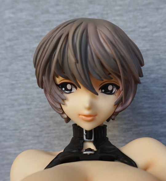
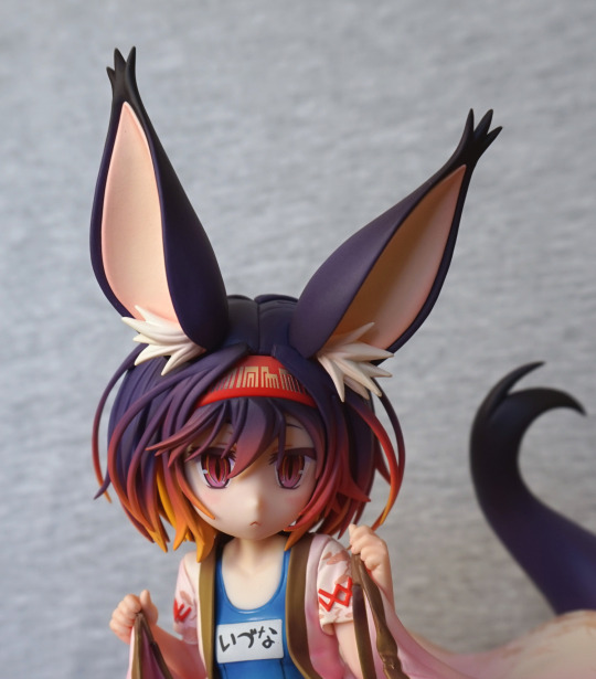
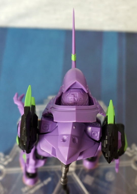
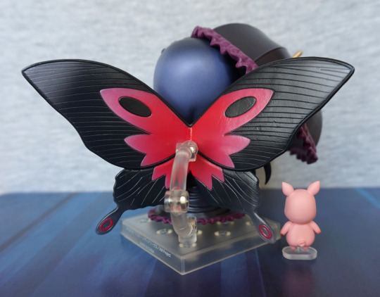
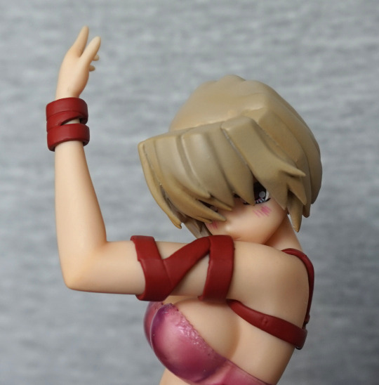
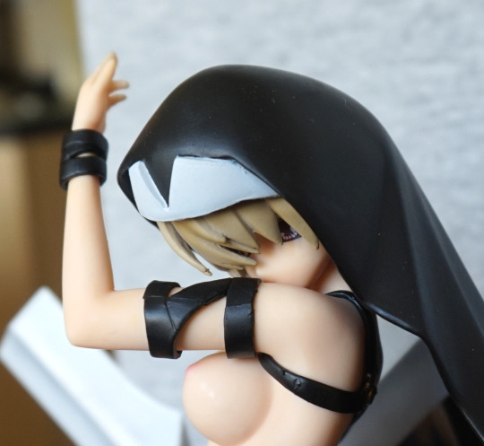
“Face” close-up:

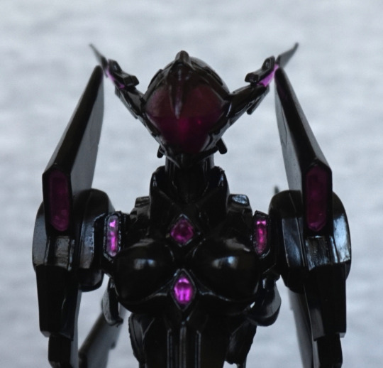
I love that they’ve added all her small, purple details in. The ones in the middle shine more than the others such as the ones on her shoulders. The mask is a nice shade of purple, with the mildest hint of face.
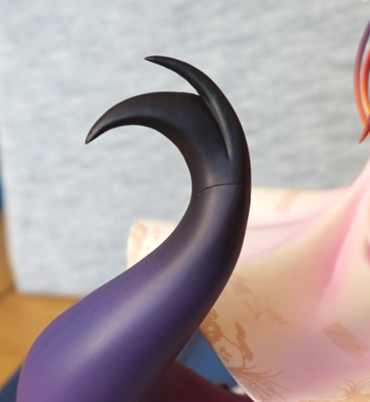
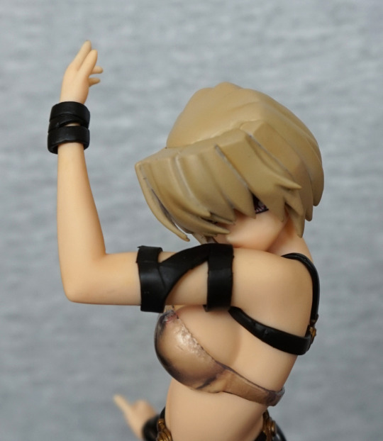
Side of her head:

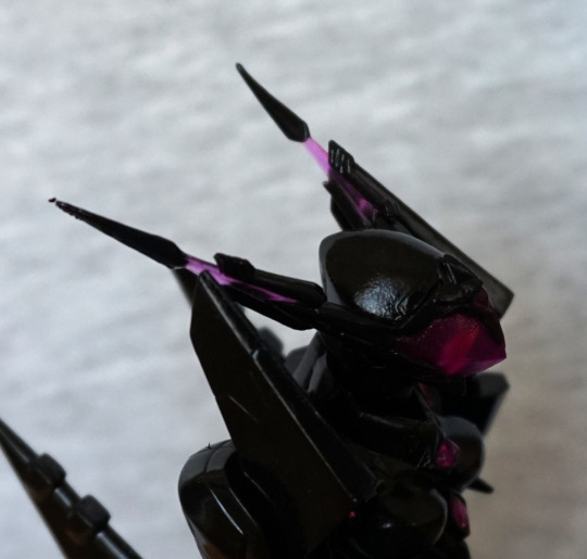
Here you can see where the finish isn’t entirely even. The purple parts of her head spikes have been included, but these points are prone to bending, which can be seen with her left spike. I may fix this at some point, but it will be a mild pain to do so.
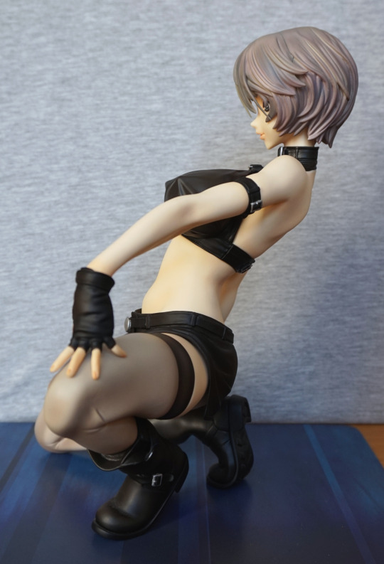
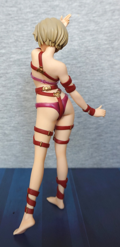
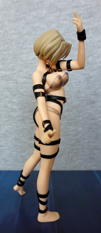
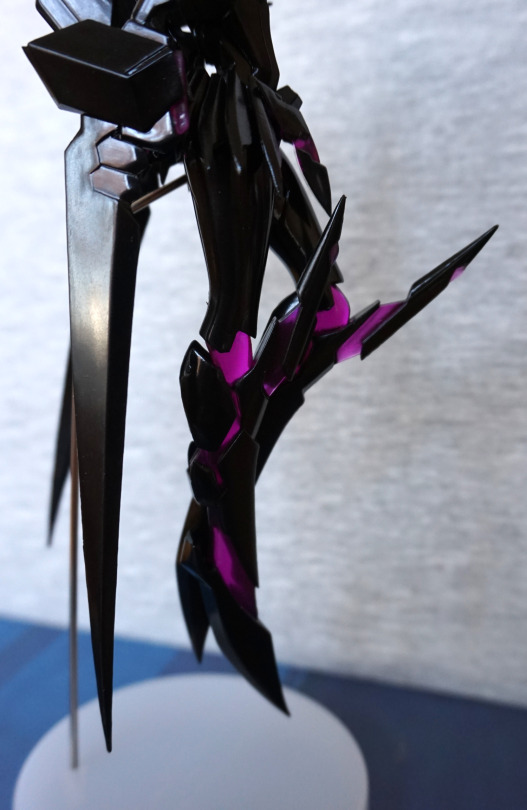
Left:

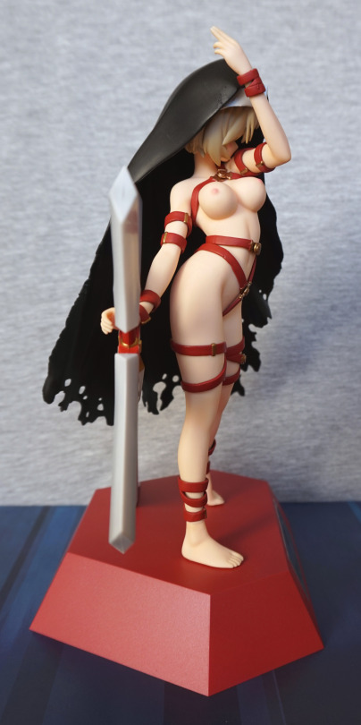
If you look closely at her arm spike, this presents the largest issue I have with the finish – here you can see the splotchiness I was referring to. And here we get a good look at her support stand, which manages to be not too intrusive. Here we can see where her legs are extended out, showing the purple areas – I do rather like her in this mode. The way she’s posed makes me feel like she means business.

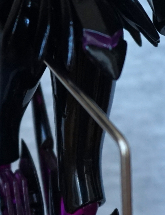
Close-up on the legs:

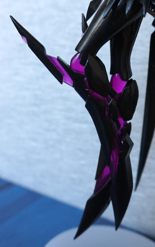
The translucent plastic is what really makes this figure imo. I think this came out well.
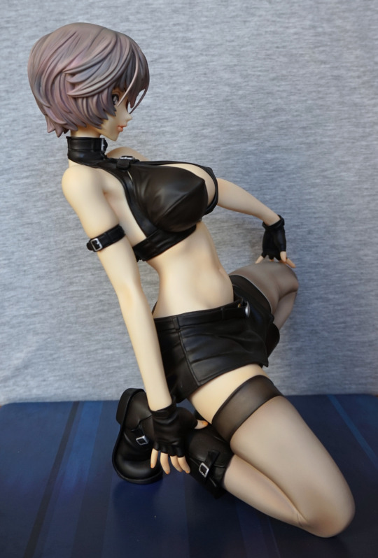
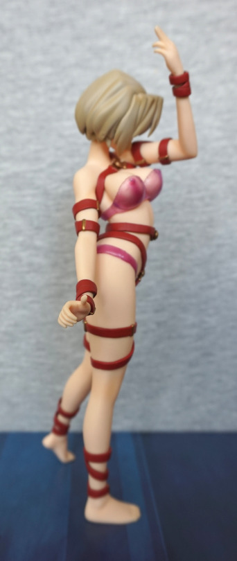
Right:

Not too different from the left. The base is plain, but holds the figure up just fine. Gives a good contrast, if you’re looking at her from an angle that the base is behind her. 

Arm close-up:

This one has a better finish to it than the other one. The trianglar & diamond-shaped parts came out well imo. If the finish was even like this all over, I’d strongly recommend it as a prize figure, but with the finish flaws it draws it more back to average.
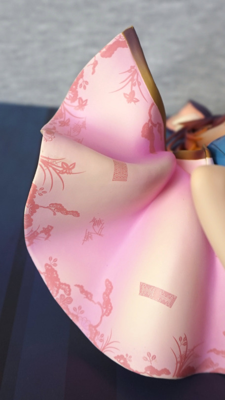
Detailing:

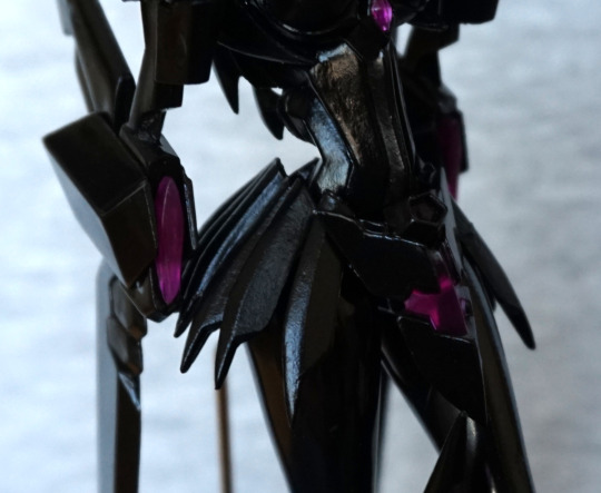
More purple! Still loving these litle deails throughout – the one on her am and skirt. 
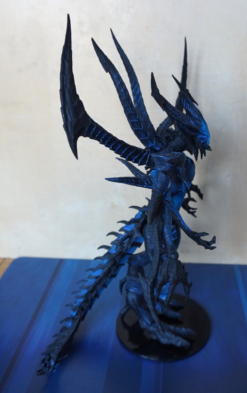
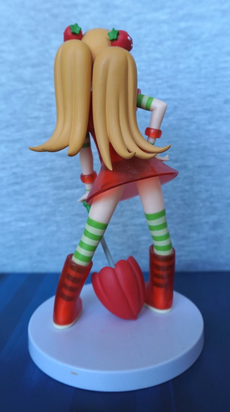
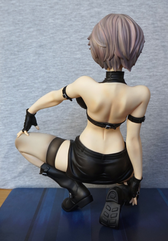
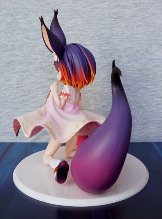
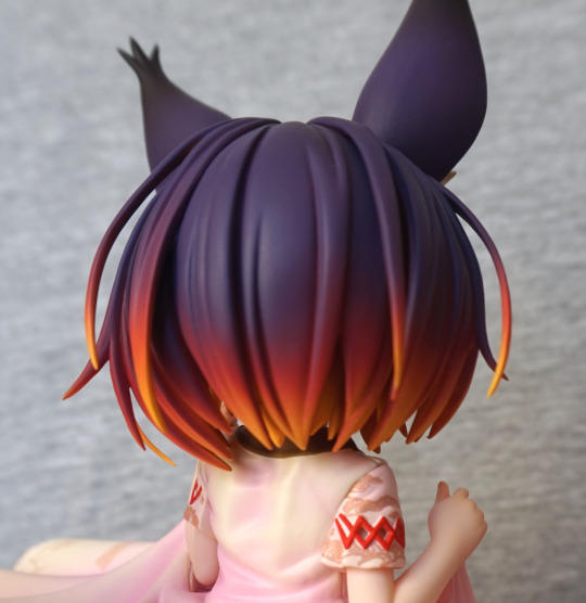
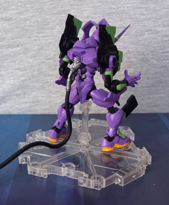
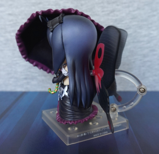
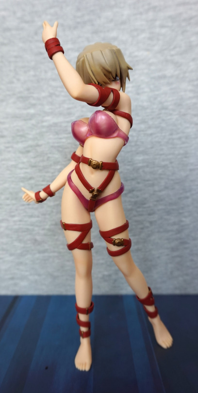
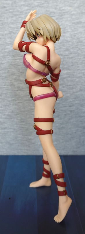
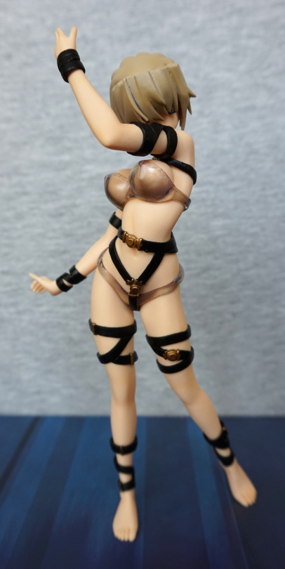
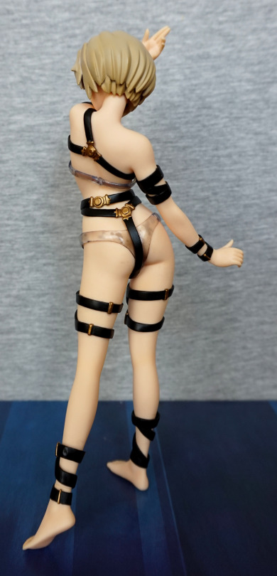
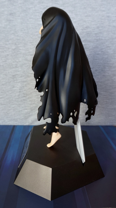
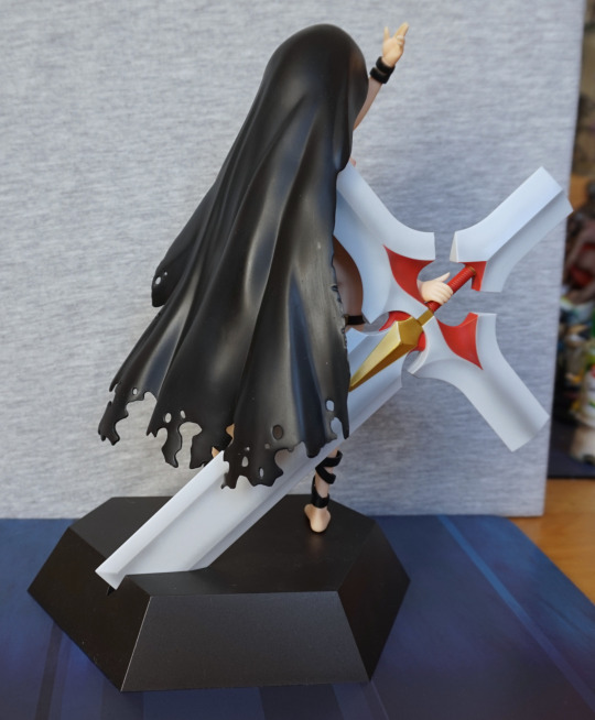
Back:

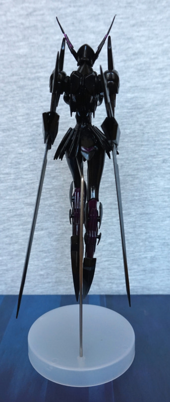
Her back is well-sculpted, and she has the fins on the back of her legs. I think she really does have the spiky, slender appearance from the back.
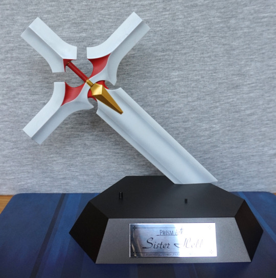
Stand:

The stand goes into a small hole in her left leg. It’s a bit of a fiddle to get in there, but sturdier than I thought it would be. She stands fine, without wobbling, unless you poke her. I like this stand, as I don’t find it too intrusive, and it holds her in the air well. Being metal, they have been able to make it quite thin, so it feels like it stands out less than a plastic clip or pokey stand.Overall, I’d recommend this figure to someone who wants all things Black Lotus, and those who want a cheapish figure as they like the character design. I don’t think I’d recommend her to a general collector, due to prize figure flaws. I’m happy with her though, and glad to add her to my collection. 

Figure Spotlight: Diablo

I have both the Diablo figures by NECA – one is “normal” Diablo, other is Shadow of Diablo. Here they both are together:

image

The normal Diablo I got as a gift, the Shadow of Diablo I ended up paying a fair bit for, as it got customs’d. Both figures are from the same mould, with different paint jobs. 

The normal Diablo:

image

The paint job on this one is quite striking – the yellow and red contrast nicely. The figures are decently poseable – along with the usual articulation, his shoulder parts move, his back spikes move and his table is bendable. 

Here’s a shot of his side:

image

Not too much to see here, though one thing here is to note he’s not on his stand properly – both of these figures are prone to falling over, and the peg is not long enough to hold him in place at all. This sort of makes the leg articulation useless, as you can’t really pose his legs in many positions without him faceplanting. Usually I have him leaning against the wall to prevent him from attempting to skydive. 

Back view:

image

Nice paint job here too. Tail is poseable, but it’s kinda awkward to move it around – the wire is quite stiff. Now to leave this Diablo munching on the wooden backdrop, and look at Shadow of Diablo:

image

This guy has a reasonably striking appearance from afar, but does not stand up to closer scrutiny. Close-up on his face:

image

 The blue wash appears messy, where it blends into the black parts, and the shoulders don’t look as well blended as the ones on the red version. Whilst the blue paint does feel more sloppy, I’m not sure if the paint itself was partially a factor in the figure’s paint flaws. There’s less colours to play with here, though NECA is known for doing sloppier paint jobs towards the end of figure runs. 

Here is his side:

image

Not much to say here – looks rather like the original version, only blue. 

The back:

image

Here you can see the blue wash being uneven on the two outer back spikes. Also if you look closely near the tip of his tail you can see two dots – this is the wire showing through :/. Pretty sure this was from the figure’s construction, where they haven’t embedded the wire correctly. Fortunately, it doesn’t show as this part is usually facing the wall. 

So if you have a choice of one or the other – definitely go for the “original” version. The blue one just doesn’t have as good of a paint job, and an image search seems to confirm it’s not confined to just mine (as well as some reviews from the time). Getting hold of either at this stage is likely to be an expensive proposition though. I believe the original RRP was £25, but good luck getting them for that now. 

Armisael – Evangelion – Wave

This figure I randomly came across in Nakano Broadway Mandarake. Didn’t see it on the site prior to going, but it instantly went into the basket once I saw it. So here she is:

Reading about this after buying, she was an exclusive, so really happy I managed to come across her at a good price. One of the things that probably keeps her price down is some people regard her as a bit of a lazy cash-in, as she’s not too dissimilar to some of the other entries in this line. However, I was really excited to see this one, as it’s based on one of the events in the series. 

I love the “veins” effect, though the fading on the black parts of the suit is a bit odd. Not sure why the suit colouring has been done like this, instead of closer to Rei’s design. 

Left:

She leans forward a bit, but this is not really visible from the front. Not sure what’s up with the tippy-toeing. She looks nice from the side as well imo. 

Right:

Here, she doesn’t feel like she’s leaning quite as far from the other side to me. Paint is a little unsteady in some of the smaller areas. The fade, despite its oddness, seems to be done well. Hair seam feels a bit neater on this side.

Back:

Backpack has been done nicely, but there’s some stray paint on her backside. Bit of a shame. Palm paint on her hands also has some flaws. Veiny effect still nice throughout though. 

Base:

To match the others, she has the same “biohazard sample” base. I like this attention to detail on the bases. 

Shot from the bottom:

Here we can see the Adam embryo is an indentation into the base. I like the way they did this on the bases, and I think the effect looks really good. This base is also a pleasing red colour. 

Overall, I’m really happy with this figure and glad to have stumbled upon it. I can see why it isn’t a particularly sought-after piece being “another Rei”, but for me I really like what it is, so had to get it :). If you don’t think she’s too boring, and happen to come across her, I would recommend her. 

Asuka Langely – Fruits Punch

This one I bought before Rei, as I found it cheap but boxless. Then I had to chase down Rei…. which I eventually got, and for a reasonable price :). 

So here’s the Asuka that goes with the Fruits Punch ReI:

The mark on the base was just some dirt, and got washed off after these photos. I like the way Asuka’s outfit is more flamboyant than Rei’s, which matches her personality. Asuka does feel a good bit more detailed, with the more complicated rain-dress and the way her clothes poke out of the rainwear. The matching bracelets work really well imo. Her umbrella is held in by pegs on either end – one for the base, one for her hand. 

Again her face and hair are a simplified style. Her neuroclips are more clearly themed than Rei’s, by being obviously strawberries. I guess Rei’s are supposed to be pips? 

Left:

Her hair curls up nicely, and those strawberries kind of work. Bit of a weird shape. However, the seam on her leg is pretty visible. 

Right:

I do like her pose from this angle – has that sassy look that fits Asuka. Her hands are sculpted nicely, and have a good amount of motion in them. Again, her leg has a clear seamline in it. 

Back:

Her hair looks OK, if simple. The umbrella looks OK, but not too much like a strawberry to me. Feels like they went more umbrella than strawberry, but it’s not a dealbreaker. 

Overall, I’m pretty happy with this figure. Even though Rei is my favourite of the pair in the show, I think this is my favourite of this pair of figures. I feel it has more to offer visually, and the extra clothes make the outfit less jarring. Again, this is a figure if you like unusual outfits. Happy with this pair – you should be able to get them fairly cheap, if you like them. Wouldn’t recommend paying a lot as they are prize figures, but they’re pretty nice ones.

Rei Ayanami – Fruits Punch

This figure I had times I really wanted to buy it and times I thought it was the worst thing ever… but seeing it in person, I decided to go for it. So here she is:

So here she is, donning an outfit that’s an interesting mishmash between beachwear and rainwear. Personally, I’d prefer if this figure didn’t have the gummi boots. Her hair has been done in a simplified manner, but this is more for the style of the figure. I do love the fruity bracelet she’s wearing. 

Left:

She definitely has an older prize figure look about her, with the shiny skin and simplified style, however the simplified style has been worked with, making it age better than others. I like the way the lemon umbrella goes over her shoulder, but it’s gonna bend over time. It also has a little drip that comes down off it, but mine likes to be a bit sideways. She does have a hole in her hand a peg on the umbrella sits in, so she holds it fairly firmly. 

Right:

The rainwear is a rubbery material, whilst the rest of the figure is hard plastic. The holes let us look at the paintwork better, underneath the raincoat, which I appreciate. Hair seam definitely isn’t in hiding here.

Back:

I like the finish on the back of the lemon umbrella – it has a nice shade to it. The back of the raincoat has some interesting details which stop it from being plain. 

Overall, I think this is a cute figure. If you like your figures in unusual outfits, and a fan of Evangelion, this figure could be for you. The paintwork is imperfect in places, but seems decent enough for a prize figure. It doesn’t feel as cheap as I thought it might do, so was pleasantly surprised by that. 

Kuroyukihime – Tea-drinking edition

So.. finally! The Japan loot! Which will be coming out in no particular order…. 

(Yes, it has taken me over a month to finally get to this point…)

First up, here we have Kuroyukihime engaging in a suitably British pastime of drinking tea:

She has quite a cute expression on her face. The paint job does a good job of texture, but not one of shading. Her coat does get affected in this photo, but I don’t think it’s as bad irl. Though the buttons are the same colour as the coat, which doesn’t change outside of this photo :P. 

Close-up of her face:

Her face is fairly decent – a bit heavy-handed with the linework. The hair is pretty simple, and is pretty flat where it isn’t stranded. 

The tea:

Yep, looks like a more British brew, than an Asian one. Tea doesn’t quite get to all the edges of the tea surface, so it does leave a bit of a “shallow cup” look to it. Because of the way the tea is angled, you don’t tend to see much of it anyway. 

Left:

This figure shows the figure in a better light, and pretty close to its actual look. If you’re wondering how she sits on this chair, there are a couple of dimples at the front of it, which she rests in.You can still easily nudge her out of them, but they’re good enough for display purposes. Here we can see a little bit of rough painting on the edging on her skirt. It’s a little inconsistent most of the way around. 

Right:

Little bit of a scuff visible in her hair. There are a couple of these. Here we can see the attempt at shading in her hair. It’s fairly abrupt imo, but there’s less of a contrast when looking at it irl, so it’s not too visible. again, the skirt edging is a bit messy. The skirt is folded nicely, but feels a little stiff, as that’s the only crease there is. that isn’t pleats. 

Back:

Slightly roughly-hewn chair XD. Just plain white back here. The chair connects to the base with 4 pegs – these were an absolute arse to get in place. Even with heat they were difficult, and I was a bit worried about breaking them. I don’t think I’ll disconnect the chair from the base, lest I snap a peg or two. 

Chair, no Kuroyukihime:

The front of the chair has some blue shading for the middle bit, though it’s nothing to write home about. On mine, there are stray paint blobs too, which aren’t too visible here. Here we can see the dimples that keep her in place, and why they’re not super-effective at it, being fairly shallow. 

Overall, it’s reasonably decent for a prize figure. I think this is one more for the Kuroyukihime fans than anyone else. From a small distance away, she’s a pretty decent figure, but doesn’t really stand up to close scrutiny. I think she’s a bit hard to find an optimal viewing angle too. I’m pleased to have this figure, even though I don’t think it’ll be winning any awards. 

Suzune Arizono – Kiseijyui Suzune – Questioners

This figure is now my largest scale figure – at 1/3.5 scale. Bit of an interesting choice there, but hey. I bought this figure from someone on MFC.

So here she is:

She’s immediately striking from her pose and size. She isn’t too tall as a figure, due to her kneeling pose. There’s no hiding her chest, lol. 

Close-up of her face:

Her face feels a bit doll-like to me, and looks a little odd. Doesn’t help her eyes feel a little flat. She does have painted lips though, and I think her mouth looks good. Her hair is nicely shaded, and the strands sculpted well. The buckles on her collar are also painted and sculpted well.

Left:

Looking at her from the side reveals she’s leaning backwards somewhat. The arm looks somewhat unnatural from this angle. The colours in her hair show up well from this angle too.

Right:

I think she looks more attractive from this side than the other. Her arms look less odd from this side, and we can see her body better. I like the amount of details that have gone into her clothes, especially considering she’s a cast-off. The seam-lines have been done in realistic places, and she has wrinkles in her skirt and top.

Back:

Here we can see the buckle that holds her top on. I like the way her boot is folded over where she is leaning on it. I think her spine crease is a bit severe, but her shoulder bones are sculpted well.

Frog:

Yep, you read that right. She has this frog keeping things… kind of SFW? This frog doesn’t detach, but if you’re buying this figure, I’d ask why you would even want to, as it’s a highlight of the figure.

The clothed option I’d say is a viable one. Also, once you’ve sussed how to cast her on and off, it is reasonably easy to do.

Here are her clothes:

As we can see, they’re reasonably detailed and well-painted, in the small spots that have paint. But they’re rather the dust magnet, for being black.


To cast off her skirt, we separate her:

The upper half also has her collar off in the upper picture – this is how her top comes off. This collar can then be placed back on the figure, to mostly hide where her top comes off. The lug between the upper and lower halves is big, giving it a good, solid connection. It fits tightly, but not so tight that you can’t wiggle it out by hand.

So here she is, reassembled:

Her pose comes across as powerful and confident. I love the sculpting around her stomach area. Without the chest covering parts, her clothes become a small halter-top and a strap around her midriff. The gap does kind of show where the cups attach into the collar – that isn’t too well hidden.

Close-up of her chest:

She has a nice pair of nipples. She’s large-chested, but doesn’t feel ridiculous. They’ve managed to keep them to a nice shape, that isn’t reminiscent of balloons. 

Frog:

The frog is very nicely painted, and has a good amount of shading. I love the way his tongue is reaching up across her stomach, and he is in a good clinging pose. Some people have detached the frog from this figure, and apparently it isn’t detailed and sculpted underneath – things are pretty much frog-shaped, so I wouldn’t be tempted to do that. 

Frog eye:

Here you can see the way she’s shaped to the frog. Here we can see the frog is lighter on the bottom than the top, and its eye. Eye isn’t very detailed, but does the job. 

Left:

She looks nice from the side, apart from that arm still looks odd 😛

Right:

Here you get a good look at the side of her chest, and a bit of her backside. That’s one pointy nipple.

Back:

She has a nicely sculpted ass. I think she looks really good from the back, when cast-off. 

Close-up of her boots:

Love the distinct tread in her boots. 

Boot side:

The boots are very nicely detailed – the buckles are really nice, and the boot not being fully tight gives it extra detail 

Left glove:

Her gloves are nice too, and look leathery. Plus there are some nice seam-lines on them, adding to the detail. However, looking close you can see where some paint has gone stray. She’s also got delicately painted nails, adding to the detail.

Overall I really like this figure. Despite being a larger scale than anything I own, she fits on a Detolf shelf quite well, due to her pose. Was a bit worried she’d be too big to fit anywhere, but was glad to find that was not the case. I think her body shape and the unique frog aspect make this a really good figure and one I’m very pleased to have in my collection. Would recommend this figure if you don’t mind the relatively minor flaws with it, if you can get hold of it. Might not be easy to do that. 

Tribble – Star Wars

I found this in the same charity shop as yesterday’s figure. And was not gonna leave this one behind! I’ve been looking to buy one of these on and off for awhile, so glad to find one at a price I was prepared to pay.

 So let’s have a look at him (or himher… seem to recall tribbles are hermaphrodites):

Fluffy ball! Better not feed it!

And to show it’s an official Tribble:

He’s been tagged, for identification and tracking purposes.

Though the main feature of this “figure” is the box, which has holes so you can keep him in the tub:

Here we can confirm the contents:

Ooh, child safe. I don’t have to worry about it around my husband then!

Some good advice:

Don’t want to be overrun with furry critters!

Some further rules:

Hm, need to find me a Vulcan apparently. 

Top:

Can see him well from the top :). 

Glad to have this furry ball, despite it being just a furry ball… but was an iconic episode of Star Trek. 

Rock God – Guitar Hero

Found this fellah in a charity shop, still sealed. So ofc I had to do my bit for charity and buy him:

image

Here he is, showing the world how to rock! He was a bit hard to assemble, as the peg on the base wouldn’t fully go into his speaker. A poke with a sharp object to make the hole deeper, and bam! In fits the peg :D. Once assembled, he does stand up OK, but if he’s slightly off, he’ll just rock over onto his butt ><. 

His colouring is very nice though – not particularly complicated shading job, but the colours work. The beard probably has the most amount of shading in this figure.

Close-up of the base:

I like the fact they’ve used the logo for the stand, but it would’ve been nicer if the stand was larger or heavier, so that the figure was less prone to rolling over. The pegs are solid though, and has withstood the rolling over this figure has done. 

Left:

There are some paint transfers, seemingly from his skirt. Or is it a kilt? I do like the belt and the massive metal chain. 

Right:

The buckles on the shoes and wrist straps are nice. He does articulate a bit, but not very usefully. You can’t get many poses out of him. 

Back:

I like the fact the speaker has some detail on the back. His hair has a nice amount of shading in it. 

Top:

His face looks really good, and his mouth as depth to it. His eyes look a bit odd, as they are plain blue, but it is a pretty shade of blue. 

Overall, I like this figure, It’s an OK figure, but not overly fancy. I got him pretty cheap though. And he goes well with his golden counterpart I already had :). 

Hatsuse Izuna – No Game No Life

This figure was also waiting for me at home, from my holiday in Japan. Pre-ordered this one some time ago, as the chance of delay is very real with the companies that produce/distribute via GSC. However, amazingly, this one was released on time! And thus got to hang out in the parcel box until I returned home… This figure is of a younger character in a swimsuit, so flagged this as NSFW, though she’s not showing anything. 

So let’s first check out the epic base she comes with:

image

Yeah, uh, thanks Aquamarine. 

And here she is, freed from her plastic prison:

image

The first thing that stands out are the colours – they’re very vibrant, and do the anime justice. I’m very happy her hair came out vibrant, which is essential for a NGNL figure. The swimsuit is also slightly shiny, and that works really well too imo. 

Close-up of her face:

image

Her earls look really good, and her hairband has come out well. The hair paint blending stands up to close scrutiny too. Not a big fan of her expression, but it has been done well. I’d prefer it if she at least looked a little happy and not under duress. 

Swimsuit:

image

The details are really nice, as well as the contrasting finish, though the finish doesn’t show so much in this photo. The red details are painted as they’re moulded, but they do sort of suddenly end… which I find a little odd, but not a dealbreaker for me. Do think it would look better if they appeared to carry on underneath her arms. 

Left:

image

Here we can see her HUGE tail, which is very nicely painted, but does have a whacking great big seam mark down the middle of it. Would prefer it if that wasn’t there, but it doesn’t show from the front, thankfully. 

Leg close-up:

image

Her shoes are nicely done, as with the wrinkles in her socks. The base of her shoes is also done with a shiny finish, which gives them a look of quality. 

Robe pattern:

image

She has this detailed pattern on the top and the bottom of her robe. It looks really good, and helps this figure stand out from less expensive figures. The shading here is also lovely, and really helps to add depth. 

Close-up of the shiny swimsuit:

image

Here you can see where the light is being reflected off it, and the wrinkles that have been sculpted and shaded. I think the belly button is a bit overdone though, but this style seems pretty common on Japanese figures. 

Right:

image

Hair still looking vibrant :). And more of the robe pattern. The red detail on her sleeves looks better like this, as you can’t see the odd termination.

Back:

image

The shading from her hair and tail are both really visible here, and look great. You can also see shading on the base of her shoe and on the back of her ears. I love the way it’s all so smoothly blended. 

Close-up of the tail tip:

image

Yeah, this was the first seam mark I noticed. Really rather visible. Would’ve been nice if they could’ve done something about this to make it show up a bit less, but again, not visible from the front. 

Back of her head:

image

Just love the sunset colours.

Detail of the dress from underneath:

image

The edging is done really nicely in gold, plus this pattern printed throughout. Also the dress is shaded under here too, to emphasise the peaks and valleys in the fabric.

Seams in the robe:

image

These are very visible if viewing the figure from beneath, as they’re pretty gappy. Kinda almost wants some filler in there… Again, it is a hidden seam, so you only really see it when you’re looking for it, but you do really see it if you look from the bottom imo. 

Overall, this is a really nicely produced figure, with many things that point to it being a premium product. However, Aquamarine figures are pretty pricey. And it really depends if you want a loli in a swimsuit… I don’t really see her in a pose-y way, so I like this figure, but I know her pose, outfit and supposed age is a bone of contention between collectors. But from a pure-figure perspective, she’s a really nice figure, and I think Aquamarine did a really good job with her. 

EVA-01 – TV ver. – Evangelion – NXEDGE

This one I ordered just before holiday and was delivered whilst whilst I was away. Well, I say delivered, more like chilled out at the delivery office until I paid the charges… This one sold out online in most places, so when it briefly was in stock again at AmiAmi, I went ahead and grabbed it, as I wasn’t sure if I’d see it in Japan if it was sought after. Turns out I could’ve picked it up, but I would’ve been annoyed if I didn’t see it and didn’t buy it when I could.

So here he is:

D’aww one cute l’il EVA. The articulation is very nice and smooth, and the colours are striking. 

Here he is from a more top-down angle:

The sculpting is really nice, and there’s a good amount of detail on this small model. For this, I feel he’s worth the price. 

Here he is in the box:

And the other bits that weren’t on display:

He comes with a goodly amount of accessories, as well as the stand, which I’m pleased with. The accessories all seem to be of good quality, with moulding and painting. 

Here he is from the front with no weapons:

Not sure if he wants to hug me or strangle me… 

Left:

Here we see his slit eyes, and the sculpting on his head, that not many figures tend to have in such detail. Here we can also see the fuel cable he comes with, which clips on reasonably well, but is still fairly easy to knock out. 

Right:

Yep, looking good from this angle too. Got all the li’l green details. 

Back:

Not much colour to speak of back here. On one of my other models, the “diamond” bits just above the fuel cable are black, but here they’re purple. 

Another back shot:

Certainly a fair amount of sculpting going on here, which makes EVA-01 eye-catching. 

Top:

We even have his EVA-01 logo sculpted into the top of his head. So if he’s drunk and lying in a ditch, you’ll be able to find out where to return him. 

Overall, I really like this small figure. Glad I got it, and I didn’t risk missing out on it, even if it would’ve been cheaper. If you don’t mind paying a fair bit for a small figure, I’d recommend him, and probably this series of figures. 

Mito Ikumi – Food Wars – Kotobukiya

This figure I tried to buy off the seller once before, but he changed his mind about selling. Then a couple of months later I saw him selling it again – kind of surprised he didn’t message me, seeing as I was willing to buy before, but ah well, messaged him and bought it.

After spending a week at a drop-off point before bring collected, she finally got to me:

And I’m definitely glad to have her in my collection. She comes pre-attached to the base, so all you need to do is give her her meat cleaver and she’s all assembled. She also demonstrates two of the things I tend to like about Kotobukiya figures – the bases are never plain, and the ‘clean’ art style and colouring that can make these figures stand out.

Close-up of her face:

She has a good smile to her, and nicely shaded hair. Her outfit is painted cleany, and looks true to the character. Her body is nicely sculpted with her collarbones and her boobs which don’t feel too overly large. The silver buckles on her straps contrast nicely and are painted well.

Close-up of her stomach:

She has a crease above her belly, and her pelvic area is sculpted, which helps her body look realistic. I also like the way her shorts are unbuttoned, but not revealing anything. The shorts have a decent amount of detail, and are a pleasing shade of blue, that compliments the figure.

Left:

Her pose is leaning forward slightly, which I think works well. It gives off a sexy vibe, without overdoing it. Her body looks trim, but not muscly, which fits the character for me.

Her boots are nicely shaded, and look like a comic version of leather, which fits the style of this figure.

Right:

Here we can see where she is holding her right arm with her left. The fingers are posed very naturally, which I like. Here we can see her larger holstered cleaver – I like these details, but these knives aren’t ‘real’, so you can’t take them out. Kinda wish you could, and decide which knife/cleaver she is holding, but it’s not a biggie.

Back:

Her back has a good amount of detail to it, with the back of her top and her shorts having pockets.

Let’s have a closer look at her upper back:

A bit of flashing or spare paint is present in the upper knot of her top. Not a dealbreaker, but a bit sloppy. The lower knot is a lot neater imo. I like the way her spine has been shaded on the back too.

Backside:

Showin’ a little crack, I like the way they’ve clearly made the shorts as a separate piece. So many figures don’t have the clothes as separate pieces, so I really like it when a manufacturer does something like this. It makes a big difference to a figure imo. She might not be big in the backside department, but I think they’ve done a good job with it. The shors are really nice, with the pockets and the blue shading. There is some slightly “off” paint where the short trim is – believe this is supposed to be frayed jeans, and the shorts are cutoffs, but the effect doesn’t quite work for me. It’s a hard thing to get right, but it’s not something I’d expect to be excellent on a Koto figure. Does look a bit more like a wool trim though – think they’d need more dark blue lines in it for it to work better.

Overall, I really like this figure and glad to have it. Food Wars doesn’t have a lot of figures, so it’s nice to have a decent one in my budget. I did look at buying the Alter one, but I didn’t want to spend twice the money on a Mito Ikumi figure. If money was no object, the Alter one is likely to be a decent bit better and more realistic in its appearance, but I think this one is a solid substitute if you don’t want to spend so much.

Kuroyukihime – Accel World – Nendoroid

Normally I don’t buy Nendoroid, but this one is Kuroyukihime so I decided to make an exception based on the subject and the price:

I love this outfit of Kuroyukihime’s and she had her umbrella too, so I couldn’t say no. The figure is painted well, and the shiny butterflies stand out. I also really like the cute, smiling face.

Here she is with Arita in avatar form:

She also has an arm so she can hold Arita in her arms, but I didn’t take a picture of this. I likely won’t display her like that, as she can’t both hold him and her umbrella, and I like the umbrella too much. Arita looks cute and well-painted. I love the fact he is much smaller, as I can imagine him being so in Kuroyukihime’s presence.

Left:

Here we can see her hair, which is less detailed from the side, but this is standard for Nendoroids. It is shaded though, so it doesn’t look bad. I didn’t take a shot of the right, as it’s mostly umbrella, or similar to this if I took it out of her hands.

Back:

Love her wings. The moulding details help them stand out, and the colours chosen are good. Arita has his tail, which is about all you’d expect from this angle.

Umbrella:

The umbrella has some texture to it, which helps show those touches that go into official figures over bootlegs. It helps give it a fabric-y feel. The rim is also painted nicely, which frames it well. The handle for the umbrella is also painted neatly, especially given its small size.

Overall, I really like this Nendoroid and I don’t feel it overdoes the chibi. Some Nendoroids I’m put off by the proportions, but for this one I feel it works. Glad to have another Kuroyukihime in my collection.

Astarotte Ygvar – Astarotte no Omocha!

This figure was included in my Mandarake order, and was a store purchase:

I did try to buy this from a MFC user, but they went AWOL during the process of trying to buy, so I was glad to see this on Mandarake. She’s very cute imo, and I love the cute swimsuit she’s wearing. And also the cute tail. 

Close-up of her face:

Aww, she’s got that little tooth that demonic beings have in Japanese things. Her hair is nicely shaded, and pretty detailed in its sculpt. Her eyes are also detailed, and I like the way there’s an edging to the swimsuit – see the heart cutout on her suit. The seams on the ring are also really well done, and make the ring look like the plastic the rings are made out of. Imo, it is better than Rin’s ring.

Left:

I love the flowers in her hair, plus the wispy parts that fly out of the larger clumps of her hair. Her leaning pose feels natural to me, and not overdone. 

Close-up of the hair from the side:

The petal-bows in her hair look nice and compliment her hair. The hair wisps aren’t particularly well blended in at the top, but it doesn’t bother me much. 

Right:

Here she is with her ring. Her tail curls nicely around the ring, and we can see the translucent ring, which is a pretty pale blue colour. I like that they’ve included the air valve in the moulding. 

Close-up of the ring:

The detail in the mould is really nice – the edges of the ring has the flange that most of these rings have, and the creases almost make it look like it’ll be soft to the touch, though it is not. The valve doesn’t stand up to close scrutiny, but it is a nice inclusion. 

Back:

Her hair is nicely shaded, as well as her swimsuit. Her tail looks good from this angle too.

Close-up of her back:

Her tail blends OK into her back, but not with any particular finesse. She’s also got a cute little heart on the back of her swimsuit too, which is a nice detail.

Overall I think this is a very pretty, cute figure, with the added bonus of having a tail. Really glad to finally have her. 

O-157 – Moyashimon: Tales of Agriculture

A likely short blog… for a random buy in a Mandarake Urban Mine. 

Now for a photo not in my usual location:

This guy is designed to dangle, so took the photos of where he dangles underneath a wall-mounted display cabinet. This cabinet is… not the best… so the bracket is to prevent the bottom of it bending over time, and provides the perfect hanging point for this dude. 

This dude is… E. Coli. Yep, just the thing I wanted a figure of! But he’s cute and tentacly! 

Side:

Nothing much interesting here. He’s a little bit darker in colour than the little keychain I got, some time ago. I prefer the colour used in the keychain, but this colour isn’t bad. 

Back:

Yep, nothing to see here. 

If you’e short of a smiley strain of E. Coli in your life, this guy delivers. He is an older prize figure, so the quality is that of an old prize figure, but being something that doesn’t have much need for different colours, it works. Also if you want to display this one, you’re going to need somewhere to dangle him from – for me this is a bonus, as it’s one less thing to find shelf space for! 

Sister Hell – Sister Tilette ver

So that limited edition I mentioned… it was still for sale at the retailer I found it at. So I decided to get that one too:

The translucent clothing on this one does more to hide her intimate areas. But still, doesn’t leave much to the imagination… The hair on this one also has the weird shape to hold the habit.

Face:

Again, her face is largely obscured by hair and her arm. However, she’s also got some blush on her cheek, which is a nice touch. The hair paint seems a little less messy on this one too. 

Left:

Yep, looks nice like the other one. Might not be too many words on this blog, as this one is a clone of the other. Her censoring clothing doesn’t match as well to her straps as the other one. 

Right:

Back:

I think the gold and red works as well as the gold and black. I did wonder if it’d feel like it blended in too much or wouldn’t quite match, but I don’t feel that looking at the figure. 

Base:

Here’s her base, which differs in the plaque saying “Theresa Tilette” and being red. 

The other angles of the base are pretty much the same:


Now for Tilette fully assembled:

Looking impressive as the other one. The habit has the same flaws as the other one, and is identical. This one has more colour contrast, with having a red “outfit” rather than black. 

Left:

Mmm, bad habit…

Right:

Yep, still rockin’ that nice body. Hand didn’t naturally go on quite as well as the other one, but isn’t really visible from the front. Could use some heat to move it, if I felt it needed moving. 

Back:

Again, same as the other one, but with more red.

Overall, I like the two colour schemes equally. I have these two on either end of a shelf, and I think they look really good like that. This one will likely be a lot hard to get hold of, as she was a limited edition, limited to 300 pieces. So it was a bit random finding this one at a random UK retailer. 

Sister Hell – Flooding Ver

I first saw the limited edition of this figure, but didn’t go for it. Then I came across this one for sale from someone I’ve traded with before on MFC, and decided to buy:

This is the figure with her ‘censors’ on, and her habit. Not sure that the ‘censoring’ clothing does much to hide anything though… She also comes with a stand, which will be shown later in this review. For the next few pictures, I’ll show her without her habit, so you can see the figure fully. 

Here’s the same angle, without the habit:

Without the habit, her hair looks strange, as it’s shaped to hold it on her head. The rest of her body looks nice though, with the straps adding much-needed detail. 

Face:

Her face is really hidden. Not too much of a fan of this design decision. We can also see where the hair wasn’t detailed, as when assembled it is hidden by the habit. I think it would’ve been nice if they did more with her hair so she could be displayed with or without the habit and still look good.

Left:

Here we can see she is posed quite well. I like the fact she balances well, even without the stand. I like the way she is twisting her body.

One seam is visible where her neck joins to her head, but the others can be hidden with the straps she is wearing. Here we can see the join on her left ankle, but move the strap slightly up and this would be concealed.

Right:

Not too much different to see on this side. Apart from the bra doesn’t do much to hide her nipples. Erm. I do love the straps that go around her body, and the gold clasps that compliment them.

Back:

And the reason for taking these pictures without her habit. When it is on, you can’t see her back, however the back is finished nicely, with the clasps on her bands. Her hair looks less derpy like this too.

Back with the habit:

Here we can see what it covers. This piece is somewhat disappointing as it feels cheaper than the rest of the figure but it is pretty much a required part.

Let’s have a quick look at the stand before we assembled her and take off her censoring clothing:

Ended up with a bit too much shine on the plaque there. That’s what I get for not having a proper setup 😄. The plaque is nice though. She has two pegs to solidly hold her on the base, and a large cross to hold. Her hand does go over the red handle part, but doesn’t clip on tightly, which probably does help with assembly. All in all, a very nice base. The cross-sword is painted well, with a good amount of shading.

Stand back:

Looks good from this angle too.

Base of the base:

Not too much to see here. Just thr fact it was made in China and where the cross attaches into the base. I like the fact that there is goodly amount of corner here, as it means the cross on the stand is sturdily attached.

Now for Sister Hell, fully assembled:

She’s a very striking figure imo. As these pictures were done on a different day, we can also see the plaque better here 😀. I feel her chest does defy gravity a bit, but not to the point it is bothersome. We can also see how she loosely holds the cross.

Casting her off is awkward – over time the plasticiser has come out of the transparent parts, so be prepared for that if you get this figure. The bra you may need a tool to poke out the ‘peg’ due to this. The knickers will need a good amount of heating so they can flex enough to come down over her legs. The bands around her waist have pegs, so can be taken off easily, to allow her knickers to slide off.

Once cast off, you will likely need to wash off the plasticiser – water may be sufficient, if not a bit of washing-up liquid should do the trick.

I don’t think she is designed to be reversibly cast-off, but it can be done, if you take the parts off carefully.

Face:

Here we get a better look at the front of the habit – sadly the white area is rather blobby, and doesn’t look cut well. Hair seems to suffer a little of this too. The habit is probably the most disappointing thing about this figure. If a bit of time and effort was put into the habit, I think it’d be a noticeable improvement.

Left:

Her habit covers her up from this angle, so not much to see.

Right:

Here we can see her chest and stomach quite well. I like the way her nipples have been done – they stand out but aren’t over the top, as with a fair number of figures. They’re a pretty perky pair though. I like the way they have a ‘crease’ above her stomach, to give her body some definition. 

Back:

Does what it needs to do – the cross stops the figure from being totally plain at the back. 

Overall, I really like this figure and glad I got it. However, the habit quality is an annoyance for me – wish she looked OK without it, or a bit more time and effort was put into making it look as nice as the rest of the figure. If you want to, you can leave the lower bands off of her body, but to me, she looks better aesthetically with them on. She does have sculpted genitals, which you can see if you look closely at the front shot with her cast off. Personally, I like what the bands add to her, so I’m unlikely to cast her off that far. 

It’s hard to recommend this figure for a premium price, but if you can pick it up cheap, I think it’s a solid figure. Kinda wish she was easier to cast off, and more scope for putting her clothes back on, should one wish to. 

Melona – Queen’s Blade

This figure I purchased from Mandarake. Prior to purchasing, I was on and off considering buying her. I preferred the colour of the green one, so this was the one I chose to buy:

I like the shades in her hair and the green slime base. The clear disc is not attached to any part of the figure, so I don’t intend to use this to display her. It’s nice if you want a consistent round base to match with other figures, but personally I prefer her without.

Right:

This side isn’t much of a viewing angle, as if hasn’t been designed to be so. We can see her cute slime slippers here, which I think look good and do a decent job of holding her to the slime stand.

Now for the reason I didn’t lead with the front shot:

She does have a skirt part that covers her genitals, but it sort of pins in place so it was a bit awkward to reassemble, so I didn’t.

I think her face looks cute from this angle, and is one of the two main angles she looks good at.

Back:

Here we can see the lovely gradient in her hair – I love this effect. She doesn’t quite rest on the stand, but later we’ll see how I get her to rest on there properly.

Upwards angle showing the back of the skirt:

The skirt in of itself is quite pretty, but has design flaws. I like the way it looks from the back, with the hole.

The main skirt flaw:

The skirt doesn’t fasten up well at all. These pegs give the feel that the skirt isn’t really much of a display option unless you don’t cast off your cast-off figures. I gave it a good go to fasten it again, but no dice. It is very hard to get into the gap to apply pressure.

Skirt separated:

Here we can see where it attaches to the stand and gives her more support, which made it feel like a mandatory part. However, without it, she can place her hand in the dimple on the slime puddle, so this skirt can be an optional part. Am on the fence if it is supposed to be a mandatory part. 

Melona cast off:

She looks nice from this angle, showing some skin. There is some shading detail on her skin, but it doesn’t feel like much. Having the peg in the slime puddle is a bit of an eyesore though. Would’ve been nice to be given a plastic piece to fit in there, though if you are looking at her from above, it isn’t visible really.

Slime close-up:

I like all these tiny slimes dotted around her body as different things. And this guy is cute, even if he isn’t functional. The green plastic does give off a slime ‘feel’.

Right:

Not too much to see here still, though you now have the curve of her butt.

Back:

Yeah, barely me difference here, but now she rests her hand in the slime pool, which does look better.

Now the shot you may’ve been waiting for:

Melona without anythin’ on. Her genitals I find a bit on the strange side, but hey, she is a slime in humanoid form. Here is where most of the darker paint went on her body, though she does have some shading on her knees. And her cute smiling face shows above her legs.

You can reveal her breasts:

And to my surprise they were painted decently well, especially given they aren’t really designed to show. Her ‘hair’ isn’t removable, so the only way of seeing her chest is to bend her slime arms out of the way. They won’t stay there naturally, but I should imagine with heat you can get them to stay in a different position. 

Overall I do rather like this figure, and think it met my expectations. This is an older figure, like the Rin Tohsaka figure I recently blogged about, and does show its age. I’d recommend this figure, if you like the look of her, though she may be hard to obtain. 

Rin Tohsaka – Fate/Stay Night – Swimsuit Ver

Here we have another unexpected find on Suruga-ya – Alter’s Rin Tohsaka, swimsuit edition. I tried to buy this figure from someone on MFC, but then they messed me about and stopped replying to my messages :/, so this one was an insta-basket when I saw her.

So here she is:

image

I feel she is a little plain in the face, but the rest of her works well. She doesn’t hold up favourably to modern figures, but she is good-looking for her age. The ring comes pre-attached to the figure, but the handles are separate pieces. Other than that, she just pegs to the base.

Closer look at her upper half:

image

Here we can see that she isn’t shaded too much, which is the reason for her face appearing on the plain side. Her swimsuit is shaded though, which I think is much-needed, otherwise it’d feel very much prize figure. Her eyes are a nice shade of blue, which I think compliments her outfit. Her hair is not heavily shaded either, which I think shows, but doesn’t bother me. She has some hair shading at her crown and hair tips, so it isn’t totally flat.

Left:

image

Here we see she has two deliberate seams in her outfit, which have been given realistic creasing. I like these, as it works well. Again, a lot of her skin shading is given by natural light, rather than paint. We can also see she has pink nail polish on her toes, which is a nice touch.

Close-up of the ring:

image

Here we see the handles, which I think have been very nicely done. The handles slid in nicely, and I’m not concerned about them falling out. The ring itself, however, does have an appearance of the hard plastic it is made out of, rather than rubber. There are crease lines in it, but something about the paintwork on the flatter areas doesn’t really hide the fact it is plastic. It isn’t a deal-breaker for me, but I believe this is one area that would be improved on a modern figure.

Right:

image

This picture probably best captures the plastic-ness of the ring. As we can see, her hair does have some shading in, but it is rather on the subtle side. And this picture makes me realise one of the big differences between this and a newer scale – the finishes are shinier and less varied than on a modern equivalent. Also she has a bit of a seamline down her arm. The swimsuit still looks really nice though.

Back:

image

Here we can see the shiny, less-detailed hair. And the way the ring isn’t quite rubber. Nothing particularly bad about the figure, but it doesn’t hold up to modern standards.

Overall, I like this figure, though it does have its flaws. I’d mostly recommend it to Tohsaka fans, who aren’t put off by the quality of older figures. If you can find her for a reasonable price, I’d recommend her, but she was a hard one to find – after the sale fell through on MFC, I did try to find her, but with no luck. However, I’m glad to have found her for a reasonable price, even if I did need to forward her (Suruga-ya doesn’t do international ship

Figure Spotlight – Satan (Shin Megami Tensei)

This was my first FuRyu figure, and probably still my favourite. Not familiar with Shin Megami Tensei, but when I saw this figure, I had to have it. When I first found it, I couldn’t find anywhere that was selling it cheap enough to justify buying it, but eventually one cropped up on eBay for a good price, so I went for it. Looking around, I may have been able to get it a bit cheaper, but I didn’t massively overpay.  Here he is from the front:

image

Mmm, a very vibrant shade of blue, as well as the plentiful detailing. I like the mix of materials, though the clear parts are a pain to dust as they’re spiky and on the delicate side. Managed to not break any though. 

Here’s a closeup of its front half:

image

Many arms in evidence! Closeup of the wings:

image

They have a vibrant red underneath, which contrasts nicely, along with the transparent parts. 

A top view, showing its sheer length:

image

The tentacles came in various parts – once assembled, this figure becomes quite large! Required two dinner mats for this dude!

View of the tentacles on the back:

image

Closeup of the wings from the back:

image

Still pleased with this figure, and probably one of the reasons I started to seriously collect. The painting is very nice on it, the character design is awesome, and you can get this figure relatively cheap. Reading up on it though, some people have had issues getting him in one piece. Mine only has one real issue – on the top of the left wing, there is a bit where it rubbed the box, but it’s not too visible.