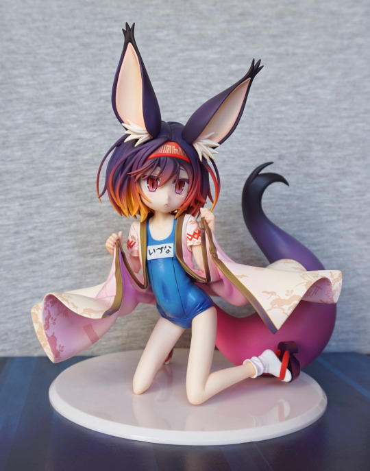
Today’s blog brings us Hatsuse Izuna by Aquamarine. And one not by Aquamarine.
I did not get the box with the bootleg, so there will be no box comparison. Though there were two problems with the bootleg figure prior to the final photoshoot – on arrival, her foot was snapped off, and then her tail became unglued prior to the test photoshoot. Not the best start!
Here are some photos of the damage, which I repaired before the photoshoot:


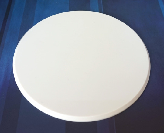
Base
For this figure, the base is a very plain one:

The official is an off-white, and the bootleg is stark white. Not a huge difference, unless you have them side-by-side.
Bottom of the bases:

On the official, we have the copyright information. And the bootleg has some sticky residue from the tape holding it into the remains of the blister packaging, plus some of my hair (might’ve had this lying around my room for awhile…).
The bases feel the same, so from visual inspection it’s only the colour and the copyright information that are noticeable differences. The official base weighs 40g and the bootleg weighs 36g, so there is some difference in the plastic used. On a personal level, I don’t like either base, and don’t use the official one with my official figure – she currently sits on a glass shelf, so the base only has the attribute of taking up space. However, the bootleg does show that the official base isn’t quite as plain as it could be.
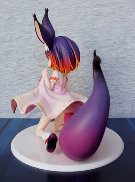
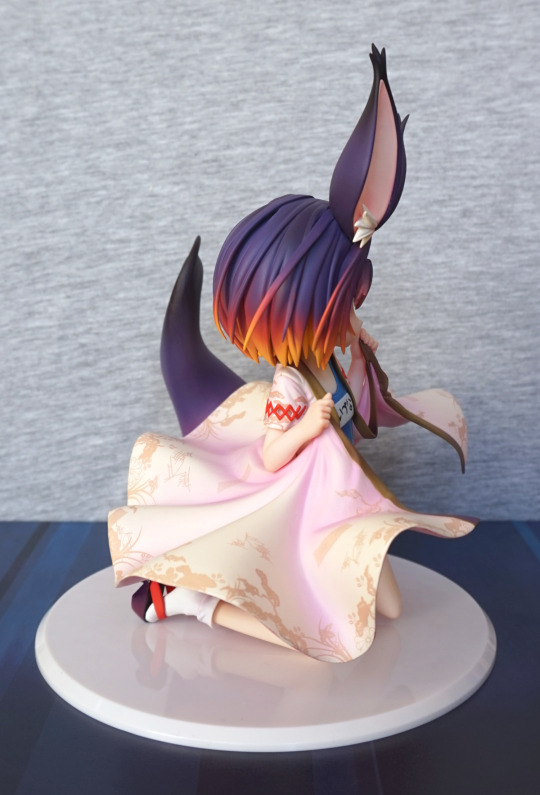
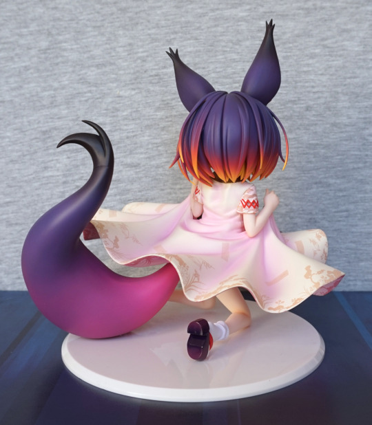
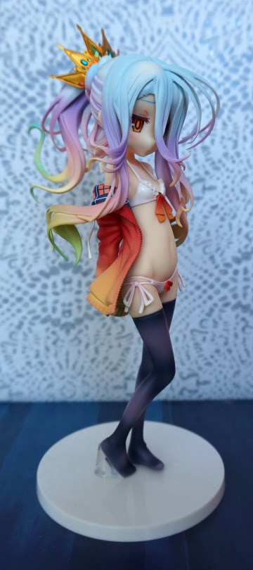
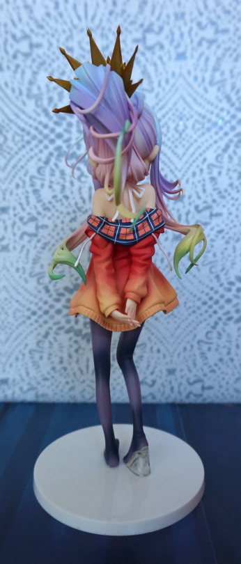
Figure spin-around
Here are some photos showing the figures side-by-side in the same shot:


The most noticeable difference I’d say is the hair – the gradient is fairly different on the bootleg, leaving the hair having much more yellow than the official. The second thing that stands out to me is the tail – the gradient isn’t as nice on the bootleg as it is the official.
Close-ups
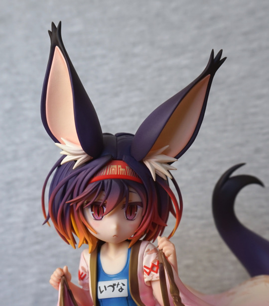
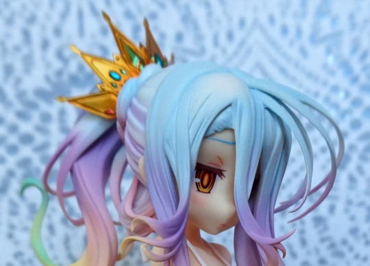
Let’s take a look at her face first:

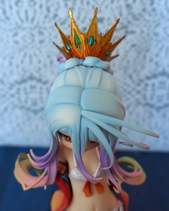
The hair gradient is much smoother on the official and doesn’t dominate her hair. If we look to the left side of her hair, it looks liken they sprayed it after assembly instead of before, leaving large amounts of yellow undertones.
The seams at the top of her fringe have significant gaps on the bootleg, plus yellow paint seemingly seeping out. Her headband also doesn’t fare too well, with a less golden paint and purple paint overspray.
For her face, the printing is of a lower quality and the blush on her cheeks hasn’t been blended in, giving her a more “comic” look.
A closer look at her headband:

Here we can see that it’s not just the hair colour getting onto her band, but her band colour has seeped onto the top of her fringe with the bootleg. Original is definitely taking it here! If we look to the upper part of her hair, we can see where the purple paint wasn’t thick enough to cover the initial yellow coat and one bit of purple paint is straight-up missing on the front-facing part of her hair.
For the fringe, we can see where the bootleggers have stuck with a more basic red paint instead of blending to the nice subtle red of the original.
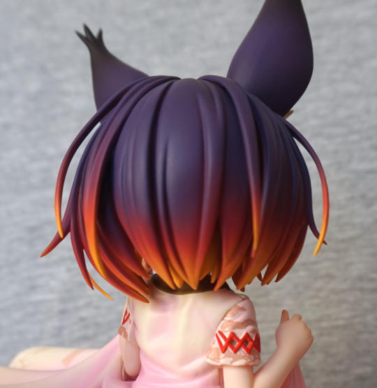
Back of her hair:

Here we can see how the bootleg’s hair was originally painted yellow and had the other colours layered on top. This deprives us of the nice, solid tone of purple the original has. Due to the quick sprays the bootleg has, we can see how the gradient and coverage suffers. It also hasn’t been handled well, leaving marks in the paint.
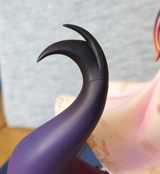
Ear close-up:

Buy one bootleg, get warehouse dirt free!
Most (if not all) of the dirt we see on the bootleg came with the figure. Not entirely sure if it’ll all wash off, but chances are some is embedded in the paint, so there will be some black dirt clearly visible against the pale colours of the inner ear.
We can see where the remoulding has gone kinda wrong here too – the points on her ears have been lost and the whole thing curls up far more than it should. They’ve also seemingly used the same cream colour as the base colour for the ear and the tuft, presumably to save time and cost. On the original, it is painted a bright white like a tuft should be. Lastly for the ear, the purple on the bootleg is marred with bits of yellow paint.
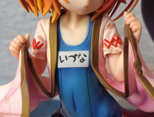
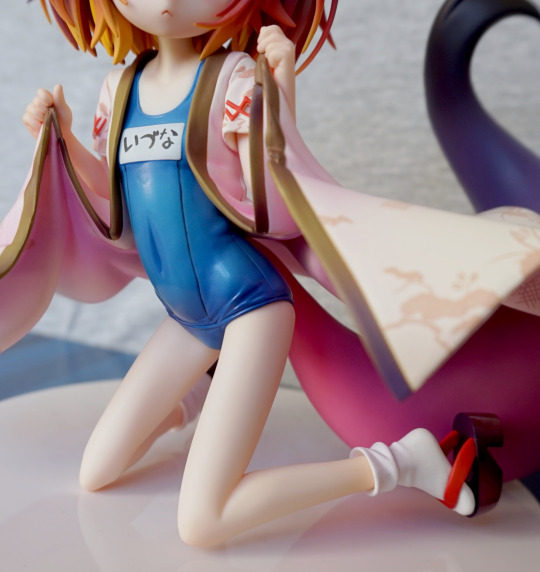
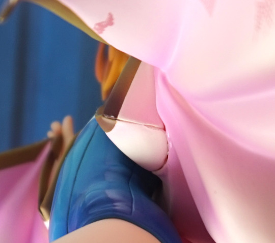
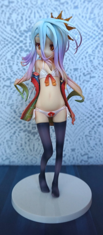
Chest:

For me, these parts are surprisingly close for a bootleg and official. The writing actually looks OK to me on the bootleg – the bit on the end may’ve been squeezed in a bit though. We can see where the label paint overshot – it should’ve followed the raised line on the right, but it is extended out, giving the label a weird rumpled look. They’ve also neglected to paint the lines on her swimsuit, but I’m not entirely sure this was a bad choice given the blobbiness of the original.
The shading on the swimsuit makes less sense on the bootleg, but isn’t distractingly bad. What is mildly distracting when looking up close is how there is a gap between her upper chest and the swimsuit on the right-hand side of this photo.
With her body wrap, we can see how the not-great seams on the original are now even worse on the bootleg, and don’t even attempt to join up really. By both not-joints there is missing paint, plus the scratched paint just below her chest.
It’s not overly visible in the photos, but the swimsuit on the bootleg doesn’t have as glossier finish as the original.
At the top of the photo, you can see the usual mess that bootleg figure hair usually is – the official comes to nice, neat points whilst the bootleg has very obvious seams and blobbiness.
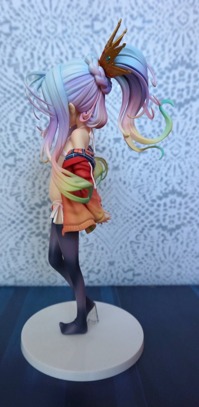
Upper arm:

Here we can see how the “print” on the bootleg has been roughly painted on this part of the wrap and there’s no background shading. The rest of it isn’t so bad, but this part really suffered. Moving onto the red crisscross pattern, the original is a bit flawed, but the bootleg tops it, especially the part where two of the diamond parts don’t even touch.
In the crook of her elbow we can see the bootleg has less subtle shading, leaving her looking a little sunburned. She’s also developed a skin condition and has some surplus plastic poking off her hand.
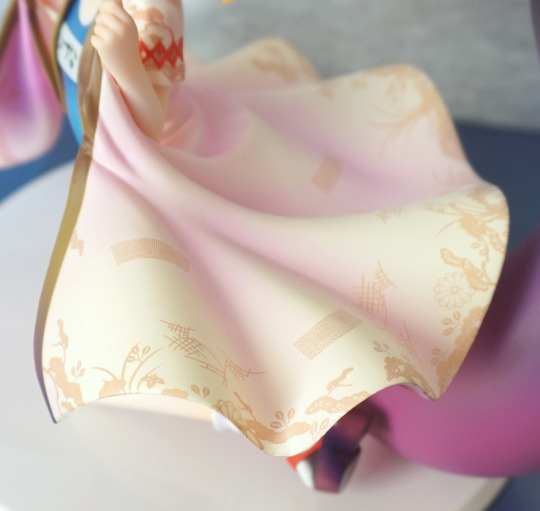
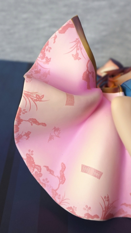
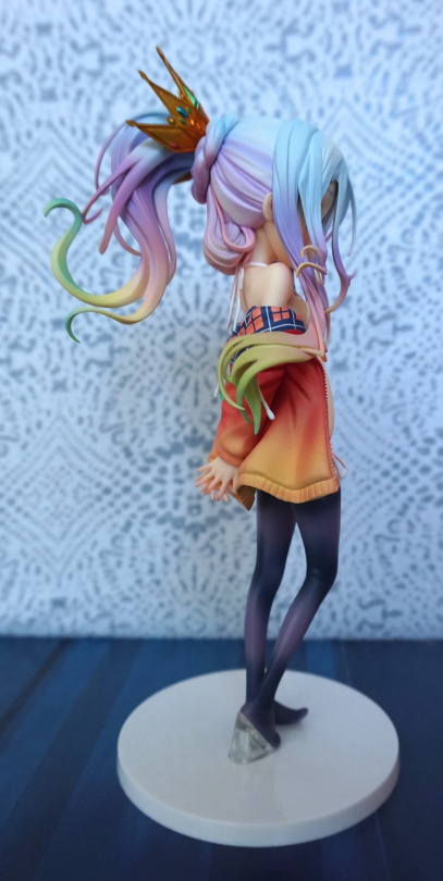
Close-up of the wrap:

Again, these are surprisingly close in appearance. The printing on the bootleg didn’t suffer too much, and contains pretty much all the details of the original. If we pretend there was a lack of warehouse dirt, there are some small tells though. Near the top of the image, we can see where the paint has been scratched during production of the bootleg. With the print itself, we can see where it interferes with the gold banding and we have some whitish bits overlapping. Another subtle print issue is where the design goes onto the very edge of the wrap, where it does not on the original. Finally, the pink shading is not blended as well on the bootleg.
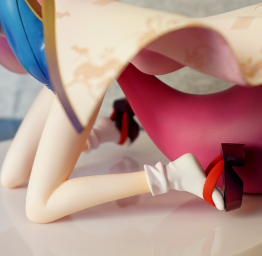
Leg:

The legs themselves aren’t that different, nor is there anything particularly wrong with the bootleg one. However, this all falls apart when we get to the sock and notice a distinct seam line on the bootleg. The paint is also rough here, giving a very cheap feel to her sock. On the official, we have a much more vibrant, pleasing red on the sandal strap compared to the bootleg. The shading on the base of the sandal has been simplified, so the dark shading isn’t concentrated to the inner-ish parts of the sandal base.
Foot:

Here we can really see the difference between Aquamarine’s super-gloss and the bootleg’s… whatever. The roughness of the paint is particularly bad here, and looks like she’s been using those sandals a fair bit! We also don’t have the nice gradient the original has.
Tail:


Here we can see the original tail transitions fairly smoothly between around four colours, and the bootleg jerkily transitions between three. We also have a shinier finish on the tail on the bootleg, but it’s not massively noticeable. The bootleg is also marred with marks, straight out of the factory. The lower picture shows just how different the colouration is and how scratched up the tail is on the bootleg.
Underside:

Let’s see what’s going on underneath… The bootleg has shiny knees, but not a shiny swimsuit. The original has highly-contrasting finishes whereas the bootleg is the same level of half-shininess throughout. We also see some gapping between her swimsuit and her legs, where the parts don’t quite fit together. The difference between the paint colours of the bottom of her wrap are pretty stark too. and then there’s the much-maligned tail seam… On the original it isn’t too hidden, but there’s definitely no ignoring it on the bootleg. On the original they’ve at least attempted to blend it in (though some people’s copies are far worse than mine), but the bootleg it is just… there.
Conclusion
This bootleg may fool some people, but has some pretty distinctive differences from the original. The hair and the ears are the big giveaways, with smaller flaws throughout. If the thing hasn’t fallen apart. The base is also a distinctive clue – if it is bright white, then you’re looking at the bootleg. If you can only get a good look at her body then the missing black lines and lack of shiny finish are the biggest differences.