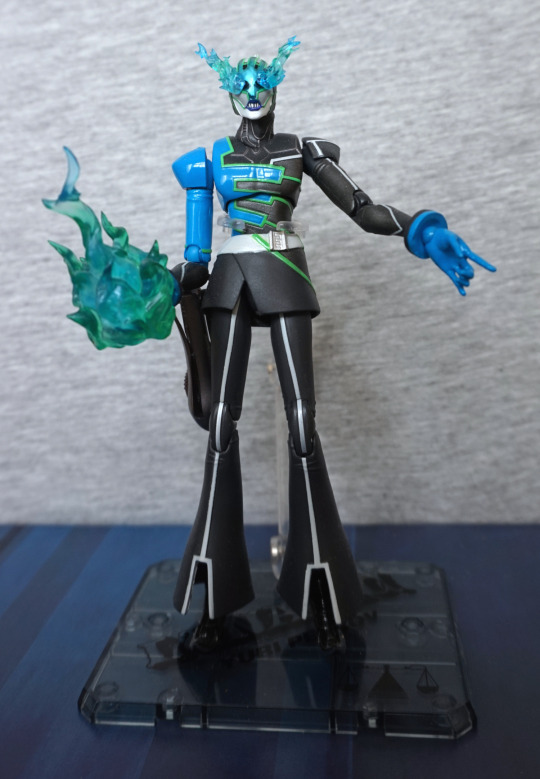
This figure was part of a Suruga-ya order. Unfortunately, this one had an unpictured extra – cigarette smell :/. So this figure got a couple of baths too…
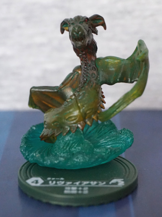
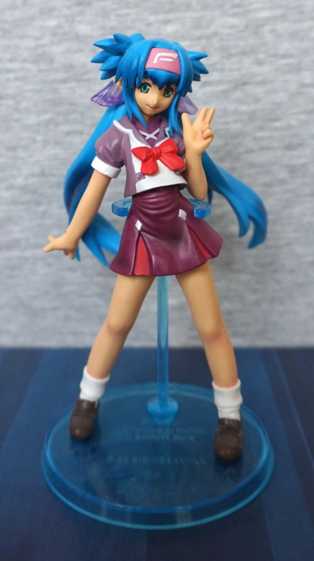
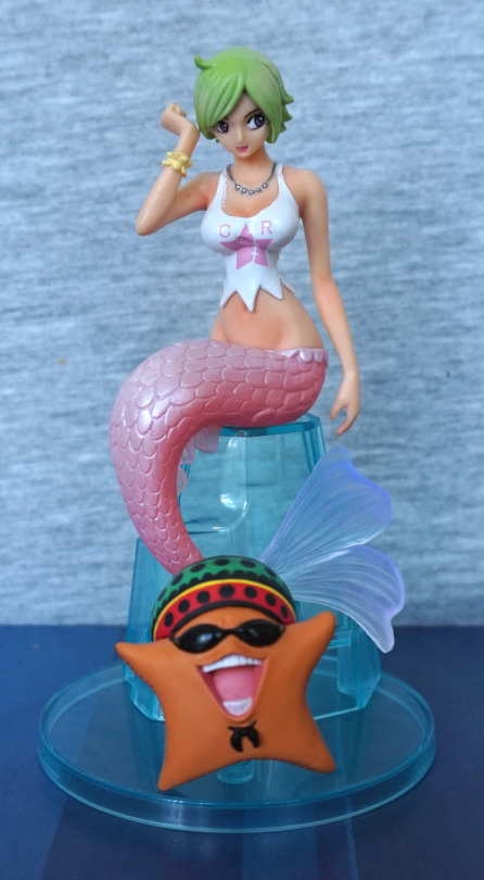
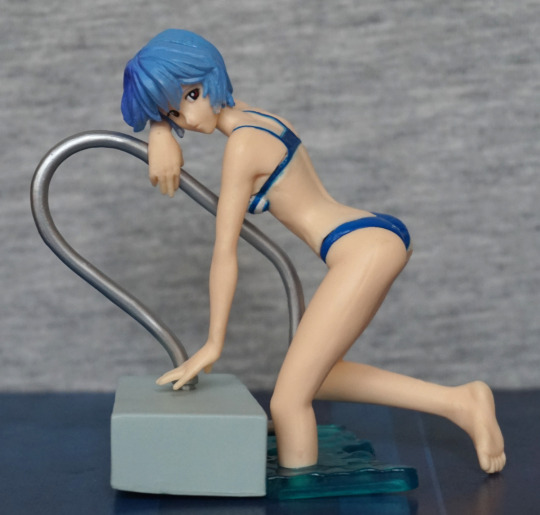
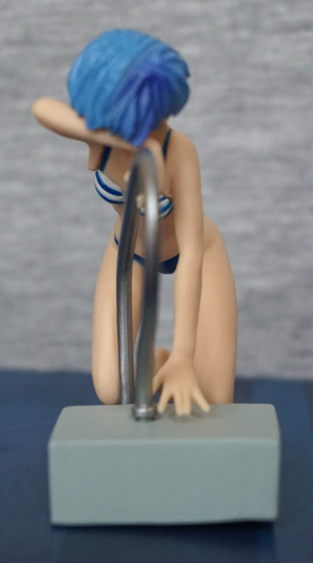
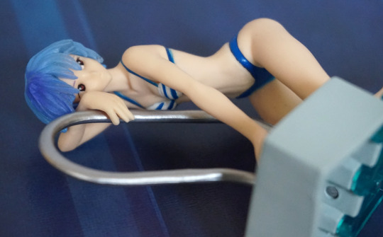
Here she is, assembled with the pool piece:
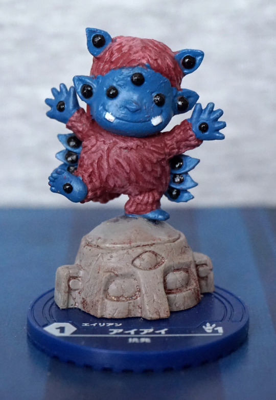
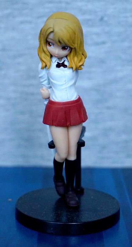
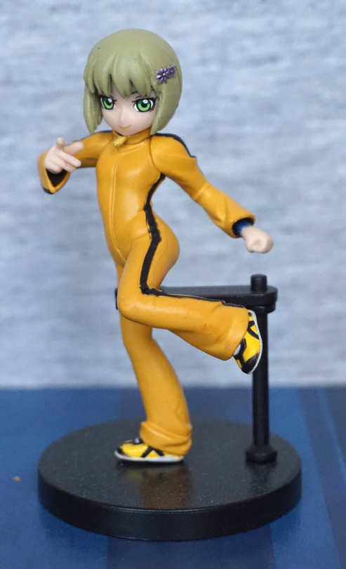
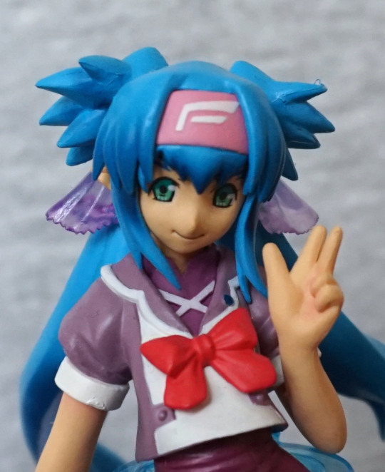
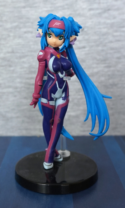
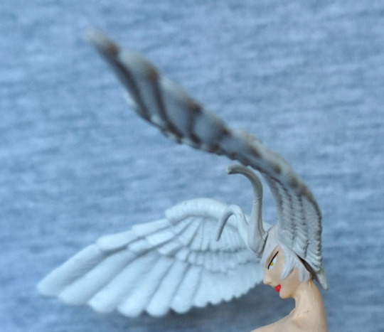
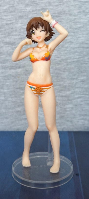
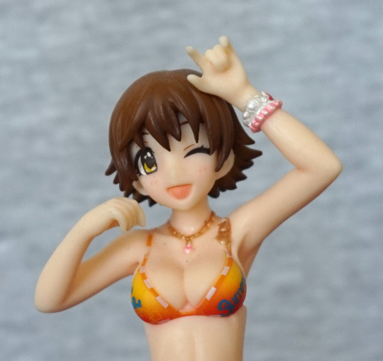
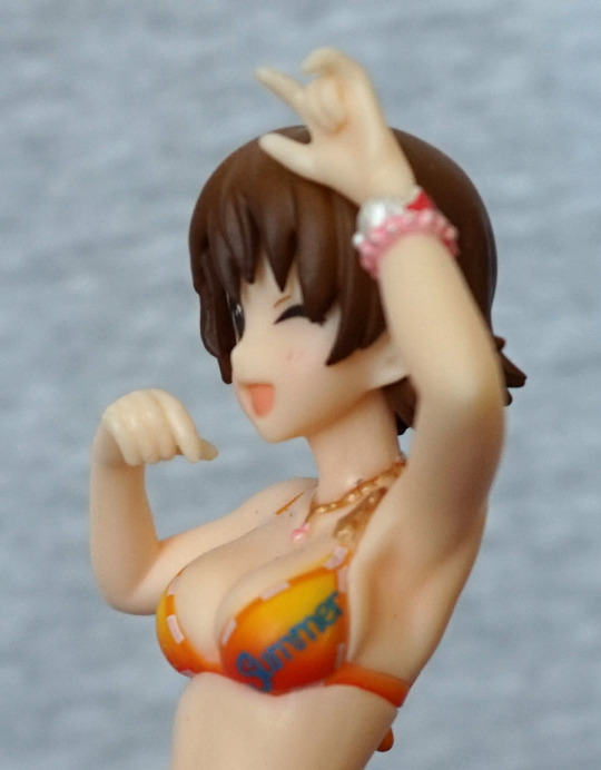
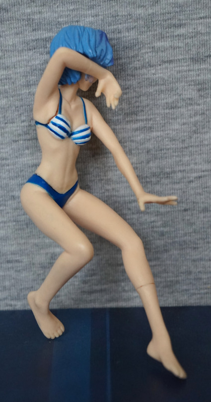
I like the pose for this figure, which is why I chose it. Figure quality isn’t great as she’s a small gachapon figure. Main thing that bothers me is the kinda strange paint job on her hair – not sure what’s going on with the shading there.
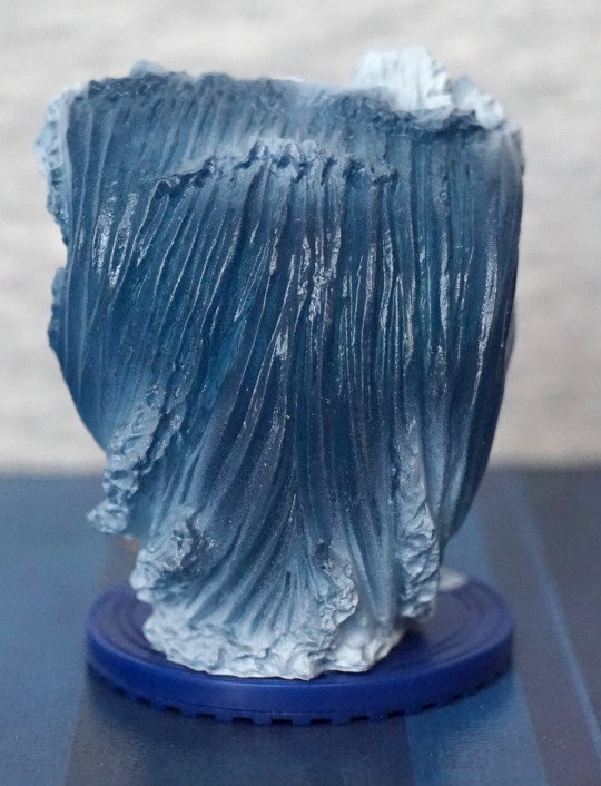
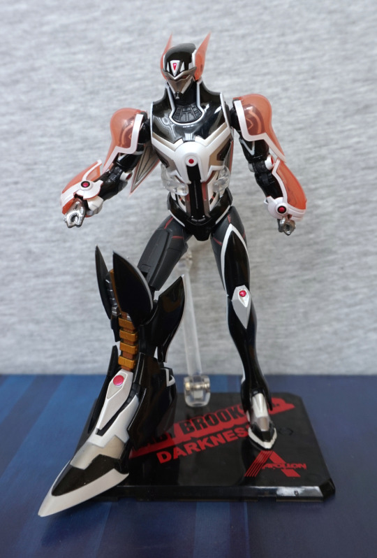
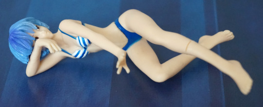
She also has a leg piece:
.. so you can do this if you really want to. Could look cool on a shelf ledge like this, or some kind of custom display.
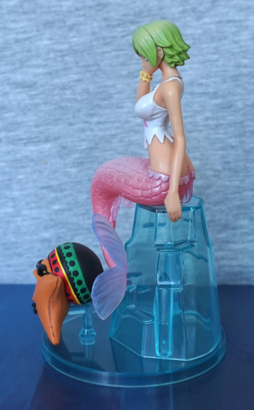
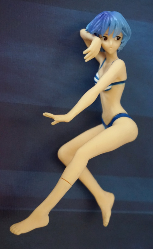
However, it’s more so you can do this:
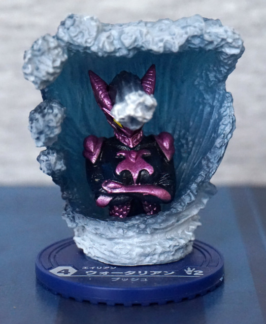
If you’d prefer to display her without the poolside, this piece allows her to look complete. Though her pose is a bit odd without the poolside.
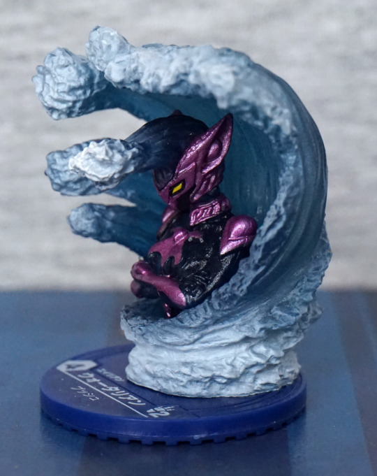
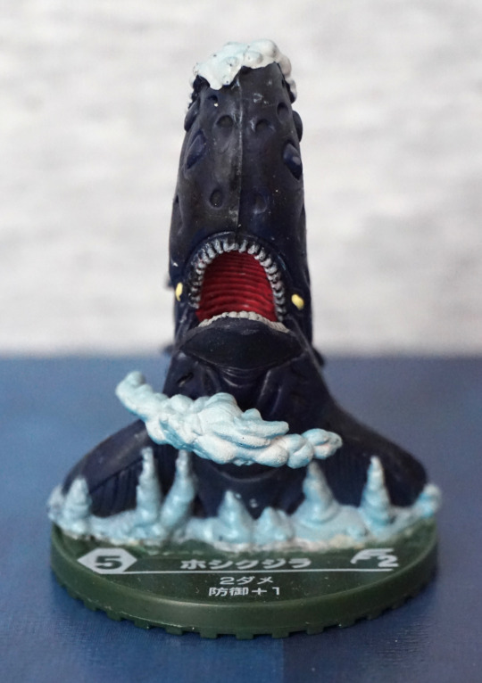
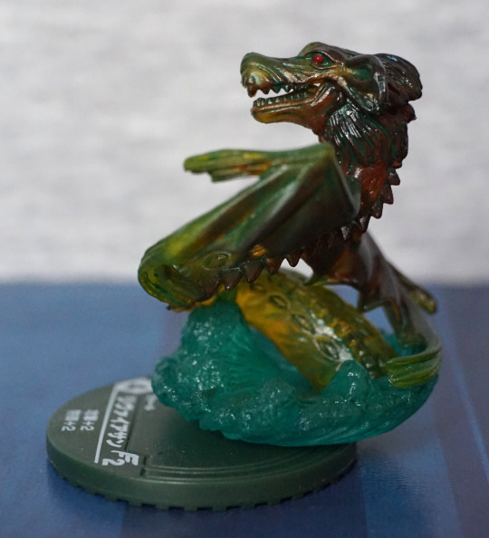
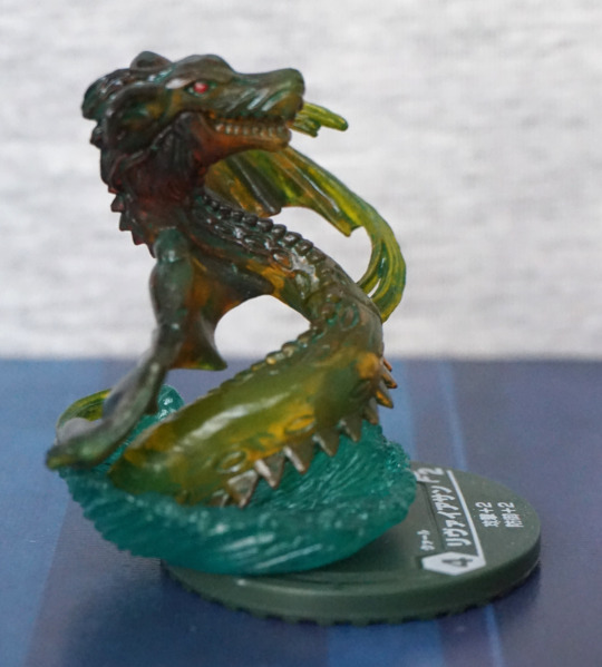
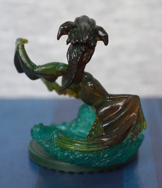
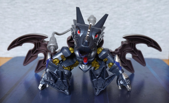
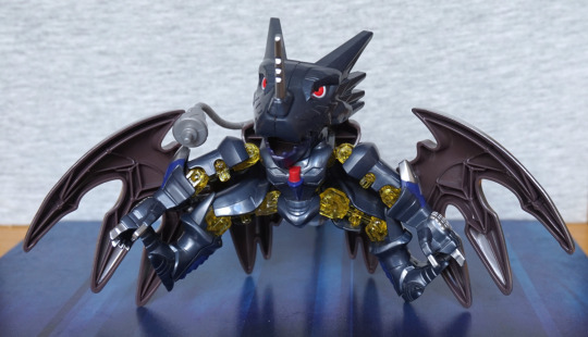
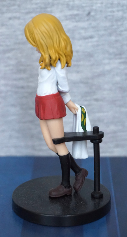
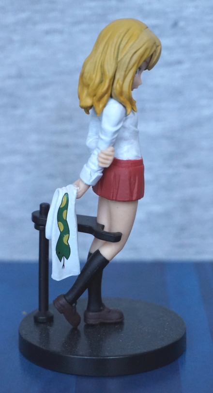
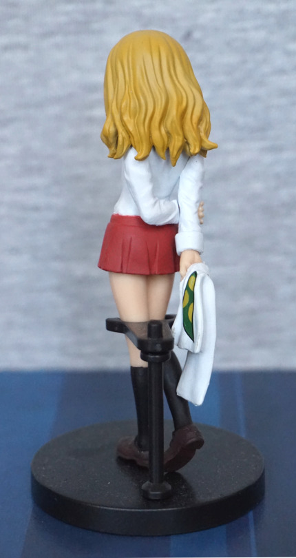
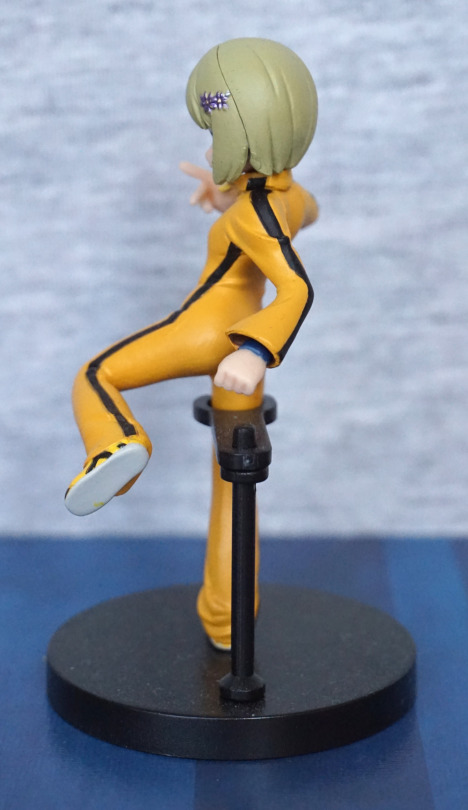
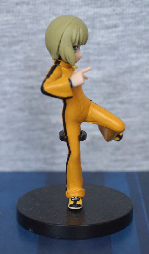
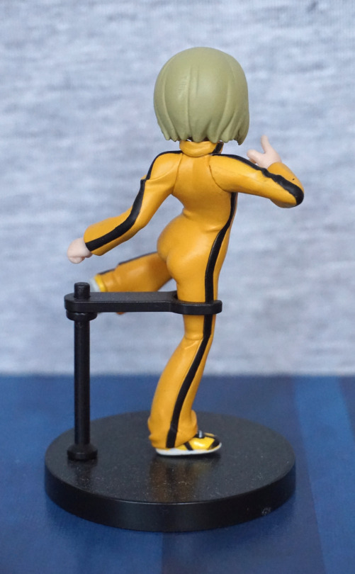
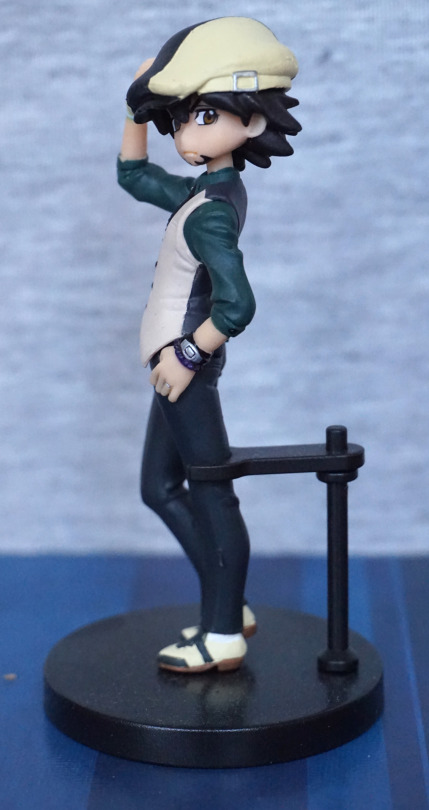
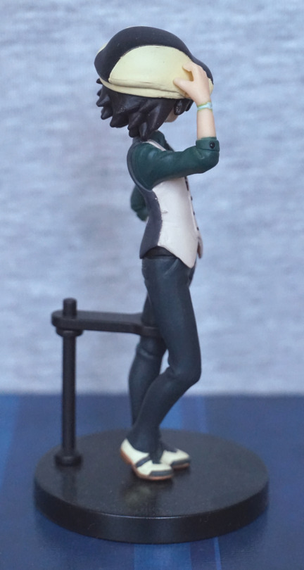
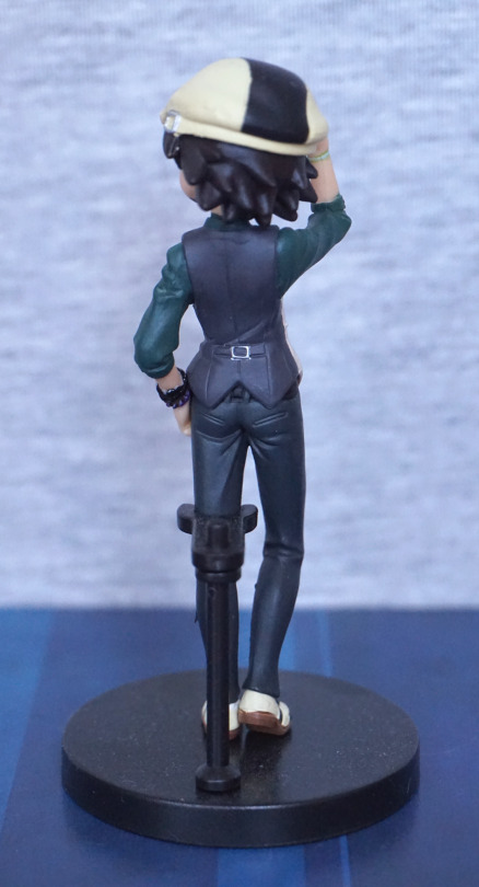
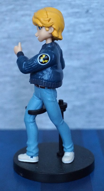
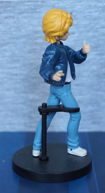
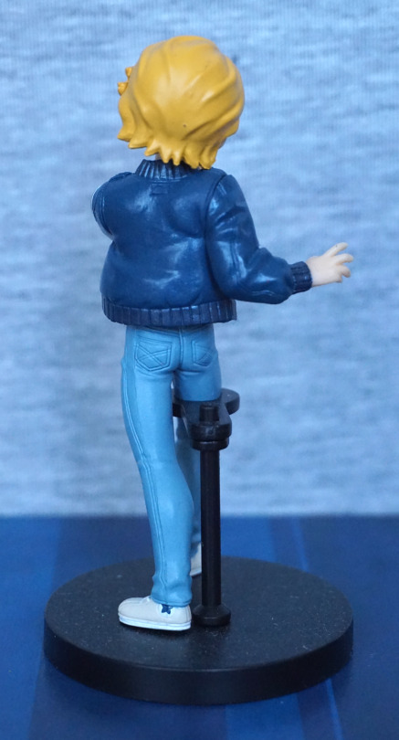
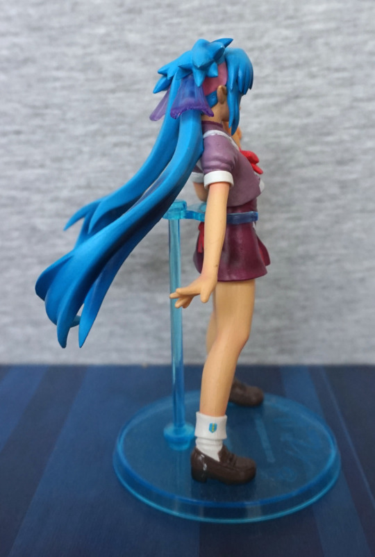
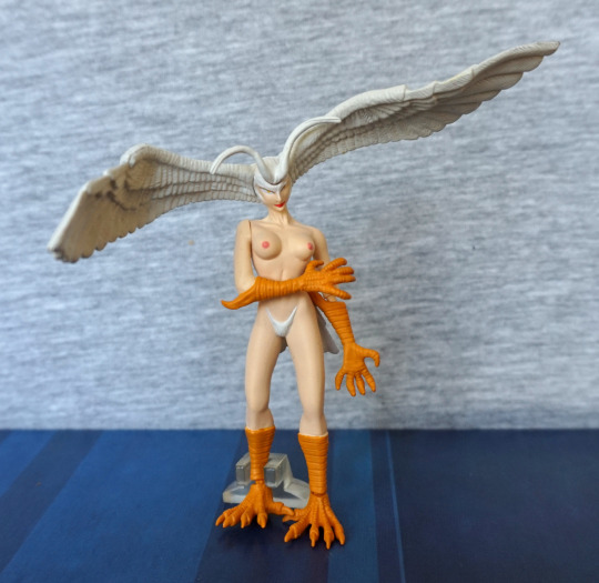
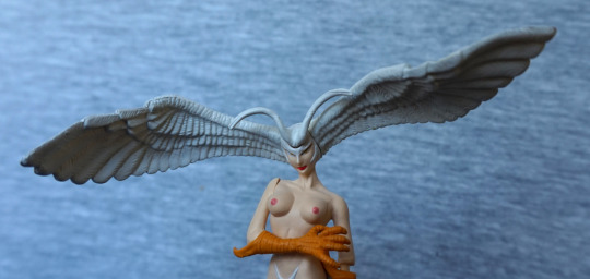
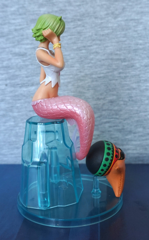
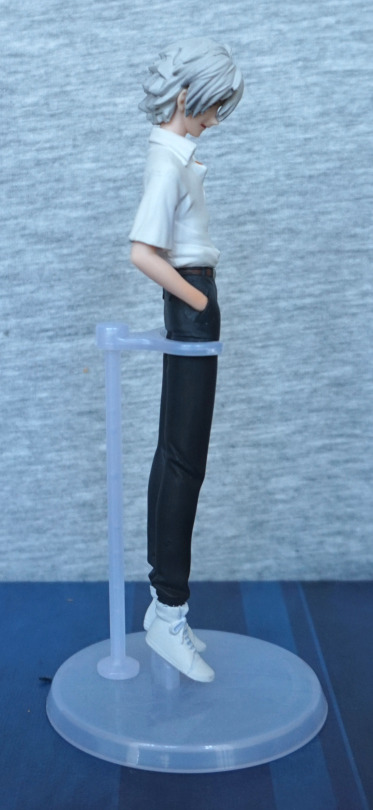
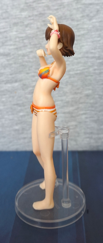
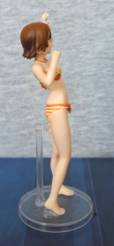
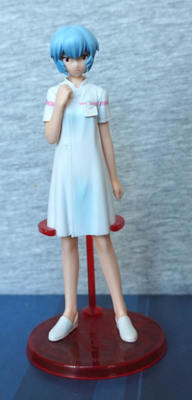
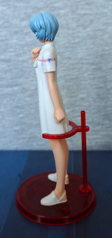
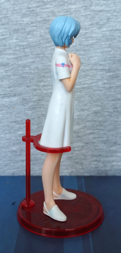
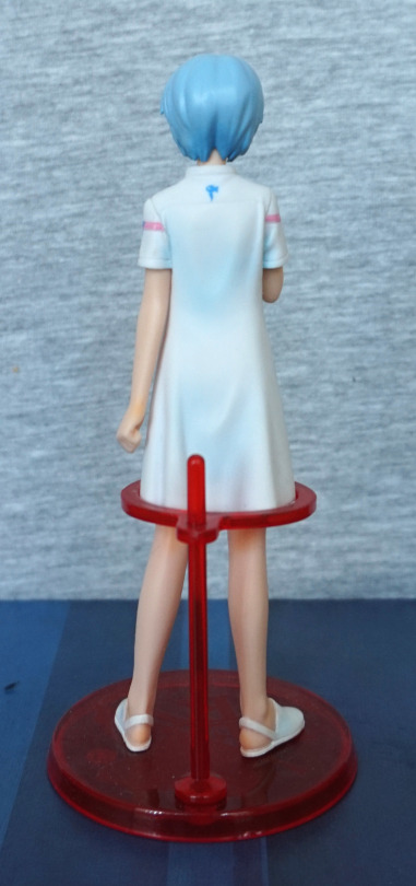
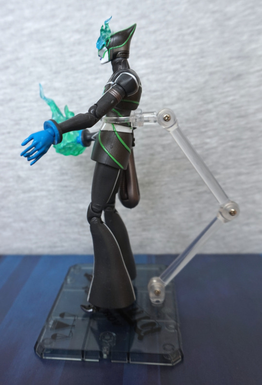
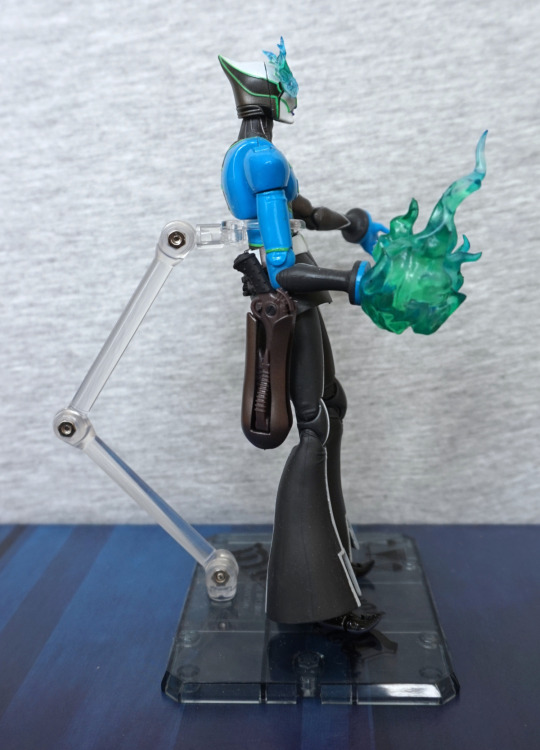
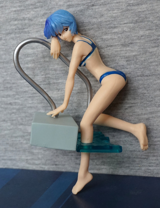
Some other angles without the pool:
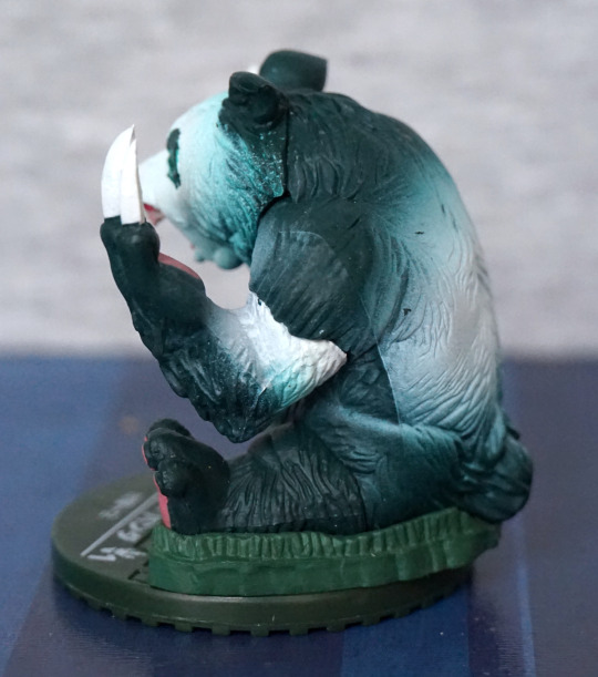
“Don’t look at me”:
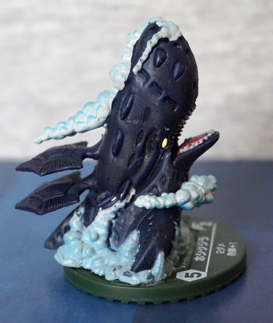
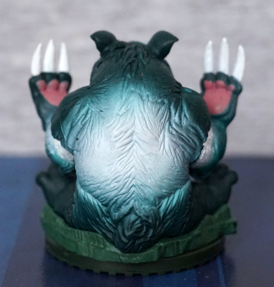
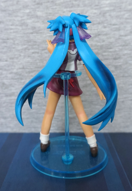
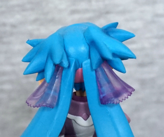
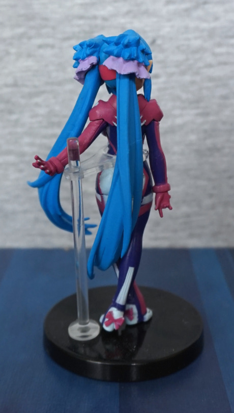
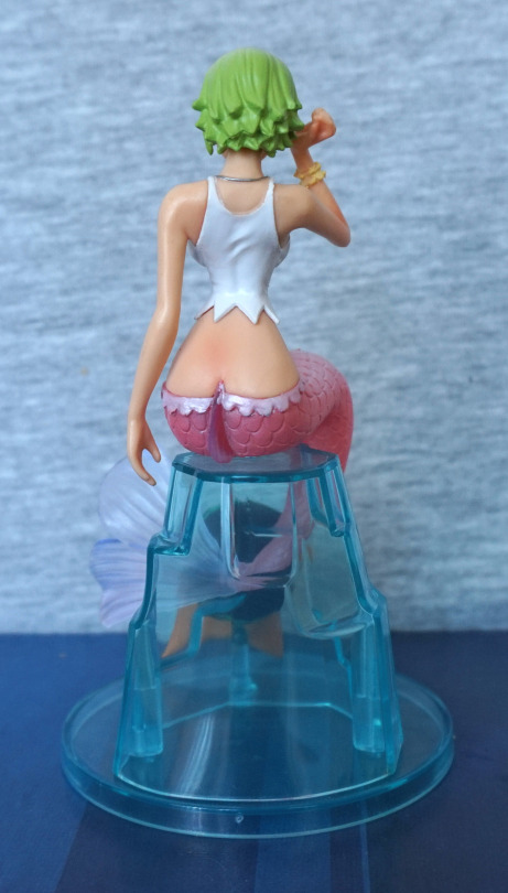
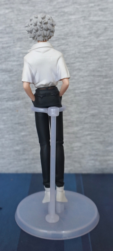
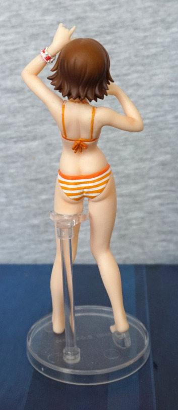
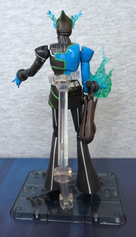
Back:
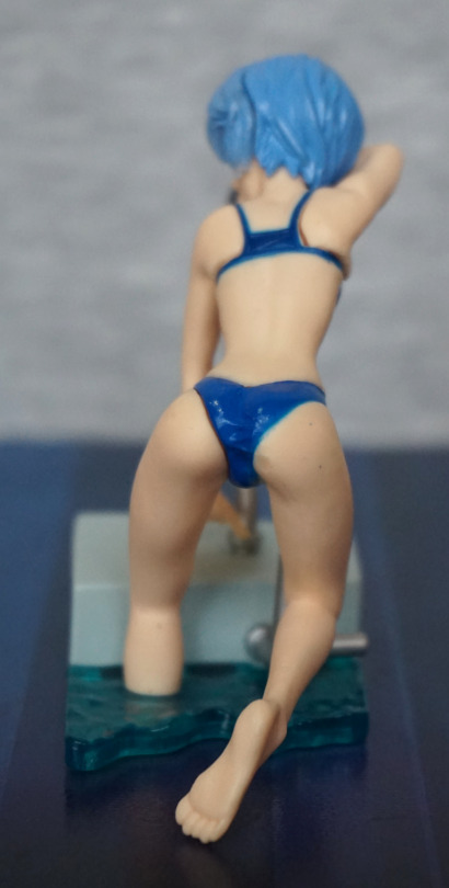
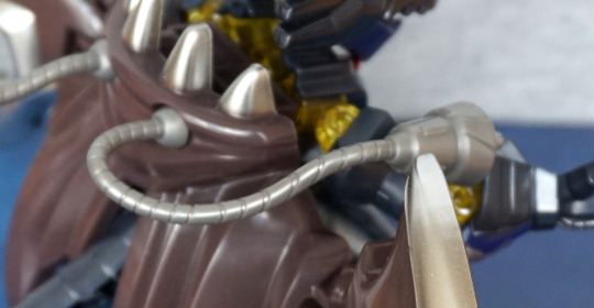
Here you can see where her parts need to be shoved together a bit more.. Her foot is nicely sculpted, and we do have some wrinkling in her bikini bottoms.
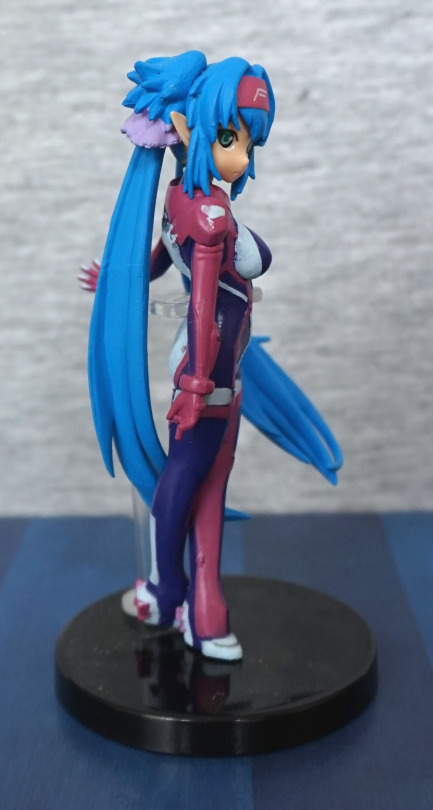
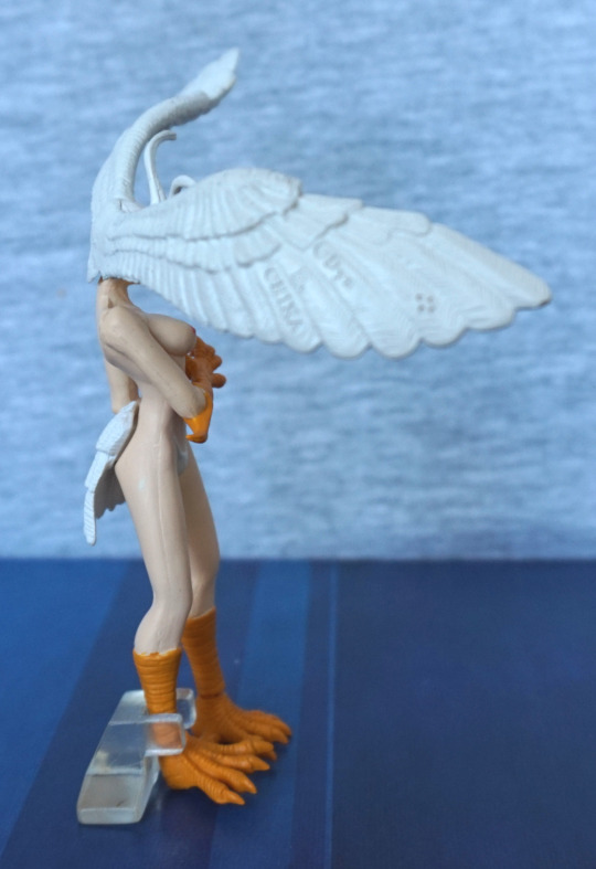
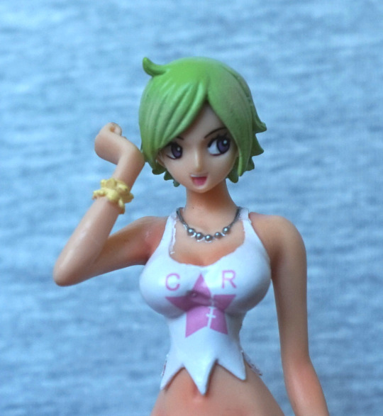
Front:
Not too much to see here. However, you can see the paint job that looks like some ink was spilled on her head… Probably needed to use a lighter blue here.
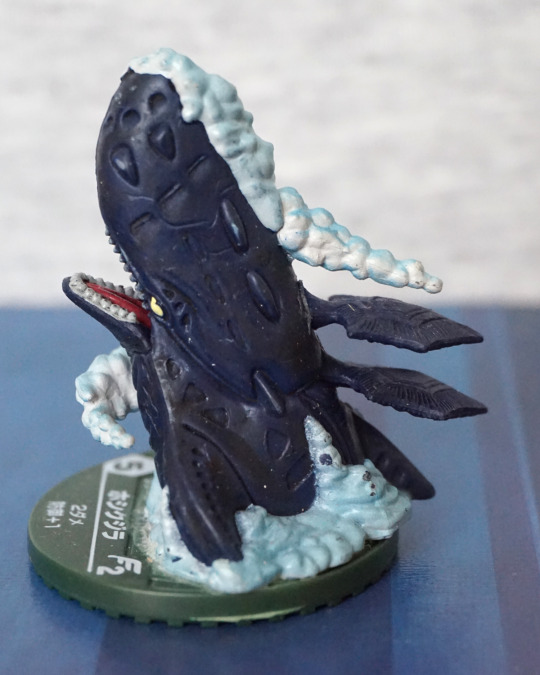
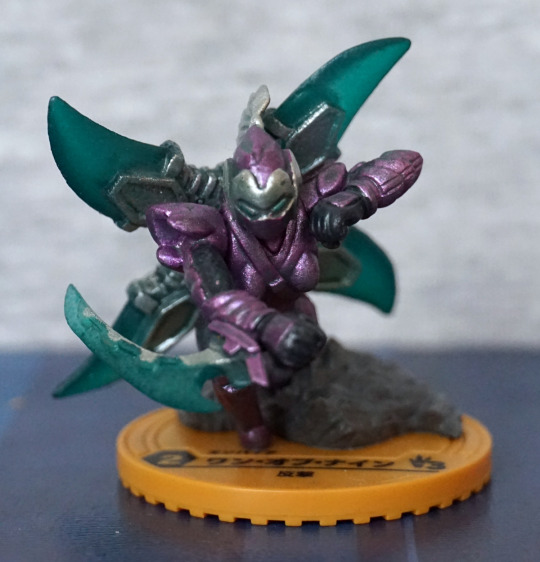
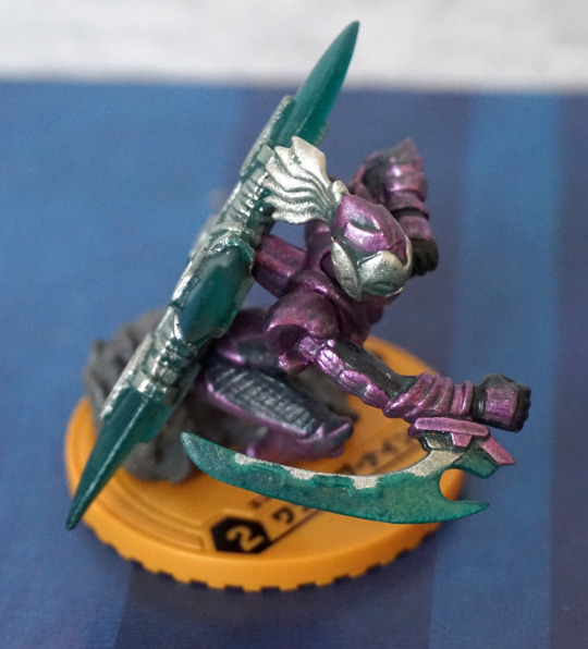
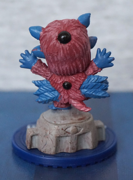
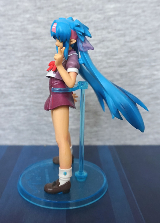
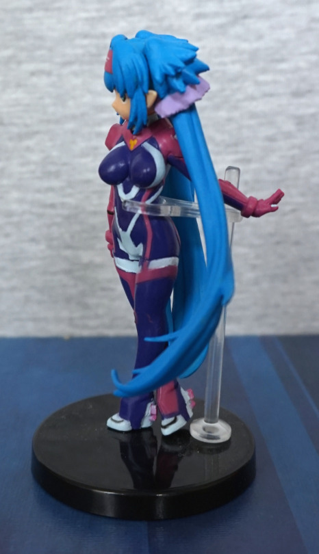
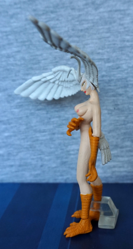
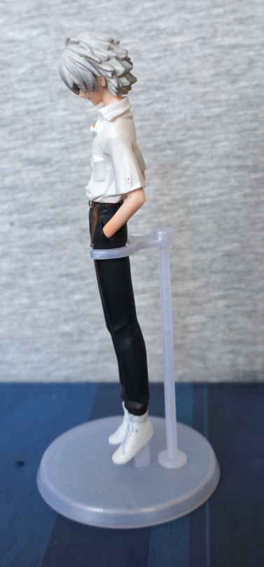
Other side:
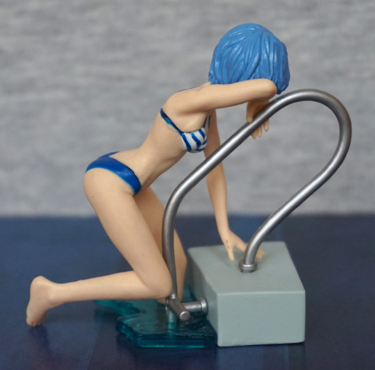
Not too much to see on this side. Hair is nicely sculpted, pool handle looks good.
View from below:
She has some nice sculpting on her body, giving her good body definition.
Overall, she’s decent for a gacha figure, and would recommend as a “bonus” item to an order. Hopefully if you get one though, it won’t come with bonus smoke smell like mine :