Tag: eastern figures

Silica – Sword Art Online – Noodle Stopper

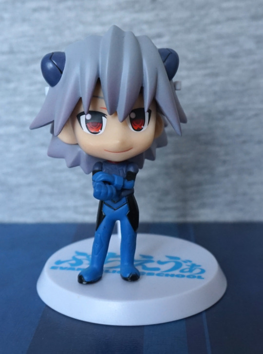
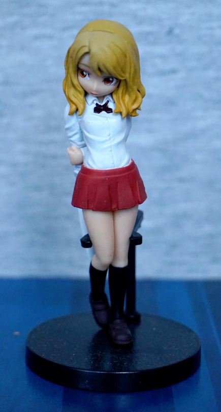
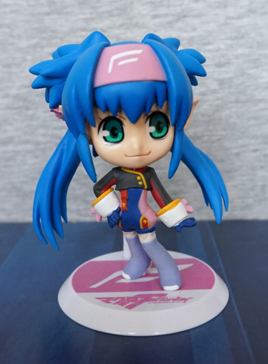
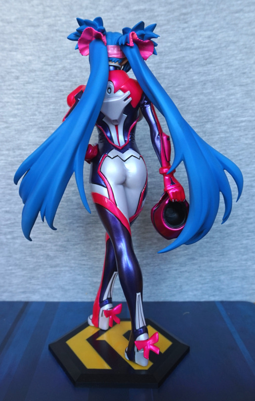
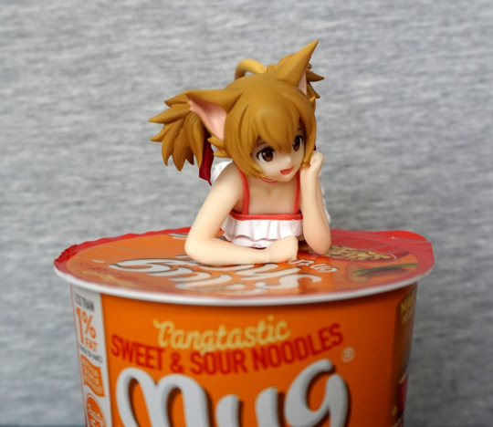
Pre-ordered this as it was a noodle stopper and SAO. She isn’t one of my favourite characters, but I thought this was cute and cheap enough to go for it.

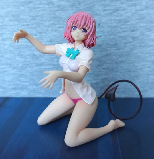
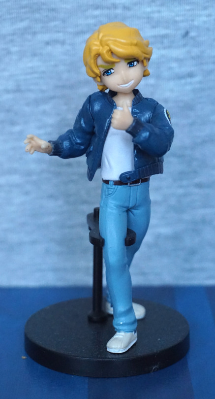
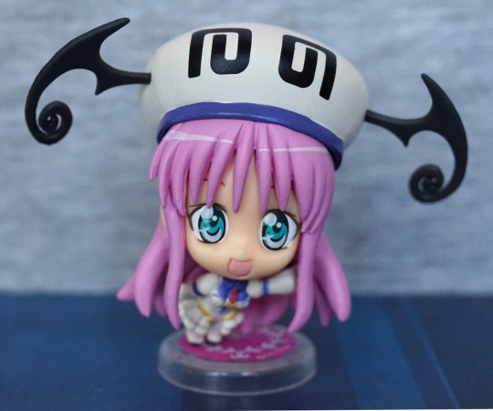
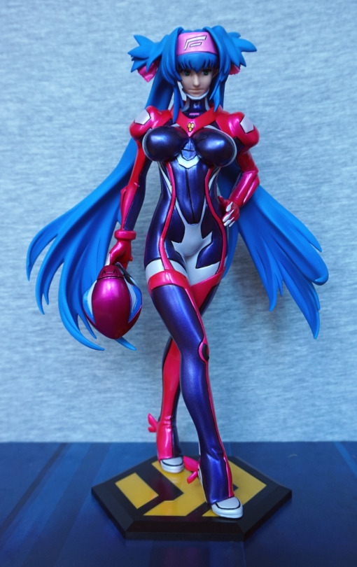
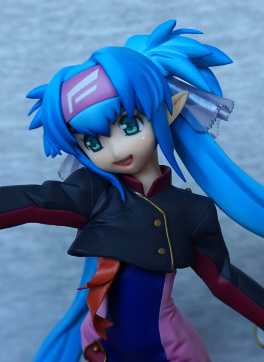
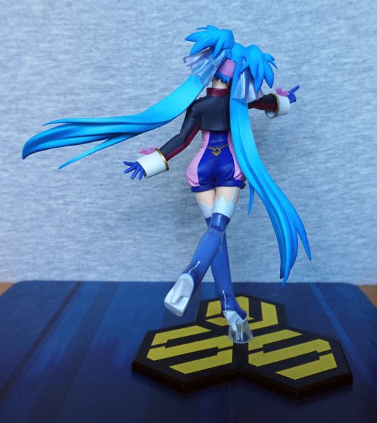
So here she is, being cute:

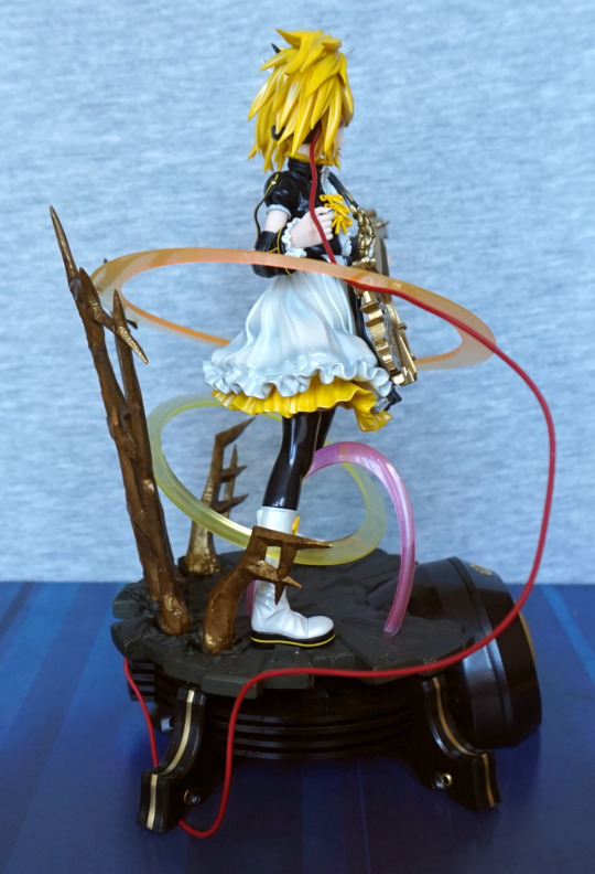
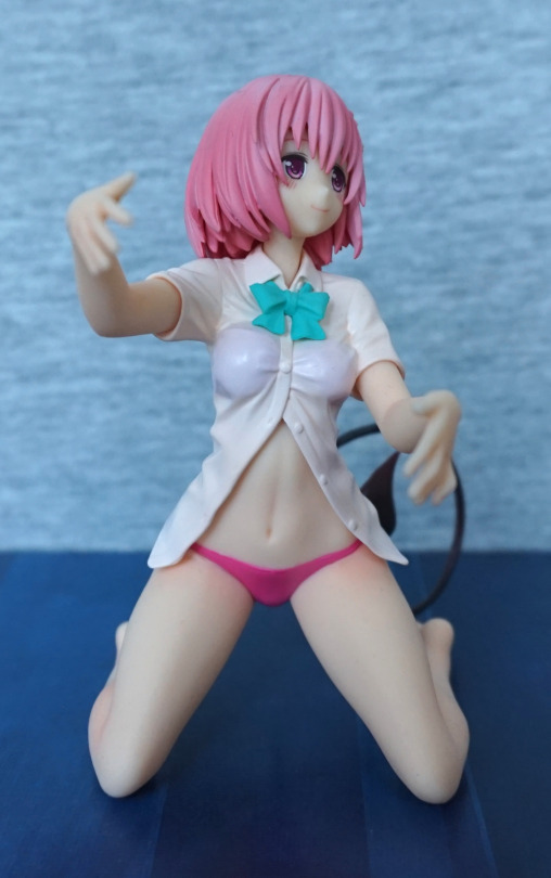
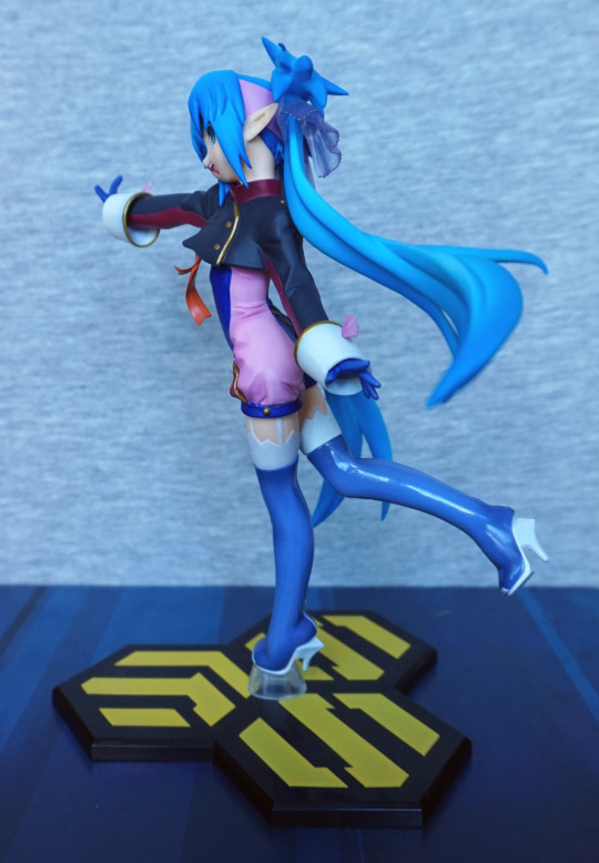
And herein demos my main issue with this figure – she’s pretty hard to display, and get the most out of her. 

Closer look:

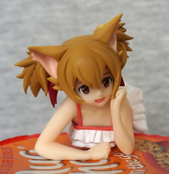
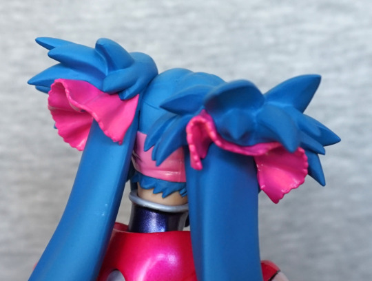
I love the cute, playful expression, and the hair is nicely done. There are little clumpy bits, if you look close, but these are sort of to be expected with a prize figure. The front of her swimsuit has been done nicely, and the red parts are enough within the lines to not be distracting. The posing of her upper half is really well done imo, and feels expressive. 
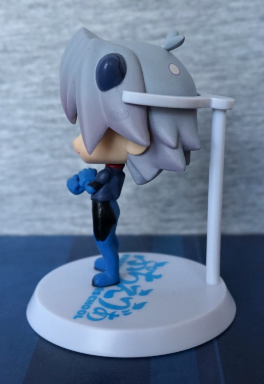
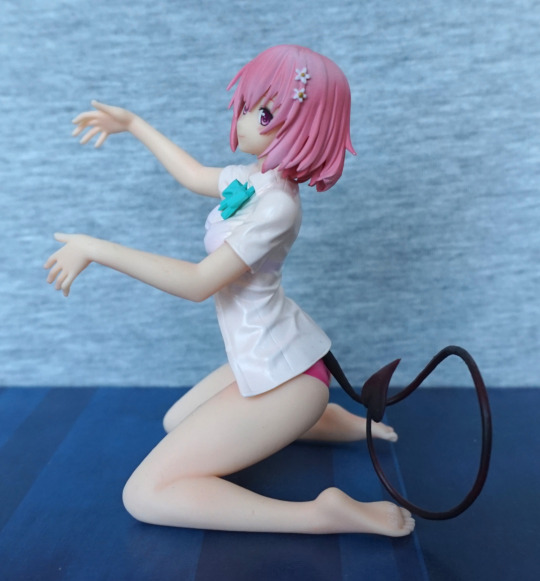
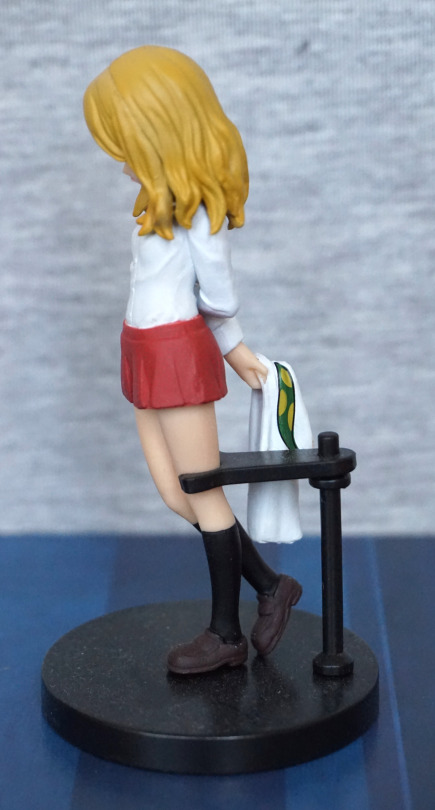
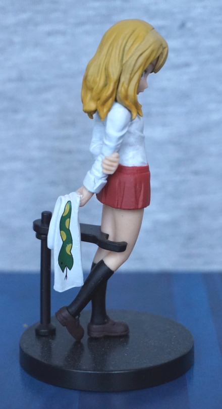
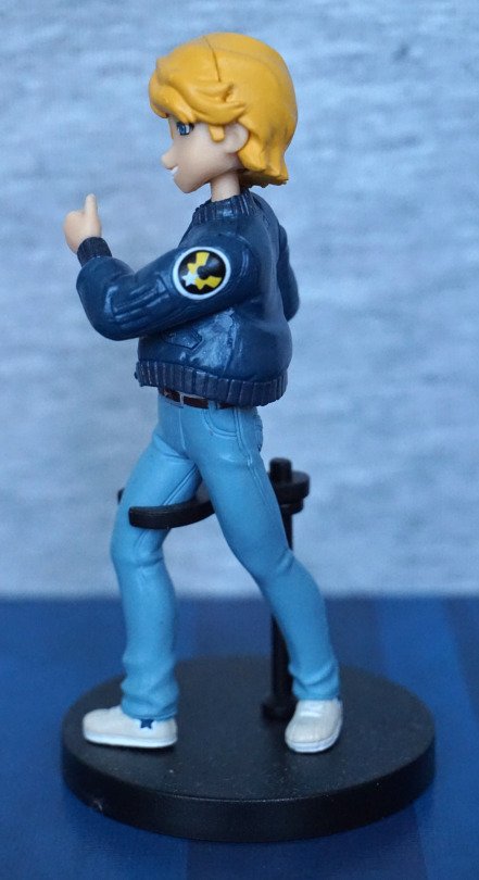
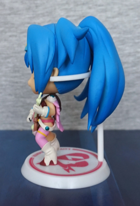
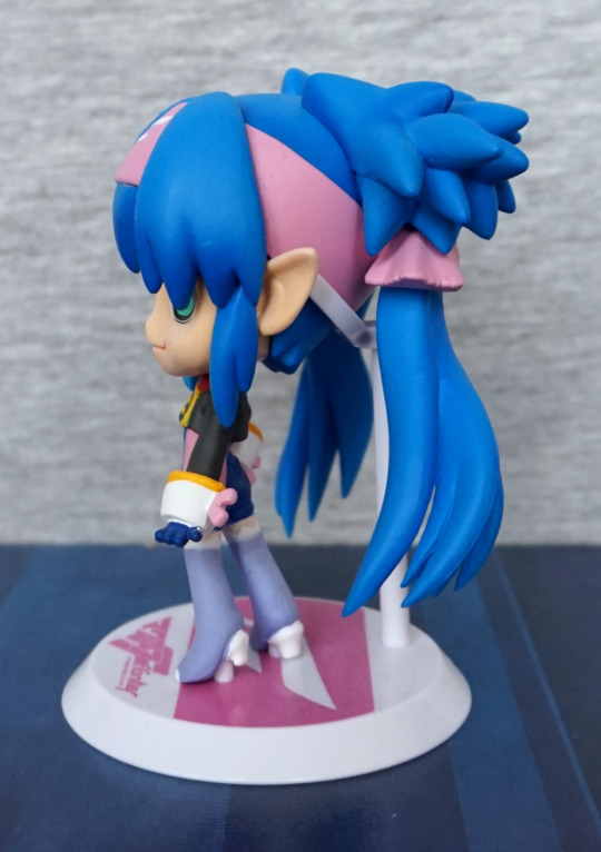
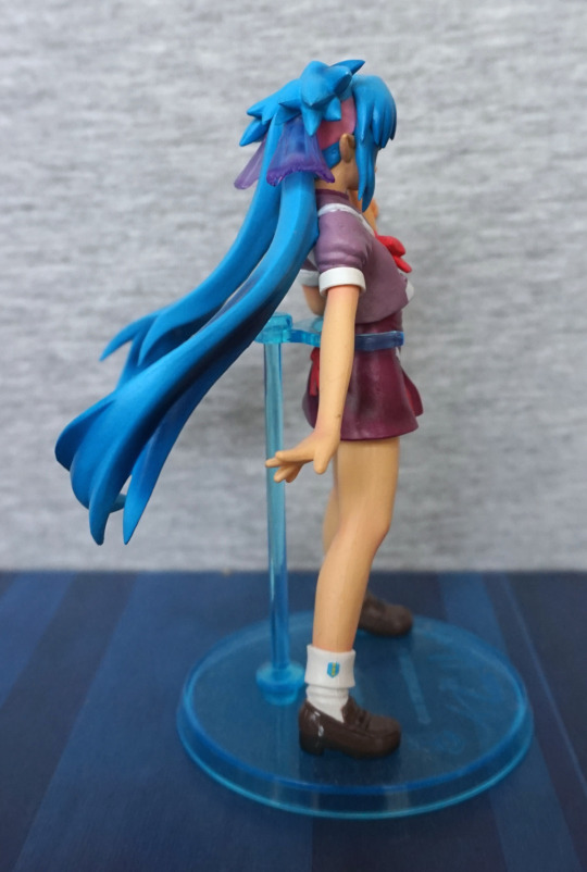
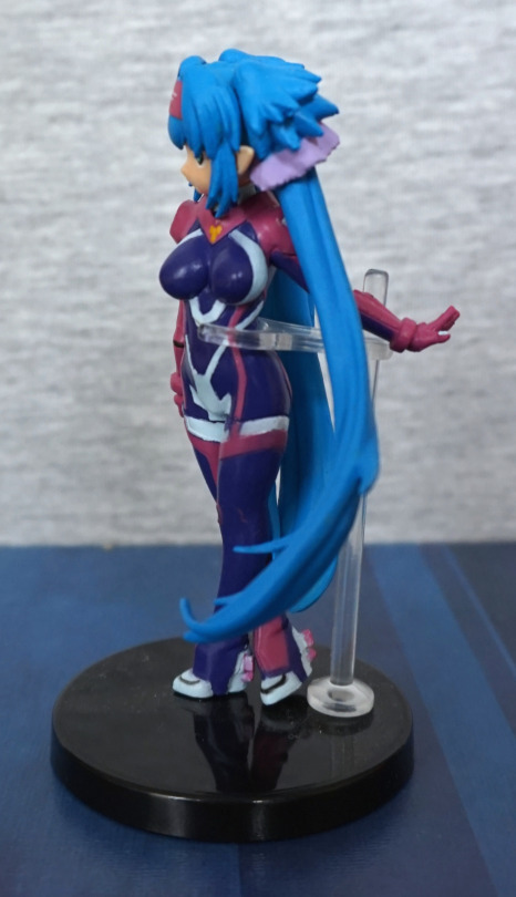
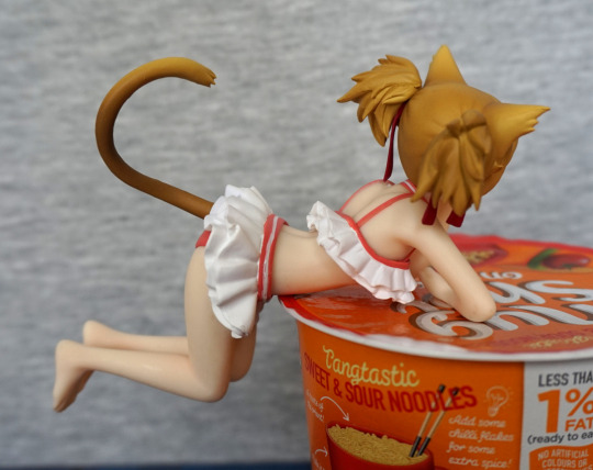
Left:

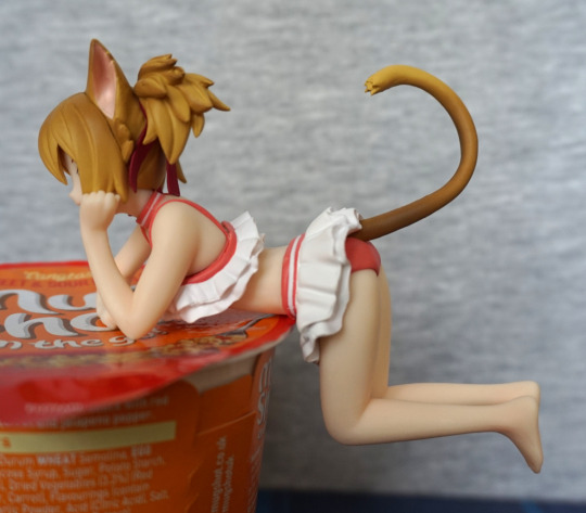
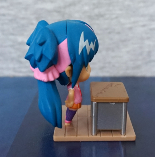
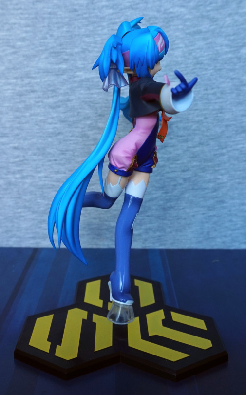
And here’s the everything we can’t see, if we use an opaque item to rest her upon. Her outfit is cute and neatly painted – I like the fact they’ve given her a collar, though it isn’t really visible from the front. Her tail curls playfully upwards, and the shading on it is nice. Love the detail they’ve put into her hair.

Unfortunately with this pose she’s a tad back-heavy – she will sit fine like this, but if she’s not fully resting on an object or you nudge her, she’ll fall off fairly easily. Out of the “noodle stopper” figures I have, this one wouldn’t function too well as one, even if you decided to use it for that imo. 
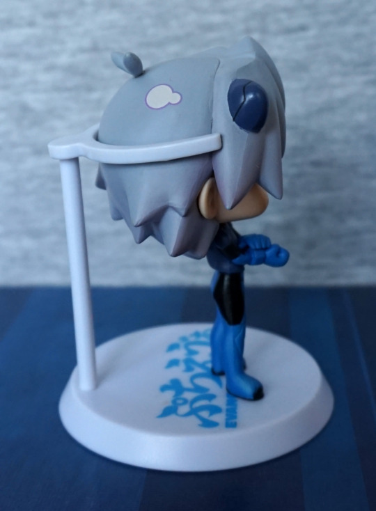
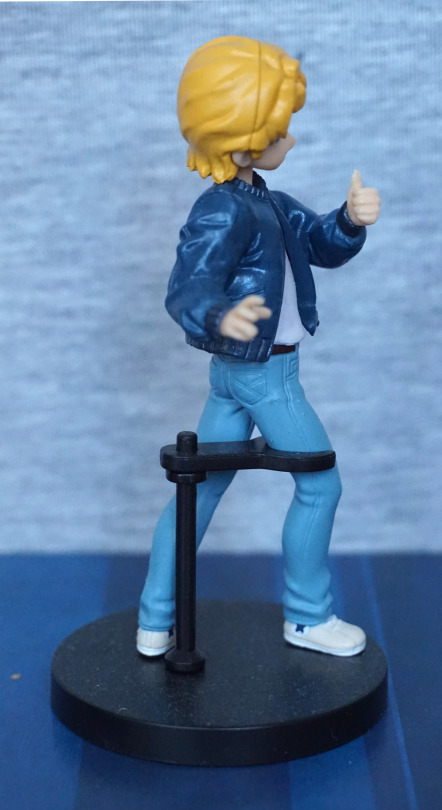
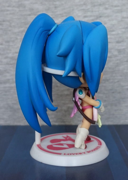
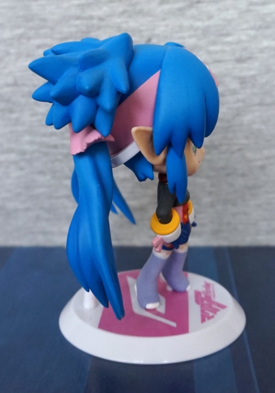
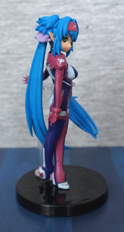
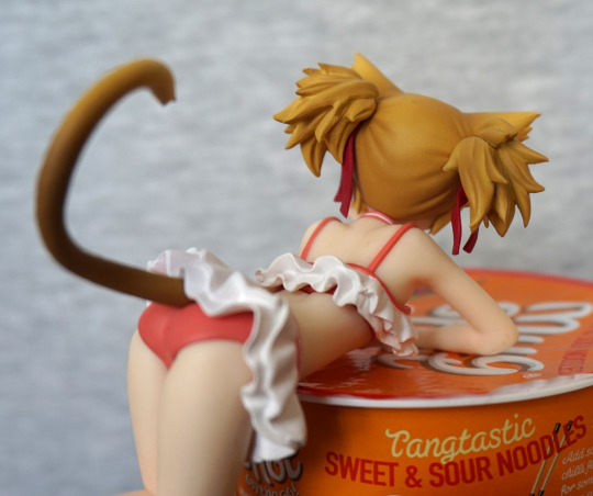
Right:

Paint is a tad more uneven on this side, but still looks decent enough. Love all the bits they’ve sculpted in the hair, and her tail shading fits the curve of her tail. 
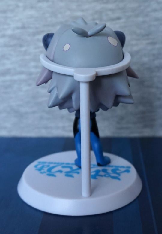
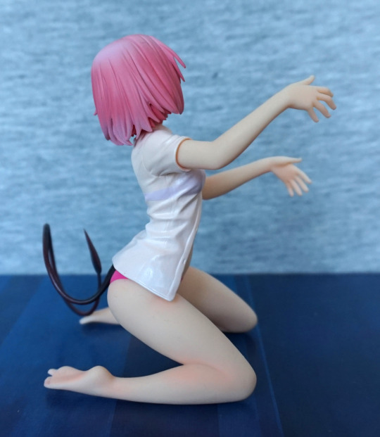
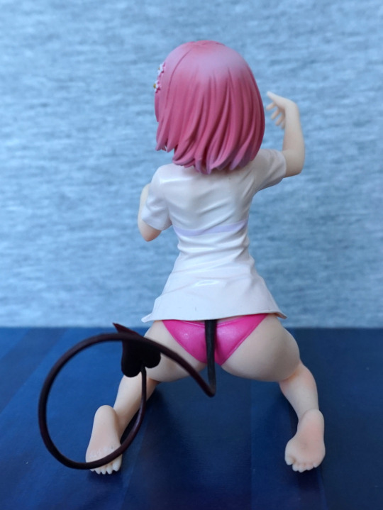
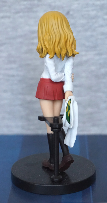
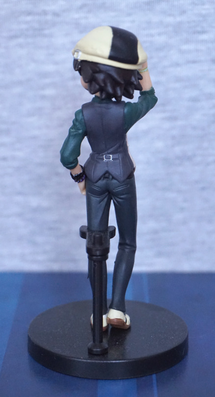
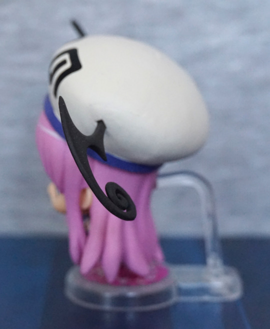
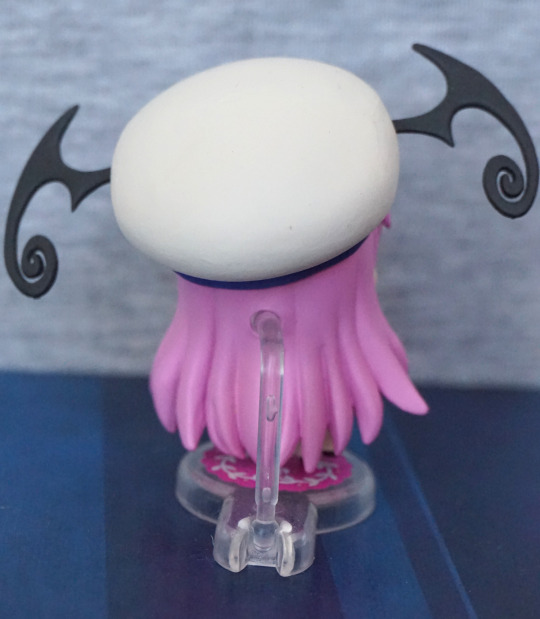
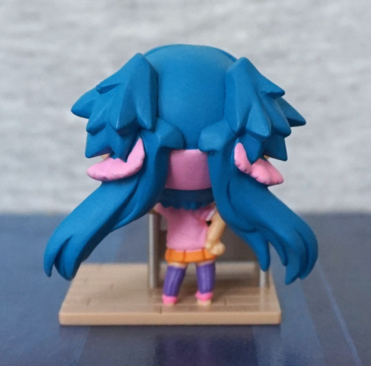
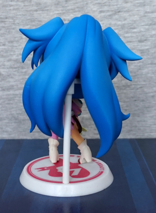
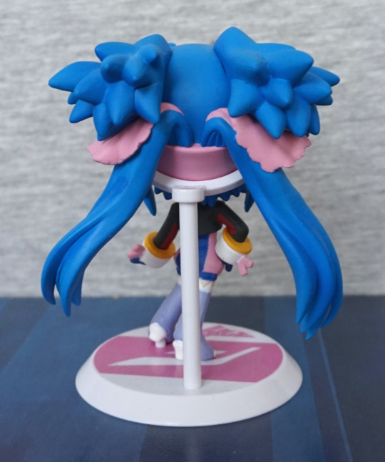
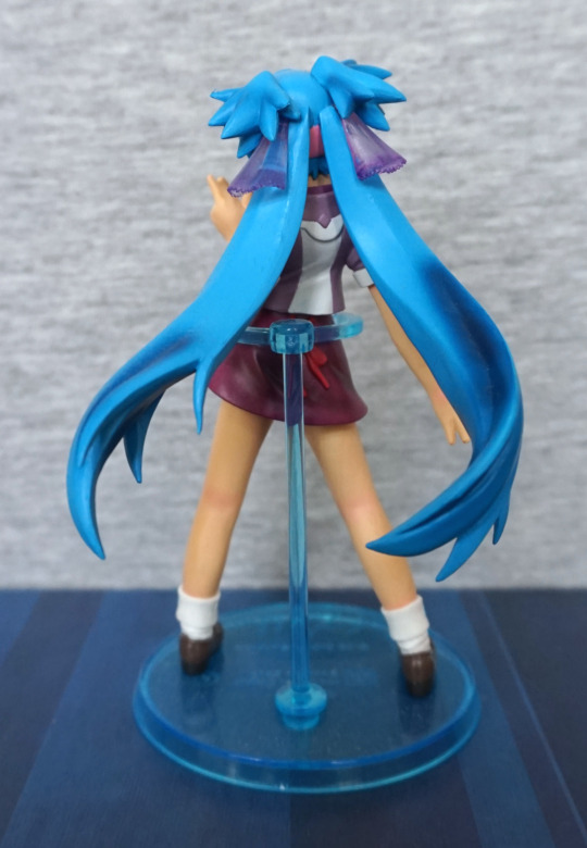
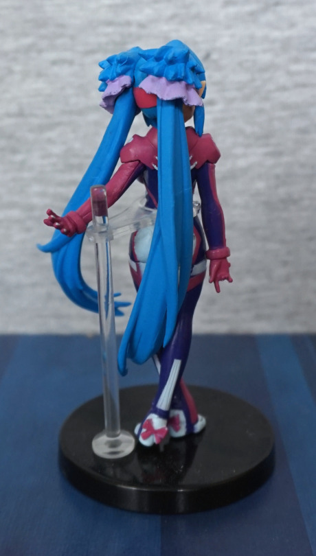
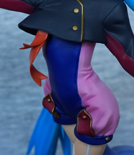
Back:

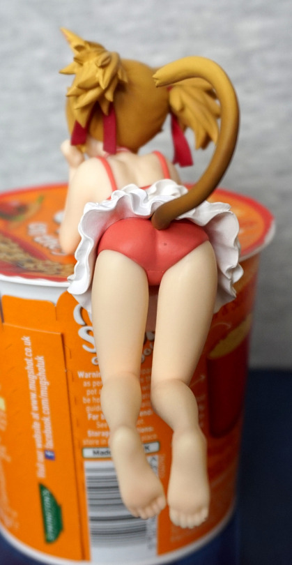
The tail ends somewhere out of sight, which works for me. The frills in her skirt have been sculpted nicely, along with her butt. There’s a bit of an annoying paint flaw on mine – a little excess paint on her panties. Her legs and feet are sculpted nicely, and her toes look good. 

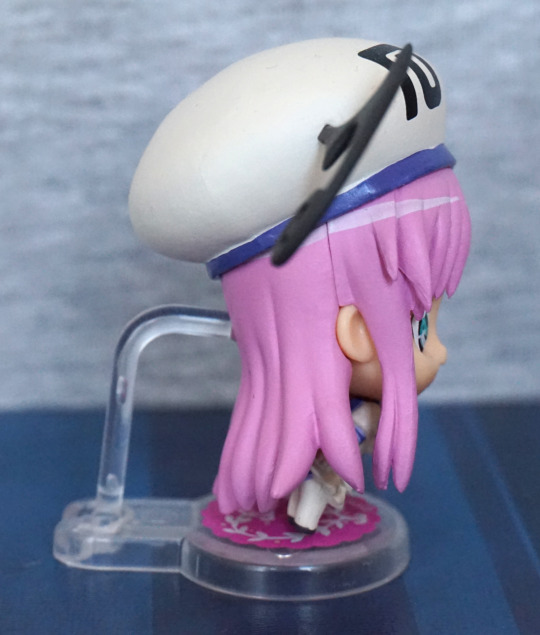
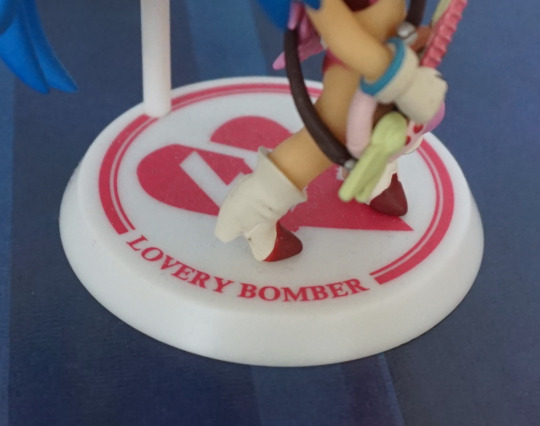
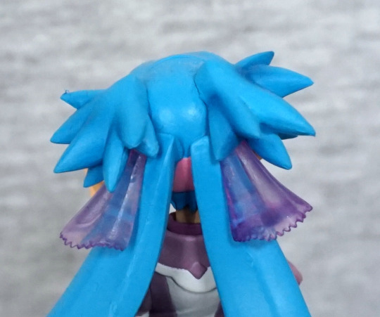
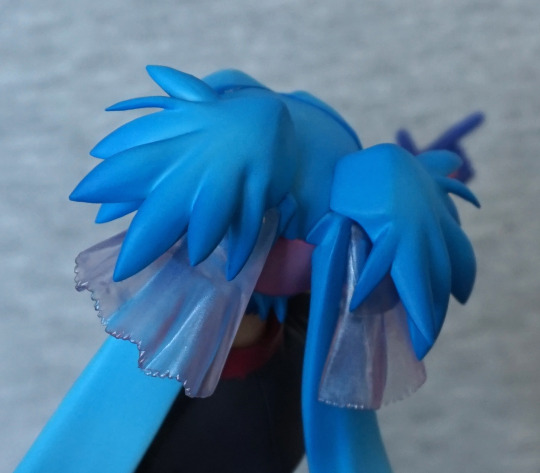
Close-up of the back of her hair:

I like the shading on her hair, and as mentioned previously, the amount of detail they’ve put into it. Seems a fair bit more than your average prize figure. Her top also has a fabric bit painted under her frills, which is a nice attention-to-detail.

Overall, the figure looks very nice, and has been executed nicely for the most part. The major issue that prevents me from recommending it is the display potential – I think it would’ve been better to have her head turned to the side, so she could be displayed side-on. Currently I have her sat on a clear U-shaped riser, so you can see more of her, otherwise it’s a toss-up if you display her face or her body. I suspect the pose was chosen to accommodate the tail, and it works on that front, but I think she would’ve been better coming with a small clear claw stand, so you can display her unobstructed…. as let’s face it, nobody’s going to use this as noodle stoppers. 

Rin Kagamine – Nuclear Fusion – Vocaloid

Here’s a Vocaloid figure with a difference… one that isn’t overly cutesy. When I found out this figure existed, I had to go and order it.

Not too long later, she arrived:

Rin Kagamine, as a rocker. As a fan of heavy music, this one strongly appealed to me, and I love the hairdo Rin is sporting. I think this figure was styled well, and the base is very much a part of the whole ensemble – no boring black disc here! 

I love the design of her guitar – I think it works well as a focal point for the centre of the figure. 

Face:

Here she is, not looking very impressed with you. I do love that hairstyle, and the white-black hair ties match up well with the rest of her outfit. From the parts of the outfit that can be seen in this photo, you can see the clean lines that the figure has, and the detailing that went into the sculpt.

What you can also see is the end of the darned headphone wire. This thing Does. Not. Stay. In. I wish there was more depth to the hole or it had some way of gripping the wire so it stays in when nudged. This is my main gripe with the figure. However, this wire is a separate part, so you can bend it however you wish, or choose not to have it. I like the curved lines you can create with it, so I prefer to have it, so long as I can get the damn thing to stay. It will probably meet up with some white tack at some point in its future. 

Left:

Here we can see they’ve put a good amount of detail into her clothing, and have her boot creasing at the ankle. The coloured rings look… OK, but I’m not 100% sold on them. I did think about displaying her without them, but decided the figure kind of needed them. I like the fact they’ve included some wires going into the speaker, and the four “legs” on the base, which make it super-stable as well as look cool. 

Speaker:

Here is a closer look at the speaker and its wires. I like the fin included in front of the speaker (not very practical, but looks cool) and the little logo thing on the top of it. The paint is also nice and shiny here. Here you can also see where the base has been given some weathered effects, and I think these work well. Also Rin’s boot has a nice neat yellow line going round the sole. 

Right:

Here the rings look cool, with the way they flow. Also got an opposite colour scheme going on with her clothing, which I really like. The light and shading on this figure work really well, which I feel is decently showcased in the white part of her dress.

Back:

I like this golden “fence” part. I like the colour, and I think it fits well with the figure… even though it’s kind of random. As a nod to Rin’s normal clothing, we have yellow lines on her arms, which are painted well.

Back of her head:

Here we can see they put detail into the back of her hair as well as the front. Also I plugged the headphones in properly for this shot (yay!), and it does look good when it is behaving. We’ve also got a small detail in the form of a stud on her shoulder. 

Ring attachment:

This is how the back ring attaches, so it appears to float. This one can be a little easy to knock out if you’re not careful, but will stay fine if you don’t nudge it. However, because of the holes in this back piece, it does show a reasonable amount that something’s missing if it isn’t in place. Also just having two of the rings really doesn’t look right imo. 

Overall, if you like some heavy metal in your figures, whilst they remain plastic, I’d recommend this one. I’m not sure how appealing this would be to a general Rin Kagamine fan, but I personally love the concept and think it is well-executed. Kinda wish the rings were more of an optional part, as they can look a little “eh” close-up, but think they work just fine at a viewing distance. 

Classic Archer – Archer

Here’s a bit of a fun figure… Archer being Classic Archer:

When I found this figure existed, I had to get it. It’s not the fanciest of figures, being on par with a trading figure, but the pose really makes it. 

For the paint, what’s there is painted neatly, but there isn’t any shading. Might’ve been nice to have some shading on his jacket, so it wasn’t so flat and grey. Unfortunately mine has a bit of a scrape on the knee, but I did buy this secondhand, so this may’ve been the previous owner. Being flat-shaded though, it’ll probably be easier to fix if I do. 

Let:

I can hear him glugging down his drink, whilst he’s making Mallory wait… This figure is certainly posed well. I like the fact they’ve sculpted texture on his hair, and the seam is mostly smoothed out on his side. The bottle also has some good decals on it, which look good. 

Right:

I, uh, focused on his leg? Though there isn’t too much more to see here than the other side – seam appears blended, and the paint is neat. Here we can see the bottle is semitransparent, which is a nice touch. 

Back:

Some little nods to fabric creasing at his shoulder and elbow. His shoes have the soles sculpted, which is a nice touch. Fairly plain back here though. 

Overall, I’m pleased with this figure. The paintwork might not be overly complex, but being a cartoon character, this isn’t super-necessary. What’s there is neat, which is more important imo. This figure is really good in the posing and the sculpting, which is what sells this figure. The iconic pose works well, and I think this is a good collectable for an Archer fan. 

Nagisa Kaworu – Chibi Plugsuit – Evangelion

Just a small figure for today, a li’l chibi Kaworu:

Got him in a shop in the UK, who sells a few small anime collectables. I like the light shading in his hair, and the facts he’s in his plugsuit. Not sure if the face entirely fits him, but I’ll mildly let it off for being a chibi. 

Left:

Here we see he has a painted ring shine, which I’m not a massive fan of. I like the sculpt of the hair though, and the plugsuit looks decent from the side.

Right:

Again, more shine, and a li’l tuft of hair at the top for added cuteness. Hair mould lines are mostly blended in, giving the hair a “finished” feel. Plugsuit is also neatly painted on this side, and I like the fact his ears have been sculpted and are poking out of his hair. 

Back:

Looks OK from the back, but the stand does rather hide him. With the stand going most of the way up his hair, it’s pretty distracting, if you want to look at him from the back. Also he has a nasty habit of pinging out of the stand when you move him, which I don’t like. Kinda wish it was lower down somehow, or he had a body stand. With a poke-in-the-back stand you do lose some design, but they do tend to hold figures better than these claw stands. 

Overall, he’s an OK chibi, but I’m not sure how much it really captures Kaworu, though this is based on his Evangelion@School appearance rather than the show. Wish the stand would hold him better than it does, but it is functional if you leave him be. 

Momo Deviluke – To LoveRu Darkness – Bottle Holder

This figure I came across randomly, and decided I’d like to order it, because of its kinda different nature. 

So here she is, Momo holding an invisible bottle:

This figure is very nice for a prize figure – she has shading in her hair, and a few other places. The paint is largely neat, without a bunch of messy lines. I love the cute expression on her face, and her shirt has been rendered well. The tail is also posed well, and I do rather like the way it curls. 

Front:

They’ve painted her chest darker, to show she’s wearing a sheer shirt, and she’s wearing a bra to match her knickers. Or swimsuit bottoms? The green bow helps to break up the pinkness of the figure, which I like. There is a tiny bit of overage on the knickers, but nothing too drastic. 

Left:

The flowers in her hair have been painted well, and the twist of her tail looks good from this angle too. Her feet look nicely detailed, and the pose has some dynamicness to it. 

Right:

Not too much extra to see here, but there’s shading on her leg, which is a rarity for a prize figure. Her toe has also been posed here – I appreciate the asymmetry here. The sleeve goes well around the arm, and looks realistic. 

Back:

Here, the back of her bra is a bit too heavily painted, and looks a bit odd. Fortunately this isn’t an angle I’ll be looking at, so not too much of a major issue for me. Here we can see the twists of the tail, which give it motion. Her knickers are also shaded too here. 

So that she can hold the bottle, her arms are rubbery and can be flexed about, so there’s no worrying about breaking her, if you want her to hug something. She can sort of hug a Nendoroid’s head. and I did have her hugging the Queen of Pain for a time. She’s a fun figure to play with, thanks to her pose, and would make for an interestingly posed piece. She’s made to hold a smaller size of bottle, so your average 500ml bottle doesn’t fit so well imo. 

So I could easily recommend this figure, if it appeals to you. If you want to find her, you may have more luck searching for just “hold figure” on figure websites. 

Karina & Pao-Lin – Tiger & Bunny – Half-age Characters

Now for the second two half-age characters I got out of the blind boxes.

First one today is Karina Lyle, aka Blue Rose:

As she’s young in the anime, she looks very young here. The figure itself is neatly painted, and looks good. 

Left:

Her hair looks decent, bit of stray paint from the skirt. Shoes are well-sculpted and painted.

Right:

The snake is printed well on her towel.Her hair sculpt feels a bit imprecise,but does the job. 

Back:

Hair looks good from the back, and she is posed well. I think it gets her shy nature over well. Her shirt is well-sculpted, though I think the skirt is a little overly flat. 

Overall, I think it’s a decent figure, but nothing special.

Lastly, Pao-Lin Huang:

I like the pose on this one – feels dynamic, and fits the kung-fu stylings of Dragon Kid. Most of her is painted well – special mention to the hair clip – though there is some stray black paint on the stripe that extends down her left leg. I like the sculpting on her suit, and gives it a good “suit” feel. 

Left:

Hair is a bit overly flat here, and some knobbly paint. Her pose works well from this side though.

Right:

Again, the hair feels overly flat, her shoe is painted well, though her pants paint did escape a bit onto her shoe. 

Back:

Hair looks OK from the back – a bit more detail here, so it doesn’t feel so flat. The suit is creased nicely back here, and the black lines are nice and sharp, so she looks good from the back.

Overall, two more nice figures that fit the theme of the sets (two were from one series, the other two from another). Out of these two, Pao-Lin is my favourite. Out of all four, I’d probably pick Kotetsu as my favourite, followed by Pao-Lin. 

Kotetsu & Keith Goodman – Tiger & Bunny – Half Age Characters

In a fit of rarity, I actually bought these in a brick n’ mortar store, for a not-too-unreasonable price. I got four of these figures total, and will be splitting them into two blogs.

This first blog will feature Kotetsu T. Kaburagi and Keith Goodman.

First up,

Kotetsu:

image

Looking cute in his half-age form, I think they did a really good job on this one. The paint is mostly pretty neat, with a couple of stray bits – main one that can be seen here is the collar.

Left:

image

Bit of a loose lump on his lower leg here. Paint is neat around the beads and strap he wears on his left wrist, and the buckle on his hat. 

Right:

image

Bit of blobbiness on the waistcoat seam, but again, nothing too bad. Seam on his hat is fairly visible, but not really a dealbreaker. Paint on his sleeve has decided to take over his arm a bit, though. 

Back:

image

Buckle on the back of his waistcoat looks good, and the wrinkles on his clothes look fairly realistic. Hair is also nicely sculpted. 

Overall, I’d say this is a decent trading figure, that succeeds in looking like a young Kotetsu. 

Now for Keith Goodman, aka Sky High:

image

Here he is, definitely with an air of the “cool kid” about him, which I think works well for him. I don’t think the paint works quite as well on him as it does on Kotetsu – it feels a bit shiny in places, and I think his jeans could’ve done with a bit of shading to blend them in a bit more. 

Left:

image

The logo on his jacket is rendered well, and the sculptwork here is nice. Not really sold on the slight shininess of the jacket though. 

Right:

image

I’m liking the dynamicness of his pose, and the detailing on his shoes. 

Back:

image

Slight paint lump on the back of his hair. Would’ve been nice to see some more strands back here in his hair, but overall it looks OK. Nothing to really complain about back here – looks like I’d expect, so that’s good. 

Overall, I think he’s also a decent figure, but I think Kotetsu has the edge in quality over Keith. Still, they’re both solid figures that I could recommend. I think they both succeed in being the half-age counterparts of the characters they represent. 

Lala Deviluke & Misc Straps

First up is this mini-figure of Lala:

This figure has her wearing Peke, in his normal dress-form. Her hat was a pain – she now has a small blob of tack under it to keep in in place. It can balance on its own, but has a tendency to roll off eventually. Bad Peke! 

Her face is nice and detailed, and I like her hair. The paint on her dress is OK, but looks a little blobby. 

Sides:

The parts on the sides of her hat look really good, though the purple band isn’t particularly neat. Hair looks fine fromthe sides. 

Back:

Her hair looks good from the back, hat looks plain, not that there’s much detail to go back here. 

Overall, this figure is OK for a trading figure. 

Now for some dangling doodads that I bought around the same time. First up, Migi with some popcorn:

Migi, the bucket and the popcorn are painted nearly, and look good. I love this little strap, and glad I bought it.

This one is Hatchiyack from Dragon Ball Super:

This isn’t a character I’m familiar with, but I loved the design and the bright colours. The painting is neat, and he has a decent amount of detail in the sculpt. 

This is helmet of 

Senkou Kishi Road/Flash Knight:

Again, not a series or character I’m not familiar with, but I loved the metallic purple colouring, plus the gold colour matches well with the purple. Painting looks neat from the front, but a bit iffy on the sides. Overall, an interesting-looking strap. 

Pose Skeletons – Re-Ment

In Japan I bought two diorama sets for these, but they didn’t come with any figures, so I ended up ordering them from AmiAmi. 

This set I haven’t got out of the box yet, but here’s some pics of the box to show what it would look like if I set it up:

Maybe I’ll carve out some space on a shelf for this sometime…

Let’s move onto the next set, with the addition of a skeleton:

Yup, I bought a toilet. I like the accessories it comes with. The mat that comes with this set, without it being an actual toilet mat as I know and love, this could potentially used as a doormat or something. 

Angled view:

…who doesn’t need a brown skeleton pooping on a toilet?

Here is another skeleton I’ve posed, on top of a flying alien queen:

These skeletons are very poseable, living up to their name of “Pose Skeleton”. If you’re a bit rough with them, the joints can pop apart though. 

Here are the other skeletons I bought:

The two in the middle glow in the dark. I thought, from the names given to them, they’d glow in different colours, but they both seem to glow the same shade of green – not sure what the difference is supposed to be between them. 

However, there’s no mixing up this skeleton with any of the others:

Demon skeleton! The wings articulate, which can be partly seen by the hinge on the tip of each wing. There’s also a hinge where the wings attach to his back, so you get a good range of movement with them. He’s also the only one to come with a stand – it works OK, but it doesn’t grip him too hard, so he’s fairly easy to knock over. 

Sides:

As can be seen from these two pics, his tail articulates, which is useful if you want to pose him sitting or leaning against something. The purple accents also make this guy stand out, and I like the way these have been done:

Back:

The detail on the back matches the front, which is nice to see. 

Overall, I’m pretty happy with these figures – the amount of joints mean you can do many poses, and makes them very expressive. Sometimes they’re a bit fragile and joints can become disconnected, but as long as you’re not rough with them, they should be fine. 

Asuka Langely – Evangelion – Parfom

As I bought Rei, I had to go for Asuka too, so here she is, having a good pout:

As with the Rei figure, her hair is very nicely painted, and the face works well. The plugsuit also feels well-designed from the front, to work with the articulation. 

Left:

Here I’m actually hiding the stripes with her hand :P. Again, these can look kind of odd when you articulate her. From the sides, her suit is pretty much the same as Rei’s, only red. 

Right:

Here are the stripes…. not lining up at all. So I’m not likely to pose these figures side-on. Her hair looks nice though, and the hair seam would be more hidden if I gave her fringe a bit of a shove ¬¬. 

One issue I’ve had with this figure is with one of her legs – iirc it is the right one – when I first opened her, it was loose in the box, and feels a bit prone to popping off. Not sure if this is common with Asuka, or a bit of a defect with mine. Should be fine when she’s standing still, but during posing, it’ll probably pop off again. 

Back:

Her hair flows nicely back here, and the shading really adds to it. Paint all looks good back here, though you can’t see much of her.

Doll:

I loved the fact that she came with such an iconic accessory – and the painting is all very nicely done. Only issue is getting her to hold it – there are no pegs or anything, so you need to either balance it or tack it to her hands, if you want her to be holding it, like on the box art. Currently I ended up putting this in storage, but I may choose to tack it to her at some point, so I can have her holding it and not get pissed off when I knock it out of her hands for the nth time. 

Faces and hands:

Same as Rei, she has two other faceplaces and two spare sets of hands. I almost feel as if there should be some kind of “wacky” set of hands that should come with Asuka, but that’s not to be found here. 

Overall, she’s a solid figure. I think what’s there is well-designed and thought out, but some more hands wouldn’t have gone amiss. Again, it’ll come down to what the price tag is – looking at Mandarake, the price tag on these has gone down a bit, and I think I agree with this assessment. 

Rei Ayanami – Evangelion – Parfom

This was a figure I got some time ago, but never did do the blog for. So… no time like the present!

Front:

First thing that stands out to me is her hair – I love the way this has been sculpted and painted. I like the colour of her eyes – it complements the colour of her hair. The green parts that go over her chest are attached to the other half, so they don’t block the articulation of her upper half. The red dot is also on her lower half, which helps her not look too odd when articulating. 

Face:

Her hair clips are nearly painted, and the shading in her hair is subtle but effective. I think this expression fits Rei very well. The lines on her suit are also neat. 

Left:

The way her hips are make the lines odd on her suit -they’ve extended them onto the hinge part to include it, but this ends up looking odd if you articulate her. Her arms look good though. Due to her chibi proportions, she has very small feet, and wouldn’t balance too well (if at all) without the stand. This stand design works pretty well though.

Right:

I like this splayed hand. Her hair also looks good from the sides, and I think the seam is pretty well-hidden, even though it is right there. As her fringe needs to come off for her faceplate to be changed, there had to be some kind of visible seam. 

Back:

The shading on her hair works well back here, and the paint on backpack looks really good. Here we can see better where they’ve added lines to make her suit work with the hinge style chosen for this figure type. 

Glasses:

She can’t wear these, but you can have her holding them. I think they look pretty decent. 

Alternative hands and faces:

I think the faceplates have been well-chosen to fit Rei, but you don’t get a lot of hand choices. I don’t see this as a big problem, as I don’t think chibi figures are necessarily suited to action poses. Might’ve been nice to have another set, just to round it up to the usual 3 alternative pairs. 

Overall, I’m pleased with this Parfom figure. I think the hip joints are the most problematic part, which will likely be a bit of an issue on most figures in this line imo – I think a decent part of if you’ll like these figures is if you mind the hip ball joints. For me, I prefer this proportions these figures have to “normal” chibis. I think they are a little on the pricey side for what they are, but the paint is above average for an articulated figure imo. So I think if you like the proportions of these figures, and aren’t bothered by the joints/hip design, then I think you won’t be disappointed. If you’re on the fence, I’d probably say give this line a miss. 

Klan Klang – The rest!

OK, last Klan Klang blog for awhile… These are the last few Klan Klang items that I bought in this tranche of buying stuff. Don’t worry, I have more Klan Klang items on order (not figures though), so there will be more Klan Klang in the new year! (Yeah, you guys can’t see the massive backlog I have right now… So. Many. Photos.)

First up, Klan Klang teaches!

image

Aww, isn’t that adorable?! The paint on this figure has been well done, and is neatly painted. 

Here she is without the desk obscuring her:

image

D’aww. Don’t think she felt like coordinating colours this day… I feel the orange and purple clash a fair bit with the pink. 

Sides:

image
image

Hair seam is average, the spiky parts of her hair look good, and the paint neat. 

Back:

image

Hair looks good, but a bit plain in the middle. Also the pink of her hair ties could’ve done with going a bit further up into her hair. Decent enough though. 

Top of the desk:

image

Here we have some writing, but I can’t read Japanese. Talked to a friend on Discord, who helped me translate this to “Oi! You are not watching!”… poor Klan Klang, not getting the attention of the class!

Here’s the front of the desk:

I like the fact they’ve included a storage slot here – a fair amount of attention-to-detail has been put into this desk, which is nice. 

I was on the fence about adding this mini-figure to my order, as I didn’t feel it was very “Klan Klang”, but overall I’m glad I did – it’s a very cute figure, and a welcome addition to my collection. 

Next up, we have an acylic standee:

image

I love the detailed outfit, and the colours work well. The shading details in her hair are really good too. These acrylic stands are of a decent size, so they don’t get lost in amongst the rest of the rubbish on my desk. 

Here’s the back, even though there isn’t a lot to see:

image

And, lastly, a mini-shikishi board:

image

Not sure if the colouring is supposed to be like this, or it has gotten faded over time – the colours seem a bit overly red. I like the design, but wish she looked a little happier tbh. I like the more casual nature of depiction, which sets it apart from the other stuff I own. May end up tacking another one onto an order, if I see another at a convenient time, just to see if this one is indeed sun-faded. If this comes up for sale, it’s usually cheap, so would be perfect to be tacked onto an order. 

Hope all the Klan Klang didn’t get too tedious! 

Klan Klang – Keyrings!

So in a few of my orders I snuck in a few Klan Klang keyrings, so let’s see what ones I got…

First up, one of her in a casual outfit:

A cute keyring, decently painted, though I find her outfit a bit indistinct from the front, with all the bits it has. Do love all the tiny details on the back though. 

This keyring also came with a second part:

Queedlun Rea! Or however you want to spell it… Klan Klang’s conveyance. I like the chibi design, which fits with the chibi keyring. No design on the back, so you want to ensure this part always faces forward when on display. 

Second we have micronized Klan Klang:

The painting is a bit rougher on this one, but the design holds up. The back pattern hasn’t got any gold highlights though. Would be nicer if her headband was a bit of a darker shade – looks a bit sat-in-the-sun coloured, but I guess they matched it with her outfit to reduce the amount of paints required. 

Micronized Klan Klang with a strap:

This one was rather cheat-y by Banpresto – it’s the same mould and paint scheme as the previous, only this one has a lobster clasp attached, instead of a chain and a ring. This makes it better for an ita bag, as you then don’t have a long, dangly chain to deal with. The paint seems a bit neater on this one, but it’s probably luck of the draw a bit with these minor prize items. I do really like the design of the strap though – lovely shade of purple, and features a Queedlun Rea silhouette. I think the font choice also works well. 

Now for a macronized Klan Klang:

Again, the lighter shade is used here for her headband and ties. No particular reason to do so either… but hey. It’s probably been all sorts of shades in the show. I like the little smile, but I think the eyes aren’t as good as the other keyrings. The suit is painted well for such a small item, though it doesn’t hold up to close scrutiny. Nicely detailed though, and I really wanted Klan Klang in her suit, so definitely happy with this keyring.

What’s better than Klan Klang in her suit?

Klan Klang with some armaments! The eyes seem to work better for this one, despite being pretty much the same as the previous keyring. Paint seems a bit neater, but they’ve seemingly sacrificed line width detail for the closer paint, but I still think it looks good. I like all the little details on the armaments, and thnk they did a good job with these. 

I think the last one is my favourite of these, but none of the others are bad. I’d prefer if the strap one wasn’t a straight-up dupe of another keyring, but having a different attachment does help differentiate it. So now to Klan-Klang up all my stuff!

Klan Klang – Chibi figures – Macross Frontier

Now for two chibi-styled prize figures of Klan Klang. 

First one is Klan Klang in her “Lovely Bomber” outfit:

Here she sports something other than her pink headband, and a prettied-up guitar. I love the vibrant blue of her hair, and her outfit works well, for its small size. 

Sides:

Hair seam isn’t doing any hiding, but the sides of her uniform are neatly painted, and I like the shoulderpads she’s wearing. She also has blue hairbands to match her blue “Lovely Bomber” headband. 

Back:

Plenty of hair back here, and a nod to her usual hairstyle. 

Base:

Ah, Japanese translation, how we love thee. The logo is decently visible too, and her feet don’t obscure it too much, which is a nice touch. Her shoes look nice too. 

Now for a micronized Klan Klang:

Here she is in her micronized outfit. I think the cute face fits, but not totally sold on the skin tone. Her outfit is nice and vibrant, and features all the major features. Paint is a bit over the lines in places, but not excessively bad. Worst bit for me is the pink that doesn’t quite go to her right-hand-side of the headband. 

Sides:

Hair looks good, has some shading and joins up well. She has some stubby ribbon bits, which I think are fair for the smallness of the figure and the chibi style. Her ears are nicely pointed, and look good pointing out of her hair. 

Back:

Her hair flows to the side on this figure, so we can see the back of her uniform… or at least some of it, thanks to the support. The support on this figure actually works well. The hair coming out from behind her headband is overemphasised on here, compared to some of her counterparts. Looks a bit odd like this, but not too offputting. She does seem to have pink glasses-cleaners in her hair though, than the sheer fabric she actually has. 

Base:

Base looks OK, and does the job. Fits Klan Klang, by being a representation of her headband though. 

Overall, I’m happy with both of these figures. Overall, I think the quality of the Lovely Bomber figure is higher, but I prefer the micronized version for her outfit. 

Klan Klang – midi figures – Macross Frontier

Today there shall be not just one figure, but two! You lucky blog reader, you. 

Both these figures are by Bandai – one blind box, one just boxed. 

First up, Klan Klang in a casual uniform:

Quite a cute figure, and I like the translucent blue base. The colours work well with this figure. There’s a small amount of shading, but nothing to write home about – the dark bit on the skirt looks a bit like a grease stain imo, but the hair is nice. 

Face close-up:

Not too much to the face, but looks OK. Here we can see some of the smaller flaws with the paint, but overall, pretty decent. 

Sides:

Her hair is positioned so that it doesn’t foul with the stand, which was nice for assembly. The shaded ends of her hair show up well here, which is one of the things I like about this figure. I also like the little logo on her socks. Her shoes are also nicely detailed and painted neatly. 

Back:

Hair shading looks overly severe here – would’ve been nice to see more blending. Back of her clothes looks good though.

Top of her hair:

Some mould-blobbyness, but not too bad. The hair ties are translucent, which is nice to see. 

Overall, a nice-looking figure, competently painted, but could do with a bit more blending of colours in places.

Next up, half-age Klan Klang:

I accidentally ended up with two of these, so here’s just the one of them. She’s wearing her suit that she wears when she’s macronized in this figure, which is a mildly interesting choice. I like her in her suit though, so fine by me. On both of these figures, the paint is noticeably dodgy in places – here you can definitely see some paint errors on her legs. Again, she’s posed so you can see some of her long hair form the front. They have included some small details, like the SMS logo, but it’d be nicer if the paint job wasn’t quite so sloppy. 

Sides:

Again, some derpy paint, but the sculpting and pose hold up. 

Back:

Her back is fairly obscured, so not much to see here like this. The main details are there though, but we’ll just have to admire the bows on her shoes. She was a tad fiddly to pose initially, but she’s fine once done. The clear stand holds her well, without being too distracting from the figure. Her hair ties are not translucent though :P. 

I think the first one is the clear winner, in terms of overall quality. I like the idea of the half-age figures, but their execution leaves something to be desired. I do like seeing Klan Klang in her suit, but the paint issues let the figure down as a whole. 

Klan Klang – Macronized ver – Banpresto

Now for a large Klan Klang! This one was an Ichiban Kuji prize figure:

And this figure certainly is large, to match her macro size! I love the shiny purple of her uniform, and the much more serious expression, to match her personality in macro mode. I love the bold colours of her uniform, which have been replicated nicely here. She does lack detailed shading though, due to her price status. 

Face:

Her face has been sculpted decently well, though I think her mouth is a little on the big side. We have the SMS logo on her uniform, but it looks a little elongated. Her chest is large like it is in the anime… but looks like they’re defying gravity a bit. Most of the black lines around here are neatly done. 

Left:

Here we can see she has her hand on her hip and is leaning forward slightly, to suit her stance. I like the way her hair curls around her body on this side. There’s a seam in her hair by her shoulders, but it is decently blended imo. 

Right:

Aand that’s some platforms to be using for piloting! Obviously doesn’t bother her, though… I like all the detailed creases in her uniform, and the hair down the side of her face is sculpted well. 

Helmet:

Here we can see some dodgy painting, but not too bad overall. She holds the helmet well, but I seem to recall there was some hairdryer action to get her to hold it in the first place. I’d recommend warming her hand to get it in there, as I think there’s a high chance of accidentally scraping some paint. I do wonder how comfortable a helmet is with all that hair though. 

Back:

Here we see they’ve done plenty of details on the back of her suit too, which really helps complete the design. The hair looks good, and is nicely out of the way so you can appreciate the detail they’ve put into this figure. 

Hair close-up:

Here we can see the sculpting is done well, but her hair ties are not translucent on this figure – not unexpected for a prize figure. I like the way they’ve done the hair underneath her headband though. 

Heels:

I like these little bows on the back of her heels – that little bit of girlishness that stays with her in macronized form. The sculpt isn’t too detailed, but they do the job. 

Overall, I do like this figure. I think it definitely has a prize figure feel irl, but it was very reasonably priced when I bought it (and I was able to kindly ask the store I bought it from to pack it so it fit into SAL small packet, which was awesome). Overall, I’d recommend this as an affordable version of Klan Klang, though shipping might be a bit high if the store doesn’t pack it tightly. Thankfully my local mail service isn’t too brutal with parcels, so her box wasn’t even dented on arrival. 

Klan Klang – Micronized Ver – Alpha x Omega – Macross Frontier

And now for some Klan Klang… as I went out and bought a whole bunch o’ Klan Klang figures & merch…

First up, we have the micronized version of her by Alpha x Omega:

And she’s very cute! Only Alpha x Omega produced any kind of premium scale figure of her, and thankfully this one is a nice one! They also did a macro version of her, but Santa’s told me I’m not seeing that one until Christmas… 

I think the pose works well – it gives off the playful vibe that micronized Klan Klang has. I can imagine she’s running up to one of the other characters and gesturing towards them. 

I like the way they’ve done her outfit – her jacket is overlaid on her dress(?), which gives her outfit some depth. Her boots are also sculpted at the top – they’re not a separate part, but there’s some depth there so it doesn’t look like she’s got painted-on boots. 

The shading in the paint is all very nice, and helps add detail to the figure. The details are also painted cleanly, which is especially important for the gold edging. 

Face:

She has a very cute face, and her mouth is painted well. Here we can see the jacket – the gold paint mostly holds up close-up – if I had to nitpick, the ends of the gold piping on the jacket edge are a bit dodgy. The creases work well, and she also has a small pocket here. Her hairband is done as a separate piece, which helps it feel like a band. They’ve even included some sculpt details in her ear, which is nice to see. 

Outfit:

The pink-blue border holds up well, and I love the contrast between the gold and the blue on the erm… tie bits? I like the way the ribbon she’s wearing curls nicely down and helps emphasise her movement. We can see a bit of a seam close-up here, but it has been blended well, and could potentially be regarded as a seam in her clothing, as would exist in a real dress. 

Left:

I live her playful, stretched out pose. She’s also got an interesting heel design going on there… I love the little pink ribbons on her cuffs. The base holds her well but personally I would’ve preferred for her front foot to actually be on the base, instead of her being “midair”. 

Right:

Here we can see she’s got the “SMS” on her ribbon, as well as the base. Nice attention to detail there. Her hair flows well around her body, and is well-shaded. Contrast is probably a bit too high in the photo… the figure is fine. 

Back:

Here we see she’s got a small gold detail on her back, so they haven’t neglected the back of her outfit. There’s also an intentional seam on the jacket, plus a paint detail on the back of her boots. 

Hair close-up:

Here we can see they’ve done her hair ribbons in translucent plastic. I think they could’ve done with a tad more paint/dye, but they do the job. 

Overall, I’m really pleased with this figure and glad I got it. I think this is a solid figure for Klan Klang in her micro form, which is good… as there aren’t a lot of figures of her. It was nice to be able to get a figure that wasn’t a prize figure for her. 

Alien Warrior – Alien Vs Predator

This xenomorph is based upon one in AvP, according to the box. This one I randomly came across on Suruga-ya and thus I decided to order it:

And he’s a big mofo… bigger than my backboard. In terms of painting… he’s black. And a bit more black. So,um, nothing to talk about here as regards paint… but the moulding makes up for this. 

‘Face’:

He has a translucent dome, but you can’t really see through it – just the vague shape underneath. The detail in the moulding is visible here – I love the texture on the webbing bits of its mouth. 

Chest:

The bones look good on the chest, and plenty of details further down. 

Left:

I like the preparing-to-leap pose. It’s also done so it’s fairy well balanced, and will happily stand on a flat surface. 

Arm close-up:

Again, good sculptwork that captures the textures and details of a xenomorph well. 

Right:

From this site, its tail tries to stab the camera :P. The back pipes stick out well, and we have the other wibbly protrusion here too. 

Side of head:

Liking the details on the neck, but the shoulder ridges look a little odd – there’s not a huge amount of texture on them, and I’m not convinced over the way the arms join into it. 

Back:

A lovely amount of sculpting back here – I like the spine and the lines that join up to it. Its hips stick out nicely too.

Tail:

One vicious-looking tail! Love the end of the tail. 

Overall, I like this figure. It’s a big, solid figure that’s well-sculpted, and balances well. If you want a cheapish statically-posed Alien figure, I would recommend this FuRyu series of figures. 

VF-1 – Macross

This one was added to a small order. 

And it is small:

This is a gachapon toy of the VF-1 from Macross. Or Robotech if you prefer. It’s decently detailed for a gachapon figure, but does have a habit of falling apart. 

Right:

Logo on the gun is rendered well, and I like the little details in the sculpt. The paintwork is neat, but doesn’t have much detail to it. 

Front:

Vrrooom. 

Back:

Engines are sculpted here, and you can see the VF-1′s feet. for when it is gerwalk mode. 

Top:

Here you can see the way it is twisting from not wanting to stay assembled. I like the little logo on the wing.

Bottom:

Here you can see a hole for the stand. There are two holes here, for an extra accessory you get with one of the other gachapon figures. I like the fact they’ve done the plating on the wings… even if it is obscured by copyright info… 

Overall, an OK little figure, but does have the disadvantage of liking to fall apart. Kinda wish Kinder Eggs had things like this, but this wouldn’t fit in a Kinder Egg. Hm. 

Rider – Fate/Stay Night – Blindfolded ver

After getting the incorrect version last time, I managed to order the right one this time!

image

Aha! The Rider trading figure I wanted! And this one is in better condition too – bonus. She’s in a very similar pose, only she has her blindfold on, which for me, makes Rider feel more complete. The sculptwork is good, and the paint is neatly done – not overly fancy, but it feels like the correct colours.

Left:

image

Standing with her back arched, she feels ready to pounce with her blade. I like this slightly unusual pose. 

Right:

image

The hair has been made to flow nicely around her arms, which I like. 

Back:

image

Her hair has some shading, which helps to give it depth. It’s sculpted well, and works for Rider. She can hold her blade either way up, but I felt this worked best. 

This trading figure is a nice one, and definitely a higher quality than a lot of small figures, though it’ll likely a bit pricier due to this fact. Does feel in keeping with GSC’s quality, and am glad to have finally found and got around to buying it.