Tag: keychain

Chestburster Victim & Facehugger Keyring – Aliens

Now for a bit of an interesting figure… one that’s part of the scenery…

image

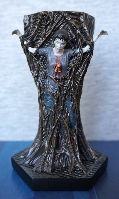
This wasn’t a figure I was planning on getting, but saw it for a reasonable price, and decided to go for it. Thinking of posing this with one the xenomorphs in the same Eaglemoss series. 

The sculpt is surprisingly detailed, and the paint is mostly good, which is a surprise for an Eaglemoss figure. There are some parts where the clothing paint does go onto the fines, but most strands are OK. The clothes are well done, and are shaded well, and the blood isn’t half-bad. My biggest complaint with the figure is the skin colour feels a little too ashen, and could’ve possibly done with a splash of skin-coloured paint. 

Chestburster close-up:

image

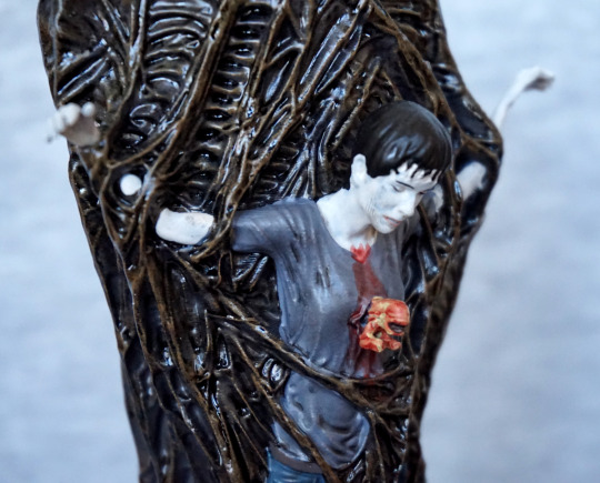
A chestburster’s head… in full, gruesome detail. I think this has been done well, and we have the t-shirt pushing back from the wound. I feel there’s some inaccuracy in how this would look irl, but I think the artistic liberty does help the chestburster stand out. I feel a little more detail in texture could’ve gone into the hair, but I don’t think this is a big thing, and the paint is nice on the hair, with the strands on the victim’s forehead. 

Sides:

image
image

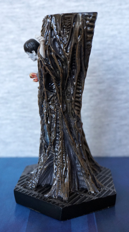
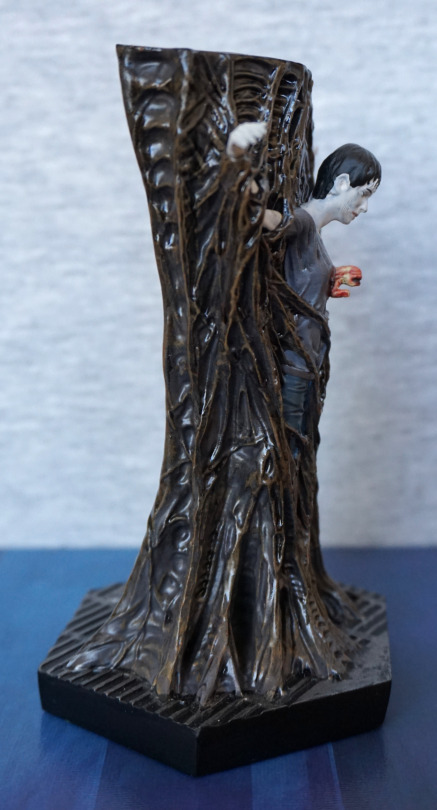
The sides of the figure look nice, with the alien wall texture continuing around the figure. 

Back:

image

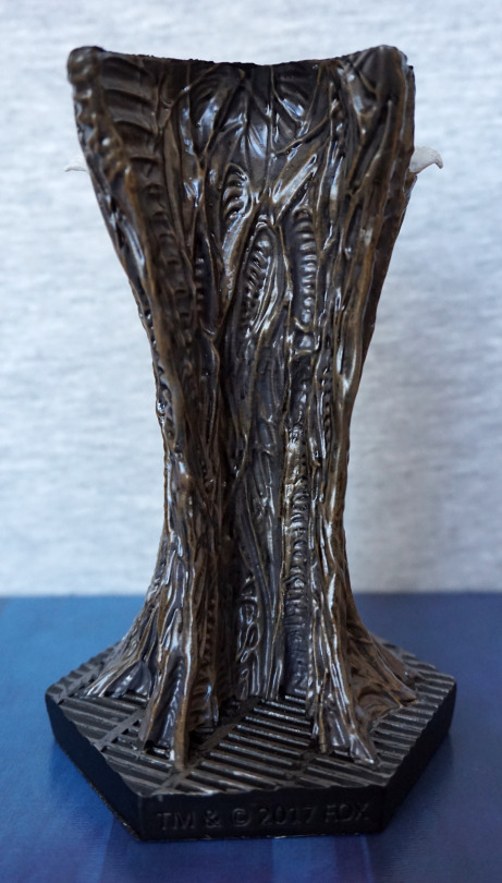
Was quite impressed with this – they’ve actually textured the back, so if you have this at an angle where the back shows, it will still look “the part”. The paint here is also nicely and subtly shaded. 

Due to the subject, I don’t think this figure will be especially popular, but it is nicely done, and would look nice in a diorama. 

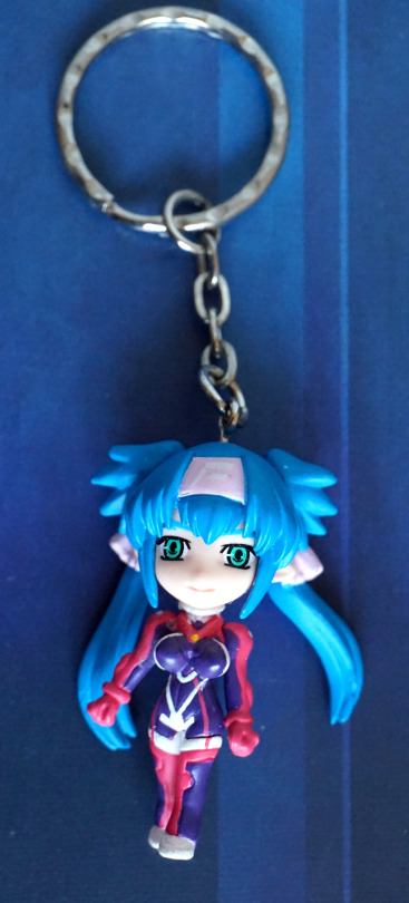
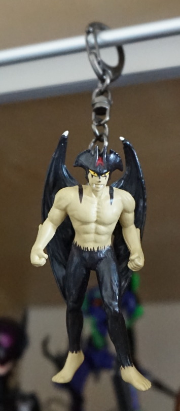
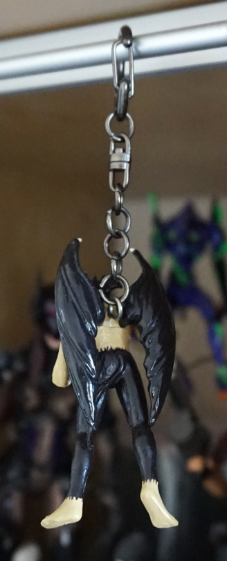
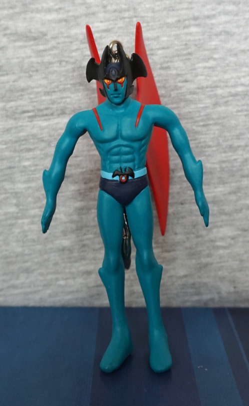
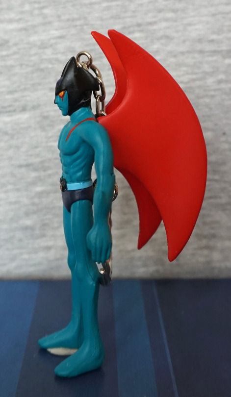
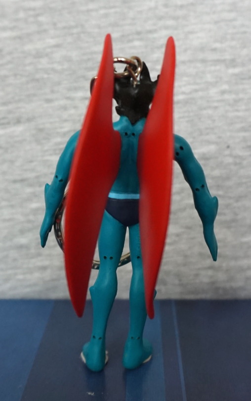
As a small added bonus, here’s a keyring by Tsudaka Hobby that I picked up in a Suruga-ya order:

image
image

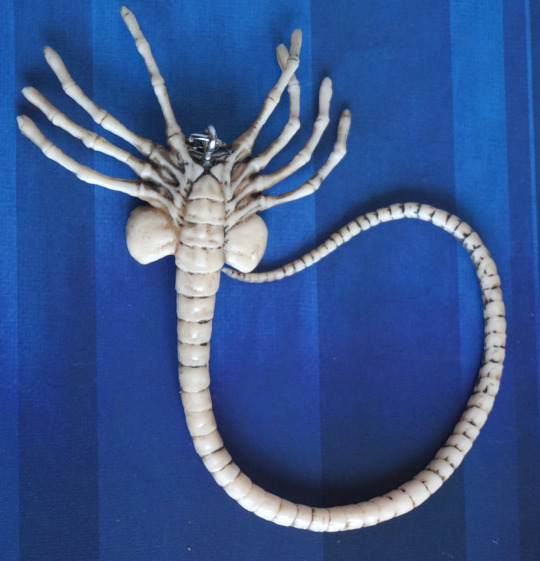
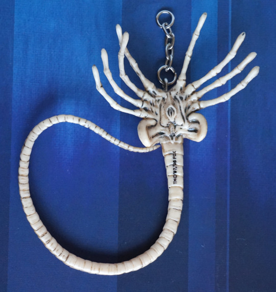
It did come with the key loop, but I removed this to more easily place it in an ita bag (featuring all my favourite things). The legs and tail are very flexible, so they’ll bend if caught on anything. The black wash is OK, but I wish they left a little more on to soften the effect. The bottom of the facehugger is also sculpted decently well. I like this keyring, and glad I got it. 

Klan Klang – Keyrings!

So in a few of my orders I snuck in a few Klan Klang keyrings, so let’s see what ones I got…

First up, one of her in a casual outfit:

A cute keyring, decently painted, though I find her outfit a bit indistinct from the front, with all the bits it has. Do love all the tiny details on the back though. 

This keyring also came with a second part:

Queedlun Rea! Or however you want to spell it… Klan Klang’s conveyance. I like the chibi design, which fits with the chibi keyring. No design on the back, so you want to ensure this part always faces forward when on display. 

Second we have micronized Klan Klang:

The painting is a bit rougher on this one, but the design holds up. The back pattern hasn’t got any gold highlights though. Would be nicer if her headband was a bit of a darker shade – looks a bit sat-in-the-sun coloured, but I guess they matched it with her outfit to reduce the amount of paints required. 

Micronized Klan Klang with a strap:

This one was rather cheat-y by Banpresto – it’s the same mould and paint scheme as the previous, only this one has a lobster clasp attached, instead of a chain and a ring. This makes it better for an ita bag, as you then don’t have a long, dangly chain to deal with. The paint seems a bit neater on this one, but it’s probably luck of the draw a bit with these minor prize items. I do really like the design of the strap though – lovely shade of purple, and features a Queedlun Rea silhouette. I think the font choice also works well. 

Now for a macronized Klan Klang:

Again, the lighter shade is used here for her headband and ties. No particular reason to do so either… but hey. It’s probably been all sorts of shades in the show. I like the little smile, but I think the eyes aren’t as good as the other keyrings. The suit is painted well for such a small item, though it doesn’t hold up to close scrutiny. Nicely detailed though, and I really wanted Klan Klang in her suit, so definitely happy with this keyring.

What’s better than Klan Klang in her suit?

Klan Klang with some armaments! The eyes seem to work better for this one, despite being pretty much the same as the previous keyring. Paint seems a bit neater, but they’ve seemingly sacrificed line width detail for the closer paint, but I still think it looks good. I like all the little details on the armaments, and thnk they did a good job with these. 

I think the last one is my favourite of these, but none of the others are bad. I’d prefer if the strap one wasn’t a straight-up dupe of another keyring, but having a different attachment does help differentiate it. So now to Klan-Klang up all my stuff!

Food Keychains – Daiso

No trip to Japan is complete with a visit to Daiso. And I noticed the food items on ball chains, and had to buy some. I limited myself to three, so here are the three I picked.

First up, a fried egg:

Mmm, nicely fried. 

Back is plain:

Rice n’ stuff:

Not sure what the pink stuff is, but it does spring onion and seaweed. 

Noodles:

Also some egg in this one :). I like the fact this one includes chopsticks too. 

All three look tasty, but can confirm they are not. Well, they don’t have much taste to them… lol. But they do look really good, and only cost ¥108 each. 

Fate/Stay Night keychains

Here’s four keychains based on characters from the Fate franchise – two of Medusa (Rider), one of Rin Tohsaka and one of Gilgamesh.

First Rider keychain:

image

This is a new piece of merchandise, based on the new movie (Heaven’s Feel). Haven’t seen it yet, but I’ve been liking Rider’s look on the merch that’s been coming out. Love her outfit on this keychain, plus her hair is nicely done too. 

Back:

image

Nope, not much to see here. The back print seems to have a decent feel to it, and doesn’t feel it’ll scratch off too easily, but isn’t covered (most Japanese print keychains seem to be like this). There are some translucenty black squares around the outside, but I don’t feel it brings anything special to the keychain.

Second Rider keychain:

image

Thought this one was quite cute, and I liked the fact it had an extra dangly bit. This keychain is metal, so it is a bit weighty. The print on this one is enclosed between the metal backing and clear sealant on the front. Not entirely sure what the gold cube represents, but hey. 

Back:

image

Nice brushed effect on the back. And some copyright text. 

Rin Tohsaka:

image

I got this in a convenience store, and can’t find any reference to this exact keychain on the internet – there is another very similar one that’s larger. Rin looks good on this keychain, and I also like it for this:

image

As the design is printed on the front face, it has a 3D effect, which gives it some depth. I like this effect, though the design isn’t protected with any kind of coating. 

Back:

image

Not too much to see here. Not hugely thick print, but deffo does the job. 

Gilgamesh:

I got this in a blind box, so didn’t get this one by choice. Not a fan of Gilgamesh in this form – much prefer him in his armour, so I didn’t recognise who this was at first. Thinking I may try and sell this one. 

Back:

Nice logo on the back. Not totally boring! Also there’s an earphone jack, so you can attach it to your phone if you like…

And that concludes my Fate keychain collection! And now I get to stop typing keychain and resume being English. 

Devilman Keyrings

I had some promotional credit from a proxy service that I wanted to try out, so decided to go for a cheap item. I found these Banpresto Devilman keyrings on a “Buy it now”, and decided they were a good option. 

The proxying worked fine, with no issues, so that was good. 

Firstly we have this small Devilman keyring, that was already on one of my keyring display bars:

He was the smallest of the three keyrings, and of a decent quality.

Next up, a larger version of Devilman’s movie appearance:

With the larger size, there’s a lot more detail in the sculpt and the paintwork. I prefer the expression on the other keyring though. 

Devilman in his original cartoon form:

The sculpt isn’t hugely detailed, but gets the Devilman feel across. Logo on his belt is a bit squiffy. but his face is nicely rendered. Not sure if I’ll put this one on display, but it’s nice to have it. Might as well have one figure in his original appearance :P. 

Overall I’m happy I went for these keyrings.