Tag: eastern figures

Tablis – Evangelion

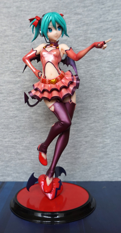
This was a figure I was considering for a long time, then finally had the opportunity to add it to a Suruga-ya order for a reasonable price:

image

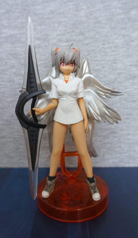
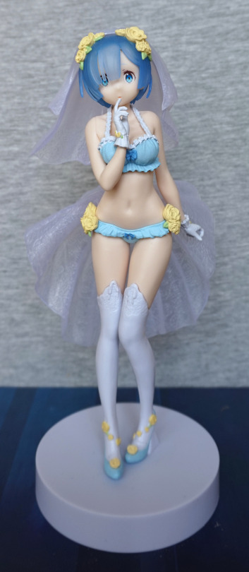
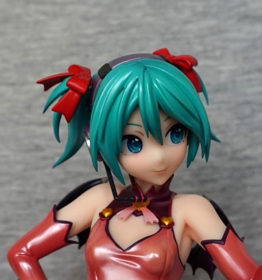
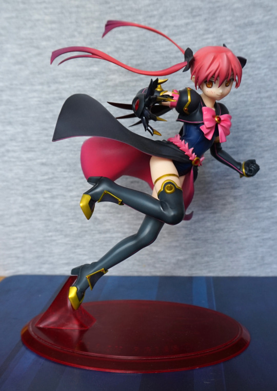
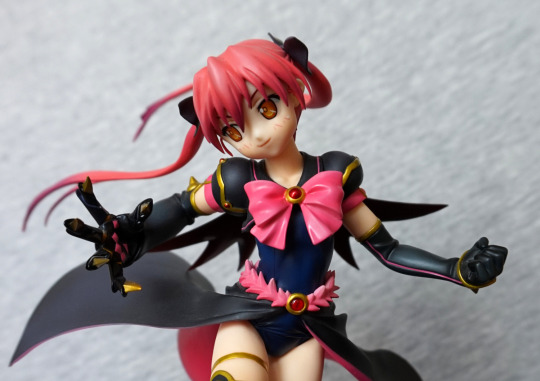
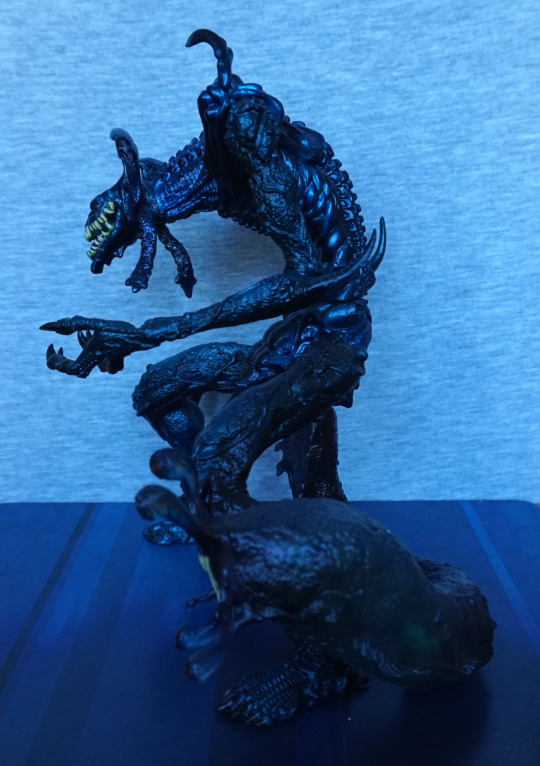
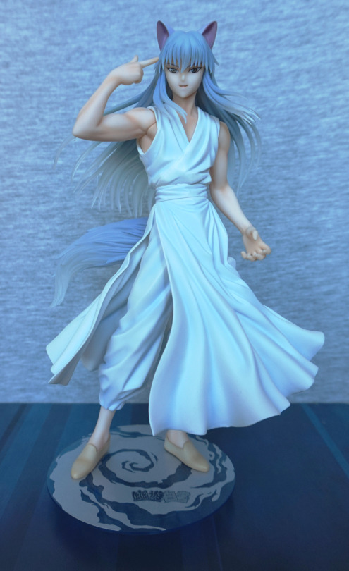
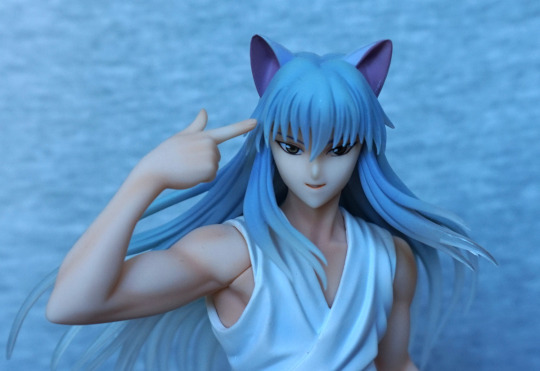
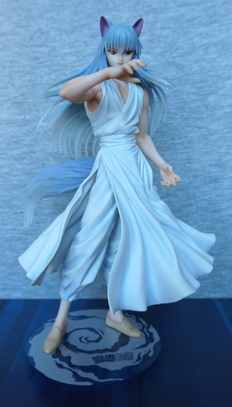
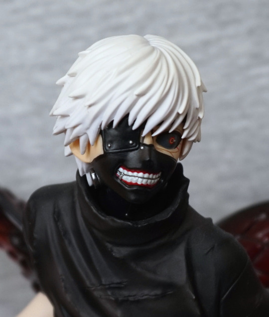
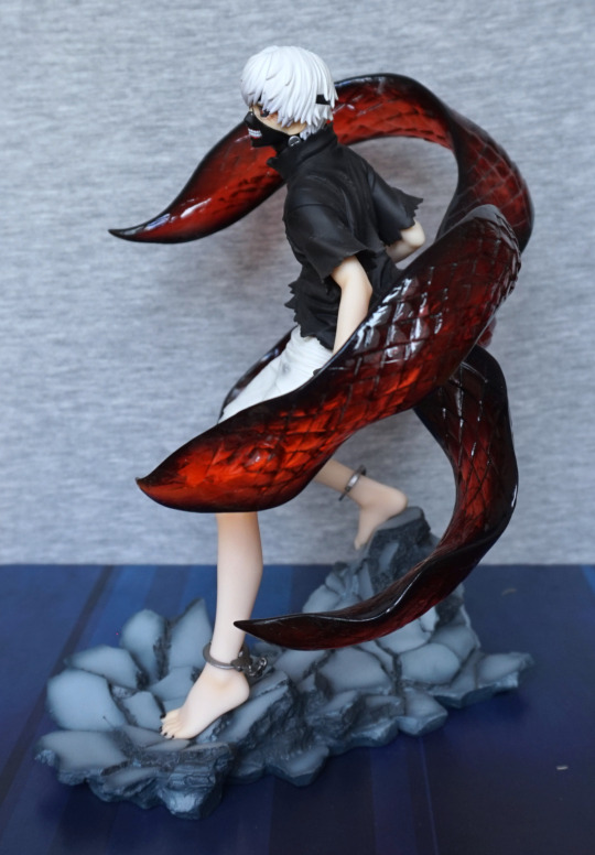
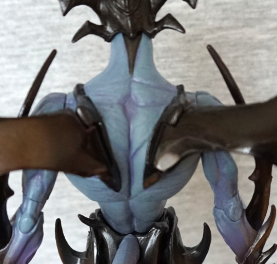
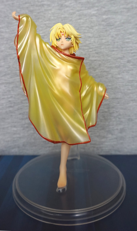
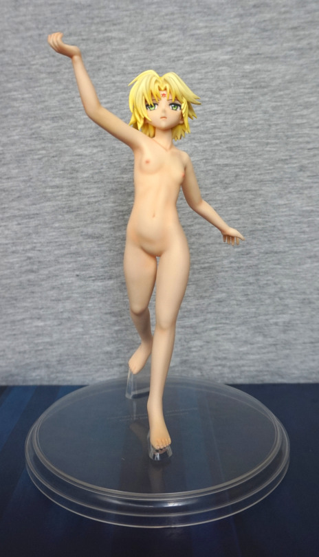
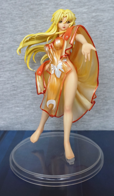
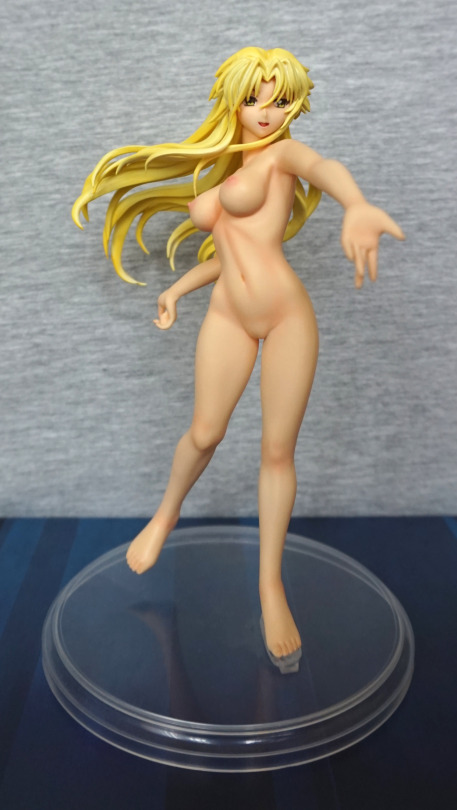
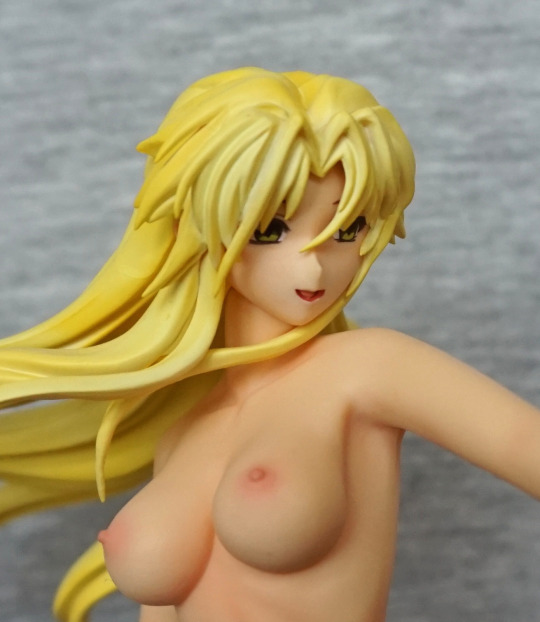
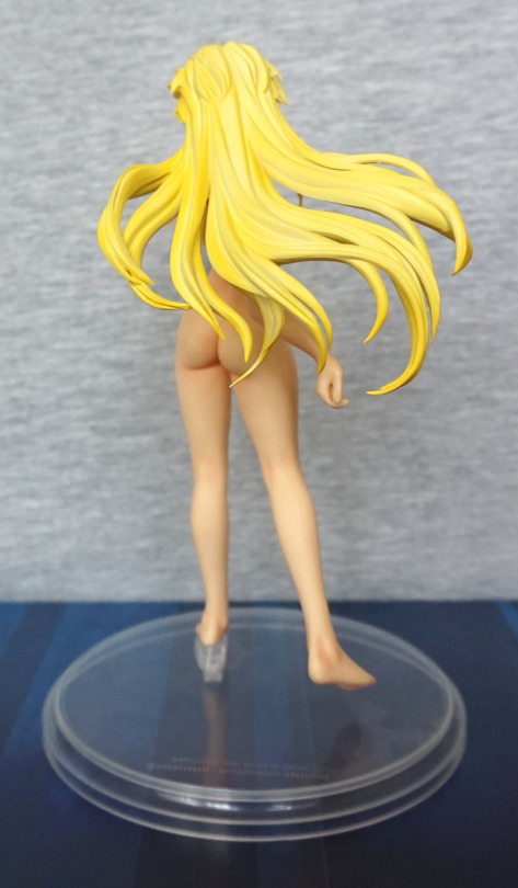
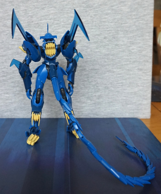
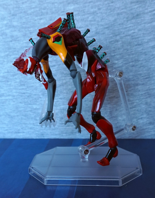
“No pants” Tablis – an angel from Evangelion. She comes with an alternate arm if you don’t want her holding the weapon, but where’s the fun in that? This figure of Tablis has a few hints to its human counterpart in the grey hair, orange undershirt and white overshirt. Not sure where he lost his pants to though. There is some underwear under that shirt though. I like the body sculpt, but the face feels overly simplistic compared.
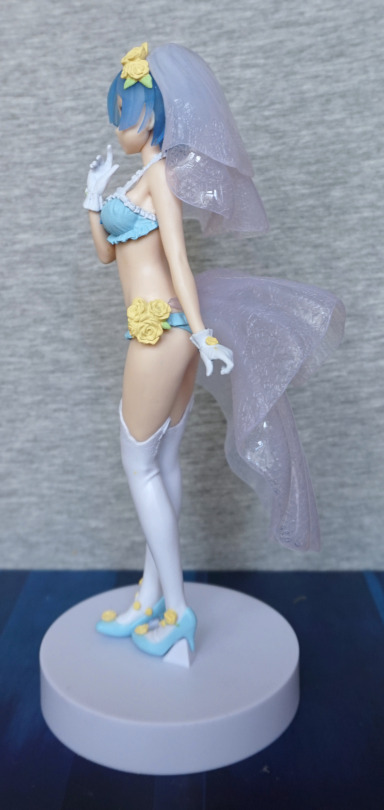
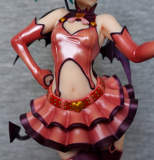
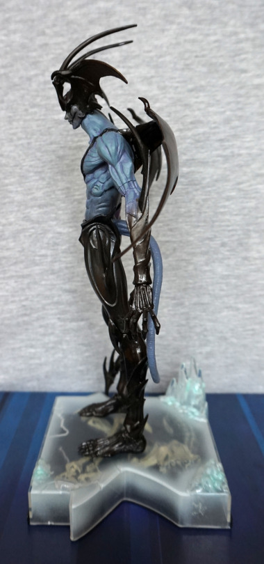
Left:

image

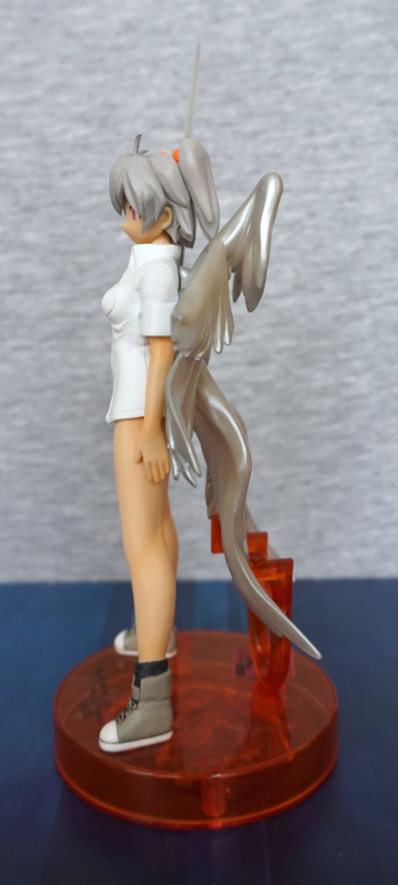
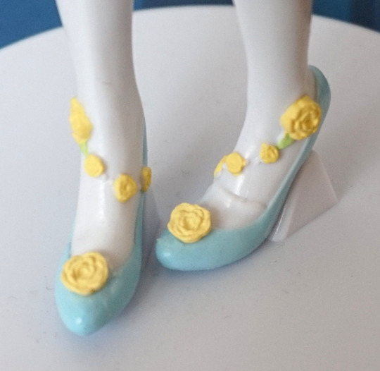
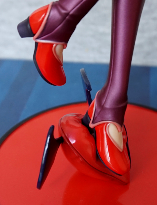
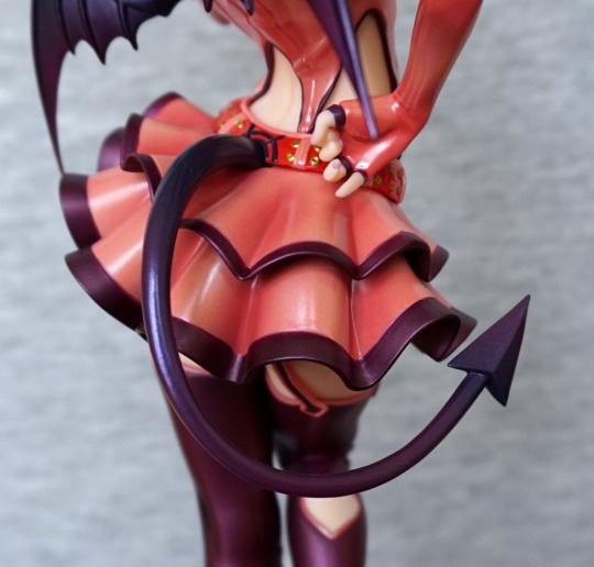
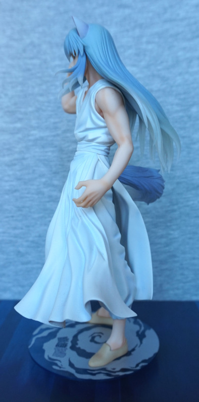
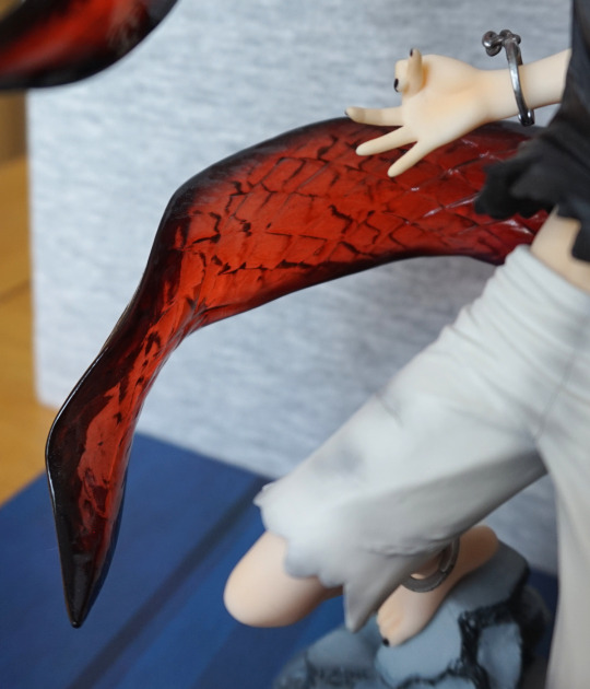
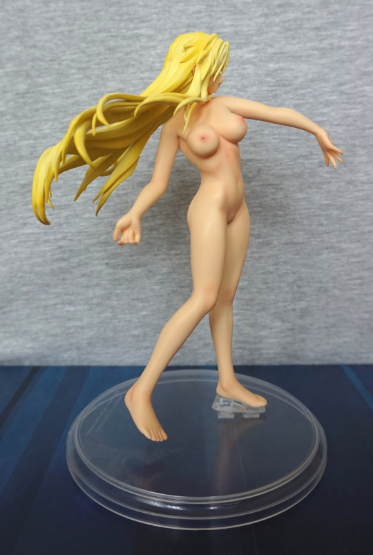
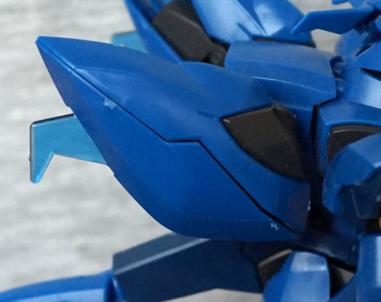
The wings have a nice amount of depth to them, and the stand holds them well, to prevent any kind of sagging over time. You could choose to leave this part off, if you wish to risk it. The shoes are nicely painted, but this side does look overly flat.
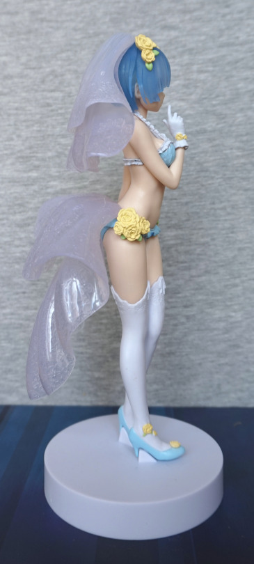
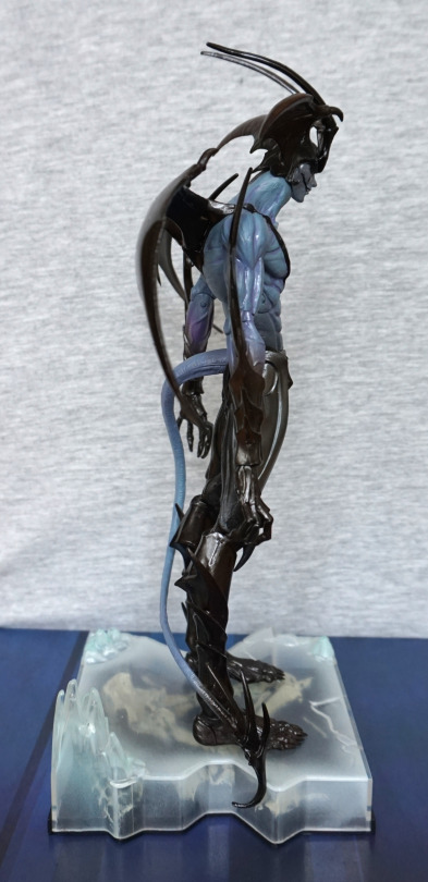
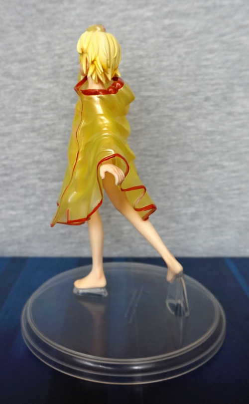
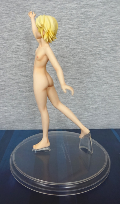
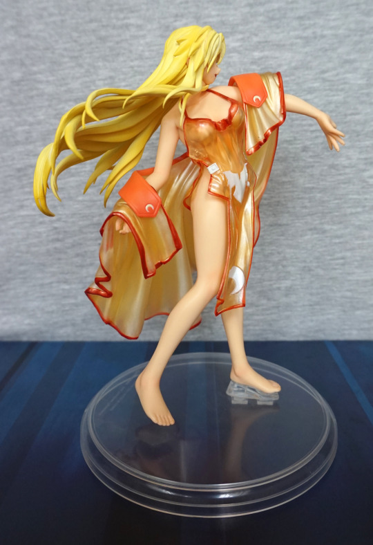
Right:

image

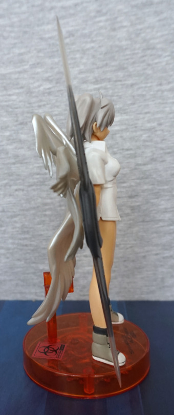
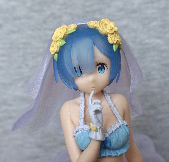
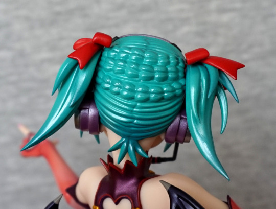
Not too much extra to see here. Hair has a pretty decent sculpt.
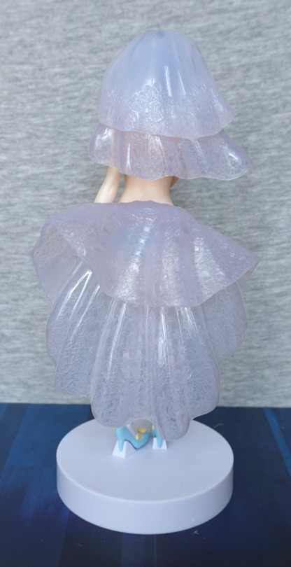
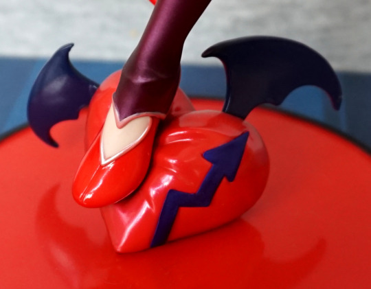
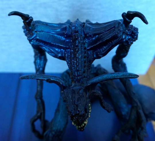
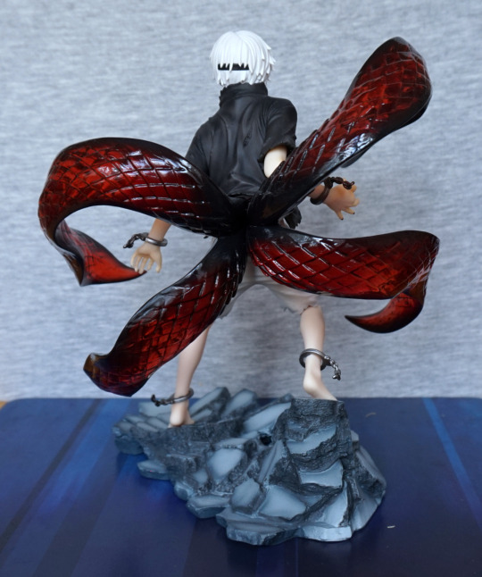
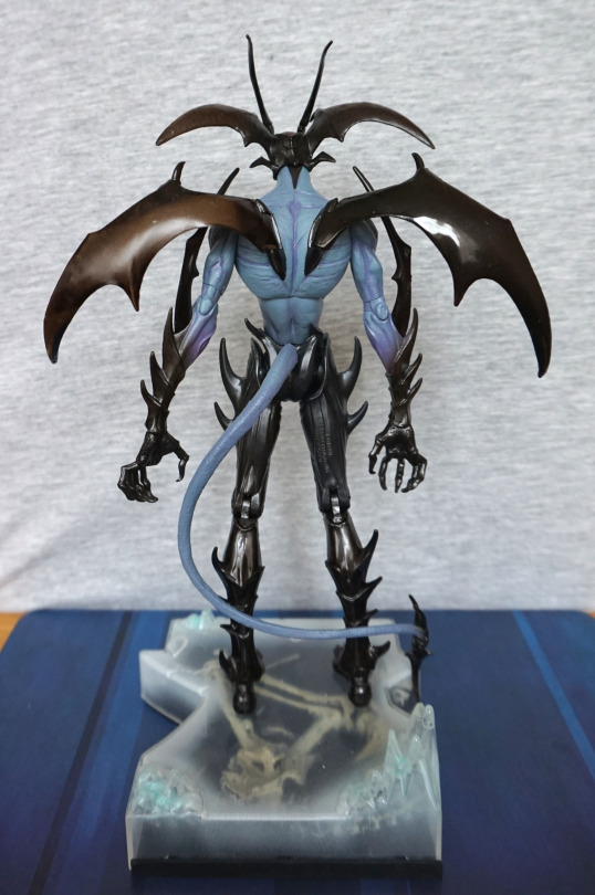
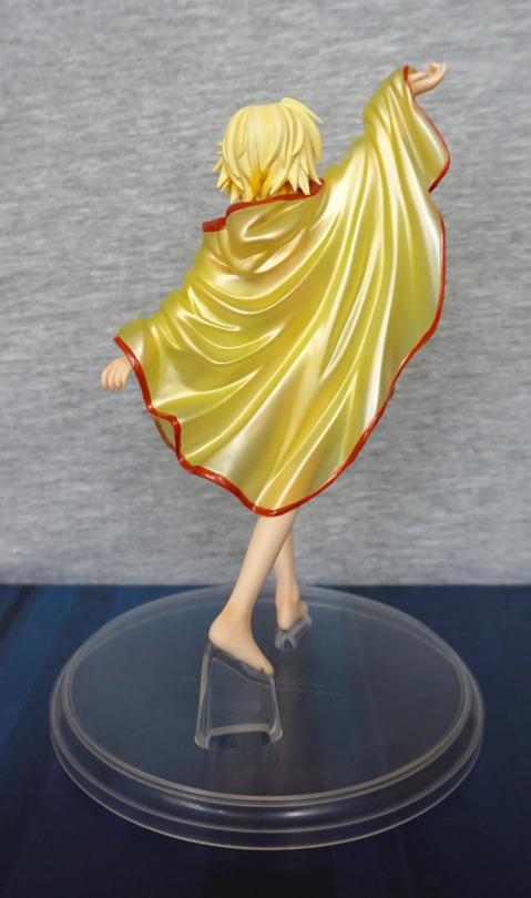
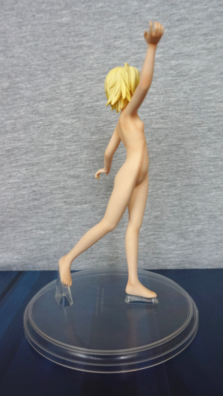
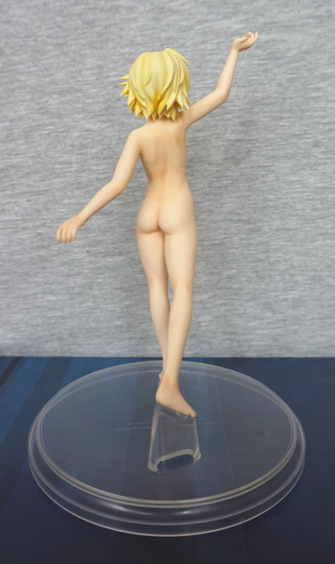
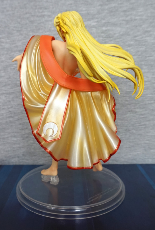
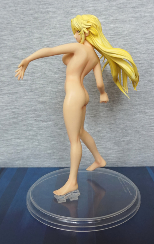
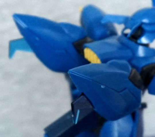
Back:

image

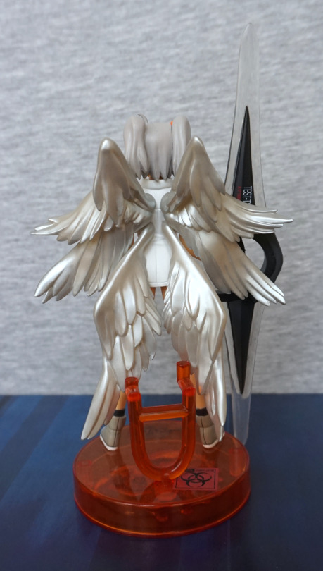
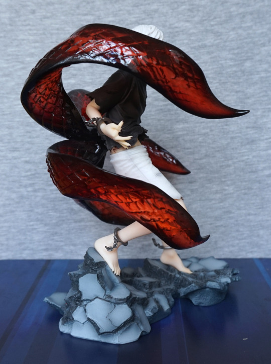
The wings are definitely the star feature of this figure – I love the shiny finish, and the sculptwork is really nice. Love all the different wing segments, which really adds to this figure. 
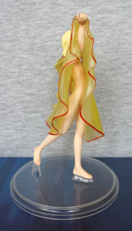
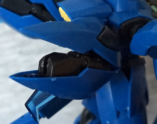
Weapon:

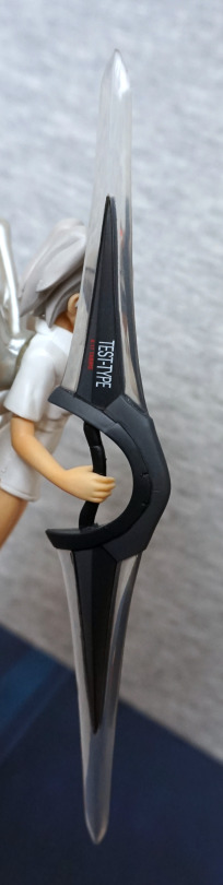
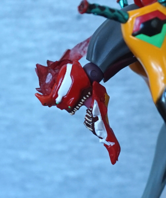
Here we have the words “TEST TYPE” and “A-17 TABRIS”. I like this little detail, but kind of wish it was on the other side or both sides, so it’d be showing in its natural position. The arm isn’t super-poseable, so it’s not easy to show the writing when displayed.

Really glad I decided to get this figure. For me, this concludes the ones of the set I was really after. There is another Rei-based one I’d like, but it’s rather hard to get hold of, so I’m not anticipating getting it. Overall, I’m pleased with this figure, and especially so with the wings. Would recommend these figures at a reasonable price, but they’re not super-detailed so wouldn’t recommend them much over their retail price. 

Skull Kid – Majora’s Mask

This was a promo item from Nintendo, but I bought it at a collectable figures retailer. 

Here he is, all bright and shiny:

I love the colours on this figure, which is what attracted me to buying it. And the fact I’ll totally get around to playing some of the Zelda games I haven’t yet, which includes Majora’s Mask. This figure also came with a free layer of dust, which I’ve now mostly removed… Still some visible in the logo on the base cough. 

Mask close-up:

I love the bright colours, and they’ve been rendered well on this figure. THe entire figure is neatly painted, which stands out mostly on the mask. The symbol on his hand is also nice and crisp. 

Left:

Love those shoes, thought I can’t imagine they’re too practical! All the pieces are neatly painted.

Right:

I’m in two minds about the weathering effects on the orange parts, but it does add needed detail to the figure, otherwise it’d look overly plasticky. I also like the Aztec-y design on the sides of the base.

Back:

Love all the splayed out spikey bits. Back doesn’t have too much to see, but what’s there is good.

Overall, I’m happy with this figure, and glad I was able to get it. 

VF-31J Siegfried – 35th Anniversary Cosplay

As someone with an eye for the slightly unusual, this figure appealed. However, let’s start with the less unusual part:

She wasn’t too bad of a built but yeah… those stickers on her chest… They really don’t stick well, and the middle blob is actually her belly button. Yes, they sculpted it, then gave you stickers to cover it… Still considering peeling these stickers off and painting her, as it looks so bad. 

Her face was prepainted, but they give you a blank one, should you wish to paint your own, which I thought was a nice inclusion. 

Side:

I like the fact the hair is articulated, and the pink pieces in her hair. The headset looks good… but the bits on her hips are annoying. Not entirely sure what they’re supposed to represent, but for mine, on one side, it was hard to get it to sit right on the pegs that are there to ensure it articulates correctly. Also the stickers… they like to unstick themselves on this bit. If you look underneath the hip parts, you can see a sticker freeing itself – the parts that fold over on the stickers like to unstick. 

Back:

I like the look of the design back here, barring the escaping stickers. 

For balancing her, it’s a bit tricky with her small feet, but possible. Wouldn’t recommend – was a pain for these photos, so I’d recommend either displaying her with the VF-1 or fabricating some kind of stand/using putty to get her to stay.

And now for the pièce de résistance:

Here she is, riding the VF-1 in Gerwalk form! You initially make the plane in flight mode, but where’s the fun in that? She can be assembled into a walking mode, but it was such a pain to do the transformation, I couldn’t be arsed to change it to see what it looks like – and this is the main downfall of the kit. It pretty easily falls apart, which is so very annoying. The handlebars she’s holding can pop off, and then some of the associated parts can fall off. Some of the wing parts are also easy to knock off. 

The plane form is a bit flopsy from the ability to take it apart and “transform” it. 

And the stickers have the same issues as the ones on her body – they’ll peel and unfurl in places, especially for the ones that fold over a part. If you do want to paint it though, it comes with water decals, so you can use those for the writing after painting it. 

Left:

She does pose reasonably well on it, though getting her legs onto the stands is a bit of a challenge. Here you can see where one of her feet isn’t actually in place. D’oh. 

Right:

And here she is, standing almost properly. The nub on the foot stands does help to keep her in place whilst you pose her. I do like the way the legs are folded out for her to stand on. 

Back:

Booty shot :P. Looks OK from the back, not too much to see here. Getting the entire thing to balance can be a bit of a pain – at certain times, the plane did try to nosedive onto the mat. If you get the feet in the right positions, it should stand up OK though. 

Overall, I really like the unusualness of this kit, and it does look decent when built… if you ignore the stickers peeling off :/. I’d probably recommend this more as a kit that should be painted, rather than stickers due to this. And the not very helpful guide of how to stick them on – some are done during the build process, but the vast majority there’s some large pictures numbering all the stickers at the end – and one of them did require disassembling her to get it on properly. Some parts of the build were a massive pain in the butt, so I’d be prepared for the damn thing to fall apart at least once on you. 

I’d only recommend this kit, if you really want the end result. I wouldn’t class it as a particularly fun kit to build. 

Rem – Wedding ver – Re:Zero

I don’t usually go for wedding figures, but this one I felt was rather pretty and reasonably priced, being a prize figure, so I decided to buy her:

And, yeah, she’s really nice for a prize figure. I love the design, and the paint is neat. She has some decent translucent hair and the flowers contrast well with it. She hasn’t donned her dress yet, so she’s in her wedding lingerie… but with her veil and train. Rather the odd outfit if you think about it too much… She doesn’t have any shading to her, but the sculpting does leave her with some shadows to help out. I like the way this figure is constructed, as it has largely negated paint mess. 

Face:

Some white paint escaping on the top of her bra – that’s probably the largest paint flaw on mine. The flowers are sculpted well and look good. I like her shy/unsure facial expression and pose. 

Knickers:

These flowers are also done nicely, and you can see how the different coloured parts are separate pieces, for the most part. The other noticeable paint flaw for me is the yellow smudge on her glove, from the flower paint.

Feet:

These flowers have been painted neatly for the most part, but looks like some leaves got missed out, but not a surprise with their small size. Guess it avoids extra mess. I like the pale blue of these shoes. Not sure what’s going on with the strap/fold/thing on her left shoe though… 

Left:

I think she’s posed well, and I like the fact her straps are sculpted as a separate part – no weird foldy strap here. The veil and train look OK from this angle.

Right:

Her sides are sculpted well. Her socks feel more plastic than fabric, due to the finish and lack of shading paint. Her hair seam doesn’t show much, mostly due to the flowers.

Back:

In some of the photos I looked at of her prior to buying, I think the back looked better than it does irl – I think I’ve captured the plastic-y nature of the veil parts a bit more here. These parts are embossed on one side, and flat on the other. It’s not terrible, but I don’t think it’d fly on a scale figure. The lower part you need to push into her back, and for mine that was NOT an easy endeavour, and definitely required heating to get it into place… but once done, the connector is hidden, which I do like. From the front, I think these pieces look decent, but from the back it can make her look cheapy… but she is a prize figure. 

Overall, I think this is a strong prize figure, and worth picking up, if you want a decent budget figure that’s wedding-themed, if you can find her for a reasonable price. I bought her near her release, so she cost ¥2000 & postage. 

Hatsune Miku – Heart Hunter Ver – Vocaloid

This figure I thought about preordering, but ended up skipping on it. After release, I was on the fence about ordering her, then she ended up on sale at Nippon Yasan, so I ended up grabbing her:

And wow, she’s a nice figure. I was initially attracted to this figure, as she has a wings and a tail. The other parts that appealed were her pose, the bright colours and the varying finishes of her outfit. 

Face:

I love her face, and her mic is there, but doesn’t disrupt from the figure. I love the ribbon on her chest, and the ones in her hair contrast well with her hair. The hair looks OK from the front, but not sure on the finish – more about that later. 

Outfit:

I love the way the material has been stretched out over her chest, and the colours emphasise her body shape. The yellowy colour blended in with the salmon-y colour works really well, and is used to add depth and detail in many places. The belt has been well-painted, and the gold parts are all painted neatly. The purple edging used throughout also compliments the colours, and works well to finish the edges of our outfit. 

Heart:

I love the heart, and the creasing is done well, to show she’s standing on it. Love the little wings it has. Can see a tiny bit of paint smear when looking close to the bottom of her leggings. Not entirely sold on the moulded seam on the top of her shoe. The shiny purple of her leggings is nice though.

Side of her foot:

There’s a metal peg that goes up through her foot, protruding from the heart. She seems to be stable on it, and I’m not worried about her falling off/over. She will wobble when moved, due to the pose though. Love all the little details here, but there are some small bits of stray paint if you look closely. 

Left:

Her body is shaped well, and her clothes sit well on her body. I like the way the garters have been done separately and there’s a bit of a gap under her bum. 

Close-up of her outstretched arm:

Love the shading. And the heart cutouts, like the one here. Everything’s edged nicely. She also has some cute pink nail polish. 

Right:

Her pose looks good from this side too. Love the metallic shade of her stockings. The tail has a spot of shading on too, which I appreciate. Looks kinda sassy from this side.

Back:

Her wings are nicely shaded, and the ribs look good. I like the way they’ve added ribbed details to the back of her top, and the fact there are also window-hearts back here too.

Back of her hair:

This, for me, is the weakest part of the figure. Really not a fan of the finish that they’ve used on her hair – I guess it’s supposed to be pearlescent, but it comes off as “cheapy plastic”, without having extra shading in her braids. Some shading was done lower down, but I think it needs more shading to pull this finish off. Either that, or have the hair less super-shiny. 

Tail:

I love the way the tail curls round, and the sharp shape of the end, which contrasts nicely. I love the detail put into posing her fingers, and the detailing on her belt around her tail. 

Overall, I really like this figure and glad I decided to get it. It’s a very nice figure, and would make a statement on most shelves. Even if you’re not a Miku fan, I think this figure has an appeal of its own. Would happily recommend this figure, despite the hair, as the hair isn’t too bad from the front. 

Rei Ayanami – Swimsuit v1.5 – Evangelion

For awhile, I was toying with the idea of ordering the original version of this figure, but I didn’t quite like it enough to do so. Then I found out there was this v1.5 version, and went for it:

image

The main differences between this one and the v1 is the hair and the matte finish to her swimsuit. The mould is the same for both versions.

Face:

image

I love the soft faded effect to her hair, and am a sucker for translucent hair, despite its weirdness. I think her face has been rendered decently well for a prize figure. The matte texture certainly looks nicer than the shiny one imo, but it is more prone to showing up scuffs on the figure – of which there is a minor amount. She does have a seam line that is pretty noticeable on her left arm in this photo. 

Swimsuit:

image

Here we can see they’ve added in wrinkle details, and seams to the swimsuit, but they haven’t added any markings to the labels. Usually the character’s name would be written in the space. Guess she’s borrowing a swimsuit for the day?

Left:

image

Here we can get a good look at the shower – the finish is nicely rendered, but due to the way the peg is, it does lean a little. Overall, I like this piece, and seems to have all the details it needs. Unless you want some limescale 😛

Due to the way Rei is facing, this actually makes for a good viewing angle. I like her overall pose, and I think this side shows it off well.

Right:

image

Here we can admire the details in her hair – she has a good number of strands moulded, which is a lot nicer than some prize figures where they just have the top of her hair smooth. 

Back:

image

Erm, er, let’s try that again:

image

Here we can see they’ve sculpted her spine and shoulder blades. The swimsuit hugs her backside, and is creased near her middle, which are all nice detail.s 

Base:

image

I like the fact they’ve coloured the grout – this is also a feature new to the v1.5, and I think it really adds to the base. The shower drain has also been nicely done, and looks like a drain. Her foot does look a bit overly rectangular from this angle… but is nicely sculpted otherwise. 

Overall, I really like this figure and glad I got it. The shower could do with being a bit more stable, but I don’t think it’s critical, as it looks fine from the front, and not prone to falling out – just leaning a little. Glad I went for this one, and would recommend it. I don’t think there’s any reason to own both versions of this figure, and would recommend picking your preferred one. Looking at pictures of the other version, this is definitely my preferred version.

Black Aries –  Makai Tenshi Djibril

This was a figure I got along with the Saber Maid in yesterday’s blog. I hadn’t come across her before, but loved the design:

I love the pose of this character, the contrasting colours and the claw hand. Her hair also has a nice gradient, going from pink to purple. I also like the gold accents as they add some nice highlights to the figure.

Face:

I like the small marks on her face, and the claw from this angle looks menacing. The shading on her… leotard(?) looks very nice too. I love the small crystal on her belt, and the large bow looks good.

Left:

Here we can see the claw more front-on, and I love the crisp lines and details on it. Her hair looks nice, and has a good gradient to it. I also like the shading on her boots and gloves, so the black isn’t completely flat.

Right:

I love the gradients under her dress and the details on the bottom of her boots, plus they’e added creases where her ankle is bending the boots.

Back:

Here we finally get to see the wings that you attach as part of the assembly. In isolation, I think they look good,but they were a pain to get pegged in place. Due to the keying on the pegs, they don’t feel like the sturdiest of things, so I’d recommend being careful with them, lest the peg snaps. Once you’ve worked out which way they go in, and have them in place, they’re fine though. Love the motion in this figure, and I think this back shot really shows that off. 

Overall, I really like this figure, and glad I got her, despite not being familiar with her as a character. She only has this figure according to MFC, and at least it’s a very nice one if you are a fan, though. Would recommend this figure. She feels sturdy enough, and being an Alter figure, she’s likely to have support against leaning, so not too worried about that. With her relative obscurity, she seems to be fairly cheap to get hold of in the aftermarket.

Saber – Maid ver. – Fate/Hollow Ataraxia

This figure I got from a Discord user. 

Front:

She’s a pretty impressive figure in her own way, with a strong stance. I love the dark metallic blue of her outfit, and the attention to detail in the sculpting. 

Face close-up:

She’s a happy maid :). The figure definitely has an older feel to me, not that I mind. Hair is nicely sculpted, and I like her collar. 

Mop:

I like the way this mop sits on the base – it’s moulded to sit on the edge of the base, which I like. A fair amount of detail has been put into the mop, which I appreciate. The tassels are also shaded well.

Left:

There is a nice sheer effect to her leggings, and her shoes have been painted neatly. I like the bands around her leg, which match nicely with her outfit. Her hair has been done well to hide any seamlines. 

Right:

This shot shows the shiny blue of her outfit quite well on her skirt. Her hair is blended quite well to her neck. She holds the mop quite well, and it doesn’t seem prone to falling over. 

Back:

I love the way her back shows through the dress – it certainly adds a focal point to her back. The painting on her back really adds to the depth. The bow is also nicely presented on her dress, and helps show she’s moving her hips a bit to the side, causing movement to her dress. 

Hair close-up:

I love the details put into her hair – the sculpt is very nice. The bow is also really nicely sculpted and painted to match her dress. 

Top-down view:

Here we can see the cuffs she’s wearing got some attention too – the cufflinks are painted nicely, and there’s some texture here. Her nails are also painted neatly. 

For what could be a very simple figure, there is a lot of attention to detail, and I think it’s a really nice looking figure. There is an updated version of her, with a nicer base, so I’d likely suggest that one, especially as it seems to be around the same price secondhand. But this one definitely isn’t a bad figure, and I’d recommend it. Would be nice if the base was less plain, though. If it wasn’t for the fact I got a really good deal on this one, I may have gone for the updated version, but I could still recommend this one. 

Asuna – Aincrad ver – Sword Art Online

As I don’t have many figures of Asuna, I decided I wanted a scale of her, and this one cropped up on MFC for a decent price. 

Front:

image

I was attracted to this figure by the pose and the golden rings. For this one, I think the promo version looks a fair bit more attractive than the final product, but it’s still a decent figure. I like her outfit and the rings, but they’re not as shiny as the promo version would suggest. The base is also a flatter colour – would’ve been nice to have more shading on this. 

For me, the weakest part of the figure is the hair:

image

It has been nicely sculpted, but the paint makes it feel a bit plasticky. I feel it could’ve done with some darker shades. The rest of the details on this figure though, have been painted decently well, and the lines are nice and clean.

Left:

image

Here we can see her launching herself from the pillar – I do like this pose. They’ve included the braiding in here hair, so that’s nice. The clothes are sculpted well, and include creases.

Right:

image

Here is her sword – this detaches at the hilt. She holds it well, and looks good. Her hilt is also a part that has to be attached. I think this picture also partly captures the plastic finish to her hair. The shading looks nice, and I love the way it’s flowing out in different directions… but that finish… 

Back:

image

Her cloak looks good from the back, and the pillar has paint details from the back. The texture on the broken part of pillar looks good too. 

Overall, I think this figure is decent, and worth what I paid for it. I think the RRP is a bit much for it, what with the hair and the other smaller downgrades from the promo version. She seems fairly available in the aftermarket, and you can probably get her for a decent price.

Gelmar – Devilman

Wandering around Yahoo! Auctions Japan for Devilman merch, I came across this Gelmar figure, and decided I’d bid on him. He didn’t come with a box, which was advantageous for me, so I could pack him with another item (which will be featured in a future blog, but not for some time). 

So here he is:

I love his blue, shiny colour and his overall design. His sculpting is also fairly detailed. 

Face close-up:

He does have a bit of a paint scratch on one tooth, but it’s not too bad. The wings on his head are detailed nicely, and I like the tentacley things sticking out from the sides. The teeth also have a couple of different coloured paints, which adds to their detail. 

Gelmar’s “slug”:

Rawrgh. He’s also painted well, in the places that were painted. Due to this part being partially rubbery, he was sticky with plasticiser, but I washed most of it off. He did smell a bit because of it too. 

And for the reason he’s rubbery:

He contains some unfortunate souls! Getting this part out isn’t too bad, but putting it back in can be a pain – it only fits in properly in one orientation, so it can take some fiddling to get it right. 

Close-ups of this part:

Looks like he’s munched up these dudes well. This part is nicely sculpted and painted. 

Top of Gelmar’s head:

Here you can see some of the shininess of the blue parts. He has a well sculpted spine, and I like the claws protruding from his shoulders.

Left:

I like the fact he has very different textures on his harms to his body – the contrast works well, and the details definitely make up for the lack of varying colours in the character design. 

Right:

I love the overall monstrous shape of his body. With his tail, he’s pretty stable, but for me, his tail does slip out easily if I move him. Loving all the small details and his clawed hands.

Back:

His back isn’t short of details in the sculpt, which is nice. Here you can see where his tail part is two segments, for the soft rubber part. The blend is handled reasonably well though. He does have some limited articulation, but other than moving his harms, none of it is really worth messing about with for me. 

Overall, I’m really happy I decided to go for this figure. I love his devilish appearance, and the blue metallic colour is attractive to me. Would recommend this figure, but he can sometimes be pricey in the aftermarket. He does have other colour variants, but I don’t think I’ll attempt to chase them down.. however I’d consider buying one if I see one come up at a reasonable price if I’m on the hunt for Devilman loot again. 

Yoko Kurama – Yu Yu Hakusho

This figure I’m not familiar with the source material, but I couldn’t turn down a wolf dude, so I preordered him. 

And thus he arrived at my house:

From the photos on MFC it wasn’t clear if the translucent parts were tinted blue or purple – I’d say they’re a bluey grey. Not entirely sure my photos are also clear in this regard – camera felt like nudging the white balance into the blueish range. 

I love the motion in his clothing, and his face is sculpted well. His skin has been given a decent amount of shading, which helps his muscles stand out. I like the effect of the translucent hair, but not sure it works as well as the promo art. 

Face close-up:

I like the ears and his expression. Here we can see the seam where the arm can be exchanged – I like the fact they’ve included an exchangeable part by default (unlike Kaneki Ken…) and the seam isn’t too visible when displaying the figure. 

Close-up of the alternate arm:

I like this arm too, but for the photoshoot, it can get in the way of his face. His tendons are sculpted well on this arm, and the hand looks good.

Front with the alt arm:

As shown by this photo, viewing angle is important if you choose to use this arm part. However, it does make for a better generic pose than him pointing at his head. 

Left:

This arm is also painted well, and has a good amount of detail sculpted on his hand. Clothes also work well, and I like the way his hair flows over his shoulder.

Right:

Here we get a first look at the tail – and it shows why I’m on the fence about translucent hair. It’s a nice effect in isolation, but doesn’t really give the impression of being hair. I’ll just admire the shading on his shoes and feet. 

Back:

The sculpt lines in the hair are well done – it does convey the different hair textures well. Also having the sculpted strands is nice, and adds detail to the figure. 

Base:

The base has a ring underneath, to make him appear as if he’s slightly floating on this wind disc. A relatively simple base for Kotobukiya, but still looks good. The silver print and the transparent blue plastic work well and complement the figure. 

Overall, I’m happy with this figure – there is more paint detail on this one than there usually is for Kotobukiya figures, and well, he’s a wolf dude :P. I’d prefer if the hair was the more purplish colour in the promo photos, but suspect that would be less canon. Looking at images of him, his hair colour does vary somewhat, but probably tends more to grey than purple. Would recommend this figure, if you like his design. There aren’t too many figures of this guy, and the other “main” one has some unfortunate arm seams. 

Kaneki Ken – Awakened Ver – Tokyo Ghoul

This figure I was considering chasing down in the aftermarket, as I liked the design, but then found Kotobukiya was doing a repainted re-release. So I PO’d that instead. 

So here he is:

image

I love this figure, and the base works well with him. The paintwork is really nice, and the upgraded kagune were definitely worth waiting for – I love the transparent plastic they’ve used, and think it looks much better than the pictures of the original that I’ve seen. 

He also has some nice paint details, with the shading on the shorts and his nails being painted. 

Face:

image

One mini-controversy with this figure is they didn’t re-release the bonus head – you can use it if you have it, but you’ll be relying on sourcing the old release. I’m not too bothered about it myself. The head itself is painted well, and looks good in isolation. 

Close-up of part of the kagune:

image

Shiny, glossy :). We can also see some paint shading on his hand here too. 

Left:

image

Lotsa kagune. I like the way his feet are posed, and standing on the rock. 

Right:

image

His pose, what you can see of it, looks good from this angle too. The broken handcuffs are painted well, and have a sense of motion to them. 

Back:

image

The back of his shirt is sculpted well, and you can also see the band for his mask back here. The kagune comes out nicely from his back, pushing his shirt out of the way. 

Overall, I’m really happy with this figure, and definitely think this is one of Kotobukiya’s nicer figures. Worth the price I paid imo, though he will now have gone up in the aftermarket. Would recommend it, and not surprised it’s gone up in the aftermarket. 

Aquaman – Justice League

This figure I was on the fence about buying, and decided to go for it, before I lost the opportunity to get it at a reasonable price. 

So here he is:

Whilst I’m not much of an Aquaman fan, I like the shininess and the colours of this figure. The copper-green colour scheme is very eye-catching, especially with the metallic effect paint. The belt has also been sculpted well, and complements the figure. 

One thing that’s a pain is his trident:

It looks nice, but he doesn’t hold it too well – it’ll easily slip through his hand, which makes it awkward if you’re moving him off the shelf… To remedy this, I’ve used a balled-up Glu Dot on his hand to hold the trident in place. I have him displayed slightly above eye-level, so the Glu Dot isn’t visible, but I don’t think it’s even that noticeable in the above shot. 

Face:

I like his face – not sure what it’s supposed to look like, but I think it has been done well in terms of general sculpt and paint. The hair has a nice sculpt to it too. We can also admire the edging on his collar here too. 

Base:

The base is the standard Artfx+ affair, with the Justice League logo, rendered nicely in silver. The base is magnetic, as these figures have magnets in their feet to hold them to the base. For him, the magnets aren’t strong enough to pick up the base, but it does help him stand up for sure. 

Left:

I love the curved parts on his suit, and the glossiness of the green. Almost think his gloves could’ve done with some kind of edging to make them less plain though. They feel like they end prematurely somehow. His sideburn is well done on this side though. 

Right:

The join on his leg is pretty noticeable from the side. Probably the largest flaw with the figure, outside of his slippery weapon and the fact it’s Aquaman. Still liking the fins on his outfit. 

Back:

Bit of a square arse… Not sure what’s going on with that. Especially with the creases moulded underneath on his legs, it seems to emphases the odd shape  :(. I think the rest of the back of his legs looks OK, though the shiny patterns do make it look a bit like he’s got rubber-legs. For his back, I think it’s better ignore most of him from the waist down, but the suit top texture looks good, and his hair looks decent enough. 

Overall, not a bad figure, but not worth RRP. I’ve usually seen him for sale around the £35 mark, which is a fair price. I think with the lack of extra colour and shading that other characters get, maybe he should have been given a lower price point out of the gate. 

Leafa – Sword Art Online – Noodle Stopper figure

Pre-ordered this one on AmiAmi, and finally got it just after I got back from holiday:

And yep, she came out cute :). I’m really happy with the way this one came out. The swimsuit is sculpted well – happy they’ve sculpted the top strap separately, and the hair is nicely shaded.The small green details have been painted nicely too. 

Close-up:

Looking close, one of the green lines on her bikini is actually way off… oops. Her hair decoration has a bit of stray green paint, but nothing too bad. She ha a goodly amount of detail in her body, which gives her a good look. Her eyes are pretty detailed, and the small details on her face are painted well.

Left:

The detail lines in her hair work well, with the shading that’s also present. I like the posing of her legs – it works well and she sits well, keeping my Mug Shot nicely stoppered. She also has some small details in her ear, which is a nice inclusion for a prize figure. My only minor complaint on this side is the strings on her bikini look a bit too wide. 

Right:

I like the way her hair tumbles down behind her, and the plaits look good. Her foot is well-sculpted and posed. The bow looks less “noodly” on this side. 

Back:

Her back has a nice realistic shape, and she has a bit of butt cleavage showing. The bow looks really good on the back. I like the way they’ve included some folds near the knot. 

Overall, I really like this figure and would recommend her. She should be fairly cheap as she’s a prize figure, but that all depends on what her aftermarket does. Would still recommend her at more than I paid, as she’s possibly a bit nicer than other figures I have of this size (and paid more for!). 

Amon – Apocalypse of Devilman

The third and final figure of this set is Amon:

Big brute! He has a pretty large presence, with his bulky chest and muscly arms. He’s also the tallest of the three. I love the big head wings and the furry texturing on his legs. His torso also has a better blend than Devilman’s, making it a less jarring transition. 

Left:

Not too much to see on the site – the hairy arm texture looks good though, and his feet have a fair amount of sculptwork going on. Love the added veins. 

Right:

Here we see more hairy texturing – and the hair seems fairly well blended on his ankle to his foot. Those elbow claws must get in the way though!

Back:

Not a big fan of the sculpting on the red parts of his back – seems kind of.. unrefined? Not quite the same level of detail as the front of the figure for me. The rest of his back looks OK though, and he has a nice end to his tail.

Though for my figure, I knew he was coming in a sun-damaged box, but apparently the base is also prone to sun damage, and that had yellowed too – the other figures did have yellowing to their boxes but not to the bases. Hence why it is a more yellow piece in the other blogs.

And for this blog, here is all three together:

They do overlap a bit too much for my liking, but definitely look impressive as a set. Glad to finally have the set, even if one is a bit yellowed. Would recommend this set if you can get them at a reasonable price, but getting hold of Devilman and Amon might be quite the challenge. Saylos seems to be fairly readily available when I was hunting this set, but the other two… not so much. 

Super-glad I can now display them together!

Devilman – Apocalypse of Devilman

Ever since I got Saylos from this set, I’ve been wanting to get the other two. And thankfully both turned up on Mandarake! 

So here is Devilman:

image

I love the blue-purple colouring of his body, and all the details in the body sculpt. The lower parts of his arms blend well to his arms, but below the torso… not so well. 

Face:

image

His face looks good, and the antennae came out well. I love the little fangs poking out of his mouth. 

Left:

image

Here we can see he leans forward slightly – this can be slightly annoying for balance, especially as his ankles aren’t the tightest joints. The body detailing extends to his sides, which I’m appreciating in this photo, and his hands look nice n’ spiky. 

Right:

image

Here we can see more of his tail, which looks like it has a lethal end. I like the way it curls down to the side of his body. He has plenty of spiky details.

Back:

image

The backs of his wings don’t really have any details to speak of, but the body has some sculpting. Here we can see how he is flicking his tail behind his back. 

Close-up of the wings:

image

Here we can see the wings are hinged – I like the fact they included this articulation, so you have a bit more in terms of posing options for him. 

Overall I rather like this figure and glad I got him. Certainly a worthy addition to the set.

As a bonus picture, here are the three bases for all of the figures:

image

Yes, one of them is a bit yellow, which I’ll go into in tomorrow’s blog. The skeleton effect is excellent, and does look very neat imo. Love the amount of designwork that went into these bases. Though having two foot pegs for all of the figures would’ve been nice… 

Izuruha – Ru/Li/Lu/Ra

Now for the fourth and final Izuruha:

Clothed, her body shows through the clothes, and gives a good silhouette, without showing anything off. I like the more serious expression on this one, contrasting with the smiling one on the other figure. 

Left:

With this figure I had to heat up the legs on the stand – when I first tried to assemble it, the back leg was very far off from the back stand – hence why I’m fairly sure the arm has drooped some on yesterday’s figure. 

Right:

Here you get to see a lot of her body. Sneaky side view :).

Back:

The creases are well done in the clothing, and there is a hood evident too. Hair is also nicely sculpted. Overall, I think she looks good clothed, if this is your preferred option. 

Now to cast her off:

She does look somewhat younger than the other version, so I can imagine this not appealing to some people. Again, the body is well-sculpted and painted giving it a lifelike feel. 

Left:

Again, the pose is fairly dynamic, giving a unique look to these figures. And look ma, no seams!

Right:

A bit of an interesting line from he leg to her stomach. Not quite sure that’s right, but it doesn’t look bad to me. 

Back:

Again, hair is well-sculpted and shaded. She has a more slender frame on this figure, and the backside to match. I like the fact you can see her shoulderblades. 


Overall, I like this figure as much as the other ones. I’d recommend them, if they’re your kind of figure, and they shouldn’t be too expensive to buy, if you find them for sale. 

Izuruha – Golden Diva ver – Ru/Li/Lu/Ra

After getting the blue/grey pair, I decided to eventually pick up the golden pair. 

This blog will be about the Golden Diva version:

I didn’t quite get her robe back on quite right when taking these pics… The blonde/gold versions are certainly more colourful. The outfit is pretty, and her hair flows well. 

Right:

I like the pose of this figure, which is why I ended up getting a second one of her XD. 

Back:

The robe does a good job of covering up the parts you may not want to see, if you prefer clothed figures, but leaves it so you can see her back, which has been sculpted well.

Now for the NSFW pictures.

Front:

The painting on her body is really good and looks natural. The other nice thing about these figures is the bodies are one piece of PVC, so there are no seams. The head is a separate part, so there is a connection there, but not visible normally, with it being under her chin/hair. 

Face/chest close-up:

Her face has been painted well, but her nose is a bit pointy. Her chest is painted well, and looks realistic. I like the fact her chest isn’t comical sized. 

Left:

Her body is sculpted well, and the curves look good. The hair also has some nice highlights to it. 

Right:

Her chest is probably most visible from this angle. I like the way the light works on this figure. I’m thinking her outstretched arm may have sagged a bit over time, and I may fix this at some point. I know from the next Izuruha figure I’ll be blogging about that these figures do bend a bit over time. 

Back:

The hair looks nice from the back, and so does her backside. We can see that her ankles have been sculpted well too. 

Overall, I really like these Izuruha figures, and this one isn’t an exception. If you like the figure (and not too bothered about source material – doesn’t seem like it’s something that’s particularly accessible outside of Japanese language things),I would recommend it. 

Geara Ghirarga – Gundam Build Divers

This figure I saw on AmiAmi, and was like… yes, I have to preorder that. I really want to build that. 

And build it I did:

Overall, it was a decent build – not too many stickers, I don’t remember any bits being overly complex on the main body. but the tail was fun. Also I probably need to tidy up the plastic nubs a bit here and there… My fault, not the kit’s fault. I do have some better cutters now… 

Left:

Here we have the articulated back parts, which look really good imo, and give the figure some decent depth. Also I like the design detail in the boots – and the yellow accents in general. 

Right:

Here he is, tail half-posed. His head looks menacing, with all the angular parts. I love these little details. 

The blue translucent parts come out of his back like so:

And, even cooler, you can shut them like so:

So need to tidy the plastic nubs…But I thought this was a pretty cool feature to have on a model kit. 

Both of the pods closed:

Some of the kits I’ve built, this would be a choice you’d have to make during building, but I love the fact that he transforms, so you can quickly and easily transform him between “stances”. Credit to the kit designers here!

Back:

Looks very angular from the back, and you can see the leg joints here, but they’re not disruptive to the design of the figure, which I like. The yellow accents contrast nicely.

Close-up of his upper back:

I like this cooling fin detail on this back. 

Tail:

Ahh, the tail. You have to be careful building this – the end segment only pushes on, so you have to be careful not to shove the next fin parts down onto it too hard. And the holes in the fins are only just big enough for them to fit on the wire, so some of them were buggers to get on. And then resulted in me knocking the end off, and then having to start over. You then have to wind the other end of the wire around some parts in the end part, to secure it in place. Adjusting this bit was a pain, and I’m not sure I got it quite right. Also the fins can turn over and go a bit all over the place – see the top of the tail. But the end result does look pretty nifty overall. 

You can also pull his tail off, and he can wield it, but I think I’ll leave it as a tail. If you like his design, I’d recommend giving this kit a go. Just… be patient with the tail. 

EVA-02 Beast Mode – Evangelion

Now onto EVA-02… in beast mode. Decided to go for this one over the normal EVA-02 as it is a much more interesting look to it. 

So here she is outta the box:

Grragrarrrgghh. I love the cores popping out of its back, and the hunched pose. Though working out what to do with the feet was a bit problematic. It doesn’t pose very easily imo, and feels a bit of a strain to get it looking good. I love the paint on the legs, and the overall beastly look. 

Close-up of the face:

You can leave the blood off the top of its head, and there is a picture on the box, including the issue of doing so – you’re left with an odd, flat bit and a hole in the head that doesn’t look good if the top of its head is showing. 

Here we can see some of the sloppy paint – a white dribble on its chin, and some orange creeping out from underneath. Overall, there’s a few lines that aren’t neat here, giving the overall painting a bit of a scruffy look. The jaw does move though, so it has that going for it. 

Another effect for the head:

This one is a little awkward to get into place,  but looks cool once done. Fire! 

From the top:

Gives a good feeling of motion, and the paint jobs are done nicely on these effect parts imo. 

Left:

I think the hunched-over part of its back has been done very well, and I love the blending of colours here, plus the shape. You do get a sense of the inorganic giving into the organic. Looking at that arm in the foreground, I am definitely seeing some wandering grey paint. Also a paint chip on its back – recessed part, near the reflection. There are a couple of paint chips, and the paint feels like it could be easily chipped. It’s part of why I’m not so happy with these Evangelion figures – they’re not finished to a high standard, which doesn’t make them look as good as they should close up. It leaves me kind of frustrated, as there aren’t many options for articulated EVAs, and they’re figures I feel work well with articulation. I like the size of these too – you can fit a few in a display, unlike my model kit EVA-01. 

Right:

Still liking that blood splatter from the head – at least I think it looks good on the figure. The colour blends look good on this side too. Also we have the equipped “claw” – I did have both equipped at one point, but needed to remove the other as it was getting in the way of photos. 

Close-up of the “claw” swipe-lines:

These are supposed to be giving the hands motion, to show The Beast clawing at things. I think they kind of work. However, putting them on the hands is a bit of a tricky challenge, but once all four fingers are in, they stay on OK. I think it’d be cool to have two EVAs fighting, and use this effect. 

Back:

Here we get to see the cores closer… and that damn scratch. I’ll just keep looking at the cores/rods… yeah.. I like them. 

EVA in the box:

Now for some first impressions time… I love the way the figure was presented in the box – the pose looks really good and certainly looked good when it was boxed. If I saw it in a shop, I’d definitely pick it up and look at it, even if I didn’t know Evangelion. And now for the other thing… a bunch of large accessories, and no small ones. No spare hands, no extra arm parts or anything like that… but you do get a blood splatter for if you tear its arm off! Or a part of your choice! I do like this idea, and is worthy of losing some accessories for this one. However, the swipe claws I would’ve liked to see something else tbh. Some more hand poses could’ve been interesting – maybe something with the fingers outstretched and the thumbs flat/backwards, for posing in a crawling pose. The dirt smash accessory I could take or leave – I think it’s a decent idea, but I just don’t like the look of this splat. 

Overall, a bit of a mediocre figure. I still love the design of it, just the execution could’ve done with some more work, as it feels kind of half-baked. I can’t really see this one going up much in the aftermarket, but I think it’s decent enough.