Month: September 2018

Haruna Sairenji – To Love Ru

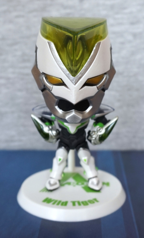
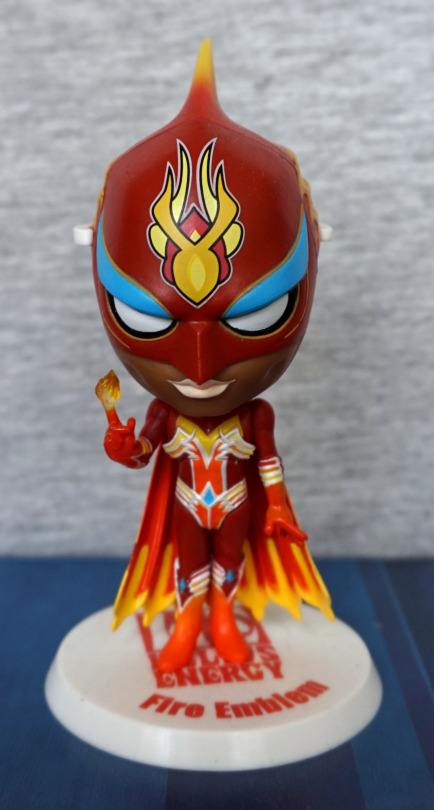
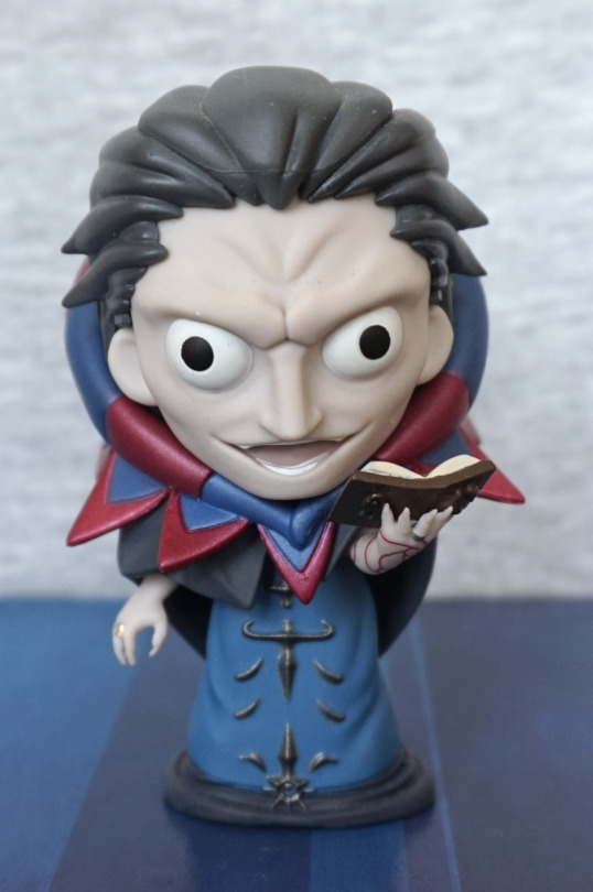
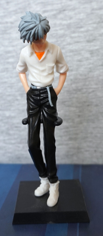
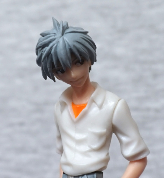
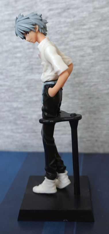
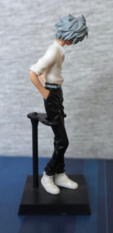
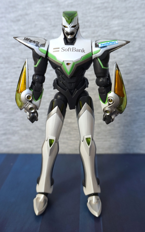
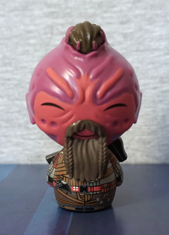
More chibi! Get yer chibi here! Today we have Sairenji from To Love Ru in a gym outfit:

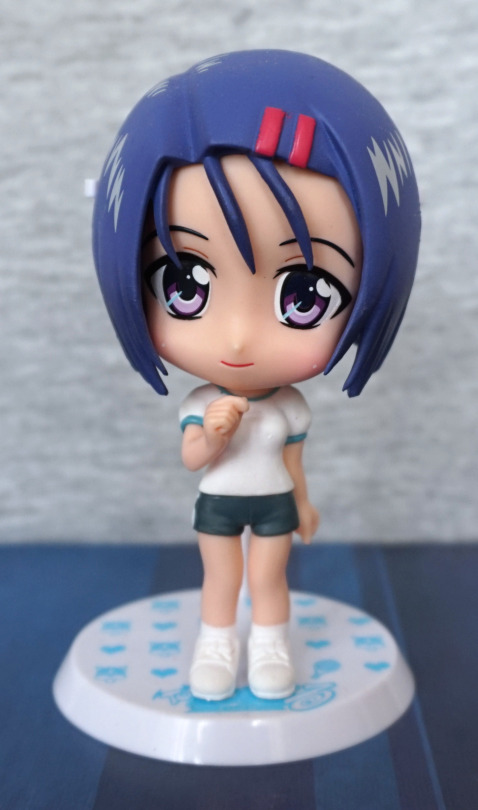
The paint quality is really nice on this one – the eyes have a fair amount of detail, and I like the blush on her cheeks. Her hairclips and clothes are also painted neatly. I like the fact she has some animation in her pose, instead of being static. 
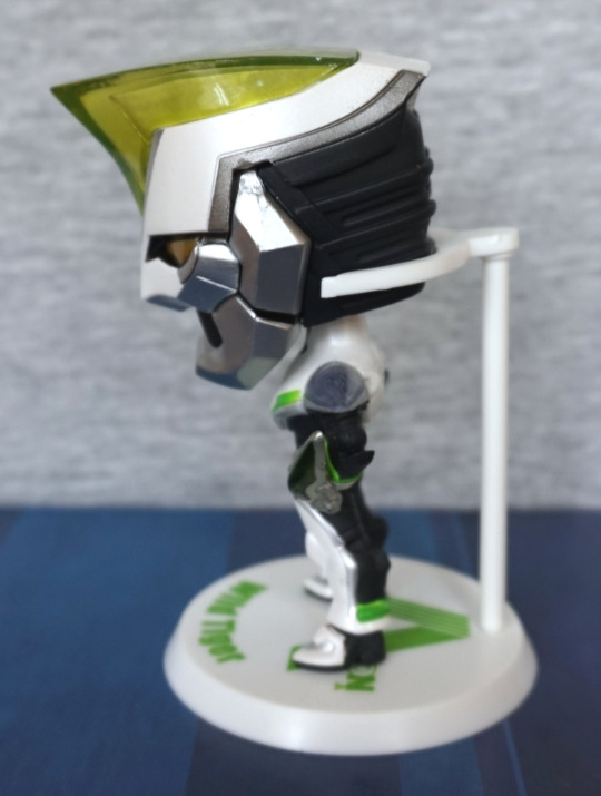
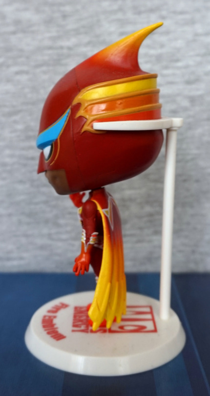
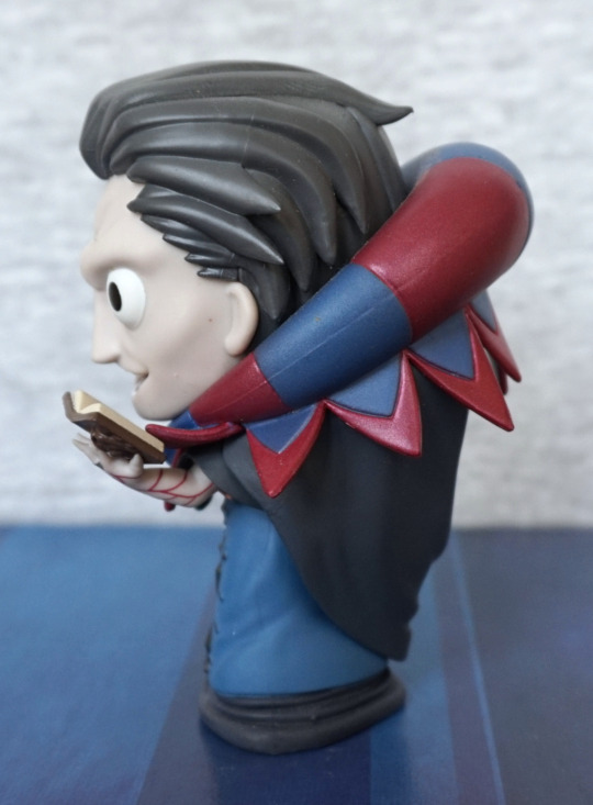
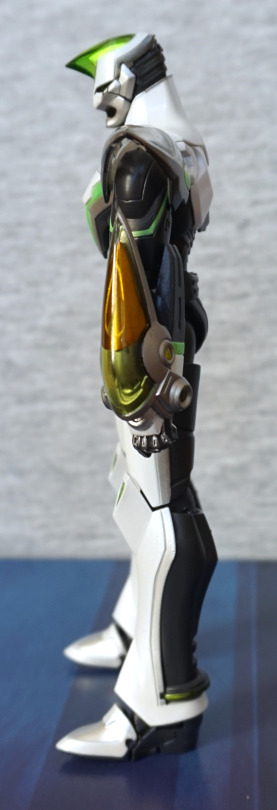
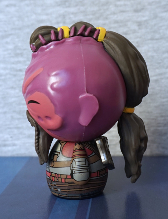
Left:

Hair has a pretty distinct seam in it, but the hair highlights look nice, She has some shading in her hair, which is a nice touch. 
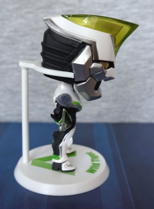
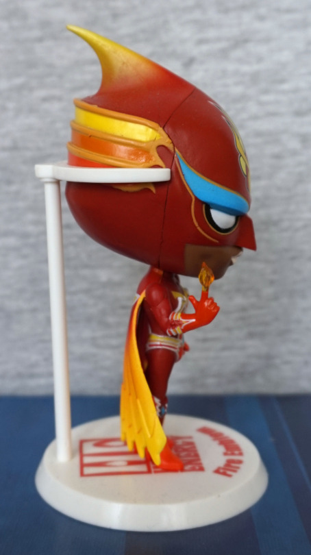
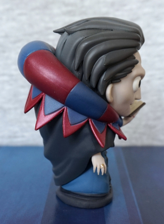
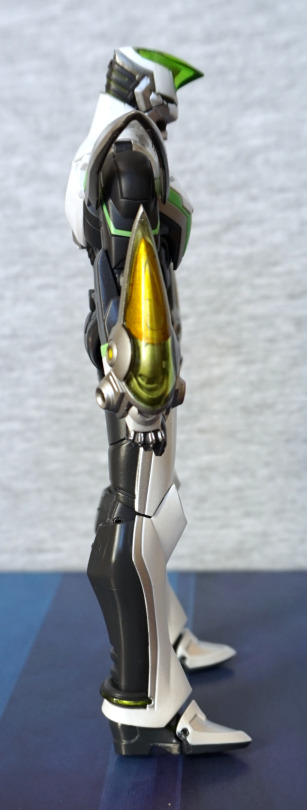
Right:

Some blobby paint on this side, d’oh, but the same isn’t quite as bad. Otherwise, fairly the same as the other side.
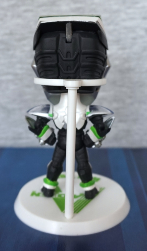
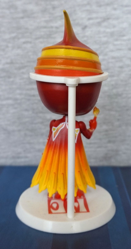
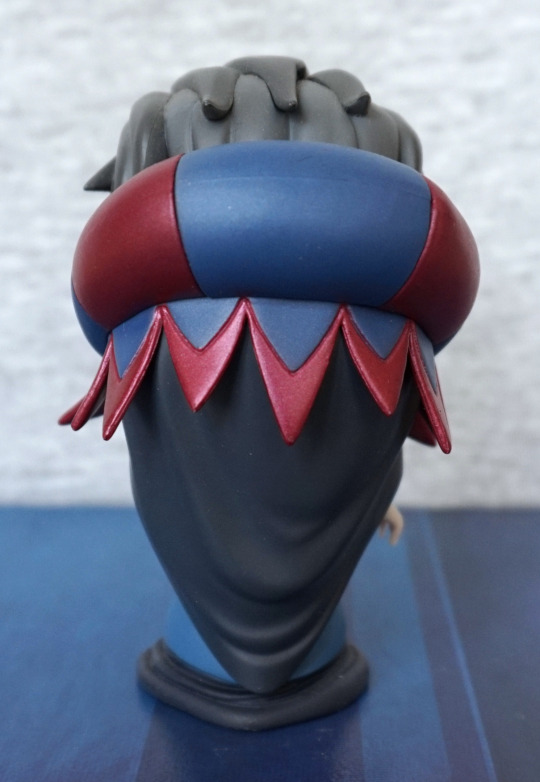
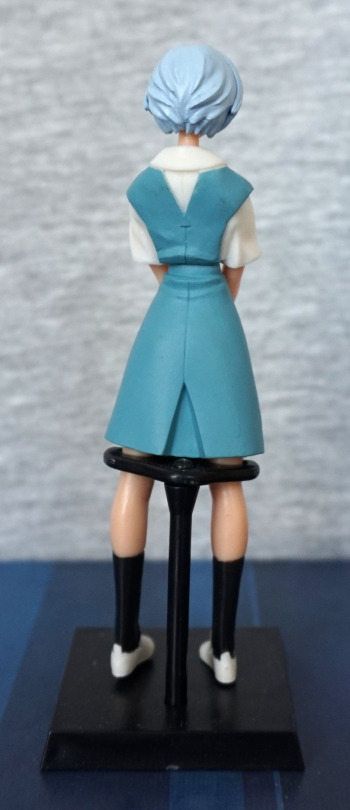
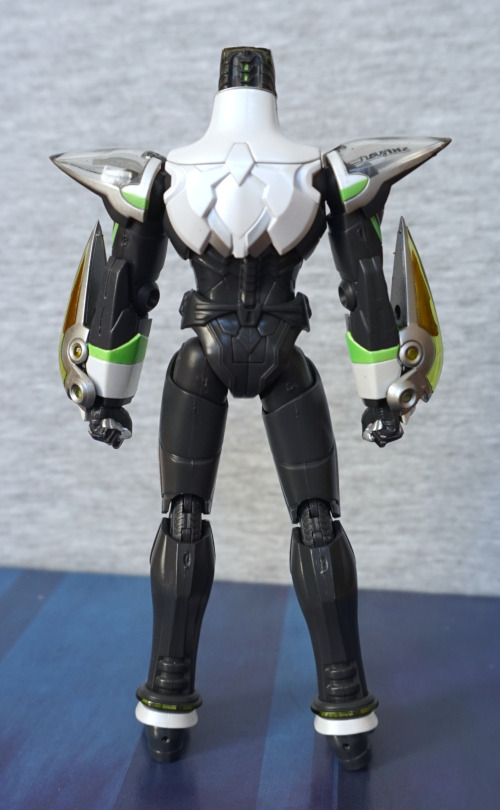
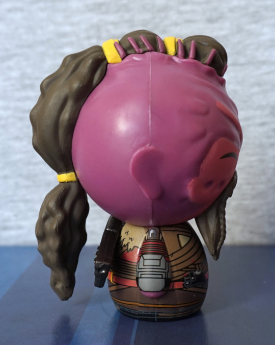
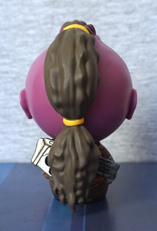
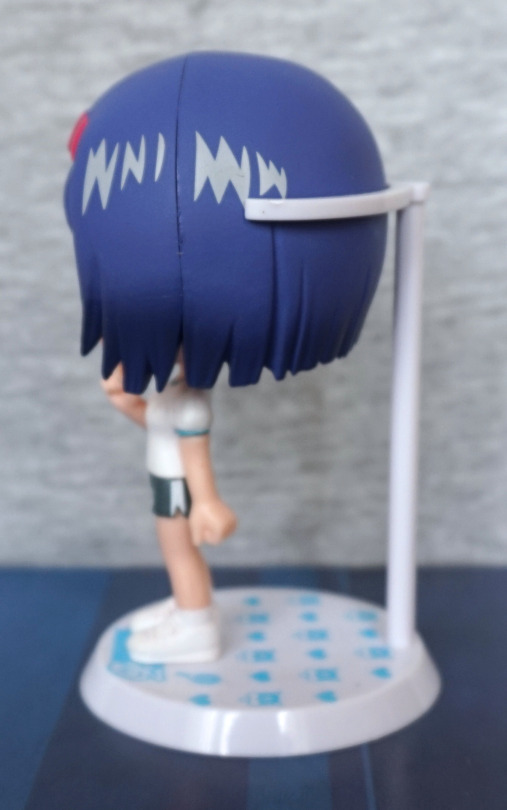
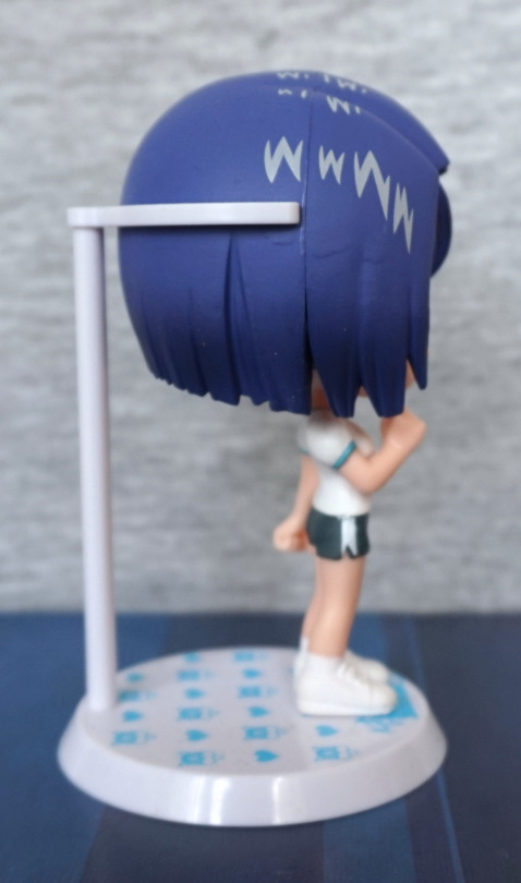
Back:

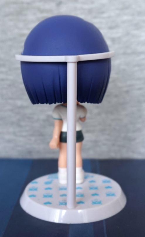
Not too much to see here, move along. Though the pattern on the base is nice. 

Overall, I really like this Sairenji figure. The paint quality is a cut above most chibi figures I’ve seen, and looks like Sairenji. She also wasn’t a crazy price, like most of the the To Love Ru chibis, so glad to have her. Would recommend this figure. 

Wild Tiger – Tiger & Bunny

And now for some main character action:

Whilst I don’t usually go for chibis (yet I’m doing a series of blogs featuring them…) I do rather like this one, and well, in Japan they’re cheap, lol. I liked this one for the detail on it, and I like the clear part on his head. He’s been painted well, and he has a decent amount of detail – his eyes have the black inset, the silver parts have been split into separate parts, and he has the clear shoulderpads and the guards on his arms. 

Left:

His head does have the wideness of a chibi, but doesn’t feel drastic compared to Fire Emblem. The shapes work well, and the colours feel well-chosen.

Right:

Same as the left really. I like the detailing on his legs – he has the silver edging and the green part that goes around his anke. 

Back:

He’s sculpted well back here, and you have the details of the back of his helmet, and the shapes in the white portion of the back of his suit. Some small green paint details, which help add accents to the figure.

Overall, I rather like this chibi, and am glad to have bought it. His base is better than Fire Emblem’s as you can see more of the company logo, which is also helped by his wide stance. I’d recommend this chibi, if you want a Tiger chibi. 

Fire Emblem – Tiger & Bunny

This figure I found in a bargain bin, with only half of its packaging, so he was cheap:

I love the bright colours of Fire Emblem, and this one is painted well. The decal on his head is nice, and the blue contrasts nicely with the red. They’ve made good use of transparent plastic to have him making the small flame that he does in the show. His cape is also nice and bright. 

Left:

The tip of his mask has a nice gradient to it, and the stripes are painted neatly. I find his chibi head shape a bit awkward from the sides though – looks a bit too fat. 

Right:

Some stray mustard yellow on this side, and the head seam is a lot more obvious here. Didn’t quite go fully together in assembly. His gloves looks nice though, and the cape curves a bit, which is nice.

Back:

Really liking the gradient in his cape, and the detailing on it is good. It has a sculpted shape to it, which really helps, especially with the parts at the bottom. 

The base has his company logo on, plus his name, though the logo is mostly obscured by his feet. Might’ve been better just to stick with whatever parts of the logo fit without his feet in the way, but eh. 

Again, this is a character without too many figures, so it’s nice to have him represented in my collection, even if it is in chibi form. 

Caster – Fate/Zero

GillesThis figure I bought for cheap, as he’s missing his base, but he doesn’t really need it:

And also because it’s Gilles De Rais. I find his expression a little on the odd side, but what’s there is well-painted. He has a bit of a seamline in his hair, but nothing too drastic. I can see a bit of paint slop on the bottom of his dress, but the rest is painted nicely, including the pattern on his left arm. 

Left:

Couple of seams visible here – one on the upper part of his clothing, and one in his hair, but they’re mostly hidden. Here we can see more of the linework on his arm, which looks really nice. Top has a bit of flow to it, which is nice to see.

Right:

Clothing seam is pretty well blended here. The points on his hair are sculpted nicely, and he has some fine details on his hand – you can see his rings and pointy fingernails. I love the red and blue of his… collar? Whatever it is. 

Back:

His cape hangs nicely, and the collar is painted well. Nothing to complain about here.

He’s definitely a decent chibi figure, and one I’m glad to have. I don’t think the stand really adds much (apart from ugly whiteness), so I don’t miss it at all. He doesn’t fall over either, due to his wide base for a chibi figure, so I think he looks great without it (and possibly why his previous owner no longer had it…). Glad to have another Giles to add to my collection, as there really aren’t many figures of him. 

Nagisa Kaworu – Evangelion – Gacahpon

This was from the same set as the Rei from yesterday:

His shirt has the same plasticy finish as Rei’s, but it’s more apparent as he has more shirt showing. Main finish issue for me though is his trousers – almost looks as if he’s wearing PVC pants due to the shininess. Hair sculpt is pretty decent, but his shirt is overly orange. Could’ve done with a slightly less bright paint here.

Face:

Hair is a bit rough, but that’s kind of to be expected by gacha figures. The moulding is nice though, and his face looks decent. 

Left:

Paint looks tidy, and the pose looks good. His hands go neatly into his pockets too. 

Right:

Hair also looks good from this side, creases in his clothes have been moulded nicely. 

Back:

Everything seems to be finished off nicely on this side. Belt and paint is neat. The texture on his trousers almost looks better on this side than the front, as it is less shiny. Shirt still looks like it’s made out of a thick binbag or something though.

Overall I’m happy with Kaworu, and both of these gacha figures. Glad I found the machine :). Just wish I didn’t get a double of each! Would’ve possibly tried my luck some more, had I more change at the time. Ah well. Happy with the two I did get!

Rei Ayanami – Evangelion – Gachapon figure

I found one ‘legit’ gachapon machine with Evangelion figures in it! This one was the first one out, and was Rei Ayanami:

An OK gacha – decently well painted for its small size, and straightforward to assemble. Not so keen on her hair colour though. Sculpt is decent, and looks good. Main complaint is the bow is painted on top, which makes it look translucent & odd. 

Left:

Can see where part of the dress was filled from in the mould. Seamline isn’t too bad, better hidden than some larger figures I’ve had. Shoe is a bit of a mess on the side. 

Right:

Skirt and shoe are both a bunch neater on this side. Hair also looks nicer here too. White sleeve looks a little odd – more plastic than shirt. 

Back:

Mould is decent at the back, and has a moulded seamline for her dress, lol. Paint also doesn’t quite go to her shoulder like one of the other Rei figures I blogged about… hm, maybe Rei just doesn’t have her dress go to her shoulder… 

Overall a decent gachapon figure. Nothing impressive, but does the job for the price point.

EVA01 Test Type – Evangelion – LM-HG 001 Bandai

I couldn’t escape Japan without getting at least one model kit. So here’s EVA-01:

This one was a fiddly mess to build, and made me appreciate more modern model kits. The waterslide transfers were… a fair bit more tricky than I thought they’d be. From the front, he looks OK, but definitely a kit that could benefit from paint. Some of the areas are large and bland, and the blue plate could’ve done with some black dot stickers. 

Head:

Rawr. He’s lookin’ at you. Face looks pretty good from the front, wish there were some black insets or stickers to go on the front green parts. Head itself articulates well. 

Knees:

Just about got these stickers on OK :P. Here you can see the green stickers like to escape a bit. I like the use of colour here, and looks good from a distance. 

Left:

The purple stickers on the fins went OK. Here you can see the green decal didn’t go on too well, but the black ones were OK. From the left he looks pretty decent, and the colours work well. Here you can see some of the fluff stuck on the black parts of his arm already – this is a rubbery part. Not entirely sure why, but it’s kind of annoying due to being a dust magnet.

Head:

The triangular corners could’ve done with fitting on better. I like the green part on the lower arm though. His head looks good, though doing the stickers on his eyes was a pain. The head spike sticker works well though. The black parts on his arms articulate, which helps with posing.

Right:

So… no 1 sticker on this side? Yeahhhh… it didn’t go well and ended up breaking up into three pieces, then one folded over, making it impossible to apply. Shame, because it was on OK, but then I accidentally nudged it with a finger :(. Though the green part at the top fits better on this side. The ribbing that forms his back looks good from the side too. 

Close-up of the transfer that made it:

These ones worked well, once I worked out what I was doing. Still weren’t fun to do, but at least these look great once completed. 

Back:

I like the shapes on the back. Here we have some black inset stickers – much-needed for the back, otherwise it’d look too flat. And we can see a bunch of mould edges – this kit was rather prone to them and I’m too lazy to sand ‘em all off. 

Top of the head:

Here we can see some rather special pieces…

*Ptcffff*:

Here we can eject the entry plug! I like this little feature. And, um, I need to poke that sticker back on… The mechanism is a fun thing, but the little part that goes over the entry plug does have a nasty habit of popping off, and it’s a pain to get back on :/. The fact it has a few moving parts is nice, but could really do with having better ways of connecting! 

He also came with an oversized Shinji (well, a figure to fit that entry plug ain’t happening), which you could paint, but that got chucked in a drawer. It’s beige, doesn’t stand up on its own and looks rather meh. 

Overall, I wouldn’t recommend this kit. The result is OK, but not really worth the effort imo. He did come with some other accessories I didn’t photograph, which could make for good posing opportunities, but they’re nothing particularly special. There’s a big gun, but it can have a habit of falling apart and is plain grey unless you paint it. I don’t have any other EVA model kits to compare him to, though. Maybe get this one if you plan on painting it, as it would be a fairly decent base for that. 

Trinity – The Matrix – N2 Toys

Another cheap pickup, due to Western figure not popular in Japan:

Always thought about buying one or two of The Matrix figures, but the quality vs price tends to be pretty bad. But hey, this one was cheap. 

Let’s start with her head – the sculpt is nice, but the paint leaves a bit to be desired. For some reason, they’ve done her glasses in a matt finish – this looks odd and makes it look like she’s wearing opaque goggles. A more shiny finish would’ve helped here. though in a modern figure, they may have actually done her glasses with a transparent plastic. Her hair looks a little derpy too. 

In isolation the clothes look nice – the finish is good, and the wrinkles help to add realism and depth. However the paint got a little sloppy at the top, making it look painted on in the upper part. And +1 for the pointless articulation – she only looks good with her arms outstretched, so the arm articulation is… kinda useless. Maybe some point if you’re setting up a specific diorama and need her pointing slightly up/down. Action-wise, you’re not going to get a lot here. Her belt paint is crisp, though.

Left:

Her hair has some good texture to it, making it look good from this angle. I feel she might want to give her clothes a bit of a tug to straighten them out, at least a little bit. Here we can see that with the arms, if you were to point them a bit too far up or down, things are gonna look a little weird. The guns themselves are sculpted nicely, with some small details in there, making them look like guns. She also holds them well, and looks like she’s shooting. 

Right:

Here we can see a nasty seam on her neck. It’s partly visible on the other side, but here, you aren’t missing it. Here we see they’ve sculpted her ears too – much better than Taserface *ahem*. Her belt loops are painted crisply too. Her body pose I feel fits with her arm pose, when aiming. 

Back:

Bit of broken leg syndrome going on there! Her hair abruptly stops, which looks a little odd. Also the paint on her top is a bit of a mess here too, which is a shame. Her ensemble still feels like PVC back here, so that’s good. Arm joints look a little blergh though, and I do feel they maybe should’ve gone all out on the frontwards aiming and forgot about articulating it, when they’ve gone for a specific arm pose. Articulating the arms does mean she can hold them flat in the box, seeing as how assembling your figures was less of a thing in the early 00′s. 

Other accessories:

I feel these are surplus to requirements, and don’t have a way of fitting with the figure. The knife is painted nicely – if she had a sheathe for this, I’d put it on her side. The machine gun, however, feels kind of misshapen, so this one is for the accessory drawer for sure.

All in all, one for the older figure fan. If you can handle pointless joints and a bit of a derp paint job on the top, then maybe this figure will interest you. I’m happy to have a Matrix figure in my collection that manages to be semidecent and look fine at a bit of a distance. 

Tiger – Tiger & Bunny – S. H. Figuarts Movie Edition

Saw this dude cheap in Mandarake, so added him to my pile of stuff:

He’s surprisingly weighty, as he’s part-metal, and feels a good, solid figure. Overall, his design feels clean, and he’s easy to articulate. He does come with a stand, but he stood up just fine on his own, so decided to take pics of him in a neutral stance for this blog. The colours are nice on this figure, and he looks the part. 

Left:

His face has that slightly menacing look from the side. His arms are nicely detailed, and the “cover” part looks good. His leg is nicely finished, with a silver stripe. 

Right:

Very much the same as the left. He’s a symmetrical character, barring the logos, so this was to be expected. 

Back:

Here we can see the small details on the back of his head, and the angular patterns of the armour on his back. However, the whole thing feels… too flat. Especially on the lower part of his back and upper legs. The green detail around his ankles is nice though. 

Accessory time!

He comes with two of these guns, but was only arsed to equip one. They’re nicely detailed, and have a bit of paintwork on them. 

Side:

They peg into the inside of the arm “cover”, and the handle goes into his hand. It’s hinged at the handle join, so you can still pose him when he has it equipped. which I really like. I love the effort that went into this accessory, especially comparing it to the boring one-colour accessories Western figures can frequently come with. 

From the top:

Yep, definitely happy with this one. 

The other pieces:

Due to the peg, the guns have specific sides. And a decent selection of hands, for all your favourite Tiger poses.

And his base:

Will likely assemble this so I can have him in a more action-y pose.

Overall, I think as a figure he is a little on the plain side, but solid. This figure can be picked up cheaply, so would recommend it if you like what you see here. Was a bit worried about what he’d be like out of the box due to the cheap price tag, but I think he’s fine, just mostly because Tiger & Bunny isn’t too popular, and a lot of the figures are pretty samey. 

Taserface – Guardians of the Galaxy – Dorbz

Needed something cheap to meet the tax-free threshold… after dithering over the sale goods I settled on this dude, despite not seeing the film (yet):

I was attracted to him as he was… purpleish. From the front he looks decent – his beard has a good sculpted texture, and his face seems to be painted decently neatly. His outfit is also a detailed pattern. 

Left:

Aaand here is where it gets messy. Bis body looks fine from the side – the print looks neat on his body. As for his head, his ears have been reduced to flat, barely-shaped pieces of plastic. And that seamline… not even a little bit of sanding? On his hair, there’s places where yellow paint have been blobbed about, and small areas where the paint is too thin. The purple paint on his hair shows some of the same issues. Looking at pics of the character via the magic of Google, these design pieces don’t fit at all… He does have bands in his hair, and the yellow seems even a bit brighter than the brightest one. And the purple bits? What? 

Right:

Smooth and seamy. Just.. blergh. Getting a feeling why this dude was on clearance now. At least the ear is actually ear-shaped here. I know he’s misshapen, but it should either be clearly so… or not. The other side looks like a mould fault rather than a sculpting thing. 

Back:

His hair does give the feel of a braided mess, which is accurate to the character, whilst being simplified to fit into the Dorbz design.

Top:

Let’s get to the bottom of the hair issues… or not. As far as I can tell, the purple bits are supposed to be bits of skin showing through his hair? Just makes him look like he’s got a poorly-painted centipede trying to make its way out of his skull… It doesn’t look good on this figure, and it doesn’t look like anything I can see from the movie. This figure would be much-improved if these pink tentacles were removed and the front bands were painted orangey yellow instead. 

All the major flaws, all at once:

Yeah. Blergh. His gun isn’t shown too well in most shots, as it’s mostly hidden. Shame, because it actually looks OK. 

Overall, can’t recommend. He looks OK from the front, from any other angle… well, a bit shit. I may use him for painting practice or something. Shame, as the body is really nice, and some minor tweaks would have him looking better from certain angles. Not sure why they didn’t sculpt his ears – whilst they are deformed in the movie, they weren’t completely flat like this.