Tag: aliens

Panther Alien – Aliens Retro Collection

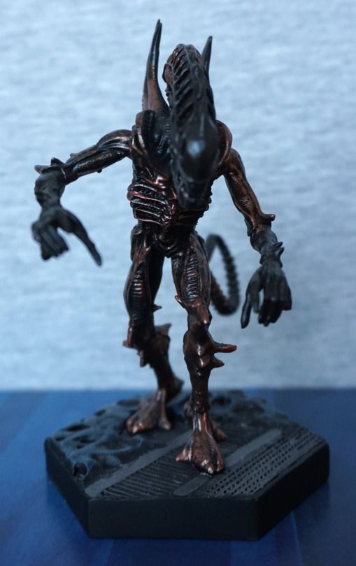
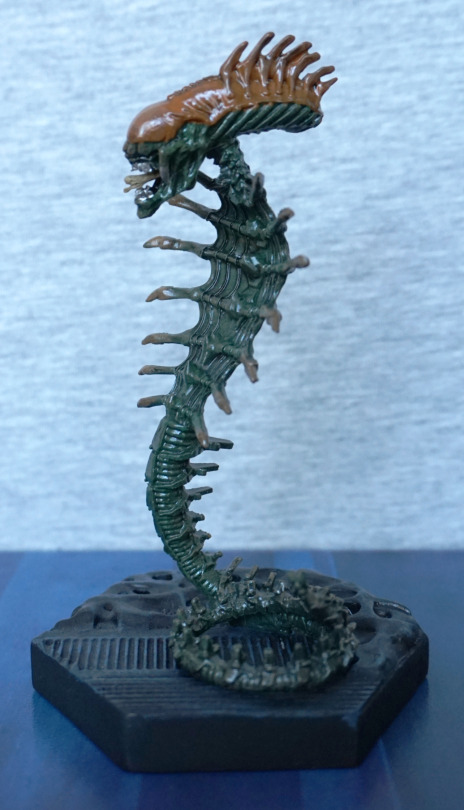
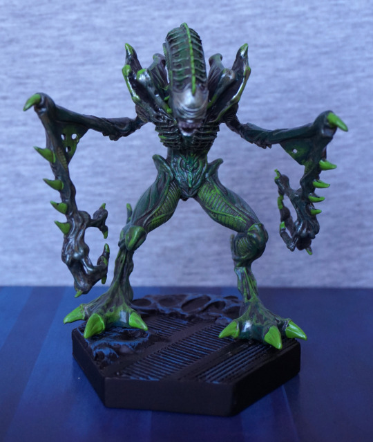
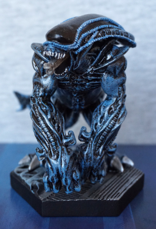
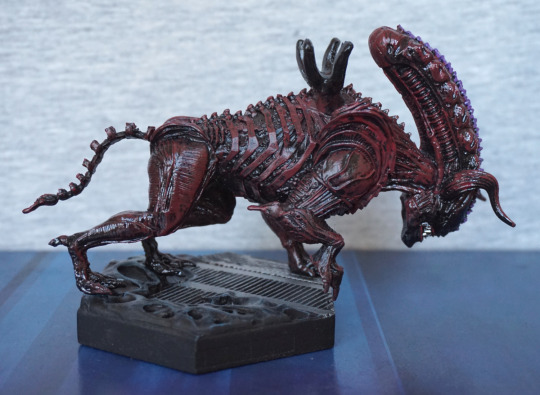
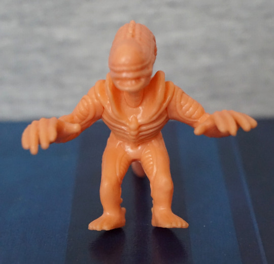
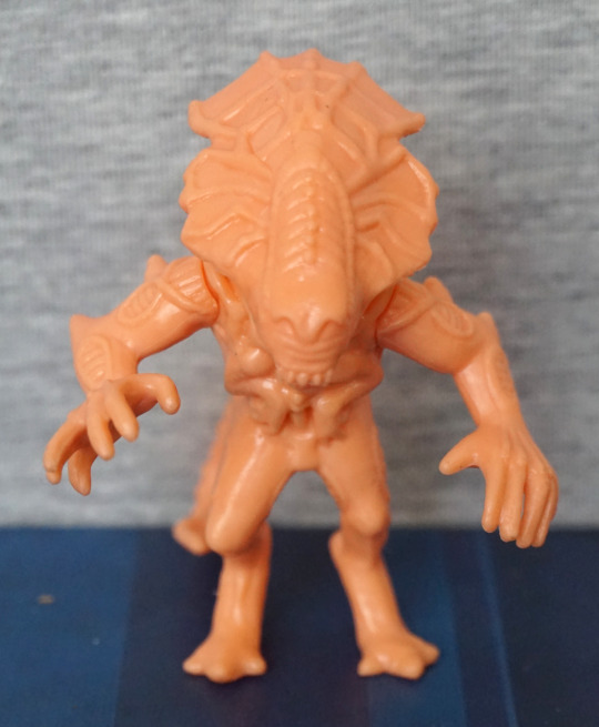
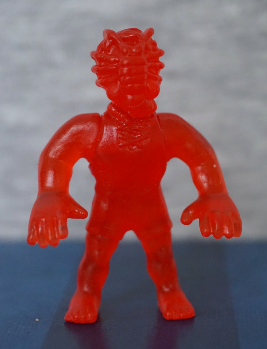
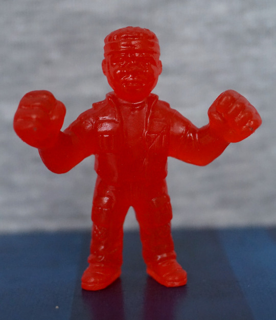
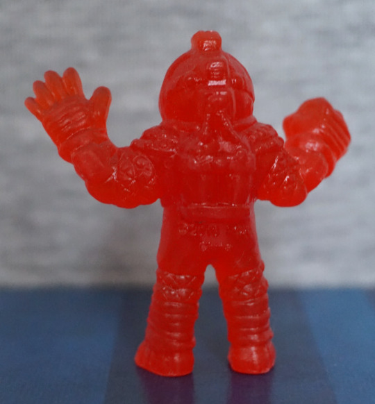
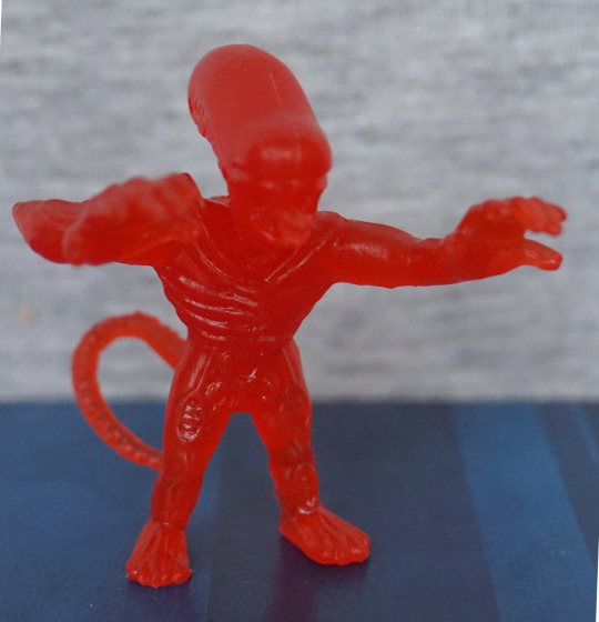
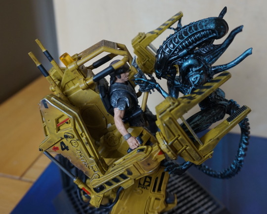
And, finally, the panther alien:

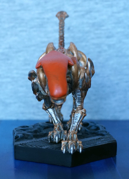
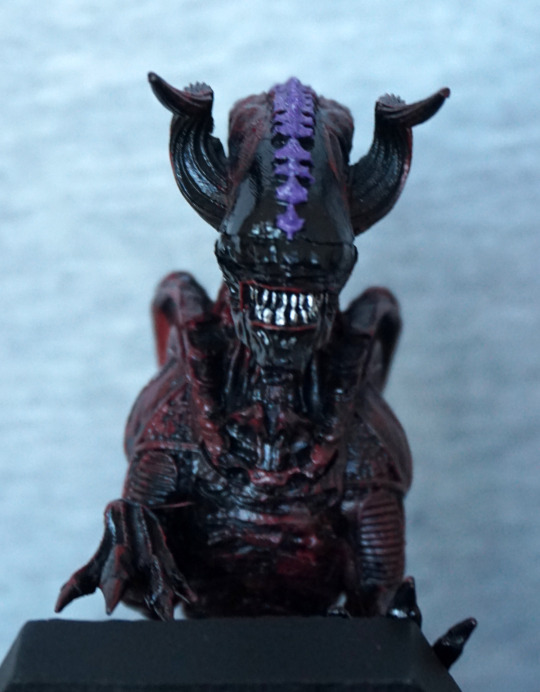
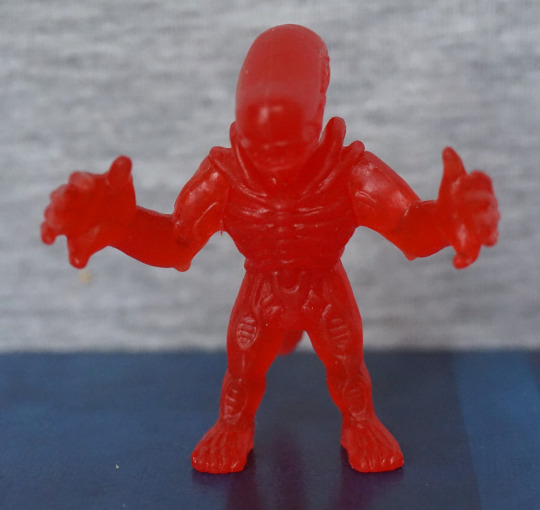
I’mma gonna headbutt you… The body colours look really nice together, the orange head would look better if the paint app was thicker… seems a bit thin and uneven in places… 
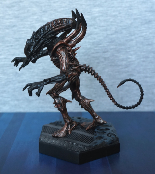
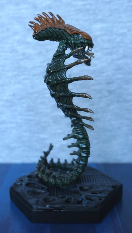
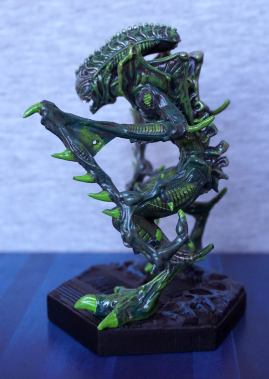
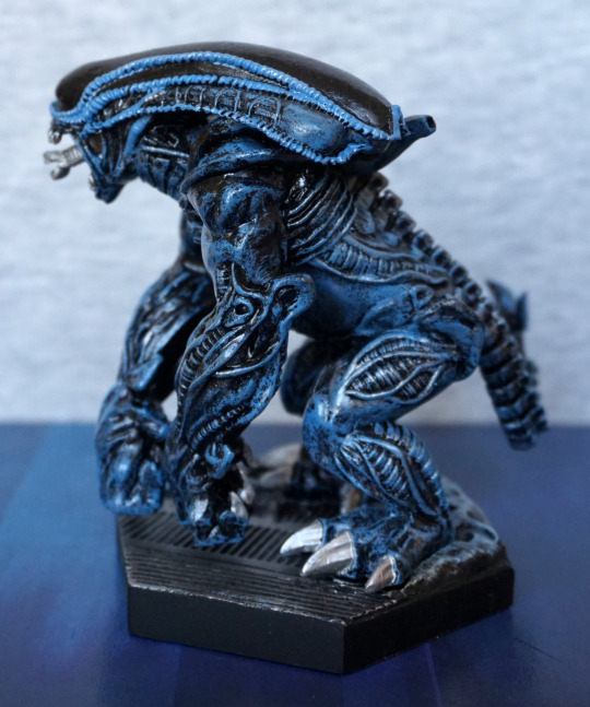
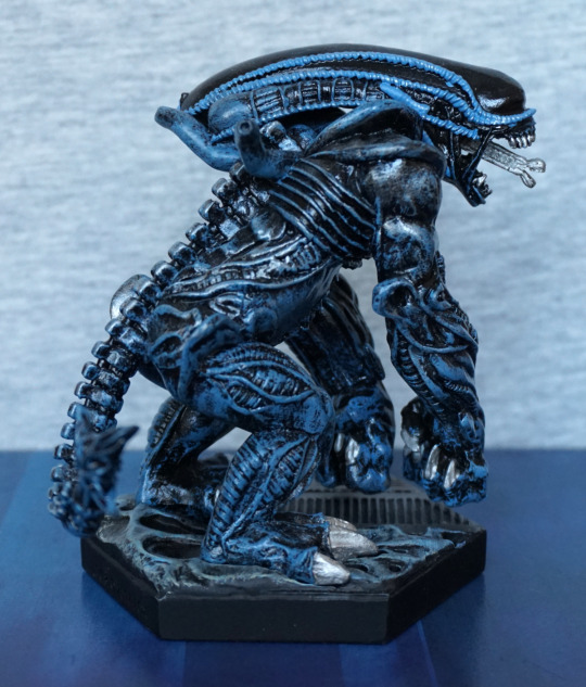
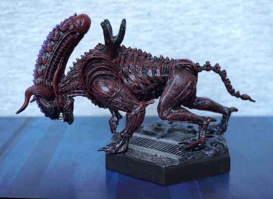
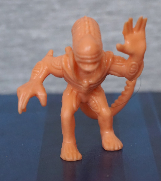
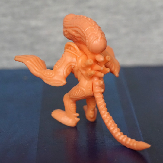
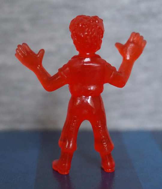
Left:

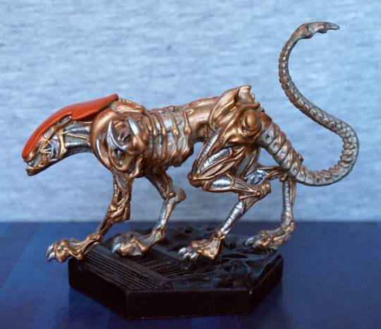
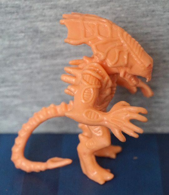
I like the pose, has a feeling that he’s slinking. The colours also work really well, and I think they’ve chosen the right places to paint gold/silver, though some place are a bit sloppy. I think the tail adds to the impression he’s slinking. 
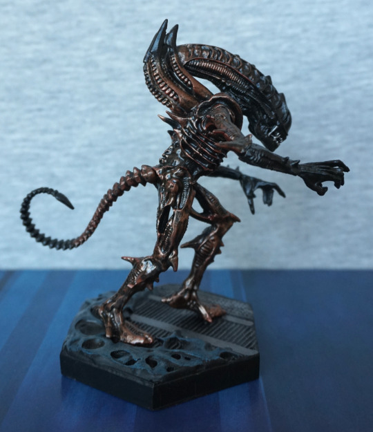
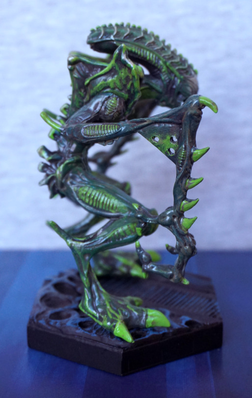
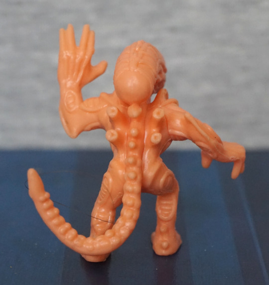
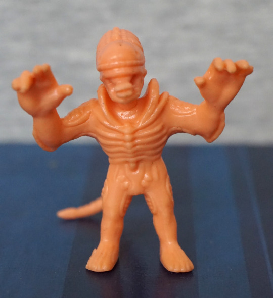
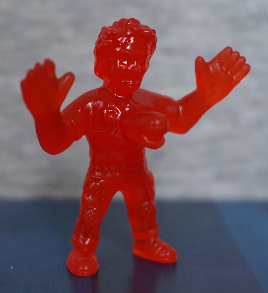
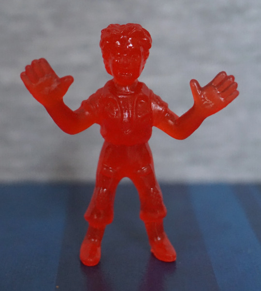
Right:

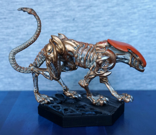
More of the same on the other side. I love the shape of his feet. 
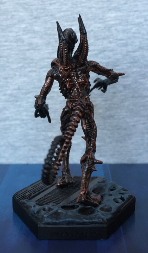
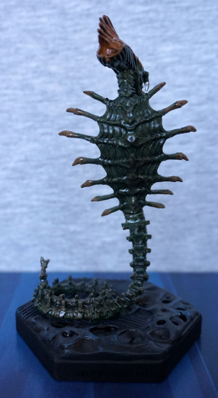
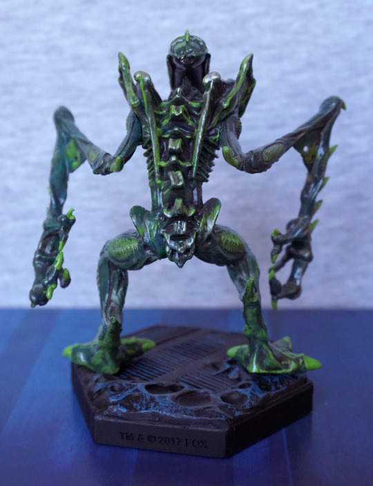
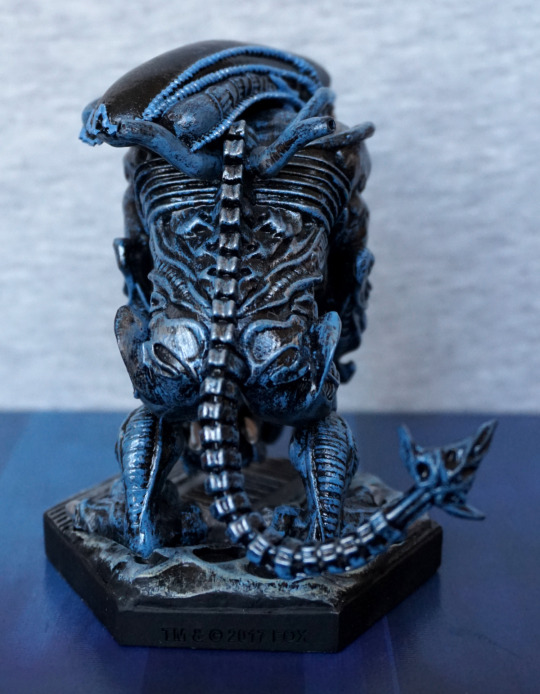
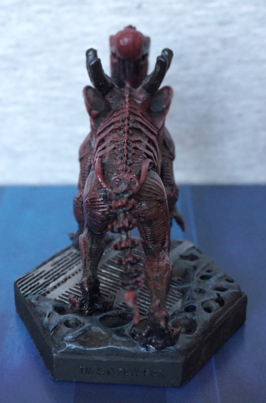
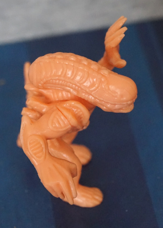
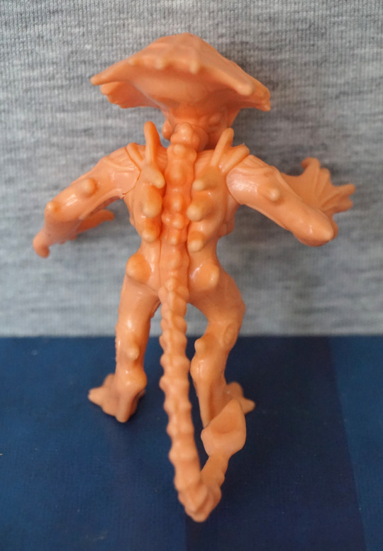
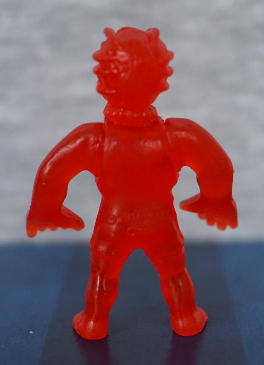
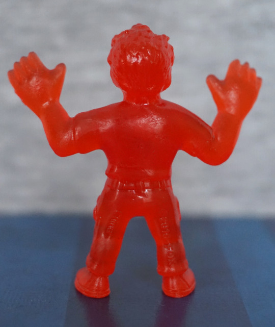
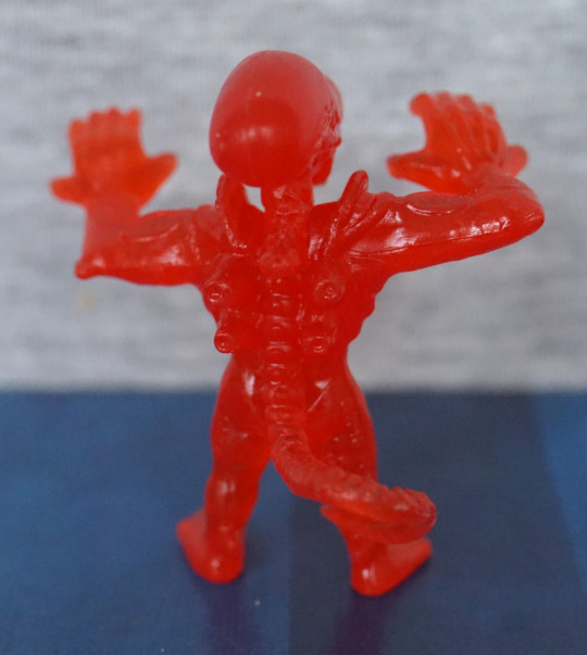
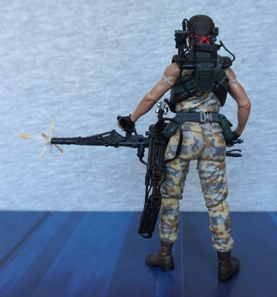
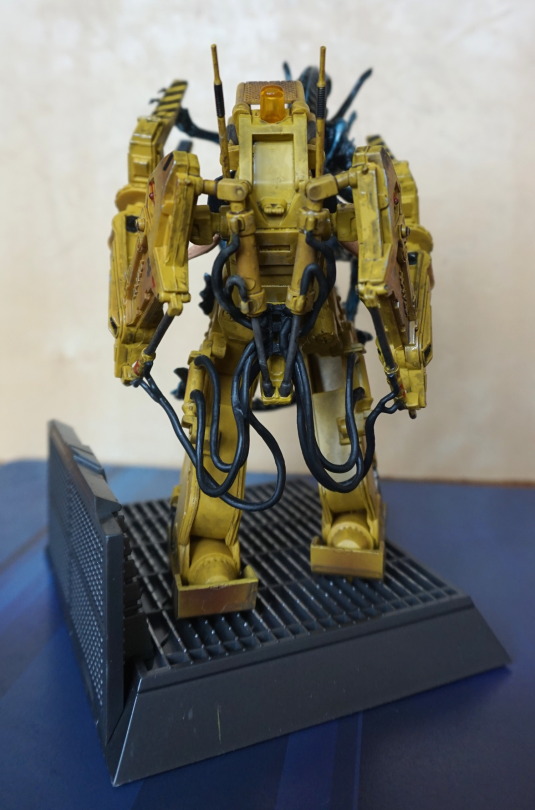
Back:

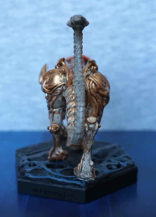
Not too much to see here. Looks like the moulding got sloppy at the back of his legs though, unfortunately. Tail looks fine.

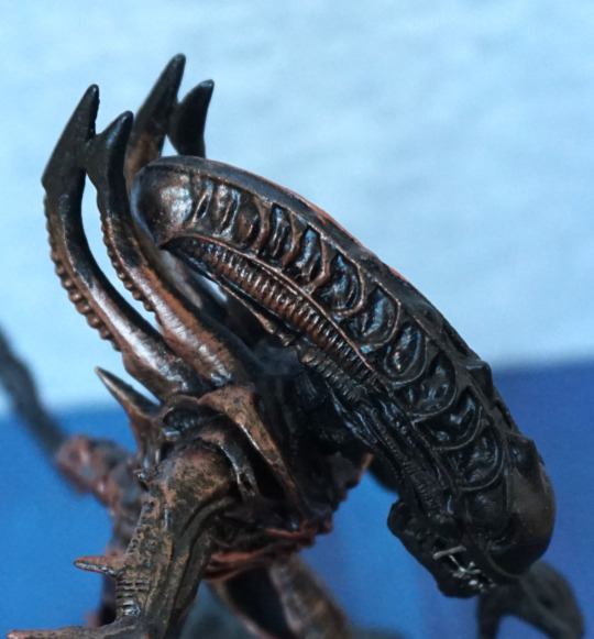
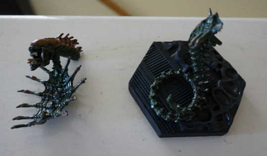
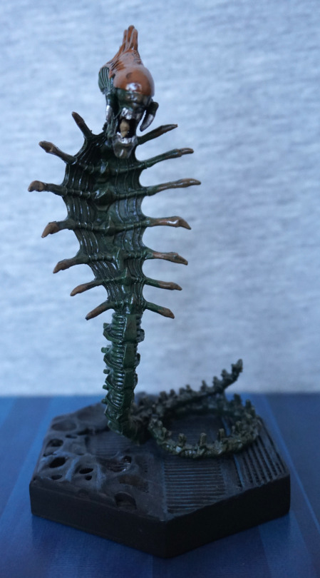
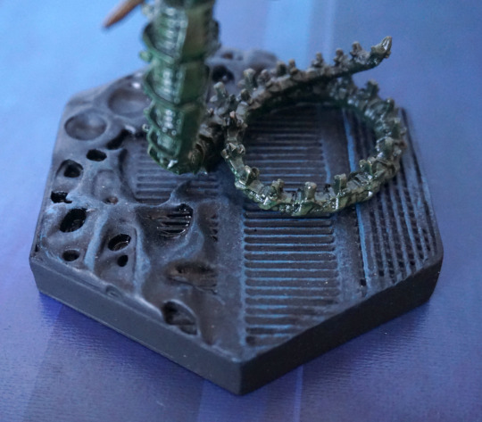
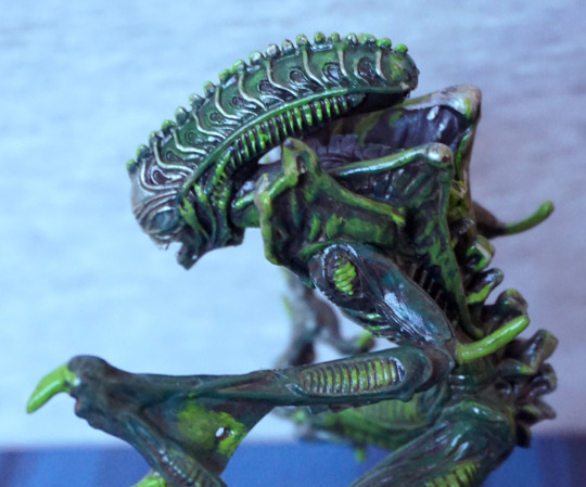
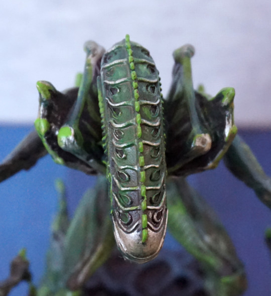
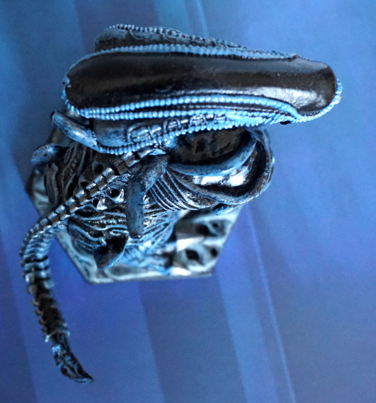
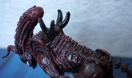
Closer look at the tail:

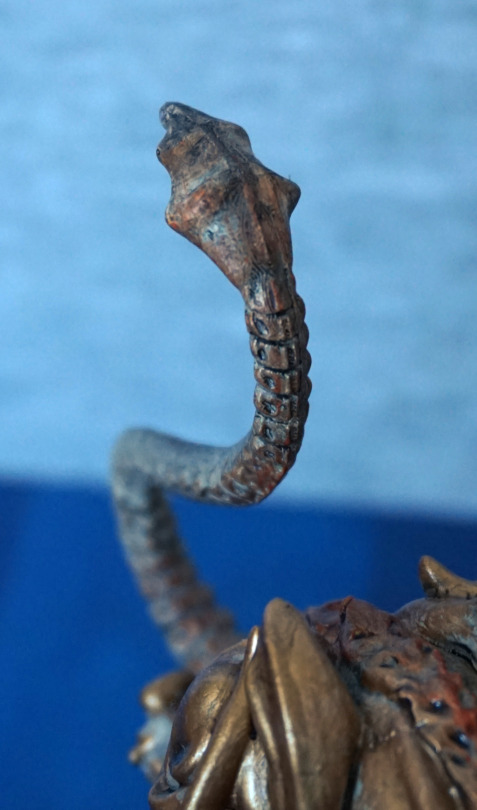
I like the shape of the end of his tail, and feel it is well sculpted overall.
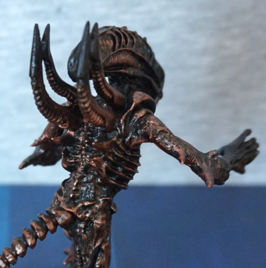
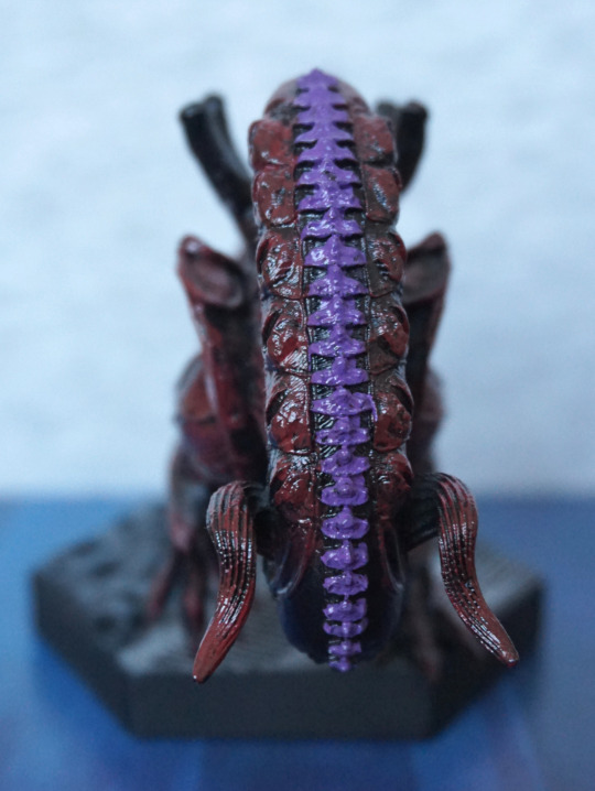
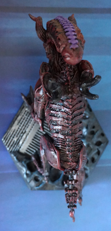
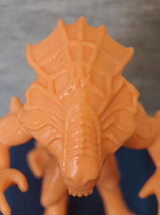
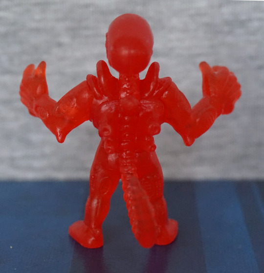
Top:

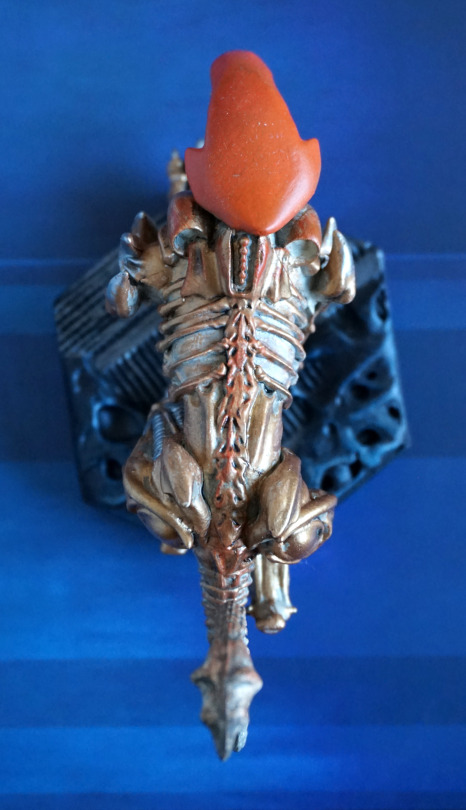
They’ve added some orange down his back, not sure this worked too well. At his upper back, I think they should’ve stuck with just the dot-spine bits. The blend ion his spine could’ve worked, but I feel the paint app is too uneven for it to work, and was probably too ambitious with Eaglemoss’s usual final quality – their painters don’t seem to blend too well, so I think this would’ve been fine as just gold, or maybe a darker shade of orange. 

Overall, he’s pretty decent. He’s certainly an eye-catching piece, but does have some flaws in the paintwork. 

Scorpion Alien – Aliens Retro Collection

Today’s xeno is an alien crossed with a scorpion:

This one shares a similar colour scheme to the Revoltech Big Chap I got some time ago. I do like the contrast of the copper against the black. With him having a slight profile, not too much of the detail is visible front-on.

Left:

Here we can see much more of his pose, and I think he’s posed well. What I’m less fond of is how the gold highlights have been used – I think it would’ve looked better if the highlighting on the head was more like the silver on the Mantis. Again, the arms are half-copper, half black in a way that isn’t hugely appealing. 

Right:

I like the way the tail curls, but again, the odd colouration. Only place the half-colouring is working for me is the “pipes”, which are more like spikes on this one, to fit in more with the scorpion theme. 

Head close-up:

Sculpting is nice here, The copper almost fades away here, making it look less sudden than the other side. He’s also got his teeth painted in silver. Spine painting is mediocre close up. 

Back:

Back looks better as it has better copper coverage. For the tail, I’d like it more if the gold was over the top side and not on the bottom – I think that contrast works well. 

Back close-up:

I like the distribution of the copper paint on his back, though the sculpt feels “muddy” and confused. I feel the details got a bit lost here. Back spines are still cool though :P.

Overall, I think the sculpt is strong enough, and the colours work. Just would prefer the colours to be better distributed so it doesn’t look so odd. 

Snake Alien – Retro Aliens Collection

This one came with the mantis alien, and was the other figure to break in transit:

image

Yeah, it has a really thin body, so getting this one through the postal service is a risky business. It also has a LOT of spines, so these may also snap off. Even on my replacement, I had one of the tiny bits snap off near the base of its tail, but fortunately it isn’t really visible unless you know it is supposed to be there. 

So let’s get onto the less broken one:

image

HISS! He’s posed well, and the design is pretty decent. What’s there is sculpted and painted well. 

Left:

image

He arches up nicely, and I like the spines on his head. The colour contrast between the green and the brown is nice. If you see the triangular bits sticking out of its lower back, one of those is missing, but can’t remember exactly where. 

Right:

image

From the back, I’m not sure if the spines are painted as the sculptor intended, suspect they were going for a blend, but is a bit messy here. Head is nicely done though.

Back:

image

I like the detailing on the back of webbing. Not too much to say about the back. 

Base:

image

I like the way he’s curled up, to support his body. The base looks decent too. 

Overall, I like the look of this figure. However, I would’ve liked to see more meat on the body of it – not just for stability reasons. Whilst snakes don’t have too much to them, this snake seems to not exist in the middle, and is only bone and webbing in the middle. I think it would’ve helped the stability and design if this figure was given a snake’s body all  the way down. 

Mantis Alien – Aliens Retro Collection

Next up, the mantis alien:

This was the one I was most excited about… so let’s see how he fares. From the front he looks good – we have a couple of shades of green going on, and some silver. I’m glad they’ve used a couple of shades of green to paint him, as it does add a lot to the figure. I like the pose of the figure too. 

Left:

I like the pose of the arms and the body. The circular parts are nicely highlighted in the lighter green, and the sculpt o the head is lovely. What I like less is the webbing on his arm. The paint looks very sloppy on it, and it looks more like metal sheeting than skin. 

Close-up of the side of his head:

Couple of sloppy paint bits – the green on his shoulder and a little on the ribbing on the lower part of his head, but I do love this head design. The silver highlights on it work well too. 

Right:

And the webbing on this side… ergh. Awful. Looks like he’s got some metal in the crook of his arm. It’s like the sculptor didn’t even try to get the webbed effect the original had. If they did something similar to the shoulder sculpt, that may’ve worked. Anything but this… weird attempt. Nothing would’ve been better, but could’ve made the figure dangerously fragile. I’ll just stare at his lower arm instead… yes, that looks better. 

Back:

Weirdly, he has no tail. With the webbing and the lack of tail, I do wonder if the sculptor was trying to do this from memory instead of with source material… The back is OK, but not a strong point of the figure. 

Top of the head:

Pattern looks good on the top of his head :). 

Overall, he looks decent enough from the front, but the “webbing” on his arms really brings this figure down. I still like him, but there’s definitely some weird design decisions going on here, which I don’t fully understand. Yes, the arms probably needed more support material, but why no extra raised bits to look like webbing? Is this actually some kind of statue of the mantis alien, instead of a specimen? Yeah. Gonna go with that. 

Gorilla Alien – Aliens Retro Collection

With the bull alien came the gorilla alien:

This is one burly dude of an alien! I do love the “growling” pose, and we also get to see his inner mouth due to it. The blue dry brushing effect does help to accentuate parts of the figure, and I think this mostly works. 

Left:

That’s some big claws he has there on his legs! Love the colour scheme. What I love less is some of the line painting at the top of his head is a bit messy. The sculpting is nice, with plenty of details to look at. 

Right:

Here the lines are neater, but one pesky bit at the front of his head there. We have a lot fo the same details as the left side, and I do like how he’s posed. He also seems he’s got his hands curled, ready to pound the floor. 

Back:

Big butt! I think his body looks a bit awkward from this angle, and maybe needed a little more shape to it to make it less square. However, it is detailed nicely, and I do like the design of his tail, which has an interestingly sculpted end part that I like. 

Top:

He has a nice, shiny head, a little bit marred by stray paint. I like the way they’ve gone for a different finish here, and the effect it gives it. 

Overall, I’m a fan of this one. The colours are nice, and the posing is good. Feel they’ve done a good job of capturing the gorilla alien’s appearance.

Bull Alien – Aliens Retro Collection

This is the first of six blogs for the three Aliens Retro twin-packs. Bought all three packs when they were on sale on the Eaglemoss shop. Partly glad I got them there, as I was able to get replacements, as two arrived broken. However, they could’ve done a better packing job… 

These alien designs are based on the never-aired Alien cartoon designs. 

Anyways, enough ramble, let’s have a look at the Bull alien:

image

Starting off with a side pic, as front-on doesn’t have as much to see. The head design is really nice, but I’m not too fond of the body – the stripes feel too flat, making the body feel too flat in general. The front arm and feet look good, but his back leg feels a little awkwardly shaped. Not a fan of the tail – feel as if this should be beefed up, and look more like the original Kenner version. Another advantage of doing this would be to make it less fragile – my first one the tail was snapped off in the box, and getting him out, I can see why. I don’t think they had to go this thin to achieve a bull tail effect. 

Head:

image

The purple stripe is nicely painted, and faithful to the original design. The horns look good too, and I think they did a really good job here.

‘Face’:

image

Nice set of grinning, silver teeth here. Got a seam line going on, which isn’t too much of a big deal, as you don’t usually see this angle – here I’m holding the figure to get this shot. The bottom of his body doesn’t look particularly well-sculpted from here, however, again, it’s not particularly visible on display. The ‘arm’ poses do work well at this angle though, and does make him look menacing. 

Left:

image

Man… if only they gave the exoskeleton parts a bit more shape… The limbs look a lot nicer on this side imo, and the back leg doesn’t look oddly stretched. 

Back:

image

I feel his back pipes are a bit short and stumpy. I think it’d be more aesthetically pleasing if they were bigger/more dominating on his back. I like the way the exoskeleton ribs end with spine parts, but still feel they could do with more shape in general. 

Back:

image

His back looks OK, nothing special. I know bull tails are thin, but I feel as if they could add more weight to the tail, possibly remove the spine parts (maybe do ridges like the body?) to make the figure more robust. If you’re moving this figure around, be careful not to clip the tail on anything, as it will easily snap. 

Top:

image

The plates at the top of his limb joints work well, and the body shape is nice and bulky. 

Overall, I think he’s a decent figure, but does have a fragility problem in the tail. Thankfully Eaglemoss is happy to provide replacements if they have them, though resin is fairly easy to fix with superglue if you break it yourself or can’t get a replacement. If I were to change anything, it’d either be the tail or to add a more rounded shape to the flat surface of the back parts. though I feel these complaints are relatively minor. 

Aliens x M.U.S.C.L.E – Series 2 – Part 2

Now for some alien warriors and their main nemesis…

First up, this dude:

Why, hello there! This one, um, has a normal hair. That’s mine. Sorry. Overall, he looks OK, pretty similar to the ones in the other set. Only this one is waving. 

Top of his head:

I do like the sculpting on the top of these alien warrior’s heads. That part did come out well, though here we can see the arm joint is a bit “eh”. 

Xeno number 2:

This guy… likes to lounge around. This guy I’d say is the weakest of the three warriors in this set – his pose isn’t overly exciting, and he doesn’t stand up on his own either… 

Lastly for the xenos:

With his arms up, this feels more like a xeno pose, crossed with a M.U.S.C.L.E one. He’s also in attack mode, with his inner mouth poking out. He also isn’t super at balancing, but his tail does more to support him, so he doesn’t look like he’s lazing out. 

Now for their natural enemy… the Ripley!

The sculpting feels more detailed than series 1, and she has something that almost passes as an expression. 

Ripley with Newt:

Another iconic “pose”. However, I’m not too much of a fan of the sculpt on this one, no matter how hard I try to not see it. From the front, Newt looks like she’s melting into Ripley a bit, and the faces look odd. From the back, Newt’s leg looks like it has been flattened, which doesn’t look good. The hair sculpts look good, if a little merged. Rifle looks the part though. 

Again, a mixed bag. The sculpts seem to have more detail in this set, but there’s more balance issues with this set, or other moulding weirdnesses. 

Aliens x M.U.S.C.L.E – Series 2 – Part 1

Series 2! For this series, I got the “normal” edition, which is in a flesh colour. I think there was a limited run of these in different colours, but in blind bags, but those aren’t ones easily available. However, I was happy to get these in a non-translucent plastic. 

First up, the Alien Queen herself:

image
image
image
image

She has her cute li’l arms sculpted, and her large head plate. At a glance, I don’t mind the head plate, but looking close, the spider-web effect is a bit odd to me. The front part of her head I like the texture of though. Here, you can see better the odd ring bits than the translucent set – here I can tell they look odd to me as the rest of the arm lacks texture, which makes them stand out. 

Her back and spine look good – lots of sculpting and texture here, giving a detailed appearance. No detail under her head plate, though. Overall, I like this one.

Powerloader, featuring Ripley:

image

Here we can see Ripley piloting the powerloader – her clothes are nicely sculpted, and her face is fine for the size. I think they did a good job with this, given the size. One of the aerials is a bit bent on mine, but I could fix this. 

Sides:

image
image

Lots of small mechanical details here, which are nice. Claws look nice, but a little bent – I suspect if I do try to sort these, there is a good chance they’ll bend a bit over time. The join between the front cage and the powerloader itself is a bit rough, but it doesn’t really bother me. 

Back:

image

Looks good from the back – we have a decent amount of hydraulic parts modelled here. Just need to sort out that derpy aerial… 

Half a figure, Bishop:

image
image

Unfortunately mine has a hairline from when it was moulded. Ignoring that, he’s been well-sculpted, and I love this iconic choice of character and “pose”. 

Apone:

image
image

First thing that stands out to me is the flatness of the top of his hat – not sure why his hat is so flat. However, he does look ready to kick butt with that cigar and his fists. Sculpting is OK on this one, but again, another one of those hair marks. 

Bit of a mixed bag here – I think the sculpts are better thus far than the first series, but there’s more of those hairlines. Also the Alien Queen isn’t very well balanced, so she’ll need some tack to keep upright. 

Aliens x M.U.S.C.L.E – Series 1 – Red ver. – Part 3

Now for the last four figures in this set. 

So, let’s continue on with Kane…

Nom! Here we have Kane being facehugged. The facehugger is nicely sculpted, but his body is a bit lacking – the way they’ve done the joins on his arms doesn’t work well – instead of looking like the edges of his shirt, it very much looks like his arms are stuck on. His shorts/legs is a better bit of moulding. 

Kane, unfortunate ver.:

Due to the material used, I don’t think the chestburster shows up too well on this one. But it’s certainly an iconic thing to include, I can see why they did this one. Even though it’s a bit indistinct, I’m glad they included this.

Lambert:

I don’t find the likeness on this one too good, and her expression certainly looks odd in my photo. Her clothes are nicely sculpted, but her body feels an over-distorted shape – looks like they tried to give her boobs, but didn’t sculpt the shirt shape correctly, so her entire top is puffed out. 

Lastly, Parker:

Again, a mould hairline on the back. I think this decently looks like Parker, and the sculpting is good – his iconic headband is there, and his clothes look decent. And he also looks ready to do some punchin’ M.U.S.C.L.E-style. 

Overall, these ones were a bit of a mixed bag, but I don’t think any of them are terrible. I like the red colouring, but it does make the sculpting look less distinct, so I feel this is a bit of a trade-off. 

I’m glad I got this set, and I like the mash-up between the two franchises…. enough to buy series 2! Stay tuned for series 2 😉

Aliens x M.U.S.C.L.E – Series 1 – Red ver. – Part 2

Now for four more of the series 1 of the Alien M.U.S.C.L.E figures.

Ash:

image
image

What’s he holding here? Not entirely sure… is it the Inanimate Carbon Rod? Hm. His front is sculpted well, and has a reasonable level of detail, given the figure type. However, the back feels a bit bland and seems to have a couple of moulding issues – there’s a couple of hairlines on his back, which I don’t think are supposed to be there. 

Brett:

image
image

Looks reasonably like the character, Here we have some sculpting to stand in for his shirt design, and I think that works well. We also have some creasing moulded on the back of his jacket, which is a nice touch. 

Dallas:

image
image

This was also one I recognised when taking them out of the tub, so the likeness is likely reasonable. Again, on his back there’s some hairlines which I’m pretty sure are not supposed to be there. His outfit looks good from the front though, and is nicely detailed. 

Lastly, for this blog, Kane in his spacesuit:

image
image

I did have to look at the character list to see who this was… This one is pretty detailed though, and does look like the iconic spacesuits used in the movies. And with those fists, its wearer could certainly go do some punchin’

Overall, most of these were decent, but I think the Ash one didn’t look as good as the others – I didn’t find the likeness as good as the others, and there seems to be some sloppiness of the design around the back. 

Aliens x M.U.S.C.L.E – Series 1 – Red ver. – Part 1

Saw Ashens on Youtube review some of these, and decided to get some for myself. Found this red “trash can” of them cheap-ish on a UK site and went ahead and ordered them.

They come in a nicely designed tub, based on the old MUSCLE figure packaging:

And it has this really cool lid design:

D’aww, look at that cute chestburster, busting out of the lid. The artwork is nicely done on the packaging, and mix the two properties well.

So let’s look at some figures! Today, we’ll mostly focus on the aliens. Let’s start with a facehugger:

These things are not easy to photograph… The translucent plastic works OK, and the sculpting is good on the facehugger itself – we have joints on the legs, the sucker on the bottom, and the spine markings along its back. The egg feels less detailed, as there is no indentation in the top and it doesn’t seem to have much texturing on the outside. 

First xeno:

Again, the translucent plastic does make the details hard to see, but they are there. He definitely has the MUSCLE proportions, with the large hands and stretched pose. He does have a pretty noticeable seam on his head, though. 

Wanna hug?

Fairly similar to the first, but with a different pose. I do like this one’s pose more than the other. With these, I like the sculpting on the tail and the “pipes” and shoulder blades look good. The round parts on the front of the legs I find a little weird-looking. 

Last one for today, Ripley:

She seems OK, for what I can see of her. I recognised her, so that’s a good sign for the sculpting. There’s a decent amount of detail here – her hair has texture, we can see her boiler suit collar, and the details on her shoes. 

Overall, I’m happy with these four. 

Vasquez – Aliens – NECA

The day after FACTS, we decided to wander around the town we were staying in. Found a couple of comic book shops, but only made one purchase. Things were largely overpriced, and arguably this one was, but she’s hard to get a hold of now, and she has a bootleg version, if eBay auctions from China are anything to go by. Reallly should have bought her when I had the opportunity to, but nope. Decided to pay the premium, as this one had officially been imported (via heo), so I could guarantee it was not a fake. 

So here she is:

And wow, I’m not actually salty about overpaying. This is one of the figures I reckon NECA knocked it out of the park with. The sculpt and the paint both work for me, though the lack of assembly instructions was frustrating. Please stop this NECA, with your more complicated figures. 

Close-up of her face:

It has an almost lifelike quality to it, which impressed me. The bandanna print is crisp. We can also see some wear and tear on her armour, and the writing is nearly done. The cross on her neck has been neatly done too, which was a nice surprise. 

Close-up on the smartgun:

This thing is cool but it was interesting working out how to assemble the piece that hangs off. The muzzle flare can be removed, if you have trouble fitting it all in a display. The detail in the mould is good. 

Left:

Some nice detailing in the fabric of her trousers, and a pocket. Here you can see the assorted equipment she has. The shoulder camera was a pain to get in – she has a rubbery strap with a hole in, which didn’t quite align with the hole in the back. Some heat helped me move the strap hole into alignment with the back hole though, and I got the pest in. 

Also love the paint detail in her shoes. 

Close-up of her arm:

The ties around her arm have been done well. The articulation in her arm is decently hidden for an action figure. 

Right:

The satchel is well-detailed with folds and stretch marks. Again, nice detail on the trousers and the boots. 

Back:

Here you can see the problematic strap that runs from her left side, up to the middle of her back. However, once the piece was in, it really completes her look. 

Close-up of her camera:

I’m seeing a little bit of stray plastic looking at this photo I could cut off… Lots of little details in the moulding of this piece – grip handles, texture on the side of the camera box, and the bits and pieces of the camera itself. 

And to round this blog out, an action shot:

Yeah, this figure looks really good and isn’t too hard to stand up. Had some issues at the beginning, but she behaved for most of this photo shoot, which was a boon. 

I’d recommend this figure. Yep. If you like her, and you can get hold of her, I’d say get this figure 😀

Powerloader & Alien

So this was a figure that came with a game… OK, it was Colonial Marines: Collector’s Edition. I decided to look up how much the game itself is worth out of morbid curiosity – you can buy it for £2.49, and get it posted to your door. Yeah.. 

(For those who are not in the know, Colonial Marines is notoriously terrible). 

So here’s the figure:

image

Maybe they should have produced this figure, and just shelved the whole game idea. I bought this for £19.50, though most of the auctions tend to run at £25-30 at time of writing. 

The paintwork on the powerloader is especially impressive – the alien is mostly done with a blue wash type of thing, which looks a little odd in places, but works from a distance. 

Let’s get a little closer to the action:

image

That’s one desperate xeno trying to get in there! The alien has nicely wedged itself up there, without clipping or anything. 

Let’s see how the marine feels about this:

image

He doesn’t look too happy about it, and also his teeth have turned to flesh! Bit sad they missed his mouth, when it looks like everything else was painted. 

Let’s see how the alien is getting along:

image

Bit hard to get a shot of his face, but it is nicely sculpted. Still looking hungry, I see. 

Back of the diorama:

image

Amazingly, they’ve even textured the back of the diorama stand! Also a lot of attention to detail in the paintwork on this side of the powerloader. Love the dirty weathering effects.

Back of the powerloader:

image

All the wiring and gubbins you’d expect. Plus the cute little light on the top, and the aerials. 

Now for the alien’s backside… is it as pretty?

image

I would say… not quite. From this angle, the blue wash looks a little blobby in places. You can see him prepairing to grab onto the powerloader’s arm for more stability, though. 

From the top:

image

Bit of a random shot, but came out better than expected. The detail on the alien’s head looks good, and it emphasises the alien’s pose. 

All in all, I really like this figure, and can see why it has held its value, more so than some of the other game collectables I’ve picked up over the years. The game also came with some iron-on patches and a map of the ship on tracing paper. The other touchy-feely bits were crap. I do feel I got a good figure for my money, and hey, I also have a joke present for anyone with a PS3…