Tag: marvel

Hela – Rock Candy – Thor: Ragnarok

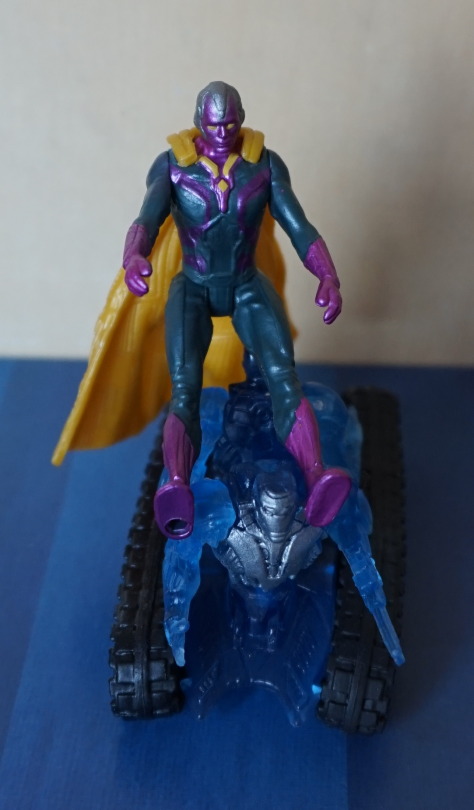
This Rock Candy figure I bought elsewhere, but on the same day as the Harley Quinn one… I think if I saw it at a later date I wouldn’t have bought it, due to the quality of the other one. So let’s see what this one is like.

Front:

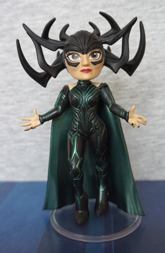
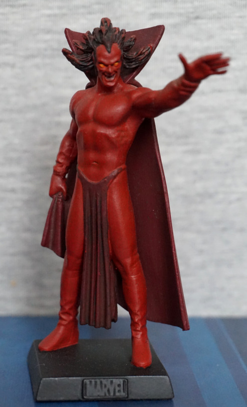
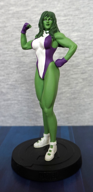
Here she is, proclaiming her unboxed glory. At a first glance I really like her outfit and her helm, but her face does feel a bit derp. Feels like her eyes and mouth don’t quite match up somehow.

Face close-up:

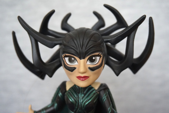
From this angle the effect is much less. Nose feels slightly too big though. And the paint across her nose went on the wonk. Still prefer that to Harley’s nose scrape though. Overall, I like the sculpt of her helm, and think this works well. The parts of her face work well individually, but not entirely sold on the overall look. 
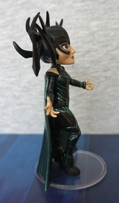
Outfit:

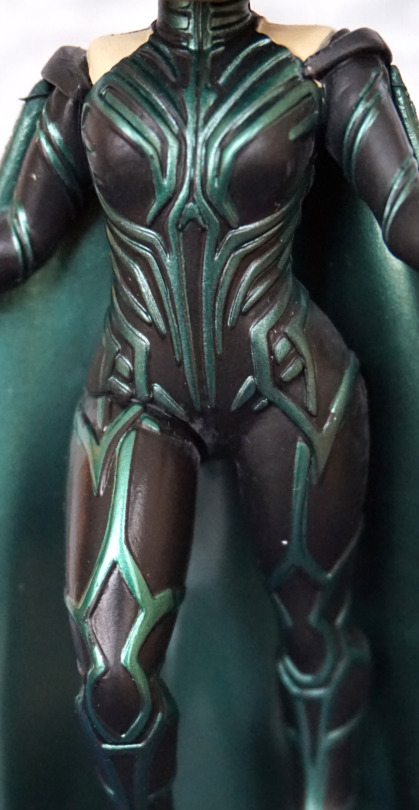
The big thing that attracts me to Hela figures – her outfit. The paint colours are nice and striking here, and seem to match up with the colours of other figures of her. However, the paint is hilariously off in places – especially the upper right part of her suit. These paint issues weren’t restricted to this one in the shop, and this was the one I chose for being least distracting with errors. As the centre of the suit attracted my eye, I was looking for the least amount of error in this part.

Here we can see the rubberised bits used to cover her arm joints… but they tend to have a mind of their own and not sit properly on her shoulders. May need to heat treat these so they sit in the right location more naturally. 
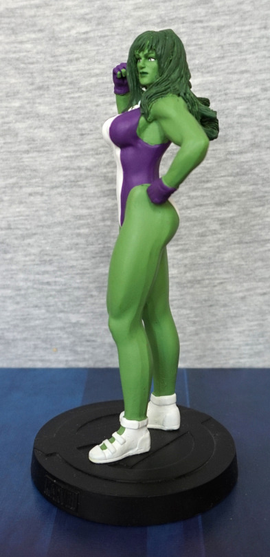
Left:

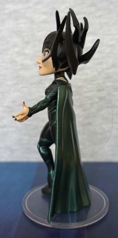
Hm, apparently she stole one of my hairs. Gerroff that! Helm looks good from the side, and the paint is nice on her arms. They’ve painted her fingernails, but it is a bit blobby. 
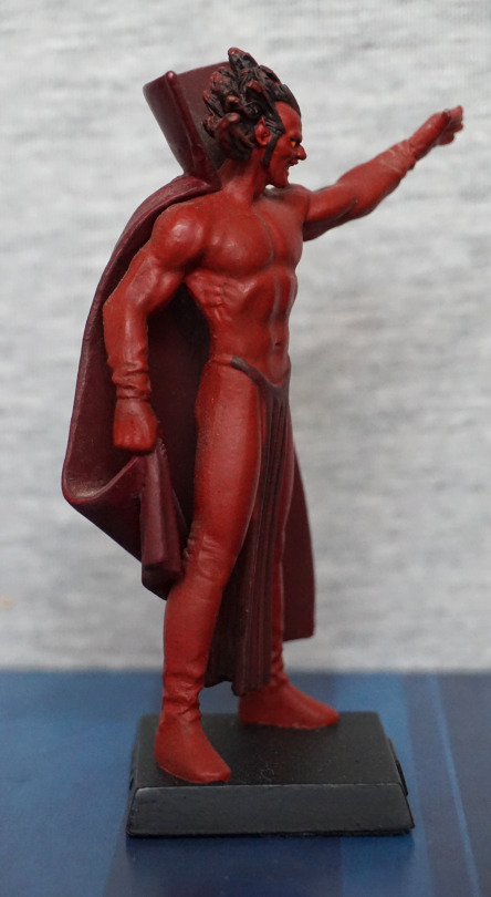
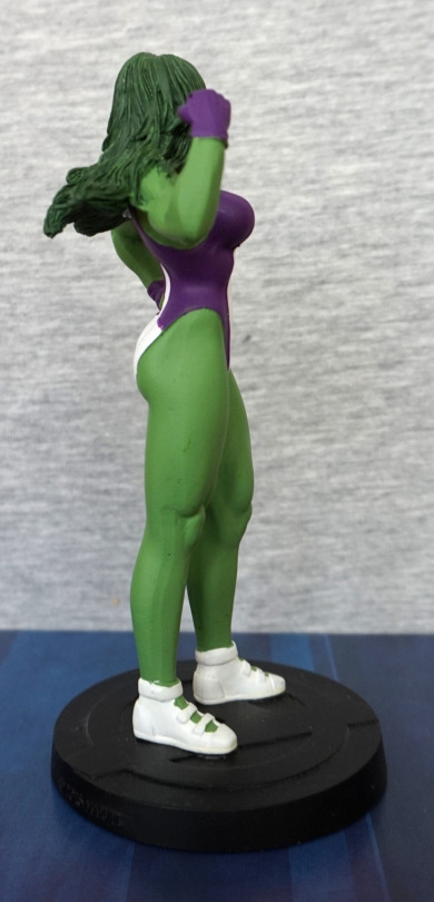
Right:

Looks OK from this side, but her shoulder does look odd… and I think the paint is a bit more pallid on her shoulders. Bit of a nasty seam there too. 
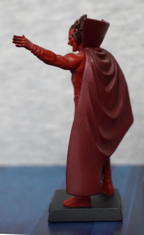
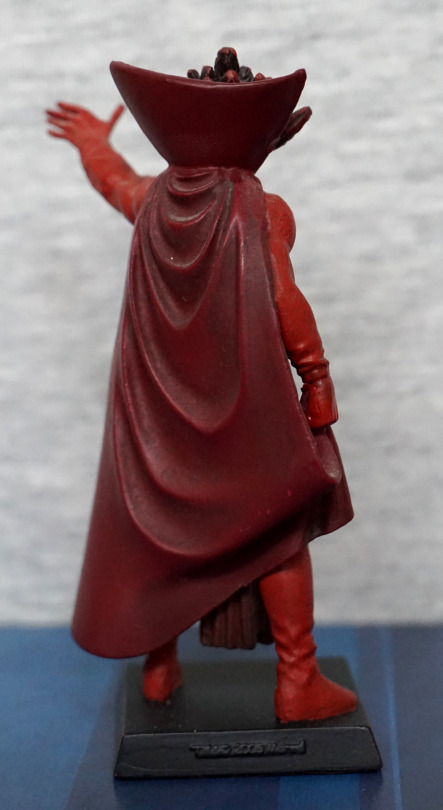
Back:

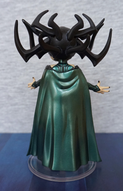
I like the shininess of the cape, and the colour is lovely. The fabric wrinkles look good, so I’m pleased with this. Just wish more of this was visible from the front. The way it joins onto her back isn’t as lovely, but it does the job. 

Not particularly pictured is the fact she’s a bobblehead – in the above pic you can see some of the gap around her head that allows her to “bobble”. Not sure I’m keen on this feature, but it doesn’t really take anything away… so that’s there if you like to bobble your bobbleheads. 

Overall, I’m more pleased with this figure than the Harely one, but it still isn’t particularly high quality. I did get this one cheaper though, but not sure I could recommend it. 

Black Panther – Marvel

Today’s blog features Black Panther, made by Eaglemoss.

Front:

This is his comic book appearance, rather than his film appearance – Eaglemoss has done figures of both, but this is the older one. 

Here he is, looking very stealthy in his cape. There isn’t much in terms of colour, but the gold accents and eyes have been painted nicely. The sculpt is good too, and I do like his pose. 

On mine, the left arm has been misassembled – I may break this at some point and reglue (probably not particularly needed to repin). Not sure how I didn’t notice this when I was photographing it…

Left:

I like the way he he bent over slightly. Here we can see the gold accents do go around his back, under his cape. Nice to see this attention to detail.

Right:

Here we can get a bit of a better look at his eye – they’ve used 2 paint colours here, which does elevate their appearance. His bag o’ tricks is a nice touch. 

Again, please ignore the “elbow”. At first, I think it looked like a design element, but on closer inspection, it’s a mistake. The joint here wasn’t pushed all the way in, so left with this mess… ah, QC. Or not. 

Back:

I like the cape design, with the large flowing wrinkles. Tiny paint scratch on the back, but this could’ve been a previous owner. 

Overall, a decent figure, or will be once I repair him I guess. If you get one that’s properly assembled at a reasonable price, I’d recommend him. 

Juggernaut – Marvel

Another big heavyweight of a character, Juggernaut:

Here we have him doing his typical thing of charging into something. Or at least I assume that’s what he’s doing. The paint job feels much simpler than that of Colossus (featured in yesterday’s blog). Here they’ve at least used two different shades of red for his outfit, so he doesn’t blend all into one, which can be an issue with some Eaglemoss figures. The paint on his arms, however, feels rather sloppy, thanks to the overspill on his bands and the half-arsed dark wash. I also feel the holes on his mask feel a bit roughly-hewn rather than neatly cut, as per his mask in his comic design. 

Left:

I think his bands are so tight he’s bleeding? He has muscles sculpted on his leg, but honestly it looks more like a piece of cooked meat rather than a leg to me. Almost like they went “fuck it, call it a day” when doing the sculpt. The boot sculpt is nice though. 

Right:

Again, due to the way his bands are painted, looks like they’re potentially cutting into his arm. Arm muscles also suffer a bit from being oddly shaped and feeling half-sculpted. 

Back:

There was an attempt. The middle band of his outfit feels an absolute mess back here. Again, you can see the poor sculpt of the muscles on his left leg. However… they’ve weirdly nailed the sculpt of the bottom of his boot, and that actually looks decent. His right boot is pretty good too – though the sole is a tad uneven. 

Overall, this figure… isn’t great. Feels like it was half-arsed in sculpt and paint. There are some positives, but overall he’s rather “meh”. Why did I buy this again? Oh yeah, bought him with another two Eaglemoss figures and didn’t look at him too closely… Wouldn’t recommend unless you really want a small Juggernaut figure. Or you’re an idiot like me and pick random stuff up for cheap. 

Colossus – Marvel

Today we’ll be looking at Colossus by Eaglemoss:

image

Here he is, in his comic book colours. There is some attempts at shading – some more successful as each other. He has some lighter red paint highlighting his muscles, but this looks a bit odd towards the top of his suit. There is some dark-coloured wash too, which works better. The lines on his body are good for the most part, but he does that strange seam on his right leg. 

Looking at him front-on:

Here’s a better look at his front, where you can see the unusual bright red paint in full effect. The sculpt on his pants(? underpants?) is good, and gives a fabric feel. 

I think his face sculpt is done well, and his boots are nicely painted. 

Left:

I like his pose, and the sculpt has a good amount of detail. They’ve certainly gone to town on his muscles. The gold accents add some nice focal points to the figure. 

Right:

Here we can see the creasing on his pants was sculpted all around. And that seam on his leg, which is slightly offputting, as it does disrupt the grooves on his leg. Bit of a difficult one to deal with though tbh. 

Back:

Here we have more of the red highlighting, that I don’t think works too well. The sparing bits on his left work better than the larger blobs on the right – I think the lighter red needed to either be used more sparingly or actually blended. There is some dark wash going on, which does help accentuate the figure though. And them pants be tight… The paint, on average, has been neatly done, which is an achievement for an Eaglemoss figure. 

Overall, I think this is a decent figure, and would recommend if you like it. Personally, I’m happy with him. 

Red Skull – Marvel

And finally, Red Skull:

Yep, he’s definitely got a red skull alright! The paint on his head is really good, and features all the details you’d expect a skull to have. However, not much are seems to have been taken when painting his sash, so that’s a bit blobby and weird. I like his screaming pose, but I don’t think they got his hand positions quite right – he looks more derped than angry because of it imo. 

Left:

Again, the head looks really nice. They’ve attempted painting a buckle on his belt, but the paint hasn’t gone on thick enough, and it looks like a smear. The pistol he’s holding does give off a German vibe, which matches what it is supposed to be. 

Right:

Sculpt looks nice, buttons could’ve done with a bit better paint job. I like the belt though. 

Back:

Paint doesn’t seem to have gone on quite right, and there’s a bit of brushmarks at the bottom. Sculptwork is passable, but his guns seem a little bent. Not sure what happened there. 

Overall, I think this is an OK figure. Again, some small paint tweaks could’ve elevated this figure into a better one, but my main complaint is with the guns – I think a little better posing could’ve gone a long way. 

Mephisto – Marvel

For the other two figures that I got with Lex, I picked characters that I think look cool, but probably should learn more about.

First pick was Mephisto:

An interesting pose, but one that’s not likely to all be in focus in one photo. The sculpt on this dude is nice, but not sure if he’s had a hard life prior to me buying him, or the paint wasn’t so good on his loincloth to begin with. Due to his red nature, the paint job is on the simpler side.

Left:

Here we can see he’s stretching out, though it is unclear where glove begins and arm starts – would be nice to get some more paint definition here for his glove, as it does look like it has mutated into being part of his arm. Or he’s wearing some kind of skin-coloured suit… 

Right:

Again, the sculpt failed to capture where glove starts and body ends. I like the fact they’ve sculpted his hand as doing something though. The side of body sculpt looks good, though, again, his boots could’ve done with a different shade of paint to differentiate them from his body. Hair looks nice though.

Back:

Cape does the job, and there’s some paint shading back here, which looks nice. Collar part of the cape looks a bit overly starched, compared with the rest of it though. 

Overall, he’s an OK figure. Could be much more if they painted his clothes properly. Wouldn’t recommend paying a premium price for this one. 

She-Hulk – Marvel

I bought this at the same time as the Crash Bandicoot, And I managed to squeeze both into my luggage. And some DVDs. And some Minecraft papercraft…. This one is a fair bit smaller than Crash though. 

Front:

The sculpt is nice, but the paint feels a bit flat, and slightly squiffy in places. The face and hair are painted nicely, along with the shoes at this angle, but the purple paint is a bit missing in spots around the edges of her leotard, and a bit of lumpiness in the white paint. With this lighting, she doesn’t look too flat, but the green paint is all one colour, so it can feel a lot flatter in certain lighting conditions.

Left:

Here you can see some of the missed purple paint. Also some weird lines on the back of her legs.I think her hair looks like it’s in need of a wash…

Right:

Again, there’s some strange lines on her leg, on the lower half this time. White paint went a bit squiffy at the top of her right shoe. Hair and paint edges on her leotard are better on this side though. 

Back:

Hair looks good, but the paint edges look odd in a few places. And again, one of those strange lines running down her leg. 

Overall, it’s an OK figure for what I paid. I think some extra QC wouldn’t have been amiss on this one. Not sure I could recommend this figure though. 

Deadpool – Marvel

Now for some articulated action with Amazing Yamaguchi Deadpool:

Yeah, this fellah here. I won’t be doing much articulation of him in this blog post though – am trying to catch up a bit with my bloggery. He does have some decent articulation to him though. 

Love the paintwork on the figure – the shading on his chest looks really good, and his mask is sculpted well. The ammo pouches and the gun pouch are detailed well. 

Left:

Looks OK from the side. Not too much to say here. Joint on the back of his head sticks out a bit, looking at him from the side. 

Right:

Pouches look good from this side, and he’s also got a large knife/small sword strapped to his leg on this side, as part of the figure. Imo, with the knife on his leg, the straps on his lower leg look a lot better- they look kind of odd on the other side, as there’s no paint separating them from his leg. 

Back:

Love the sheathed swords accessory. Looks good on his back, and pegs well. The straps on his forearm look good. Leg joints, whilst visible, do meld in well for me, compared to other figures. 

Accessories:

He comes with a good range of accessories – no Chimichanga though. He has a good range of hands, plus his guns and swords, if you wish for him to wield them. There is also a spare head. 

And now for what the weird red bar is for:

You can pop his eyes out, and replace them with the ones in the plastic tray. pictured above. I think this is a pretty neat idea, and gives you many head options at a cheap price. 

Overall, this is a decent, chunky figure of Deadpool, and I would recommend it. Looking at pictures of the Figma one, it does seem to be more refined than this one, but this one won’t eat at the wallet so hard. Having a brief read around the internet, it does seem to come down how much you want to spend vs the look and feel you like as to which one you get. For me, the price of the Figma was not worth it, and there’s not enough in it to make me get the Figma. And I already had the Marvel Legends large Deadpool. 

Angry Groot – Eaglemoss

This figure originally came with “Marvel Fact Files – Cosmic Special Edition #5″. 

I, however, just bought the figure without the magazine:

Was drawn to this figure, due to its unusual look. Most Groot figures have him more tree-trunk-like, and this was more like spiky, angry tree. I love the shouting expression and his hairstyle. 

Left:

The paint job isn’t hugely complex, but it works. Most of the niceness of this figure is in the sculpt. 

Close-up of his arm:

Love the poking out parts of bark, and his hands look good, with the green emphasising his knuckles. 

Right:

Looks fine from this angle too. Some asymmetry going on, which is nice. 

Back:

I like the “flow” of the bark on his back. The shapes tessellate well and look good. Also a fan of that spiky hair 😀

I like this figure. The pose and facial expression convey a lot of emotion, and you can’t help but imagining him roaring. A welcome addition to my collection. 

Wasp – Kotobukiya Bishoujo

The day before I went to FACTS, I went to a handful of comic book shops and Japanese merch shops in Belgium.

First purchase was Wasp from Super Dragon Toys, as she was on sale. Had seen her clearance in the UK, but didn’t get her as I wasn’t sure if I liked her. Seeing her in person made me decide I wanted her. So here she is:

image

I love the happy expression, and the shiny wings. The gold has also beeen superbly done – gold can often look poor on figures, but here, it’s a good hue and shiny. 

Close-up of her face:

image

Love the shiny lipstick and moulded mouth. She’s also got some shading painted into her eyes, which is a nice touch. Her hair is sort of simple, but nicely sculpted. Here we can also see a couple of creases moulded into the neck part of her suit, giving it a lifelike appearance.

Close-up of the base:

image

A nice, creative base. No solid-coloured disc here. The splash looks good, with the blue fading out towards the droplets. Also some ripples on the disc part of the base, so it isn’t just flat. The colour complements the figure imo.

Right:

image

Here we see the bulk of her outfit – I love the gold piece running down the middle, and the gold on her palms. The suit itself also has a few well-placed creases, to show it is indeed a bodysuit. 

Left:

image

Here we can see where the wings peg into her back, and the paints nicely match up. And her shapely backside – she has a pear shape goin’ on here. 

Close-up of the gold on her shoes:

image

I don’t think she has much grip on the floor, but the finish is nice and gold colour attractive. 

Back:

image

This shot shows off some of the iridescence of the wings. I love that they’ve managed to make the wings iridescent – it shines quite well, and looks great in the sunlight. 

Her hair looks good from the back too. 

Close-up of the wings:

image

This is definitely one of the features that attracted me to buying this figure. More figures need iridescent parts! And well-done gold parts! 

Overall, I really like this figure, and kind of wish I bought it sooner XD. Might’ve got it for a bit cheaper, but hey, I have her now!

Groot Evolution – Marvel Legends

Visited a nearby Toys R Us, and found they were having a closing down sale, so decided to pick up a couple of items – first being Groot:

His face sculpt is really nice, and the body is… mostly nice. It does give a wooden feel, but… it’s also plasticky too. 

Here’s the close-up of his face:

His eyes look really nice, and his face feels woody and detailed. 

Back of his head:

The head is nicely sculpted , and here you can also see the twiggy parts on his arms, which help hide the shoulder joints. They’re not super-effective though. 

Let’s “zoom out” to his back:

Not much hiding that back joint, but the wooded texture is nicely spread throughout. You can see the extra bits in his arm joints, which help to hide the joint when flexed. 

Side shot:

Head looks good from all the angles. This angle does rather show the sculpting off – it’s nicely detailed so it doesn’t feel entirely “action figure”. I could imagine if Mattel made this, it would look much flatter. 

He is also decently poseable:

He’s reaching out for you! Groot! Maybe if I watched the film I could come up with a decent tagline here… Or maybe just more “groot”. 

Upper shot of the above pose:

Being the evolution set, it also came with kid Groot:

I used a macro lens here – you can see the print dots in a couple of places, but these aren’t really visible when you’re looking at him.

And baby Groot:

D’aww. Ditto for the print dots. 

The pot Groot stands up nicely, and is a good display piece. The kid Groot is somewhat harder to stand up, and is annoying, which is a bit of a shame. It would’ve been nice if they provided a clip base for him to stand in. When I decide where to display him, I’ll likely stick him down with a glue dot. 

Overall, I am happy with this figure. Due to the fact his legs come as separate pieces, he can lose his lower legs when you’re trying to pose him, but it’s not a massive issue. I don’t think I would’ve paid full price for him, but he’s definitely good if you pick him up for a discount. He certainly has the height compared to other similar figures, due to the aforementioned separated legs – it allowed Marvel to make him tower above figures in the same line, yet keep the same box format. 

Marvel’s Vision

This figure I picked up at Home Bargains. This is a very small figure that comes with a ‘spirit tank’, Sub-Ultron 011:

image

Was attracted by the colours,. and the fact it came with the tank accessory, to make it more interesting than the 2-figure packs. 

Here is a close-up of Vision:

image

For a small figure, he’s well painted, but the purple on his chest looks kind of our of place, as it appears it hasn’t been designed with the mould in mind. Looking at pictures of Vision on the internet, it’s supposed to follow some contours on his suit, which has been lost in this rendition. 

Here he is from the back:

image

The moulding is nice on this cape, but it’s only really kind of a bit bendy at the top. 

Which leads to his articulation being pointless:

image

He really doesn’t have much articulation, but he is very small. Would’ve been nice to do something with the cape so he can sit, or give him knees so you could potentially do some poses, despite the cape. 

Sub-Ultron 011:

image

The silver effect is nice, but the tank tracks are kinda wonky to the body, and the arms can easily fall off the body halves. Can imagine that’s kinda handy as a kid, emulating battle damage… but I don’t think they’re supposed to fall off. 

Other views of Sub-Ultron 011:

image
image

It mostly looks OK as its own thing, but researching Sub-Ultrons, I don’t think this is accurate to what it is supposed to be. Sub-Ultrons are robots, and this appears to be more of an ethereal entity, due to the large use of unpainted translucent plastic. From what I can see, they should only glow blue in places, not be mostly blue. It looks OK in its own right, but doesn’t seem very faithful for what I believe it’s supposed to be. 

Despite it being a vs set, I decided to do this:

image

Well, at least he can now sit, despite the cape!

Not entirely convinced by this purchase – I wouldn’t suggest spending much on this set, and this might be one of the smaller items I may pack away at some point. Still love the colours, but I’m not super-attached to it.