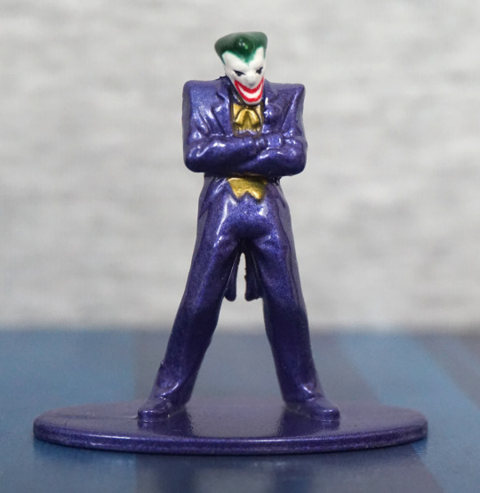
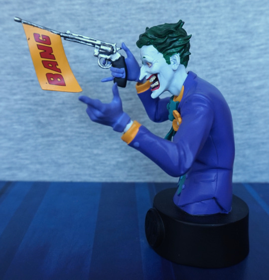
This is the last of the busts I currently have to review, and it’s The Joker:
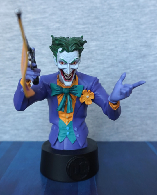
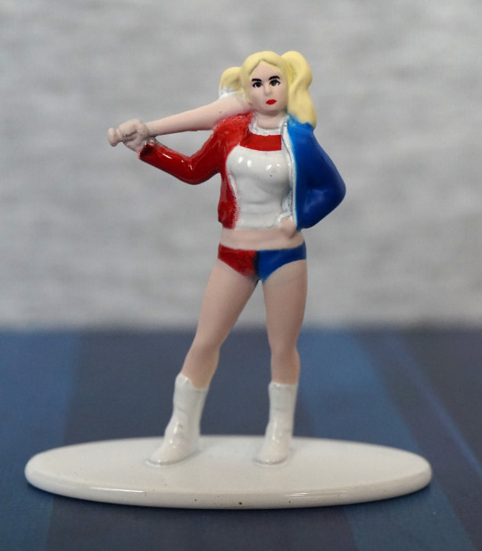
From the front, this one has a lot more to look at than the other ones, which I think really helps with the overall look and feel. Not a big fan of the paint on his bowtie – the darker lines aren’t blended at all, which makes it looks sloppy close-up. However, the bold colours overall work well together, and this figure does work at a bit of a distance.
Face:
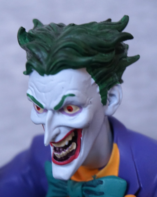
I appreciate them including some pink paint to represent his tongue, and this surprisingly works. His lips are OK, and they can get away with some rough paint here, what with the Joker being a bit slapdash himself. The eyebrows feel a bit severe though, as there is no detailing to them. The hair is really nice in of itself – there is shading present here, which really helps it look like hair. Some bits are missed though, as you can see on the left-hand side of his face. The right is pretty much the same on mine, but with a bit of paint on his ear.
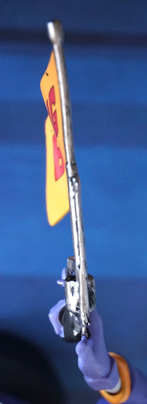
The gun:
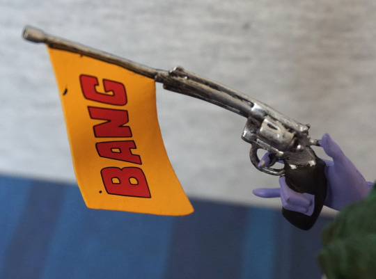
The lettering came out well here, but mine has some marks on this side. Also you can see how the gun started off bent – this part is a softer rubbery material, which does mean it won’t break in the box, but you may have to straighten it out. What is more annoying than the black splotches is the super-lazy painting on his hand… really? This passed QA? As it’s black, maybe I’ll actually repaint this…
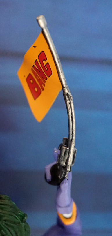
Here is how bent the gun was when I got him out of the box:
I heated it up with a hairdryer, held it in position, then doused it for awhile in cold water:
Ah! Much better! I’m not too bothered about this, as it’s not the first bendy figure I’ve had and it’s pretty easy to fix, but I feel that they may have been able to go stiffer with this or use a metal wire/rod inside of it to hold it straight. Especially if someone’s new to collecting, this is going to be a really disappointing feature, and I don’t think there’s any need to have it this soft.
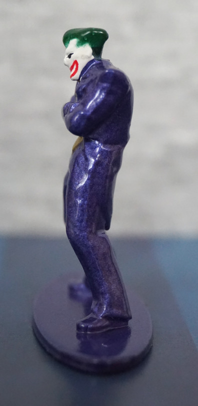
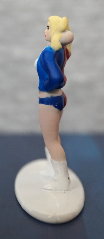
Left:
I like this pose – there is a dynamic quality to it, and his face looks good in profile. The main messy edge here is the edge of his glove. The paint line between him and the base seems neater on this side than some of the others I have.
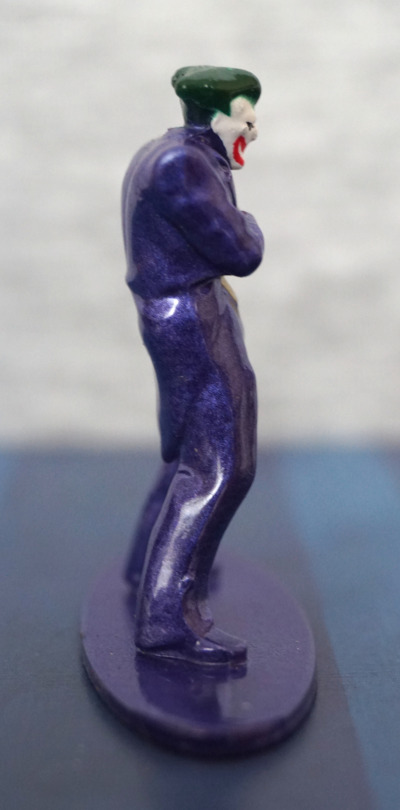
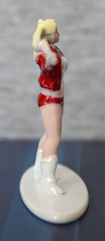
Right:
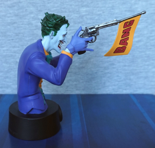
This side of the BANG! banner is a neater than the other side, and looks good. The paint is a lot neater on this side too, with a lot less to complain about. There is a seam that goes down his side, but I don’t think this really disrupts the figure.
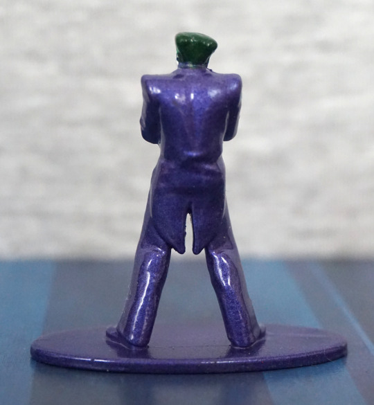
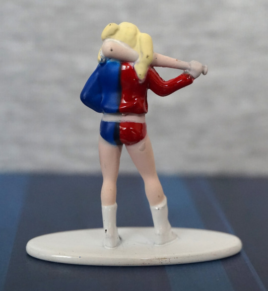
Back:
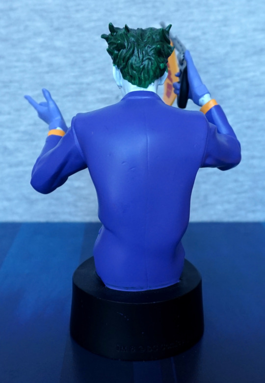
Looks like some dints got into the mould – not sure what happened here. The paint itself is smooth though, and the back of his hair is painted well. We don’t have much in the way of fabric movement back here, but it looks passable. We have one detail in the form of a suit seam running down the back, but I’m not sure it really adds anything. Collar moulding I think could’ve gone a bit better. Sleeves look nice though.
Overall, I think this is a decent entry, and probably works better than the others as a concept – there is more going on here, which means he doesn’t look overly plain, as they decided not to fully shade these. However, there are some pretty sloppy painting mistakes and lack of paint blending that you’d get in a more premium product. I think if you set him off at a bit of a distance, it’s quite a striking piece, so would recommend if you’d like to see him sat on your shelf. Just be prepared to straighten out the gun!