Tag: jada toys

DC Nano-Metals – Part 3

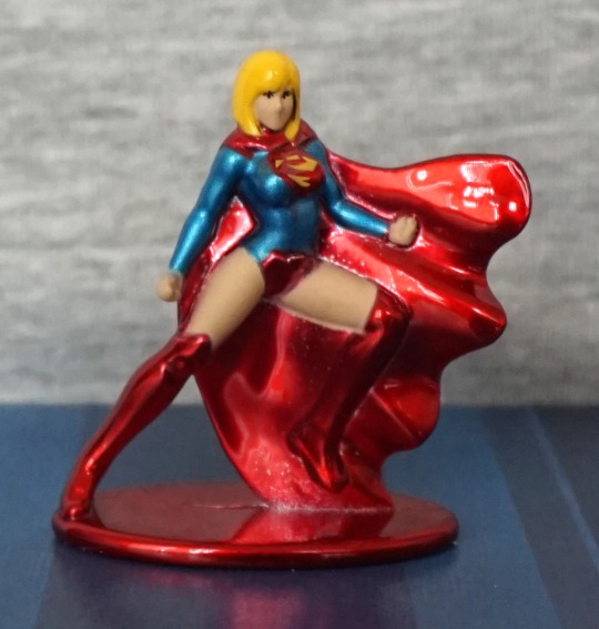
And here we have the last three in the pack. 

So let’s start with Martian Manhunter:

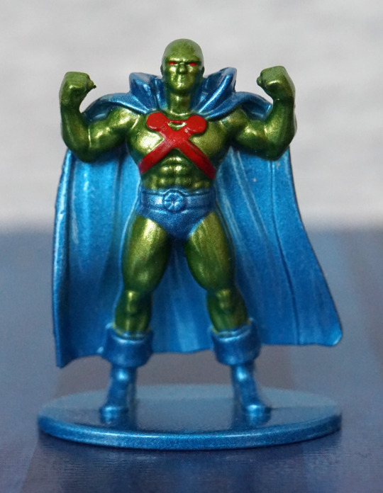
I think this is one of the best-looking ones in the set – the paint is fairly neat, though the blue paint is over-spilling in some areas. The red paint is within the lines though, which is the more critical colour here. We have a better choice of green here, which makes me more confused about why they went with the green they did for Killer Croc. I do wish they painted his belt red though. The disc parts should be gold, but being a simplified figure, I’m going to let them off for not painting these. The pose and sculpt are both decent, so no complaints there.

Back:

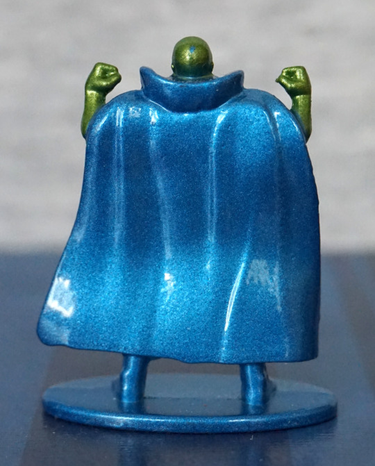
Not much to see here, other than cape. Not the most realistic ripples, but it’ll do. Also his cape paint seems to have escaped onto his head 😛

Superman:

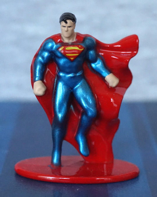
Again, a not-too-bad figure. I think this one is let down by the paint a bit, but that isn’t helped by the relatively ambitious sculpt – with him in a flying pose, they’ve had to use the cape as support, which means the blue and red paint have bled into each other in places. Also makes it hard to paint without the over-spill showing up badly. The logo has been rendered surprisingly well, comparing the paint jobs in these figures. Again, no mouth, but this weirdly seems to only feel “apparent” when you’re looking up close. 

Back:

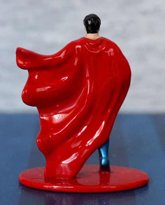
Cape looks good, and the paint job looks surprisingly decent and clean here.

Yep, I think this one is one of the stronger ones in this set. 

Lastly, Wonder Woman:

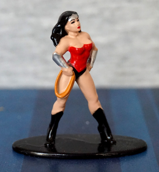
Interestingly, the females in these Nano Metal figures actually get mouths – and their faces look better for it. What doesn’t looks so good though, is the lasso on her hip – the lasso looks OK in of itself, but they’ve distorted her leg so the lasso has something to support it… so her leg looks rather misshapen. Personally I would’ve preferred it if they had the lasso sitting on her leg, instead of flatting out her leg to accommodate it. Paint-wise, she looks OK. 

The one thing that does bother me though is no “banner” at the top of her shirt – she needs some silver pain here, to match her headband if they were going for her more silvery look. To me, this makes it feel like she’s more “sexy Halloween costume” than Wonder Woman. 

Back:

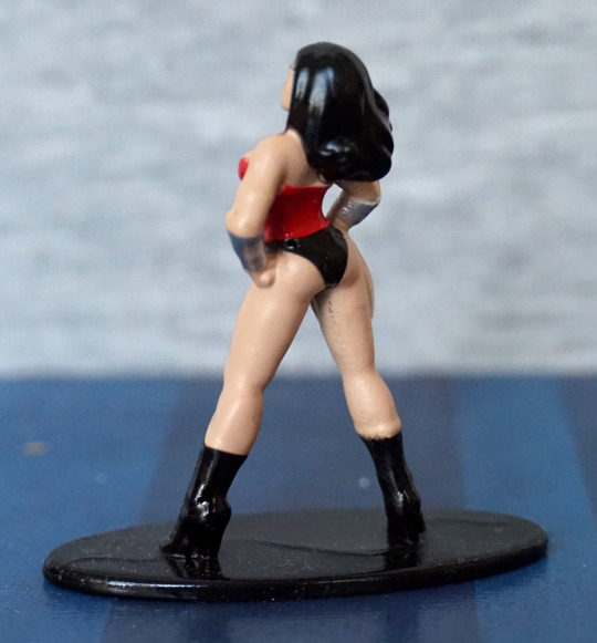
Bit of escaping paint on her leg there, but overall, not a bad paint job. Here we can see her shoes have been turned into platforms to support her properly, which I think is a fair enough decision. 

If you ignore the lack of edging on her top, not a bad nano figure.

Overall, this set isn’t too bad, if you can pick it up cheaply. There’s definitely some misses in the set, but most of the figures are reasonably solid for their size. These figures are 1.65″ tall on average, so normally you wouldn’t look so closely at them as some macro photography. I’m not sure I’d pay the RRP for the set, but if you see these at a discount, I don’t think they’re too bad. 

DC Nano-Metals – Part 2

Now for four more Nano Metals figures. 

Here is some Killer Croc:

*GRIN*. Can’t say I’m a fan of the sculpt on this one, but it does amuse me so. The green doesn’t fit Killer Croc at all either. Shorts are roughly painted, and don’t look great either. The parts of his face that are painted are painted neatly but… well… it looks like that. Just look at it

There’s some nice sculpt details here in the spiny knobbles, it’s nice they’ve given him pockets, but that right pocket sticks out so far, like he’s got a large lump of something in there. Left pocket would look better, if it didn’t melt into his back. 

Overall, this one has amusement value only. 

Metamorpho:

I’d say this guy is the least-known out of the heroes included in this set. Paint is a bit sloppy in this guy, though he can partly get away with it, being a guy made out of several elements. Wish they would’ve done his shorts in black, rather than lazing out and just doing them in brown. The figure already features black on his face, so not sure why they didn’t. 

Back:

They’ve done a nice job of sculpting his mud leg, and the paints are a bit neater back here. 

Overall, I think he’s a decent mini-figure. 

Two-Face:

This is based on his orange-and-purple outfit form, which wouldn’t be my first pick. However, they’ve done a decentish job of rendering him at a first glance – colours look bold, suit is sculpted well, and his face has both its halves. Main issues for me is they didn’t paint his tie black, and whilst they gave him a mouth, it does look rather odd. And on that point… where are his eyes?!

And is it me, or does he look like he’s trying to take a shit? 

Back:

Back looks OK, but the paint doesn’t quite meet happily in the middle. 

Overall, probably not one I’m going to prominently display.

Lastly, Mr Freeze:

I really like the colours and pose on this one. However, his head doesn’t hold up to close scrutiny – looks like they didn’t fully decide if they were going to do his head or his helmet, and melded the two… I think it would’ve been better if they went without the helmet, and made his head less elongated. This would make the figure look better, and give the owner the option to add a clear part, if they wished. The gun is nicely sculpted though. 

Back:

Gun looks good back here, and his backpack looks decent. Helmet-head looks less silly from this angle, as there are no details on this side. 

Overall, I think he’s one of the stronger figures in the set. But dammit… that head-thing. Wish they didn’t do that. 

DC Nano-Metals – Part 1

I bought this set cheap-ish at TK Maxx. 

First up is a silverish Batman:

The paint is mostly in the right places and doesn’t look too bad. No mouth painted though… Can’t say I’m a big fan of the colour scheme, but I think it works. 

Back:

Not too much to see at the back. The cape is nicely wrinkled though. 

The Flash:

I like the colours on this one, and the paint is neatly done on this o0ne. The logo came out decently well on his chest, and his muscle definition works. 

Back;

His belt is a bit sloppy here, and the wing(?) on his boot is more of a nub. His body is sculpted well though. Pretty pleased with this one.

Green Lantern:

This guy, the paint went a bit sloppy – think the green needed to extend a bit more down his front, and one of his gloves has a bit of white mist paint. His mask is OK, but again, half a face, though the way his faces is moulded almost gives him a mouth a bit higher up. The logo on his suitl looks nice, but his chest does sort of seem to melt at the bottom, in terms of sculpt. 

Back:

Looks OK from the back, though his hair does melt into his suit. Don’t think the green and the black paint want to play nice with each other, but I don’t think it’s too bad.

Out of these three, Flash is the one I like most. I don’t think any of these look bad, but not really keen on the Batman.

Joker, Harley, Cyborg & Mr Freeze – Metal Nanofigs

Ended up getting some more Nanofigs from Asda. Not sure quite why I keep doing this… oh yeah – they’re cheap… 

So first up, Joker:

Well-painted, for such a small figure. He has purple boots though… and the shiny jacket might be an acquired taste, 

Left:

A little bit of an ear going on, and a very red smile. Hair has some shape to it. 

Right:

Bit more definition in the green hair paint on this side. And a sea of shiny purple. Good thing I like shiny purple.

Back:

Some details in the sculpt back here. Am happy with this nanofig. 

Next up, how did his ‘partner’ Harley go?

Ah. Hm. Yeah, she didn’t fare so well. Missed paint on her hair, by the bat and the lines aren’t too crisp on the jacket. Not sure what’s going on with the bat, being flesh-coloured… that doesn’t quite work. She has a full face though, unlike some of the nanofigs, which is a nice change. 

Left:

Yeah, definitely evidence of some painty mess here.

Right:

Seems to be some mess going on with her hip, and her foot seems poorly moulded. Or maybe overpainted. 

Back:

Faaail. A number of black marks, and not much attention paid to paint edges. You can’t see the back of the figures, and this one shows it. 

Cyborg:

Recognisably Cyborg, but he does have some mutant growths on his shoulders. There isn’t a large amount of detail in the paintwork, but what’s there has largely been done neatly. 

Left:

A sea of silver. Think some definition has been lost in the legs from the thick paint apps, but probably better this than seeing through the paint. 

Right:

Head paint has been done well, rest of it is what it is, lol.

Back:

Yeah, looking decent back here, no real complaints. 

Overall, he’s pretty decent, but does suffer from the lack of paint details these figures have. 

Lastly, Mr Freeze:

Mr Melty Face! His head looks distinctly mutant, like they couldn’t decide if it was his helmet or his head. I think it would’ve looked far better if they shortened his skull, so he didn’t have his helmet on. Paint on his left arm looks like a “yeah, that’s about right” job. Rest of the paint, such as it is, looks like it has gone where it was supposed to. 

Left:

Not much definition here. Looks OK. 

Right:

His glove and boot lack detail in the moulding imo, and look overly plain. 

Back:

One large paint gouge here, at his mid-back :(. His left glove looks really good from this angle, with the gun… looks better here than on the front!

Overall, Mr Freeze looks OK, barring that stupid head. Argh. Goggles could’ve done with more work too. 

My favourite out of these is the Joker. Harley is probably the weakest out of this set. For less than £2 each, they’re pretty decent, and better than what you can get out of some pricier blind bags. And you can pick the ones you want! Wouldn’t recommend ordering these off the internet (unless you’ve got good pics of the ones you’re buying) as the paint jobs can vary massively. Did try to pick the better looking ones, where I could. I remember there only being one Mr Freeze though. 

Aquaman, Superwoman, Spider-Gwen – Nano Metals Die Cast

And here we have the only other figure-related items I bought during Toys R Us’s closing. 

First up, Aquaman:

Paint on this figure isn’t too bad, though the trident with the green bits between the tines is a bit odd, but can understand they moulded it like that so the tines wouldn’t be too brittle. Not sure if the gaps would have been better as green or black. Green does kind of blend in, with the green base & legs of Aquaman. With these figures, they don’t have painted mouths, but honestly, that’s a better option than a poorly drawn squiggly line that can stand to make the figure look even more “off”. One thing I don’t like is the trident wasn’t painted on the back, but I don’t think I’ll be looking at the back much. What’s more annoying is they didn’t paint his belt – they had gold paint for the trident, so why didn’t the belt get painted, darnit? Hunting down a prototype shot, they painted his belt orange. Sigh. 

Next figure is Superwoman:

Looks like the front of the cape had a bit of a hard live, plus some flesh paint slop on the underside of her leg. Not too bad for a small figure though – logo is passable for this nano size. Back of her looks fine. 

Lastly, Spider-Gwen:

This one has no mouth, so this was a perfect fig for them! Paint is OK, but definitely a little sloppy in places. Amazingly, her back white paint came out well. There is some scratches on the base, but these were present from the moment I bought it – these were all last-on-the-peg figures. 

These figures are honestly fine for their super-cheap price point. Though if you have a selection to look at, I’d recommend leafing through for the best painted you can find, as the paint jobs do vary.