Tag: dc

Poison Ivy – Ame-Comi – DC

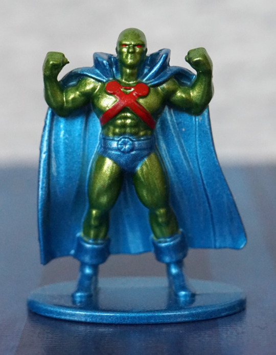
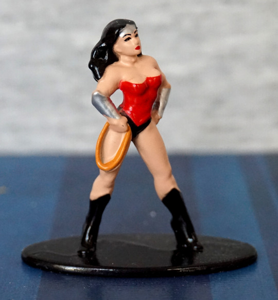
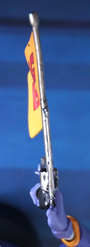
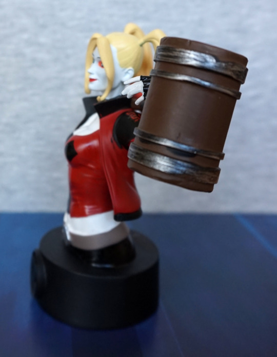
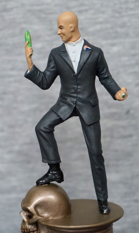
This was one of the Ame-Comi figures I was after, and it eventually turned up on eBay. 
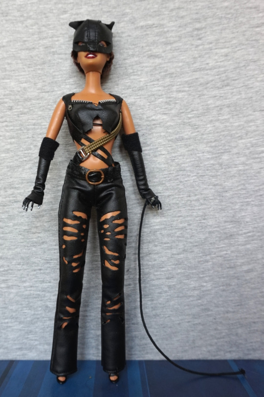
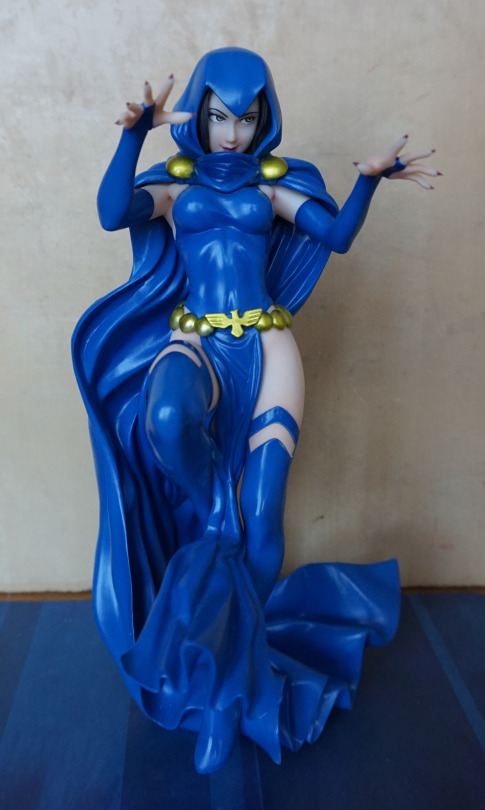
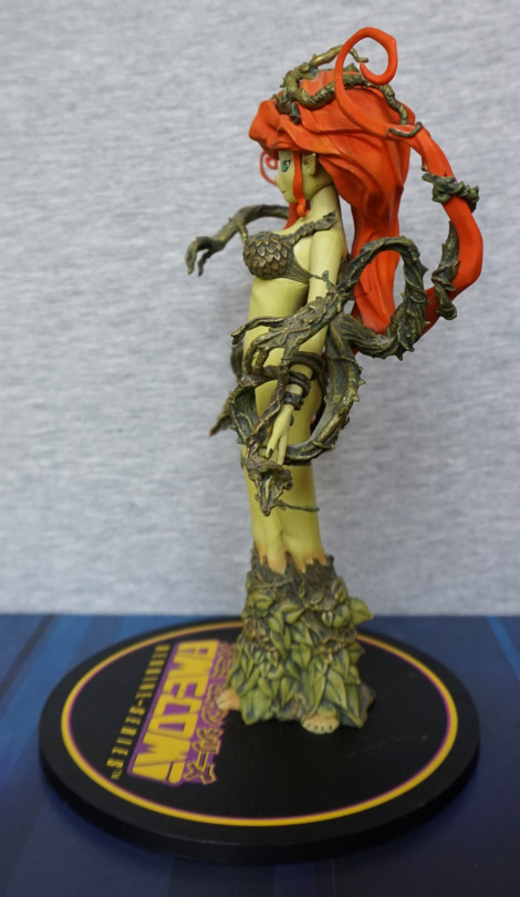
Front:

image

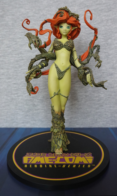
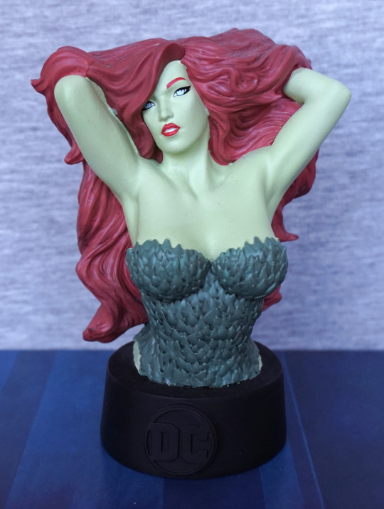
I love the pose of this figure and the colour scheme. To me, she looks more like a relative of Poison Ivy, than Poison Ivy herself, but I like her in her own right. 

I like the amount of detailing that has gone into her vines and leafy clothing. 
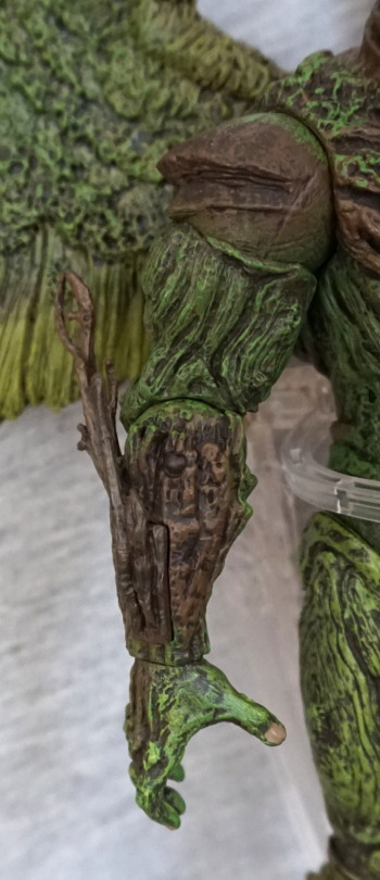
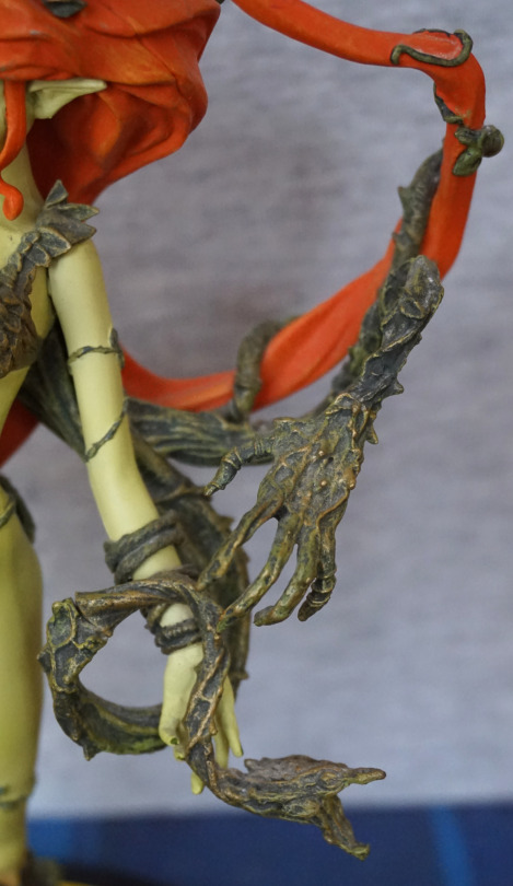
Vine hands:

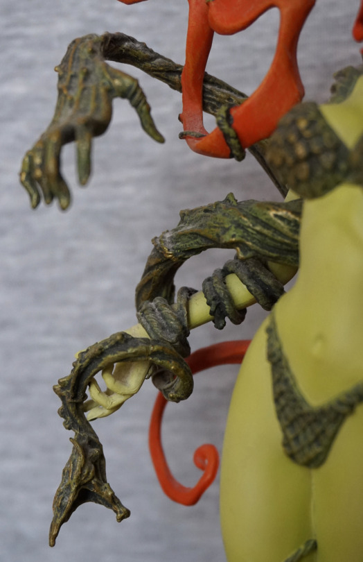
The texture work is nice here, and I love the grasping vine hands

Feet:

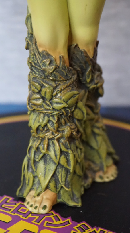
The leaves are well-sculpted here, and the shading in the paint adds a lot ot the leaves. She’s also got her toenails painted neatly.
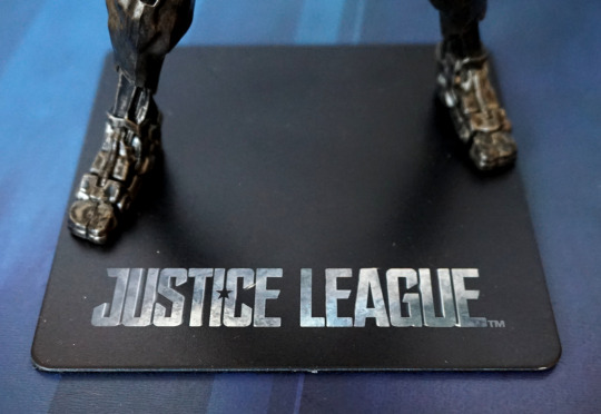
Base:

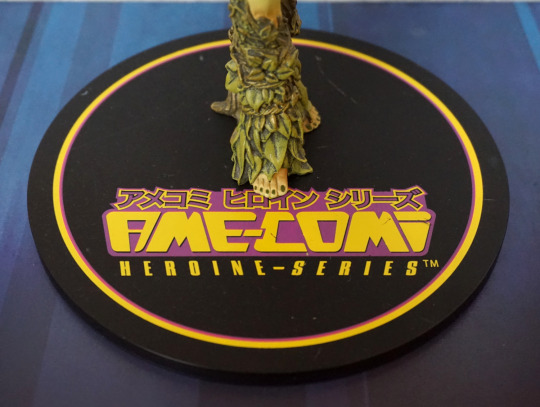
Ignoring the marks, the base logo is nicely placed, so she isn’t covering it in any significant way. Does take up a lot of room though. 
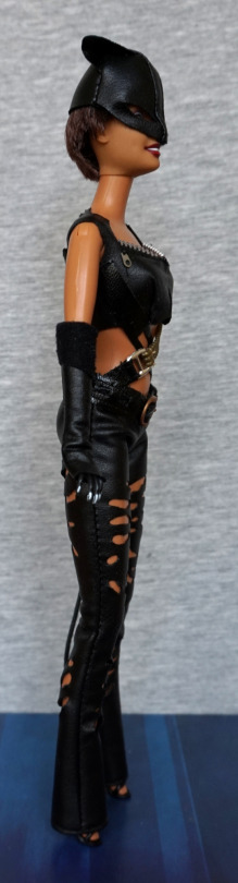
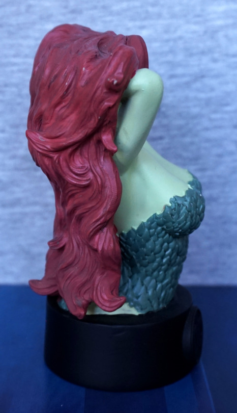
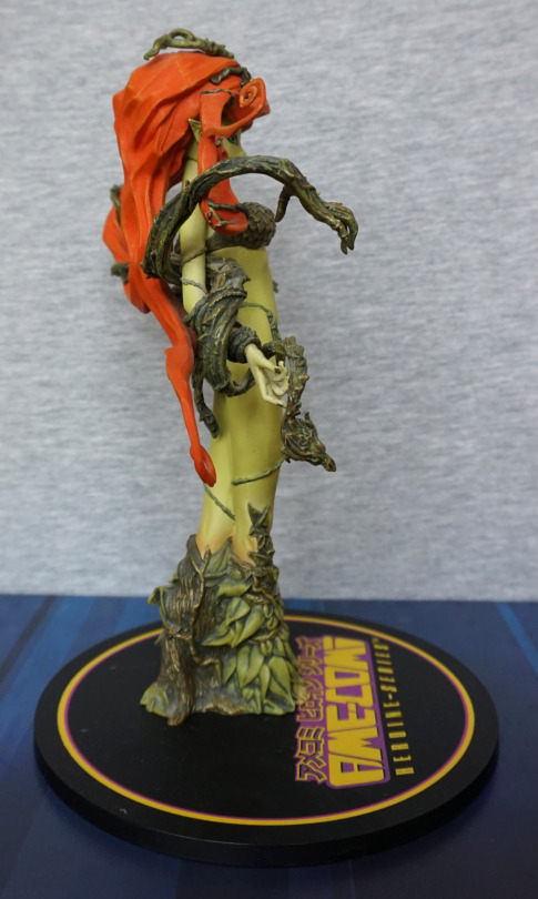
Left:

The vines curl around her hair, which I think is a nice touch. The figure has a nice amount of depth to her. 
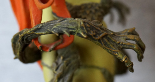
Vine close-up:

The detailing is really nice on these, and there aren’t too many joins. Here we can see one, to the left of the photo. 
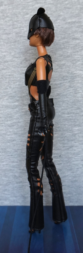
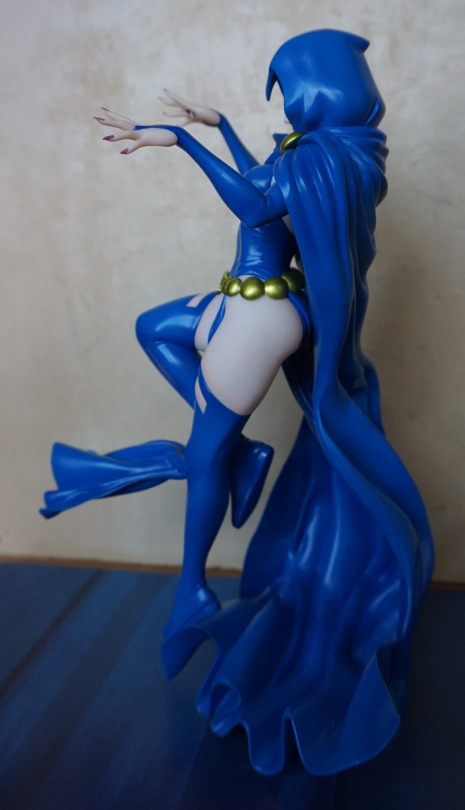
Right:

Some thicker vines on this side, and some transitioning of the leaves on her legs. 

Arm vine:

Nice blend of colours on the vine itself, and I don’t think I want to get in its way. 
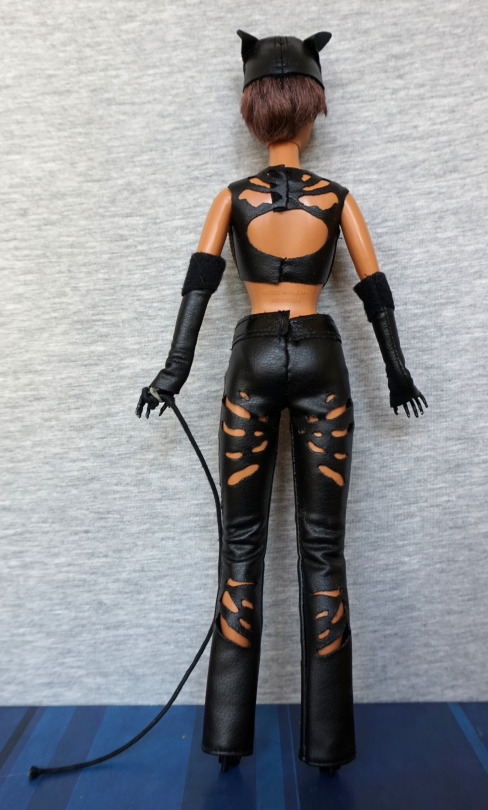
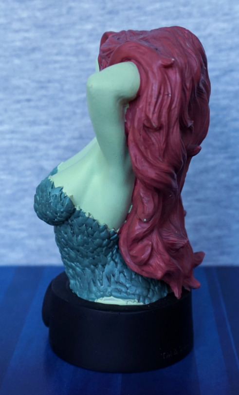
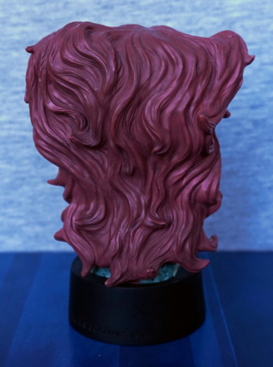
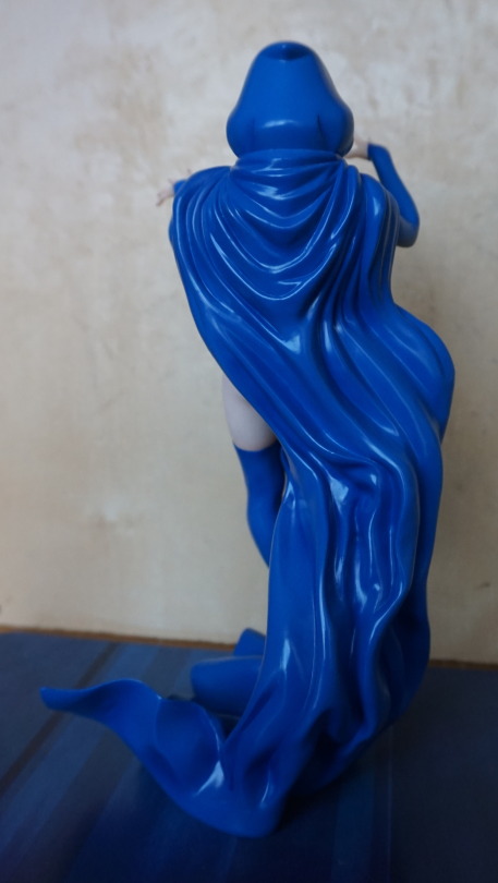
Back:

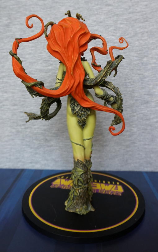
Here we can see how the vines like to play with her hair,. We’ve also got plenty of leaf detail back here, so the back isn’t plain. The hair is sculpted nicely, and has a good amount of detail throughout. 

Glad I was able to get this figure, and am happy with it. Maybe at some point I’ll try to get the mark off her base. 

Harley Quinn – Rock Candy

This was a random buy, as I came across her at a reasonable price. Was considering getting one or two of the Rock Candy figures as I like the proportions. As Harley Quinn is one of the characters I collect figures for, she was one of the natural choices.

So here she is:

image

With my copy, there is a slight mark on her nose – annoyingly I didn’t notice this until I unboxed her, otherwise I would’ve probably not bough her. I like the rest of her face though, the front of her collar is done well… and the hammer is nice, apart from the slight bend it has to it. However, the less good things are the fact the quadrants of her top aren’t aligned properly, leaving some overlap on the black and there’s a noticeable seam on the collar to her left side. Can also see a bit of paint mess on her hat pom-poms.

Left:

The colours are nice, the sculpt isn’t too bad (collar feels a bit thick though), but there are small paint errors dotted around – most noticeable is just above her hand. 

Right:

Right looks better than the left and doesn’t have much in the way of noticeable issues. Do wish they put a rod in the hammer handle so it didn’t bend so freely. It does make assembly easier (and the figure cheaper…) but at a cost. 

Hammer & leg close-up:

One thing I can say for the hammer is the sculpt job is nice, and the paint used for the bands works well… if you ignore the paint slop. The diamonds are printed well on her leg, which is nice. 

Back:

Square overlap doesn’t seem as bad on the back and the paint looks mostly neat. Cuffs have a bit of slop, but this is pretty common. 

The big paint slop though…

Who the heck QC’d this… or more to the point, didn’t? Pretty nasty paint flaw here, and this is why I don’t buy Funko stuff often. Wouldn’t recommend buying their figures online, unless you’re not fussed over paint mess… as this is not too uncommon. 

Overall, I like the design, but the execution leaves something to be desired. A handful of paint errors and an ugly amount of flashing on her collar doesn’t make for a very premium figure. Honestly wouldn’t recommend these at full price. 

Starfire – DC

Another Eaglemoss figure… but this time for a DC character:

Just about recognisable as Starfire :P. This is based on her New-52 outfit and is part of the Chess Collection. Some of her body sculpting is nice, such as her chest, others are more suspect, like her upper legs and lumpy arms. 

The chosen colours for the paintwork work well, but the actual paint job is… lacking. Her face and upper clothes seem to be fine, as is most of her sues, but the other parts are roughly painted, leaving her skin looking lumpy. Top of her left boot also missed the mark. 

Left:

The upper parts of her hair look OK, but where it should blend to yellow and white there is just a sudden transition into this part, which makes look like she accidentally dipped her hair in bleach. Not a good look… 

The bands on her armguards are overly lumpy – the should be raised, but this is too raised for the bit that goes over her arm. With her boots, I think she’s supposed to be standing on her toes, but with her standing so high up like this, her feet either look misshapen or like she should have some heels descending from the back of her shoes. I think it would look better, if her feet were less straight up (i.e. if she lowered her heel more to the ground). 

Right:

Looks to be some attempt at highlights in her hair, but they don’t work too well. Her arm looks a bit lumpy this side, and apparently she’s developed some webbed fingers… Didn’t realise Starfire was turning aquatic! Her feet look less odd from this side, but still, I think she’s a bit too much on her tippy toes. 

Back:

Back paint definitely has some slops in it. Hair highlights seem to work a bit better from the back to me… Here we get to see the absolute lack of blending they’ve done between the yellow and orange paint. Not sure why they didn’t even try, seeing as the yellow and white are blended. 

Overall, this isn’t a great figure. Would only recommend to someone collecting the set or people who just want Starfire stuff (like me). Stafire has had a rough time with collectables imo, so decided to pick this up as it was Starfire and cheap enough despite its flaws. Thankfully, since buying this, Kotobukiya is re-releasing her Bishoujo figure so I’ve got that to look forward to! Yay! 

DC Nano-Metals – Part 3

And here we have the last three in the pack. 

So let’s start with Martian Manhunter:

I think this is one of the best-looking ones in the set – the paint is fairly neat, though the blue paint is over-spilling in some areas. The red paint is within the lines though, which is the more critical colour here. We have a better choice of green here, which makes me more confused about why they went with the green they did for Killer Croc. I do wish they painted his belt red though. The disc parts should be gold, but being a simplified figure, I’m going to let them off for not painting these. The pose and sculpt are both decent, so no complaints there.

Back:

Not much to see here, other than cape. Not the most realistic ripples, but it’ll do. Also his cape paint seems to have escaped onto his head 😛

Superman:

Again, a not-too-bad figure. I think this one is let down by the paint a bit, but that isn’t helped by the relatively ambitious sculpt – with him in a flying pose, they’ve had to use the cape as support, which means the blue and red paint have bled into each other in places. Also makes it hard to paint without the over-spill showing up badly. The logo has been rendered surprisingly well, comparing the paint jobs in these figures. Again, no mouth, but this weirdly seems to only feel “apparent” when you’re looking up close. 

Back:

Cape looks good, and the paint job looks surprisingly decent and clean here.

Yep, I think this one is one of the stronger ones in this set. 

Lastly, Wonder Woman:

Interestingly, the females in these Nano Metal figures actually get mouths – and their faces look better for it. What doesn’t looks so good though, is the lasso on her hip – the lasso looks OK in of itself, but they’ve distorted her leg so the lasso has something to support it… so her leg looks rather misshapen. Personally I would’ve preferred it if they had the lasso sitting on her leg, instead of flatting out her leg to accommodate it. Paint-wise, she looks OK. 

The one thing that does bother me though is no “banner” at the top of her shirt – she needs some silver pain here, to match her headband if they were going for her more silvery look. To me, this makes it feel like she’s more “sexy Halloween costume” than Wonder Woman. 

Back:

Bit of escaping paint on her leg there, but overall, not a bad paint job. Here we can see her shoes have been turned into platforms to support her properly, which I think is a fair enough decision. 

If you ignore the lack of edging on her top, not a bad nano figure.

Overall, this set isn’t too bad, if you can pick it up cheaply. There’s definitely some misses in the set, but most of the figures are reasonably solid for their size. These figures are 1.65″ tall on average, so normally you wouldn’t look so closely at them as some macro photography. I’m not sure I’d pay the RRP for the set, but if you see these at a discount, I don’t think they’re too bad. 

DC Nano-Metals – Part 2

Now for four more Nano Metals figures. 

Here is some Killer Croc:

*GRIN*. Can’t say I’m a fan of the sculpt on this one, but it does amuse me so. The green doesn’t fit Killer Croc at all either. Shorts are roughly painted, and don’t look great either. The parts of his face that are painted are painted neatly but… well… it looks like that. Just look at it

There’s some nice sculpt details here in the spiny knobbles, it’s nice they’ve given him pockets, but that right pocket sticks out so far, like he’s got a large lump of something in there. Left pocket would look better, if it didn’t melt into his back. 

Overall, this one has amusement value only. 

Metamorpho:

I’d say this guy is the least-known out of the heroes included in this set. Paint is a bit sloppy in this guy, though he can partly get away with it, being a guy made out of several elements. Wish they would’ve done his shorts in black, rather than lazing out and just doing them in brown. The figure already features black on his face, so not sure why they didn’t. 

Back:

They’ve done a nice job of sculpting his mud leg, and the paints are a bit neater back here. 

Overall, I think he’s a decent mini-figure. 

Two-Face:

This is based on his orange-and-purple outfit form, which wouldn’t be my first pick. However, they’ve done a decentish job of rendering him at a first glance – colours look bold, suit is sculpted well, and his face has both its halves. Main issues for me is they didn’t paint his tie black, and whilst they gave him a mouth, it does look rather odd. And on that point… where are his eyes?!

And is it me, or does he look like he’s trying to take a shit? 

Back:

Back looks OK, but the paint doesn’t quite meet happily in the middle. 

Overall, probably not one I’m going to prominently display.

Lastly, Mr Freeze:

I really like the colours and pose on this one. However, his head doesn’t hold up to close scrutiny – looks like they didn’t fully decide if they were going to do his head or his helmet, and melded the two… I think it would’ve been better if they went without the helmet, and made his head less elongated. This would make the figure look better, and give the owner the option to add a clear part, if they wished. The gun is nicely sculpted though. 

Back:

Gun looks good back here, and his backpack looks decent. Helmet-head looks less silly from this angle, as there are no details on this side. 

Overall, I think he’s one of the stronger figures in the set. But dammit… that head-thing. Wish they didn’t do that. 

DC Nano-Metals – Part 1

I bought this set cheap-ish at TK Maxx. 

First up is a silverish Batman:

The paint is mostly in the right places and doesn’t look too bad. No mouth painted though… Can’t say I’m a big fan of the colour scheme, but I think it works. 

Back:

Not too much to see at the back. The cape is nicely wrinkled though. 

The Flash:

I like the colours on this one, and the paint is neatly done on this o0ne. The logo came out decently well on his chest, and his muscle definition works. 

Back;

His belt is a bit sloppy here, and the wing(?) on his boot is more of a nub. His body is sculpted well though. Pretty pleased with this one.

Green Lantern:

This guy, the paint went a bit sloppy – think the green needed to extend a bit more down his front, and one of his gloves has a bit of white mist paint. His mask is OK, but again, half a face, though the way his faces is moulded almost gives him a mouth a bit higher up. The logo on his suitl looks nice, but his chest does sort of seem to melt at the bottom, in terms of sculpt. 

Back:

Looks OK from the back, though his hair does melt into his suit. Don’t think the green and the black paint want to play nice with each other, but I don’t think it’s too bad.

Out of these three, Flash is the one I like most. I don’t think any of these look bad, but not really keen on the Batman.

Catwoman Barbie – Batman

And now for a Barbie that I can appreciate! Never did see one as a kid that I’d ever want, but at 32 I find the purrfect Barbie for me:

Hm. I really could’ve straightened out that mask a bit more, couldn’t I?

Anyways, onto the figure – I think the fusion of Catwoman and Barbie works well here – it definitely looks like an even mix of both. I love the fact the clothes have been made to look like leather, and she has just enough touches to sell itself as being Catwoman. A large part of that is the mask, but she has cat claws on her gloves, and the quintessential whip. She has a utility belt thing going on, which apparently marks this as being based on Catwoman from the 2004 movie… which I haven’t watched. Hm. I should probably get on that. Anyway, moving on…

Left:

The seams have been sewn so the stitching is inwards, so everything looks nice and neat from this side. Her claws have been tipped with silver, which has been nicely done. Her neck does look a bit odd from the side though. 

Right:

Here we can see a small zipper, which is a nice attention to detail. I do rather like the fluffy upper to her gloves, and the high heels poking out from the bottom of her trousers. 

Back:

Here we can see some things that weren’t finished off too well – several of teh back joints are uneven, which is a bit of a shame. Also a bit of excess fabric at uppermost join. Her hair is very nice though, and the backs of her trousers look good, even if the belt doesn’t quite line up… 

Overall, I’m glad I bought this Barbie, and I think it makes an excellent first choice :P. Not sure if it’d appeal to a Barbie fan, as her outfit does somewhat limit her articulation, though all the joints are there. For me, I’m using this as a display piece, so I’m not bothered by knees being hampered by her trousers. I may have to get a doll stand for her though, as she’s not standing on her own with those small feet. 

Joker – DC Comics – Eaglemoss Batman Universe

This is the last of the busts I currently have to review, and it’s The Joker:

image

From the front, this one has a lot more to look at than the other ones, which I think really helps with the overall look and feel. Not a big fan of the paint on his bowtie – the darker lines aren’t blended at all, which makes it looks sloppy close-up. However, the bold colours overall work well together, and this figure does work at a bit of a distance. 

Face:

image

I appreciate them including some pink paint to represent his tongue, and this surprisingly works. His lips are OK, and they can get away with some rough paint here, what with the Joker being a bit slapdash himself. The eyebrows feel a bit severe though, as there is no detailing to them. The hair is really nice in of itself – there is shading present here, which really helps it look like hair. Some bits are missed though, as you can see on the left-hand side of his face. The right is pretty much the same on mine, but with a bit of paint on his ear. 

The gun:

image

The lettering came out well here, but mine has some marks on this side. Also you can see how the gun started off bent – this part is a softer rubbery material, which does mean it won’t break in the box, but you may have to straighten it out. What is more annoying than the black splotches is the super-lazy painting on his hand… really? This passed QA? As it’s black, maybe I’ll actually repaint this… 

Here is how bent the gun was when I got him out of the box:

image

I heated it up with a hairdryer, held it in position, then doused it for awhile in cold water:

image

Ah! Much better! I’m not too bothered about this, as it’s not the first bendy figure I’ve had and it’s pretty easy to fix, but I feel that they may have been able to go stiffer with this or use a metal wire/rod inside of it to hold it straight. Especially if someone’s new to collecting, this is going to be a really disappointing feature, and I don’t think there’s any need to have it this soft. 

Left:

image

I like this pose – there is a dynamic quality to it, and his face looks good in profile. The main messy edge here is the edge of his glove. The paint line between him and the base seems neater on this side than some of the others I have. 

Right:

image

This side of the BANG! banner is a neater than the other side, and looks good. The paint is a lot neater on this side too, with a lot less to complain about. There is a seam that goes down his side, but I don’t think this really disrupts the figure.

Back:

image

Looks like some dints got into the mould – not sure what happened here. The paint itself is smooth though, and the back of his hair is painted well. We don’t have much in the way of fabric movement back here, but it looks passable. We have one detail in the form of a suit seam running down the back, but I’m not sure it really adds anything. Collar moulding I think could’ve gone a bit better. Sleeves look nice though. 

Overall, I think this is a decent entry, and probably works better than the others as a concept – there is more going on here, which means he doesn’t look overly plain, as they decided not to fully shade these. However, there are some pretty sloppy painting mistakes and lack of paint blending that you’d get in a more premium product. I think if you set him off at a bit of a distance, it’s quite a striking piece, so would recommend if you’d like to see him sat on your shelf. Just be prepared to straighten out the gun!

Harley Quinn – DC Comics – Eaglemoss Batman Universe

So after buying the other two busts, I decided to take advantage of Eaglemoss’s introductory offer for the first three busts in the series. I will only be reviewing two, as I plan to sell the Batman bust. 

First up, we have Harley Quinn:

image

I like the colours and design on this one – it feels less plain than the other two I reviewed, but there is still a fair amount of block colour going on. I love that they’ve included the hammer, as it definitely adds something to the bust. 

Face close-up:

The eye shadow colours fee a bit overdone and severe close up, though the pain seems to be neatly done on the face. Here we can also see the apint isn’t overly neat in certain places – especially her right breast, where there is red showing from underneath the black. 

Left:

Here we get to see mostly hammer. Not sure what the back blobby bits are about, under the lower thin ring. I appreciate the weathering effect though. What I appreciate less is the escaping black paint on the side of her jacket. 

Right:

Here we can see they can do some blending with the paint – her hair doesn’t look too bad. Though the orange doesn’t match the pink that the hair and eyeshadow should be, if you’re choosy about this kind of thing. Her hairband here is also hair-coloured. Again, there’s some marks and missing bits in the paint – red dots on her sleeve, her belt is a bit skin-coloured, and a couple of dots on her hip. 

Not sure if the munch in her hair was a divot that was supposed to line up with the mallet at some point or an air bubble in the mould. Whichever, it is a bit odd. 

Back:

The design on her back in of itself is printed nicely, but not quite straight. I think this would’ve come out better if the design was a bit smaller – it feels like it takes up just a bit too much of the jacket. Again, the painting is a bit hit-and-miss, but I do like the sculpted wrinkles in the jacket. 

Overall, an OK bust, but with Eaglemoss’ varied paint job qualities, you may not want to risk ordering this one from Eaglemoss directly, as I think the paint errors do show up fairly well unless you have her at a distance. 

Poison Ivy – DC Comics – Eaglemoss Batman Universe

This is the second bust I bought in Forbidden Planet, featuring Poison Ivy:

Initially, the design kind of appealed, but… this didn’t grown on me (pun partially intended). The paint is neat on her face, but her hair painting definitely seems to leave something to be desired, and the paint jobs varied on her leafy clothing. This one was OK, but still a bit messy in places. 

Overall, from the front of this figure, she suffers from plainness – her top is nice, but the large amount of flat-coloured skin just makes it feel like there should be.. more. Her hair could have done with some shadows and highlights, and some of the edges tidying so it doesn’t look like her hair is fusing into her skin in places. 

Left:

Here we can see where a bit of the green paint blobbed onto her hair, and some unfinished edges around the hair. Here, you can see a particularly sloppy job of the top painting – all of the edges here feature inaccurate paint. 

Right:

The edges of her top are better painted on this side – passable for a cheaper bust figure. However, there are little dots in her hair that don’t look very good. 

Back:

Definitely not a fan of this angle. There’s some attempts at shading, but the overall look is Cousin Itt waterfall of hair. The overall shape isn’t very pleasing to me, and the moulding is… enthusiastic, but just doesn’t feel like it fits to me. 

Overall, I not too happy with this bust, and question my wisdom in buying it. I bought it was it was Poison Ivy… and kind of because I was buying the other one already. I did try to go for a better painted one – some of the paint jobs were really questionable. Overall, I wouldn’t recommend this one. Save your money and go and buy a Kotobukiya figure or something. 

Lex Luthor – Chess Piece – DC

This figure I bought at an antiques store, that also has a few sellers that sell more modern collectables.There was a 3 figures for one price deal, and this one was my first choice:

image

And here we have Lex Luthor brandishing some kryptonite. I love the way he is posed, making the most of the stand. The paint is also really good for the most part – not too much paint creeping out of the lines. I love the skull on hte base, and there’s also a “king” symbol to show which piece this is – a fitting role for Lex Luthor.

Side:

image

Here we see he’s on his presidential campaign, to get as close to “king” as he can. I love the sculpt on the clothes, and the colour of his suit, but some of the sculpt lines are a bit strange- his heel on his right shoe seems to have an extra bit, and an odd like on his neck. Also not too sure about the ring – I don’t think it came out too well. 

Back:

image

I like the way the seamlines on this figure follow the seams that a suit would have. The finish on his suit gives it a premium suit feel to me, and the creases in his clothes are sculpted well. Though it does look like that kryptonite is melting his hand… not sure if he should be handling it like that… 

Back of the chess piece:

image

Here there’s also a marking to show it’s a king piece. I love the riveted metal effect on the base, and it really works to finish off the figure. 

Overall, I’m really glad to have him, even though I don’t intend to collect the rest of the set. For a small figure, it’s painted well and Lex doesn’t have too many good figures to choose from imo. Glad to have this in my collection, without having to buy the rest. 

Catwoman – New 52 – ARTFX+

This figure was pretty much an instabuy when I saw it… after some price-checking.

So here she is, out of the box:

They’ve nailed the shiny outfit she wears, though the zipper doesn’t feel super-detailed. I like her pose, as it conveys her confidence and strength. Her collar also looks nice, and her lipstick is painted well. The base is the standard Kotobukiya magnetic stand that they use for their Western property figures.

Left:

Here we can see she is endowed, but not overly so. There are a couple of creases in her outfit, and her buckles on her boots are painted well. Here we get a look at her whip – this is mostly a cord, which looks OK at a distance, but would prefer if it was something with a poseable wire.

Right:

Her small ears on her hood work well. Buckles on this side are also well painted and sculpted – I like the way they’re not perfectly even. Here we can also see her spiked gloves, which look good.

Back:

Here we see a bunch of creasing in the back of her outfit – I do like the fact they have sculpted it like this, instead of totally flat, like most Catwoman figures. The band for her goggles looks a little odd though – just doesn’t feel like it’s any particular material.

She also has switchable goggles, here is a close-up of the ones used in the above figures:

These goggles are pretty decent. Please ignoe the dust on her chest… Here we can see the lack of sculpt detail in the zipper, above the zipper itself. Would’ve been nicer if the teeth of the zipper were more defined.

Without glasses:

Her eyes are painted well, though her eyes do look a little bloodshot, as it seems the eyelid edge paint went a bit walkies into the whites of her eyes. If you look just above her eyes, on the sides of her hood, you can see the indentations that the glasses attach to. Looking at the zipper pull in this shot, it does appear to be a bit distorted.

Alternative glasses:

After trying these pair of glasses on her, I think these are the ones I will display her with. I like the way they are see-through, so you can see her eyes. The orange colour is nice too.

Overall, this figure is fairly decent, but does have a couple of flaws. I could recommend it at a good price, but not worth an inflated aftermarket price. Personally, I quite like this figure, and am happy to add another Catwoman to my collection.

Cyborg – Justice League (2017) – Kotobukiya

This figure I found was for sale at one of Mandarake stores I planned to visit, so put it on my “to buy list”.

And then bought it:

Whilst the film was a pile of poop (watched it on the plane), I quite like the design of Cyborg. Not convinced it rivals his comic book look, but I like it on its own merits. What I like about it: the red accents, the wires near his chin, and a couple of other details on his upper half. What I don’t like: The midriff feels overly fussy, his legs feel too “robot”. 

Face:

His face is nicely sculpted and painted, and I think Kotobukiya did a good job of this. The metal part fits well. His hair, however, looks rather on the painted-on side, which spoils it a bit. I really like his upper chest with the angular parts, red glow and wires. Love the show-of-strength pose. 

Stand:

The base is magnetic, so he sticks well to it. I like the logo, but the base being thing looks like more like a cheap coaster than a base for a figure. Wish they went for the thicker style the other western Kotobukiya figures came on. 

Left:

The pose doesn’t feel overdone from this angle, which I  like. The sculptwork is really nice and looks good from this angle.

Right:

The expression fits the pose from this side, but the hair being a bit shiny looks odd. ‘tis my main niggle with this figure. The shading on the metal parts is really nice and give it a lifelike feel. 

Back:

I really like the design of the back, and think it works better than the front… but that’s more DC’s fault. The fin effect is a lot less fussy than the randomness on the front, and the metal places help accent it. The shielding on the spine looks really good to me:

Here we can also see the number of paint effects going on, on the metal parts of the figure. I think they did a really good job with that. 

Overall, I think if you like this figure mostly relies on if you like DC’s design. Apart from the hair, I think Kotobukiya did a good job of recreating Cyborg in figure form, and am glad to have him, even though the film is poop. 

DC, stop making crap movies kkthx!

Harley Quinn – Arkham Knight – DC Collectables

Bought this from Hawkin’s Bazaar, of all places. They were doing a sale, and she was a good price, so I picked her up:

As far as Harleys go, this figure isn’t super-special, but is decent-enough looking for the tenner I paid. I like the creases in her clothing, and she’s got some blush on her face, making it stand out more. She is a mild pain to pose though – hard to get her to hold the bat like I want her to. The paint is largely crisp and clean, but paint jobs do vary between figures, so I picked from the best I was looking at. Some of them the white overpaint wasn’t quite thick enough to hide her uniform underneath. 

Face close-up:

I do rather like the face on this figure. The flashing on the hat does make it look a bit like a blow-up hat, lol. Maybe it is? The furry balls on her hat and chest are meh, but they are on most figures, and these seem decent enough. 

Close-up of the bat:

Yep, looks like the quintessential Harley bat. Ruffs have a bit of stray paint on her wrists, but are well-sculpted. 

Left:

Looks OK from this angle. 

Right:

Some creasing at her middle and on her arm. Not sure they fully committed to the outfit wrinkles from this side. Note she has none on her legs. 

Back:

Here they seem to be a little undecided if they were committing to put wrinkles in her outfit or not, too. She does have a butt though… Her neck looks odd from this angle too. The paint is good on her outfit though.

And one of the major annoyances with this figure:

No. Stand. Holes. And she’s not easy to stand up on her own – she’s pretty finnicky, so can suddenly go SPLAT. Why DC Collectables, do you have to do this? Why no peg holes…? 

I think this might be quite a divisive figure – the shininess is going to appeal to some, but not so much to others. Not surprised this one has binned, but I think it’s a fairly solid figure for half the RRP. Though you may want to consider including a claw stand into your purchase so she doesn’t fall over. Currently I have her propped up against an acrylic stair stand, so she doesn’t fall over. 

Blue Beetle – DC Icons

Here we have a bit of a random buy – Blue Beetle:

image

Am a sucker for winged things and blue. Found him in a discount pile, priced at £5 for the mildly damaged box. What was even better, when I brought him to the checkout, I found out the store was doing a half-price on all damaged & discounted goods…. can’t argue with £2.50!

Here he is with his wings pointed upwards:

image

The wings freely rotate, so can be positioned freely, on the axis given. However, they are not hinged so you can’t ‘flap’ the wings backward, but not sure this is entirely necessary for a beetle.

Close-up of his wings (the pegs do shove further in to mostly hide the unpainted section):

image

They are attached to a beetle, who clings onto his back. I think this is a pretty neat design,as someone unfamiliar with the character. It also gives him some cool ‘spikes’ either side of his head, by virtue of its antennae.

Back shot:

image

I love the shininess of the wings, and the details upon them. The dark blue areas are also metallic paint, which shines nicely. I’d say he isn’t a super-detailed figure, but what’s there is well done. The contrasting textures on his suit are nice, and the grooved lines neat. 

Side shot:

For some reason, I only took a pic of his right side in this configuration, but this will do for demoing what he’s like. The joints are nicely done and largely blend well. I love the way the beetle’s legs hang onto him, and you can see the beetle’s antennae, which make cool ‘spikes’ over his shoulders. The white areas on his legs help break up the large amount of blueness. 

One thing that annoys me slightly is that his forearm seems a little big for his upper arm, and seems to show at any angle. I suppose I could pretend it’s a gauntlet, but it doesn’t look distinct enough for that. 

However, if you don’t like his forearms, he can be ‘armed’: 

He comes with two blasters that you can equip on his forearms, hence the forearm split. These guns are pretty neat, but do look a bit like “lump of plastic” from certain angles imo. There really isn’t much paint detail on these – mostly what you can see here. 

Here he is from the left:

The gun on his left arm has a decent amount of detail and some other paint details. It’s also sculpted to fit properly around his arm, making it the clear candidate for the left arm. 

From the right:

The moulding is nice on the right gun, but it just seems too… solid? Would’ve been nice to see some kind of painting/shading on it. Same with bits of the right gun – maybe the banding on the barrels could’ve been painted a darker blue or something. But hey, I bought him for £2.50 so I’m not that fussed! I’ll likely display him with the left gun and with his right hand. 

Overall, I’m pleased with this figure, definitely think he’s worth the price I paid! Not sure I would’ve paid full price for him personally, but he seems to be a solid figure in the DC Icons range. 

Swamp Thing – DC Deluxe Action Figure

This one I picked up on a recent trip to Swindon – I missed getting him when he was originally released, so I gave up and forgot about him. Found him for sale for what I think was his original RRP, so decided to buy him this time around :D. And glad I did:

This guy is huge. Or at least his wings are – was fun getting him to fit in shot :P. The sculptwork and painting gives him a very wooden and organic appearance. 

Close-up of his face:

I love the texture on his face, those red eyes and his antlers/horns. A decent amount of sculptwork went into is face, and the paint has been well done to emphasise the correct areas. 

Left side:

He doesn’t have too much depth, if you don’t flap his wings back, but they do flap backwards and up/down if you wish to. However, they only go so far down, before they foul on each other, if they’re spread out like I have them. 

Right:

This shot has better focus.. here you can see the wooden texture is present throughout, and his head has a good shape to it, with the wooden antlers. The stand I’m using is a Play Arts Kai stand I got as part of a lot of miscellaneous items. Sadly Play Arts Kai do not sell these separately, so your only real chance of getting these is by buying them secondhand. I have NOT bought any of the China fakes, so don’t know what flavour of Chinesium they’re made out of. If they’re made of the brittle plastic that the Bandai fake ones are, I’d be worried the stand would break with this dude. Failing a PAK stand, a doll-style stand of a sufficient size may work well. 

Back:

And here he is… exceeding the size of my backdrop! Love the fact the textures run throughout the figure – there’s no “plain” sides. The mossy effect on his wings is nice, along with the other wooded textures. He also has a flower on his right calf, but this has gotten covered up by the stand in this shot ><. 

But why the stand? His wings make him back-heavy and are not removable. This means, despite his articulated feet, he is prone to overbalancing and falling over – a stand will help prevent this, and from him trying to tear a hole in your collection with his massive size. 

Though he does have some removable accessories:

Initially, he has two bits of twig in these holes (see the first photo in the blog), but you can also equip him with a “sword” and shield:

I think this choice of accessories was a neat addition to the figure, and allows you to customise him to your preference. The holes are different sizes on the two sides, so he can only equip his weapons this way around. 

Close-up of the shield, as the sword was in earlier shots:

Looks a bit like an oversized walnut shell to me, but could easily also be hewn from wood, which is what I think was intended. 

Close-up of a twig:

You can see where these plug into when you look carefully at the figure, but they’re not immediately apparent. Looks like I didn’t have it pushed in all the way in for this shot. 

Overall, I really like this figure, and glad I got him in the end :). If you like what you see, and don’t mind you can’t remove his wings, I’d recommend getting him, if you can find him for a good price. Bear in mind he is a deluxe figure, so his price is higher than that of “regular” Western action figures. Watched a review from around the time of his release, and they quoted $50 for him (I paid £40). You may also want to factor in the price of a stand, unless you’re willing to put the work into making him balance, which may limit posing. 

Figure Spotlight – Kotobukiya Raven

This was a figure that I had to have, once I saw it. Not sure what time elapsed between the wanting and the actual buying – think I did have to wait for funds – but this is a figure I really like. 

image

And here she is, casting a spell at you :D. The paintwork is really nice on this, and the sculpting has nice, bold lines without being overly fussy. Also move the smile on her face. 

Here’s a shot showing how she stands:

image

The cape is also her stand – this was one of the things that drew me to this figure – the fact she doesn’t need a plastic disc to stand. And she stands up sturdily too. 

Here’s the cape from the back:

image

Imo the cape looks nice from every angle, and doesn’t look ‘tortured’ into being the stand. I can see people not liking her shiny, blue look, but I love the colour, so it doesn’t detract for me.