Tag: harley quinn

Harley Quinn – Rock Candy

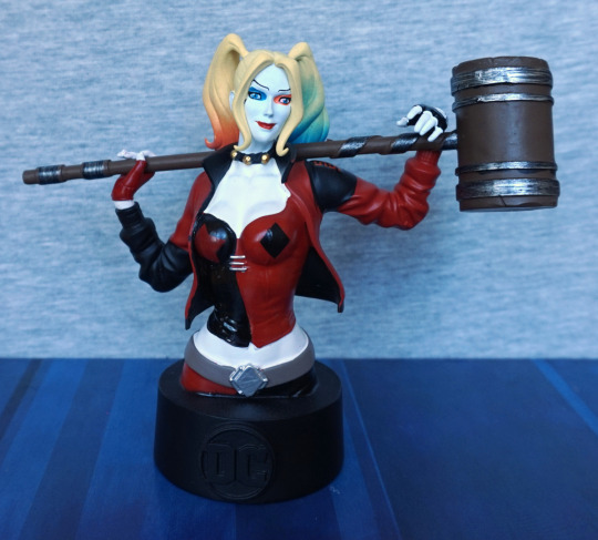
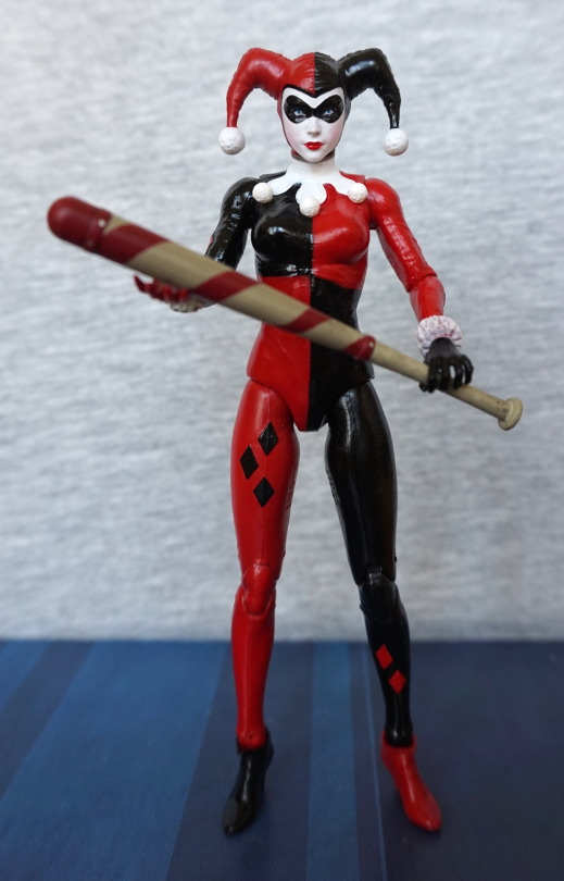
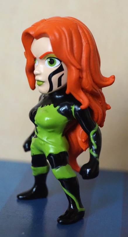
This was a random buy, as I came across her at a reasonable price. Was considering getting one or two of the Rock Candy figures as I like the proportions. As Harley Quinn is one of the characters I collect figures for, she was one of the natural choices.
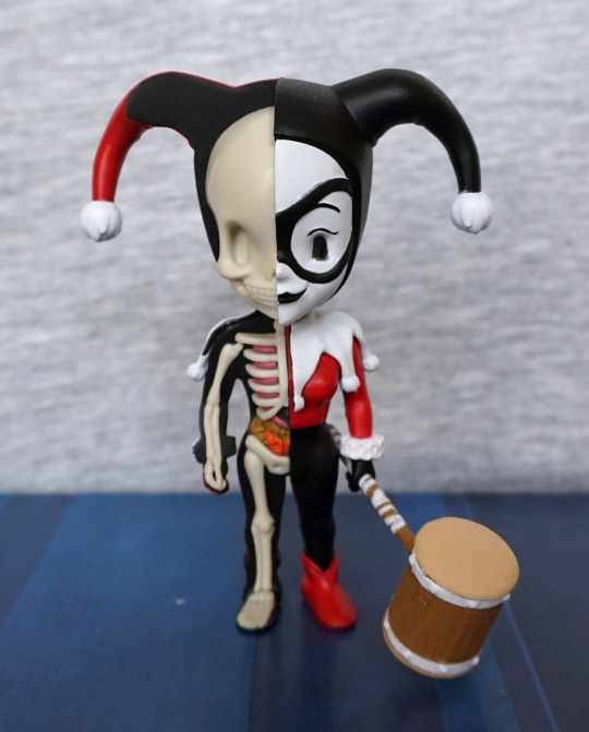
So here she is:

image

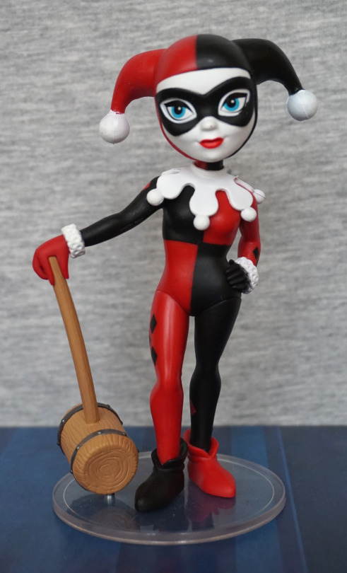
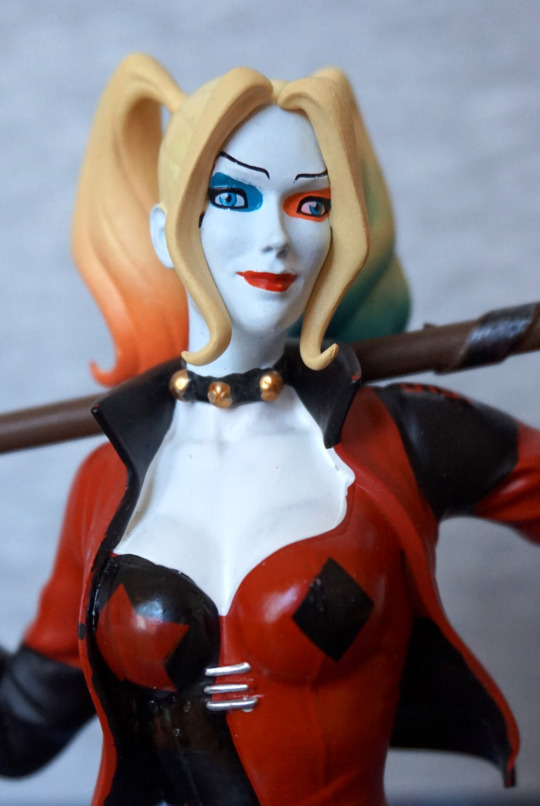
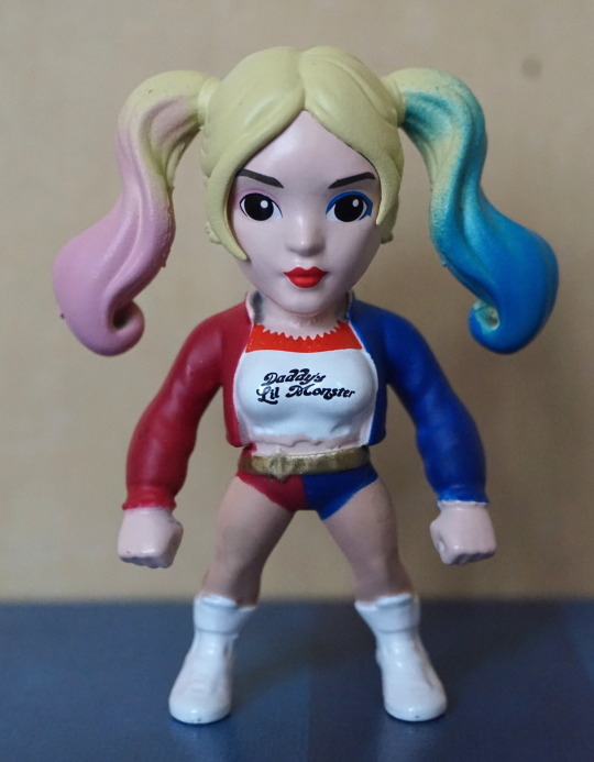
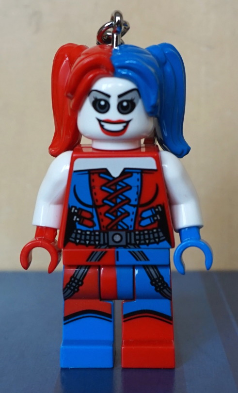
With my copy, there is a slight mark on her nose – annoyingly I didn’t notice this until I unboxed her, otherwise I would’ve probably not bough her. I like the rest of her face though, the front of her collar is done well… and the hammer is nice, apart from the slight bend it has to it. However, the less good things are the fact the quadrants of her top aren’t aligned properly, leaving some overlap on the black and there’s a noticeable seam on the collar to her left side. Can also see a bit of paint mess on her hat pom-poms.
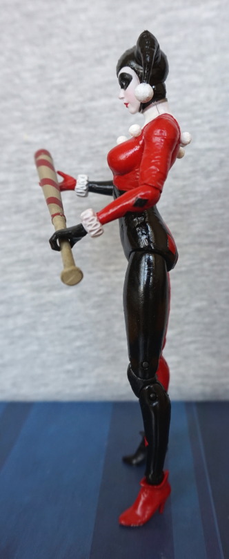
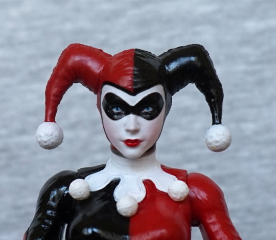
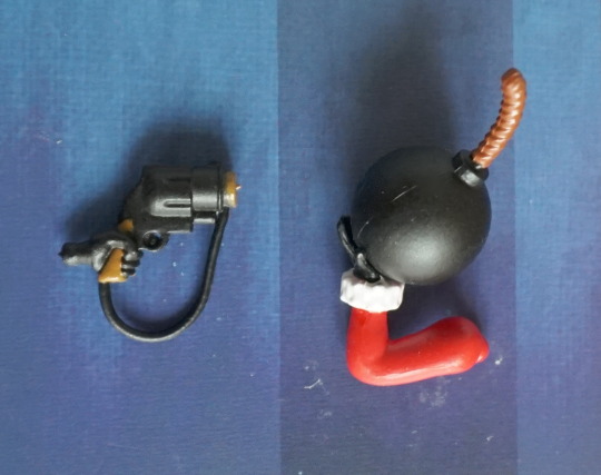
Left:

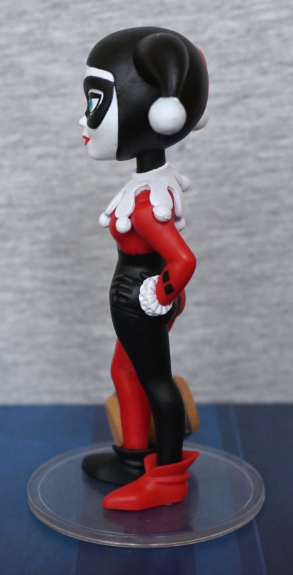
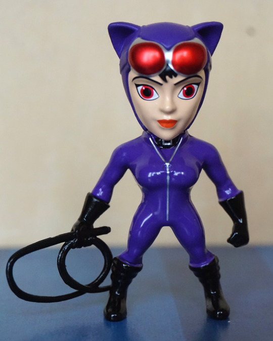
The colours are nice, the sculpt isn’t too bad (collar feels a bit thick though), but there are small paint errors dotted around – most noticeable is just above her hand. 
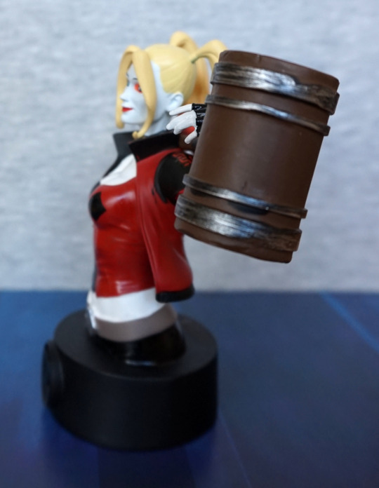
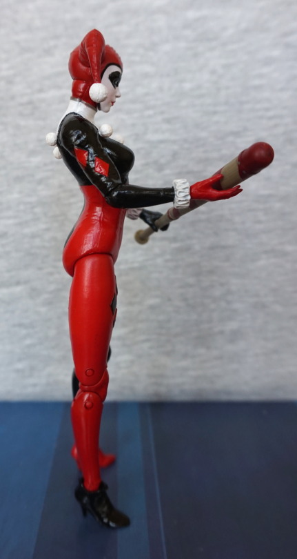
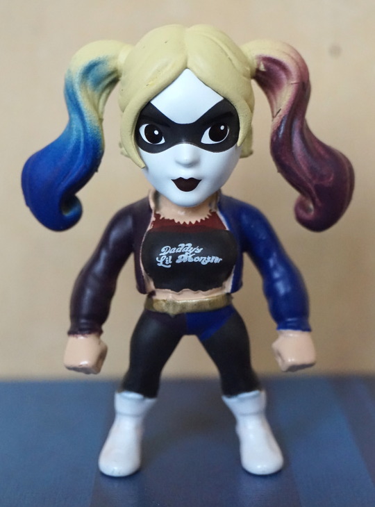
Right:

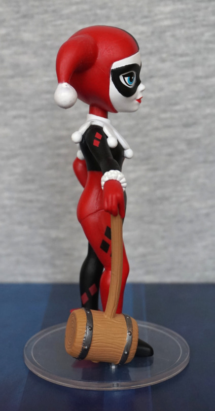
Right looks better than the left and doesn’t have much in the way of noticeable issues. Do wish they put a rod in the hammer handle so it didn’t bend so freely. It does make assembly easier (and the figure cheaper…) but at a cost. 

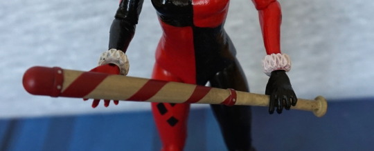
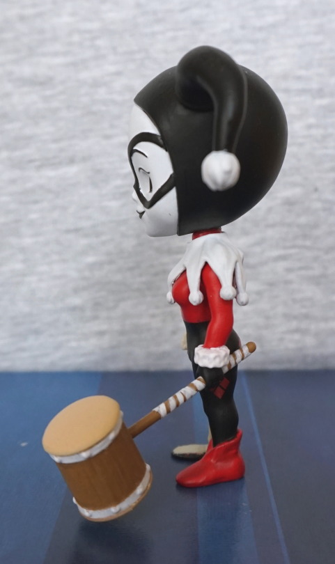
Hammer & leg close-up:

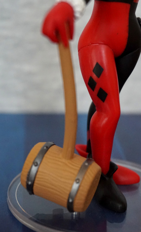
One thing I can say for the hammer is the sculpt job is nice, and the paint used for the bands works well… if you ignore the paint slop. The diamonds are printed well on her leg, which is nice. 
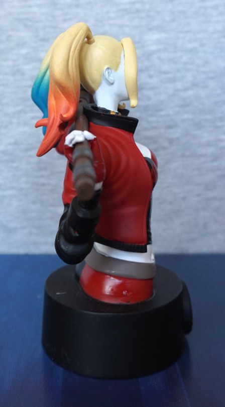
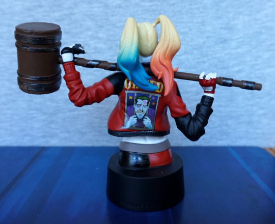
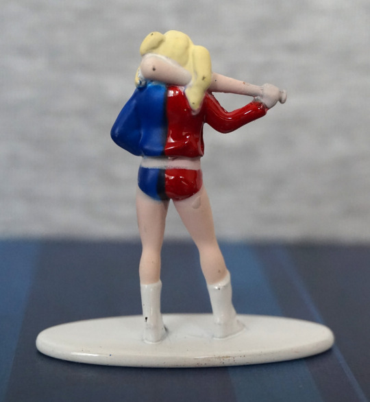
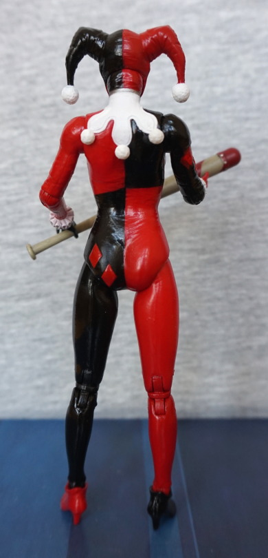
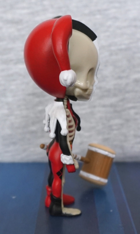
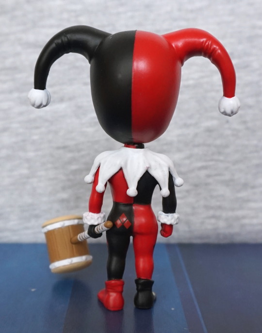
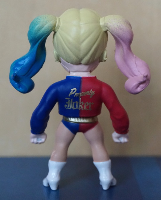
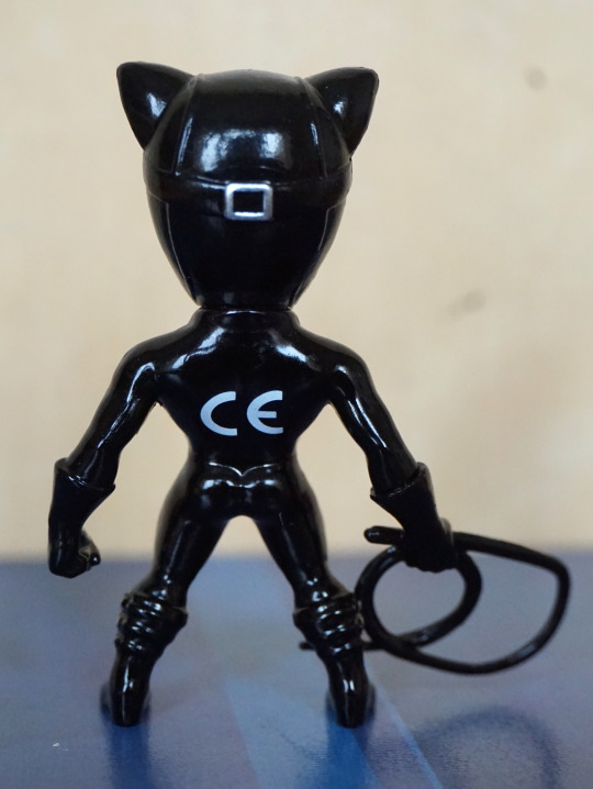
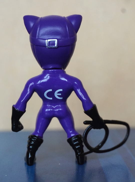
Back:

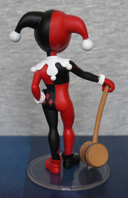
Square overlap doesn’t seem as bad on the back and the paint looks mostly neat. Cuffs have a bit of slop, but this is pretty common. 

The big paint slop though…

Who the heck QC’d this… or more to the point, didn’t? Pretty nasty paint flaw here, and this is why I don’t buy Funko stuff often. Wouldn’t recommend buying their figures online, unless you’re not fussed over paint mess… as this is not too uncommon. 

Overall, I like the design, but the execution leaves something to be desired. A handful of paint errors and an ugly amount of flashing on her collar doesn’t make for a very premium figure. Honestly wouldn’t recommend these at full price. 

Harley Quinn – DC Comics – Eaglemoss Batman Universe

So after buying the other two busts, I decided to take advantage of Eaglemoss’s introductory offer for the first three busts in the series. I will only be reviewing two, as I plan to sell the Batman bust. 

First up, we have Harley Quinn:

image

I like the colours and design on this one – it feels less plain than the other two I reviewed, but there is still a fair amount of block colour going on. I love that they’ve included the hammer, as it definitely adds something to the bust. 

Face close-up:

The eye shadow colours fee a bit overdone and severe close up, though the pain seems to be neatly done on the face. Here we can also see the apint isn’t overly neat in certain places – especially her right breast, where there is red showing from underneath the black. 

Left:

Here we get to see mostly hammer. Not sure what the back blobby bits are about, under the lower thin ring. I appreciate the weathering effect though. What I appreciate less is the escaping black paint on the side of her jacket. 

Right:

Here we can see they can do some blending with the paint – her hair doesn’t look too bad. Though the orange doesn’t match the pink that the hair and eyeshadow should be, if you’re choosy about this kind of thing. Her hairband here is also hair-coloured. Again, there’s some marks and missing bits in the paint – red dots on her sleeve, her belt is a bit skin-coloured, and a couple of dots on her hip. 

Not sure if the munch in her hair was a divot that was supposed to line up with the mallet at some point or an air bubble in the mould. Whichever, it is a bit odd. 

Back:

The design on her back in of itself is printed nicely, but not quite straight. I think this would’ve come out better if the design was a bit smaller – it feels like it takes up just a bit too much of the jacket. Again, the painting is a bit hit-and-miss, but I do like the sculpted wrinkles in the jacket. 

Overall, an OK bust, but with Eaglemoss’ varied paint job qualities, you may not want to risk ordering this one from Eaglemoss directly, as I think the paint errors do show up fairly well unless you have her at a distance. 

Joker, Harley, Cyborg & Mr Freeze – Metal Nanofigs

Ended up getting some more Nanofigs from Asda. Not sure quite why I keep doing this… oh yeah – they’re cheap… 

So first up, Joker:

Well-painted, for such a small figure. He has purple boots though… and the shiny jacket might be an acquired taste, 

Left:

A little bit of an ear going on, and a very red smile. Hair has some shape to it. 

Right:

Bit more definition in the green hair paint on this side. And a sea of shiny purple. Good thing I like shiny purple.

Back:

Some details in the sculpt back here. Am happy with this nanofig. 

Next up, how did his ‘partner’ Harley go?

Ah. Hm. Yeah, she didn’t fare so well. Missed paint on her hair, by the bat and the lines aren’t too crisp on the jacket. Not sure what’s going on with the bat, being flesh-coloured… that doesn’t quite work. She has a full face though, unlike some of the nanofigs, which is a nice change. 

Left:

Yeah, definitely evidence of some painty mess here.

Right:

Seems to be some mess going on with her hip, and her foot seems poorly moulded. Or maybe overpainted. 

Back:

Faaail. A number of black marks, and not much attention paid to paint edges. You can’t see the back of the figures, and this one shows it. 

Cyborg:

Recognisably Cyborg, but he does have some mutant growths on his shoulders. There isn’t a large amount of detail in the paintwork, but what’s there has largely been done neatly. 

Left:

A sea of silver. Think some definition has been lost in the legs from the thick paint apps, but probably better this than seeing through the paint. 

Right:

Head paint has been done well, rest of it is what it is, lol.

Back:

Yeah, looking decent back here, no real complaints. 

Overall, he’s pretty decent, but does suffer from the lack of paint details these figures have. 

Lastly, Mr Freeze:

Mr Melty Face! His head looks distinctly mutant, like they couldn’t decide if it was his helmet or his head. I think it would’ve looked far better if they shortened his skull, so he didn’t have his helmet on. Paint on his left arm looks like a “yeah, that’s about right” job. Rest of the paint, such as it is, looks like it has gone where it was supposed to. 

Left:

Not much definition here. Looks OK. 

Right:

His glove and boot lack detail in the moulding imo, and look overly plain. 

Back:

One large paint gouge here, at his mid-back :(. His left glove looks really good from this angle, with the gun… looks better here than on the front!

Overall, Mr Freeze looks OK, barring that stupid head. Argh. Goggles could’ve done with more work too. 

My favourite out of these is the Joker. Harley is probably the weakest out of this set. For less than £2 each, they’re pretty decent, and better than what you can get out of some pricier blind bags. And you can pick the ones you want! Wouldn’t recommend ordering these off the internet (unless you’ve got good pics of the ones you’re buying) as the paint jobs can vary massively. Did try to pick the better looking ones, where I could. I remember there only being one Mr Freeze though. 

Harley Quinn – Arkham Knight – DC Collectables

This one I bought at Hawkins Bazaar, who had a few characters on clearance. But some of them are being sold at B&M for cheaper, so if you see figures there, check if they’re in B&M or TK Maxx first. 

Here is Harley Quinn, based on her appearance in Arkham Knight (not played the game, but does she appear in both of her outfits?):

Most of the paintwork is well done, but there are a few dodgy bits here and there. The paint quality varied between figures, so I picked the best one. Some of them, the white paint was encroached upon by the black/red paint. 

This figure is very shiny. Not sure if I’m a fan of the look or not. Wish the black line on her left side was a bit straighter. The diamonds on her leggings are painted nicely though. 

Close-up of her face:

I like the rouge on her face, the lipstick and eyes are painted very well. Not too much of a fan of the “blow-up” hat look. The hat has been given seams like it’s an inflatable, not sure if this is intentional detail, but not really a fan. The creases are nicely realised. Some of the white n her collar does seem to let some of the undercoat show through, but not too badly on mine. 

Left:

Here you get to see the extent of the shiny. Does make it look like she’s wearing some plastic-y fetish suit. The colours are very vibrant though. 

Right:

Looks fine from this angle, other than some previously made points. 

Back:

Quite a bit of creasing detail throughout her body and hat. The pom-pom balls are nice. Her neck looks odd from this angle though, from the way they’ve done the joint. 

And now for some notes about posing her:

Why, DC, why?! No hopes in her feet to add a stand, so you’ll either have to go for no stand or a claw stand. Without a stand, she’s a bit finnicky to stand up. You can get her to stand, but she will be prone to falling over. Also getting her to hold her bat can be troublesome, though looks good once you get her to hold it properly. 

Overall, I can see why this figure was reduced. She’s a bit of a pain to pose, and I think the shiny look would be polarising between collectors. She articulates well, but this is let down by the lack of stand. If you see this for around a tenner, and you like the look of her (and prepared to throw in a stand if you can’t prop her up), I’d recommend her. But I’d recommend also leafing through the stock to ensure you get one with a minimal amount of paint flaws. 

Harley Quinn – Arkham Knight – DC Collectables

Bought this from Hawkin’s Bazaar, of all places. They were doing a sale, and she was a good price, so I picked her up:

As far as Harleys go, this figure isn’t super-special, but is decent-enough looking for the tenner I paid. I like the creases in her clothing, and she’s got some blush on her face, making it stand out more. She is a mild pain to pose though – hard to get her to hold the bat like I want her to. The paint is largely crisp and clean, but paint jobs do vary between figures, so I picked from the best I was looking at. Some of them the white overpaint wasn’t quite thick enough to hide her uniform underneath. 

Face close-up:

I do rather like the face on this figure. The flashing on the hat does make it look a bit like a blow-up hat, lol. Maybe it is? The furry balls on her hat and chest are meh, but they are on most figures, and these seem decent enough. 

Close-up of the bat:

Yep, looks like the quintessential Harley bat. Ruffs have a bit of stray paint on her wrists, but are well-sculpted. 

Left:

Looks OK from this angle. 

Right:

Some creasing at her middle and on her arm. Not sure they fully committed to the outfit wrinkles from this side. Note she has none on her legs. 

Back:

Here they seem to be a little undecided if they were committing to put wrinkles in her outfit or not, too. She does have a butt though… Her neck looks odd from this angle too. The paint is good on her outfit though.

And one of the major annoyances with this figure:

No. Stand. Holes. And she’s not easy to stand up on her own – she’s pretty finnicky, so can suddenly go SPLAT. Why DC Collectables, do you have to do this? Why no peg holes…? 

I think this might be quite a divisive figure – the shininess is going to appeal to some, but not so much to others. Not surprised this one has binned, but I think it’s a fairly solid figure for half the RRP. Though you may want to consider including a claw stand into your purchase so she doesn’t fall over. Currently I have her propped up against an acrylic stair stand, so she doesn’t fall over. 

Harley Quinn – XXRay

The stall had a bunch of XXRay figures for €15, including this deluxe edition. Price is about average for the normal editions, but couldn’t resist this deluxe edition, especially as it was Harley Quinn. 

Here she is, out of the box:

I’m a sucker for novelty figures, and have been looking at these XXRay figures, but usually they’re either too expensive, or not a character I want. 

Her internals have been well-sculpted and painted. It’s nice having one of these figures, but I feel having a lot of them would be kind of “meh”, as they seem to largely do humanoid characters, so the internals don’t vary much. On the externals, there’s a couple of bits of stray paint (you can see one above her left bobble). 

For accessories, she comes with the hammer as pictured above, plus these pieces:

Unfortunately taking her apart is not easy, so I haven’t actually tried these pieces out, but it’s good they included other weapons for her to hold. I’d likely pick the hammer for her anyway, as it’s the most iconic item of the three. Bomb has a noticeable seam though, which isn’t so good. 

Left:

Here we see her, as if she was whole. Paintwork is mostly OK, with a little escaping here and there. 

Right:

Bony! I like the way they’ve done the cutaway. Her cutaway foot seems too flat though. Would’ve been good if these bones were raised like the ribs. 

Back:

Imo the back looks good. No real complaints back here. 

I think these XXRay figures are a neat idea, but I don’t think I’d collect a lot of them as it’s much of the same. Having a couple makes for a good novelty, having a collection would just water down their impact for me. All in all, I’m happy with this one and maybe I’ll pick up a Joker if I come across one going cheap or one or two others. If you like what you see, I would recommend them, but not paying a lot for them, as they aren’t that big. 

Metals Die Cast figures – 2.5″

Went into a local comic book shop recently, and came across these Metals Die Cast figures. I had seen some of them online recently, but this was my first time in the wild. He was doing a discount if you bought 3, so I chose four, then deliberated over another two. 

So here are my picks! Plus the first time I was using a different lens on the camera, so enjoy the higher res photography for these smaller figures

First up, Harley. Because, yes Harley :P:

There were three, and apparently I went for this one. They all had their paint flaws, but I ended up with Miss Melty Top. The fact she has eyeshadow is nice though, and the writing came out clean. 

Back:

The texture ended up a bit rough on the hair for Harley – should imagine it’s the complex shapes that didn’t quite work for it. The gold text on her back is nice though. 

Variant Harley:

I do like these colours – does give her a bit more of a sinister vibe. Didn’t notice when I was buying it, but in this photo you can see where they tried to hide an error when painting the upper half of her top. Oops. 

Next up, Poison Ivy. Here she is in her traditional colours:

I think these ones ended up with a better paint job than the Suicide Squad ones. Lovely contrast of colours.

Her back:

Ah, erm… but apparently come with the downside where the CE logo has been put prominently on the back of their heads. Her hair is a nice vibrant colour though. 

¾ view:

Short and slightly stocky. Bit of interesting green coming out of her armpit there.

New 52 Poison Ivy:

Can’t say I’m a fan of the New 52 design, but this figure turned out well. The colours complement each other well for me, and is more striking than the other pictures I’ve seen of her. Better than the DC figure I saw… 

¾ view:

Her tattoos on her face came out well. Some slop on the green paint, but these are dinky figures on a budget. 

Back:

Lovely bright, vivid orange… just.. logo. 

And thirdly, Catwoman:

I think the Catwoman figures have been painted the best, and were two of the easiest picks. The paints are lovely and shiny, and she feels very much “Catwoman”.

¾ view:

Shiny!

Back:

Is Catwoman now selling out? Nope, just being safe! The paint on her buckle is crisp and clean. 

Lastly, purple Catwoman:

This was one I was considering importing, because, hey, purple AND Catwoman! She’s mostly well-painted, but they’ve added a mould for her zipper pull, but didn’t paint it. Same on the one above, but I find int more noticeable. 

Back:

Same ol’ CE logo, but less shiny on her head. Silver also missed a bit on the buckle, sadly. Ah well, I’ll just admire her butt instead…

Overall, I’m impressed with these figures. They’re not super-well painted, so if you have the option to go to the shops to buy these, I’d strongly recommend it, so you can pick out the one with the best paint job. Store I went to had one case of each, so mostly I was stuck with the choice of one figure of each type, but I don’t think I did too badly. The Metals ranges seem to be decently priced, which is a surprise for a UK collector. Once they’re in more shops, I’ll probably end up getting more of the range (I think they’re only just coming into UK shops). 

And as a bonus Harley Quin LED Lite:

I got this at Christmas, but forgot to include it in the Christmas blogs. Love the bright, vibrant colours, and the quality of Lego’s printing. I’ll probably end up just displaying her instead of using her as a keyring.