Tag: batman

DC Nano-Metals – Part 1

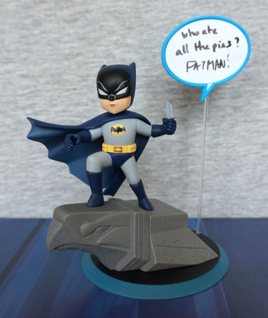
I bought this set cheap-ish at TK Maxx. 

First up is a silverish Batman:

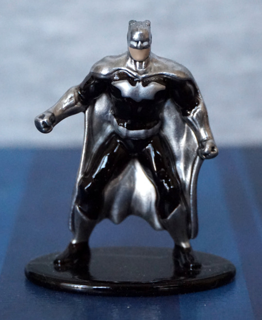
The paint is mostly in the right places and doesn’t look too bad. No mouth painted though… Can’t say I’m a big fan of the colour scheme, but I think it works. 

Back:

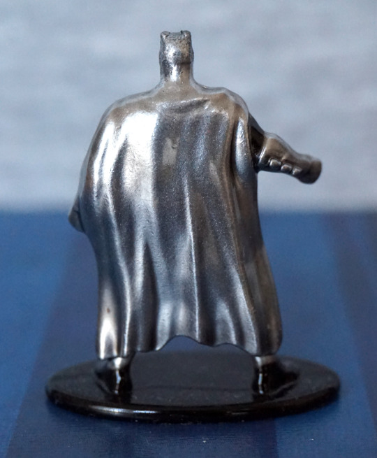
Not too much to see at the back. The cape is nicely wrinkled though. 

The Flash:

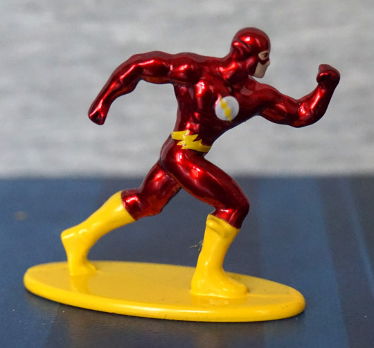
I like the colours on this one, and the paint is neatly done on this o0ne. The logo came out decently well on his chest, and his muscle definition works. 

Back;

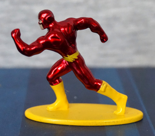
His belt is a bit sloppy here, and the wing(?) on his boot is more of a nub. His body is sculpted well though. Pretty pleased with this one.

Green Lantern:

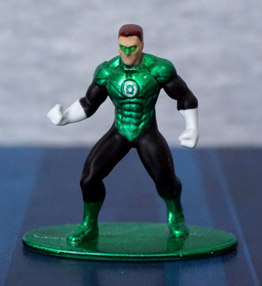
This guy, the paint went a bit sloppy – think the green needed to extend a bit more down his front, and one of his gloves has a bit of white mist paint. His mask is OK, but again, half a face, though the way his faces is moulded almost gives him a mouth a bit higher up. The logo on his suitl looks nice, but his chest does sort of seem to melt at the bottom, in terms of sculpt. 

Back:

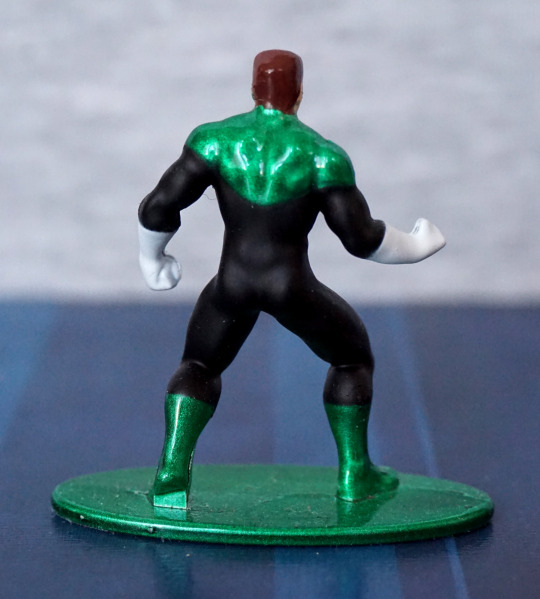
Looks OK from the back, though his hair does melt into his suit. Don’t think the green and the black paint want to play nice with each other, but I don’t think it’s too bad.

Out of these three, Flash is the one I like most. I don’t think any of these look bad, but not really keen on the Batman.

Catwoman Barbie – Batman

And now for a Barbie that I can appreciate! Never did see one as a kid that I’d ever want, but at 32 I find the purrfect Barbie for me:

Hm. I really could’ve straightened out that mask a bit more, couldn’t I?

Anyways, onto the figure – I think the fusion of Catwoman and Barbie works well here – it definitely looks like an even mix of both. I love the fact the clothes have been made to look like leather, and she has just enough touches to sell itself as being Catwoman. A large part of that is the mask, but she has cat claws on her gloves, and the quintessential whip. She has a utility belt thing going on, which apparently marks this as being based on Catwoman from the 2004 movie… which I haven’t watched. Hm. I should probably get on that. Anyway, moving on…

Left:

The seams have been sewn so the stitching is inwards, so everything looks nice and neat from this side. Her claws have been tipped with silver, which has been nicely done. Her neck does look a bit odd from the side though. 

Right:

Here we can see a small zipper, which is a nice attention to detail. I do rather like the fluffy upper to her gloves, and the high heels poking out from the bottom of her trousers. 

Back:

Here we can see some things that weren’t finished off too well – several of teh back joints are uneven, which is a bit of a shame. Also a bit of excess fabric at uppermost join. Her hair is very nice though, and the backs of her trousers look good, even if the belt doesn’t quite line up… 

Overall, I’m glad I bought this Barbie, and I think it makes an excellent first choice :P. Not sure if it’d appeal to a Barbie fan, as her outfit does somewhat limit her articulation, though all the joints are there. For me, I’m using this as a display piece, so I’m not bothered by knees being hampered by her trousers. I may have to get a doll stand for her though, as she’s not standing on her own with those small feet. 

Poison Ivy – DC Comics – Eaglemoss Batman Universe

This is the second bust I bought in Forbidden Planet, featuring Poison Ivy:

Initially, the design kind of appealed, but… this didn’t grown on me (pun partially intended). The paint is neat on her face, but her hair painting definitely seems to leave something to be desired, and the paint jobs varied on her leafy clothing. This one was OK, but still a bit messy in places. 

Overall, from the front of this figure, she suffers from plainness – her top is nice, but the large amount of flat-coloured skin just makes it feel like there should be.. more. Her hair could have done with some shadows and highlights, and some of the edges tidying so it doesn’t look like her hair is fusing into her skin in places. 

Left:

Here we can see where a bit of the green paint blobbed onto her hair, and some unfinished edges around the hair. Here, you can see a particularly sloppy job of the top painting – all of the edges here feature inaccurate paint. 

Right:

The edges of her top are better painted on this side – passable for a cheaper bust figure. However, there are little dots in her hair that don’t look very good. 

Back:

Definitely not a fan of this angle. There’s some attempts at shading, but the overall look is Cousin Itt waterfall of hair. The overall shape isn’t very pleasing to me, and the moulding is… enthusiastic, but just doesn’t feel like it fits to me. 

Overall, I not too happy with this bust, and question my wisdom in buying it. I bought it was it was Poison Ivy… and kind of because I was buying the other one already. I did try to go for a better painted one – some of the paint jobs were really questionable. Overall, I wouldn’t recommend this one. Save your money and go and buy a Kotobukiya figure or something. 

Catwoman – DC Comics – Eaglemoss Batman Universe

I saw this in Forbidden Planet, and decided to pick it up with another bust, which will be tomorrow’s blog. 

So here she is:

I like the shininess of her outfit, and the face is painted neatly. I also like the interesting pose, with her getting ready for shenanigans,. 

Left:

Her fingers are posed a bit oddly – I don’t think that finger spacing is particularly natural. Her chest looks a good size though, and the buckle for her hood loks good. The finish on her hip doesn’t seem to be too well applied though, which doesn’t help distinguish it form her belt. 

Right:

Buckle also looks good from this side, but again, the shininess of her outfit seems to decrease on the way down. Looks like some black paint went a bit stray on the strap of her goggles. Also we have the strange finger posing on this side. Not entirely sure what’s up with that, but does look OK if you don’t focus on it. 

Back:

Some suit seamlines sculpted in the back here, which look good. I like the way they shiny paint goes around her belt, to help the strands of it stand out. Paint looks a little janky around her google strap, but not too bad. 

Overall, I think a decent amount of detail has been put into this bust. I think for the price point, this is a decent bust, and glad I bought it. I got it a bit cheaper than the RRP, which I think was a fair price for it. 

Batman – Q-Fig

I’ve been holding off buying this particular Q-Fig, as it looks like kid Batman. But then B&M reduced them to £3 so I went… why not? 

The paint job is decent, but the sculpt…. Batboy! Not entirely sure what they were aiming for when they did this, especially as subsequent Q-Figs didn’t have this young-age style. The stone effect on the eagle is nice though. And the whiteboard speech bubble is a nice touch (I used the supplied whiteboard marker to write on the speech bubble). 

Right:

Here we can see his very basically sculpted body, which adds to it being “kid Batman” rather than some kind of chibi Batman. One mould line visible on his fingers. 

Back:

Not much to look at back here. 

Overall, it’s a well-painted figure, but the sculpt really lets it down. It’s not sold as “kid Batman”, and it fails at being chibi-Batman. I can see why many of these got to the “final discount” stage at B&M. A few more details in the sculpt could’ve added some age to him, which would’ve made for a better overall figure. I can see people being rather disappointed with this, when it was included in Loot Crate. If you’re OK with it being kid Batman, it’s an OK figure though. And you have the added feature of the whiteboard,