The art for this figure is by the popular Chinese artist wlop. They have had several statues of their work made, especially for the characters of their series Ghostblade. I did read some of the Ghostblade series, but didn’t really gel with it.
There are two versions of this figure – one with tattoos and a special edition with none. The tattoos are half the reason I ordered it so didn’t want the special edition. For Chinese buyers, the tattooless edition was only available to people who had previously purchased Light Year Studio statues, but international distributors just had her up as a normal preorder. Both editions were the same price at CN¥3,280. I ordered through an international distributor and the total cost including surface shipping was US$540. So not a cheap lass, but she is 1/4 scale.
Original Art
This is the original art piece the figure is based on:
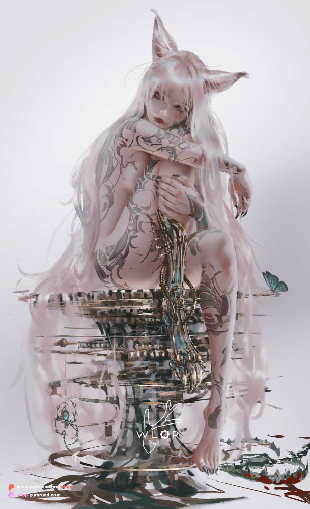
Link: https://x.com/wlopwangling/status/1833707395463496028
Box
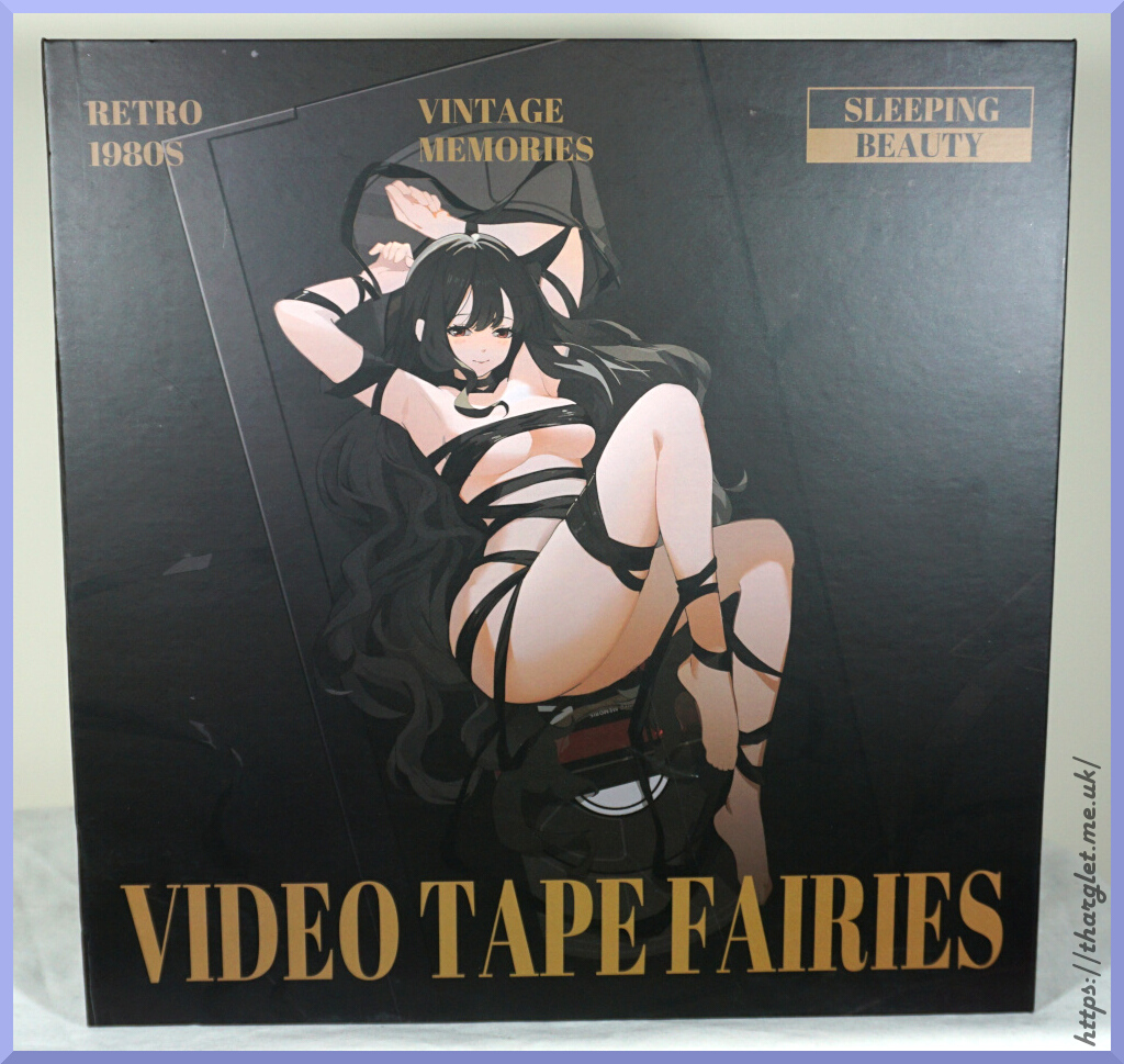
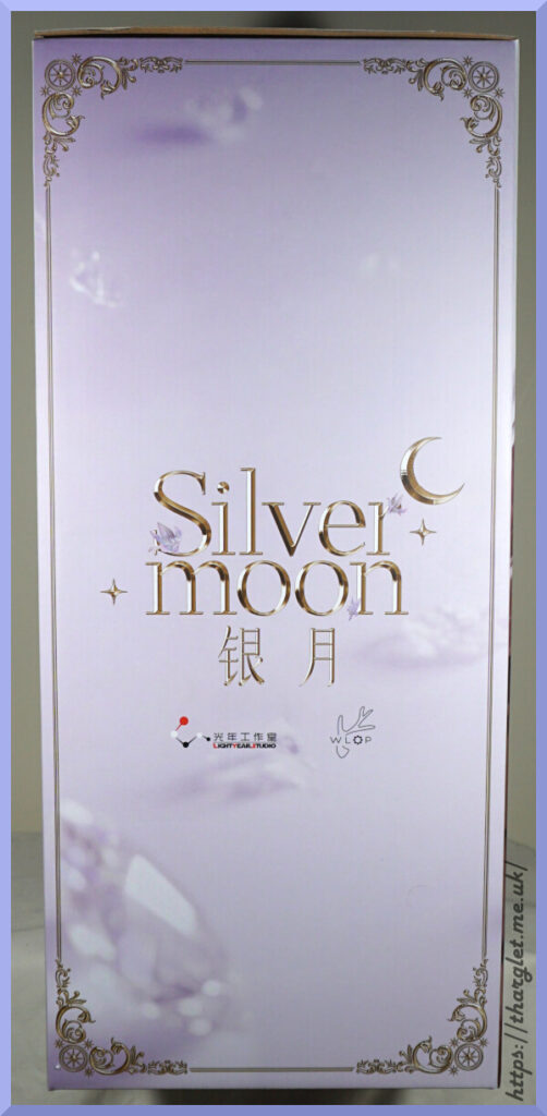
Front:
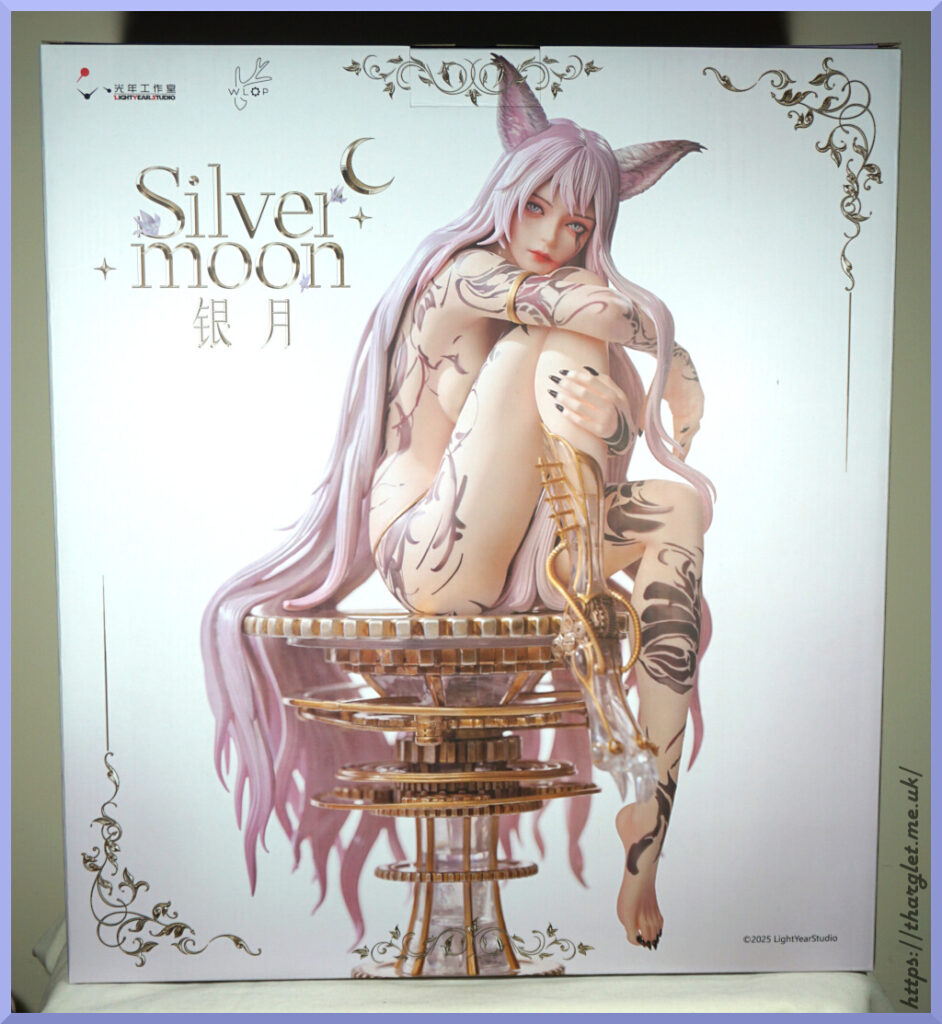
The front of the box is dominated by a photo of the figure, nicely framed with gold vines and a “Silvermoon” logo.
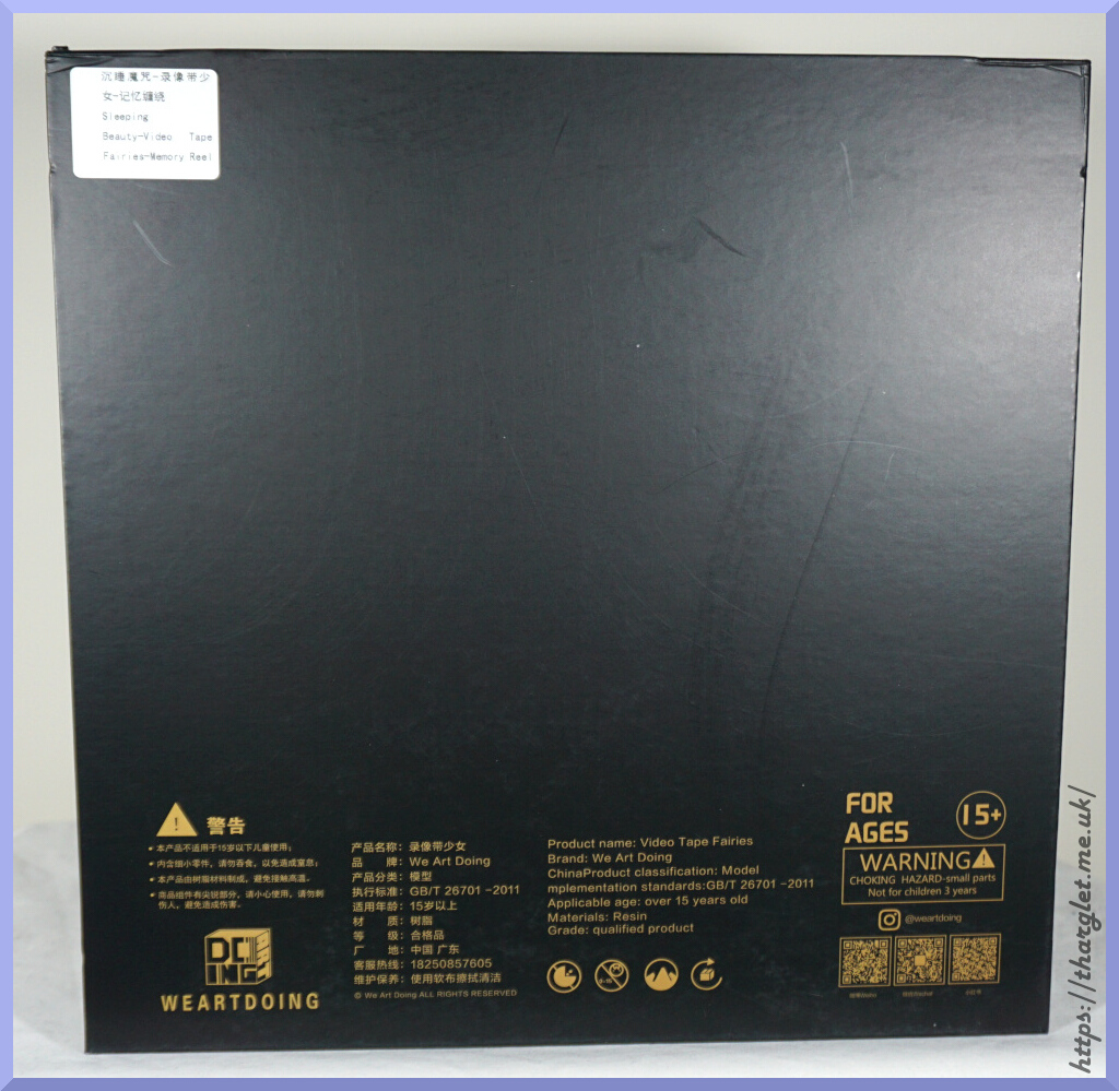
Back:
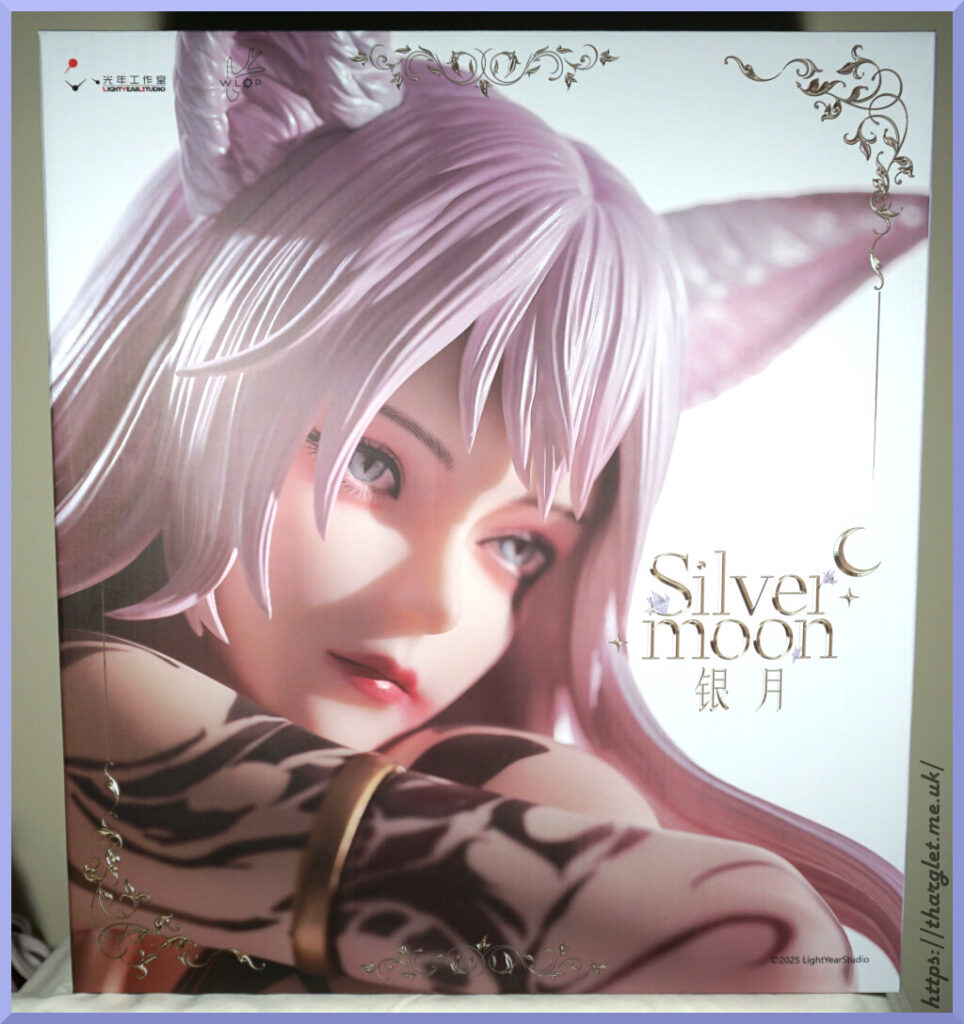
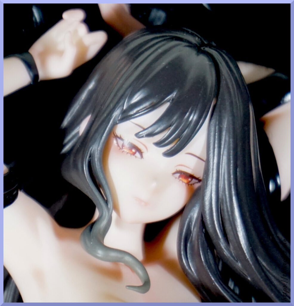
Here we have a closeup of her face. /review. Oh, you want more angles? OK.
Sides:
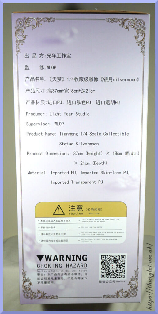
One side is kept simple with the logo, then the other side has the obligatory information dump. All of the PU!
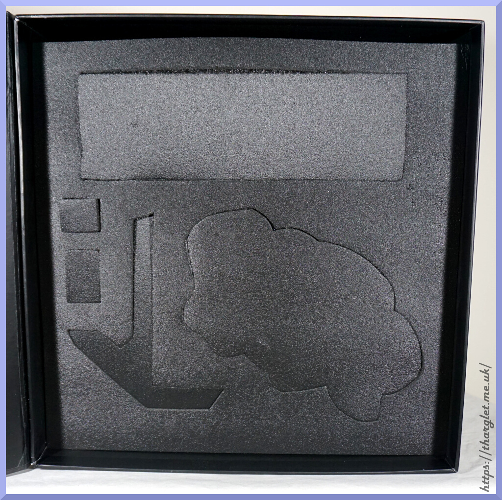
Contents:
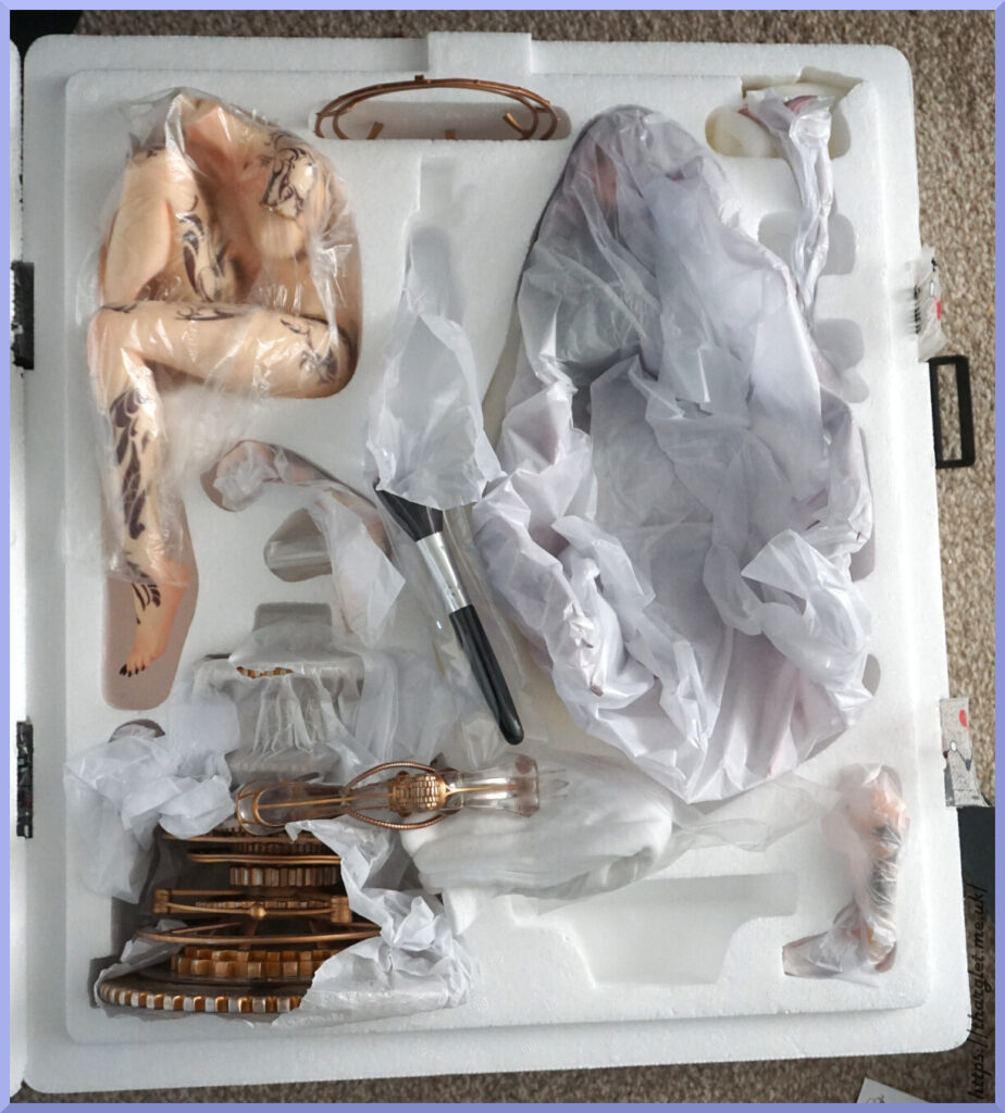
Not sure when it happened, but the leg of my figure leapt over to near where most of the base is stored. Didn’t notice until after taking this photo. It should be in the hole just above where the brush is sat (also not sure where this was supposed to be in the box). Fortunately no damage was caused by the leg relocating itself.
There is one other empty hole – this is the bottom part of the base which I had already taken out at this point. Here it is:
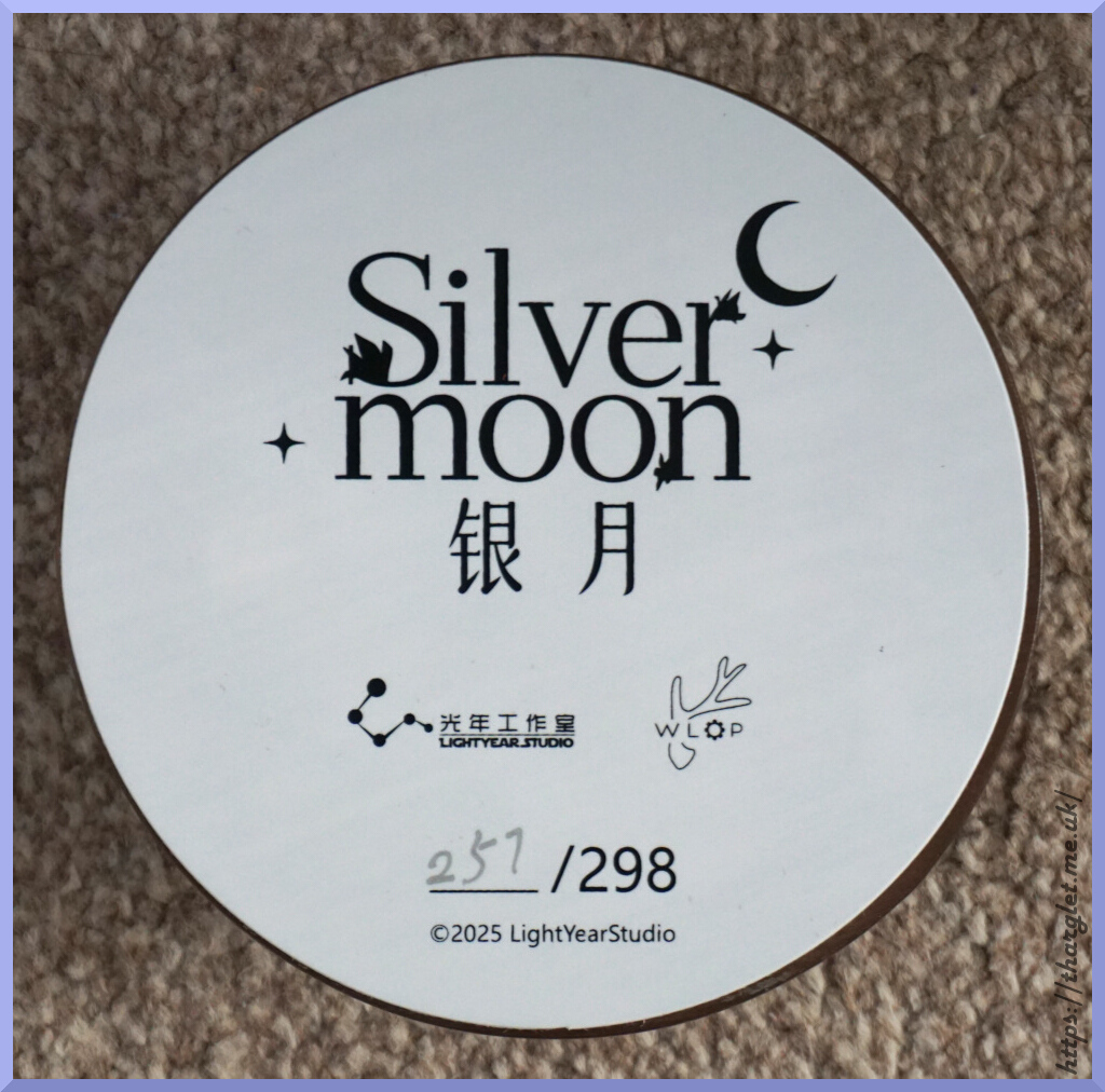
I got #257/298. Took a photo of this prior to assembly, as I’m not going to see it again.
Manual and Assembly
The figure did come with a loyalty card and certificate, but didn’t photograph these. I did, however, photograph the manual because oh my goodness, the assembly.
Here’s the front of the manual:
Nice clear image of the figure and its logo.
And the back:
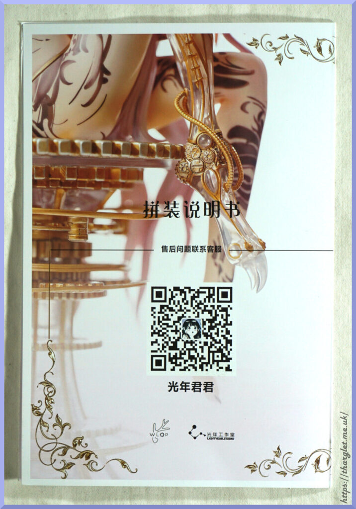
…and this side tells you it’s the assembly instructions. And a QR code for Light Year Studio’s WeChat for aftersales issues.
So let’s get onto the meat and potatoes, the instructions themselves:
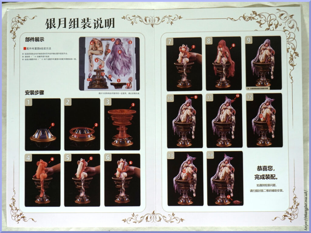
Looks pretty simple right? Just follow the instructions, pop the stuff on as shown and done? Just like Naga? Ohhh nooo.
The gripes start as early as instruction #2 – this part just rests in place and doesn’t clip on. Fine if it’s nowhere it’ll get nudged or have a breeze flow past, but otherwise I’d recommend tacking this in place. They did provide some tack, so I have tacked it at the back on two spokes so it can’t move. Where I plan to put her she may get some vibrations which may well knock this part about so tacking it in place will prevent it going for a wander.
Next problematic instruction – #4. It’s not immediately clear which way around she goes and can sort of fit either way. The magnets also suck so it doesn’t really pull her down and hold her on the base.
The biggest problematic instruction however is #8. Getting her head on is an absolute trial. And because of the way things are shaped, you must assemble in the order given with little leeway to do it any other way. Once her hair is on you don’t have clearance to assemble the hair strand in #5 or her arms. The hair strand between her legs slots into the hair at the same time as her neck but it flops around like nobody’s business – would be nice if they provided a peg to peg it into her neck then for her head to go over both parts so that aspect would be easier. But getting her hair over the stand, head on her neck and her butt on the base is just incredibly, incredibly fiddly. I swear they should have made this more parts so it wasn’t so convoluted to put together. Or at least had the strand connect to her solidly in some other way so you’re not trying to awkwardly peg two things at once. Not sure how long it took me, but it was 2 sessions of messing about. Wouldn’t be surprised if I was fiddling with the sodding thing for 20-30mins and getting quite rough with it just to get things in place. Eventually got there, but oh man, it’s not a friendly figure to assemble in my opinion.
Overall, it’s nice to have instructions, but they’re far too sparse – some information of which way around she sits on the base would be nice, and maybe some instructions of how to do the head assembly without forcefully attacking the thing would’ve been nice. Ideally, I think some modifications could’ve been made to facilitate easier assembly.
Base
Let’s start with the base. These are the pesky struts that sit against the base:
I can understand why this is a separate piece as it is on the fragile side, but I don’t understand why they didn’t add at least couple of pegs to it to lock it into place.
The base as a whole:
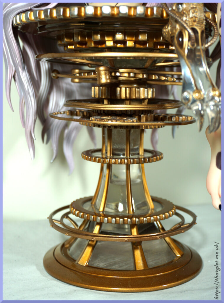
The whole base does look pretty cool. Some hints of silver do add to the piece and add an element of wear and tear to it.
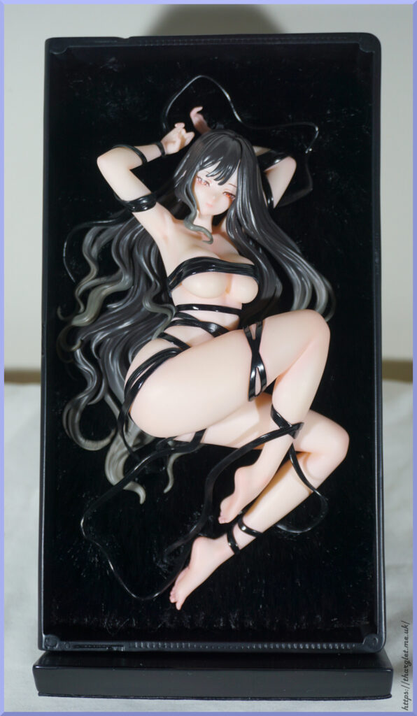
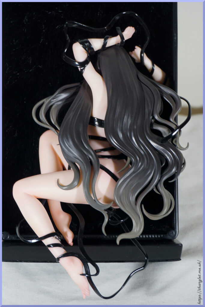
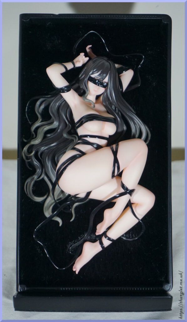
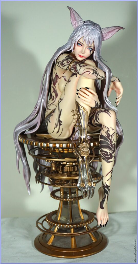
Figure Spin-around
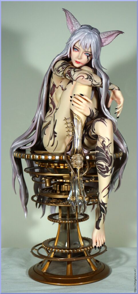
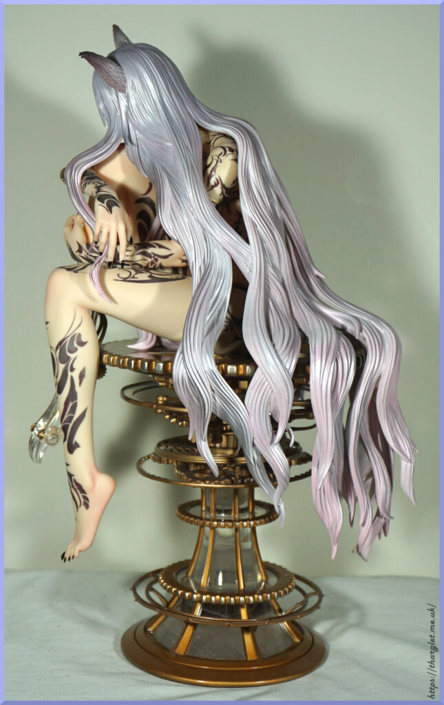
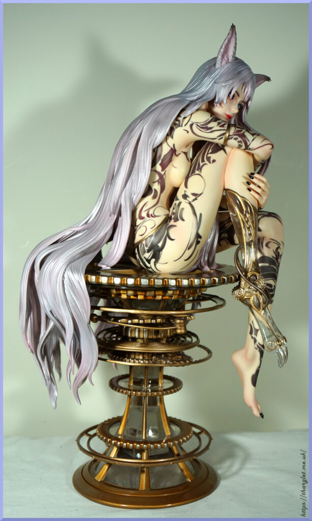
The hair colour is definitely a lot less pink than the promo photos – the final colour is definitely more silvery which is more fitting with her name, but it is also purple rather than pinkish. I like purple so this is an improvement for me, but if you were hoping for pastel pink hair…. she ain’t got it.
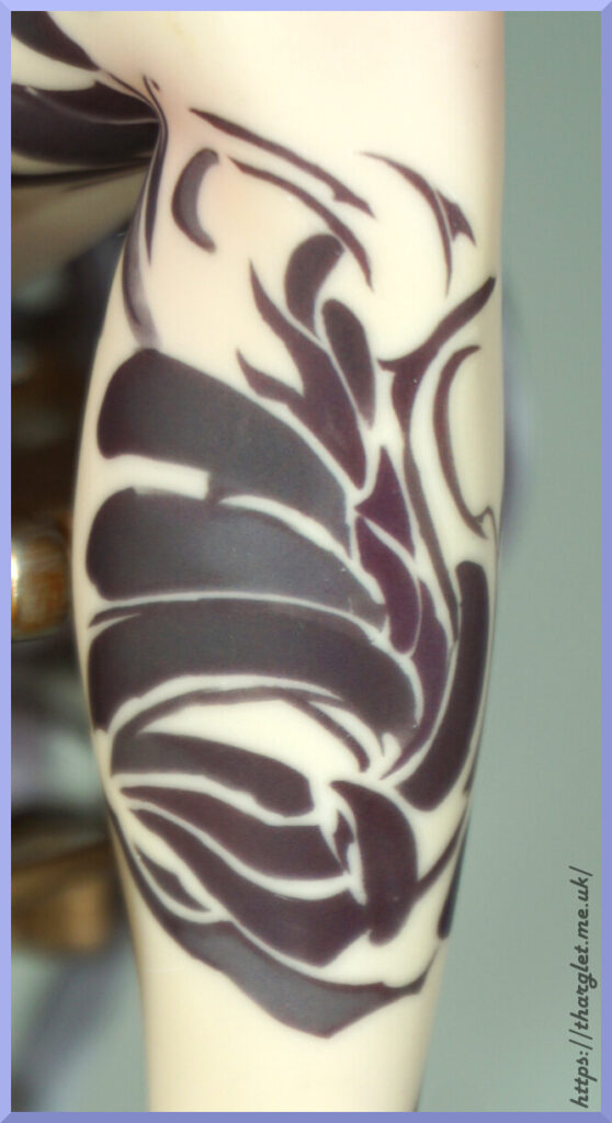
The tattoos are very painted-looking, which is in keeping with the art but in some respects does look like she may have been sharpie’d on rather than tattooed. It doesn’t bother me, but can see this feeling odd to some people. There’s a nice variation of colour in the tattoos so they’re not just a flat black.
Figure Close-ups
Face:
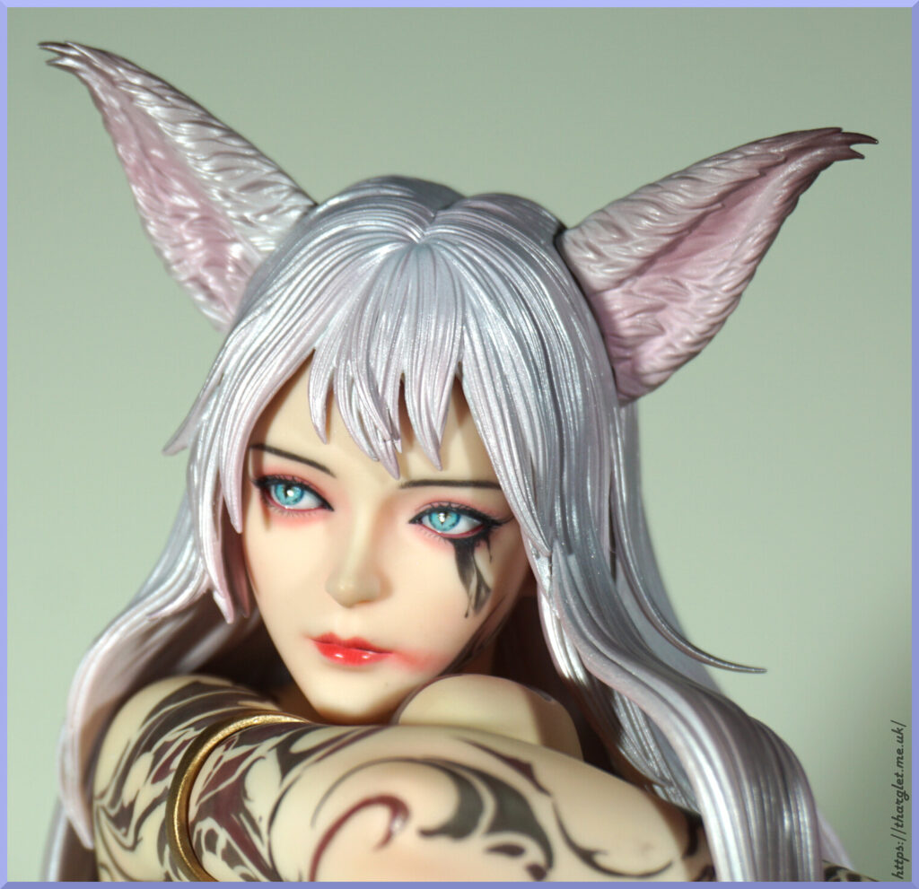
As can be expected of expensive Chinese figures, they spend time on the faces. I love her pale blue eyes and thoughtful look. The lipstick smudge is deliberate – it is part of the original artwork but not this intense of a smudge. Her face is less round than the art. Overall, I like her face though it’s not the most detailed I’ve seen on a higher end figure.
The ears have a bunch of sculptwork and shading to them, but honestly…. I don’t think they look that great. I don’t think we could expect the furriness of the original art, it is close to the promo images but it’s just not doing it for me. The upper shadow on her left ear isn’t visible when looking at her, but the ears don’t sit smoothly to the head. Under intense lighting the colouration looks more off than it does on display, but they just stick out somewhat.
Back of the head:
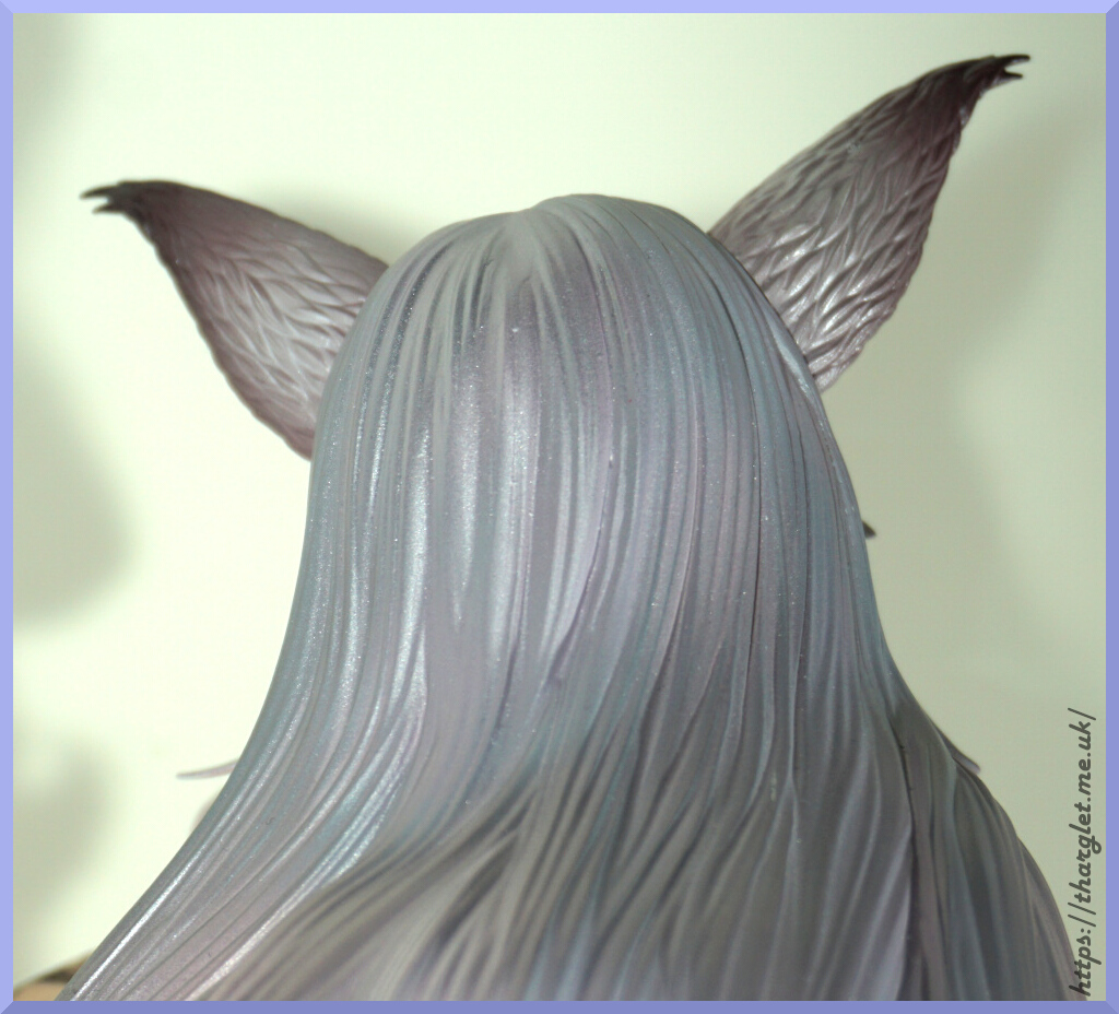
Personally prefer the colouring of her ears back here, but not sure if the texture chosen really fits. The hair you can see there are various colours running through it.
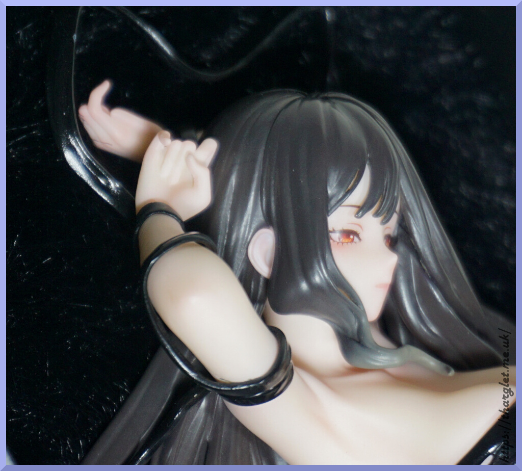
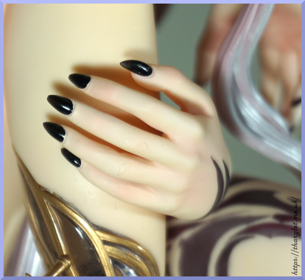
Arm:
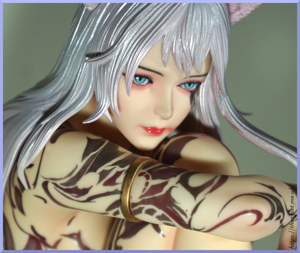
She has the obligatory gold band to hide the arm join. It’s fairly unobtrusive but do wonder if they could have added something more fitting to her naturistic theming. Here you can see where the tattoos vary between red and black.
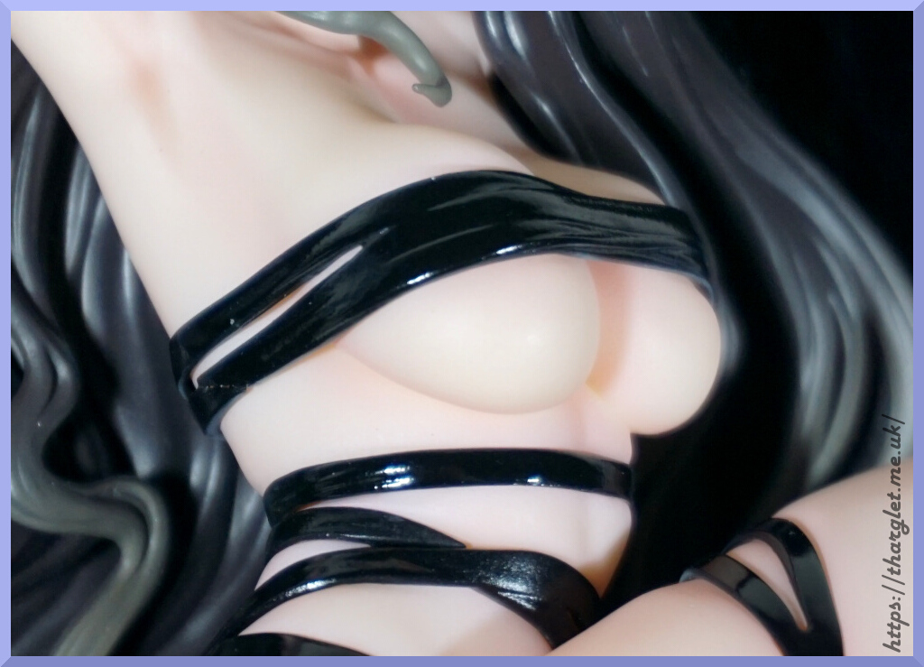
Body tattoos:
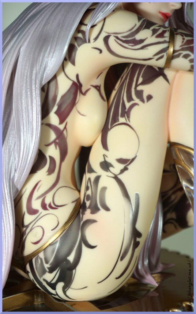
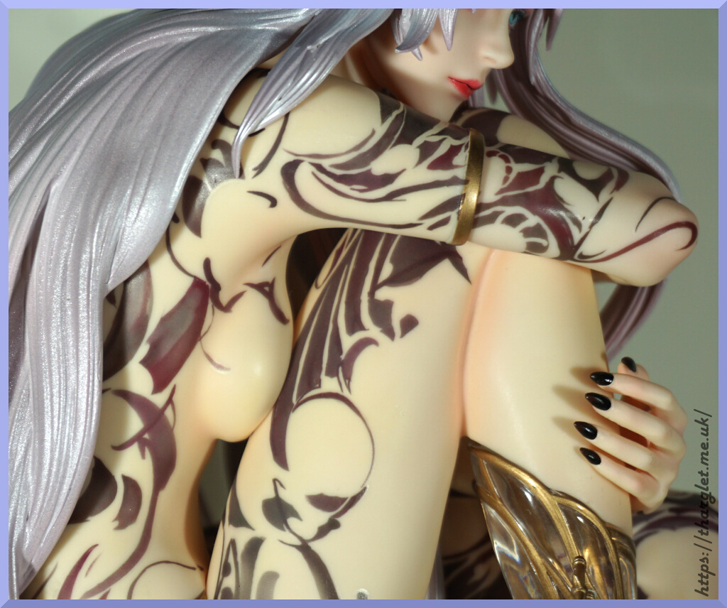
Looking up close, you can see the way they have a painted effect. I feel two ways about the effect, but it has grown on me. We also have the boob squish up against her leg.
On her hip we can see some of the golden knickers they’ve given her so she’s not entirely nude. Once assembled, this is about the most you see of it.
Arms:
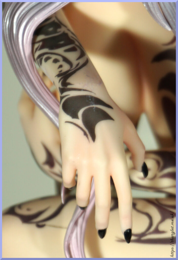
And here you can see the result of me trying to get her head on 😅 Unfortunately I’ve got some paint transfer from her hair to her arm – haven’t cleaned it off yet and didn’t notice until editing the photos. Will likely clean this off at some point, but goes to show the frustration I had assembling the dang thing.
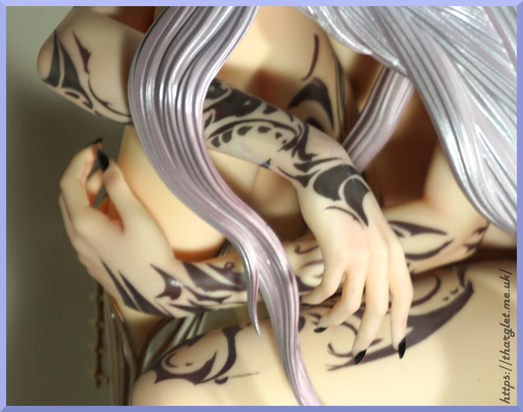
The tattoos are nicely detailed here and complement the figure well.
Hands:
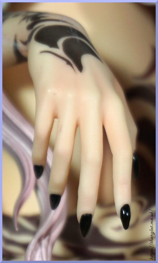
Her hands are nicely shaded with some red tones. Not sure if they were trying to give her cuticles on the hand holding her leg, but the painting looks a bit off here especially on her middle finger. It is a bit noticeable when viewing, but not massively so.
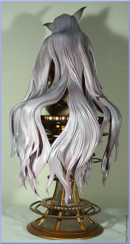
Back of her hair:
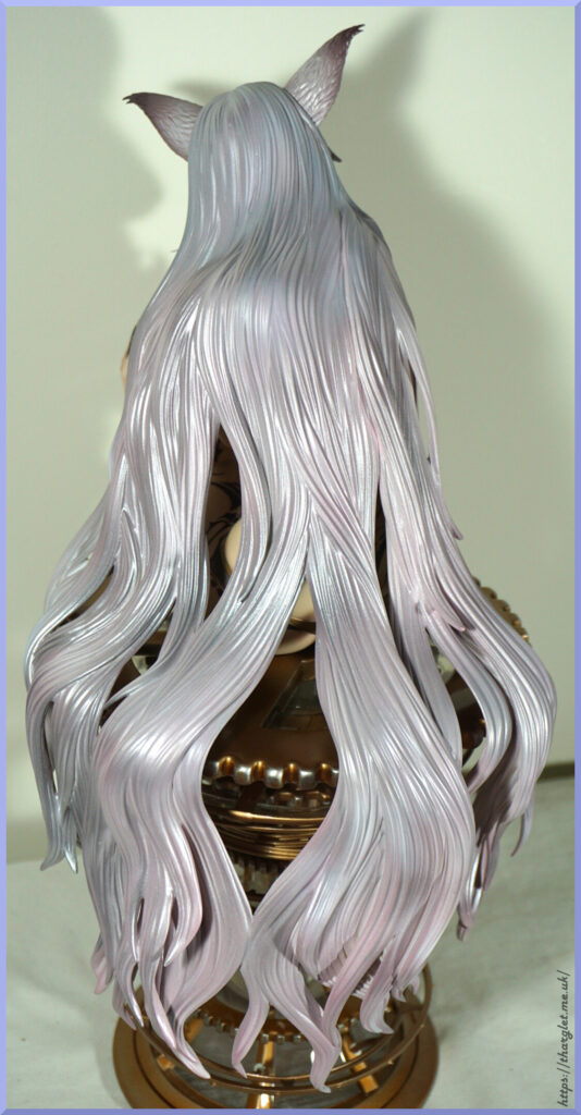
She has no lack of hair. They’ve done a decent job of adding sculpted strands to it, and it does fit around the base reasonably well if you get it in the right place. I do like the way it flows around the base, but wish you could put the back of the hair on separately or it was PVC+ABS with lots of plasticiser so that you could at least bend it so it wouldn’t get in the way so much when trying to get her head on.
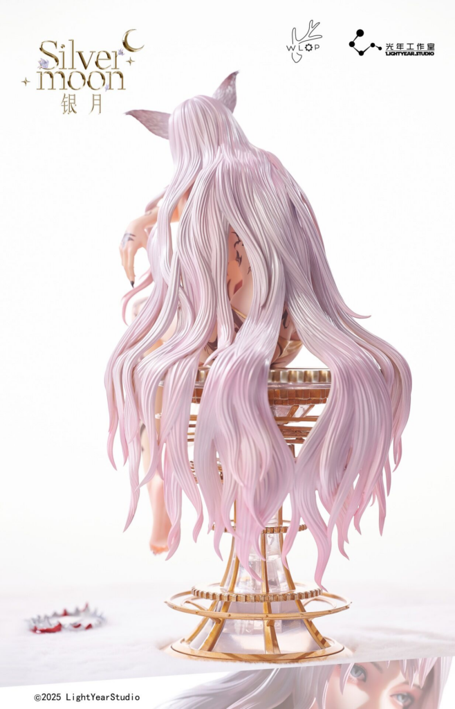
I like the silvery tones, though if you were expecting the colours from the promo this may be disappointing. She is called Silvermoon, so having silvery hair makes sense but the promo was very much pinky in tone:
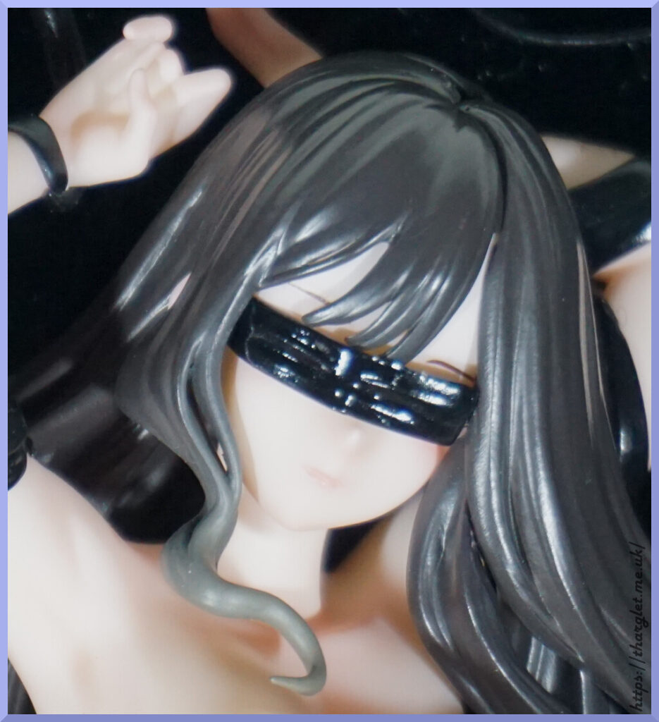
Pesky strand:
This piece you slot between her legs whilst building up the figure, and it connects into the head. I came so close to leaving it out. You could probably get away with not having it, but I didn’t want to be defeated. You can see it from certain angles but honestly I wouldn’t have noticed it if they omitted it.
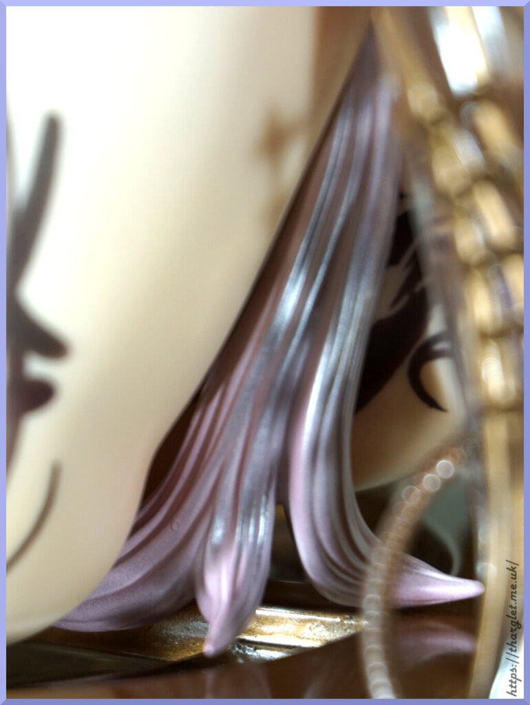
Organic leg:
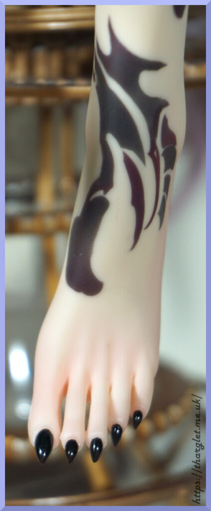
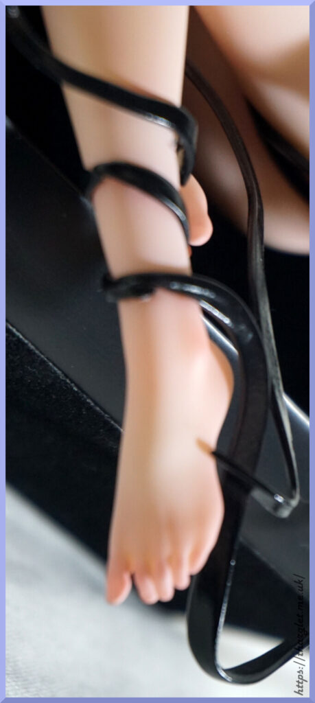
More of the painted colour-varying tattoos here. Her toenails are better painted than her fingernails and the cuticle effect works better here. The toes actually have gaps between them, which is relatively uncommon for figures unless they’re spreading their toes.
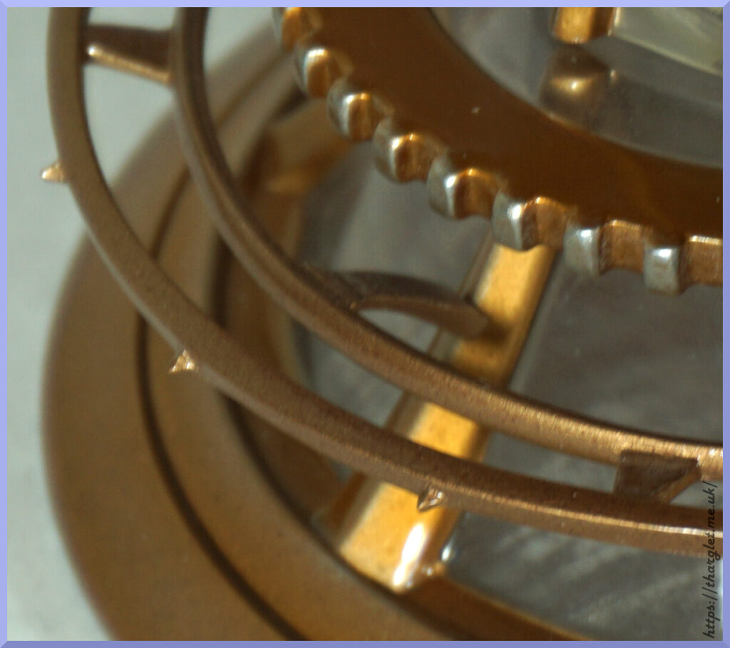
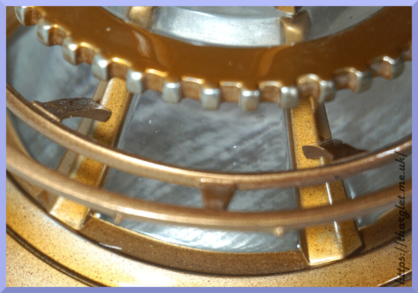
Machine leg:
Love the look of this part. They blended the gold and clear parts well, and captured the machinery look of it.
Only one issue for me:
This part you have to putty in and it doesn’t tell you which way up to put it. You’ll see at the top where I put a little too much putty. I tried putting it in without putty, but nope, no friction whatsoever. Rather disappointing to have to putty in a piece like this – I’m not sure why they couldn’t make pegs that would stick into the leg without putty but oh well. This part came packed with the putty – the instructions don’t tell you to putty it, but it being bagged with it tells you all you need to know.
And the extra piece:
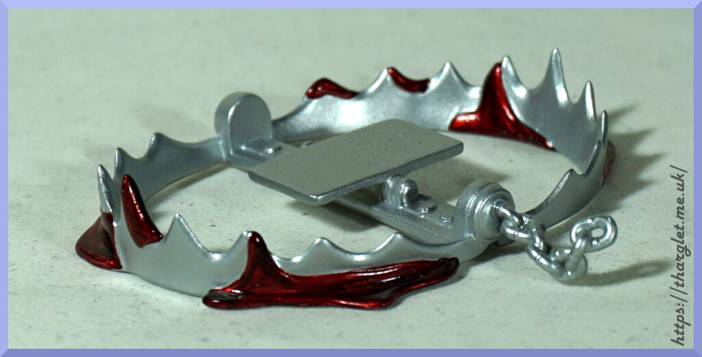
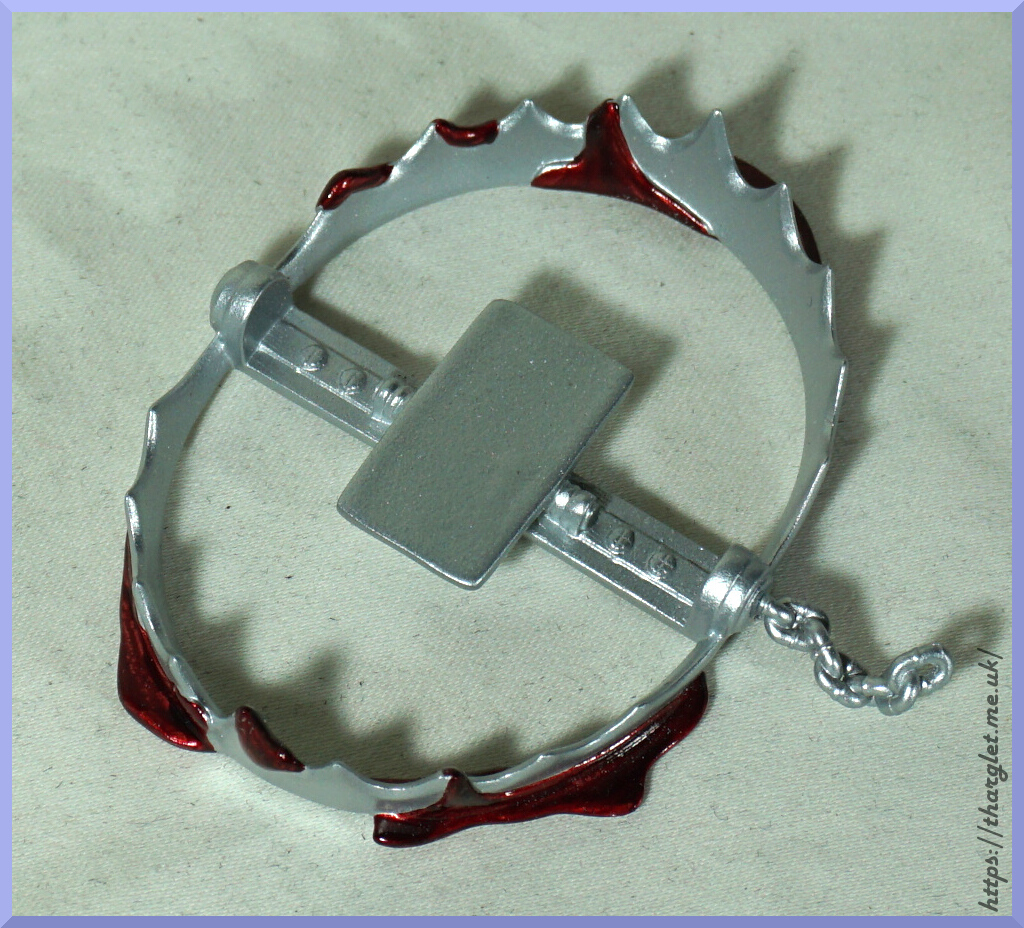
I know it’s in the original art, as an explanation as to why she has a mechanical leg, but I feel this piece is very “ehh”. The whole thing feels like an afterthought – the sculpting and paint seem very so-so. Might use this with a Nendo or something, don’t feel too inclined to place it with the figure. It’s only featured in the blurred background of the promo images so didn’t realise this even came with it until I unwrapped it and went “what’s this?”. I’m not against macabre elements in figures (and I do own a bunch of horror-themed figures, including Clive Barker’s Tortured Souls), but I just don’t feel it really fits to have it there with the figure. Just feels odd and misplaced especially when it doesn’t match the quality of the main figure. The blood looks good, but the trap itself is only one shade of silver which really makes it look brand new and/or kind of cartoonish, which doesn’t fit with the whole it chomped her leg off.
Conclusion
Another look at her again:
I think if you go in with no expectations and didn’t have to wrangle the assembly, it’s a striking looking figure with a decent amount of detail and of a good size. There’s certainly a lot of little details to appreciate but I’m not sure it quite fulfils the quality at this price point – assembly being a massive sticking point.
Compared to her promo image, the base feels a bit less premium and she’s a lot less pastel. I don’t think it deviates too much from the promo images but the pink hair is bound to disappoint some people I reckon. The tattoos are one of the main factors that set this figure apart from others, so paying the same price for the unadorned one seems rather crazy to me. Yes, you do get the mechanical leg but I don’t think that’s enough to set it apart from other figures at this price point unless you really don’t want tattoos on your figures.
For people who ordered on the basis of the artwork, I expect there will be disappointment from that angle. She’s not the soft, fluffy creature she is in the art though the promo images didn’t promise this. We’re also missing the spider and butterfly in the original art. Most of the differences versus the artwork were in the promo image so I expect most people wanting the art as a figure will have simply avoided ordering if it wasn’t similar enough.
Overall would I recommend this figure? Probably a no at its price point. If it was closer to CN¥2,000 then I’d say it’s a flawed figure but if you like what you see and prepared to wrangle it then go for it. I would have preferred it if she wasn’t so expensive, but happy to have her in my collection now that she’s constructed. It’s a striking piece that I don’t think matches with much in the market – would love to see more heavily tattooed female figures.