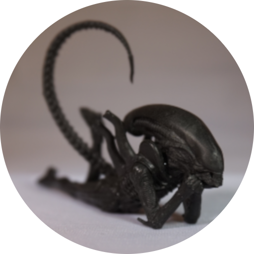
This figure I came across on a work trip…. then had to use my best Tetris skills to fit it into my luggage… being an EasyJet flight, I only had the one case to work with… but I did it!
So here he is:
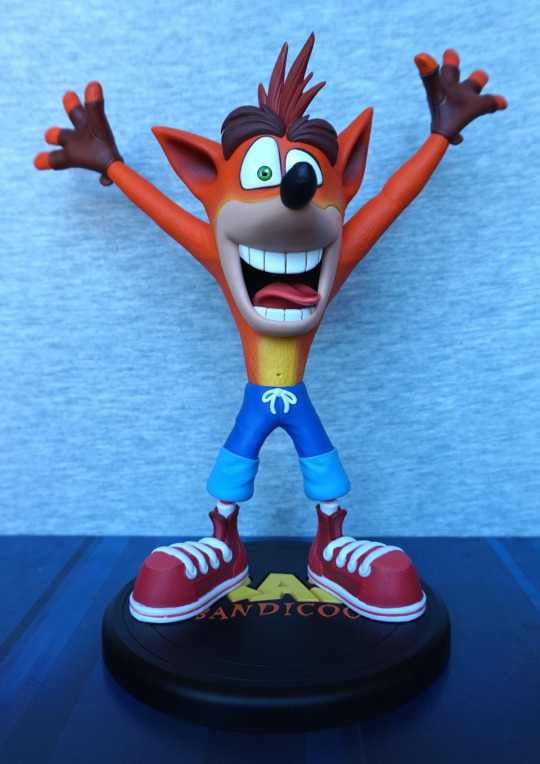
I love the clean line and bold colours. Certainly a figure that will stand out on most shelves. The painting is neat, and I love the sculpted tongue.
Face close-up:
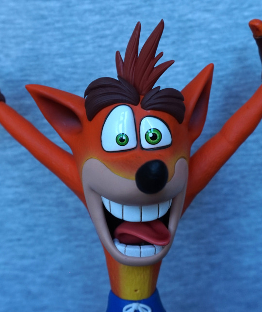
I like the way they’ve blended some yellow paint around his mouth, to add some shading to his fur. He also has super-shiny eyes to contrast with his skin.
Left:
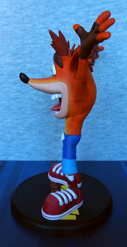
He looks good from the side, even with the cartoonish proportions. I think they’ve done a good job with his body shape.
Right:
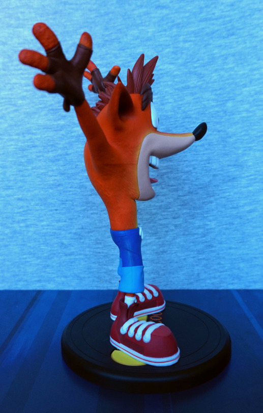
Looks good from this side, though you can see a seam on the side of his body. Looks a little odd, but not hugely noticeable. His shoes look good and are neatly painted.
Back:
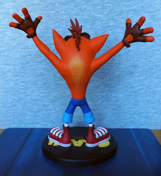
From the back, you can appreciate the fur texture he has. They’ve also painted a light orange area on his back, so it isn’t totally plain back here. His gloves look good – the straps are well sculpted, and there’s edging around the edges, on the fingers. He’s got a couple of creases in his trousers too, which adds to the detail.
Base:
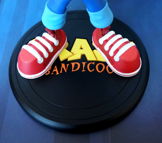
Sadly you can’t see much of the logo, but what’s visible is printed crisply and looks good.
Overall, I’m really happy I managed to get him home in one piece. I love the colours and the pose, and would recommend this figure to a fan of the series.
