Tag: neca

Alex Mercer – Prototype

This little Mercer was a promotional item, so was a nice random find at a not-very-good con. This was the only figure I bought at the con, as there weren’t many stalls there (wasn’t much of anything tbh…) and most of them were local artists. They had an “artist’s alley”, but the entire con was pretty much artist’s alley… Nothing wrong with having a lot of artists, but it would’ve been nicer if there was more variation there. 

Anyways… enough drivel about a con of a con in the UK… 

Here he is:
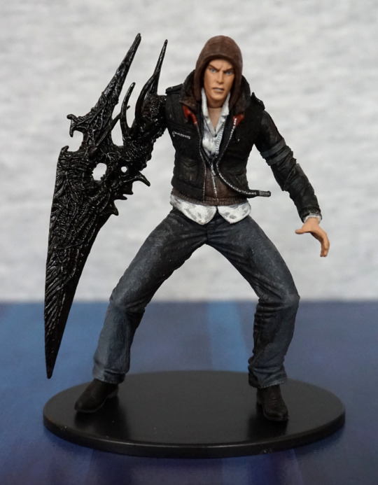
Cute-sized Alex Mercer, d’aww. The detailing is nice, and the paintwork is nice and neat. I like the way the three layers of his clothing have been sculpted, and his virus arm. 

Claw arm:
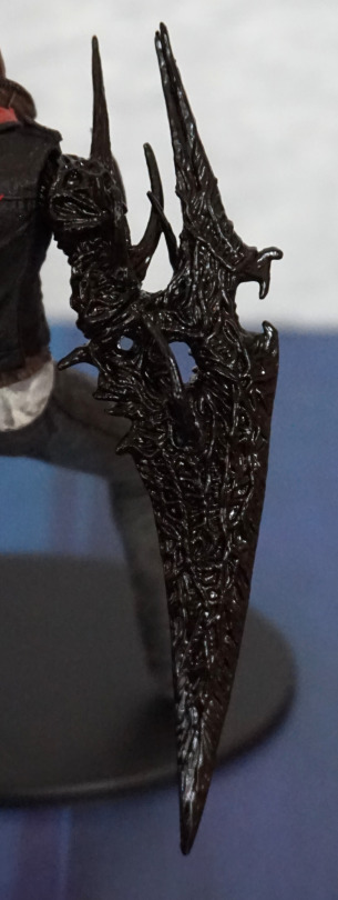
I love the texture on this, and the glossier finish, which makes it have a more organic appearance. 

Left:
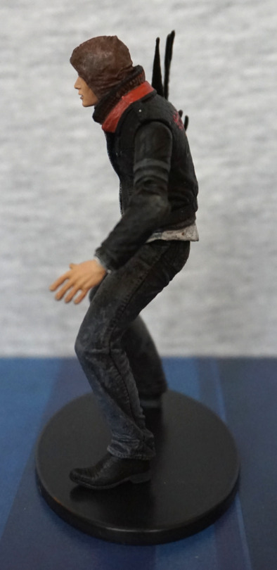
Here we have his normal hand, I like the way they’ve posed his fingers, so it looks like he’s about to spring into action. The seam in his jeans has also been well-sculpted, along with the stressed-jeans paintwork. 

Right:
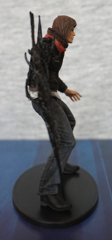
Clothing looks good on this side too, love the creasing detail in his hood. 

Back:
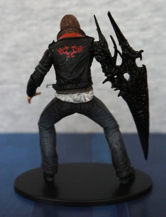
The pattern on the back of his jacket is nice and crisp. The dirty shirt effect feels a little overdone here, but isn’t really a big part. Some red paint has crept onto his collar here, so the paint at the back did get a little sloppy.

Double the Alex, double the fun!:
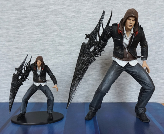
This guy is actually a smaller version of a larger figure that NECA produced. I bought the larger one years ago, but was never able to get the small one for a decent price, due to its more limited nature. Both have the same sculpt and articulation, so this Mercer is one that’s been shrunk in the wash :P. 
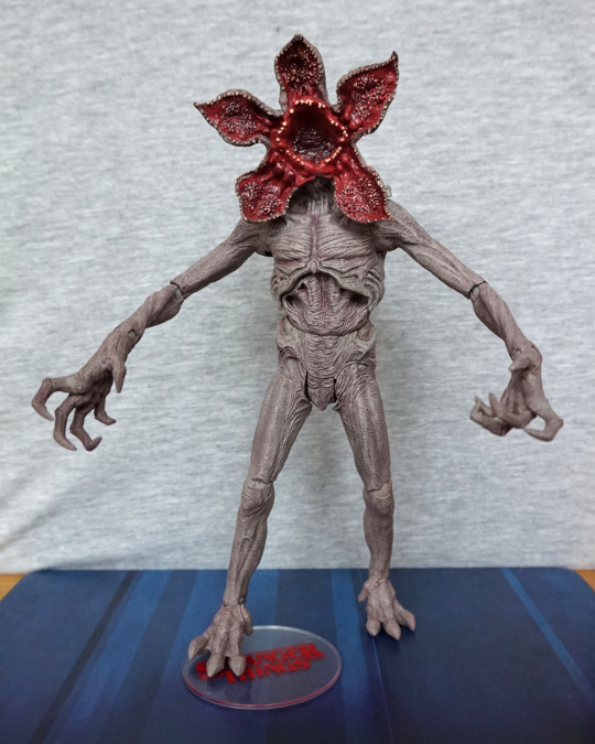
Demogorgon – Stranger Things

This is a figure I aimed to chase down on release, and found it at a local comic book store for a good price.

So here he is:

image

Love the paint on his erm, face? The body paint is also really good, and gives the figure extra depth and detail. 

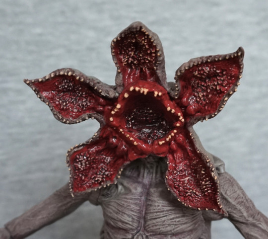
“Face”:

The teeth are done well, and there’s some lovely blending in the red paint. Love the fact they’ve added the bony protrusions on its “leaves” as well as having he teeth ring. Wouldn’t want to get too up close and personal with that!

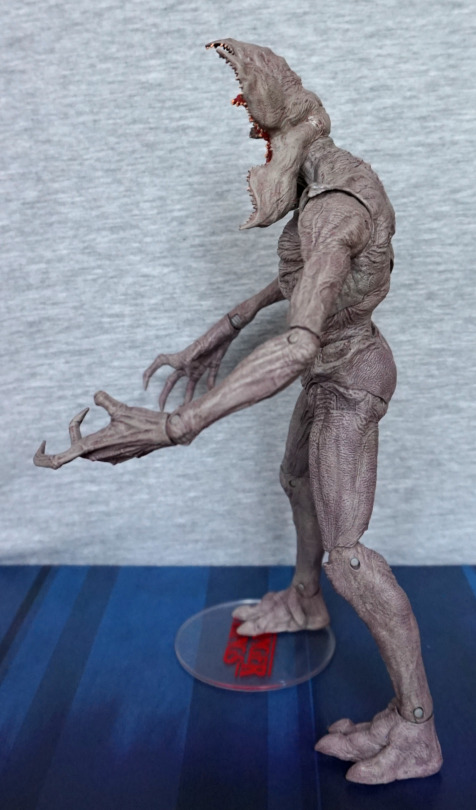
Left:

image

He has been textured well throughout, and I like the clawed hands.

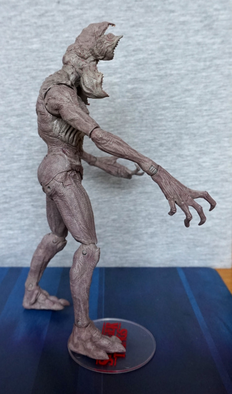
Right:

image

The textures and colours are good on this side too. Joints blend in decently well, where they show. 

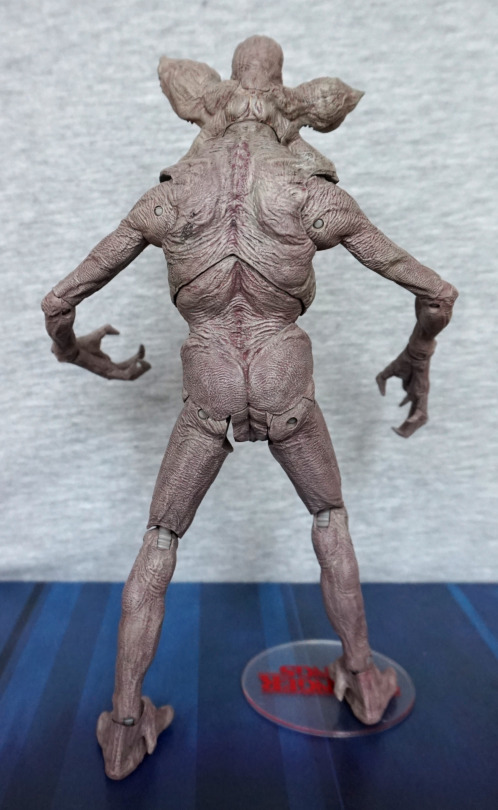
Back:

The leg joints are very square. It looks fine when he’s standing straight, but moving the legs at an angle like his left one is in this shot… looks a little odd. Again, the texturing is very good. The rest of the joints have been made to not stand out too much, so it’s just the leg joints that are an issue. 

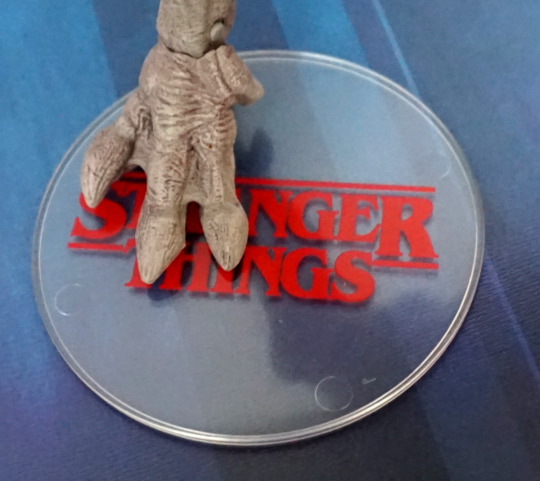
Base:

The base has the logo on, but however you pose him, it’s going to obscure a good chunk of the logo. I like having a logo on the base, but feel it’s kind of pointless if the figure’s foot is going to cover it… still, it’s a nice touch, even if it isn’t the best execution.

Overall I really like this figure and glad I got him. Think he’s a bit prone to fally-over, but I’ll find out over time. He doesn’t seem too hard to balance, just that you will have to balance him to ensure he poses OK. If you wanted him in more of a fighting position, you may want to invest in a claw stand. Really glad I got him. 

Figure Spotlight: Diablo

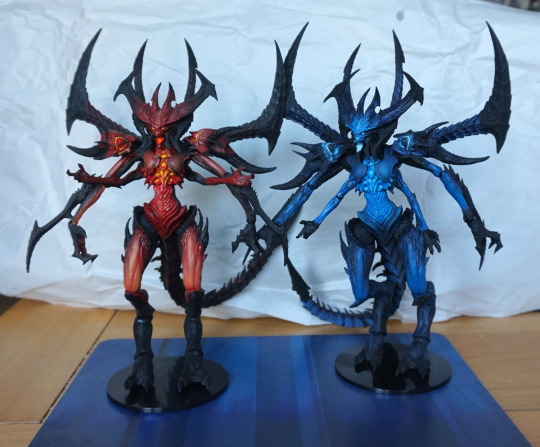
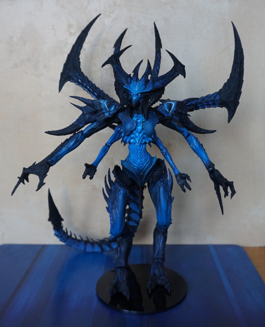
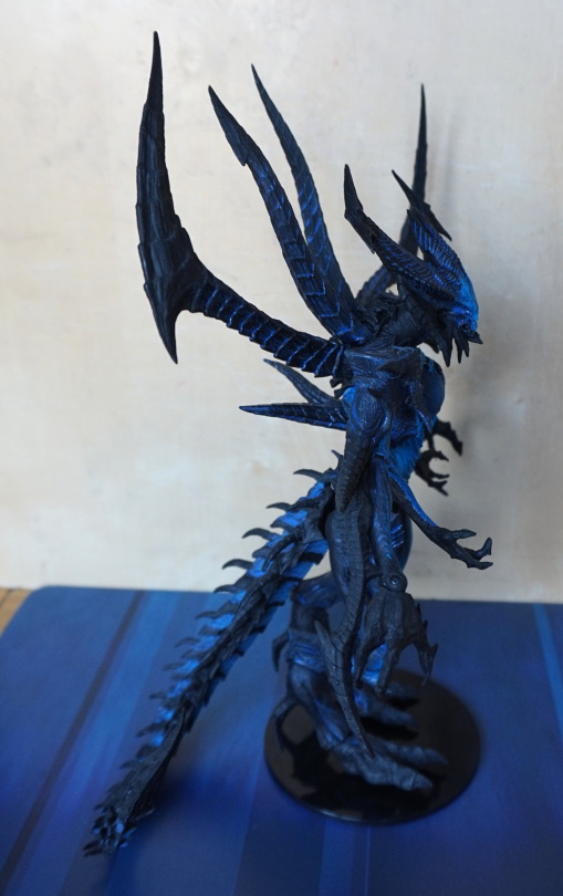
I have both the Diablo figures by NECA – one is “normal” Diablo, other is Shadow of Diablo. Here they both are together:

image

The normal Diablo I got as a gift, the Shadow of Diablo I ended up paying a fair bit for, as it got customs’d. Both figures are from the same mould, with different paint jobs. 

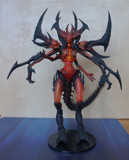
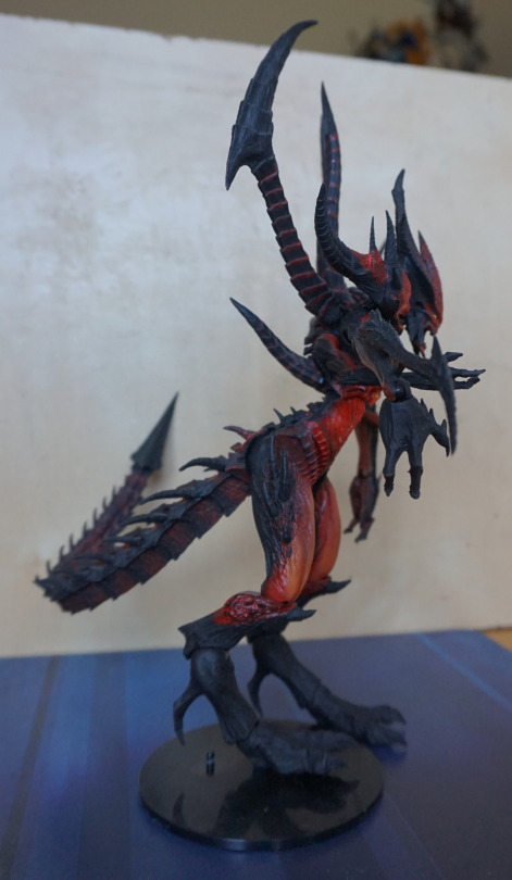
The normal Diablo:

image

The paint job on this one is quite striking – the yellow and red contrast nicely. The figures are decently poseable – along with the usual articulation, his shoulder parts move, his back spikes move and his table is bendable. 

Here’s a shot of his side:

image

Not too much to see here, though one thing here is to note he’s not on his stand properly – both of these figures are prone to falling over, and the peg is not long enough to hold him in place at all. This sort of makes the leg articulation useless, as you can’t really pose his legs in many positions without him faceplanting. Usually I have him leaning against the wall to prevent him from attempting to skydive. 

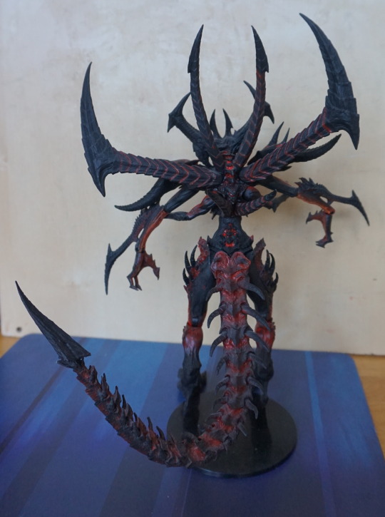
Back view:

image

Nice paint job here too. Tail is poseable, but it’s kinda awkward to move it around – the wire is quite stiff. Now to leave this Diablo munching on the wooden backdrop, and look at Shadow of Diablo:

image

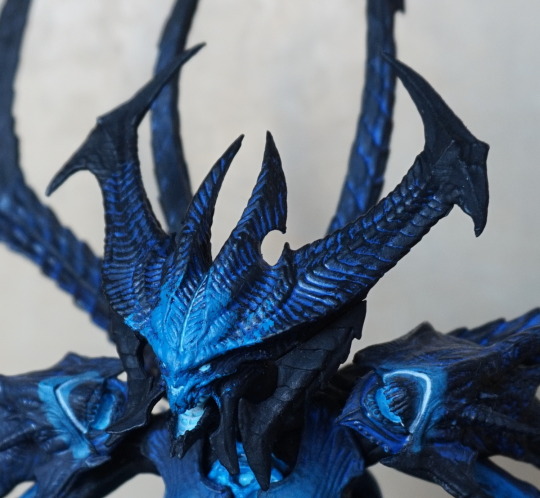
This guy has a reasonably striking appearance from afar, but does not stand up to closer scrutiny. Close-up on his face:

image

 The blue wash appears messy, where it blends into the black parts, and the shoulders don’t look as well blended as the ones on the red version. Whilst the blue paint does feel more sloppy, I’m not sure if the paint itself was partially a factor in the figure’s paint flaws. There’s less colours to play with here, though NECA is known for doing sloppier paint jobs towards the end of figure runs. 

Here is his side:

image

Not much to say here – looks rather like the original version, only blue. 

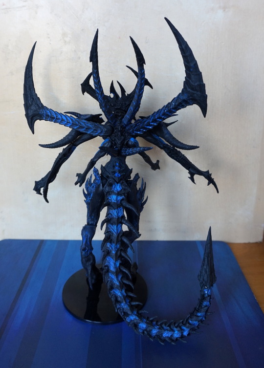
The back:

image

Here you can see the blue wash being uneven on the two outer back spikes. Also if you look closely near the tip of his tail you can see two dots – this is the wire showing through :/. Pretty sure this was from the figure’s construction, where they haven’t embedded the wire correctly. Fortunately, it doesn’t show as this part is usually facing the wall. 

So if you have a choice of one or the other – definitely go for the “original” version. The blue one just doesn’t have as good of a paint job, and an image search seems to confirm it’s not confined to just mine (as well as some reviews from the time). Getting hold of either at this stage is likely to be an expensive proposition though. I believe the original RRP was £25, but good luck getting them for that now. 

Chatterer 18″ – Hellraiser – NECA

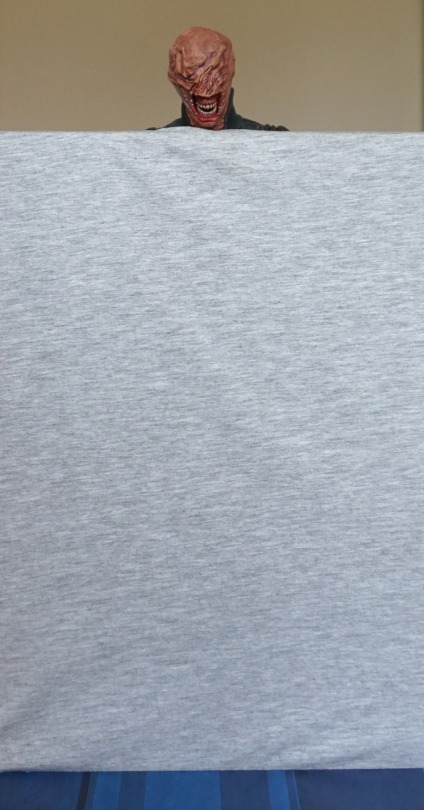
Now for my largest purchase of FACTS! In price, as well as size… 

Though I couldn’t use the usual backdrop:

image

… so I apologise if the photos are a bit meh today. 

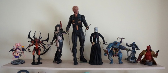
Here he is displayed on a shelf, showing how big he is:

image

Yeah, this dude towers over everything! 

So let’s get a closer look at him:

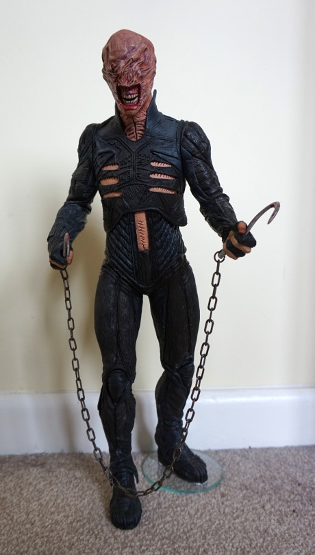
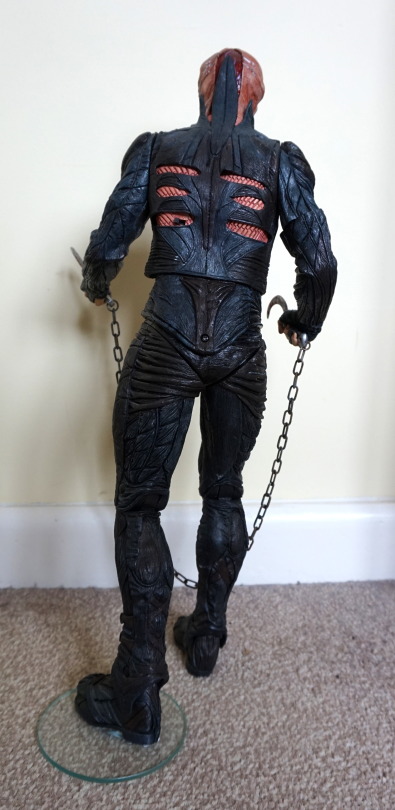
image

His top is leather, whilst the rest of him is hard plastic. The leather overlay on the top is a really nice touch. I got this figure cheap, as it does have a few flaws – there’s a paint scratch on his lip, and most of his leg joints were glued by a previous owner, as well as being glued to the glass disc. I don’t mind him being attached to the disc – it certainly helps him stand, but the joints being seized is kinda annoying. 

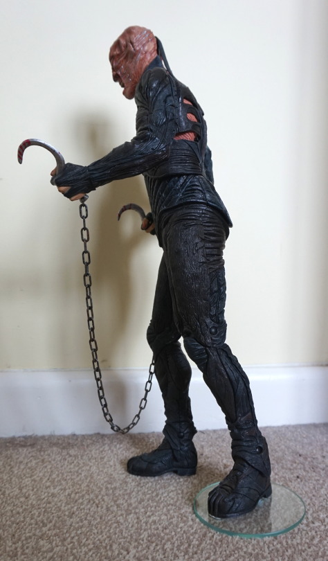
Left:

Detailing is nice on the arm, and a bit of a lack on the leg tbh. The halves don’t quite meet up in texture at the top. 

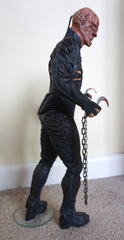
Right:

Here we can see better the arms have plenty of creases running round them, and various fake leather pieces making them up. Here the leg issue is better demonstrated – where crease lines don’t run from the back half of his leg to the front. The white dots are glue residue – I may attempt to remove these at some point, but this is from the haphazard efforts to force him into a stable position. 

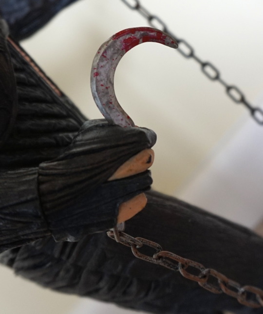
Close-up of one of his hooks:

The blood effects are nice, and the chain is plastic, with fake rust. Looks good though. The top half of the hooks slide into his hand, an the bottom of the hook is attached to the chain, and clips into the other half. These fit easily and nicely in his hands, so no issues there. His arms have full mobility, but due to the way the arms have been designed with particular orientations in mind, this limits poseability, if you want things to line up. 

Back:

Back looks nice, and the leg hinges aren’t too visible. The screw on his backside is where the batteries live (he has an action feature!) and the switch is there to turn him on and off. 

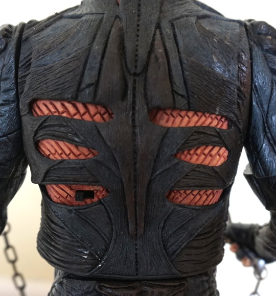
Close-up of his back:

Here we see the switch, which says Off-On above it, and the leather overlaid on his flayed back. Kinda wish more of the figure was covered in material (it’s a rubbery plastic made to resemble leather). 

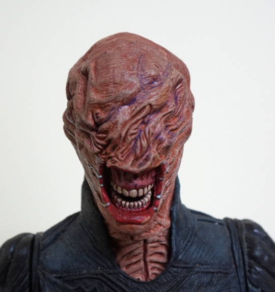
Close-up of his face:

Lovely amount of detail in the face, with the sculpt and the paint. Here you can quite clearly see the paint chip on his lip. I feel a lot of the detail in this figure is in his face. 

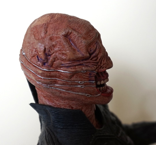
Side of head:

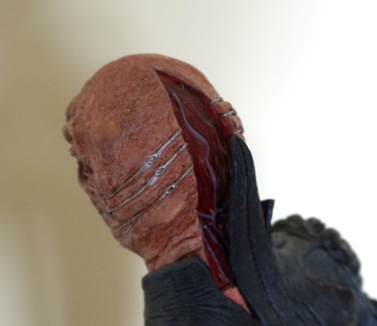
The metal wires have been well-painted, and moulded so they’re digging into his skin. 

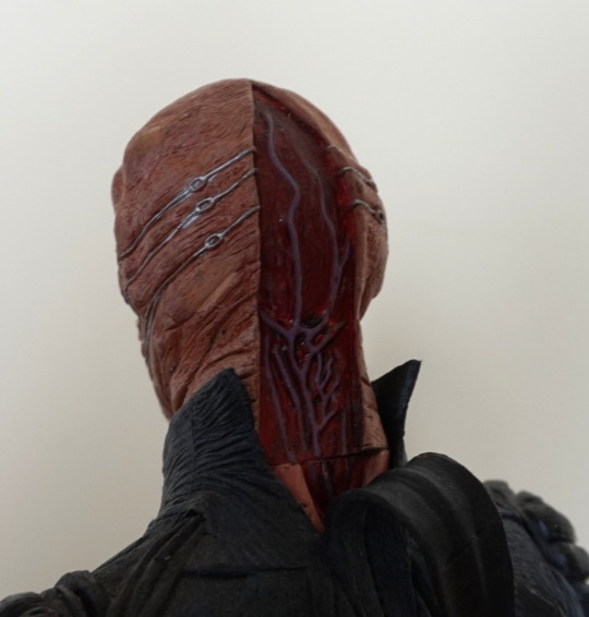
Back of his head:

His head is slightly rotated – if you have his head straight, the removed flesh parts line up properly. Love the veins shown in his head. I think they did a good job back here. 

So action feature… what would chatterer’s action feature be? Well, he has a motion-activated chat:

Initially, it didn’t work when I put the batteries in, and it turned out that one of the battery terminals were corroded. Currently they’re replaced with a piece of foil, as it was the one bridging the two batteries. Probably won’t bother replacing the foil, but was really glad to find he still chatters, even if the motor is a bit noisy lol. 

Lara Croft – Union Jack variant – NECA

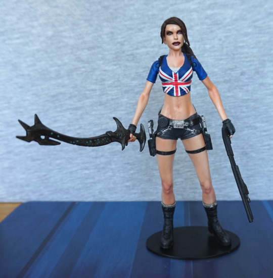
Last but not least from Forbidden Zone, Lara Croft in a Union Jack shirt:

Upon getting her out of the box, she has a platiciser issue, and her skin is quite sticky. Haven’t washed her yet. Had to buy her because… union jack. 

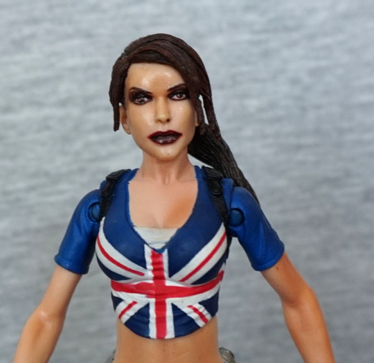
Close-up of her top:

Her hair they’ve tried to shade but not sure it worked. The texture seems a bit rough on her hair. Her makeup I think is a bit too on the severe side. Far off, the painting on her top looks OK, but close-up, it doesn’t really hold up. The neckline is particularly a mess, but there is some mess in the middle of the flag. The 

The shininess on her face is due to the plasticiser, and some of the uneven colour may be due to it too. If the makeup parts were done in a less severe colour, I think her face would look much nicer, and I wouldn’t have complaints about it. 

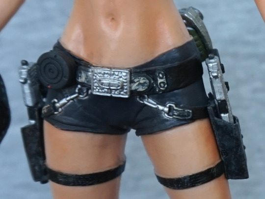
Close-up of her shorts:

Most of the painting is pretty neat. Some weathering effects, which is a nice touch. And a nice-looking belly button :). The guns can come out of the holsters – they start off in the blister, or she can hold the pistols. 

Empty holster:

They’re rubbery and hold the pistols quite well. They need a bit of a shove to get in there fully. 

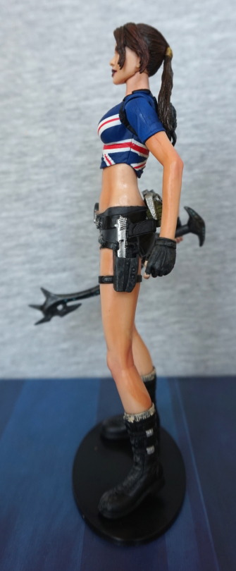
Left:

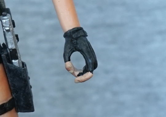
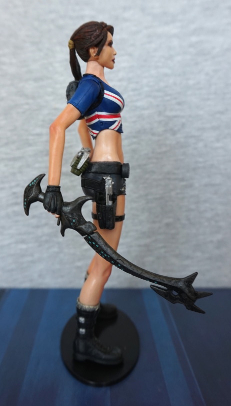
She looks good from the side. Some weird orange line on her leg – not investigated if this is plasticiser effect, or if it’s painted on there. Unsure if deliberate or not, could be mud… Here I’ve taken the shotgun out of her hand, but here’s why you kind of need a weapon equipped:

Yeah. You can face the back of her hand forward, and that doesn’t look as odd, but the hands are moulded for holding her weapons, so you can’t do too much with them if she hasn’t got a weapon in her hand. Would’ve been nice to have some fists/flat hands so she didn’t look odd when not holding a gun or the sword. 

Right side:

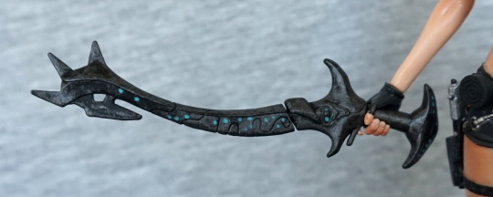
Looking a bit sunburnt on this side, lol. I love this interesting-looking artefact weapon. I should probably really know what it is… 

Close-up of the weapon:

Love the blue dots on it, and the intricate design. 

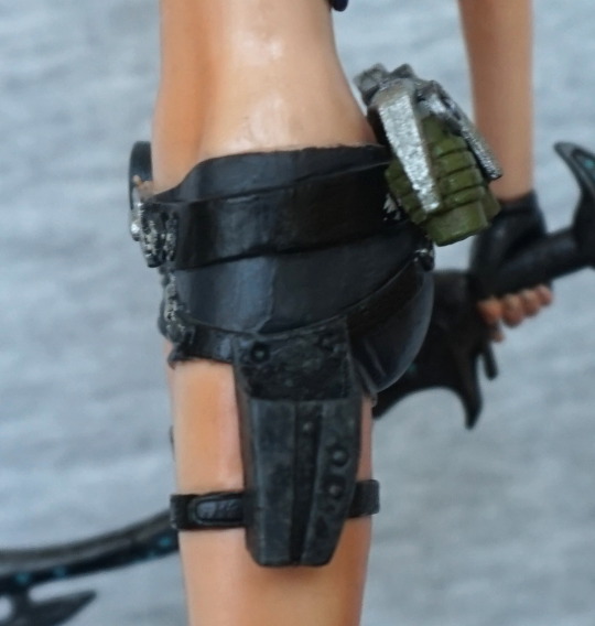
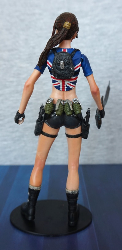
Back:

Some mottling, which might be the fault of the plasticiser. But it does look like she’s been out adventuring to me :)> Plenty of grenades back here to fend off the beasties. Love her backpack – this has been well sculpted and painted. Hair still looks a little rat-tail though. 

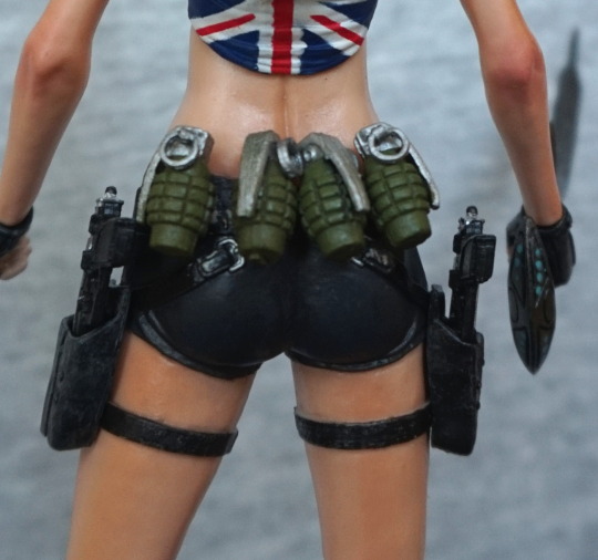
Close-up of the grenades:

… and her backside. Not too much of a backside view, due to the accoutrements on her belt. The grenades look good, and painted neatly. 

And the last of her arsenal:

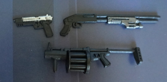
Pistols look OK, shotgun is painted OK, but the backend I think looks like it has been through a steamroller – I guess to make it thin enough for her to hold. Also not sure it’s actually faithful to any of the games? Grenade launcher looks… eh. That one is going into storage. She can’t hold it well either. And another point about holding her weapons – she seems to like to practice trigger safety, and it seems hard/impossible to get her trigger finger into the trigger guards on her weapons. Kinda like the weapons were a bit of an afterthought. Pistols look good in her holsters, even if they look mediocre out of them. And she has that sword to wield, which is the favoured option for me. 

Overall, I love the look of this figure and did a good job for the most part, just a shame about some of the more major paint flaws. Also she has very little articulation in her arms, which severely limits posing. However, I’m forgiving of this – with older figures, the elbow joints tend to suck massively and show far too much, so this is the better option. Would’ve been nice to have some replaceable hands, and dispense with the kinda crappy looking guns.