Tag: play arts

Behemoth King & Marlboro – Final Fantasy XIII

These pair of creatures I picked up cheap at a Hobby Off, without boxes. I was impressed with the prices in the Hobby Offs I visited, even if they didn’t do tax-free shopping.

Firstly, let’s have a look at the Behemoth King:
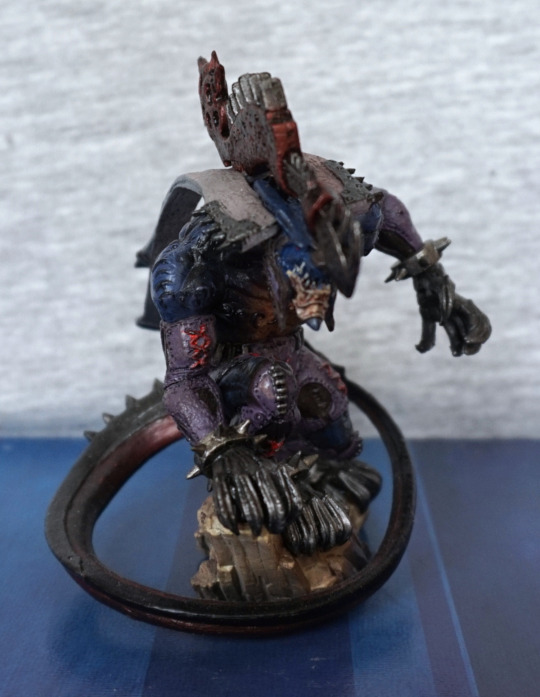
Looking at these creatures close-up, there are many small details to be seen, such as the stitches on his sleeve, and the metal edging on his shoulder… ribbons? His tail curls around him nicely, and for this figure the “front” isn’t the best viewing angle, but you do get to see his face.

Left:
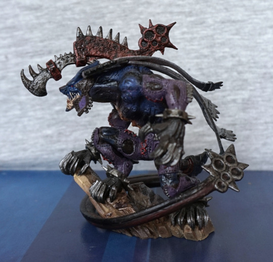
This I would regard as his viewing angle, as you can see mos of his pose. Here we see his tail has a heavy metal end that I’d definitely not want to tangle with! The muted blue and purple colour scheme works well, and definitely counteracts blandness in colour design for a creature, without going full-on fantasy. I also wouldn’t want to tangle with the clawed gloves he seems to be wearing on all his limbs. The weapon on his back is also nicely sculpted and painted.

Right:
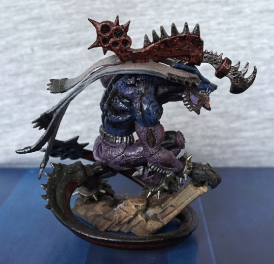
Here we can see he has a good amount of shading in his back paint. The rock “stand” is largely visible from here, and the textures and colours on it are nice and feel like stone. The ribbons on his shoulder look like they are blowing in the wind, which is a nice touch.

Back:
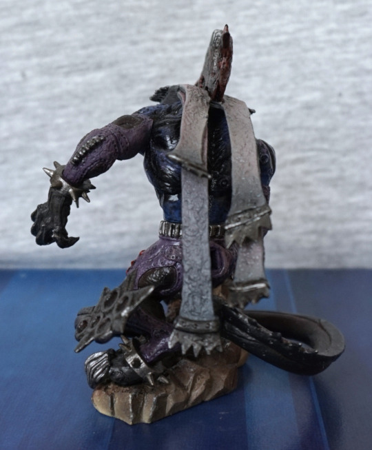
Here we can see the ribbons (as I’m calling them…) are textured nicely and are shaded down their length. Also liking the spiky collars on his wrists/ankles.

Overall, I’m impressed with the quality of the sculpt and the paint for this figure, plus I love his overall design.

Now for Marlboro:
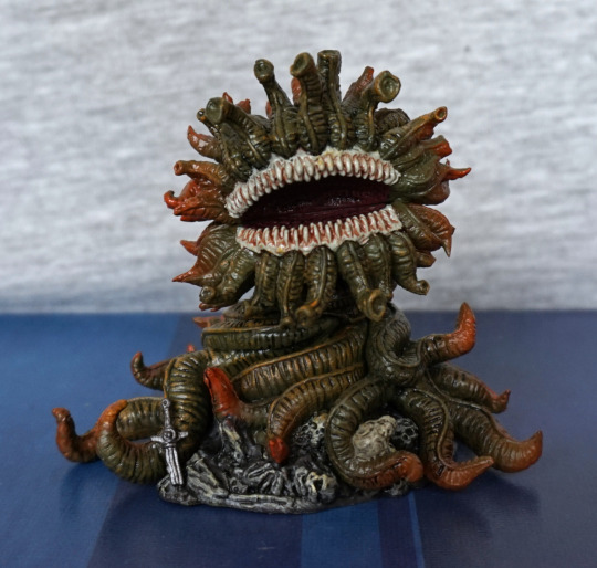
My research revealed, that yes, his name is a reference to the cigarettes, as he kills you with his stink. I love the detail of this creature’s design, and the muted colour scheme. He also feels kinda cute to me, by monster standards. Here we see him looking like he’s wrapped himself over a dead adventurer, who still had his sword. I love his big, gaping mouth, with all its teeth. The paintwork is quite detailed around here.

Left:
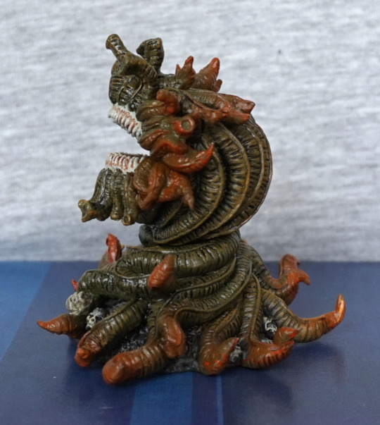
Here we see His Plantiness has orange tips on all his extremities. I like this touch in his design, and the paint seems blended well with the green, so there isn’t a harsh transition.

Right:
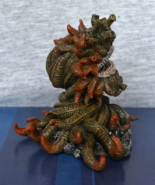
Again, more orange-ended tentacles, plus some skulls beneath him. Yeah, don’t think I want to tussle with those teeth.

Back:
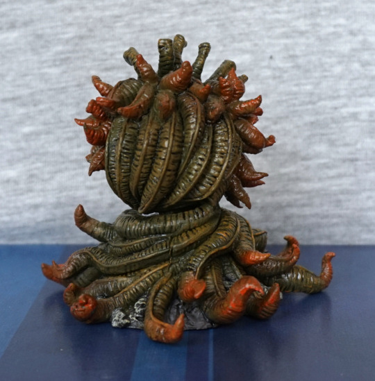
Here we see an obvious join about halfway up his back – this is the only noticeable flaw imo. Here he also has some yellow accents on his vines, which adds some depth and detail to him. I think a decent amount of detail has been put into his sculpt, and definitely gives him a plantlike appearance.

Overall, I’m really happy with this figure too. On a personal level, I think Marlboro is my favourite of the two, but that’s down to creature design rather than quality. I could recommend these figures, who would like some more creaturey small figures in their collection.
Vaan – Final Fantasy XII – Play Arts

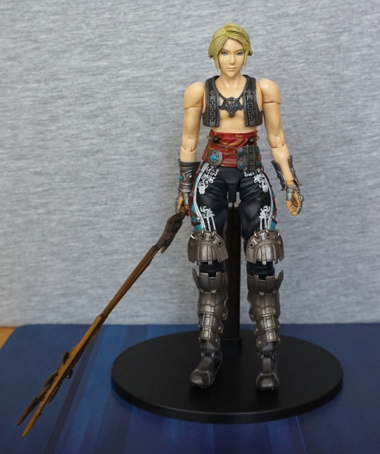
This is the second of the two Final Fantasy figures I bought. Vaan:

I was less enthralled with him, as his joins on his arms have nothing to hide them. Not a big fan of articulated figures where the joints are visible in the fleshy parts. But his outfit makes up for this – I love the white design on his pants, and his medallion. I love the amount of details in his clothes, even though he has less of them than Ashe. And my collection could do with some more bare-chested males :P. 

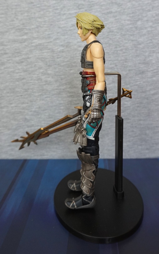
Vaan’s left:

His gauntlets are nicely moulded and painted. The elbow joint isn’t so bad, but the shoulder joint does make it look a bit like he’s had a shoulderpad implanted in his flesh. His hair looks more natural than Ashe’s though.

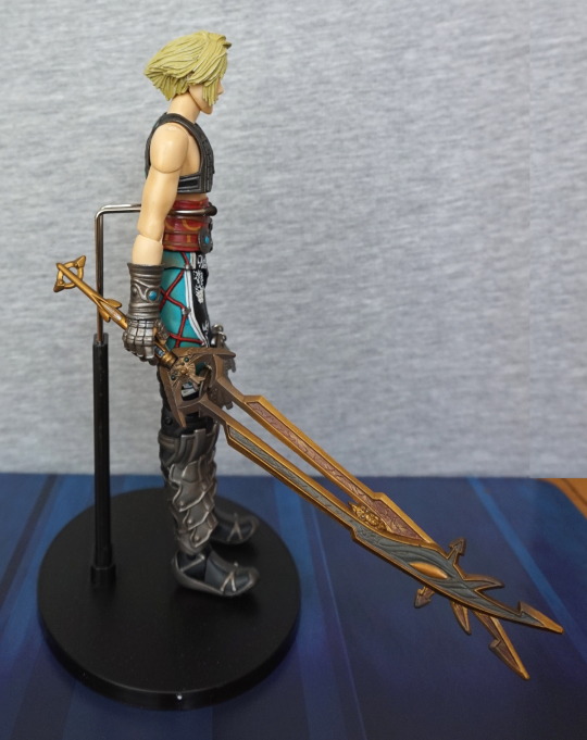
Right side:

I love the strap detailing on his trousers, and here we can see his sword, which is equally as impractical and ornate as Ashe’s. 

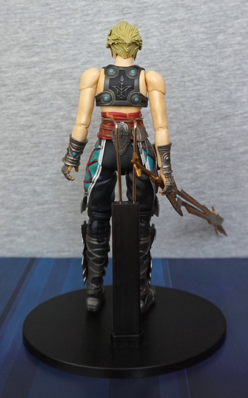
Back:

Love the back of his chestpiece. His butt is nothing exciting, but he has some well-moulded wrinkles in his trousers, showing their bagginss. Hair nicely finished at the back.

Close-up of his sword:

The hilt of the sword was broken away from the upper blade part, so the break location was about as good as you’re going to get. However, I couldn’t feel a “true” position for the hilt to line up with the other part correctly, so I had to glue it the best I could. Either the break’s been repaired before, or possibly some of the plastic has rubbed away. So I got it as straight as I possibly could, and it doesn’t really show too much. Depending how I pose him, the wonk won’t be terribly obvious, but I guess if the break annoys me, I’ll have to split it again, file down the surfaces until flat, and re-glue. 

An unexpected, but welcome pair of figures to my collection. Really happy with the detail for the price I paid. These figures seem to be reasonably cheap online, but not quite as cheap as I got them for. I would recommend these figures if you like their looks, or into the characters, and don’t mind the articulation points. 

Ashe – Final Fantasy XII – Play Arts

I found two of these Play Arts figures for sale for a good price at a local store. I debated over just buying Ashe as I liked her appearance, or if I should buy both and sell one. 

In the end I’ve decided to keep both, as I wanted to keep Ashe, and it turns out Vaan had a broken sword (probably been broken for some time, looking at the break), and he was a good looker too. They were definitely both secondhand, as there was a good amount of dust on their stands, and the figures themselves. A quick visit with the duster fixed that though. 

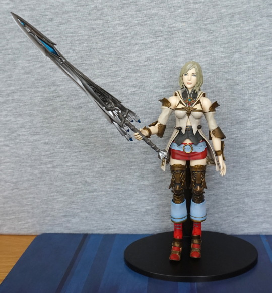
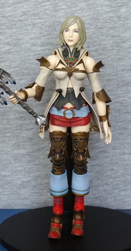
This blog will be about Ashe:

image

I love her outfit, and the sword designs are amazing. Let’s get a little closer and look at Ashe’s outfit:

image

The hair paint & sculpt isn’t anything amazing, but I can forgive that for the rest of her. The outfit is sufficiently detailed and well-painted. The colours are striking and complimentary, which is what drew me to this figure, along with the metalwork details. I guess it took her a long time to get dressed in the morning though!” That’s a lot of clothing pieces to put on! 

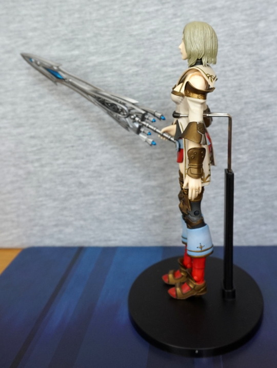
Left side:

image

She has a ring on, which is painted well. A small detail on the cuff of her boots too. Despite the sculpted nature of the hair, it just doesn’t look quite right somehow to me. 

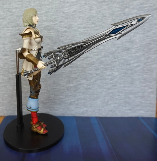
Right side:

image

Not much to say about this side, but we can admire the massive sword for a bit. 

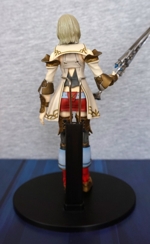
Once you’re done, here’s her back:

image

The attention-to-detail on the front has been carried on around the back. Her outermost top also splits at the back, allowing you to see the lower layers, which is a nice touch. Can’t let those layers go to waste! I’ve managed to cover up the gold trim pattern on the outermost layers in most of the shots (doh), but they’re nicely painted, and I like the pattern. 

A close-up of her sword:

image

I’m a sucker for the blue crystals embedded in her sword, and I love the ornate, if impractical, design. I’m guessing it uses some enchantments to be useful in battle, lol. Maybe I should play/watch someone play some Final Fantasy…