
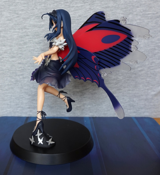
Found this randomly on MFC, and decided I ‘needed’ it. So went and found it on Mandarake and ordered it:
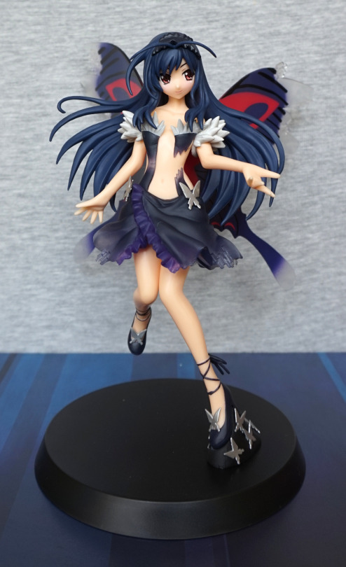
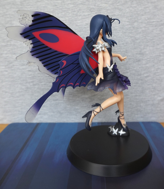
I love the pose of this figure, and the partially transparent clothes. Not a big fan of the split in her dress on her left side – would’ve preferred this to be whole. Her hair isn’t as dark as it should be imo, but it still looks pretty, if not really accurate.
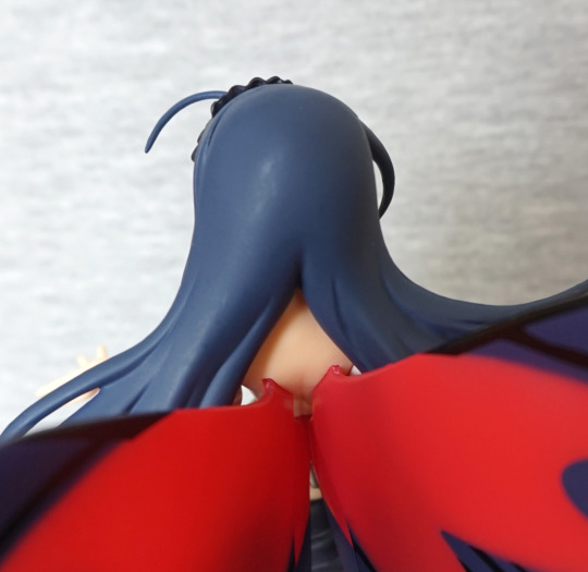
Close-up of her face:
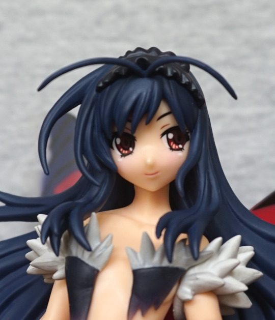
She has a cute face, nothing special. Her frills don’t seem to be white, but I think this is for the best as they’d clash with Kuroyukihime’s clothes too much.
Dress close-up:
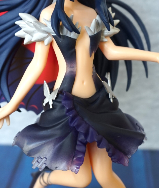
The fading is really nice, but the plastic does give off prize figure vibes.
Shoes:
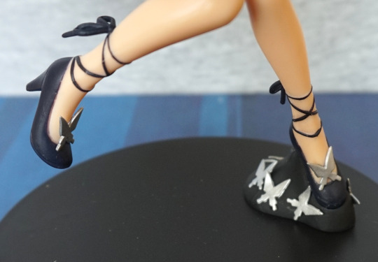
Love these cute heels and the ribbons around her ankle. They’ve put some of the butterflies on the base, which give it an accent.
Left:
Here we can see her wings – I think they were a nice idea, but didn’t quite work in execution. The contrast between the colours doesn’t make them blend well and don’t match with the style of the figure, which I think is a bit of a shame. There’s a nod to matching with the fading, but it’s much sharper than the clothing, which doesn’t help it match. A smoother fade would’ve helped them look nicer too imo.
Close-up of the wings:
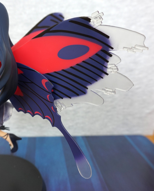
Here you can see the fade better – towards the bottom is decent, but not a fan of the upper wing portions. Looking at the lines like this, I much prefer the lower part, where the lines are much thinner and closer to each other, than the scribbled business going on at the top.
Close-up of her skirt:
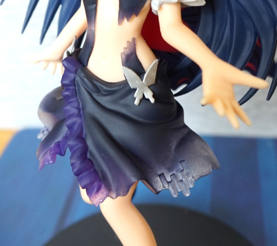
Here we can see the clothing break, which doesn’t look realistic, and I rather they didn’t do this. Fade on the back part of her dress probably is best admired without close scrutiny.
Foot:
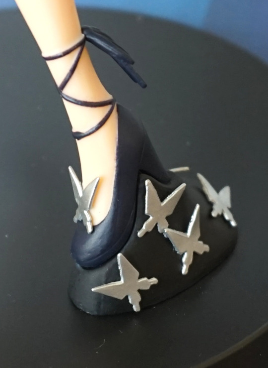
Here we get a closer look at the butterflies on the base – simple but effective. Her foot is glued to this part of the base, and this slots into the round disc.
Right:
Her arms are posed well, and give a good sense of motion. Here we have some derpy black lines at the top of the upper wing. I think Kuroyukihime would’ve spent more time designing her wings to get them looking good than the artist did here. Bottom wing is more Kuroyukihime.
Back:
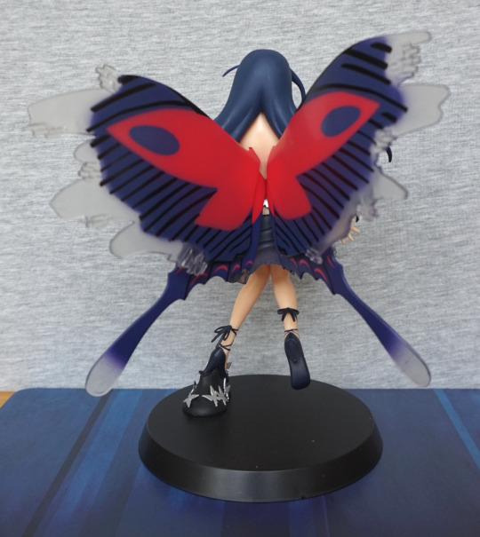
The wings are quite striking from this angle. I like the use of colour, but I think the pattern could’ve been neater.
Close-up of the wing joints:
No real blending here, as they slot into her back as four separate pieces. They were a bit of a pain to get in – you have to be careful to not knock other ones out whilst doing it. Also, don’t be surprised if you have to heat her back up to get them in. Once in, they haven’t fallen out though.
Overall, I think she’s a striking display piece, who isn’t necessarily character-accurate, but a fun interpretation of Kuroyukihime, that isn’t similar to other versions of her (not including the repaint version). I think this one is more of one to admire at a distance, as close-up scrutiny is likely to reveal paint flaws and little oddities.