Next up, Rinna Mayfield:
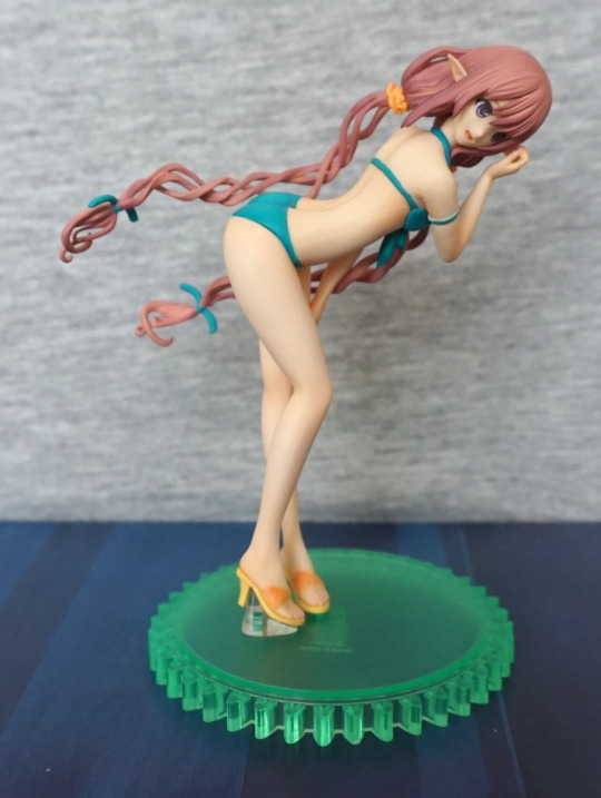
Uh, wait, something seems to be wrong with this… Hair is not supposed to defy gravity…
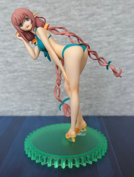
Ah, that’s better! That looks like the prototype shots! I totally didn’t have to redo these shots at a later date, owing to not noticing her head was on backwards… Nope. Nosiree. What attracted me to this one was her interesting pose and nice combination of colours. In the promo shots the swimsuit looked blue, but I think this more turquoise colour works better. I like the way her hair hangs – with one ponytail flicking upwards, and one dangling down.
Other side:
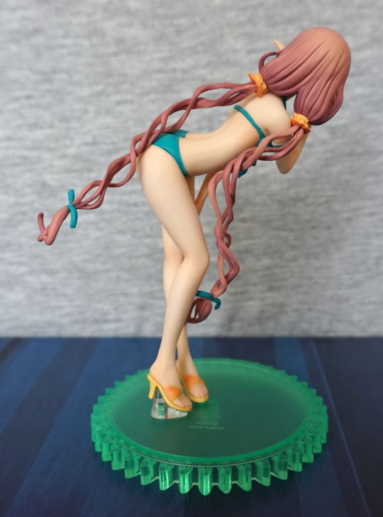
Bit of a gap where her leg connects to her body. I love the hairbands – they look like flowers to me, and here is a close-up of them:
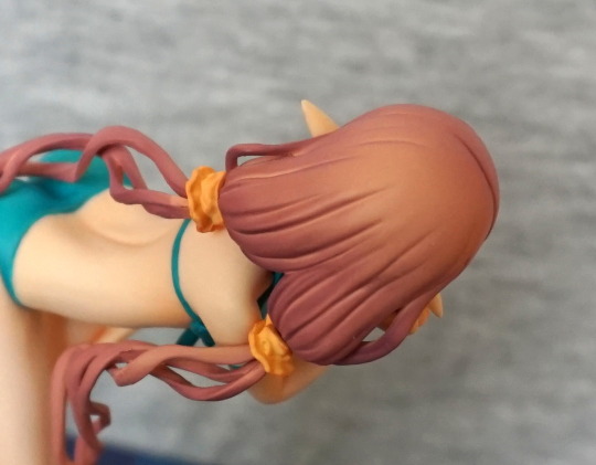
The hair is also nice – enough detail to make it look like hair to me, and the shading is nicely done.
Front of her body:
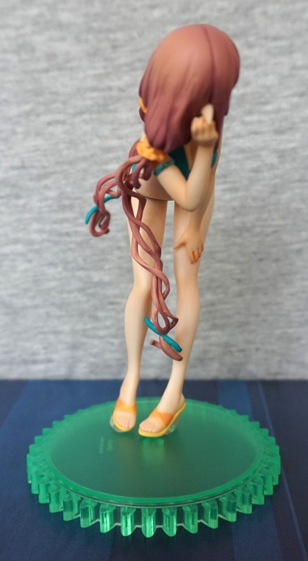
Ended up focusing on her hair braid, but that’s probably the most exciting part of this angle. Little bit of globby paint visible, but not noticeable unless you’re looking for it. Here you can see where she’s scratching her ear/head.
Back:
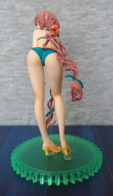
Her backside looks good, not much to report on this angle. She does look to lean a bit with her legs though.She doesn’t seem to be standing in the stablest of angles, with her toes pointed inwards, but she is in a turning position.
Top:
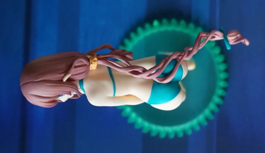
Here you can see the way her hair flows over hr back – I like the way they did this. The top of her hair seam isn’t the best though. It’s sort of hidden near her ear, but less so on the very top of her head. There aren’t any seam issues on her back.
Close-up of her bikini:
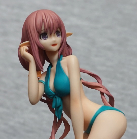
Love the bow dangling down from it, and there’s some wrinkle lines. It also sits on her, instead of being a part of her, which is nice.
Overall, I really like this figure now that I’ve figured her head was on backwards.The paintwork is really nice, with a good choice of colours, and her pose is dynamic and interesting.
