The next three blogs will be dedicated to Ena Hoshijiro. This blog will be about the ACG version, the next blog will be about the FuRyu version (as I bought this prior to starting this blog), and the third blog will be comparing the two.
First… some history with me and this figure. Originally saw this one up for preorder, but couldn’t really afford it, and I couldn’t find much out about it, so I didn’t preorder it, despite wanting to. Instead, I went for the FuRyu version, which had the added advantage of already being released. I remember searching a lot for it on eBay until it popped up at a good price, and I went for it.
Recently, I went to search for the ACG version, to see what happened to it, only to find the price had severely bombed, to a price comparable to the FuRyu figure. To compare, I paid £20 shipped for the FuRyu one, and I paid just under £28 shipped for this one. There aren’t very many photos of the actual ACG figure, so I decided to just go for it. And super-glad I never preordered it for £80-90!!
So, with the backstory out of the way, here she is:
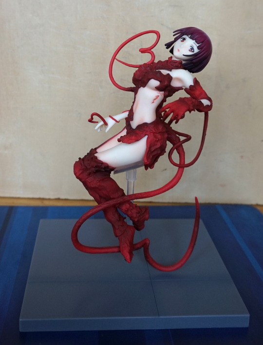
I honestly don’t think they did a bad job with her, but I can see why her price dropped. She’s not really comparable to the expensive scales I own, but there’s definitely some nice detailing in her. If you look at the picture above, you’ll see three of her tentacles have been formed into hearts. Personally, I think it would have been better to stick with one at her hand, and maybe the more subtle one towards the bottom. Not keen on the upper one.
A closeup of the hand heart:
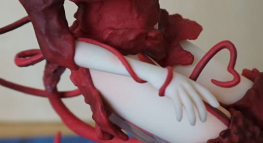
I like the path this tentacle takes, and did go “d’aww” when I first saw it.
Here’s a shot of the top of her body:
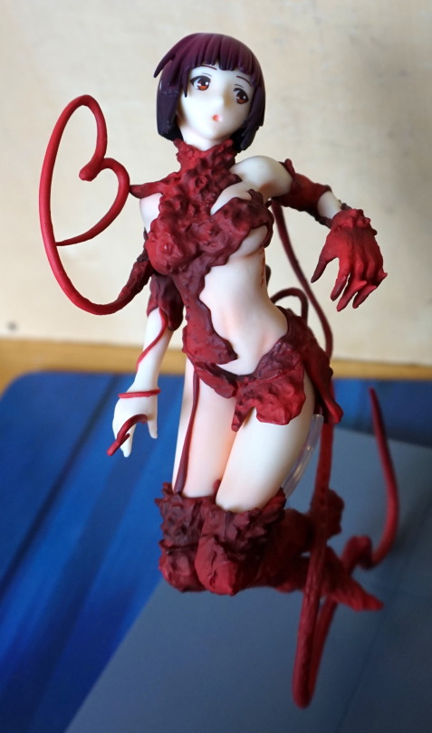
I don’t find her face too far off what it should look like, but it could’ve done with some paint detail to make it look a little less flat imo. The shading on her “placental” parts is nice though, and gives them a rich variety in colour. The bit on her leg could do with some tweaking to make it look less blood dribble and more “connector”. One leg is shaded more than the other, not sure this was a good decision, but for me I don’t really see both legs at once.
A shot from the back:
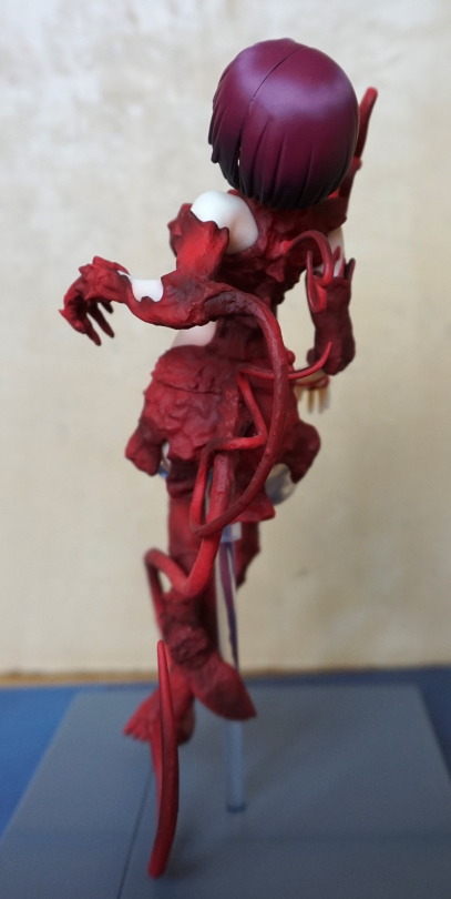
Some nice shading in her hair, but a pretty obvious seam line. The tentacles are attached nicely, with some proper “holes” for them to come out of.
A shot from behind the figure:
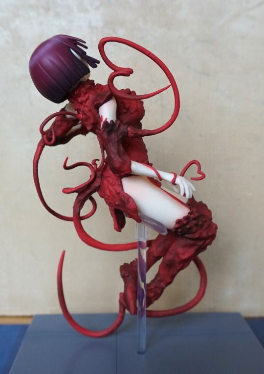
She certainly looks tentacley, and I like that. I think if they got rid of those silly, tight kinks I’d be totally happy with the tentacles.
Now for closeup of the stand:
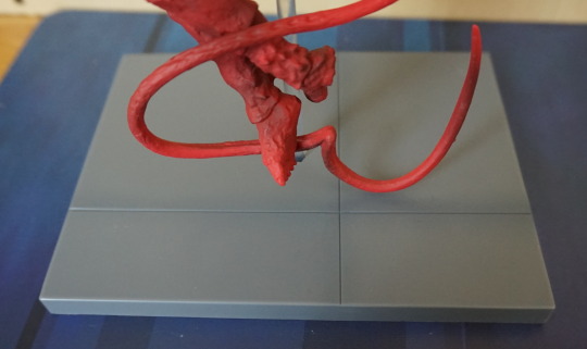
Hm. Floor tile. The original artwork showed her with a black stand, which may have been a better bet. It’s grown on me a bit, but my initial thoughts is that it would have been better with a black, smaller base to contrast against Hoshijiro, and make her stand out. I think the base could’ve done with some weathering, and maybe the pen she used in the series… almost tempted to add the latter to the base, to give me something to look at.
She’s also a good figure if you prefer your Hoshijiro less covered in… meat. I don’t think her hair colour is particularly accurate, but I’m happy to ignore that, as I like the colour. I think she’s a solid figure for the price I paid, but I think her original asking price was too much, so not surprised her price tanked.
