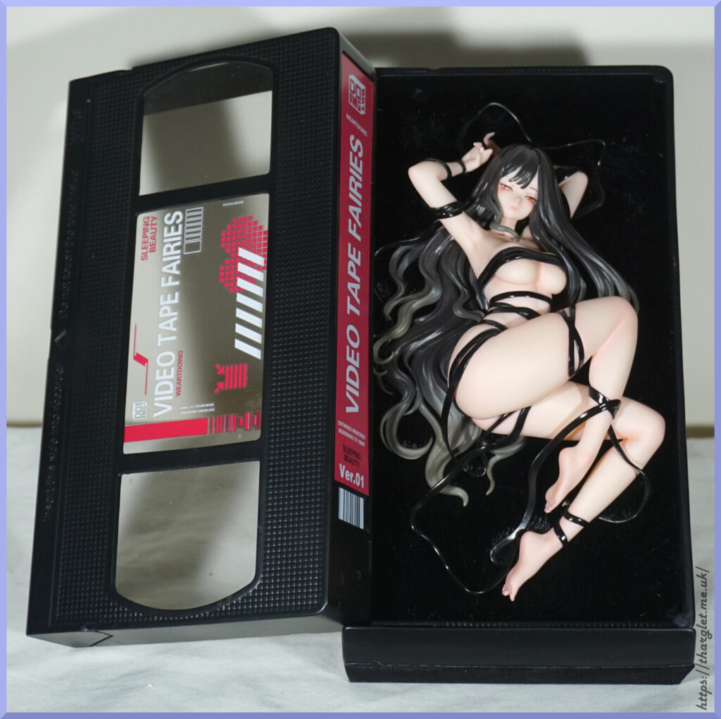
This figure I didn’t pre-order. Initially I planned to skip it as ODD had some other releases coming up that were more my jam. But then the Chinese Crackdown hit, ODD split up and this became the last release of “old ODD”, and their upcoming designs were scrapped. The ODD brand continues – but as part of Apex (formerly Fish Head Man). Not to be confused with Apex Innovation.
As the release drew nearer, I decided I wanted to get it even if it was just to review it. However listings on Taobao were dry – previous ODD releases there was a decent amount of leftover stock. I’m in the ODD WeChat group, and one person was offering up a preorder – they ordered her twice by mistake. I did consider adding my hat into the ring but ultimately decided not to, especially as someone else chimed in with “why not list it in Xianyu?”. And that got me browsing… and finding a couple of people offering their preorders up on Xianyu. Initially I tried a cheaper preorder but the seller never responded to the shopping agent. The second one was for MSRP (CN¥1,280), and they came back quickly. Yay!
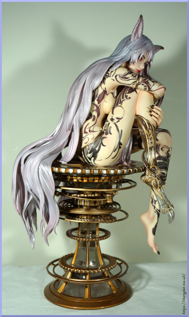
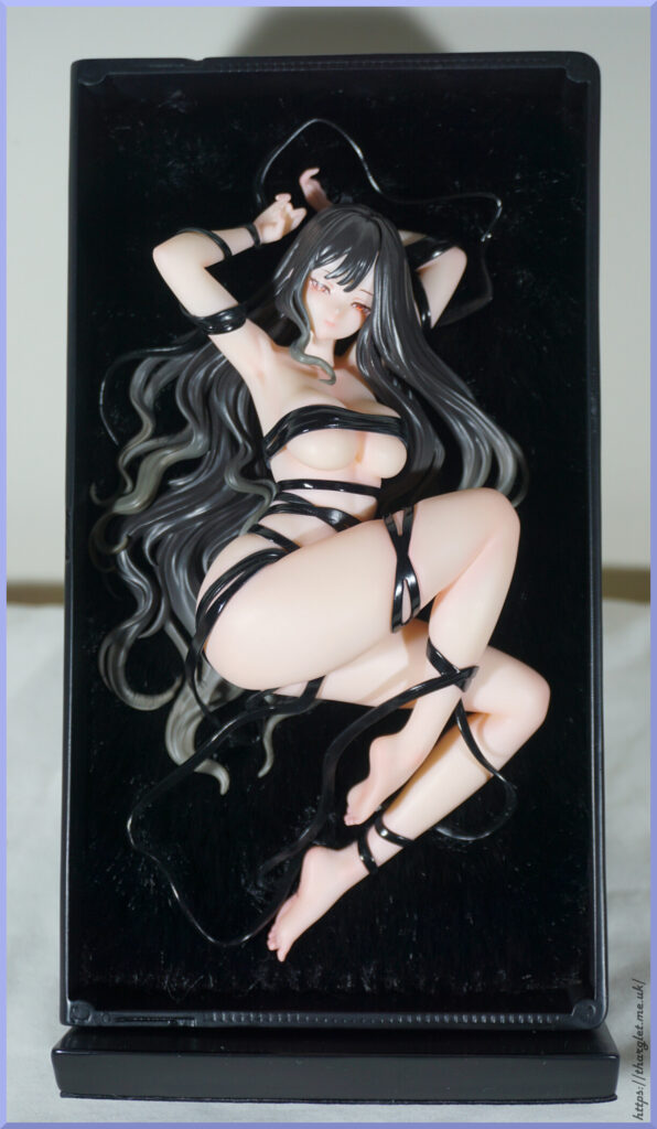
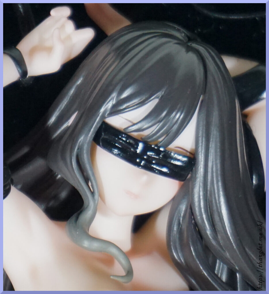
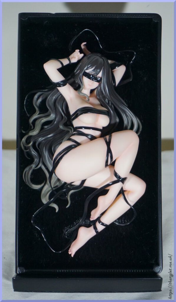
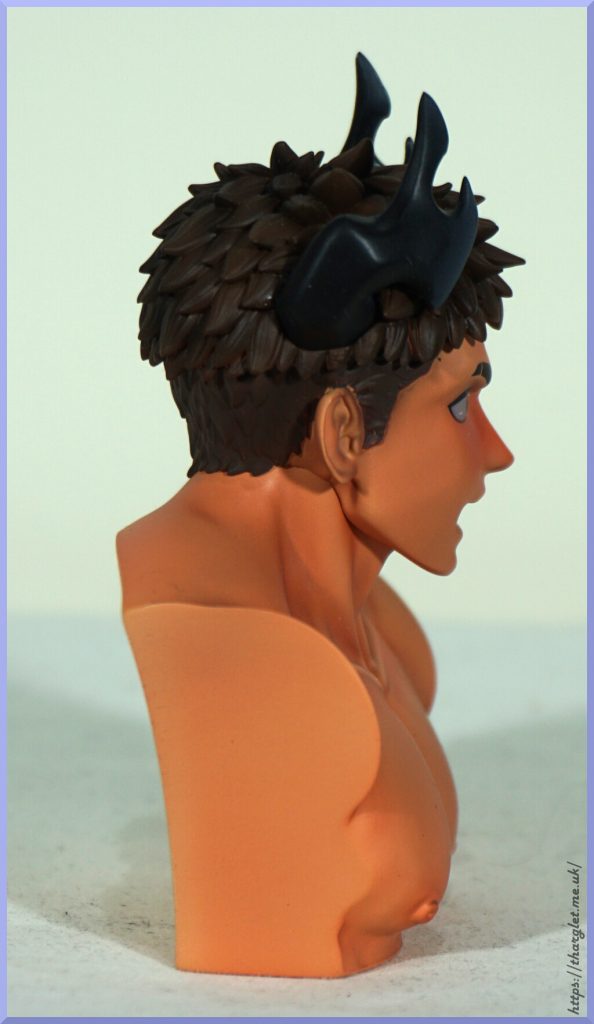
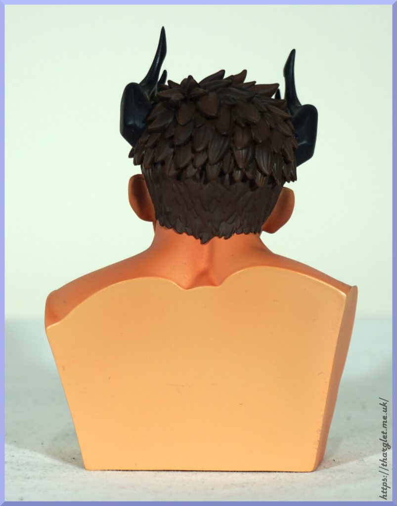
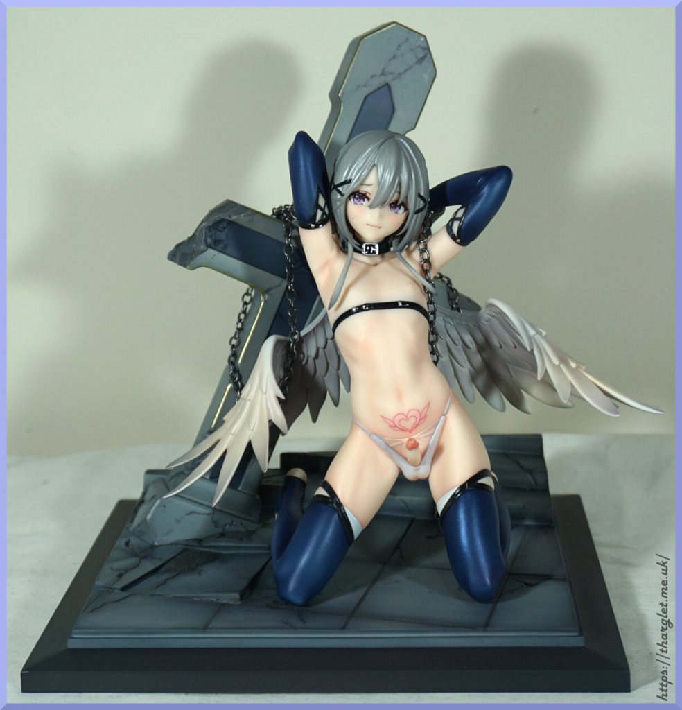
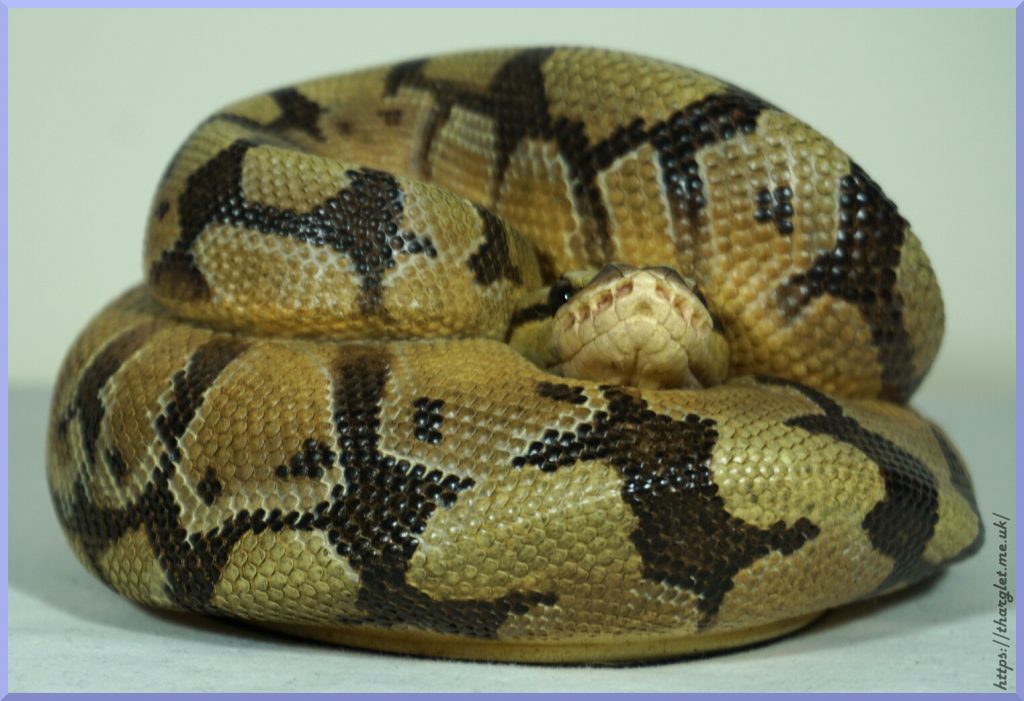
One nerve-wracking wait later… it was at the proxy! I went for the usual closed-box inspection, so then I spent the next 2 weeks fretting I screwed myself over and that there was potential there was nothing in the box especially as it was lighter than I expected. Thankfully my random fears were unfounded, and arrived just fine. Outside of the small brain, this piece is smaller than my other ODD pieces. She was listed at 20cm, but sometimes small facts like that don’t enter into my brain somehow.
Shipping-wise, the box was 36x29x20cm and 1370g. Overall she cost CN¥1,425 (£153) with shipping and service fees. One advantage of the small size and weight was international shipping was really cheap.
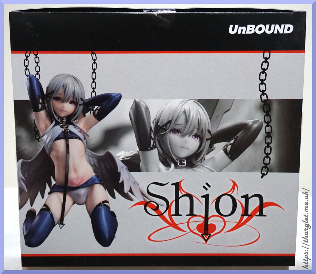
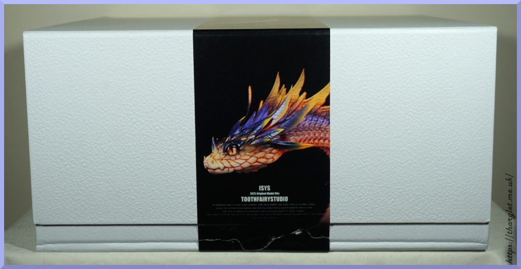
Box
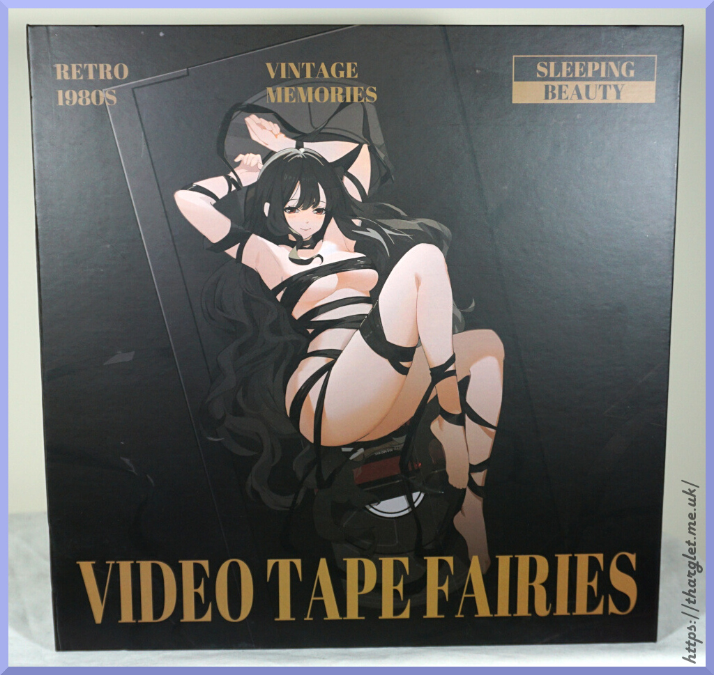
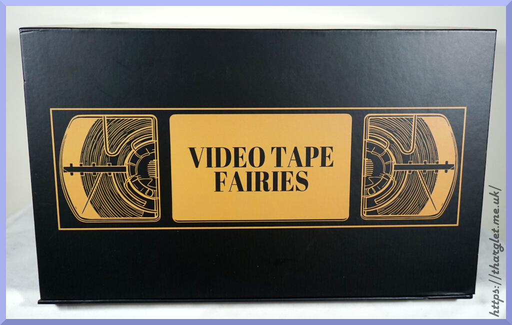
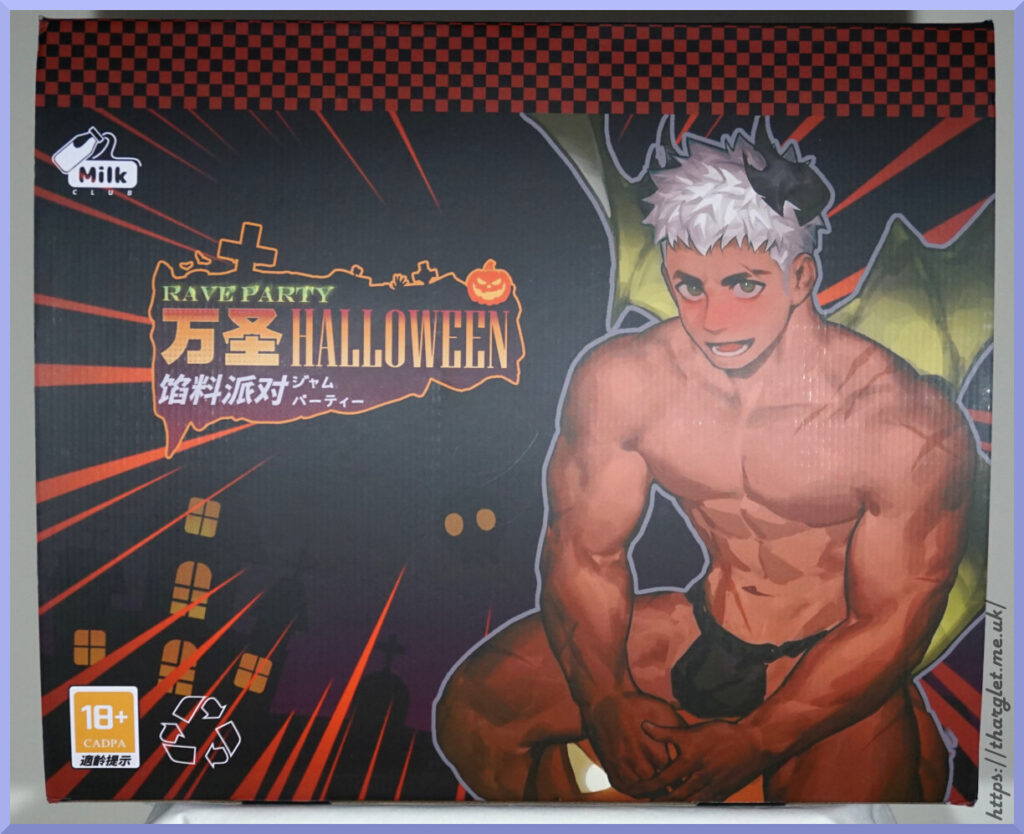
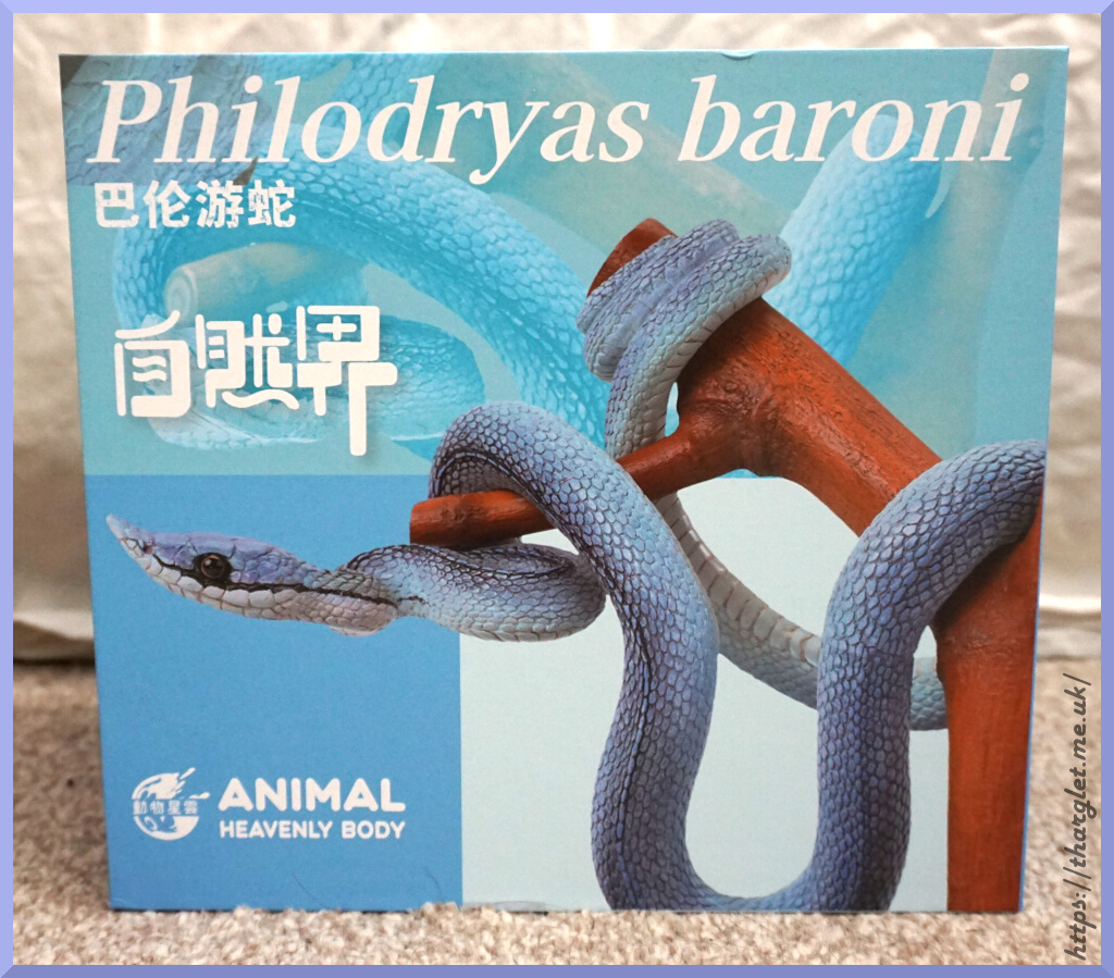
For the main image we have this on two sides of the box:
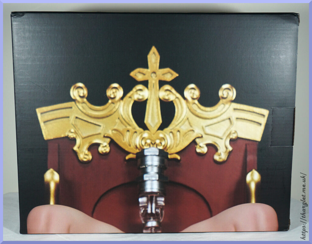
No, that’s not me failing at photography – the image is pixelated and blurry on the box. Looks like they took one of the promo images and resized it. Well, at least it lets us know what’s in the box roughly.
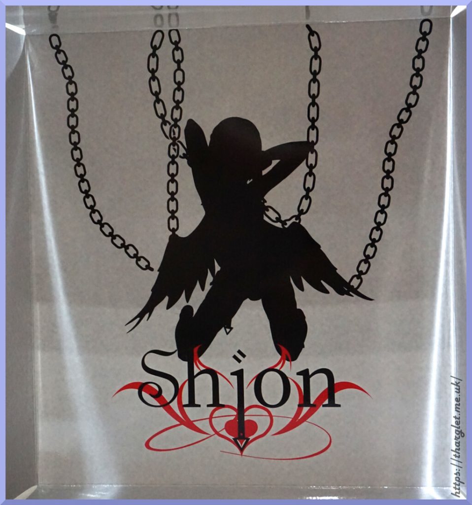
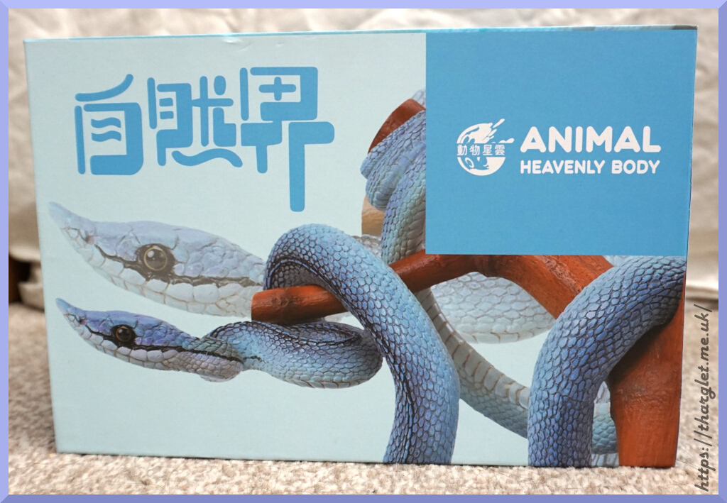
The other two sides:
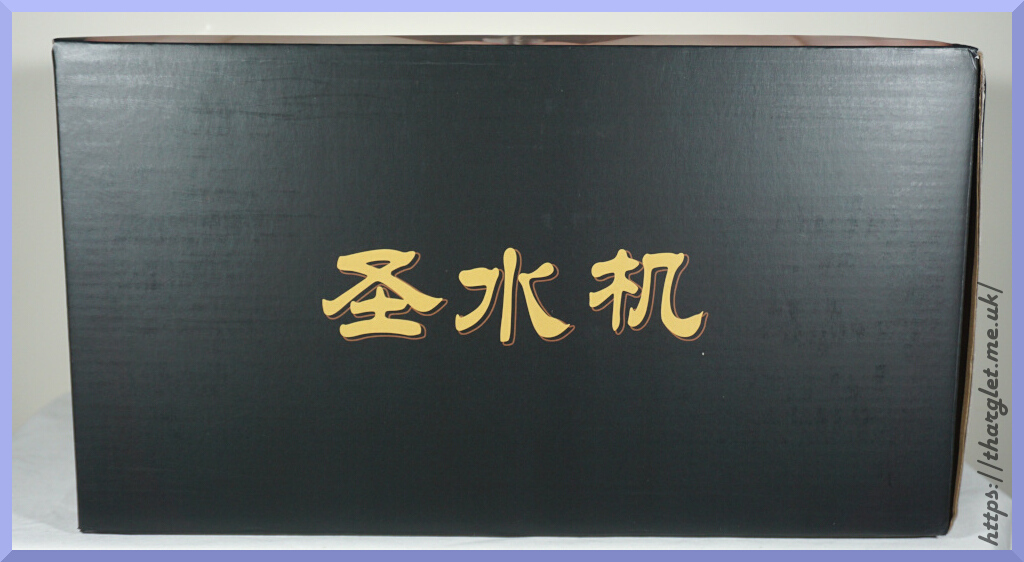
Google Translate says this says “Holy Water Machine”. Probably the nicest looking side.
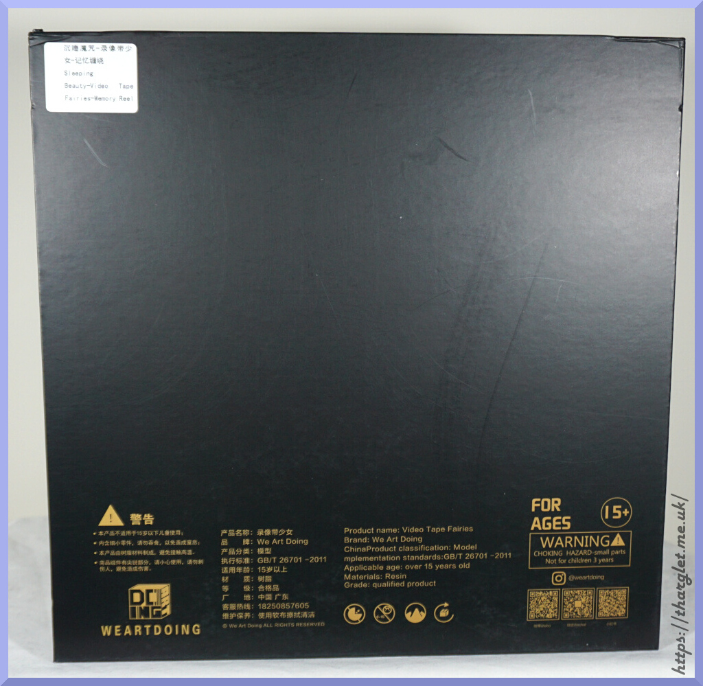
The top and the bottom of the box are just black.
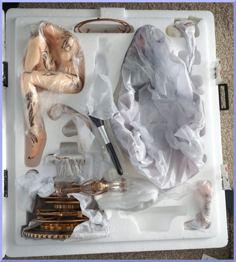
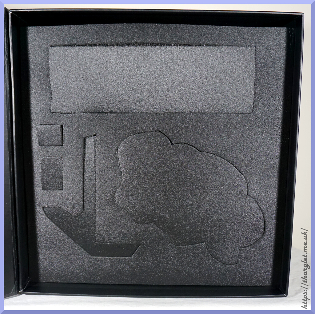
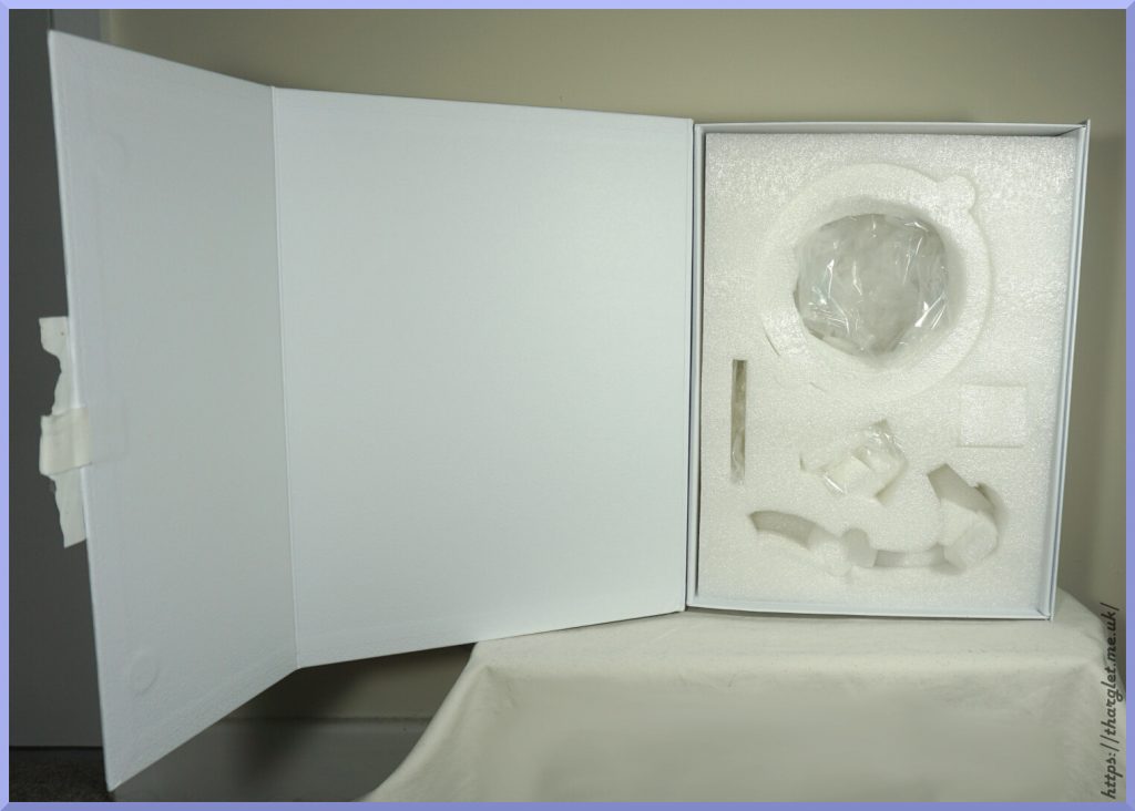
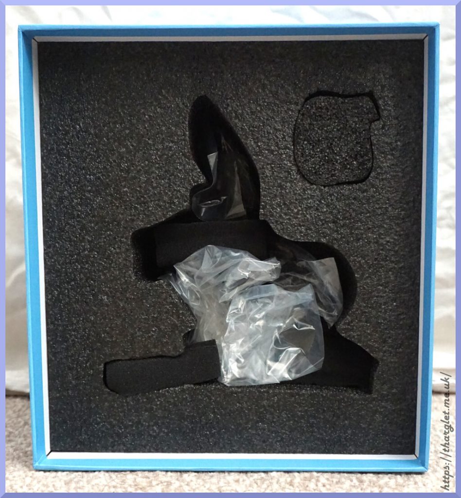
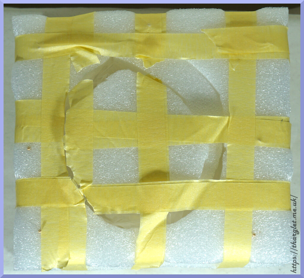
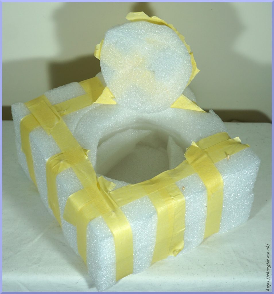
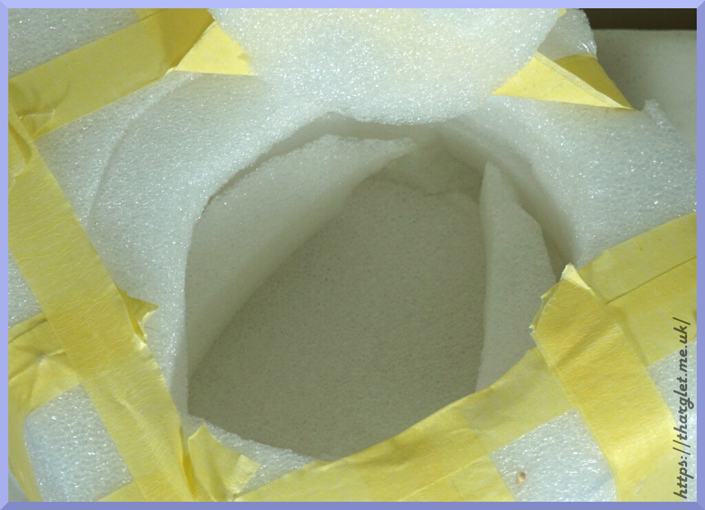
Foam inner:
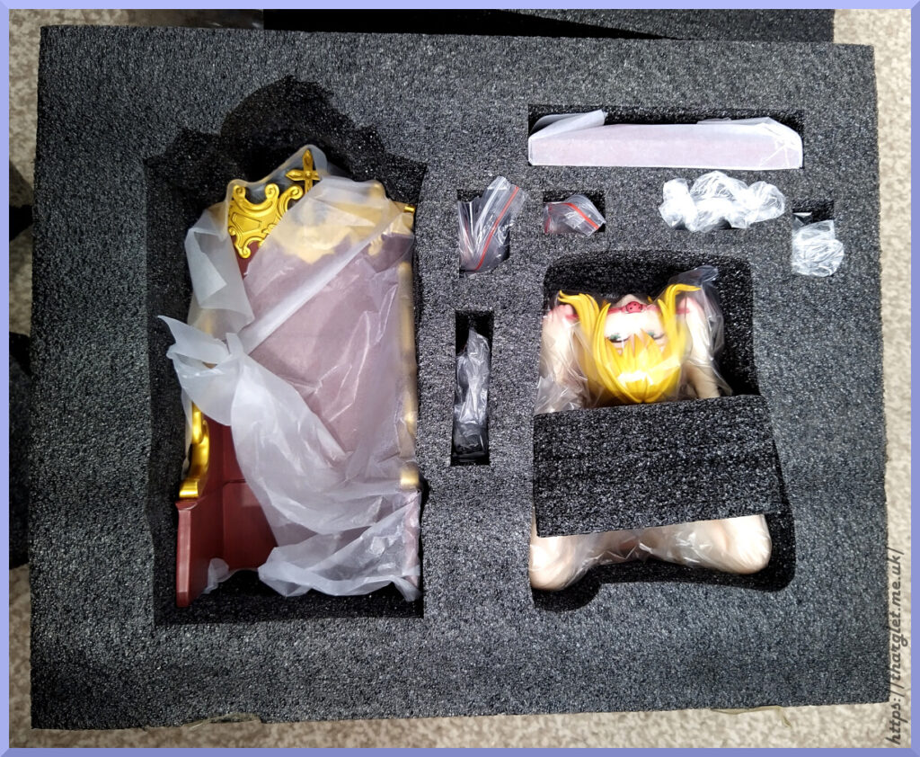
Nice compact design – not much wastage of space here. Thick enough border on the foam so that parts can’t get dented from the outside. There was a foam block above the part on the left, but removed it for this photo.
Overall, the box is functional. Not winning any design awards with the outer. Can understand they couldn’t show the figure on the box, but the whole thing is very lazy. I’m fine with the writing on the sides, but the front image could’ve been the holy water dispenser from the “SFW” side or some kind of imagery reminiscent of the theme but not the figure itself. The foam inner did its job of protecting the parts and the items weren’t too hard to remove.
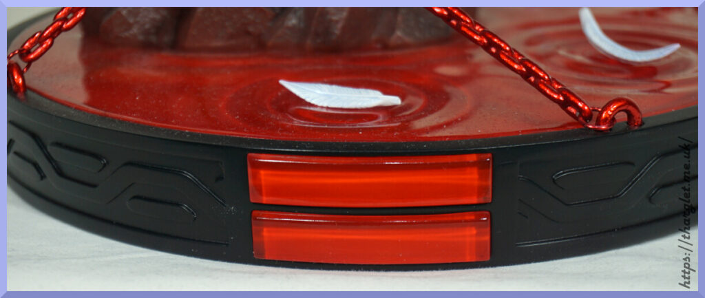
Water dispenser
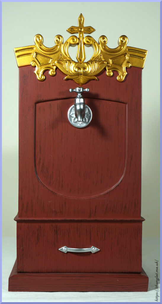
Front:
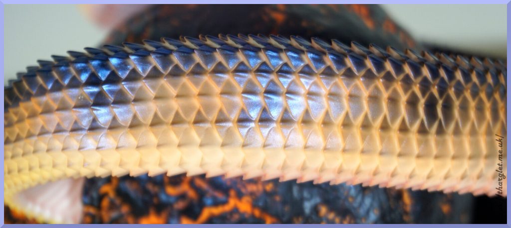
Nothing suspect going on here. Just a tap and decorative panel. The top detail is well-sculpted and has a nice golden finish to it. The tap magnetically attaches to the panel – it can be knocked off/turned around if you accidentally hit it but strong enough to stay in place whilst on display. The wood has a nice dark cherry wood appearance. It’s not the most realistic wood texture I’ve seen but does the job. The silver fixtures are also nicely detailed.
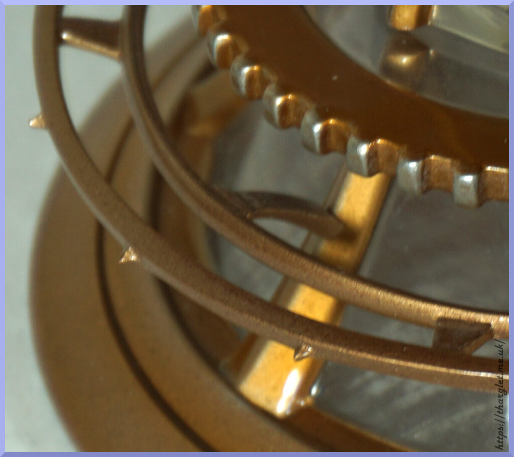
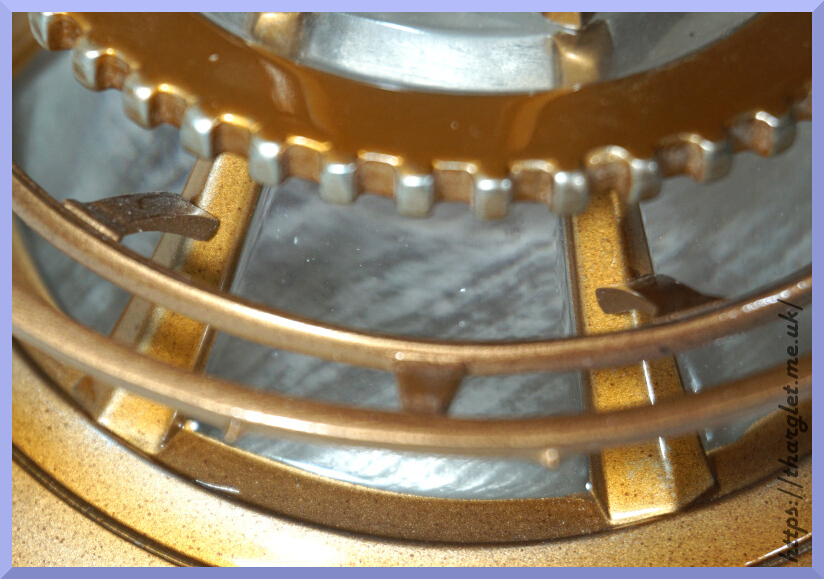
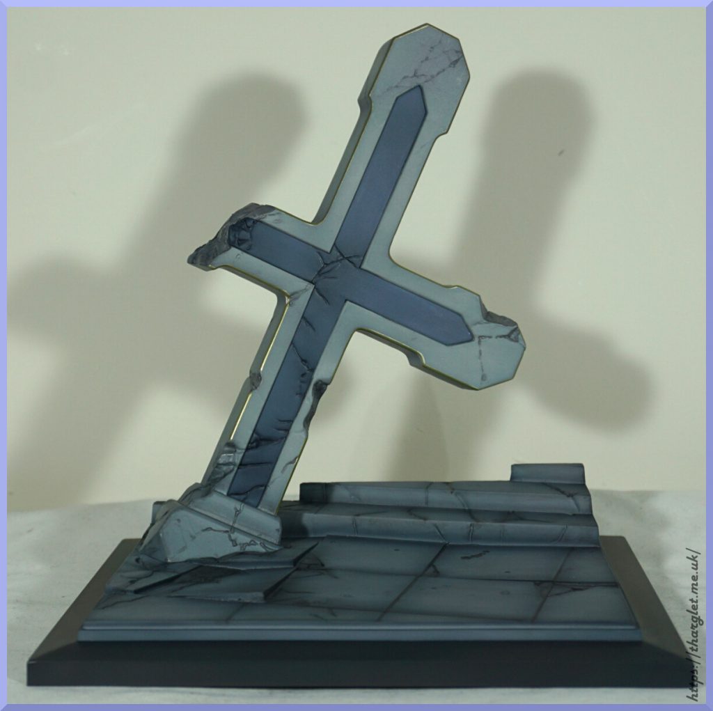
Closeup of the crest:
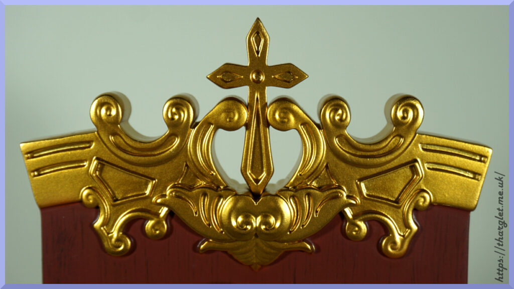
Up close some of the sculpt looks a little imprecise – most notably the lines at the ends. The cross signifies this is supposed to be holy water – can reserve judgement for later.
Three-quarters view:
Here we can see the tap in better detail – looks the part, no complaints here.
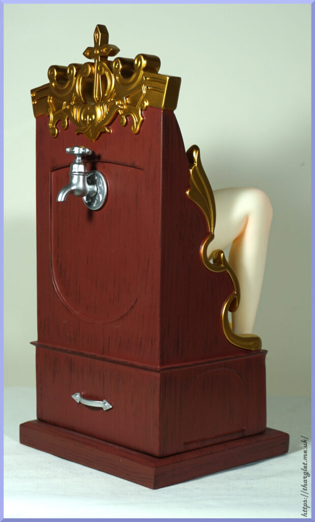
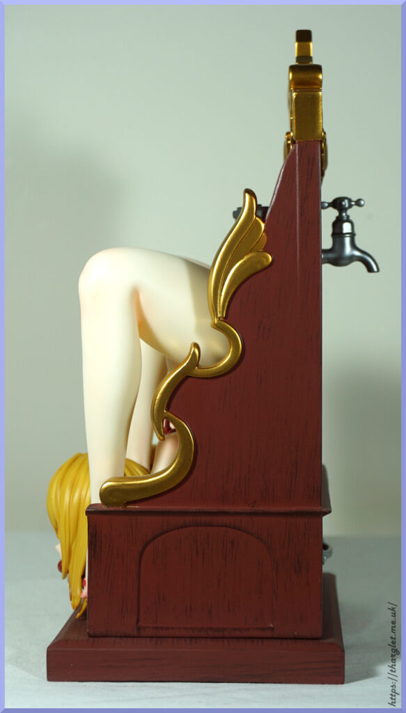
Sides:
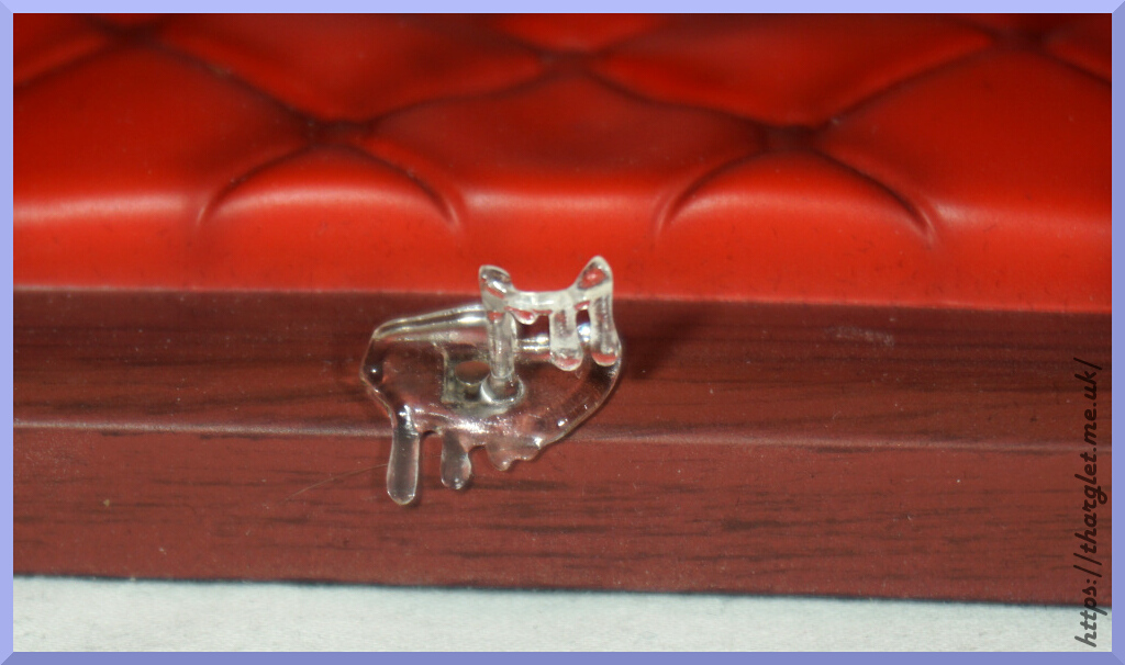
Both sides are the same – I like the way they continued the gold edging here too. The bottom scroll could’ve done with more distinct sculpting, but it’s a minor issue. We also have a carved detail to stop the sides from looking too plain. On the left side I do have a little bit of escaped gold paint at the bottom on the wooden lip.
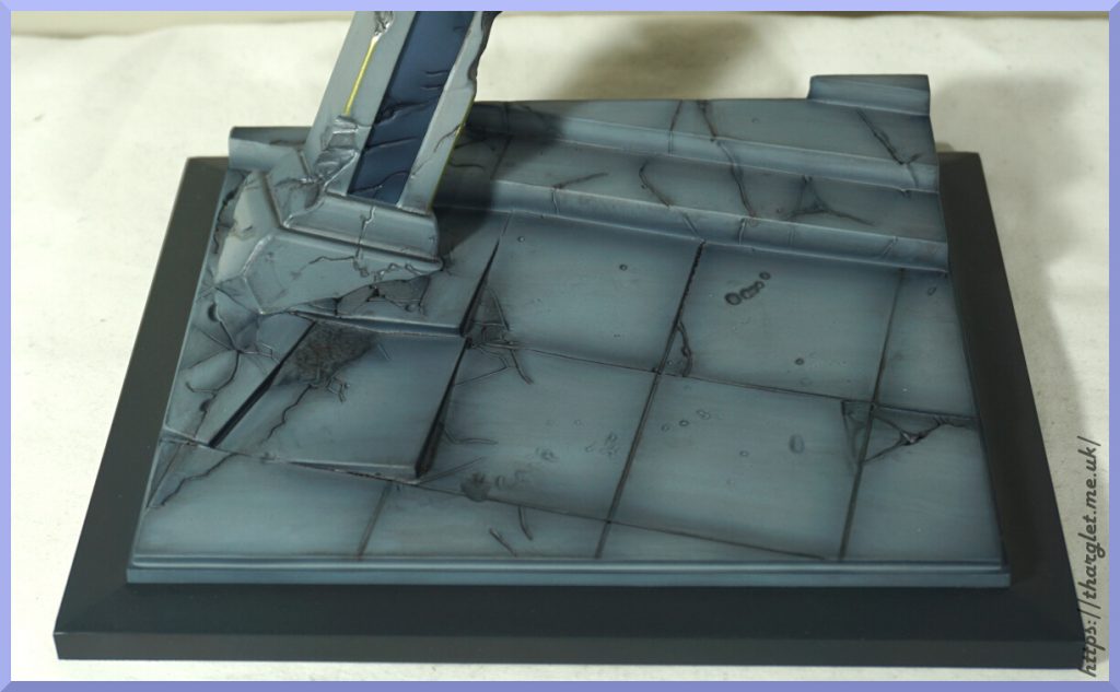
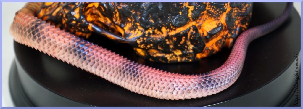
Around the back:
Here we have an interesting divot and a more conventional one. The wooden texture wasn’t fully carried on into the upper recess – not sure why.
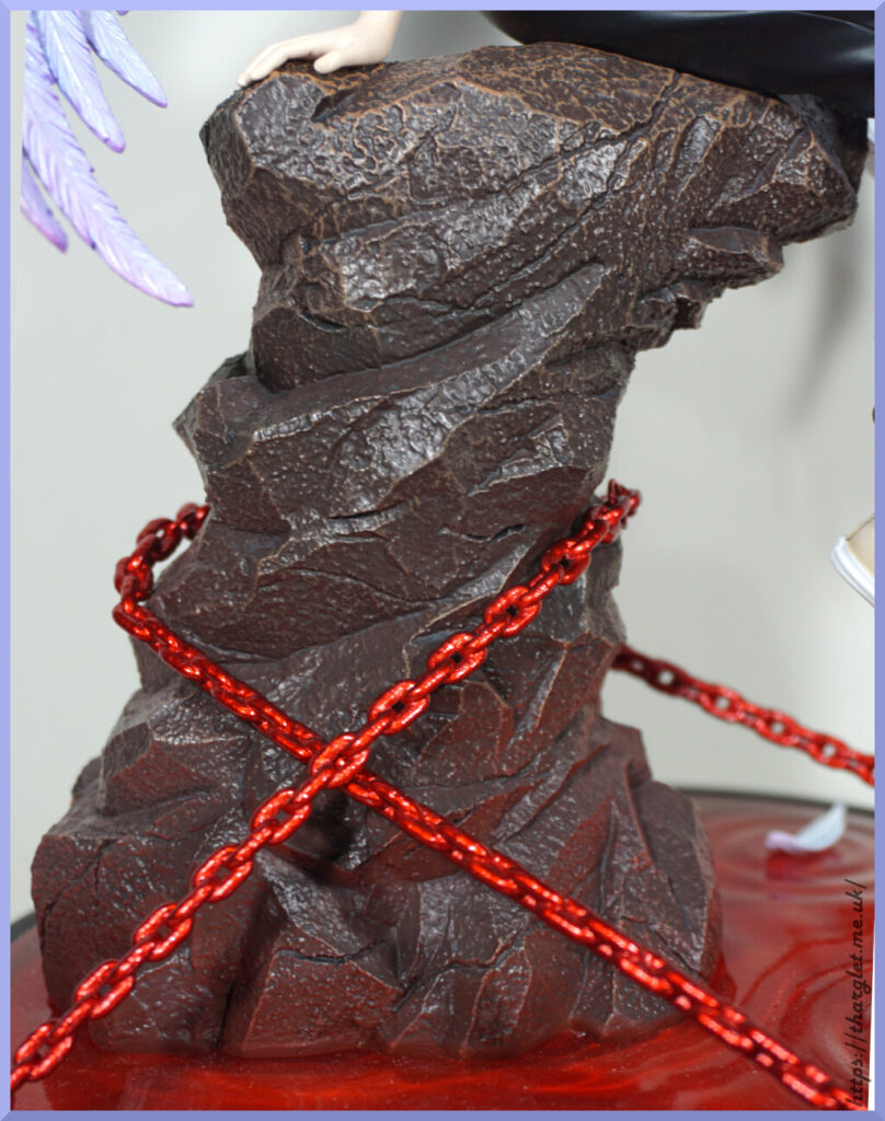
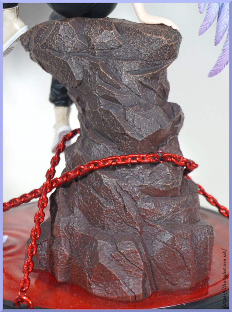
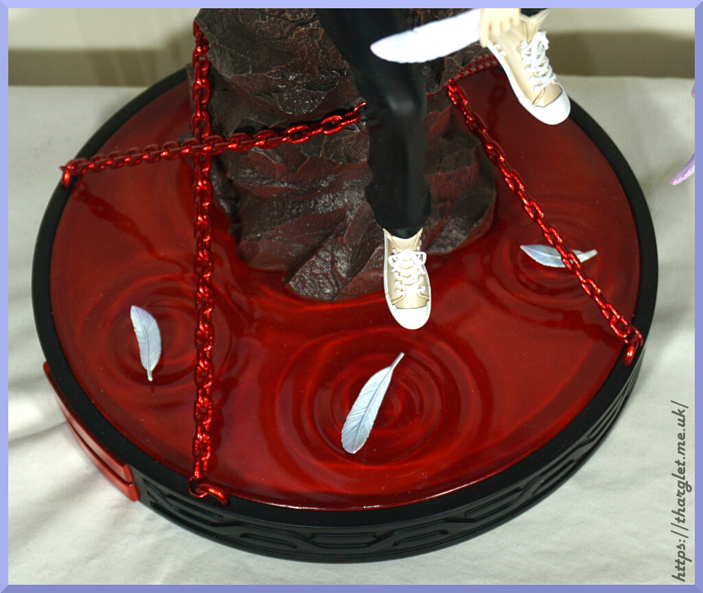
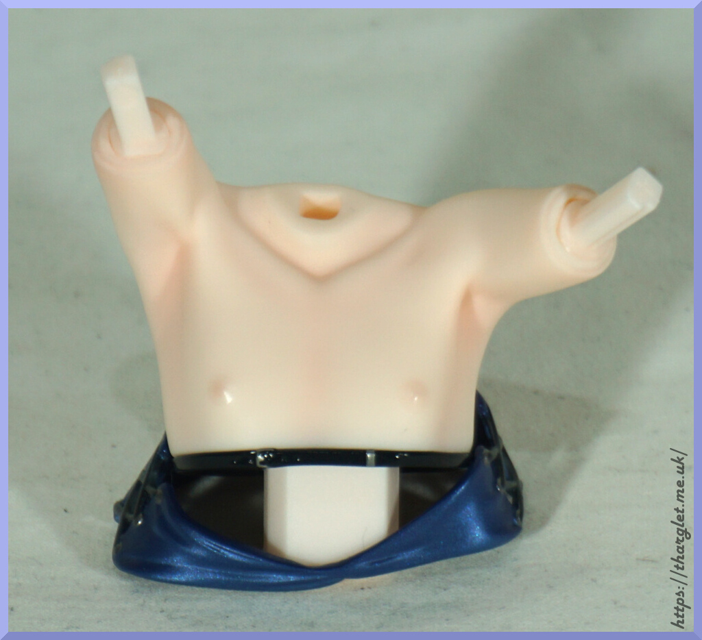
Cushion:
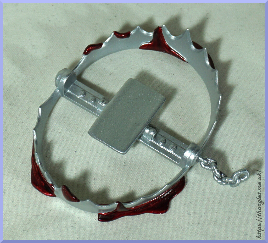
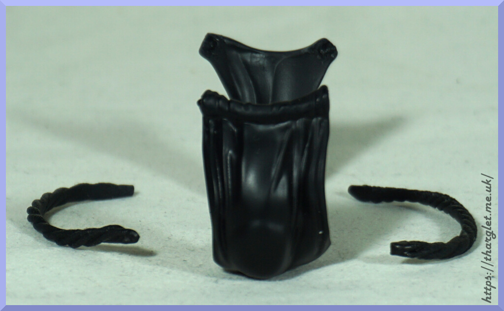
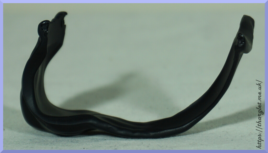
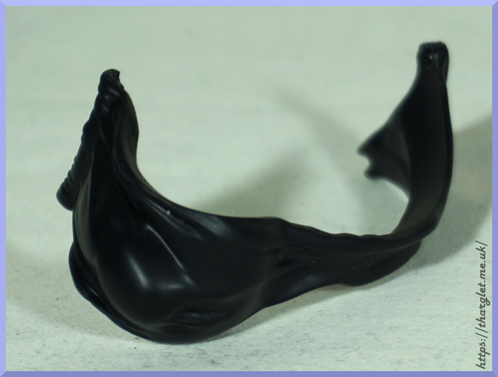
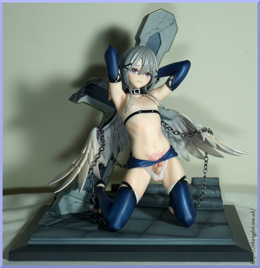
Here we have a shaped cushion, showing something is going to fit here. I have a feeling most who are reading this know what. There is also a square divot for an accessory – ended up using this as a guide of which way the walls of the holy water cabinet should fit – it can slot on either way around as there are no attaching pegs. Or not at all if you want the full view.
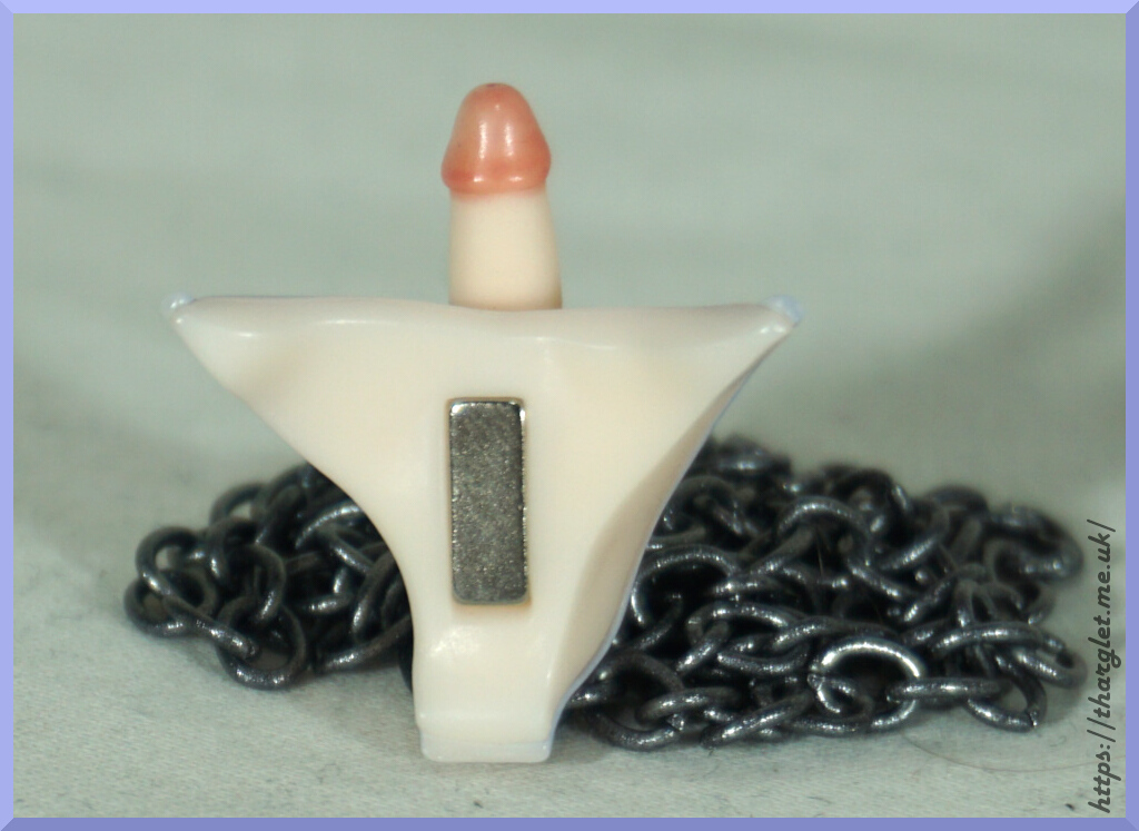
So let’s attach the accessories:
Both of these magnetically fasten to the wood. They both attach well without being too easy to knock off.
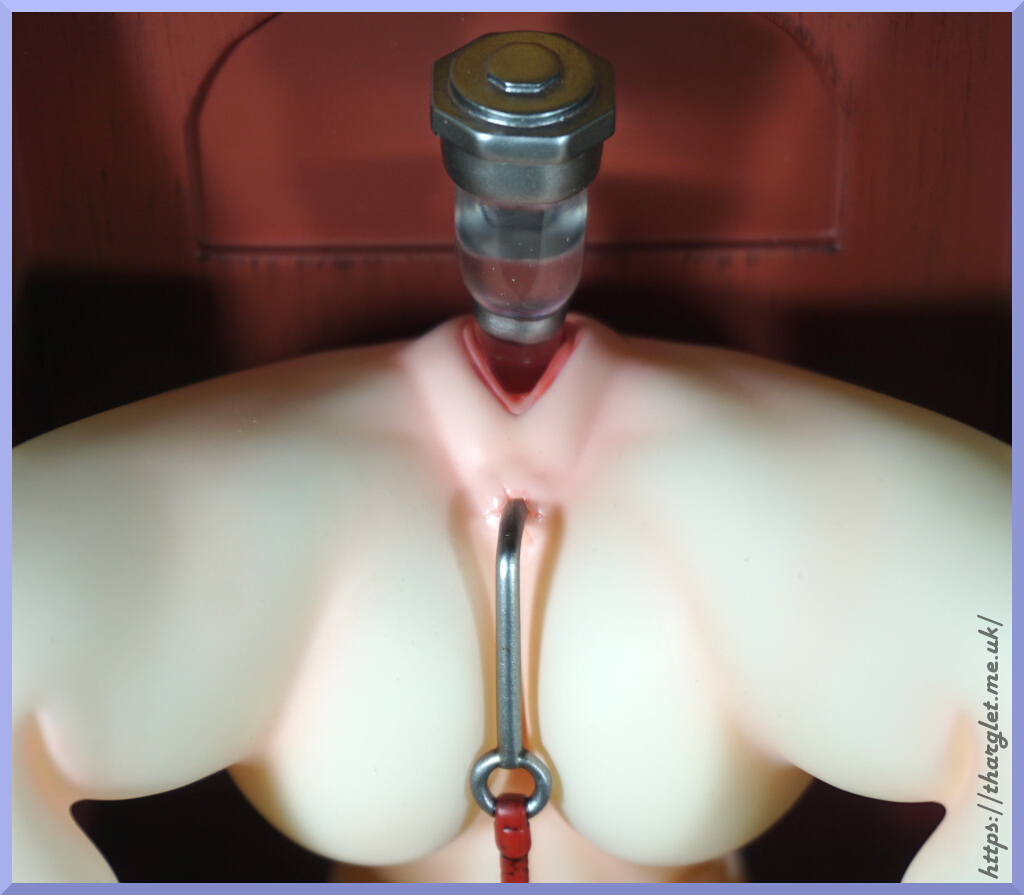
Close-up of the water extractor:
I like the way they have given it a water level. Now let’s find out how this gets filled up…

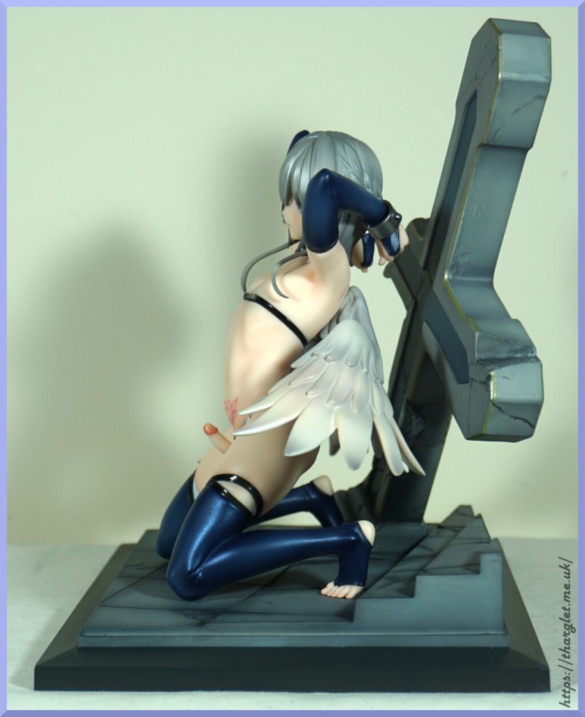
Conclusion
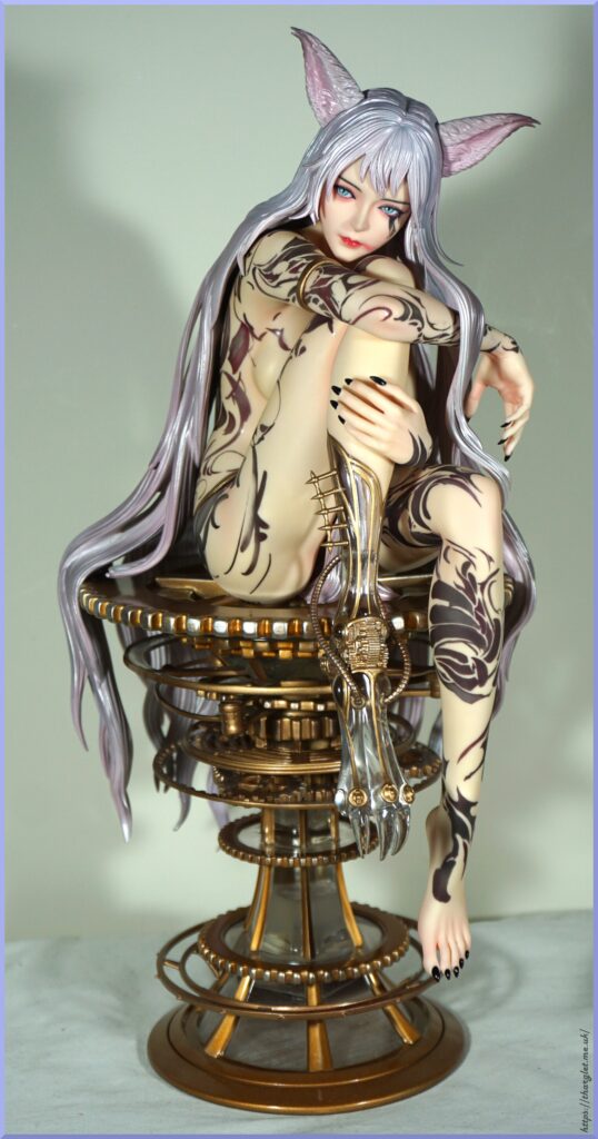
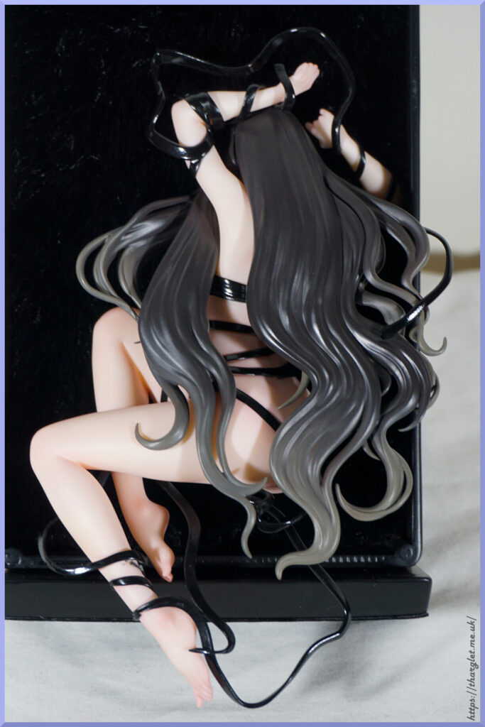
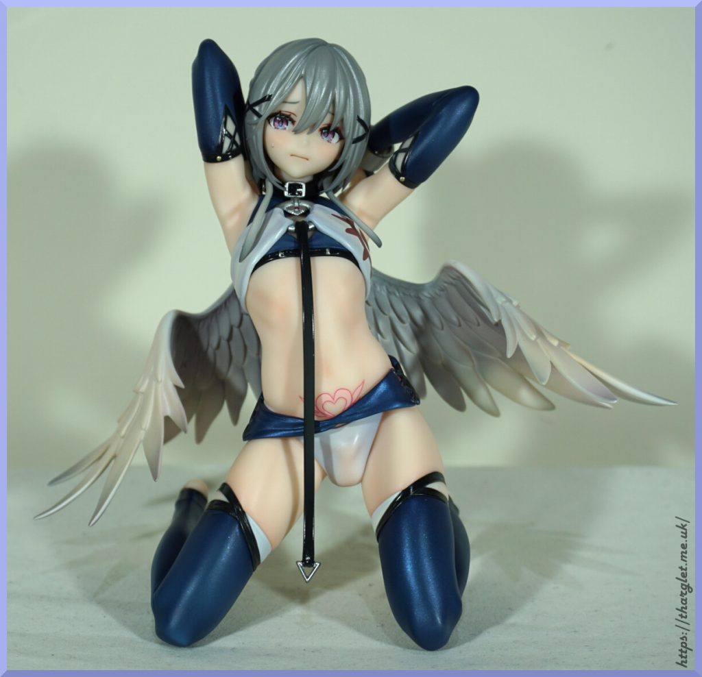
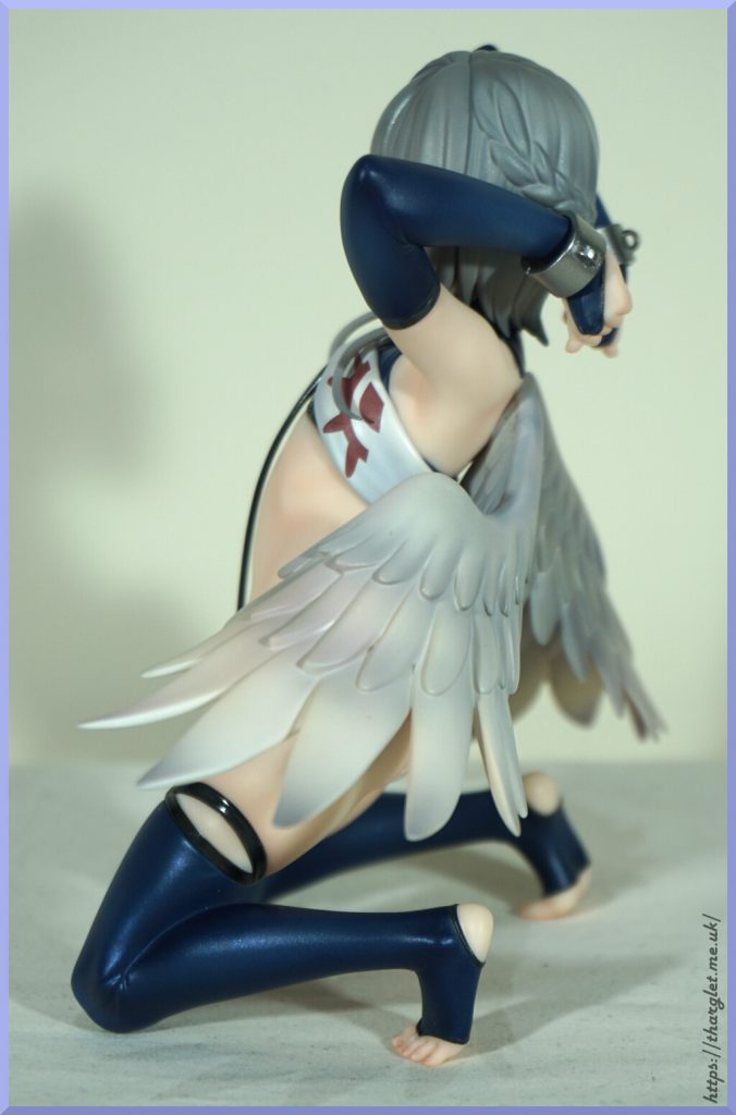
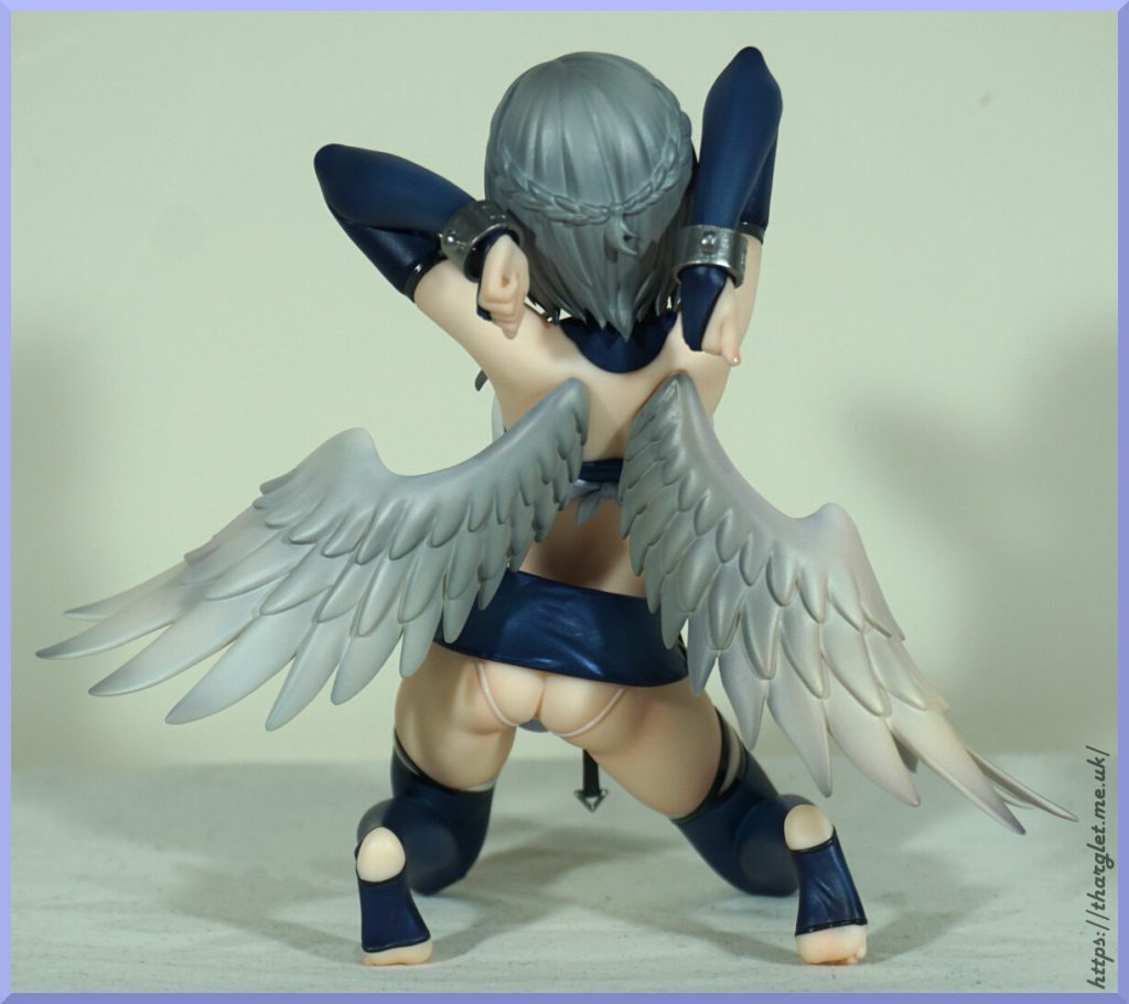
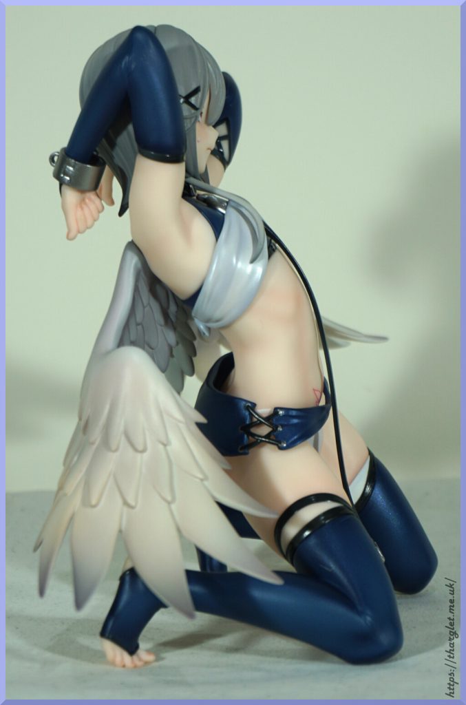
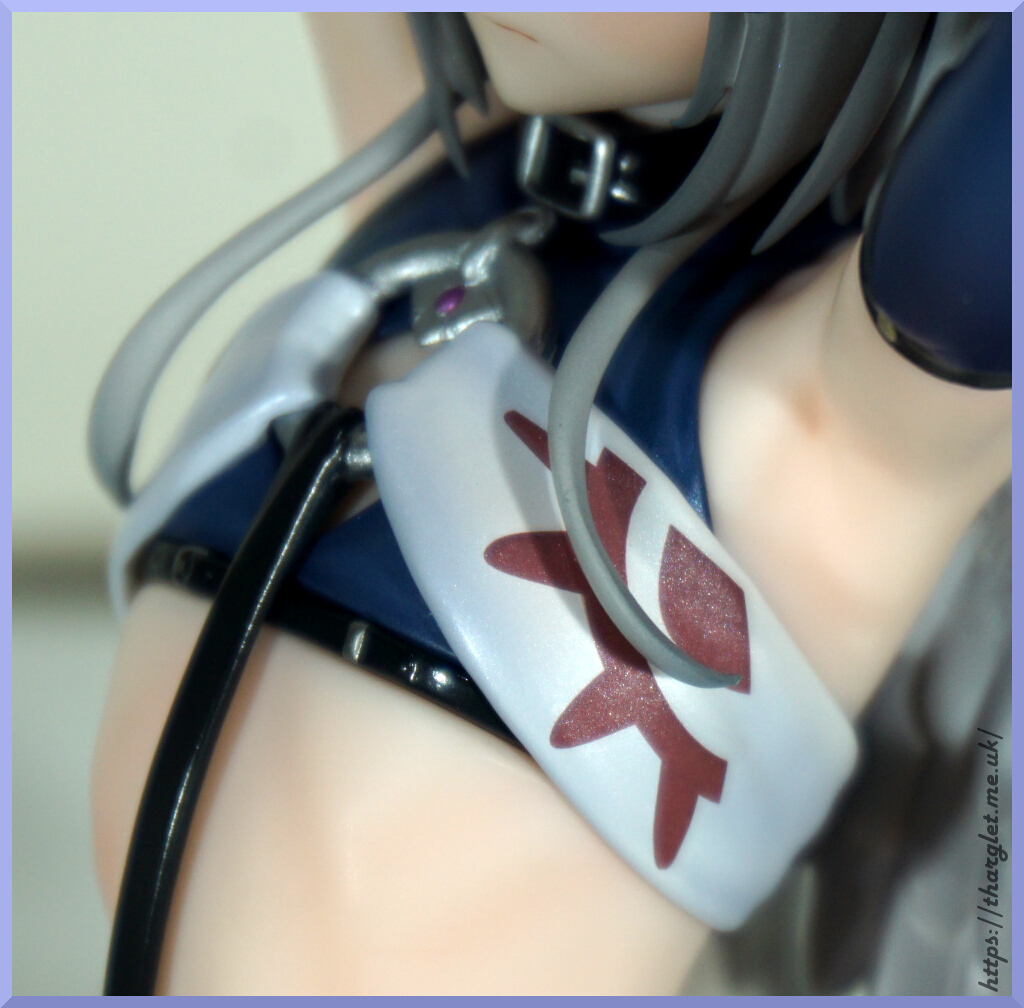
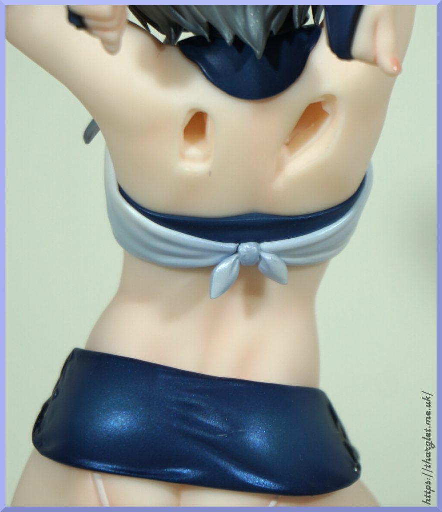
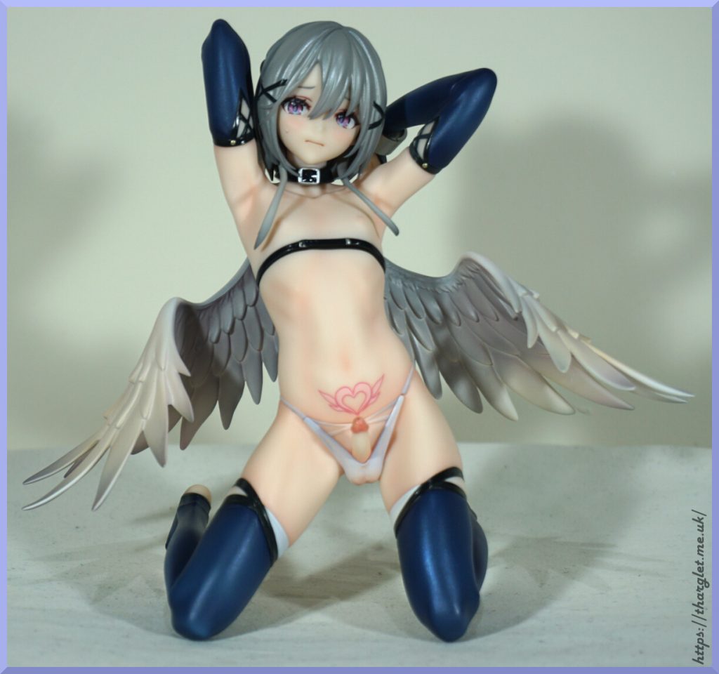
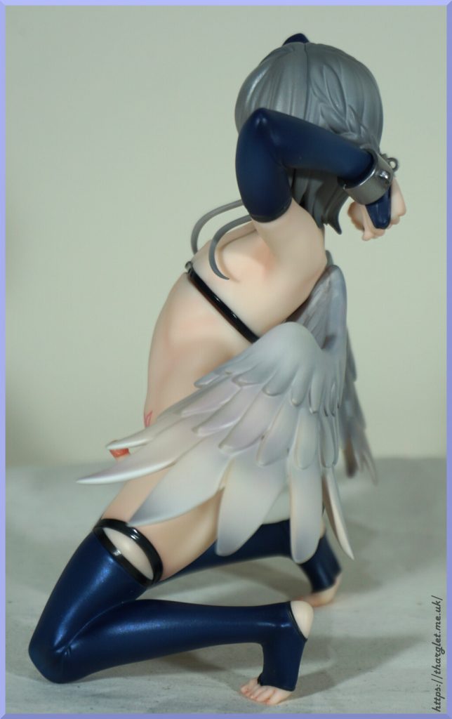
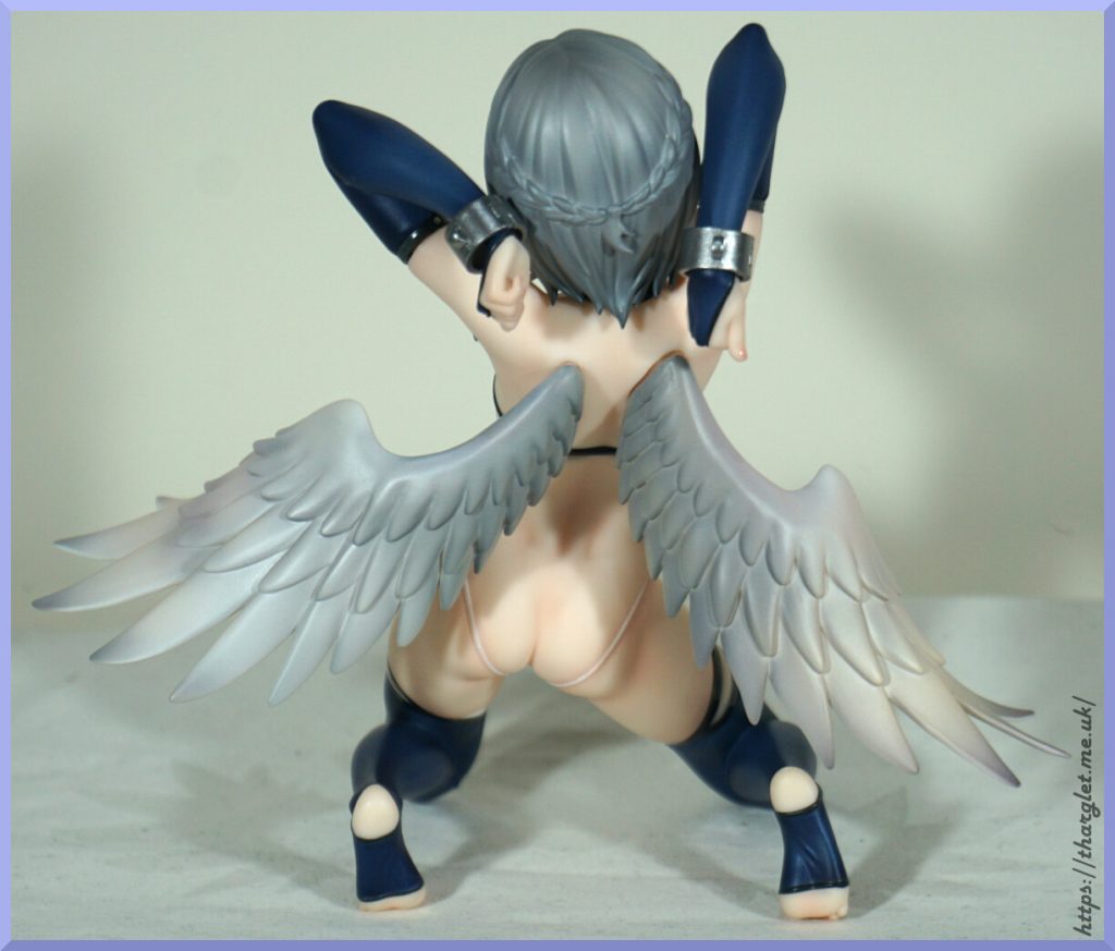
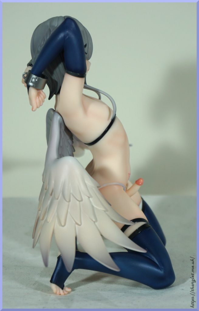
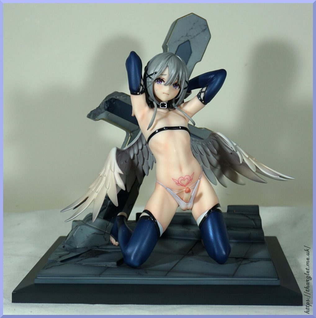
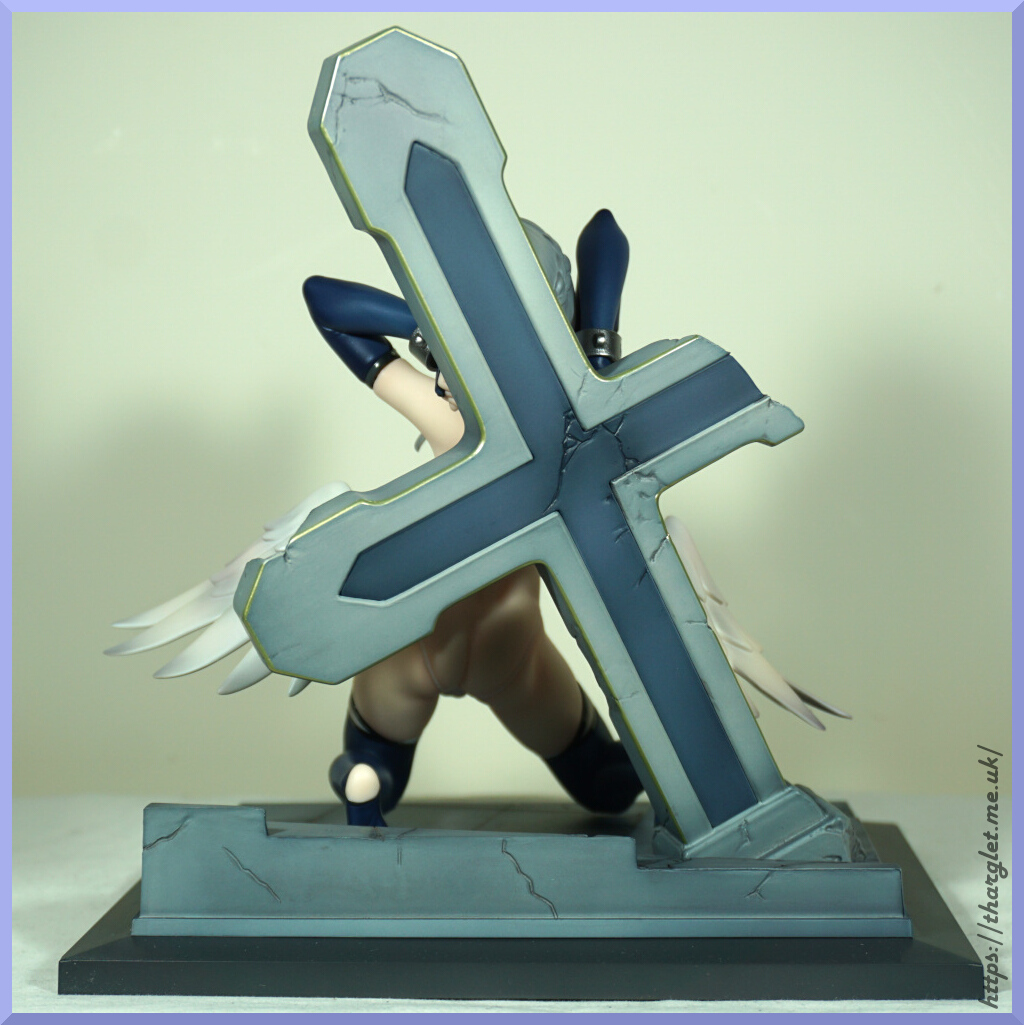
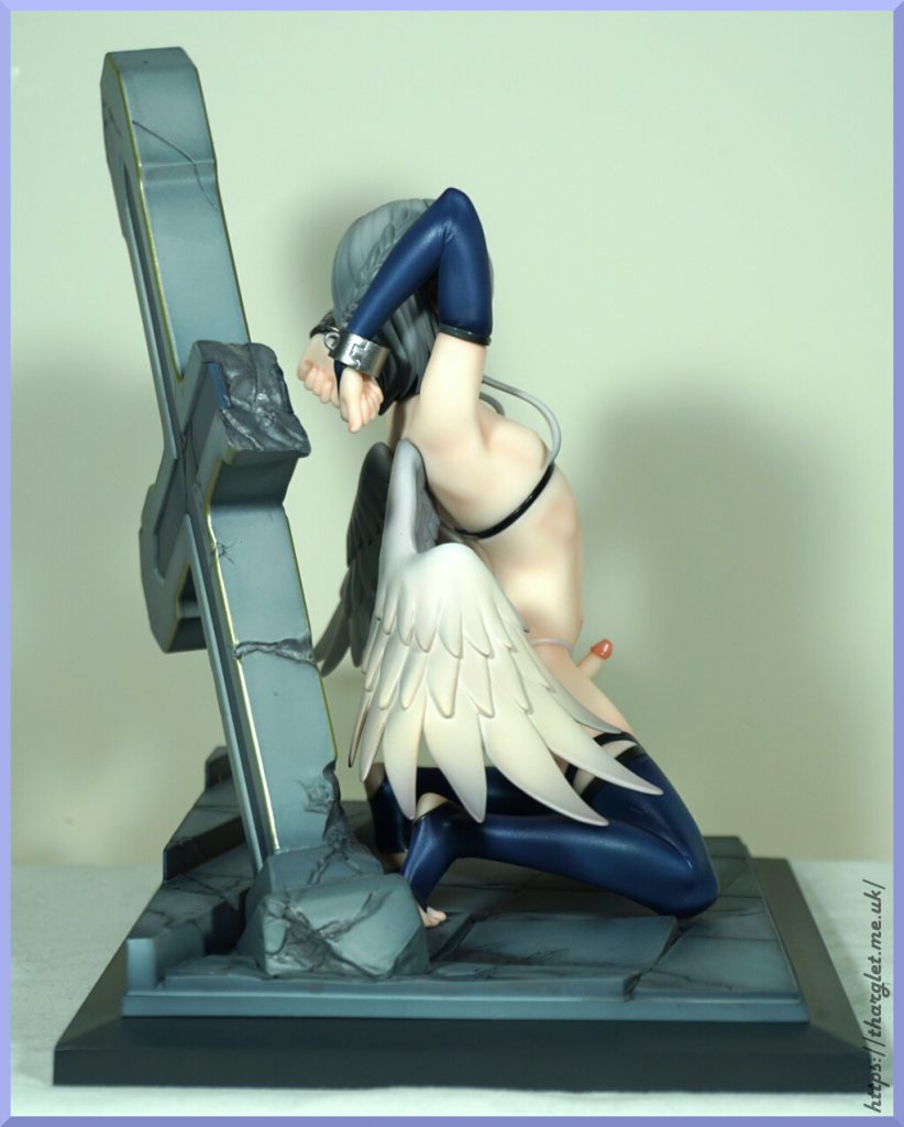
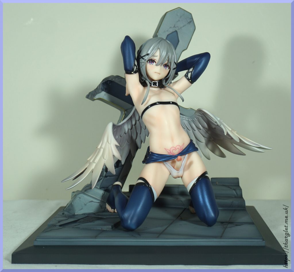
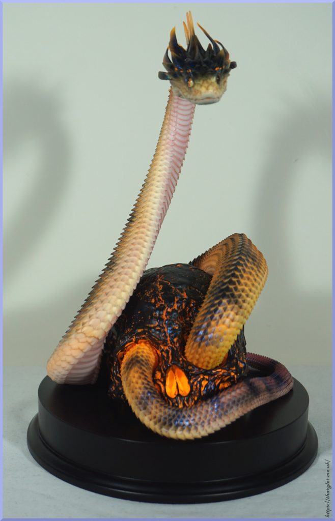
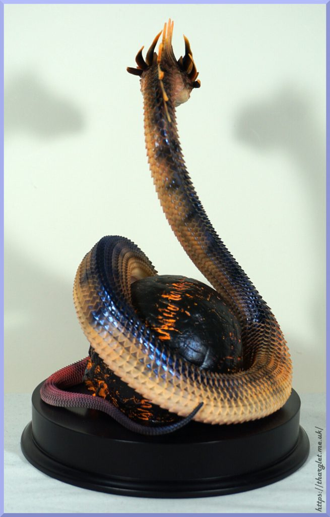
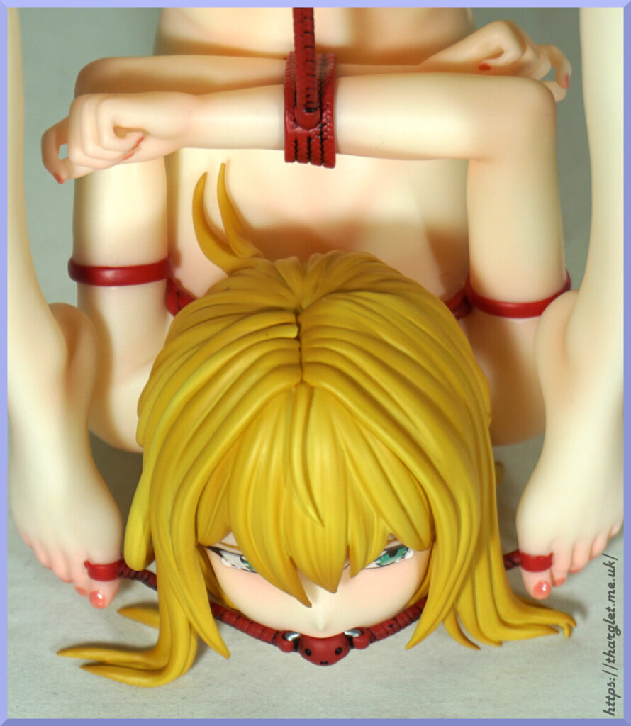
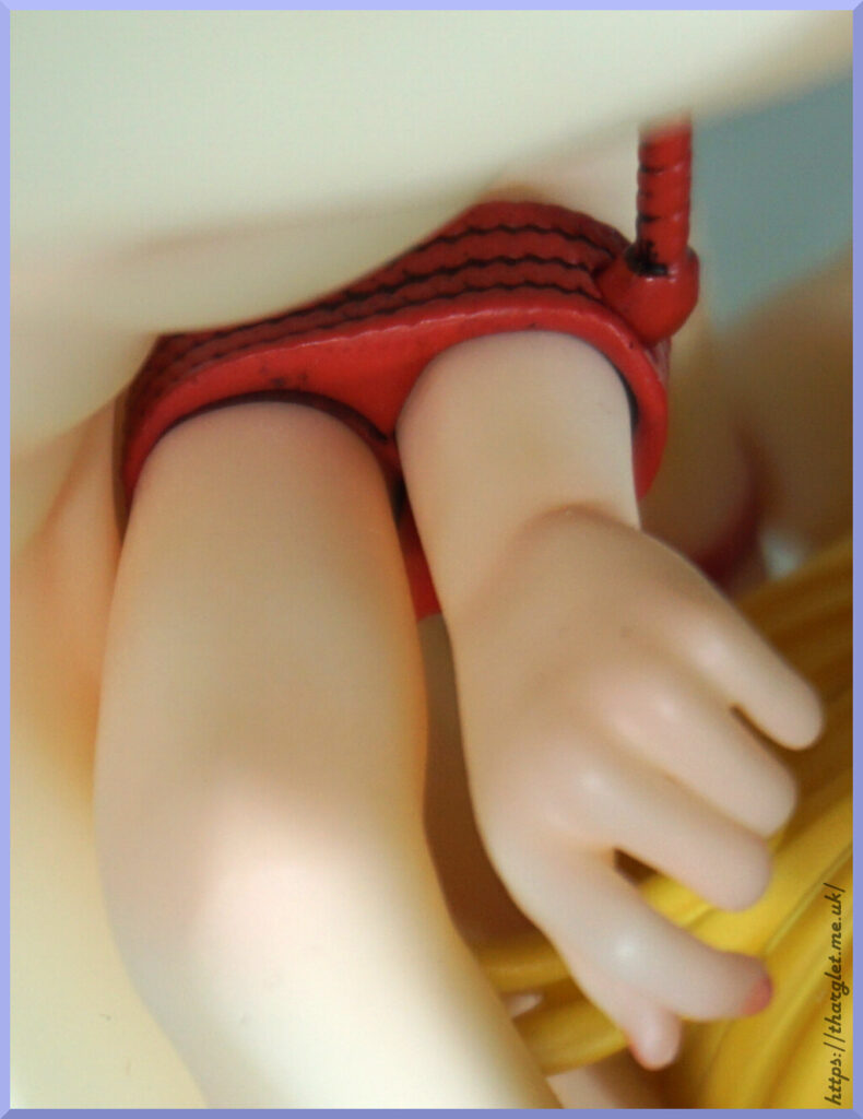
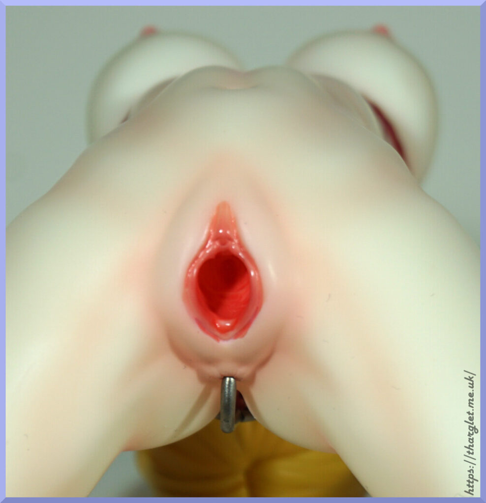
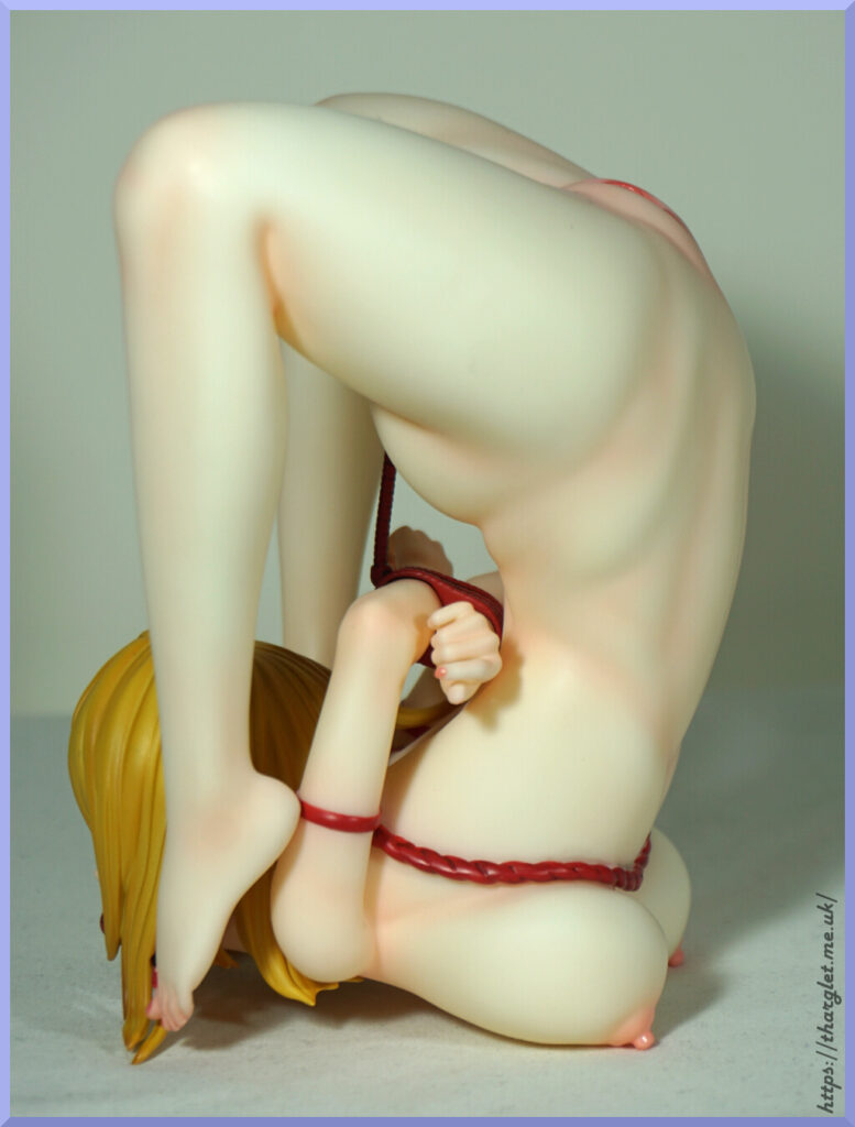
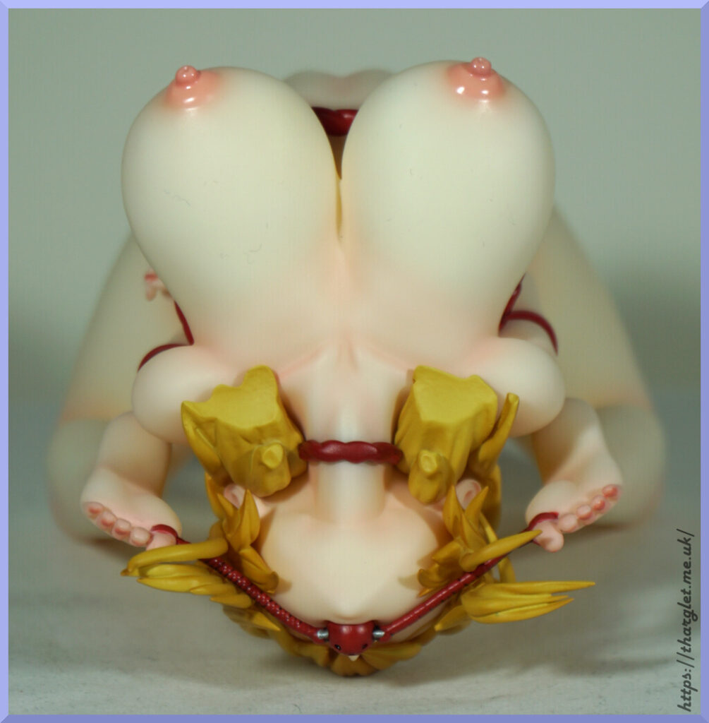
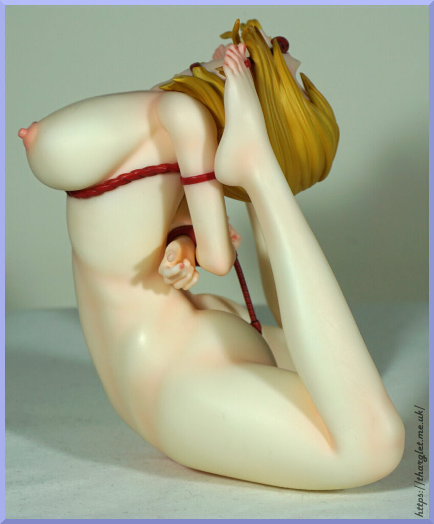
I feel like this one is very much a niche figure – either you’re going to be into this or not. The religious theming is probably going to put some people off, but there is an option to do away with it. Without the surround she can just be a contortionist in bondage, and you can include the “water extractor” if you so wish. I like the way there are these display options. The strap and bar going to her anus you can’t really leave off though – it leaves a noticeable hole in her arm restraints.
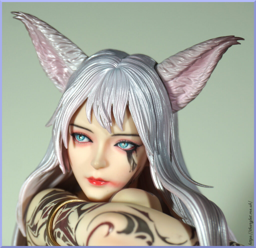
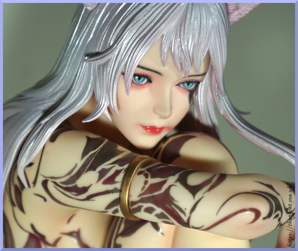
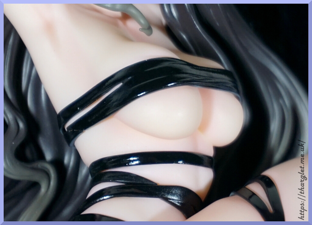
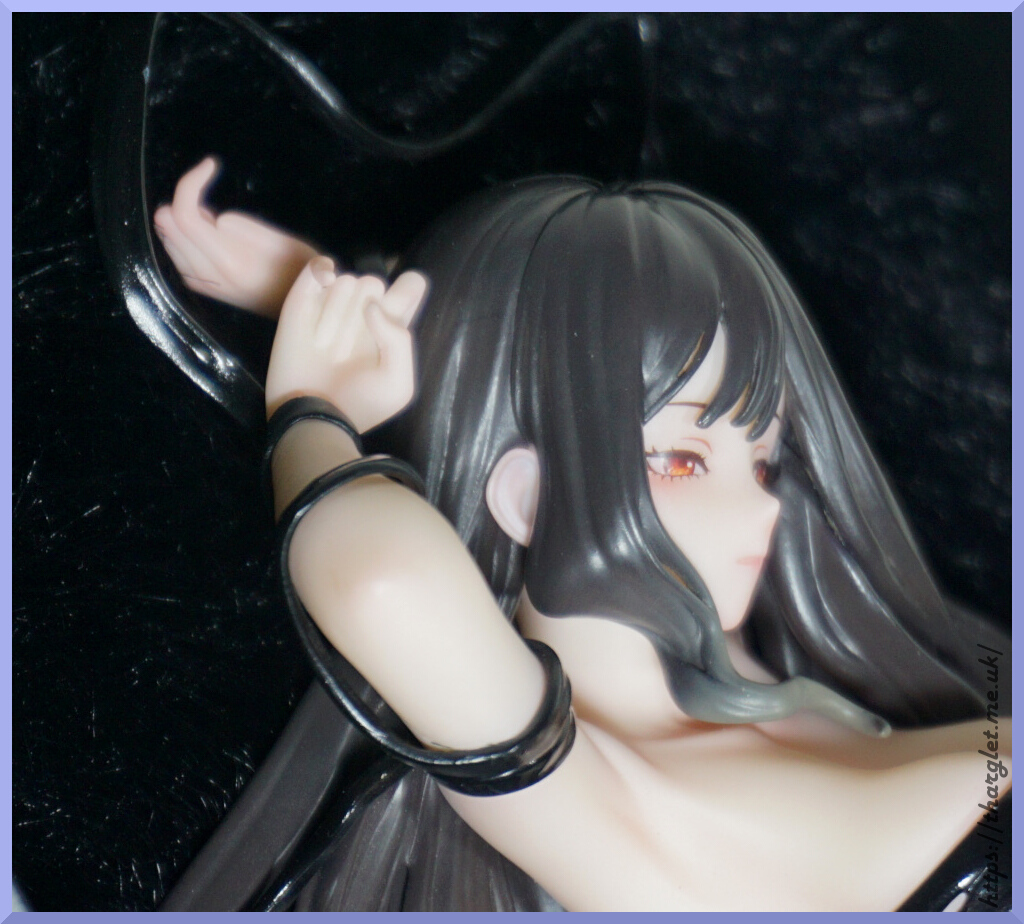
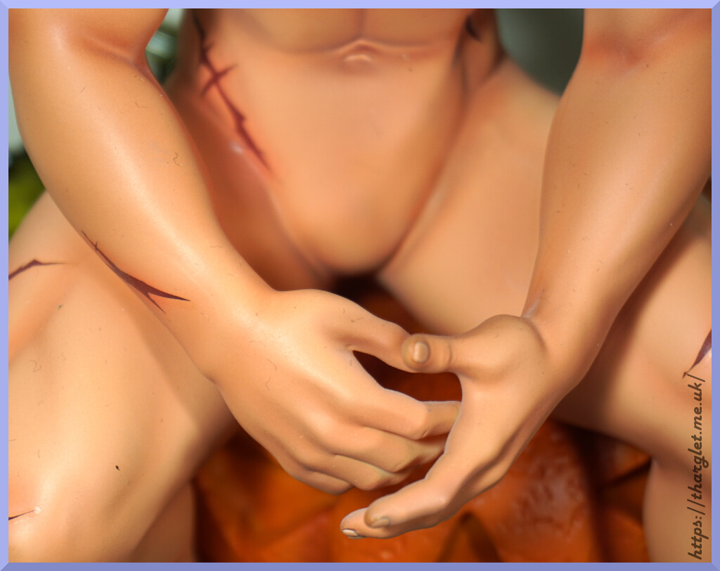
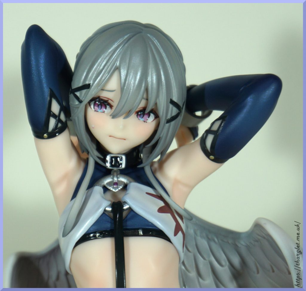
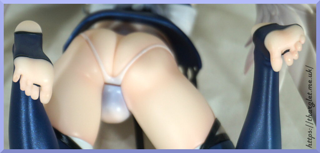
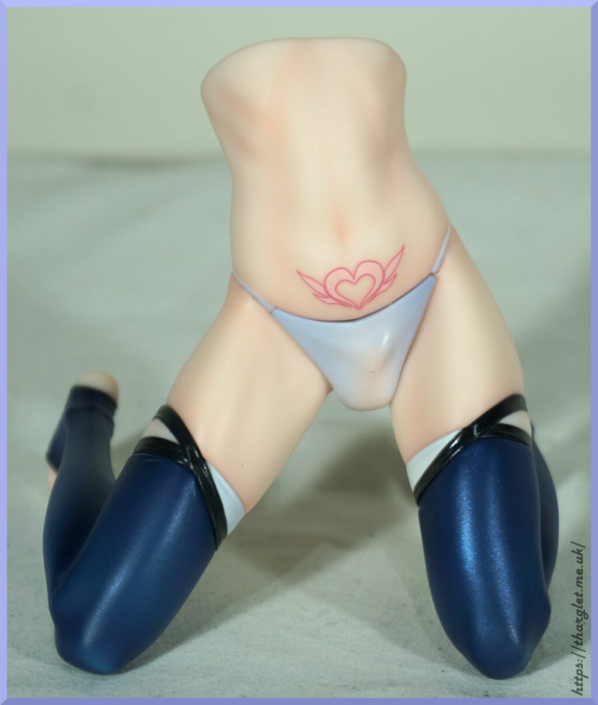
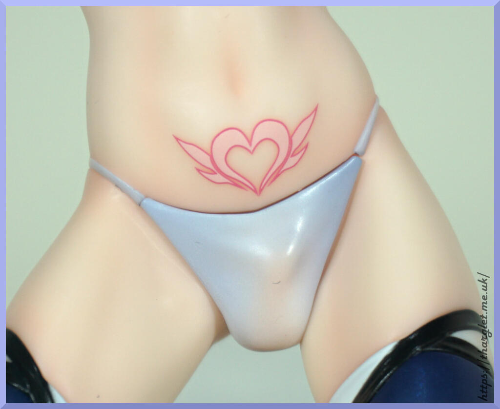
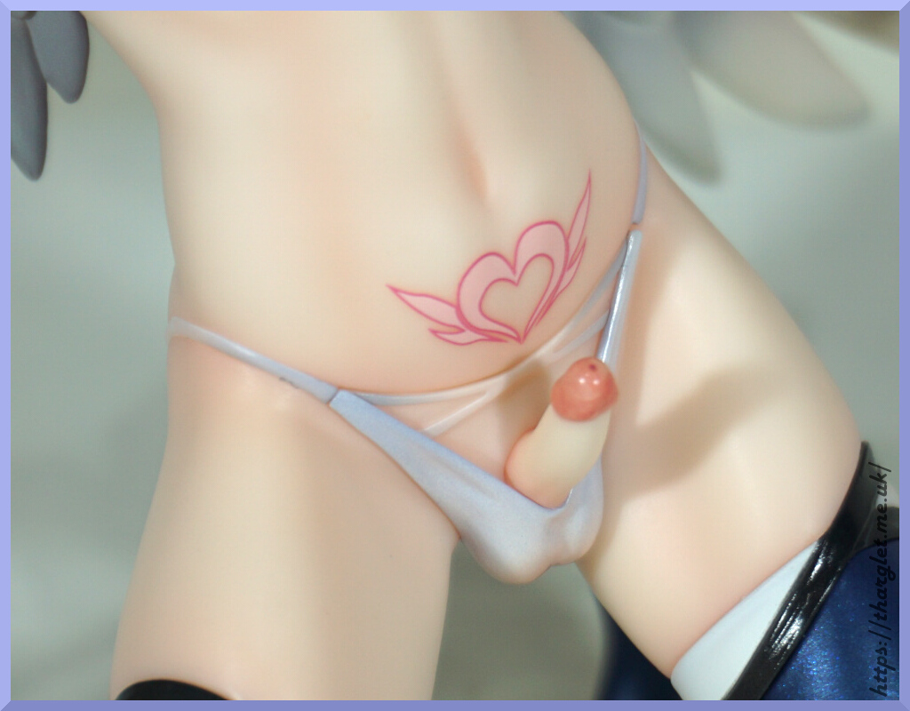
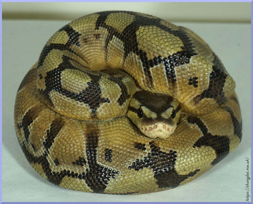
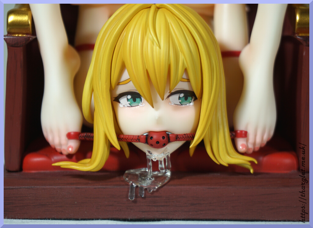
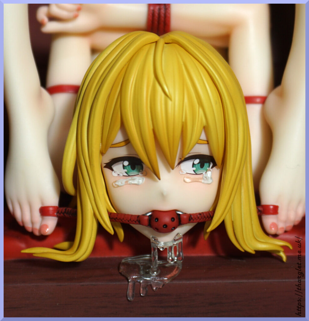
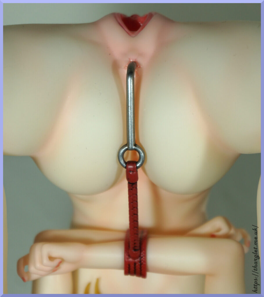
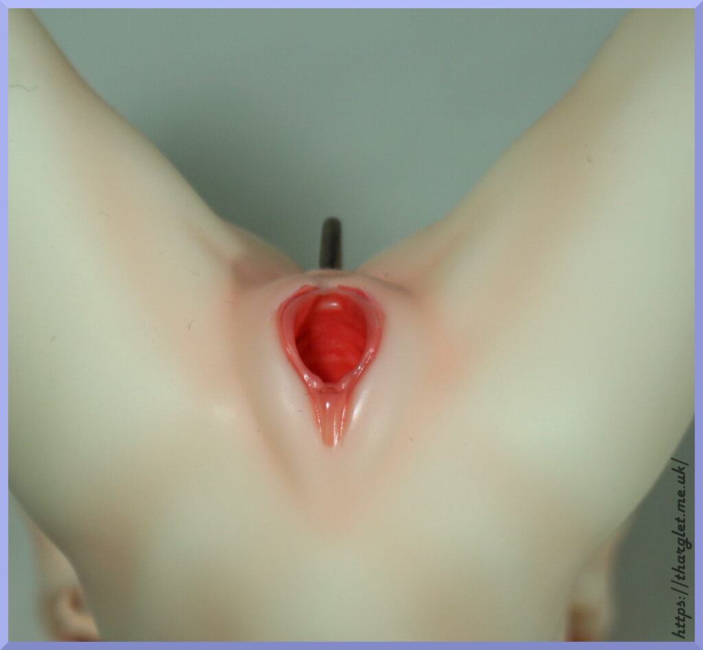
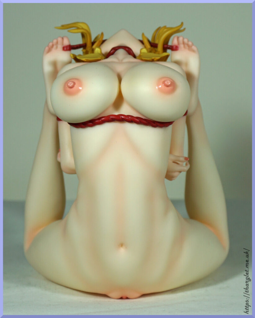
Overall, the paint and sculpt quality is very good but there are some areas that could do with improvement – most notable being the painting on her labia. Seems an odd place to have subpar painting on a figure intended to be nude fetish figure. The drool can look odd seeing as it doesn’t attach to her face or the gag, but I don’t think it’s a dealbreaker. You could do without it, but it will leave a gap on the base.
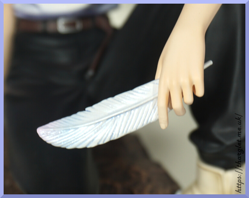
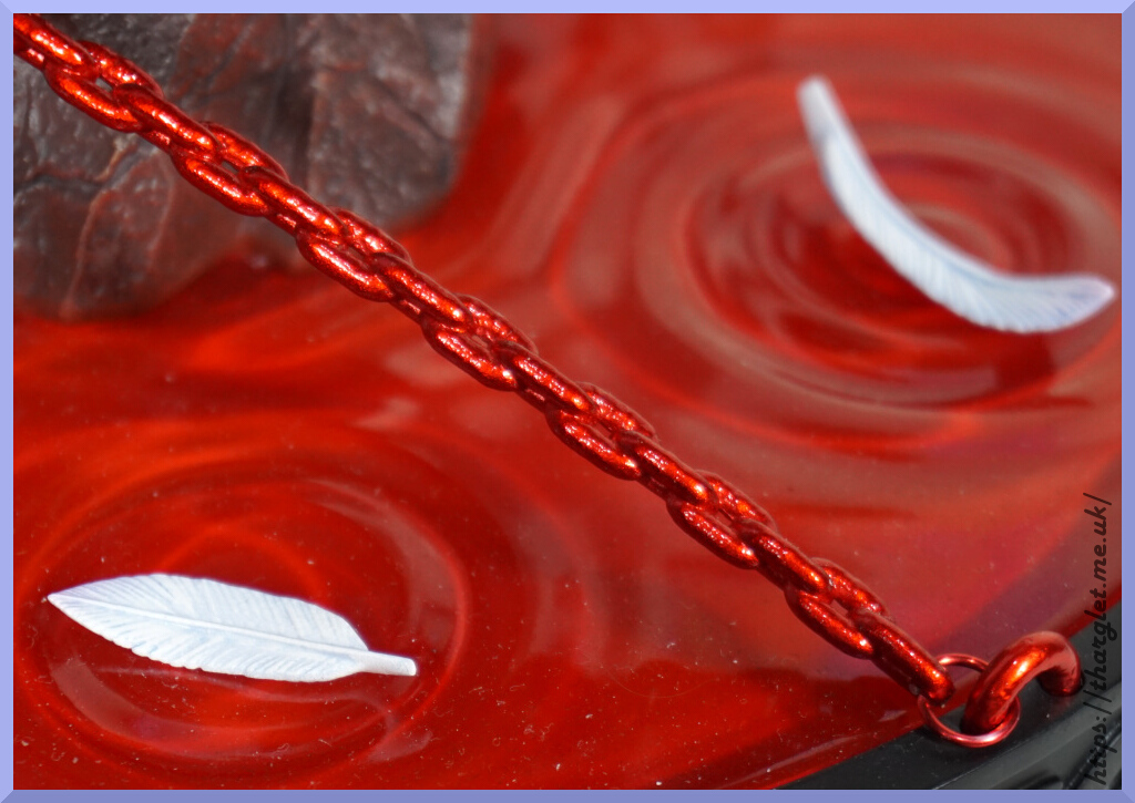
The tears were a strange inclusion – I don’t think she needs 3D tears, but they’re there if you want to attempt to attach them or use them for some other purpose. I’m content to leave them in the box.
Overall would I recommend this figure? Yes, if it’s your thing though I’d bear in mind it’s a small figure – she’s about 12cm tall and the stand is about 20cm tall so you’re not getting a lot of figure for your money. However you are getting something that is unlikely to be replicated in the current market apart from maybe Insight. And anyone in this collecting space is likely aware of their reputation…