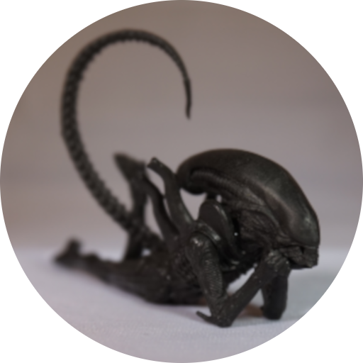
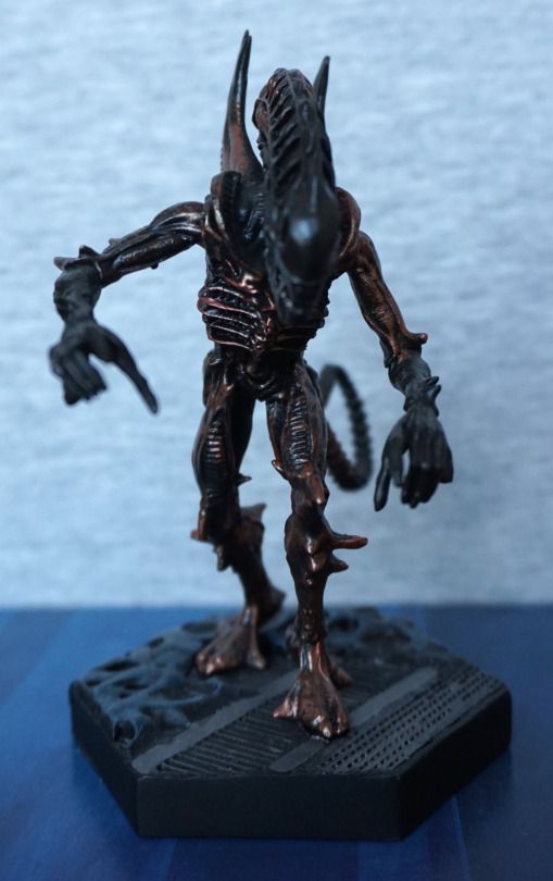
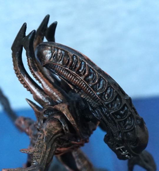
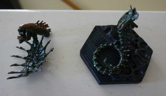
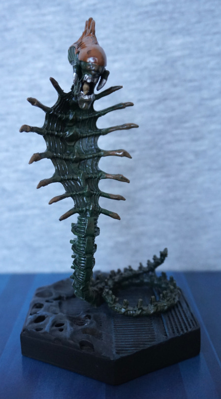
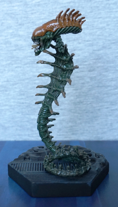
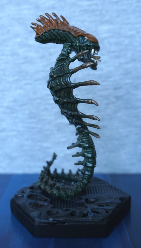
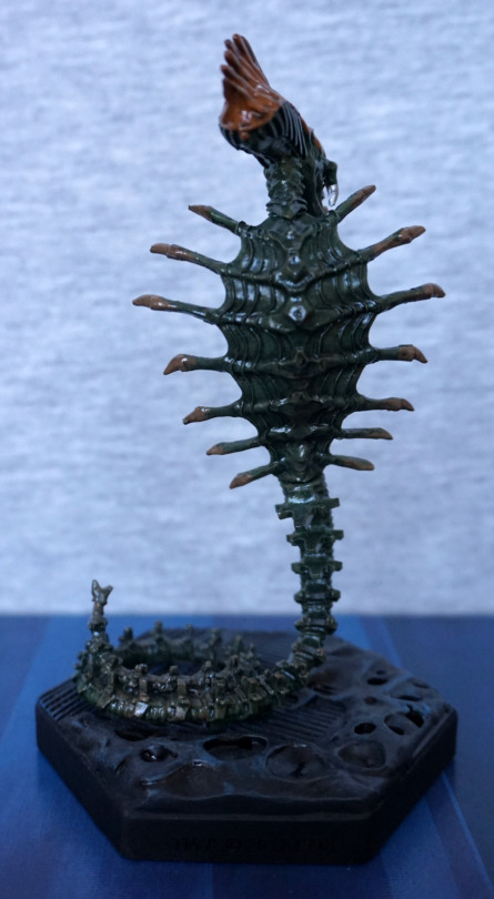
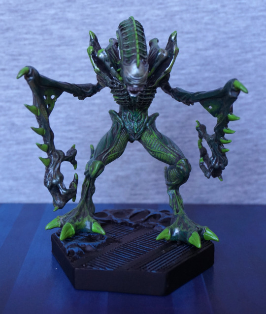
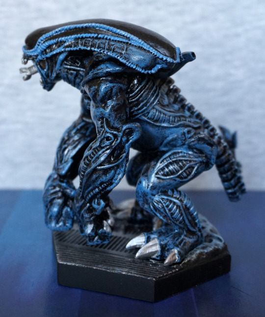
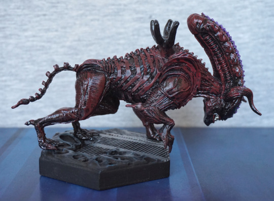
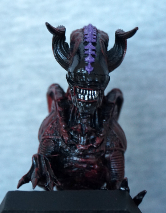
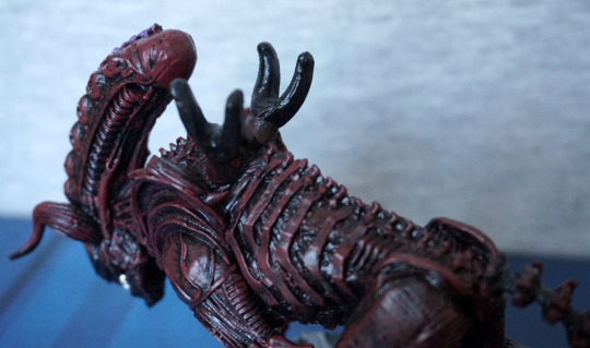
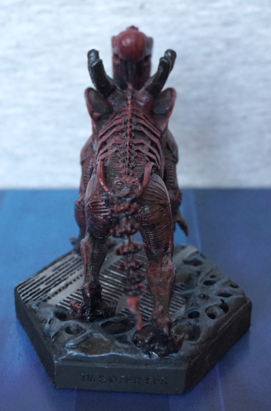
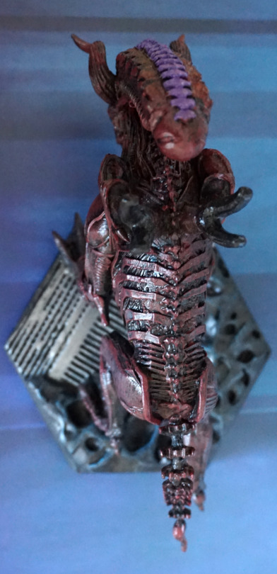
And, finally, the panther alien:
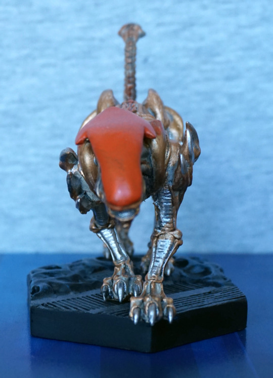
I’mma gonna headbutt you… The body colours look really nice together, the orange head would look better if the paint app was thicker… seems a bit thin and uneven in places…
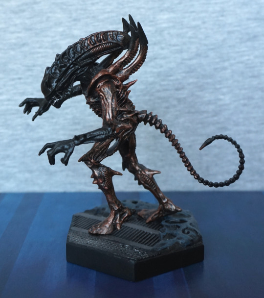
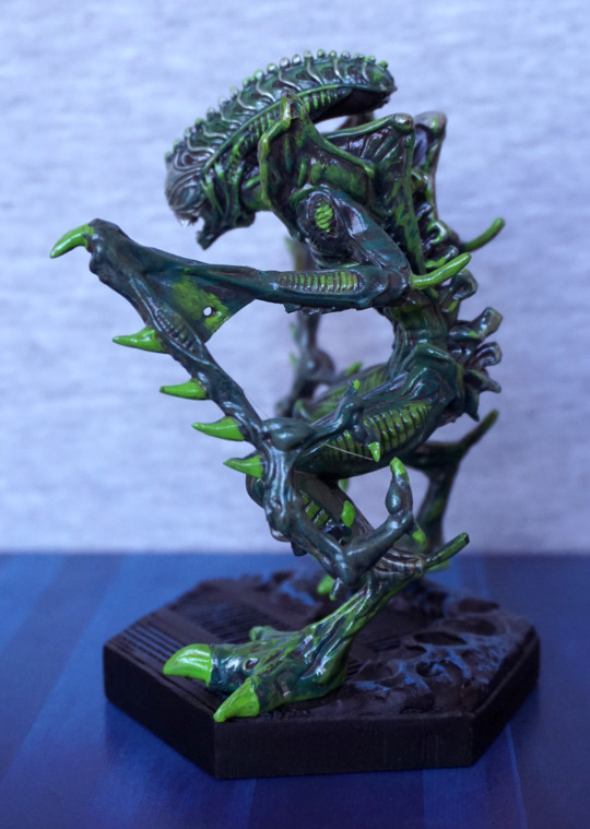
Left:
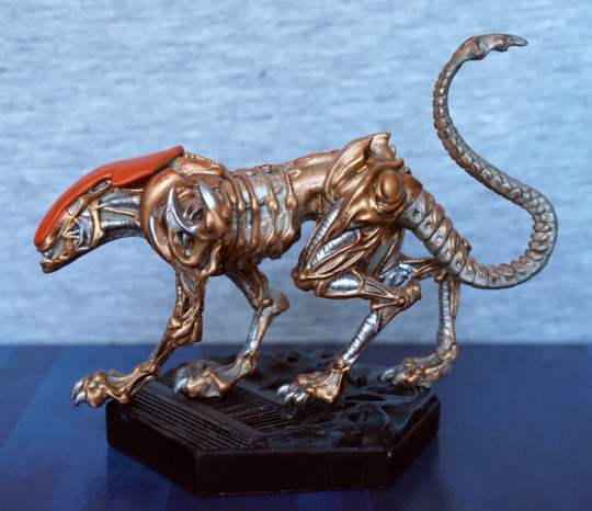
I like the pose, has a feeling that he’s slinking. The colours also work really well, and I think they’ve chosen the right places to paint gold/silver, though some place are a bit sloppy. I think the tail adds to the impression he’s slinking.
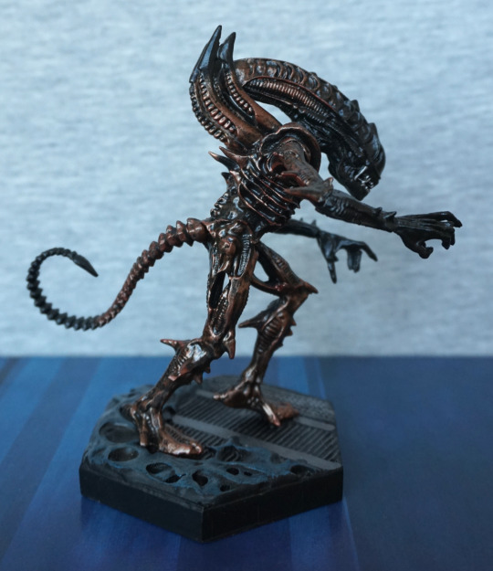
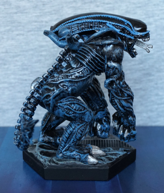
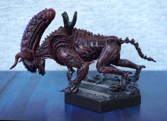
Right:
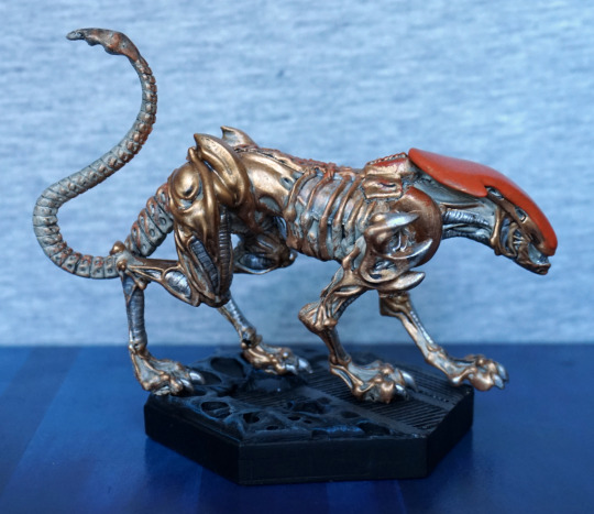
More of the same on the other side. I love the shape of his feet.
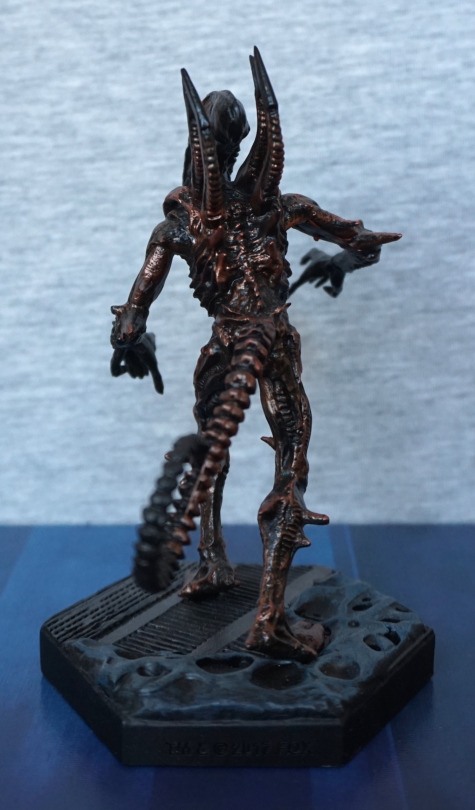
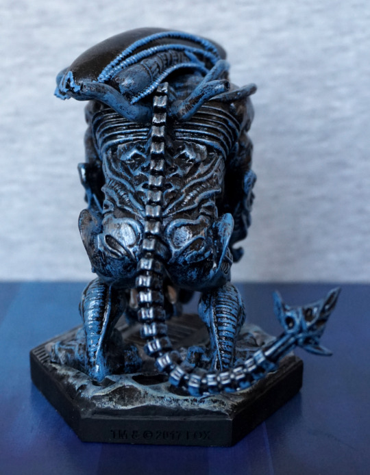
Back:
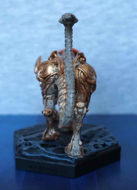
Not too much to see here. Looks like the moulding got sloppy at the back of his legs though, unfortunately. Tail looks fine.
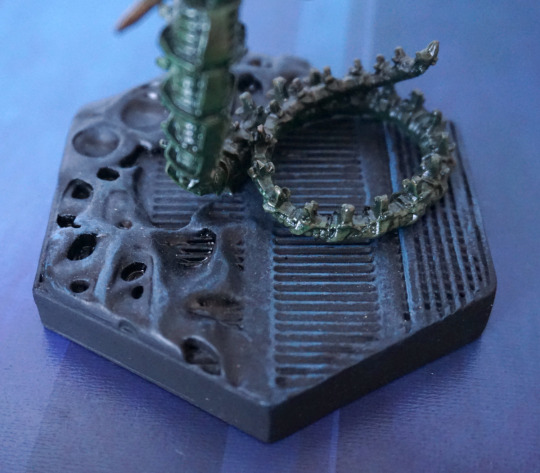
Closer look at the tail:
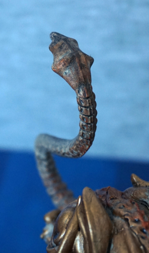
I like the shape of the end of his tail, and feel it is well sculpted overall.
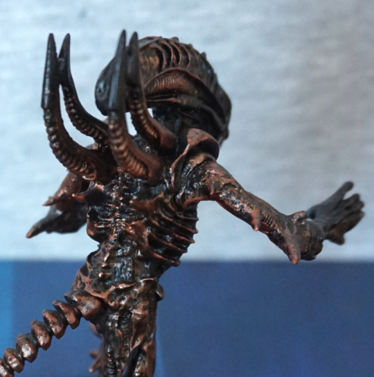
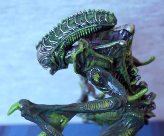
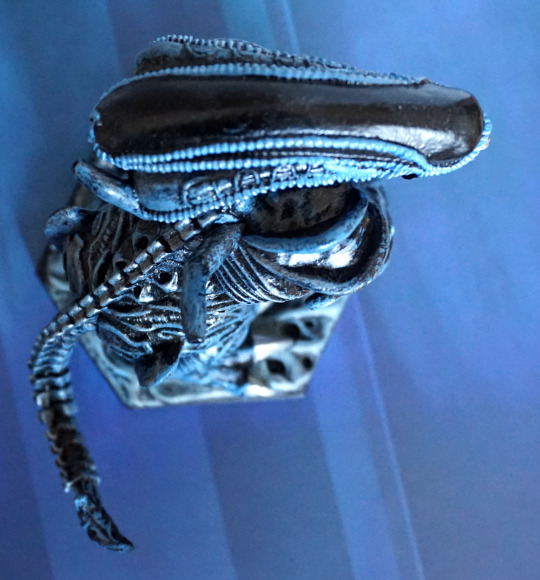
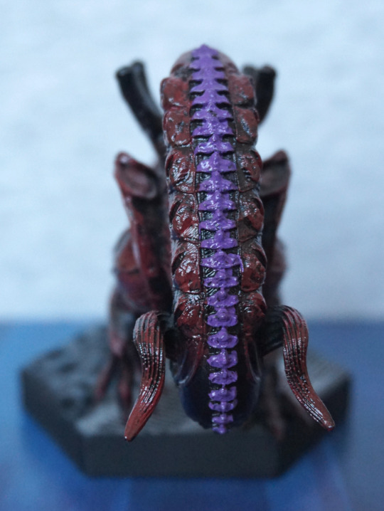
Top:
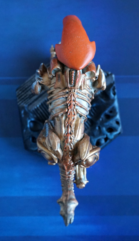
They’ve added some orange down his back, not sure this worked too well. At his upper back, I think they should’ve stuck with just the dot-spine bits. The blend ion his spine could’ve worked, but I feel the paint app is too uneven for it to work, and was probably too ambitious with Eaglemoss’s usual final quality – their painters don’t seem to blend too well, so I think this would’ve been fine as just gold, or maybe a darker shade of orange.
Overall, he’s pretty decent. He’s certainly an eye-catching piece, but does have some flaws in the paintwork.
