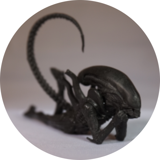
Next up, the mantis alien:
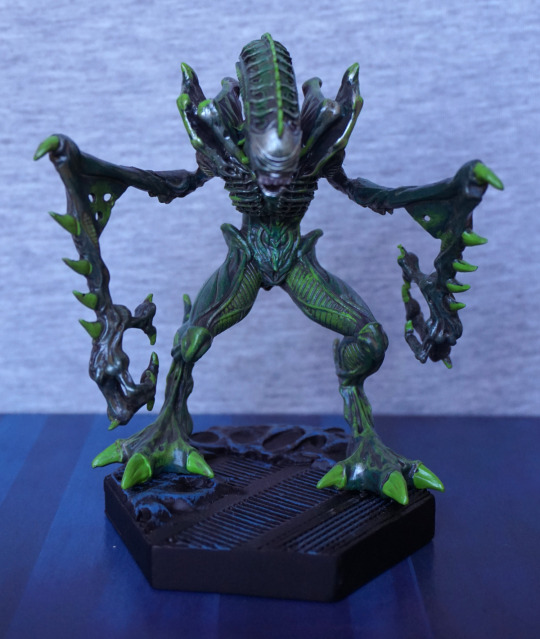
This was the one I was most excited about… so let’s see how he fares. From the front he looks good – we have a couple of shades of green going on, and some silver. I’m glad they’ve used a couple of shades of green to paint him, as it does add a lot to the figure. I like the pose of the figure too.
Left:
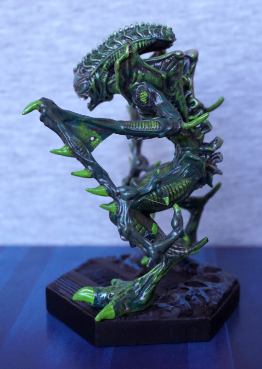
I like the pose of the arms and the body. The circular parts are nicely highlighted in the lighter green, and the sculpt o the head is lovely. What I like less is the webbing on his arm. The paint looks very sloppy on it, and it looks more like metal sheeting than skin.
Close-up of the side of his head:
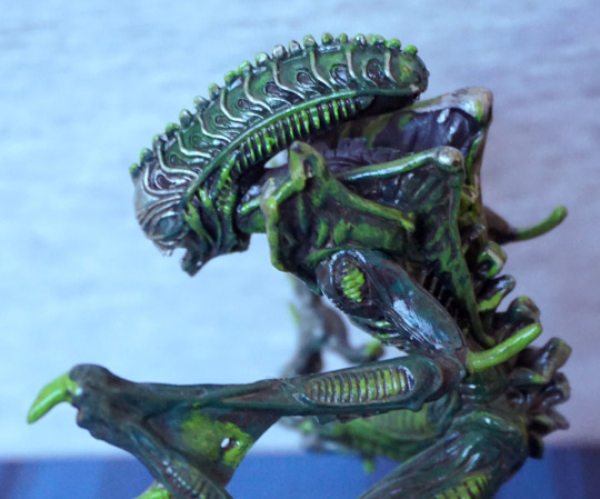
Couple of sloppy paint bits – the green on his shoulder and a little on the ribbing on the lower part of his head, but I do love this head design. The silver highlights on it work well too.
Right:
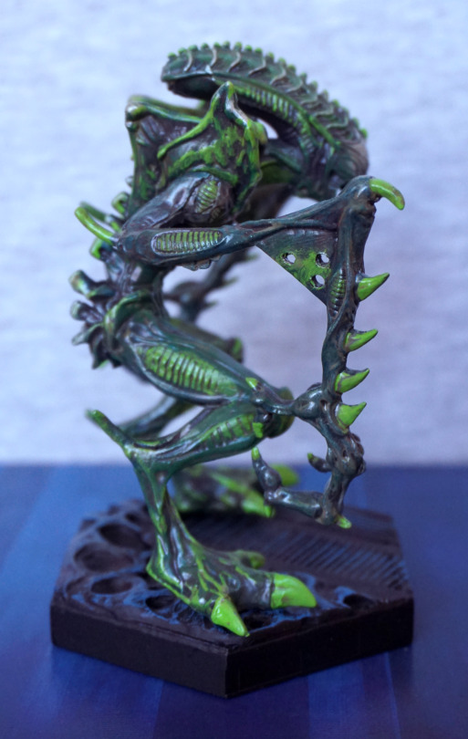
And the webbing on this side… ergh. Awful. Looks like he’s got some metal in the crook of his arm. It’s like the sculptor didn’t even try to get the webbed effect the original had. If they did something similar to the shoulder sculpt, that may’ve worked. Anything but this… weird attempt. Nothing would’ve been better, but could’ve made the figure dangerously fragile. I’ll just stare at his lower arm instead… yes, that looks better.
Back:
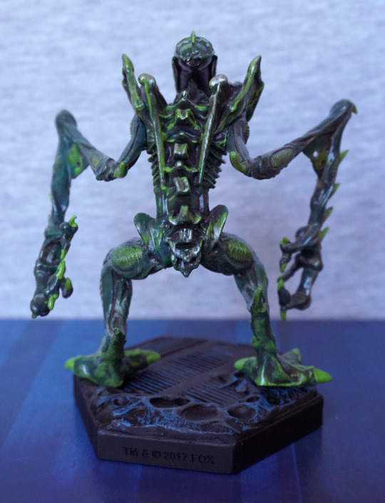
Weirdly, he has no tail. With the webbing and the lack of tail, I do wonder if the sculptor was trying to do this from memory instead of with source material… The back is OK, but not a strong point of the figure.
Top of the head:
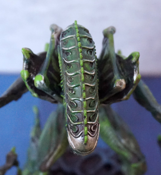
Pattern looks good on the top of his head :).
Overall, he looks decent enough from the front, but the “webbing” on his arms really brings this figure down. I still like him, but there’s definitely some weird design decisions going on here, which I don’t fully understand. Yes, the arms probably needed more support material, but why no extra raised bits to look like webbing? Is this actually some kind of statue of the mantis alien, instead of a specimen? Yeah. Gonna go with that.
