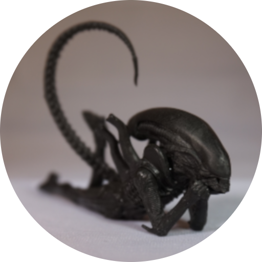
After receiving the previous Myr, I decided I need more Myr. So… more Myr!
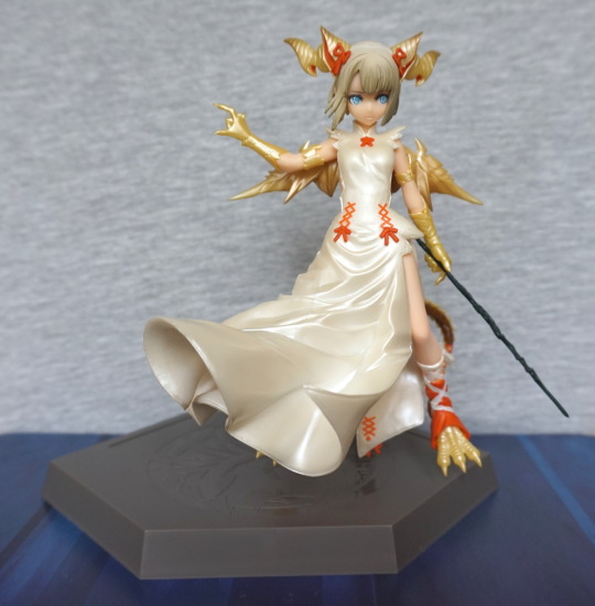
The simpleness of the dress with the small details make this a striking figre. She’s supposed to be motioning to her backdrop… but this was in her box at the time of taking pictures. I love her expression and the orange ribbons on her dress. And one feature prize figures frequently don’t have: shading in her hair!
Close-up of her face:
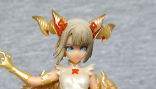
Some lovely, small details in her bows and lipstick. I like her blue eyes too. Hair lacks the definition a scale would usually have, but the shading makes it look the part. The horns also have eye-catching shapes, as well as being shiny.
Here she is, more angled on the stand:
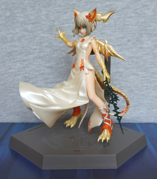
I think she is designed to be displayed at roughly this angle. but not so good for photographs to show her details. The lower half of her dress flows well over the empty part of the stand, and definitely looks like it was designed to be seen at this angle. I like the way there are cuts in the side of the dress, so you can see some of her, and her lithe body. It is a pretty outfit. The range of finishes on this figure work really well too.
Let’s take a closer look at that staff:
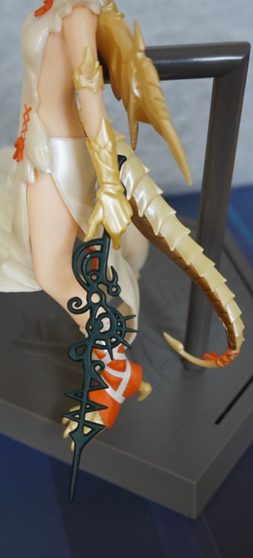
Tiny scratch on mine. Mostly looks the part, but close up, you can see how flat it is – not sure it’s really like this in the artwork, so I suspect they flattened it for the sake of quality – making it rounded would be prone to more flaws, as well as being more difficult to manufacture. From a distance, it looks fine.
Left side:
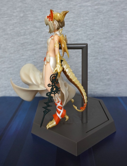
Here we can see her revealed skin. Some amount of detail has gone into sculpting her hand. Her tail looks good, and the lines painted well on the ribbon that’s on there. Love the amount of detail that’s gone into the ribbon and cloth “boot” she’s wearing on this side.Also you can see her ear poking out from her hair, which is a nice detail.
Right side:
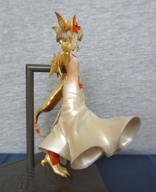
Here, she’s less revealed. You can see the seams in the dress,the upper one is pretty neatly done, the lower one about average. I think she’s saying “that camera? I’m gonna destroy it if you keep pointing it at me…”. Uh, please don’t, I’m nearly through with this review, I swear!
Back:
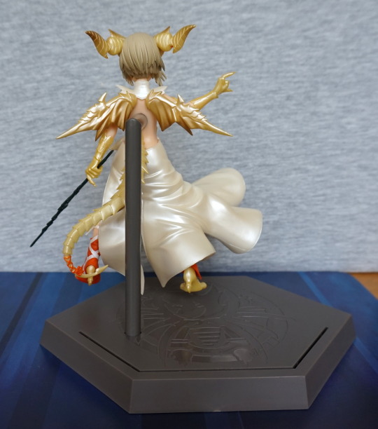
The ripples on the dress are continued around to the back. Her wings are nicely detailed on the back, and catch the light well. Here you can see where her hair is darker towards the bottom – nice that they continued the shading all the way around.
Let’s get a closer look at those horns and wings:
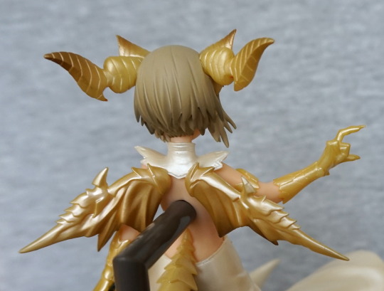
Some paint shading in the horns, which is a nice touch. And those wings are looking small but amazing.
So… what if we don’t want a great big massive stand in her back?
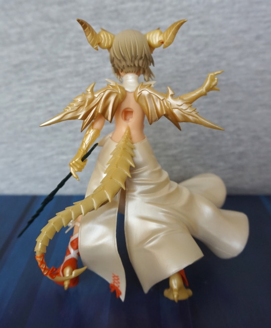
Erm, er well…. Not too attractive! But we can get a better look at her tail like this. I find it interesting they’ve joined the tail far higher up than most creatures have a tail. We can also admire the neat painting they’ve done on her tail ribbon. It’s kind of a shame they went for a back stand, as she looks really good from this angle too – would’ve been nicer to have a stand that maybe went under her dress or a clear claw stand. Foot pegs may’ve worked, but even if they were clear, she probably wouldn’t look like she was floating, which is the look they were going for. Ah well, can’t have everything.
Also she doesn’t work too well without a stand from the front:
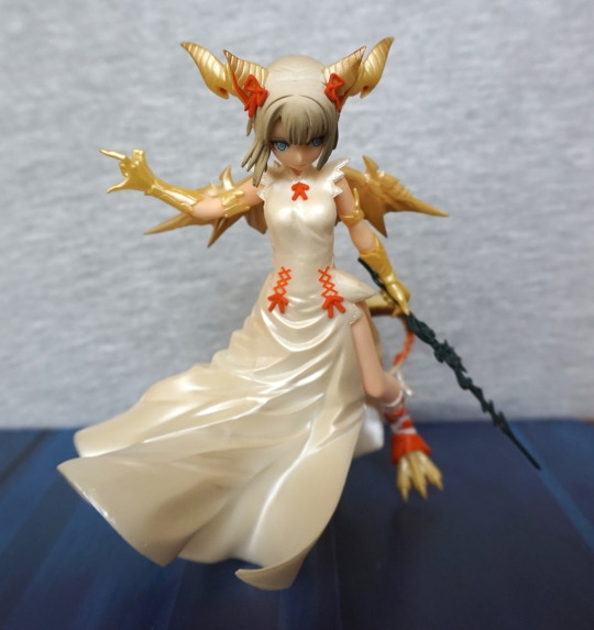
You can lean her so she stands, but she’s looking down. You could get away with doing this, if you displayed her on a high-up shelf, but really she’s designed to be displayed with the stand.
Really pleased with this figure – Eikoh has done a really good job with it. Would recommend it if you like what you see.
