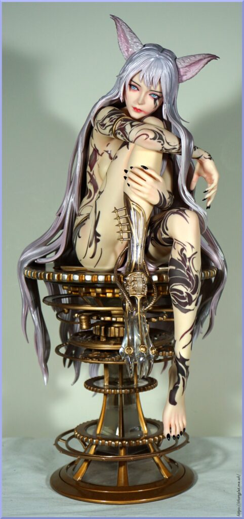
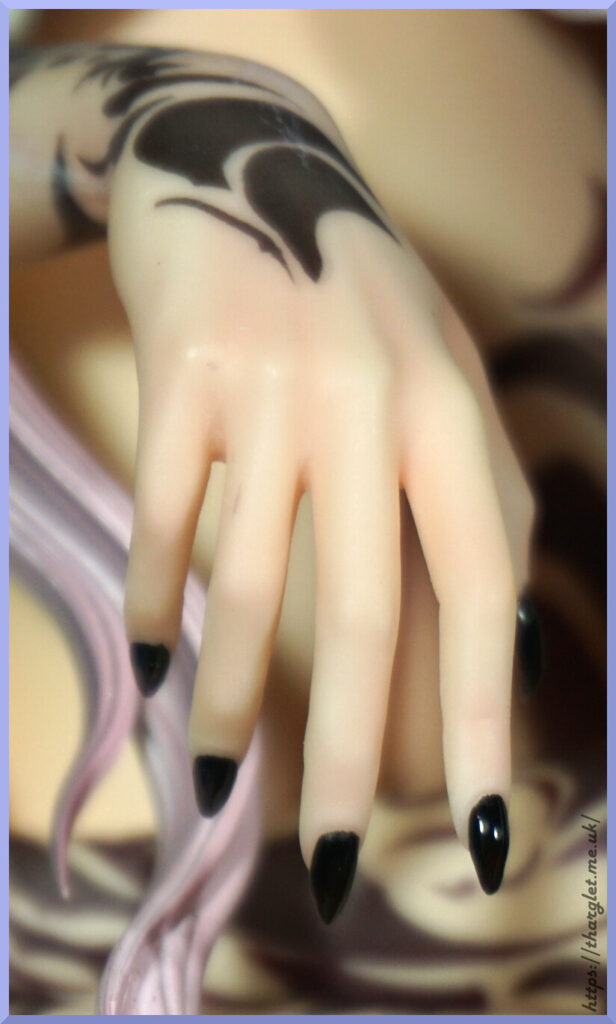
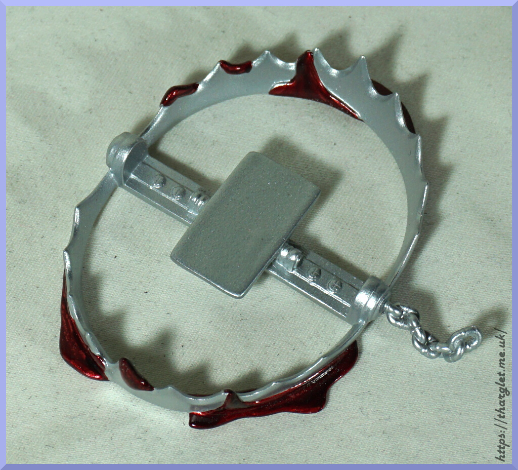
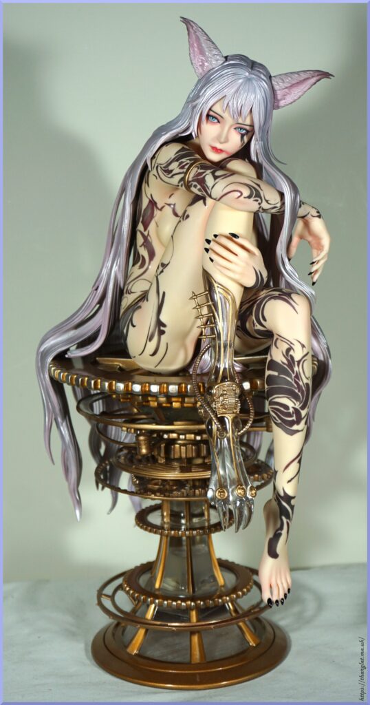
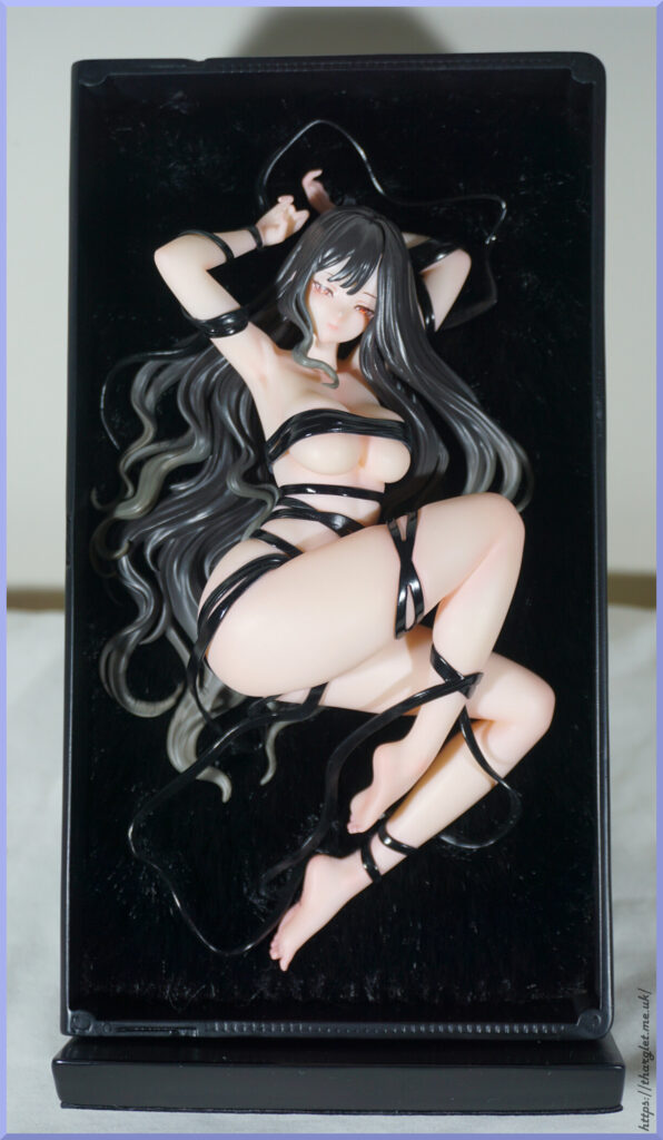
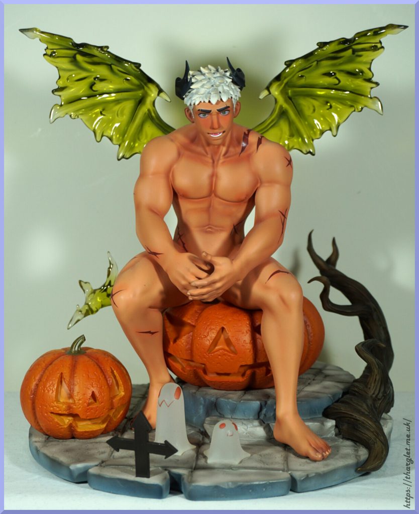
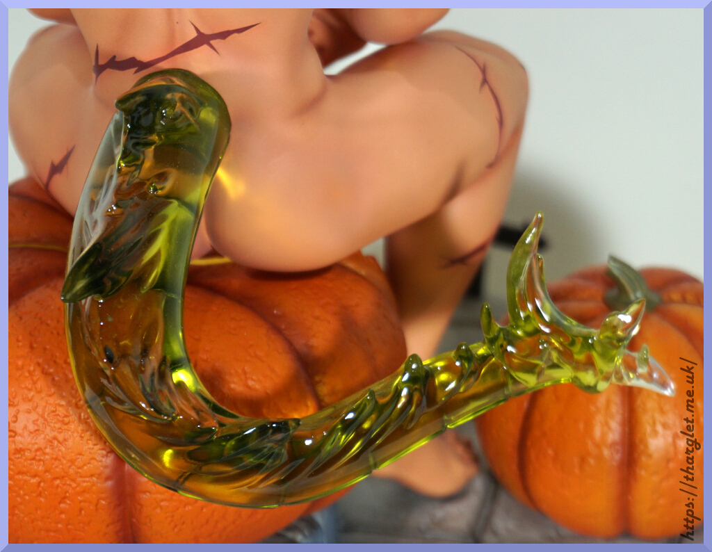
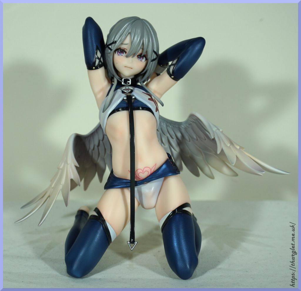
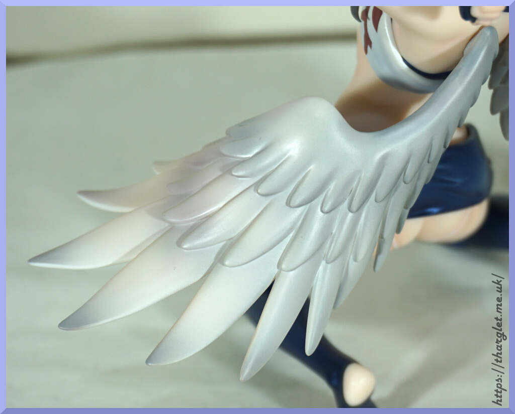
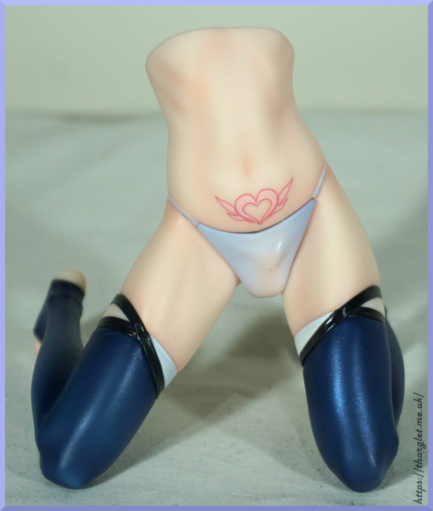
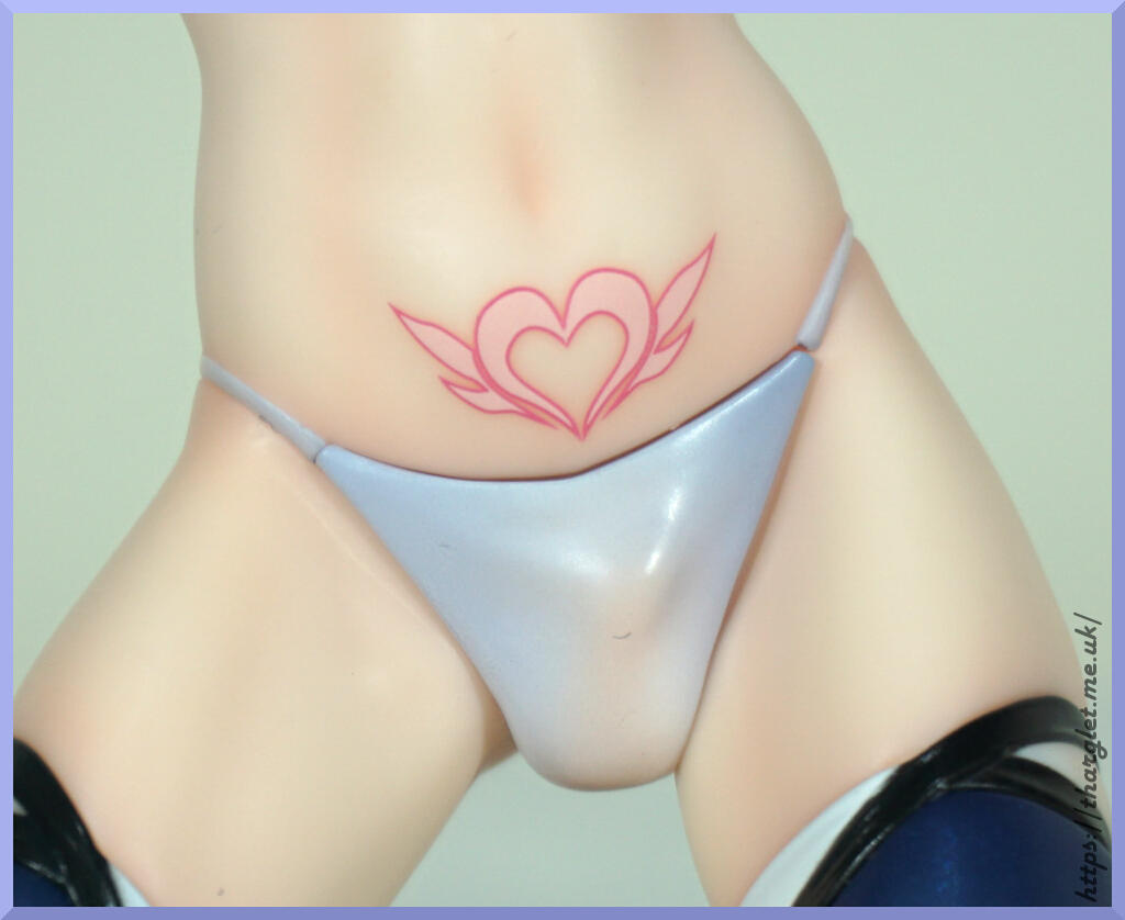
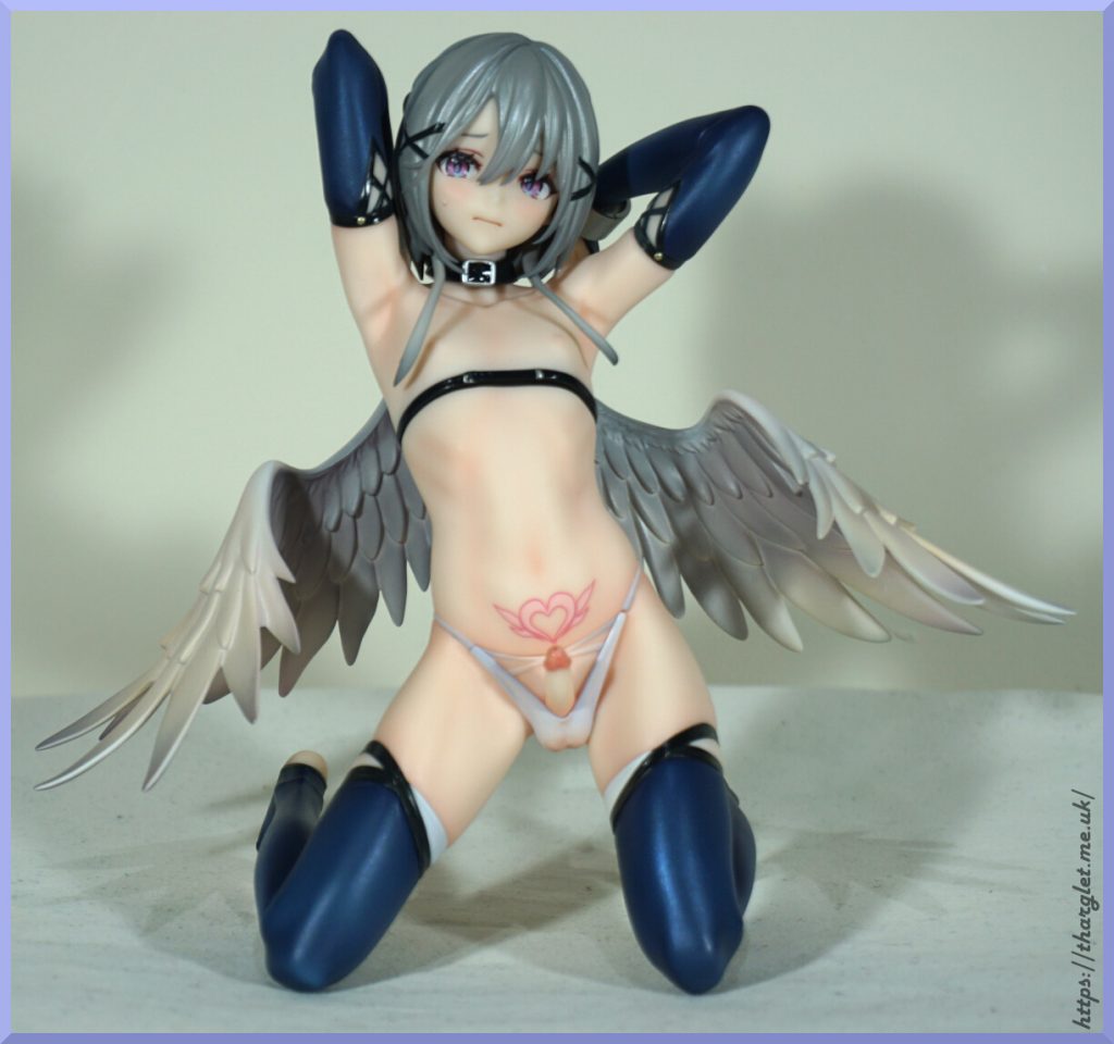
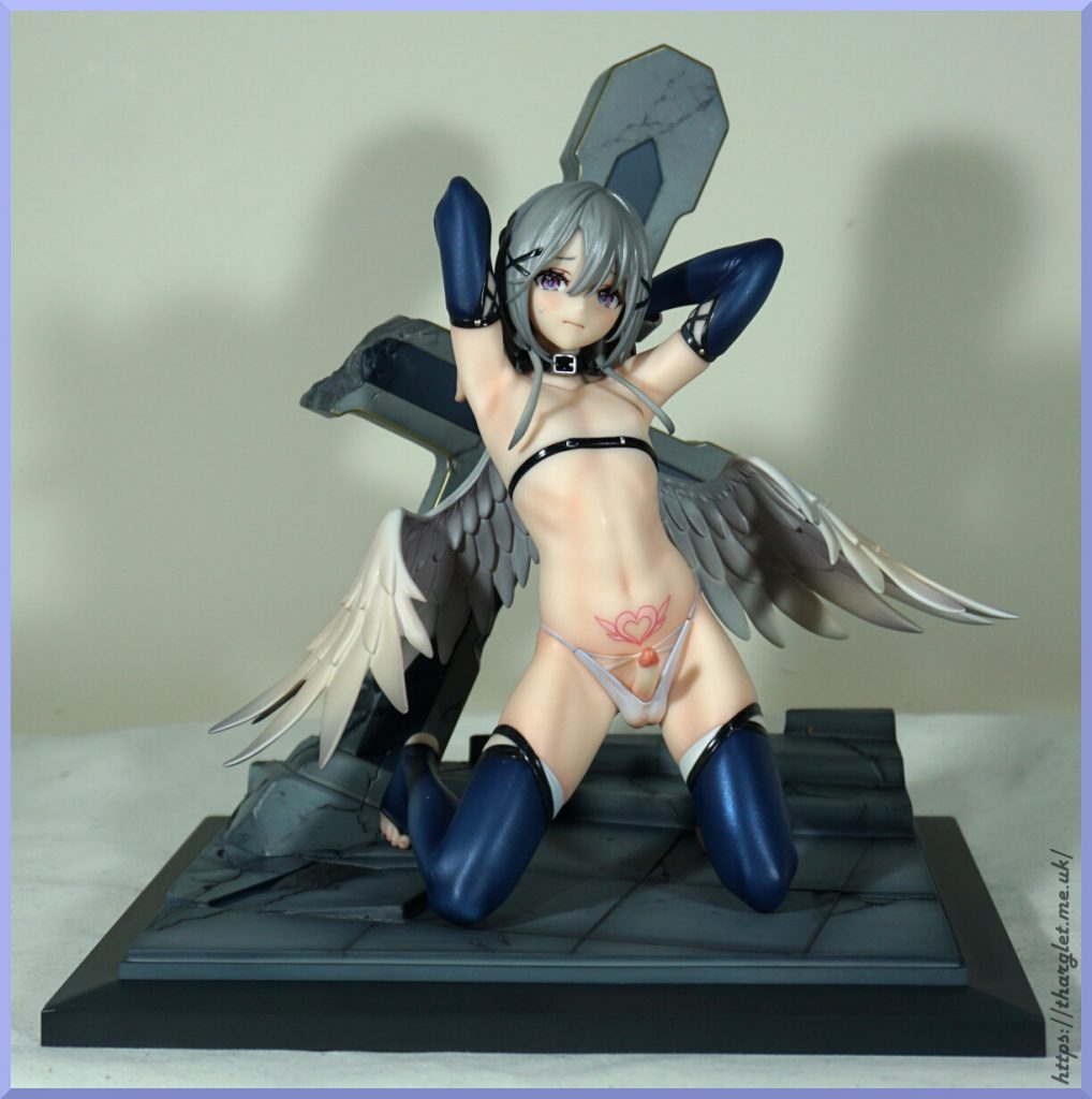
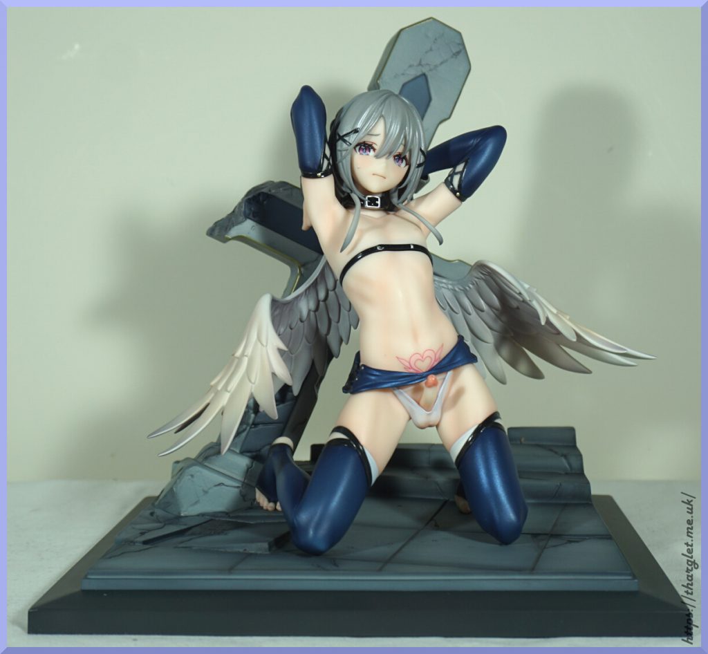
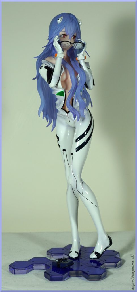
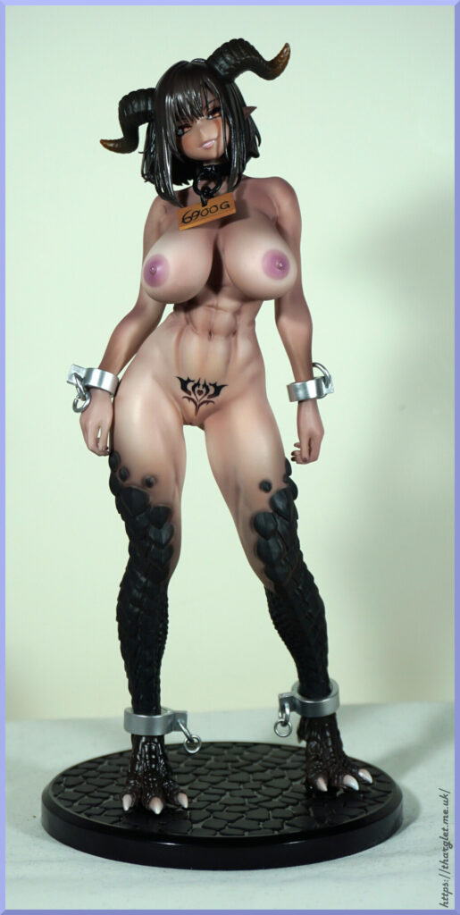
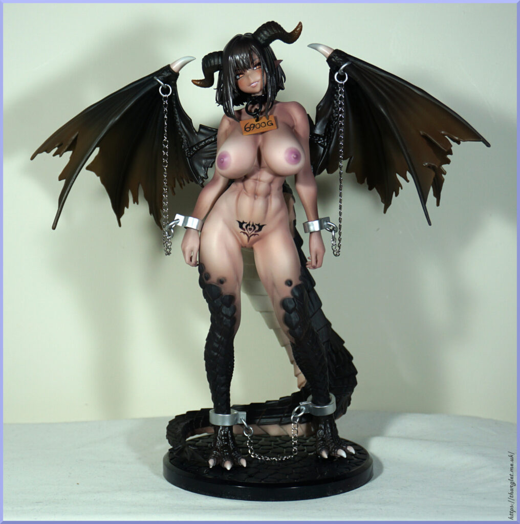
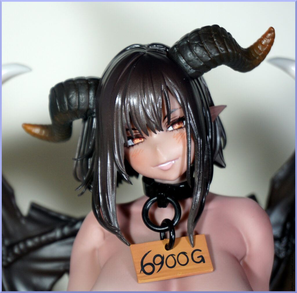
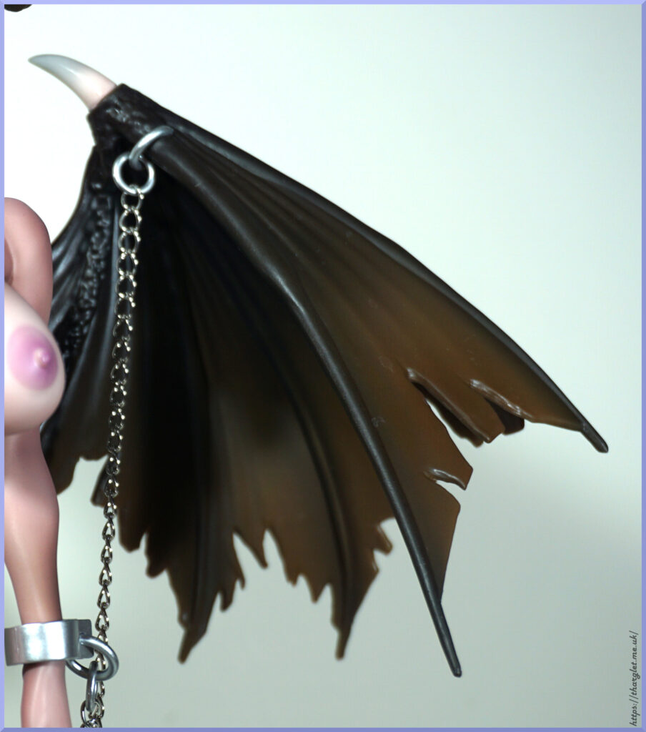
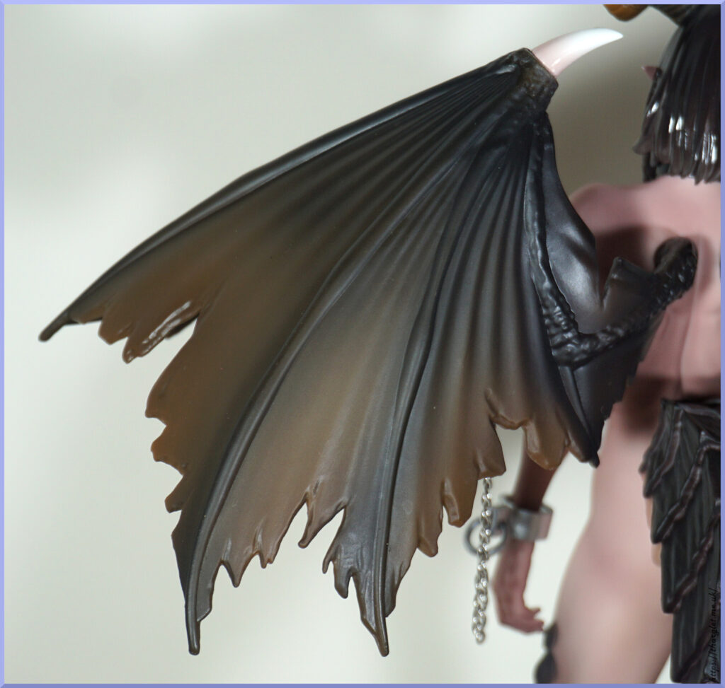
This figure was an instant preorder for me – I’m a big fan of dragons and dragon hybrids. Also she has a succubus tattoo. And apparently I am not alone – she got enough pre-orders for Insight to switch to PVC production – which for a winged figure was a relief as wings can be quite breakable with their sharp points and thin nature.
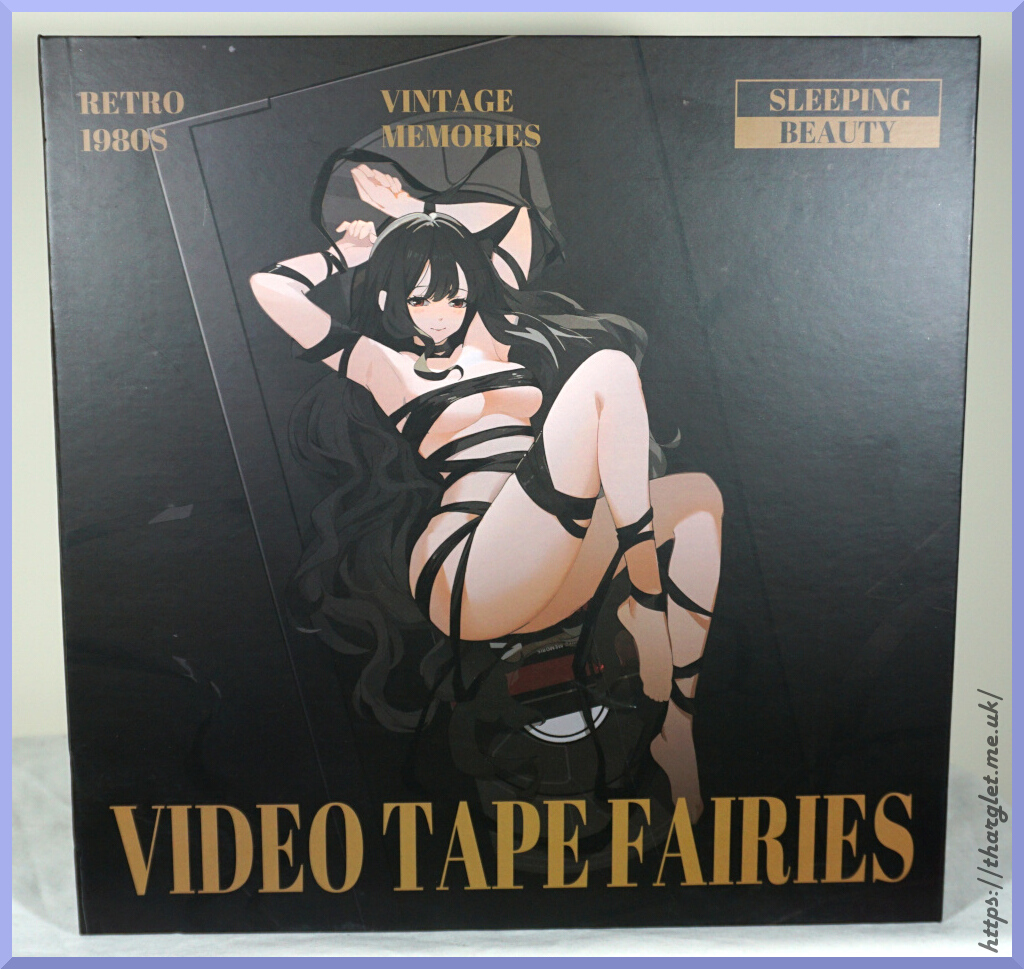
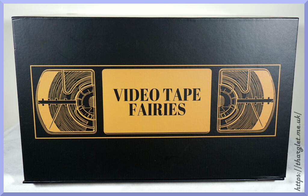
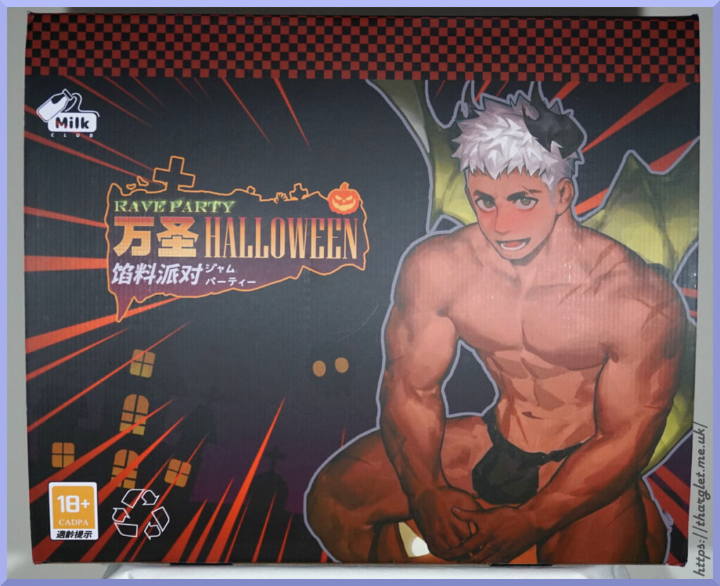
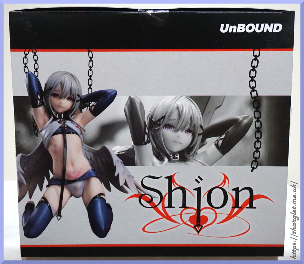
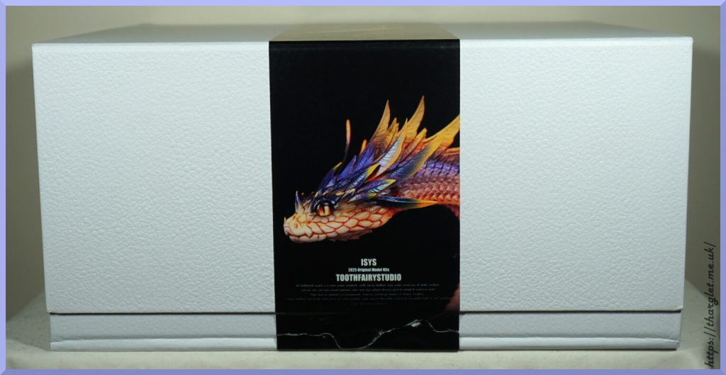
Box
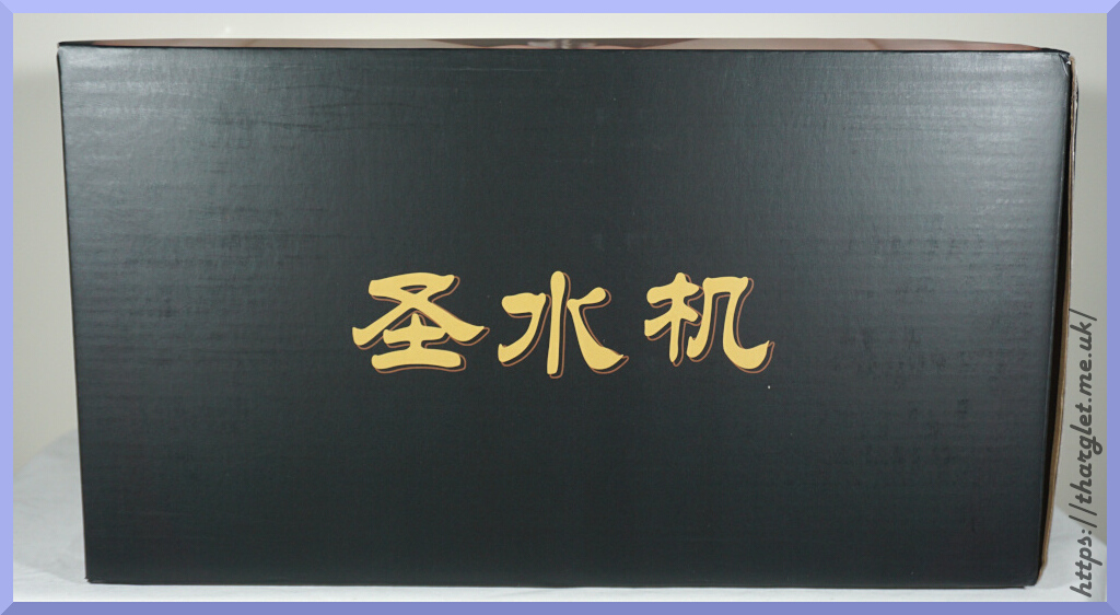
Front:
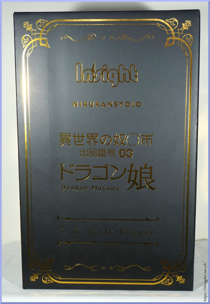
Fancy and plain at the same time. The gold foiling is nice, but kind of hard to read/look at under certain lighting conditions. And we have a transliteration of 少女 to “syojo” – usually this is transliterated to “shoujo”. Design gets the job done, but doesn’t feel particularly inspired by the figure itself.
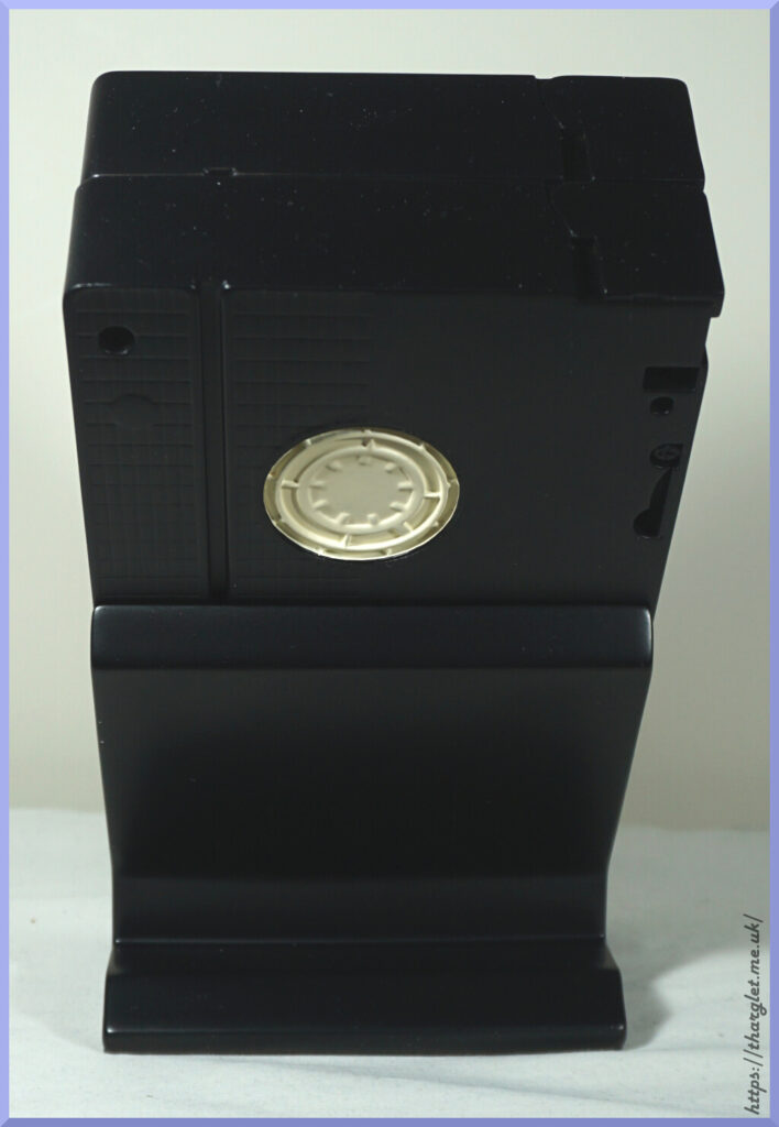
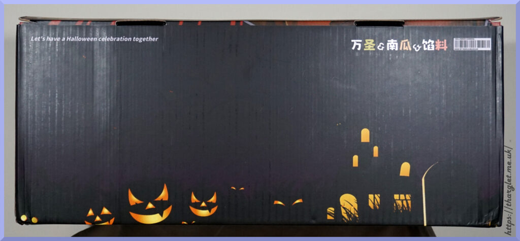
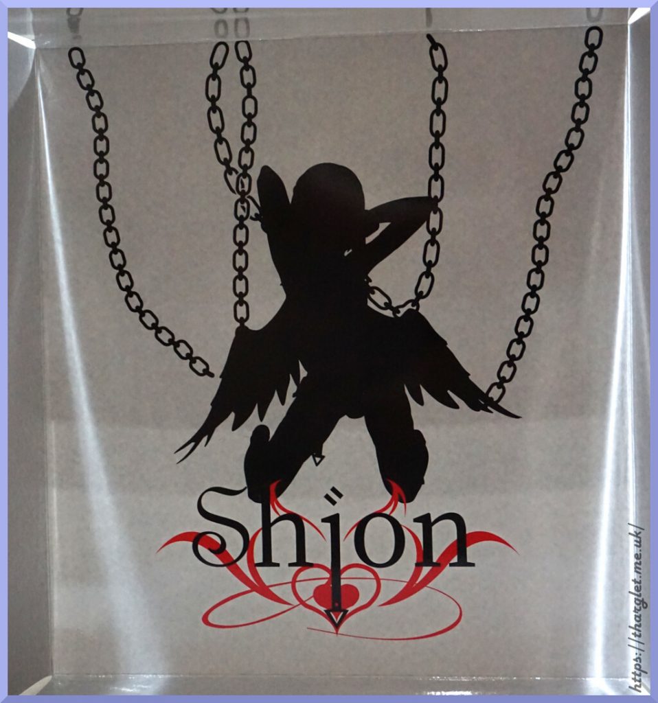
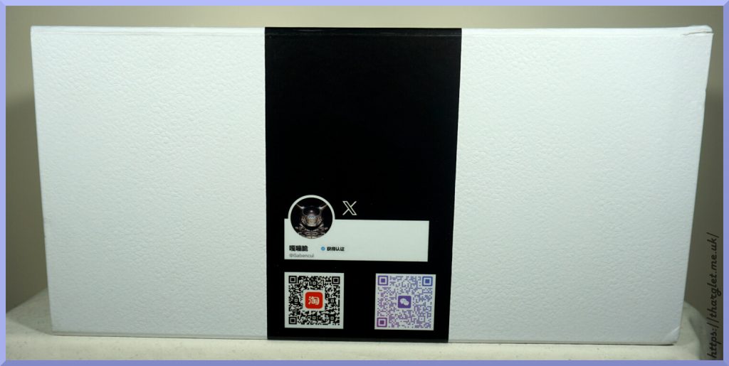
Side(s):
Here we have a silhouette of the figure so can get a feel for what’s actually in the box. The opposite side is the same, so didn’t take a photo of it.
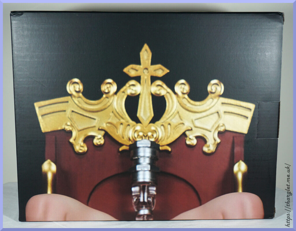
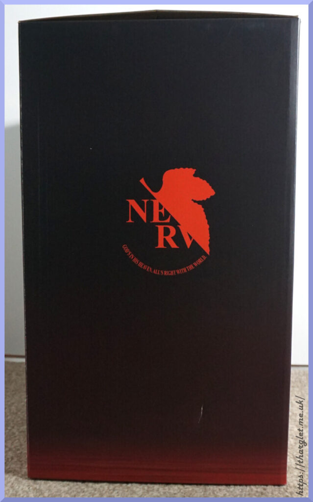
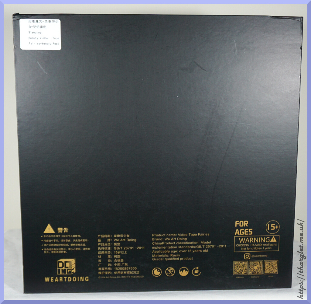
Back:
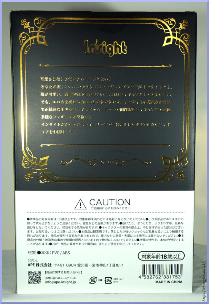
Yeah, the gold makes it a pain to take photos with lighting. Could I have fiddled it to make it more readable? Yeah, but I’ll provide a translation of the gold text below.
Is it a blurb about the figure? No. It’s a blurb about Insight:
Cuteness and beauty alone aren’t enough!
Insight is a figure brand that brings your erotic desires to life.
A cute face and beautifully detailed sculpting are essential qualities for a figure.
However, what people find erotic varies from person to person. Insight offers a wide variety of figures, from classic beautiful girl figures to niche and unique figures, with a wealth of new products!!
With a lineup only Insight can offer, we will deliver figures like no other you’ve ever seen before.
Hm. It’s fine, but I would’ve much preferred blurb about the figure rather than Insight themselves. Could’ve put this blurb on one of the sides then had some backstory for the figure on the back.
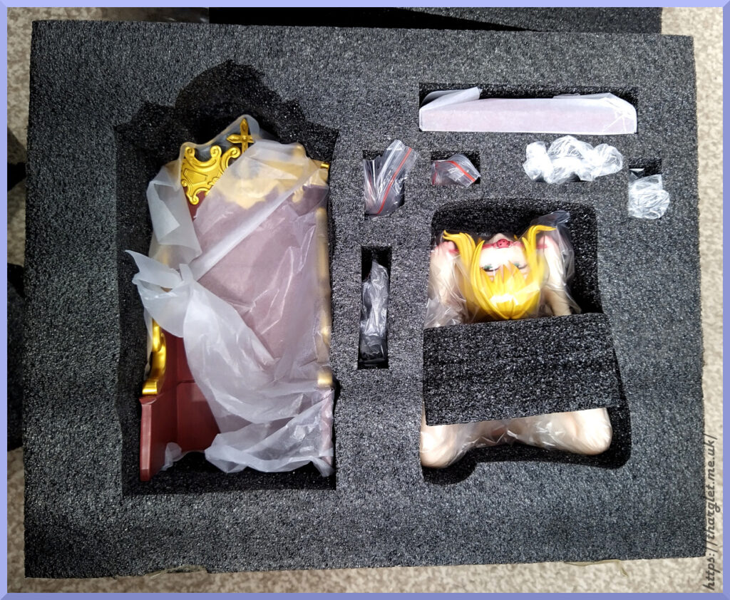
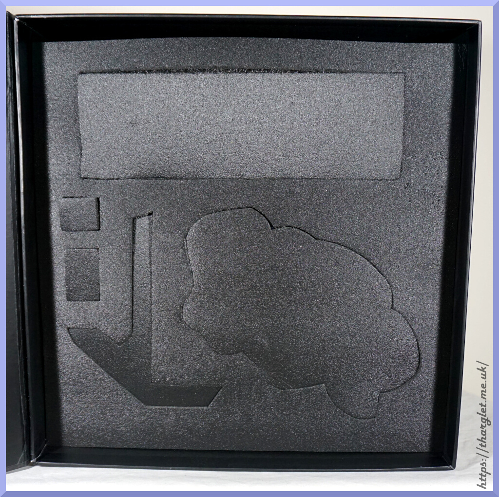
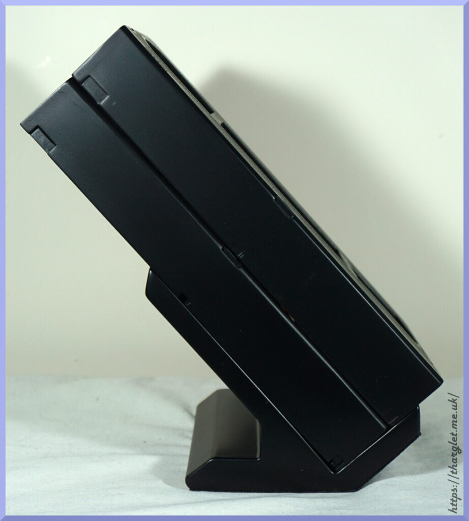
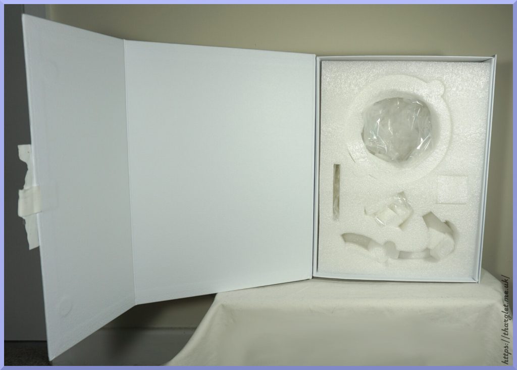
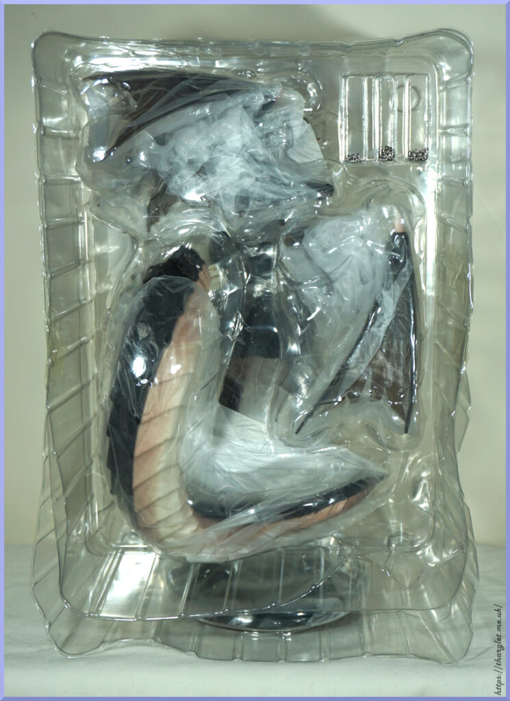
Inner:
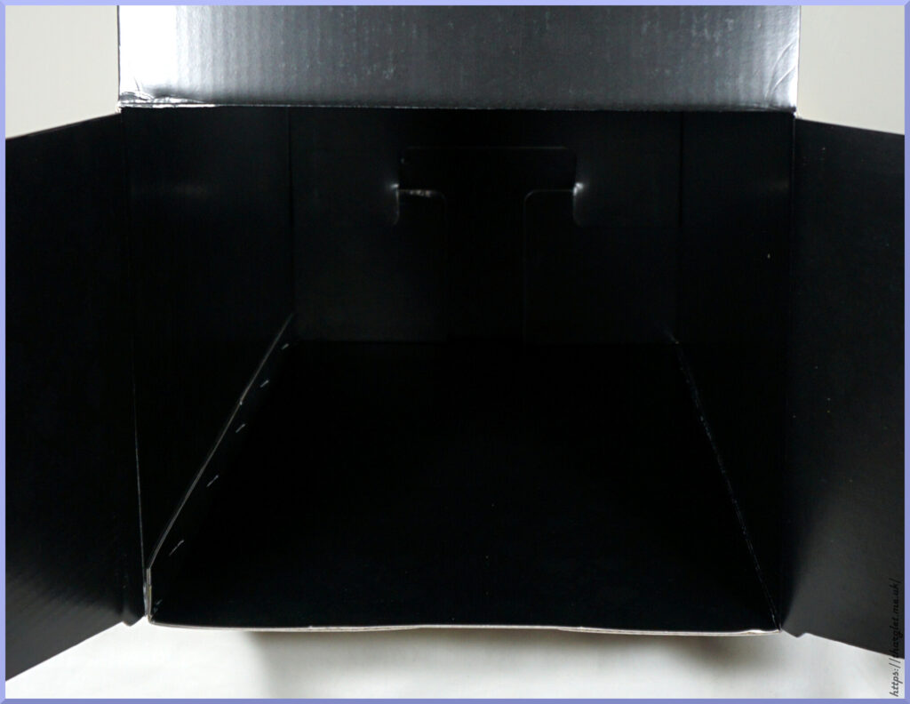
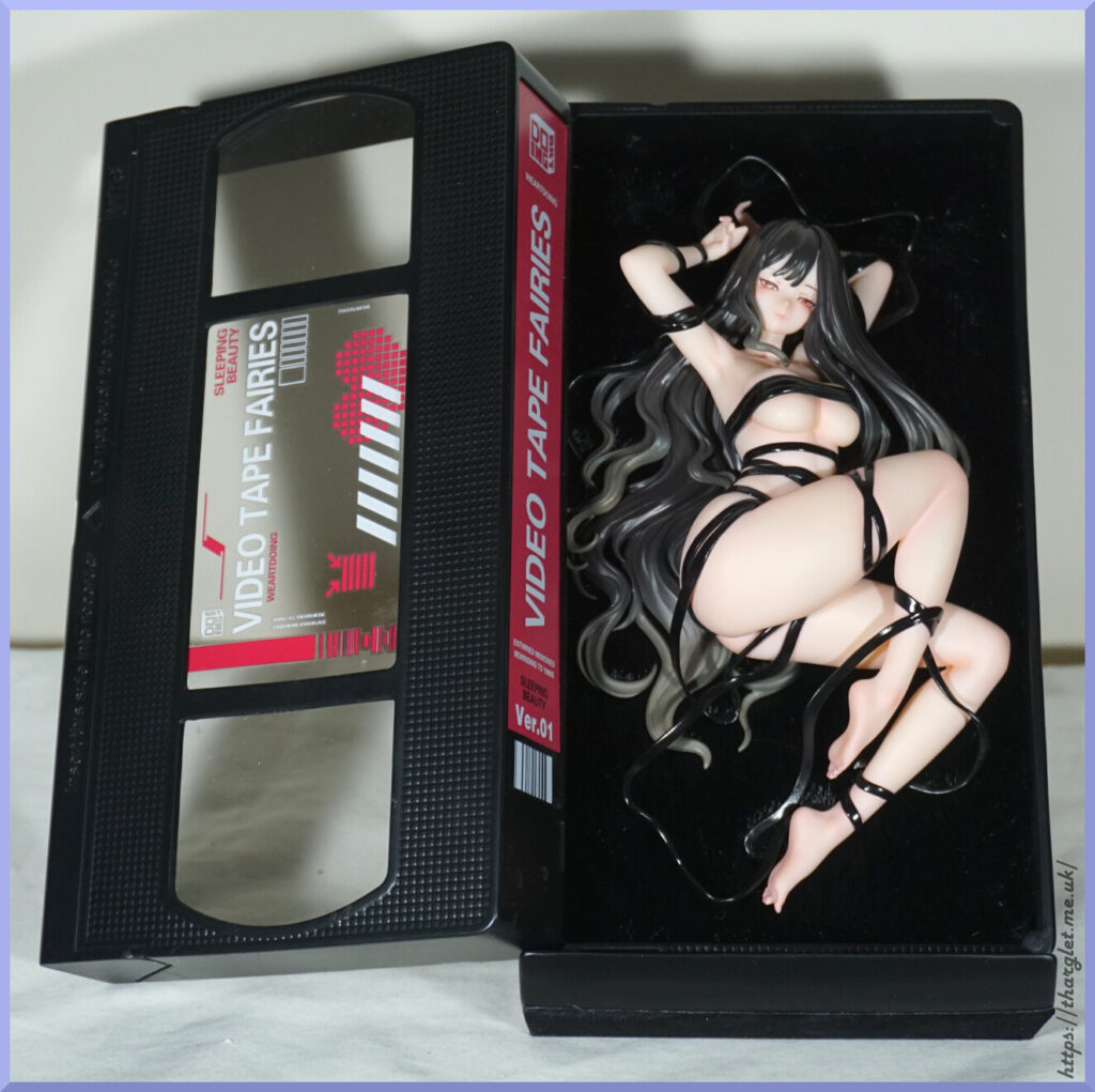
A black void. However if we look closer…
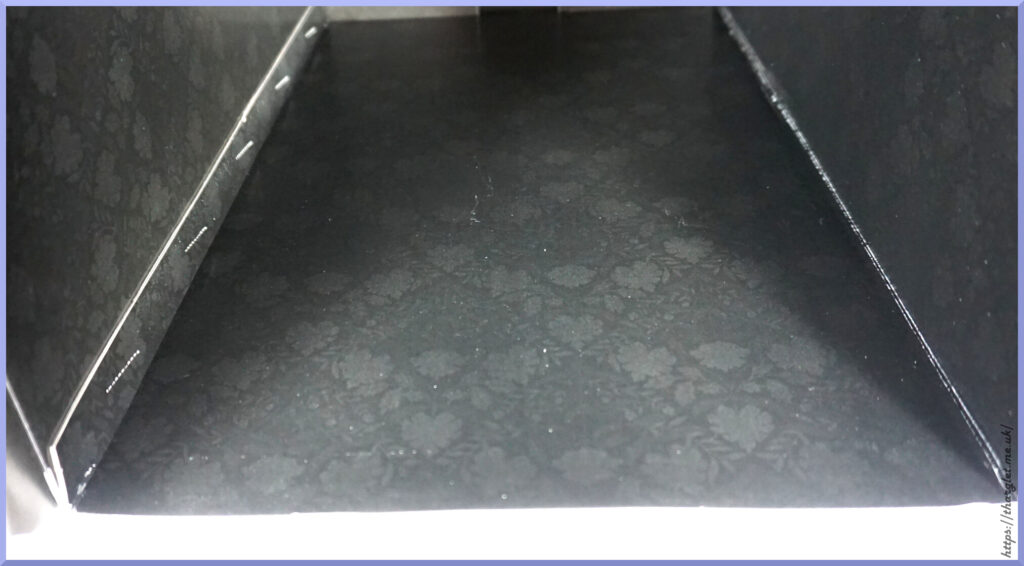
There is actually a design in there, but without bright lighting it’s easy to miss – and may look like the box is a bit dirty inside as some of the lighter parts of the pattern are easier to see. So instead of a box liner, we have the same choice as bootleggers – printing a design directly onto the box inner.
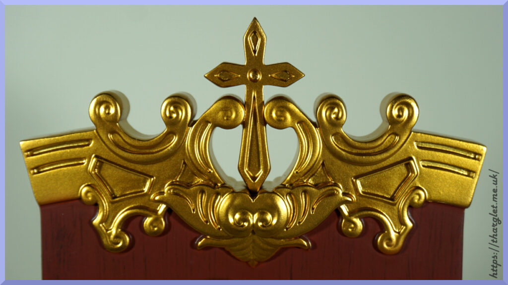
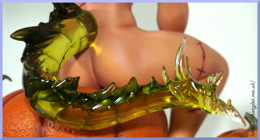
Overall, the box is fine. It does the job but isn’t particularly inspiring. I feel like the twiddly borders could’ve been more “dragon inspired” with maybe some scale or wing shapes. Or her tail has an interesting shape that could’ve been used – we’ll see that later. The gold foiling does help give the box a more premium feel, but I do think it was overused. It’s certainly nicer on the outside than your average Insight box, but compared to the competition it falls a bit short. One thing I appreciate with Native is the box designs tend to involve a motif related to the figure itself.
Conclusion
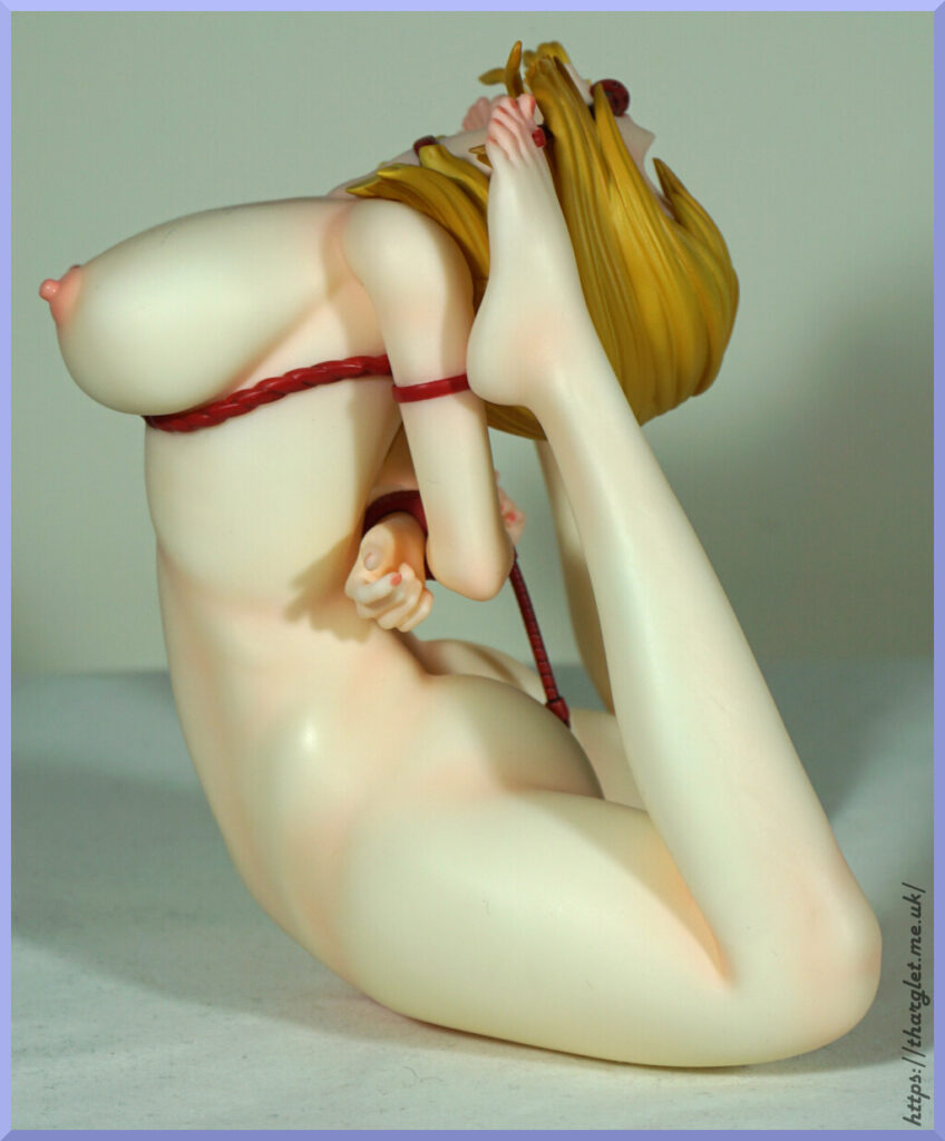
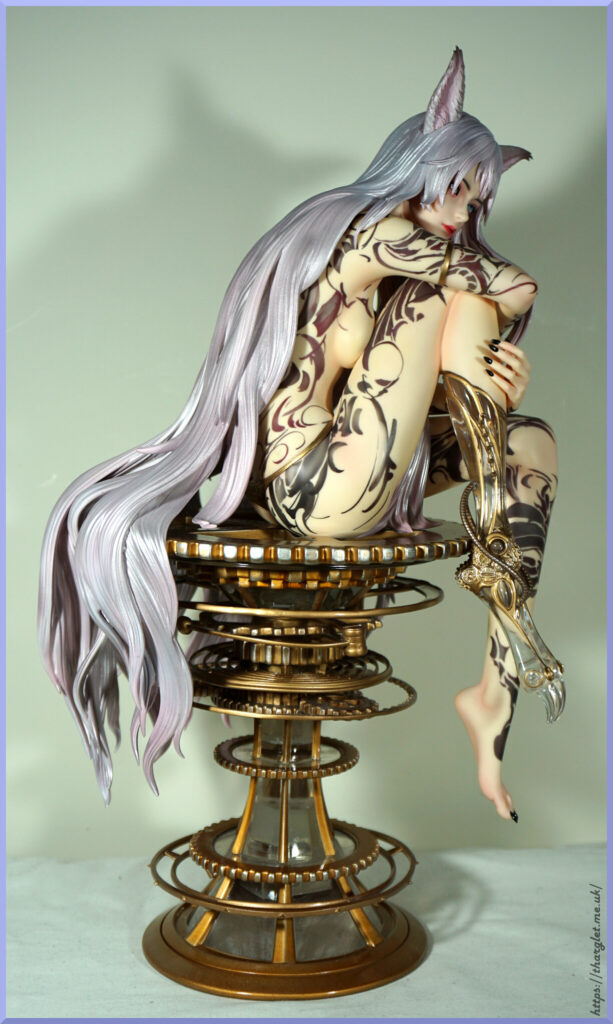
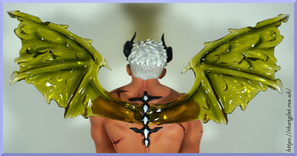
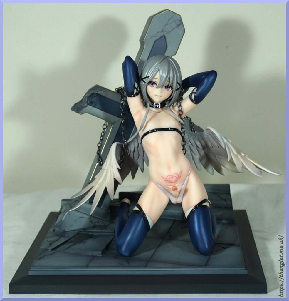
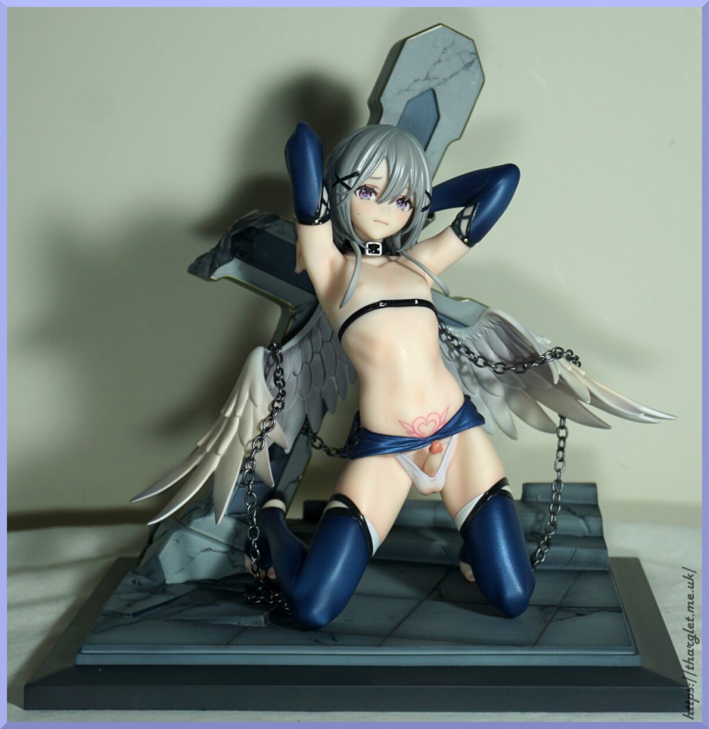
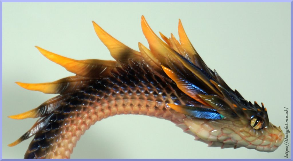
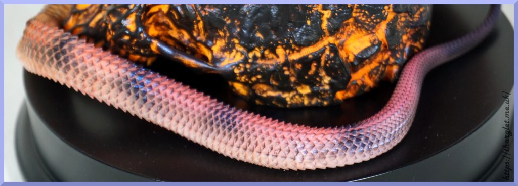
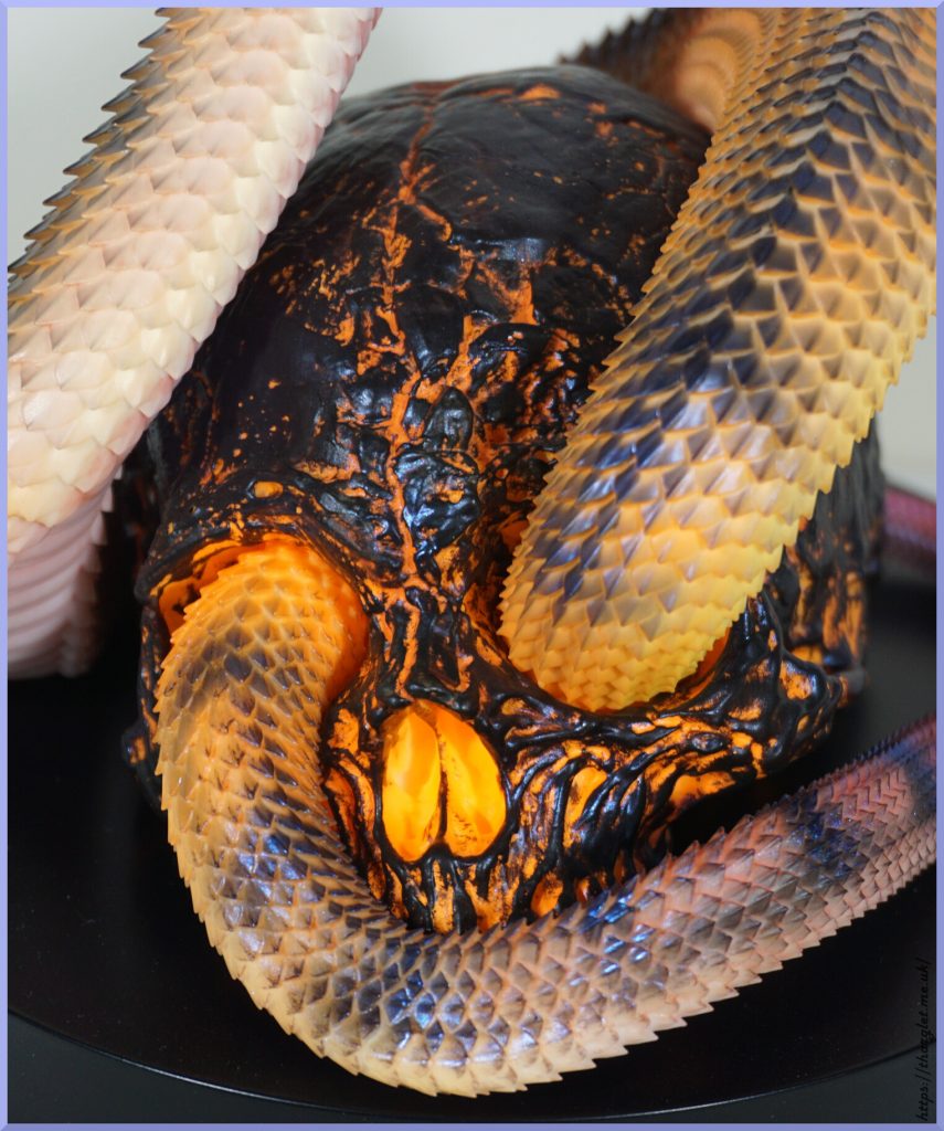
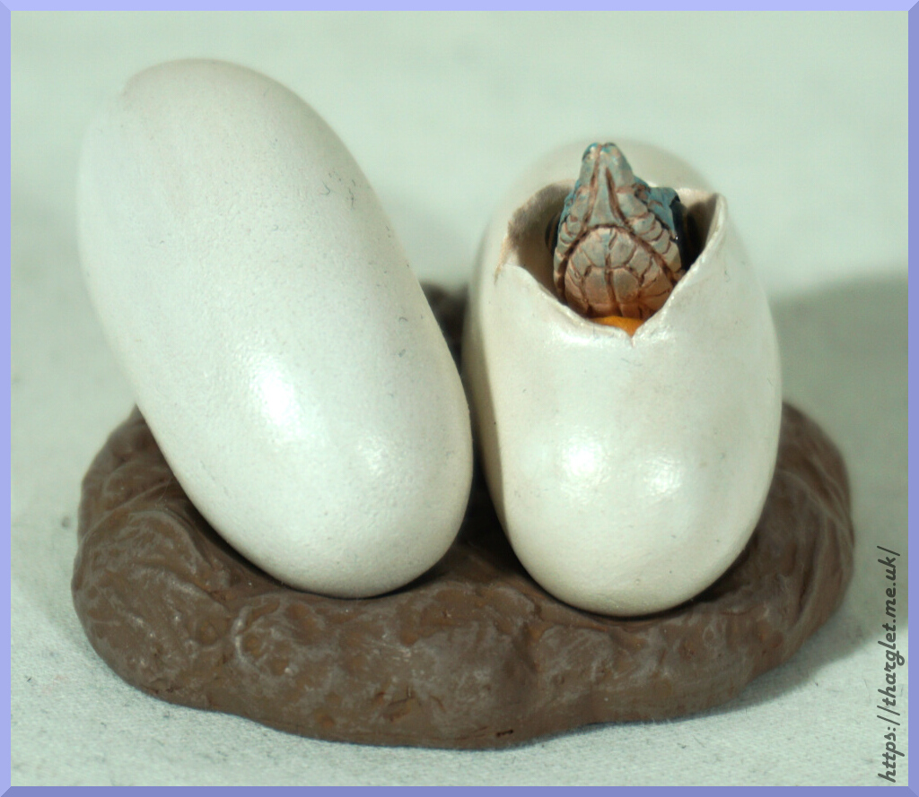
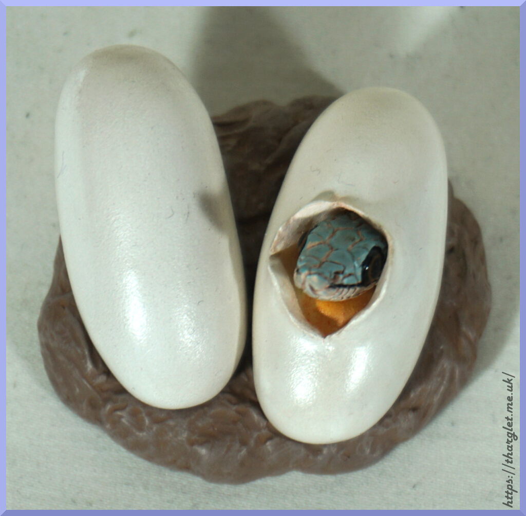
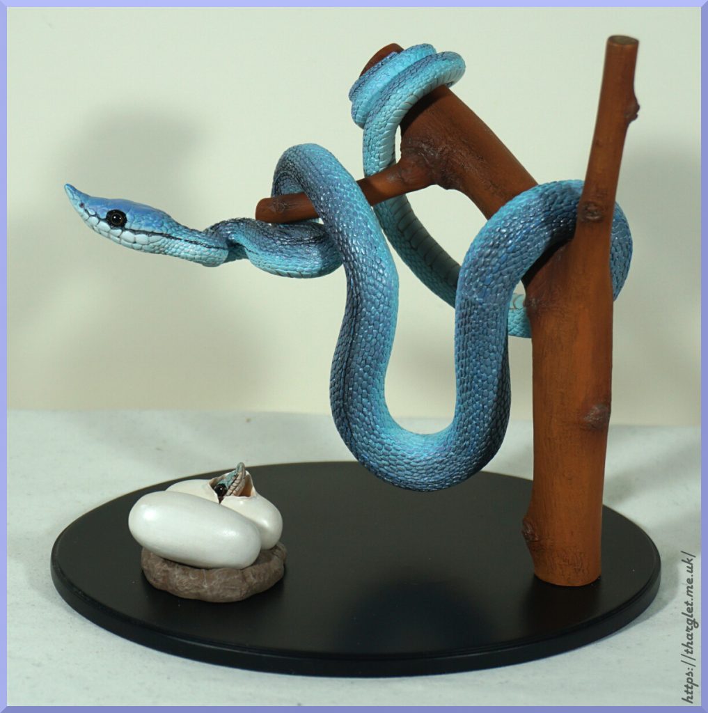
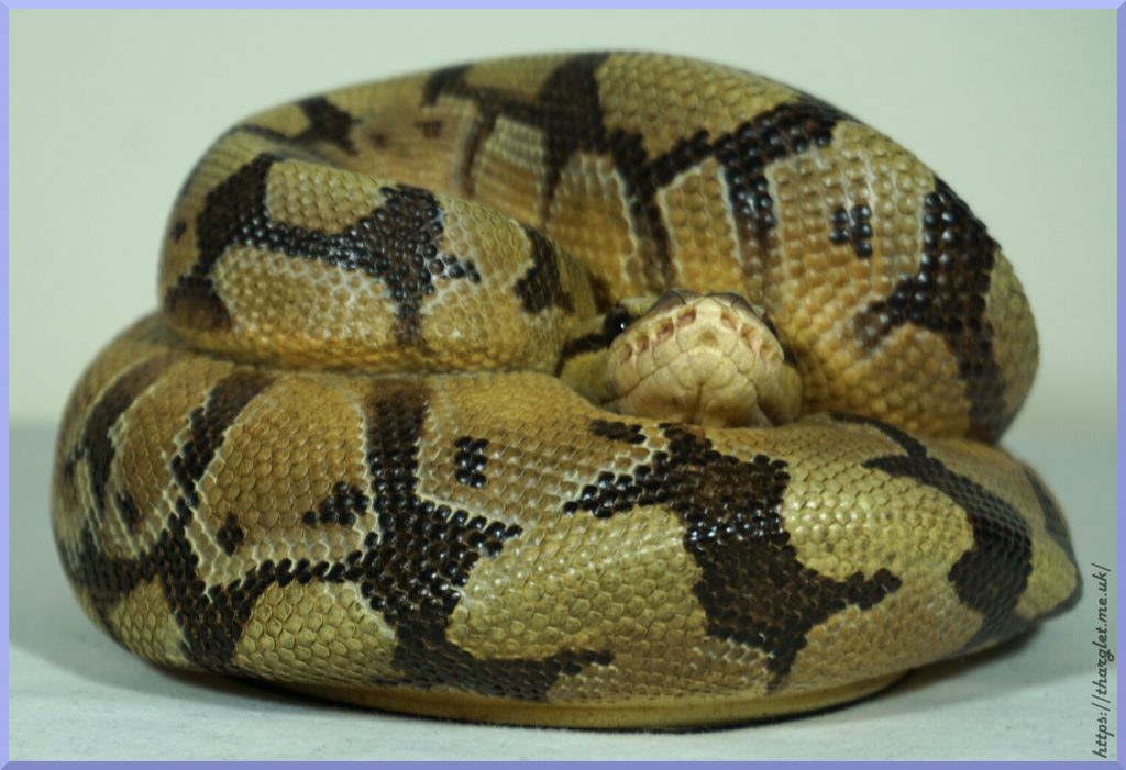
This figure certainly isn’t for everyone – but being a dragon figure that does place her in a niche already.
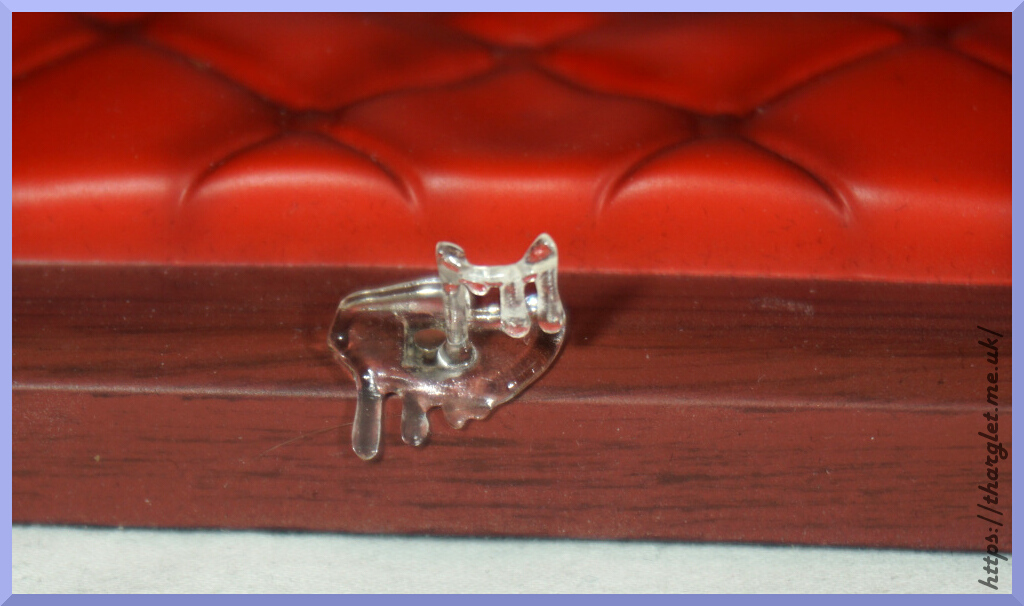
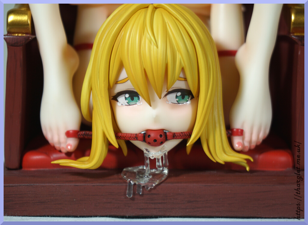
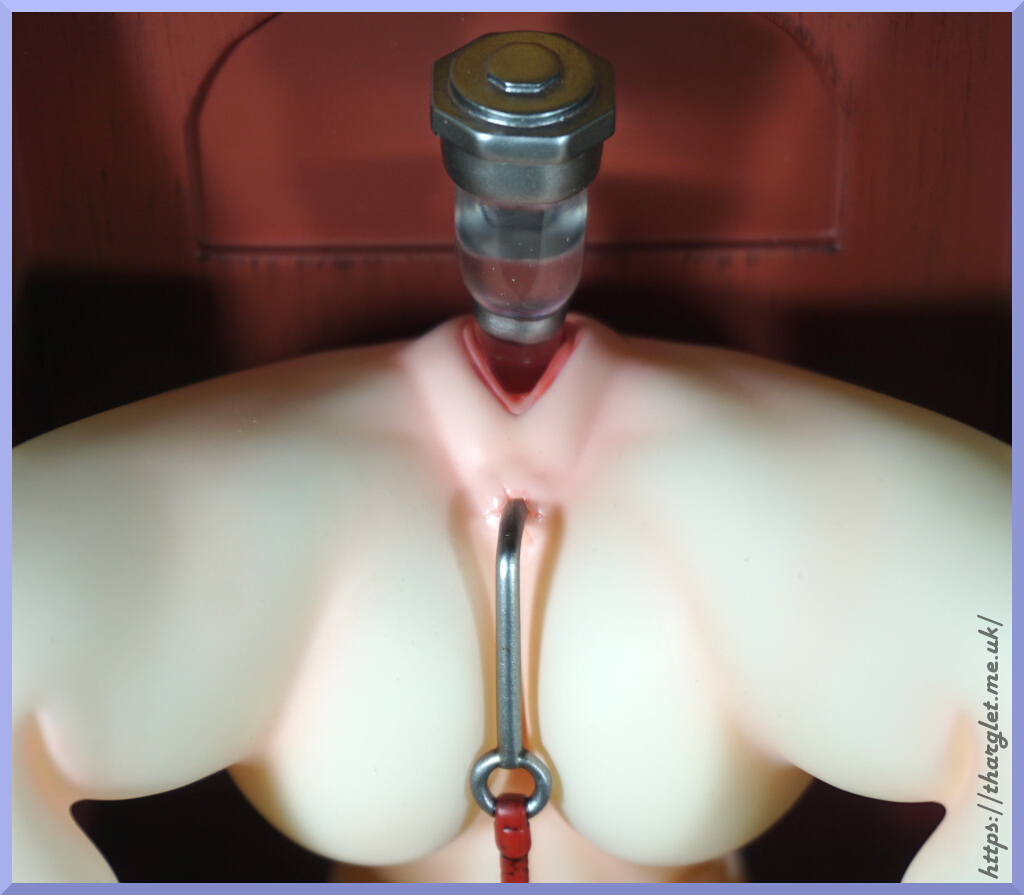
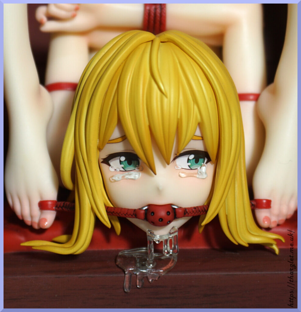
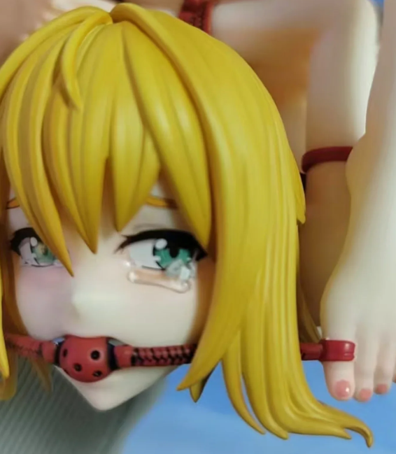
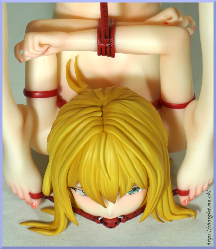
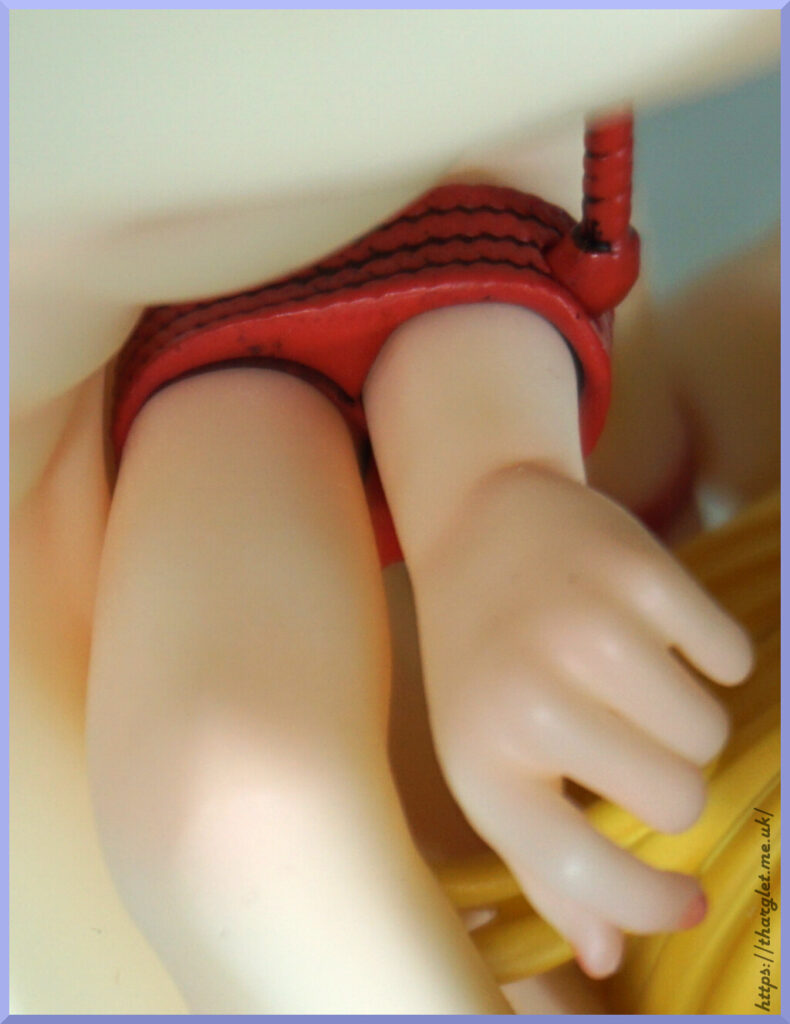
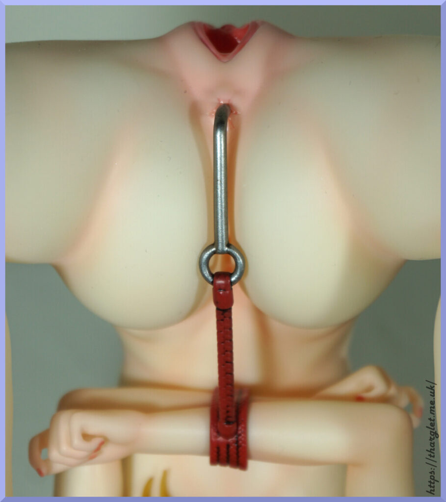
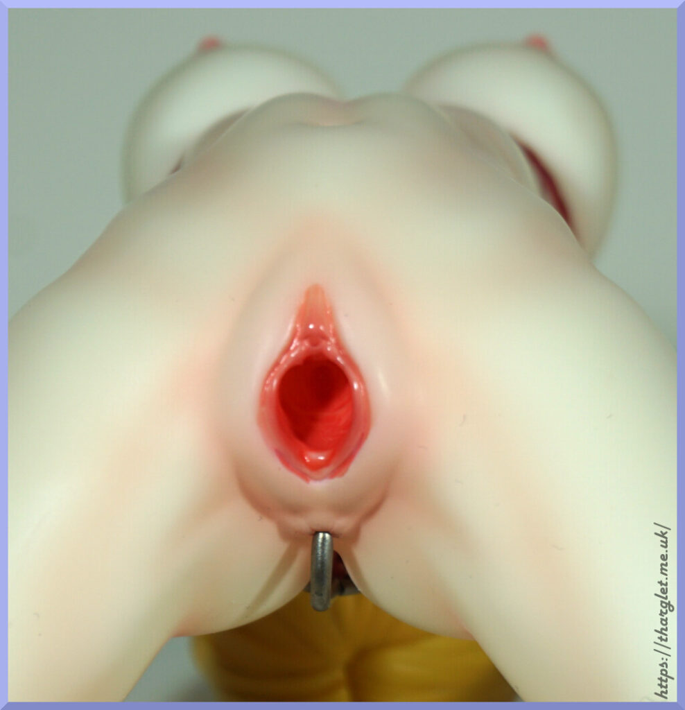
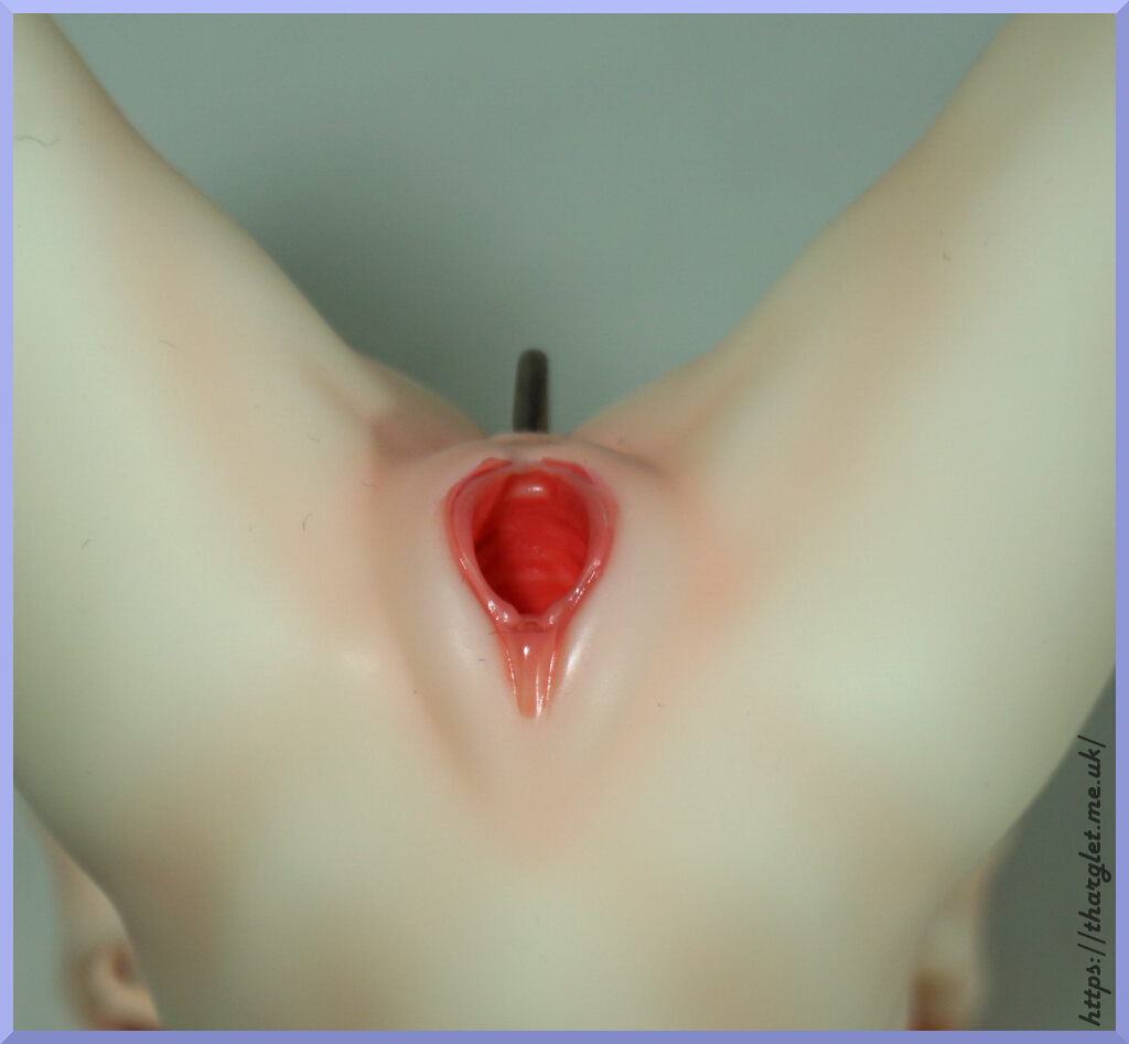
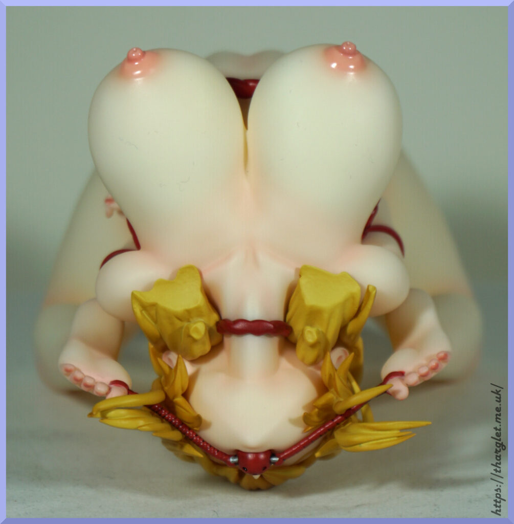
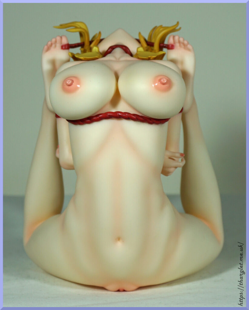
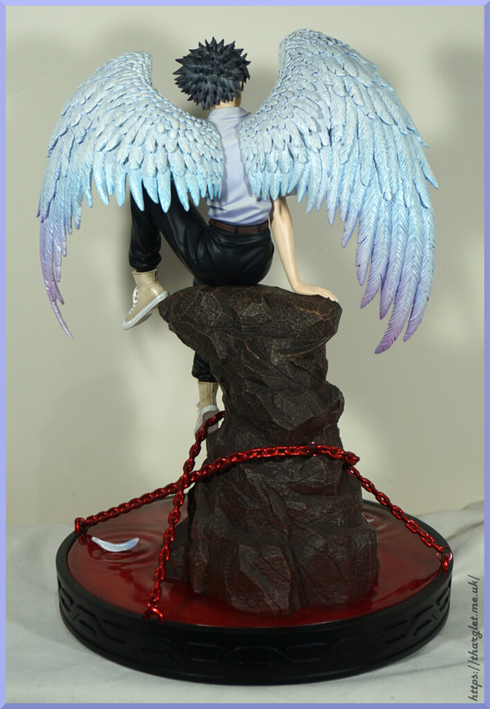
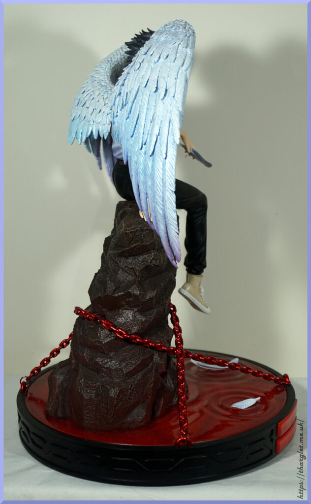
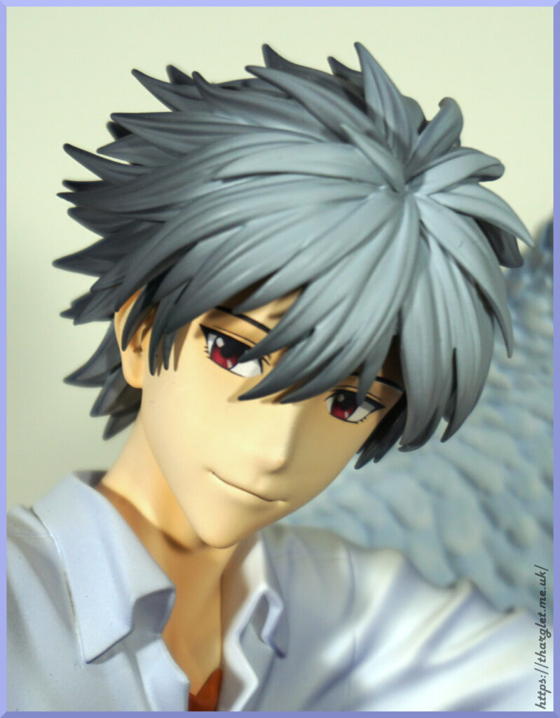
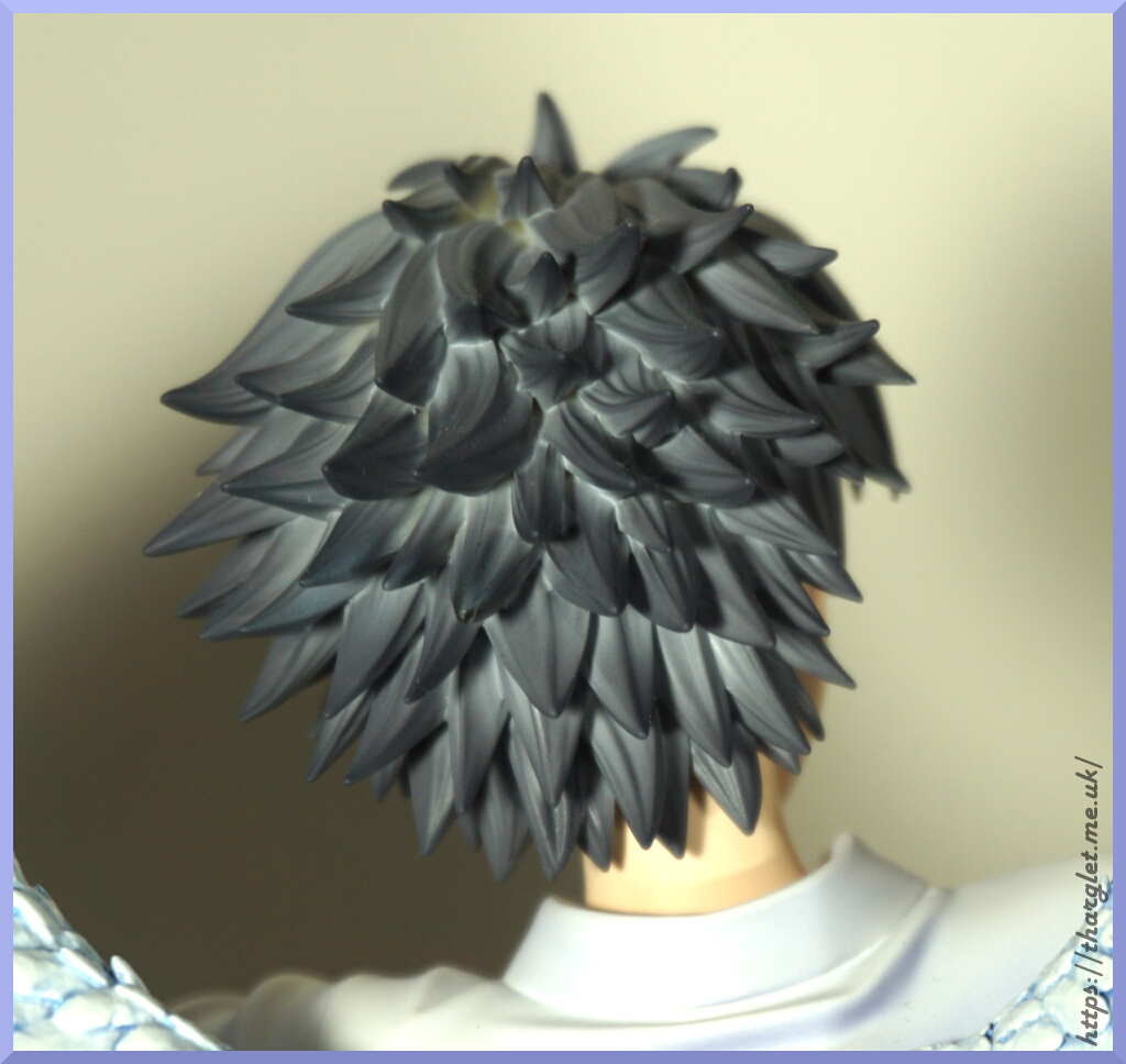
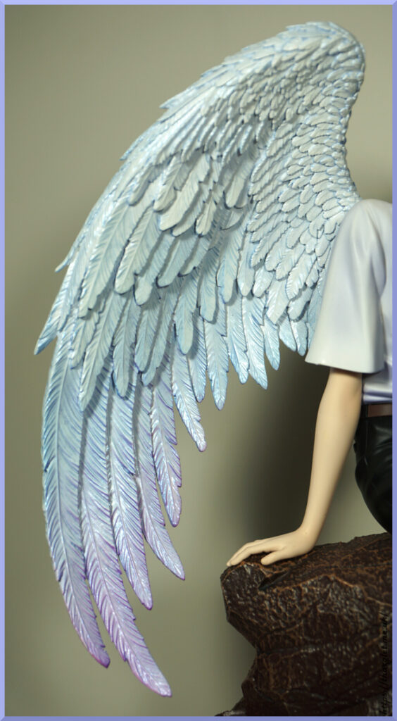
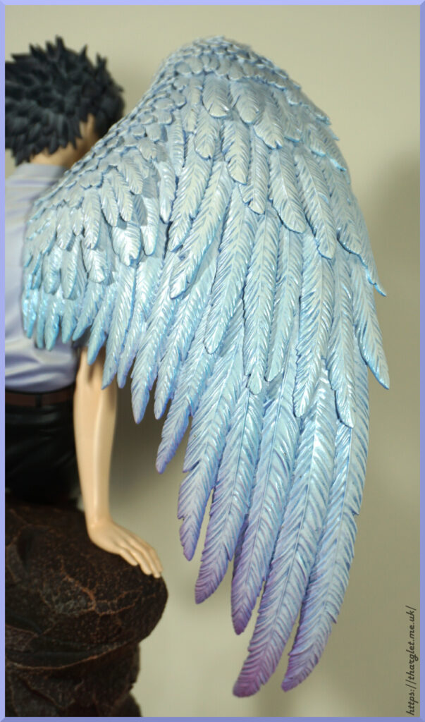
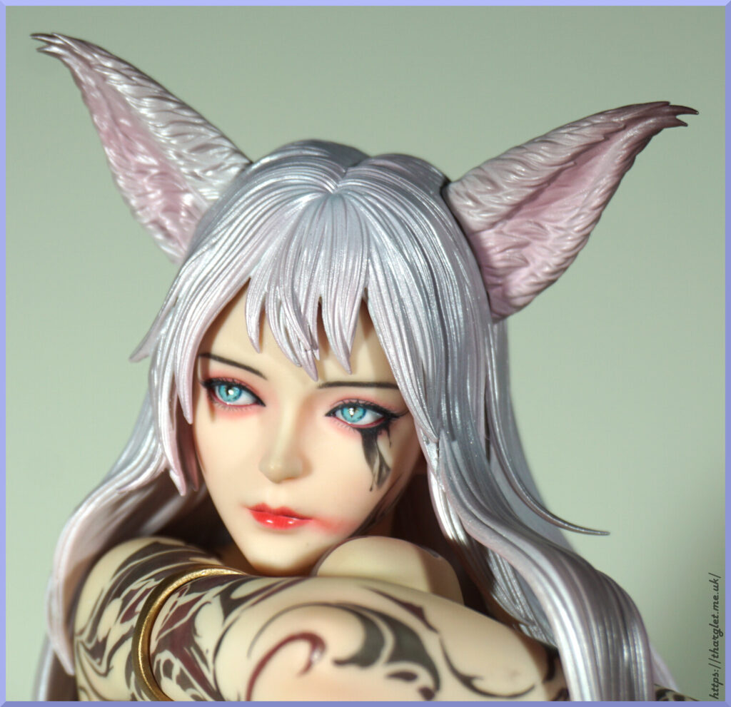
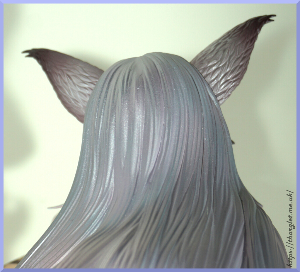
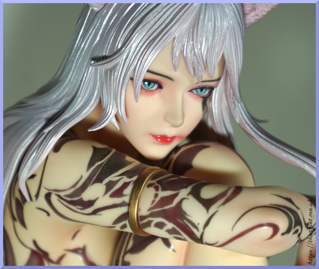
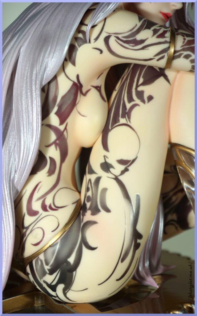
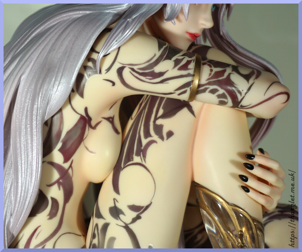
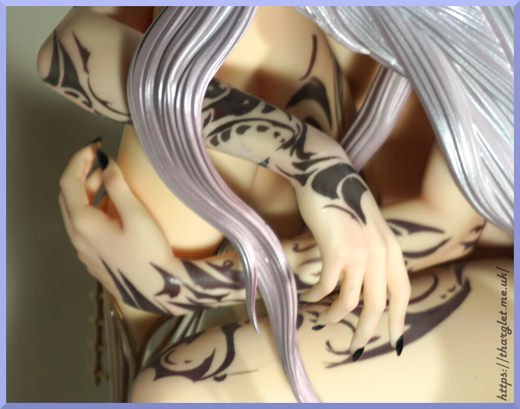
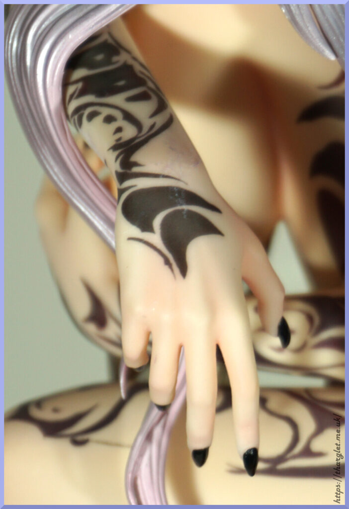
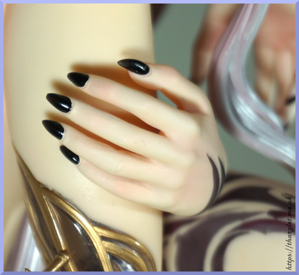
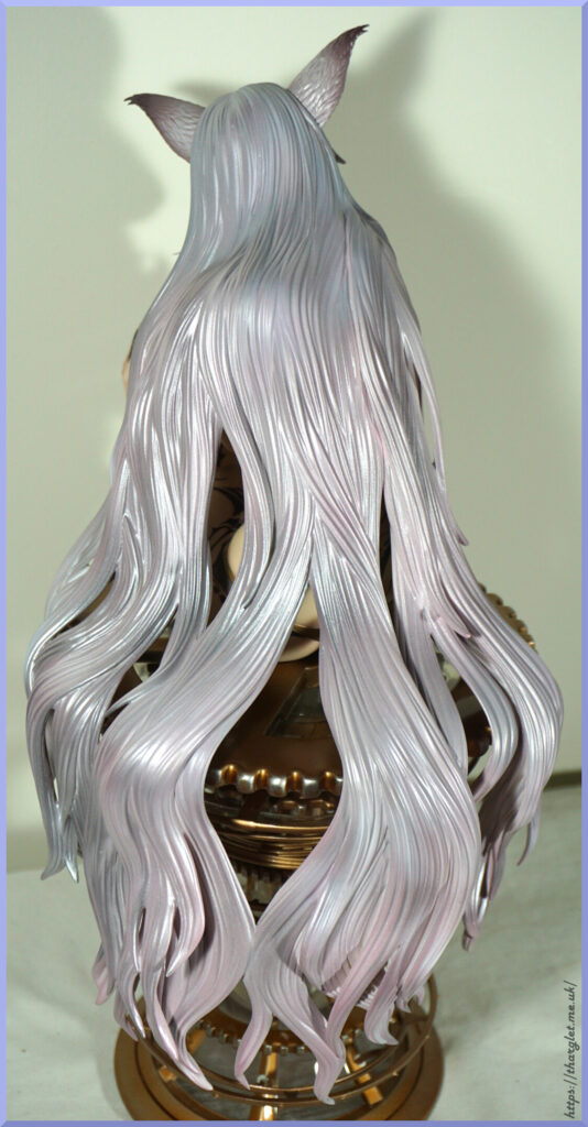
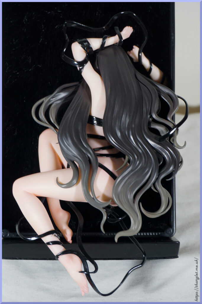
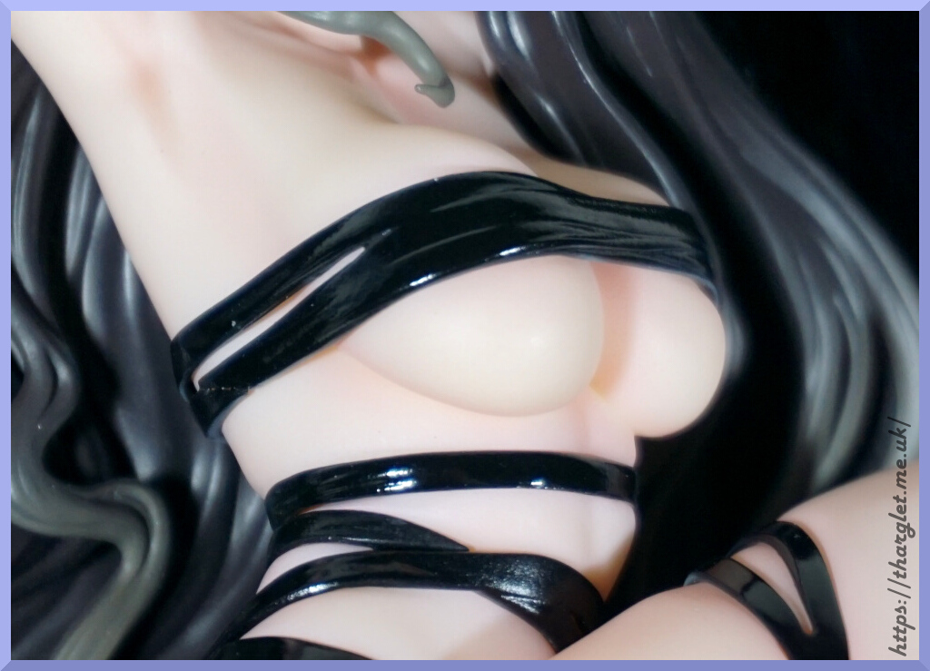
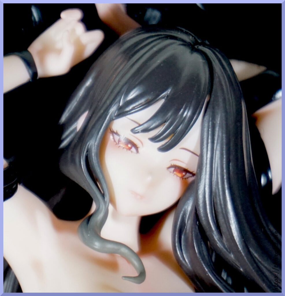
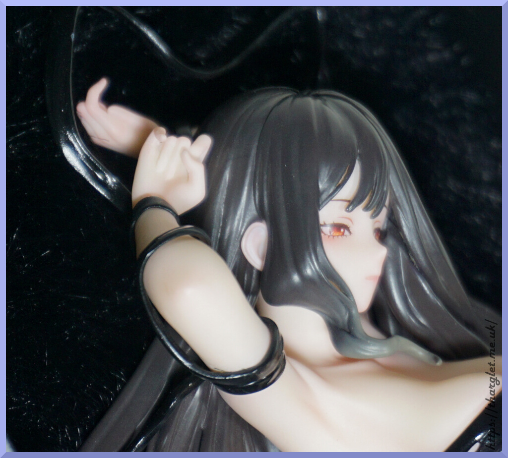
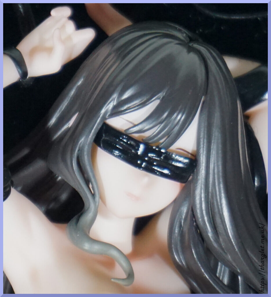
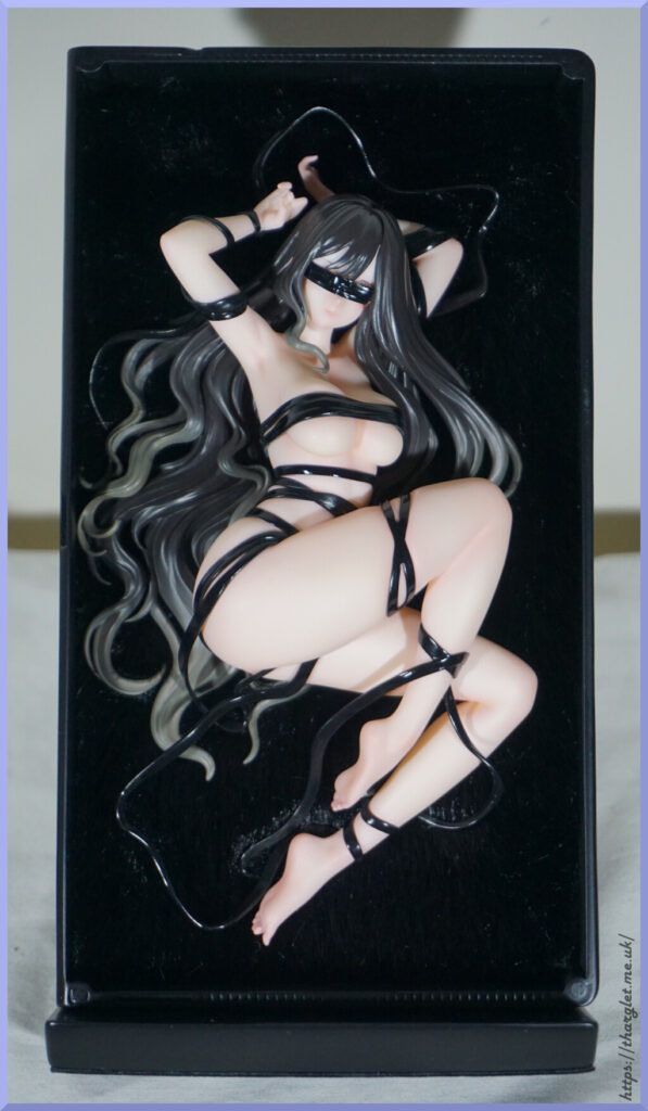
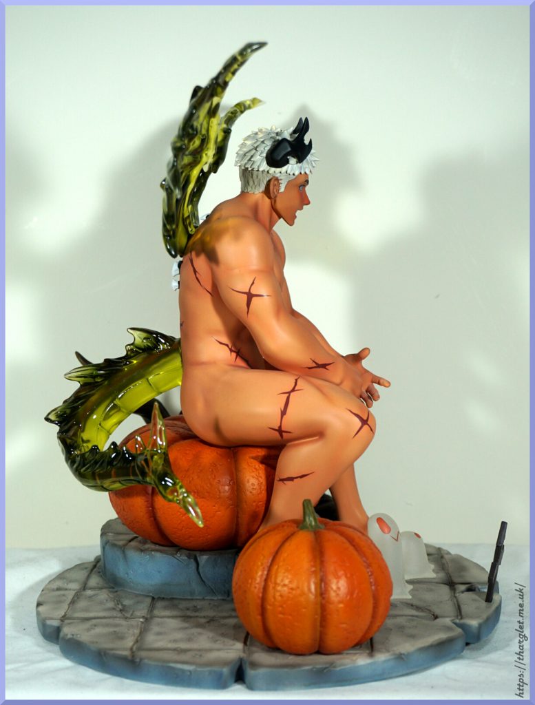
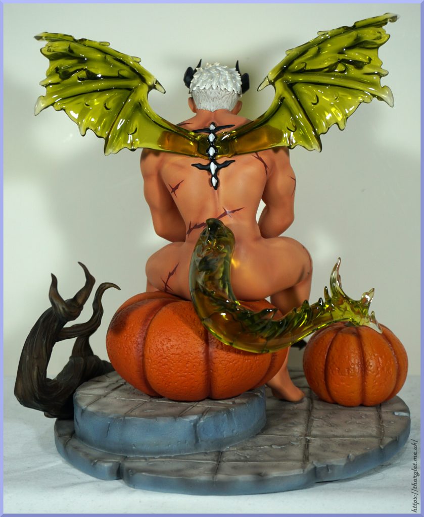
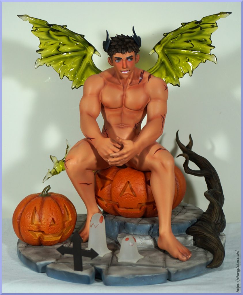
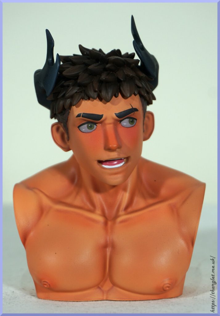
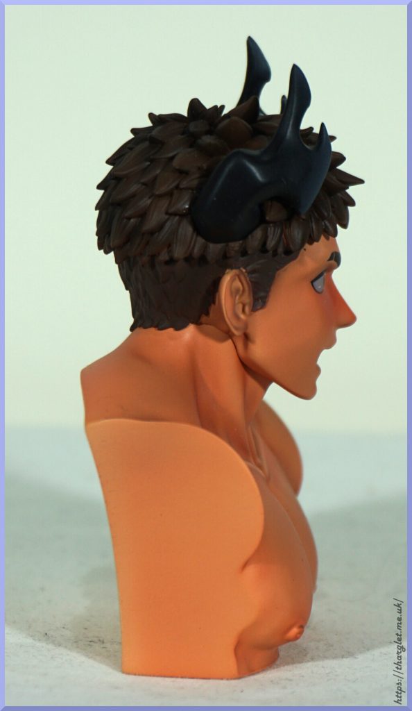
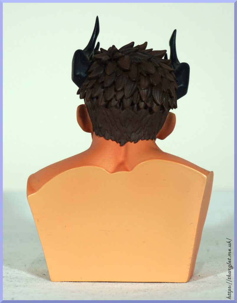
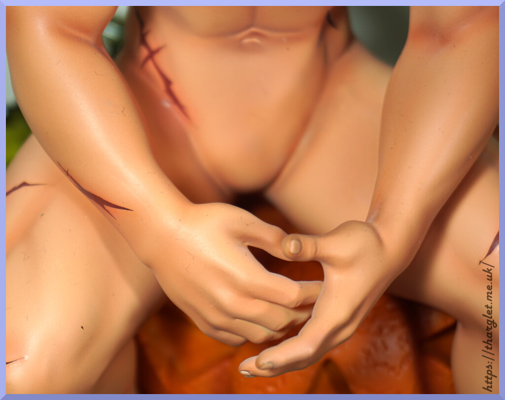
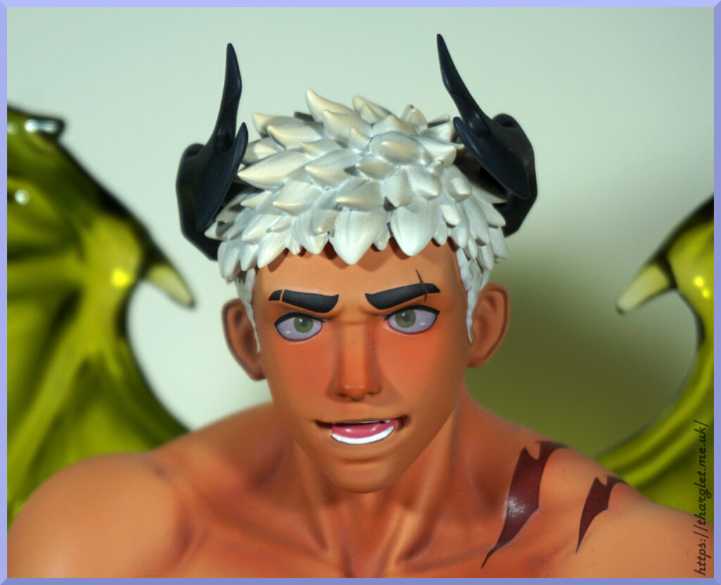
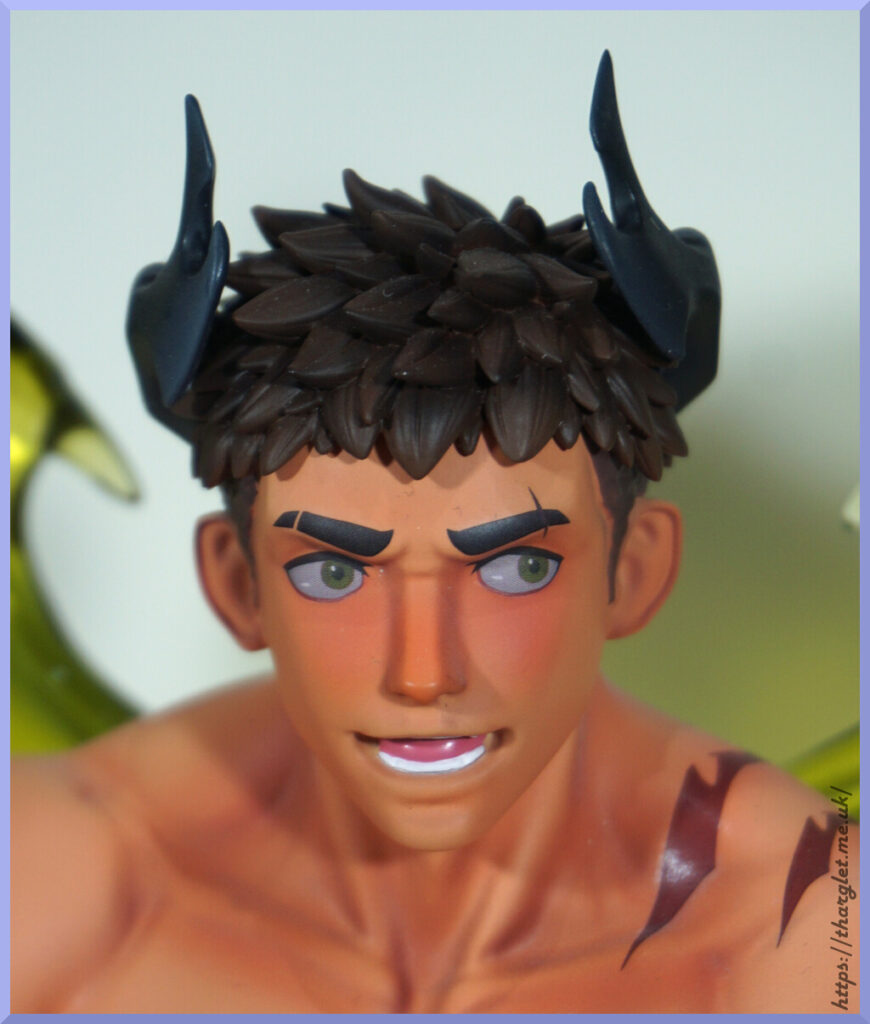
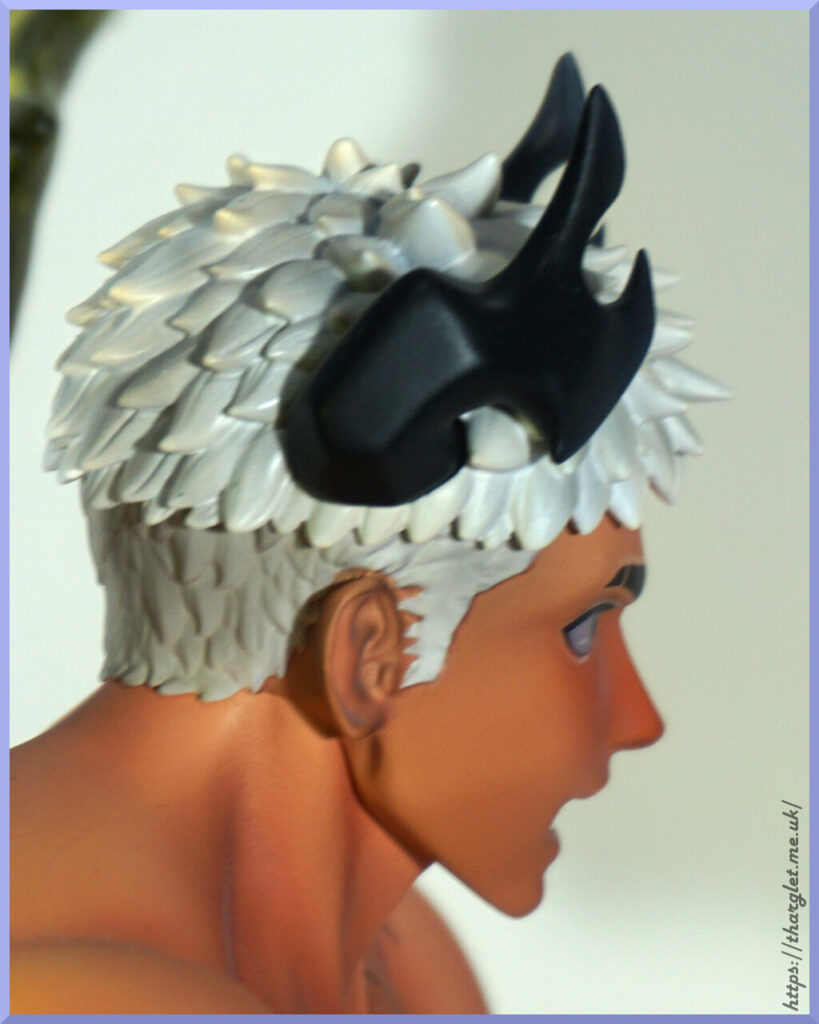
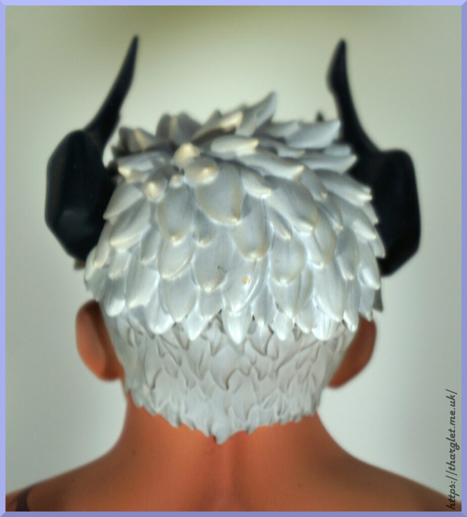
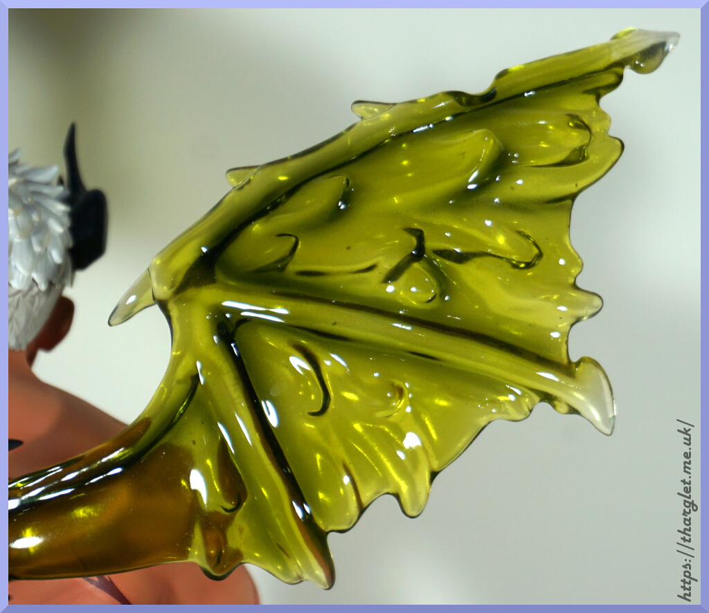
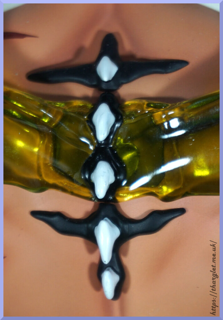
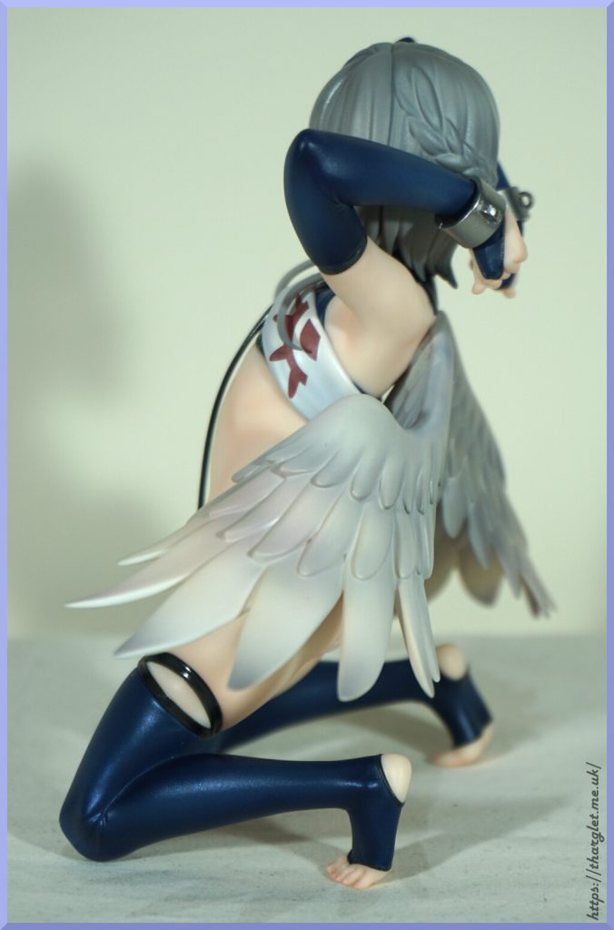
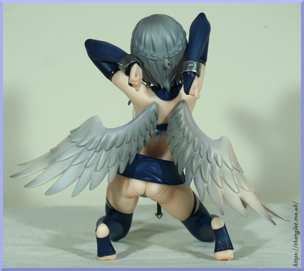
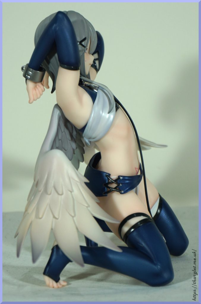
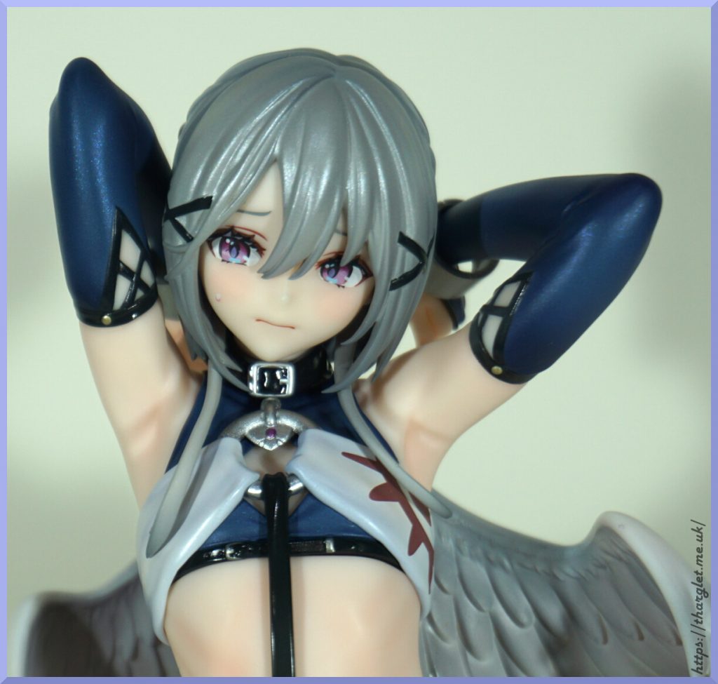
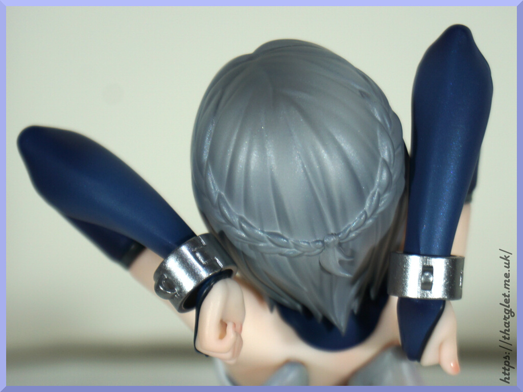
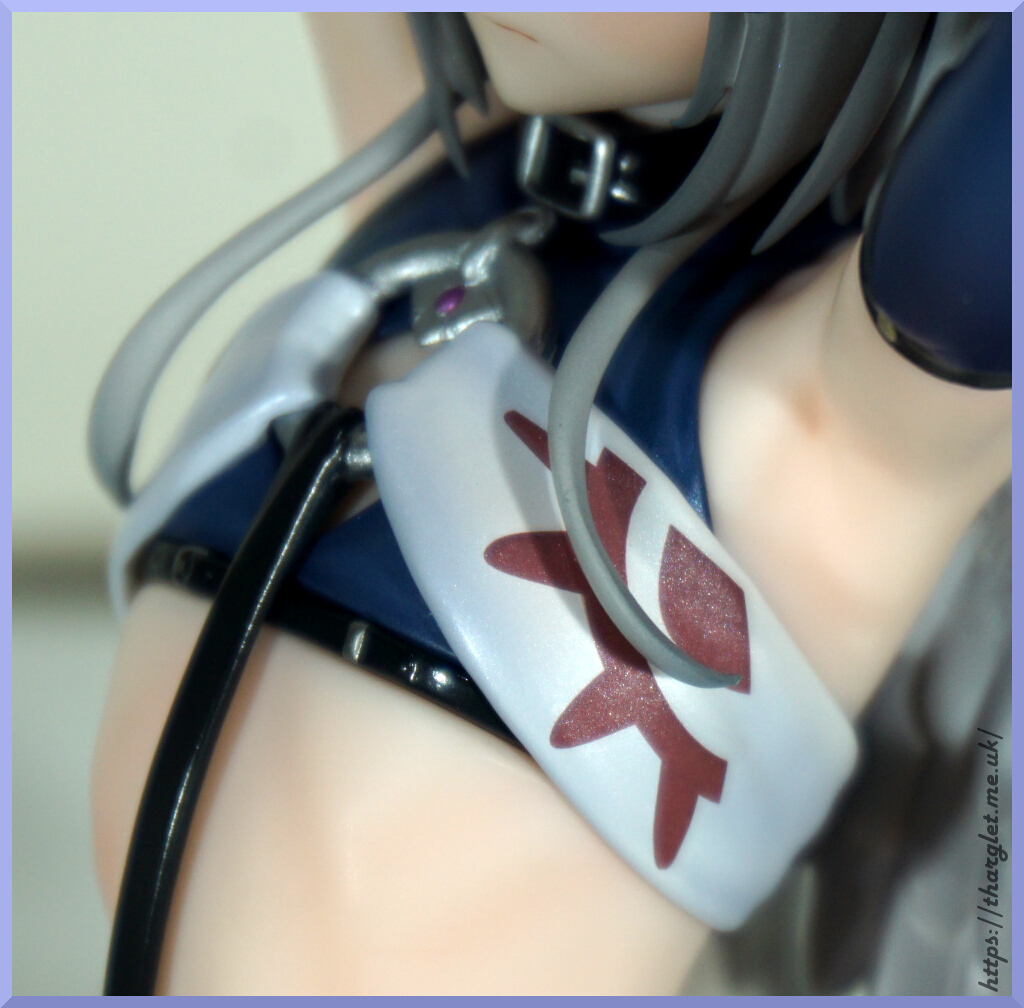
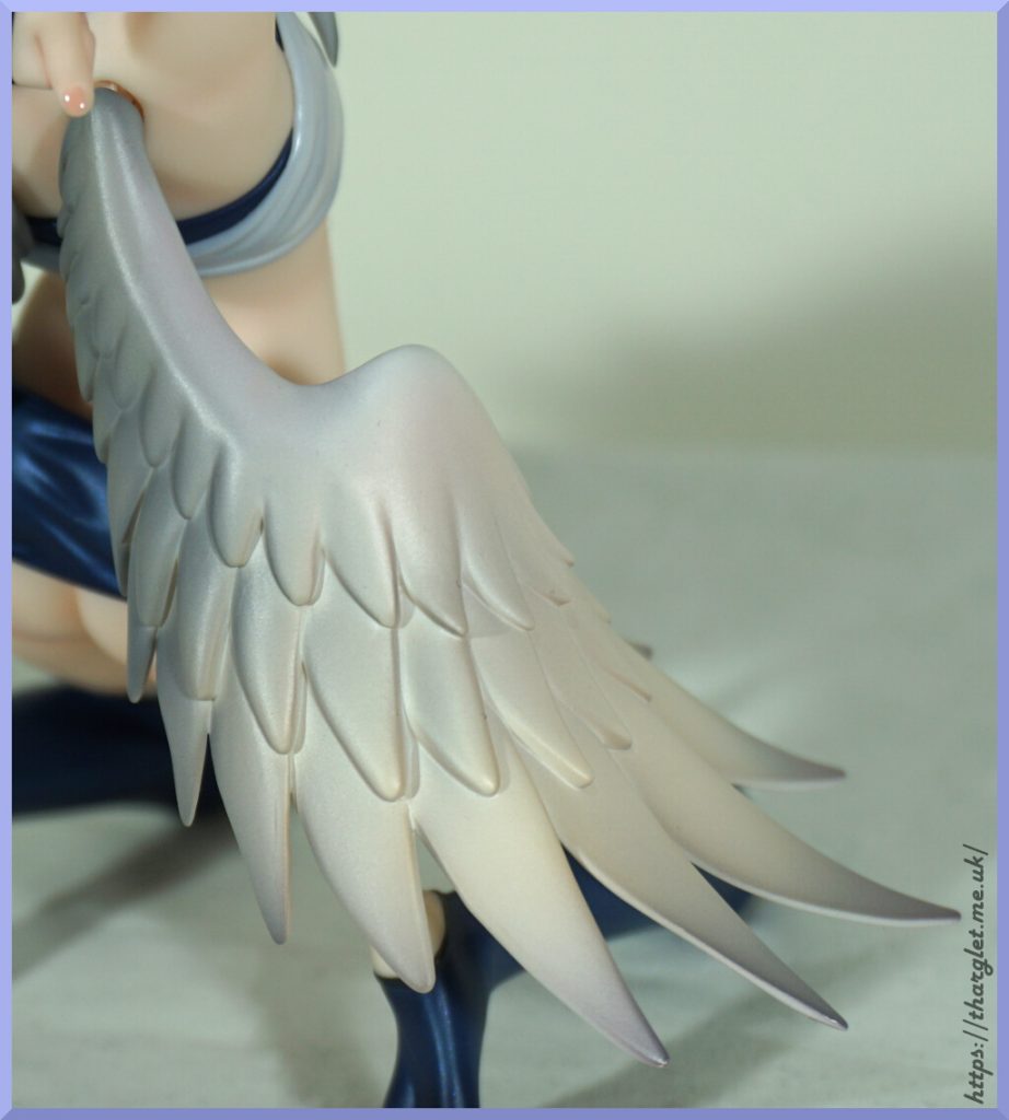
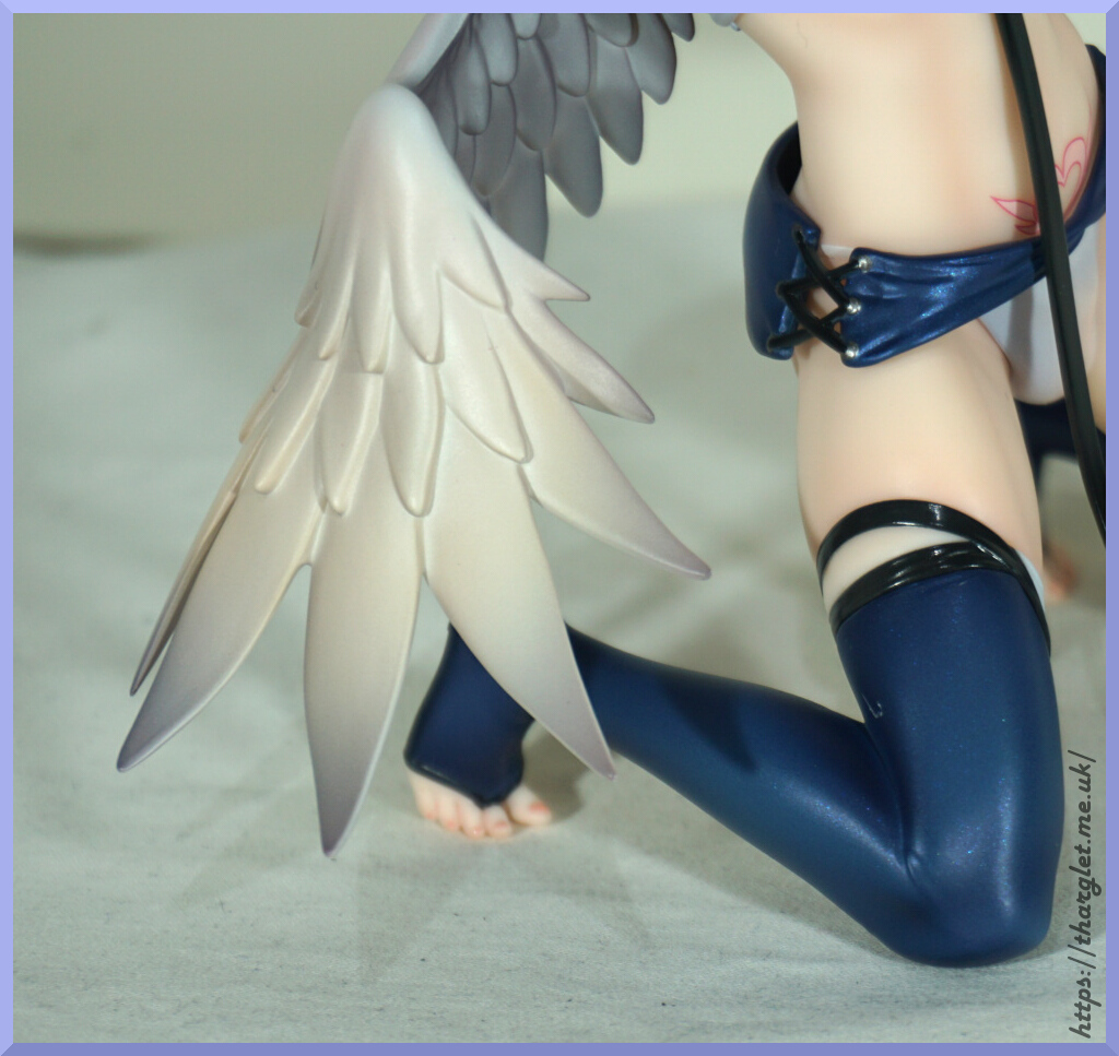
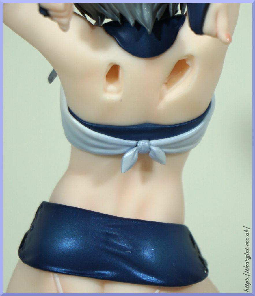
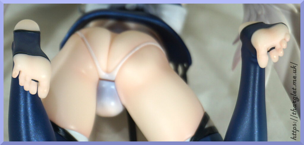
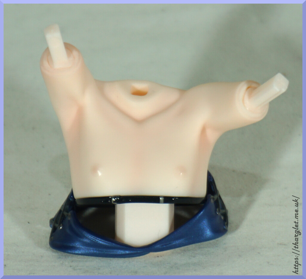
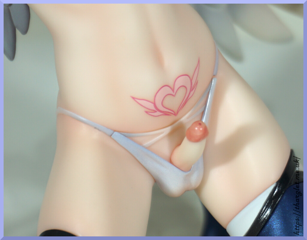
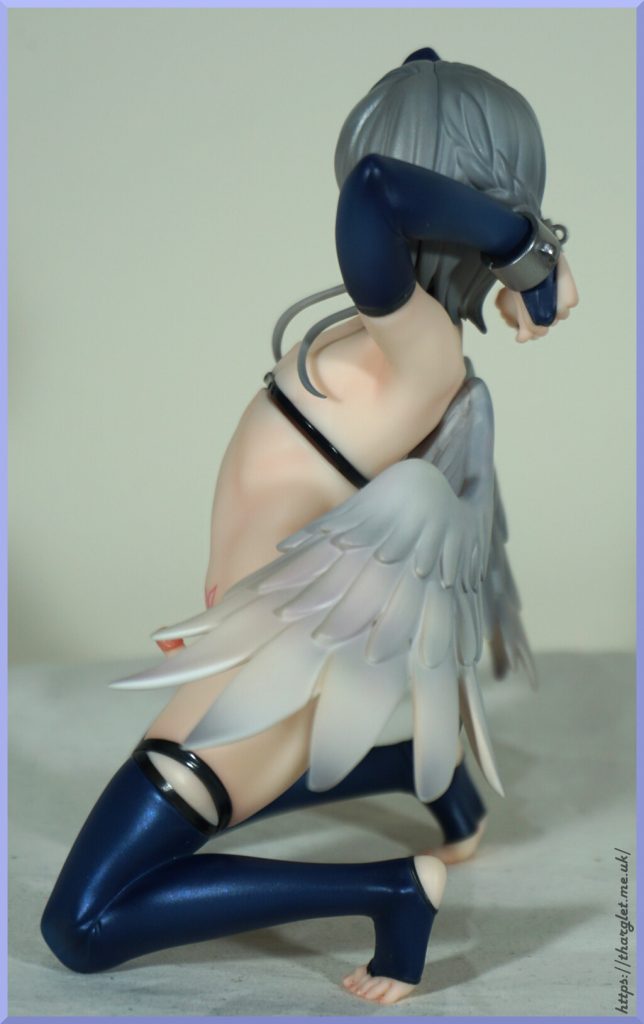
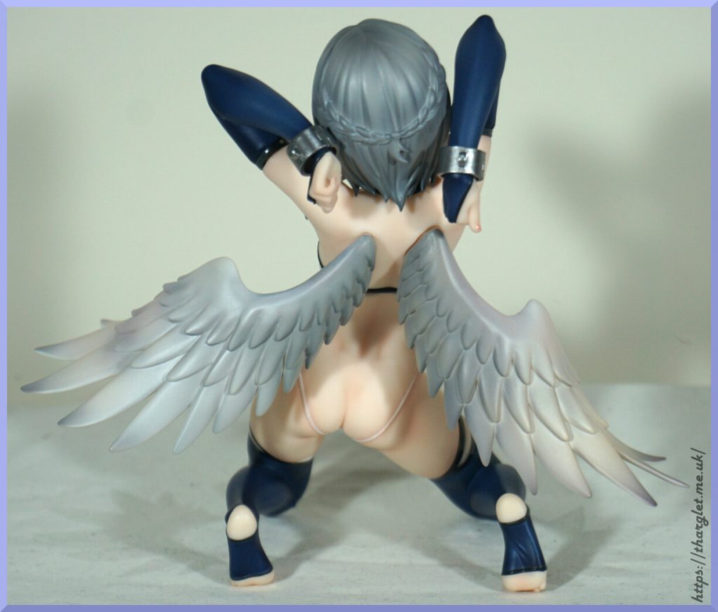
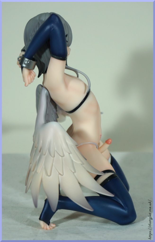
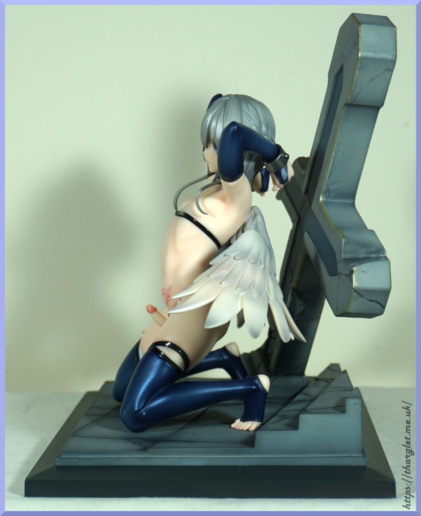
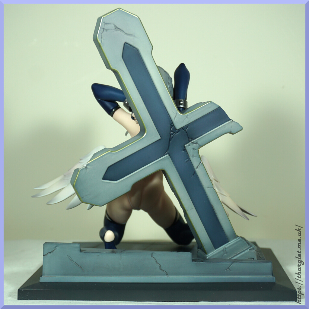
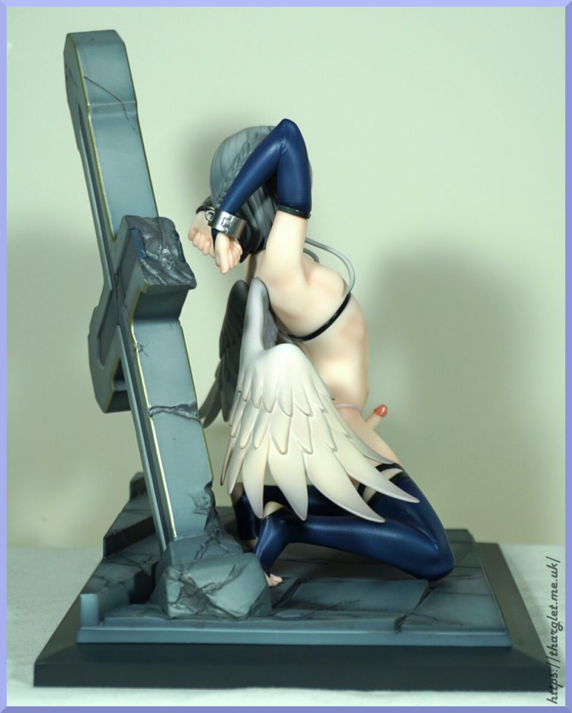
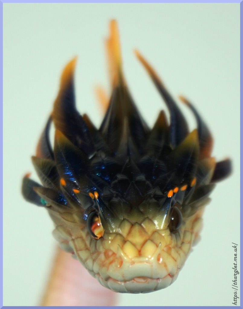
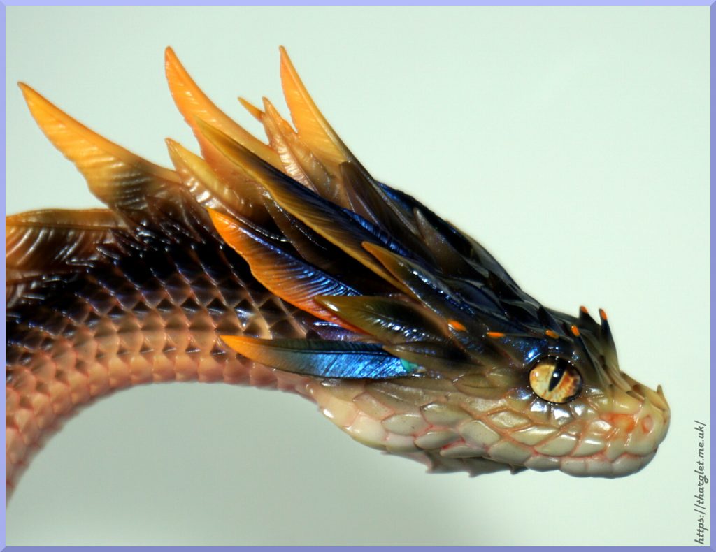
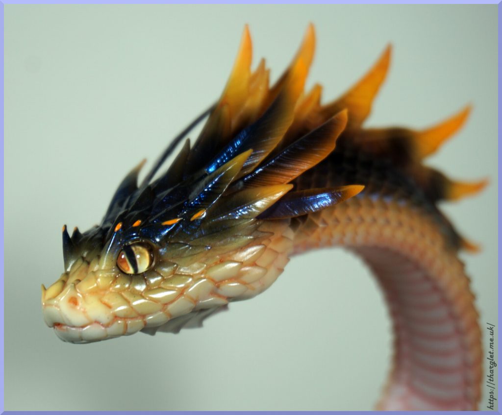
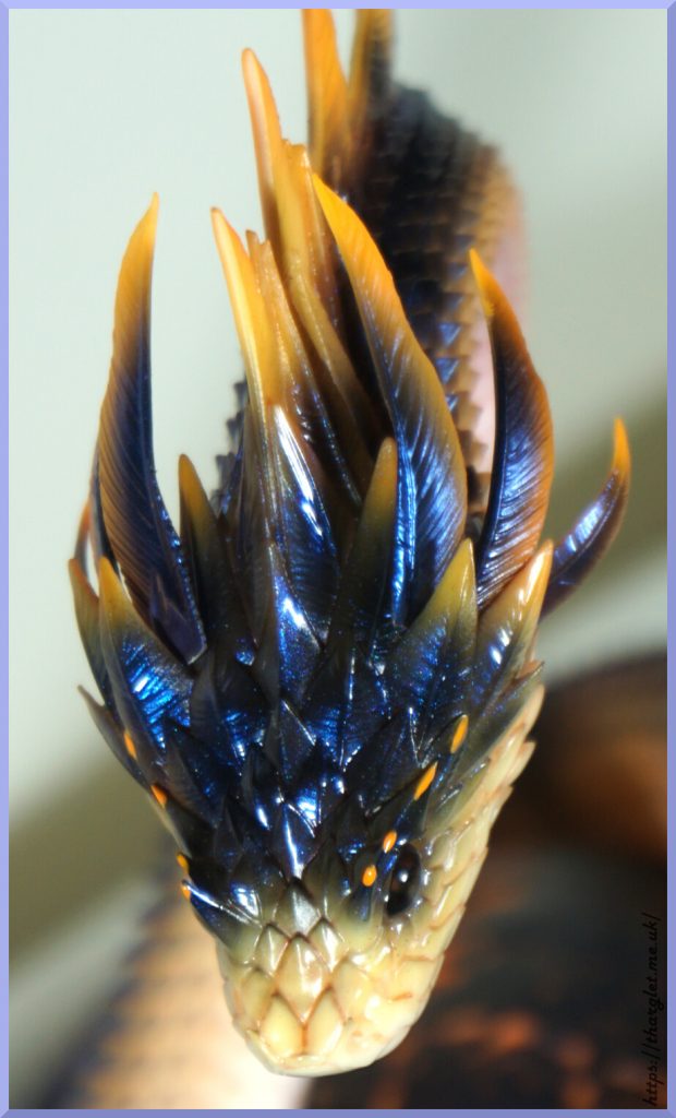
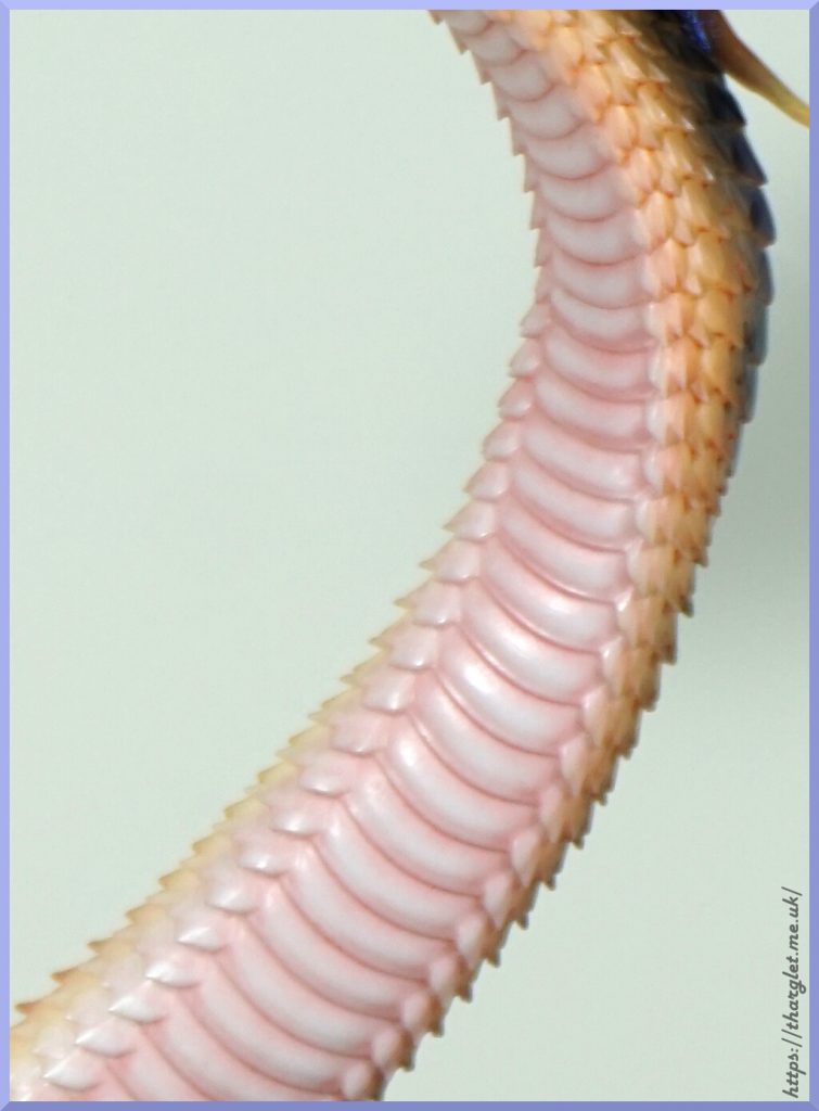
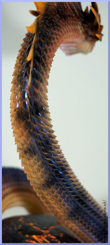
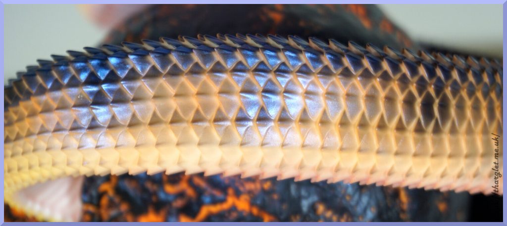
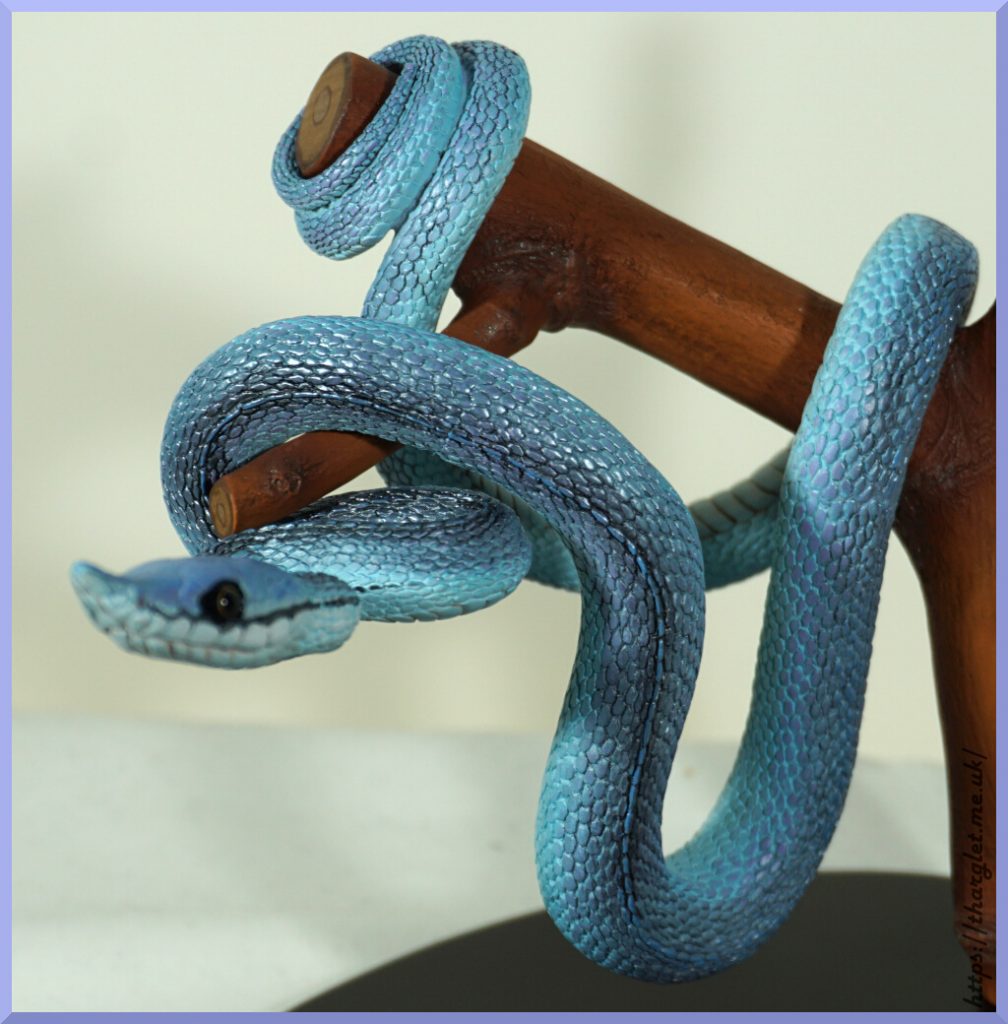
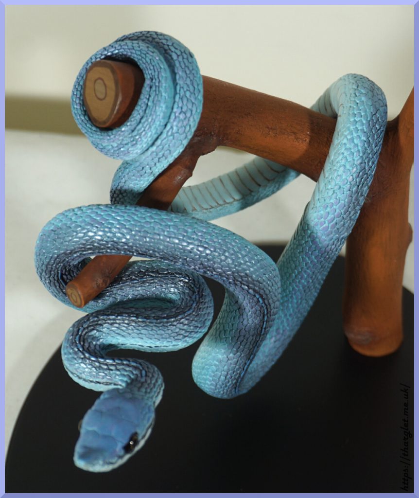
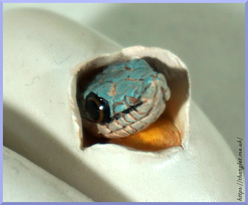
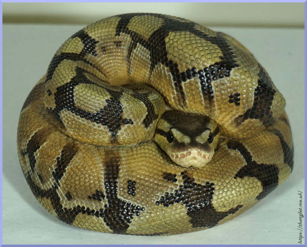
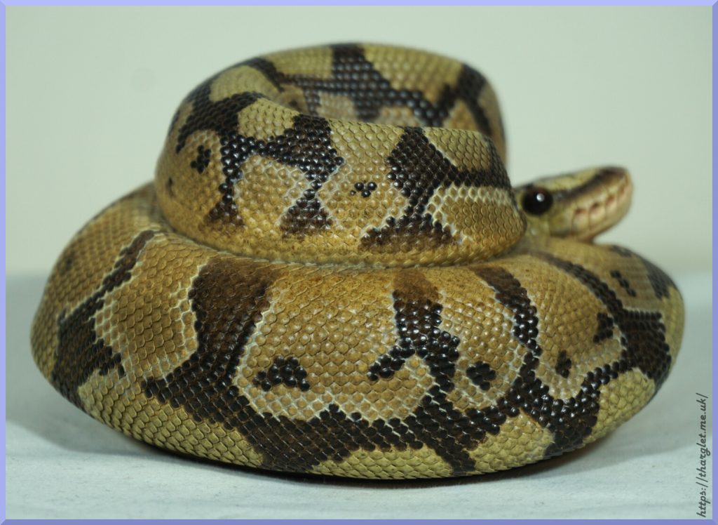
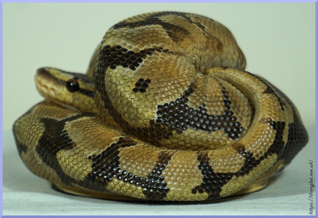
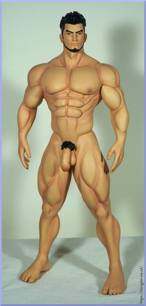
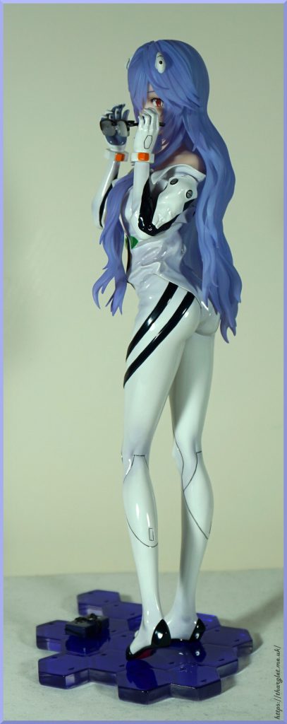
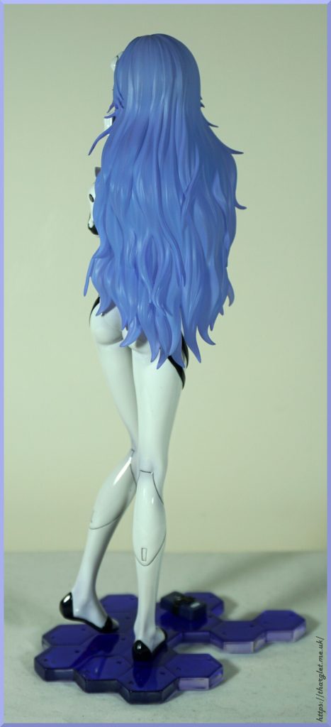
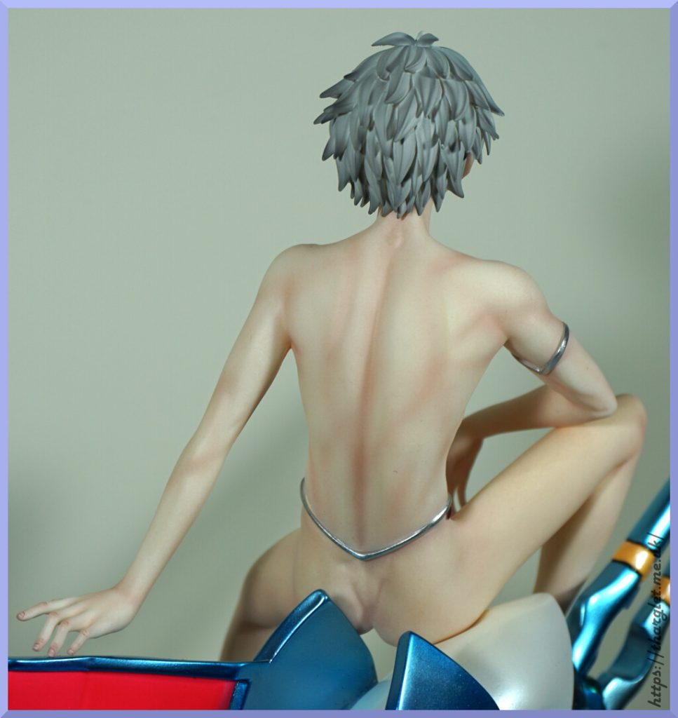
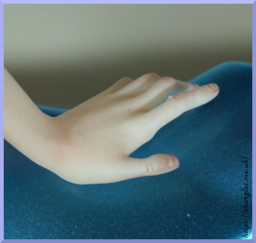
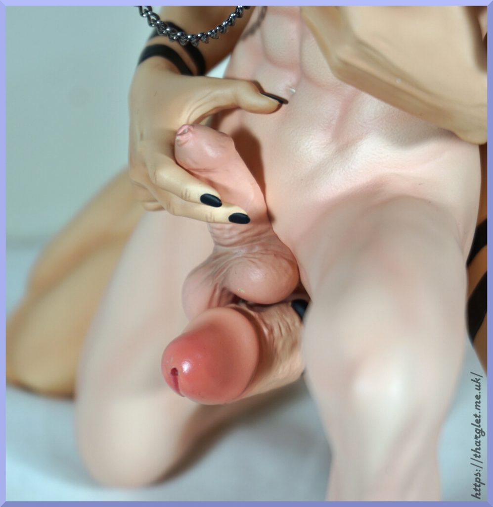
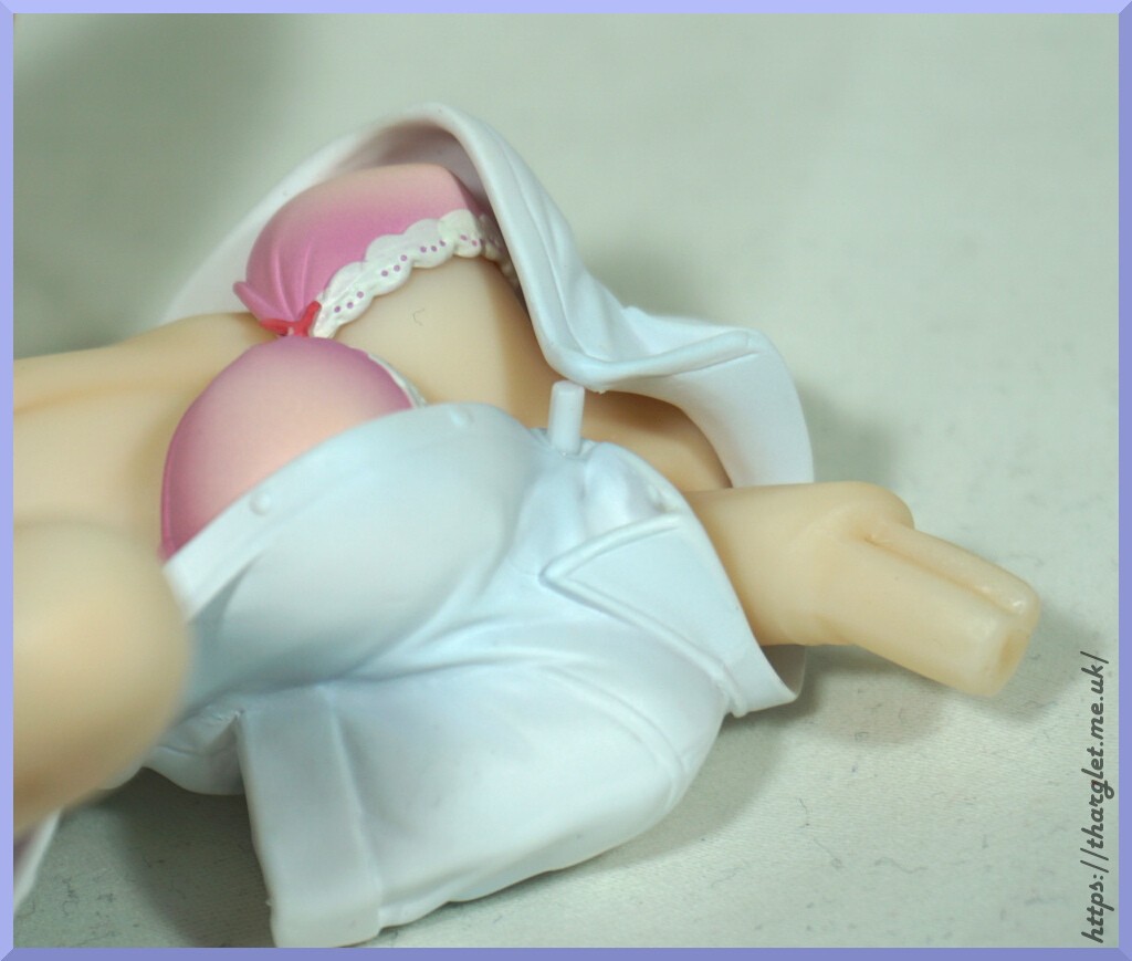
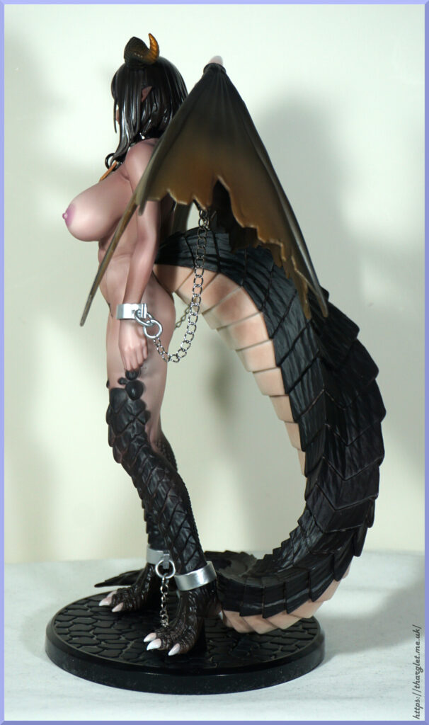
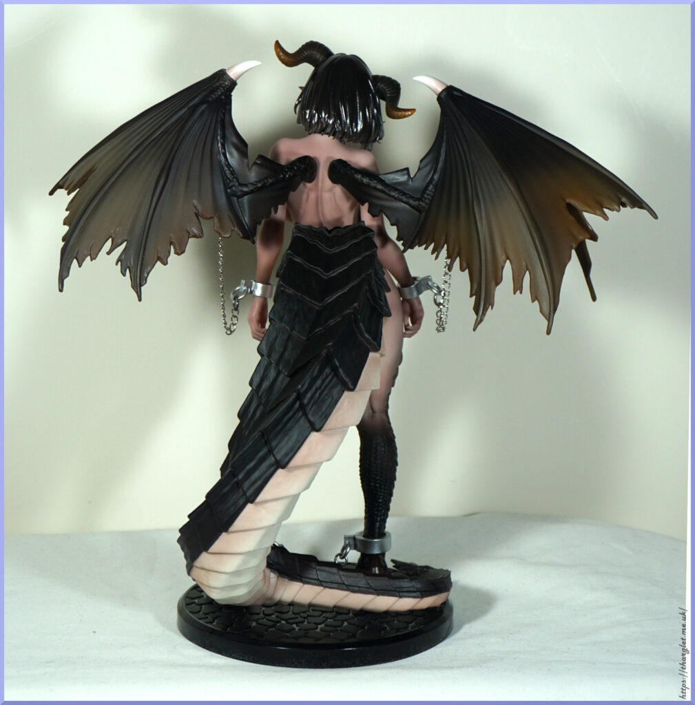
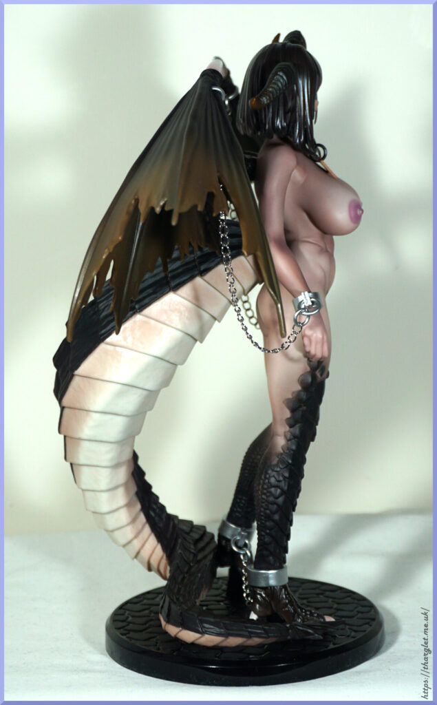
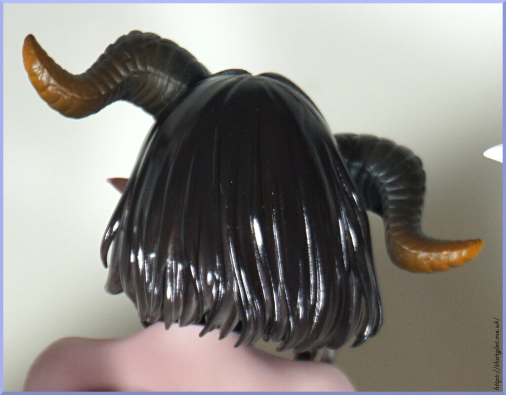
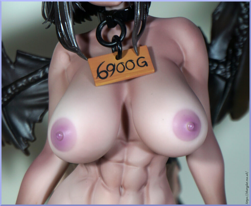
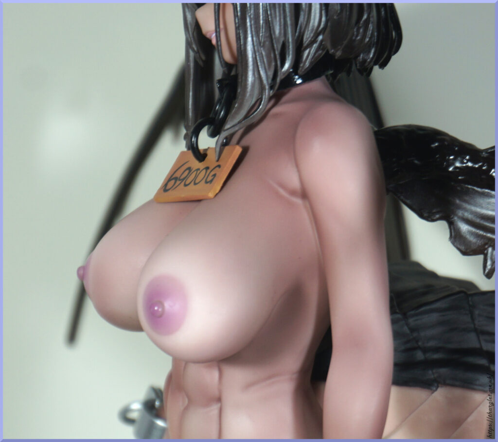
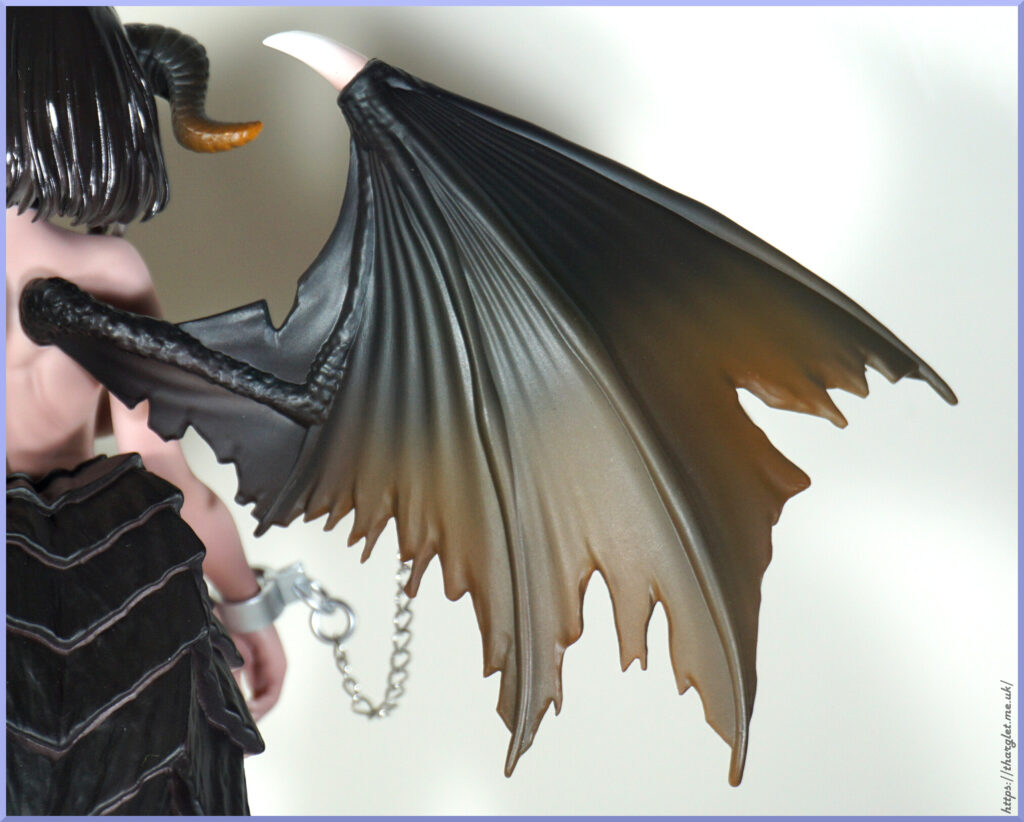
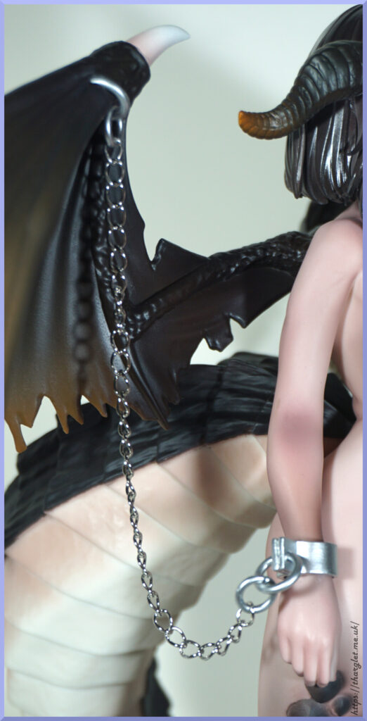
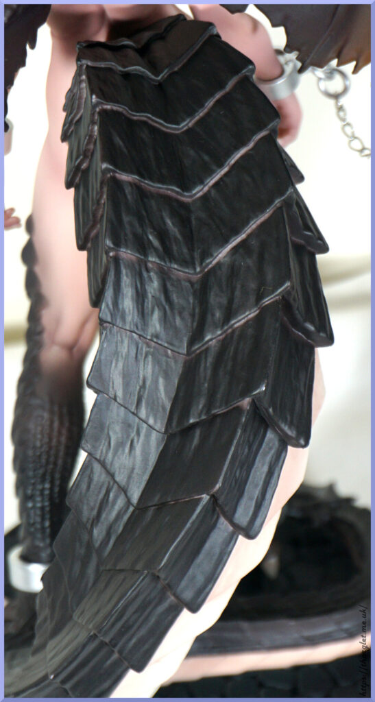
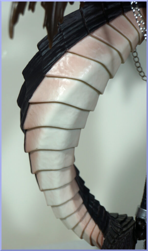
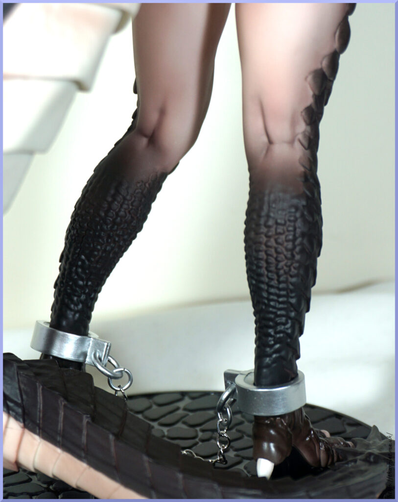
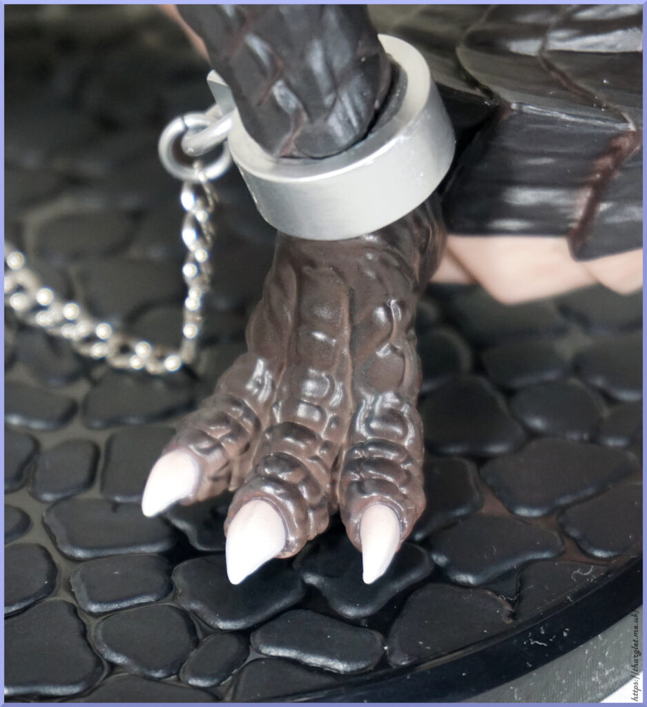
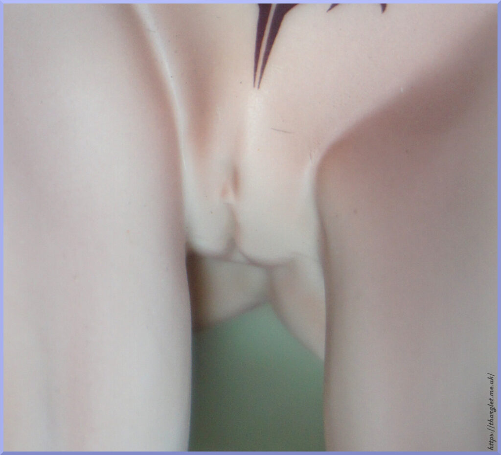
There are some aspects that are great with this figure – most of the sculpting is solid, the face is nice, chest is ample and has good areolae. However, there are two major factors that let her down – the boiled sweet hair and the toylike wings. I think if both of these aspects were revised I could actually recommend it to collectors, but as it stands these cheapen the look of the figure too much for them to not be noticeable to someone buying a figure at this price point.
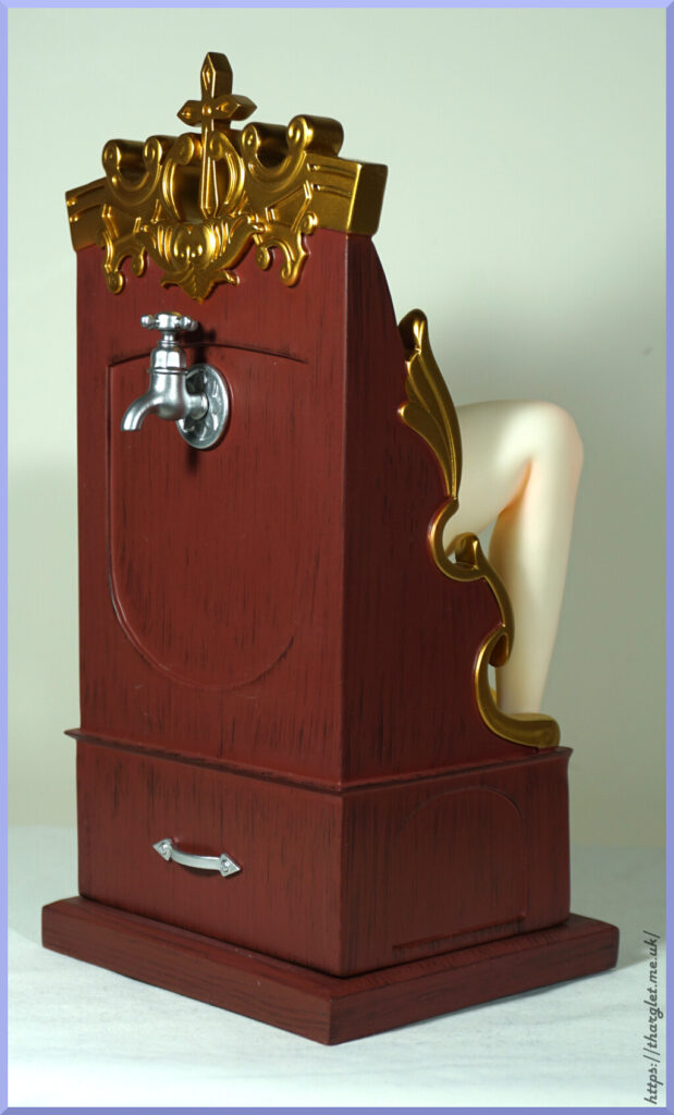
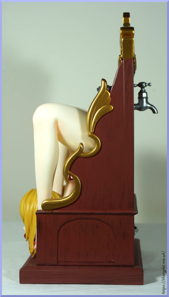
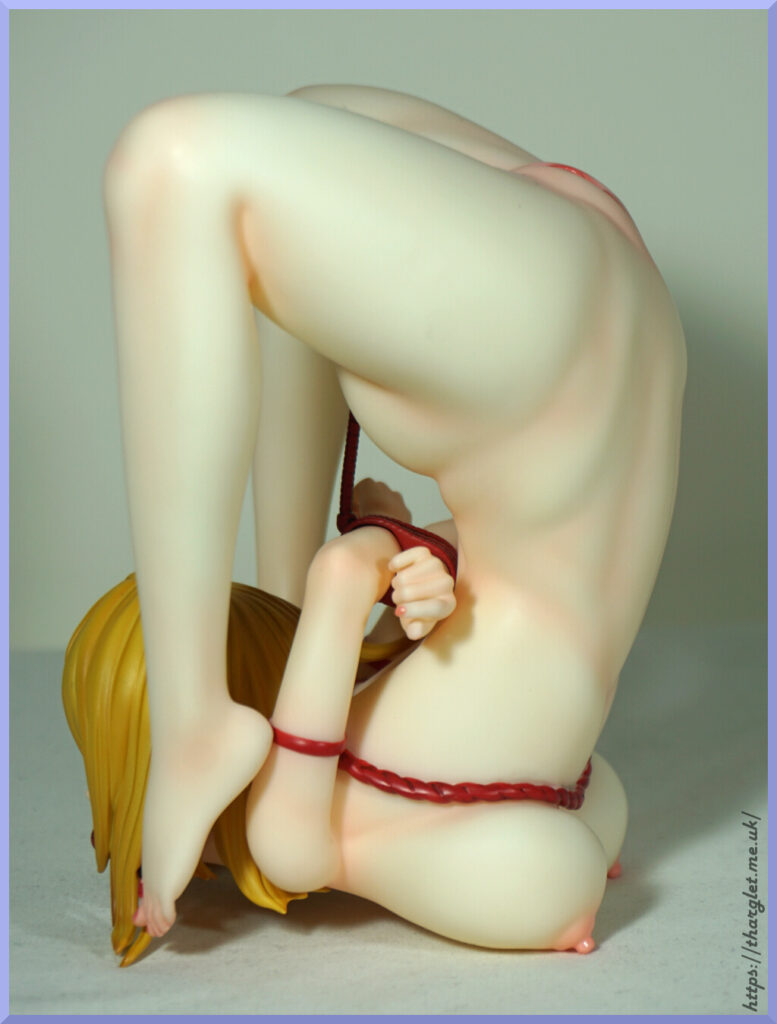
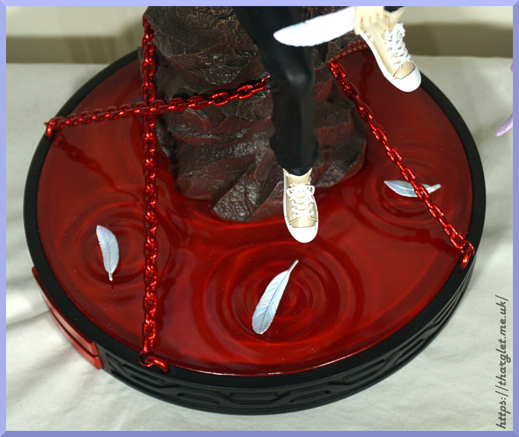
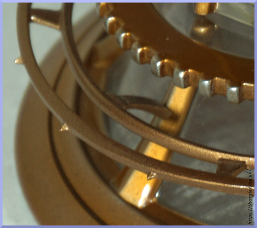
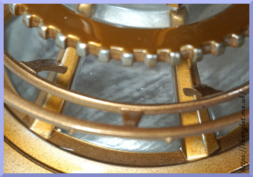
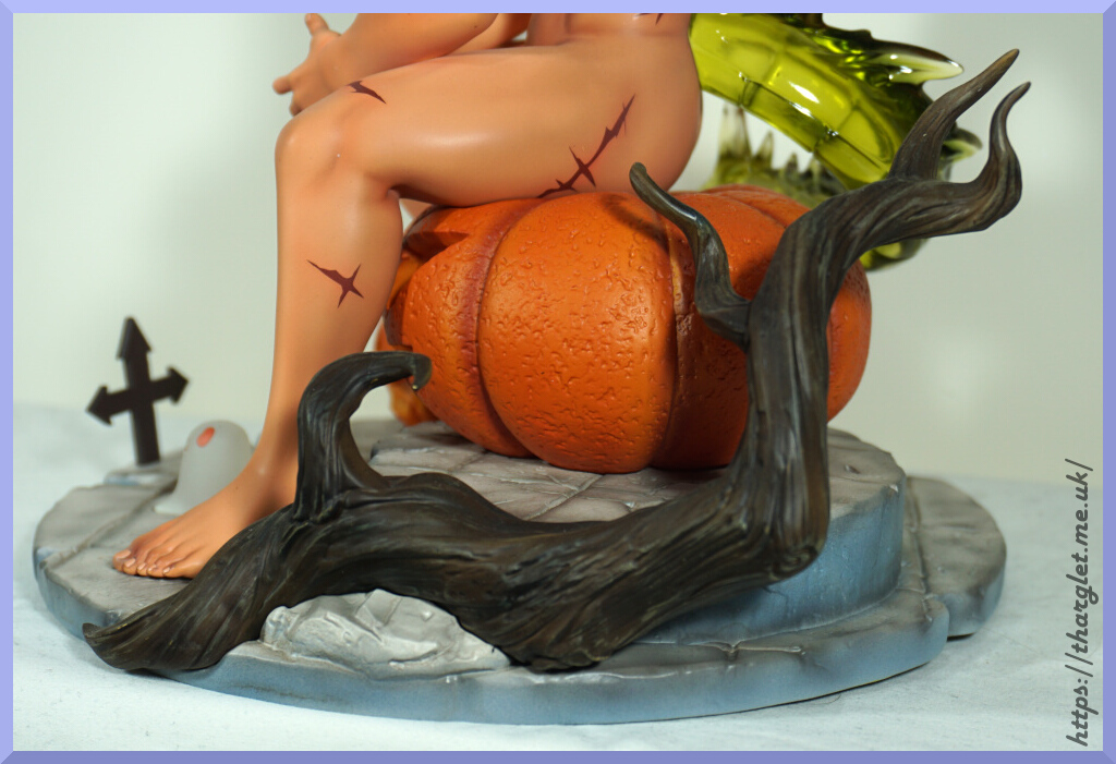
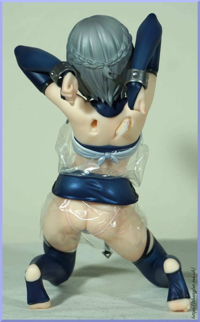
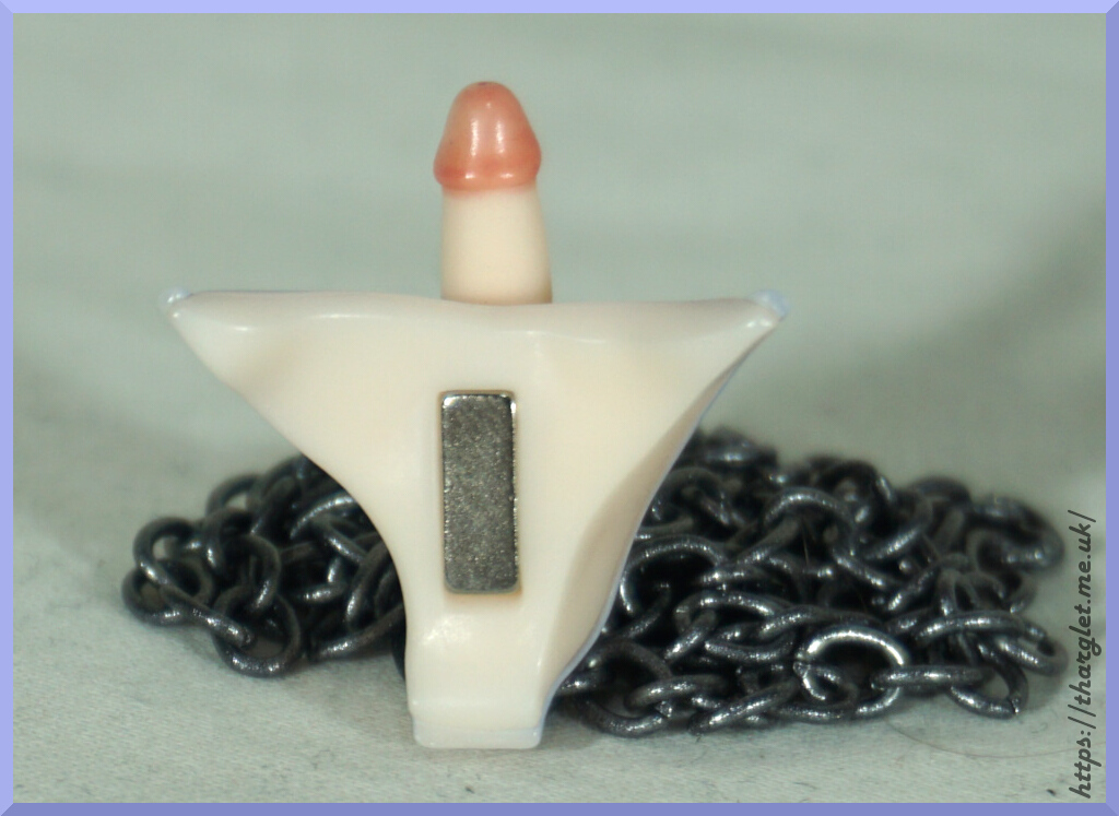
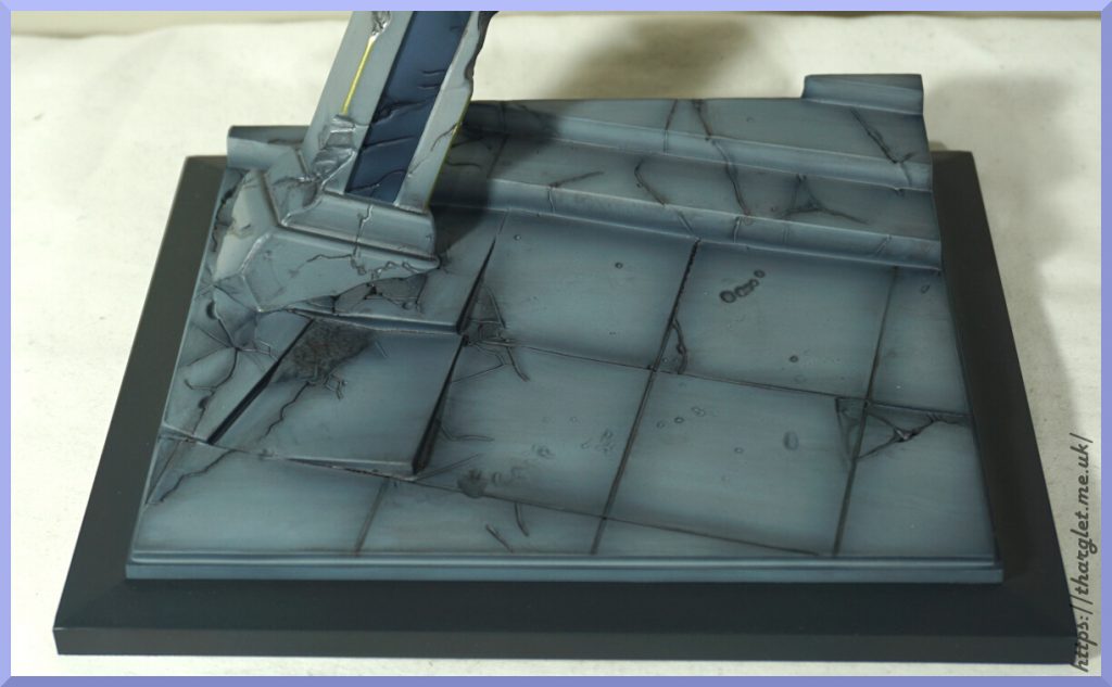
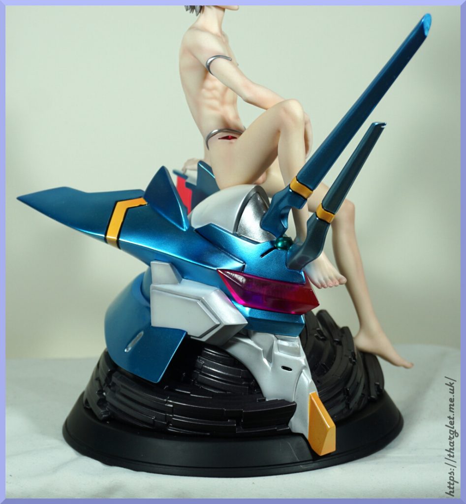
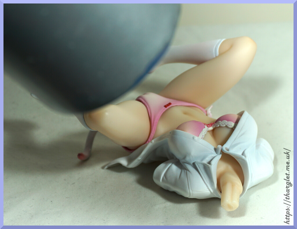
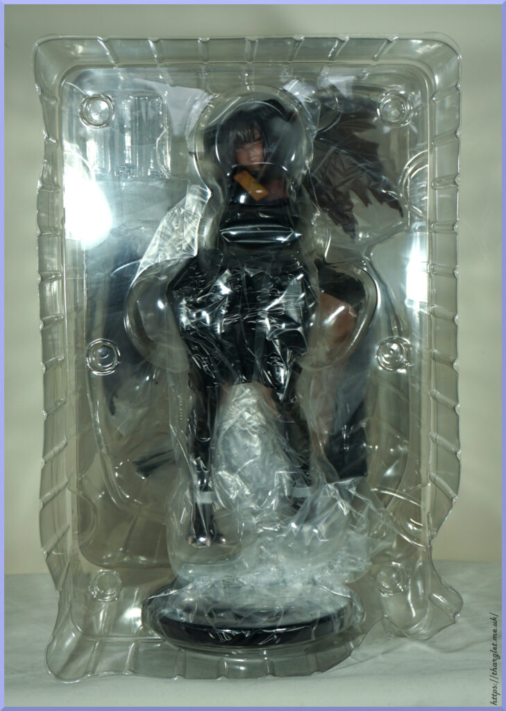
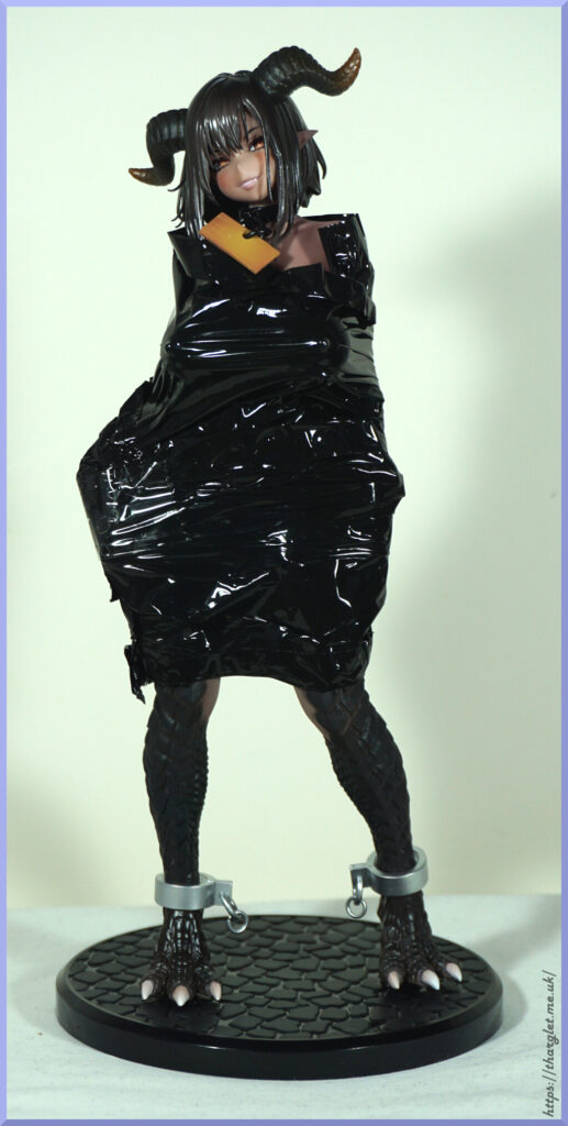
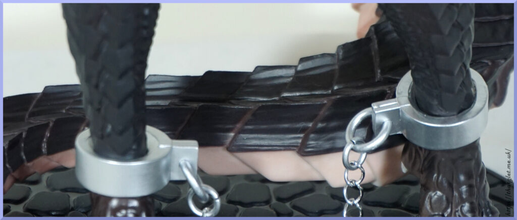
Assembly was surprisingly easy for an Insight figure, but still problems with fitting the base to the figure – they really need to get better with making bases fit their figures. On one of my Akuma-chans I actually broke the base slightly because of this issue. Not surprised if some people will with this one.
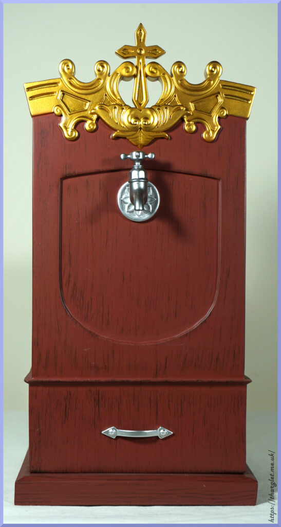
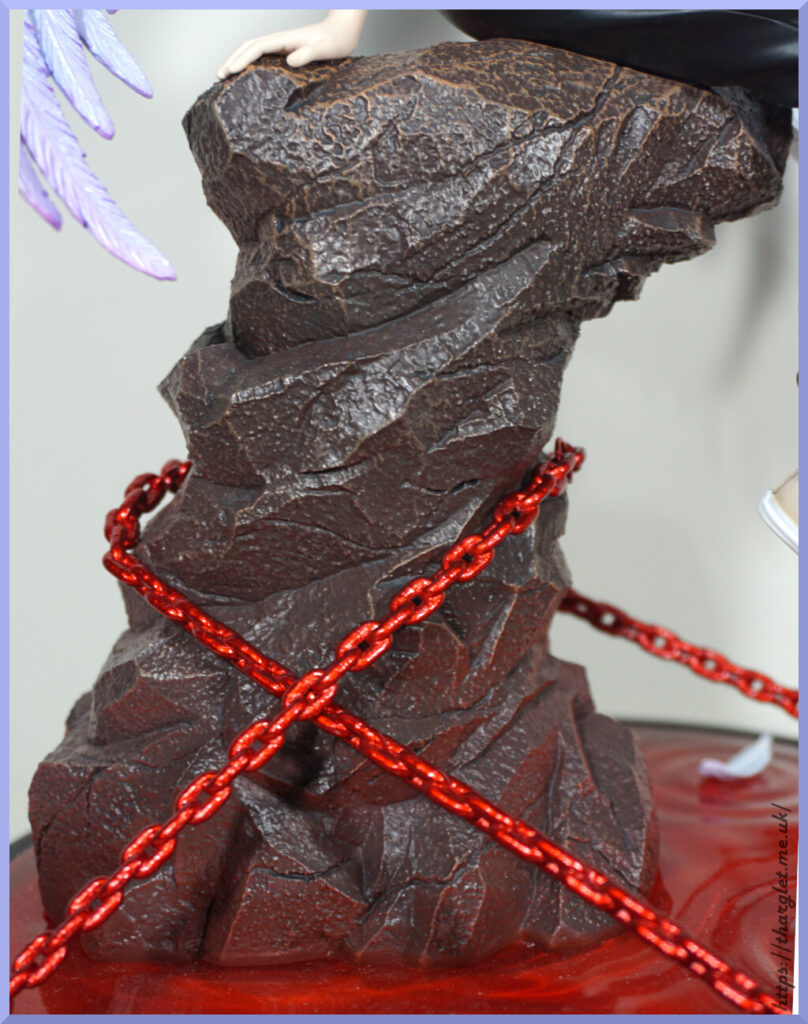
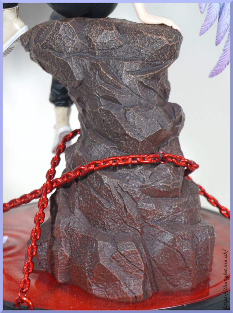
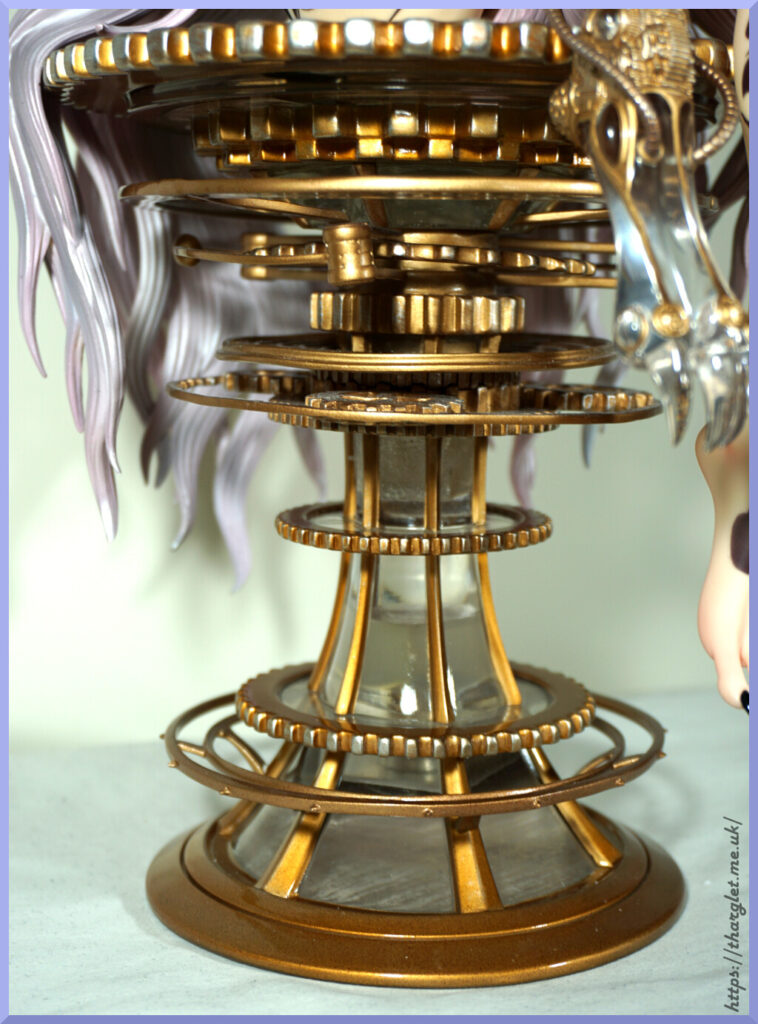
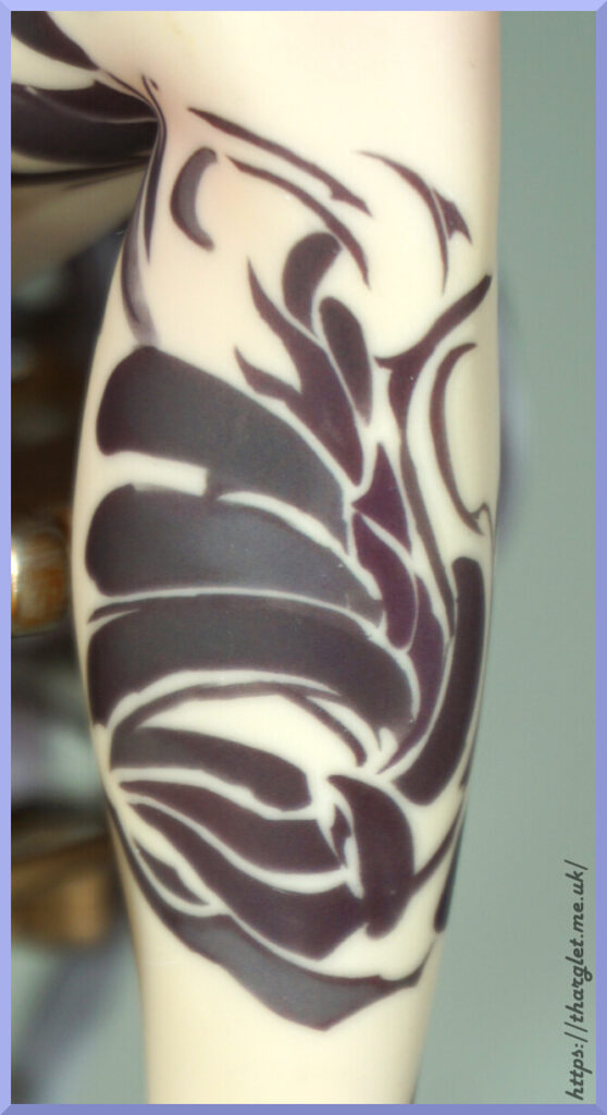
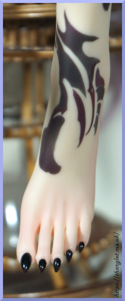
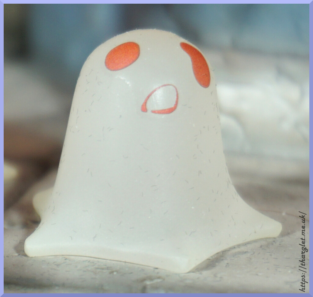
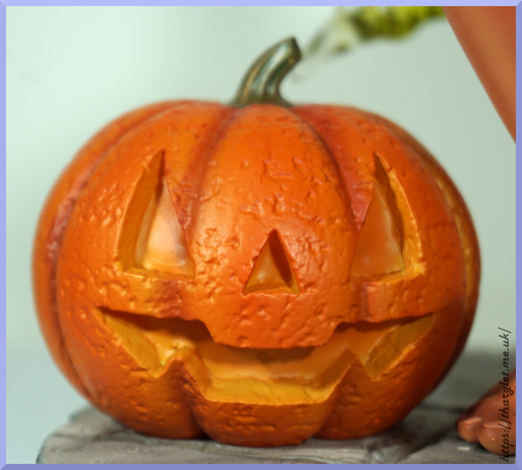
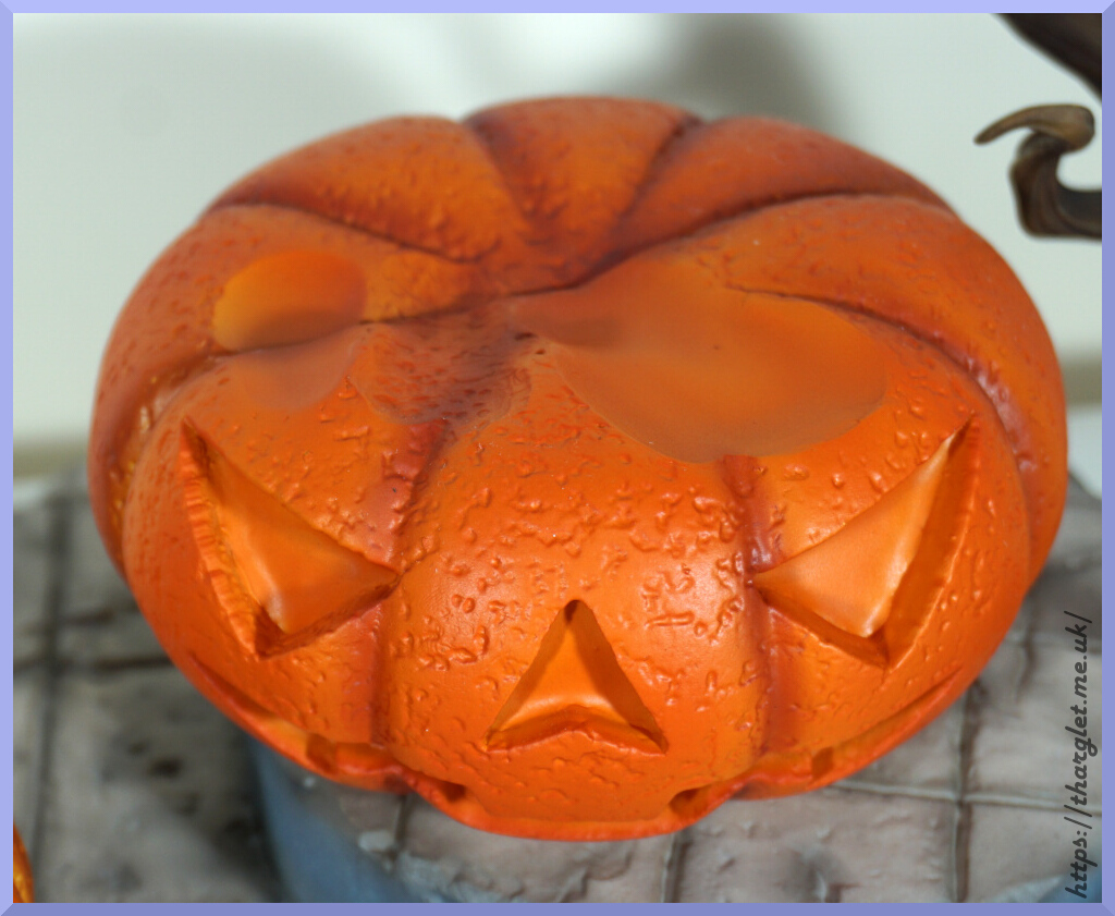
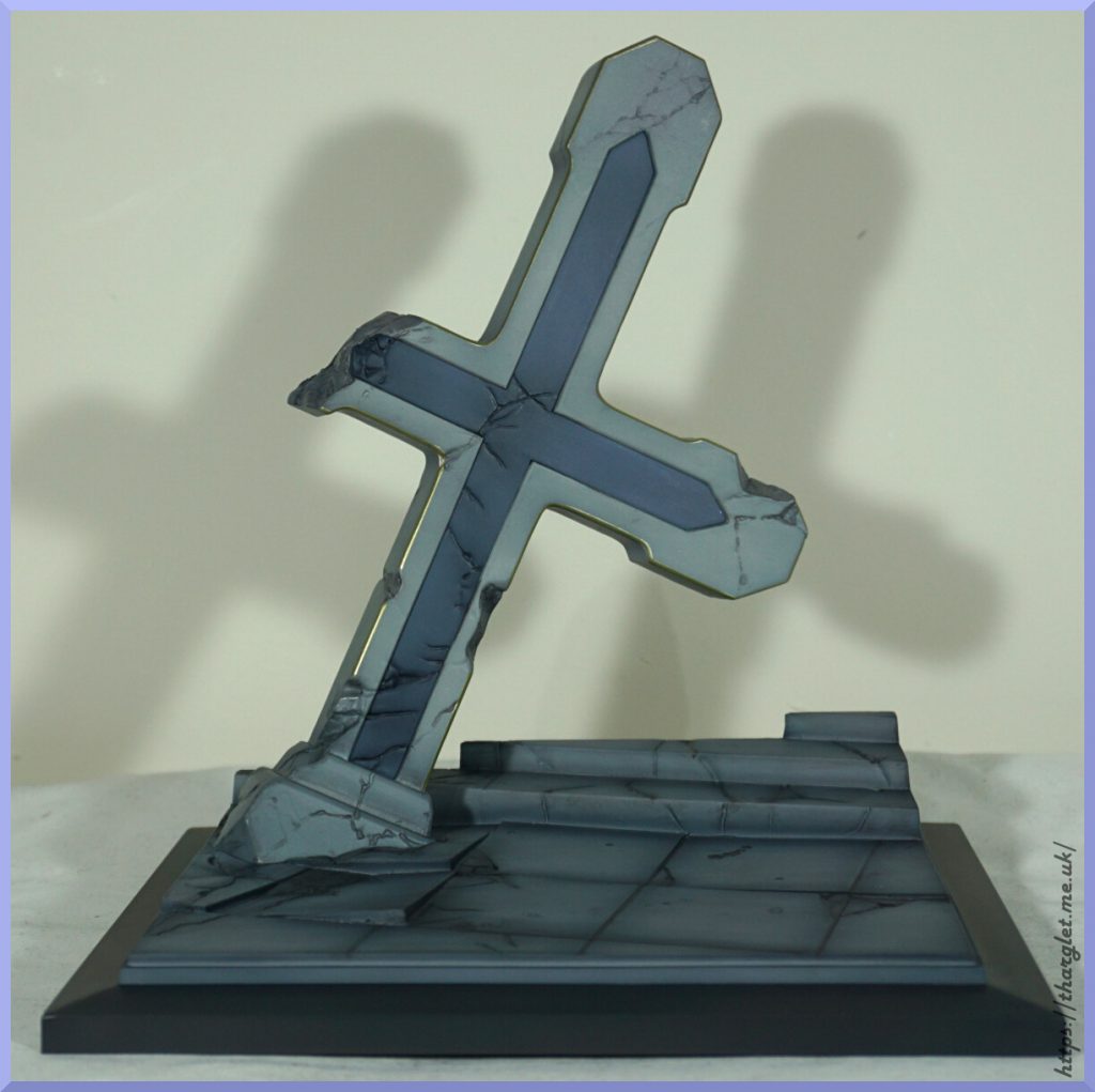
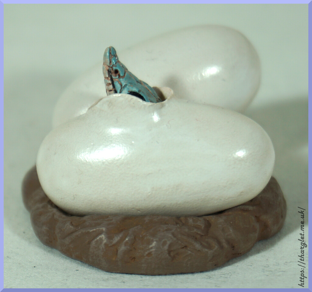
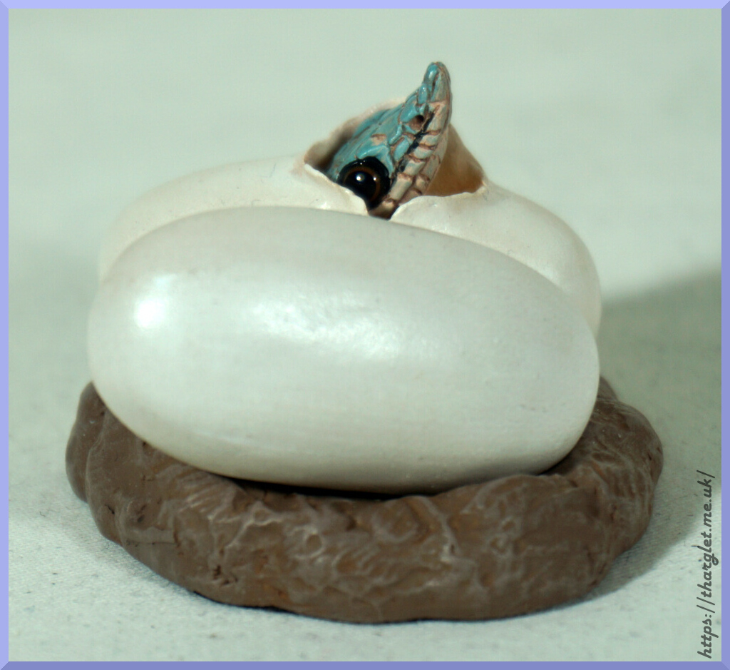
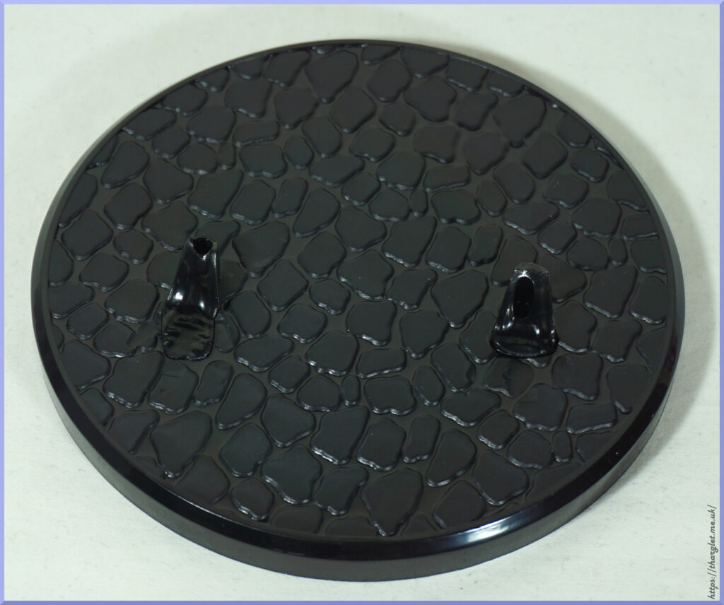
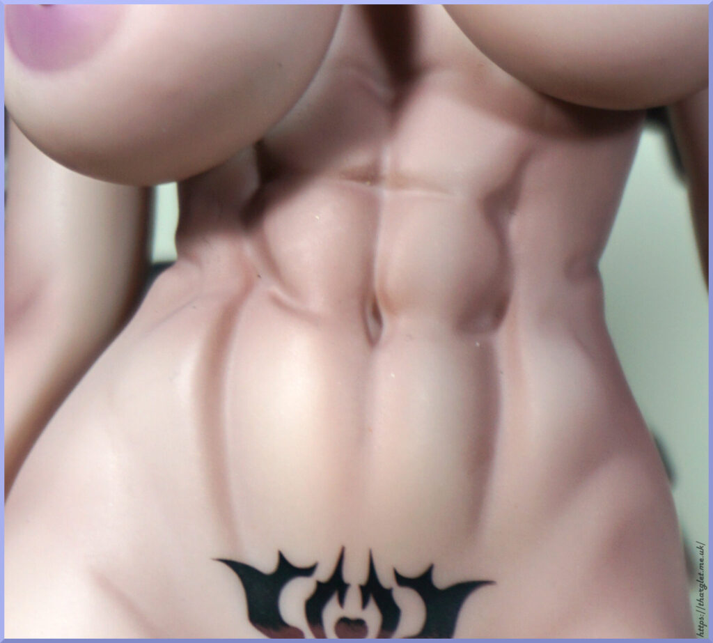
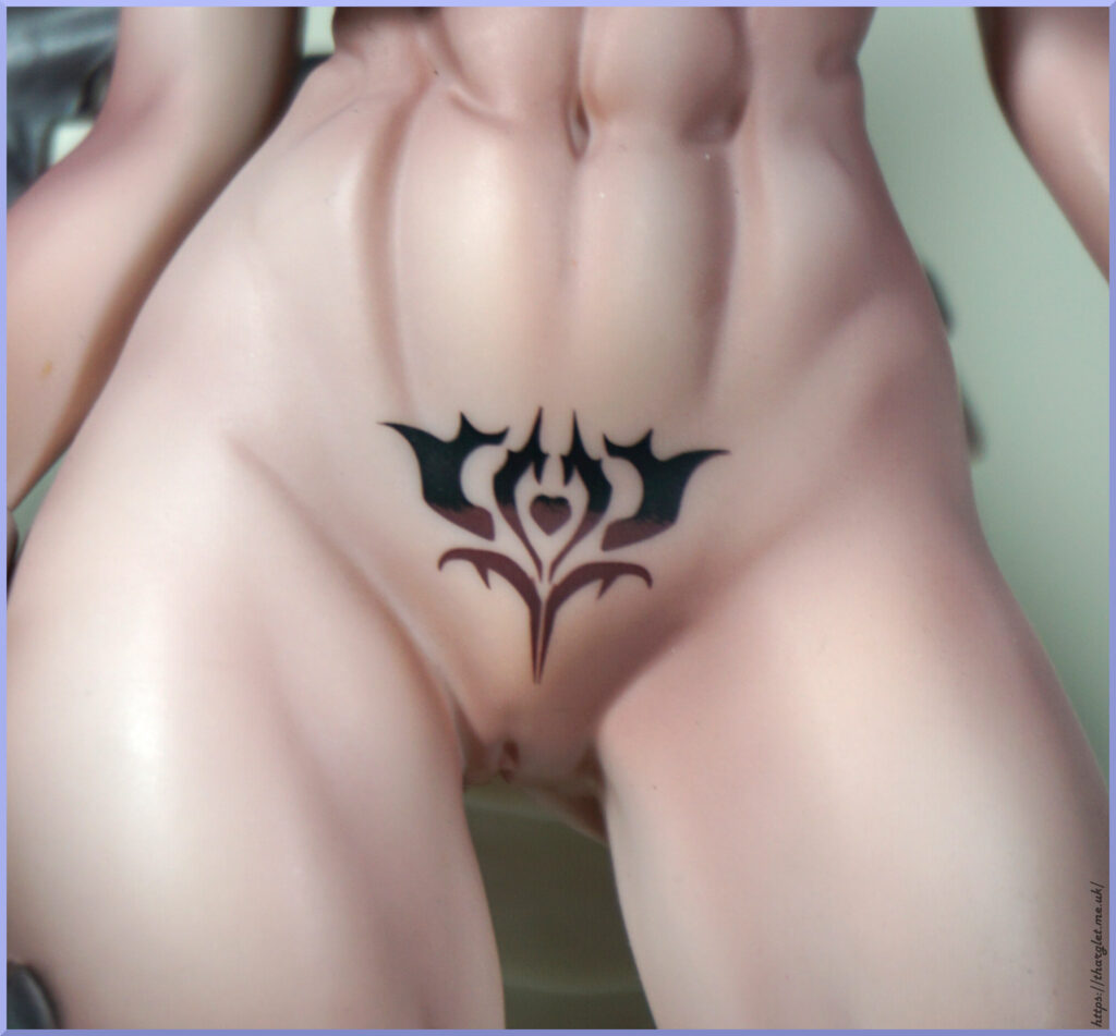
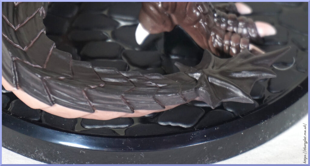
There are some other minor areas that could do with improvement – the shading on the body is fine for the most part, but there’s a couple of areas where it went a bit odd. Not too much of a fan of the way the abs/belly button was done. Base could’ve been done in a grey to make it look more like cobbles, but it’s better than a plain disc at least.
Overall, I think this is a solid effort by Insight standards – it’s still not going to compare to the “golden standard” of other 18+ manufacturers, but they’re not producing dragon slave girls. If you like the overall look, and not too bothered by the major flaws, you could go for it – just be prepared to struggle with the base.