Tag: furyu

Silica – Sword Art Online – Noodle Stopper

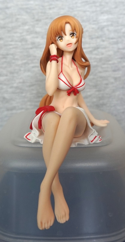
Pre-ordered this as it was a noodle stopper and SAO. She isn’t one of my favourite characters, but I thought this was cute and cheap enough to go for it.

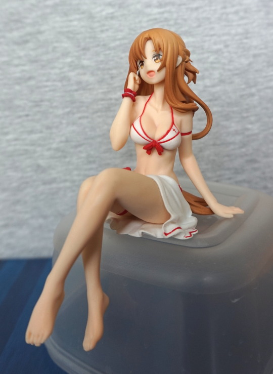
So here she is, being cute:
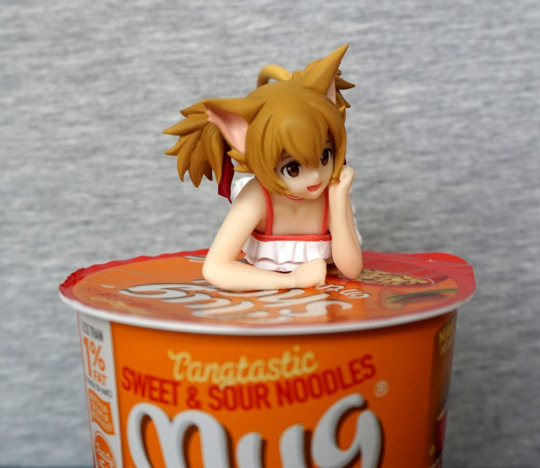
And herein demos my main issue with this figure – she’s pretty hard to display, and get the most out of her. 

Closer look:
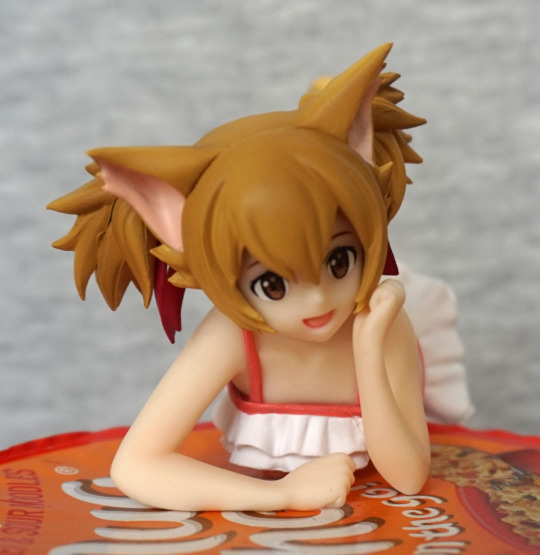
I love the cute, playful expression, and the hair is nicely done. There are little clumpy bits, if you look close, but these are sort of to be expected with a prize figure. The front of her swimsuit has been done nicely, and the red parts are enough within the lines to not be distracting. The posing of her upper half is really well done imo, and feels expressive. 

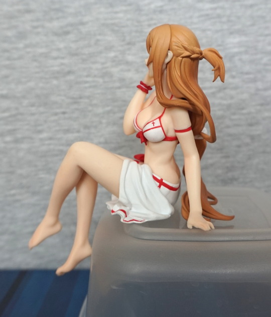
Left:
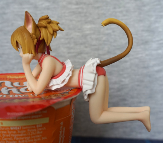
And here’s the everything we can’t see, if we use an opaque item to rest her upon. Her outfit is cute and neatly painted – I like the fact they’ve given her a collar, though it isn’t really visible from the front. Her tail curls playfully upwards, and the shading on it is nice. Love the detail they’ve put into her hair.

Unfortunately with this pose she’s a tad back-heavy – she will sit fine like this, but if she’s not fully resting on an object or you nudge her, she’ll fall off fairly easily. Out of the “noodle stopper” figures I have, this one wouldn’t function too well as one, even if you decided to use it for that imo. 

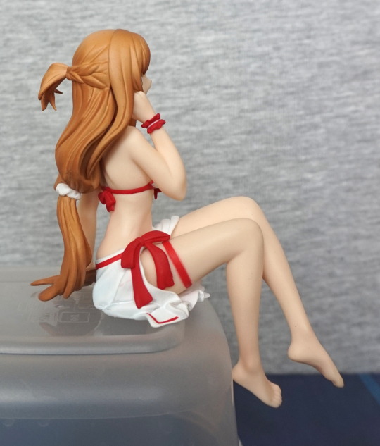
Right:
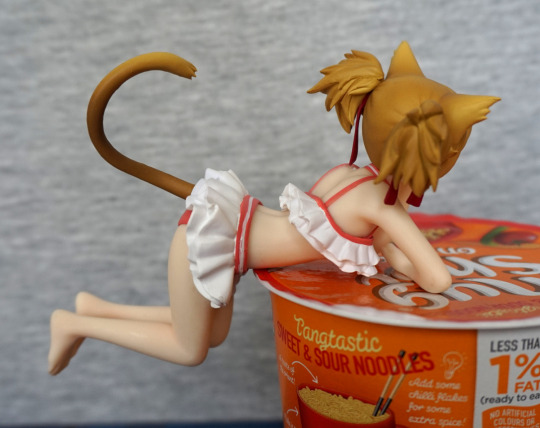
Paint is a tad more uneven on this side, but still looks decent enough. Love all the bits they’ve sculpted in the hair, and her tail shading fits the curve of her tail. 

Back:
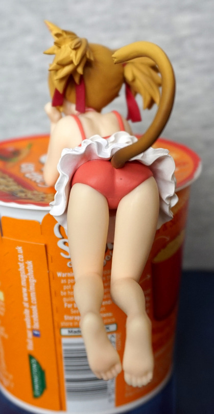
The tail ends somewhere out of sight, which works for me. The frills in her skirt have been sculpted nicely, along with her butt. There’s a bit of an annoying paint flaw on mine – a little excess paint on her panties. Her legs and feet are sculpted nicely, and her toes look good. 

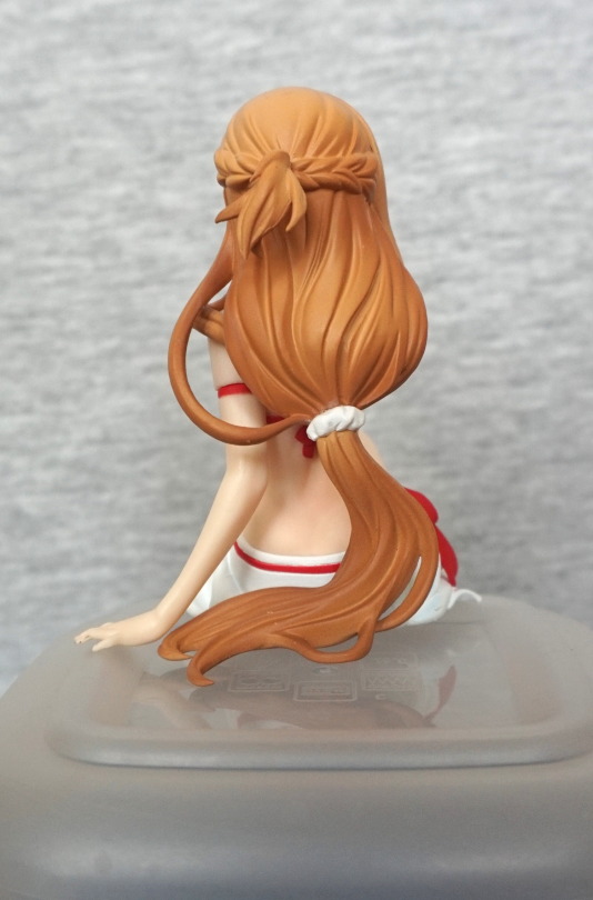
Close-up of the back of her hair:
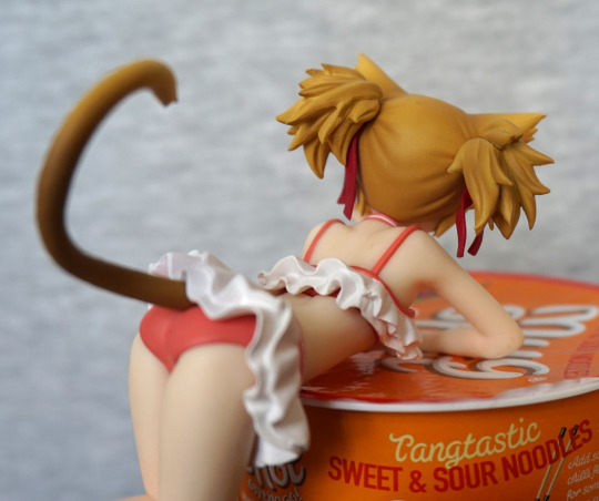
I like the shading on her hair, and as mentioned previously, the amount of detail they’ve put into it. Seems a fair bit more than your average prize figure. Her top also has a fabric bit painted under her frills, which is a nice attention-to-detail.

Overall, the figure looks very nice, and has been executed nicely for the most part. The major issue that prevents me from recommending it is the display potential – I think it would’ve been better to have her head turned to the side, so she could be displayed side-on. Currently I have her sat on a clear U-shaped riser, so you can see more of her, otherwise it’s a toss-up if you display her face or her body. I suspect the pose was chosen to accommodate the tail, and it works on that front, but I think she would’ve been better coming with a small clear claw stand, so you can display her unobstructed…. as let’s face it, nobody’s going to use this as noodle stoppers. 
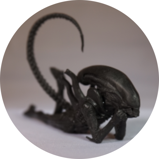
Alien Warrior – Alien Vs Predator

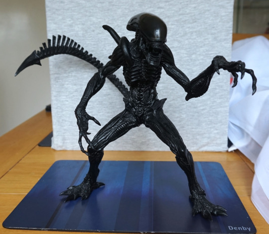
This xenomorph is based upon one in AvP, according to the box. This one I randomly came across on Suruga-ya and thus I decided to order it:

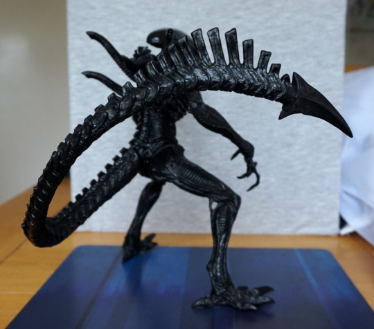
And he’s a big mofo… bigger than my backboard. In terms of painting… he’s black. And a bit more black. So,um, nothing to talk about here as regards paint… but the moulding makes up for this. 

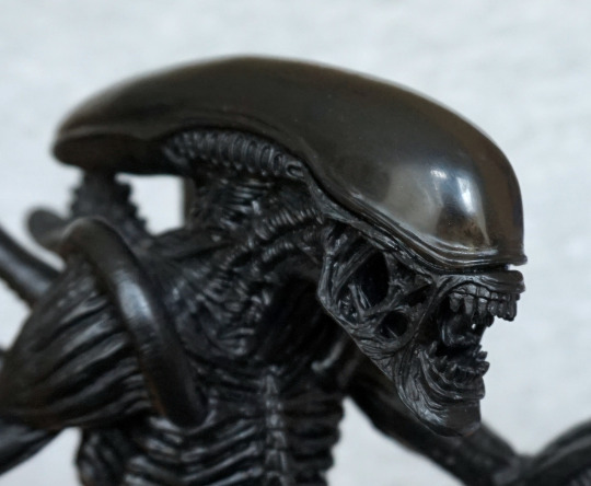
‘Face’:

He has a translucent dome, but you can’t really see through it – just the vague shape underneath. The detail in the moulding is visible here – I love the texture on the webbing bits of its mouth. 

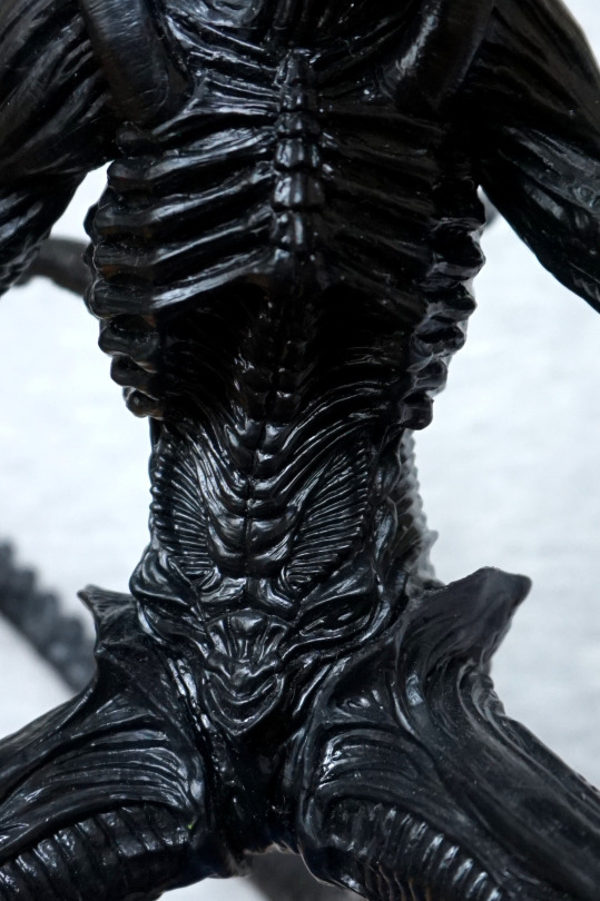
Chest:

The bones look good on the chest, and plenty of details further down. 

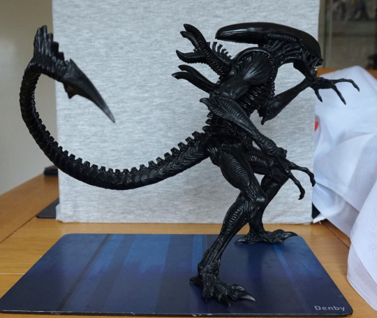
Left:

I like the preparing-to-leap pose. It’s also done so it’s fairy well balanced, and will happily stand on a flat surface. 

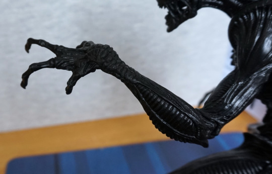
Arm close-up:

Again, good sculptwork that captures the textures and details of a xenomorph well. 

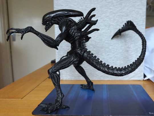
Right:

From this site, its tail tries to stab the camera :P. The back pipes stick out well, and we have the other wibbly protrusion here too. 

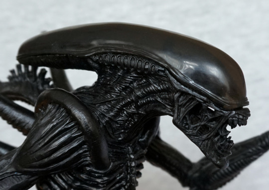
Side of head:

Liking the details on the neck, but the shoulder ridges look a little odd – there’s not a huge amount of texture on them, and I’m not convinced over the way the arms join into it. 

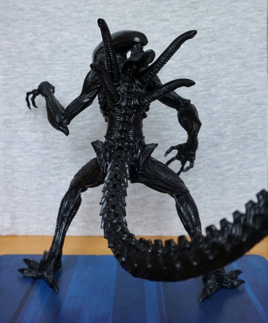
Back:

A lovely amount of sculpting back here – I like the spine and the lines that join up to it. Its hips stick out nicely too.

Tail:

One vicious-looking tail! Love the end of the tail. 

Overall, I like this figure. It’s a big, solid figure that’s well-sculpted, and balances well. If you want a cheapish statically-posed Alien figure, I would recommend this FuRyu series of figures. 

Jack the Assassin – Fate/Grand Order

This was one of the figures on my “to buy” list when I headed to Japan – it was one of two Jack figures I was thinking of buying, and I decided to go with this one.

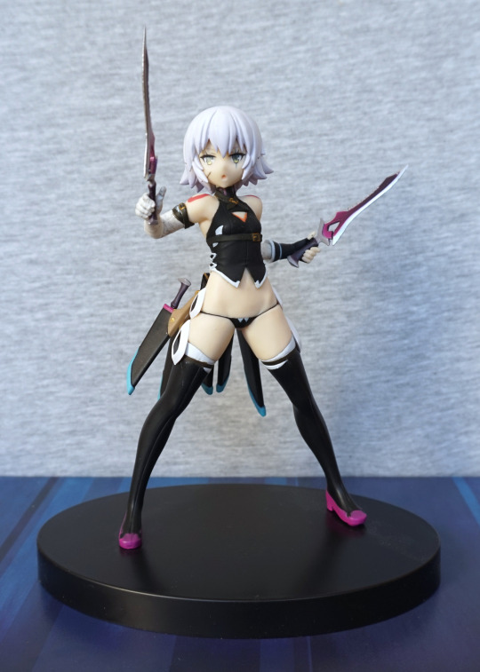
So let’s look at her out of the box:

I like the pose, but not sold on her expression. According the the promo shots, I actually have her daggers in her hands the wrong way up, but honestly, I prefer them pointing upwards rather than downwards (please don’t shoot me Fate fans!). 

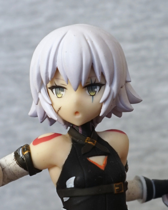
Face:

I like her eyes and the scar. Here we can see the paint job is mediocre – the edges on her top are a bit messy. and the straps on her arm have paint all over the shop. 

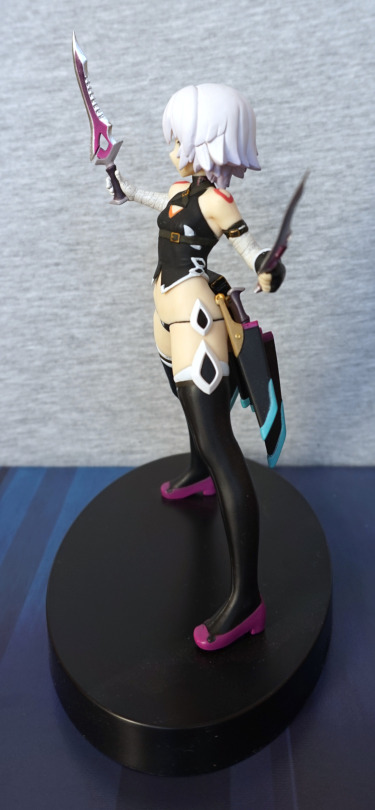
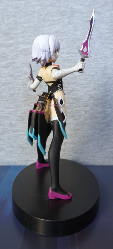
Left:

I like the diamond parts on her leg. Her hair looks OK, but isn’t particularly detailed. The side of her top is nicely detailed, and I do love the knife holders on her back.

Right:

She looks good from this side. Still likin’ the knives and the details on her top. 

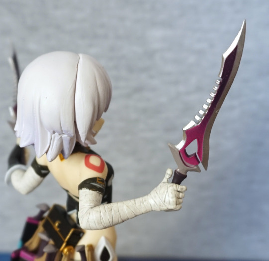
Arm close-up:

They tried to make the bandages on her arm look dirty, but I’m not sure I like the effect. However, I do really dig the daggers – they’re a detailed shape, and the paint with the gradient is really nice. Definitely one of the highlights of this figure.

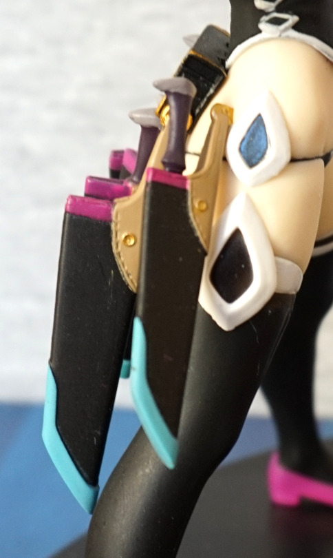
Side of the knife sheathes:

Here we see some of paint marks that aren’t uncommon on certain prize figures. Other than that, the sheathes are pretty nice. 

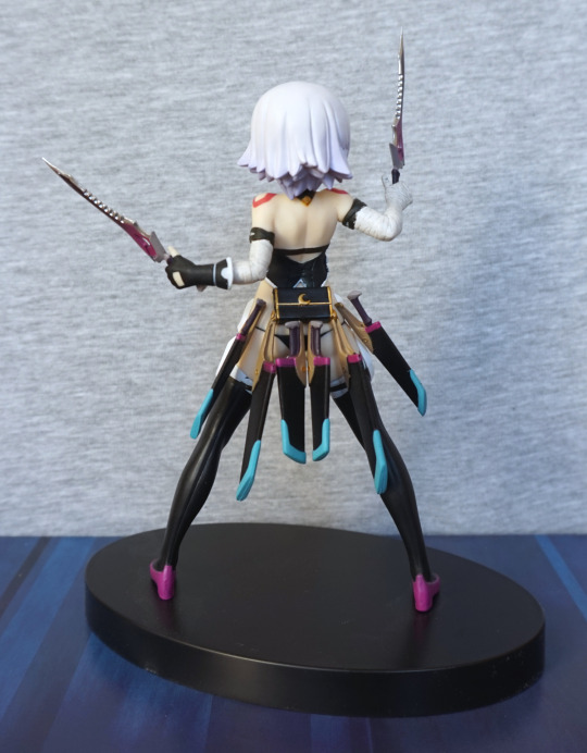
Back:

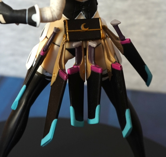
Here we have a bag o’ tricks and all them sheathes. She looks really good from this angle. 

Close-up of her back:

The pack is painted decently well, but the knives are a little bit of a mess. Not too much of a problem, as they’re on her back. 

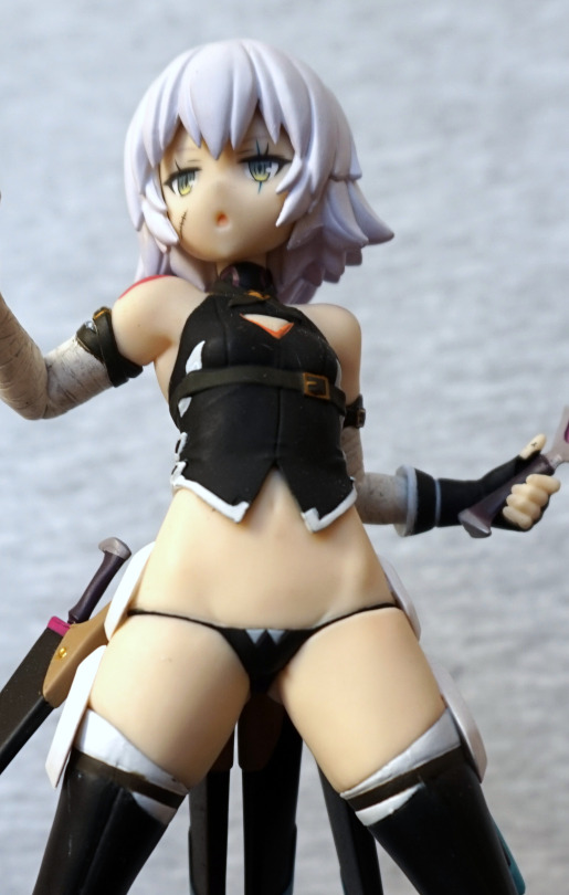
Front shot:

Her outfit is an interesting one… looks like she forgot her trousers this morning :P. The body is sculpted decently well, with some definition near her hips and groin, and she has a belly button. 

Overall, it’s an OK prize figure. She should be pretty cheap to get hold of – I wouldn’t recommend spending a whole load on this figure due to her flaws, but she is a reasonably decent figure imo. 

Seiki Hokuhou – Kantai Collection

This figure was a bit of a random buy for me. I was considering the scale, but the price for it turned out to be quite hefty, so I set my heart on getting one or two of the KanColle prize figures, as I don’t play KanColle, but I like some of the character designs.

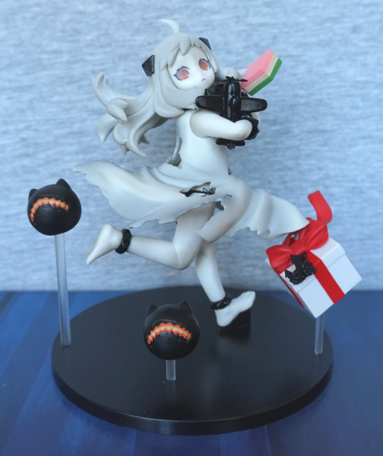
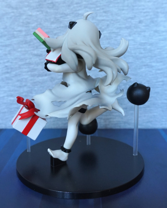
So here is Seiki Hokuhou:

I liked this one as she looks quite cute, and I like all of the extras around her. With the present and the items she’s holding, it feels like it’s her birthday :).

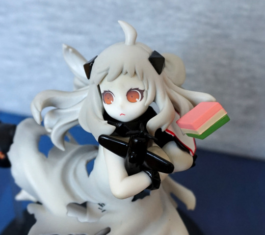
Close-up of her face:

She has a bit of a worried expression, some food and a li’l plane. Nothing here is super-detailed, but what’s there looks good. I think he eye print could do with a little bit more vibrancy – it feels a little on the faded side. The Japanese sweet has a couple of flaws, but nothing seriously bothersome for me. Her hair has been done in a plainer style, but it’s one that works with this figure.

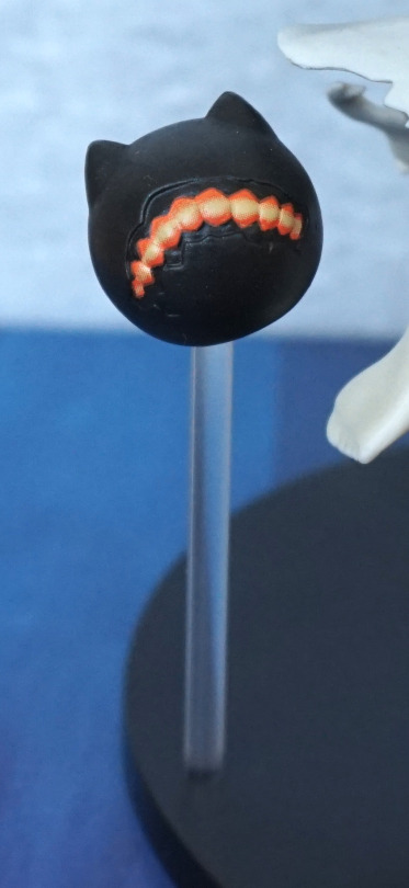
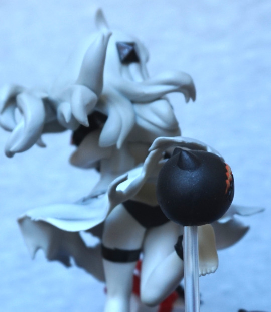
“Fiery chain chomp” companion:

These guys are cute, but quite basically printed. Here you can see the dots in the printing process, and I’m not using the macro lens here. From a distance they look OK, but close up, you can see this detail.

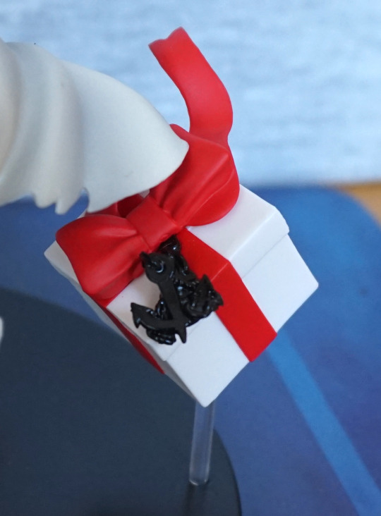
Present:

This present has been nicely done, and has a lovely anchor detail that has been sculpted well. Love the themeing here. The ribbon looks good and is flowing in the imaginary airflow around her. Dress side:

Here they’ve even thought to detail her underwear underneath her dress, which even has a little bow painted on. The dress shading itself is subtle, but effective. This is a figure that couldn’t be left plain without looking super-dull.

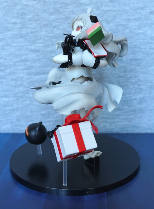
Left:

Here we see the bottom layer of the sweet is trying to run away. Pretty sure that’s not intentional. The edging on the cloth it sits on could’ve done with some work – the white edging would’ve been nicer if it had been fully painted red imo. The present is looking very spiffy though – it is shaded well, and he red band is crisp on this side. The dress also looks good, and a decent amount of sculpting went into the rips in her dress.

Right:

The back of her hair has a fair amount of life, and looks good. The poles the accessories are sitting on aren’t exactly hiding, so you have to wilfully ignore them.

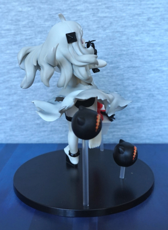
Back:

Here we can see a greater amount of shading on her dress, which is what partly makes this figure. We can also see her feet and legs are well-posed and give her a good sense of motion. The anklets and bracelets she wears are also nice details.

Pantsu:

Yep, she has a pair of black panties. For those that care. I like the fact they’ve detailed them in. Here we can also see that her toes are sculpted well.

Overall, I think this is a decent prize figure. It’s one of the ones that is well-shaded, which is a win in my book. If I were to make one change, it’d be make the face print a bit more vibrant. And then align the sweet properly, though this probably isn’t incorrect on other instances of this figure. I’d recommend this figure to anyone who is interested in owning her. I think she’s reasonably available at a good price.

Black Lotus – Accel World – FuRyu

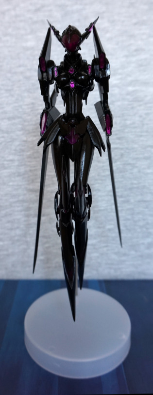
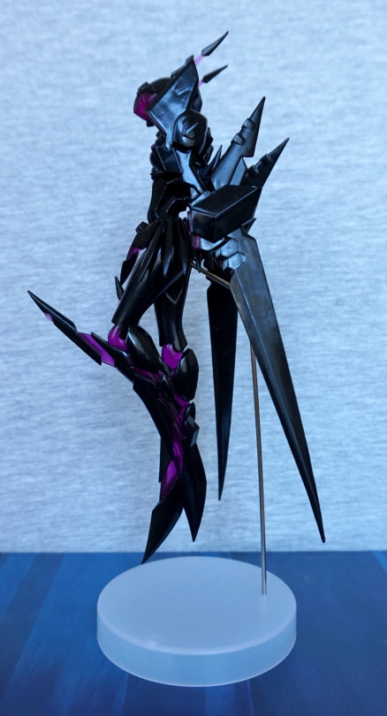
This was a figure I didn’t expect to see, so was really happy when I did. As it wasn’t overpriced, it was an instabuy. So here she is:

There aren’t too many figures of Kuroyukihime in her avatar form, so gotta buy them all :). According to MFC, I have all but two exclusive model kits, which are too rare for me to obsessively track down.

And, as usual, she’s a bit hard to photograph, with her main colour being black. Her finish isn’t too even, and being a flat colour, this is pretty noticeable. Not entirely a surprise though, as she is a prize figure. She is nicely posed though, in her battle mode.

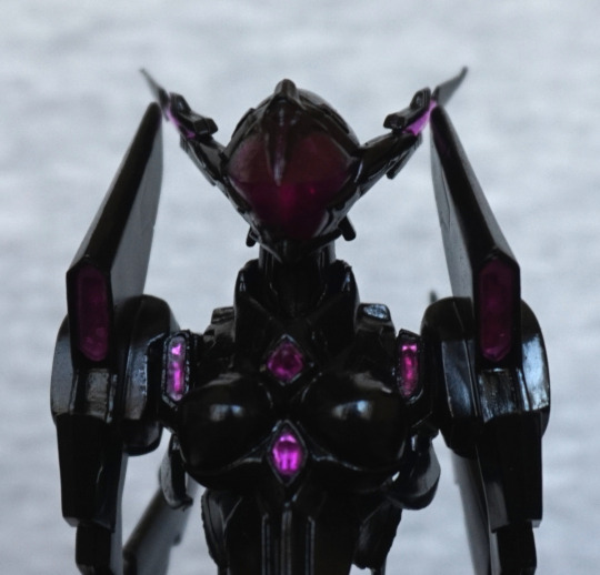
“Face” close-up:

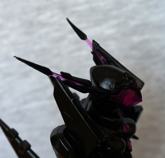
I love that they’ve added all her small, purple details in. The ones in the middle shine more than the others such as the ones on her shoulders. The mask is a nice shade of purple, with the mildest hint of face.
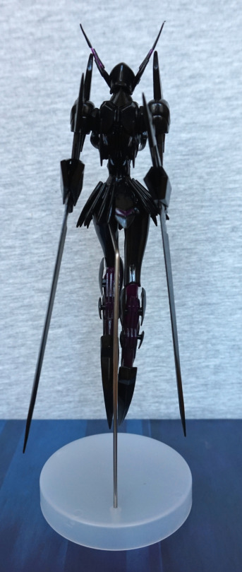
Side of her head:

Here you can see where the finish isn’t entirely even. The purple parts of her head spikes have been included, but these points are prone to bending, which can be seen with her left spike. I may fix this at some point, but it will be a mild pain to do so.

Left:

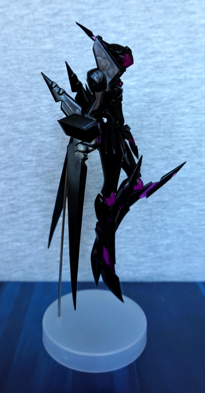
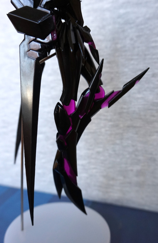
If you look closely at her arm spike, this presents the largest issue I have with the finish – here you can see the splotchiness I was referring to. And here we get a good look at her support stand, which manages to be not too intrusive. Here we can see where her legs are extended out, showing the purple areas – I do rather like her in this mode. The way she’s posed makes me feel like she means business.
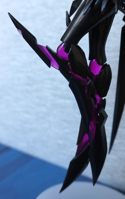
Close-up on the legs:

The translucent plastic is what really makes this figure imo. I think this came out well.
Right:

Not too different from the left. The base is plain, but holds the figure up just fine. Gives a good contrast, if you’re looking at her from an angle that the base is behind her. 

Arm close-up:

This one has a better finish to it than the other one. The trianglar & diamond-shaped parts came out well imo. If the finish was even like this all over, I’d strongly recommend it as a prize figure, but with the finish flaws it draws it more back to average.

Detailing:

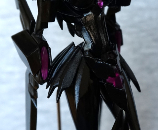
More purple! Still loving these litle deails throughout – the one on her am and skirt. 

Back:

Her back is well-sculpted, and she has the fins on the back of her legs. I think she really does have the spiky, slender appearance from the back.

Stand:

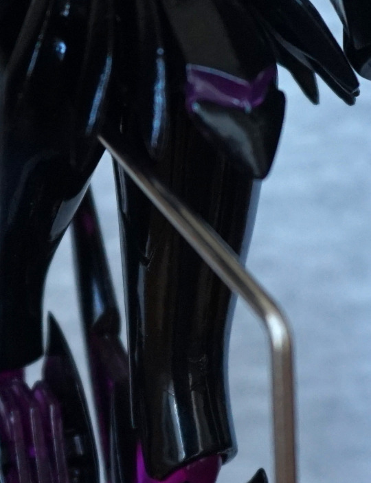
The stand goes into a small hole in her left leg. It’s a bit of a fiddle to get in there, but sturdier than I thought it would be. She stands fine, without wobbling, unless you poke her. I like this stand, as I don’t find it too intrusive, and it holds her in the air well. Being metal, they have been able to make it quite thin, so it feels like it stands out less than a plastic clip or pokey stand.Overall, I’d recommend this figure to someone who wants all things Black Lotus, and those who want a cheapish figure as they like the character design. I don’t think I’d recommend her to a general collector, due to prize figure flaws. I’m happy with her though, and glad to add her to my collection. 

Figure Spotlight – Satan (Shin Megami Tensei)

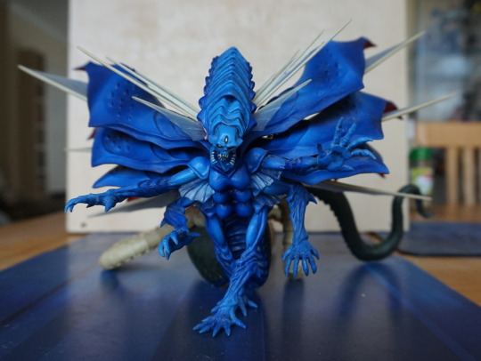
This was my first FuRyu figure, and probably still my favourite. Not familiar with Shin Megami Tensei, but when I saw this figure, I had to have it. When I first found it, I couldn’t find anywhere that was selling it cheap enough to justify buying it, but eventually one cropped up on eBay for a good price, so I went for it. Looking around, I may have been able to get it a bit cheaper, but I didn’t massively overpay.  Here he is from the front:

image

Mmm, a very vibrant shade of blue, as well as the plentiful detailing. I like the mix of materials, though the clear parts are a pain to dust as they’re spiky and on the delicate side. Managed to not break any though. 

Here’s a closeup of its front half:

image

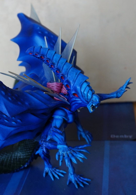
Many arms in evidence! Closeup of the wings:

image

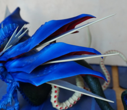
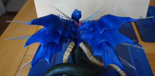
They have a vibrant red underneath, which contrasts nicely, along with the transparent parts. 

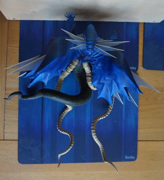
A top view, showing its sheer length:

image

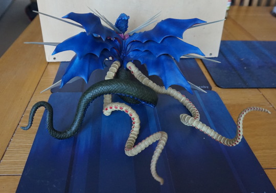
The tentacles came in various parts – once assembled, this figure becomes quite large! Required two dinner mats for this dude!

View of the tentacles on the back:

image

Closeup of the wings from the back:

image

Still pleased with this figure, and probably one of the reasons I started to seriously collect. The painting is very nice on it, the character design is awesome, and you can get this figure relatively cheap. Reading up on it though, some people have had issues getting him in one piece. Mine only has one real issue – on the top of the left wing, there is a bit where it rubbed the box, but it’s not too visible. 

Asuna – Noodle Stopper – Sword Art Online

Upon arriving home from my travels, I had this figure to unbox:

Asuna, from Sword Art Online, in noodle-stopping form. Or more like a shelf-edge figure… not sure how many people are actually going to use these figures to keep the steam in their Cup-o-Noodles. Initially I wasn’t going to get either of the SAO noodle stoppers, but upon seeing this one, I decided to order her, and I’m glad I did. FuRyu have done a really good job with her!

Front:

Her feet seem really detailed, with her toes. She also has a good amount of shading in her hair, which not all of these figures do. Most of the red lines are pretty neat, a bit wobbly on her left hand boob, but nowhere as bad as the initial pics implied it could be. She has a good amount of definition around her stomach and neck/collar area. 

I love the expression on her face, and her face has been well-painted. No complaints here from me. 

Left:

Here we can see the cross detail on her swimsuit top, which has been crisply done. Her hairstyle has been well-recreated, with her plaits and mini-ponytail. Love the way they have her ear sticking out, and the towel over her lap looks good. 

Right:

The large bow looks really good, along with the one on the back of her swimsuit top. She also has well-defined shoulderblades. The cuff around her wrist has been painted well. 

Back:

Here’s the back of her, which does a look a bit prize-figure-y in sculpt, but the shading is really nice. She rests well on a flat surface, with her backside, hair and hand. Left arm looks a little funny on the join,but tbh, it’s a minor complaint. 

Overall, I really like this figure, especially for the price I paid. I’d recommend this figure to anyone who’d like a figure of Asuna to perch on the edge of a shelf or similar location. Mine currently sits on the edge of the vivarium :). 

Morrigan Noodle Stoppers

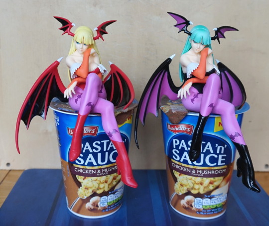
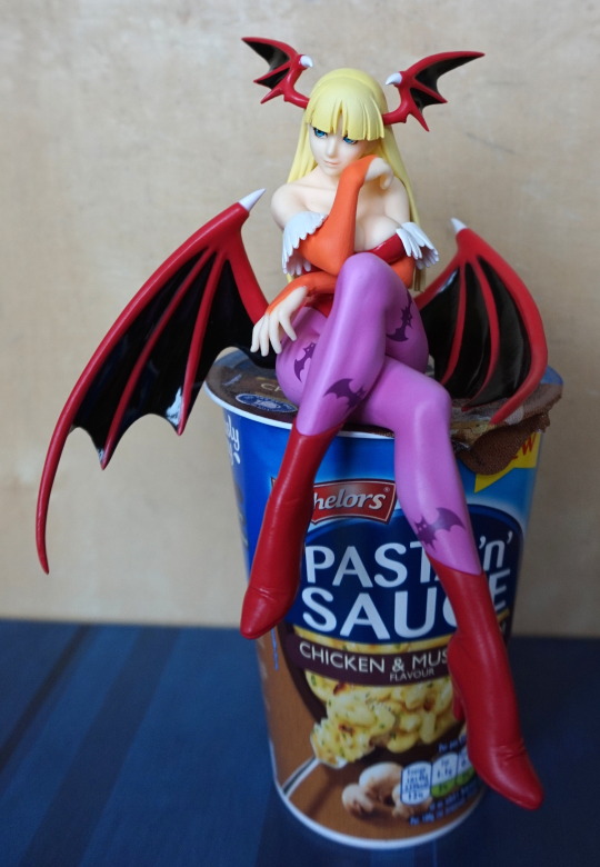
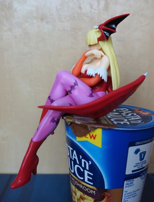
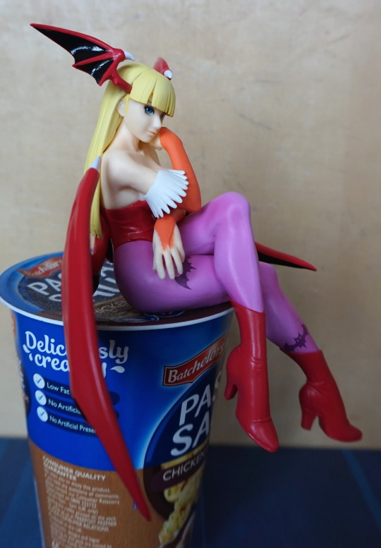
Ordered these, was excitedly anticipating them until I got the Yoko one, pondered cancelling order, then remembered the order with a retailer than doesn’t officially support cancellations, so decided definitely not. Fortunately I think these ones turned out better than the Yoko one. 

I ordered both variants, here they both are:

image

Should’ve swapped them in this shot – 1P/default coloring on the right, 2P on the left. These figures could grace your noodles whilst they’re cooking but their pose is perfect for a shelf edge. 

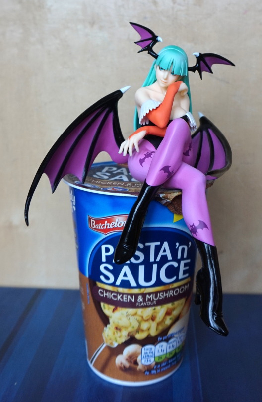
First up, 1P:

image

I love the pose chosen, and the shading in her hair is nice. The print on the leggings has been done well, and is crisp. She has a mix of shiny and non-shiny finish – was ‘promised’ for Yoko, but this shows FuRyu can do it. 

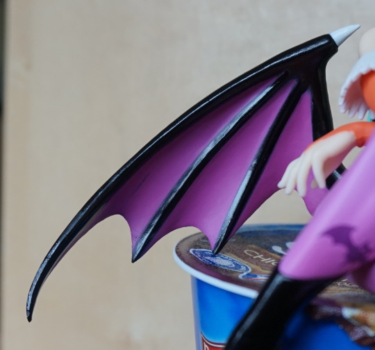
Left side:

image

Her hand is nicely posed, the left wing helping to keep your noodles shut. The white edging on her top doesn’t have the best finish though. For the most part, the wings were painted well – but there are a couple of lines where the purple paint wasn’t applied thick enough. 

Right side:

image

Yeah, she’s regardin’ you. And finding you wanting. Bit of a seam here on her leggings, but is one of the nicer ones for prize figures. 

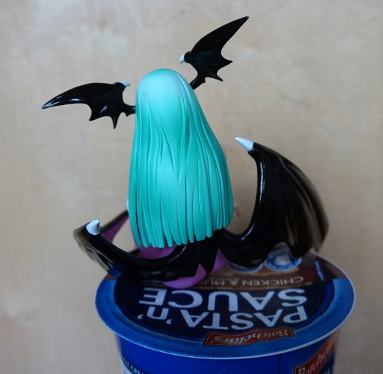
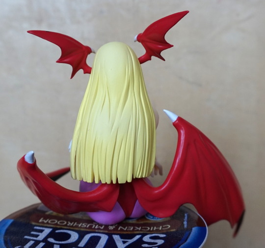
Her back:

image

The shading on her hair is nice, but there is a bit of much on her hair, which I’m not sure if I can clean up. 

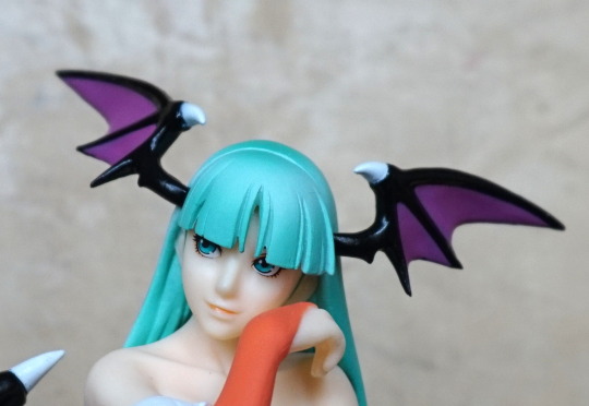
Close-up of her face:

image

It has been nicely done imo, you can just about see the dodgy painting of the orange bit though. The hair mould is crisp, but the way the paint went on, it does make it look a bit clumpy. On the 1P one, it’s not so noticeable, but it does feel a bit overly square. 

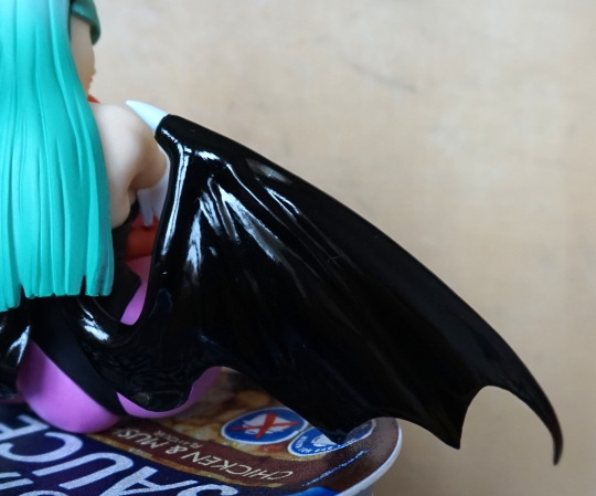
Back of the wing:

image

Shiny!

Front:

image

The black line I didn’t notice until I processed this photo – fortunately it usually falls into the shadows. The purple and black do provide a nice, crisp contrast.

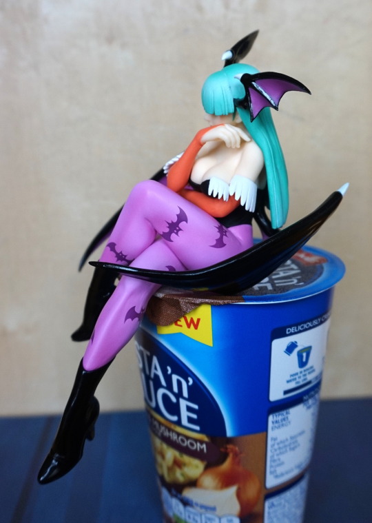
Now onto 2P:

image

This one has a less shiny finish, but it’s nice to have some variety. She’s exactly the same mould as the 1P one. 

Her left:

image

Clothing edging does look neater on this one, and the leggings are just as spiffy. 

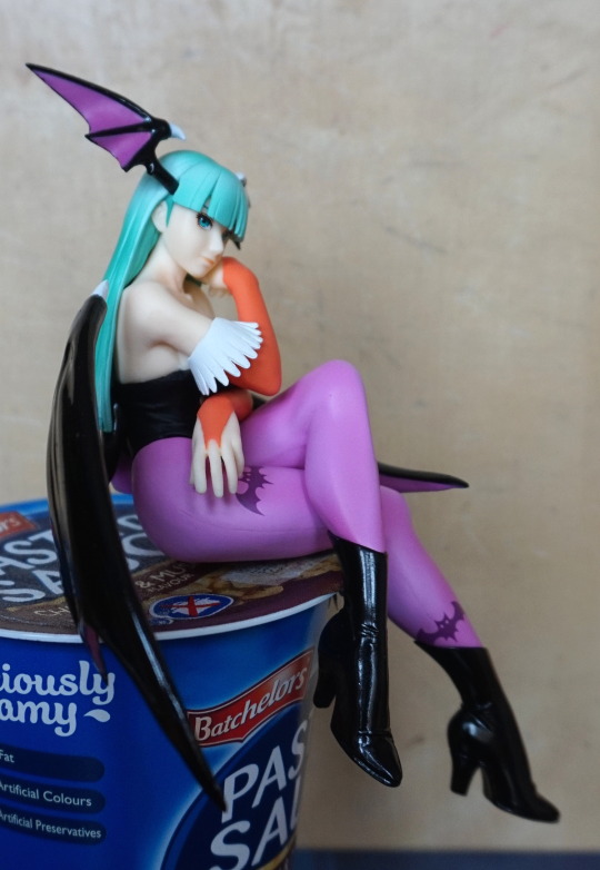
Right:

image

Same look of disapproval. But here you cna really notice the squareness of her hair. It just looks… so very square. And the yellow paint seems to emphasise this. Also she seems to have slopped some orange paint on her hand here. Oh well. 

Back:

image

The shading is less distinctive on this one. To the naked eye. it can look very flat, in terms of colouring, which makes the hair look more unnatural. In this shot, it doesn’t look as bad as I had in my head. 

I’m pleased with the pair, and glad I ordered both. I think the less ambitious design to the Yoko noodle stopper helped improve the quality of these figures. If I were to change something about these figures, it would be the hair, but displayed on a shelf it looks fine. My favourite parts of the figure is the paintwork on the legs and the face. Her legs are shaded very well, which makes them stand out. Would recommend these figures, if you like what you see.