Tag: swimsuit

Rei Ayanami – Swimsuit v1.5 – Evangelion

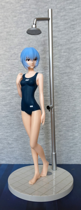
For awhile, I was toying with the idea of ordering the original version of this figure, but I didn’t quite like it enough to do so. Then I found out there was this v1.5 version, and went for it:
image

The main differences between this one and the v1 is the hair and the matte finish to her swimsuit. The mould is the same for both versions.

Face:
image

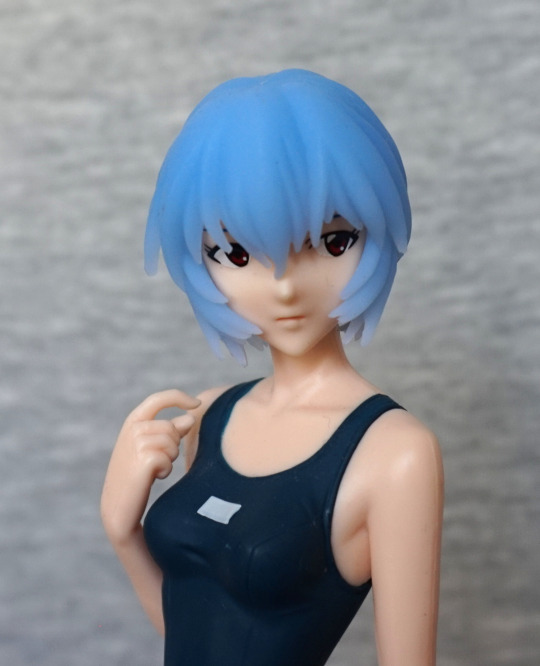
I love the soft faded effect to her hair, and am a sucker for translucent hair, despite its weirdness. I think her face has been rendered decently well for a prize figure. The matte texture certainly looks nicer than the shiny one imo, but it is more prone to showing up scuffs on the figure – of which there is a minor amount. She does have a seam line that is pretty noticeable on her left arm in this photo. 

Swimsuit:
image

Here we can see they’ve added in wrinkle details, and seams to the swimsuit, but they haven’t added any markings to the labels. Usually the character’s name would be written in the space. Guess she’s borrowing a swimsuit for the day?

Left:
image

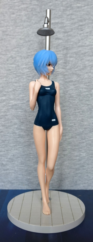
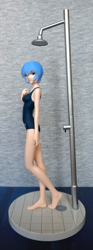
Here we can get a good look at the shower – the finish is nicely rendered, but due to the way the peg is, it does lean a little. Overall, I like this piece, and seems to have all the details it needs. Unless you want some limescale 😛

Due to the way Rei is facing, this actually makes for a good viewing angle. I like her overall pose, and I think this side shows it off well.

Right:
image

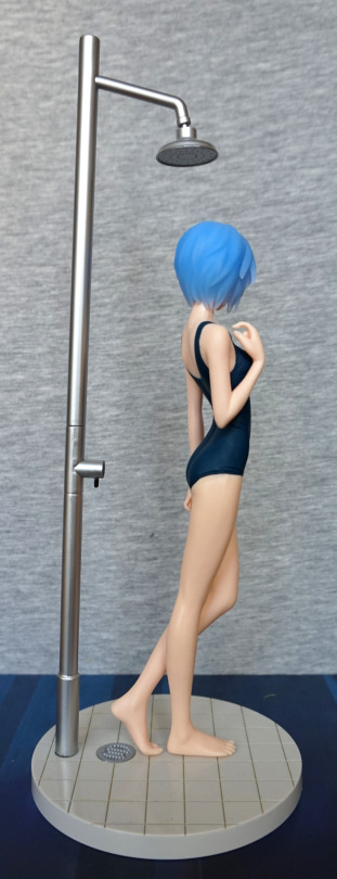
Here we can admire the details in her hair – she has a good number of strands moulded, which is a lot nicer than some prize figures where they just have the top of her hair smooth. 

Back:
image

Erm, er, let’s try that again:

image

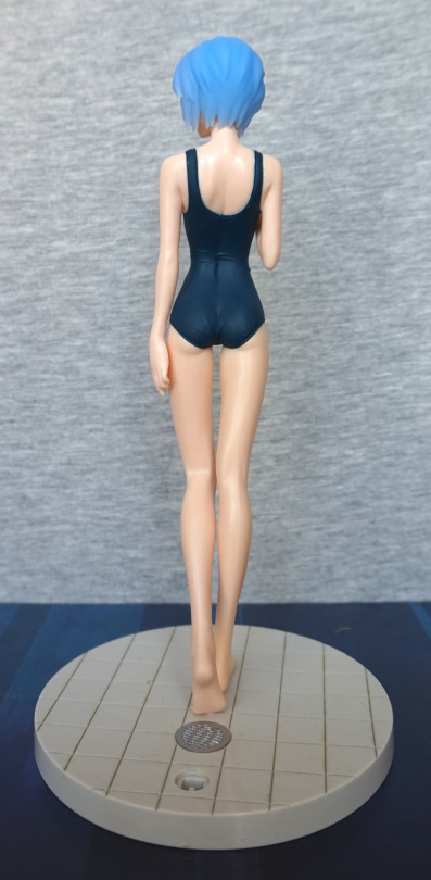
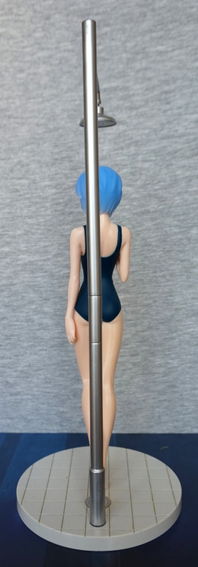
Here we can see they’ve sculpted her spine and shoulder blades. The swimsuit hugs her backside, and is creased near her middle, which are all nice detail.s 

Base:
image

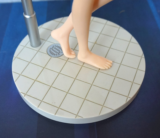
I like the fact they’ve coloured the grout – this is also a feature new to the v1.5, and I think it really adds to the base. The shower drain has also been nicely done, and looks like a drain. Her foot does look a bit overly rectangular from this angle… but is nicely sculpted otherwise. 

Overall, I really like this figure and glad I got it. The shower could do with being a bit more stable, but I don’t think it’s critical, as it looks fine from the front, and not prone to falling out – just leaning a little. Glad I went for this one, and would recommend it. I don’t think there’s any reason to own both versions of this figure, and would recommend picking your preferred one. Looking at pictures of the other version, this is definitely my preferred version.
Rin Tohsaka – Fate/Stay Night – Swimsuit Ver

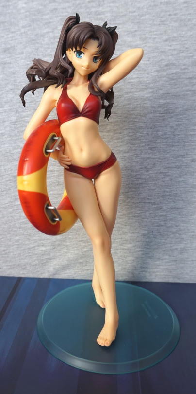
Here we have another unexpected find on Suruga-ya – Alter’s Rin Tohsaka, swimsuit edition. I tried to buy this figure from someone on MFC, but then they messed me about and stopped replying to my messages :/, so this one was an insta-basket when I saw her.

So here she is:

image

I feel she is a little plain in the face, but the rest of her works well. She doesn’t hold up favourably to modern figures, but she is good-looking for her age. The ring comes pre-attached to the figure, but the handles are separate pieces. Other than that, she just pegs to the base.

Closer look at her upper half:

image

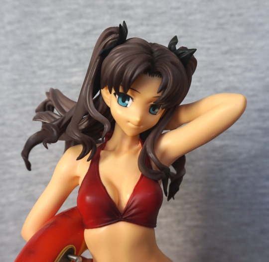
Here we can see that she isn’t shaded too much, which is the reason for her face appearing on the plain side. Her swimsuit is shaded though, which I think is much-needed, otherwise it’d feel very much prize figure. Her eyes are a nice shade of blue, which I think compliments her outfit. Her hair is not heavily shaded either, which I think shows, but doesn’t bother me. She has some hair shading at her crown and hair tips, so it isn’t totally flat.

Left:

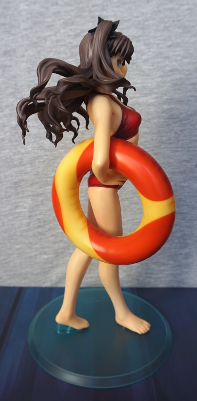
image

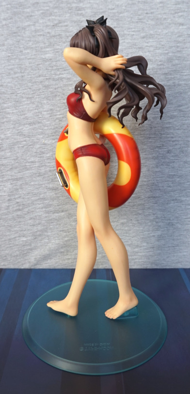
Here we see she has two deliberate seams in her outfit, which have been given realistic creasing. I like these, as it works well. Again, a lot of her skin shading is given by natural light, rather than paint. We can also see she has pink nail polish on her toes, which is a nice touch.

Close-up of the ring:

image

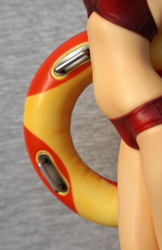
Here we see the handles, which I think have been very nicely done. The handles slid in nicely, and I’m not concerned about them falling out. The ring itself, however, does have an appearance of the hard plastic it is made out of, rather than rubber. There are crease lines in it, but something about the paintwork on the flatter areas doesn’t really hide the fact it is plastic. It isn’t a deal-breaker for me, but I believe this is one area that would be improved on a modern figure.

Right:

image

This picture probably best captures the plastic-ness of the ring. As we can see, her hair does have some shading in, but it is rather on the subtle side. And this picture makes me realise one of the big differences between this and a newer scale – the finishes are shinier and less varied than on a modern equivalent. Also she has a bit of a seamline down her arm. The swimsuit still looks really nice though.

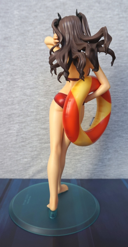
Back:

image

Here we can see the shiny, less-detailed hair. And the way the ring isn’t quite rubber. Nothing particularly bad about the figure, but it doesn’t hold up to modern standards.

Overall, I like this figure, though it does have its flaws. I’d mostly recommend it to Tohsaka fans, who aren’t put off by the quality of older figures. If you can find her for a reasonable price, I’d recommend her, but she was a hard one to find – after the sale fell through on MFC, I did try to find her, but with no luck. However, I’m glad to have found her for a reasonable price, even if I did need to forward her (Suruga-ya doesn’t do international ship

Sakuya – Sister Princess

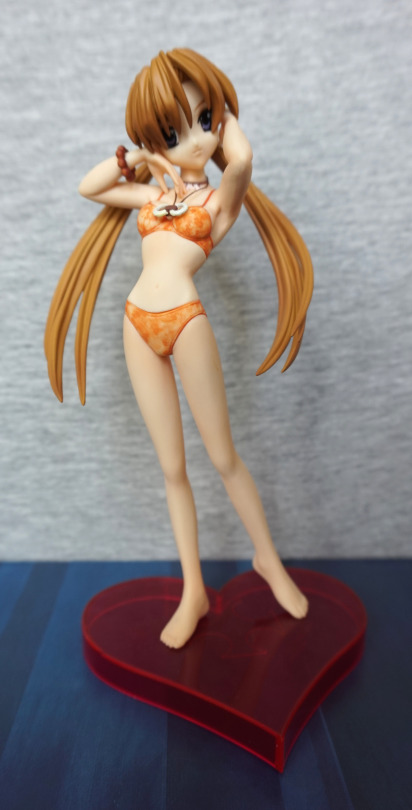
Another “bargain” purchase from the same retailer as Barnaby. This one I tried to find pics of online… but came up blank. So decided to go for it anyway. 

So let’s see what she looks like:

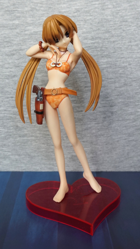
image

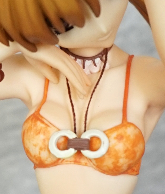
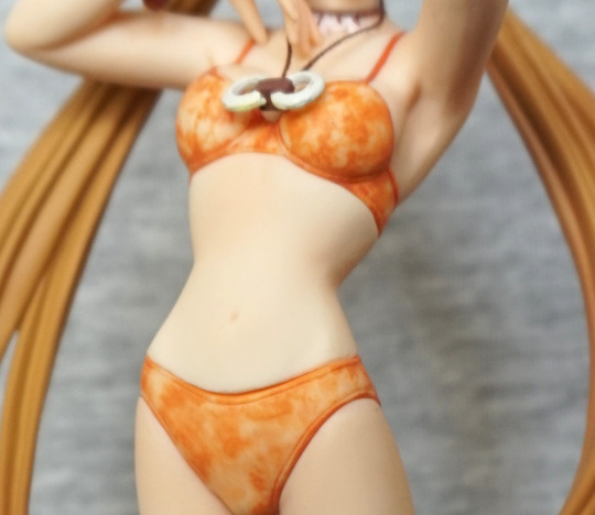
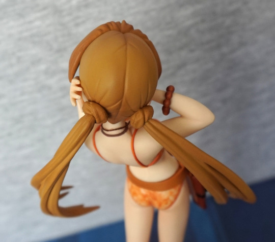
Her swimsuit is a nice marbled orange colour. From the prototype pics I couldn’t work out if it would have a shiny effect – turns out not, and I think it works fine as-is. The fabric necklace was a nice surprise – I like mixed media touches like this. What is disappointing about this figure for me, however is her hair – it dangles very significantly over her face, and you don’t really see much of her face. In the prototypes they’ve lit her in an unnatural way so there isn’t as much shadow. Displaying this figure, you’re likely to get a decent amount of shadow over her eyes. What compounds this lighting issue is the dark colouring of her eyes – when strongly lit from one angle, this causes her face to look overly plain as it overemphasises the light areas. You can also get the same effect from viewing her from above, where you can’t see anything but face. 

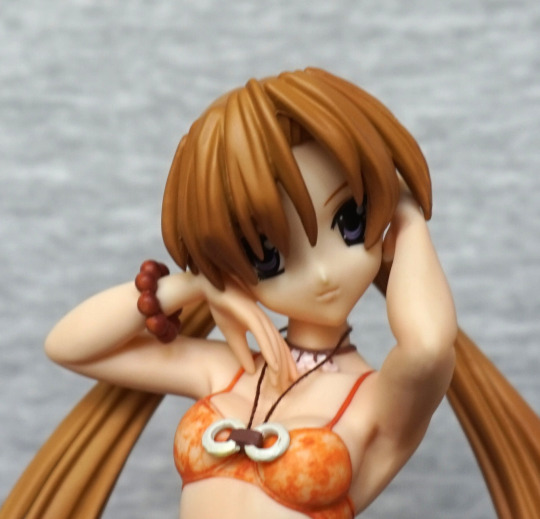
Let’s have a close-up of her face before we move on from it:

It’s not a bad face when viewed close. Just something doesn’t quite work between face and hair. She’s quite cute when viewed from below. 

A closer look at the necklace:

… and the chest. There’s some lifting going on with that swimsuit, despite what those bra straps are saying :P. It does give her body more definition, so I think the curvy boobs are needed. OK, back to the necklace… she has one painted onto her – here the paint does look messy on it, but this really isn’t visible when looking at the figure normally. Here we can see the binding is painted on, and the string simply inserts into this part. Had me fooled until I looked at this photo, lol. And I’m thinking the marbled paint on her outfit is the best feature of this figure. 

In terms of painting, this figure does lack in the body shading department:

This isn’t just my photo-editing whiting things out – as far as I can tell, there isn’t any paint shading on her body, or what’s there is incredibly subtle. She does have some sculptwork that’s gone missing in the editing of this photo, but it is pretty subtle. Imo her stomach could’ve done with a small amount of shading to bring out the curves in her body. 

Base:

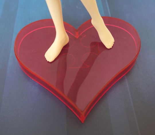
A fairly simple base, but I love the heart shape. Contrast got upped a bit too much here, and it’s more of a “red red”. I think the colour complements the figure. 

Left:

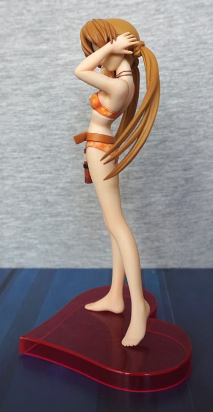
Here we see the sculpting carrying the figure. Her pigtails are mostly the same colour, barring the tips. She has nails sculpted, but I think they’re the same colour as her skin. Her toes are definitely not painted in a different colour. 

Some more of her hair:

There is some shading up here, but it’s pretty subtle. Could’ve done with some darker paint all the way down her crown. 

Right:

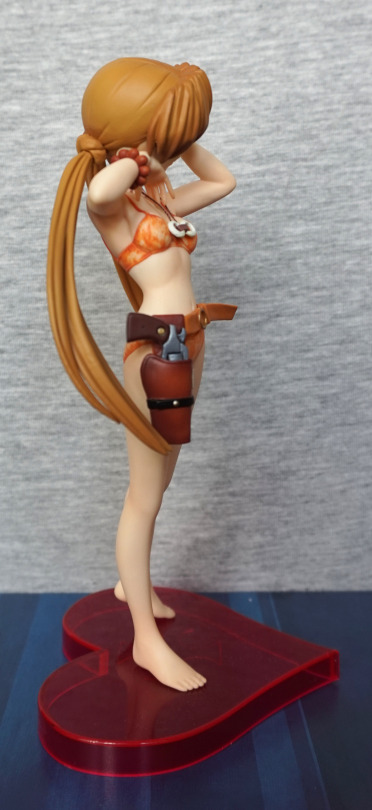
The gun and gun holster are painted nicely! We have some shading here! And I’m pretty sure she’s knotted her hair to get it into pigtails. Not sure how she managed that, can’t imagine it’s too practical!

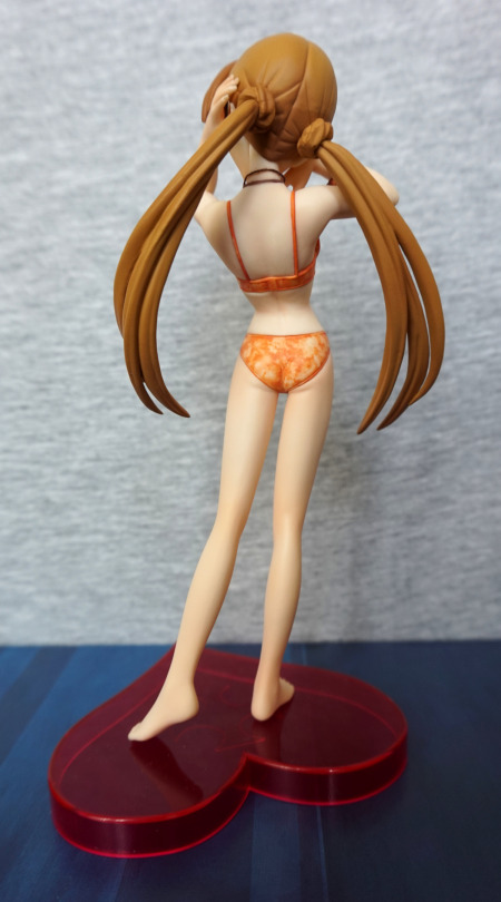
Back:

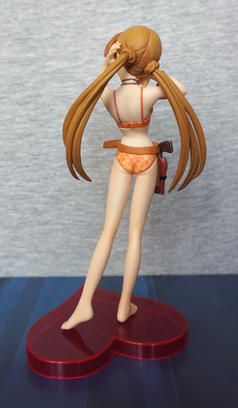
Some distinct join going on under her top. Looks a bit too, erm, linear to be the top pressing into her imo. Backside is sculpted well though. Again, no shading in the paint on her back or legs. 

Time for a break:

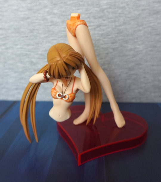
Bwah! This is how she comes apart, so you can put her holster on her .

With mine I think I need to have the holster on her:

Due to her leaning back pose, the upper half of her leans back a slight amount, giving a bit of a gap. Fortunately I prefer her with the gun. 

Back, without the gun:

Here the joint is OK. Not sure how prevalent this issue is, as I only have one, and well… there’s a lack of pics of her on the internet. But I’d be prepared to mod her joint to get her upper half to sit fully upright. 

Overall, I wouldn’t recommend spending a lot on this figure. I paid £18, and I think I got my money’s worth. She’s a bit above a prize figure – she doesn’t have the shiny plastic that plagues prize figures and the paint that is there is well-applied without flaws, but equally well she has a lot of areas where the paintwork could’ve done with more detail. Also she’s a short figure, as she’s a fairly short character – she measures just under 18cm without the stand. If you like her simple, clean look, then maybe consider her, but I don’t think I could give a strong recommendation for her. Maybe if you have to have all the Sakuya figures?

Shiro – Swimsuit ver.

When the Nippon-Yasan sale hit, this figure was the first thing I grabbed, before leafing through the rest of the sale, and making final decisions on what figures I’d buy and which ones I could let slide. I did see this for sale in the last N-Y sale, but stupidly passed on it. So it was nice to have the chance again!

Due to her canonical age, here’s a picture of her face for the blogbot:

image


So for random passers-by and people who clicked to see the full post, here’s the full picture:

image

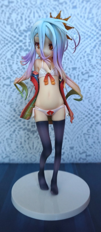
I love Shiro’s colours, and they have been rendered very competently here. Her hair is nice and vibrant, and has been given an outfit to match. The gradients are really nice. My minor gripe is the white spot on the front of her hair is a little on the large side, and I’d prefer it more blue than white.

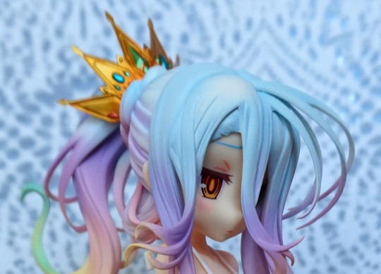
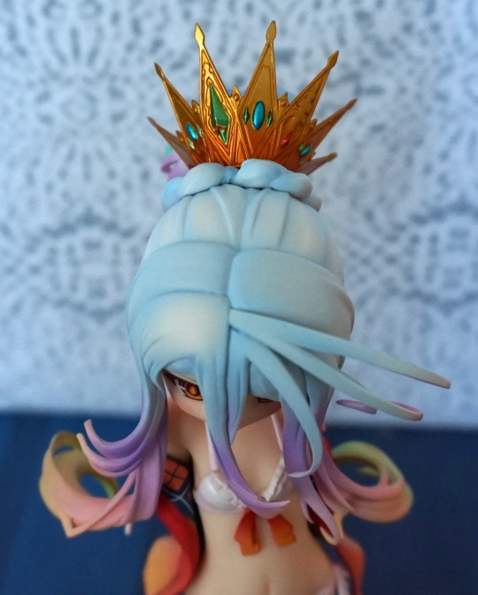
Here’s a shot of the top of her head:

image

Her crown is a nice, shiny golden colour, with brightly coloured gems, and I feel strongly matches her intended design. 

Shiro front-on:

image

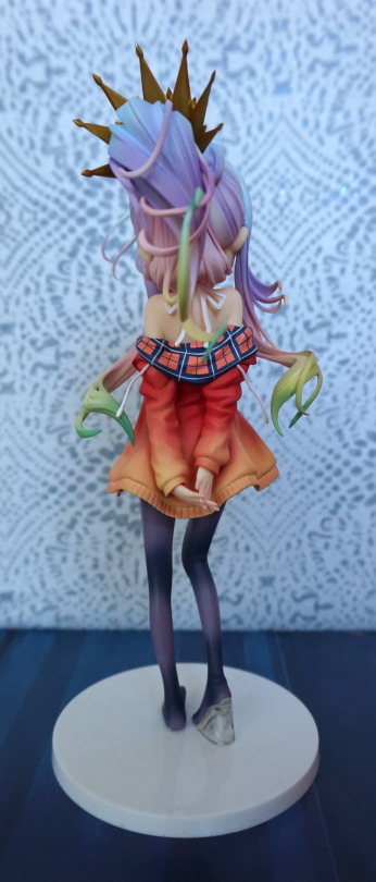
I like the way they’ve shaded the ribbons dangling from her top. I like the blended tones in her stockings too. The underside of her jacket has been painted really well – the pattern looks nice, and well-rendered. 

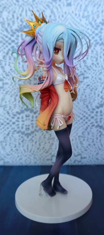
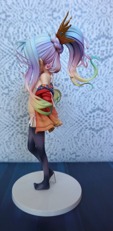
Left side:

image

Love her hair. The strands have been sculpted well, and I love the way they’re flicking in different directions. 

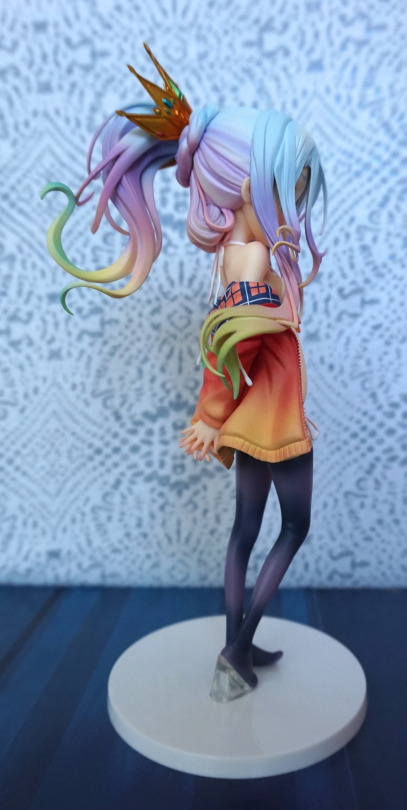
Shiro’s right:

image

Here you can see her shoulder where she’s shrugging out of her jacket. 

Back:

image

Here you can see the inner pattern of her jacket clearly – here it is red and blue, and blends into green and yellow at the bottom. You can glimpse the blending from the front of the figure – it’s impressive they went to this detail, when you can barely see it. She also has a bow on the back of her neck, where her top is tied, which is a nice detail. They’ve also modelled the cords on her jacket. 

The base is super plain – not sure if I’m a fan of this. It does help the figure stand out more, which is helpful due to her diminutive stature. It also means it doesn’t really add anything to the figure either. I maybe tempted to add an overlay for it, possibly of the NGNL logo. 

Overall, I really like this figure – the colours are very nice, the sculpting has been very nicely done. She’s quite an expensive figure though, so depending on how much you’re willing to spend will probably dictate if this figure ends up in your collection. 

(For me, this figure I’m not sure she goes with her given age, which goes for a lot of Japanese characters. Some people find her to be in an ‘attractive’ pose, but tbh, I don’t feel she gives off that vibe).