Tag: muscle

Aliens x M.U.S.C.L.E – Series 2 – Part 3

Now for the rest of the figures in this wave.

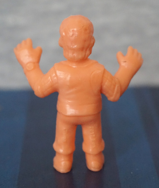
First up, Burke:
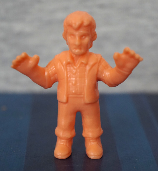
I like the texture on the guy’s shirt – how to do a plaid shirt when you don’t have colours to use. I like the sculpting on this one – detail has been put into the clothes, with the wrinkles, pattern and his shoes. Another hairline to report on the back though. He does have a watch sculpted too, which is nice to see. Overall, I think this is a decent figure.

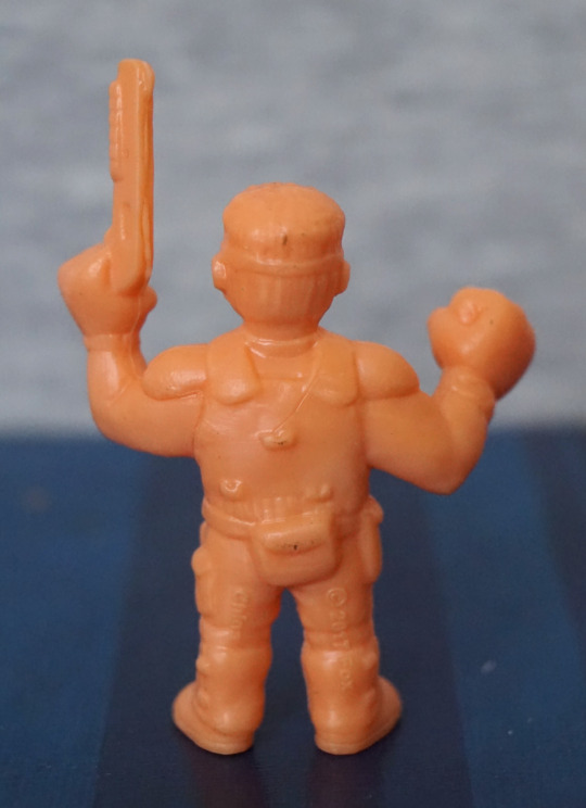
Hicks:
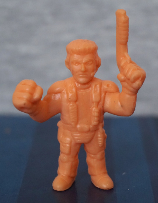
Hicks, giving off a strong Duke Nukem vibe. I think they’ve gone overly Nukem with the hair, which is what does it. Still, not a bad little sculpt, but probably not going to please someone who needs their figures character-accurate. 

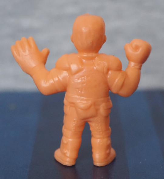
Hudson:
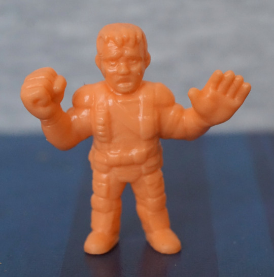
Erm… and now I’m getting Frakenstein’s Monster vibes from this one. For me, this doesn’t really feel like Hudson, and looking at pics on Google Image Search… I’m still feeling that. The hair doesn’t look right, and his face looks derp. If we ignore it’s supposed to be Hudson, he looks OK for a generic army dude… though I think his face needs changing so it doesn’t look like he’s going “uhhhhhh”. 

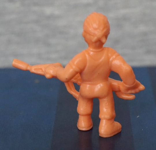
Lastly, Vasquez

(she better not get my blog flagged again!):
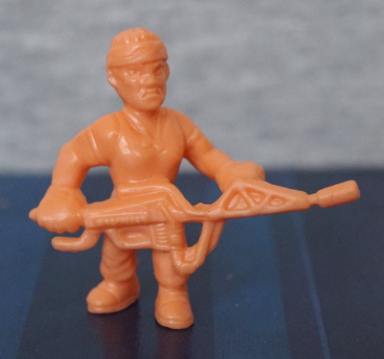
That. Face. That…. face. They went for annoyed Vasquez, but ended up with pissed off granny. The mouth is too long, and I think the facial features are too squat, leading her to look older and angrier. They did give her dog tags though…. Her gun looks OK as far as sculpt goes – can’t blame the for filling in the smaller holes, for structural integrity. Also mine is a bit bent, but I could ix this, so I don’t regard this as a negative of the figure. 

If it wasn’t for the weapon and the headband though, I think it’d be a bit confusing who this is supposed to be… Again, OK for generic army dude, but kinda fails at being Vasquez.

Again, a mixed bag as regards figures. I think they’ve tried to add more to these figures, which has mostly worked, but have ended up with some odd faces, which doesn’t help with recognising them. This set has some highlights and some lowlights, so I’d recommend just getting the set(s) with figures in that appeal to you. And maybe not look too closely at the faces. 
Aliens x M.U.S.C.L.E – Series 2 – Part 2

Now for some alien warriors and their main nemesis…

First up, this dude:

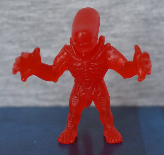
Why, hello there! This one, um, has a normal hair. That’s mine. Sorry. Overall, he looks OK, pretty similar to the ones in the other set. Only this one is waving. 

Top of his head:

I do like the sculpting on the top of these alien warrior’s heads. That part did come out well, though here we can see the arm joint is a bit “eh”. 

Xeno number 2:

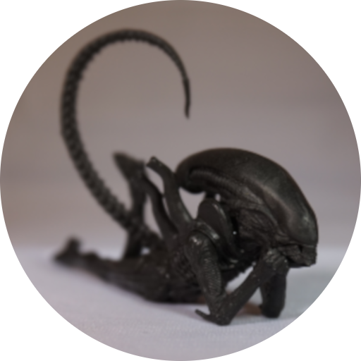
This guy… likes to lounge around. This guy I’d say is the weakest of the three warriors in this set – his pose isn’t overly exciting, and he doesn’t stand up on his own either… 

Lastly for the xenos:

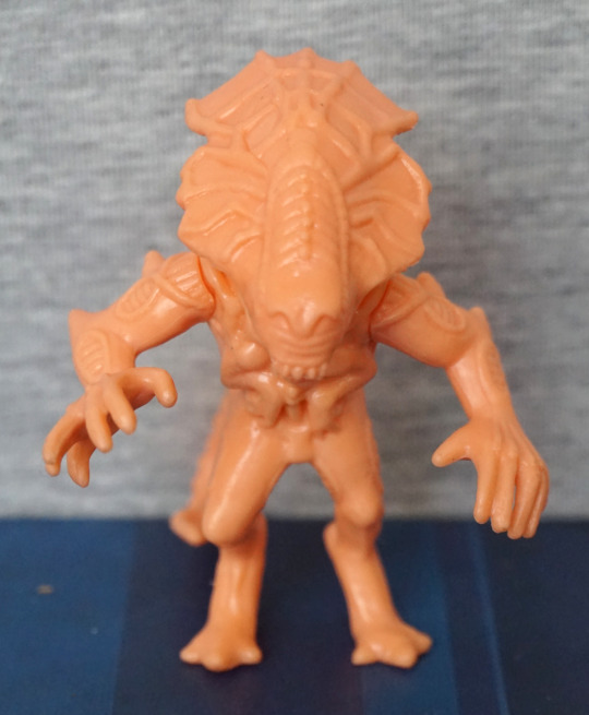
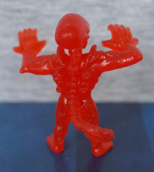
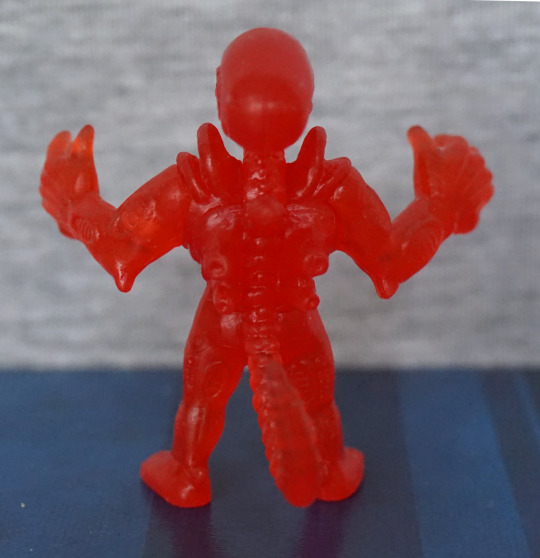
With his arms up, this feels more like a xeno pose, crossed with a M.U.S.C.L.E one. He’s also in attack mode, with his inner mouth poking out. He also isn’t super at balancing, but his tail does more to support him, so he doesn’t look like he’s lazing out. 

Now for their natural enemy… the Ripley!

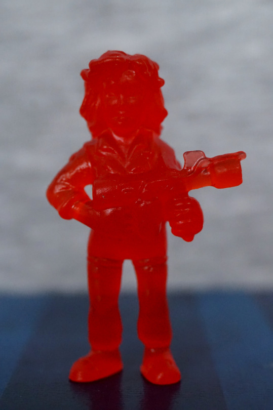
The sculpting feels more detailed than series 1, and she has something that almost passes as an expression. 

Ripley with Newt:

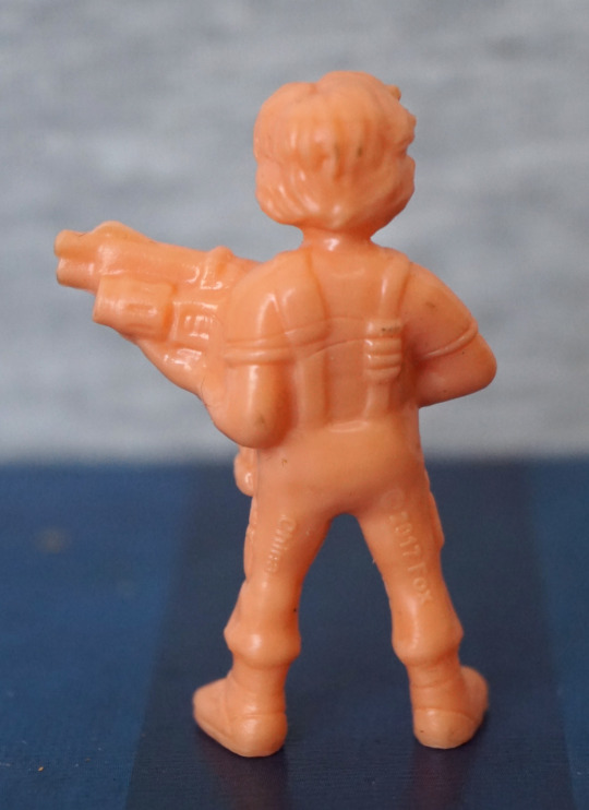
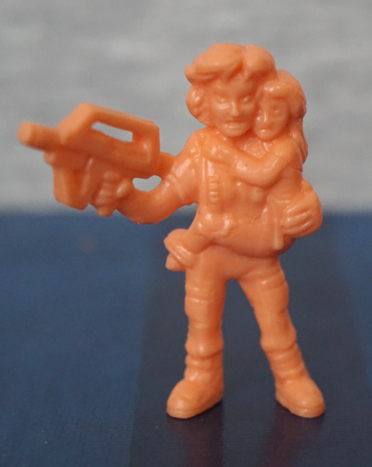
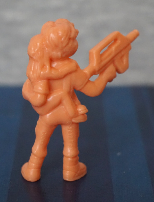
Another iconic “pose”. However, I’m not too much of a fan of the sculpt on this one, no matter how hard I try to not see it. From the front, Newt looks like she’s melting into Ripley a bit, and the faces look odd. From the back, Newt’s leg looks like it has been flattened, which doesn’t look good. The hair sculpts look good, if a little merged. Rifle looks the part though. 

Again, a mixed bag. The sculpts seem to have more detail in this set, but there’s more balance issues with this set, or other moulding weirdnesses. 
Aliens x M.U.S.C.L.E – Series 2 – Part 1

Series 2! For this series, I got the “normal” edition, which is in a flesh colour. I think there was a limited run of these in different colours, but in blind bags, but those aren’t ones easily available. However, I was happy to get these in a non-translucent plastic. 

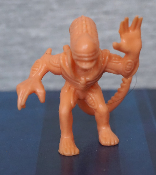
First up, the Alien Queen herself:

image
image
image
image

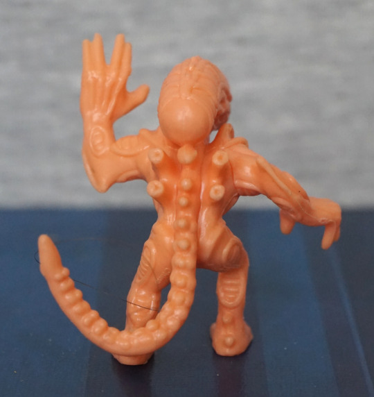
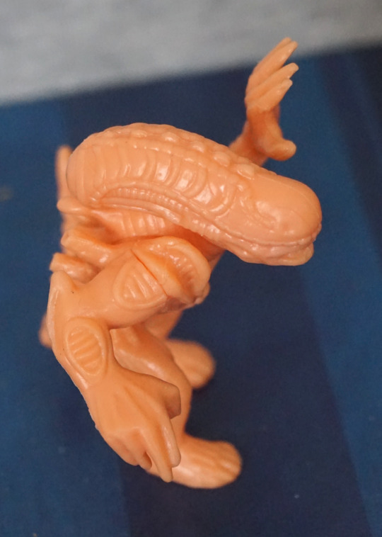
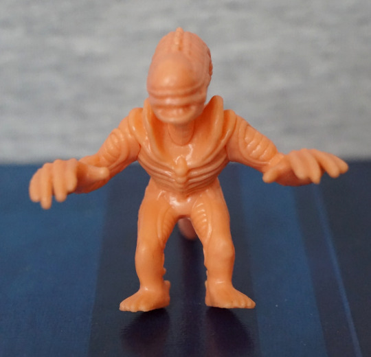
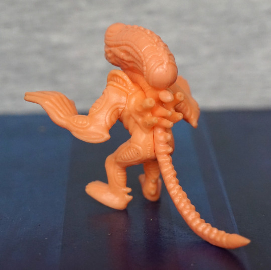
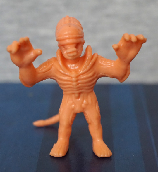
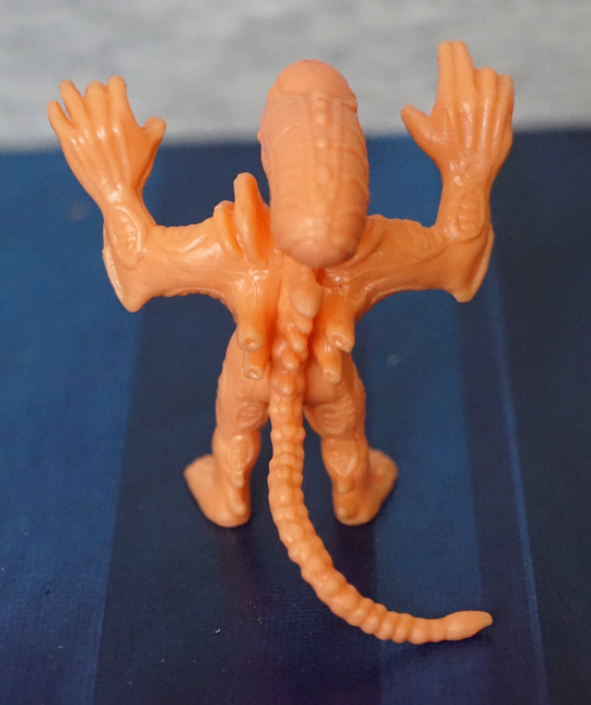
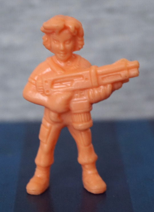
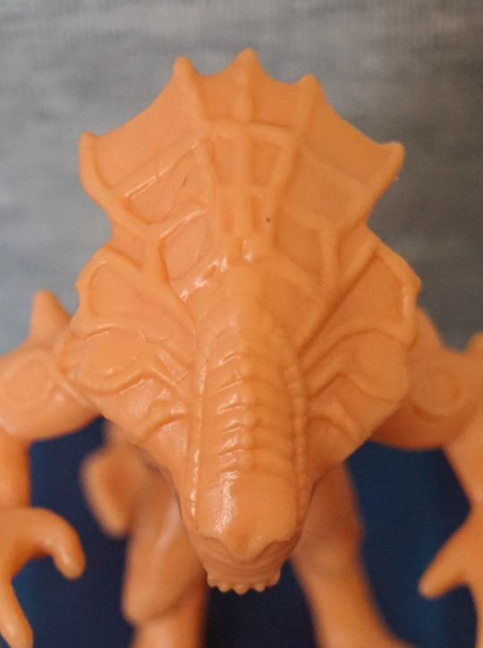
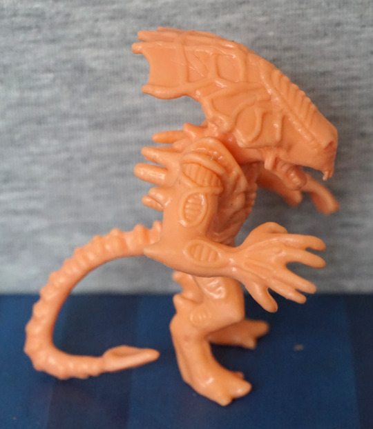
She has her cute li’l arms sculpted, and her large head plate. At a glance, I don’t mind the head plate, but looking close, the spider-web effect is a bit odd to me. The front part of her head I like the texture of though. Here, you can see better the odd ring bits than the translucent set – here I can tell they look odd to me as the rest of the arm lacks texture, which makes them stand out. 

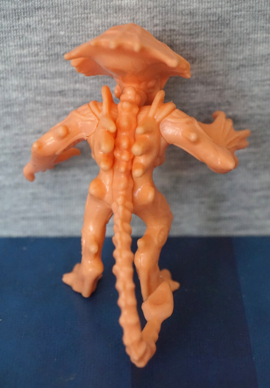
Her back and spine look good – lots of sculpting and texture here, giving a detailed appearance. No detail under her head plate, though. Overall, I like this one.

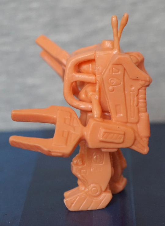
Powerloader, featuring Ripley:

image

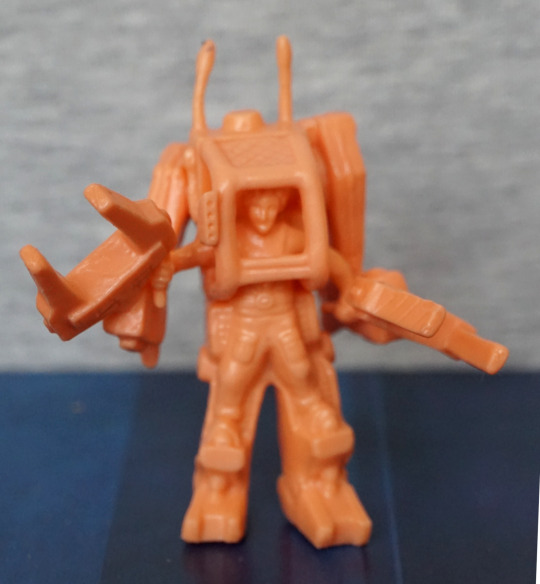
Here we can see Ripley piloting the powerloader – her clothes are nicely sculpted, and her face is fine for the size. I think they did a good job with this, given the size. One of the aerials is a bit bent on mine, but I could fix this. 
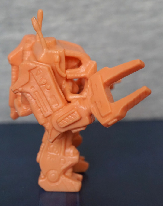
Sides:

image
image

Lots of small mechanical details here, which are nice. Claws look nice, but a little bent – I suspect if I do try to sort these, there is a good chance they’ll bend a bit over time. The join between the front cage and the powerloader itself is a bit rough, but it doesn’t really bother me. 
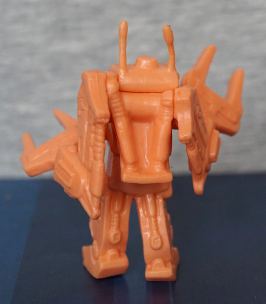
Back:

image

Looks good from the back – we have a decent amount of hydraulic parts modelled here. Just need to sort out that derpy aerial… 

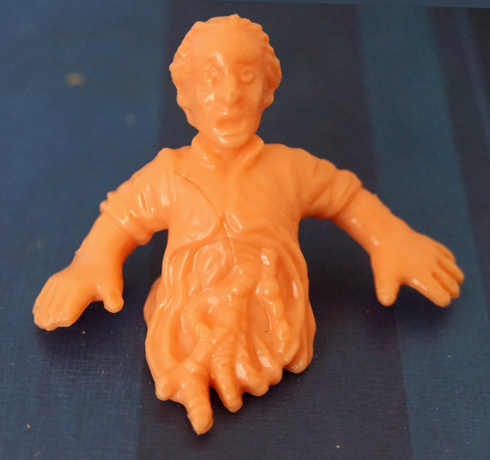
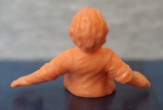
Half a figure, Bishop:

image
image

Unfortunately mine has a hairline from when it was moulded. Ignoring that, he’s been well-sculpted, and I love this iconic choice of character and “pose”. 

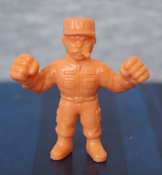
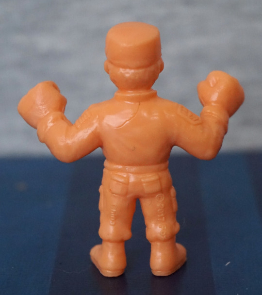
Apone:

image
image

First thing that stands out to me is the flatness of the top of his hat – not sure why his hat is so flat. However, he does look ready to kick butt with that cigar and his fists. Sculpting is OK on this one, but again, another one of those hair marks. 

Bit of a mixed bag here – I think the sculpts are better thus far than the first series, but there’s more of those hairlines. Also the Alien Queen isn’t very well balanced, so she’ll need some tack to keep upright. 

Aliens x M.U.S.C.L.E – Series 1 – Red ver. – Part 3

Now for the last four figures in this set. 

So, let’s continue on with Kane…

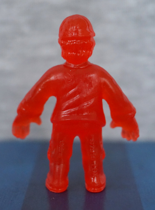
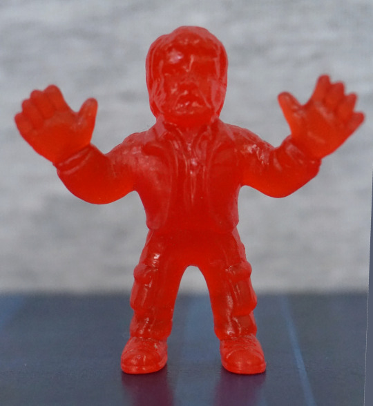
Nom! Here we have Kane being facehugged. The facehugger is nicely sculpted, but his body is a bit lacking – the way they’ve done the joins on his arms doesn’t work well – instead of looking like the edges of his shirt, it very much looks like his arms are stuck on. His shorts/legs is a better bit of moulding. 

Kane, unfortunate ver.:

Due to the material used, I don’t think the chestburster shows up too well on this one. But it’s certainly an iconic thing to include, I can see why they did this one. Even though it’s a bit indistinct, I’m glad they included this.

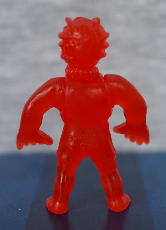
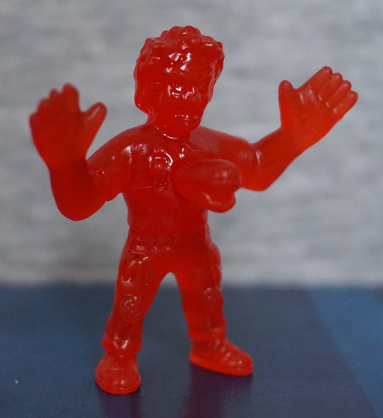
Lambert:

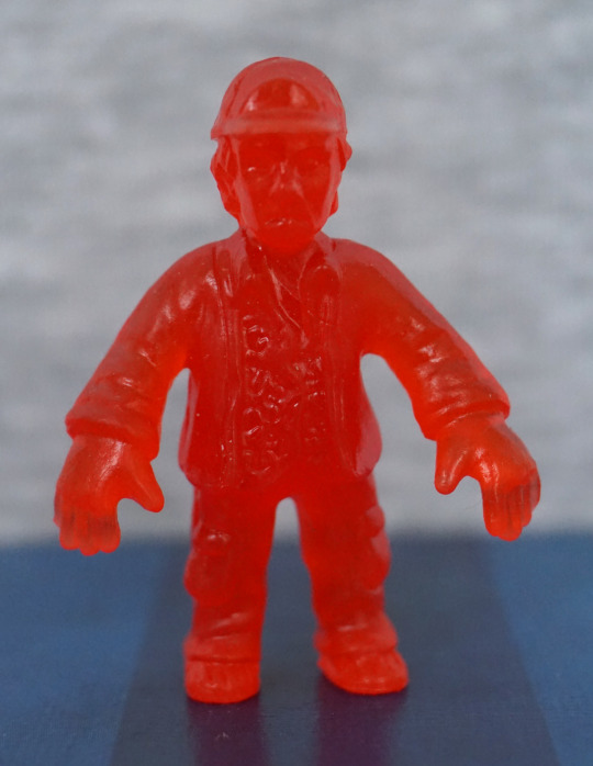
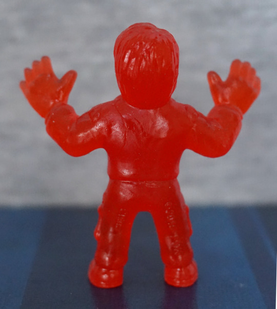
I don’t find the likeness on this one too good, and her expression certainly looks odd in my photo. Her clothes are nicely sculpted, but her body feels an over-distorted shape – looks like they tried to give her boobs, but didn’t sculpt the shirt shape correctly, so her entire top is puffed out. 

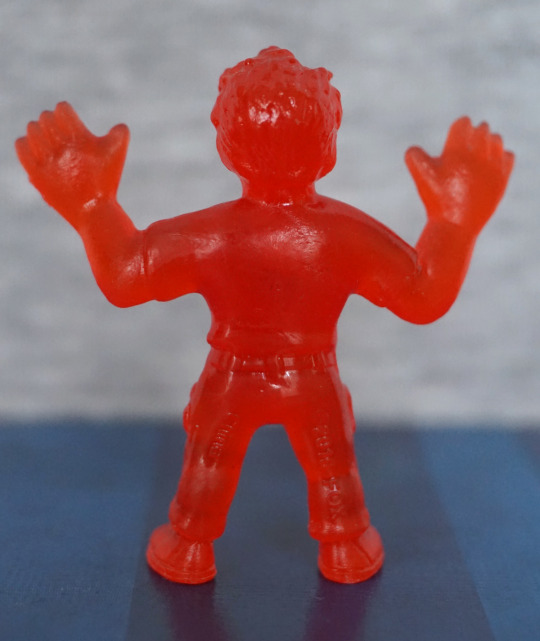
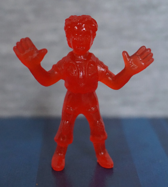
Lastly, Parker:

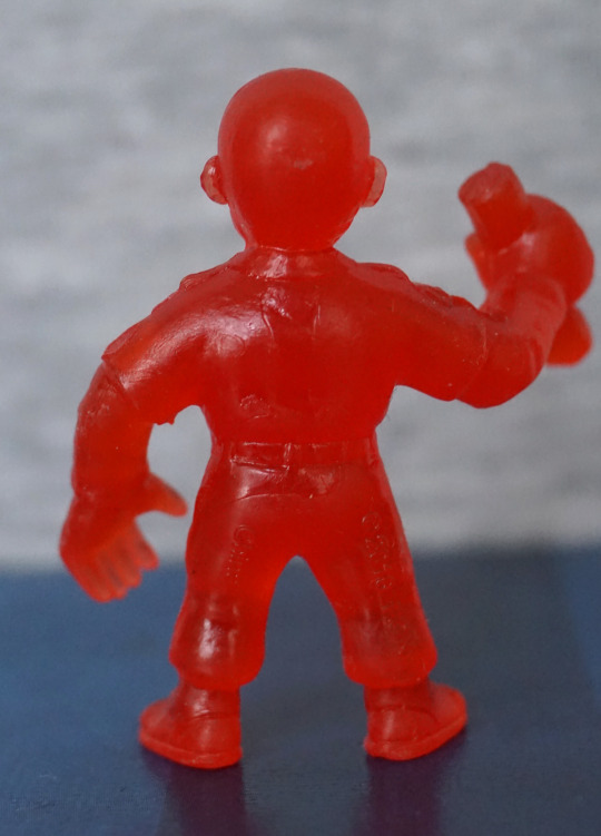
Again, a mould hairline on the back. I think this decently looks like Parker, and the sculpting is good – his iconic headband is there, and his clothes look decent. And he also looks ready to do some punchin’ M.U.S.C.L.E-style. 

Overall, these ones were a bit of a mixed bag, but I don’t think any of them are terrible. I like the red colouring, but it does make the sculpting look less distinct, so I feel this is a bit of a trade-off. 

I’m glad I got this set, and I like the mash-up between the two franchises…. enough to buy series 2! Stay tuned for series 2 😉

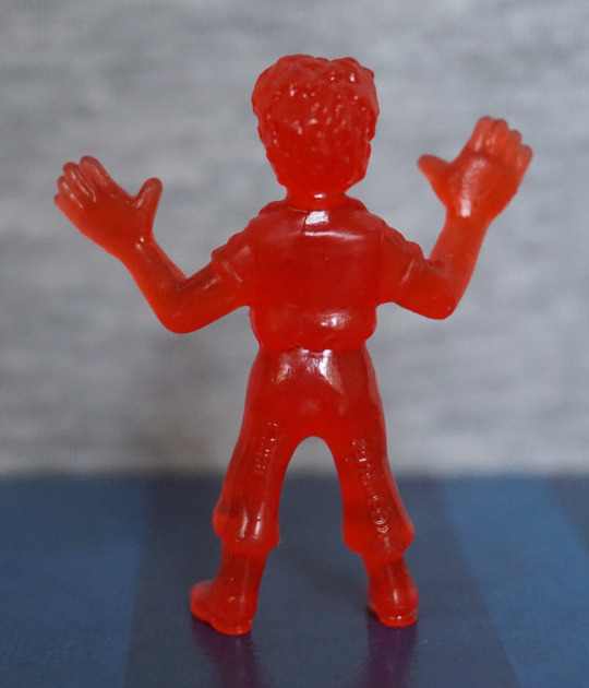
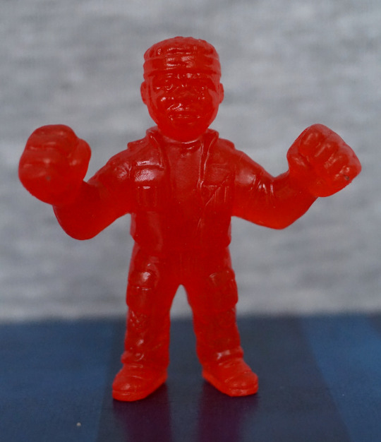
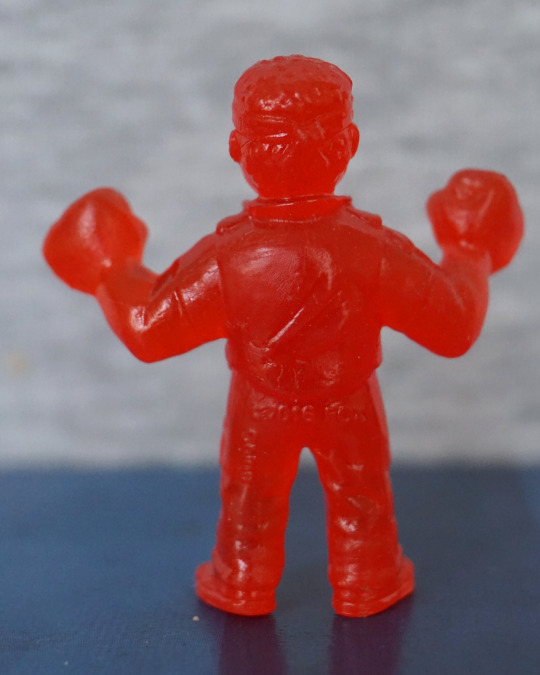
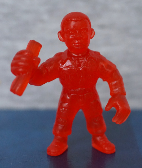
Aliens x M.U.S.C.L.E – Series 1 – Red ver. – Part 2

Now for four more of the series 1 of the Alien M.U.S.C.L.E figures.

Ash:

image
image

What’s he holding here? Not entirely sure… is it the Inanimate Carbon Rod? Hm. His front is sculpted well, and has a reasonable level of detail, given the figure type. However, the back feels a bit bland and seems to have a couple of moulding issues – there’s a couple of hairlines on his back, which I don’t think are supposed to be there. 

Brett:

image
image

Looks reasonably like the character, Here we have some sculpting to stand in for his shirt design, and I think that works well. We also have some creasing moulded on the back of his jacket, which is a nice touch. 

Dallas:

image
image

This was also one I recognised when taking them out of the tub, so the likeness is likely reasonable. Again, on his back there’s some hairlines which I’m pretty sure are not supposed to be there. His outfit looks good from the front though, and is nicely detailed. 

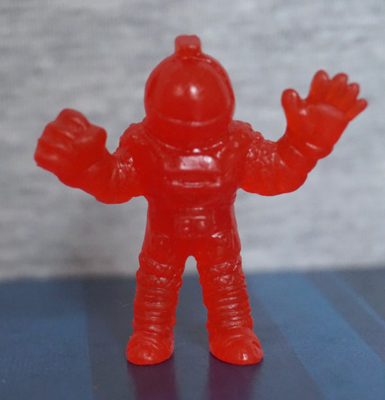
Lastly, for this blog, Kane in his spacesuit:

image
image

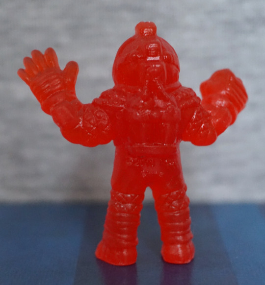
I did have to look at the character list to see who this was… This one is pretty detailed though, and does look like the iconic spacesuits used in the movies. And with those fists, its wearer could certainly go do some punchin’

Overall, most of these were decent, but I think the Ash one didn’t look as good as the others – I didn’t find the likeness as good as the others, and there seems to be some sloppiness of the design around the back. 

Aliens x M.U.S.C.L.E – Series 1 – Red ver. – Part 1

Saw Ashens on Youtube review some of these, and decided to get some for myself. Found this red “trash can” of them cheap-ish on a UK site and went ahead and ordered them.

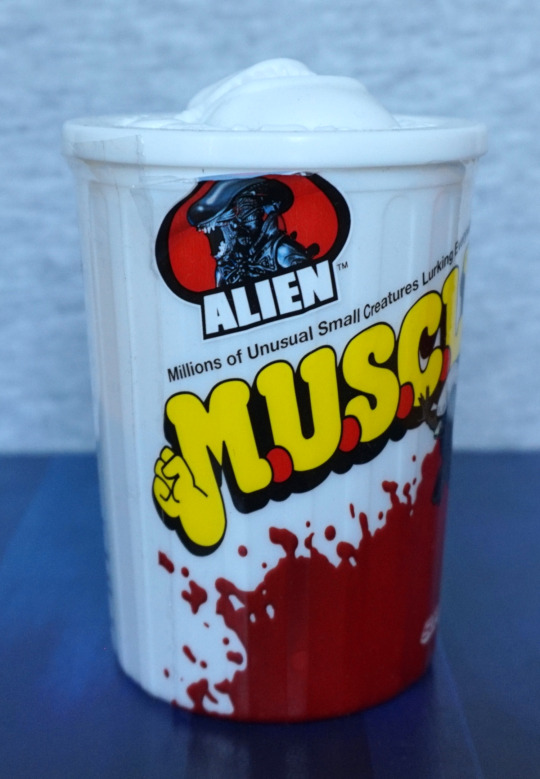
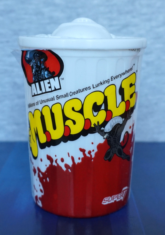
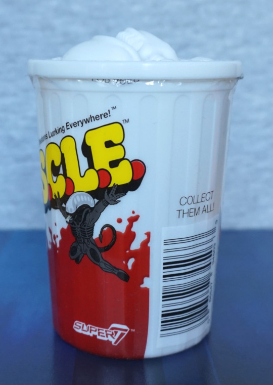
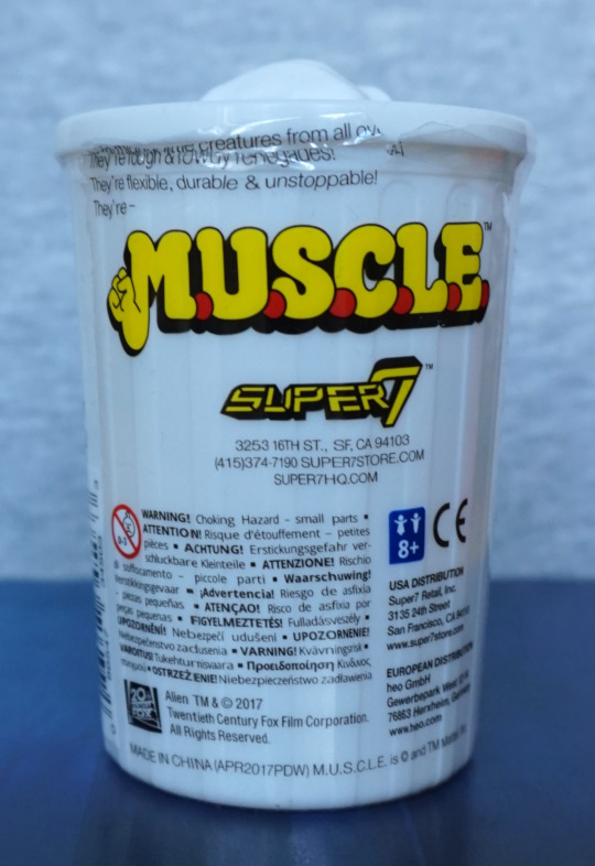
They come in a nicely designed tub, based on the old MUSCLE figure packaging:

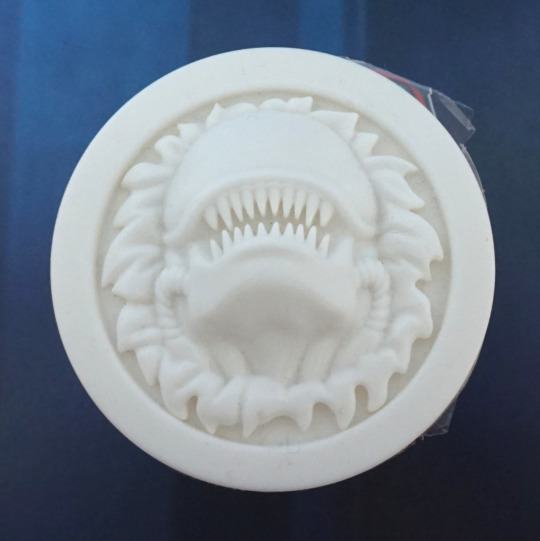
And it has this really cool lid design:

D’aww, look at that cute chestburster, busting out of the lid. The artwork is nicely done on the packaging, and mix the two properties well.

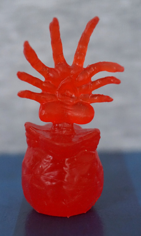
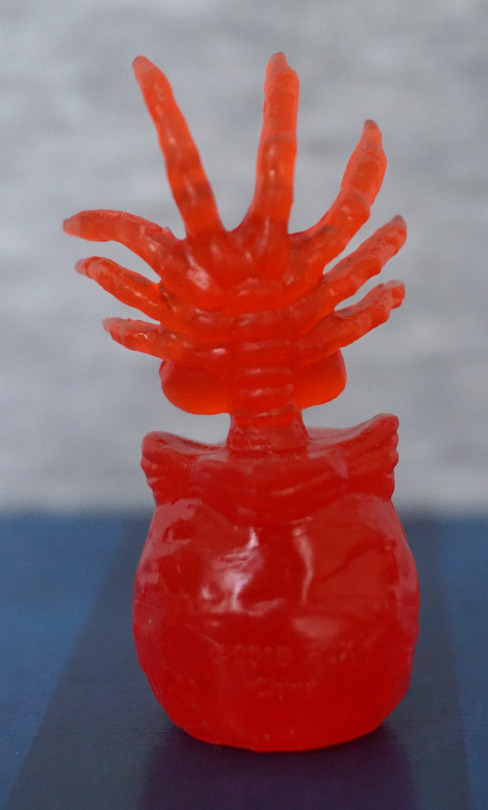
So let’s look at some figures! Today, we’ll mostly focus on the aliens. Let’s start with a facehugger:

These things are not easy to photograph… The translucent plastic works OK, and the sculpting is good on the facehugger itself – we have joints on the legs, the sucker on the bottom, and the spine markings along its back. The egg feels less detailed, as there is no indentation in the top and it doesn’t seem to have much texturing on the outside. 

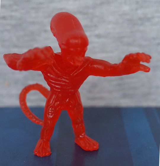
First xeno:

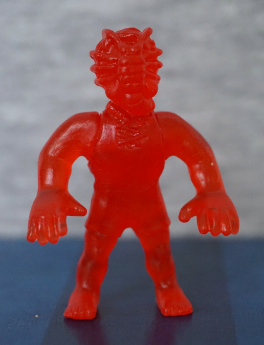
Again, the translucent plastic does make the details hard to see, but they are there. He definitely has the MUSCLE proportions, with the large hands and stretched pose. He does have a pretty noticeable seam on his head, though. 

Wanna hug?

Fairly similar to the first, but with a different pose. I do like this one’s pose more than the other. With these, I like the sculpting on the tail and the “pipes” and shoulder blades look good. The round parts on the front of the legs I find a little weird-looking. 

Last one for today, Ripley:

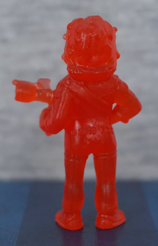
She seems OK, for what I can see of her. I recognised her, so that’s a good sign for the sculpting. There’s a decent amount of detail here – her hair has texture, we can see her boiler suit collar, and the details on her shoes. 

Overall, I’m happy with these four.