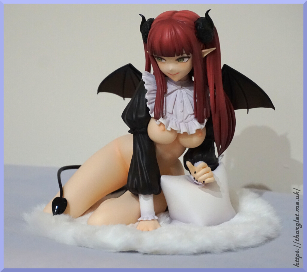
Category: Eastern

Official vs Bootleg: Banpresto Q Posket Catwoman

oday’s blog features Q Posket Catwoman. As this is a small figure without any box or accessories, there will be a “bonus” blog next week featuring another Q Posket bootleg I ordered at the same time.

Want to vote on which figures you’d like to see in the Official vs Bootleg series? Head over to the OvB voting site!

Pricing
MSRP (without tax) – prize figures do not have an MSRP
Price I paid for the official (inc shipping): ¥2,393 (£13.00)
Price I paid for the bootleg (inc shipping): $3.77 (£2.93)

The official I bought unopened from Mandarake.

I ordered this bootleg as I was curious what I would get for the princely sum of £3. These small figures are usually sold without boxes in multilistings, so I decided to grab two and see how they turned out.

Base

Top:

https://i.ibb.co/2PMbbRH/bases-top.jpg

The bases from the top are very similar, with the holes and the logos in the same place. The writing is thicker on the bootleg, and came pre-dusty. The “Q” looks copied, then for the “posket” the bootleggers have seemingly picked a font they thought was similar enough. It isn’t very similar though – the characters are thicker and lack serifs (the sticky-out bits at the ends of letters).
The leaf pattern around the edges matches with the official, which is a mild surprise given the half-arsed font match on the top of the base.

Bottom:

https://i.ibb.co/jzQMD7C/bases-bottom.jpg

As is typical, the official has copyright markings and the bootleg has nothing. The construction also slightly differs between the two – the peg holders on the official are one solid piece with the base but on the bootleg we have a part inserted to form the bottom of the pegholders.

Overall, the bases are very similar. There are two tells here – no copyright on the base, and the incorrect font on the top of the base. So if you see these displayed at a con unboxed, the easiest trick of inverting it to look for copyright notices holds strong (n.b. if there is no copyright for a Q Posket on the bottom, this is a surefire tell of a bootleg, however the inverse doesn’t 100% prove it is official, as in some cases bootleggers will do their best to duplicate everything).

Figure spin-around

https://i.ibb.co/wwvqYCk/spin-front.jpg

https://i.ibb.co/8jpF202/spin-right.jpg

https://i.ibb.co/mJHhZ7R/spin-back.jpg

https://i.ibb.co/JqyBmND/spin-left.jpg

Not too dissimilar with each other. The main things that stick out for me is the more transparent goggles on the bootleg and much more skin visible as you rotate the figure. We’ve also got variations in the finishes, where the bootleg is duller in some spots but shinier in others.
Oh, and the zipper. For some reason on my official, this now has a tendency to point straight out. It is flexible though, so it can be pushed down more into the intended position.

Figure close-ups

Face:

https://i.ibb.co/hXcbwkg/face.jpg

The masked part of the bootleg’s head is less shiny than the official, which can be seen via the window reflected on her forehead.
Going to skip the goggle lenses for a sec – on the bottom of her goggles is a bit of silver plastic sticking out… resisting urge to go snip it. The silvery parts of her goggles are quite rough-edged when looked at up close. The official holds up well, even getting this up close and personal with it.
OK, back to those lenses. The tint is much better on the official and looks more in line with how Catwoman should be. The yellow on the bootleg isn’t strong enough and doesn’t give off the luminous yellow/orange vibe that Catwoman’s goggles should have.
Comparing the eyes on the figures, her left eye is markedly different and the iris & pupil are up much higher on the bootleg than the official’s. The lower parts of her eye are also off on their own journey, leaving some skin in her eye area and the lashes in the incorrect position. When not looked at up close, the defects in the eyes aren’t too distracting though.
Underneath her left eye, we also have some paint damage which is definitely visible at a distance and looks quite offputting. Catwoman isn’t usually in the habit of having her face marred, so it looks quite odd.
The lipstick is pretty solid for a bootleg, though we do have some stray lippy going just above her lips. Official Catwoman has gone for a matte lipstick, whilst the bootleg has gone for a glossy look.

Neck & chest area:

https://i.ibb.co/phzKkr2/zipper.jpg

OK, I think the obvious place to start here is… what’s happened with her chest?! The bootleg has been very much incorrectly assembled, and the chest area has been placed kind of on top of the jacket instead of recessed into it. To complete the mutant look, we have some yellowy skin paint slopped thickly over it. From the front, it’s harder to spot the error, but some angles look hilariously bad as it sticks over her collar.
Her collar has curled over more on the bootleg, and her zipper is in a flat, fixed position. The zipper pull on the bootleg can’t be moved without breaking it.
The zipper itself has lost a chunk of the moulding detail on the bootleg and doesn’t look as nice as the official, however the paint is correctly placed on both the official and bootleg.
Lastly, we have some glue slop on her jacket over her boobs, probably from attempting to glue the chest part in completely the wrong place.

Butt:

https://i.ibb.co/KWjWsGW/butt.jpg

Here we have more matte on the official and shiny on the bootleg. The official isn’t free of flaws, and we see some hairline markings in the plastic. However, the bootleg suffers much worse in this regard and has what looks like quite a scratched-up posterior when looked at up close. What is more visible to the naked eye though is the scratched paint that’s missing from her right buttcheek. That doesn’t look so good.
I think bootleg Catwoman got her catsuit from AliExpress, whilst the official Catwoman got hers from a much more quality store.

Feet:

https://i.ibb.co/M8qZgfv/feet.jpg

Pretty similar here, and the paint on her buckles is neat on both the bootleg and the official. The official we do have a little bit of flesh colour poking out – let’s take a closer look at that.

Pegs:
https://i.ibb.co/9GKsLhB/feet-pegs.jpg

https://i.ibb.co/Nsr46qr/pegs-side.jpg

Honestly, this is one part where the bootleg I think is slightly better – having the black pegs means that the flesh colour can’t stick out by mistake. On the official, it’s supposed to let you know when you’ve shoved the pegs in fully, but it’s a bit awkward (at least on mine) which leaves a bit of a line visible on my official. It’s not a huge deal to me though.

OK, let’s pop her head off:

https://i.ibb.co/17FBsHc/neck.jpg

This figure starts of as three separate parts – head, body and base, which is typical for Q Poskets so her head is removable.
The bootleg’s collar has been painted not very well at all – the black paint isn’t dedicated to be either on the outward facing side or all the way over the top, as per the official. We’re missing some of the black paint on the bottom of the collar on the bootleg too, which ruins the look of the collar. Whoever was doing silver paint did a good job, though. Credit to silver paint guy.
For the official, the skin parts are just the colour of the plastic, the bootleg it’s all painted, which probably wasn’t the best idea but possibly cheaper than getting the right colour of plastic.
Overall, the paint on the bootleg here does nothing to alleviate the incorrect assembly.

Bottom of the head:

https://i.ibb.co/G73jvB7/head-bottom.jpg

Bootleggers missed this copyright marking. Here there isn’t much difference between the two – some extra black paint slop on the bootleg. The band is a lighter silver on the bootleg, but this isn’t too noticeable unless you have both of them together.

Whilst we have them headless, let’s do a headswap:

https://i.ibb.co/QDGb4hr/head-swap.jpg

Yep, you can do this. Not entirely sure why you’d want to though, as the face and body of the bootleg are pretty flawed.
Also this is similar how I had the official displayed before I got the bootleg… initially I thought my official base was defective, but then I realised she’s supposed to be looking sideways when both sets of peg holes on the bases turned out to be the same, d’oh! So I have the bootleg to thank for that!

Conclusion

All in all, I’d say you get your £3’s worth out of the bootleg. It’s definitely flawed but… £3. That’s less than 4 American bucks. You can currently get the official version of this figure much cheaper than I bought it (is ¥600 at time of writing on Mandarake), so I’d recommend just buying the official currently for anyone vaguely interested in it.
Telling them apart is pretty easy, thanks to the manufacturing mistake with the chest, and the more transparent goggles. And if you’re still not sure, turning the figure over will reveal a lack of copyright on the base of the bootleg. So a pretty easy one to avoid if seen in the wild.

Official vs Bootleg: FREEing Red Pyramid Thing (figma)

Time for something horror-themed… in more ways than one. When I bought the bootleg to feature in this series I wasn’t intentionally hunting for it, but the photos I saw of the bootleg made me buy it. So let’s see what horrors I manage to uncover.

Want to vote on which figures you’d like to see in the Official vs Bootleg series? Head over to the OvB voting site!

Pricing

MSRP (without tax): ¥4,444
Price I paid for the official (inc shipping): ¥4,000 (£28.13)
Price I paid for the bootleg (inc shipping): $16.20 (£12.58)

I bought the official figure secondhand whilst visiting Japan.

Box

This bootleg came with the box, which was interestingly folded around the inner plastic. Not entirely sure why they did that, seeing as it doesn’t take up less space to do so. I guess they didn’t want to take the time to shove the blister into the box.

Front:

https://i.ibb.co/XW4DCTq/box-front.jpg

The bootleg box from the front is a straight-up photocopy of the original. The colouring is a bit off, but hard to tell anything’s amiss from the box front if you don’t have the original next to it. Ignoring the figure, the main difference here is we don’t have a backing card for the figure – in the official box we have a sheet of red card, in the bootleg, nothing.
The bootleg box also looks like it had a trip around the warehouse floor with its fine layer of dirt before it made its way to me.

Sides:

https://i.ibb.co/PG2xQKN/box-right.jpg

https://i.ibb.co/wsZ0NZP/box-left.jpg

Again, the sides are a mildly inferior copy. Here it is more obvious though, with the skin colour being markedly different than what it should be. The other parts also show colour differences, but it isn’t as distinct as the arm colour imo.

Back:

https://i.ibb.co/ssDXLkQ/box-back.jpg

Here is where the print quality issues are most apparent. Looks like Pyramid Thing is attempting to hide in the shadows on the bootleg box promo shots. However, being a direct copy it would likely fool less experienced collectors.
My copy of the bootleg box has a massive crease down the back from being folded in transit. Also no tape of any kind.

Box ends:
https://i.ibb.co/P4KDd6c/box-top.jpg

https://i.ibb.co/WvX65jk/box-bottom.jpg

Print quality is the same as the sides. Nothing new to report here.

Flaps:
https://i.ibb.co/mbvGpY0/box-flaps.jpg

https://i.ibb.co/RC3Rmfr/boxes-open.jpg

Ended up with the boxes the wrong way around in the first photo… swore I remembered to switch them as I knew I’d rotate the photo… apparently not. Again, as with the Alien figma, the flap shape is different, though there is no difference in what’s printed on there this time.
Upon opening the box, the official has the card insert present but the bootleg does not.

Accessories

This figure comes with a decent number of accessories for an SP release.

Let’s start off with the hands:
https://i.ibb.co/mh8j5Cx/hand-trees.jpg

https://i.ibb.co/SfsZDcr/hand-trees-under.jpg

For the hand tree, the official comes with a figma-branded white tree, but the bootleg comes with a clear, bubbly tree.
For the bootleg, we have the same hands as the official. The casting is mostly OK on the bootlegs, but we do have some seams that have been tidied up on the official. The part that the bootleg hands fall down is the paint – the reddish brown wash is much too harsh and makes it look like the bootleg hands are carved from stone or something, instead of wearing latex gloves.

Knife:
https://i.ibb.co/NtFbgXc/knives-top.jpg

https://i.ibb.co/BGXQBcn/knives-back.jpg

The bootleg knife is actually pretty decent. If someone switched the knife on my official figure, I’m not sure I would notice until I looked closely.
We do have some difference in appearance between the two – the paint on the blade and hilt is less even and the blade edge is less smooth on the bootleg.
The knives are both the same size (any apparent difference in the photos is an optical illusion of them not being aligned properly).

Spear pole:

https://i.ibb.co/7Wpp2R2/spear-pole.jpg

The bootleg one came with a quite severe bend to it, and the paint is a lighter shade. The paint isn’t quite as good on the bootleg, but not very noticeably bad.

Spear pole peg:

https://i.ibb.co/9gF21xm/spear-pole-end.jpg

Here, the official is unpainted and, for some asinine reason, the bootleg has a painted peg. This makes the peg into a funny shape, and means the bootleg spear cannot be assembled – I tried, I tried and I tried again. Wasn’t happening. The spear tip would just drop off straight away.

Spear tip:

https://i.ibb.co/bJ3czYX/spear-tips.jpg

Here the spear differs noticeably – the official has a dark silver metal-coloured tip and the bootleg is black. Bootleg moulding is also a bit shaky, leading the edges of the spear tip to be uneven and rough. Not that the flaws on the bootleg matter much, when it isn’t usable with the spear shaft.

Spear neck:

https://i.ibb.co/LhzXwJx/neck-piece-front.jpg

https://i.ibb.co/Qmvd8QF/neck-piece-back.jpg

This figure comes with a pretty neat action feature featuring this neck piece – you can have him speared in the neck, using the hole provided. There will be some images of this action feature later in the blog.
For the neck piece itself, we can instantly see a difference in colour – the flesh tone is paler on the bootleg and the lower half is more cream than grey. The neckline on the bootleg has also been painted much higher and the neck paint is very thin, allowing the grey/cream paint to show through in spots. If that wasn’t economical enough with the paint, the bootleg neck piece isn’t painted on the inside, unlike the official.
Lastly, the bootleg comes with a joint of its very own, unlike the bootleg. The official also had a protective plastic piece in the top, to prevent damage to the hole.

The accessories on the bootleg are very hit and miss. The knife is decent, but the spear is a definite miss, with the large bend in it and the whole fact it can’t be assembled without modifying the spear shaft. The neck piece doesn’t look too bad, though is definitely lower in quality.

Base

https://i.ibb.co/C9qpcmM/bases-side.jpg

From the side, the bootleg is an inferior copy of the official. The typical air bubbles can definitely be seen in the bootleg copy. Also a slightly different clear plastic, which doesn’t have the same tint as the official.

Base’s base:

https://i.ibb.co/Xbk93XR/base-bottom-top.jpg

We have the “figma” logo and tagline replicated here.

Underneath:

https://i.ibb.co/nMgbZqw/base-bottom-bottom.jpg

Official has the copyright for the figure, and, unsurprisingly, the bootleg does not, leaving this as probably the biggest tell this is not an official stand. Here we can also see a rough end on the stand arm – typically bootleggers don’t sand the nubs off of stands when clipped out from a sprue.

The bootleg stand is pretty typical for a bootleg figma, with its air bubbles and lack of copyright. The base does feel cheaper than an official one, but would do the job to replace a broken stand.

Figure spin-around

https://i.ibb.co/PzLmvD6/spin-front.jpg

https://i.ibb.co/TmQ6xH2/spin-right.jpg

https://i.ibb.co/NWSXYHR/spin-back.jpg

https://i.ibb.co/3FV8wv1/spin-left.jpg

And here we get to see why I found this bootleg entertaining – poor ol’ bootleg Pyramid Thing seems to have been out in the sun too long and got sunburned. Though he did manage to save some of his arms going by the colour of the joints…
The other major difference that stands out to me is the yellowy colouring on his clothes. Also the bootleg’s clothing is very sticky – likely plasticiser leaking out, as it’s the same kind of stickiness. Whatever it is, it makes the bootleg unpleasant to handle.

Figure close-ups

Head:

https://i.ibb.co/h9NPB26/noggin.jpg

Here, the official captures the grimy, red metal… thing quite well. Bootleg, not so much as some of the detail has been lost, especially towards the bottom. The paint colour is also a bit off, feels more brick red to me, though it still captures the pyramid thing vibe decently well.

OK, downhill from here. Let’s get into this horror.
Brain from the back:

https://i.ibb.co/ryFgr72/brain.jpg

The shading has been done well on the official, giving a creepy, leaking brain appearance, with bonus rusty nail.
The bootleg gives off an orange Silly Putty vibe, with a black plastic peg nailed into it. Not quite the horror we were going for.

Front of the apron:

https://i.ibb.co/k1pVM1L/apron.jpg

Let’s start off with the rips – on the official they’re done decently well, not perfect, but the red paint is mostly where it should be and you can tell what it is supposed to be. On the bootleg, we have the most halfarsed attempt ever on the upper half, making it look like he’s had an accident with a red marker pen. Lower half is a better attempt, but with the blood mostly missing the holes, it looks like blood spatter rather than the intended gashes in his clothing.
The silver buckles haven’t been painted on the bootleg and are instead the same as the rest of his clothing. Also the paint is really uneven on the bootleg – his skirt doesn’t match his upper half, thanks to the very different applications of the paint between the halves, making the upper half look much more yellowy.
The bootleg’s upper half has ended up slightly lower down, which may’ve been caused by the internal joints not being quite the same as the official’s.
Lastly, the top of the bootleg’s skirt hasn’t been cut correctly, leaving it a wobbly mess and starting higher up on his body. The official has been cut to match the middle torso part, and does so well.

Back:

https://i.ibb.co/n1CF4h4/back.jpg

The bloody carved holes in the clothing don’t look good on the back of the bootleg either, but at least they’re pretty much in the right spots this time.
The straps over his shoulders have been done in an OK shade of brown on the bootleg, but lacks the shading of the original. The belt buckles are nowhere as nicely painted as the official though.
With the zipper on the back of the official, it extends to the middle of his back, just above the hole whilst on the bootleg, it only extends down to the upper back joint, and then they forgot to paint the rest of it. Not a big issue, and one that’s essentially dwarfed by the yellowy-creamy colour he’s been painted with.

Closer look at the straps:

https://i.ibb.co/bmfh7tX/upper-back.jpg

Yeah, things don’t get better for the bootleg up close. The straps have seemingly been flattened to the body on the bootleg, and there’s body paint on the tips of the straps.

Feet:

https://i.ibb.co/YtHMgsG/feet.jpg

The bootleg definitely misses out on the finish of the official, and the moulding is really poor here. We’ve got extra bits of plastic, and the front part of the toes just doesn’t fit on very well, especially when compared to the official. However, the toe joints do function, which can be a rarity with bootlegs. The ankle joints are also visible from the front on the bootleg, which adds to the uglier foot look.

Let’s see if these feet can dance:

https://i.ibb.co/LCsPLj7/splits.jpg

Yep, both can do limited splits of about the same angle. Both are restricted by the skirt of the dress – whilst it does flex some, it’s not enough to allow free movement.

Knees:

https://i.ibb.co/G9ZztGB/crotch.jpg

The joints look like the same type, but are slightly different colours. The bootleg joints are slightly concerning though as there is a distinct gap in the joint – these could eventually split and come apart. Also the “modesty panel” on his skirt on the bootleg has a lack of cream paint to match the rest of his skirt. Not a big issue, as you don’t usually look down here.

Outside of the arms:

https://i.ibb.co/kMCwygS/arm.jpg

Man, that skin texture on the bootleg is just awful.
The official has some nice shading, and is around about right for what I think his skin colour should be. We also have some of his glove on his wrist, to complete the look of the gloves.
And the bootleg… oh my, the bootleg. You could almost pass this off as a black version of Pyramid Head, if it wasn’t for the poor quality of the darker shading which makes him look diseased or burned. They’ve also neglected to paint the part of his glove on his arm, giving him a bit of a mutant arm look. Lastly, we have a fairly clear mould line running down the length of his upper arm.

Inside of the arm:

https://i.ibb.co/Px48jsS/arm-joints.jpg

On the official, they have selected arm joints that match up reasonably well with the arm colour. For the bootleg, did they pick paint to match the joints? No. Joints to match the paint? No. Instead we have these very light skin tone joints that don’t match in the slightest. Not sure what they were thinking with this one, even for a bootleg. The bootleg joints don’t look to be very high quality – the lower one seems to be splitting already and plenty of extra plastic on the shoulder joint. Initially I thought these joints did differ on the bootleg, but on close inspection, they are the same, it’s just the bootleg ones are slightly mutant from poor production quality.
Again, he’s looking very much seared in the skin department, almost leathery. The hairlines and poor reproduction of the details on the upper arm end up reinforcing something bad has happened to this poor Pyramid Head. He probably deserved it though.

Shoulder:

https://i.ibb.co/5W7Rq3b/shoulder-joint.jpg

These photos I could’ve made a closer match I found out after the photoshoot… but the bootleg’s joints are a bit harder to manipulate, leading me to accidentally believe it didn’t have the same joint inside. The bootleg will articulate upwards and hide the shoulder joint though. However, this photo does show that if you do want the arm in a lower position on the bootleg it will look silly anyway due to the joint colour.
This photo is taken of his left side from the back – on this side my bootleg isn’t quite assembled correctly, leaving a gap between the skin and his dress which looks really odd close up. This area is all odd and misshapen, but this area doesn’t usually show much on display.

OK, now for some accessory testing! Let’s exchange some hands:

https://i.ibb.co/NstMrQy/hand-peg.jpg

Here the joints do differ – the bootleg has a black joint, whilst the official matches the grey of the gloves. The black peg is also hewn off quite badly, and lacks the retaining ring that the official has. That ring is pretty important – it holds the hands on once assembled. For my bootleg, the left hands fall off very easily.

OK, new hands:

https://i.ibb.co/YcnjhF1/hand-swap.jpg

The bootleg’s hands went on OK, just the aforementioned issue that one of them will fall off pretty easily when handling the figure. The black joint isn’t so bad on the bootleg, due to the improper painting of the hands, but it does sort of make his hands look stubby to me.
If it wasn’t for the poor paint job, these would be an OK set of hands.

Let’s do a neck change now:

https://i.ibb.co/4sttBLQ/bootleg-neck-and-joint.jpg

Uh, that’s not supposed to happen. That joint is supposed to stay in his head. OK, some hard shoving should get this back in…
Hrngh, hrngh:

https://i.ibb.co/rmYW0QB/bootleg-broken-hole.jpg

… bollocks. The joint was an extremely tight fit, and the glue gave out before the ball would go back in. Yay, broken bootleg with no real way of repairing it! However, the review must go on!

Whilst we have the heads off, let’s compare the paint underneath in more detail:

https://i.ibb.co/L8X93H5/head-underneath.jpg

I do really like the fleshy-brainy texture they managed to produce on the official one.
The bootleg I’m not entirely sure what they were going for, and I’m not sure they were sure either. The orange and yellow doesn’t seem reminiscent of anything, so it’s almost like his head was stuffed with something rather than being brain. We’ve also got a really ugly seam line that isn’t present on the official.

Inside of the neck:

https://i.ibb.co/ZH8Cyvj/neck-holes.jpg

Here the official has gone the extra mile and the inside of the neck is painted with a skin texture, even though this part isn’t usually visible due to Pyramid Thing’s large head. Bootleggers saw the opportunity to use less paint, and left it black.

Let’s see if the bootleg spear is good for something:

https://i.ibb.co/s6SjrKg/bootleg-stabbed-nohead.jpg

Huh, it actually does manage to clip into the neck. Just a shame his head will no longer stay on.

Both stabbed Pyramid Things:

https://i.ibb.co/mtz4h0P/neck-pole.jpg

Both work fine with their respective accessory. And this allows me to have the bootleg’s head balanced on his body, so hey, extra utility.

Let’s go for some final posing!

https://i.ibb.co/680FyKx/posed.jpg

The official holds his weapons well, in whatever pose you would like. Poor bootleg can only use his spear to stab himself, though he can hold his knife OK. Oh, and is now permanently headless thanks to the broken headpiece.

Articulation

The official doesn’t have any distinct articulation issues, though the head won’t rotate fully due to the brain parts fouling on the shoulders. However, I’d very much take that instead of a head that breaks.
My official figure passes a “flop test” (grab the upper torso of a figure and shake) with flying colours – nothing rattles around. My bootleg nearly passes, and only the upper torso joint waggles around. Overall, the joints on the bootleg work, with nothing too stiff to move or too loose to pose. However, the head breaking is massive minus points, and if you do a full ab crunch, the torso on mine pops off at the lower joint, which doesn’t happen on my official. The torso will pop back on fairly easily though.
Not sure how long the bootleg’s joints will last – I wouldn’t want to handle this guy roughly if I was keeping him, but they have all stayed intact for this review.

Conclusion

The bootleg could’ve been OK for a bootleg if it wasn’t for the head joint breaking and the bizarre paint job on the skin. If you were making a horror diorama, and wanted some dismembered arms, the bootleg’s could fit the bill. Weapons would also work with a horror diorama. If you bought the bootleg to display, you’d have to be pretty picky with the posing so that the horrible non-matching joints didn’t show.
As far as telling these apart, looking at the contents of the box would very quickly tell you if you’re looking at the official. If you were just looking at the box, someone could be easily duped as there’s no super-clear tells (e.g. missing manufacturer logos) that tell you something’s wrong.
Would I recommend this one to someone who happily buys bootlegs? Ehhh. Definitely not the worst bootleg you could buy, but does have some significant flaws. You’d have to be happy with the mediocre paint job and not using the spear accessory. It could be possible to modify the peg to work with the spearhead, but replacing the neck for the special part can result in a broken bootleg.

Medusa vs. Medusa: Sega & Banpresto

Time for something slightly different… a “bonus” blog, comparing two Medusa (aka Rider) prize figures. For a Fate character, Medusa’s been a bit shafted in the figure department – most of her figures are from 2010 or earlier. Then after an 8-year drought, a figure was released! Aaaand it was a mediocre bunny by Funnyknights. Then a few figures of her Fate/Grand Order appearance, which I’m personally not fond of.
Then we get… two prize figures! I’ll take what I can get! There were some debates of which people favoured, but me being me, I went for both.

This blog is intended as a one-off – mostly to compare these two figures and an excuse to use some new photography lights I’ve recently purchased.

Pricing

Due to the weird shipping situation, I’m going to quote prices without shipping for this blog.
Price I paid for Sega SPM Rider: ¥1,800
Price I paid for Banpresto EXQ Rider: ¥800

The Banpresto figure was opened, so I got it cheaper than the current market value (~¥1,500). Sega’s can now be had for around ¥1,200 plus shipping – I was rather overeager to get it, so ended up paying a bit more to not risk missing out. Wasn’t sure how popular she was going to be, seeing as it had been a long time since a F/SN Medusa figure had been released.

Promo shots

This is the main images we had to go on, prior to the actual release:
https://i.ibb.co/bg82hQp/promo-shots.png

Much was left up to the imagination, how would the flowing hair work? What kind of stands would they have? What would the final paint finish be like?

Bases

Here are the bases disassembled:

https://i.ibb.co/FVDDH03/base-parts.jpg

The Sega one has three parts to support the diving pose, whilst the Banpresto’s is just two with a support for her hair.

Assembled:

https://i.ibb.co/K9XPpzK/bases-front.jpg

https://i.ibb.co/BVtD0Gj/bases-top.jpg

Both are very sticky-uppy. I prefer Sega’s base, as it is clear and has a nice logo on it. Banpresto can have a consolation point for being less of a space hog, though.

Figure assembly

The Sega figure comes in several parts, unlike the Banpresto one:

https://i.ibb.co/G9Kq8Nz/sega-pieces.jpg

As she is reasonably sizeable once assembled, this does help her fit into a smaller box than she otherwise would.

The Sega one also has hands posed to slot her weapons into:

https://i.ibb.co/JFMyM4b/hand-slots.jpg

Her weapons fit fairly snugly into these holes, and don’t feel in danger of dropping out. The head on mine though can be a tiny bit pesky about falling out when moving her around though.

Pegs:

https://i.ibb.co/tQzh07W/foot-pegs.jpg

The Sega one comes pre-attached to her foot stand, whilst the Banpresto has an extra-long peg to push into the base. So Banpresto fully took advantage of giving her an opaque base here. Both of these provide a sturdy attachment point to keep the figure on the base.

Figure spin-around

This photo was done after the photoshoot, attempting to capture the viewing angles that I believe the manufacturers were aiming for:

https://i.ibb.co/0CgxM6j/spin-actual-fronts.jpg

And here’s a spin-around of other angles:

https://i.ibb.co/6P4zwXS/spin-front.jpg

https://i.ibb.co/9NT1HX8/spin-right.jpg

https://i.ibb.co/Fs2DWSM/spin-back.jpg

https://i.ibb.co/r4kgKT5/spin-left.jpg

Both are dynamically posed, the Sega one moreso than the Banpresto one. In terms of display, I think the Banpresto one is more flexible in where you can place it versues eye-level, but the pose is more eye-catching and different on Sega’s.
The hair stand is definitely less obtrusive on Sega’s, but Banpresto’s doesn’t look as bad as I thought it might, and the intended display angle does help hide it to some extent.

Close-ups

Face:

https://i.ibb.co/M1CCd2T/face.jpg

The rune on her forehead looks different on both – though to me, they both look slightly off in different ways. The Banpresto one is a bit too thick and not quite elongated enough whilst the Sega one feels a bit closer, but has been squeezed vertically, leaving it slightly misshapen.
With the masks, the Sega one has had the dots painted silver, whilst this was skipped on the Banpresto one. Also I think Sega’s is closer to her intended mask colour, especially in contrast to her hair.
Her nose and lips are more prominent on Sega’s, which I personally prefer. However, I can see people being a fan of the Banpresto one, as it has a more anime-ish vibe to it.

Hair seams:

https://i.ibb.co/cD9RNnJ/hair-seams.jpg

Here they both show their prize figure roots (…geddit?) and have pretty visible seamlines in their hair. Sega’s has a bit more gap in it, but you really need to be looking at the figure at specific angles to notice it. The Banpresto ones are a bit more noticeable, if you’re looking closely at the figure as they’re very much there when looking at her from the back or the top.
With the moulding, they’re both pretty typical for prizes, and do lack some of the detail a scale would have, but look fine for their price point.

Hair mass:

https://i.ibb.co/XXTprgg/hair-bulk.jpg

Here we can see the Sega one has some painted shading. The light/shadow on the Banpresto’s hair is all thanks to the lighting – picking it up and inspecting it makes it pretty obvious there’s no shading details on it. With her intended viewing angle, it’s not much of an issue, but looking at her from behind she does look rather flat if there isn’t strong lighting on her.

Hair supports:

https://i.ibb.co/RvSgmLP/stand-sega.jpg

https://i.ibb.co/BcPftNC/stand-banpresto.jpg

The Sega one does a good job of hiding in her hair, but the Banpresto one does a fair bit more supporting. It clips onto her hair to some extent, which will prevent it sagging over time. The Sega one is a bit more of a pain to position the hair onto, and I do wonder if the hair will slip a bit over time.
Both have super-flexible plastic hair, so they definitely do need these supports to not eventually sag.

Dress:

https://i.ibb.co/mFDdpm8/dress.jpg

Both of these aren’t the best executed in my opinion,. I think the sculpts are OK for the black part of the dress, but both are let down by the band. The Sega one has a fat band of plastic that just looks odd and the Banpresto one hasn’t been painted well. The Sega one kinda gets away with it as this part is mostly hidden due to her pose. The Banpresto one doesn’t so much as it is up front and centre. I suspect most of the Banpresto ones will have similar paint flaws based upon previous prize figure experiences.
At least a couple of the purple paint transfers on the Banpresto one are from her hair – it took a bit to get her hair in the right places, and it did scrape one of her boobs. These tiny flecks aren’t uncommon on prize figures though, even without the figure scraping on itself.
With positioning of the hair – the Banpresto one came a bit misshapen, but was fairly easily bent back into the display pose that seems to be intended by the prototype pictures. For both of these figures, I wouldn’t be surprised if they both need their hair sorting if they’ve been in their box for awhile due to the plastic used.

Armband:

https://i.ibb.co/WzmhXy1/arm-decoration.jpg

The Banpresto one has diamonds, whilst the Sega one just has dots. Points to the Banpresto one here.

Foot:

https://i.ibb.co/tpBTGXN/foot.jpg

The purple detail looks better on the Banpresto one, as they have painted the line to separate the parts. The shape of it also feels a bit more refined than the Sega one.

Sega Medusa getting stabby:

https://i.ibb.co/QX31Tts/weapon.jpg

One feature that attracted me to the Sega one was the fact she had her weapons. They look decent for prize quality, and flow well with her pose. Her fingers have a bit misshapen plastic though on mine…

Chain running through her hair:

https://i.ibb.co/Wvs98LB/sega-hair-weap.jpg

With the flexibility of her hair you can choose to have the chain running underneath some of the strands if you wish to give her a bit more of a dynamic feel. Or you can have the chains outside of her hair if you don’t want to be worrying she’s about to tangle herself up.

Conclusion

Both are decent prize figures, but do have the flaws prize figures do. The shading is definitely limited, especially on the Banpresto figure, and both have parts that aren’t as neat as a scale would be. Her simple character design is fairly suited to being a prize figure though, which helps both prize figures look decent.
I think the Sega one is much closer to its prototype image – the hair seems to have changed a fair bit before production of the Banpresto one, as well as the surprise white hair stand. Whilst you could heat the hair up and position it closer to the prototype image, it’ll likely clump back together again due to the flexible plastic. I’d also expect her hair to sag down eventually over time if the hair stand piece isn’t used. A clear hair stand piece would’ve been appreciated, but not unexpected, as it would’ve added additional cost to the figure to have another plastic type in there.
If you collect Medusa figures, I think both are decent for their price point. If you had to pick one of the two, I think it falls down to personal preference – the Banpresto one would more easily fit into a collection, but the Sega one has a much more unique pose though it does come at the cost of being harder to find a placement that looks good. For me, I have the Sega one displayed “jumping down” from an upper shelf.
If I had to pick between the two, I would likely pick the Sega one – I love her attacking pose, and the stand is nicer, though slightly less functional for holding her hair up over time. Seeing as I don’t have to pick… I will be proudly displaying both :).

Official vs Bootleg: FREEing Shiro (Cat ver; S-Style)

This figure was intended to be the first entry of Official vs Bootleg… and here we are at OvB number 9! This bootleg was released several months before the official product was released, so I was super-curious how it turned out.

Want to vote on which figures you’d like to see in the Official vs Bootleg series? Head over to the OvB voting site!

Pricing

MSRP (without tax): ¥3,685
Price I paid for the official (inc shipping): ¥4,210 (£29.45)
Price I paid for the bootleg (inc shipping): $14.58 (£10.42)

I pre-ordered the official figure.

For this one, I did not get the box with the bootleg, so we’ll be skipping that portion – though the bootleg box is very different from the official from the photos I’ve seen. And like a good portion of S-Style bootleg boxes, it has a window whilst the official ones do not, which is a massive clue to it not being an official S-Style figure.
This figure also does not have any accessories, so it’s straight onto the base.

Base

Side-by-side:

Yep, don’t think we can get much more different. Like the other official S-Style figures, the official base is a cog shape. For Shiro, her base is a darkish blue and does not have any pegs as she can stand on her own. The bootleg however… is a roundish fluffy thing that likes to shed feathers. Being cheaply made, its final shape cannot really be called circular, as it contains many irregularities.

Bottom:

For the official, we have the standard copyright notice and a central support to keep the base sturdy. The bootleg has been sewn to a piece of fabric, so there is some finishing work going on here. And no, they haven’t put any copyright info down here.

And here’s a picture for an exact size comparison:

Bootleg base is a decent bit bigger than the official. If the bootleg base was done more professionally, I think it could be preferable to the plastic discs these figures come with – they don’t tend to be well-liked. I think they’re OK, and I do like interlocking them when I’m displaying S-Style figures in a group, but I do agree some of them are a bit too gaudy-coloured.

Personally I display this figure with no base, so no actual points to award here really. As far as telling which is which, I’m not sure you could mix these two up. If the bootleg base wasn’t as poorly produced, I think it could be a contender for this figure as it is more interesting than a cog that doesn’t fit with the figure’s aesthetic.
Due to the fact the bootleg base sheds and isn’t a proper shape, I’d recommend buying something separately if you want her on a fluffy base.

Figure spin-around

https://i.ibb.co/k5mmv9Q/spin-front.jpg

https://i.ibb.co/gSBJzw0/spin-front-nobase.jpg

https://i.ibb.co/kK2qY5n/spin-left.jpg

https://i.ibb.co/W3PGMhL/spin-back.jpg

https://i.ibb.co/xmG0J2Q/spin-right.jpg

For the first photo, we can see how the official base design really doesn’t fit the figure, quite literally. With FREEing going for a very specific base design for this line, certain poses don’t work with it. It can be somewhat alleviated if you own multiple S-Style figures, as you can interlock the bases and have the figure stretch over two… or in this case, abandon the base entirely. The bootleg base is actually winning out here, now we have the figures on their respective bases. As the bootleg base obscures parts of the figure, the actual spin-around was done with no bases.
For the bootleg, we’re looking at sloppy paint and moulding throughout. Also her left arm is badly bent – I did fix this when I initially got the figure, but due to the flexible plastic she’s made from, it bent back up again. I decided to leave it like this for the blog, as this is the arm’s preferred state.

Figure close-ups

Eagled-eyed viewers may have spotted an oddity in the spin-around. However, if not, I did have an issue with the bootleg’s tail – originally it was attached but after a week or so it fell off as I think it was only being held on by paint:

https://i.ibb.co/sVSJDKQ/bootleg-tail-oops.jpg

It left this hole in the figure:

https://i.ibb.co/6rKqfQt/bootleg-tail-hole.jpg

Not a great start! So to repair this I used some white-tack to hold it in place, which does show a little:

https://i.ibb.co/GssCz1p/bootleg-tail-repair.jpg

So that’s what that extra whitish blob is next to her tail, and isn’t part of this comparison. If you’re wondering why I didn’t glue it, that would be because it would take time for the glue to dry and the repair wouldn’t be guaranteed as the surfaces may not marry up enough for glue to take. And avoids accidentally adding some bonus glue to other parts of the figure, so decided this was the least effort and less chance of accidental disaster.

Now onto the face:

https://i.ibb.co/TvpScNY/face.jpg

Bootleg Shiro’s face never ceases to amuse me – she looks very angry and sneery to me. Her eyebrows, eyes and mouth paint are responsible for this angry look. For the eyebrows, we’ve lost a line and they’ve now been done in black and the same blue as her hair, and very much angled inwards. The tops of her eyes seem to have the gotten a bit more of a severe angle too. To complete the angry look, the mouth paint has missed the intended spot, which makes it look a bit like she’s sneering.
Comparing the eye prints, the design on the bootleg looks like they’ve redone the design from scratch with maybe the prototype photos as a reference – we have two brown lines coming down on either side of her irises and the eye shine on her right eye merges in much more with the white of her eye.
Her hair is very much a mess, with lumpy paint and lumpy plastic. We can see where they didn’t bother sanding down the extra bits of plastic and any of the pointier hair strands don’t come to a sharp point. The ahoge-ish bit is also looking very sorry for itself, and is closer to her head.

Closer look at an ear:

https://i.ibb.co/sRGttHk/ear.jpg

Yeah, the bootleg really suffers here. The sharp points are no longer sharp, with two now fused together by a blob of plastic. The fur detail in her inner ear is lost, and now we have something that almost looks like a furry paw. The pink paint has been haphazardly done on the bootleg, so it is not the shape of the ear as it should be. With the white parts, there is a lack of the pinky-purple shading of the official too.
Oh, and some paint slop and a bit of missing paint. Though my official has some tiny bits of missing white paint, as seen by this close-up – but these areas are very small to the naked eye, so I can see why this passed QC.

Top of her head:

https://i.ibb.co/Vj2xHM9/head-top.jpg

The official has a hair strand and the bootleg has a splitting headache… The official does have a seam, but it is very slight compared to the bootleg’s, especially for the fact the hair clump covers half of the seam line, whereas the hair clump is much more pointed forward on the bootleg. A good chunk of the moulding suffered here on the bootleg – we’ve lost the angular shapes on the hair and the strand detailing on the back half of her head is much more indistinct.
Lastly, we have a lack of paint detail here on the bootleg – official has shades of blue and purple, whilst the bootleg is only blue.

Back of her hair:

https://i.ibb.co/W3PGMhL/spin-back.jpg

The shading on the official is smoother and in less-defined blocks. Bootleg is typical bootleg with distinct colour blocks and mediocre blending. We’ve also got some weird neon blue at her hair tips to complete the bootleg’s look.

Bottom part of the hair:

https://i.ibb.co/p0zZGZz/hair-underneath.jpg

Let’s see if the quality continues where we can’t see. The official is just plain purple here, and the seam line is slightly visible but nothing too bad.
Bootleg… well, they tried. Seam line isn’t hiding at all, and the purple paint has been roughly slopped on, leaving certain parts bare or with brushstrokes clearly visible. Quite a bit of the mould detail is missing or distorted too – towards the left of the photo, there should be a bunch of hair clumps that are just not present, and the rightmost of the left section has a dimple that is missing on the bootleg.

Left armband:

https://i.ibb.co/2cKrFNg/front-armband.jpg

The official is painted neatly, in an off-white colour. The bootleg’s is very much white, and has a distinct amount of bleed over the edges.

Right armband:

https://i.ibb.co/RhNKnJ5/neck-back.jpg

Here, we have some paint bleed on the official. But… the bootleg has no paint. Nada. Nothin’. Zip. Just a mutant arm that hasn’t been put together properly.

Whilst we have her head off, let’s compare the neck:

https://i.ibb.co/v3hWr3R/neck.jpg

https://i.ibb.co/KDC9t5n/head-hole.jpg

This bit was the part I was most curious about on the bootleg, before I got the original – had they modified the neck to be this monstrosity? How similar will the official be? Turns out, pretty dang similar, so she looks very strange with her head off.
The hole on the official is more towards her back which does stop her neck sticking too far away from her body – the strange shape is to make her neck look right for having her head turned.
The holes are slightly different in size, so a headswap doesn’t work terribly well without modifications:

https://i.ibb.co/pybshgx/headswap.jpg

As we can see, the official head simply sits on top of the bootleg body due to the peg being too large. The bootleg head sits slightly oddly due to the too-small peg.

Heads:

https://i.ibb.co/TmWyF6K/heads.jpg

To me, the bootleg head looks very sorry for itself when pictured like this. The colours blend very nicely on the front strands of hair on the official, and all the parts that are usually not seen are painted evenly in purple.
The bootleg, on the other hand, looks like a clumpy mess, with some random shading suggestions in her hair. The purple is sorta thrown on the hidden parts unevenly, leaving large parts white – Shiro should only really have white hair at the very top of her head.

Curled hand:

https://i.ibb.co/jwdF4k8/hand-underneath.jpg

This was one area I was expecting the bootleg to suffer… and it does. The fingers are flatter than they should be and are pretty indistinct. The official one actually manages to look like fingers, though not super-detailed due to the scale.

Tail:

https://i.ibb.co/fnvWxGK/tail.jpg

Well, we already know the bootleg tail is somewhat of a disaster… let’s analyse it!
For the official, we have some purple shading, and the seam line isn’t obvious. It also stays attached.
Bootleg we just have white paint here, and a very distinct seam with a bunch of flashing at the bottom. It also has a natural tendency to lean – it was very bent over when it first arrived, and will slowly lean over time. Official I’ve had since release, and no bending to report thus far.

Tail tip:

https://i.ibb.co/YBVw8jy/tail-end.jpg

Unfortunately was quite hard to do this shot, but the bootleg mould is a unrefined version of the official one.

Panties:

https://i.ibb.co/k9QZM1z/panties.jpg

Welcome to the blog if you’ve scrolled down to find these!
Bootleg panties are definitely not superior to official ones. The lines are thinner on the official, and much more neatly painted. Bootleg lines suffer from a lack of paint and a lack of staying in the lines. Her right leg is also not properly attached, leaving an unsightly gap. The official gives the impression her tail is slightly pushing her knickers down, but that’s entirely lost in the bootleg imo.

Underneath:

https://i.ibb.co/MRtpqWZ/underneath.jpg

The small amounts of paint shading look better on the original imo – the bootleg she just looks kinda slightly sunburned.
The quality of the plastic is so much better on the official – it doesn’t have that weird finish to it, and the thinner parts on the bootleg have gone semitransparent, which isn’t very humanlike. Or nekolike. Maybe Cheshire-cat like, but that’s not what we have here.
The toes also shows the poor quality of the moulding, along with the hand we previously looked at, which leaves the bootleg looking rather odd.

Conclusion

The bootleg is pretty easy to tell apart from the official – there are a number of flaws that can be looked for, but an incorrect base would be a massive clue you’re not looking at the official product. If you’re looking at just the figure, if it’s bent up and lacks the purple shading, then you’re looking at a bootleg.
Would this figure satisfy the less morally-inclined budget-conscious shopper? I’d say no, as this figure is likely to deteriorate over time – having her front arm bent and her tail flopping does rather spoil how the figure looks, and then there’s the chance parts might just drop off. Overall the bootleg is pretty poor, and would have to be displayed at some distance to hide the flaws. If you can consider them able to be hidden at all.

Official vs Bootleg: Figma Alien

This blog is part 3 of 3 of the Alien Blog Series, so for those of you who are not into Alien, feel free to rejoice :P.

Want to vote on which figures you’d like to see in the Official vs Bootleg series? Head over to the OvB voting site!

Pricing

MSRP (without tax): ¥8,148
Price I paid for the official (inc shipping): ¥8,122 (£59.60)
Price I paid for the bootleg (inc shipping): $13.80 (£10.77)

The official figure I preordered.

Box

Figma bootlegs commonly come with their box, so I have a box for both the official and the bootleg.
Front:

https://i.ibb.co/KwFRHLq/box-front.jpg

Instantly we have two bits of missing text on the box – the Max Factory and GSC logos in the top left and the Fox logo and copyright in the bottom left.
Interestingly, we still have the “10 years anniversary” print on the plastic window, though the colouration is different.
The colour depth is also significantly poorer on the bootleg box – if you look in the bottom right where the box says “ALIEN”, you’ll notice the Alien’s tail a lot less distinct on the bootleg.
Another notable difference is this:

https://i.ibb.co/YLJPHrM/box-postcard.jpg

The postcard on the bootleg is visible, whilst the official it is not…. that’s because the bootleg lacks the inner card liner that Figma have in their boxes.

Top:

https://i.ibb.co/x2VbtbN/box-top.jpg

Again, the Max Factory and GSC logos have been removed. We also have some standard tape on the bootleg – my official figure has been on display, but the crinkled-up tape is the circular round “tape” that GSC uses.

Sides:

https://i.ibb.co/ctVmFyx/box-right.jpg

https://i.ibb.co/56WQmfZ/box-left.jpg

Not much to report here, other than the shoddy print quality. Oh, and the bootleg is creased up from not being packaged well before being posted.

Back:

https://i.ibb.co/NyF6cgr/box-back.jpg

Can’t see any edits here. Just some murky photos on the bootleg box… don’t want to show too many of the details off of the official product now, do we?

Bottom:

https://i.ibb.co/SmjGjVy/box-bottom.jpg

Again, logos removed. Well, at least the bootleggers got the correct box bottom this time, unlike the Revoltech Alien Queen.

Flaps:

https://i.ibb.co/bPCh4FR/box-flaps.jpg

Rotated this image, so the boxes are the wrong way around here. But notice what’s conspicuously missing? Telling you that the postcard is behind the “inner paperboard”, because the bootleg doesn’t have one. Interesting that they actually remembered to remove this.
Also the flaps are slightly differently shaped, which is an interesting change to make. Guess they already had some flap template they decided to use for the cutting.

So if you come across this figure boxed, it’s pretty easy to tell you’re looking at a fake due to the removed logos. The lack of backing card is also a big clue you’re looking at a less-than-official figure.

Accessories

Let’s start with that postcard:

https://i.ibb.co/RjDfwyv/postcards-front.jpg

https://i.ibb.co/QPX1vTG/postcards-back.jpg

Interestingly they’ve removed the logos off of the back, but left the copyrights on the front. Other than that, there isn’t really any big differences between the two – side by side there’s a difference in colour of the blacks, but if I saw the fronts one at once, I’d have a hard time telling them apart. So you do get a serviceable postcard out of this, but that’s not really worth £10.

Instructions:

https://i.ibb.co/DG82Jty/instructions.jpg

Again, there wouldn’t be much notable difference here, other than the fact they’ve removed the Max Factory logo (top right of the first page)

Rest of the bootleg accessories:

https://i.ibb.co/QczN3w6/bootleg-baggie.jpg

Hmm, this isn’t how Max Factory usually packs these… The original official packaging I’ve long since disposed of, but it was the same style as other Figma – with a segmented bag for the base parts, and separate packaging for the other parts. The official facehugger tail packaging will appear later. The bootleg also lacks the Figma resealable bag.

You said facehugger? Yes I did:

https://i.ibb.co/PQ0qCCn/facehugger-front.jpg

https://i.ibb.co/3Fjz1cW/facehugger-left.jpg

https://i.ibb.co/zRb2fQC/facehugger-back.jpg

The bootleg is a much more cheerful shade of yellow, and some of the details have turned to mush on the underside. We also lack the pale shading on the top of the flap parts.
Also the bootleg one has a major defect – I couldn’t disassemble it! They’ve painted it post-assembly, and the tail is now firmly glued into place, and no amount of tugging is likely going to get it to separate properly – I suspect if I do detach the tail, it’s going to take some of the peg with it. Or I’d just have to snip it off and go from there.

Let’s look at the alternative tails for the facehugger:

https://i.ibb.co/stfD8Qx/facehugger-alt-tail.jpg

Unsurprisingly, they match the colours of their respective facehuggers. Here we can see how Max Factory taped the tail to a board so it wouldn’t get damaged in transit. I don’t plan to take it off the card as this thing is tiny, and I don’t want to lose or damage it. Interestingly, the bootleg has an extra shading detail, though it’s not one present on most facehugger interpretations. They’ve also painted the peg, so I suspect it’ll be a pain in the ass to attach to the facehugger, if I could even do so. The tail attached to the bootleg isn’t fully pushed in, so I suspect the peg would be too large anyway. The official has some paint drippage on the peg, but probably not anything that’d impede assembly.

Hands:

https://i.ibb.co/qpmT00v/hands-top.jpg

https://i.ibb.co/PMzbLm3/hands-bottom.jpg

With both the official and the bootleg, you get one set of replacement hands. The black and silver are painted decently on both the bootleg and the official, and the moulding looks around about the same. However, what’s supposed to be the brown wash has been applied very patchily on the bootleg. A sign of things to come…

For the accessories, each one has a “tell” to signal it isn’t the official. Though special mention goes to the facehugger on mine, with it being nonfunctional. The tail that is stuck on isn’t even in a good position, so it can’t display well without being modified.

Base

Here’s the bases side-by-side:

https://i.ibb.co/41Bnx9V/stand-side.jpg

The official stand arm has a bluer hue to it, and a lack of air bubbles. This bootleg stand definitely has air bubbles on show – which is a common trait of bootleg stands of this type. The bootleg stand also has a bit of flashing poking off the end of the peg – on Figma, this doesn’t tend to impede getting the figure on the stand much, but probably wants clipping prior to using the stand.
Bootlegs are probably the easiest way of getting a replacement Figma stand (sadly, would be nice if GSC sold replacement stands or stand parts). One thing to note is the plastic can be weaker, so if the screws are too tight to articulate the stand, unscrew them a bit first to prevent accidentally snapping it. And tighten the inevitably loose screws whilst you’re at it.

Base’s base:

https://i.ibb.co/PtGyT5v/stand-base-top.jpg

https://i.ibb.co/fCnt8B0/base-bottoms.jpg

Side-by-side, we can see there is a colour difference between the bases, plus there is a more distinctive frosting pattern on the official. On the bottom of the base we lack the copyright information on the bootleg.

Here is a close-up of what the copyright looks like on the official:

https://i.ibb.co/JWTz8R0/stand-copyright-notice.jpg

I’ve increased the contrast significantly, so that it is more visible in this photo. They can be kinda hard to see when looking at the base, but visible enough you can tell that it is there.

Overall, the bootleg base functions, but has the quality control flaws to be expected from cheap manufacture. It can be differentiated from the official by the lack of copyright on the bottom, and likely by having air bubbles in the stand arm. If you wanted to use it as a replacement for a broken official stand, it will work though.

Figure spin-around

Time for the main event! Let’s have a look at these two side-by-side:

https://i.ibb.co/ykrqs74/spin-front.jpg

https://i.ibb.co/1rMtvYY/spin-left.jpg

https://i.ibb.co/260mCm3/spin-back.jpg

https://i.ibb.co/LRFjTYJ/spin-right.jpg

The first things that stand out to me is the clarity of the dome and the fact the bootleg’s head is less hunkered down to the body. Oh, and the fact it looks like the bootleg has been rolling around in the dirt. The figure is supposed to have a subtle brown wash, however on the bootleg this has translated to a very uneven wash on the figure, which makes it look like mud. Can’t say I’m a massive fan of it on the official, but at least it is subtle enough to not look like dirt.
With the head, it’s not uncommon to see this on bootlegs – either they use a different joint piece or the holes aren’t drilled right, leaving the heads more prominent. In this case, it doesn’t look so unnatural to human figures, and not really noticeable unless you’re looking closely. It seems more visible in these photos than looking at it in person. It does offer one more test though – with the official, the head is practically straight when touching the upper back protrusion, but the bootleg is slightly looking up.

Figure close-ups

Right, let’s go back in time and get the bootleg figure out of the box:

https://i.ibb.co/QPztj3b/bootleg-out-of-box.jpg

Off to a good start with the bootleg!

OK, now for an articulation test after shoving the head back on:

https://i.ibb.co/fFTTyPn/bootleg-falls-apart.jpg

Don’t think this Alien is going anywhere fast! With my bootleg copy, his right leg will fall off very easily, and did fall off once or twice when I was moving the figure around. Articulating the joint, it will definitely have a propensity to fall off. The upper arm joint was also fairly loose, but will stay most of the time. One of the arm joints is frozen and won’t articulate without doing something to sort it.
For my official, articulating it doesn’t have pieces flying everywhere (Mafex Alien could learn a thing or two…).

Whilst we have his leg off, let’s look at the bootleg leg joint:

https://i.ibb.co/kBzH7Rb/bootleg-leg-joint.jpg

https://i.ibb.co/r4CS5cv/bad-joint.jpg

Hm, so he’s muddy on the inside too! Almost wonder if they were using paint to sorta glue him together to go into the box… Didn’t work though as he fell apart not too long after I took him out of the box.
The joint itself is likely loose due to the “cup” part where the ball goes into being roughly cut resulting in the hole being too large to properly contain the ball joint. Action figures need a certain level of precision in their manufacture otherwise you end up with loose or too tight joints, and end up with… this mess.

Top of the head:

https://i.ibb.co/wBNrjxc/top-of-head.jpg

One of the iconic features of the alien. For the official, we have a darker shell. Some of the moulding detail is missing from the bootleg – the ribbing on the tubes that go from the front to the back and the outer bone pieces within the shell lack finer detail. The skull plate joins are also somewhat different. For the bootleg, we’ve also got a colour difference between the middle bits of bone and the outer bits, which isn’t a thing on the original. Outside of the head shell, we have a brown shading detail on the side of the head (bottom of the photo) that isn’t present on the bootleg.
For this, the bootleg doesn’t look bad, but comparing to the official, you get to see what you’re missing.

“Face”:

https://i.ibb.co/v18WYPs/inner-mouth-front.jpg

First thing that hits me is the poor paint quality of the teeth on the bootleg – both his inner and outer mouths are a mess. We’ve also lost some of the finer mould details, which adds to the messy appearance, especially for the inside of the inner mouth
Despite the bootleg’s dome appearing more transparent on top, it’s more opaque on the front, pretty much hiding the eyesockets. Quite a disappointing “feature” as this is one of the iconic parts of the transparent dome Alien design.

Inner mouth, extend!

https://i.ibb.co/74cBrGF/inner-mouth.jpg

I said extend. Yep, my bootleg is defective here, and it won’t pop out. I tried. For the inner mouth, the official is somewhat flawed, partly thanks to a mould line. However, what I can see of the bootleg’s, it doesn’t look like they tried.
We can also see how the clarity of the dome is much better on the official than the bootleg. It looks like they painted part of the dome to try and emulate the dark shading, instead of relying on the plastic’s thickness.
Here we can see how the brown wash is supposed to work, and how it’s just muddy spots on the bootleg.

Torso:

https://i.ibb.co/D8PQk1L/torso.jpg

Here, the mould details are decently replicated, but the paint…. not so much. The black paint on the bootleg isn’t as shiny as the original, and isn’t quite as dark. Also, can we get the bootleg Alien a bath? Definitely looks like he’s been rolling around in the mud from this angle. The brown wash is much more evenly applied on the official, making it look much more like shading/detail and definitely nowhere near as distracting.

Back:

https://i.ibb.co/ZxkmbQq/back.jpg

If I thought the official looked overly plain in spots, the bootleg trumps it with a lack of the knobbly textured effect that is on the flatter parts – especially noticeable on the buttocks.
The protruding parts are also all over the place on the bootleg – official shows how they’re supposed to go, but the bootleg’s are twisted all over the place. Not really a great look imo.
Oh yeah, and he’s also muddy. Did I mention that already? What do you mean the bath isn’t ready yet?

“Pipes” from the side:

https://i.ibb.co/pKVTPXT/pipes-side.jpg

Not got much to add here, but we get to see yet more of the mud and the way that the bootleg was incorrectly assembled.

Arm:

https://i.ibb.co/YBrMqbP/right-arm-above.jpg

The limbs are all a fairly similar story, so let’s just compare an arm. The moulding seems to be a decent copy, but the paint job has suffered. We can also see on this hand how unevenly the wash has been applied on the bootleg. The silver nails, for the most part, have been painted OK though.

Close-up of the other hand:

https://i.ibb.co/41VYQ7M/attached-hand.jpg

You’ve been slinging mud around haven’t you, you naughty Alien?

Tail:

https://i.ibb.co/v1Xz6Mc/tail.jpg

Well, we can definitely tell these apart! The tail end has been assembled incorrectly on the bootleg and points the wrong way. It’s not like they had an artist’s impression of this figure on a piece of card to tell them how it was supposed to go…
The curvature is also quite different – likely mostly due to poor assembly, but the bootleg also doesn’t have the two hidden joints that the official does. For some reason I didn’t take a picture of the official’s articulation, but this picture by YamiYumi shows what the articulation in the tail can do.

OK, let’s do some hand swapping:

https://i.ibb.co/bHc6FMs/bootleg-hand.jpg

Um, one moment please! Unlike the official, pulling the hand can sometimes result in the joint coming out. With the official, pulling off the hands will leave the joint in the wrist. The joints seem to be a bit short on the bootleg and a bit misshapen, which is likely the cause of this issue. And the hole not being small enough to hold it tightly.

Swap complete:

https://i.ibb.co/bL4ZZ80/bootleg-hands-replacement.jpg

Wasn’t too bad, other than having to put the joints back in the right place when hand swapping. The wrist joints have more of a habit of staying visible than the official, but the hand swap is possible. For both the official and the bootleg I heated the hands to facilitate assembly.

Conclusion

Overall, this bootleg is a mixed bag. For just under $14, I can see why someone would want to go for this bootleg rather than forking out for the official, though it definitely has its flaws, with the poorly painted brown “wash”, missing articulation in the tail and some joints either too loose or too tight.
Telling them apart, the bad paint job definitely gives the figure away, as well as the missing logos on the box. If you have the accessories to tell the figure apart, the facehugger’s “flaps” not being a paler colour and the lack of copyright on the stand are two large giveaways. If the paper parts are included, the missing company logos on those parts also reveal if you’re looking at a bootleg.

Official vs Bootleg: Kaiyodo Revoltech Alien Queen

Now for the first articulated figure of Official vs Bootleg, plus part 2 of 3 of Alien Blog Series. This Alien Queen was a bootleg I remember considering buying when I didn’t know very many places to get Japanese figures and really wanted an Alien Queen figure. In the end, I didn’t buy the bootleg back then, but was one of the first figures I wanted to do for Official vs Bootleg, and now finally I’ve gotten around to writing this blog. Yay!

Want to vote on which figures you’d like to see in the Official vs Bootleg series? Head over to the OvB voting site!

For the official figure, mine isn’t in the greatest condition as I bought it as part of Mandarake’s “Urban Mines”. One of the spines is broken, and the jaw has been reglued, which means I don’t have the inner jaw in place.

Mandarake used to have an auction subsite called “Urban Mines”. Here they would sell anything that they got traded in and didn’t want to put up for sale on their site. Figures were sold “as-is” and wasn’t uncommon for them to be broken or dirty, though a number of items were perfectly fine. Job lots were also fairly frequent – they’d bundle a bunch of figures together and sell as a lot. This wasn’t part of a lot, but there were some good deals to be had with the job lots… and surprises as they’d only take one photo of the items already packaged to go.
Auctions used to start from a bid of ¥1, but was changed to ¥100. Then not too long after this change, the Urban Mines auctions were retired. My wallet may have rejoiced, but I do miss leafing through the auctions for exciting (and cheap!) things.

Pricing

MSRP (without tax): ¥3,429
Price I paid for the official (inc shipping): ¥2,000 (£18.66)
Price I paid for the bootleg (inc shipping): £14.97

I bought this item in “as-is” condition from the Mandarake Urban Mine.

Box

Front:

https://i.ibb.co/2gHnNXM/box-front.jpg

The front of the box is a direct copy, so not too much difference here. The print quality isn’t so good on the bootleg, and the colours are incorrect. Comparing the plate part of her head, we can see the bootleg box lacks some of the yellow colouring, and comparing her leg we can see where the print is blurry compared to the official.

Other sides:

https://i.ibb.co/Bz8Gdbx/box-top.jpg

https://i.ibb.co/5L24BRB/box-right.jpg

https://i.ibb.co/dtJxBRy/box-left.jpg

https://i.ibb.co/phJSg7p/box-bottom.jpg

Here we can see that the copper parts of the box are more of a brass colour on the bootleg. We’ve also got some poorer colour definition, giving us a more muddy appearance. From the way the light shines off of the boxes, we can see the bootleg box has a shinier finish.
Another thing of note is the barcode on the bootleg is actually for the Woody Revoltech, suggesting the bottom face of the box has actually been taken from Woody’s box instead of the Alien Queen box.

Back of the box:

https://i.ibb.co/WfWhtmM/box-back.jpg

Due to the difference in prints, the stone texture is quite a stark contrast between the two boxes. The bottom of the bootleg box is much more blueish in tone, compared to the official.

Flaps:

https://i.ibb.co/jV8N1w6/box-flap-side.jpg

https://i.ibb.co/s2RKmrP/box-flap.jpg

The side flap isn’t too different from its official counterpart, but there’s some definite spacing and layout issues going on, making it one of the easier parts to tell if you’re looking at a bootleg box.
However, interestingly they’ve neglected to add the text on the upper flap, leaving that as a more obvious sign of a knockoff box.

So the easiest way of telling the boxes apart is to look at/scan the barcode. If you get Woody (453807040107) you know you’re looking at a fake.

Inner packaging:

https://i.ibb.co/Cs0q2TW/box-innard.jpg

https://i.ibb.co/S5qc56Z/box-innard-bottom.jpg

In the upper picture, we can see that the bootleg version lacks the recess for the Revoltech “coin”, and did not come with one. The clear plastic has a blueish tint to it, compared to the official.
With the lower tray, we can see that the official has a matte plastic, whilst the bootleg is shiny and cheap. This part of the box has the same indentations as the official.

Accessories

Accessory box:

https://i.ibb.co/kQzBxfC/boxes-front.jpg

https://i.ibb.co/F7bwj78/boxes-back.jpg

The boxes are actually quite hard to tell apart, but there is one notable difference – the bootleg box doesn’t have a mould mark in the bottom left. During the photoshoot I did mix them up at one point, and accidentally edited the incorrect photo initially, d’oh.
Comparing them to the rest of my Revoltech boxes, the design on the back varies to some degree, which made it hard to match up which was which. The mould mark is consistent on all the official boxes though.

Sign:

https://i.ibb.co/T8Mrn92/stands-front.jpg

Had even bigger issues telling which was official and which was not after I picked them up together and plonked them down. Well, after this photoshoot I’ve ensured that bootleg and official accessories don’t get mixed! Had to use some photos from a well-known retailer to ensure I had these correct. The print quality of the bootleg is about the same as the official, but the font of the lower writing is slightly different so the brackets are the same size as the numbers, and the upper text is slightly bulkier. Not something you’d really notice unless you had them side-by-side like this.

Coin:

https://i.ibb.co/Y8Xhck4/revoltech-coin.jpg

Yeah, they didn’t even bother bootlegging this. If there is a bootleg version of this coin out there, here’s what an official one looks like should you wish to compare.
There were two releases of the Alien Queen – I’m not sure if both came with the coin, so it could be a first release was bootlegged instead of the second release.

The accessories have very little difference, so on accessories alone it would be hard to tell. However, this will change when we get onto the base and the figure itself.

Base

https://i.ibb.co/PG6CXRD/bases.jpg

Very stark contrast in colours here – for the official base we have some grungy-looking concrete floor, with the weathering pattern continuing onto the grating. And the bootleg… we have a painted concrete floor and a weird squiggle that almost looks like a question mark. There is also no weathering effect on the grating. Yeah, deffo giving the points to the official base here.

Stand part for the base:

https://i.ibb.co/9Vk3q3g/posts.jpg

Would you like some air bubbles with that? Main difference here is the lack of air bubbles on the official, making it look much better than its bootleg counterparts. We do have slightly different clear plastics here, with a bit more clarity on the official. Not massively noticeable though.

Figure spin-around

Let’s have a look at this pair:

https://i.ibb.co/R255Bgz/queens-front.jpg

https://i.ibb.co/0c9HGXC/queens-left.jpg

https://i.ibb.co/hVzm7PF/aliens-back.jpg

https://i.ibb.co/JKyS2qB/aliens-right.jpg

Hmmm. The bootleg is… very purple! Maybe Lanard Toys used this as inspiration for the colour of their alien queen…

The official figure is a nice shade of blue-black throughout, but the bootleg is just a straight-up mess when it comes to colour. The body, tail and hands are tinted purple, whilst the legs and arms are the same blue-black as the official. Very odd combination, not sure why this happened in the bootleg production, especially as bootlegs tend to reduce the number of colours used.

OK, let’s do an articulation test:

https://i.ibb.co/8NVGth0/articulation-test-official.jpg

https://i.ibb.co/rvpzwLv/articulation-test-bootleg-xcf.jpg

The wrist joints are naturally a bit loose, and one of the spines is loose on my official. However, when it came to articulating the bootleg, it just fell apart. One of the more notable parts that fell apart were the feet – one of these on mine is really loose and will fall off without even articulating it and they’re a pain to reassemble. A couple of the limbs will also drop off without much provocation too. A lot of the joint holes on the bootleg are slightly too big, meaning it is prone to falling apart when you’re attempting to pose it. The bootleg did stay together when not being moved or posed, so at least it can be displayed without it falling apart.

Side of the head:

https://i.ibb.co/ThMDMWJ/head-side.jpg

Here we can see the stark contrast in colouring. The official is definitely a translucent plastic, whilst the bootleg seems to have been painted an opaque shiny purple. Some of the mould detail has been lost towards the back of the head, but overall, most of the mould detail has been copied over.

Jaw:

https://i.ibb.co/pK7NNx3/chompers.jpg

The mouth parts on the bootleg look kind of odd, as they’ve been left transparent instead of painted so it doesn’t match the rest of the head. Also from this distance, we can see some stray red paint dots on the bootleg – not sure why these are a thing, but at my best guess I think that this paint colour might be underneath the purple to augment the “shiny beetle” effect.
Unfortunately due to the strange colouring, I can’t use the bootleg’s jaw parts to replace the broken jaw on my official without it looking super-weird.

Underside of the back of the head:

https://i.ibb.co/DbVJFJr/head-underneath.jpg

To my surprise, the bootleg has this detail and it is painted reasonably well. On the official we have some paint shading in the bone parts which isn’t present on the bootleg. Colour is completely off on the bootleg, but with the purple head, we’re way off base anyway.

Inner jaw parts:

https://i.ibb.co/mCpZ3zz/mouths.jpg

The bootleg isn’t painted quite as neatly as the official, with the silver paint bleeding outside of the ribbed part (the paint is actually silver on both – but the light apparently reflected badly off of the bootleg). I didn’t take a picture of the teeth, but the teeth on the official look like teeth, and the bootleg is just… some random splatters of cream paint. You can see some of the mess in the side shot, though.
The mould details on the bootleg part are all a little less distinct than their official counterpart.

Back & spines:

https://i.ibb.co/VV15QBc/back-side.jpg

https://i.ibb.co/0DhzSp1/back.jpg

The mould details are the same here, but very much not the colours. Looking at the top view, we can see the round plate parts on the spines don’t match in colour, which makes them look odd when you’re close to the figure.
The spine on the lower right of my official figure is indeed broken – unfortunately the tip of this spine wasn’t included so I couldn’t repair it. So… would I use the bootleg spine to replace it? No – the colour is all wrong, and the plastic is a lot more prone to curling up, as you can see in the above photos. I was sort of hoping they’d be a close enough match, so I could get some use out of this bootleg, but I wouldn’t recommend it for replacement parts.

Arm:

https://i.ibb.co/yNhTCy3/hand.jpg

Another place where the colours are markedly different. Here, the bootleg gets to be more transparent than the official. It’s interesting we get some shading here on the bootleg, but it doesn’t work particularly well imo – the hands don’t feel like they match the arms. Silver on the fingernails is surprisingly good for a bootleg though and doesn’t look messy. The inner arms on the bootleg have the same purple tint all the way down, so look less out of place than the outer arms.
We seem to have the mould details copied across, but there is some flashing on the bootleg’s hands.

Leg:

https://i.ibb.co/vvCMnv0/leg-with-wrong-part.jpg

The first thing to note here is the fact my bootleg came with two left legs – thought I may’ve assembled the bootleg with the legs the wrong way around (due to it continuously falling apart), but whilst writing this I checked – nope, two left legs.
Here is where the paint is most similar to the official – we have a blue that is fairly close to the original, but the protrusion from the top of the hip lacks the brown shading. The plastic itself seems to have less colour to it, comparing the bony protrusions from the lower leg. The moulding has suffered around here – the indentations are less defined and a little sloppy in places, but not so much you’d notice without the official next to it.
As the legs do work with the parts both ways up, I wonder if they actually bothered to bootleg the right leg, or if mine’s an extra defective bootleg.

Tail:

https://i.ibb.co/qMYBXJd/tail.jpg

Wow, now here’s some stark contrast. For some reason the bootleggers have decided to paint the tip of the tail silver, which doesn’t make any sense if you bother to look at any pictures of the Alien Queen. The queens and most xenomorphs have their tail tips the same colour as the rest of the tail. If it was an OC, this may make sense, but with a well-established character… I guess they wanted to use more of the silver paint?
The official is the same translucent black as the rest of the figure, but the bootleg is the bright, shiny purple colour.
Also on the bootleg we seem to have a tail piece mounted backwards, as it bends the other way from the other pieces around it. Though they should be more rectangular plates anyway, as shown by the official.
Overall, the bootleg’s tail is a mess. It does have a wire in it like the official though, so you can still bend and pose it. Inspecting the bootleg’s tail, the wire seems to be fully enclosed, which can be a problem with some knockoff figures, but not here.

Lastly, this is me trying to pose both of the figures sitting:

https://i.ibb.co/BL7C4Kc/aliens-sitting-up.jpg

Yeah, back to those bootleg joints – very loose. The bootleg wouldn’t sit up at all, so I gave up. You can pose her on the stand, but if you wanted to get more adventurous with the pose on the bootleg, it’s not going to stay in place. That’s if you have enough patience to try, with the thing falling apart every time you touch it. Fun fact: whilst writing this review, I brought the bootleg upstairs to inspect some parts to write about them. During writing this, its head, the mouth part, one of its legs and both of the inner arms have fallen off. And I’m not even trying to pose the damn thing!

Conclusion

Based on the bootleg I received, I’d firmly put the bootleg in the “do not buy” category. The colouring is awful, and it won’t stay together for more than about 10 seconds if you’re touching it. It’s not good for replacement parts – most of the parts don’t match the original’s colours, and those that are a closer match probably won’t stay attached without some work. The spines are likely fixable on the bootleg, but I wouldn’t be surprised if they curl back up over time.
If you’re looking at a copy of this figure and wondering if it is a bootleg – the box barcode seems a good place to start, but the strange colouring of the bootleg is a dead giveaway. This figure has been bootlegged for a number of years, so not sure if the bootleg colours will vary, but I suspect that they will be “off”, no matter the copy. The figure should be translucent over most of its body, with some blue highlights and brown shading in key spots. Also the underneath of the head detail should be a bone colour, not white/grey.

Official vs Bootleg: Play Arts Kai Xenomorph Spitter

Seeing as Alien Day is just around the corner, I’ve decided to group together my blogs connected to the franchise. This blog is part 1 of a 3-part series.

This bootleg figure was one that intrigued me by the pictures – the title of this one said “action figure” and “model toy”, with the images looking not very articulated. So with the curiosity of what exactly I was going to get, I shoved this one in my basket.

Want to vote on which figures you’d like to see in the Official vs Bootleg series? Head over to the OvB voting site!

Pricing

A bit like comparing apples and oranges here, but I’ll include the prices anyway.

MSRP (without tax): ¥8,800
Price I paid for the official (inc shipping): £59.99
Price I paid for the bootleg (inc shipping): $18.83 (£14.68)

For the official, I bought it in the aftermarket (from a UK retailer – Zavvi)

Now, let’s get the less intriguing bit out of the way…

Base

https://i.ibb.co/gw3Bch5/stands-side.jpg

Here we can see the the bootleg base is a very close replica of the official one, only in black plastic. There is one major flaw with the bootleg though – and that’s the part with the hexagonal holes is made from a flexible plastic. If the stand is in use, this is fine, but trying to pull the damn thing apart to adjust it is a serious pain.

Grabber:

https://i.ibb.co/mzjVj5F/stand-top.jpg

Not much to say here. Works, does the job.

Base’s base:

https://i.ibb.co/1J9mqnC/bases-bottom.jpg

https://i.ibb.co/8YMmsg5/bases-underneath.jpg

The official one (if you look verryyy closely) has a Play Arts Kai logo on the top at the front, and has a copyright statement underneath the support stand. Bootleg is flat black.

Figure

OK! Now for the exciting bit! Let’s see our friends side-by-side!

https://i.ibb.co/FHxYjxp/pak-both.jpg

Here’s me (poorly) trying to get them in roughly the same pose. Indeed the bootleggers have made a static statue based on an articulated figure!

Side of the head:

https://i.ibb.co/2SzPJR8/head-bubbles.jpg

Let’s start by comparing one of the most iconic parts of this figure’s design – the yellow sacs on the side of its head, presumably storing up acid to spit. The official has some texture behind the transparent plastic, whilst the bootleg seemingly has nothing and a more translucent plastic instead. Definitely preferring the look of the official here. We can also see how the light shines off the head of the official, but not so much on the bootleg – the bootleg has a much more matte finish throughout.
With the paint, the bootleg is sporting a much brighter crest, and lacks the green colouration underneath his head, next to the backmost sac.

Top of the head:

https://i.ibb.co/ZHxTbMk/head-top.jpg

Whilst the texturing has been replicated on the back of the alien’s head, the paint and spikes leave something to be desired. With the paint, we can see it is much too contrasting and isn’t blended as neatly as the official. The spikes have also been blunted and not painted properly, plus we have some line defects in the moulding (mostly to the left of the spikes). A lot of the edges/ridges on the official have been highlighted with the blue colour, but if we look to the back of his head, we’ll see where the bootleg has missed these off. This is pretty much a constant through this figure.

Mouth:

https://i.ibb.co/7y5t2wY/gnashers.jpg

Looking at the figure’s head is definitely where the lack of shiny finish definitely shows. Again, the blue shading lacks the subtlety of the original, but the teeth paint is OK. Not amazing, but decent enough. The protrusions from the sides of his head have lost some of the moulding definition, but are actually pointed.
And now for one thing the bootleg mouth can’t do:

https://i.ibb.co/kGh1spr/official-mouth-articulated.jpg

Pfft, what’s an Alien figure when it can’t extend its inner mouth?! Major negative points for the bootleg :P.

Underside of head:

https://i.ibb.co/kH7NqV2/under-head.jpg

Bit hard to get the same angle, when you can’t articulate one of the figures…
No paint detail down here on the bootleg, though the official paintwork isn’t much to write home about. The details on the bootleg are a bit less defined here, but isn’t massively noticeable unless you have them side by side like this.

Back ‘spikes’:

https://i.ibb.co/D93XsSz/back-spikes-side.jpg

The paint is roughly applied here on the bootleg – a quick go-over with a brush it seems. The official has some subtle additions with the blue paint, but nothing that really stands out. Interestingly, the official has a decent amount of blue on the back but the bootleggers have opted to ignore this and just leave it black.

Now for the official does what the bootleg don’t.
Here we have the stuck-together cluster of the bootleg’s back spikes:

https://i.ibb.co/2NHrt64/bootleg-back-spines.jpg

And the articulatedness of the official:

https://i.ibb.co/yVhY4Qq/official-back-spikes-articluated.jpg

The bootleg wouldn’t be so bad around here if they actually posed the back spikes in a pleasing arrangement, instead of letting them get all squished up and calling it a day.

Front:

https://i.ibb.co/RD5K79w/fronts.jpg

Apparently I didn’t do any proper close-ups of their chests and arms, so here I’ll talk about them. The chest paint is actually decent on the bootleg – it lacks some of the fine blue shading, but the yellow is decently done, even if it is a bit brighter than the official. The sculpting seems to have been replicated OK, and this is probably the part that has been done the best, compared to the original.
The posing of the arms is decent enough, but the head being in that odd angle I’m not so fond of.

Leg:

https://i.ibb.co/7R92C0t/leg.jpg

Yeah, can tell this is one of the first set of photoshoots… Again, we have the overly bright blue paint detail on the knee spikes. The joints have been decently removed, though he does have some cankle going on. I don’t like the stance of the legs on the bootleg though – he feels far too upright for an alien. I think he’d look far better if he was crouching slightly, instead of looking a bit like he’s peeking over the edge of a cubicle wall after hearing his name.

Foot:

https://i.ibb.co/xqg2XFj/feet.jpg

More heavyhandedness with the blue paint. With the official, we have silver toenails and the bootleg’s are simply blobbed-on white. Much prefer the paint detailing on the official.

Now for the tail. When I first opened the box for this figure, it was broken into two, as the plastic is kinda brittle. Here is a picture with the repair highlighted:

https://i.ibb.co/JcrTyzW/tail-break.jpg

It wasn’t had to repair, but annoying. With the tail being a thin part, it’s not terribly surprising it snapped in transit, especially with not being packaged properly.

Full tail:

https://i.ibb.co/55QcWfS/tail-full.jpg

The official is on a wire, so bends freely. The bootleg is stuck in the pose you’re given. Unless you want to botch repairing it. You can use the bootleg’s to balance the figure without the stand, as pictured. With the bootleg, they’ve highlighted the outer edges, which isn’t at all present on the official.

Tail base:

https://i.ibb.co/nwWRZvF/tail-base-closeup.jpg

Here we can see the official is attached on a large ball joint. The bootleg one is a large peg, and simply slots in. Assembly wasn’t the smoothest thing, and I seem to recall heating the peg hole to make it go in for the first time. Fits in OK, once it is in there.

Tip of the tail:

https://i.ibb.co/B29TVCx/tail-tip.jpg

Here we see the bootleg’s tail is very much stunted at the bottom, though I think this happened in transit. Battle damage. Again, what’s with the weird paint highlights?
The official tail tip also has an articulation feature that the bootleg doesn’t have:

https://i.ibb.co/kHffbb4/tail-articulated.jpg

So the official can sideswipe things if you want him too :).

Finally, some photos of things you can do with the official, that the bootleg very much won’t do:

https://i.ibb.co/GvXKkYX/crouching-alien.jpg

Hewwo!:

https://i.ibb.co/bQkJ7Ww/bum-peek.jpg

Conclusion

With the total and utter lack of articulation, there’s no mixing this bootleg up with the official. I don’t think this bootleg is a very good figure at all, with the poor posing choices. They could’ve made some better articulation choices before “freezing” it in place, especially with the back spikes melded into pretty much a singular blob. Even if someone wanted a statue of this figure, I wouldn’t recommend this bootleg to them.
Having a black PAK stand is kind of neat, but the poor plastic choice does spoil it somewhat – especially as some PAKs can be a right pain to pose and can often result in altering the stand a couple of times to get it just right.

Official vs Bootleg: Native/Rocket Boy Dva

Today’s figure is very much NFSW – Rocket Boy’s Dva. Definitely not Blizzard’s D.Va.

Want to vote on which figures you’d like to see in the Official vs Bootleg series? Head over to the OvB voting site!

Pricing

MSRP (without tax): ¥14,455
Price I paid for the official (inc shipping): ¥18,640 (£124.04)
Price I paid for the bootleg (inc shipping): $22.60 (£17.17)

The official figure I preordered.

Box

When I was taking these photos, I apparently decided to have the bootleg box on the left instead of the right. Not sure why I did that, and it isn’t as if I could accidentally mix them up! Well, now you can see why I chose to label the images instead of relying on convention!

Front:

https://i.ibb.co/kX5bd28/boxes-front.jpg

The bootleg certainly lacks the subtlety of the original! No hiding what you’re buying here, though this choice does make it questionable for instore sale. Well, at least you get to see what you’re buying?
As well as the large window that has been added, the “DVA” text has been shrunk and moved into the corner so it isn’t cut off by the window, and the details are printed in white instead of silver. The bootleg box is looking worse for wear as it was shipped flat.

Right:

https://i.ibb.co/WKs1zH6/boxes-right.jpg

Close to being a copy, barring the print colour difference and the logo is slightly lower down.

Back:

https://i.ibb.co/b6mdFV5/boxes-back.jpg

As far as I can tell, pretty much a copy here, though the bootleg print quality has left the writing slightly blurry. Interestingly, the official box has a sticker over the figure details in the top right – I guess a mistake was made and only noticed after the boxes had been produced. Not particularly inclined to peel the sticker off, so not entirely sure what’s underneath, though from it naturally peeling off slightly, I can actually see there is writing underneath – I can see the “S” of MELONBOOKS” underneath.
The sticker on the bootleg box is a control sticker for the AliExpress seller – underneath is the proper barcode, but this sticker wouldn’t come off when I tried to peel it (will likely take the top layer of cardboard off with it), so I can’t photograph that directly.
One interesting thing of note is they’ve left the “Rocket Boy” logo alone and not removed it.

Top:

https://i.ibb.co/QM3NMTQ/boxes-top.jpg

If it weren’t for the white print, the bootleg would be a copy. Also note the official box is sealed with 3 round pieces of tape.

Bottom:

https://i.ibb.co/P9gVSfd/boxes-bottom.jpg

Apparently I was having a dozy day the day I took these, and the official box is on its side. They are actually the same (or very similar) dimensions. Not too much to see here, other than the round tape on the official. The reflections show a more premium finish to the official box, but that’d likely be hard to notice without them side by side.

Now to get the bootleg figure out of the box:

https://i.ibb.co/gdH2hqt/bootleg-blister.jpg

Mm, yes. Some professional packing here – and the state of the blister made it hard to do the box shots. The arm was floating around in the blister and fell out when I was unwrapping it from the shipping bag.

Accessories

Before we get onto the figures themselves, let’s look at the accessories they came with. For the bootleg, these came in a clear plastic baggie shoved in the bottom of the blister, the official ones were wrapped in an opaque black purpose-made bag. I think the official had her pasties already on, but it was quite some time ago I unboxed her (I preordered her) so I cannot remember for certain.

Front of the pasties:

https://i.ibb.co/jT3mYJS/pasties-front.jpg

The official ones are a nice, smooth shape and very reflective (hello me!). And the bootleg ones… are roughly cut and a horrible texture on top. The paint doesn’t look like it took too well to the metal, and they’re generally kind of unpleasant-looking to me.

Do the backs fare any better?

https://i.ibb.co/r0h4WFj/pasties-back.jpg

No. Absolutely not. No. The officials look fine, but the bootleg’s are very rusty. It would be very unlikely this happened in shipping as she was shipped in a plastic mailer, so my best guess is they’re churning them out of the factory in this state… Just say no to these bootleg pasties. The only thing that’s going for them is they are magnetic, but I definitely wouldn’t want to use these as a replacement if I lost/damaged one of my official ones.

Arm bangle:

https://i.ibb.co/y0CRW90/arm-ring.jpg

The bootleg lacks the lustre of the original, but is a close copy. Maybe a tiny fractional bit smaller, but not really noticeable.

Leg bangle:

https://i.ibb.co/r2yzP2h/leg-ring.jpg

Paint has the same difference, but the seams are a little bit rougher here on the bootleg. With the bootleg bangle, it is more flexible plastic than the official one, which will feature later.

Vagina front:

https://i.ibb.co/QFLZLzh/vags.jpg

The official one is painted up OK, and the paint lines are largely neat whilst the bootleg has lots of overrun on the black paint, as well as missing some in the top left. The red shading has been given less detail on the bootleg, and the pubic area doesn’t have any shading, whilst the official does some light pinkish tones added in.

Back:

https://i.ibb.co/nPGxTTM/vag-back.jpg

The official has the black paint extending around the edges so that the flesh tones don’t get a chance to show when assembled. The paint isn’t very neat back here, but it’s not a visible area when attached to the figure. The bootleg has zero additional paint back here.

Penis with condom:

https://i.ibb.co/rQHTBnm/condoms-top.jpg

The paint sades of the condoms aren’t massively different – the official has a bit of a brighter shade. Some of the fine detail of the moulding has been lost – notably the crease at the base of the condom. The bootleg comes with bonus paint dirt (or maybe a freckle?) just above the testes. Oh, and a bonus STD – plenty of pink paint on the vagina part for seemingly no reason.

Alternate angle:

https://i.ibb.co/G0j5VWM/condoms-side.jpg

Here we can see a bunch of black paint slop on the side of the bootleg – not great. We’ve also got a bit of a paint flaw on the original on the base of the condom :(. Again, the black paint on the official extends around to ensure there isn’t a flesh-toned line where one isn’t wanted and the bootleg paint just ends. Looking at the tip of the condom, the bootleg’s seems to be slightly foreshortened and not as rounded as its official counterpart.

Penis without condom:

https://i.ibb.co/C0RTC9D/penises.jpg

Here is where the skin colours are pretty obviously different between the official and bootleg – with the bootleg being a yellowy shade and the official being more white/pink toned. If you think the official version had an angry, purple head then it has nothin’ on the bootleg. Bootleg also comes with a free “freckle” and ball dirt. We’ve got less of a raging STD here in the vagina, but still some redness to the bootleg that doesn’t look good.

Alternate angle:

https://i.ibb.co/Jtnd1kn/penises-top.jpg

The black edging paint is consistent to the same styles as the parts previous. The gradient of the red head is slightly longer on the official. The paint is layered on too thick on the bootleg, making the poorly-replicated sculpt look even worse. Yeah, definitely preferring the original on this one.

Base

One more thing before we move onto the main event – the base. So… can we tell these apart?

https://i.ibb.co/y59DkZ2/base.jpg

Um, just slightly. For the official, we have some nicely-sculpted sand, though it doesn’t have shading. And for the bootleg? A roughly-hewn “circle” that has been folded up strangely, and given a suspicious yellow stain (if you can’t see it, look to the fold on the left-hand side heading towards the top left). I suspect this is some of the rust off of the pasties, as this was in same bag as the rest of the accessories. This thing also sheds bits of feathers, so I should imagine it’d eventually go bald. About the best I can say about it is that it’s fluffy – there really isn’t much redeeming about this. This figure was designed with the butt-divot base in mind, so this furry shape doesn’t support the figure well so it isn’t great from a functional perspective either.

Size comparison:

https://i.ibb.co/F4DPPRS/bases-stacked.jpg

The bootleg base isn’t quite as big as the official. Also nowhere near as circular.

Figure spin-around

OK, so the accessories didn’t get us off to the best start. Let’s have a quick look at the figure from various angles:

https://i.ibb.co/6H5HLGN/spin-fronts.jpg

https://i.ibb.co/fGSzf49/spin-right.jpg

https://i.ibb.co/grGq49y/spin-back.jpg

https://i.ibb.co/Zz2rGWF/spin-left.jpg

We can immediately see that the bootleg is much more tan, and has a weird silvery shading to her hair. Also the bootleg’s thong has seemed to have “snapped”… wardrobe malfunction incoming! The paintwork is also obviously bad on her left side.
The bootleg is also sitting up straighter than the official – this is more because the hair became deformed in transit, which means it supports the bootleg into sitting upright more. If you were to put the bootleg’s hair back where it is supposed to be she’d likely rock onto her side like the official.

Figure close-ups

Before we delve into the figure further, this is how the bootleg’s hair came out of the box:

https://i.ibb.co/RhDjfB1/bootleg-bent-hair.jpg

Yeah, can’t exactly do the review with her hair like this, so I heated it and bent it back into position. To set it, I rinsed it under the cold tap, so you may see a bit of water on the bootleg in a couple of photos (I spent a fair amount of time drying her off with some kitchen roll… but apparently not long enough). The bends in the hair likely happened in transit due to the poor packaging and the length of time spent sat in the blister.

Figures on their bases:

https://i.ibb.co/VNJST7M/fronts.jpg

The official base I still feel is sort of plain, but some time and attention has been put into it to add scuffs in the sand and make the stand support the figure. I think the idea of the furry base is a nice alternative though it doesn’t fit thematically with it being a beach figure. The one provided with the bootleg is very poor quality though, so not something I’d want to use.

Face:

https://i.ibb.co/P6NdYB8/face.jpg

For the official, we have purple-brown hair, with lighter colouring on her fringe. The fringe cuts across evenly above her eyes. And the bootleg? We have definitely purple hair, with silver shading, and her fringe is at uneven levels above her eyes. With the official, we have some shading around her eyes and underneath her fringe which is entirely absent on the bootleg. The bootleg seems to have slightly rounder eyes and more contrasting colours for the iris. The bootleg’s mouth is also crooked, which gives her different expression which feels less friendly to me.
With the moulding on the hair and the bow, there’s a bit of flashing left over on the bootleg, though not the worst as far as bootlegs go. The bootleg also has some random paint splotches on her arm above the cuff, which gives it a bit of an odd appearance.

Flower:

https://i.ibb.co/C1JC2kH/flower.jpg

The official is a bit more vividly-coloured, and has some curling around the edges. The sculpt on the bootleg has lost some of the depth, making look a bit flatter.

Though the bootleg has one additional “action feature” – you can remove her left arm, even though there is no need to do so:

https://i.ibb.co/W3tvzN2/bootleg-arm-off.jpg

Here we get a better look of the bootleg figure’s hair flower, should you wish for it. On the official, only the right arm is removable so you can put her bangle on.

Top of her head:

https://i.ibb.co/cghqYPQ/top-of-head.jpg

The official’s seams are more visible than I’d like, but the bootleg’s are even worse. The edges of the parts on the bootleg seem to have deformed slightly, which emphasises the poor construction. The colours from the top don’t seem as wildly different as the front. The bootleg’s fingers on her left hand are bent unnaturally, which makes her look a bit freakish. It’s likely possible to fix this, but I’m not going to bother. Plastic on the bootleg seems very prone to being bent.

Back of her hair:

https://i.ibb.co/KKkM9tG/hair.jpg

The shading is a lot more smooth on the official than it is the bootleg. Bootleg also features more shininess and flashing. Due to the plastic used for the hair on the bootleg it has curled and clumped up, which means it misses the refined look of the official. Unlike the Jibril figure I compared, I believe this can be fixed if you have enough time and patience to straighten it all out as it should be, but it will likely be prone to bending again in future. The clumped hair is also helping her sit up in the pose she’s supposed to be in.

Getting closer to the bottom of the bootleg’s hair:

https://i.ibb.co/y6qKtK2/bootleg-hair.jpg

Here’s a clearer shot showing some of the bending. Just to the right of her arm we can see where a piece of hair is bent so much we can actually see the face that should facing towards the floor.

Chest:

https://i.ibb.co/QNk5TrB/boobs.jpg

For the official, we have some large, slightly shiny breasts. On the bootleg, they’re less shiny and the paint is weirdly powdery. The areola is also a bit overly pink.
If we look to just below the chest, we can see where the bootleg has been poorly constructed – between the bootleg’s breasts they’ve added some peach shading, which doesn’t either continue to the lower part or tail off before it meets the join, making her look very disjointed. Again, the parts don’t match up well here on the bootleg, and we have a small gap between the parts. On the official, the join is hidden well at the cord around her body. Talking about the cord, the official has a cute bow in the middle, but the bootleg has a fairly indistinct mess that looks more like a knot. I don’t mind the more tan skin colour of the bootleg, however the paint shades chose to “match” with it for the shading don’t fit.
Moving to just above the chest to the collar part – on the left side of the photo, we can see where the black linework didn’t go very well on the bootleg. This part would be hard to replicate at speed, so not surprised that this part has ended up a mess.

Right-arm cuff:

https://i.ibb.co/ZXnmp5H/right-cuff.jpg

The paint isn’t as nice as I would like on the official, but it still beats out the bootleg. The lower band on the bootleg doesn’t extend down to the bottom, giving it an unfinished look. The white band along the middle wasn’t painted with enough paint, which means it lacks distinct edges and the black shows through a bit too much. On the official, the white bits have been done with a pearlescent finish, which is absent from the bootleg.

Left leg:

https://i.ibb.co/7v7Q7NR/left-foot.jpg

The bootleg’s leg is a bit more curled in, which means her toes are now behind her other foot. The ribbon hasn’t been painted on well for the bootleg, and looks a lot worse than the official.
If you remember earlier in the review saying the bangles were bendier for the bootleg, and that being a relatively good thing? The official comes apart like this so you can put the bangle on:

https://i.ibb.co/qnDfts8/official-leg-disassembled.jpg

But the bootleg has no such joint. Tried tugging and inspecting it – nope, no joint. For the bootleg, the bangle is just flexible enough so you can get it around her heel. I guess the person who reverse-engineered the bootleg assumed that the bangles went on the arms (hence both being removable) and didn’t look at the pictures which shows it going on the leg. Oops.

Leg bow:

https://i.ibb.co/dDMMYkn/bow.jpg

For the official, the bow matches the ribbon colour and style… as it should. On the bootleg it doesn’t match whatsoever, entirely ruining its appearance. The bow also looks smaller and more deformed. Certainly one of the weaker parts of the bootleg figure.

Leg cuff:

https://i.ibb.co/5WtC8bZ/left-cuff.jpg

The official has a printing error, where the band doesn’t match up, but other than that, it’s decently done. The bootleg on the other hand, the scallops are very uneven and have a lot of flashing still attached. And to complete the look, we have a very unevenly painted black band. Looks like I tried to paint it :P.

Left side:

https://i.ibb.co/sCn0Bz2/side.jpg

Well… not much of a competition here. For the official, we have some nicely sculpted strings painted in black, which look like they should. With the bootleg, an attempt was made… Starting with the glaring error where the paint doesn’t even match up. Even on the upper X, the lines don’t quite meet up as they should. For the string on the panties, on the bootleg it looks like it is digging in very painfully – that’s some serious deformation going on there.

Let’s get a closer look at that bit by her boob:

https://i.ibb.co/5cXb7fd/bootleg-side-hole.jpg

… wat. Really not sure what’s going on with the bootleg here, but it looks like a piece is missing. As we can see on the official, the skin is even and joins up so it looks natural. On the bootleg we have a straight-up missing chunk, and the body just isn’t joined up well.
The other side of the bootleg seems to have the same issue, but not as pronounced:

https://i.ibb.co/LY4ptPv/bootleg-offside-hole.jpg

Yeah… not great :/.

Right leg:

https://i.ibb.co/zf010ds/right-leg.jpg

With the bootleg, we have a gouge and a bunch of scratchy defects. These may not be present on all of the bootleg copies, but shows that not much care was taken when constructing this figure, so such defects are possible. The leg isn’t joined at all well on the bootleg, and just looks like a mess. The leg doesn’t meet this band properly, which just makes it look odd and out of place. The skin also lacks the fine shading that the official has, making her skin look flatter.

Right leg bow:

https://i.ibb.co/wzDLpRh/right-bow.jpg

Her we can see that the bootleg has lost a lot of the finer details that the official has. The band hasn’t been cut away properly on the bootleg, which is probably why the assembly ended up poor – on the official we can see where the ribbon tapers as it is pulled into the bow, and on the bootleg they’ve left a bunch of the plastic attached so it doesn’t taper, which would mean the parts wouldn’t fit together right if they were otherwise similar copies.

Bum:

https://i.ibb.co/HTk7ByM/arse.jpg

Here we have a nicely-shaded, rounded bum for the official. The g-string disappears into her bum, but you don’t see this angle of the figure when displayed.
However, it looks like the bootleg’s been rolling around in the dirt, and we have a lot of warehouse/factory dirt here. Not entirely sure how cleanable this is. There was an attempt made for the g-string, but it’s not a very good one – it doesn’t meet up with the front of the panties properly, and it is uneven. We also have a visible seam on her left leg, which isn’t visible/present on the official.

Accessory try-on

Now to see what her various accessories look like attached.
Let’s start off with the pasties:

https://i.ibb.co/PcC7g1r/pasties-equipped.jpg

The bootleg ones don’t look too bad attached, and they do the job. Still much prefer the originals though.

No genitalia attached:

https://i.ibb.co/5LqZFtL/hole.jpg

Here we can see where the thong strings don’t properly finish in the right place on the bootleg, which leaves it looking like her thong is falling off, no matter what genitalia you have attached.
Interestingly, the holes are different sizes – the bootleg’s is larger than the official – meaning the genital accessories can’t be mixed and matched.

Thong:

https://i.ibb.co/j3p2sgm/thong-option.jpg

Well, the bootleg fits, but doesn’t look very good. Paint’s a mess and doesn’t have the pearlescent finish of the official. The bootleg parts don’t fit as tightly as the official, which does make them easier to swap at the expense of some angles having gaps… Not a trade-off that is worth it imo.
As this is the first option, let’s have a look at the rest of the strings holding her panties on – on her right-hand side we can see that string that cuts way too deeply into her. None of the strings appear to match up with the lines on the rings, entirely spoiling the appearance of the thong. The bow on her right-hand side isn’t even complete, and is missing one of the ‘tails’. Yeah, not really sold here.

Vagina:

https://i.ibb.co/0fF7p36/vag-equipped.jpg

This angle shows the gapping on the bootleg – unless you’re viewing it straight-on, this is the kind of thing you see. Here we can see the official has tiny bits of fabric painted in the triangles, but the bootleg is just flesh-coloured. Not a massive difference, tbh.

Penis with condom:

https://i.ibb.co/8dvBcvk/condom-equipped.jpg

Maybe a bare penis is just too lewd for you… or you want her to look like the original artwork. Whichever, this option is for you. The penis options fare better on the bootleg, as the penis does hide the area where it attaches somewhat. At least the skin colours match on these accessories, which can’t be said about every bootleg and their accessories.

Penis:

https://i.ibb.co/3kVNBPL/penis-equipped.jpg

For the person who wants it all. Well, it works.

So all four genitalia accessories work on the bootleg, without them falling out or plain not-fitting, so it has that going for them.

Here’s a couple of bonus photos showing the full figure with the vagina and penis attached:

https://i.ibb.co/Z2brJTj/overview-vag.jpg

https://i.ibb.co/Vt6XvnV/overview-penis.jpg

Conclusion

Just say no to this bootleg. Couldn’t even recommend it for cheap. If I had a choice of the bootleg or nothing, I think nothing is a fairly compelling option for this one. The paintwork just isn’t very good, leading to large errors which spoil the overall appearance, and she will likely need a fair amount of heating and setting on the hair to get it all in the right places on arrival. We also have a rusty pair of pasties which I wouldn’t use on the figure, lest they transfer the rust to it.
As far as telling the official and bootleg apart, there’s no real confusing these two. The boxes are very different and the fact that the black lines don’t meet is a dead giveaway this is a cheaply-produced copy.

Official vs Bootleg: Kotobukiya Kirishima Touka

Today’s figure is Kirishima Touka from Tokyo Ghoul:re, the second (main) series in Tokyo Ghoul.

This was also the first figure that I needed a hammer to assemble – assembling the official was easy enough, but the bootleg had other ideas in mind. The bootleg only came in a (very smashed) blister, so let’s get straight to the figure-reviewing.

Want to vote on which figures you’d like to see in the Official vs Bootleg series? Head over to the OvB voting site!

Pricing

NEW section, starting from this blog. In this section I will list the MSRP (manufacturer’s suggested retail price), the price I paid for the official and bootleg including shipping (as the bootleg prices normally include shipping in the price) and state whether I PO’d the official figure or bought it in the aftermarket.

MSRP (without tax): ¥12,000
Price I paid for the official (inc shipping): ¥11,970 (£82.58)
Price I paid for the bootleg (inc shipping): £10.40

For the official figure, I pre-ordered.

Spin-around

Time to take a figure tour!

https://i.ibb.co/94bF5tx/touka-spin-front.jpg

https://i.ibb.co/ZfrVpmm/touka-spin-left.jpg

https://i.ibb.co/ydWQXp0/touka-spin-back.jpg

https://i.ibb.co/17bk5gK/touka-spin-right.jpg

First thing that is immediately noticeable is the difference in the kagune (that’s the red winglike protrusions from her back. Wiki article about what kagune are in Tokyo Ghoul) – Kotobukiya’s is a much more solid colour and the bootleg’s is much more transparent. Light can shine through Kotobukiya’s, but in normal lighting conditions it looks solid. The bases are also markedly different, and Touka’s clothing has a different highlight colour.

Base

Here is the official base:

https://i.ibb.co/FbWrYF4/official-base.jpg

Please excuse the water droplet – thought the figure was finally dry after cleaning the dust off it… Guess not for this photo!
Not a particularly coherent design, but better than a plain base. Kotobukiya generally has nicer, more involved bases than this, but we got what we got.

And now for the bootleg base to knock it down a notch:

https://i.ibb.co/PwWQcFT/bootleg-base.jpg

Mmm, quality. The plainest of discs, with a couple of metal pegs. And a small plastic one. At least this one doesn’t have any tape residue and bonus hair that previous bootlegs have had.

Close-up of a metal pin:

https://i.ibb.co/Z2KptTb/bootleg-base-peg.jpg

And these rough, misshapen buggers is why I had to hammer the bootleg onto her base. They don’t fit into the figure well at all, and the plastic underneath the peg is so thin and flimsy that the metal pegs just popped through the bottom of the base when I tried to push the figure onto the pegs. Managed to hammer the pegs in enough so that the base could sit juuust about flat, though one was still slightly proud. If I was wanting to keep the bootleg, I would’ve probably enlarged the holes instead of hammering the pegs in.

Figure close-ups

Face:

https://i.ibb.co/5R9BKML/face.jpg

The hair has a few moulding defects in the middle of it, making it blobby. We’ve also go no shading on the bootleg, which makes the hair look flatter and less detailed. The points on the bootleg’s hair are slightly less defined, but not too badly blunted.
Next we have the eyes – and here the bootleg differs a lot – it looks like the bootleggers sketched something that roughly represents Touka’s eyes. The iris on the bootleg is only one colour, missing all the small details of the original. Bootleg Touka also has an interesting arrangement of eyelashes. The red ‘blood’ detailing is entirely missing on the bootleg.
Finally, we have the mouth – the original is unpainted, but the bootleg couldn’t resist giving her some lipstick. Not sure what Touka herself would think…

Side of head:

https://i.ibb.co/4YfBbnk/top-of-head.jpg

The bootleg’s hair isn’t any better around here, and the strand of stray hair has been adhered to her head.
Her cloak hood also has a very visible seam, that can’t be seen on the original. The paint shading over this seam is particularly bad, with the colours not aligning well. Moving to the edge of the top layer of her cloak, the bootleg has several parts where the paint has gotten scratched.
Overall, the shading on the bootleg cloak doesn’t make much sense – it doesn’t really fit the contours of her clothing and it doesn’t come from a sane light source. On the original, we have highlights on the creases of the fabric.

Right hand:

https://i.ibb.co/jhzzGxS/hand.jpg

The bootleg’s hand didn’t get assembled correctly, and isn’t at the same angle as the official, but I’d consider this a neutral change. Interestingly, her hand has more definition on the bootleg. Her skin colour is also paler.
One not-so-nice change is the additional seam on the sleeve. Bit strange to not have this at the back, but there you go.

Left arm:

https://i.ibb.co/DtgDR7G/left-arm.jpg

Here, my official has a couple of marks. Not sure if these were originally there or not. The bootleg’s arm is at a more upwards angle, with a slightly differing position with her hand again.
This side of the bootleg figure also features a couple more ugly seams – one on the hood, one on the top of her arm. With the bootleg they’ve attempted to shade the wrinkled part in black, with the rest of her coat a purple colour.

Lower part of the coat:

https://i.ibb.co/7Y1kgP3/coat-bottom.jpg

The sculpt on the coats are pretty much a match, however the paint… not so much. The shading is more similar to the original than the rest of the coat, but it is still full of paint errors. Towards the right of the photo, we can see a purple blob in the middle of the black shading. The edge of her coat is also rough and not finished well on the bootleg.
Looking to her legs, we scan see that her trousers are much shinier on the bootleg than the official.

Belt:

https://i.ibb.co/F5vrQhH/belt-closeup.jpg

Here we can see the bootleg has not been attached very well, and glue is blobbing out. Looking at the moulding here, I’m wondering if the bootleg was made from an official figure taken apart as the construction is quite different – the belt seems to be part of the lower half of the figure, but on the bootleg it seems to be a separate piece.
The upper part of the cape is a uniform thickness and finish on the official but the bootleg suffers from a rough edge that varies in thickness. Some of it copies the original, and some of it looks like it has taken on the thickness of paper.

Back:

https://i.ibb.co/2NYbHrB/back.jpg

In terms of sculpt, we’re pretty much the same back here. The same paint flaws show themselves here. With the lighting on the bottom half of her coat, we can see that the bootleg lacks the matte finish of the original. The wings attach in the same way on both, however the bootleg came pre-assembled and the official you needed to push the large “wing” in.

Foot:

https://i.ibb.co/XzfkQLp/foot.jpg

Here we can see that the bootleg’s trousers are much darker in colour, and the shoe is a very different shade of brown. Interestingly, we have two different shades of brown on the bootleg, instead of the singular colour of the original. In isolation, the different colourations work OK, but I think the official’s colour matches in more with the colour tones of the rest of the figure. The bootleg one suffers from some stray white paint. No surprises there. We’ve also got some scrapes/stray paint on the “connecting” bit – I don’t think this bit looks good on either figure, but it’s not really visible when on display.

Now for the star of the show… The large kagune:

https://i.ibb.co/8dwjZzW/large-wing.jpg

https://i.ibb.co/WpM8CYx/wing-large-back.jpg

Here is where the figures differ the most – the bootleggers have gone for a much more translucent look than Kotobukiya. Personally, I’m kind of conflicted which kagune look I like more – Koto’s probably more true to what a kagune is supposed to look like, but I do really like the translucent look of the bootleg. The paint blend within the bootleg kagune has actually been done decently well and looks good. Kotobukiya’s also looks nice, and has some good details in the paint.
One downside of the bootleg is you may notice that some of the parts that stick out are at different angles – this is at least partially due to the plastic being too soft so it’ll easily bend, especially if the kagune is left leaning up against something. Initially I was going to toss the blister for the bootleg when she arrived, but ended up storing her in it so that her kagune wouldn’t get too bent up prior to review.

Small kagune:

https://i.ibb.co/gFyX9mY/small-wing.jpg

https://i.ibb.co/DkSJv5b/smal-L-wing-back.jpg

With the smaller wing, I think the transition from solid paint to translucent paint on the official works better than on the larger wing, where the tail-off feels sharper due to size.
On the back of the bootleg kagune, we see some stray paint dots – one at the top near her hood and another just down from the large red central blob. We’ve also got some roughness of the mould – the bit at the bottom that forms a loop has some stray plastic on it still.

If both the kagune came out of both figures, I’d probably swap them around and see what it would look like. I wouldn’t be too cut up about having to butcher the bootleg, but with the smaller wing being attached on the official, I don’t fancy having to break my original to test it out.

Conclusion

This bootleg would be an easy one to spot, if you’re aware it exists. With the very different kagune, purple colouration to her outfit and the shoddy base, there isn’t much confusing her for the original. Most of the bootleg is pretty poor and not very good, with the one stand-out feature of her kagune. Maybe an idea for a second release version of her?
This was the cheapest of the scale bootlegs that I’ve bought for this series thus far, and I think it shows.

Official vs Bootleg: Kotobukiya Harley Quinn (Bishoujo New 52)

This figure is the first one that was not on the original poll, but I suspect it would have garnered a reasonable number of votes, so here she is.

And talking about voting… I now have a website where you can register your interest in what figures I feature in the Official vs Bootleg series. The website is https://ovbvote.tharglet.me.uk. You can vote for figures in my collection that are marked as having a counterfeit version on MFC and that I haven’t already planned to blog or blogged about.
If you have any questions/comments about the site, feel free to comment down below or send a PM on MFC.

And now for the main feature!

The bootleg didn’t come with a box, so no box comparison for this one. So let’s get straight onto the figure!

Spin-around

https://i.ibb.co/yX6j5LR/koto-harley-right.jpg

https://i.ibb.co/wdsGsbq/koto-harley-back.jpg

https://i.ibb.co/R6JYmw6/koto-harley-left.jpg

Firstly, no your eyes do not deceive you – the bootleg is indeed a couple of cm shorter than the official. The bootleg figure has been scaled smaller than the original. Guess this saves on the plastic! The other immediately noticeable thing is the way bootleg Harley “holds” her mallet – floating roughly in front of her arm. That’s some holding ability! One thing to note about the bootleg is getting the hammer in was not easy and is very much prone to falling out. The original has some of the falling-out problem, but not as bad as the bootleg.

Due to some of the parts being mangled during the production of the bootleg cast, this one was another one that was hard to line up certain shots for. The two notable parts in this regard are the hammer-holding arm and the cape.

Hammer

https://i.ibb.co/Fgvx8cM/koto-harley-hammers.jpg

Here we can clearly see the scale difference – the bootleg hammer is noticeably smaller than the official one when they’re side by side. The colours are also markedly different – the bootleg looks like a painted wood colour to me, instead of an actual wood colour.

Top of the hammers:

https://i.ibb.co/ngfKJJ3/koto-harley-hammer-top.jpg

The bandings are a fair bit worse on the bootleg, being uneven and losing the sharp definition of the bumps. We’ve also gained a mould line around one of the bandings. The middle of the hammer has also seen some “damage”, and isn’t cylindrical like it should be.
The bootleg has also been painted post-assembly, leaving lots of paint slop of both paints.

Hammer handles:

https://i.ibb.co/cJ8xjWS/koto-harley-hammer-hilts.jpg

The red paint on the official is paint transfer from the figure, and was not originally on there. My bad.
The bootleg’s handle has lost much of the finer texturing detail on the leather wrap, leaving it looking a lot less like leather. The original also features a shiny finish on the end-cap and a matte finish on the leather wrapping, whereas the bootleg has a semi-glossy finish throughout.

Pegs:

https://i.ibb.co/pxnxWjD/koto-harley-hammer-pegs.jpg

And this is why the bootleg was so hard to assemble… the peg is so much bigger than the original, and doesn’t have a proper shape. The hole on the figure isn’t much different, so it took some heat and shoving to actually get the darned thing in. The official, on the other hand, slips in easily, and it’s just a case of getting the angle right for assembly and to balance the hammer correctly on her shoulder.

The bootleg hammer also has some scratchy defects:

https://i.ibb.co/tXjyhgJ/koto-harley-hammer-boot-scratches.jpg

What? Is this a rusty hammer?

Overall, the bootleg hammer is fairly clearly the inferior product in my opinion. Couldn’t be used as a replacement for the original due to the scale and the defective peg. Whilst the peg could potentially be fixed, the scale cannot.

Figure close-ups

Before we get onto the figure proper, let’s have a quick look at the bottom of the base:

https://i.ibb.co/9n45zXv/koto-harley-base-bottom.jpg

The original has the copyright information, and most notably, a screw. The original comes as one piece with the figure screwed to the base whilst the bootleg actually pegs onto the base. If you see her displayed loose turning her over to see if there’s a screw on the base is probably the fastest way of seeing if she’s bootleg. If there’s no screw, she’s not Kotobukiya.
We can also see here that the original base has a much better finish quality, whilst the bootleg has a bunch of defect lines and mould marks.

OK, back to the top. Here’s their faces:

https://i.ibb.co/0s2gmCf/koto-harley-face.jpg

The first thing that strikes me is the much less pleasing tones of her hair colours. Kotobukiya’s chosen a blue and red that pop and complement well. The bootleggers have gone with whatever paint they could find. The bootleggers have also seemed to have put a glossier finish on the blue part of her fringe which makes it look quite odd indeed.
I think bootleg Harley did her makeup when drunk – much too heavy on the eyeshadow and wtf is up with that lipstick?! My official seems to have her right eye stamped incorrectly, but I’ll take that over the poor colour definition on the bootleg. And to complete her facial features, the bootleg seems like she’s been rubbing her nose in the dirt, and the tip of her nose is a greenish colour. Not too pleasant to look at up close.
Lastly, we have her ruff – the official is decent, with one bit of moulding left that I can see, but the bootleg is an unfinished mess. All of the edges are rough, and it’s not something I can really ignore.

Top of her head:

https://i.ibb.co/7SVxbmG/koto-harley-head-top.jpg

The official isn’t flawless here – we have a tiny amount of paint bleed between the halves, and the way her part-in doesn’t line up between the parts may annoy some.
Now onto the bootleg… here, we are really not lining up, and have a large unpainted gap between the halves of her hair. The red hairband has become more of a bead and doesn’t really match her hair. Not sure why we’ve gone shiny just for this bit. The hair across the top of her hair has lost some of the finer details, so doesn’t look as nicely bunched as the original.

Top of her chest:

https://i.ibb.co/3FdWpmV/koto-harley-chest-top.jpg

Here we can see where her bodice didn’t fit correctly to the chest on the bootleg, leaving an odd ridge that follows the edge of the bodice. Interestingly, the ring on her cape is more rounded on the bootleg to the official. And if you’re keeping a good eye on her cleavage, then you may have noticed the speck of dirt embedded into the bootleg’s left boob.

Now to “admire” the bodice closer:

https://i.ibb.co/fpw7zQ8/koto-harley-bodice.jpg

Yeesh. This is really where the bootleg falls down, if the face didn’t do it for yah.
The official could be neater – where the red and blue paint joint doesn’t look as neat as it could, but the laces are nicely detailed and look like actual laces.
And the bootleg? An attempt was made. Blue and red paint have been quickly slopped on, without much regard for coverage. The eyelets have been completely ignored and painted over. And the lacing? All the fine moulding details have gone, and the top ones have suffered badly during moulding and don’t look like they’re pulled tight. And to finish the whole thing off, there’s semigloss sloshed over the lot of it to further make the lacing look incorrect.

Let’s take a look at her arms. First the more statically-posed one:

https://i.ibb.co/DzdFVtt/koto-harley-arm-right.jpg

Here we can get a good feel for how different the skin tones are for these figures – the official is much more of a pinkish-white tone, whilst the bootleg is a much more peachy-based skin colour.
Under her armpit, we can see a very distinct seam line on the bootleg, as well as part of the bodice banding being missing.
For the arms themselves, they are pretty similar, but the diamond paint is a bit messier on the bootleg. With the blue-red we can see the official has a much stronger contrasting colour scheme whilst the bootleg is more muted.

Hammer-holding arm:

https://i.ibb.co/kcwLSNF/koto-harley-forearm.jpg

This was the photo I was editing that made me notice the arm on my official Harley has come slightly loose – it does push down so her arm doesn’t look so misshapen. So I’m going to ignore that ¬¬.
Here we can see why the peg is such a pain on the bootleg. For the official, we have a perfectly-shaped square hole that matches with the hammer peg. (You may also notice the peg hole is painted, which is why there is a paint transfer on the official’s peg). On the bootleg we have… a roughly-hewn mess. I think they tried to add a keyed slot looking at the hammer peg, but instead we got whateverthefuckthatis. With the official arm guard, we have some subtle red shading, but on the bootleg it is simply a flat colour.

Holding of the hammer:

https://i.ibb.co/CKDxkmZ/koto-harley-hammer-arm.jpg

With the official, we can see she is leaning on the hammer so that it balances on her shoulder. The pose looks natural and carefree, matching Harley’s “doesn’t give a fuck” nature.
Now to the bootleg. She seems to have attached a spike to the hammer and rammed it through her wrist. Ouch! The self-injuries don’t end here – on her hand we have some holes and scrapes in the form of moulding issues. Her fingernails also lack the sharp points they’re supposed to have. Not sure what’s going on with the thumbnail paint on either of them, but the rest of the fingernails are painted nicer on the original. However, this detail is very small, so you wouldn’t really notice unless you look up close.

Belt and stomach:

https://i.ibb.co/mCrrfxY/koto-harley-belt.jpg

Bootleg Harley’s belt looks like it has been through the wars – the poorly-painted buckle leaves the black paint poking through, and the bullets look like they’re rusting copper oxide. The belt doesn’t seem to have been scaled down as much as the rest of the figure, which leaves it sitting higher up on her hips. It kind of looks like they attempted to re-add the detail on her buckle and ended up with a misshapen mess on the front of it. The bootleg bullets look much more of a brassy colour than their official counterparts.
The bootleg Harley’s stomach has less shading, but we seem to have some bonus warehouse dirt baked in. Yay? I really like the shading on the original as it helps give the figure more definition, so this is lost on the bootleg.

Holster:

https://i.ibb.co/XYfdNhV/harley-holster-red.jpg

Here we can see how the belt sits differently on the bootleg – on the original the holster sits below her shorts, on the bootleg it has ended up sitting at the end of the shorts line, due to the belt riding up.
The gun’s grip on the bootleg has lost some definition, but it isn’t particularly noticeable. The more matte finish is, though.
The holster on the original looks like its outer layer is made from plastic/pleather. The bootleg… I’m not sure what this looks like.
With the shorts, we can see how the official is glossy but the bootleg is not. Also we have a bonus seam line on the bootleg. Another bootleg that’s been to the Chinese knockoff clothing store.

Feet & base:

https://i.ibb.co/ScS2h4Z/koto-harley-feetr.jpg

Massive overspray here on the bootleg – her left shoe didn’t know where to stop. We’ve also got some grey scratches on the base and not entirely sure why. With the bases, we actually have more contrast on the bootleg than the official, which is a switch compared to the figure itself.

Cape:

https://i.ibb.co/TKcN4tG/koto-harley-cape.jpg

Here we can see the different colour and finish of the capes – the original is brighter and has a more matte finish. The bootleg cape curves in different amounts in certain places, which makes it look more different than it truly is in my opinion.

Bum:

https://i.ibb.co/vw6Q9Rs/koto-harley-bum.jpg

With the cape, holsters and her arm, there isn’t much backside action going on here. Here we can see the massive difference in the finish on the shorts though – on the official you can see plenty of shine, and the bootleg is super-dull. We can also see some mould defects on the back of the bootleg’s right leg – the small wormy lines. The nail polish is passable though – it didn’t quite get to the ends of her fingernails, but at least it isn’t blobbled out over everywhere.

Conclusion

This bootleg isn’t really going incognito with the poorly-done hammer peg and pose alterations. May fool a non-seasoned collector at a distance, but a close-ish inspection will reveal the poor quality. Was also interesting to find out she was scaled down – I’ve seen this with action figures but less so with bootleg scales. If you were hoping to pick this one up to use for spare parts, I’d give it a miss as it won’t work with the scaled-down pieces.

Official vs Bootleg: Aquamarine Hatsuse Izuna

Today’s blog brings us Hatsuse Izuna by Aquamarine. And one not by Aquamarine.

I did not get the box with the bootleg, so there will be no box comparison. Though there were two problems with the bootleg figure prior to the final photoshoot – on arrival, her foot was snapped off, and then her tail became unglued prior to the test photoshoot. Not the best start!
Here are some photos of the damage, which I repaired before the photoshoot:

Base

For this figure, the base is a very plain one:

The official is an off-white, and the bootleg is stark white. Not a huge difference, unless you have them side-by-side.

Bottom of the bases:

On the official, we have the copyright information. And the bootleg has some sticky residue from the tape holding it into the remains of the blister packaging, plus some of my hair (might’ve had this lying around my room for awhile…).

The bases feel the same, so from visual inspection it’s only the colour and the copyright information that are noticeable differences. The official base weighs 40g and the bootleg weighs 36g, so there is some difference in the plastic used. On a personal level, I don’t like either base, and don’t use the official one with my official figure – she currently sits on a glass shelf, so the base only has the attribute of taking up space. However, the bootleg does show that the official base isn’t quite as plain as it could be.

Figure spin-around

Here are some photos showing the figures side-by-side in the same shot:

The most noticeable difference I’d say is the hair – the gradient is fairly different on the bootleg, leaving the hair having much more yellow than the official. The second thing that stands out to me is the tail – the gradient isn’t as nice on the bootleg as it is the official.

Close-ups

Let’s take a look at her face first:

The hair gradient is much smoother on the official and doesn’t dominate her hair. If we look to the left side of her hair, it looks liken they sprayed it after assembly instead of before, leaving large amounts of yellow undertones.
The seams at the top of her fringe have significant gaps on the bootleg, plus yellow paint seemingly seeping out. Her headband also doesn’t fare too well, with a less golden paint and purple paint overspray.
For her face, the printing is of a lower quality and the blush on her cheeks hasn’t been blended in, giving her a more “comic” look.

A closer look at her headband:

Here we can see that it’s not just the hair colour getting onto her band, but her band colour has seeped onto the top of her fringe with the bootleg. Original is definitely taking it here! If we look to the upper part of her hair, we can see where the purple paint wasn’t thick enough to cover the initial yellow coat and one bit of purple paint is straight-up missing on the front-facing part of her hair.
For the fringe, we can see where the bootleggers have stuck with a more basic red paint instead of blending to the nice subtle red of the original.

Back of her hair:

Here we can see how the bootleg’s hair was originally painted yellow and had the other colours layered on top. This deprives us of the nice, solid tone of purple the original has. Due to the quick sprays the bootleg has, we can see how the gradient and coverage suffers. It also hasn’t been handled well, leaving marks in the paint.

Ear close-up:

Buy one bootleg, get warehouse dirt free!
Most (if not all) of the dirt we see on the bootleg came with the figure. Not entirely sure if it’ll all wash off, but chances are some is embedded in the paint, so there will be some black dirt clearly visible against the pale colours of the inner ear.
We can see where the remoulding has gone kinda wrong here too – the points on her ears have been lost and the whole thing curls up far more than it should. They’ve also seemingly used the same cream colour as the base colour for the ear and the tuft, presumably to save time and cost. On the original, it is painted a bright white like a tuft should be. Lastly for the ear, the purple on the bootleg is marred with bits of yellow paint.

Chest:

For me, these parts are surprisingly close for a bootleg and official. The writing actually looks OK to me on the bootleg – the bit on the end may’ve been squeezed in a bit though. We can see where the label paint overshot – it should’ve followed the raised line on the right, but it is extended out, giving the label a weird rumpled look. They’ve also neglected to paint the lines on her swimsuit, but I’m not entirely sure this was a bad choice given the blobbiness of the original.
The shading on the swimsuit makes less sense on the bootleg, but isn’t distractingly bad. What is mildly distracting when looking up close is how there is a gap between her upper chest and the swimsuit on the right-hand side of this photo.
With her body wrap, we can see how the not-great seams on the original are now even worse on the bootleg, and don’t even attempt to join up really. By both not-joints there is missing paint, plus the scratched paint just below her chest.
It’s not overly visible in the photos, but the swimsuit on the bootleg doesn’t have as glossier finish as the original.
At the top of the photo, you can see the usual mess that bootleg figure hair usually is – the official comes to nice, neat points whilst the bootleg has very obvious seams and blobbiness.

Upper arm:

Here we can see how the “print” on the bootleg has been roughly painted on this part of the wrap and there’s no background shading. The rest of it isn’t so bad, but this part really suffered. Moving onto the red crisscross pattern, the original is a bit flawed, but the bootleg tops it, especially the part where two of the diamond parts don’t even touch.
In the crook of her elbow we can see the bootleg has less subtle shading, leaving her looking a little sunburned. She’s also developed a skin condition and has some surplus plastic poking off her hand.

Close-up of the wrap:

Again, these are surprisingly close in appearance. The printing on the bootleg didn’t suffer too much, and contains pretty much all the details of the original. If we pretend there was a lack of warehouse dirt, there are some small tells though. Near the top of the image, we can see where the paint has been scratched during production of the bootleg. With the print itself, we can see where it interferes with the gold banding and we have some whitish bits overlapping. Another subtle print issue is where the design goes onto the very edge of the wrap, where it does not on the original. Finally, the pink shading is not blended as well on the bootleg.

Leg:

The legs themselves aren’t that different, nor is there anything particularly wrong with the bootleg one. However, this all falls apart when we get to the sock and notice a distinct seam line on the bootleg. The paint is also rough here, giving a very cheap feel to her sock. On the official, we have a much more vibrant, pleasing red on the sandal strap compared to the bootleg. The shading on the base of the sandal has been simplified, so the dark shading isn’t concentrated to the inner-ish parts of the sandal base.

Foot:

Here we can really see the difference between Aquamarine’s super-gloss and the bootleg’s… whatever. The roughness of the paint is particularly bad here, and looks like she’s been using those sandals a fair bit! We also don’t have the nice gradient the original has.

Tail:

Here we can see the original tail transitions fairly smoothly between around four colours, and the bootleg jerkily transitions between three. We also have a shinier finish on the tail on the bootleg, but it’s not massively noticeable. The bootleg is also marred with marks, straight out of the factory. The lower picture shows just how different the colouration is and how scratched up the tail is on the bootleg.

Underside:

Let’s see what’s going on underneath… The bootleg has shiny knees, but not a shiny swimsuit. The original has highly-contrasting finishes whereas the bootleg is the same level of half-shininess throughout. We also see some gapping between her swimsuit and her legs, where the parts don’t quite fit together. The difference between the paint colours of the bottom of her wrap are pretty stark too. and then there’s the much-maligned tail seam… On the original it isn’t too hidden, but there’s definitely no ignoring it on the bootleg. On the original they’ve at least attempted to blend it in (though some people’s copies are far worse than mine), but the bootleg it is just… there.

Conclusion

This bootleg may fool some people, but has some pretty distinctive differences from the original. The hair and the ears are the big giveaways, with smaller flaws throughout. If the thing hasn’t fallen apart. The base is also a distinctive clue – if it is bright white, then you’re looking at the bootleg. If you can only get a good look at her body then the missing black lines and lack of shiny finish are the biggest differences.

Official vs Bootleg: Jibril – Great War Ver.

For my inaugural Official Vs Bootleg, I’ve chosen to do the most-voted for option: Jibril. I own the Great War version, as I liked the darker wings and more warlike vibe.

The official version of this figure can be found on MFC here.

Images will be clickable throughout the blog, if you wish to see the full-sized images.

As this is the first blog, see if you can guess which side I have the bootleg on in this picture:

So… did you guess correctly which figure is which?

I should imagine most of you worked out which is which :). To me, the thing that stands out the most is the drunken angle which she is holding her scythe – her arm on this side has been mis-manufactured, causing this kind of odd angle. This, coupled with her expression, makes the bootleg look drunk to me, and she’s in the kind of state where she can hold onto things, but not really too concerned with what angle they’re at.

For this figure, I ordered the bootleg with the box, so if you’re interested in how the boxes compare, see the content of the spoiler below

Front of the box:

Overall, it is very similar to the original, but they have edited out the “Phat” logo in the middle of the right-hand side. Notice the extra “fluffy” black where the logo was. Another missing piece of text is the copyright in the bottom-left.
Also, unsurprisingly, there is now Kadokawa authenticity sticker on the bootleg.
Looking at the inside of the box, you can see that the decorative card did not come with the bootleg either. Some bootlegs do come with a backdrop card, but this one did not.
The box print is fuzzy and mildly off-colour, but this would be easy to miss in a photo, or to someone not used to looking for print defects. If you compare her hair on both boxes, you’ll notice the different colouring, and the wing has less contrast to it.

Left of the box:

Again, the Phat! logo has been edited out, but little difference other than this. The card cuts on this bootleg box are actually decent and match up.
One thing to note is the tape or lack thereof – the box came flat-packed, so it wasn’t taped. If someone was to package this up and sell it at a con, then you’d likely see tape common to your native country, instead of round tape here.

Right of the box:


This side is pretty much a straight copy – though the image cuts off slightly early to the left. Wouldn’t be surprised if they’ve blown the image up slightly, to compensate for having to perhaps crop it after scanning. This side is probably the most obvious that the print quality is poor.

Back:

Here are are two major differences – a lack of Phat! logo, and the bottom information area has been stripped of information pertaining to Goodsmile Company. There is also a minor change to the background near the information box to fill in the background area – note how the pattern of the background is very different to the right of the box.
With these changes – this is why I advise if you can’t work out who made the figure by looking at the box for 10 seconds, start to be suspicious you have a fake in your hands.
Another thing to bring up here is the general box condition – here we can see several bends and creases from it being folded up in transport. Again, if a figure has a creased up box, especially similar to this, I’d advise caution. Some people do fold their boxes, but it is rare. If you see it at a con though, you’re generally looking at a bootleg. The crease that gives away the box was flat-packed is the one that runs through the edited info box (towards the right-hand side).

Top:

The box bend on the back is more obvious from this angle. Would be less obvious if taped up though. Here, the replication is spot-on, barring the print quality, so not much clues this is a fake from this side.

Bottom:

Not too much to see here either, but again, a lack of tape. In my country, you don’t get to get the type of tape used here, so chances are if someone taped up the bottom of the box, it wouldn’t be the same tape type. Font for the text here is very subtlety different, but not something you could pick up without having the boxes side-by-side. The barcode matches, as most of this box is a photocopy.

All in all, I’d say this bootleg box is a close match to the original, but has key differences to make it obvious you’re looking at a bootleg. One to fool the casual buyer, but thankfully not a total replica, making it easy for someone avoiding bootlegs to avoid it.

Before we get onto looking at Jibril herself, let’s look at the accessories she comes with.

Base

Here are the bases:

Interestingly, the bootleg has one thing over the original, with not having a mould mark in the centre. Other than that, it is mildly inferior – the white isn’t quite as good, and has some mistakes in it. The bases are exactly the same size, so it has that going for it.

Close-up of the worst of the paint issues:

Here you can see where the paint has blobbed out of where it belongs, and doesn’t go over the rounded edge neatly.

Bottom of the base:

The colours of the bases are more closely matched than shown here – I edited the official so that the copyright information can be seen more easily in the photo.
For the official, the copyright information can be seen in the centre of the base. For the bootleg, we just get some remnants of tape glue (where it was taped into the plastic clamshell) and a bit of my hair. Ew. That tape residue would be a pain in the ass to get off, if you wanted to. Thankfully no horrible tape residue to be seen on the official, as the clamshell was properly packed into a box. One thing to note is most bootlegs aren’t sent in a shipping box, and this particular one was no exception, being sent in plastic wrap (as of time of writing, only one of the bootlegs for this series actually had a shipping box).

Overall, I’d say the base would be a decent replacement to the original, but does lack some of the quality.

Scythe

Top of the scythe:

The scythe head is the same size as the original, but isn’t the same colour and has defects. The paint job here isn’t bad, but doesn’t match the original’s colour. However, if you follow the lower edge of the bootleg scythe, you’ll see two places where the curve isn’t smooth, where either there wasn’t enough plastic in the mould or have been damaged prior to painting. The nicked parts are painted over, so this defect happened during or just after moulding. The tip of the scythe is also more blunt.

Scythe peg:

Here, we see how bootleggers get overenthusiastic with the paint sometimes – here, the peg is actually painted on the bootleg for some bizarre reason. Also note how the peg is slightly bent and rough – this makes assembly a lot more awkward, and took a bit of force to get the parts together. Taking apart the original is a bit of a pain, but the bootleg is even more annoying due to the defective peg. Other than the peg, the shaft of the scythe is pretty similar to the original.

Overall, the scythe isn’t bad once assembled. The damaged scythe blade does add to the whole “drunk Jibril” thing. Dunno what she’s been bashing the scythe on, but it seems to have broken it.

Headpiece

In NGNL, certain characters have little floating discs above their head. Jibril is one of these characters, so here we have her disc:

Not too different at a first glance, other the colours. However, if you look at the spikes to the top of the photo, you’ll notice the black is missing on most of them on the bootleg. The spikes towards the bottom of the photo also show the worst of the print misalignment that is present throughout. Also the coloured parts do not align properly with the black part.

Now to see where the bootleggers cheated:

Here we can see where the bootleggers printed the black on the bottom and the coloured bits on the top. With the original, all of the print is on the underside, and properly aligned, so both sides look the same. On the bootleg, the black print “cuts through” the coloured print, which makes it look inferior from underneath. Another thing to note is the peg and hole on the bootleg don’t match anywhere as neatly as the original, making the headpiece much harder to get in place.

Can’t recommend this bootleg accessory.

Azriel

Jibril did indeed come with her little chibi Azriel:

First thing that immediately comes to my attention is the shininess of the bootleg’s face – no matte finish here. A significant amount of detail has been lost at her hairline, and the large, curving part of her hair just looks sad. The paint on her face has been done with thicker lines than the original, which loses the detail around her eyes, and leaves her with panda-eyes. Her tooth is also escaping her mouth!
Her top also amuses me on the bootleg – the official it connects up with her neck… and the bootleg they’ve given her some kind of weird boob tube arrangement.
The paint transitions on her hair are poorer than the original, which contributes significantly to her cheapy feel.

Back, with her hair disc:

Here, we immediately see the hair disc doesn’t sit at the same angle on the bootleg. Another notable attribute is the plastic hasn’t been polished, leaving it looking “grainy”, with many lines. The print alignment is better on her disc than Jibril’s though, making it look better than hers.

Back, without disc:

Here we can see why the disc doesn’t sit at the same angle – the hole isn’t quite in the same place, and has some flashing in it. Here, the lack of matte finish on the hair is particularly obvious. Her wings also look like a blobby mess on the bootleg. The stand plastic is also different – the original has a slightly purple tinge that the bootleg does not. Probably cheaper plastic, but I’m not about to go breaking it to find out.

Sides:

Here we can see the overall poor quality of the finish of the bootleg. Very visible seams, particularly on the right, and a missing band of paint on her sock on the left. Also her arms are weirdly bent…

Overall, the bootleg has some amusing differences, but would work as a chibi chucked to the back of a display. If she’s upfront, you’re going to see the sloppy paint and poor finish though.

Jibril!

Now onto the Main Event – Jibril herself. Let’s start with that face of hers:

Well… there’s a superficial match here…
OK, so the hair. The hair is a blobby mess. Lots of bits of flashing and hairtips that are just fat blobs of plastic and paint. The hair undertone is a yellowy colour, which produces a less flattering colour than the white-purple of the original.
The eye decals are particularly poor imo – the originals have nice, crisp detail and a pleasing gradient. The black lines inside her eye aren’t distracting to the overall look. To me, it looks like the bootleg Jibril stuffed a mascara brush into her eyes. Ouch! Also some of the finer details are lost with the poorer eye print. Her mouth is pretty decent overall, and has much of the shading of the original, however her teeth are a bit pink to one side. One notable thing about most of the paint on her face is how it is all darker shades, which means it lacks the subtlety of the original.
Finally, her collar is a matte silver instead of shiny like the original, which gives off a bit of a “cheap toy” vibe.

OK, let’s move around back:

Ow. Here, the original is nicely smoothed and her hair parts nicely match. Some seams visible, but nothing too distracting. And the bootleg? I don’t know what dye job she went for, but her fringe is nowhere near matching the back of her hair. The yellow undertone isn’t the worst thing ever, but it’s not accurate to how her hair should be. Little care and attention has been given during assembly, so the parts don’t line up properly, leaving fairly visible gaps at this angle. The hair strand that sticks out to the right is a very notable example – not only does it not match up right, you see where the purple paint stops, giving it a very strange appearance.

Top of the hair:

This angle reveals exactly how nasty and shoddy the hair on the bootleg is. Some of the finer line details have been lost and the parts just don’t match up properly. We have some covering up of the seam at her parting on the original and the bootleg just has a gap. Overall, just a terrible mismatch in both paint and moulding.

Side of her hair & arm:

Mmm, much shoddiness. Here we see the transparent “proto-wings” in her hair are at the wrong angle, and are kind of cloudy and miscoloured. The purple line on her top has been painted shoddily, and lacks paint at the bottom. The original has a minor paint defect here, but I’d take that over the missing paint on the bootleg! We can also see where the clothing and her boob don’t fit together right on the bootleg, leaving a very odd-looking seam.
Here we can see exactly why she holds her scythe drunkenly – the purple part of her sleeve/arm has been moulded incorrectly, causing her hand angle to be entirely wrong. They have seemingly changed this part significantly for some reason, which has introduced a visible seam line. If there is a seam on the original on this part, it will be hidden underneath her chest. We can also see significant bits of flashing in the crook of her arm, and just by her elbow – guess they couldn’t be bothered to get into the arm gap to clean that out. The purple part is also not shaded very well at all, compared to the original. Looks like some black paint was used in spots – two different shades of purple were probably too expensive! The silver part on her hand also shows significant moulding defects and is painted with the inferior silver paint, which brings down the “class” of the figure significantly.

Hm, let’s take a look at her other arm:

Don’t adjust your set. Yep, that’s indeed the colour of her arm on the bootleg! Sorry about the botched focus… For some utterly bizarre reason, whoever painted this one chose to paint the skin visible through the rips in her sleeve green. Utterly, utterly bizarre. Maybe they thought this was some funky pattern instead of her arm? Whatever, I think Bootleg Jibril is diseased… Or maybe she’ll turn into a zombie… eep!

Upper of the diseased arm:

First thing that pops out to me here is the way her lower arm does not connect properly to the upper arm on the bootleg, leaving a pretty noticeable gap. The silver paint here has really been slopped on, without any attention to the details present. Probably isn’t helped by the mould being a bit crap and losing half the detail here either. We can also see the blobbly hair with lots of flashing here too.
Next thing to stand out here (other than Zombie Arm) is the seamline that runs right through the arm tattoo, making it look broken up and misprinted.
Finally, we have the band on her top that’s kinda pinkish for no reason – the original the band matches the top, but here, the front of her top is white and the back is pink. Guess she’s been buying her clothes from China too…

Let’s go for a full view ’round back:

Yeah, that hair definitely doesn’t look good around the back. The colours don’t transition properly, and she has a massive seam, disrupting the appearance of her hair. Her back is also weirdly pink, which is super-unusual seeing as the original doesn’t have much shading here. Wondering if this was intentional or a sign that the hair painting may have been done post-assembly. Makes it look like she has sunburn on her back. Here we see how the hair sculpt does differ quite a bit for the strands that are on the floor – note how some of them go underneath her body wrap, and it’s almost like tentacles on the right. Also something that can be partially seen from this picture is how her body wrap is more translucent on the bootleg. If you’re a booty fan, you’re also going to get a bit less of that with the bootleg with how the wrap sits – on the original it shows her panties slightly, and the bootleg she’s more covered up.

So, onto that hair:

This pesky mismatch of the hair caused me to have to redo some shots, thanks to making it harder to line up shots to make them similar enough for comparison. The bootleg’s hair is MUCH more curved inwards, which does make her overall footprint smaller. Not entirely sure why this happened, but this is the way it is. here we can see a much more visible seam on the bootleg, and some bits of shoddy shading. Not entirely awful, but room for improvement. Most notably the pink goes further down her hair than it should, and the purplish colour is missing off the end of some strands.

Hair on her left:

Again, this shot was a pain to take, as both her wing and hair are in different orientations compared to the original. her back hairs have become overlaid, and the curvy one in the middle-ish now all curls one way, instead of one part curving out. We can also see dull, blunt ends to the hair on the bootleg, thanks to poor moulds. Bootleg Jibril also kinda had a techno-hair vibe from the way the purple paint was applied somewhat haphazardly to the ends of her hair. It does look like one of the bits of hair towards the back moved after the painting process – there’s a blue stripe, and that looks to correspond with the hair that overlaps it. Overall, the layout of the bootleg hair isn’t too bad, but with the original to compare it to, I prefer how the original’s hair sits.
With her wing, we can see how it sits much closer to her hair on the bootleg, with it curving down more towards the floor.

Let’s take a closer look at that wing:

The original has a very nice finish and some rich, deep colours (and a little bit of house dust ahem). Meanwhile, the bootleg wing colours are nowhere as vibrant, with the black looking especially off-black. The plastic also seems to be less translucent than the original, which also ruins the look of the wings. The wing details all appear to be tehre though, however some of the wing tips have ended up rounded instead of pointy.

Left leg:

This part is one I’ve previously used as a “tell” to ascertain if someone is looking at a Jibril bootleg. Here we can see several common bootleg defects, and this part can be used to detect if either variants of this figure is a bootleg.
First thing to note is the leg print – the original has some colour variation in it, and neatly sits above the lower part of her leg. On the bootleg it goes into the crease of her leg. We can also see that her body wrap is a different shade of pink, which is usually reasonably evident in photos, even given changing lighting conditions. Her leg is poorly joined, leaving a noticeable gap. The paint is very poor on her sock, and almost looks like they used Tippex for the white part. Geting to the end of her leg, her show has a very noticeable seam that is barely noticeable on the original. Again, we have some of the red “sunburn” paint used for shading… whyyyyy.
And if you thought your Jibril’s hand was floaty in the original… take a good look at the bootleg’s – twisted at such an angle, it stands no chance of being flat to the ground.

Finally, let’s take a look underneath:

The most striking thing here is the wrap – much more see-through on the bootleg. If you get someone to take a pic from this angle, then it should be dead-obvious if it is an official figure or not. Next, we have the curly-in hair that doesn’t sit anywhere near the correct positions, and the poor, unfinished painting some parts have. There are nice gradients on the original, but particularly for the hair towards the bottom of the picture, it’s been painted from one angle, and then not finished off. The shading on her boots isn’t too bad, but doesn’t really match the original. Again, we seem to have a fascination with pink-ish paint, and her legs seem to have sunburn and her panties have pink undertones. Here we can also see areas where parts of the figure have a matte finish in the original, but shiny on the bootleg – most notably the skin and her boots. Her arse is shiny on both, though.
And the last thing that stands out to me is her hand – on the bootleg, the hand colour doesn’t match her leg colour, and predictably whoever painted this couldn’t be arsed to paint her sleeve ring on the underside – it is actually painted on top, but not here. If you look at the original’s hand, you’ll see the silver ring around her middle finger.

Overall, a good chunk of her is similar to the original, but she has some major defects that make it easy to tell the bootleg from the official – most notably the way she holds her scythe. She has most of the defects of a bootleg – lack of matte finish, incorrect paint colours, seamlines, blunt parts and incorrect translucent plastic. I think a non-serious collector would be happy with this, but I think anyone who has collected some quality scales would be unhappy with her.

Rei Ayanami – Seaside ver

This figure I bought secondhand from another user on MFC.

image

She has a small chip on her leg, that was there when I bought her. She’s a very tall figure and quite heavy, as she’s cold cast. 

Left view:

image

Some detail to be seen here, in her armpit and wrinkle on her swimsuit. 

Right view:

image

Little bit of a mark here too, at the bottom of her swimsuit. Doesn’t really affect looking at the front of the figure, and that side of her is obscured from where I chose to place her, so I forgot it was there, until I got her out for these photos. 

Back:

image

Some detail to be seen here, but nothing that stands out to me. The dent in the sand on the base is a nice touch. Being a heavier material, it does cast some of its own shadows, but there’s no shading in the paint. This leaves her looking rather plain compared to other figures, especially as her skin tone is paler than the concept art for this figure. 

She’s rather a mediocre part of my collection. I don’t regret buying her, but she doesn’t particularly stand out, either. 

Rei Ayanami – Poolside Ver – Evangelion

This figure was part of a Suruga-ya order. Unfortunately, this one had an unpictured extra – cigarette smell :/. So this figure got a couple of baths too… 

Here she is, assembled with the pool piece:

I like the pose for this figure, which is why I chose it. Figure quality isn’t great as she’s a small gachapon figure. Main thing that bothers me is the kinda strange paint job on her hair – not sure what’s going on with the shading there. 

She also has a leg piece:

.. so you can do this if you really want to. Could look cool on a shelf ledge like this, or some kind of custom display.

However, it’s more so you can do this:

If you’d prefer to display her without the poolside, this piece allows her to look complete. Though her pose is a bit odd without the poolside. 

Some other angles without the pool:

“Don’t look at me”:

Back:

Here you can see where her parts need to be shoved together a bit more.. Her foot is nicely sculpted, and we do have some wrinkling in her bikini bottoms.

Front:

Not too much to see here. However, you can see the paint job that looks like some ink was spilled on her head… Probably needed to use a lighter blue here. 

Other side:

Not too much to see on this side. Hair is nicely sculpted, pool handle looks good.

View from below:

She has some nice sculpting on her body, giving her good body definition. 

Overall, she’s decent for a gacha figure, and would recommend as a “bonus” item to an order. Hopefully if you get one though, it won’t come with bonus smoke smell like mine :

Alien – Real Action Heroes

This was another random discovery on Mandarake. The description and picture didn’t match, but decided to go for it anyway and see which of the Real Action Heroes Alien figures this was…. and it turned out to be neither of the ones I was guessing it was. This one is #41. 

Here he is, on a Play Arts Kai stand:

image

S’cuse the derpy pose XD. Some of the threads on the joints had become loose, so I added some PTFE tape, so this is slightly visible due to his transparent nature. If it ever bothers me, I’ll replace the PTFE tape with clear nail polish, but PTFE tape is what I had to hand. 

Overall, he’s one cool-looking dude, but it is a rubbery plastic outer, so it had got very sticky with age – ended up giving him two baths to get rid of the sticky residue. 

‘Face’:

image

Scratches on his teeth were prior damage. Could get some silver paint/marker to fix this. His mouth has been sculpted well, and he has his inner mouth, as any Alien should. 

Crotch (because apparently I deemed this as a shot worth taking):

image

Here we can see some of the mechanisms, and the way his rubber suit is almost like a swimsuit. 

Feet:

image

Here we have some shiny silver toes. Paint and sculpt is nice. 

Left:

image

Love the sculpt on the side of his head, and he’s a decently poseable figure. Even with his joints tightened, he doesn’t stand too well on his own, so I’d recommend getting a stand, if you get any of these Alien figures. 

Hand:

image

These hands are just the rubbery plastic, plus some silver painting on his fingernails. 

He does have a second pair of hands:

These are hard plastic, with a singular wrist joint. I prefer the spiky ones.

Right:

Looking symmetrical to the left side. 

Back ‘pipes’ side:

Details look nice and crisp. 

Back:

Not too much to see back here, but we can now get a good look at his tail. 

Tail joint:

This is the part I dislike most about this figure – the tail goes onto a rubberised “spike” so it can fall off easily and isn’t poseable. Wish they had a hinged joint here, so you could move his tail to the side at lest. 

Tail in all its glory:

This thing is long and does pose issues when placing him on a shelf. The rubberised nub does allow it to bend to the side a bit, but can be knocked off in the process. 

Tail tip:

Nice bit of sculpting to end his tail. 

Head dome:

The details in here are sculpted nicely, and the transparent dome works well. You do get some dots on the dome, from the spikes pressing against it. This is also probably some of the plasticiser that’s leaked out over time too. 

Overall, I really like this figure, especially for the price I paid. He hasn’t aged too well, but the faults are mostly minor and fixable. For anyone interested, for getting off the plasticiser (sticky stuff) I used either hand soap or washing-up liquid, or possibly both. And some good ol’ fashioned elbow grease. Due to his head already having some potentially liquid dots in there already, I was careful not to dunk his head in the water, just in case it leaked (which would be a pain to fix). 

Misato Katsuragi – Moto Riders ver – Evangelion

This was a figure I decided I wanted when I saw it. Came across it on Mandarake, where it quickly made its way to my basket.

Here she is:

Some of the “free” dust can still be seen on the base. This time it wasn’t my fault it was dusty! The thing that attracted me to this figure was her outfit. I like the cute look of her face, and the skintight outfit has been done nicely for a prize figure. 

Face:

Her face is fairly decent, and I like the expression. Hair is a bit “eh”, but decent enough for a prize figure. I like the choker they’ve added to her neck. Her chest is actually a soft rubber, if you like to poke your figures. An interesting additional feature for a prize figure.

So… let’s see if she has her scar:

Nope, can’t find it anywhere down there. Due to the rubbery material used for her chest, I’m not surprised it wasn’t included. On her had, the rubber has denatured slightly, but her body seems fine. 

The zip on her uniform has been painted neatly. Sculpting is OK for the zip – looks a bit thick close-up but OK with a bit of distance.

Left:

Here she’s leaning forward slightly, and she has a shapely upper body. I like that they’ve included some shading on her suit, instead of leaving it flat-coloured. 

Right:

The creasing on her clothing looks good, and the boots have been done well. Her hair I’m not so keen on, but it does the job. Though to me, her hair doesn’t feel quite right – her hair is overly flat in places, which looks odd next to the more sculpted parts. 

Back:

Hair looks good from the back – I do like the way it flows. 

Overall, I’m pleased with this figure, though I do wonder how the rubberised bits will age. 

Freddy Krueger – A Nightmare on Elm Street – Bishoujo v2

Now for another horror-themed figure – Fredd Krueger, but perhaps not as you’ve seen him before!

This figure is part of Kotobukiya’s Bishoujo line, which has a few gender-swapped characters, this being one of them.

So here he, uh, she is:

A very sultry-looking Freddy. I love the face and the pose from the front. With the second edition, they slimmed down the base and reshaped it a bit, to make it fit with the figure more. The base does the job, but I don’t have many feelings towards it.

Face:

I love the way the lip gloss has been done, and the hair is an interesting effect, but feels a tad green which I find a little off-putting. The glove has been sculpted and painted well. Her top is fairly decent, but doesn’t have a proper ripped effect going on with the edging, which is a minor downside to the figure.

This close-up also shows the issue I have with her body shape – her back looks rather broken at certain angles… especially this one! She’s fine from the front, but some of the side angles aren’t very flattering.

Chest:

Her cleavage has been done well, and I like the cute bra under the top.


Left:

With her arm covering her back, she doesn’t look so broken. Love the dimple in the hat, and the strands in her hair. Her boots are also nicely sculpted, and I think they pulled the ring detail off well.

Stocking close-up:

Her stocking looks especially good on this figure, and they’ve even included the stocking seam at the back, which I thought was a nice touch.

Right:

The blood effect isn’t terribly realistic, and could’ve done with a bit more shading to it. The flat red makes it look kinda bad imo. The shape of the paint works, but there’s no depth to the wound. I think a little bit of an edge would have helped.

Back:

Again, lookin’ kinda bent. However, her back is otherwise sculpted well, and the shorts are really well done. Here the “off” hair shade shows up the most I think, and could’ve done with being a tad more yellow in my opinion. He doesn’t have any hair, so it would’ve been nice to give it a more complimentary shade now he has some.

Shorts close-up:

Love the logo on the back of the shorts! The detailing on these is nice, and the frayed jeans effect I think works here. The stitching has been detailed, which really adds to the realistic look.

Overall, I’m happy with this figure, and glad to have finally got around to getting it. I think the hair could’ve been done in a better colour, which is my main gripe. Seeing as I don’t move my figures around too much, I can display her at a favourable angle, so not too bothered about the oddly shaped back. I think it’d bother me more if it wasn’t for the hair though.

Kuroyukihime – Black Dress ver

A small figure for today:

A small chibi figure of Kuroyukihime, from Accel World. With this figure, I like the hair and the outfit, but not sure if the face fits – her face seems to lack the “severity” of Kuroyukihime, as it is rounded and her expression is almost smiling. Just feel it could be tweaked a bit to give off more of a Kuro vibe… However, what is there looks nice for what it is. Her dress is nicely sculpted, and her shoes fit well with the outfit – my only real complaint is that the flower is pretty much covering up the silver butterfly detail at the top. I feel the flower could’ve been a tad smaller so the butterfly could show. 

Mask:

Bendy! Haven’t got around to fixing this – some heat and cold water should fix this, but this figure is going to be prone to this part bending.. Well, better than it breaking tbh. The mask itself looks the part and is painted well.

Left:

Not too much to see from the sides. The hair strands look nice, but not too much detail in her hair otherwise. She has a sculpted ear, which is nice, and her shoes look good.

Right:

Here we get the mast, but it does appear to float from this side, as she isn’t gripping it. 

Back:

Again, not too much to see. I do like the strands on the lower half of her hair though. Just wish there was more to her upper hair so she looks a little less like a billiard ball, though this is fairly typical for chibi figures. At least the shade is nice and compliments her. 

Overall, I find this above average for chibi trading figures, as the design means there isn’t a bunch of paint slop. I don’t think it’s winning any awards for being a Kuroyukihime figure, but in its way, it is a nice figure. Just be prepared to have to straighten out the mask handle. This figure is usually pretty cheap though, if it comes up, so it is good for the price.

Gekkoukiba no Majo Lilith – Puzzle & Dragons

Along with yesterday’s figure, I bought this small figure of Lilith:

Was surprised by the small details on this figure, and the crown she wears has been nicely done. With the crown, the paint looks neat, and the colours compliment each other. 

Close-up:

The clothes… of what little she has… have been printed well. The small parts on her leg are nice and neat. Love her scythe too – the purple-gold works really well imo. 

Left:

On this side, she sports a dark wing. We can also see a cute heart-shaped earring here too. I like the way her hair flows too.

Right:

On this side, her hair seam is a bit more obvious, but not too bad. This side she has a red and white wing, which we can just about see from this angle. 

Closer look at the sides of her outfit:

More material here, than the clothes on her body! Nicely painted though, with very minimal painting errors. Has a good amount of detail to it too. 

Back:

The strands of her hair are sculpted well, and flow nicely. There isn’t any paint shading on her hair, which is a minor negative, but it still looks nice. 

Overall, I’m pleased with this small figure, and glad to add it to my collection.

Kakusei Minerva – Puzzle & Dragons

Again… finding myself buying Puzzle & Dragons figures, because the company that makes them does such a nice job of them. 

Here’s today’s figure:

And, wow, there’s plenty to look at here. Her wings come as four separate parts to attach, and her sword arm as a couple of pieces. Thankfully this one wasn’t in need of extra stand pieces, so she wasn’t too hard to build – just getting the wings and sword assembled in the right order. 

Face:

Her eyes are nicely printed, and the sculpting is really nice – I love her face, and the hair has been nicely done too. The red and yellow on the crown has been blended smoothly into a nice transition. Love the pale pink metallic armour too. The paint here is also clean. 

Ball:

The ball has an obvious seam, but the texturing on it is nice. The black parts on the edges of her armour contrast well. 

Left:

The sides are dominated by the wings – there isn’t any shading on the wings, but the deep sculpt does help make up for this. Love the shiny orange of the sword.

Closeup of the sword on this side:

The handle is a very nice sculpt, and the “runes” on the sword look really good. The lines are nice and clean on the sword, plus the gold and orange compliment each other nicely. 

Leg:

Love these orange spikes. Lots of sculpted details here, though the sculpted details don’t have any paint detail to them. However, that probably counts in the figure’s favour, as it’s less chance of a sloppy pant job but still looks good. 

Right:

Here we see mostly wing, but we can see more details of the sword. 

So here’s this side of the sword:

The dragon sculpt is very eye-catching, along with the gold parts on the hilt. Really love this design and the bright colours of it. 

Back:

.. though that sword is bigger than her… strong lass! Here we can see the four wing parts, as she twists to wield the sword. Love the way the wings add to her motion. and that she has four of them. 

Wings from slightly above:

Where the light on the left obliterates the shading, their non-painted nature does rather show up, but doesn’t look bad where there are shadows. 

I think the weakest part of the figure is the ball in her hand – it’s supposed to be a fireball, and could’ve been doing with being more transparent to emphasise that imo, as it does look like she’s holding a crystal or something instead. However, it does look OK in its own right (well, maybe not the seam), so if you’re not bothered about accuracy I don’t think it’s that bad. The wings do look plasticky under stronger light, but not as bad as the guardian’s white wings. These have more depth and motion to them, which does reduce the plasticky look.

Overall, she’s a really nice figure for the price, and I would recommend her if you’re a fan or just like her design.