This blog is part 3 of 3 of the Alien Blog Series, so for those of you who are not into Alien, feel free to rejoice :P.
Want to vote on which figures you’d like to see in the Official vs Bootleg series? Head over to the OvB voting site!
Pricing
MSRP (without tax): ¥8,148
Price I paid for the official (inc shipping): ¥8,122 (£59.60)
Price I paid for the bootleg (inc shipping): $13.80 (£10.77)
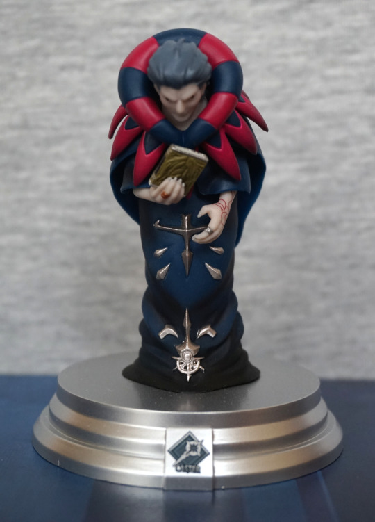
The official figure I preordered.
Box
Figma bootlegs commonly come with their box, so I have a box for both the official and the bootleg.
Front:

Instantly we have two bits of missing text on the box – the Max Factory and GSC logos in the top left and the Fox logo and copyright in the bottom left.
Interestingly, we still have the “10 years anniversary” print on the plastic window, though the colouration is different.
The colour depth is also significantly poorer on the bootleg box – if you look in the bottom right where the box says “ALIEN”, you’ll notice the Alien’s tail a lot less distinct on the bootleg.
Another notable difference is this:

The postcard on the bootleg is visible, whilst the official it is not…. that’s because the bootleg lacks the inner card liner that Figma have in their boxes.
Top:

Again, the Max Factory and GSC logos have been removed. We also have some standard tape on the bootleg – my official figure has been on display, but the crinkled-up tape is the circular round “tape” that GSC uses.
Sides:


Not much to report here, other than the shoddy print quality. Oh, and the bootleg is creased up from not being packaged well before being posted.
Back:

Can’t see any edits here. Just some murky photos on the bootleg box… don’t want to show too many of the details off of the official product now, do we?
Bottom:

Again, logos removed. Well, at least the bootleggers got the correct box bottom this time, unlike the Revoltech Alien Queen.
Flaps:

Rotated this image, so the boxes are the wrong way around here. But notice what’s conspicuously missing? Telling you that the postcard is behind the “inner paperboard”, because the bootleg doesn’t have one. Interesting that they actually remembered to remove this.
Also the flaps are slightly differently shaped, which is an interesting change to make. Guess they already had some flap template they decided to use for the cutting.
So if you come across this figure boxed, it’s pretty easy to tell you’re looking at a fake due to the removed logos. The lack of backing card is also a big clue you’re looking at a less-than-official figure.
Accessories
Let’s start with that postcard:


Interestingly they’ve removed the logos off of the back, but left the copyrights on the front. Other than that, there isn’t really any big differences between the two – side by side there’s a difference in colour of the blacks, but if I saw the fronts one at once, I’d have a hard time telling them apart. So you do get a serviceable postcard out of this, but that’s not really worth £10.
Instructions:

Again, there wouldn’t be much notable difference here, other than the fact they’ve removed the Max Factory logo (top right of the first page)
Rest of the bootleg accessories:

Hmm, this isn’t how Max Factory usually packs these… The original official packaging I’ve long since disposed of, but it was the same style as other Figma – with a segmented bag for the base parts, and separate packaging for the other parts. The official facehugger tail packaging will appear later. The bootleg also lacks the Figma resealable bag.
You said facehugger? Yes I did:


The bootleg is a much more cheerful shade of yellow, and some of the details have turned to mush on the underside. We also lack the pale shading on the top of the flap parts.
Also the bootleg one has a major defect – I couldn’t disassemble it! They’ve painted it post-assembly, and the tail is now firmly glued into place, and no amount of tugging is likely going to get it to separate properly – I suspect if I do detach the tail, it’s going to take some of the peg with it. Or I’d just have to snip it off and go from there.
Let’s look at the alternative tails for the facehugger:

Unsurprisingly, they match the colours of their respective facehuggers. Here we can see how Max Factory taped the tail to a board so it wouldn’t get damaged in transit. I don’t plan to take it off the card as this thing is tiny, and I don’t want to lose or damage it. Interestingly, the bootleg has an extra shading detail, though it’s not one present on most facehugger interpretations. They’ve also painted the peg, so I suspect it’ll be a pain in the ass to attach to the facehugger, if I could even do so. The tail attached to the bootleg isn’t fully pushed in, so I suspect the peg would be too large anyway. The official has some paint drippage on the peg, but probably not anything that’d impede assembly.
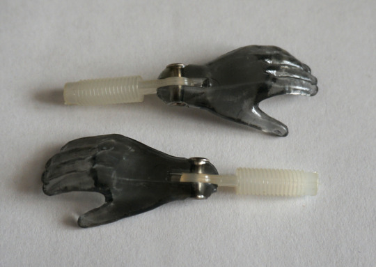
Hands:


With both the official and the bootleg, you get one set of replacement hands. The black and silver are painted decently on both the bootleg and the official, and the moulding looks around about the same. However, what’s supposed to be the brown wash has been applied very patchily on the bootleg. A sign of things to come…
For the accessories, each one has a “tell” to signal it isn’t the official. Though special mention goes to the facehugger on mine, with it being nonfunctional. The tail that is stuck on isn’t even in a good position, so it can’t display well without being modified.
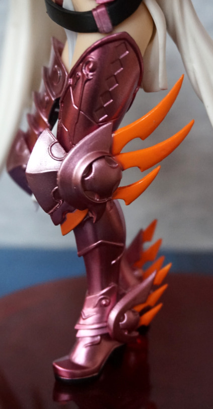
Base
Here’s the bases side-by-side:

The official stand arm has a bluer hue to it, and a lack of air bubbles. This bootleg stand definitely has air bubbles on show – which is a common trait of bootleg stands of this type. The bootleg stand also has a bit of flashing poking off the end of the peg – on Figma, this doesn’t tend to impede getting the figure on the stand much, but probably wants clipping prior to using the stand.
Bootlegs are probably the easiest way of getting a replacement Figma stand (sadly, would be nice if GSC sold replacement stands or stand parts). One thing to note is the plastic can be weaker, so if the screws are too tight to articulate the stand, unscrew them a bit first to prevent accidentally snapping it. And tighten the inevitably loose screws whilst you’re at it.
Base’s base:


Side-by-side, we can see there is a colour difference between the bases, plus there is a more distinctive frosting pattern on the official. On the bottom of the base we lack the copyright information on the bootleg.
Here is a close-up of what the copyright looks like on the official:

I’ve increased the contrast significantly, so that it is more visible in this photo. They can be kinda hard to see when looking at the base, but visible enough you can tell that it is there.
Overall, the bootleg base functions, but has the quality control flaws to be expected from cheap manufacture. It can be differentiated from the official by the lack of copyright on the bottom, and likely by having air bubbles in the stand arm. If you wanted to use it as a replacement for a broken official stand, it will work though.
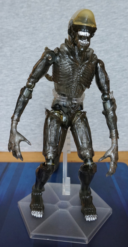
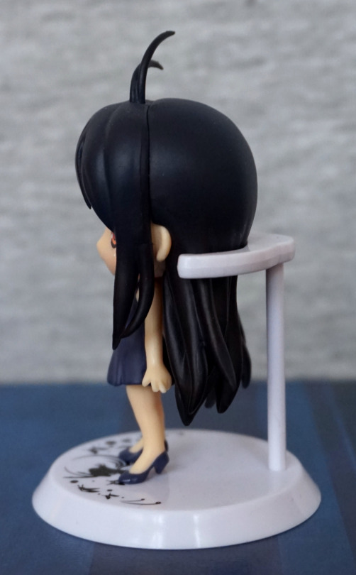
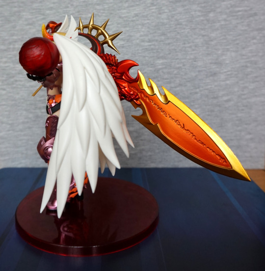
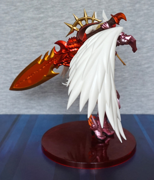
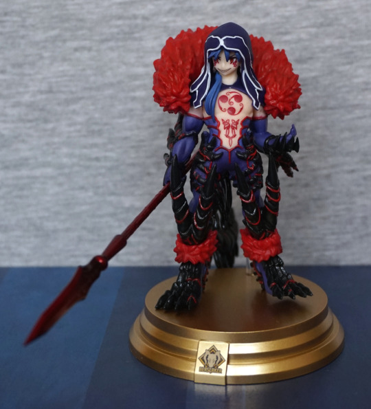
Figure spin-around
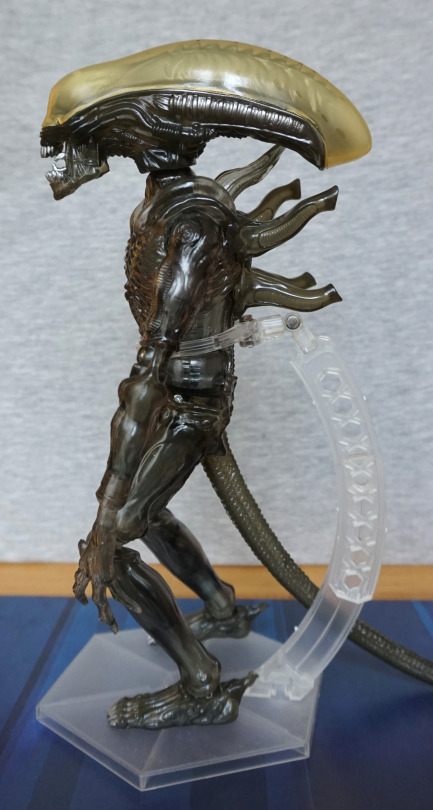
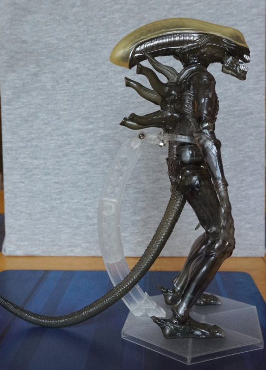
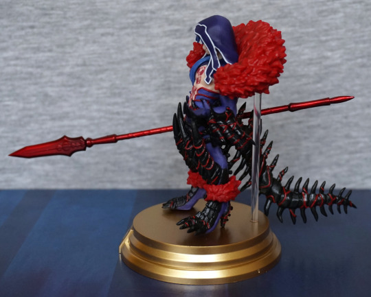
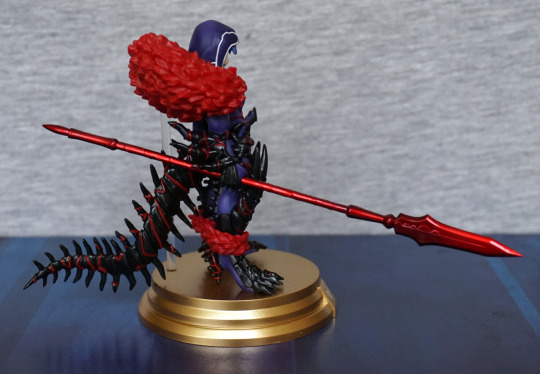
Time for the main event! Let’s have a look at these two side-by-side:


The first things that stand out to me is the clarity of the dome and the fact the bootleg’s head is less hunkered down to the body. Oh, and the fact it looks like the bootleg has been rolling around in the dirt. The figure is supposed to have a subtle brown wash, however on the bootleg this has translated to a very uneven wash on the figure, which makes it look like mud. Can’t say I’m a massive fan of it on the official, but at least it is subtle enough to not look like dirt.
With the head, it’s not uncommon to see this on bootlegs – either they use a different joint piece or the holes aren’t drilled right, leaving the heads more prominent. In this case, it doesn’t look so unnatural to human figures, and not really noticeable unless you’re looking closely. It seems more visible in these photos than looking at it in person. It does offer one more test though – with the official, the head is practically straight when touching the upper back protrusion, but the bootleg is slightly looking up.
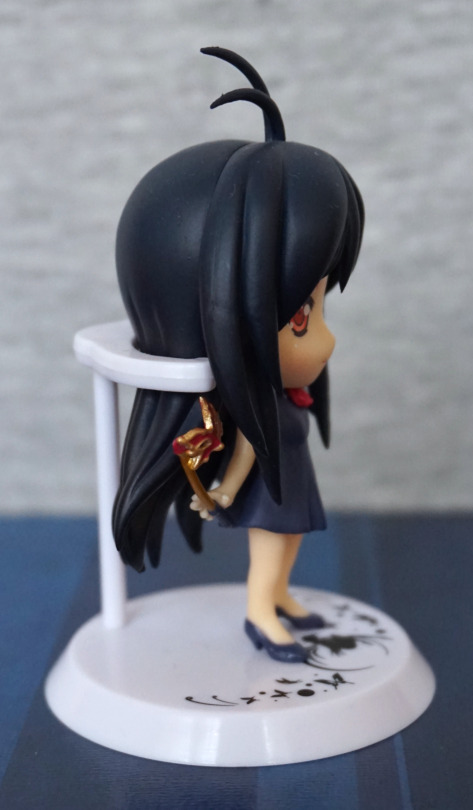
Figure close-ups
Right, let’s go back in time and get the bootleg figure out of the box:

Off to a good start with the bootleg!
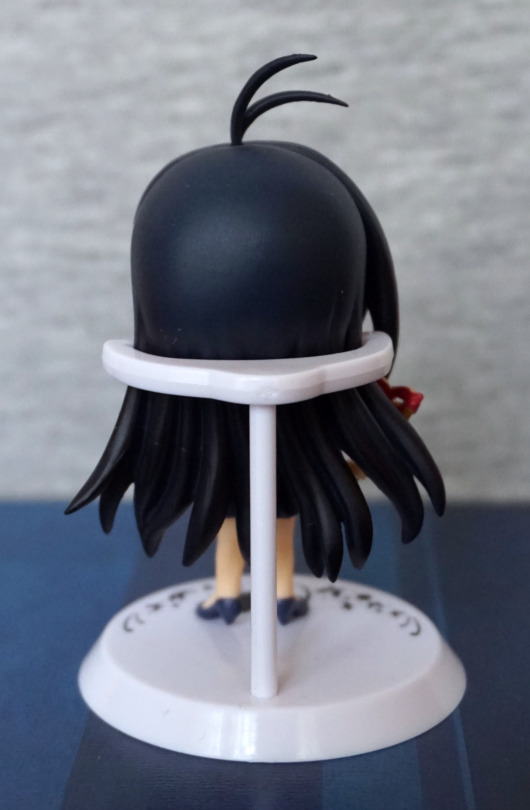
OK, now for an articulation test after shoving the head back on:

Don’t think this Alien is going anywhere fast! With my bootleg copy, his right leg will fall off very easily, and did fall off once or twice when I was moving the figure around. Articulating the joint, it will definitely have a propensity to fall off. The upper arm joint was also fairly loose, but will stay most of the time. One of the arm joints is frozen and won’t articulate without doing something to sort it.
For my official, articulating it doesn’t have pieces flying everywhere (Mafex Alien could learn a thing or two…).
Whilst we have his leg off, let’s look at the bootleg leg joint:


Hm, so he’s muddy on the inside too! Almost wonder if they were using paint to sorta glue him together to go into the box… Didn’t work though as he fell apart not too long after I took him out of the box.
The joint itself is likely loose due to the “cup” part where the ball goes into being roughly cut resulting in the hole being too large to properly contain the ball joint. Action figures need a certain level of precision in their manufacture otherwise you end up with loose or too tight joints, and end up with… this mess.
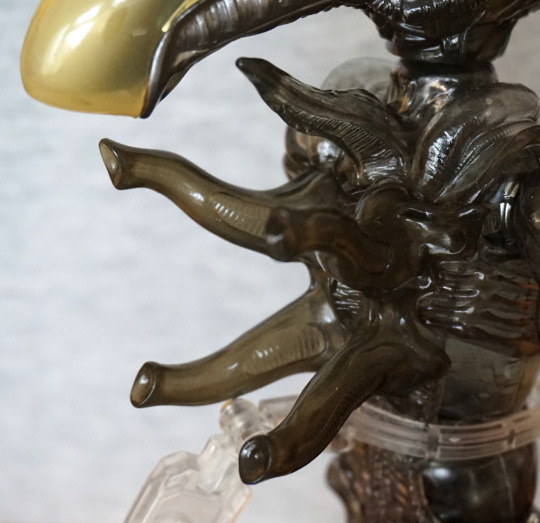
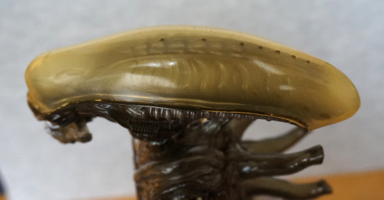
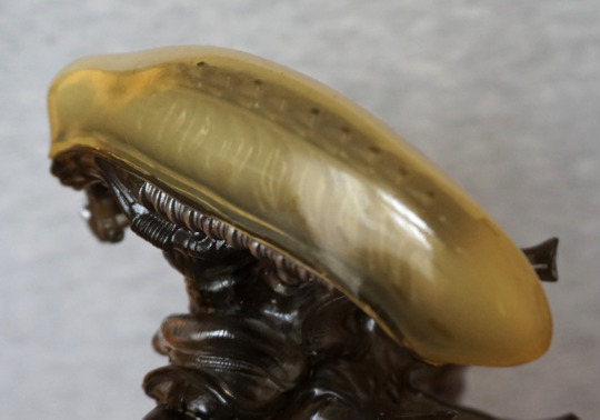
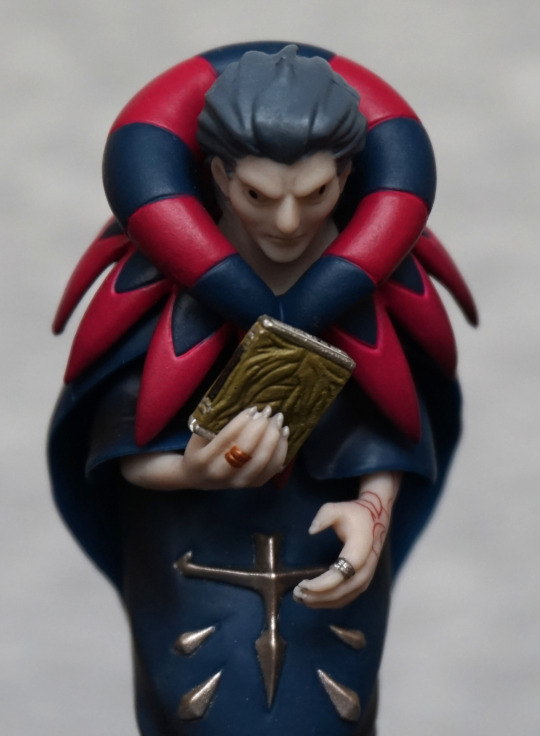
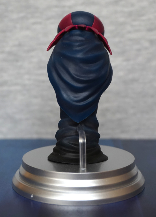
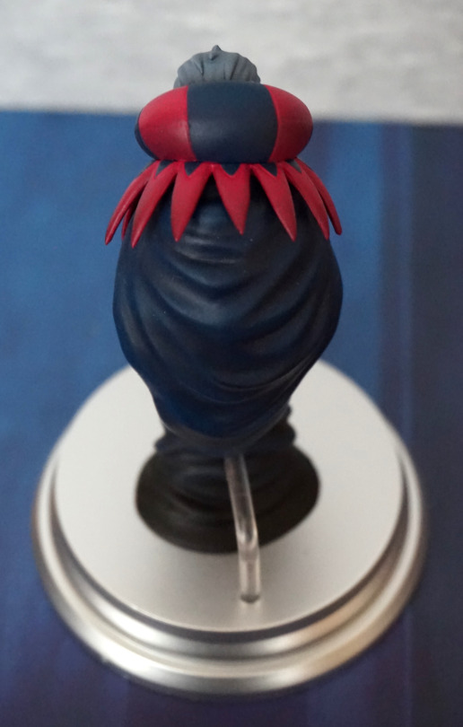
Top of the head:

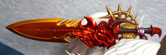
One of the iconic features of the alien. For the official, we have a darker shell. Some of the moulding detail is missing from the bootleg – the ribbing on the tubes that go from the front to the back and the outer bone pieces within the shell lack finer detail. The skull plate joins are also somewhat different. For the bootleg, we’ve also got a colour difference between the middle bits of bone and the outer bits, which isn’t a thing on the original. Outside of the head shell, we have a brown shading detail on the side of the head (bottom of the photo) that isn’t present on the bootleg.
For this, the bootleg doesn’t look bad, but comparing to the official, you get to see what you’re missing.
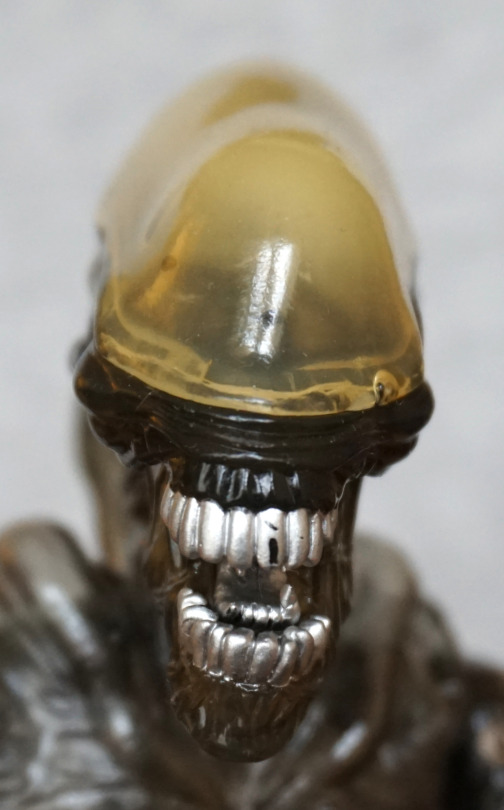
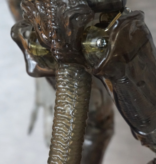
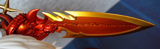
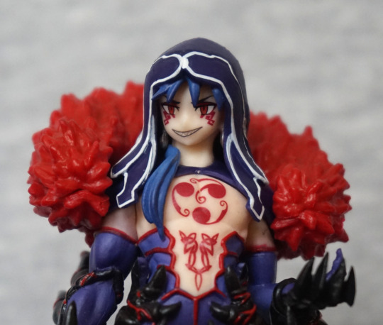
“Face”:

First thing that hits me is the poor paint quality of the teeth on the bootleg – both his inner and outer mouths are a mess. We’ve also lost some of the finer mould details, which adds to the messy appearance, especially for the inside of the inner mouth
Despite the bootleg’s dome appearing more transparent on top, it’s more opaque on the front, pretty much hiding the eyesockets. Quite a disappointing “feature” as this is one of the iconic parts of the transparent dome Alien design.
Inner mouth, extend!

I said extend. Yep, my bootleg is defective here, and it won’t pop out. I tried. For the inner mouth, the official is somewhat flawed, partly thanks to a mould line. However, what I can see of the bootleg’s, it doesn’t look like they tried.
We can also see how the clarity of the dome is much better on the official than the bootleg. It looks like they painted part of the dome to try and emulate the dark shading, instead of relying on the plastic’s thickness.
Here we can see how the brown wash is supposed to work, and how it’s just muddy spots on the bootleg.
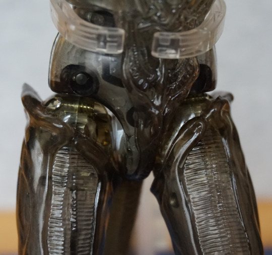
Torso:

Here, the mould details are decently replicated, but the paint…. not so much. The black paint on the bootleg isn’t as shiny as the original, and isn’t quite as dark. Also, can we get the bootleg Alien a bath? Definitely looks like he’s been rolling around in the mud from this angle. The brown wash is much more evenly applied on the official, making it look much more like shading/detail and definitely nowhere near as distracting.
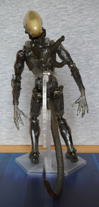
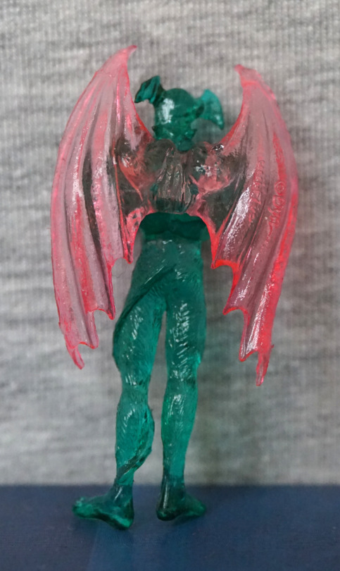
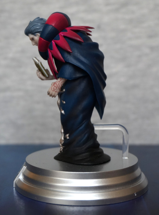
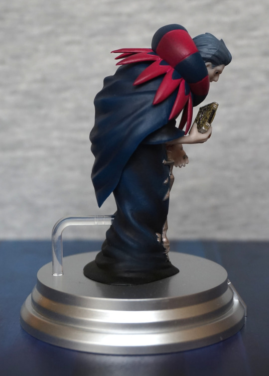
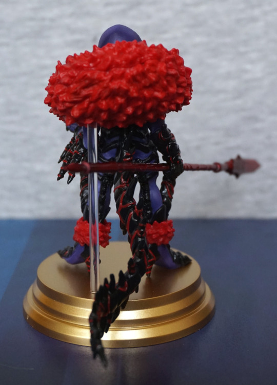
Back:

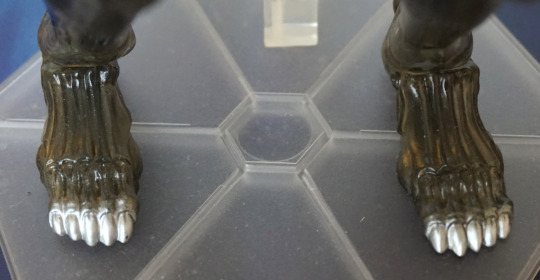
If I thought the official looked overly plain in spots, the bootleg trumps it with a lack of the knobbly textured effect that is on the flatter parts – especially noticeable on the buttocks.
The protruding parts are also all over the place on the bootleg – official shows how they’re supposed to go, but the bootleg’s are twisted all over the place. Not really a great look imo.
Oh yeah, and he’s also muddy. Did I mention that already? What do you mean the bath isn’t ready yet?
“Pipes” from the side:

Not got much to add here, but we get to see yet more of the mud and the way that the bootleg was incorrectly assembled.
Arm:

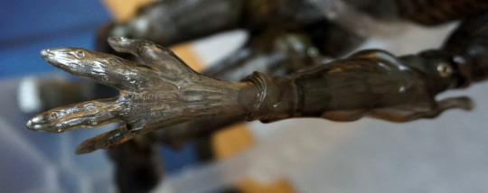
The limbs are all a fairly similar story, so let’s just compare an arm. The moulding seems to be a decent copy, but the paint job has suffered. We can also see on this hand how unevenly the wash has been applied on the bootleg. The silver nails, for the most part, have been painted OK though.
Close-up of the other hand:

You’ve been slinging mud around haven’t you, you naughty Alien?
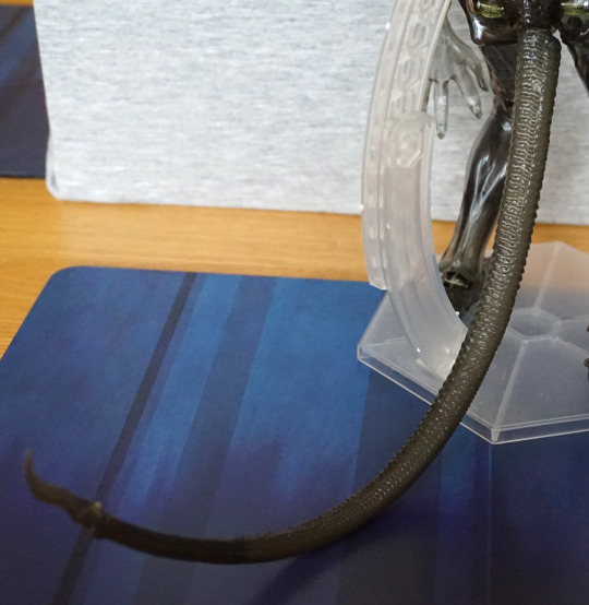
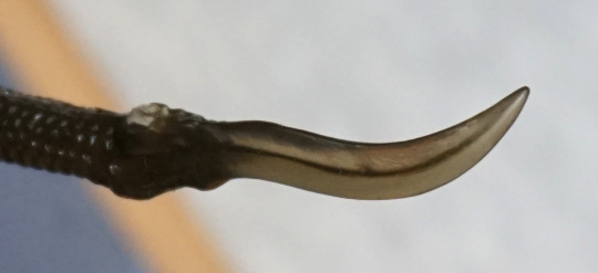
Tail:

Well, we can definitely tell these apart! The tail end has been assembled incorrectly on the bootleg and points the wrong way. It’s not like they had an artist’s impression of this figure on a piece of card to tell them how it was supposed to go…
The curvature is also quite different – likely mostly due to poor assembly, but the bootleg also doesn’t have the two hidden joints that the official does. For some reason I didn’t take a picture of the official’s articulation, but this picture by YamiYumi shows what the articulation in the tail can do.
OK, let’s do some hand swapping:

Um, one moment please! Unlike the official, pulling the hand can sometimes result in the joint coming out. With the official, pulling off the hands will leave the joint in the wrist. The joints seem to be a bit short on the bootleg and a bit misshapen, which is likely the cause of this issue. And the hole not being small enough to hold it tightly.
Swap complete:

Wasn’t too bad, other than having to put the joints back in the right place when hand swapping. The wrist joints have more of a habit of staying visible than the official, but the hand swap is possible. For both the official and the bootleg I heated the hands to facilitate assembly.
Conclusion
Overall, this bootleg is a mixed bag. For just under $14, I can see why someone would want to go for this bootleg rather than forking out for the official, though it definitely has its flaws, with the poorly painted brown “wash”, missing articulation in the tail and some joints either too loose or too tight.
Telling them apart, the bad paint job definitely gives the figure away, as well as the missing logos on the box. If you have the accessories to tell the figure apart, the facehugger’s “flaps” not being a paler colour and the lack of copyright on the stand are two large giveaways. If the paper parts are included, the missing company logos on those parts also reveal if you’re looking at a bootleg.