Tag: sega

Misato Katsuragi – Moto Riders ver – Evangelion

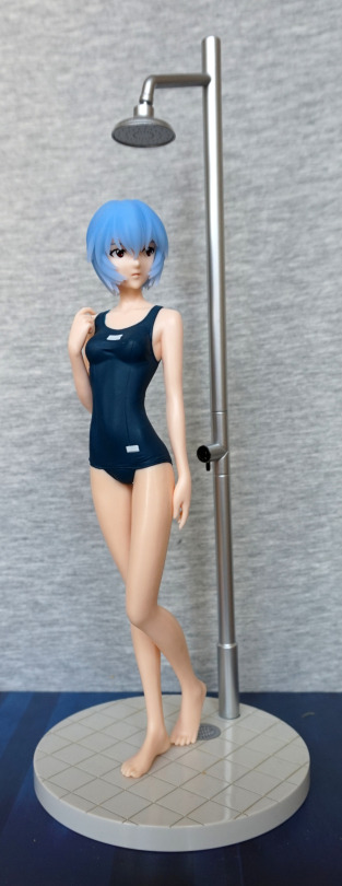
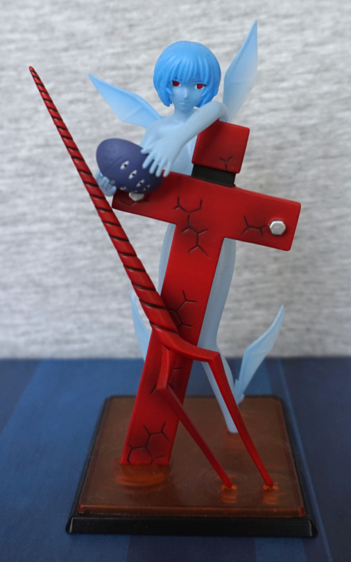
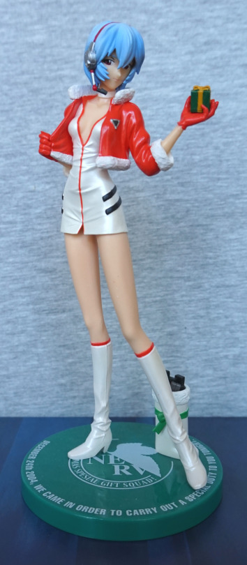
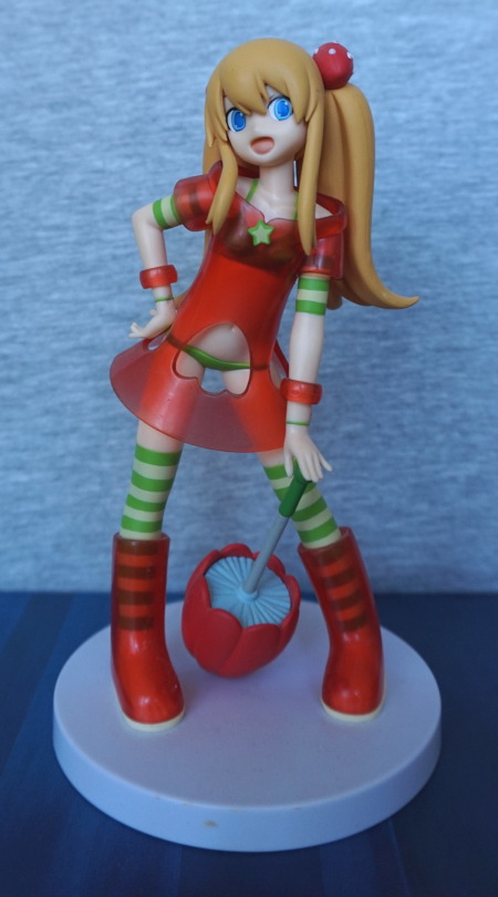
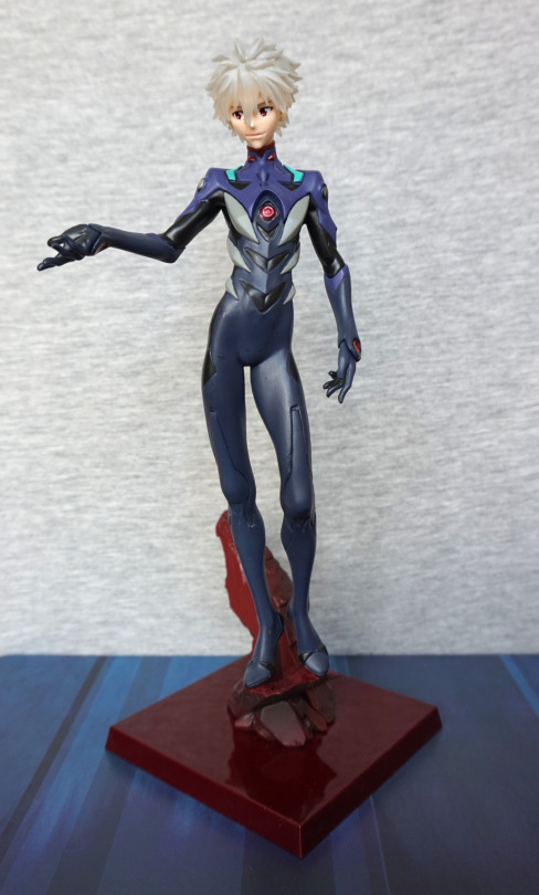
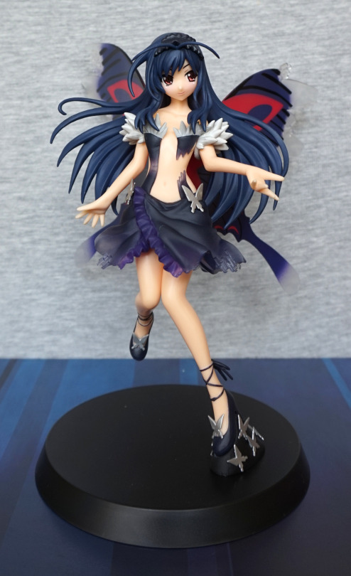
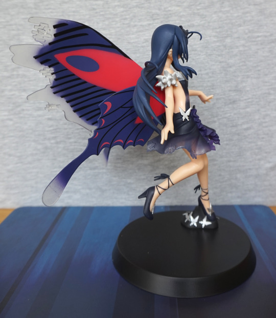
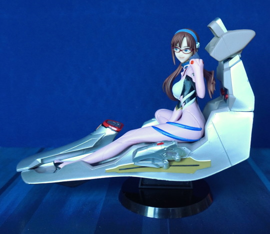
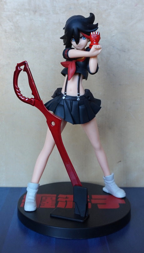
This was a figure I decided I wanted when I saw it. Came across it on Mandarake, where it quickly made its way to my basket.
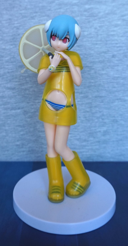
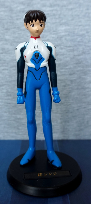
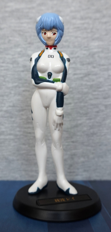
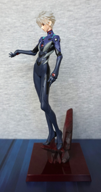
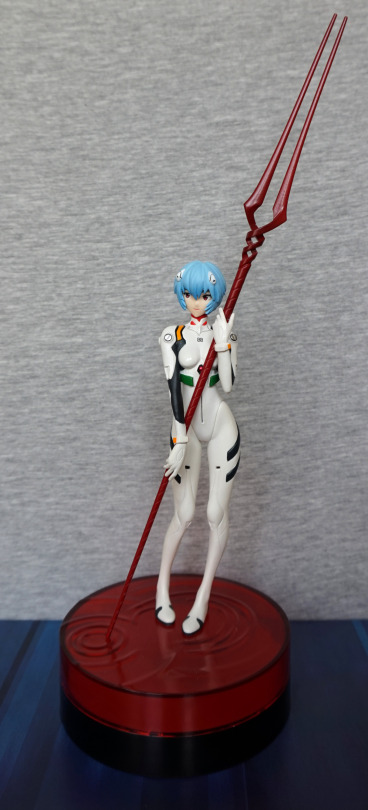
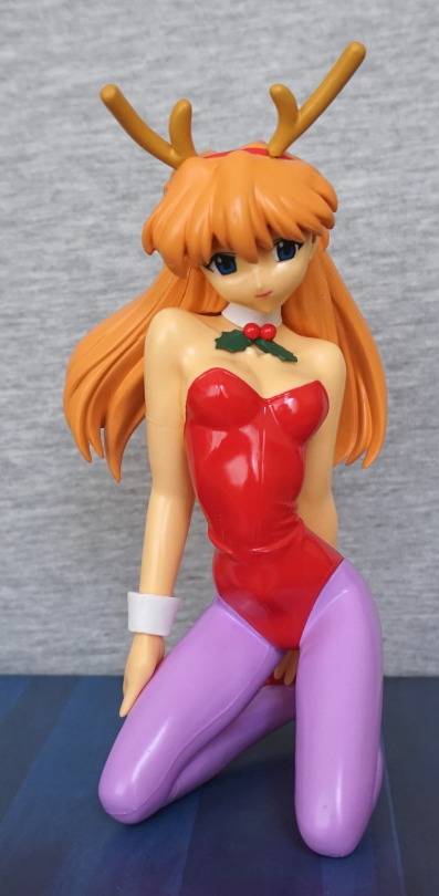
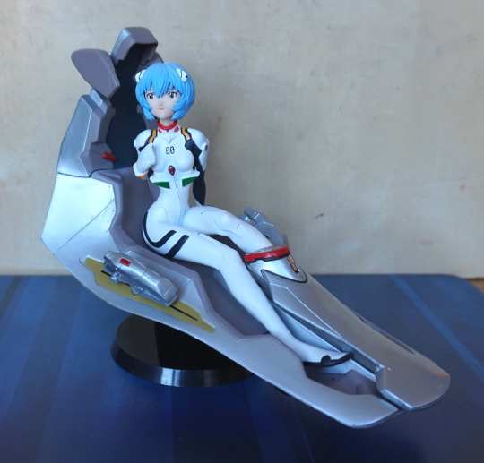
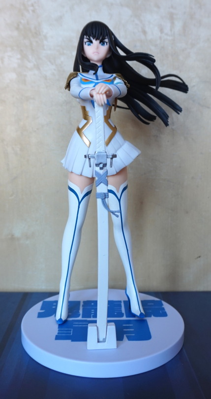
Here she is:

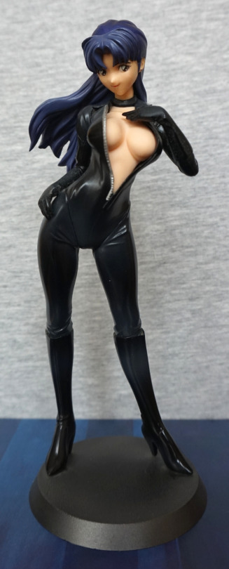
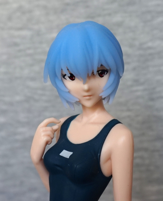
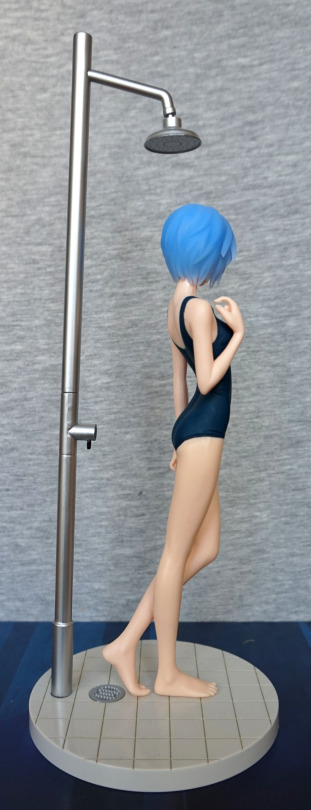
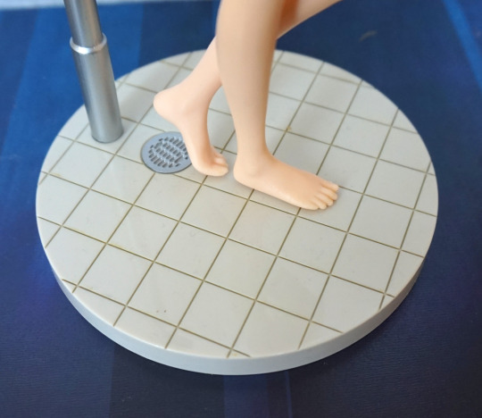
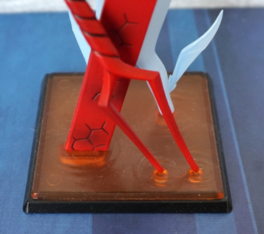
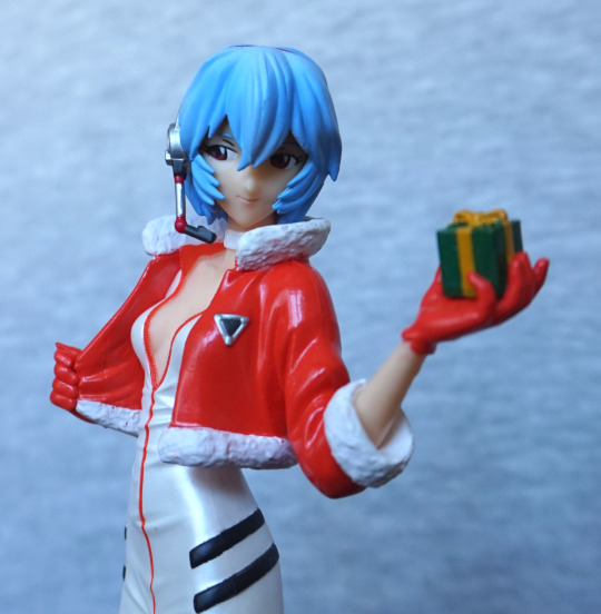
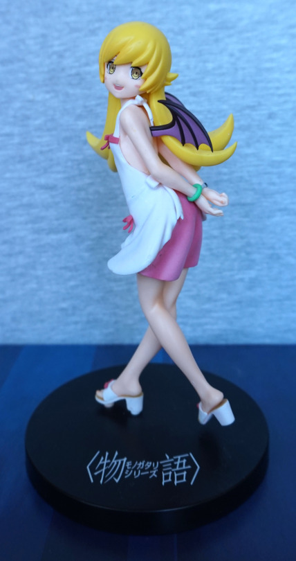
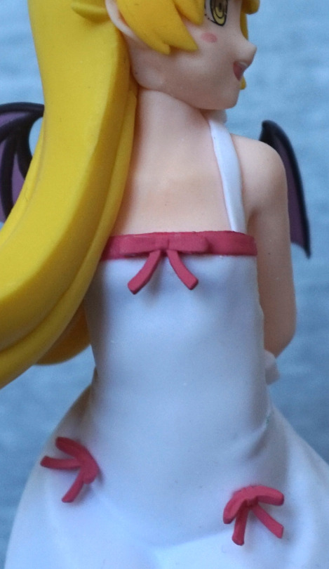
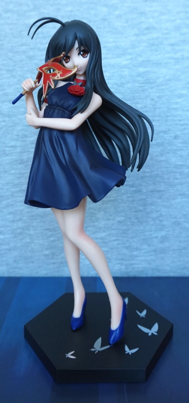
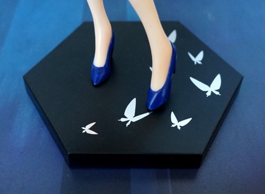
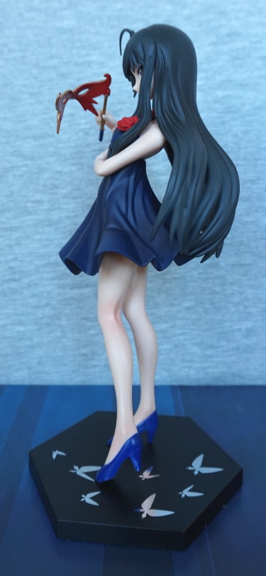
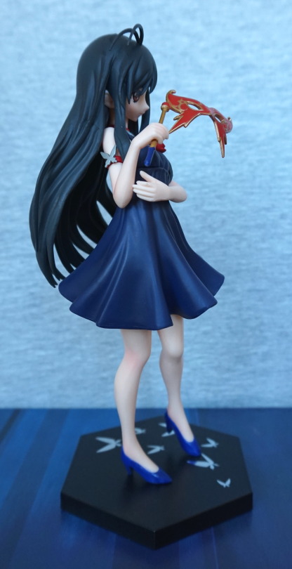
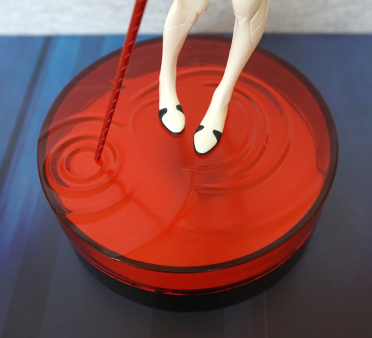
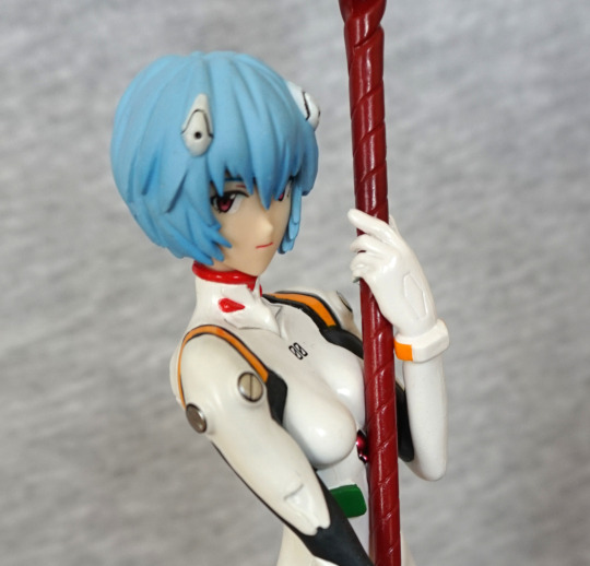
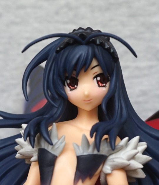
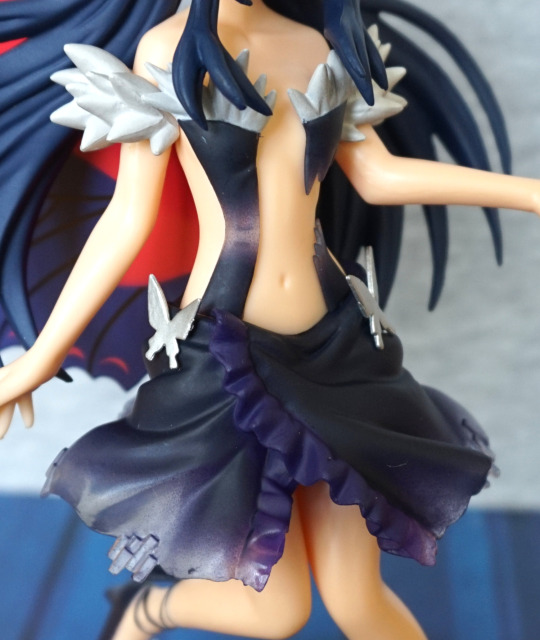
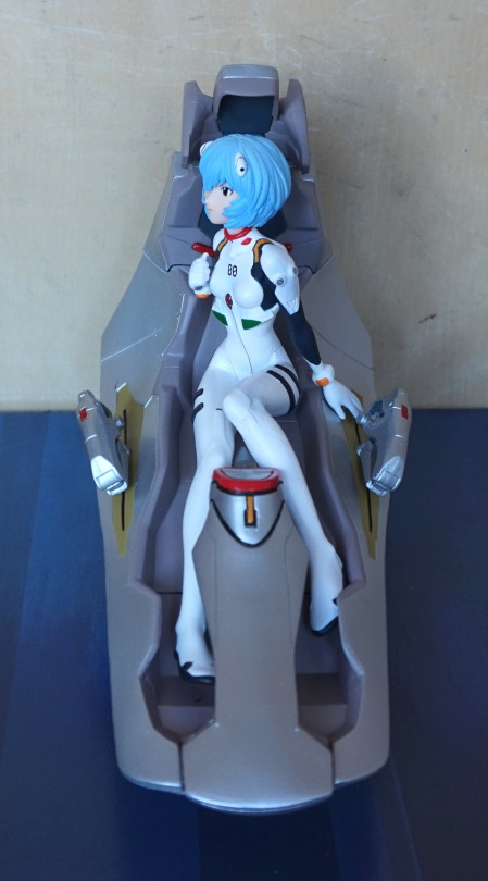
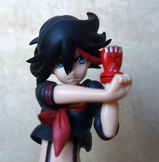
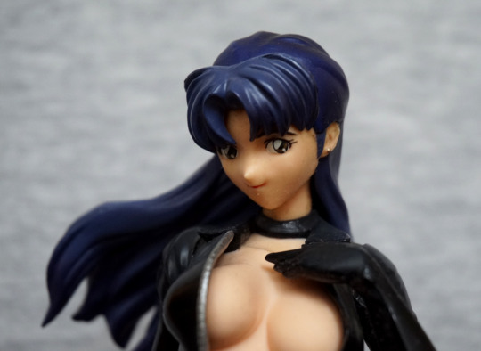
Some of the “free” dust can still be seen on the base. This time it wasn’t my fault it was dusty! The thing that attracted me to this figure was her outfit. I like the cute look of her face, and the skintight outfit has been done nicely for a prize figure. 
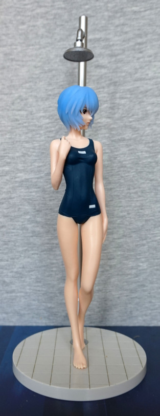
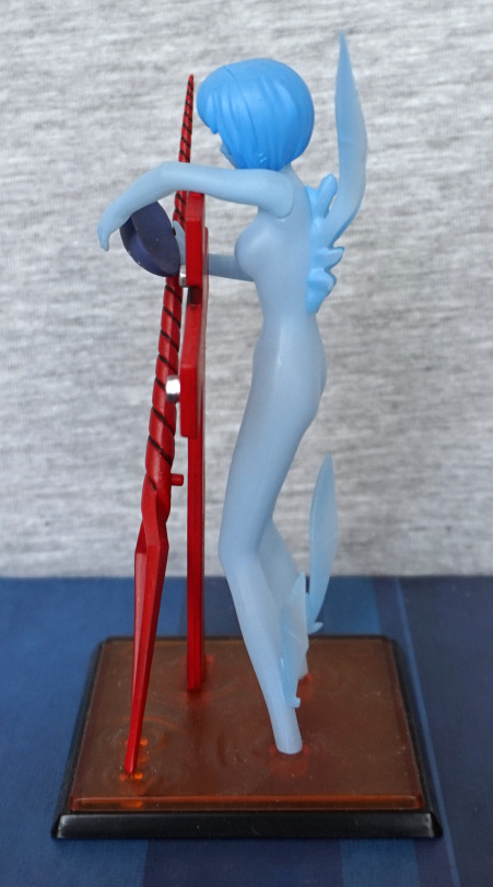
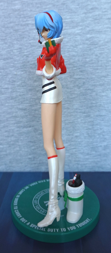
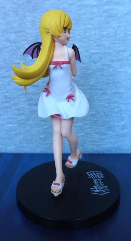
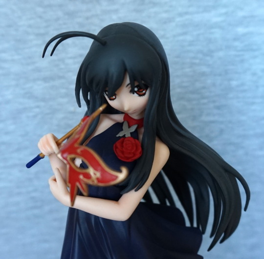
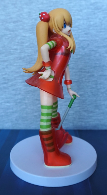
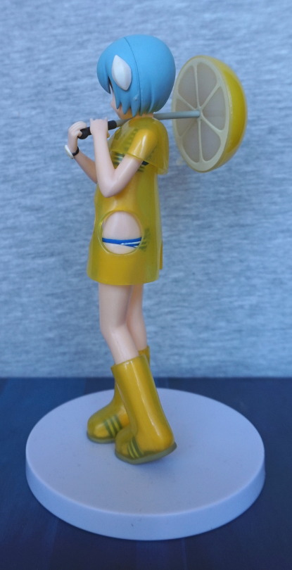
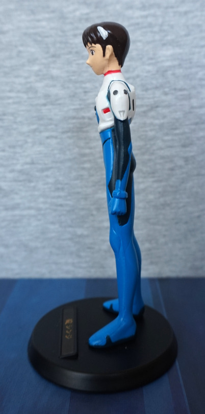
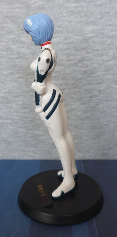
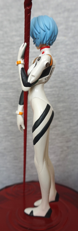
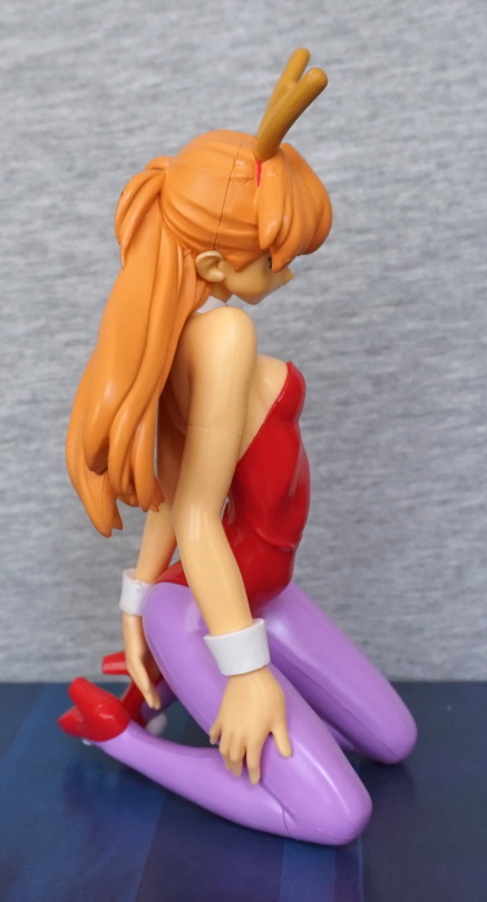
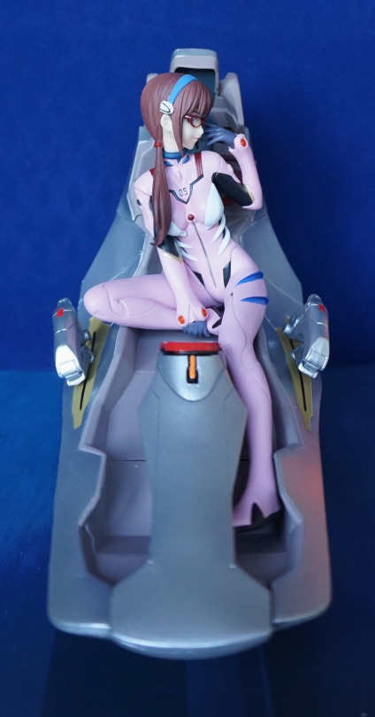
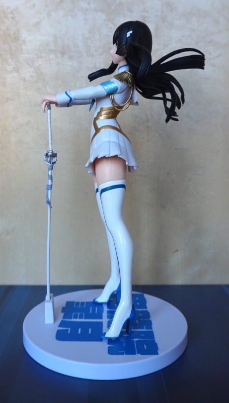
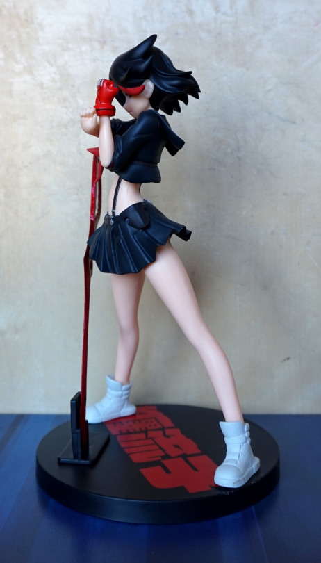
Face:

Her face is fairly decent, and I like the expression. Hair is a bit “eh”, but decent enough for a prize figure. I like the choker they’ve added to her neck. Her chest is actually a soft rubber, if you like to poke your figures. An interesting additional feature for a prize figure.

So… let’s see if she has her scar:

Nope, can’t find it anywhere down there. Due to the rubbery material used for her chest, I’m not surprised it wasn’t included. On her had, the rubber has denatured slightly, but her body seems fine. 

The zip on her uniform has been painted neatly. Sculpting is OK for the zip – looks a bit thick close-up but OK with a bit of distance.

Left:

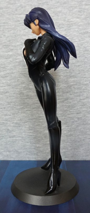
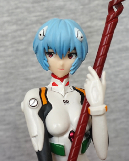
Here she’s leaning forward slightly, and she has a shapely upper body. I like that they’ve included some shading on her suit, instead of leaving it flat-coloured. 
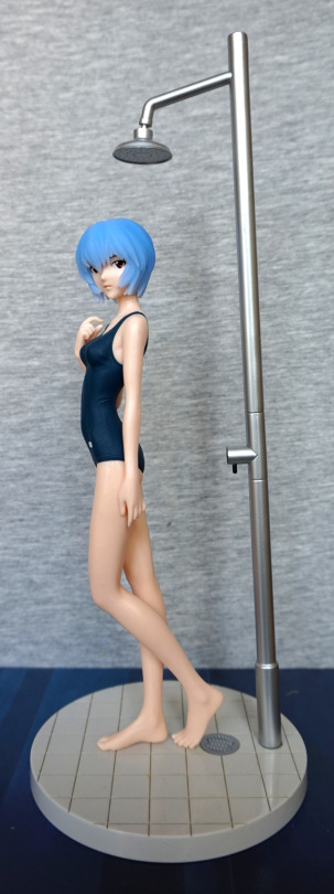
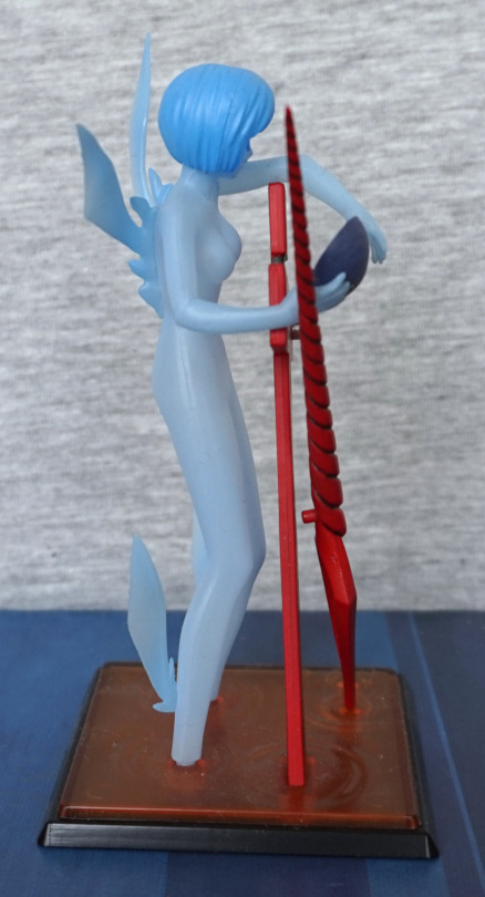
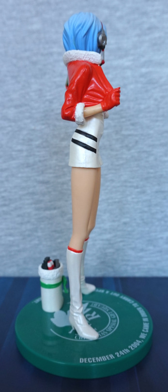
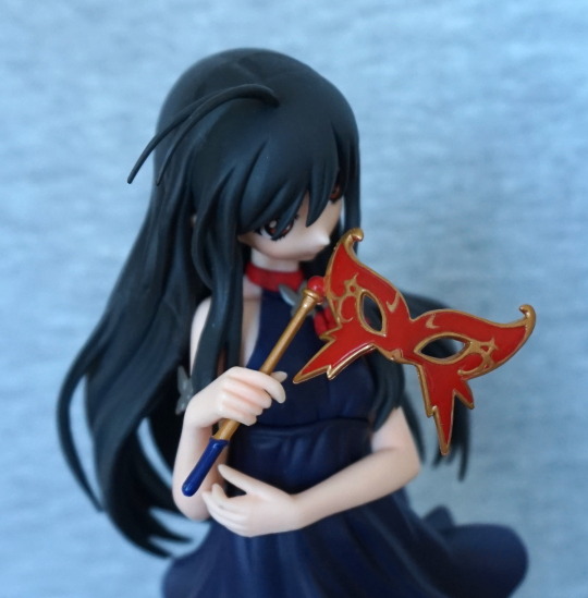
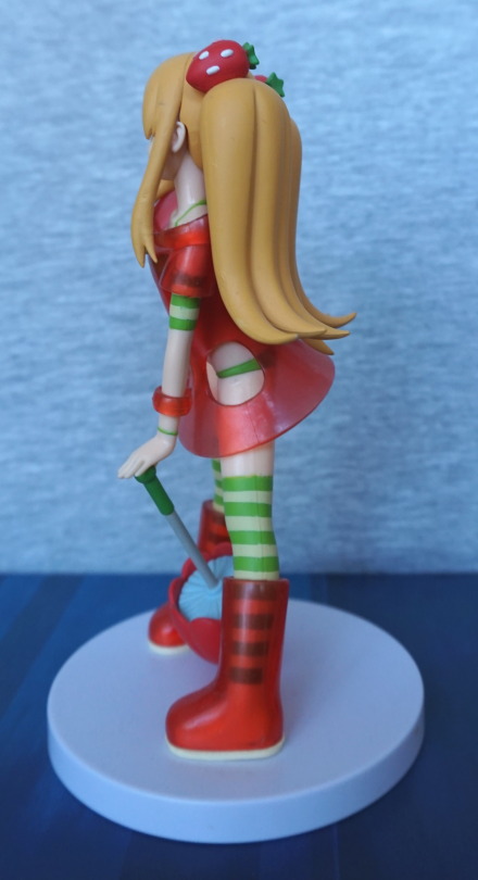
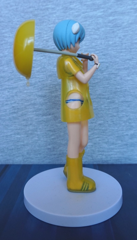
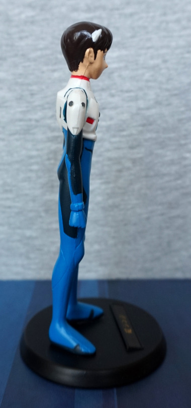
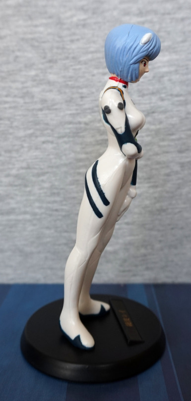
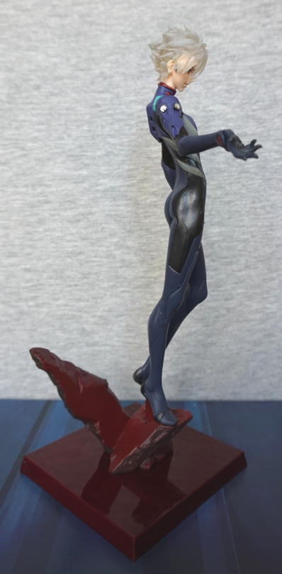
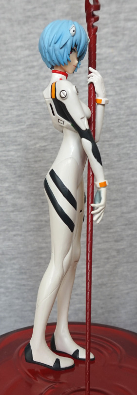
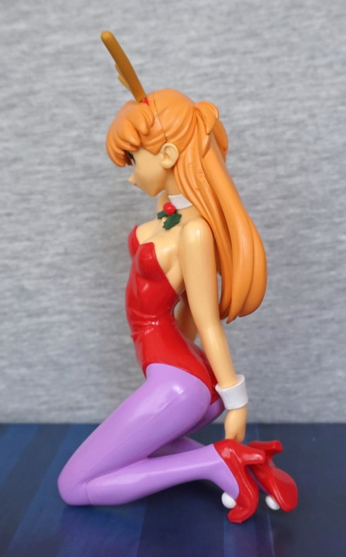
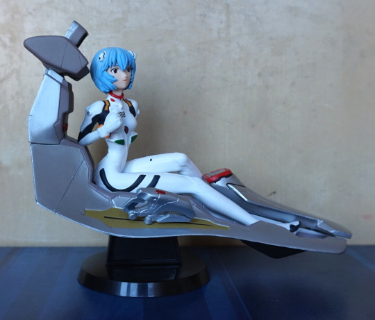
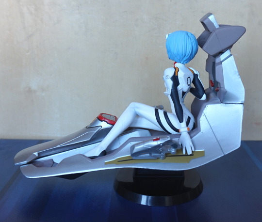
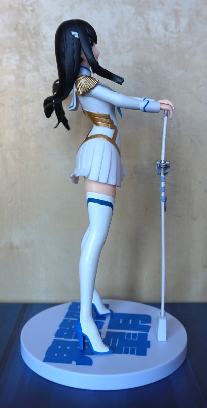
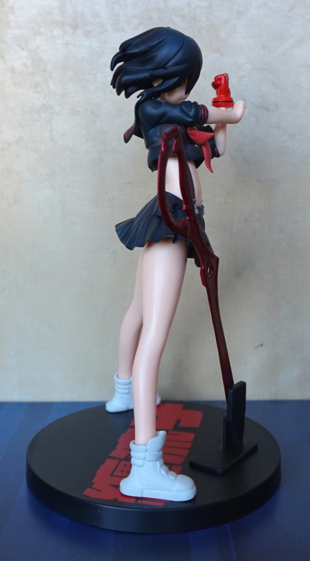
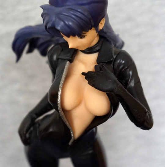
Right:

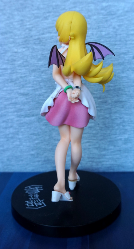
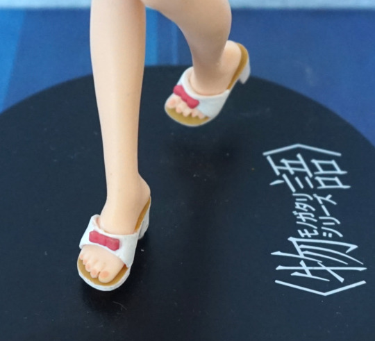
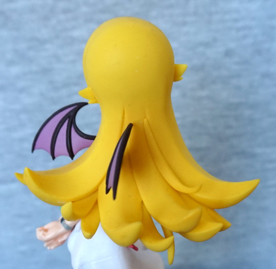
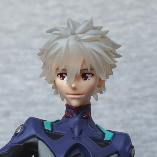
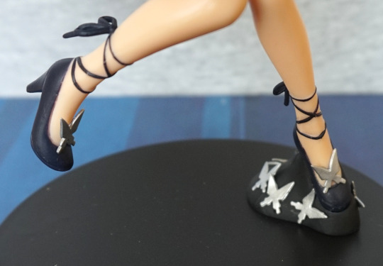
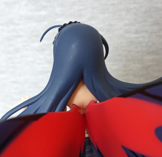
The creasing on her clothing looks good, and the boots have been done well. Her hair I’m not so keen on, but it does the job. Though to me, her hair doesn’t feel quite right – her hair is overly flat in places, which looks odd next to the more sculpted parts. 
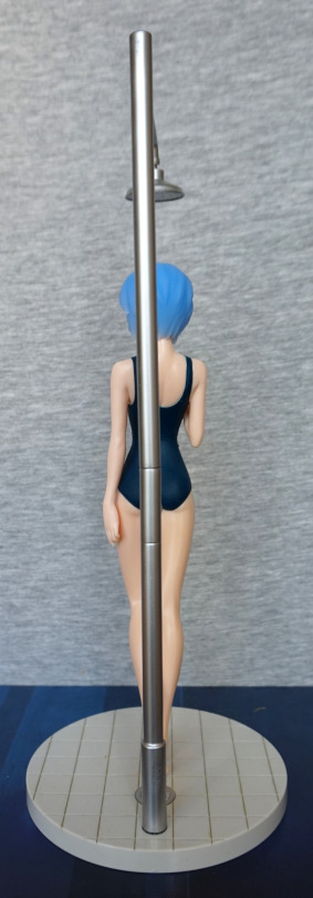
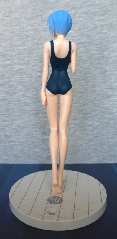
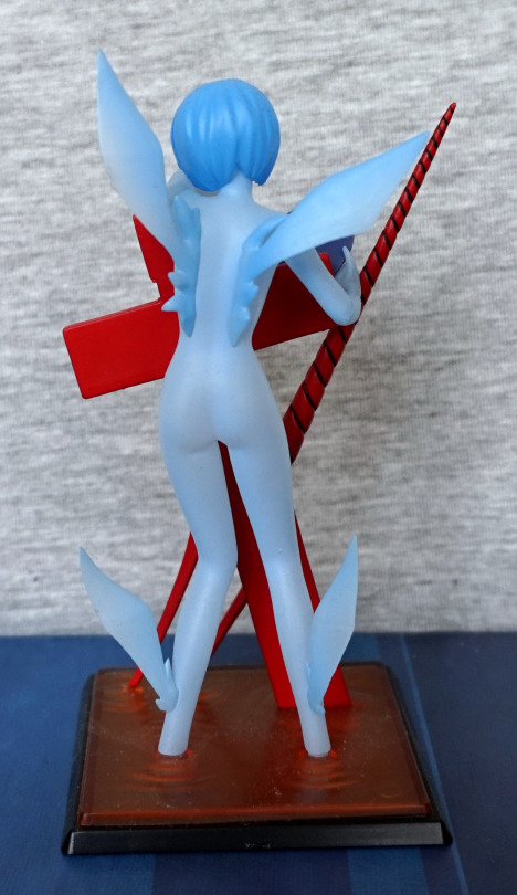
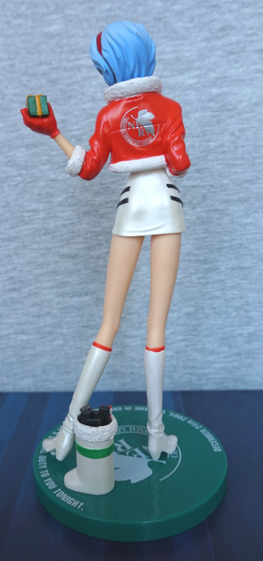
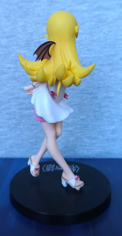
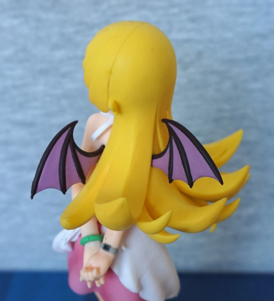
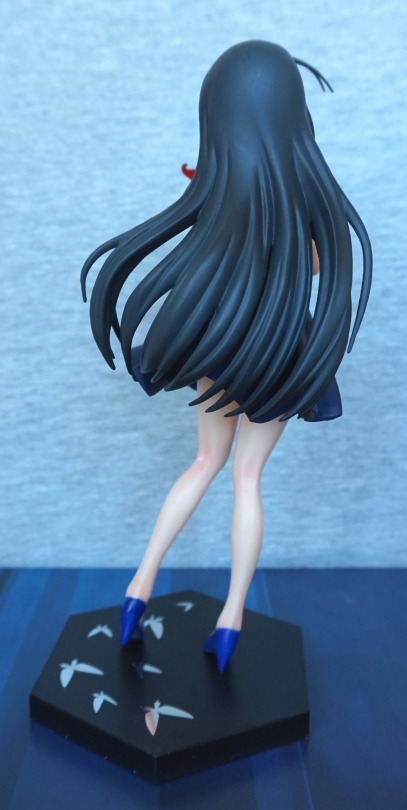
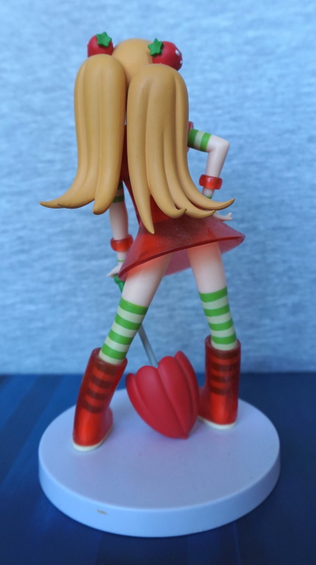
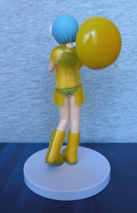
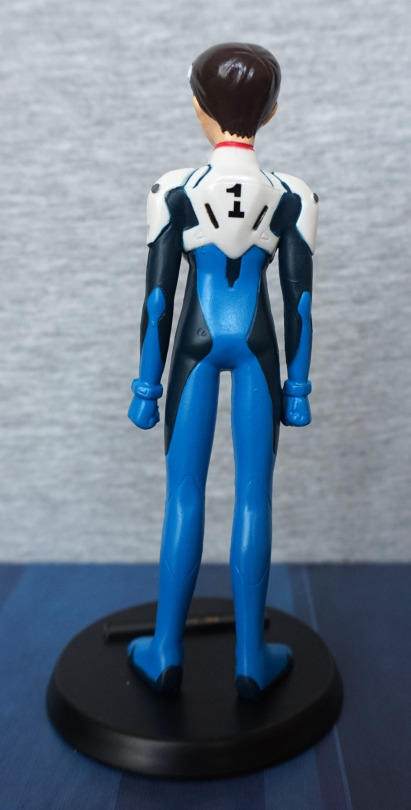
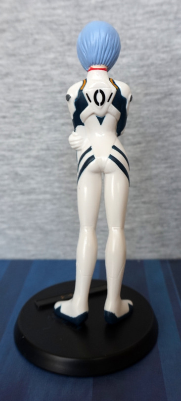
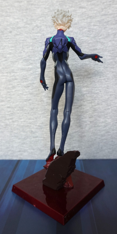
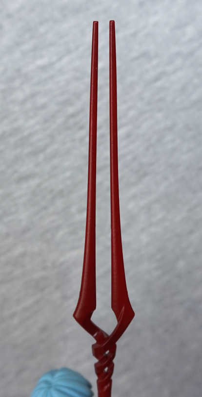
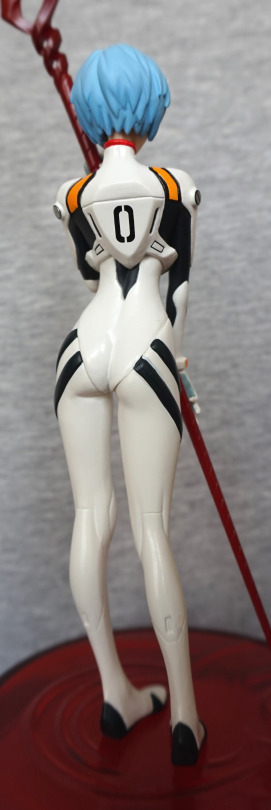
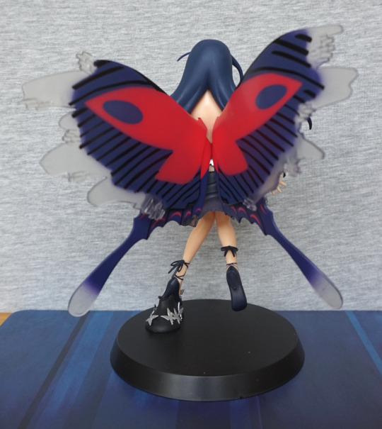
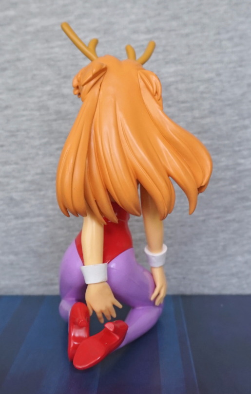
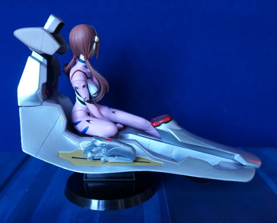
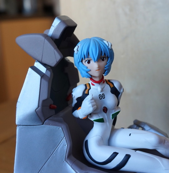
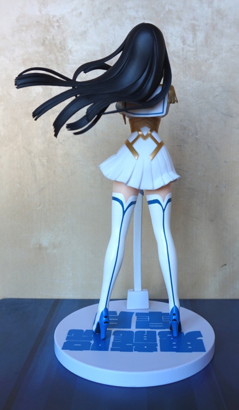
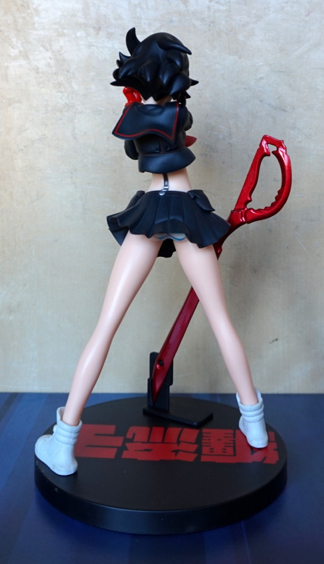
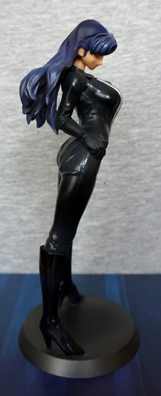
Back:

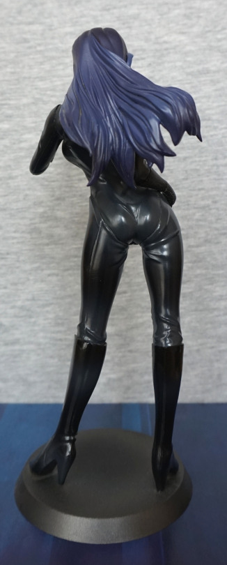
Hair looks good from the back – I do like the way it flows. 

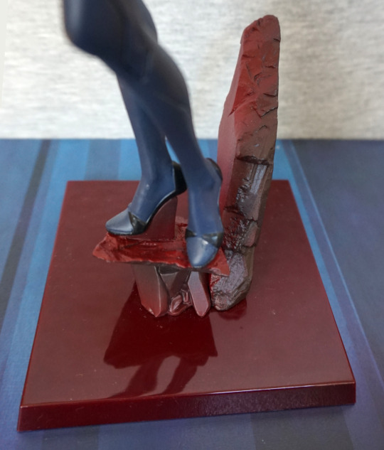
Overall, I’m pleased with this figure, though I do wonder how the rubberised bits will age. 

Rei Ayanami – Swimsuit v1.5 – Evangelion

For awhile, I was toying with the idea of ordering the original version of this figure, but I didn’t quite like it enough to do so. Then I found out there was this v1.5 version, and went for it:

image

The main differences between this one and the v1 is the hair and the matte finish to her swimsuit. The mould is the same for both versions.

Face:

image

I love the soft faded effect to her hair, and am a sucker for translucent hair, despite its weirdness. I think her face has been rendered decently well for a prize figure. The matte texture certainly looks nicer than the shiny one imo, but it is more prone to showing up scuffs on the figure – of which there is a minor amount. She does have a seam line that is pretty noticeable on her left arm in this photo. 

Swimsuit:

image

Here we can see they’ve added in wrinkle details, and seams to the swimsuit, but they haven’t added any markings to the labels. Usually the character’s name would be written in the space. Guess she’s borrowing a swimsuit for the day?

Left:

image

Here we can get a good look at the shower – the finish is nicely rendered, but due to the way the peg is, it does lean a little. Overall, I like this piece, and seems to have all the details it needs. Unless you want some limescale 😛

Due to the way Rei is facing, this actually makes for a good viewing angle. I like her overall pose, and I think this side shows it off well.

Right:

image

Here we can admire the details in her hair – she has a good number of strands moulded, which is a lot nicer than some prize figures where they just have the top of her hair smooth. 

Back:

image

Erm, er, let’s try that again:

image

Here we can see they’ve sculpted her spine and shoulder blades. The swimsuit hugs her backside, and is creased near her middle, which are all nice detail.s 

Base:

image

I like the fact they’ve coloured the grout – this is also a feature new to the v1.5, and I think it really adds to the base. The shower drain has also been nicely done, and looks like a drain. Her foot does look a bit overly rectangular from this angle… but is nicely sculpted otherwise. 

Overall, I really like this figure and glad I got it. The shower could do with being a bit more stable, but I don’t think it’s critical, as it looks fine from the front, and not prone to falling out – just leaning a little. Glad I went for this one, and would recommend it. I don’t think there’s any reason to own both versions of this figure, and would recommend picking your preferred one. Looking at pictures of the other version, this is definitely my preferred version.

Rei Ayanami – Evangelion – Gaf’s Door

Here we have a slightly unusual Rei figure:

image

Here we have Rei in an angelic form. Saw this at a Hobby Off, and had to buy it. The figure takes a decent amount of assembly – having to peg the pieces to the base and each other. Once done though, this is a small, impressive looking figure, imo. I like the fact the cross has some shading on it. One part of me would like to see more of Rei, though. 

Base:

The base is slightly translucent, reminiscent of LCL – the fluid used in the entry plugs. Ripple marks are sculpted around where the various parts attach to the base, giving it more depth. 

Left:

Here we can see… where the lance has come unpegged from the cross. Erm. Oh, and a slim appearance of Rei. I like the sky blue colour used for her, and the shape of the winged parts.

Right:

I think she looks a little too long and flat from the side, but other than that, she looks OK. The hair stands out well from the body. 

Back:

Wings arc well from the back and I like the attachment parts they’ve given them. Her pose looks good from the back.

Overall, I really like this figure – it’s a more unusual one, and has nice colours to it. Would recommend if you can find it for a decent price. 

Christmas Rei Ayanami – Evangelion – Sega

So… it’s summer. So let’s review a Christmas figure.

Of Rei, naturally:

This is a really nice figure imo – her hair is nicely detailed, she has a good expression, and for the most part, she’s well painted. I like the way she’s posed, holding her jacket because it gives us a good view of her plugsuit-inspired dress. The figure also features a couple of different finishes, so her dress and boots are pearlescent, her coat is shiny and the other elements are more matte.

Face:

A fair amount of detail went into her face, which is a bit rare for prize figures. The fluffy parts suffer for being plastic, but I don’t find them too bad on this figure, and not as distracting as other figures I’ve blogged about. I love the red shininess of her jacket, and the badge on it is painted well. Some of the red does escape onto the edging, though. Also she’s one of the few Rei figures where the hair doesn’t go flat, and I really like this about this figure.

Left:

She sports a headband, which is a nice addition to help hide the seams, but being flat to her head it does look a little odd. She has quite a slender pose, which fits Rei. I like the red band at the top of her shoes.

Right:

Here we can see the fact her hair is moulded fully at the back, which is a rarity. The creases in her jacket give a sense of realism. We can see a bit of a seamline in her dress, but it doesn’t stand out much. Her legs aren’t shaded, but not much shows, so I don’t find that fact too significant. We can also see the headset she’s wearing, not sure why. Maybe she’s posing during a music video or some stage show…?

Back:

A bit of a miss with the red paint on her jacket, d’oh. Her bum sticks out slightly, which works well. I like the way the logo is printed on her jacket – I think silver paint was a nice choice, and the print is nice and crisp. The present paint looks OK from the back, but is a little dodgy on the front – some of the yellow paint wasn’t applied thickly enough.

Present boot:

Rockets… what’s possibly clips… yep, this appears to be presents from NERV! The bow is painted nicely, but there is a bit of a miss on the green paint on the ribbon, but it isn’t too bad.

Back:

Looks OK, nothing too special to say about the back. The toes on the boot feel a bit short though – feel like they could’ve lengthened them so it would feel more proportionate.

Base:

“December 24th 2004, we came in order to carry out a special duty to you tonight”. Mmm, special duty… Is Shinji getting the prize gift? I think the presents in the boot will keep Asuka happy for a bit.

Overall, I really like this figure. It’s definitely one of the nicer prize figures I have. Also being a Christmas figure she was really cheap – they don’t tend to keep their value as a lot of people don’t feel like displaying them outside of the Christmas period and end up selling them. But me being me, appreciates a good figure all year round :P. Yes, even the Christmas ones. If you need more Christmas and Rei in your life, I’d recommend this figure.

Oshino Shinobu – Monogatari – Ver.2

I was pretty sure I’d end up with at least one Oshino figure by the end of my Japan holiday. My only surprise is that I managed to keep it to one. Whilst I’m not familiar with

Monogatari

, I do rather like Shinobu’s design, and this one was on my “to buy” list due to the wings.

So here she is:

She’s definitely a cute figure, but… as we go on to see… her quality is somewhat lacking. Her hair and expression are nice, and the wings… cute li’l devil wings. I know some people have passed on this figure due to the fact they aren’t character-appropriate, but for me I’m a sucker for wings and therefore don’t care. Barring her skirt, she is pretty much plain, flat colours. If you look near her bracelet, you’ll see a bit of a seam too.

Left:

Here we see the obvious seam in her hair, and a bit of a weird sticky-out bit behind her ear. It looks OK from the front though, If you look near her ankle, there is a bit of a flaw in the finish. On her skirt, you’ll also see a bit of a grubby mark – there were a few of these on the figure. If it wasn’t for these marks, the skirt would look good. She’s also posed nicely, which is what attracted me to this figure. So at least there’s that.

Right:

… I think she’s broken her neck! Yeah.. this angle ain’ pretty! Her shoes are nice, but here you can see where I had issues getting her into the base – she didn’t slot in nicely. The bows feel a bit “plonked on” and aren’t exactly the pinnacle of sculpting. For me, this lacklustre effort emphasises the overall plainness of her dress. But that neck… she doesn’t look odd from the front, but the side angle makes me think “The Exorcist”. I feel they could have made this figure with her not quite as side-on so she didn’t look like she has broken her neck.

Dress close up:

The top edging is a bit dodgy, and the strap is a bit uneven in the sculpt. I’m starting to wonder if those bows are erasers…

Feet:

The feet themselves are nicely done, and the bows here look OK. However the white paint on the shoes themselves is awful and is a blobby, bootleggy-style mess. One of her shoes there is a gap between the sole and the upper, but apparently I didn’t get a good photo of that. 

Back:

Her hair is definitely a big block of yellow… something. Has an old prize figure feel. Not too much to say about it.

Hair from the top:

I like the shapes in it, that’s about it. Doesn’t much look like hair. Could’ve really done with some shading.

Wings:

They’re pretty nice, paint a little shaky though. More notable on the right wing. These weren’t too hard to put in place, but did need heat to go. Her wrist accoutrements are nice, but I’m seeing some stray paint near her watch….

Overall, I wouldn’t recommend this figure. It’s not awful, but it isn’t great either. You could certainly do worse… like a bootleg. This figure was readily available at around 1k yen. I wouldn’t recommend paying more than that tbh, if you like it despite its flaws. Or y’know. Just don’t bother. 

Kuroyukihime – Accel World – Incognito Avatar Ver

Whilst there aren’t so many Black Lotus figures, there’s plenty of Kuroyukihime… so here’s one more!

This figure was nicer out of the box than I was expecting. The mask is painted well, the dress has some shading, and her face looks really nice. Also the base isn’t boring and plain.

Face:

The eyes are nicely detailed, and don’t feel as overly heavy in the linework as the ones on the FuRyu one I looked at recently. I love the butterfly attaching her collar to her dress, and the rose is a nice addition. 

Mask:

The colours complement each other well, and are within the lines. Is a really nice piece. 

Base:

These butterflies are silver and are decently reflective. It goes well with the dressed-up party theme. Her shoes do look a bit on the “painted on” side. but aren’t too bad imo.

Left:

Her hair isn’t shaded, but I don’t think it detracts that much from the figure. Having the dress shaded though does make a good bit of difference to the look of the figure and I’m glad they did it. Here you can see the shading they have on the back of her legs – from the side it looks OK, but from the back it looks kind of like she has sunburn. 

Right:

She has a nice armband on this side – butterfly-themed ofc :). I like the way her hands are posed as it gives a sense of motion to her.  Most of the hair is stranded, which makes it look good. 

Back:

Here you can see the sunburn on the back of her legs. Her legs are nicely shaped though, and her hair is sculpted nicely. 

Overall, I really like this figure. I may get the recoloured variant at some point in the future. Super-glad I picked this one up. 

Asuka Langely – Fruits Punch

This one I bought before Rei, as I found it cheap but boxless. Then I had to chase down Rei…. which I eventually got, and for a reasonable price :). 

So here’s the Asuka that goes with the Fruits Punch ReI:

The mark on the base was just some dirt, and got washed off after these photos. I like the way Asuka’s outfit is more flamboyant than Rei’s, which matches her personality. Asuka does feel a good bit more detailed, with the more complicated rain-dress and the way her clothes poke out of the rainwear. The matching bracelets work really well imo. Her umbrella is held in by pegs on either end – one for the base, one for her hand. 

Again her face and hair are a simplified style. Her neuroclips are more clearly themed than Rei’s, by being obviously strawberries. I guess Rei’s are supposed to be pips? 

Left:

Her hair curls up nicely, and those strawberries kind of work. Bit of a weird shape. However, the seam on her leg is pretty visible. 

Right:

I do like her pose from this angle – has that sassy look that fits Asuka. Her hands are sculpted nicely, and have a good amount of motion in them. Again, her leg has a clear seamline in it. 

Back:

Her hair looks OK, if simple. The umbrella looks OK, but not too much like a strawberry to me. Feels like they went more umbrella than strawberry, but it’s not a dealbreaker. 

Overall, I’m pretty happy with this figure. Even though Rei is my favourite of the pair in the show, I think this is my favourite of this pair of figures. I feel it has more to offer visually, and the extra clothes make the outfit less jarring. Again, this is a figure if you like unusual outfits. Happy with this pair – you should be able to get them fairly cheap, if you like them. Wouldn’t recommend paying a lot as they are prize figures, but they’re pretty nice ones.

Rei Ayanami – Fruits Punch

This figure I had times I really wanted to buy it and times I thought it was the worst thing ever… but seeing it in person, I decided to go for it. So here she is:

So here she is, donning an outfit that’s an interesting mishmash between beachwear and rainwear. Personally, I’d prefer if this figure didn’t have the gummi boots. Her hair has been done in a simplified manner, but this is more for the style of the figure. I do love the fruity bracelet she’s wearing. 

Left:

She definitely has an older prize figure look about her, with the shiny skin and simplified style, however the simplified style has been worked with, making it age better than others. I like the way the lemon umbrella goes over her shoulder, but it’s gonna bend over time. It also has a little drip that comes down off it, but mine likes to be a bit sideways. She does have a hole in her hand a peg on the umbrella sits in, so she holds it fairly firmly. 

Right:

The rainwear is a rubbery material, whilst the rest of the figure is hard plastic. The holes let us look at the paintwork better, underneath the raincoat, which I appreciate. Hair seam definitely isn’t in hiding here.

Back:

I like the finish on the back of the lemon umbrella – it has a nice shade to it. The back of the raincoat has some interesting details which stop it from being plain. 

Overall, I think this is a cute figure. If you like your figures in unusual outfits, and a fan of Evangelion, this figure could be for you. The paintwork is imperfect in places, but seems decent enough for a prize figure. It doesn’t feel as cheap as I thought it might do, so was pleasantly surprised by that. 

Shinji Ikari – Evangelion

This is the third of these figures I have, and the final one that I currently own. Not sure if I will get any more of the set if I come across them. Maybe, maybe not.

So without further ado:

I feel his face is the weakest part of this figure – it has a very retro/old feel to it. Does almost make him more like a doll (but not of the expensive variety). Again, his suit is on the plain side, but does feature enough that it looks like Shinji. 

Left:

Not too much of a leaning issue here, and more paint details than Rei. Also the paint is more neatly done than Rei’s. Hair does look plastered to his head though, unlike Rei’s.

Right:

Shiny hair! Yeah, that’s not a good finish for his hair, and I think a big part of the old-but-not-good look. Rei’s hair looks to have been done separately, and has a matt finish. Dark blue paint is a bit messy on his arm, but the rest looks fine on his suit.

Back:

Here you can really see the shiny hair. Uh, lay off the hair gel there Shinji. His body looks a little “square” around his butt imo. Doesn’t seem quite natural. The paint is good though. 

Rei Ayanami – Evangelion

These are two older figures. I own the Asuka of this set, which I’ve previously reviewed. No idea what year these were produced, but they’re certainly on the older end! 

First up, Rei:

Definitely a “miffed Rei” look going on. For a basic figure, the sculpt hits all the important parts. The paint however, does show that this is a basic figure. There’s a little bit of escaping the lines, and no shading to speak of. 

Left:

Yeahhhh… she really does have a leaning problem. I did almost fix it, but was likely too impatient waiting for the plastic to “set”, so she ended up leaning again. Here we can see where the dark blue escapes the lines a bit, but the “bolts” on her shoulder and arm mark are good. Hair surprisingly looks decent to me. 

Right:

Pretty much the same observations as the left side. Though here you can see a seam line running down from her below and down her leg. 

Back:

The “0″ feels a little big on her backpack. Hair has been sculpted back here. She has a bit of creasing in her suit behind her knees – I think this is the only nod to the plugsuit being clothing, but to be fair it is usually skintight on most figures. 

Overall, these older Evangelion figures I more collect for nostalgia of an era I never had, and well, Evangelion. They were cheap, but I wouldn’t really recommend them. 

Kaworu Nagisa – Evangelion

And whaddaya know… more Kaworu! Got this a bit ago, but forgot to blog about ‘im. 

But I certainly didn’t forget about him:

He also has semitransparent hair, but I think I prefer this head o’ hair, though it does look like he has a layer of gel on it or smth. Could do with being a tad lighter.

For his face, it seems very close to the other one, with the darkly shaded mouth. He’s even looking in the same direction, lol. 

Now onto the main part of this figure – his chest:

He has good definition on his chest and arm muscles. As he’s a prize figure, he is mildly shiny and lacks shading, but on this figure, the lack of shading isn’t too bad, as the sculpting makes up for it somewhat. And didn’t cost eleventy billion bucks. 

His trousers are nicely done, though the finish doesn’t complement them – I think this is where the finish works the least. The creases in his trousers look more like dents in some places, like the one by his pocket in the above picture. 

Base:

I like these bases, for not being totally plain. Not much to write home about, but works. Could quite well be a tile inside of NERV… 

Left:

His pose has some depth to it. which makes him look good from the side. Whilst his build is wiry, it’s the kind of wiry that suggests he might actually be strong, which fits with Kaworu. 

Right:

Looks fine from this angle. The lighting worked well in this pic, and has given him a decent amount of definition. 

Back:

Less of a backside on this Kaworu, but I think that’s mostly due to the style of the trousers. Whilst they aren’t baggy, nothing’s tighter than a plugsuit, lol. Here you can see his shoulderblades and, erm, the dents in his trousers. I like the fact they’ve added some paint detail to the boots, with the red stripes around the back. 

Overall, I think this is a very nice prize figure, and would recommend it if you’re a Kaworu fan, and would like him dressed in something that isn’t his plugsuit. 

Kaworu Nagisa – Evangelion

Because you can’t have too much Kaworu…

image

I ordered more Kaworu Nagisa. I have another version of this figure – this one has the green parts on his plugsuit, a red rock and… most importantly, semitransparent hair. These figures are on the lanky side, but this does make displaying them towards the back of display easier, without missing out on too much. 

Close-up of his face:

His mouth feels a bit overemphasised, but the rest of his face has been nicely done. The semitransparent hair is an interesting effect – not sure if I prefer it or not. Some red paint has escaped the lines on his plugsuit, with the pip-shaped parts on his collar. The paint job is OK for a prize figure. 

Left:

Here we can see him leaning forward, and how thin he is. I like the grey parts of his plugsuit. 

Right:

We can see he has some shape to his backside, and bits of hair where you can see his fate through. His ear has been sculpted well. 

Back:

Yep, deffo an arse on this dude. Back of the rock hasn’t had any detail put on, but the back of Kaworu himself is properly detailed. All the paint looks good. 

Stand:

Here is the rock, which does transition from grey to red. I think the lower part of the rock works, but I think the pice on the right of this pic would’ve been better just to be solid red, as it looks like someone halfarsed spraypainting a rock, instead of some kind of shading, which I think was intended. Overall, the base is what it needs to be, but isn’t anything special. 

I think the liking of this figure hinges on his transparent hair and if you like this interpretation of Kaworu. I don’t think there’s any real need to own all the repaints of this figure, unless you’re like me and want it in more than one room – I’d suggest picking your favourite/what’s available and order that. 

Rei Ayanami – 20th Anniversary

This was a prize figure for the 20th anniversary of Evangelion. Decided to order this as I had a coupon code, and you can never have too much Rei:

In terms of a figure, she’s not that big, but with the base and the Lance of Longinus she takes up quite a bit of height. She comes attached to the stand, but you need to put the lance in her arms, which was a slightly awkward operation. 

Close-up of Rei’s face:

I think they were aiming for a blank expression, but she seems somewhat miffed to me. The paint is in the lines, and of the right colours (to me). The sculptwork is nice too, plus the lines on the lance are nice and even. 

Top of the lance:

Looks the part, and I think has some subtle shading. 

Base:

Here we see the pool that Rei seems to be standing in. There’s also a ripple for the lance, but I find it doesn’t quite land in the middle. Some fiddling may get it to do so though. It doesn’t bother me too much. 

Left:

Lines are clean, and the hair seam is fairly well hidden. She has some movement in her pose, making her look natural. 

Right:

Here we see where I haven’t quite got the lance into her hand. Paint lines are also clean on this side. 

Close-up of the side of her face:

She seems more serious than miffed from this angle. Comparing the shaft of the lance at the top of the image to the bottom, you can see there’s some shading there, which seems rare with her lance in figures. It’s not always needed imo, but it does help this figure. And we can take a moment to admire the silver parts on her suit arms. 

Back:

A little bit of a booty wiggle :). Most of the paint is fine back here, but I can see a bit of a flaw on one of the stripes on her backside. Otherwise it’s clean, and nicely done, which is always a nice thing to find on a prize figure. 

Overall, I really like this Rei, and was glad to have one with her lance at last. Though I’ve acquired two more since XD. Not sure why this one hasn’t done as well as the Asuka of this prize set – Rei was the “A” and Asuka was the “B”, but I think the Asuka is probably more unique than this one. I’m happy with just the Rei though, unless I find Asuka at a too-good price to pass up. 

Kuroyukihime – Sega PM Figure

Found this randomly on MFC, and decided I ‘needed’ it. So went and found it on Mandarake and ordered it:

image

I love the pose of this figure, and the partially transparent clothes. Not a big fan of the split in her dress on her left side – would’ve preferred this to be whole. Her hair isn’t as dark as it should be imo, but it still looks pretty, if not really accurate. 

Close-up of her face:

She has a cute face, nothing special. Her frills don’t seem to be white, but I think this is for the best as they’d clash with Kuroyukihime’s clothes too much. 

Dress close-up:

The fading is really nice, but the plastic does give off prize figure vibes. 

Shoes:

Love these cute heels and the ribbons around her ankle. They’ve put some of the butterflies on the base, which give it an accent. 

Left:

Here we can see her wings – I think they were a nice idea, but didn’t quite work in execution. The contrast between the colours doesn’t make them blend well and don’t match with the style of the figure, which I think is a bit of a shame. There’s a nod to matching with the fading, but it’s much sharper than the clothing, which doesn’t help it match. A smoother fade would’ve helped them look nicer too imo. 

Close-up of the wings:

Here you can see the fade better – towards the bottom is decent, but not a fan of the upper wing portions. Looking at the lines like this, I much prefer the lower part, where the lines are much thinner and closer to each other, than the scribbled business going on at the top. 

Close-up of her skirt:

Here we can see the clothing break, which doesn’t look realistic, and I rather they didn’t do this. Fade on the back part of her dress probably is best admired without close scrutiny. 

Foot:

Here we get a closer look at the butterflies on the base – simple but effective. Her foot is glued to this part of the base, and this slots into the round disc. 

Right:

Her arms are posed well, and give a good sense of motion. Here we have some derpy black lines at the top of the upper wing. I think Kuroyukihime would’ve spent more time designing her wings to get them looking good than the artist did here. Bottom wing is more Kuroyukihime. 

Back:

The wings are quite striking from this angle. I like the use of colour, but I think the pattern could’ve been neater. 

Close-up of the wing joints:

No real blending here, as they slot into her back as four separate pieces. They were a bit of a pain to get in – you have to be careful to not knock other ones out whilst doing it. Also, don’t be surprised if you have to heat her back up to get them in. Once in, they haven’t fallen out though. 

Overall, I think she’s a striking display piece, who isn’t necessarily character-accurate, but a fun interpretation of Kuroyukihime, that isn’t similar to other versions of her (not including the repaint version). I think this one is more of one to admire at a distance, as close-up scrutiny is likely to reveal paint flaws and little oddities. 

Asuka Langely – Sega HG Christmas Figure

This one was a random bid on the Urban Mine auction, and shows what older prize figures are like. This one is Asuka, crossed with Christmas:

Yeah, that’s the last shot of the cake you’re going to get. It’s a big lump of white, and not particularly attractive. Unfortunately, as an urban mine item, not much care was taken when packing her, and she wasn’t tied to the box any more. This meant she rattled around, and one of her antlers broke off :(. Fortunately there was enough of the peg on the antler, I was able to jam it back in there, and it stayed. I may glue it one day, or leave it as-is. 

Without the stand:

I love the glossiness of her red outfit, the lesser glossiness of her skin? Not so much. I’m not sure who chose to give her purple leggings, but I don’t think it was a person with good aesthetics. The seamline on her leggings isn’t pretty either. But there’s something cute and different about this figure, which makes me not hate it. If it wasn’t for the purple leggings, I could probably forgive all the other flaws. She does look very plasticky though, which is the reputation for prize figures, though things are moving on these days. 

Right:

Quite an obvious seam in her hair, and some shoes to match her top. The cuffs are OK, but simplistic. 

Left:

Pretty much the same as the other side, though you can see the cotton balls on her shoes, which is +1 to detail. Some stray plastic lumps in her hair. She has some creases in her top, but not in her pants.

Back:

Her hair is one block colour, but there is some hair lines moulded in, stopping it from looking completely plain. Her shoes are nicely sculpted. 

Close-up of the holly on her neck:

This detail is nicely done and thematic. 

Not really sure I could recommend this figure to anyone, but for £4.76, it sated my curiosity to see exactly what this figure looked like irl, and can be a part of “weird stuff corner”. The stand is likely to be relegated to a drawer, but it could gain a new lease of life if I choose to decorate it and use it as a riser somewhere. 

Mari Makinami Illustrious – Seat of Soul

And to complete the Seat of Soul set, we have Mari. As I bought the second Rei, I thought I might as well get Mari too. So I did:

She is also well-crafted, like the others in this set. 

View from the front:

I love the fact they’ve chosen a different pose from the others, where she has her leg curled up, as it helps give variety to the set. 

Mari’s back:

Not the most exciting view, but her hair is nicely done. Arm seam is a lot more visible here, but being a plugsit, it kind of gets away with it.

Back of the chair:

Yep, still nowt to see here.

Top:

Nicely sculpted and painted. One nice thing of her having a headband is you don’t get the hair seam you get on a lot of figures. She sits nicely in the chair, and doesn’t feel at threat of falling out. 

Glad I got this one to complete the set 🙂

Rei Ayanami – Seat of Soul Vol. 1

With this figure, I’ve been going back and forth about buying it. Prior to owning any of the Seat of Soul figures, I was happy to own either, and the best price I found was on the Vol 2 one, so I got that. At one point I saw it on Mandarake, but dithered too long and it sold. Then someone wanted to sell some figures, but the price they were asking was higher than what I wanted to pay, but then I checked Mandarake again… and there it was. Didn’t want to miss it again, so grabbed it. 

So here she is:

image

These figures are nicely sculpted and painted for prize figures. Seeing her in person, I do like her pose more than in the pictures. 

Side of the plug chair:

image

She’s not quite looking in this direction. 

Front of the chair:

image

She just fits around the bottom middle part. This part comes unattached, so you can place her in there in the seat, which makes it easier to get her in ther. 

Other side of the chair:

image

I love the fact they’ve posed one of her hands leaning on the side. It’s a nice attention to detail, instead of having her hand curled up or something. Her hair is more sculpted than other prize figures of Rei, which is nice. 

Back of the chair:

image

Yep. Nothin’ to see here. Move along. 

Erm, OK, safer territory, her face:

image

She has a Rei-expression. The face I find a bit nicer than the average face you get on prize figures, and her hair is very nicely done. The paint is also really good – little in the way of slop. 

Overall, I’m glad to get this figure, and I have now since purchased the second in this set – Mari. I will display Rei & Mari together, near to where the other Seat of Soul figures are displayed. 

Kiryuin Satsuki

And now for the promised Satsuki! 

This figure isn’t quite as impressive as the Ryuko one, but it is still a nice figure. The pose is very ‘Satsuki”. From the front, she has a lot less “shiny leg” problem, as she wears tall boots, though these are painted on which does make them look flat at the top. The sword sits nicely in her hands. Unlike Ryuko, the stand for the sword is fixed, but this is understandable, given her pose. 

Her left:

The sword is slightly bent – I may heat-fix this at some point, but it doesn’t show from the front. The shiny paint on this figure does help it stand out, and it is nicely done. Her hair is also nicely dynamic.

Right side:

Similar to the left, but less to see. The mould mark down her middle is more obvious in this photo than the left-hand photo. 

Back:

Hair blowin’ in the wind. Simple, but effective. The gold parts are painted well here. Some detailing on her shoes, which is nice. 

Overall a nice figure, but with the white, it can look a little overly plain and a bit plasticky. I don’t think I would have bought this figure separately, but with Ryuko, they do make a nice pair. 

Matoi Ryuko (SEGA)

Came across someone selling Ryuko and Satsuki on Facebook. 

Today’s blog is about Ryuko:

image

Been wanting these prize figures for some time, but they rarely come up for sale, or at least at a reasonable price. These ones weren’t in perfect condition, but at least they didn’t cost me an arm and a leg. Not gonna pay scale prices for prize figures! 

From the front, she looks good, but her hand can obscure her face a bit from certain angles, and her legs can look overly plain if she’s under strong lighting. 

Here is a close-up of her face:

image

Love her expression. This is also one of the few figures with Ryuko wearing Senketsu in his non powered-up form. I love the pose chosen – of her about to activate Senketsu. 

Ryuko’s left:

image

Not much to say about this angle – hair’s nicely sculpted, and a nice detail on the skirt. 

Ryuko’s right:

image

Pretty obvious seam in the hair on this side. Also an angle that shows off the lack of shading and shininess on the legs can make them look a bit odd. Boots are also an interesting shape. 

Back:

image

Back angle looks good, barring the aforementioned legs. A bit of pantsu present… The movement in the cloth is nicely done, and her hair looks good.

The scissor blade:

image

This is actually a standalone piece, with a stand to keep it on. The red paint has been done really nicely, and the glossiness really works for the blade.

The back:

image

Here you can see where the scissor blade fastens in place. I like the design of this stand – it takes advantage of the design of the scissor blade, so there’s no extra mould parts on the blade. This means you could choose to display it in some other manner, and it would work. She can’t hold it though. 

All in all, I like this figure. I wouldn’t pay the premium prices some people seem to for her, but she is solid for a prize figure.