Month: November 2018

Asuna – Aincrad ver – Sword Art Online

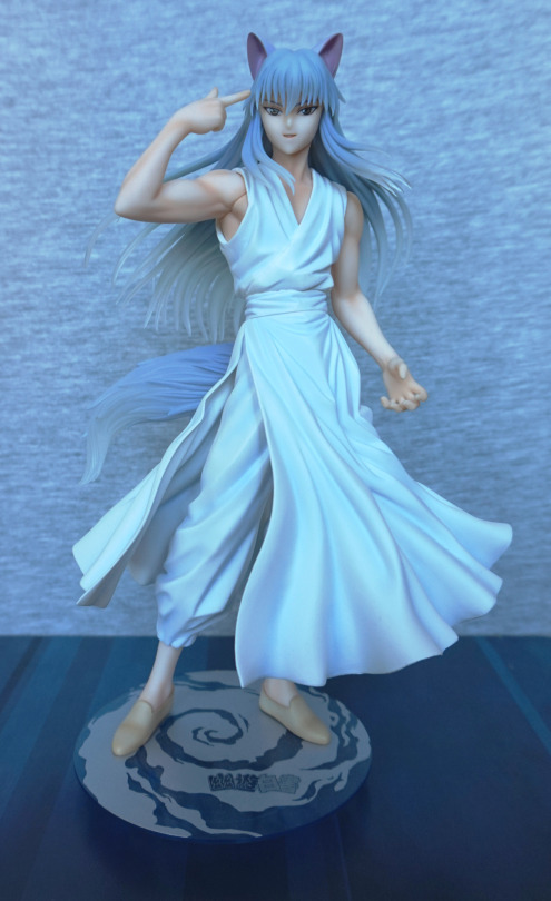
As I don’t have many figures of Asuna, I decided I wanted a scale of her, and this one cropped up on MFC for a decent price. 
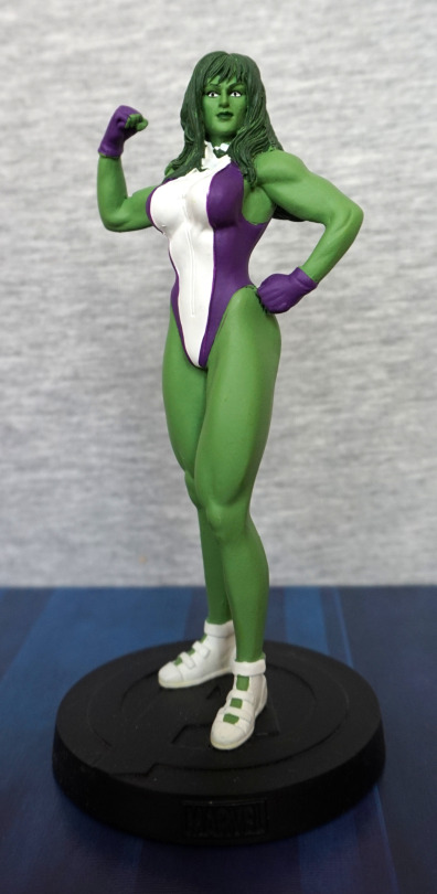
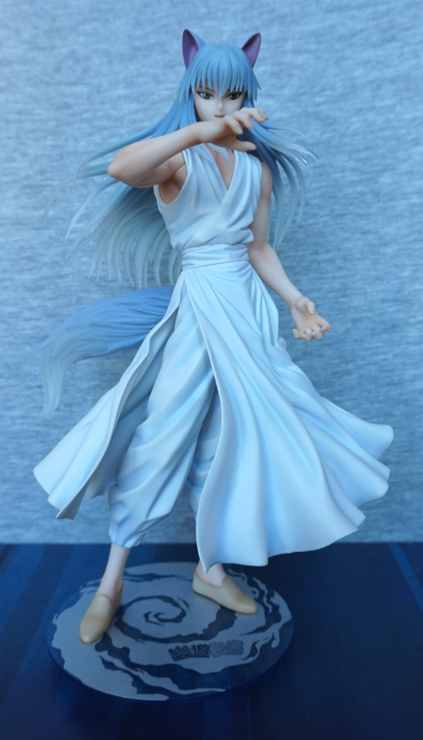
Front:

image

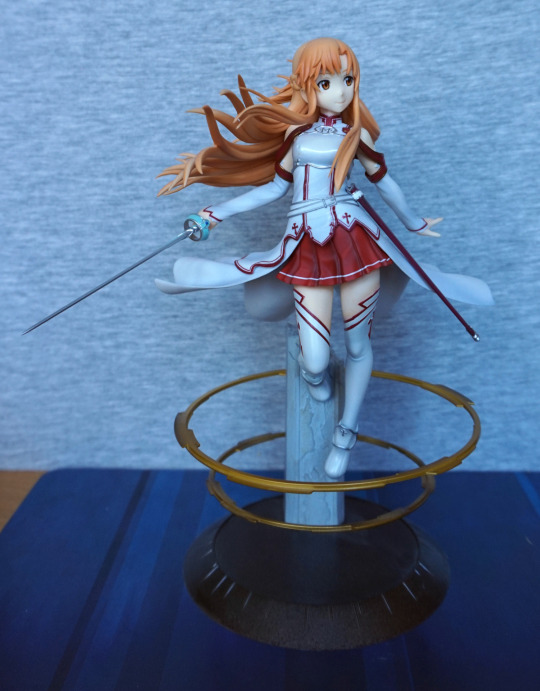
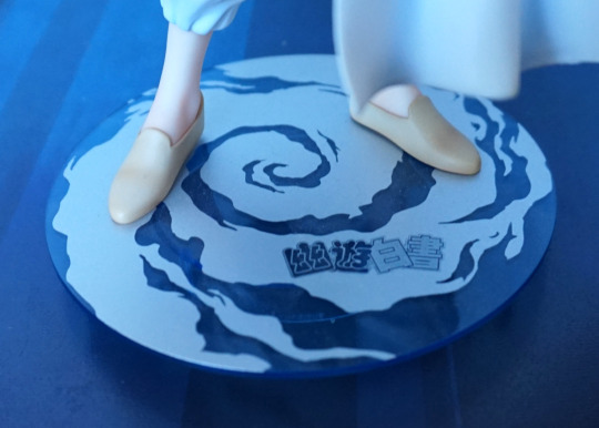
I was attracted to this figure by the pose and the golden rings. For this one, I think the promo version looks a fair bit more attractive than the final product, but it’s still a decent figure. I like her outfit and the rings, but they’re not as shiny as the promo version would suggest. The base is also a flatter colour – would’ve been nice to have more shading on this. 

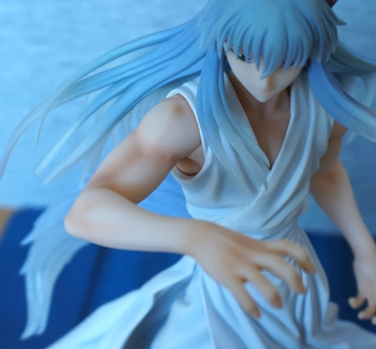
For me, the weakest part of the figure is the hair:

image

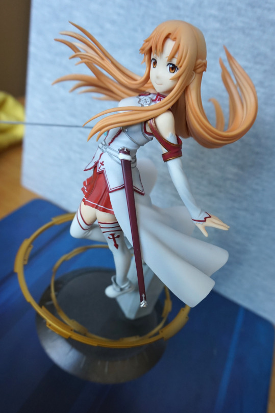
It has been nicely sculpted, but the paint makes it feel a bit plasticky. I feel it could’ve done with some darker shades. The rest of the details on this figure though, have been painted decently well, and the lines are nice and clean.
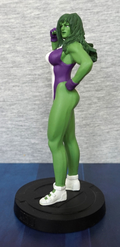
Left:

image

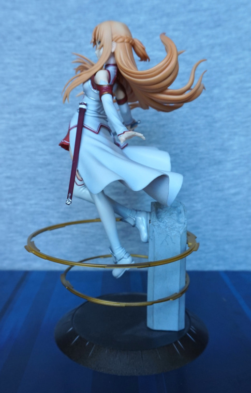
Here we can see her launching herself from the pillar – I do like this pose. They’ve included the braiding in here hair, so that’s nice. The clothes are sculpted well, and include creases.
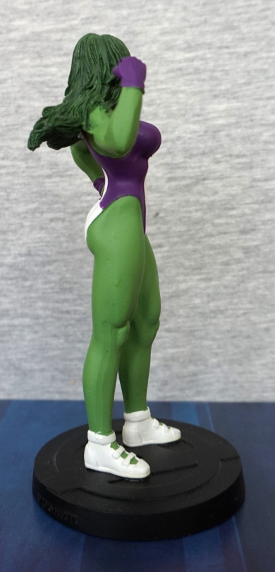
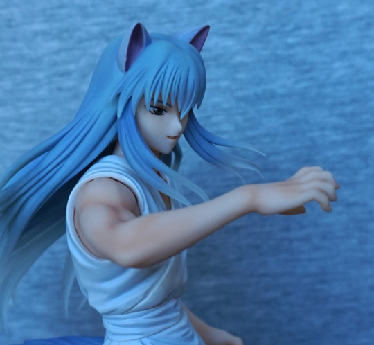
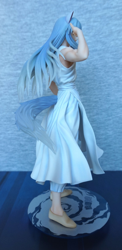
Right:

image

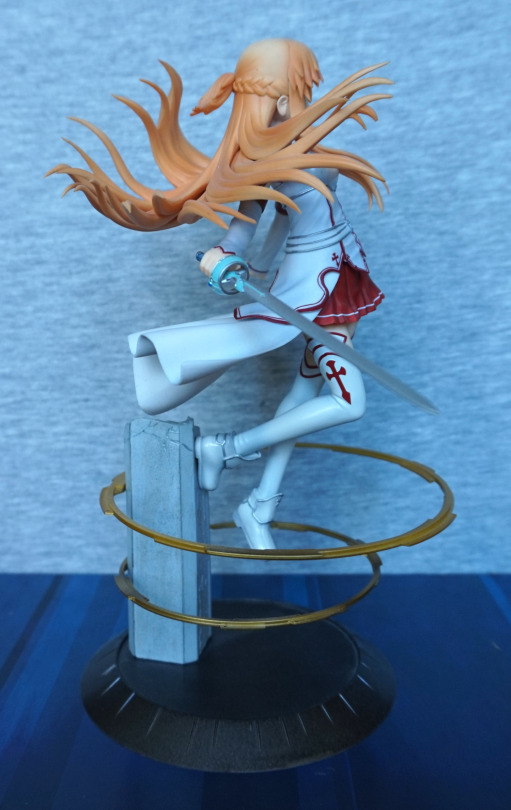
Here is her sword – this detaches at the hilt. She holds it well, and looks good. Her hilt is also a part that has to be attached. I think this picture also partly captures the plastic finish to her hair. The shading looks nice, and I love the way it’s flowing out in different directions… but that finish… 
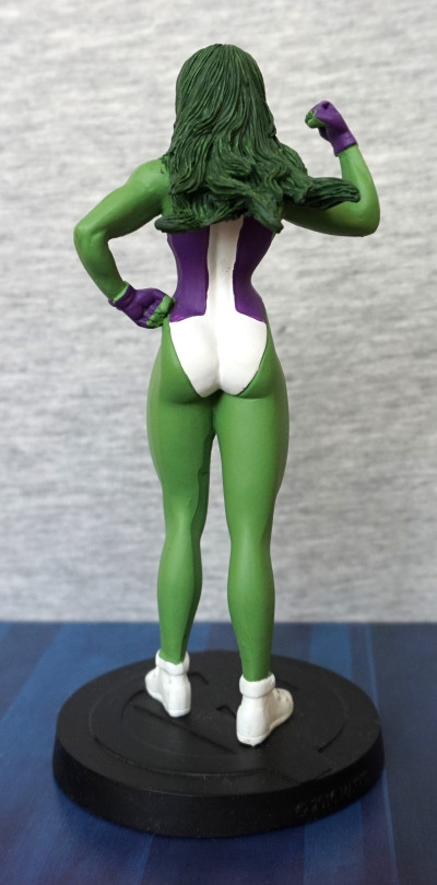
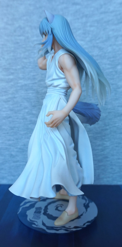
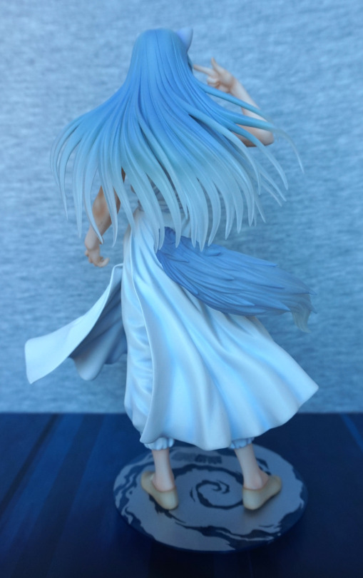
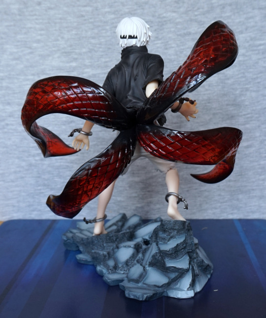
Back:

image

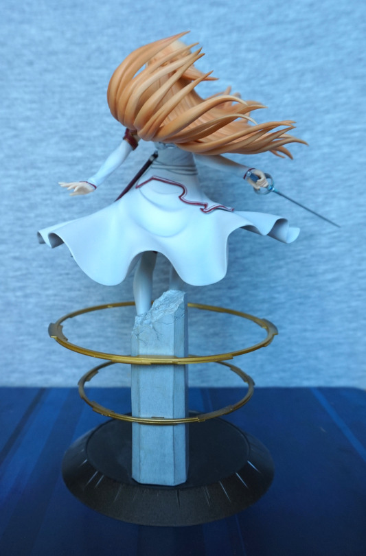
Her cloak looks good from the back, and the pillar has paint details from the back. The texture on the broken part of pillar looks good too. 

Overall, I think this figure is decent, and worth what I paid for it. I think the RRP is a bit much for it, what with the hair and the other smaller downgrades from the promo version. She seems fairly available in the aftermarket, and you can probably get her for a decent price.

She-Hulk – Marvel

I bought this at the same time as the Crash Bandicoot, And I managed to squeeze both into my luggage. And some DVDs. And some Minecraft papercraft…. This one is a fair bit smaller than Crash though. 

Front:

The sculpt is nice, but the paint feels a bit flat, and slightly squiffy in places. The face and hair are painted nicely, along with the shoes at this angle, but the purple paint is a bit missing in spots around the edges of her leotard, and a bit of lumpiness in the white paint. With this lighting, she doesn’t look too flat, but the green paint is all one colour, so it can feel a lot flatter in certain lighting conditions.

Left:

Here you can see some of the missed purple paint. Also some weird lines on the back of her legs.I think her hair looks like it’s in need of a wash…

Right:

Again, there’s some strange lines on her leg, on the lower half this time. White paint went a bit squiffy at the top of her right shoe. Hair and paint edges on her leotard are better on this side though. 

Back:

Hair looks good, but the paint edges look odd in a few places. And again, one of those strange lines running down her leg. 

Overall, it’s an OK figure for what I paid. I think some extra QC wouldn’t have been amiss on this one. Not sure I could recommend this figure though. 

Crash Bandicoot – First 4 Figures

This figure I came across on a work trip…. then had to use my best Tetris skills to fit it into my luggage… being an EasyJet flight, I only had the one case to work with… but I did it! 

So here he is:

I love the clean line and bold colours. Certainly a figure that will stand out on most shelves. The painting is neat, and I love the sculpted tongue. 

Face close-up:

I like the way they’ve blended some yellow paint around his mouth, to add some shading to his fur. He also has super-shiny eyes to contrast with his skin. 

Left:

He looks good from the side, even with the cartoonish proportions. I think they’ve done a good job with his body shape. 

Right:

Looks good from this side, though you can see a seam on the side of his body. Looks a little odd, but not hugely noticeable. His shoes look good and are neatly painted.

Back:

From the back, you can appreciate the fur texture he has. They’ve also painted a light orange area on his back, so it isn’t totally plain back here. His gloves look good – the straps are well sculpted, and there’s edging around the edges, on the fingers. He’s got a couple of creases in his trousers too, which adds to the detail. 

Base:

Sadly you can’t see much of the logo, but what’s visible is printed crisply and looks good. 

Overall, I’m really happy I managed to get him home in one piece. I love the colours and the pose, and would recommend this figure to a fan of the series. 

Gelmar – Devilman

Wandering around Yahoo! Auctions Japan for Devilman merch, I came across this Gelmar figure, and decided I’d bid on him. He didn’t come with a box, which was advantageous for me, so I could pack him with another item (which will be featured in a future blog, but not for some time). 

So here he is:

I love his blue, shiny colour and his overall design. His sculpting is also fairly detailed. 

Face close-up:

He does have a bit of a paint scratch on one tooth, but it’s not too bad. The wings on his head are detailed nicely, and I like the tentacley things sticking out from the sides. The teeth also have a couple of different coloured paints, which adds to their detail. 

Gelmar’s “slug”:

Rawrgh. He’s also painted well, in the places that were painted. Due to this part being partially rubbery, he was sticky with plasticiser, but I washed most of it off. He did smell a bit because of it too. 

And for the reason he’s rubbery:

He contains some unfortunate souls! Getting this part out isn’t too bad, but putting it back in can be a pain – it only fits in properly in one orientation, so it can take some fiddling to get it right. 

Close-ups of this part:

Looks like he’s munched up these dudes well. This part is nicely sculpted and painted. 

Top of Gelmar’s head:

Here you can see some of the shininess of the blue parts. He has a well sculpted spine, and I like the claws protruding from his shoulders.

Left:

I like the fact he has very different textures on his harms to his body – the contrast works well, and the details definitely make up for the lack of varying colours in the character design. 

Right:

I love the overall monstrous shape of his body. With his tail, he’s pretty stable, but for me, his tail does slip out easily if I move him. Loving all the small details and his clawed hands.

Back:

His back isn’t short of details in the sculpt, which is nice. Here you can see where his tail part is two segments, for the soft rubber part. The blend is handled reasonably well though. He does have some limited articulation, but other than moving his harms, none of it is really worth messing about with for me. 

Overall, I’m really happy I decided to go for this figure. I love his devilish appearance, and the blue metallic colour is attractive to me. Would recommend this figure, but he can sometimes be pricey in the aftermarket. He does have other colour variants, but I don’t think I’ll attempt to chase them down.. however I’d consider buying one if I see one come up at a reasonable price if I’m on the hunt for Devilman loot again. 

Alien – Clear ver – Alien Resurrection

Saw this dude on Mandarake and decided to add him to an order. Was on the fence as I don’t always go in for clear versions of things, but the coloured version of this figure I have is in poor condition, and, well, it’s a Xeno. 

Front:

I was pleasantly surprised by this figure – the details are reasonably visible, thanks to the figure size and the yellowish tint. Not sure if the yellow tint is intentional or something that’s developed over time, but it works for me, lol. 

And yeah… I still had the Demogorgon on the table… He will balance without a stand, but he’s much easier to balance with one. 

Left:

I like the tail on these figures – works well to counterbalance the figure, and looks good. I like the details in the sculpt on the legs and his chest.

Head close-up:

He doesn’t have any detail on his dome, but the side moulding makes up for it. Plenty of tendony things going on here. 

Right:

His “pipes” have a nice texture sculpted onto then. His splayed feet do help significantly in balancing him too.

Arm close-up:

I like the flange detail, and they’ve also captures the round markings. His arms also rotate at the shoulder, which gives you some customisability to his pose. His hips also rotate, which is mostly useful for balancing purposes, and you can rotate his head a bit, but I don’t find that too useful. His tail can also rotate at the base, if you want it pointing sideways.

Back:

Here we can see his spine is sculpted, and some of the details on his legs. The tail works well with the pose.

Overall, I’m happy I got this. I wouldn’t pay a huge amount for him, but for the bargain price I paid, I’m certainly happy with him. 

Yoko Kurama – Yu Yu Hakusho

This figure I’m not familiar with the source material, but I couldn’t turn down a wolf dude, so I preordered him. 

And thus he arrived at my house:

From the photos on MFC it wasn’t clear if the translucent parts were tinted blue or purple – I’d say they’re a bluey grey. Not entirely sure my photos are also clear in this regard – camera felt like nudging the white balance into the blueish range. 

I love the motion in his clothing, and his face is sculpted well. His skin has been given a decent amount of shading, which helps his muscles stand out. I like the effect of the translucent hair, but not sure it works as well as the promo art. 

Face close-up:

I like the ears and his expression. Here we can see the seam where the arm can be exchanged – I like the fact they’ve included an exchangeable part by default (unlike Kaneki Ken…) and the seam isn’t too visible when displaying the figure. 

Close-up of the alternate arm:

I like this arm too, but for the photoshoot, it can get in the way of his face. His tendons are sculpted well on this arm, and the hand looks good.

Front with the alt arm:

As shown by this photo, viewing angle is important if you choose to use this arm part. However, it does make for a better generic pose than him pointing at his head. 

Left:

This arm is also painted well, and has a good amount of detail sculpted on his hand. Clothes also work well, and I like the way his hair flows over his shoulder.

Right:

Here we get a first look at the tail – and it shows why I’m on the fence about translucent hair. It’s a nice effect in isolation, but doesn’t really give the impression of being hair. I’ll just admire the shading on his shoes and feet. 

Back:

The sculpt lines in the hair are well done – it does convey the different hair textures well. Also having the sculpted strands is nice, and adds detail to the figure. 

Base:

The base has a ring underneath, to make him appear as if he’s slightly floating on this wind disc. A relatively simple base for Kotobukiya, but still looks good. The silver print and the transparent blue plastic work well and complement the figure. 

Overall, I’m happy with this figure – there is more paint detail on this one than there usually is for Kotobukiya figures, and well, he’s a wolf dude :P. I’d prefer if the hair was the more purplish colour in the promo photos, but suspect that would be less canon. Looking at images of him, his hair colour does vary somewhat, but probably tends more to grey than purple. Would recommend this figure, if you like his design. There aren’t too many figures of this guy, and the other “main” one has some unfortunate arm seams. 

Kaneki Ken – Awakened Ver – Tokyo Ghoul

This figure I was considering chasing down in the aftermarket, as I liked the design, but then found Kotobukiya was doing a repainted re-release. So I PO’d that instead. 

So here he is:

image

I love this figure, and the base works well with him. The paintwork is really nice, and the upgraded kagune were definitely worth waiting for – I love the transparent plastic they’ve used, and think it looks much better than the pictures of the original that I’ve seen. 

He also has some nice paint details, with the shading on the shorts and his nails being painted. 

Face:

image

One mini-controversy with this figure is they didn’t re-release the bonus head – you can use it if you have it, but you’ll be relying on sourcing the old release. I’m not too bothered about it myself. The head itself is painted well, and looks good in isolation. 

Close-up of part of the kagune:

image

Shiny, glossy :). We can also see some paint shading on his hand here too. 

Left:

image

Lotsa kagune. I like the way his feet are posed, and standing on the rock. 

Right:

image

His pose, what you can see of it, looks good from this angle too. The broken handcuffs are painted well, and have a sense of motion to them. 

Back:

image

The back of his shirt is sculpted well, and you can also see the band for his mask back here. The kagune comes out nicely from his back, pushing his shirt out of the way. 

Overall, I’m really happy with this figure, and definitely think this is one of Kotobukiya’s nicer figures. Worth the price I paid imo, though he will now have gone up in the aftermarket. Would recommend it, and not surprised it’s gone up in the aftermarket. 

Aquaman – Justice League

This figure I was on the fence about buying, and decided to go for it, before I lost the opportunity to get it at a reasonable price. 

So here he is:

Whilst I’m not much of an Aquaman fan, I like the shininess and the colours of this figure. The copper-green colour scheme is very eye-catching, especially with the metallic effect paint. The belt has also been sculpted well, and complements the figure. 

One thing that’s a pain is his trident:

It looks nice, but he doesn’t hold it too well – it’ll easily slip through his hand, which makes it awkward if you’re moving him off the shelf… To remedy this, I’ve used a balled-up Glu Dot on his hand to hold the trident in place. I have him displayed slightly above eye-level, so the Glu Dot isn’t visible, but I don’t think it’s even that noticeable in the above shot. 

Face:

I like his face – not sure what it’s supposed to look like, but I think it has been done well in terms of general sculpt and paint. The hair has a nice sculpt to it too. We can also admire the edging on his collar here too. 

Base:

The base is the standard Artfx+ affair, with the Justice League logo, rendered nicely in silver. The base is magnetic, as these figures have magnets in their feet to hold them to the base. For him, the magnets aren’t strong enough to pick up the base, but it does help him stand up for sure. 

Left:

I love the curved parts on his suit, and the glossiness of the green. Almost think his gloves could’ve done with some kind of edging to make them less plain though. They feel like they end prematurely somehow. His sideburn is well done on this side though. 

Right:

The join on his leg is pretty noticeable from the side. Probably the largest flaw with the figure, outside of his slippery weapon and the fact it’s Aquaman. Still liking the fins on his outfit. 

Back:

Bit of a square arse… Not sure what’s going on with that. Especially with the creases moulded underneath on his legs, it seems to emphases the odd shape  :(. I think the rest of the back of his legs looks OK, though the shiny patterns do make it look a bit like he’s got rubber-legs. For his back, I think it’s better ignore most of him from the waist down, but the suit top texture looks good, and his hair looks decent enough. 

Overall, not a bad figure, but not worth RRP. I’ve usually seen him for sale around the £35 mark, which is a fair price. I think with the lack of extra colour and shading that other characters get, maybe he should have been given a lower price point out of the gate. 

Power Armor – Fallout 4

So… I actually bought a Dorb again…

And it’s this cute looking dude here:

Personally, I think this is one of the better looking Dorbz, and I’m still thinking that when he’s out of the box. The head has been done well – the finish on the helpet is good, and there is a decent amount of detail to be seen here. 

Left:

The paint is neat, there is a seamline, but that would be hard to hide on a flat surface like this. Shiny! 

Right:

I can see one stray brush mark on his helmet, but other than that, paint look good, Like the gun thing he’s holding, but this is that part where I admit to not playing Fallout 4 and subsequently not knowing anything about it. 

Back:

Nice bit of detailing back here on the helmet, and the body looks decent for its stylised fashion.

Top:

Definitely got that Dorb-y shape to him. Seams are a bit of a mess though. Well, he was put together on the wastelands, so we can’t be too hard on him :P. Would be better of the seam wasn’t so rough-hewn and misaligned though.

Overall, I think he’s good for the money I paid. I got him for £3 at B&M. I think it’d be a hard sell at over a fiver tbh. Still think he’s a decent-looking Dorbz, so would recommend if you like the style. 

AG-SYS – Wipeout

And this was the one I was waiting for, before I bought the other, as they’re 2 for £20 at GAME. 

Managed to snag this one prior to the official release date (per GAME’s site). Was just there, chillin’ on the shelf, so I wasn’t leaving without it… and gladly they had the Feisar there too :D.

So here it is:

This ship ha a more interesting design than the other, what with having two distinct “halves”. The paintwork is nicely done, and it also has the weathering effect like the other.

Right:

This one has asymmetric paintwork, which is a nice attention to detail. Paintwork looks neat and crisp.

Top:

Love the overall shape of this one – a fair bit different from a bog-standard ship design. Also has its designation nicely painted down the middle. I also like the fact they’ve done the windows in transparent plastic, adding to the realism of the figure. 

Back:

Some nice detailing in the engine area here.

Underside:

They’ve actually painted down here on this one, which seems to be a step up from the previous one. Looks like they’ve learned from the last one.

And here are the pair together:

They look great together, and I’d definitely get more Wipeout ships, if they chose to release them. Even if this pair cost me £20… I’m not entirely sure they’re worth that much, but hey, captive audience unfortunately. They know how to pick their franchises!